Progressive disclosure is about helping users get invested before getting to the nitty gritty. Read on to discover a new way to approach complex features!
All users want products to give them the tools to achieve their goals and complete the tasks they need. People want to feel in control and do what they want – but there’s a limit to how much freedom people can deal with. Concepts like the paradox of choice remind us that too much of a good thing can be bad.
Start new web and mobile apps today! Enjoy unlimited projects.

That’s why so many designers swear by the pattern of progressive disclosure. It represents the notion that users don’t want to deal with a load of new things at once. It makes for a stressful experience that has a huge learning curve and not at all what designers want to give users.
By disclosing things progressively, we separate the information into parts so users can advance in a way that is more comfortable and even enjoyable. But how can designers implement that in their own products? Let’s find out.
In the UX design world, it’s no secret that users want power. Not only the power to do what they need to do, but to do it in their own way. And yet, people everywhere want something else that is just as important: simplicity. All the best products are designed in a way that gives users power but doesn’t burden them with endless options. It’s all about striking that balance and making sure you’re not overwhelming users.
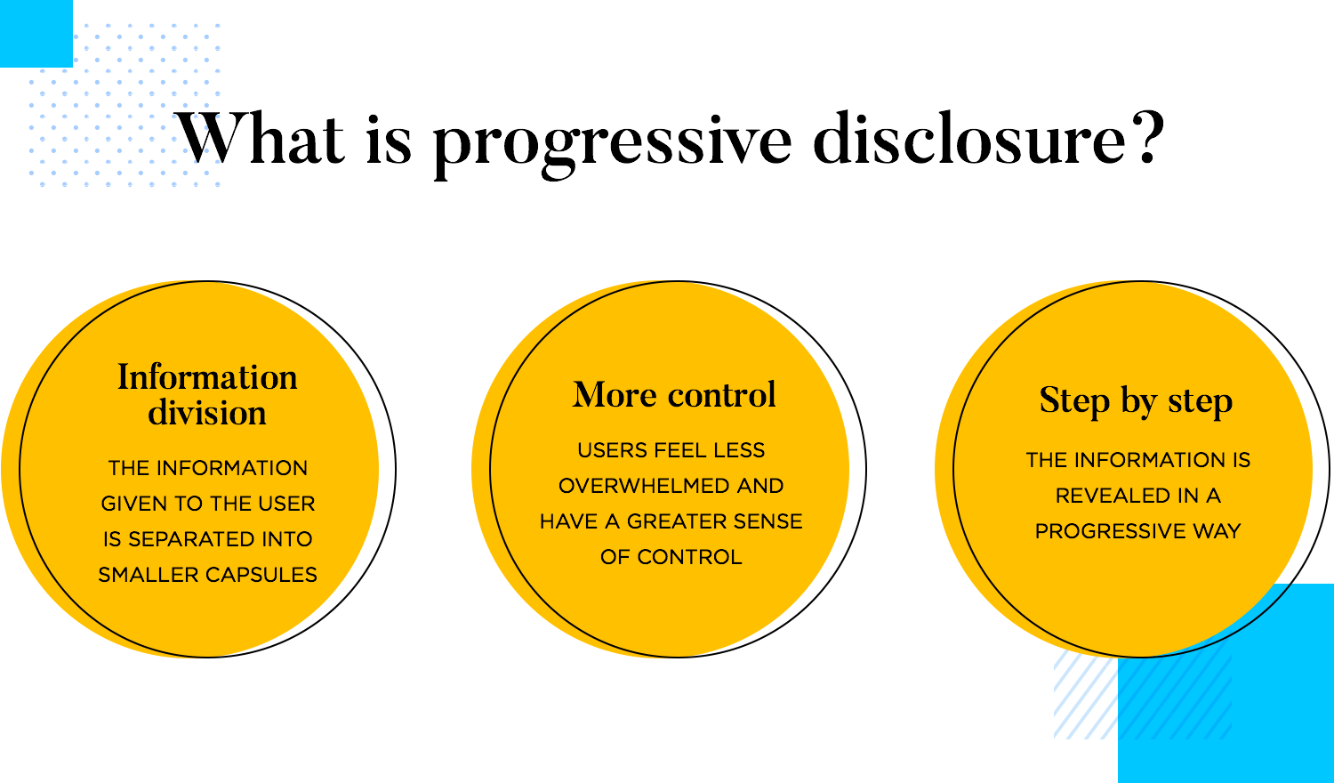
It all started back in the 80’s when IBM carried out a study on highly technical specifications. Their conclusion was that if these specifications were hidden until later on, brand new users had a higher margin for success as a whole. And so, progressive disclosure was born.
Instead of simply giving users a huge wave of information and choices, we separate it into bits. This can be a powerful way to not just ensure users don’t get overwhelmed by the new information, but also of breaking up tasks that users don’t really want to do. Things like long forms, tasks that take up a lot of time, introducing technical features and giving users the option to customize their own experience. Progressive disclosure is all about waiting until users are ready to deal with the most complex or less entertaining aspects of the product.
Another type of progressive disclosure UX is staged disclosure. This is when users are shown a step-by-step guide in a linear fashion. A classic example of this is the wizard, a UI feature to help users complete an activity such as creating a new Justinmind prototype.
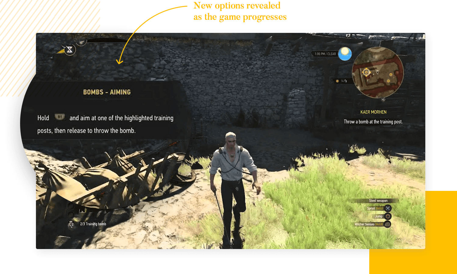
Consider an elaborate video game that places users in a completely new universe. This universe will have its own characteristics, rules and specifics. This goes to show that simply pushing all that information on a user is a recipe for disaster. People would be overwhelmed by so many details, so many things they need to keep in mind – taking away from the gaming experience.
It’s no coincidence that so many of these complex games offer information bit by bit. By disclosing information in a progressive way, we can allow users to become invested in the game before they get to the nitty gritty. This is true not just for elaborate video-games, but all sorts of UX products.
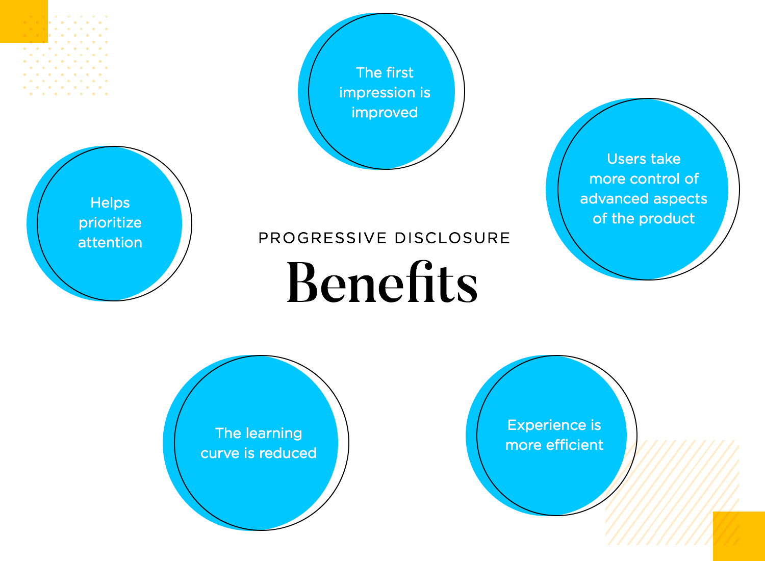
For brand new users, the progressive disclosure as a pattern helps them prioritize their attention. They have enough time to familiarize themselves with the basics of the design before moving on to more elaborate features or tasks. In terms of usability, this makes the entire product easier to explore and improves the learnability.
In more broad strokes, implementing progressive disclosure makes the entire experience more efficient for all users. It improves the first impression that users have of the design, helping them get past the learning curve.
Start new web and mobile apps today! Enjoy unlimited projects.

Giving users bite-sized bits of information can be an art form. Aside from giving users just the right amount of information, you want the general interface to maintain that clean appearance. This isn’t about adding boxes with entire paragraphs at certain points of the design, but giving users the basic tools they need in order to succeed and benefit from the product.
Always keep in mind that progressive disclosure is about balance and focusing the user’s attention to what matters, especially at first. Just like design teams have to prioritize everything into primary and secondary navigation menus, so too must be done with information and features.
This is done so that the true central features and information of the product – the core – is experienced first by the user. It’s about getting users to see the central feature and give them the space to venture into the more complex things if they desire.
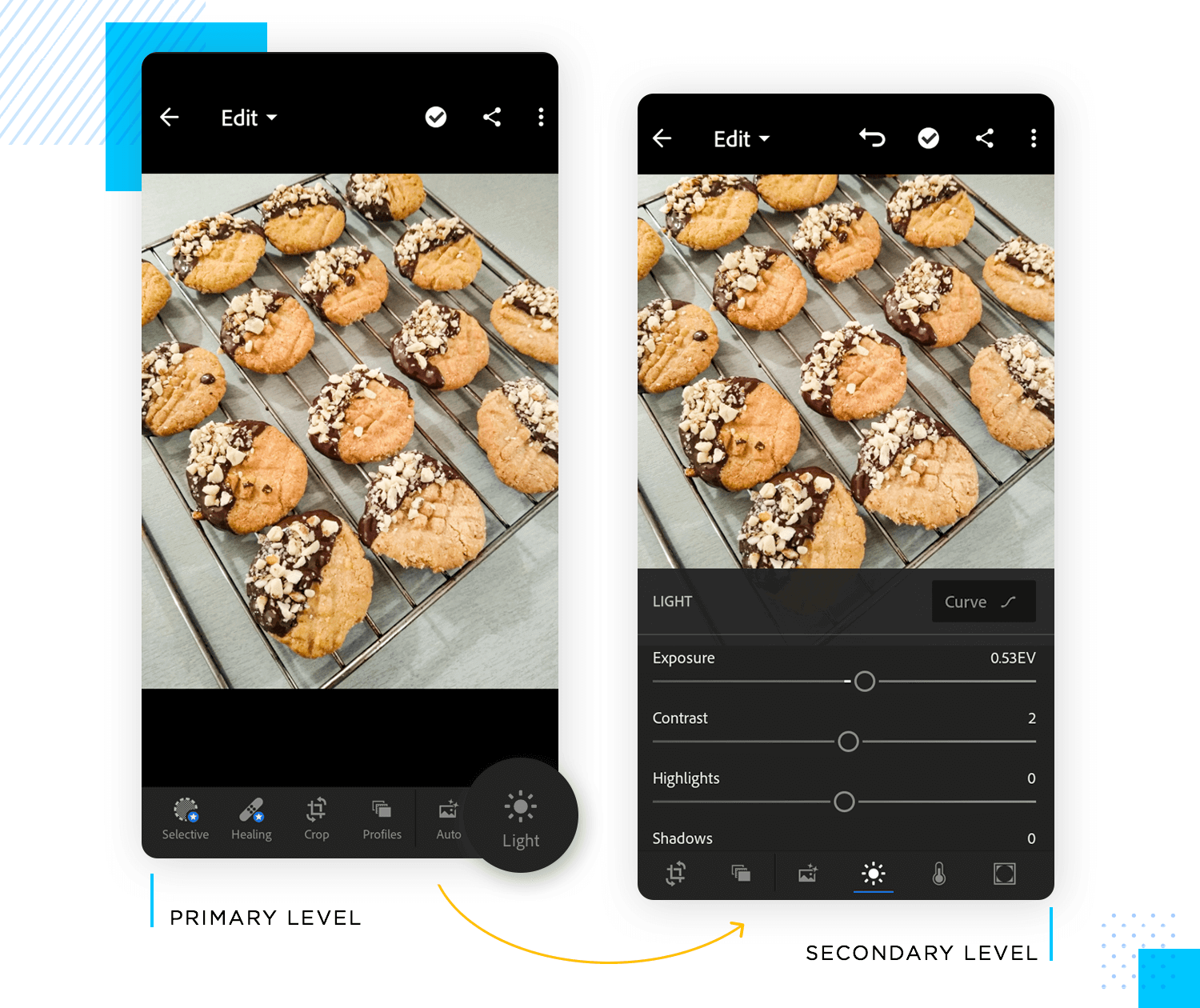
The outcome is that you introduce users to what matters while paving the way for the secondary features. It’s not necessary to force users to discover the secondary features, mainly because some of them may never need them at all. And that is ok.
The primary features and information can’t be too extensive. If the design team tries to highlight and explain everything, the user loses the true benefit of progressive disclosure. You want to direct the focus of attention to a few key features, not have a full walkthrough of the design. Another important thing to bear in mind is that you want to be straightforward with the user, seeking to simplify the primary information.
For the users who want to explore every corner or who do need the advanced features, it’s important to make the way there obvious. This isn’t just about having a clear line that separates the primary from secondary, but also making the secondary easy for users to find.
While this may sound a bit complicated, it’s actually rather simple. Knowing what the secondary things are, the design team has to make sure it’s mechanically accessible. Most products that go through a rigorous usability testing are bound to reach this standard, as it’s mostly achieved by good button design and links that appear to be clickable. For most apps, this can be achieved with a clear button for advanced settings or a walkthrough of the secondary feature.
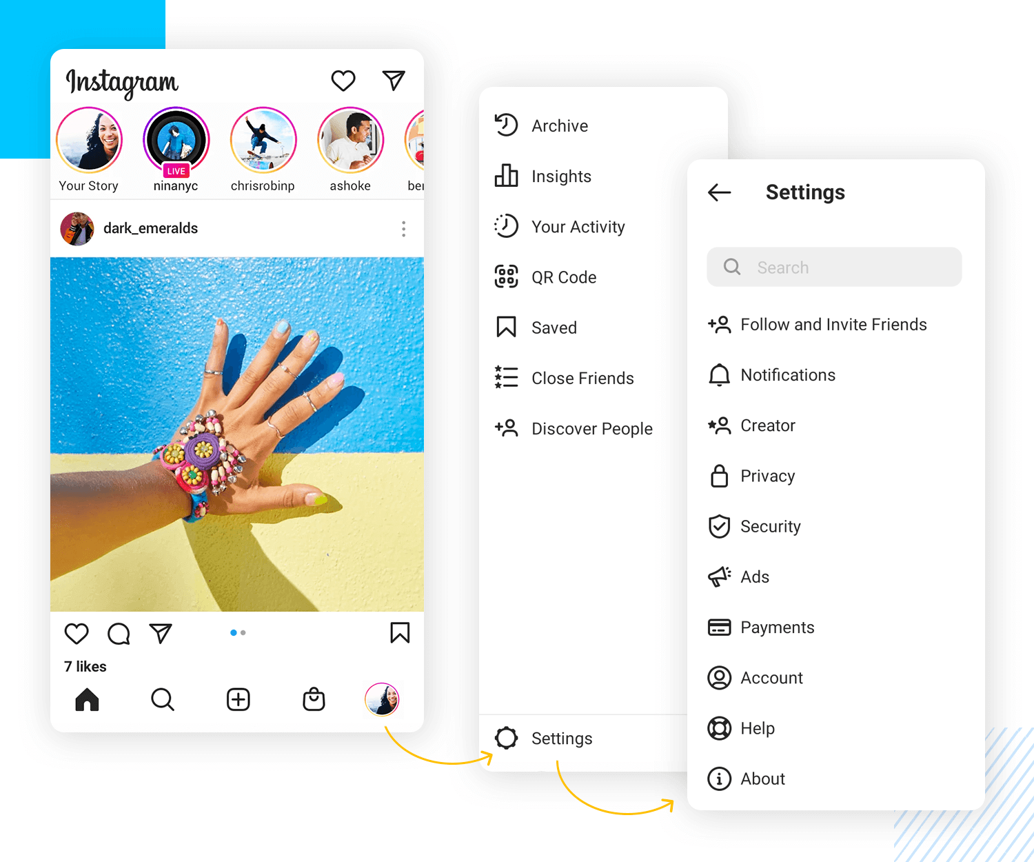
This key thing here is that users shouldn’t have to wander aimlessly around the design to find the secondary level of disclosure. A pillar of progressive disclosure is having explicit microcopy in links and buttons that set the expectations of users for what’s on the other side. This is a classic usability rule, but becomes even more important when it comes to allowing users to see the more complex face of the product.
In the design industry, there’s a general consensus that having more than two levels of disclosure is a bad idea. One of the reasons is that if the design team creates several levels of progressive disclosure of new information, it’s really easy for users to get lost or forget the important details. This makes the entire idea of progressive disclosure ineffective.
Another problem is that on principle, if you need many levels to disclose information to new users, you may have a serious issue at hand. The need for so many levels can be a symptom of the feature creep or a product idea that isn’t well-defined. The design may try to cover too much ground, with the designers being now faced with the task of simplifying the entire product.

Another issue that can create problems is trying to add levels of depth for the secondary disclosure.
Consider a list of secondary features we wish to introduce to the advanced user. Someone on the design team suggests having two levels of secondary disclosure, dividing the list in a way that appears logic. While this may sound like a good idea in theory, the practice is that additional levels complicate the entire user experience. Some users may never encounter the second level or conclude that it’s all done when the first level is finished.
This can be a bit challenging if you don’t have access to a prototyping tool that allows you to go really deep with the realistic details.
The big things like visual hierarchy and navigation design are key and need to be validated before you can move on to the finer details. The small things like button states and microcopy are important too, because they pave the way through which users will discover the other face of the product.
You want to know if users can understand the information correctly, as well as if they can find everything the way the design team intended. You want to make sure that the information disclosed gets the job done or if it can be simplified further. Remember that a lot of the concepts that represent the pillars of good progressive disclosure are also usability standards that all users expect nowadays.
Start new web and mobile apps today! Enjoy unlimited projects.

Noom is all about helping users get into shape in a healthy way. The app became popular due to it’s powerful UX design, which plays heavily into the concepts of gamification and progressive disclosure. The Justinmind team wrote a great UX case study of Noom, in which we can appreciate how these two key traits set the app apart from the competition.
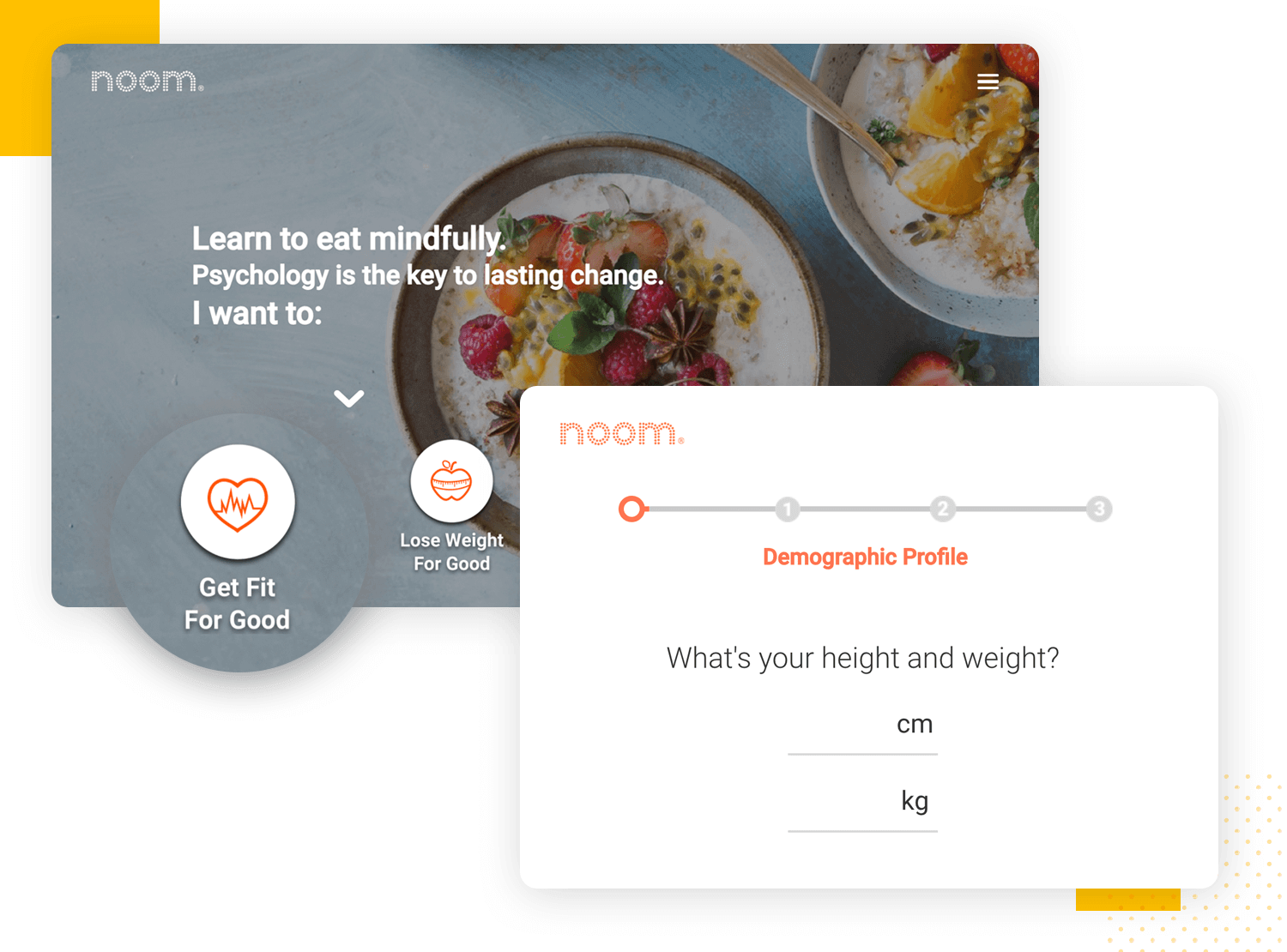
More specifically, Noom doesn’t introduce every one of its many features to new users all at once. Instead, it reels users in, introducing features one at a time as users progress on the app. It’s done in a way that feels natural to users, elevating the user experience as a whole. Users are entertained and invested before they realize and never feel overwhelmed by the information provided to them.
There’s a lot to be said about Google’s Chrome, but we’ll focus on how Google approached the advanced settings. To many users, the navigator can be extremely personal. It’s most likely one reason why the settings are easy to find as well as easy to process for users. The most common changes that users may need (the primary settings) are all laid down on the screen, using a vertical navigation bar to help users find their way.
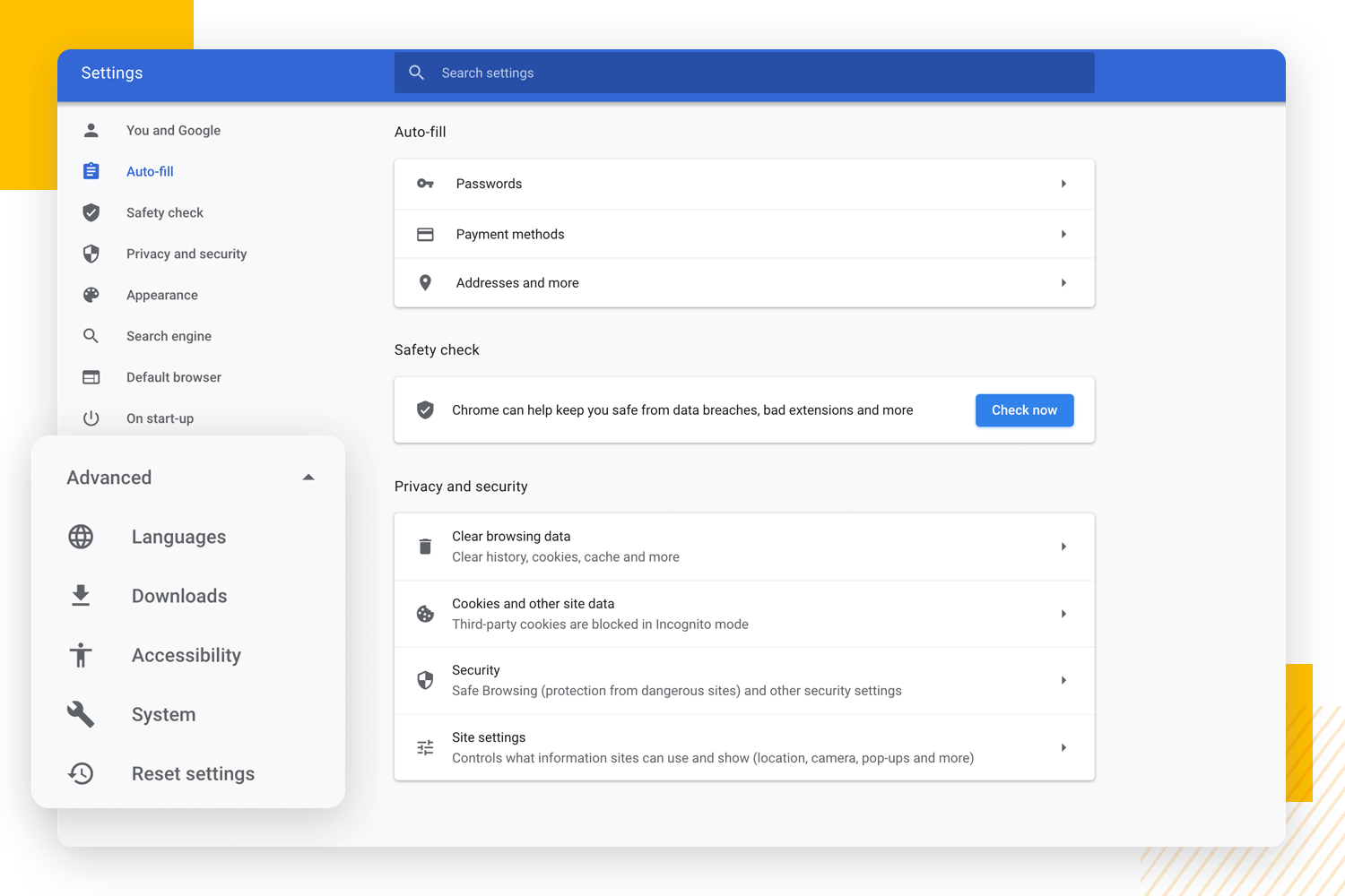
The advanced settings (secondary) represent the things that most users don’t need to touch or perhaps those that are sought out by tech-savvy users. These aren’t immediately visible, but remain easy to find should the user need them. All the way at the bottom of the primary settings, users will find a clear button that opens the secondary settings. Google added a link on the navigation bar too, just for good measure.
By now, Ubisoft’s Assassin’s Creed is a gaming classic. It fits our previous example perfectly, representing an entire world that is created for the game. Players are never bombarded with information straight from the beginning, but are fed bits of information in animations and dialog boxes as they dive deeper in the game.

One of the best things about the information disclosure in the game is that players are fed only the information that is relevant for them at that point in time. This allows players to enjoy themselves and be immersed in the fantasy world easily, without worrying about remembering a thousand details.
That’s right. Our own blog, like many others, uses the pattern of progressive disclosure on our blog homepage. Using snippets to give users a glimpse into the content before they click on that specific post, our blog helps readers get realistic expectations of what they will find in each post.
Widely used by news platforms, blogs and other websites that hold a lot of content, this pattern is all about giving readers a little taste of the article before they commit. Going back to the homepage of the blog is easy enough, you may say, so why bother?
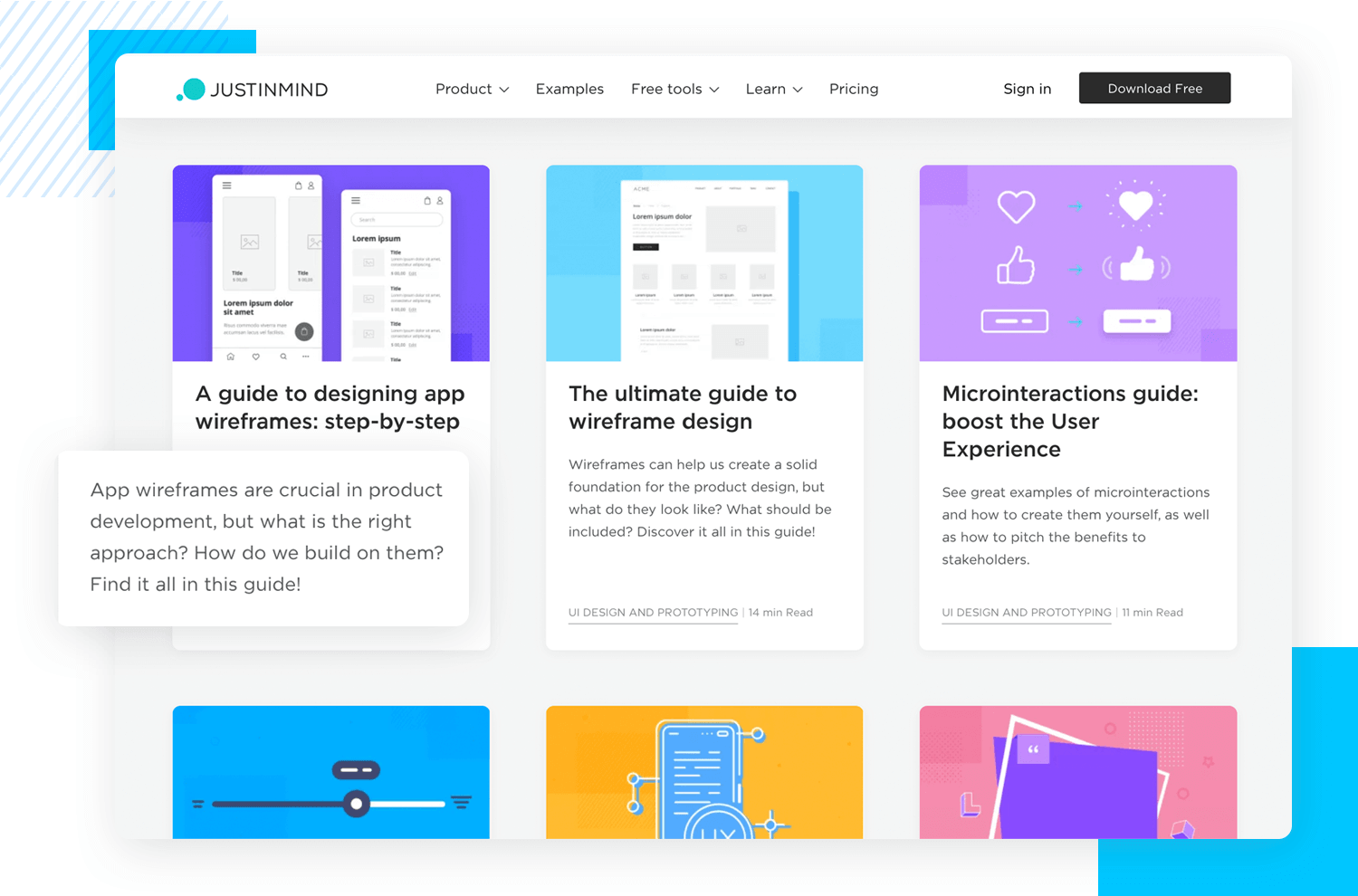
The truth is that the main concern isn’t how long it’d take readers to go back to the homepage and choose something else. The real concern is giving users the right amount of information about each post, so they can choose the right piece of content from the very start. By offering a small bit of information on the individual posts, we equip users to choose something they are more likely to enjoy reading – resulting in a better experience as a whole. That’s progressive disclosure at work, folks.
Duolingo has become a massively popular tool for those who want to learn new languages. In fact, we love this example because learning a brand new language can be very intimidating at first. There’s so much to remember, so many details and new information.
If an American were to simply go to Berlin to learn German, they’d be quickly overwhelmed by how much they have to learn. In part, that’s why having an actual teacher is a better way to learn. The teacher reduces all this information, passing to you only the basics so you gain some footing with the new language. The teacher progressively discloses details.
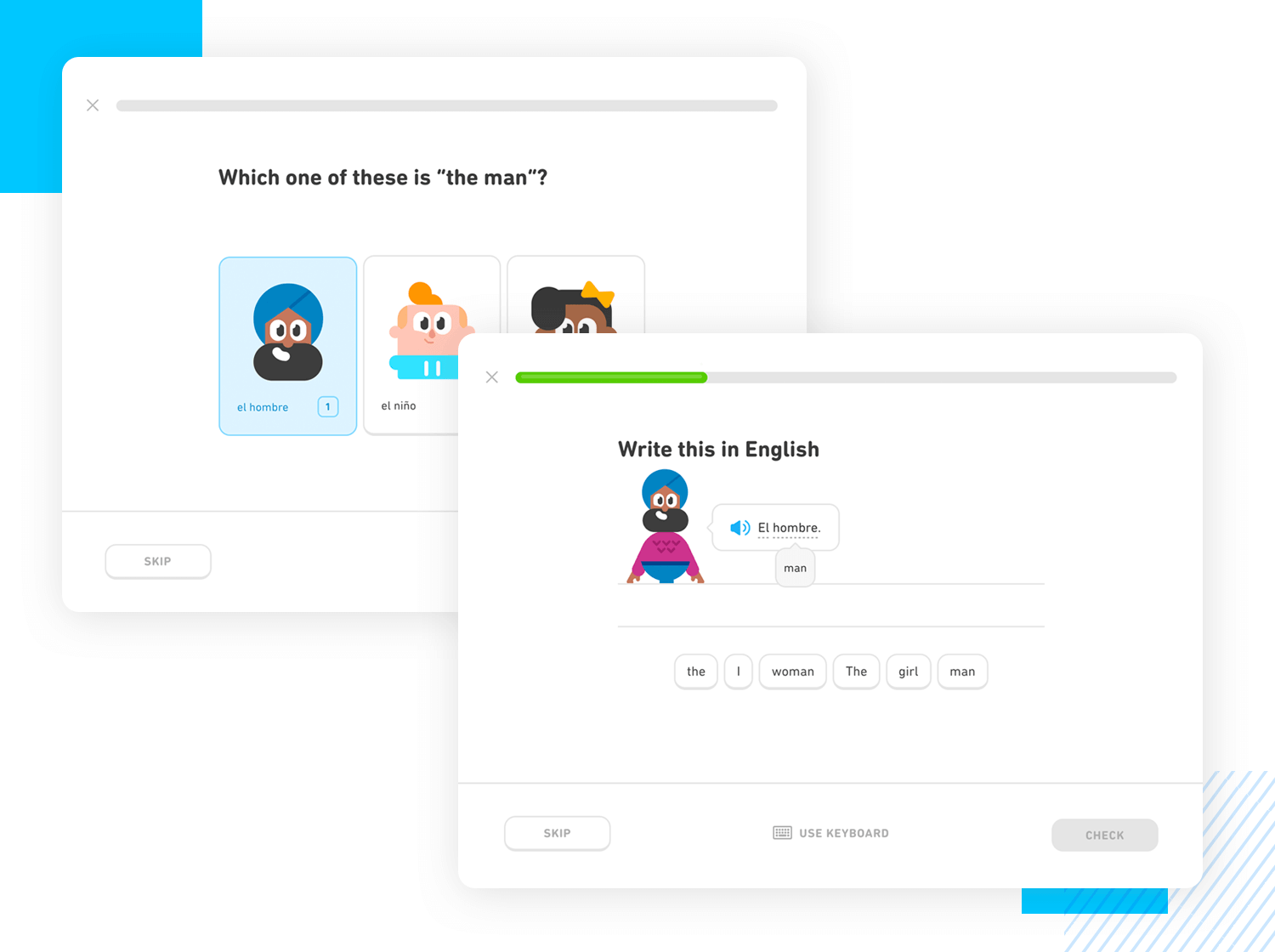
That’s why Duolingo is such a wonderful tool. The app itself helps users to grasp a few key concepts per lesson, without burdening people with a ton of details or complex phrases. With baby steps, the app progressively helps users to build on their skills in a way that is comfortable and enjoyable. Even the homepage of the language itself progressively discloses the lessons, so users can take it slow and avoid that intimidating aspect of training for a new skill.
We love that Duolingo is able to take progressive disclosure to such an extent. It’s a pillar in the app and it’s easy to see how this encourages users to keep going.
Progressive disclosure is a concept that plays a surprisingly big part in UX design. It has the power to improve the first experience users have, shorten the learning curve and help users achieve their goals with the product. At the same time, it forces designers to narrow down on what truly matters in the product – which can be tough but also illuminating.
Altogether, progressive disclosure can be a powerful tool in improving the usability and quality of the user experience for all users. It’s all about striking the right balance between giving users power to do what they want, while offering a certain degree of simplicity.
PROTOTYPE · COMMUNICATE · VALIDATE
ALL-IN-ONE PROTOTYPING TOOL FOR WEB AND MOBILE APPS
Related Content
 Step into a world of innovative UX ideation techniques to help you get your creative juices flowing. We explore a range of methods to help you generate fresh ideas and solve complex design challenges through mind mapping, role-playing, dot voting, and more.19 min Read
 Calendar app design can be simple or complex. In this post, we show you 25 of our favorites and how you can make a start on your own27 min Read
 Lean UX is all about changing the focus of the work and gaining perspective in the design - but why is it so popular? What does it mean in practice? Read on to find out!34 min Read
