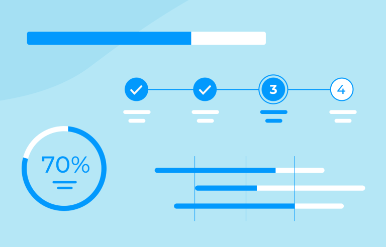
Progress bars set expectations, give an impression of activity and can calm users. Here are 25 that get the job done
Good design has the power to turn the mundane into the marvelous. UX designers are no different when it comes to infusing a small amount of pleasure into a seemingly straightforward experience.
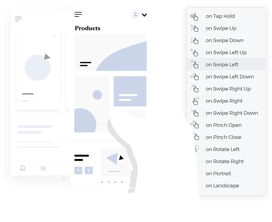
Prototype web and mobile apps with fully-interactive progress bars
The humble progress bar hasn’t escaped this treatment. Progress bars are not the most exciting thing in the world but in the world of UI design, they prove to be a powerful tool. They’re what you see when a screen is loading if you’re downloading something, watching a video or listening to a song. A progress bar shows you have much progress you’ve made and how much left you’ve got to make.
As you wait for a download to complete, the progress bar— that little horizontal line that gradually fills up— serves as your digital companion. It acts as a visual countdown, indicating how much longer you have to wait before you can jump into your new content.
Progress bars are ubiquitous: whether you’re downloading apps or installing games, they consistently keep you informed about the status of a task.
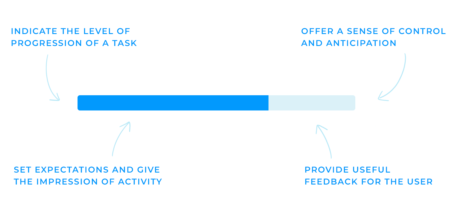
They’re a great way to calm your users. What they do is set expectations and give an impression of activity. They’re a way of communicating with the user and being transparent. A progress bar tells them: hey, we’re doing what you asked but it’ll take this long.
Baking a cake without a recipe can, unfortunately, lead to a mushy and disappointing result. Having clear instructions would surely make it easier to track your steps to avoid this. Think of a progress bar as a recipe for a task, offering specific guidelines and measurable outcomes.
For lengthy tasks, like downloading a large file or installing a software update, a progress bar keeps you engaged and informed. It visually represents the remaining time, helping to alleviate those darn feelings of frustration or abandonment, very close to feeling rejected even!
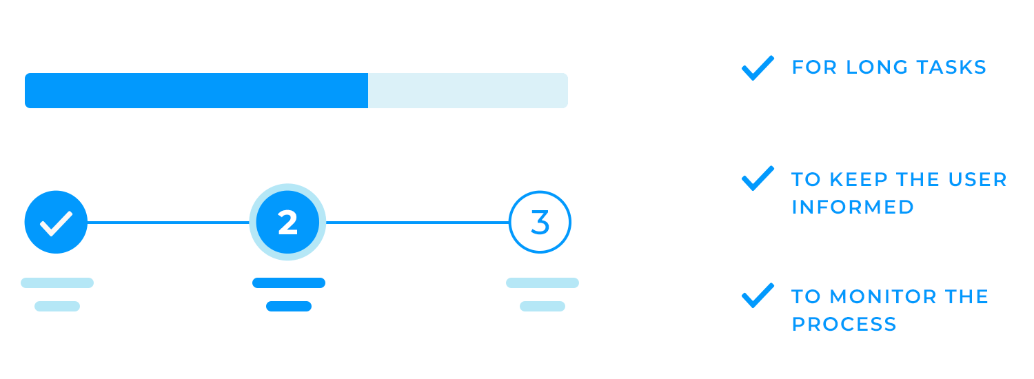
And last, but certainly not least, complex tasks can feel overwhelming. By breaking these tasks into smaller, manageable steps and showing a progress bar for each one, users can monitor their progress and stay motivated. This approach makes the task feel less intimidating and more achievable.
Without a progress bar completing a lengthy online form can feel like an endless slog. But with one, you can see exactly how far you’ve come and how much is left to do. This encourages you to keep going, knowing that the finish line is in sight, helping you to keep your eyes on the prize.
Similarly, setting up a new account or device can be a daunting task. A progress bar in a setup wizard, for example, breaks down the process into smaller, manageable steps, just like a to-do list! Checking each item off is like completing a new step. It’s just so satisfying!
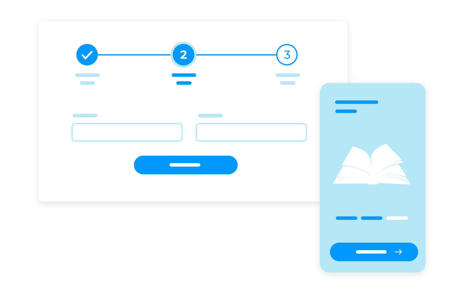
Another example of this would be online checkouts. We all know how long and frustrating they can be, just like in real life. However, unlike real life, users can feel less of that.
By breaking down the checkout process into smaller steps and displaying a progress bar, users can see how close they are to completing their purchase. This helps to keep them engaged and motivated to finish the process.
Progress bars are very good at doing their job, which is indicating the progress of a certain task users need to do before finalizing a process.
Imagine not having something to tell you how long it takes for you to download a large file. The fear of the unknown can be very overwhelming for many users like you. However, with a progress bar, they can see exactly how much of the file has been downloaded, which gives them more control over the situation.
Uploading a file can also take a while, and a progress bar is essential in keeping you updated on the upload status. It prevents these horrible and undesirable emotions, ensuring users don’t accidentally close the browser or navigate away before the upload finishes.
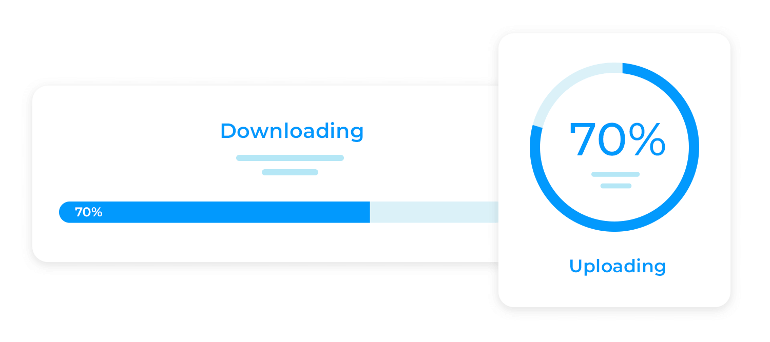
It’s not just with the big stuff. Long-loading pages or elements can also be quite irritating for users. By showing a loading progress bar, you reassure users that the page or element is still in the process of loading and that they haven’t been forgotten.
If a website is loading very slowly, with no progress bar in sight, you might start to wonder if the page is stuck or if something has gone wrong. Doubting yourself and sitting there confused, you’ll probably end up feeling a bit useless for not being able to fix it. Not what good UX design is about.
However, a progress bar can help to alleviate these feelings. A visual representation of the time remaining for the page to load reduces uncertainty, which can improve your overall experience on the website.
Prototype web and mobile apps with fully-interactive progress bars

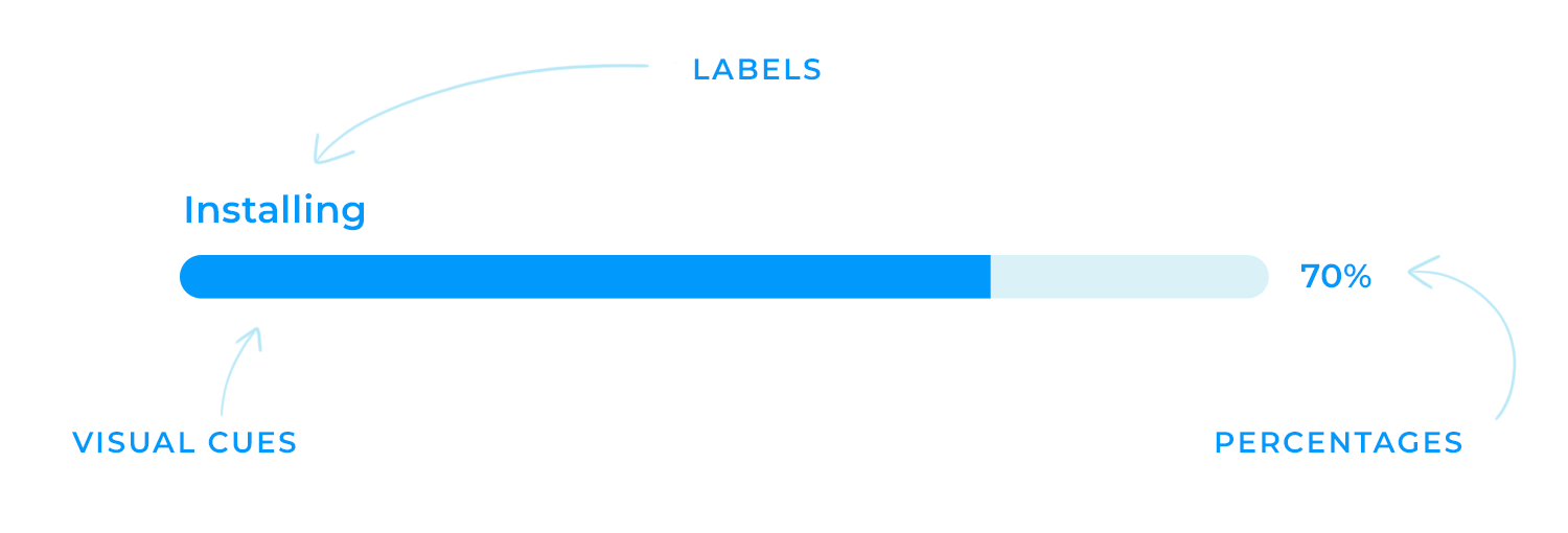
Clarity is key when it comes to progress bars. Users need to be able to quickly and easily understand the status of a task. This can be achieved through the use of text, percentages, or visual cues. For example, a progress bar with clear indicators can provide a visual representation of the task’s progress, while a percentage completed can give users a more specific measurement.
The choice of method depends on the context of the task and the needs of your users. For long-running tasks, such as downloading a large file or installing a software update, a percentage completed can provide a more detailed and informative representation of progress. However, for shorter tasks, such as uploading a small image, a simple message like “Uploading…” might be sufficient.
Creating a smooth user experience requires consistency. Imagine entering a restaurant where each room has a completely different cuisine and décor. Yes, that would be really confusing. Your website or application should follow the same guidelines.
Just like a restaurant’s signature ambiance, maintaining a consistent look and feel across your pages or applications creates a familiar and inviting experience for your customers.
A well-designed progress bar is akin to a friendly server who anticipates your needs and makes you feel right at home. It’s a subtle yet essential touch that enhances user satisfaction and reinforces your brand identity.
Responsiveness is a crucial aspect of modern web design. It ensures that your website or app looks and functions well on a variety of devices, from smartphones to desktops. This is especially important for progress bars, which should be easy to see and use on different screen sizes.
Ensuring progress bars work well on different devices means designing them to be flexible and adaptable. This might involve using responsive design techniques, such as fluid layouts and media queries, to adjust the size and placement of progress bars based on the screen size.
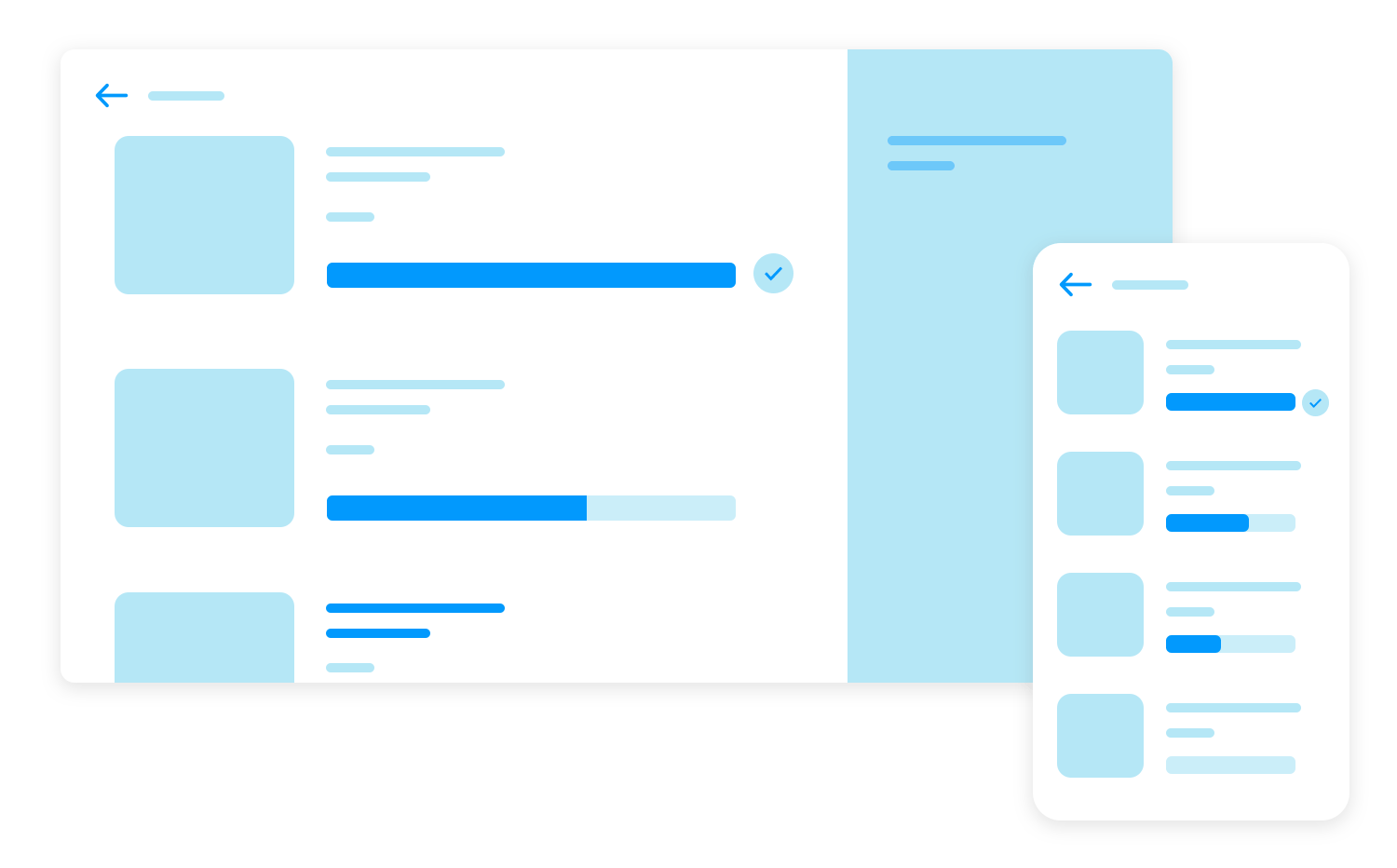
Adjusting size and placement for mobile vs. desktop is another thing to consider. Progress bars on smaller screens should be smaller in size and placed in a more prominent position to make them more visible. On the other hand, progress bars on larger screens are larger, which makes them naturally easy to locate.
Colors make you feel things, even if you’re not aware of it. That’s why you would most likely find that the walls of a therapist’s office are painted yellow, as yellow is the color that most evokes feelings of comfort and joy. A study also shows that this color tends to be the favorite among children!
That being said, color choices play a significant role in the overall effectiveness of progress bars. The right colors can enhance clarity, improve user engagement, and reinforce your brand identity.
As previously mentioned, make sure that the colors used in progress bars are consistent with your brand’s identity and overall color palette.
Putting this into practice, think about what emotion you want to convey with your colors. For example, if your brand is playful, go for bright, cheerful colors, but if it’s serious, opt for more muted tones. Doing so provides a cohesive visual experience and further strengthens brand recognition.
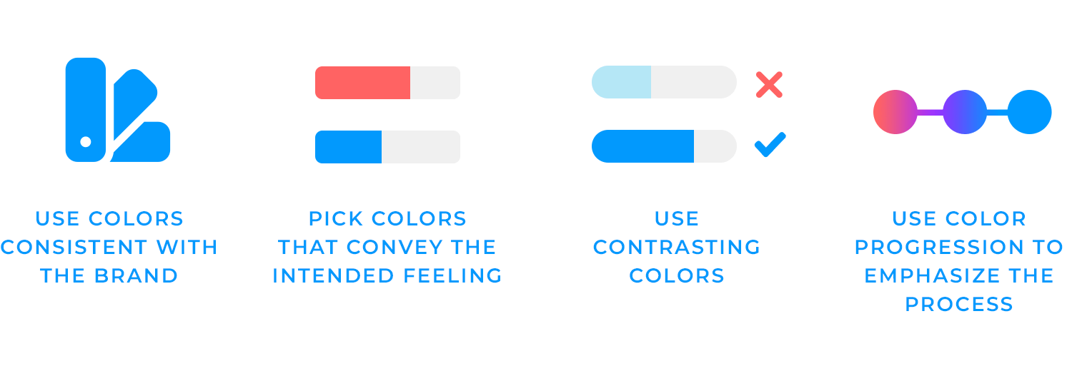
Another thing to keep in mind is making sure you use contrasting colors in your progress bar. Select colors that offer a clear contrast between the progress bar’s background, the filled portion, and any text or icons.
You should always consider the needs of users with visual impairments. 1 in 4 men are prone to be color-blind, so make sure to choose color combinations that are accessible to them and to those with low vision.
Incoroprating color changes in progress bars can also enhance user-experience. Imagine watching a plant grow. As the days pass, you see the leaves unfurl and the colors change from pale green to vibrant emerald, giving you a sense of satisfaction for all the hard work you put to make that happen!
Similarly, color changes in progress bars can provide a similar experience for users. By starting with a color that indicates the beginning of a task, such as red, and gradually transitioning to a color that signifies completion, such as green, you can create a visual journey that keeps users excited and anticipating the end result even more.
Adding some animation and transitions might not be essential, but they can surely make a big difference. They add a touch of polish and sophistication to your progress bars, making them more engaging and visually striking.
But keep in mind to use these added elements with clear judgment, to avoid distracting your users.

Instead of a plain, boring bar, you can add subtle effects like a gentle glow or a smooth filling animation. This can make the task feel far less tedious than it actually is.
Animations can also provide valuable feedback. Let’s say you’re looking at a progress bar and it starts to fill up quickly, this is a sign that the task is progressing smoothly.
If the bar slows down, it can indicate that there’s a temporary delay. This helps users manage their expectations better and keep them informed about, yes, you guessed it, their progress.
Where would we be without labels? In total chaos, that’s where. You would probably end up adding sugar instead of salt to all your meals.
The same goes for progress bars. A progress bar without any icons or labels can easily confuse the user and push them to make bad decisions, like leaving your page, God forbid.
Icons can quickly communicate information without requiring users to read lengthy text. A checkmark icon, for example, can instantly convey that a step has been completed, while an alert icon can signal a potential problem.
This can help your users understand the task’s progress and make informed decisions instead of acting out of panic or confusion.
Icons can also provide a more intuitive understanding of the task’s status. When users see familiar icons, they can quickly associate them with specific meanings. This obviously reduces confusion and makes the user experience flow more awesome.
Also, who doesn’t like tiny cute checkmarks? We are programmed to love their appearance because they are associated with getting things checked off a list, or receiving a good grade on a test. That means using them in your progress bar can actually make it more visually engaging and inviting!
Labels, on the other hand, help users understand where they are, where they’re going, and how much progress they’ve made. Clear labels, such as “Step 1 of 5,” provide a sense of direction and help users stay on track to get the task done with a bit of guidance.
Additionally, clear labels can make the task feel more manageable. Like we keep saying, when users see that a task is broken down into smaller, more manageable steps, it can, and will, seem less daunting.
Timely feedback is really important with progress bars. A progress bar that updates itself offers users a precise view of the task advancement and empowers users with that incredible sense of control over a daunting situation.
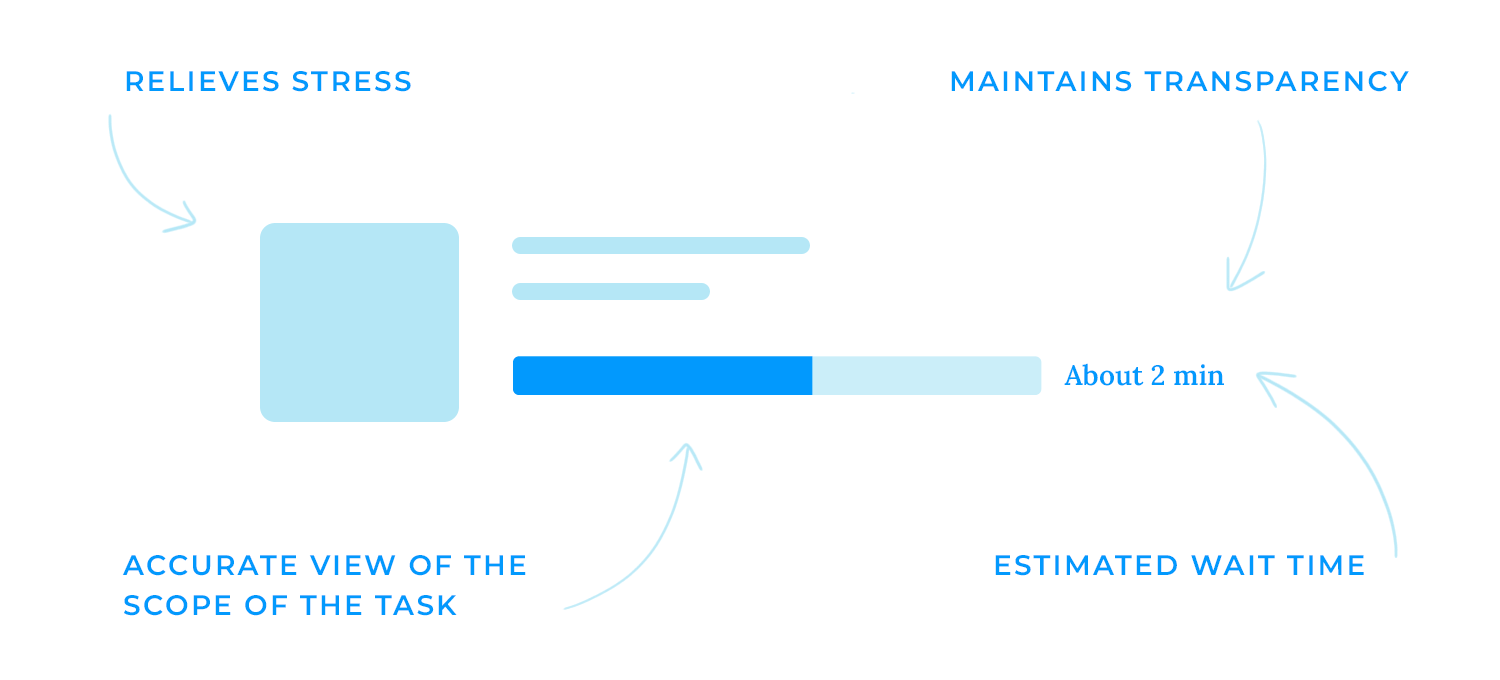
When a task exceeds the anticipated duration or has come to a halt unexpectedly, it’s crucial to ensure communication and feedback to the user to maintain transparency and keep them informed of the situation.
This can include showing a message that clarifies the delay or offering estimated wait times and alternative steps to take in order to assist them effectively.
It’s important to provide clear context for progress bars. Explaining the task being completed helps users understand what’s happening and why it might take time. For example, if you’re uploading a large file, let users know the file name and size, that way they know what to expect!
For long-running tasks, providing an estimated time remaining can be especially helpful. It gives users a sense of control and helps them plan their time accordingly, and who doesn’t love that?

However, it’s important to be realistic about your estimates. If a task is taking longer than expected, you have to be transparent and communicate with users.
Remember, communication builds trust. Clear communication about what happens after completing the current task can help users manage their expectations and feel less anxious.
For example, if users are uploading a file, let them know what will happen after it is complete. This could be a confirmation message, a redirect to another page, or a notification that the file is ready to download.
Visual cues can also help to keep users informed and engaged. They can show users the progress they’ve made and the steps that are still ahead.
When users see a progress bar filling up, it can make the wait feel shorter. This is because the progress bar provides a visual representation of the task’s progress, which is way more comforting than staring a blank screen, wouldn’t you agree?
Prototype web and mobile apps with fully-interactive progress bars

Here are 25 progress bars that we wouldn’t mind seeing when we’ve got a little waiting on our hands. Also, if you want to check out how to incorporate progress bars into your project from the very start, check out our post on UI wireframes.
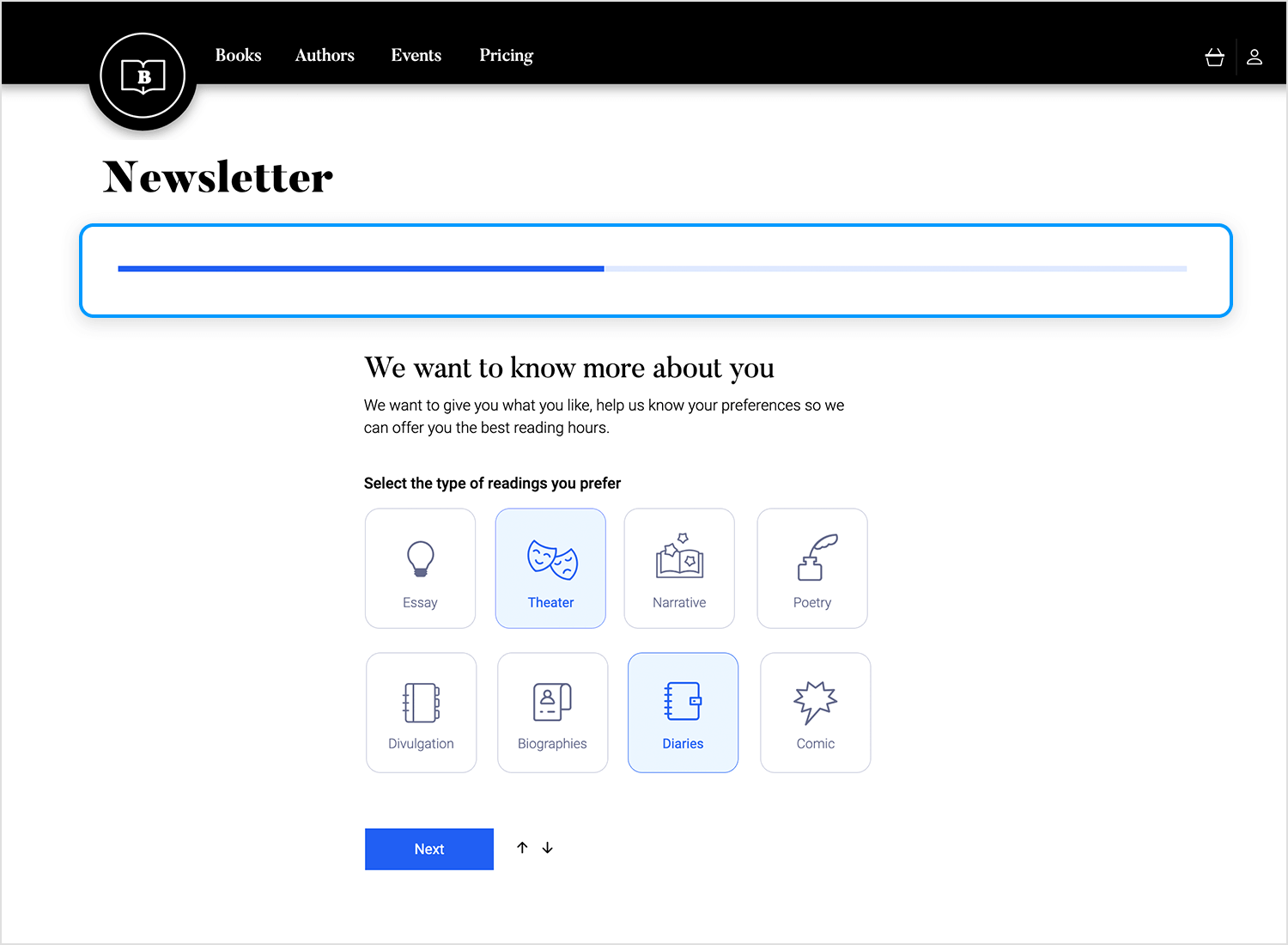
The Justinmind online bookstore template features a sleek, dark horizontal bar that dynamically tracks progress through the newsletter signup process. As users select their preferred reading types, the bar fills with a subtle glow, guiding them towards completion.
The “We want to know more about you” section, positioned just below, invites you to share your literary preferences, ensuring a personalized experience tailored to your unique tastes. The overall design is clean, visually striking, and intuitively guides users through the signup process, making it a delightful journey for every book lover!
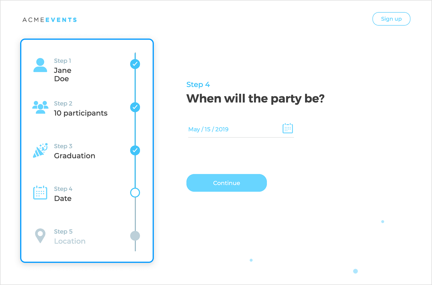
The Justinmind web form event registration process features a visually engaging vertical timeline that guides users through each step. Completed steps are marked with satisfying checkmarks, while the current step is highlighted by a partially filled circle, indicating progress.
The remaining steps are represented by empty circles, a clear visual cue of what lies ahead. This intuitive design acts as a countdown and adds a sense of accomplishment as users move towards registration completion.
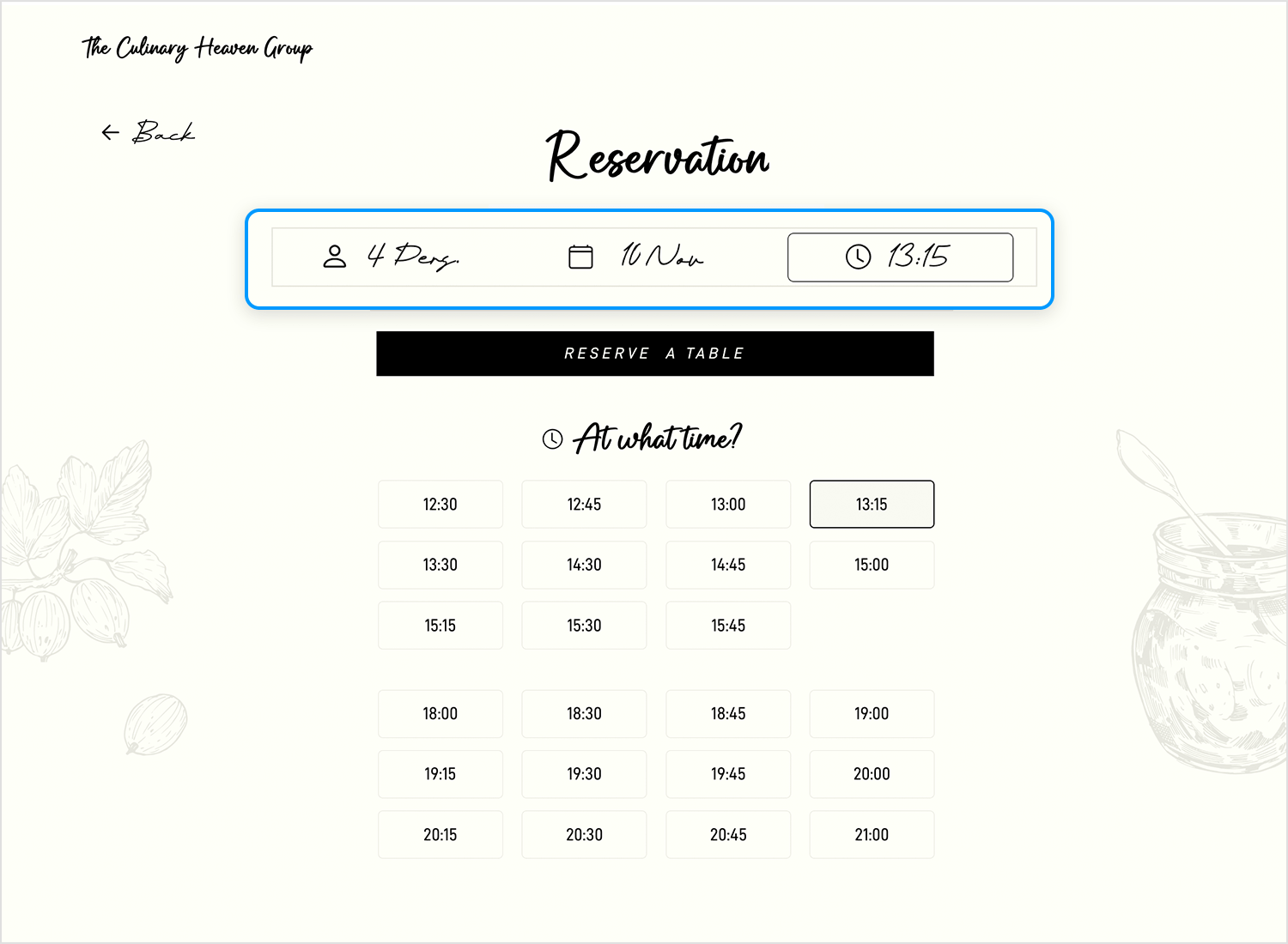
Although a traditional progress bar might be absent, the Justinmind restaurant landing page’s reservation section employs a subtle and effective approach to guide users. The clear, concise labels for “Persons,” “Date,” and “Hours” intuitively direct diners through the reservation process, making it easy for potential patrons to secure their tables and anticipate a delightful culinary journey at their favorite restaurant.
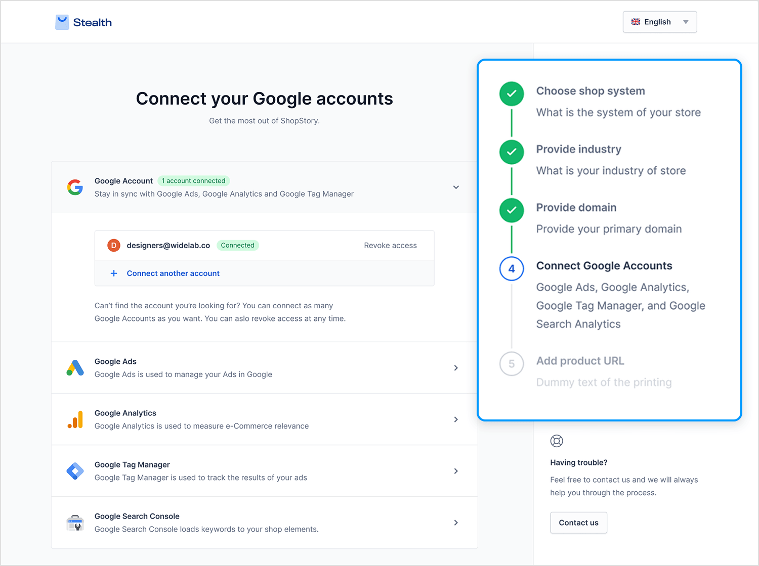
The Mateusz Wozniak onboarding process unfolds like a captivating journey, guided by a sleek vertical timeline. Completed steps are marked with satisfying checkmarks, while the current step is highlighted with a dynamic, partially filled circle that pulsates with anticipation.
The remaining steps, including “Provide your domain” and “Add product URLs,” are represented by intriguing empty circles, inviting you to explore what lies ahead. This visually engaging design tracks your progress while adding a touch of excitement, making the onboarding process feel like a rewarding adventure.
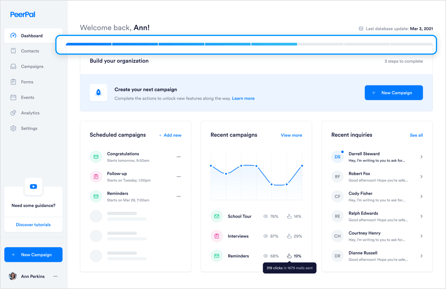
Michał Roszyk put together this awesome progress bar UI design within the PeerPal dashboard A horizontal bar is displayed at the top of the “Build your organization” section, indicating the user’s progress in completing the necessary actions to unlock new features. The bar is partially filled, suggesting that the user has made some progress but still has steps to complete.
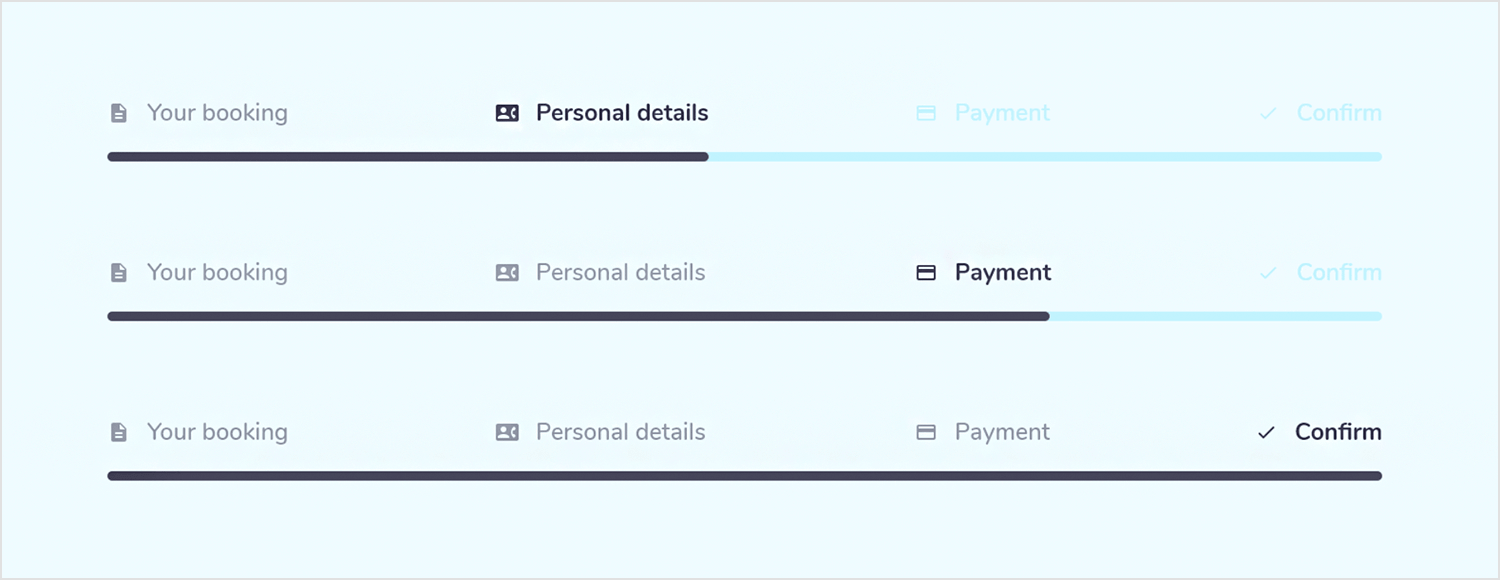
The Manon Leverrier progress bar UI design offers a visually engaging journey through the online booking process. The horizontal bar is divided into four distinct segments and fills as you complete each step, from entering your personal details to finalizing the reservation.
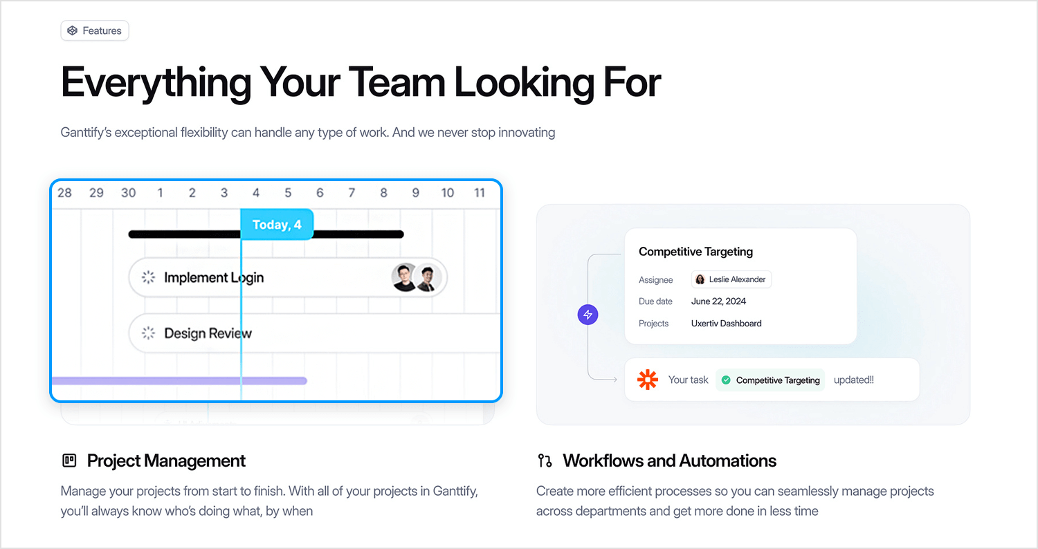
Barly Design for UI8 created this Ganttify – Website Design project that displays a timeline that is divided into days, and specific tasks or milestones are marked along the line. A progress bar beneath each task indicates its completion status, with a filled portion representing the completed work and an empty portion indicating the remaining work.
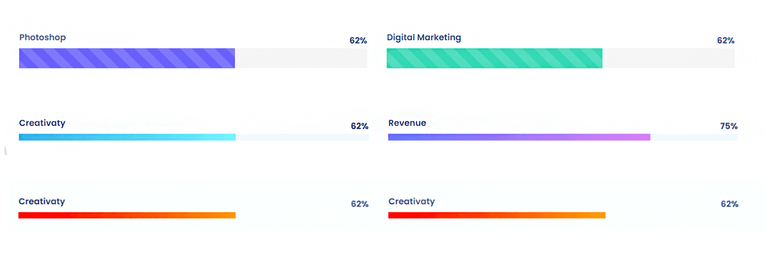
The Shaafik Aziz project management dashboard is a visual masterpiece, featuring an engaging design that effortlessly conveys the status of each task. A series of horizontal progress bars, each color-coded for visual distinction, are filled to represent the completion percentage of each task.
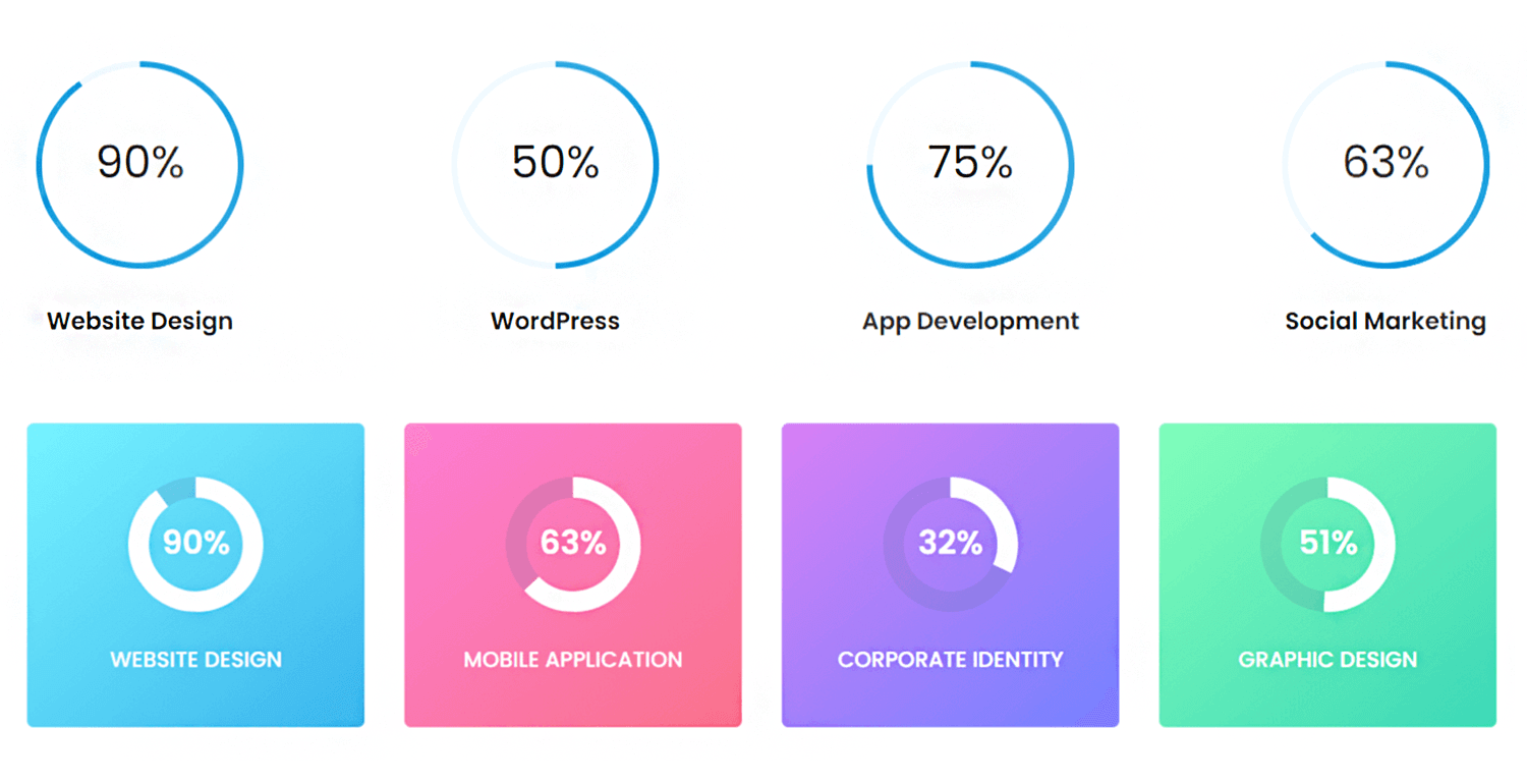
Another progress indicator by Shaafik Aziz showcases a set of circular progress bars to represent the completion percentages of various tasks or projects. Each circle is filled with a color gradient, visually indicating the progress level. The percentages displayed within each circle correspond to the specific completion rates for Website Design, WordPress, App Development, and Social Marketing.
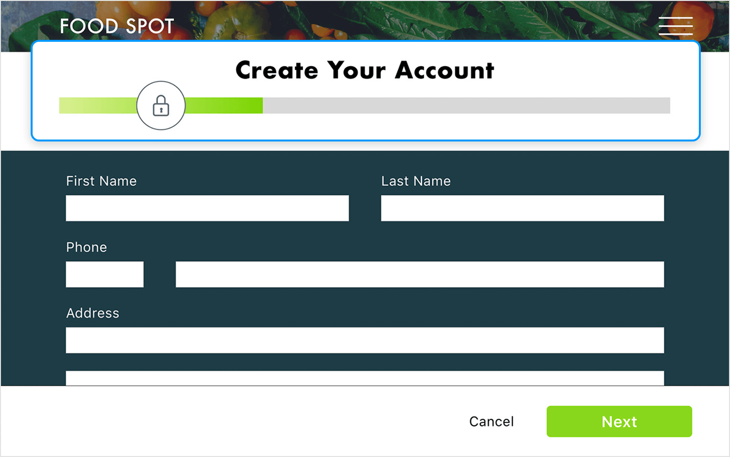
This progress bar by Franz Tabang is for signing up for the Food Spot platform. As you fill in your details, watch the green bar grow, symbolizing your journey toward joining the Food Spot community. The clean design makes the signup process quick and enjoyable!
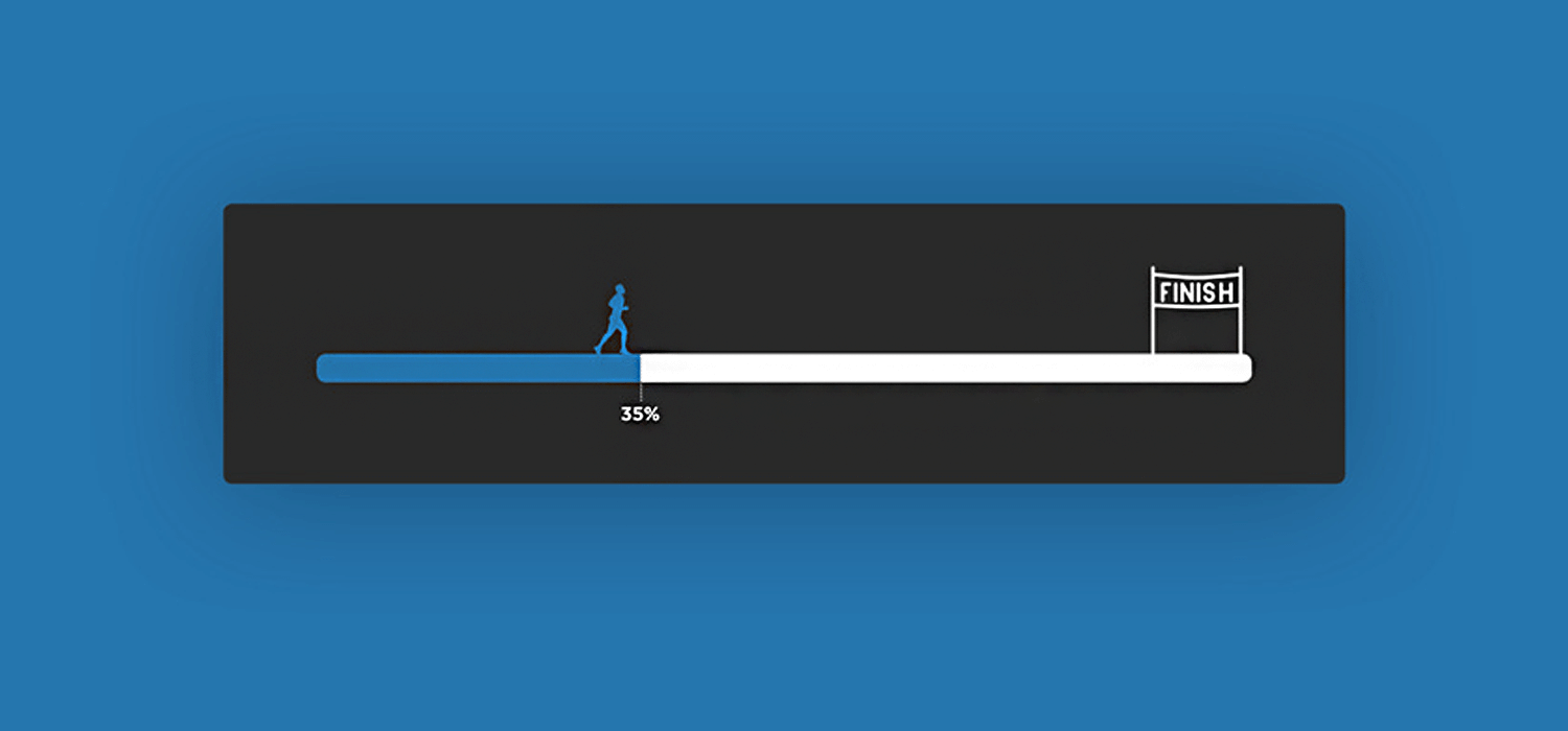
Sometimes a progress bar feels like a marathon and Jared Gase managed to capture that idea perfectly. It’s simple and the metaphor packs a punch.
Ah, another progress bar that sets expectations. Good! Carol Wu‘s 3 step page progress steps firmly let you know where exactly you are and how much you’ve got to go before you complete the form. Plus, once each step is completed, the corresponding circle transforms into a satisfying checkmark. How cheeky!

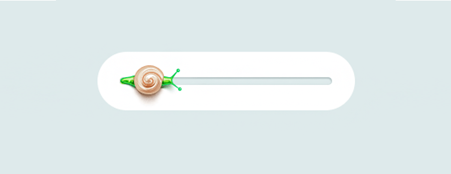
This progress bar by Andrey Davlikanov is fun, colorful and different. But, let’s be realistic. Nobody wants a progress bar to move at a snail’s pace, do they? Nice design, shame about the metaphor.
Amazon’s tracking bar is very useful for online shoppers eager to know when their delivery will arrive. This progress bar usefully tells you if there was a delivery attempt in case you were out.

It also lets you know when to expect your delivery. A timeline like this in e-commerce is great because users want to know when their packages we dispatched and when they’re arriving.
Prototype web and mobile apps with fully-interactive progress bars

We love this progress bar by C.H.C. The little chat box slopes down the progress bar as it loads, creating an engaging and dynamic animation. It’s delightful.

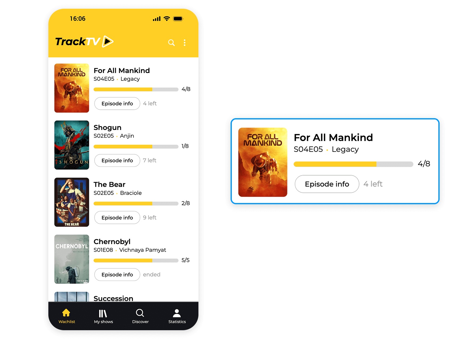
The progress bar UI design within the Justinminds TV shows tracker mobile app visually represents the user’s progress through the seasons of the show, indicating that the user has watched episode 5, titled “Legacy.” The bar’s fill is partially yellow, signifying the completed episodes, and partially gray, representing the remaining episodes. Use it for your own projects!
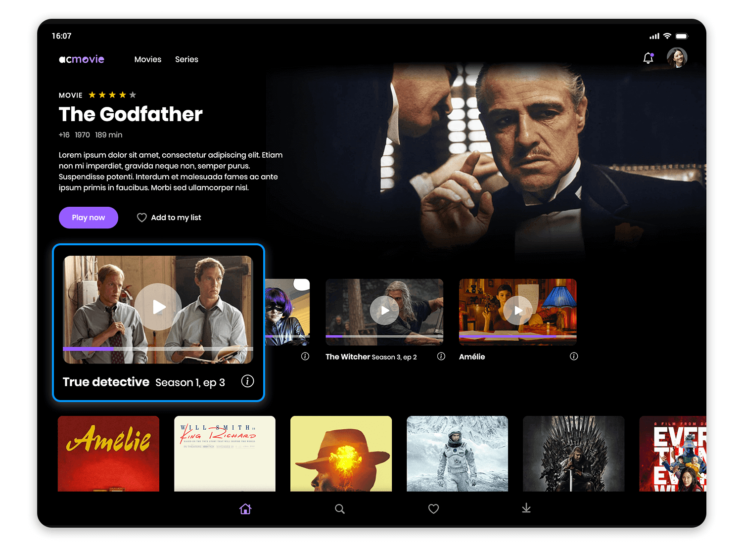
Another Justinmind streaming app features a progress bar beneath the thumbnail, visually indicating the user’s progress through the series. The progress bar for “True Detective” shows that Season 1, Episode 3 has been watched, while the others indicate that only the first episodes have been viewed. This design provides a clear overview of the user’s viewing history and makes it easy to resume watching their favorite shows!
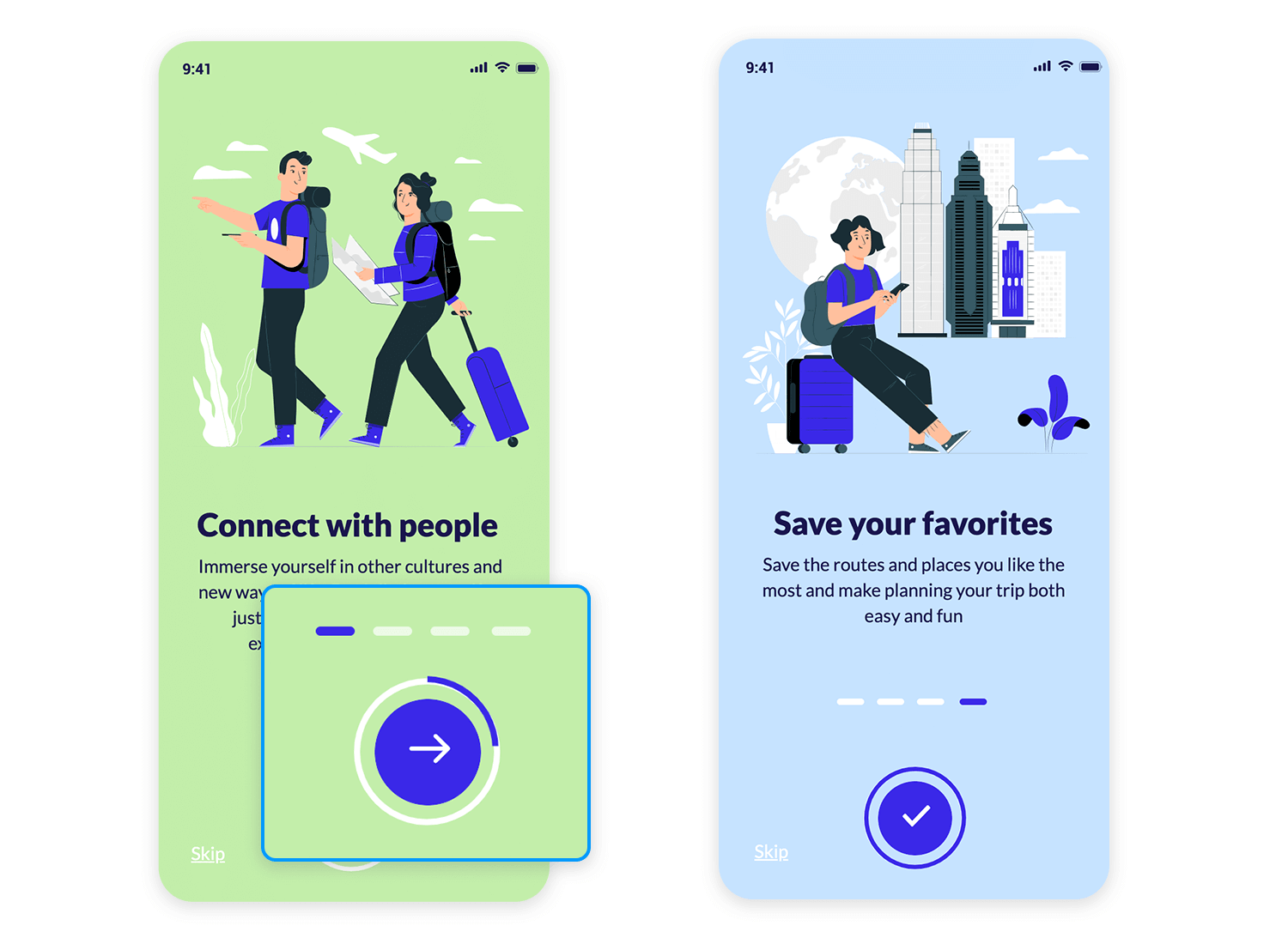
The Justinmind onboarding app’s progress bar, is basically a horizontal line divided into four segments. Three segments, filled in white, mark the steps you’ve already conquered, while the fourth, filled in blue, highlights your current position. The circular button with a right-pointing arrow, positioned just below, invites you to embark on the next step of your onboarding journey.
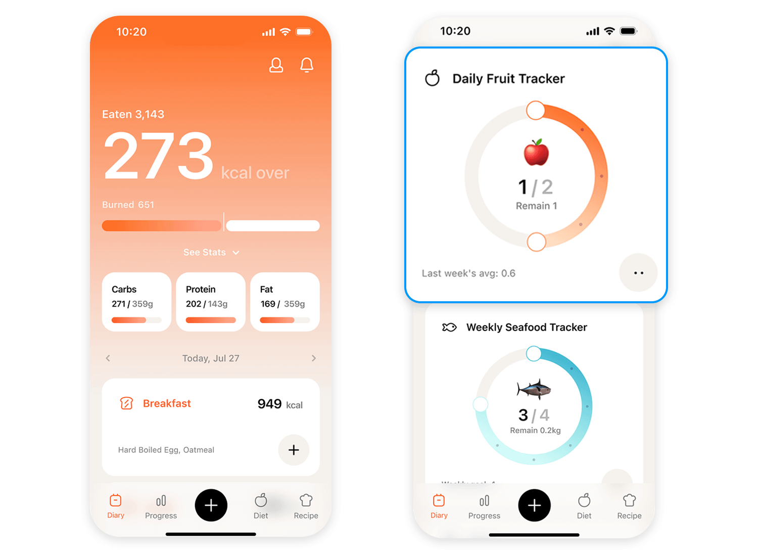
The Calorie Counter Mobile App template by Valerie Lokinskaya incorporates two tracking sections: the Daily Fruit Tracker and the Weekly Seafood Tracker. The Daily Fruit Tracker, featuring a partially filled circle, indicates that you’ve consumed 1 out of 2 recommended fruits for the day. This engaging design not only tracks your progress but also inspires you to maintain a healthy and balanced diet!
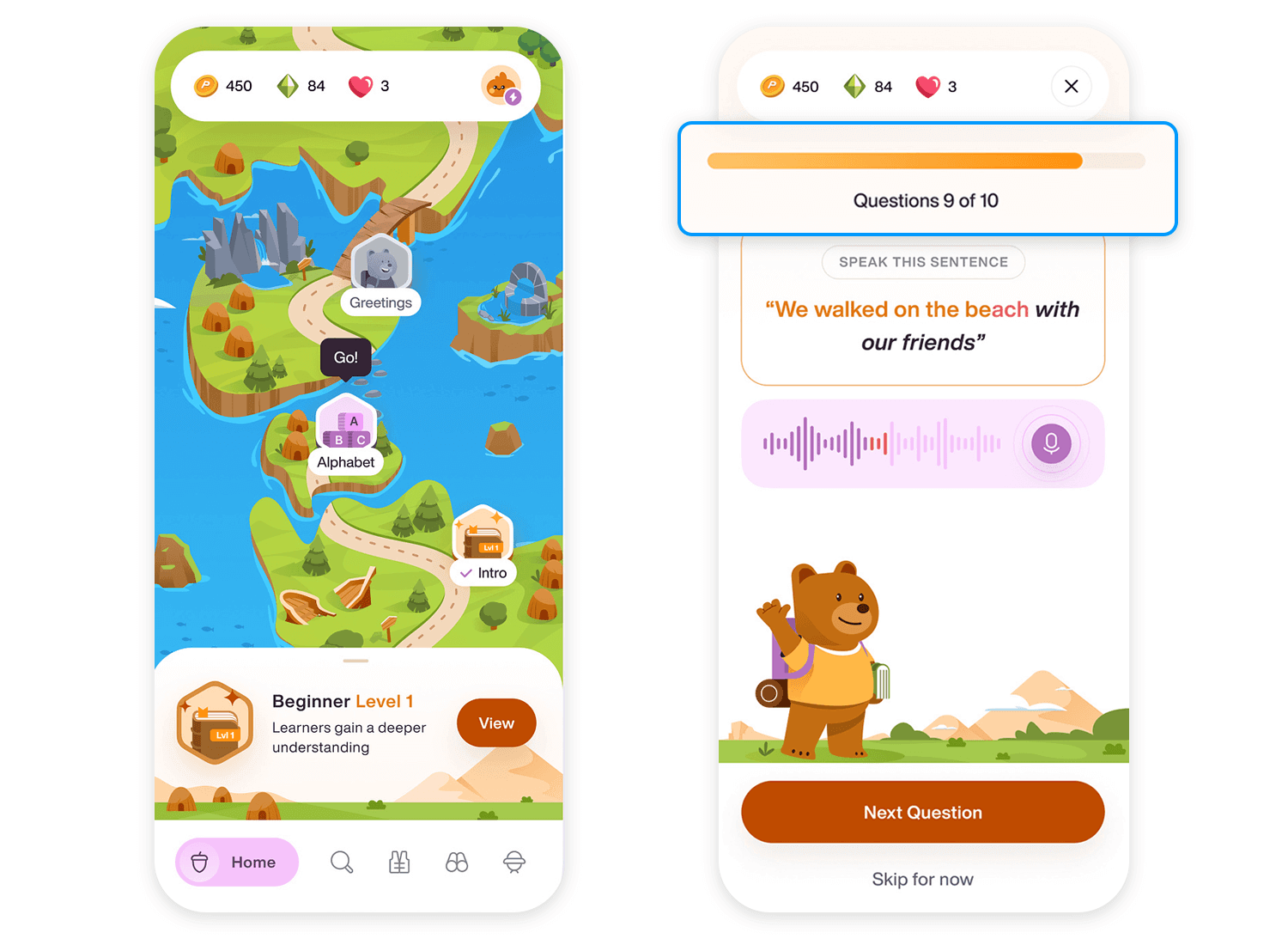
The English practice design template by Valerie Lokinskaya transforms learning into an exciting adventure. The gamified interface features a character navigating a map-like landscape, while a progress bar at the top tracks your overall progress through the lesson, displaying the current question number out of 10. Within each question, a separate progress bar visually represents your completion status, adding an extra layer of engagement.
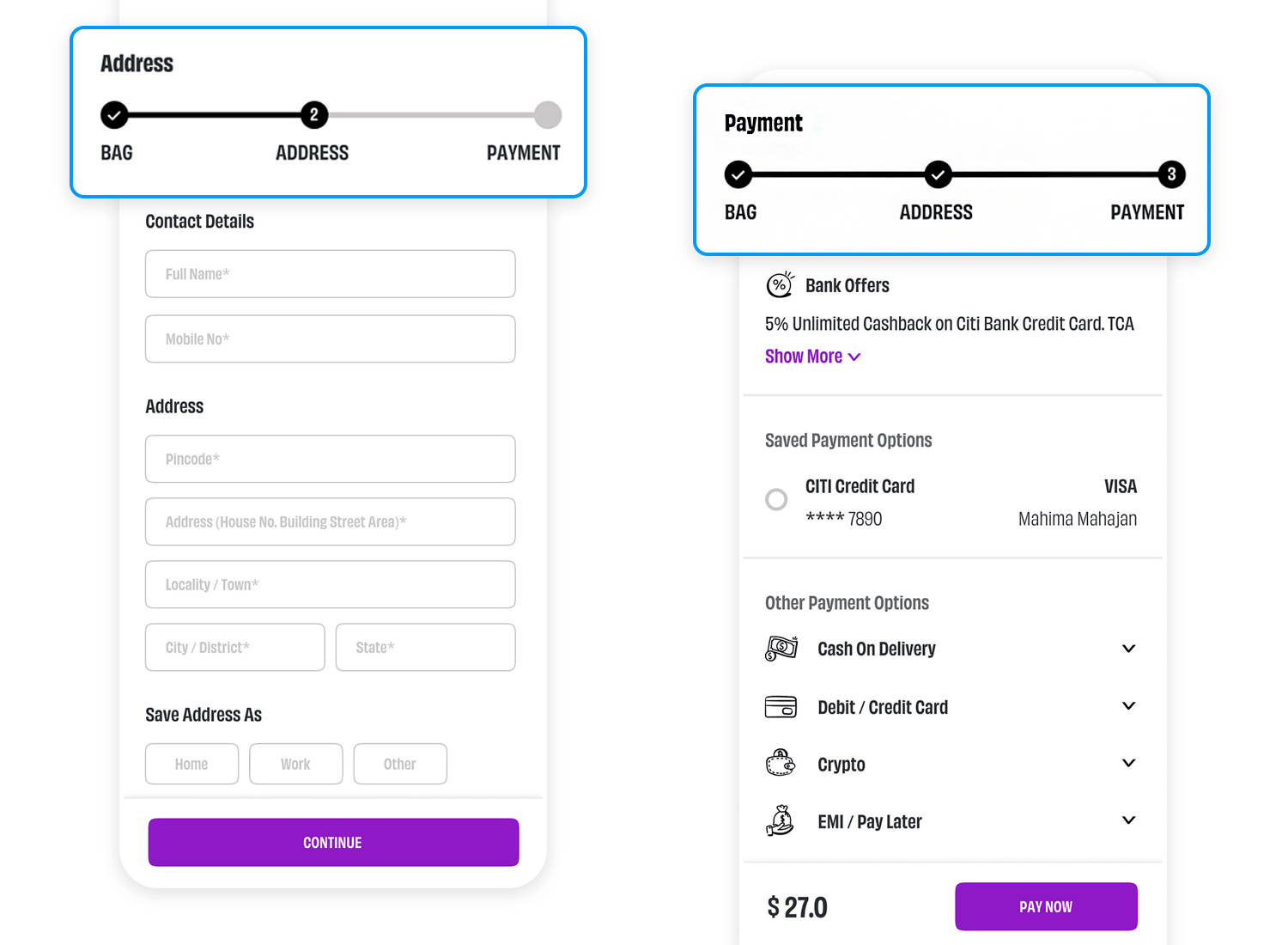
The Mahima Mahajan e-commerce checkout process uses a simple horizontal bar with three steps: Address, Payment, and Bag. The “Address” step is already done, so it’s filled in. You’re currently on the “Payment” step, entering your payment information. The “Bag” step is still empty, but it’s the last one where users will confirm their order. Simple, yet effective!
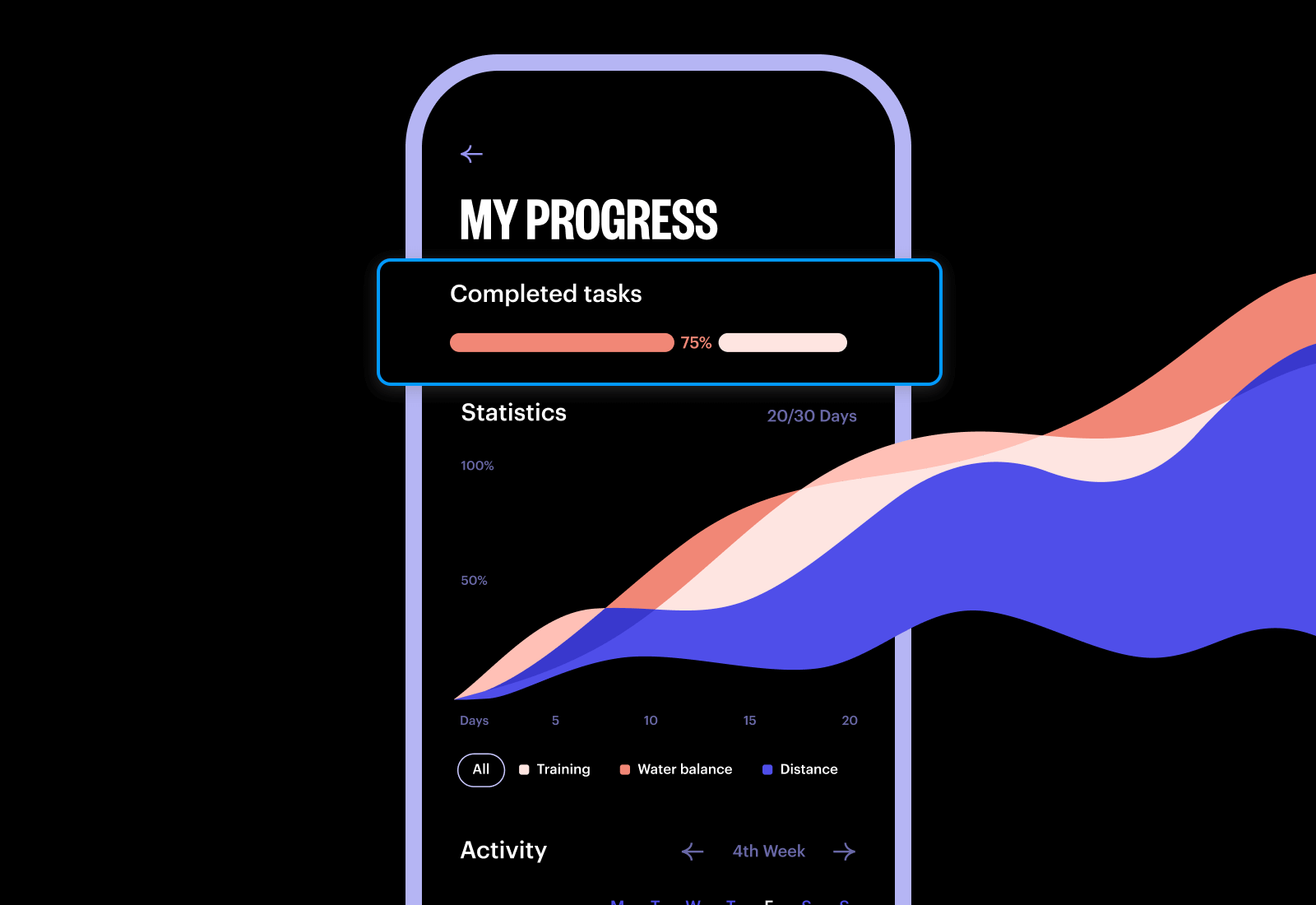
The Tubik Challenge App Progress Screen is a visual treat that gives you a clear picture of how you’re doing. At the top, a progress bar shows you’ve conquered 75% of your goals. Below, a cool line graph reveals your training, water intake, and distance covered over the past month. It’s like having a personal cheerleader, giving you a high-five for every milestone. This awesome design makes tracking your progress a fun and inspiring experience.
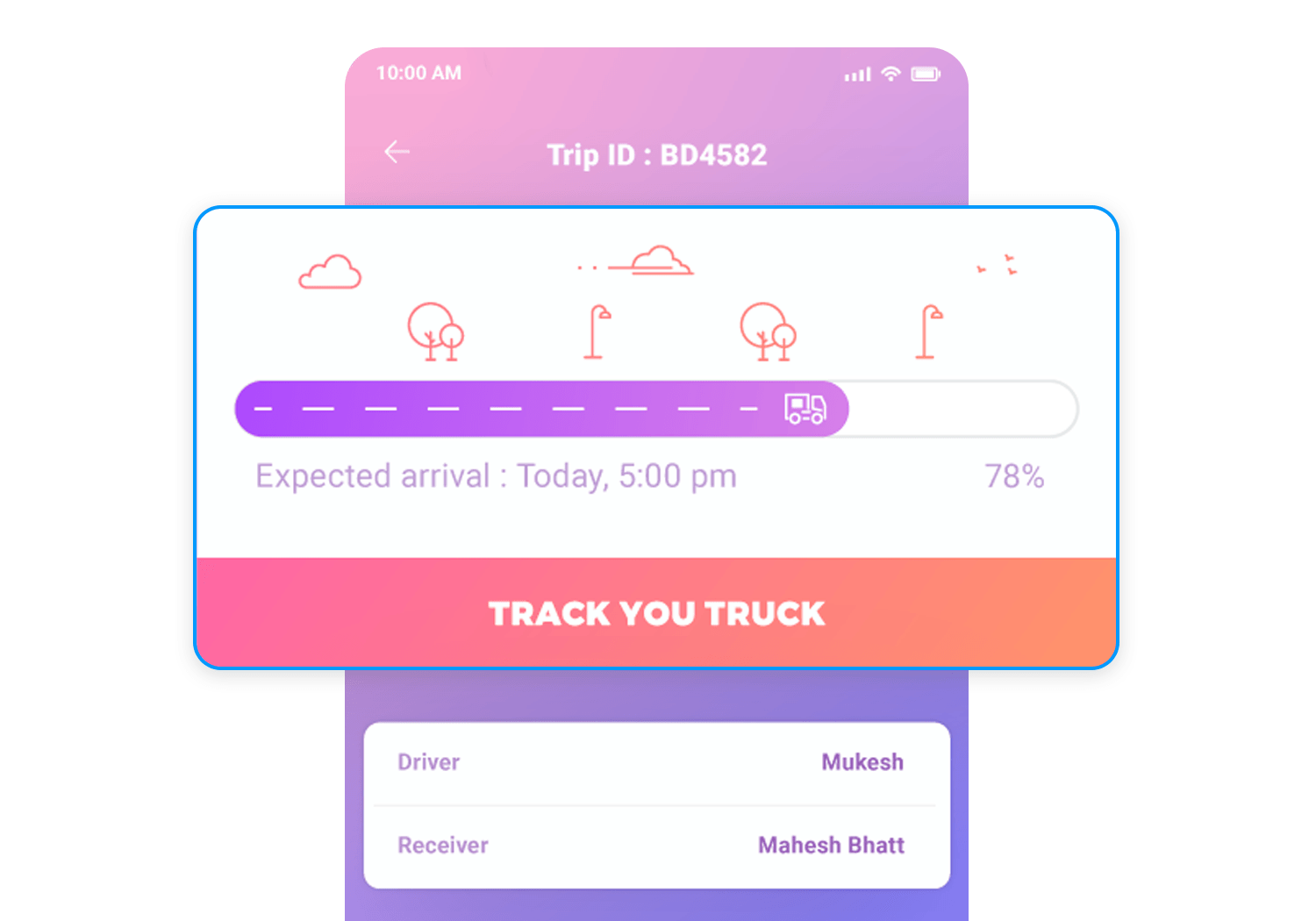
This progress bar by Krishanpal Singh makes use of calm gradients and quirky illustrations. What’s great about this little progress bar is the “expected arrival” copy, reassuring users and setting expectations. Although, the “78%” seems superfluous. How can a person put that into context? What does 78% of the way there mean? A better alternative might be how many miles are left on the journey.
Similar to the last one, this progress bar by Think Pixel works for the runners among us. The shoe represents the distance travelled and the finish line… it’s so close! This design would work really well in a fitness or exercising app.
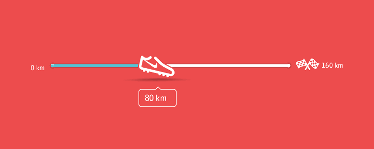
Illustrations are a great way to create engagement and add visual interest to a user interface. A progress bar is a great place to add a relevant animation, especially as it beats a standard progress bar.
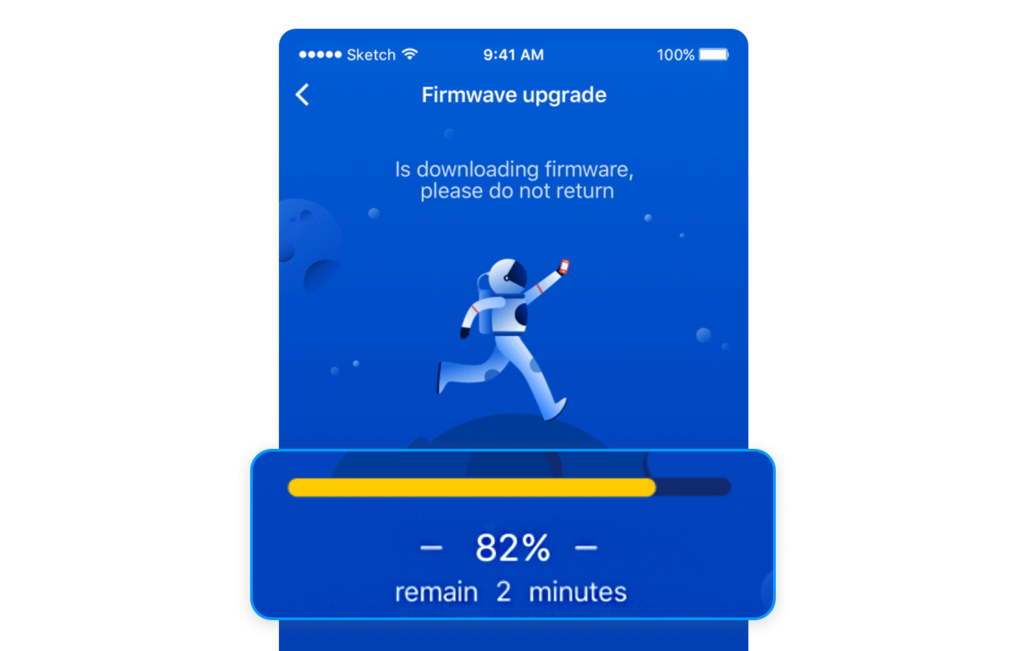
This one, by Supi, is animated and the astronaut runs across the moon as it spins on an axis. The color palette is uniform and doesn’t hurt the eye. We’d be happy to see this one.
Skeleton screens aren’t as scary as their name might suggest. They are actually more of a friend than a foe.
Skeleton screens create a preview of the page, giving you a sense of what’s to come. It’s like peeking into a gift box before you open it, building anticipation and excitement!
Sometimes, a subtle hint is all you need. Loading placeholders, like animated dots or spinning circles, provide a visual cue that something is happening behind the scenes, acting like a soft reassuring nod from the website informing you that your request is being processed.
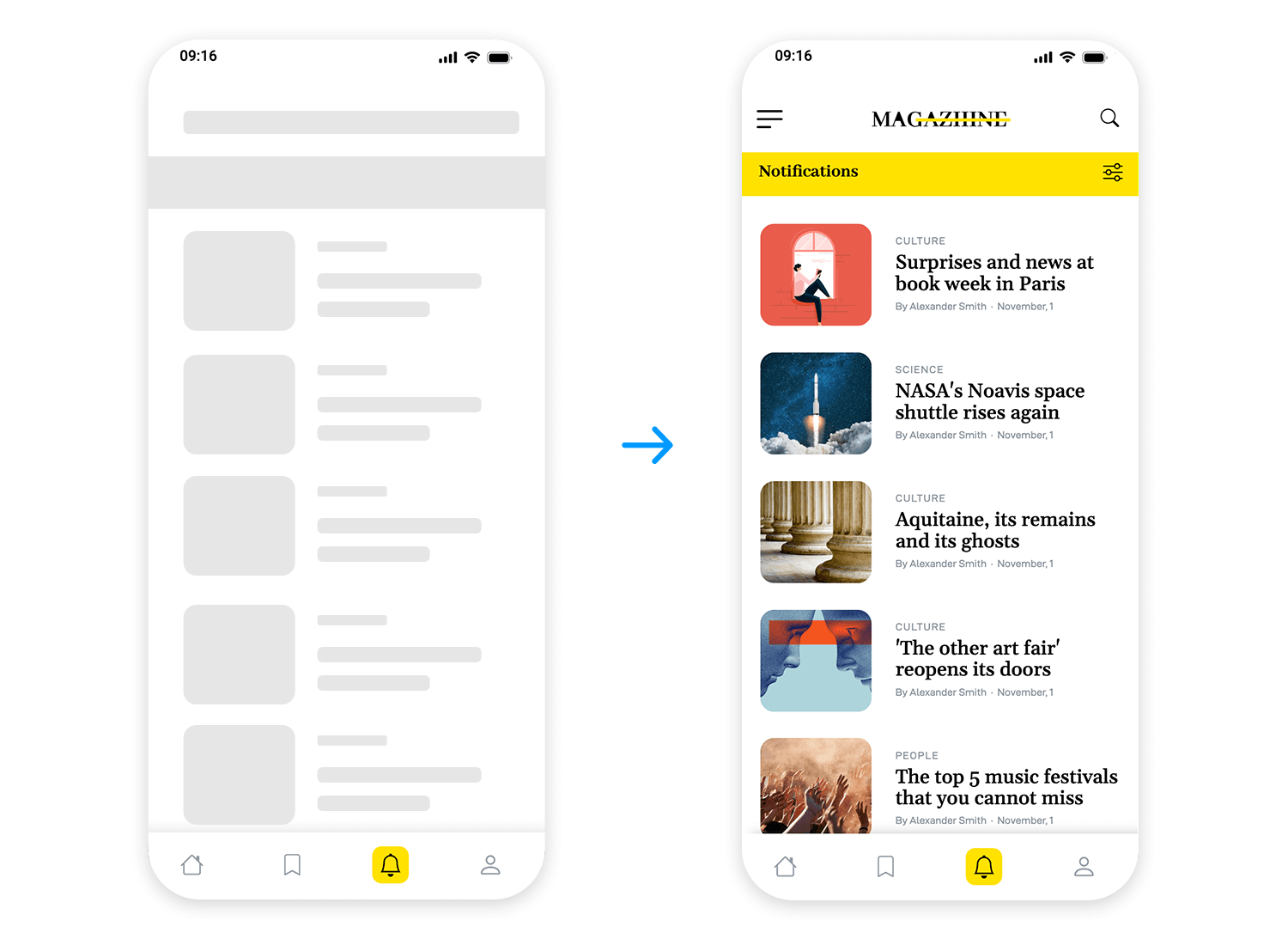
Animations and visual cues can transform a loading process into an engaging experience. Imagine watching a map expand or a progress bar fill with vibrant colors. It’s like witnessing a captivating performance, making the wait more enjoyable.
Sometimes, simplicity is key. Pulsing icons, dots, and checkmarks offer clear and concise visual indicators of progress in the most fun of ways!
A progress bar is an opportunity to make the waiting time a little more interesting than usual for your users.
What a progress bar can do is make impatient users happier, boost engagement and set expectations. If a progress bar looks like it’ll be a while, this can act as a cue for someone to get up and make themselves a hot drink during the wait. Use these 25 progress bars as inspiration for your own designs.
PROTOTYPE · COMMUNICATE · VALIDATE
ALL-IN-ONE PROTOTYPING TOOL FOR WEB AND MOBILE APPS
Related Content
 A fun look at different data table designs, from basic lists to smart, interactive ones, based on how complex the data is and what users need.18 min Read
 Single page design v multi-page design – everything you need to help you choose the right design for your site’s content18 min Read
 Website backgrounds can be a powerful tool in creating an experience. But what kind of experience can you convey and how? We got the full run-through for you!14 min Read
