What is the parallax effect in website design? Is it worth the time and investment? Find out with these examples!
We can trace the parallax effect back to ancient Greece. Or at least the word “parallax”. In Greek, “Parallaxis” means “alteration” and that’s the backbone of the parallax effect. But altering what? In Physics, the parallax effect refers to how the position of objects that you look at change their position according to whatever position you, the observer, are in.
Design and prototype parallax websites with Justinmind. It's Free. Unlimited projects!

For a real life example, imagine you’re driving through the countryside – no, more relaxing – you’re a passenger, sitting back and gazing at the fences by the side of the road whizzing past at lightning speed. A few fields away, in the horizon, you notice a forest. The position of the forest changes more slowly than that of the fence, which is closer to the car. This is the parallax effect in real life!
In this post, we’ll look at the parallax effect in action in web design as a scrolling feature as well as some best practices and some radical examples. Never forget you can prototype your own incredible parallax products with Justinmind’s prototyping tool. Enjoy!
The parallax effect in web design is a technique where background elements move at a different speed than foreground elements as you scroll through a website. This creates a sense of depth and motion, making the experience more dynamic and visually engaging. When paired with thoughtful UX design principles, it can elevate the overall user experience by guiding visitors intuitively through content while keeping them engaged.
Originally inspired by animation techniques used in video games, parallax effects have become a popular way to enhance the storytelling aspect of websites. They give visitors a more interactive feel by drawing their attention to specific areas, guiding them through content, or simply adding a “wow” factor to the design.
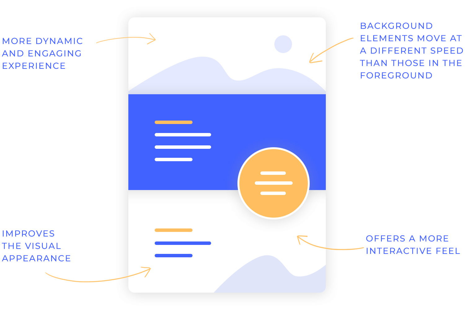
In a parallax effect website, you might notice images or text shifting subtly as you scroll, almost as if you’re peeling back layers of the design. It’s more than just eye candy – it can also improve the user experience by creating a natural flow or making complex information easier to digest.
Whether it’s a subtle background shift or a bold animation, parallax effects design is all about blending creativity with functionality. But as with any web design trend, it’s important to use it thoughtfully to avoid overwhelming users or slowing down the site.
Now that we’ve explored what parallax effects are, let’s see the different types you might find in web design. Each variation adds its own flavor and functionality, letting designers craft unique and memorable experiences.
This is the most common type of parallax effect. Here, the background moves slower than the foreground as users scroll, creating a subtle yet immersive sense of depth. It’s perfect for drawing attention to key sections or creating a storytelling flow.
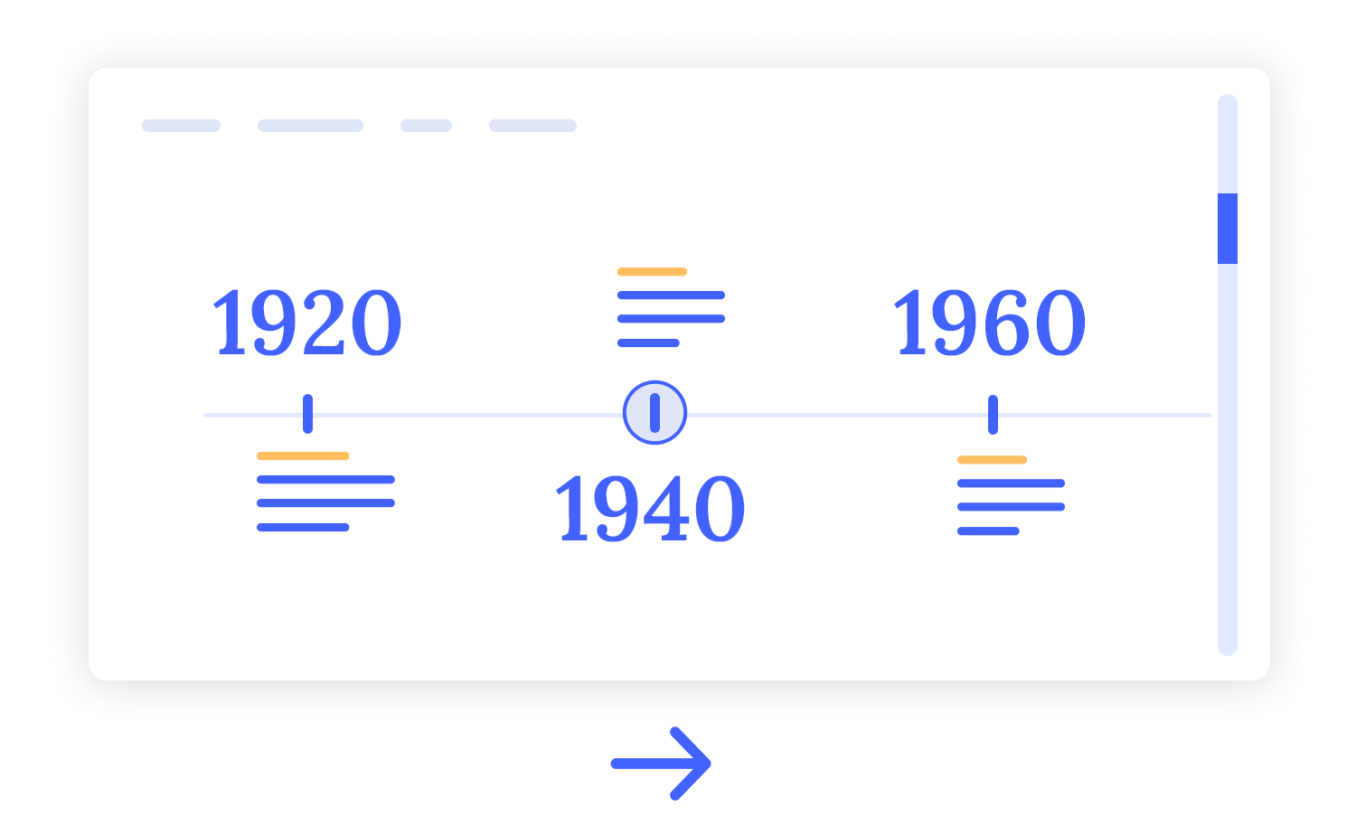
Unlike the traditional vertical scrolling, horizontal parallax involves side-to-side movement triggered by either vertical or horizontal scrolling. This type of parallax effect design can be particularly striking for showcasing wide visuals, such as panoramic images or timelines.
This interactive approach responds to the user’s mouse movements. Elements shift and tilt as the cursor moves, making the experience feel dynamic and responsive. Mouse-based parallax effects are great for adding playfulness to a design without requiring scrolling.
In layered parallax, multiple images or elements are stacked, each moving at a different speed. This creates a rich, 3D-like experience, where each layer contributes to the overall effect. It’s ideal for storytelling or adding complexity to parallax effect websites.
This variation focuses on adjusting the scrolling speed of different elements to create dramatic visual effects. Whether it’s text speeding by or images moving more leisurely, speed-based parallax can help guide users’ attention to specific content in a fun and engaging way.
Each of these parallax effects design examples serves a purpose, so choosing the right one depends on your website’s goals and the type of experience you want to deliver. When used thoughtfully, they can elevate your design and leave a lasting impression.
Parallax effects can bring a sense of depth and intrigue to your website, but using them effectively means finding the right balance between stunning visuals and usability. To ensure your design elevates the user experience rather than detracting from it, here are a few practical tips to keep in mind.
It’s easy to get carried away with bold animations, but less is often more when it comes to parallax. Overly dramatic movements can not only distract users but also cause discomfort for some. Instead, focus on creating smooth, subtle transitions that enhance your design without overshadowing the content.
While eye-catching visuals can steal the show, your content must always remain front and center. Moving backgrounds or elements shouldn’t compromise the clarity of your text. To strike the right balance, aim for high contrast and generous spacing to ensure users can absorb your message effortlessly.

What works beautifully on a large screen may not translate well to smaller devices. Parallax effects can behave unpredictably on mobile, so it’s crucial to test your design across different screen sizes. A responsive, adaptable approach will help maintain a smooth and enjoyable experience for all users.
Not everyone finds motion effects enjoyable – or tolerable. For visitors who are sensitive to movement, offering the ability to turn off parallax features can make a big difference. This small touch not only boosts inclusivity but also shows thoughtfulness toward a diverse range of user needs.
Designing parallax layers is where creativity truly comes into play. You can create a visually stunning and immersive experience by layering and animating elements strategically.Let’s break down the key considerations for building impactful parallax designs.
Before jumping into animations, crafting a detailed wireframe is essential for visualizing how foreground and background elements will interact effectively.
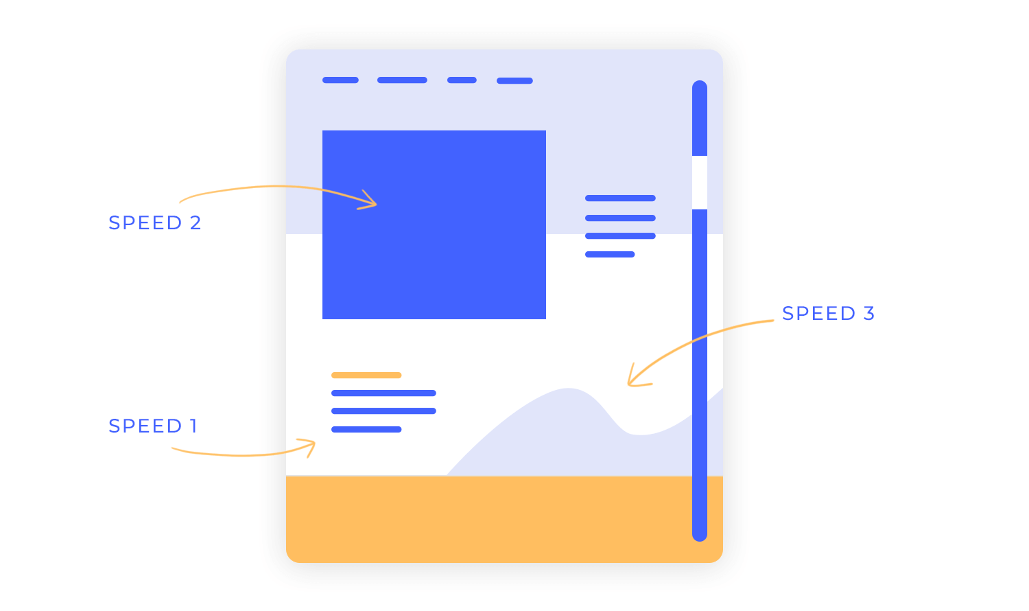
The foundation of any parallax effect is deciding which elements belong in the foreground and which in the background. Foreground elements typically move faster to draw attention, while background elements move slower to create depth. A well-planned speed contrast helps guide users’ focus while maintaining a smooth visual hierarchy.
Creating depth in parallax design begins with understanding how to layer elements strategically. Before moving into the visuals, using a prototyping tool can help you experiment with the movement and interactions of various layers.
Adding layers of images or text with varying speeds creates a 3D-like depth effect. For instance, background layers might shift minimally, while closer layers move more prominently. This depth-based layering gives your parallax effect design a natural, engaging flow that keeps users scrolling.

High-quality visuals are essential for any parallax effect website, but they should also align with your overall UI design strategy. Lightweight images ensure smooth scrolling without slowing down your site. Avoid overly complex visuals that might clash with the overall design or distract from your message.
Transparencies can blend layers together naturally, making transitions feel seamless. Subtle fades or overlays keep elements flowing smoothly and prevent harsh separations that could disrupt the effect. This approach works well in layered or depth-based parallax designs.
These principles help you create parallax effects design examples that look impressive and deliver a smooth, enjoyable user experience. Effective layering techniques make your website stand out while staying functional and user-friendly.
If you're wondering how to create parallax effects for your own website, Justinmind's parallax support page has all the steps you need to bring your ideas to life. Explore how to set up animations, adjust layers, and refine scrolling effects with easy-to-follow guidance.
Design and prototype parallax websites with Justinmind. It's Free. Unlimited projects!

Sleek animation, a clean interface, contrasting nude and dark colors and a blend of ornate and heavy script typefaces make Fluttuo stand out from the eCommerce crowd. Adding a parallax effect to the bag makes for a unique and complete online shopping experience.
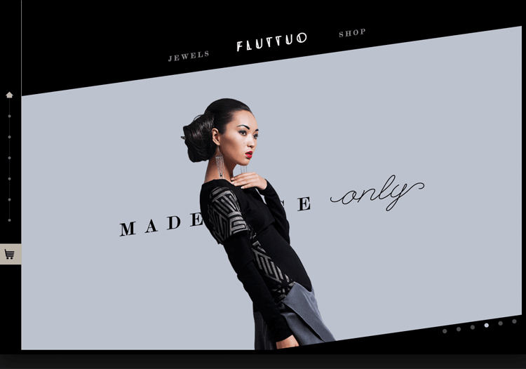
With a background layer and another on top within a pre-loaded screen, the parallax effect is for the top layer to slide over the background. As the viewer scrolls, they take in the context and style of the jewelry site via the background aesthetics, whilst the top layer provides the product details and the main story.
The smooth scroll parallax effect is accompanied by hovering section heads and mini carousels. This is a highly interactive UI and complements the brand that is always ‘experimenting with new materials and innovative designs’.
This design from Supernatural Kitchen website showcases how parallax effects can enhance visual storytelling by focusing on small, impactful details. Elements like depth-based layering and optimized materials move naturally as you navigate, creating a sense of immersion without overwhelming the user.
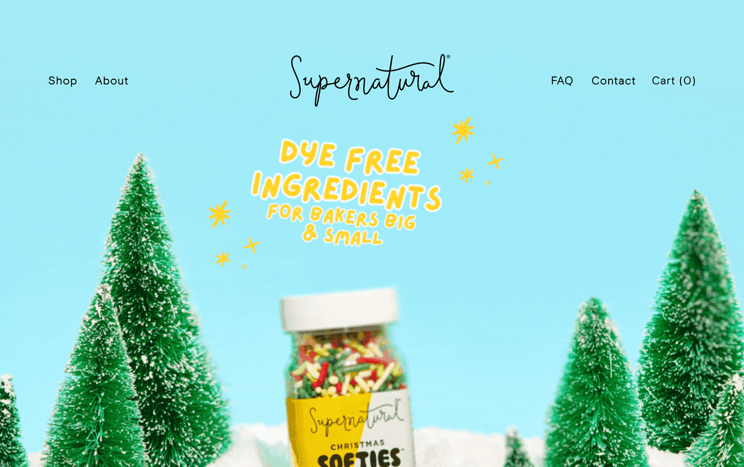
The interplay of fades and high-quality visuals makes sure the transitions feel smooth and intentional, adding just enough motion to keep things dynamic. It’s a thoughtful approach that prioritizes both style and performance, making the experience engaging yet seamless.
Dave Gamache’s parallax website demo is great for anyone just getting into parallax effects. When you scroll down Dave’s site demo, he shows us how to fade elements in and out upon scroll, how to pin layers, and how to rotate a mobile device with a horizontal slide effect on the mobile screen. Awesome!
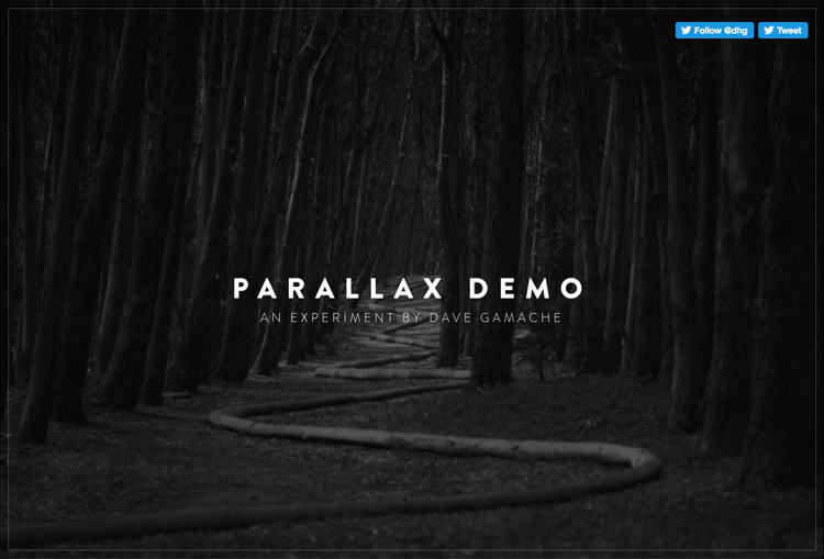
Dave’s top tips for parallax scrolling:
Make it easy for all browsers to animate your parallax effect website. Focus on the most important properties of parallax effect animation, including scale, rotation and opacity.
Only animate fixed position elements, and do it sparingly.
Don’t go nuts on resizing images – browsers don’t always handle this very well
NASA Prospect is an interactive experience that describes a story of planetary prospectors. NASA has sent them out to rediscover what mankind has left scattered across the solar-system after a global disaster.
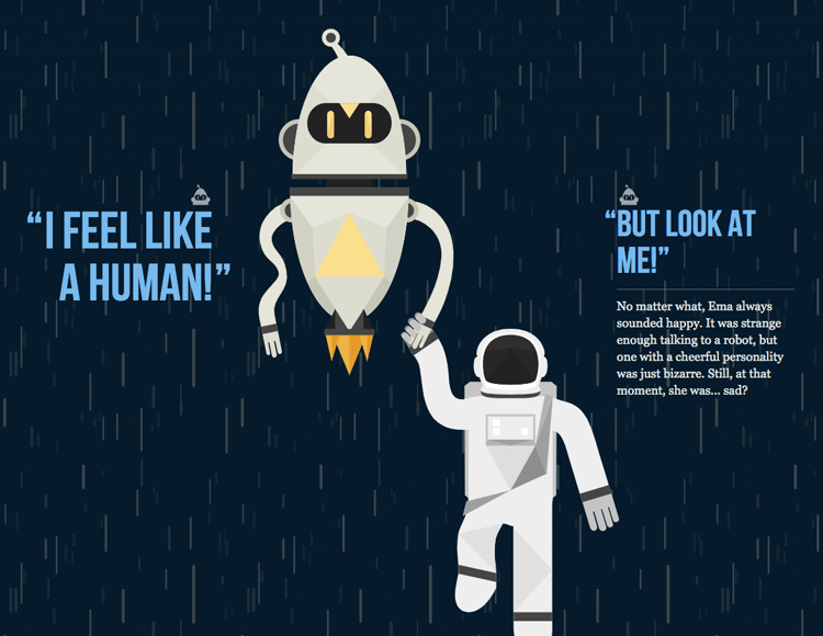
Simple, interactive, delightful use of the parallax effect. The audio really helps to set the scene and is an enchanting addition to the design.
Firewatch’s website immerses users into the wilderness of its story-driven game through a stunning parallax experience. The site beautifully mirrors the game’s serene yet mysterious atmosphere, using layered parallax scrolling to create depth across the sprawling forest landscapes.
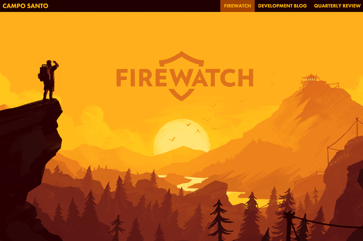
Each scroll invites you deeper into the world, with dramatic lighting effects and a warm, earthy palette that bring the environment to life. Subtle animations and interactive elements add an adventurous touch, perfectly setting the tone for the narrative without overwhelming the use.
Hello Monday sports a split-screen 3D parallax effect, featuring design cases down one side of the screen and their accompanying description and case details on the other. Each design case has its own look and feel.
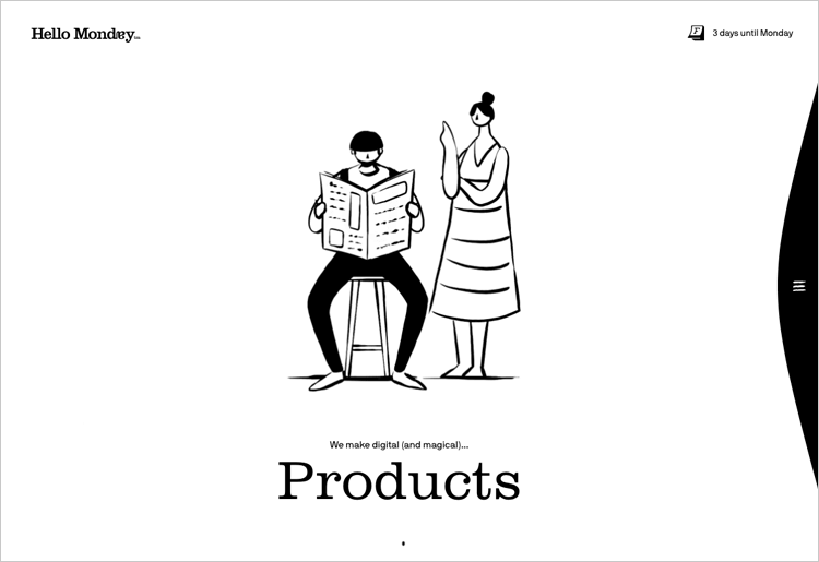
The website design uses a selection of engaging transition effects which contribute to a seamless user flow along with a clean grid. This is accompanied by a mix of bright colors, beautiful images and bold typography.
We love how Dogstudio pulls you in with its creative centerpiece – a 3D dog that feels alive as you scroll and explore. It’s not just fun to look at; the way the animations respond to your actions keeps you engaged and curious.
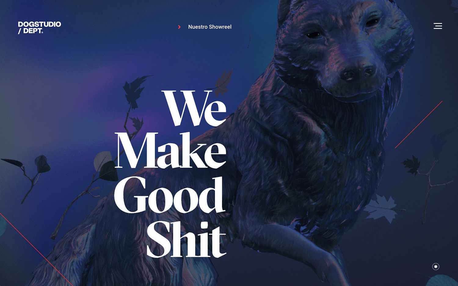
The scrolling effects make the dog move and shift, adding a real sense of depth. Even hovering over project titles changes the lighting on the dog, tying everything together in such a clever way. It’s a great example of how parallax effects can turn a simple interaction into something unforgettable.
We’re impressed by how Recap After Use blends minimalist design with engaging interactivity. The site opens with a sleek black-and-white theme, featuring a pen that uncaps and recaps as you scroll, adding a playful touch to the user experience.
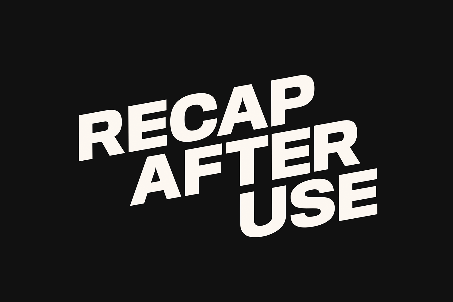
As you navigate through the portfolio, subtle parallax effects bring each project to life. Hovering over a project fills out its outline with details and shifts the image, giving it a sense of three-dimensionality. This thoughtful use of parallax effects enhances user engagement without overwhelming the clean aesthetic, making it a standout example of effective web design.
Outdoor lifestyle magazine Another Escape has a great website. It uses the parallax effect to both separate the different sections of the website, but to also present us the main topics that the latest edition touches – getting the reader involved in the current volume of the magazine before we even get the magazine.
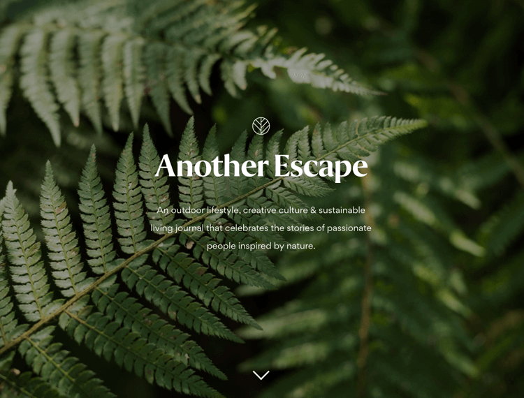
The clean design leaves the user free to focus on the powerful images that speak to everyone who craves the freedom of isolated nature. It’s almost enough to make us all pack up the office and move to a forest in Bavaria!
“We really like telling stories that touch people to appeal to emotion.”
Using the parallax effect and rotations, Immersive Garden’s website gives the illusion of depth, 3D and immersion in the scenes without actually using 3D technology. Even though the interface is minimal, it is also visual and intuitive.
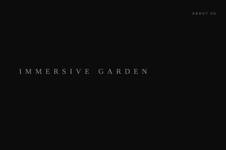
The website is made of lots of short video sequences that once loaded, can be played, paused and restarted by the user.
One of the most interesting things in this site is the organic cursor. Immersive Garden has used a variety of speed, scale and magnification effects to make it reactive and lively.
Every Last Drop offers an engaging journey through our daily water consumption. As you scroll, a charming character guides you through everyday activities, revealing the hidden water costs behind each one.
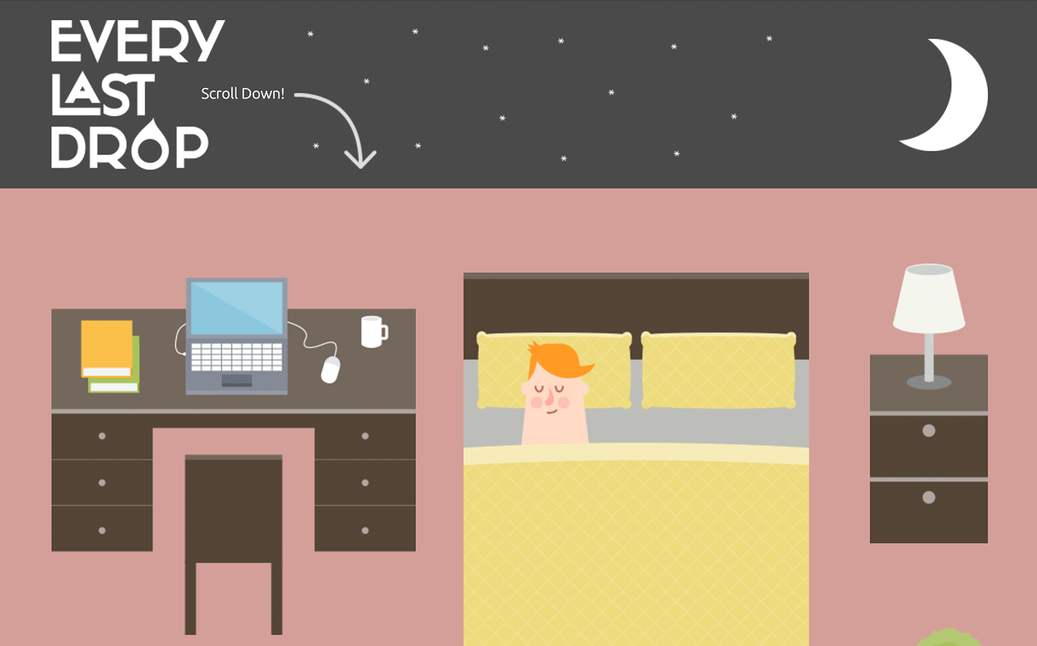
The parallax design creates a sense of depth, making the experience both informative and immersive. It’s a clever way to highlight the importance of water conservation, turning a simple scroll into an eye-opening adventure.
And last but not least, Cyclemon. This website is the cyclist’s dream. As you scroll down the page, you are met with a whole range of bikes in different environments. You’ll also see that each bike has a title, which describes what type of rider the user might be. This helps to give the viewer context and hopefully inspire them to convert – or so you might think.
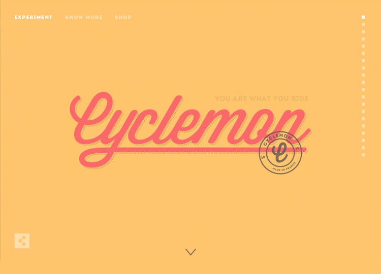
In fact, this isn’t an online bike retailer at all. No, it’s a site owned by two graphic artists selling their artwork. This is a perfect example of how enticing the parallax effect can be.
This website focuses on the scientific brilliance of the city of Oxford, UK. The website uses the parallax effect with division of sections – the past inventions that arose from the city, and the current promising research that will lead to innovation in the future.
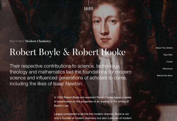
The parallax is implemented in a smart way, so that the user has the illusion of depth when the text moves at a different pace to the background image. No muss, no fuss.
Mobile design and development agency, Fueled, has an incredible website. The use of parallax effects, combined with the bold colours contribute to a unique website that represents the agency perfectly.
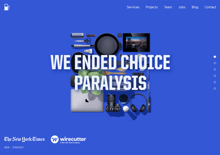
We fell in love with the mid-part of the homepage, in which as we scroll we are greeted by a phone screen that displays some of the agency’s top projects. But here’s the twist: as you scroll, you’ll see that intense changes in colors with parallax scrolling signify different projects, with the projects being shown on the same, unchanging phone skin. Creative and memorable!
You can’t help but feel the light and playful vibe of Minna’s website as you scroll through. The parallax effects are subtle but work so well – they guide your eyes naturally across the screen without feeling forced.

It’s fun to see how the design reflects the brand’s refreshing teas, with soft movements and clean visuals that match the product’s story perfectly. It’s simple, smooth, and just feels fresh – exactly what you’d expect from a brand like this.
Design and prototype parallax websites with Justinmind. It's Free. Unlimited projects!

This Goonies fan website works hard to rake the user in creating a spooky vibe as creepy music starts to play immediately upon entering, setting the vibe immediately.
The first thing the user sees is a background image of Goon Docks from the trees at a distance. As they scroll further down, the camera zooms in, as if they were spying on the docks. As the user continues to scroll, a vertical bar stretches downwards to indicate scrolling progress. Further scrolling causes you to fly past pieces of eight which rotate in unison.
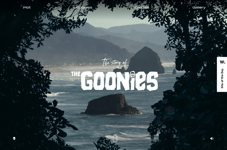
However, the plot starts off well but doesn’t continue, leaving thin content on the rest of this one-page website with little more than credits, gallery and bios for the Goonie characters. With a little more work, this website could be the ultimate Goonie fan site and a brilliant example of visual storytelling with parallax effects.
Bearideas exemplifies the effective use of basic parallax scrolling to create a dynamic and engaging user experience. As you navigate through the site, background images move at a slower pace than the foreground content, generating a subtle yet impactful sense of depth.
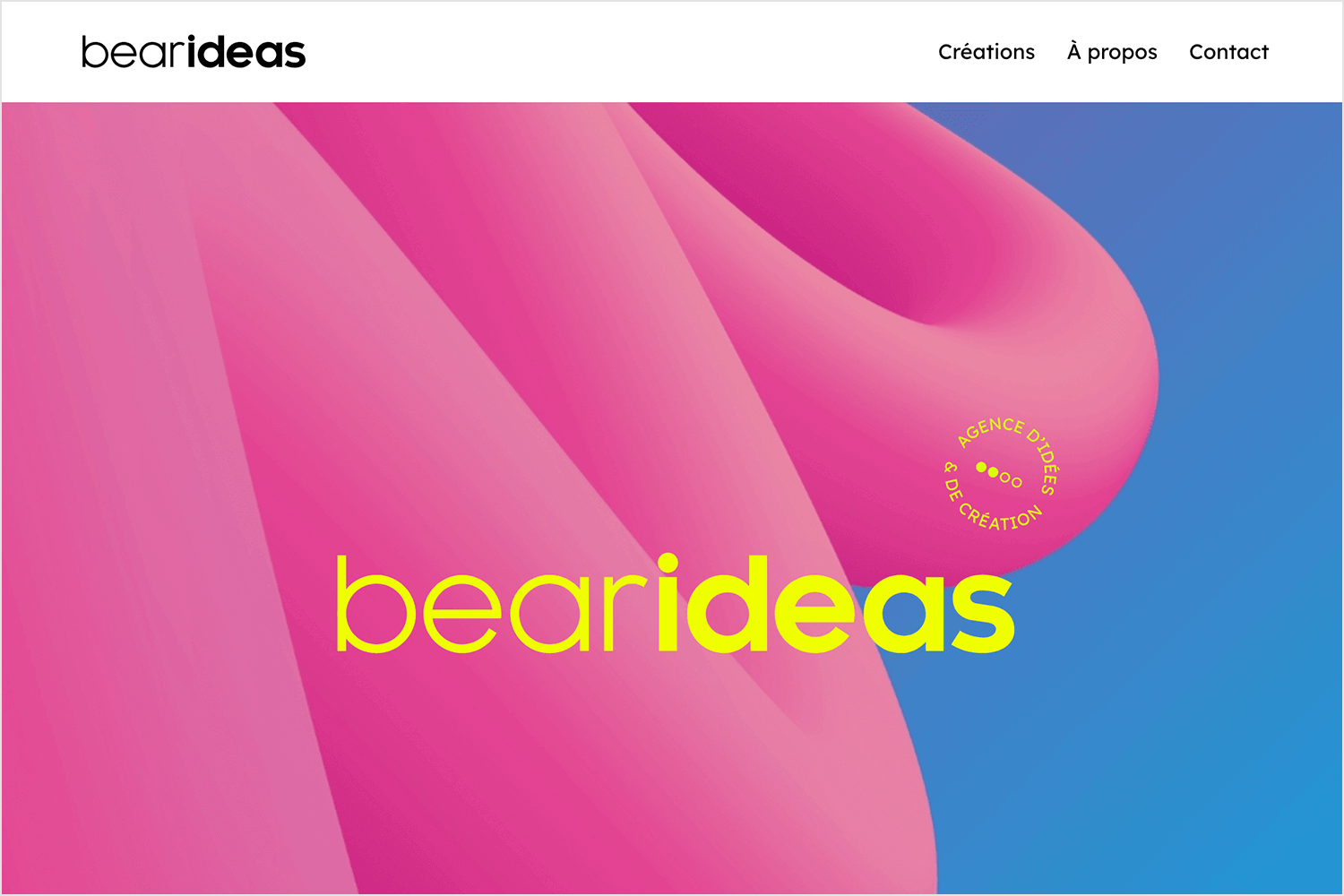
This technique not only enhances the visual appeal but also guides the user’s attention smoothly through the showcased projects and information. The restrained application of parallax effects ensures that the content remains the focal point, providing an intuitive and enjoyable browsing experience.
There’s something captivating about how Okalpha uses layered parallax scrolling to bring depth and motion to their site. As you scroll, elements seem to dance at different speeds, creating a vivid sense of space and dimension.
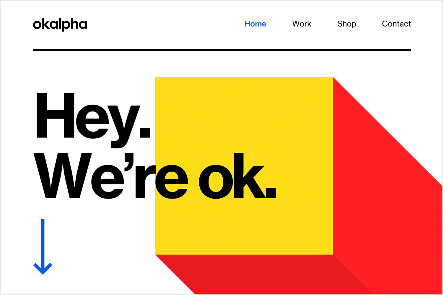
The transitions feel smooth and purposeful, guiding your attention to key points without overwhelming you. It’s a great example of how parallax can go beyond aesthetics to enhance storytelling and user experience.
Dockyard Social pulls you in with its vibrant design and clever use of basic parallax scrolling. As you browse, the background shifts more slowly than the content in the foreground, creating just the right amount of depth to keep things visually interesting.
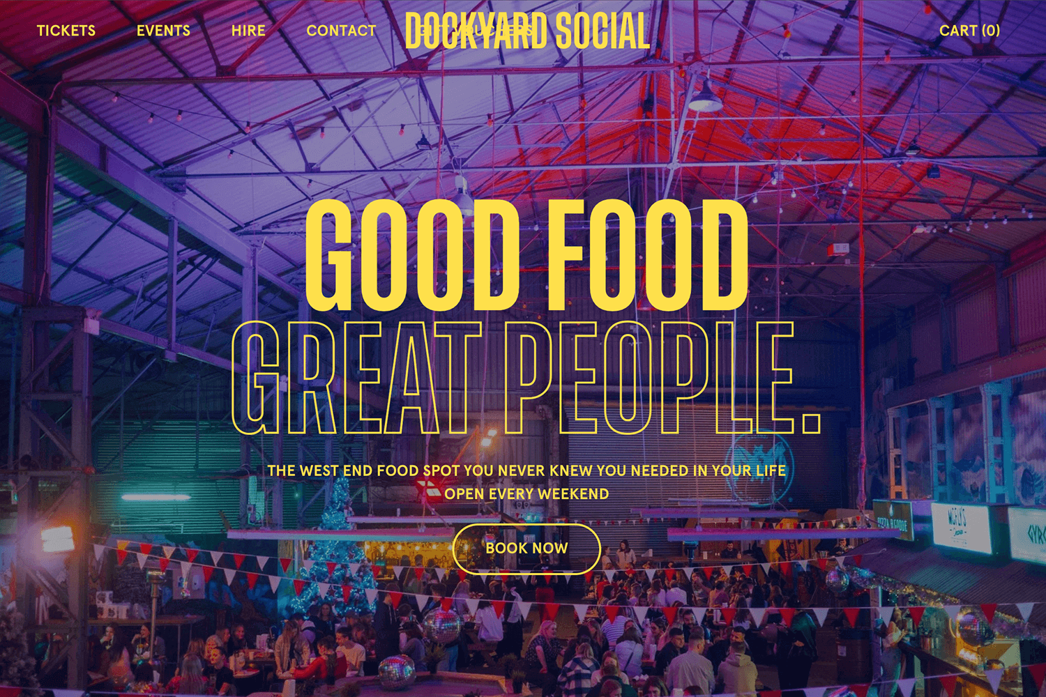
The parallax effect doesn’t just look great – it helps guide you through their offerings in a way that feels seamless and natural, perfectly reflecting the lively energy of their Glasgow street food hub.
Tomato Can Blues, while not a website, is a piece featured in the New York Times which documents early amateur cage fights prior to the birth of MMA.
What’s most impressive about this page are the iconic sketched illustrations by Attila Futaki that depict the main character the writer follows, Rowan, getting boxed in a cage. As the user scrolls down below the fold, the audience moves out towards the screen to make it look as if they are retreating from the fight and into the text.
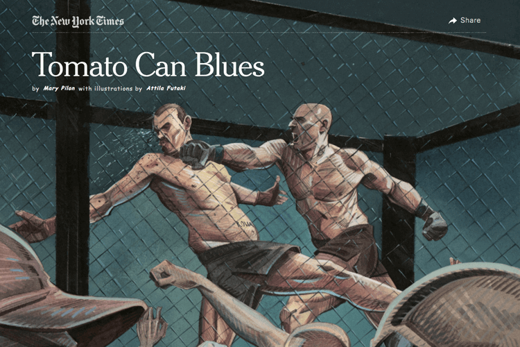
This parallax scrolling effect is a great way to generate interest in the mind of the reader and convince them to start reading the text!
Alex Dram is a designer from an agency called Finsweet. His website portfolio features a dazzling parallax effect arrangement – as the user scrolls down, the logo design opens out into a short paragraph of an intro.
You’re then greeted with two buttons: “About” and “Works” at either end of the page.
It’s aesthetically pleasing, showing a planet in a lilac space emitting radio frequencies and an envelope element resembling a paper aircraft following the cursor around the screen.
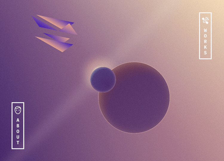
This site gets top marks for beautiful aesthetic design. The only gripe we have with it is that, as the thunder and radio frequencies keep flashing, it’s not immediately clear if it is a response to the user’s scrolling or if it’s just automatic. As it turns out, it’s automatic. There’s no indication of when you arrive at the footer, meaning that there may be some excess scrolling before the user realizes it.
OnCorps integrates layered parallax effects to create a clean, professional feel with just the right amount of movement. As you scroll, dots and geometric patterns shift at different speeds, adding subtle depth to the design.
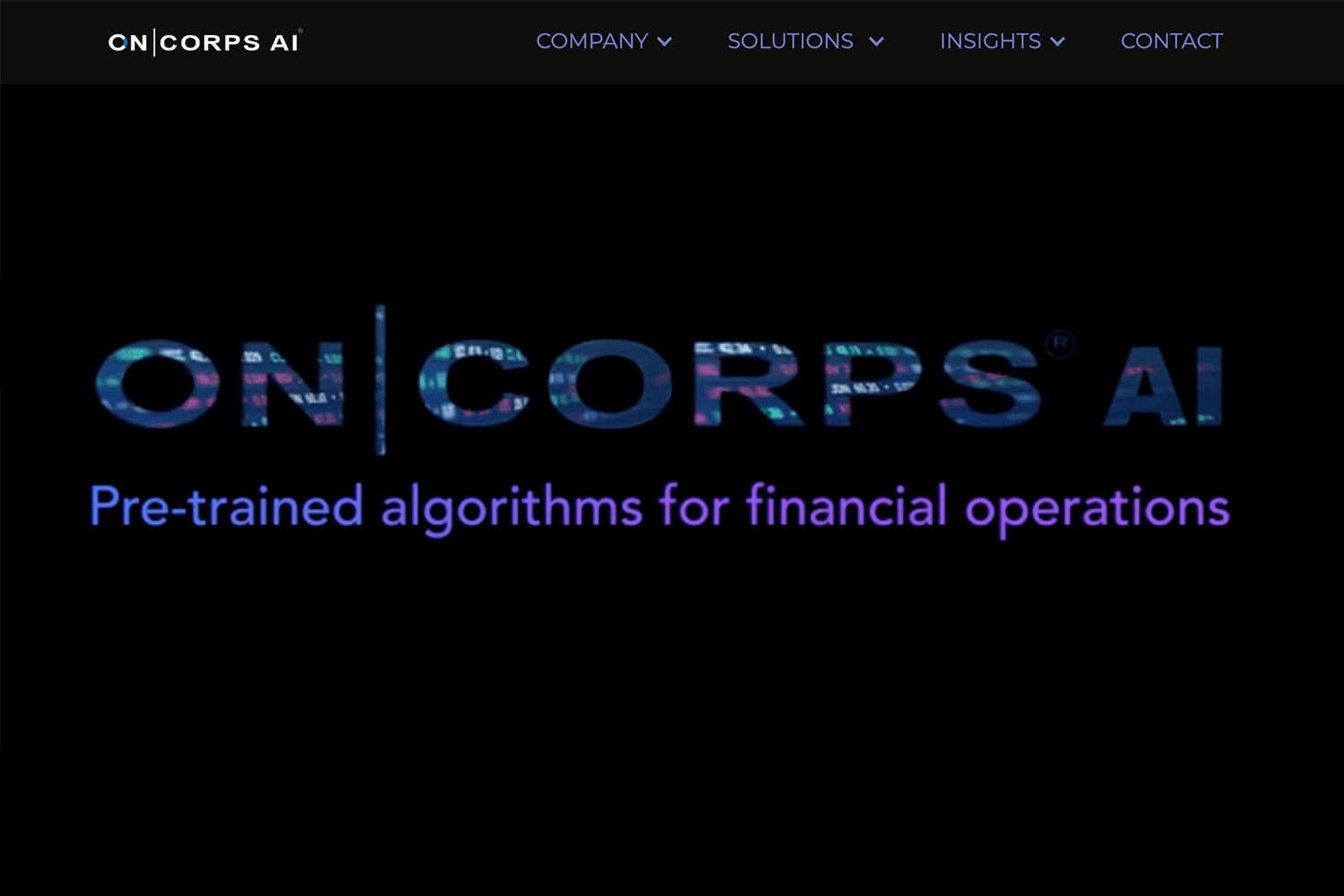
This approach keeps the site visually engaging without overwhelming the user, showing how parallax can enhance focus and maintain simplicity.
What we like about Weglot is the intuitiveness of its parallax scrolling feature. As soon as the user lands on the page, they’re told to scroll downwards and shown a progress bar depicting how far through the page they are.
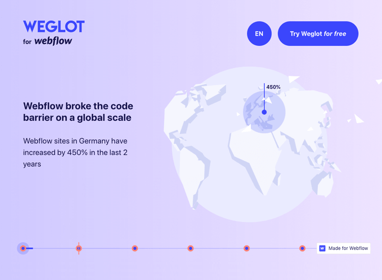
The design is aesthetically daring, showing you a white earth against a calming pastel background with website growth figures on different continents sprouting up as you scroll down. As the user scrolls on, a side panel of large text slides out onto the screen informing the user that there is a huge language barrier and is then presented with a chisel to break the barrier.
This storytelling parallax website is definitely worth a gander, even if you’re not going to use their services.
Jomor Design stands out with its clever use of layered parallax scrolling. As you scroll, elements move at different speeds, creating a sense of depth that feels both immersive and smooth.
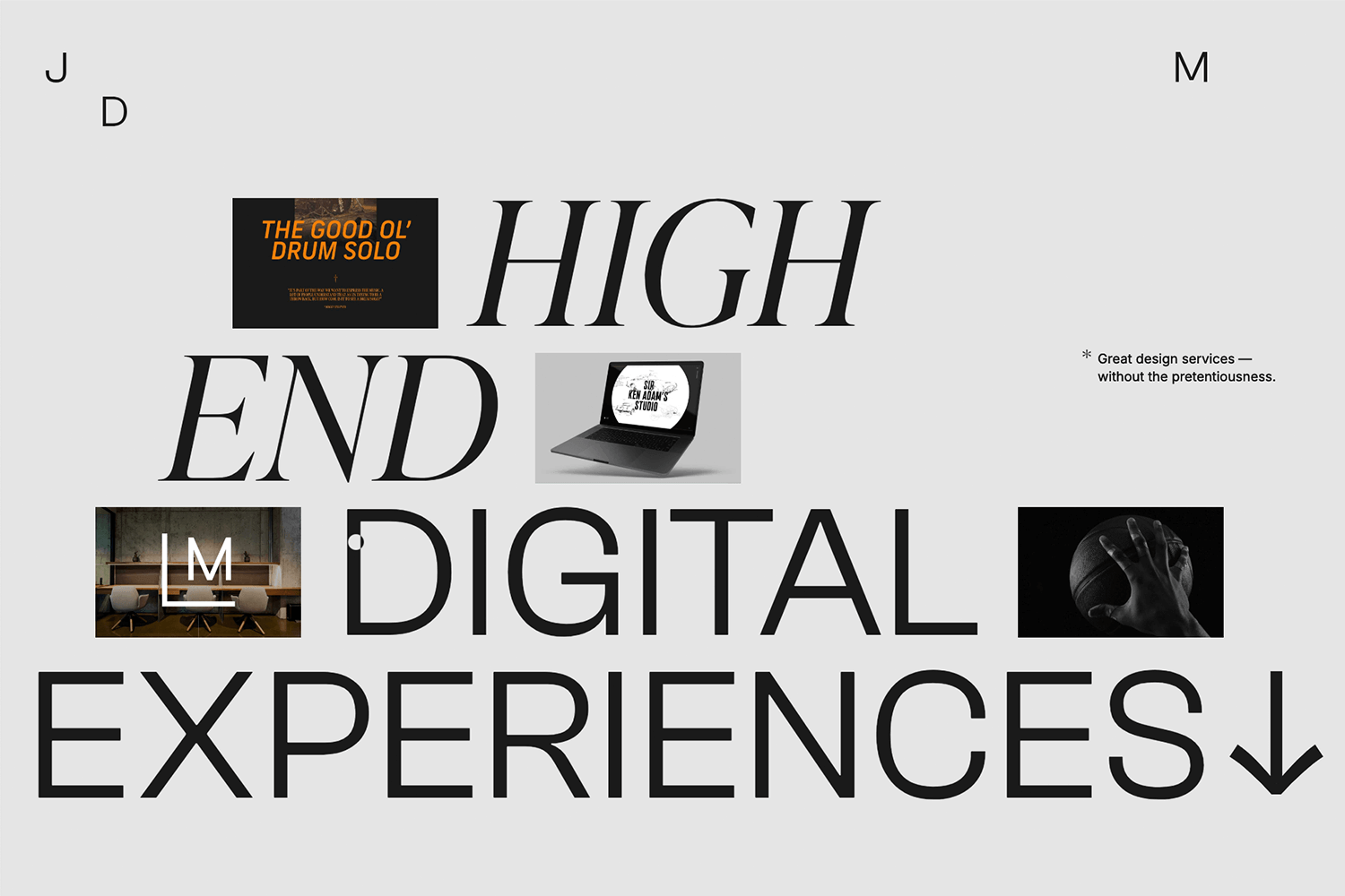
By this they draw attention to key details while maintaining a clean and polished design. The animations are subtle yet effective, enhancing the overall user experience without overwhelming the content. It’s a thoughtful example of how to use parallax to keep users engaged.
Sychronized Studio’s goal was to create a glitzy parallax effect with bold white type against a dark background, along with a few bright flares of bold color throughout.
First off, what do we not like? From an accessibility point of view, the auto-scroll banner at the top leaves a bit to be desired. It brings you to an archive of digital studio images. We get that this is an important showcase, but there are other ways of drawing attention to a section without giving prone users a migraine with a banner scrolling so fast it’s difficult to read the words.
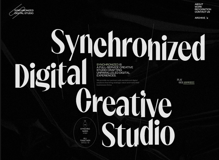
Furthermore, while this site is an impressive progression of storytelling, those who are prone to motion sickness might not appreciate the jarring effect that is bright fonts moving in circular fashion and multiple layers moving at different speeds. The whole effect is like being on a roller coaster minus the thrills and plus the motion sickness.
A strangely helpful aspect is the neon-green marker line that follows the cursor about the place and clashes with the background colors so that it is easily distinguishable from everything else.
We couldn’t skip including this example. Scrolling through The Boat feels like reading a story that comes to life. Using horizontal parallax scrolling, the site takes you on a journey where text and visuals flow seamlessly side by side.
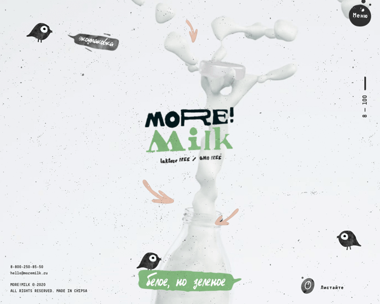
This technique really pulls you into the story, making it feel like you’re part of each scene. It’s a great example of how parallax effects can bring a narrative to life without piling on distractions.
What’s striking about Dope Good is how it uses basic parallax scrolling to create a seamless sense of flow. As you scroll, the background shifts more slowly than the foreground, giving the design a natural depth.
This subtle effect keeps your focus on the products while adding just enough motion to make the experience feel dynamic. It’s a clean, well-executed approach that enhances the site’s usability and visual appeal without overcomplicating things.
Cuberto goes all in with its mouse-based parallax effects, turning the experience into something really interactive and engaging. As you move your cursor, the elements respond with subtle shifts, bringing a dynamic vibe to the clean, modern design.
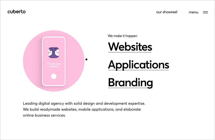
This interaction adds a lively energy to the site, making navigation feel more immersive. The smooth, controlled movements keep the visuals focused on enhancing usability, striking the right balance between creativity and functionality.
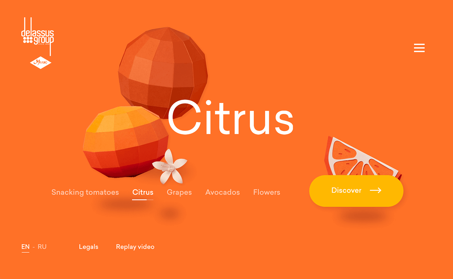
Delassus Group, a fruit and flower producer in Morocco manages to bring the parallax effect back to its basics, while managing to not make it look basic in any way.
As soon as the user lands on the site, they are immediately drawn in with bold colors, large pixelated fruit, representing their major products, citrus, grapes, avocados, and flowers. Where the parallax comes in is in the subtle movement of the fruit and text overlaying images as the user scrolls or moves their cursor. This gives an illusory 3D effect which enhances the website and makes it come alive.
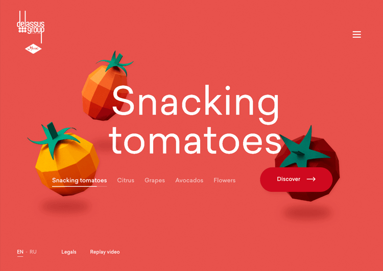
With the vibrant colors and movement, the user is drawn in to read more about each fruit and what the story behind the product is or the story behind Delassus.
This is an example where the parallax effect doesn’t directly impact the storytelling of the website, however, it adds to the storytelling experience somehow. It makes the user feel in control somehow by their scrolling and cursor movements having an effect on the position of the fruit and the text.
Jess & Russ is a single-page parallax website to tell the story of how two designers met and fell in love, without sounding too much like a Tom Petty song. The whole point of the website is to allow guests to RSVP their invites to a wedding celebration.
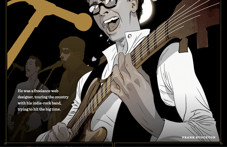
In fact, it’s the perfect way of laying down the colorful history that their relationship is built on and is a fabulous example of visual storytelling using the parallax effect.
Each image features moving components as the user scrolls downwards towards the footer, followed by a small paragraph of text quickly and humorously describing each of their lives in a specific year. It’s worth a read!
Design and prototype parallax websites with Justinmind. It's Free. Unlimited projects!

Qode Interactive draws you in with a smooth and seamless browsing experience. As you scroll, the site creates a natural flow that highlights its carefully curated designs.
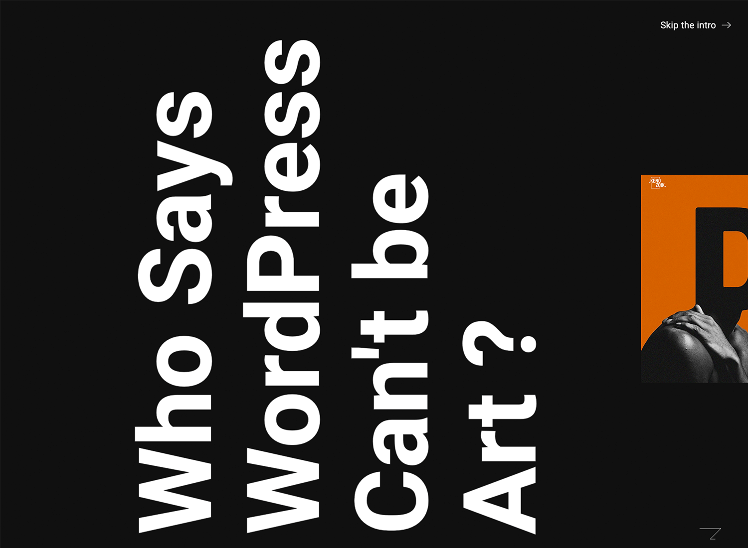
The movement feels purposeful, guiding your eyes to key sections without being overwhelming. It’s a refined approach that emphasizes simplicity and clarity, making the content stand out while keeping the interaction enjoyable and intuitive.
The NBC News feature on Detroit’s segregation wall uses parallax effects to tell a powerful story. As you scroll, the images and text move together in a way that keeps you engaged and focused on the message.
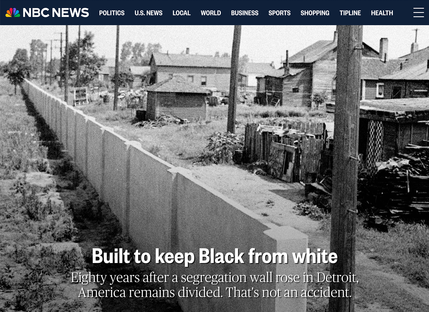
This parallax effect website shows how design can make a story more impactful. The movements are smooth and help guide you through the history without feeling overwhelming. It’s a simple yet powerful example of storytelling with design.
We really like how Ben the Bodyguard turns scrolling into an interactive story. Using a vertical parallax effect, the site follows Ben as he strolls through a city, revealing bits of information about the app in a fun, engaging way.

The effect feels like a guided adventure, drawing you into the narrative while keeping the focus on the product. It’s a clever and memorable use of parallax that combines storytelling with function naturally.
Apple’s AirPods Pro page does a great job of using parallax effects to keep things interesting. As you scroll, the features and design details appear smoothly, guiding your focus without feeling overwhelming.

The movements feel clean and easy to follow, making the page look modern while keeping everything simple to understand. It’s a great example of how parallax effects design can make a product page stand out.
In this parallax effect design example, Bagigia uses this effect to create an elegant and immersive experience. As you scroll, product details and images move with smooth transitions, highlighting the craftsmanship and unique features of their designs.
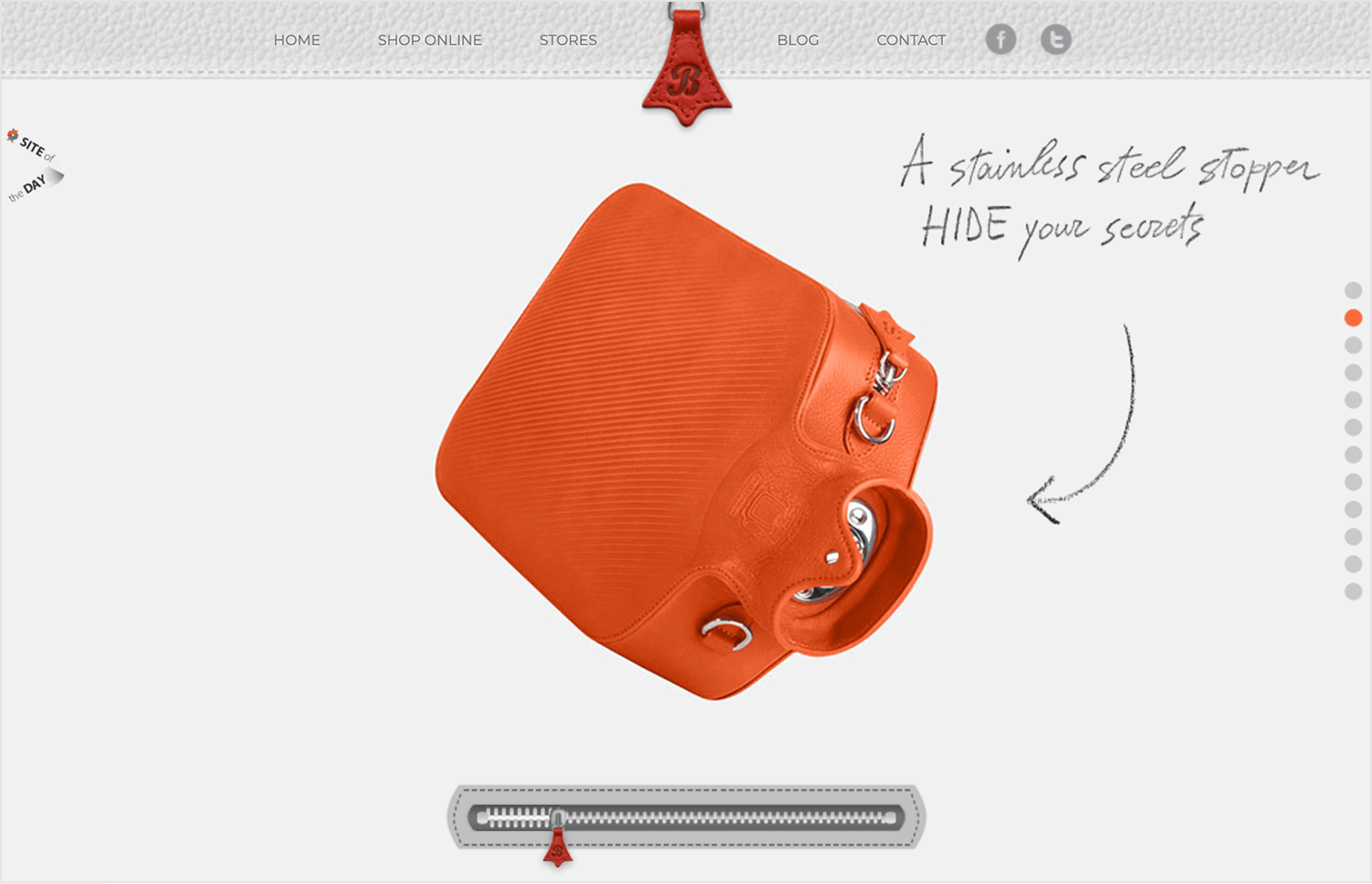
The motion feels natural and adds a sense of depth, making the page visually interesting without being overly complicated. It’s a great example of how parallax effects can enhance storytelling while keeping the focus on the product.
Plink gets creative with its parallax effects, making the site not just engaging but also easy to navigate. As you scroll, the animations seamlessly highlight key features and flow perfectly with the content.
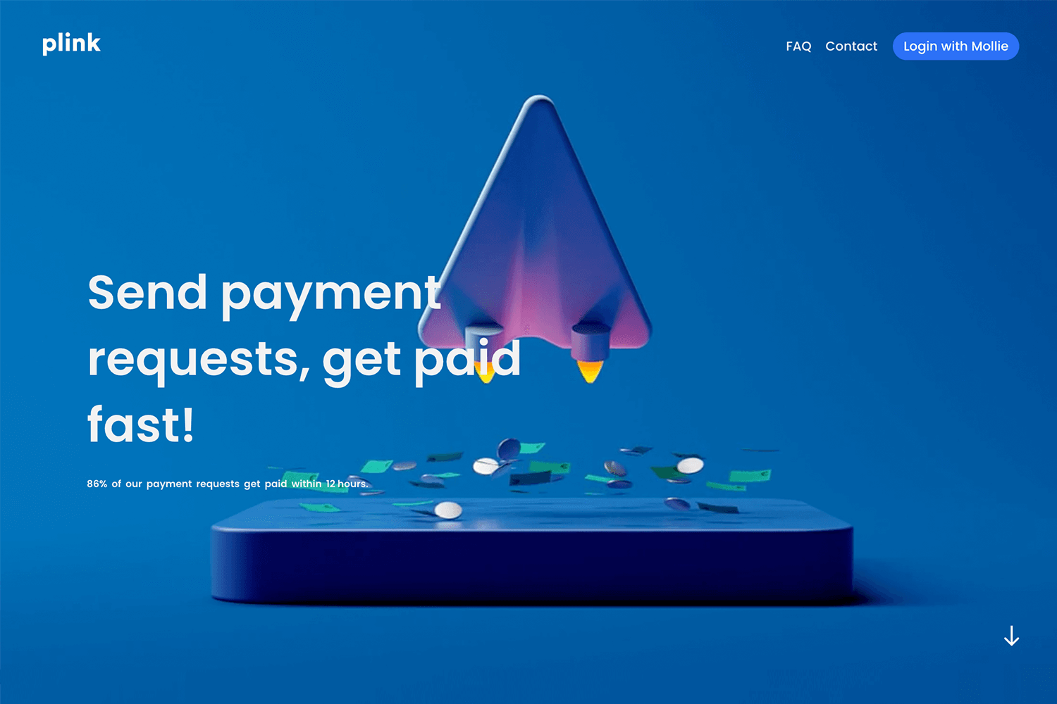
The design feels dynamic without being over the top, keeping your focus on the product while adding a modern, polished touch. It’s a solid example of how parallax effects design can improve user experience.
The Digital Bake makes great use of parallax scrolling to add a sense of movement to its clean, modern design. Geometric shapes glide across the screen as you scroll, creating a smooth and engaging visual flow.
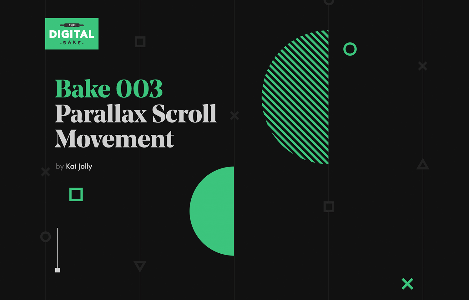
The simplicity of the design keeps everything easy to follow while still feeling dynamic. It’s a smart way to use motion to draw attention and keep the experience fresh and interesting.
Another amazing example of layered parallax effect is Sputnik Design Team’s site for how they use it to add depth and movement. As you scroll, you notice how different elements shift at their own pace, making the whole experience feel alive.
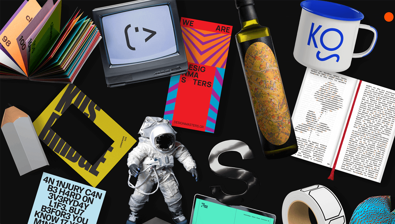
The way they’ve done it doesn’t just look good – it really helps guide your focus through their portfolio. It’s the kind of design that feels interactive and keeps you curious without being too much.
This site, Margrete, Queen of the North, takes a storytelling approach with its basic parallax scrolling, creating a sense of movement that keeps you engaged with the content. As you scroll, text and images unfold naturally, drawing you into the narrative without feeling forced.
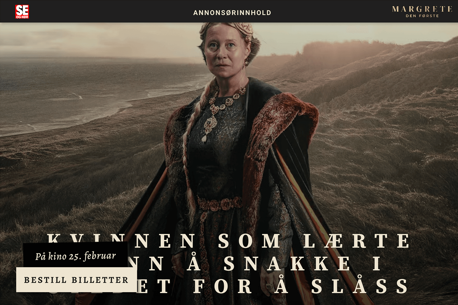
The design is straightforward but effective, using this effect to guide your attention and add subtle depth. It’s a good example of how even simple parallax effects can make a story feel more immersive and interesting.
To close our list, the Canals of Amsterdam website showcases a fantastic use of horizontal parallax scrolling. Instead of the usual vertical movement, this site takes you on a side-to-side journey through the iconic Amsterdam canals.
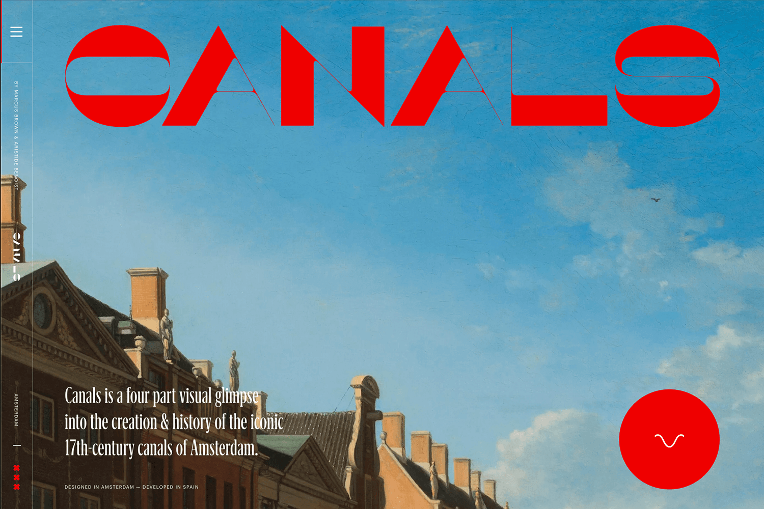
As you scroll horizontally, images and text transition smoothly, creating a flow that feels like you’re drifting along the canals yourself. This unique approach makes the experience both engaging and perfectly suited to the site’s theme. It’s a fitting example to wrap up our exploration of parallax effects design.
Design and prototype parallax websites with Justinmind. It's Free. Unlimited projects!

Does the parallax effect have a positive impact on your website? The answer is it depends on the type of content on your website.
What we do know is that, done right, the parallax effect can increase your website’s ability to catch your users attention and reduce your bounce rate. Whether or not you ultimately decide to use the parallax effect in your website design, we’ll leave to your judgement.
If you choose to embark on the parallax effect route, make sure that you make content and storytelling your first priority.
PROTOTYPE · COMMUNICATE · VALIDATE
ALL-IN-ONE PROTOTYPING TOOL FOR WEB AND MOBILE APPS
Related Content
 A fun look at different data table designs, from basic lists to smart, interactive ones, based on how complex the data is and what users need.18 min Read
 Single page design v multi-page design – everything you need to help you choose the right design for your site’s content18 min Read
 Website backgrounds can be a powerful tool in creating an experience. But what kind of experience can you convey and how? We got the full run-through for you!14 min Read


