Doodling. It’s just another word for wasting time, right? Deadlines, market competition, product roadmaps – UI designers have plenty of reasons to feel like they don’t have time to sketch out interface ideas.
But beware of skipping the sketching stage and moving straight onto engaging a UI design tool. Sketching out UI ideas can help you find the best solutions to thorny problems, and deliver the best experience to end-users.
Justinmind’s prototyping tool
The Justinmind design team is always sketching, whether on paper or on-screen with our pre-built sketching UI kit. So we decided to find out why UI designers sketch, and how to make the most of this crucial stage in digital product development.
There’s no mystery behind the term UI sketching. It simply refers to sketching out the basics of a user interface before getting into wireframing, prototyping and coding. UI sketching comes right after you’ve had a great website idea, and before building high-fidelity wireframes.
The UI sketch is the first step to understanding (and solving!) the problem.
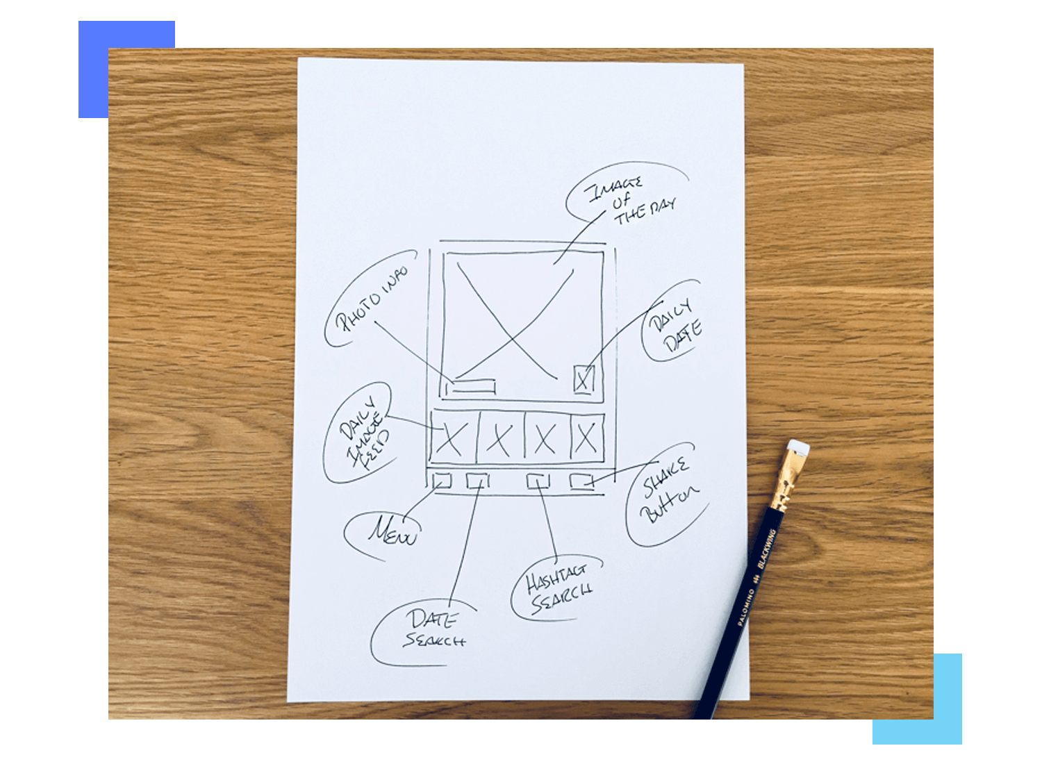
It’s up to you how your UI sketch looks. You can sketch out on communal design boards with a Sharpie, use the fun UI element stencils in your notebook, or even whip up a handmade-looking UI sketch in Justinmind.
However you choose to sketch your initial UI ideas, keep it quick and keep it dirty. Never mind the specifics of design or functionality in a UI sketch. This is about looking for the right layout, the right balance of visual hierarchy.
“The ambiguity and lack of detail in sketches foster new ideas.”
Lennart Hennigs - Senior ID Designer at Deutsche Telecom
A UI sketch should simply serve to help you eliminate bad ideas and brainstorm good ideas about how to bring your proposed product to the screen. The sketch should help you translate idea to interface in the minimum possible time.
Some people prefer the term ‘UX sketching’. But for us, UX sketching is something bigger. User experiences professionals should definitely be sketching all day err day, but they could be sketching anything from a user journey or user persona to a design presentation for stakeholders.
UI sketching, on the other hand, refers purely to the act of sitting down and working through all the possible ways you could make your idea into an interface reality.
At the end of the UI sketching process you should know that you’ve figured out the absolute best way to bring your product to the screen.
It’s easy to conflate a UI sketch with a wireframe. Both are meant to be quick and both are meant to illustrate an interface idea visually. But they’re not the same thing.
A UI sketch is you working through all the possible ways you could render your idea in interface form. It’s a chance for you to play with all the possible outcomes freely and to think how to get your user from A to B.
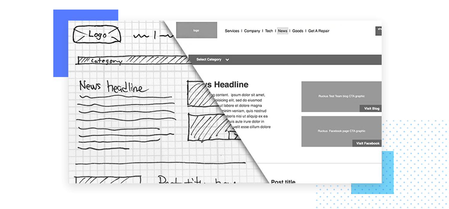
A wireframe is one step beyond a basic sketch. In a wireframe you start thinking about placement of UI elements, element hierarchy and size (although you’re still not ‘designing’ at this stage) – all relying on your app wireframe tool.
You’ll be able to see the difference between a UI sketch and a static wireframe easily. A UI sketch should have a real handmade feel, while a wireframe is made up of greyscale elements.
UI sketching might feel like an unnecessary step at first. Isn’t it enough to start right on the wireframe?
Well, no. We’ve already established that the two have different objectives. A UI sketch is the absolute best way to make sure that you’ve worked through all the possible options and found the most effective, user-friendly way to express your interface idea.
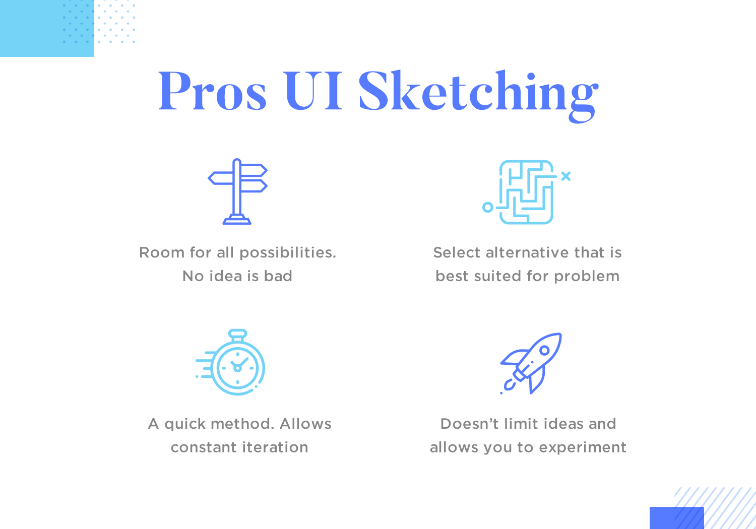
UI sketching is fast. There’s nothing faster than fooling around with a pen and paper. You can go through idea iterations much more rapidly than you can when wireframing on screen.
Sketching also frees you up. Whenever you’re designing with a digital tool, the parameters of that tool have an impact on what you make. If you know you can’t do something in the tool, you won’t even consider trying it out. That could have been your best idea, gone right there. When you’re doodling that won’t happen.
“All of these super rough sketches are unleashed ideas. I honestly believe that if I waited until I developed them on a computer, they would either have been forgotten or become watered down.”
Shawn O'Mara - Founder at ocreations
Having a UI sketch will make your website wireframe (or app wireframe) stage more effective. You’ll be working from a strong, iterated base and you’ll know where to focus your energy. You already weeded out the bad ideas; thanks to UI sketches you can focus all your wireframing time and energy on refining the stuff that really matters.
Things like finding the right UI patterns for a specific screen or function can happen at this stage. Thinking about what a specific screen would look like, you may decide that using cards UI design would be suitable or try to envision what your dashboard design would look like.
There are some potential downsides to sketching out the user interface. Mainly, if you sketch on paper, translating those ideas to your wireframing tool can be laborious. That’s what inspired the Justinmind design team to come up with our Sketching UI kit, which you can download for free.
The kit has over 100 pre-made, super sketchy UI elements that you can drag and drop onto the canvas as fast as you could sketch them on paper. If you sketch this way you can build the wireframe on top of the sketch, with no analog-digital translation needed.
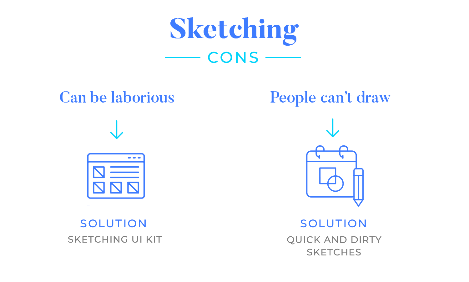
Another ‘con’ to sketching people often table is that they can’t draw. Really, that’s not important at all. You can make marks on paper right? That’s all you need to be able to do to make an effective UI sketch.
Remember, these are quick and dirty sketches to work through ideas and will not be presented to external stakeholders. Heck, you can even hide them from your design colleagues if you want!
Of course, the details won’t be found in the sketch. Things like button states, any sort of interaction, or visual embellishments can’t be put down on a sketch of a design. It is also true that if you’re trying to follow a more trendy visual style, such as neumorphic design or skeuomorphic design, you won’t be able to reflect the aesthetic beauty on the sketch.
The first step to making an effective UI sketch is – focus on ideas. Churn through as many ideas and iterations as you can. Doesn’t matter if they’re not ‘good’ ideas, doesn’t matter if your sketches are unfinished and, well, sketchy.
Just figure out the best way to approach the design within in the project context. Sketching is about communication, not aesthetics. You’re communicating your solution to a problem in its rawest form.
Try a bit of ‘divergent sketching’ to make sure you’re really working through all the possible permutations of your design problem. Divergent sketching is when you draw out different approaches to the same screen.
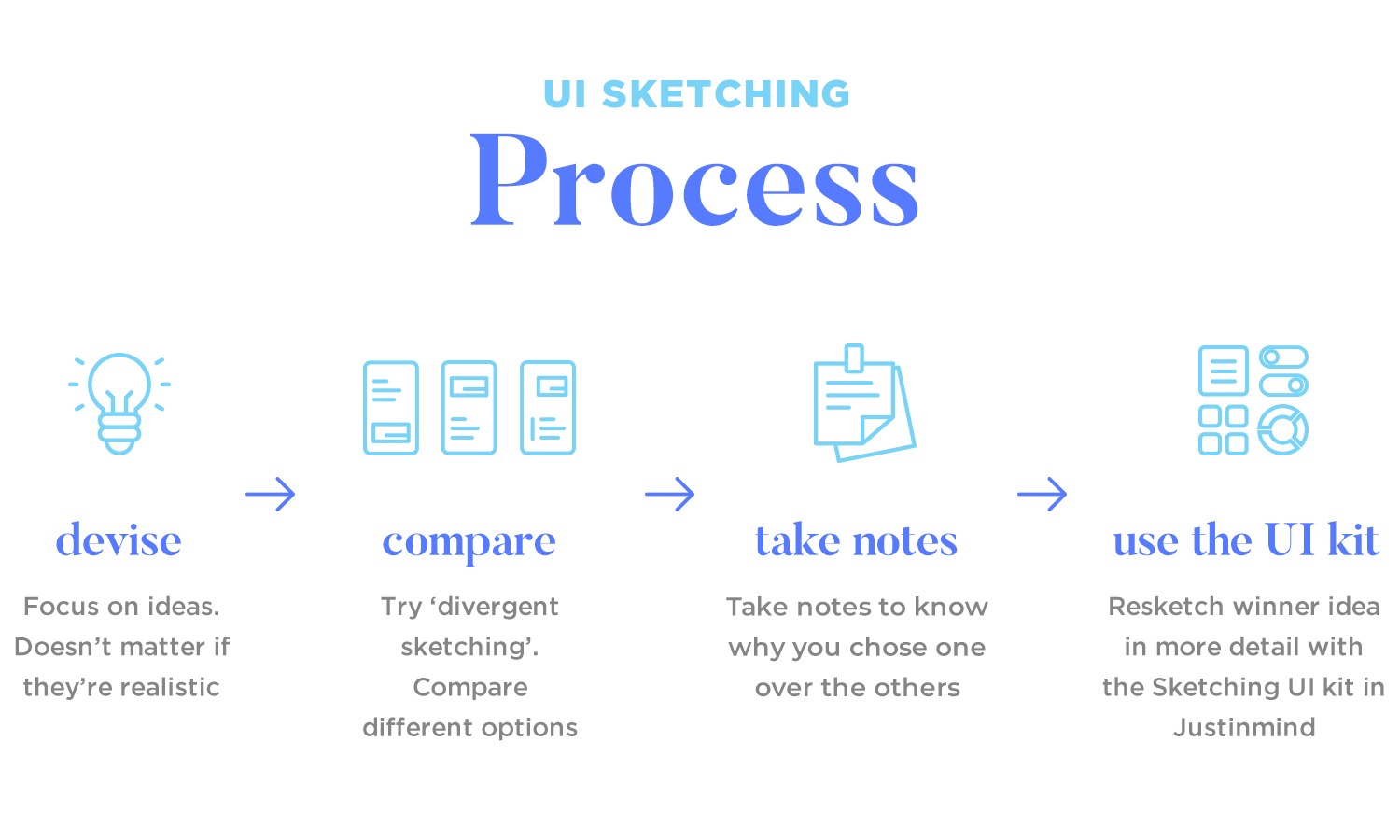
For example, you might try out a ton of different ways to design an app’s main navigation, each one sketched next to the others. There are printable templates online to facilitate divergent UI sketching.
Tip: Make notes about the pros, cons and limitations of each sketched solution. If you don’t make notes you’ll most likely forget why you chose one idea over another.
Next, take a step back and say “ok, which of these ideas am I actually going to run with?” Try applying the Rule of Three and selecting more than one possible option to work on. This might be a bit more time-consuming but it’s a great way to understand your design better.
Resketch the best ideas in more detail in Justinmind with the Sketching UI kit. You can combine the best elements from different sketches at this stage – remember that your solutions should be in constant flux up to (and beyond) the wireframing stage.
Peiter Buick over on Smashing Magazine has some really useful UI sketching tips, including:
- Build the sketch up in layers
- Add ‘interactions’ with post-it note instructions
- Photocopy sketches and use them as templates
Read all Peiter’s advice.
Justinmind’s prototyping tool
In this section, we’ll explore a variety of UI sketch examples to inspire your own creative process. Wherever you are in your design journey, these examples of UI sketches for apps and websites will come in handy and showcase the power of sketching in shaping exceptional user interfaces.
Let’s start by using these website UI sketch examples to showcase the design process in its most authentic form. Whether you’re a designer seeking fresh perspectives or a curious mind wanting to understand the craft, these sketches offer a unique glimpse into the world of web design.
This sketch UI design is a sneak peek into a potential real estate website. It’s all about creating a seamless user experience. Key features like glowing testimonials, eye-catching market stats, and a curated selection of featured properties are front and center.
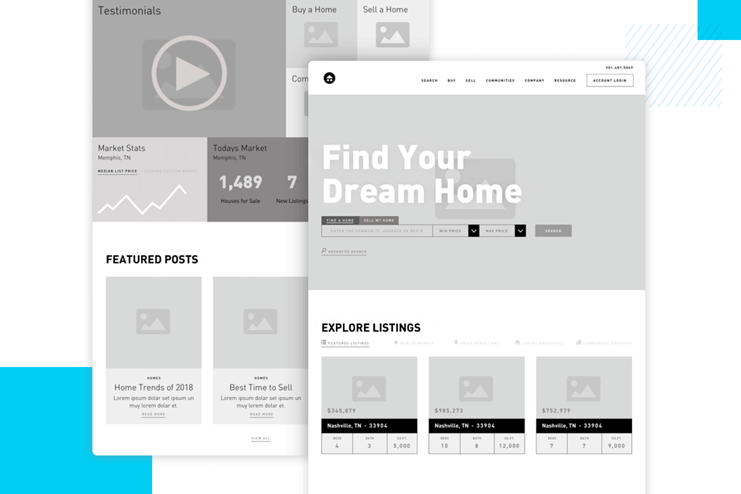
The design’s clean aesthetic and intuitive navigation make finding your dream home a breeze. It’s a solid foundation for a website that’s as stylish as it is functional.
Our second example of sketch UI design presents a basic layout for a website. It features a clear header with navigation elements and a search bar. The main content area is divided into sections with text blocks and visual elements.
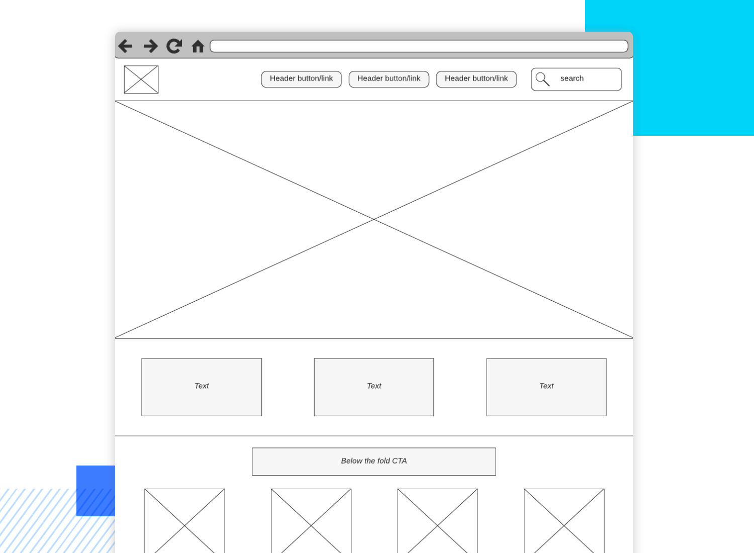
A prominent call-to-action (CTA) button encourages user interaction. The footer includes additional navigation options, social media icons, and a subscription form. This sketch serves as a foundational blueprint for further development and refinement of the website’s user interface.
This pet rescue website UI sketch design includes key sections for showcasing adoptable animals, highlighting testimonials, and providing essential information about the organization. The design emphasizes clear navigation and a clean aesthetic.
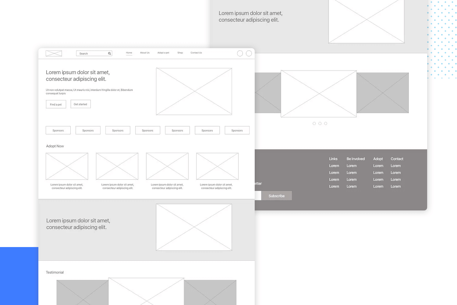
While this sketch provides a solid foundation, additional elements like high-quality images of pets and compelling calls-to-action would enhance the overall user experience.
With a clear and organized structure, this UI sketch lays the groundwork for a user-friendly website. The design guides visitors effortlessly through the page using key elements like a prominent search bar and a strong call to action to keep users engaged.
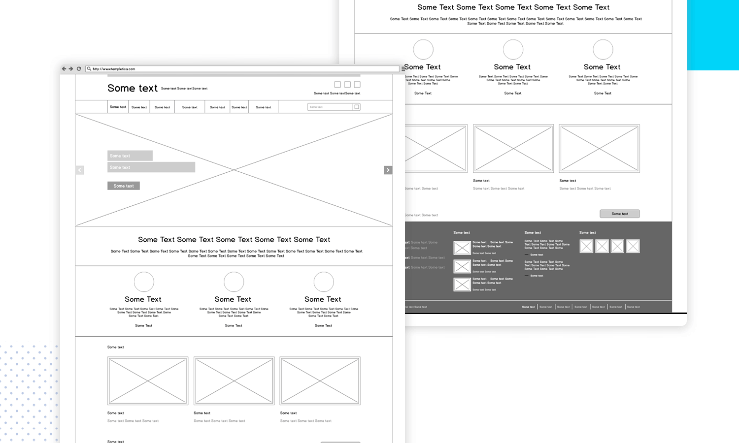
It’s a solid starting point for creating a website that not only looks good but also delivers a great user experience.
This UI sketch for a travel website exudes modern minimalism. A clean slate with a bold header sets the stage for a visually striking website. The expansive content area promises to be a focal point, perfect for showcasing standout features or captivating imagery.
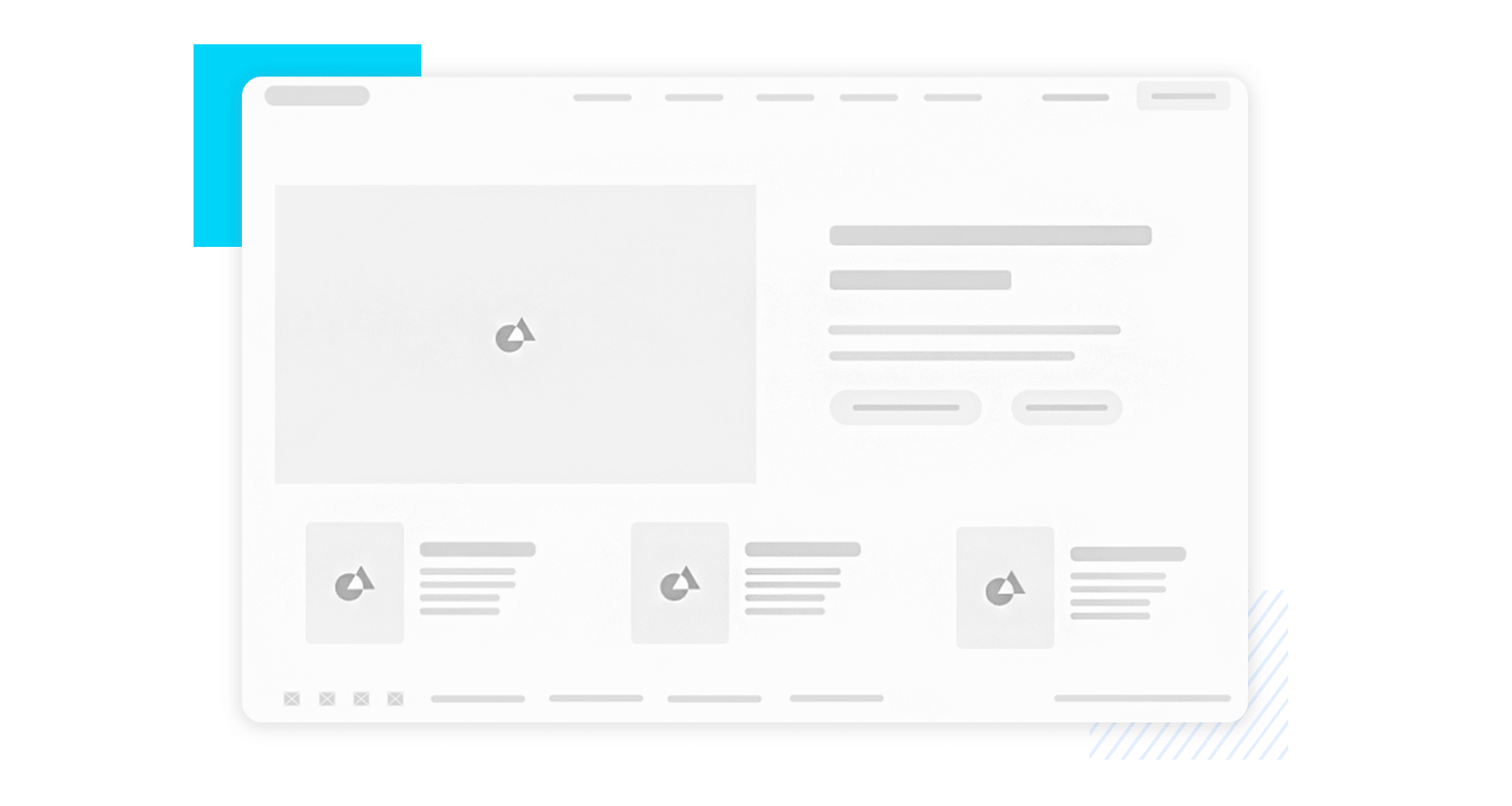
With a subtle footer, the design maintains its uncluttered aesthetic. It’s a promising foundation for a website that prioritizes simplicity and impact.
Justinmind’s prototyping tool
Here, you’ll find a collection of raw ideas, rough drafts, and unpolished gems that form the foundation of countless amazing apps. These UI sketches for apps are the first steps on a designer’s journey to create intuitive, engaging, and user-friendly experiences.
This UI sketch outlines a basic onboarding flow for the Brader Parents app, starting with a welcome screen featuring the app name and language selection. Users can then choose to create a new account with basic information fields or log in with existing credentials.
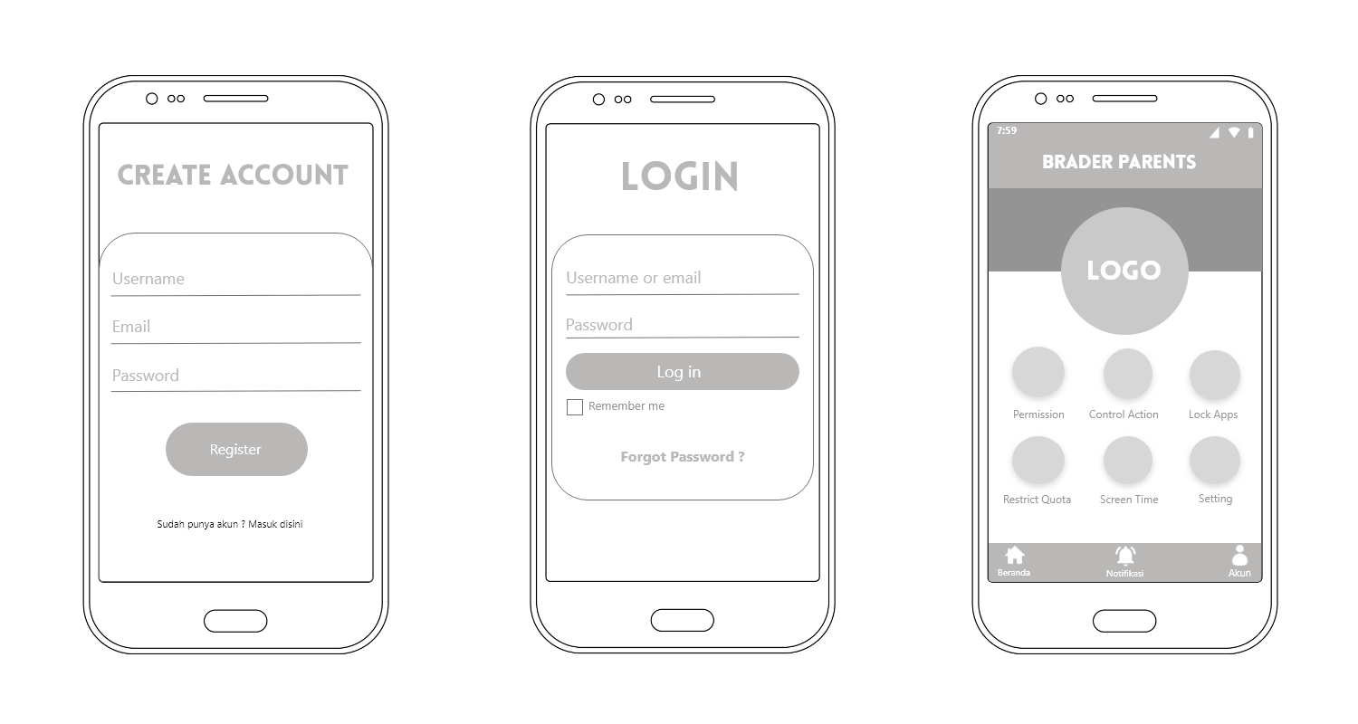
The straightforward design prioritizes user experience by clearly differentiating between account creation and login options.
This UI sketch envisions a dynamic tracking app experience, combining user profiles with interactive maps. The clean layout puts users at the center, allowing them to easily create or view profiles with key details and ratings.
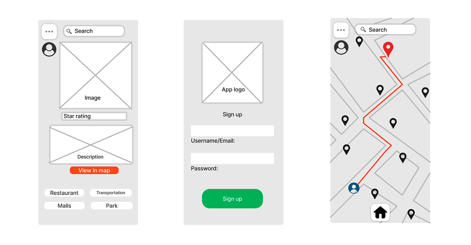
The integrated map offers a visual way to explore and connect with others based on location. It’s a promising foundation for a location-based app or social platform that fosters user interaction and discovery.
This UI sketch lays the groundwork for a powerful case management tool. The interface is designed to streamline workflows, with dedicated spaces for managing active and closed cases.
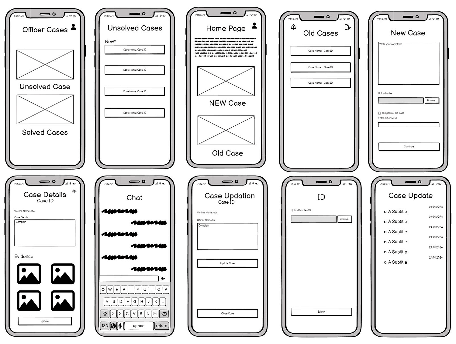
Users can dive deep into case details, collaborate through in-app chat, and efficiently manage evidence. It’s a promising foundation for an app that will revolutionize how cases are handled.
This UI sketch presents a sleek onboarding and payment journey that prioritizes user convenience. The flow guides new users through account creation, integrating payment card linking and loyalty rewards.
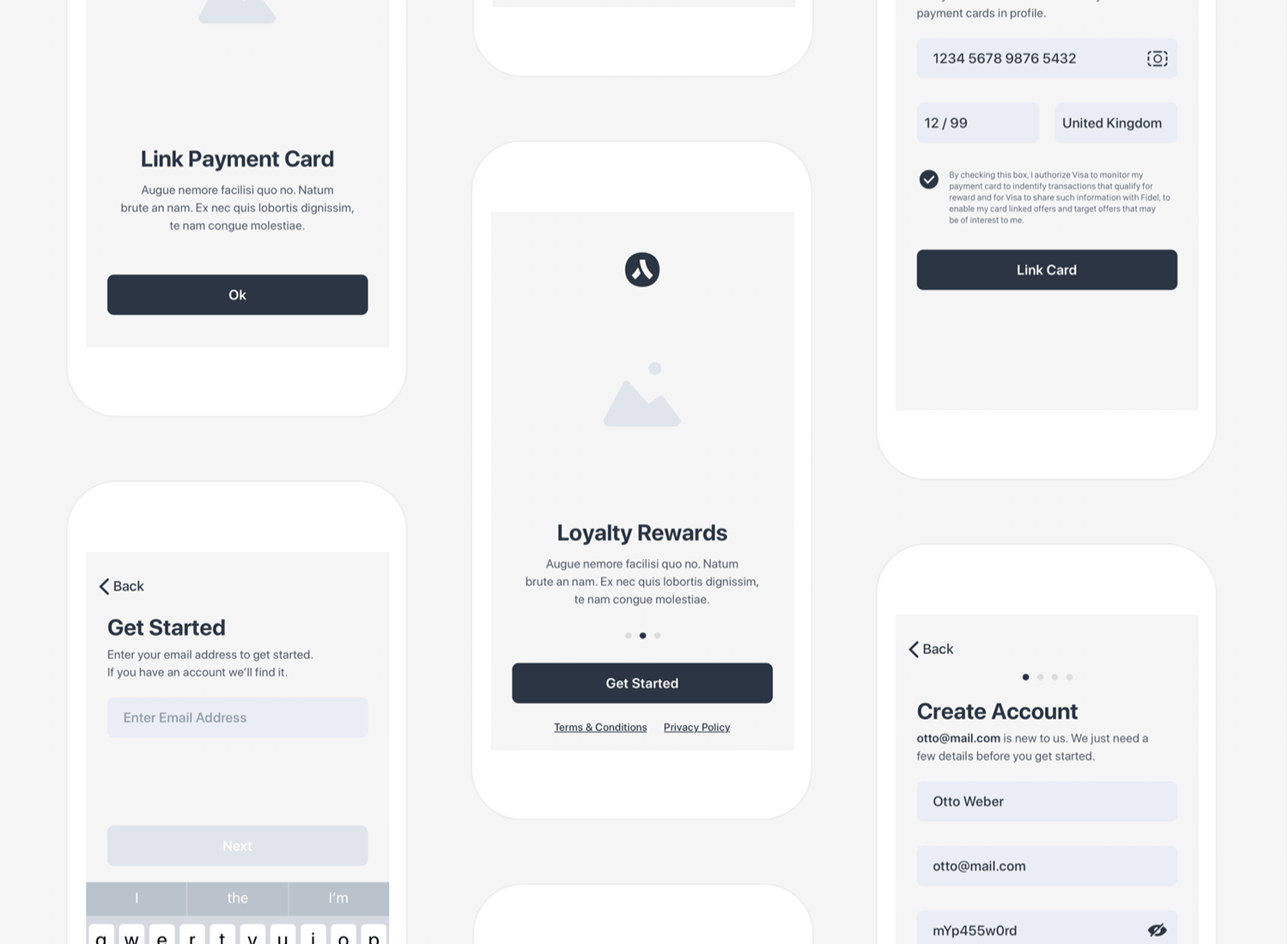
The design’s clean aesthetic and intuitive steps make the process enjoyable and efficient, setting the stage for a positive user experience from the outset.
This UI sketch outlines a mobile app focused on event management and user profiles. The design prioritizes a clean and minimalist aesthetic, featuring event listings categorized by day, detailed event views including member information, and user profiles with event history.
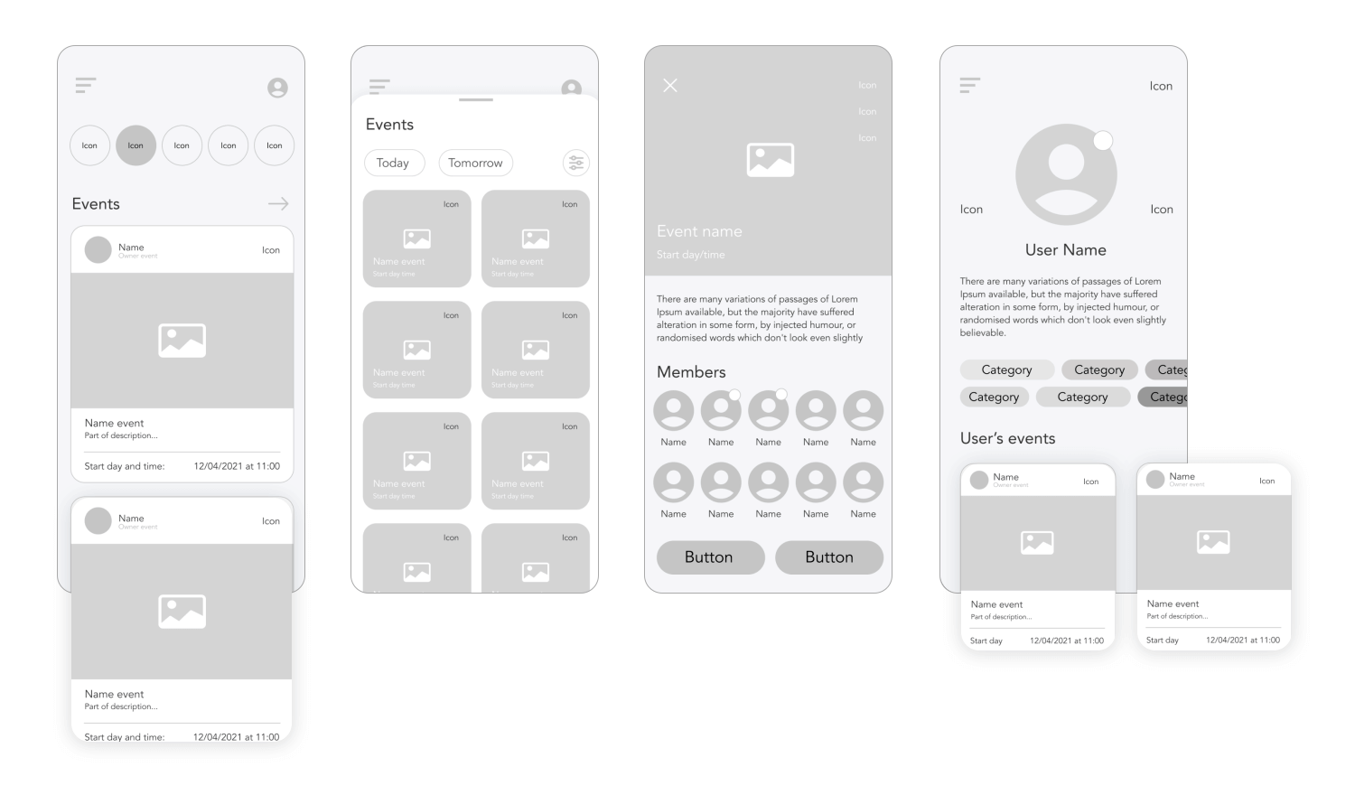
The intuitive navigation enhances user experience, making it suitable for various event-centric platforms such as social, professional, or community-based applications.
Justinmind’s prototyping tool
The UI kit includes all the components you need to create an understandable, interactive and straightforward sketch of your web or mobile design. When you’ve downloaded and installed Justinmind’s Sketching UI kit, you will have all of the following widgets available to you. Within the widget panel in Justinmind are 8 UI categories.
By effectively utilizing these categories and their respective elements, designers can rapidly create wireframes that effectively communicate design concepts and user flows. With this kit you can drag and drop the UI elements onto your canvas to create rough, quick and simple designs. The UI kit categories include over 100 different components to help you create digital sketches.
The widget library comes with pre-created browser windows, iPad and iPhone templates, perfect for creating UI sketches that are quick and fuss-free.
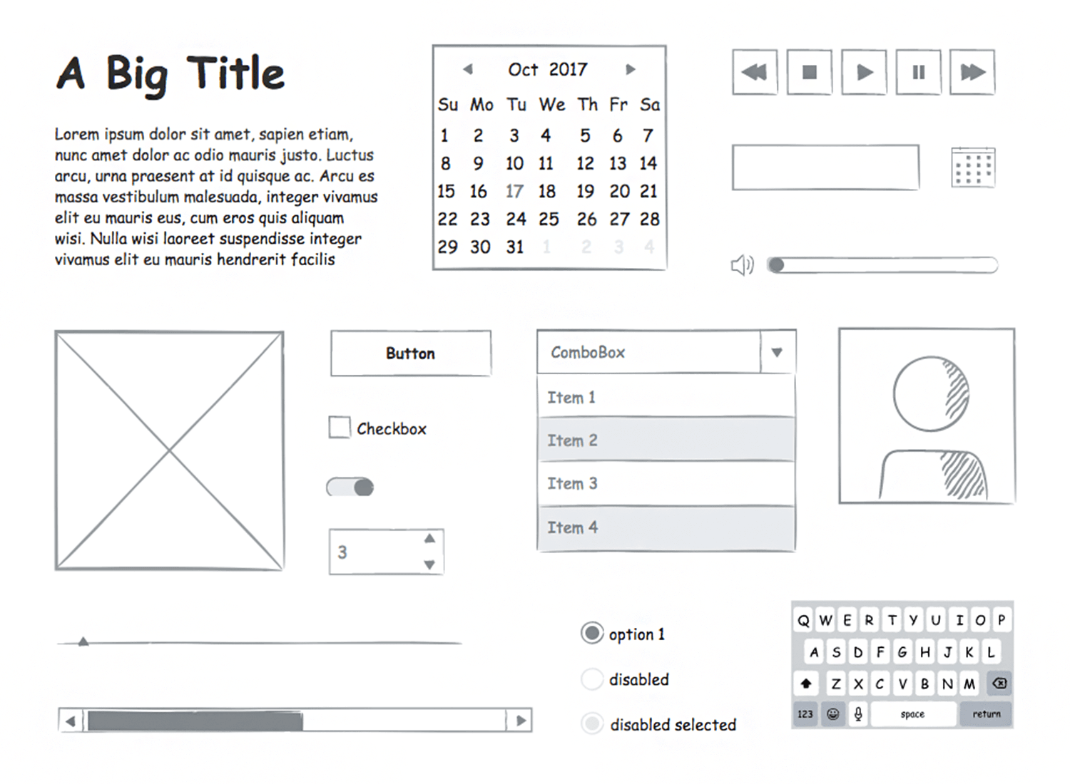
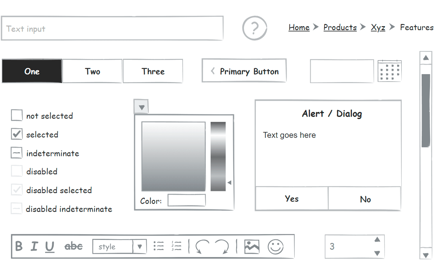
Since most mobile apps and websites have buttons and other interactive elements, the Sketching UI kit comes with various interactive components, such as toggles, buttons, sliders and drop-down menus. These are great for highlighting basic functionality.
Simple checkboxes and radio buttons allow you to create forms and tables with multiple options. Other UI elements include input boxes, calendars, scroll bars, tab bars, image placeholders and breadcrumbs.
In the web and mobile Sketching UI kit, you will also find volume sliders, playback controls, menu bars and pop-up windows.
Included in the UI kit is an iOS category which has iOS menus, keyboards and pickers so you can create sketches that stay true to Apple’s operating system.
With these UI elements it is possible to create interactive yet straightforward sketches that take no time to craft. Let’s take a closer look at these categories:
This category encompasses the fundamental building blocks of any user interface. It includes essential components such as text boxes, images, lines, and basic shapes. These elements serve as the foundation for constructing the visual framework of a design.
Containers provide structure and organization within a design. They facilitate the arrangement and grouping of elements. Examples include panels, grids, accordions, and tabs. These components contribute to the overall layout and hierarchy of a user interface.
Buttons are interactive elements that initiate actions. The button category offers a variety of styles and sizes to suit different design contexts. Options include standard buttons, icon buttons, toggle buttons, and dropdown buttons. These elements are crucial for user interaction and navigation.
Layout components establish the overall structure of a screen or page. They provide a framework for consistent placement of content. This category includes headers, footers, navigation bars, and sidebars. These elements contribute to the overall design system and user experience.
Form elements enable the collection of user input. The form category offers a range of components including text fields, text areas, checkboxes, radio buttons, dropdowns, and date pickers. These elements are essential for creating effective and user-friendly forms.
Designed specifically for iOS app development, this category provides UI elements aligned with Apple’s Human Interface Guidelines. It includes components such as navigation bars, tab bars, table views, collection views, and progress bars. Adhering to platform conventions enhances the user experience.
Media components facilitate the integration of multimedia content into a design. This category includes image and video placeholders, as well as audio players. These elements enrich the user experience by incorporating interactive media.
The graphics category offers decorative elements that enhance the visual appeal of a design. It includes icons, illustrations, and dividers. These components contribute to the overall aesthetic and branding of the user interface.
Justinmind’s prototyping tool
Getting started digitally Sketching wireframes in Justinmind is fast and easy. First, follow these simple steps:
1. Download the Justinmind prototyping tool
2. Open Justinmind and start a new web or mobile device prototype
3. To the left of the screen you’ll find a Widgets panel
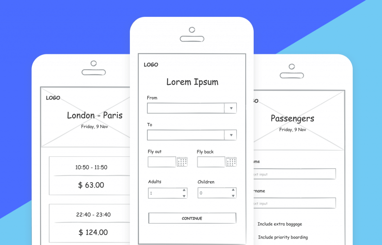
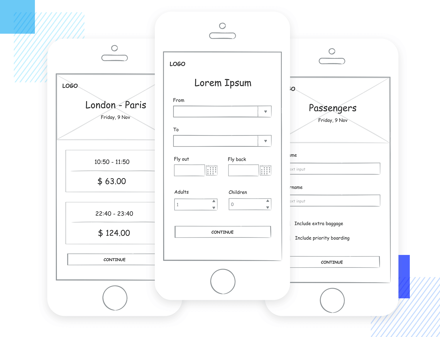
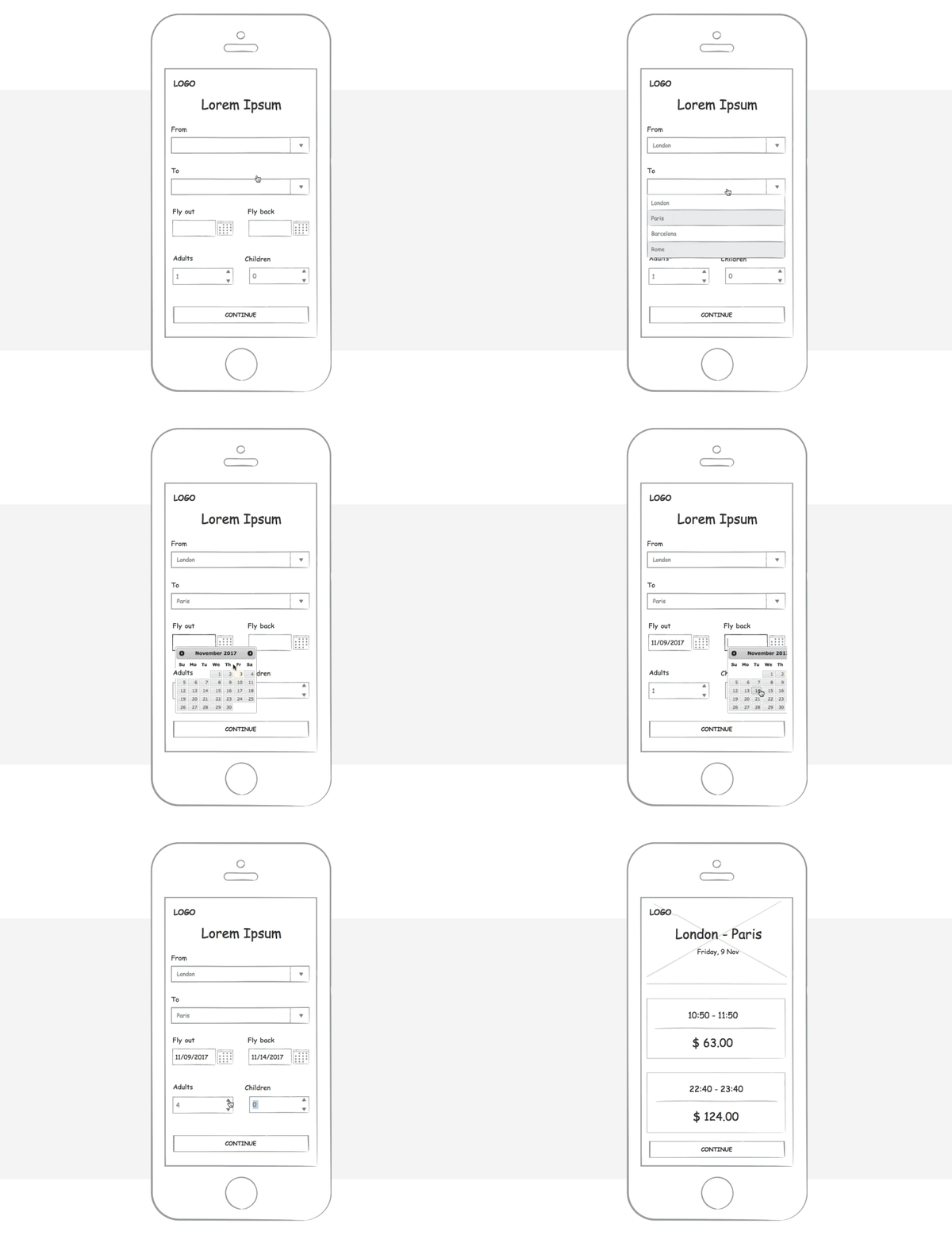
Now let’s imagine that you have been commissioned to create and develop an airline mobile app. There are individual widgets in each category of the Sketching UI kit which you can use to populate your airline app.
Under the Basic category, for example, you will find rudimentary Title, Images, Breadcrumb, Button and Scroll widgets. These can be used to create the sketched framework for your mobile app, to be wireframed at a later stage.
The first sketched screen of your airline app should allow users to choose their destination and flight date.
On your canvas, drag and drop a text box, two radio buttons, two drop down menus, two calendars, two selectors and a button. These elements collectively will make up the first screen of the airline app. It really is that simple.
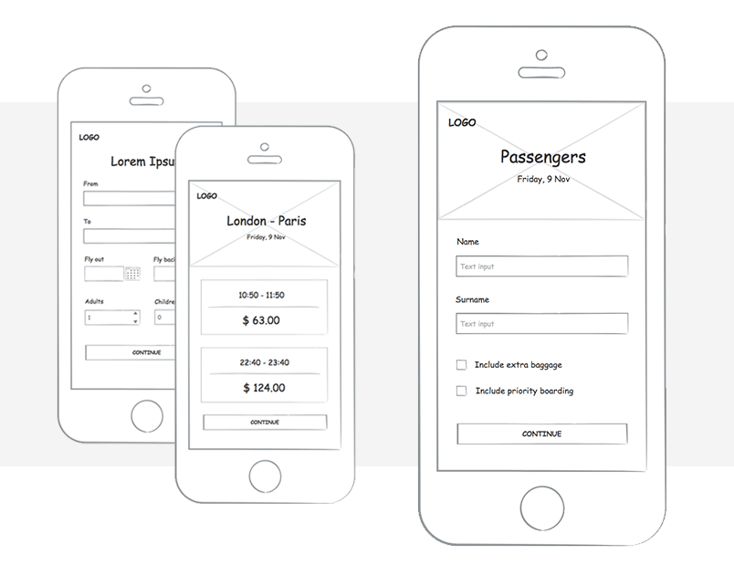
For the next screen, use an image placeholder for the top quarter of the screen. This image placeholder can be used to show the destination of your flight as well as the outbound date.
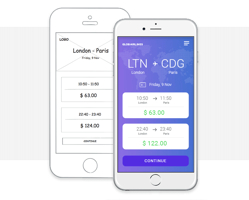
The next screen only requires text boxes which can be populated with multiple flight times and prices.
Now, you need to create a screen where users enter their passenger details such as name, surname and passport number. You can drag a checkbox from the UI kit here to denote flight extras such as insurance or extra baggage.
Since your previous screen involves entering information, the next screen can be the same but with the iOS keyboard added, to demonstrate that the keyboard will pop-up.
In Justinmind, you can apply global changes to save you time re-creating screens from scratch and maintain consistency and reuse content with templates. This is a rapid way to show stakeholders functionality of your mobile app design.
And that’s how you create simple sketches for an airline mobile app. The next step is to set up an interactive wireframe then a high-fidelity prototype.
Sketching is nothing to be afraid of. Even if you think you can’t draw, are pressed for time or just completely in love with wireframing (we feel you!), sketching out user interface ideas will improve your product design process.
There are plenty of tips and templates out there to help. So the next time you’re presented with a sticky design problem, sit down, sketch out solutions and watch your user interface design skills improve. Your users will thank you for it.
