Google Fonts is an amazing free resource. Find out about how it works and see our 50 best Google Fonts for your website.
Design hi-fi prototypes for web and mobile apps with google fonts
There’s no question that web fonts are a hot topic. It seems like, after decades of insistence, the world is finally coming to see things the way designers do: typography matters, and it’s important to get it right.
If you’re part of a large organization, you can probably afford to create your own typefaces – it seems like everyone who’s anyone has their own font these days. But if you’re starting out, resources like Google Fonts are an ideal way to establish your brand, deliver your copy and even speed up your website.
When you’re designing a website, it can be easy to settle for the default fonts and focus on other, seemingly more important decisions. However, not only would this be a mistake: you’d be missing out on the power of fonts and the benefits they can bring to your site. In your prototyping tool, seeing the final font in all its glory can shed new light on your product. Here are some examples of how choosing the right fonts can benefit your website.
Choosing the right font for your website can make a huge difference for your branding. From the logo to the number fonts, right down to improving UX with microcopy, your font choices establish a sort of non-verbal communication with your reader. Because of the way our eyes respond unconsciously to visual cues (we wrote more about this when we talked about storytelling and UX), your website’s fonts can impact your reader’s immediate impression of your brand.
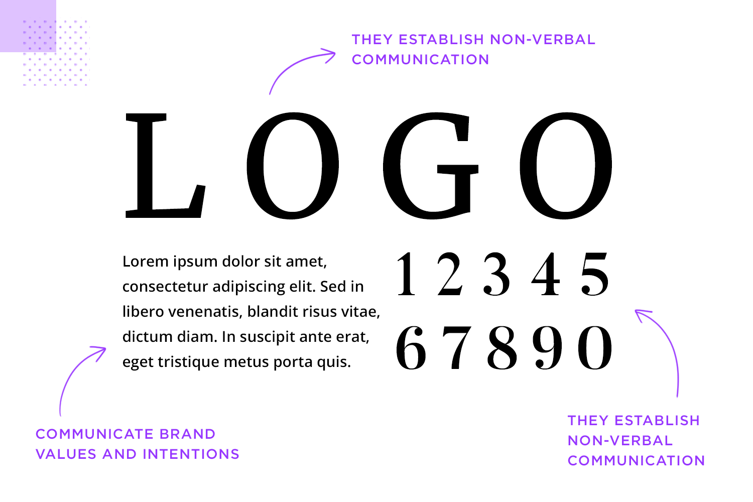
Getting the fonts right will result in successfully communicating your brand’s values and intentions. Choose the wrong fonts and you risk a jarring disconnect between what you say about your brand, and what your brand says about itself. Imagine a luxury jewelry company using Courier for its logo, for goodness sake! Or a hip new photo sharing app using Lobster for all its web copy. You see what we mean.
Consider what you want to communicate with your brand – is it luxurious and trustworthy, chunky and honest, or fresh and cool? – and choose fonts that help to communicate that message. You can incorporate the right font from the beginning in your website wireframe to convey the right feel to stakeholders.
Typography is one of the most critical aspects of UX design. Choosing the wrong font for your copy or navigation can make the text illegible and your website unusable.
Our colleague Steven put together this list of questions you should ask yourself when picking the best font for your website:
- How many weights does the font have?
- Is readability good owing to the x-height?
- Does this font scale well on multiple devices?
- Is it accessible?
- What is its contrast ratio?
If your chosen font has a decent range of weights, meets accessibility, x-height and contrast ratio standards and can be read easily on any device, it’s probably a safe bet. Remember: just because you, a knowledgeable and very attractive designer, prefer a font, doesn’t mean that it’s the right choice for your website. Once you’ve decided on a font, it’s always worth carrying out some user testing to see how readers respond to your font choices.
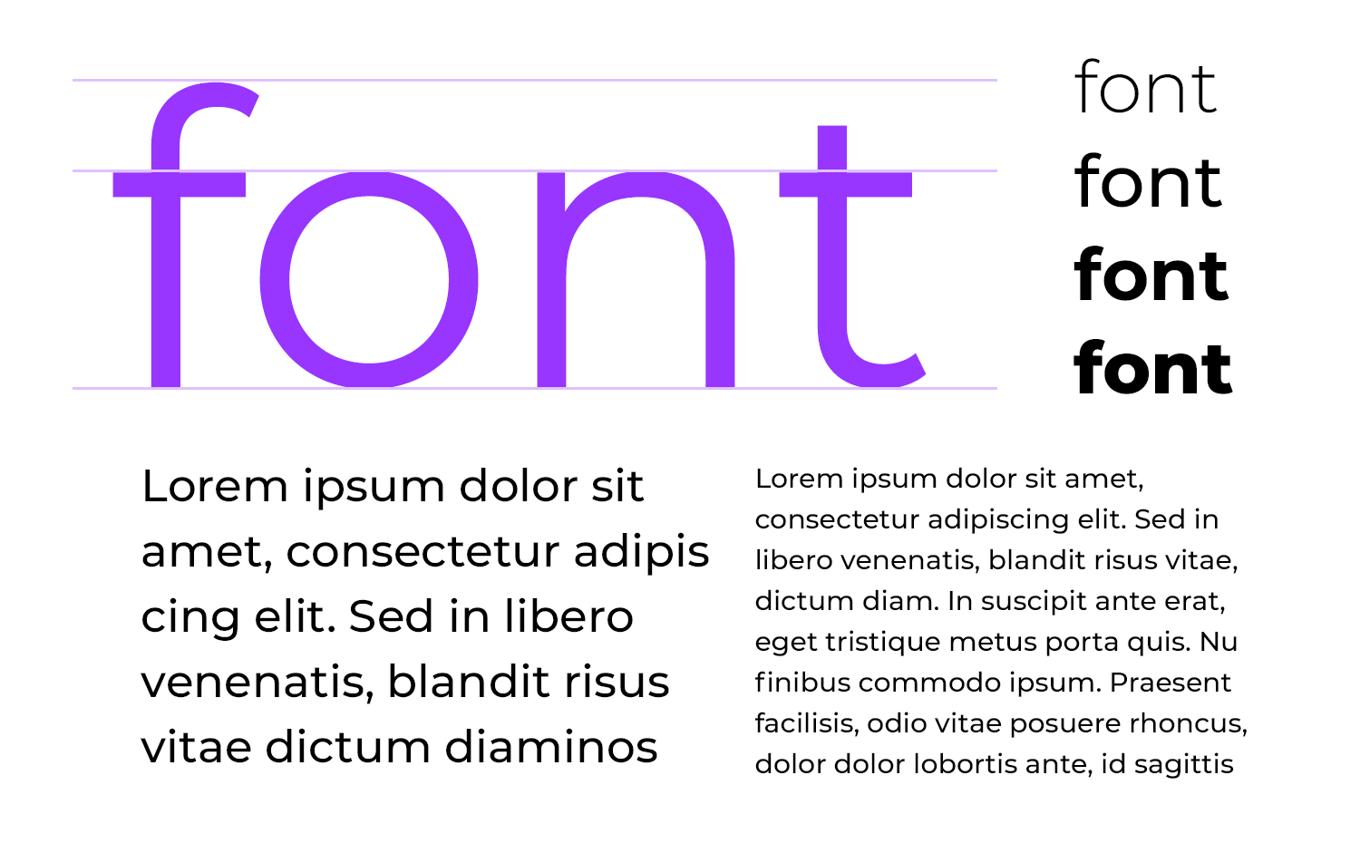
All technical fields have their share of jargon and typography, to put it lightly, is no different. Here’s a run-down of the most important terms you might find when researching fonts, and what they mean.
The biggest divide in the fonts world is between serif fonts and sans-serif fonts.
- Serif fonts are so called because their letters feature serifs, small lines or strokes attached to the end of the main part of the letter. Serifs have their origin in Roman stone carving, and are believed to be linked to the way that words were painted onto stone before they were carved. Serif typefaces are sometimes called ‘roman’ because of this. Garamond and Times New Roman are two classic serif fonts.
Types of serif include: old-style, transitional, modern and slab. - Sans-serif fonts are, unsurprisingly, fonts which don’t use serifs. These fonts typically appear more minimalist and modern, and they’re based on late 19th and early 20th century signage and advertising typefaces. In contrast to Serif fonts, sans-serif fonts are sometimes called ‘gothic’. Helvetica is probably the most famous of the sans-serif fonts.
Types of sans-serif font include grotesque, neo-grotesque, geometric and humanist.
You may well read that a certain Google Font is aimed to be used for display or for text, but what’s the difference between the two categories?
- Text fonts are designed for use in the main text of a website or app, and need to be highly-legible, even at small sizes. Text fonts are typically clean, have wider spacing, and are less chunky than display fonts, meaning they work better in small sizes.
- Display fonts, on the other hand, are predominantly designed to look stylish and original in titles, adding personality and punch, with slightly reduced legibility which would make them less ideal for use in body text.
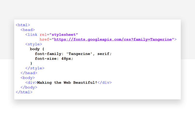
Google Fonts is a collection of 915 fonts, all available to use for free on your website. All you have to do is include a call to the fonts you want to use in your HTML and you’re good to go.
Here are some cool advantages of using Google Fonts on your website:
- Improve your website’s appearance for free
Google Fonts gives you access to nearly a thousand (mostly) great-looking fonts for free, giving you the freedom to choose between a whole range of professional-quality typefaces. Just a few years ago, the equivalent selection could have cost you thousands of dollars. - Boost consistency across platforms
Thanks to the fact that the vast majority of current web browsers support Google Fonts, including Google Chrome, Apple Safari, Mozilla Firefox, Opera and Internet Explorer. - Speed up your site – and the internet
Using Google Fonts on your website can make your site look great – and boost its performance. Check out this video from Google which explains how.
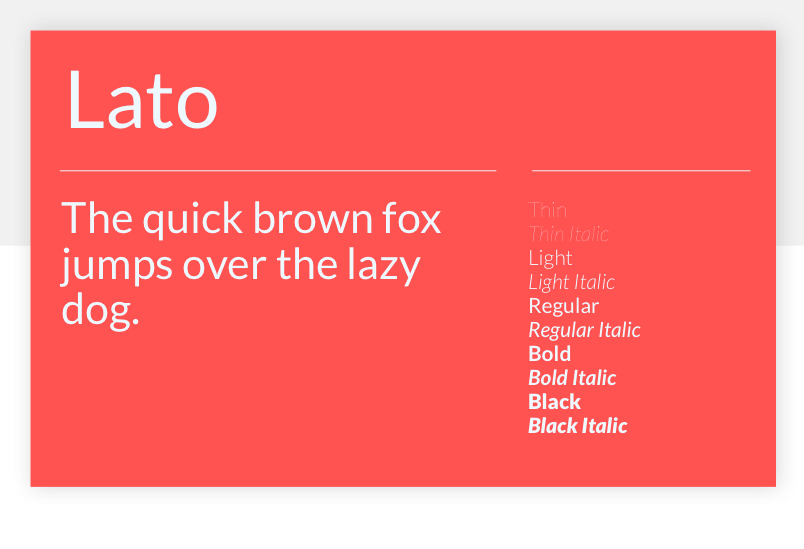
Warsaw-based designer, Łukasz Dziedzic, created Lato to work transparently in body text and also to stand out individually when used in larger-sized titles. This sans serif typeface family is simultaneously familiar and different – most especially in the way some of the font’s details are rounded off.
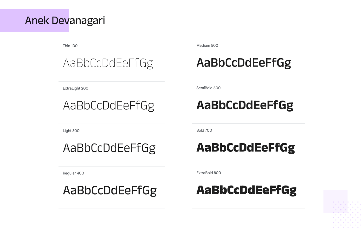
Anek Devanagari is a cool and modern sans-serif font that mixes traditional Indian style with a fresh, clean look. Perfect for anything from bold headlines to easy-to-read body text, this font shines in all sizes. We love that Google gives you tons of options with Anek Devanagari, from super thin to regular weights. It’s great for both digital and print projects, adding a touch of elegance and culture.
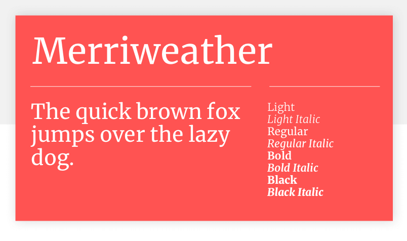
Eben Sorkin’s Merriweather is designed for optimal readability on screens. Merriweather’s large x-height boosts the font’s legibility, making it suitable for use in long texts as well as for headlines and titles. Merriweather currently has 8 styles: Light, Regular, Bold, Black, Light Italic, Italic, Bold Italic, Black Italic.
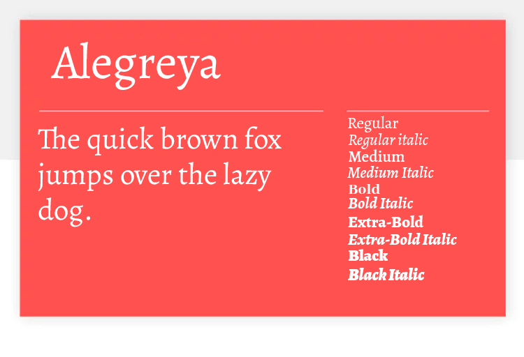
This Google font is very versatile, going back the old days of printed press in terms of shapes. Not surprisingly, this typeface offers good readability for long texts in large or small bodies. We love that Google offers so many styles for Alegreya, making this a many-faced font – from Regular 400 all the way to 800 black bold styles.
Design hi-fi prototypes for web and mobile apps with google fonts

Founded out of a Kickstarter project in 2011, Montserrat aims to “rescue the beauty of urban typography that emerged in the first half of the twentieth century”. This attractive sans serif font family was created by Julieta Ulanovsky, and is named after the Montserrat neighborhood in Buenos Aires where she lives.
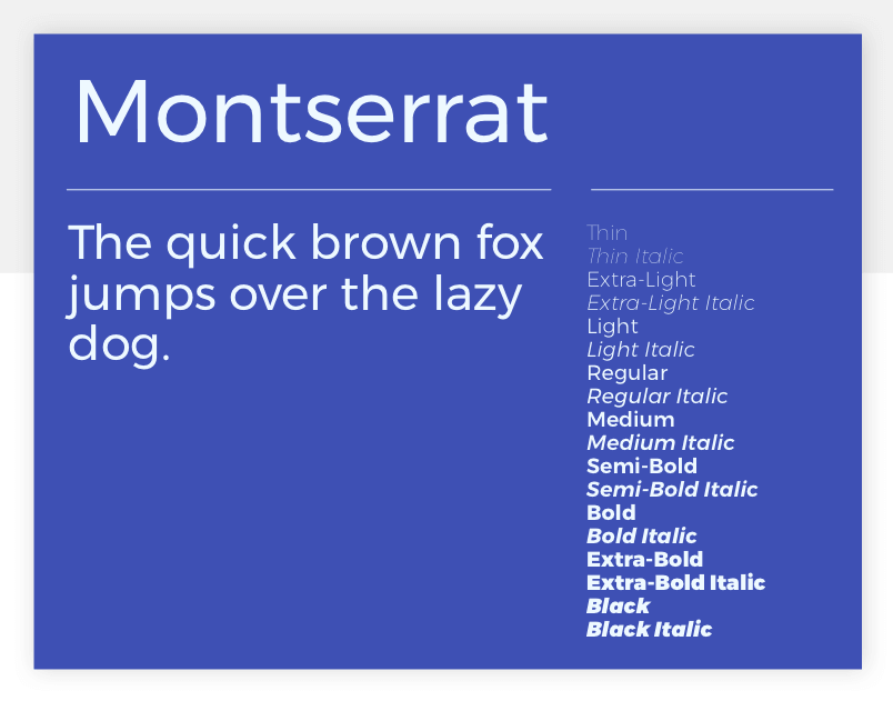
Writing about the inspiration behind Montserrat, Ulanovsky said, “To draw the letters, I rely on examples of lettering in the urban space. Each selected example produces its own variants in length, width and height proportions, each adding to the Montserrat family. The old typographies and canopies are irretrievable when they are replaced”. The resulting typeface is a modern classic, an up-to-date version of the elegance of early 20th century typesets.
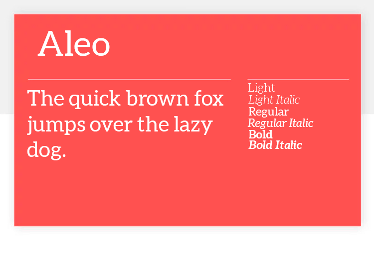
This serif typeface makes for a modern experience that respects classic usability standards. Made in close connection with another Google font we know and love, Lato, this font is also well-balanced and modern. With semi-rounded shapes and curves, Aleo is a friendly font that works really well for long texts.
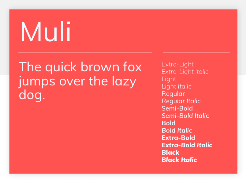
Muli is a versatile and minimalist sans-serif font which was designed by the late Vernon Adams. It was originally designed to be used as a display font but thanks to its spacing, it can work well as a text font too. Suitable for web and mobile applications, Muli also sports a single-story lowercase ‘a’, a relative rarity which is more a curiosity than anything else.
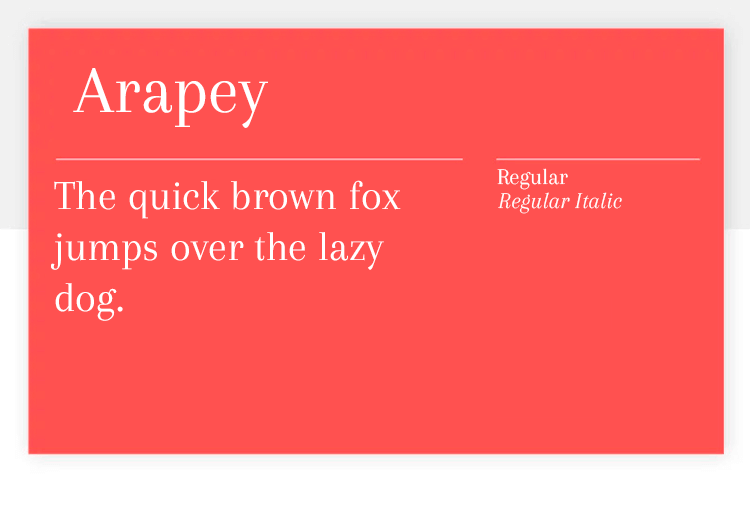
Arapey doesn’t offer too many different styles, but it’s still a wonderful Google font. The typeface has a modern structure, but still enjoys soft lines that makes for a great way to highlight content. Our designers love this font for its italic style, which is quite gentle and adds a certain glamour to any content.
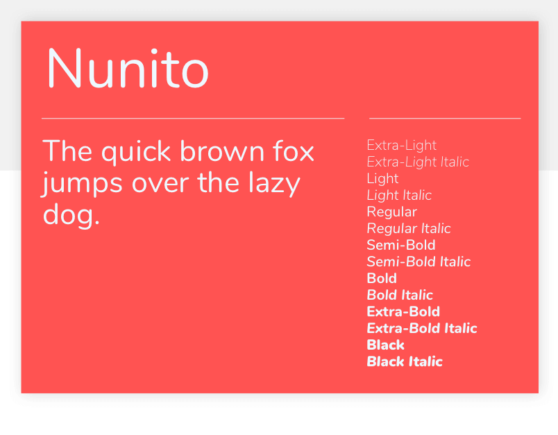
Another Vernon Adams creation, Nunito is a sans-serif font designed as a display font. With 8 different weights available, it’s a versatile, attractive font which we’d recommend using when you want a smart, stylish sans-serif heading.
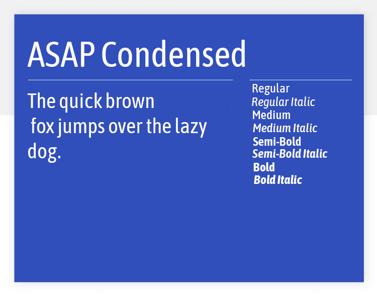
Asap Condensed comes with 8 styles, including semibold, bold and all their respective italics. It’s a handy Google font due to its standardized character width, making it easy to change styles without having to adjust the text. It’s a good condensed typeface that can make the most of headers and titles.
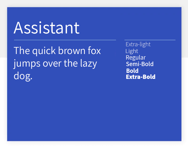
This is another very versatile Google font. Assistant is a clean typeface and offers a generous 6 styles, from extra light to bold. The carefully-planned spacing between the letters create a font with great readability. This, combined with the abundant bold styles makes Assistant especially good for larger bodies.
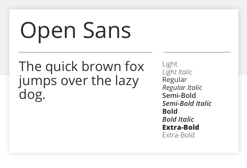
One of the most popular Google Fonts, Open Sans is an open, free sans-serif font for use in practically any scenario. Remarkably versatile, you’ll see that it combines well as a text font with pretty much all the other fonts in this listing, thanks to a simple, friendly design. Open Sans was created by Steve Matteson and is optimized for print, web and mobile uses.
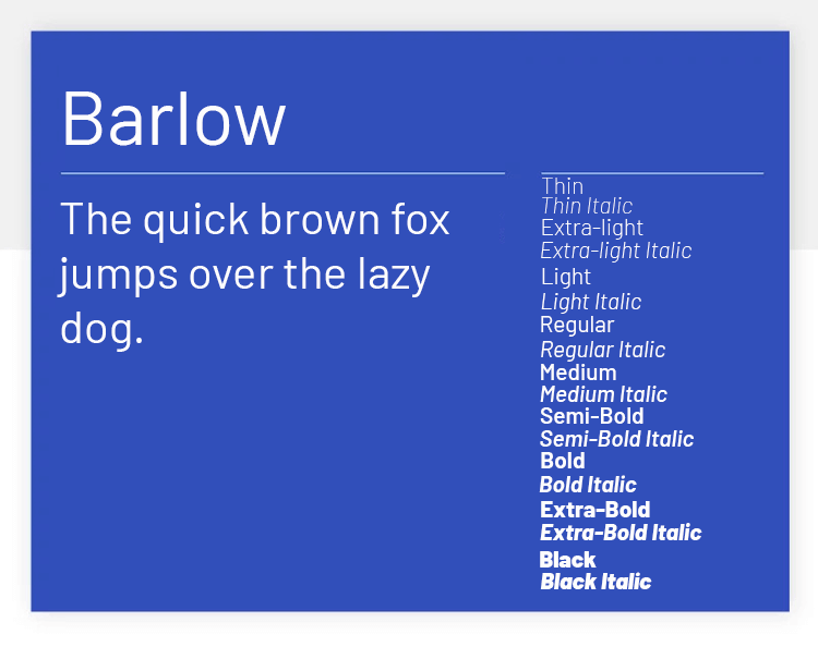
Barlow was made with the goal to reflect the general style of the state of California. This Google font shares traits and common shapes with the state’s license plates, road signs and trains. Aside from it’s curious visual roots, Barlow brings delicate rounded shapes and offers low contrast. It also has good readability, as well as 9 styles to choose from.
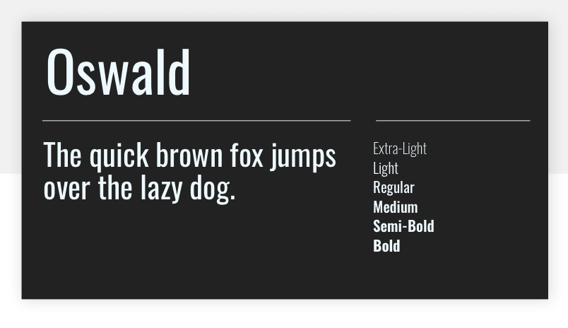
A reworking of the classic early-twentieth-century ‘Alternate Gothic’ typeface family, Vernon Adams’s Oswald font is designed for digital use on computers and mobile devices. Use it for titles or pull quotes that need to pop in spaces with size constraints.
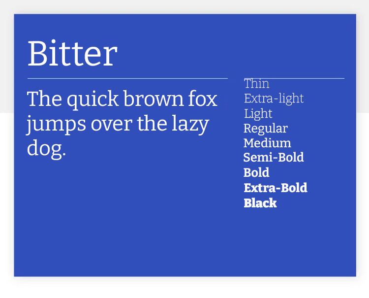
Bitter is a popular Google font, because of its great readability for long texts. Sol Matas, the designer who brings us this wonderful font, says that the inspiration behind this font was a humble and robust pixel. From there, Bitter evolved into a versatile tool with styles that range from extra light 200 all the way to 900 bold.
Design hi-fi prototypes for web and mobile apps with google fonts

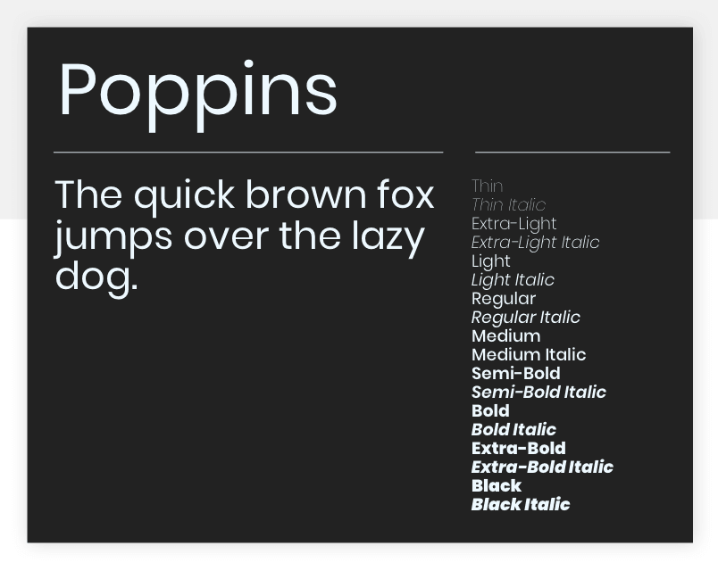
Poppins, created by the Indian Type Foundry, is an attractive, geometric sans-serif font for use in text or display contexts. It’s also the first font on our list to support the Devanagari system, which is used in over 150 languages including Hindi and Sanskrit.
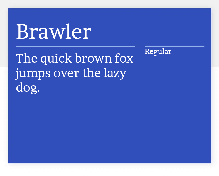
Originally intended for newspapers and tabloids, Brawler is a classic example of fonts that maintain an old-school style that still pleases crowds today. With its sharp edges and sturdy feel, this is a Google font that can add elegance to any design. It doesn’t come with different styles, but it’s still a wonderful font that can have a real impact on the user. The best part? Brawler offers great readability in small bodies.
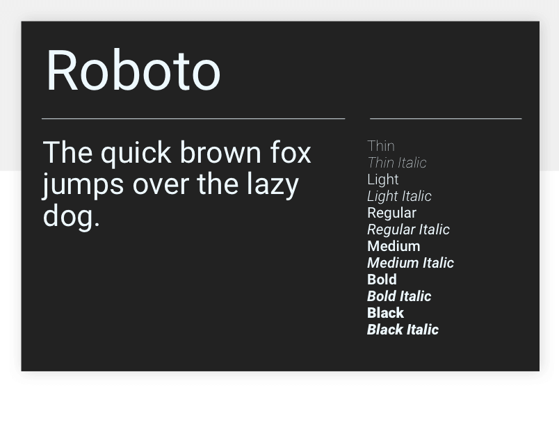
Google’s in-house Roboto is the most downloaded font on the Google Fonts website, and it’s not hard to see why. Clean, stylish and smart while simultaneously professional and friendly, Roboto is the default font for Android and Chrome OS, and is the font of choice in Google’s Material Design system. Roboto is simple and highly readable, for web and mobile uses.
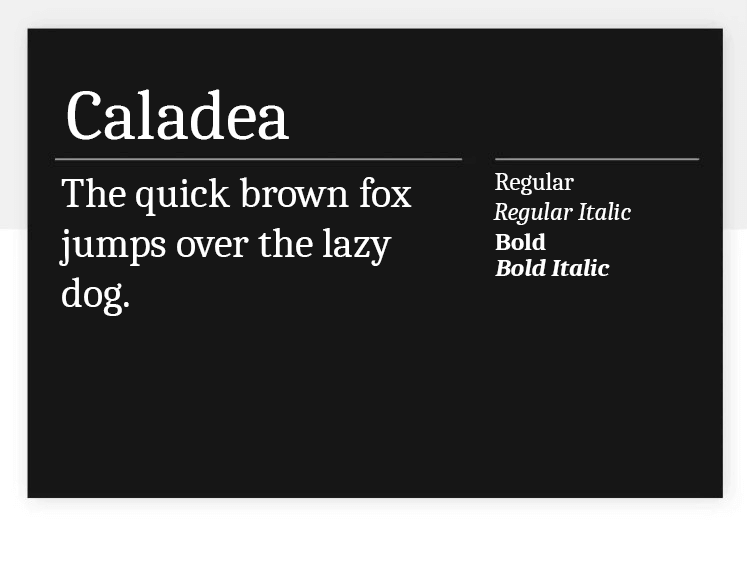
Caladea is a modern and friendly Google font. Created from Cambo, Caladea offers 4 different styles to choose from. The font is practical not just in the sense that it has styles to highlight content, but also due to its reliable readability. Caladea works both for big and dramatic titles and small texts that don’t overwhelm readers.
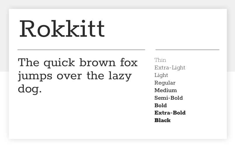
For something completely different, look no further than Rokkitt. Designed by Vernon Adams, Rokkitt was inspired by the so-called ‘Egyptian’ geometric slab serif fonts from around the middle of the nineteenth century. It’s clearly intended more for display purposes, but it still works well in text uses.
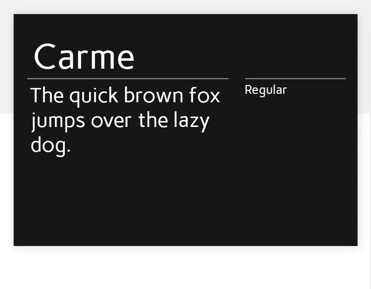
Carme is a Google font that offers clean visuals, with a dramatic but still readable result. Designed specifically for long paragraphs of text, Carme makes a good option for those looking to offer a lot of written content. The font doesn’t come with any style, but the bold one is soon-to-be released.
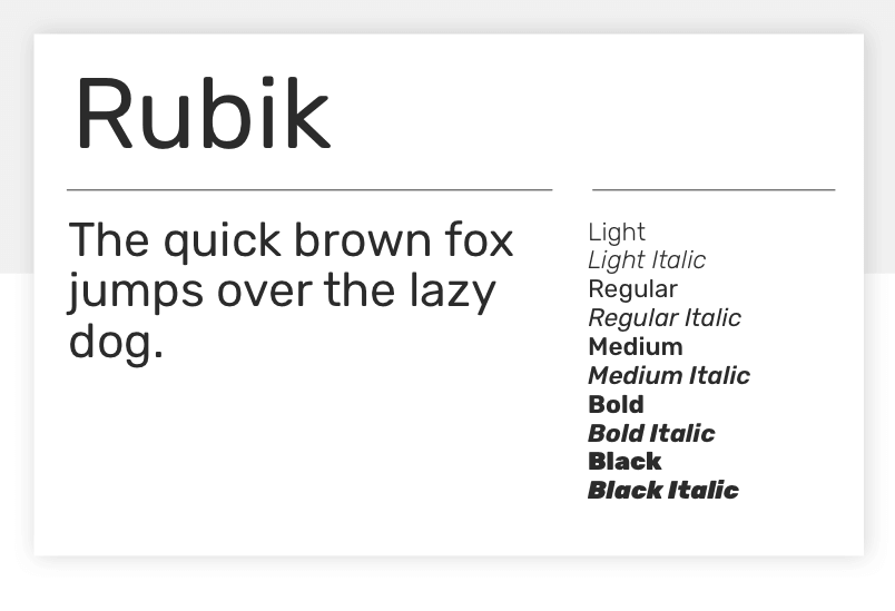
Rubik is a sans serif font designed by Philipp Hubert and Sebastian Fischer at Hubert Fischer, with a Hebrew variant revised and maintained by Meir Sadan. Rubik’s rounded corners lend it a pleasant, friendly feel. It’s perfectly at home in a display or text use.
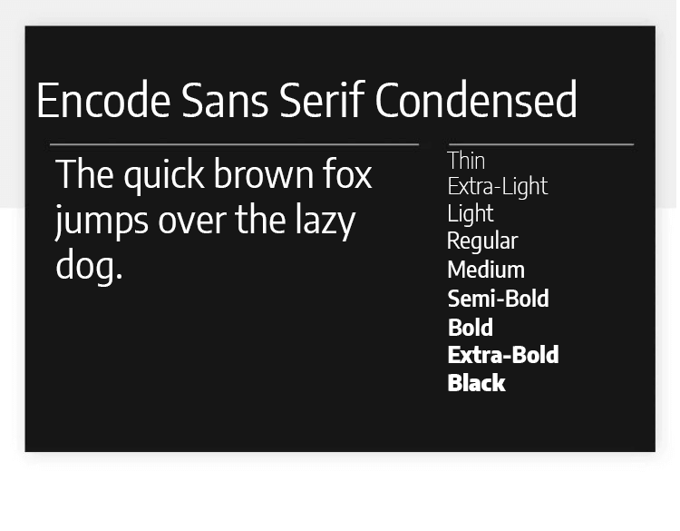
Encode Sans Semi Condensed is a Google font that our designers love for big titles. The font comes with many different styles, going from Thin 100 all the way to Black 900, making it a practical font to have at hand. Encode Sans Semi Condensed is the perfect font for big and dramatic headers and works well for highlighting content.
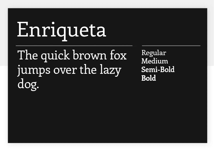
Enriqueta is a Google font that also brings a certain glamour to any page, but it’s special in its own way. This font has bold features that reminded our team of old-times, adding a Rockwell sort of vibe to the page. The best part? Enriqueta is very well-balanced, and even though it has strong visuals, it still delivers great readability – even in very small bodies!
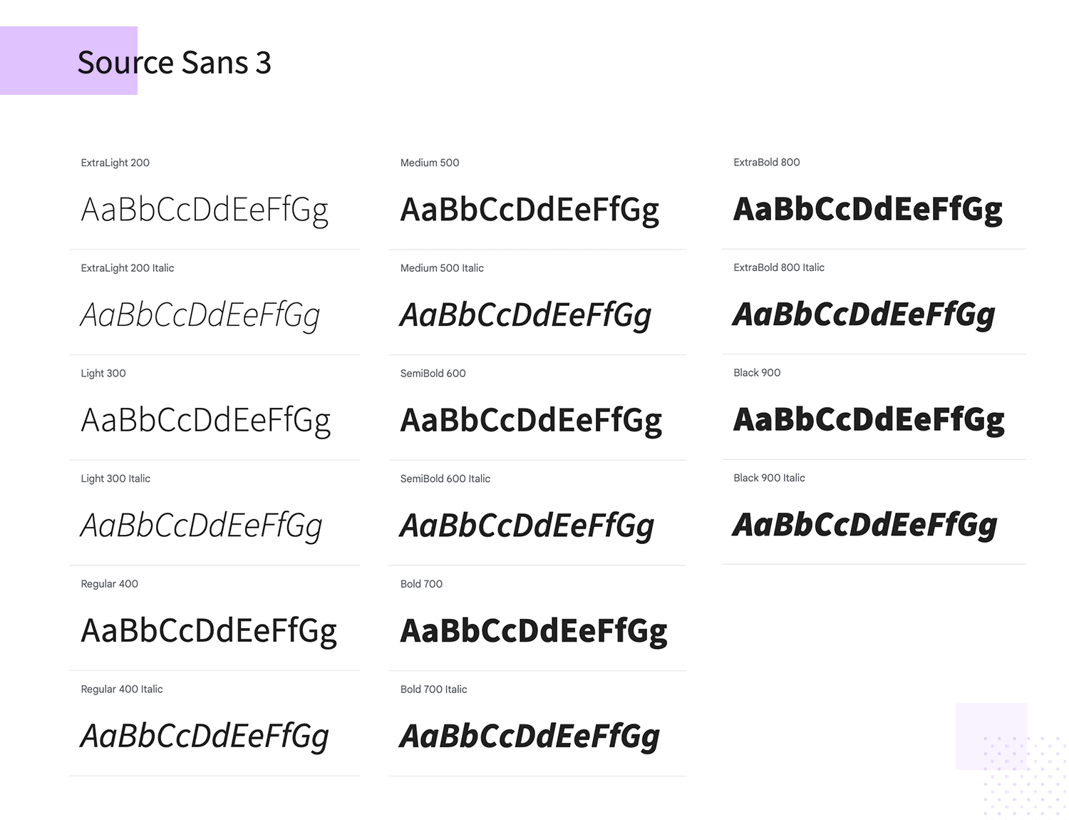
Designed by Paul D. Hunt, Source Sans 3 is Adobe’s first open source typeface family. It’s a sans-serif typeface which is really intended for use in user interface elements, but which also works well for longer texts, thanks to its width, which is higher than normal.
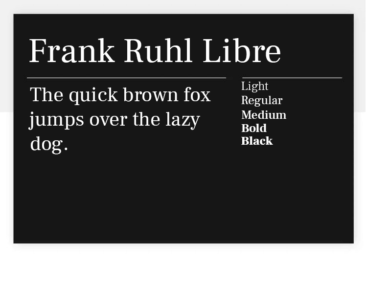
Frank Ruhl Libre was made with the intention to be unique – and it certainly achieves that. This is a condensed font that manages to differentiate itself from all the others on this list due to its strong but not overwhelming visuals and interesting proportions. We love the reduced contrast between the thin and broad strokes from letter to letter, making this a good typeface that still delivers a good readability.
Design hi-fi prototypes for web and mobile apps with google fonts

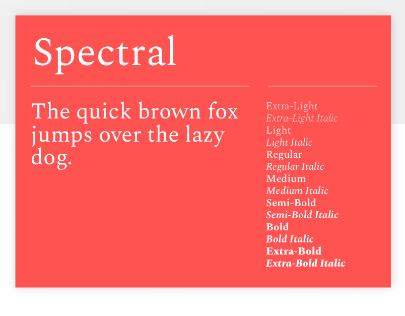
Spectral is a serif typeface commissioned by Google for use in its Docs and Slides web applications. Elegant, modern and beautiful, Spectral is at home in titles and pull quotes, as well as body text. Combine it with a sans serif font like Open Sans for best results.
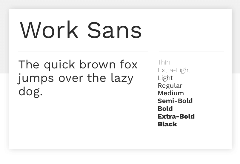
Designed by Wei Huang, Work Sans is based on grotesques (the inspiration for all sans-serif fonts) from the turn of the twentieth century. Its different weights are designed for different uses – the regular and medium weights are aimed at text uses, while the heavier and lighter weights are optimized for display purposes.
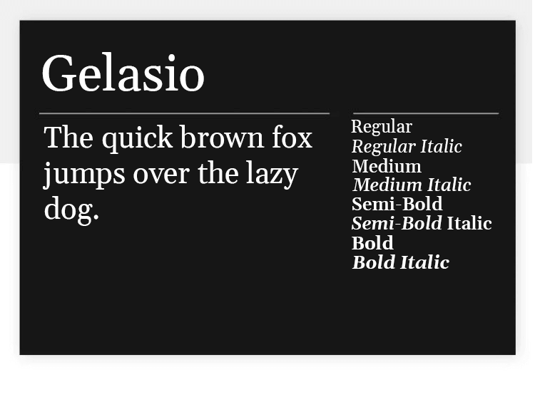
Gelasio is a wonderful Google font that is all about versatility and practicality. The font comes with 8 styles, ranging from regular 400 all the way to bold 700. Our designers love Gelasio because it offers great readability, both for long paragraphs in small bodies and big and flashy titles or highlighted content.
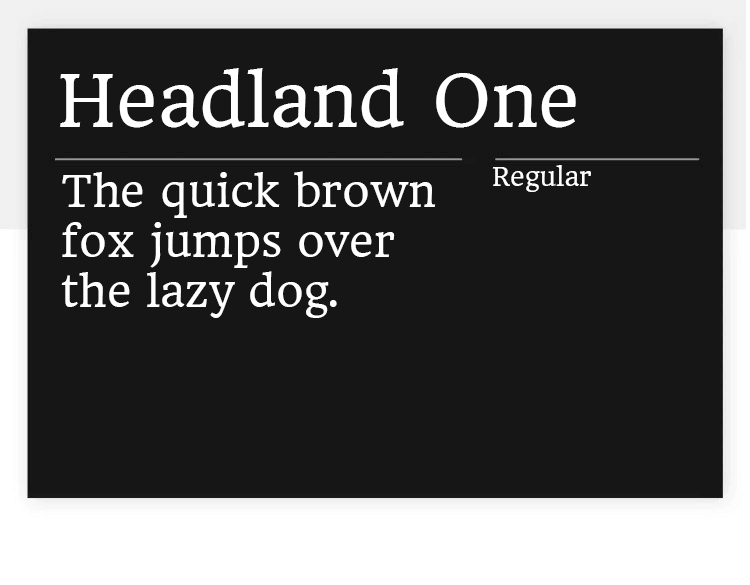
Headland One is a great Google font for smaller bodies. The font itself has shapes that are classic while still having eccentric details that give off a unique feeling to readers, especially when used in small size in long paragraphs. Headland One doesn’t come with any different styles to apply, but the font itself is distinctive enough to also be used in headers and titles.
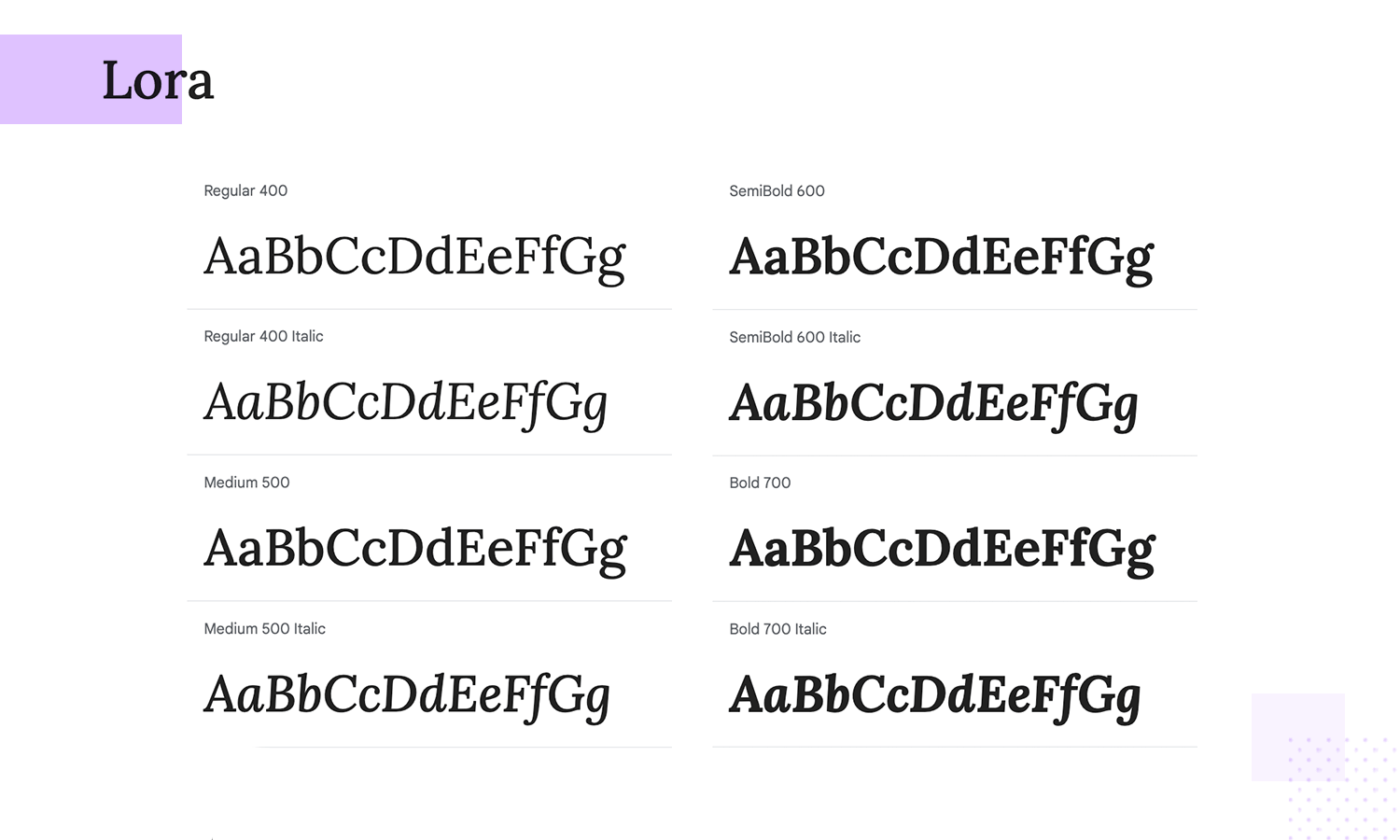
Lora is a well-balanced serif font with roots in calligraphy, offering both elegance and readability for your google fonts website. Perfect for both screen and print, Lora stands out in long-form texts, making it an ideal choice for storytelling. Its brushed curves provide a unique and modern feel. Explore Lora for a versatile and sophisticated design experience.
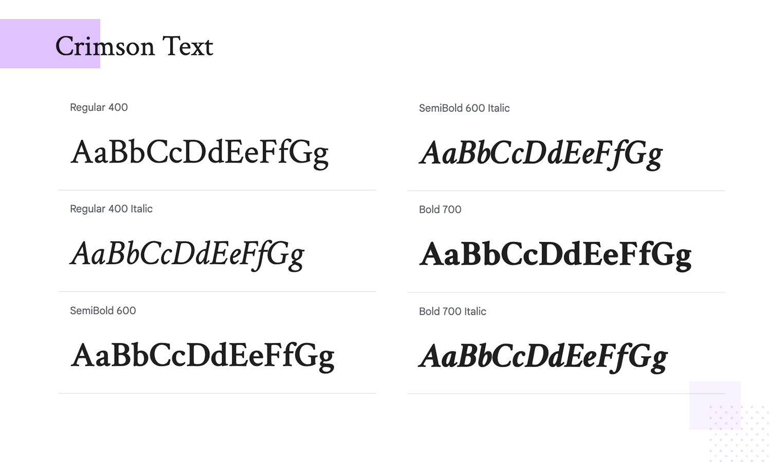
This Google font is a beautiful, classic serif font designed for book production. Crimson Text has elegant curves and its readability make it perfect for long-form texts. Inspired by old-style typefaces, it brings a touch of sophistication to any project. Ideal for both print and web, it ensures your text is both beautiful and legible.
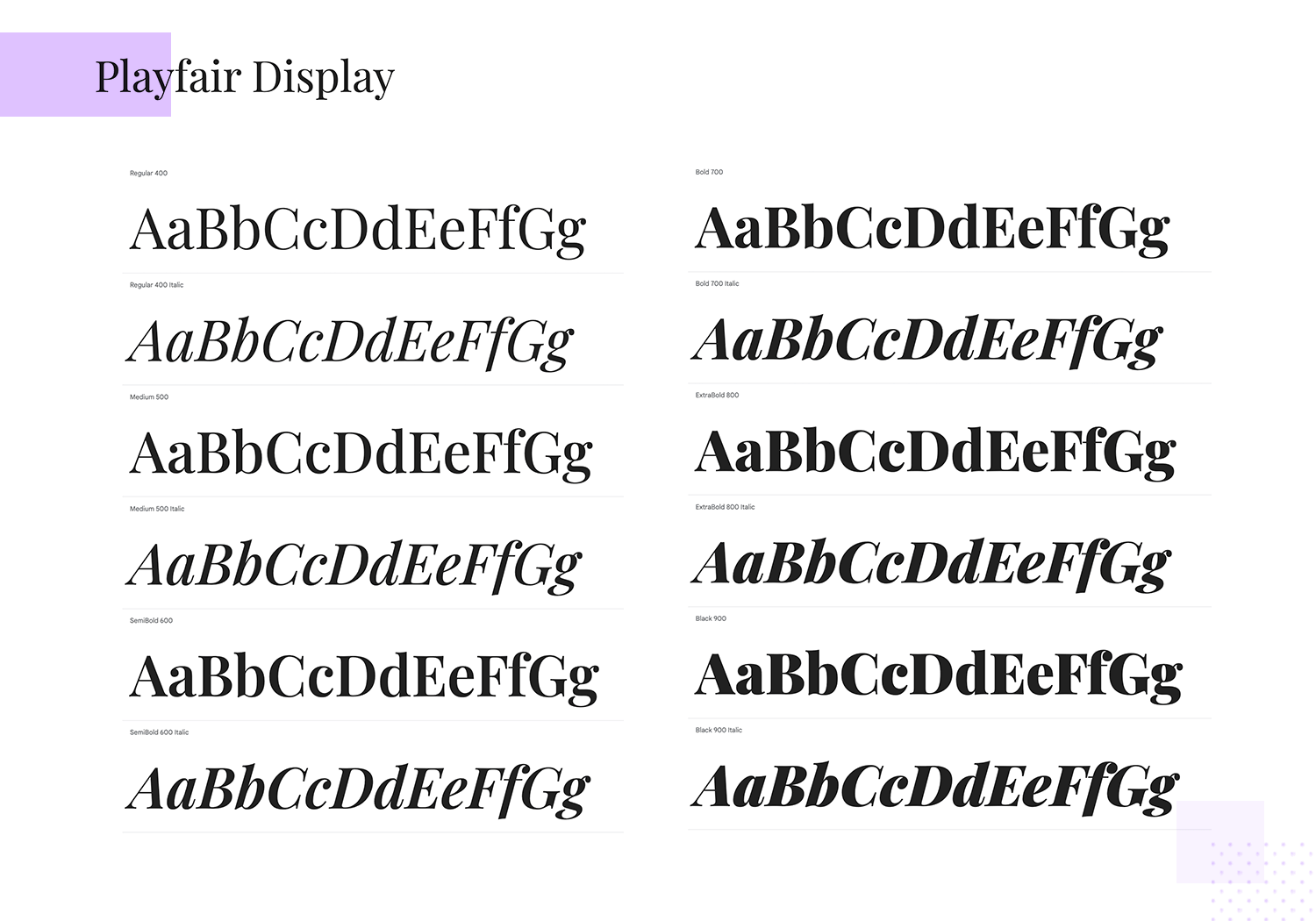
Playfair Display adds a dash of old-school charm to your modern website. Its eye-catching letters, inspired by 18th-century Europe, are perfect for headlines and titles. With its fancy serifs and elegant curves, Playfair Display brings a timeless touch to your web typography.
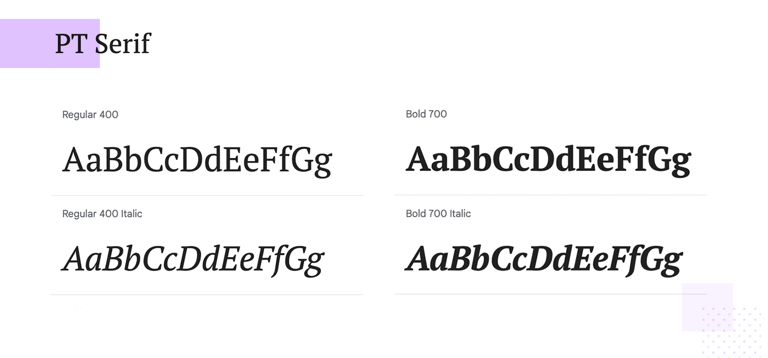
PT Serif is a versatile font that blends classic and modern styles, making it suitable for various projects. It supports many languages and is easy to read on both screens and paper. Its elegant serifs give a professional touch, perfect for adding a classic, authoritative look to your designs.
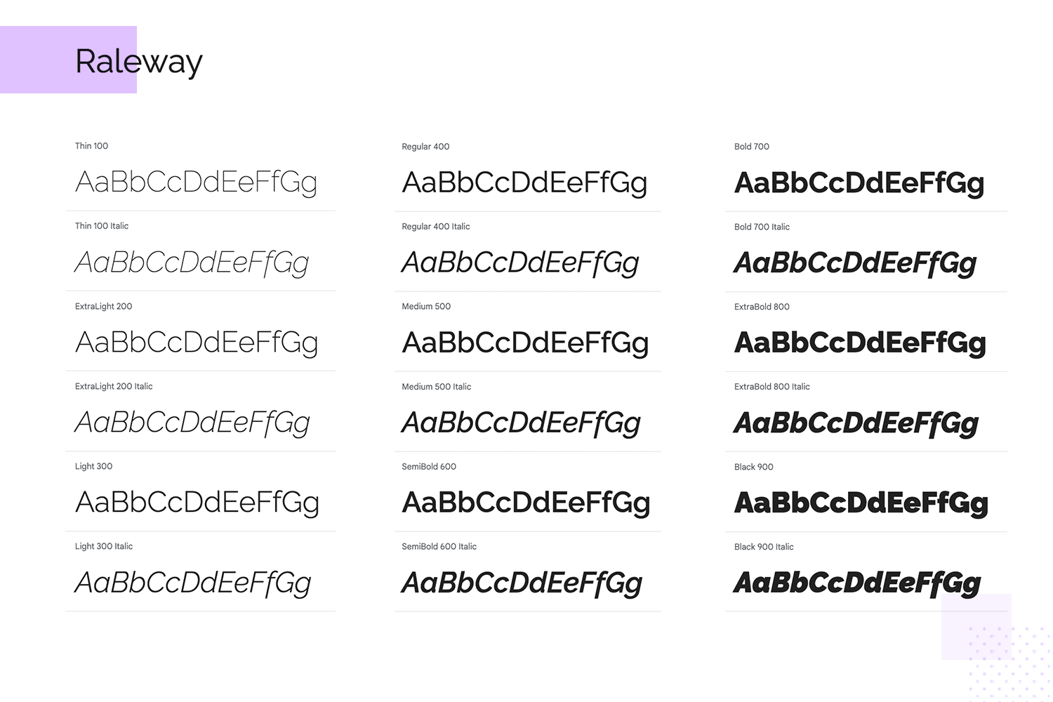
Raleway is a sleek, modern sans-serif font known for its clean lines and geometric structure. Ideal for headlines and display purposes, Raleway adds a sophisticated and minimalist touch to your google fonts website. Its extensive weight range allows for versatile use across various design elements. Integrate Raleway for a crisp, contemporary appearance.
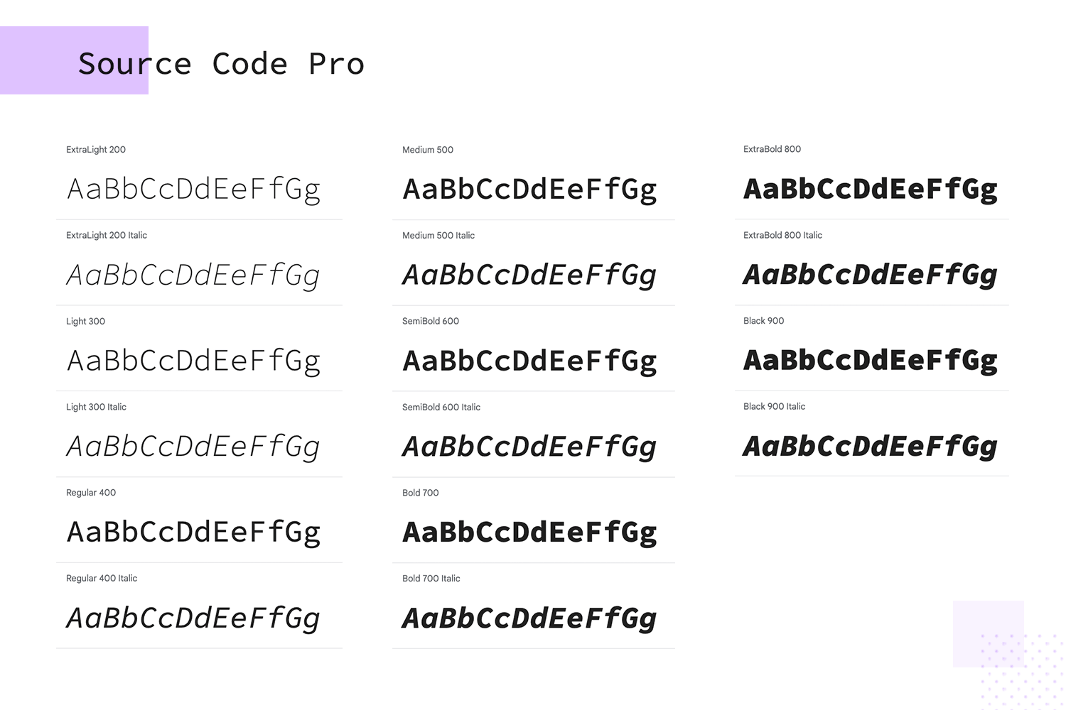
Source Code Pro is a font designed for programmers. Made by Adobe, it’s easy to read and perfect for coding. Its clean look makes it simple to understand code and find errors. It comes in different styles and is free to use for anyone.
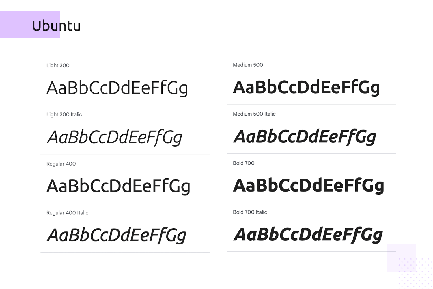
Ubuntu is a modern, humanist-style font that reflects the spirit of Ubuntu, the open-source software platform. Its rounded letterforms and excellent readability make it a great choice for web and mobile interfaces on any google fonts website. Ubuntu provides a friendly and contemporary vibe, perfect for tech-related content. Implement Ubuntu for a welcoming, modern touch.
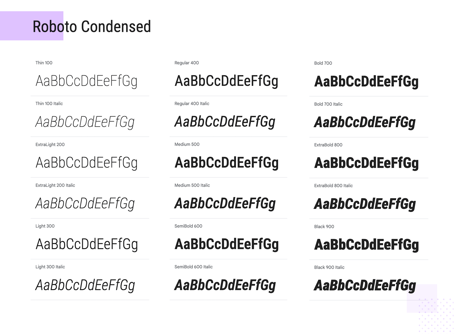
Need a font that’s both stylish and space-saving? Roboto Condensed is a sleek version of the popular Roboto font, perfect for websites or projects where space is limited. Don’t worry, it’s still easy to read and looks great in headlines or body text. Give your design a modern, compact look with Roboto Condensed.
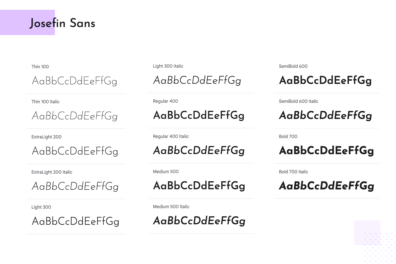
Josefin Sans is a geometric and elegant Google font website. A sans-serif font inspired by 1920s geometric-style fonts. It’s perfect for headlines and larger text, adding a touch of vintage charm to your design. Its sleek lines and versatile weights make it a favorite for modern web design.
Design hi-fi prototypes for web and mobile apps with google fonts

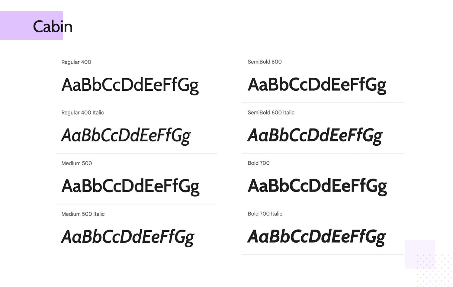
In your search for the best Google font for your website, consider Cabin is a friendly and versatile font that’s perfect for any project. Its clean, approachable look makes it ideal for headlines and body text alike, whether you’re designing a website, or creating printed materials With its rounded corners and balanced strokes, Cabin adds a touch of modernism to your designs while remaining easy to read.
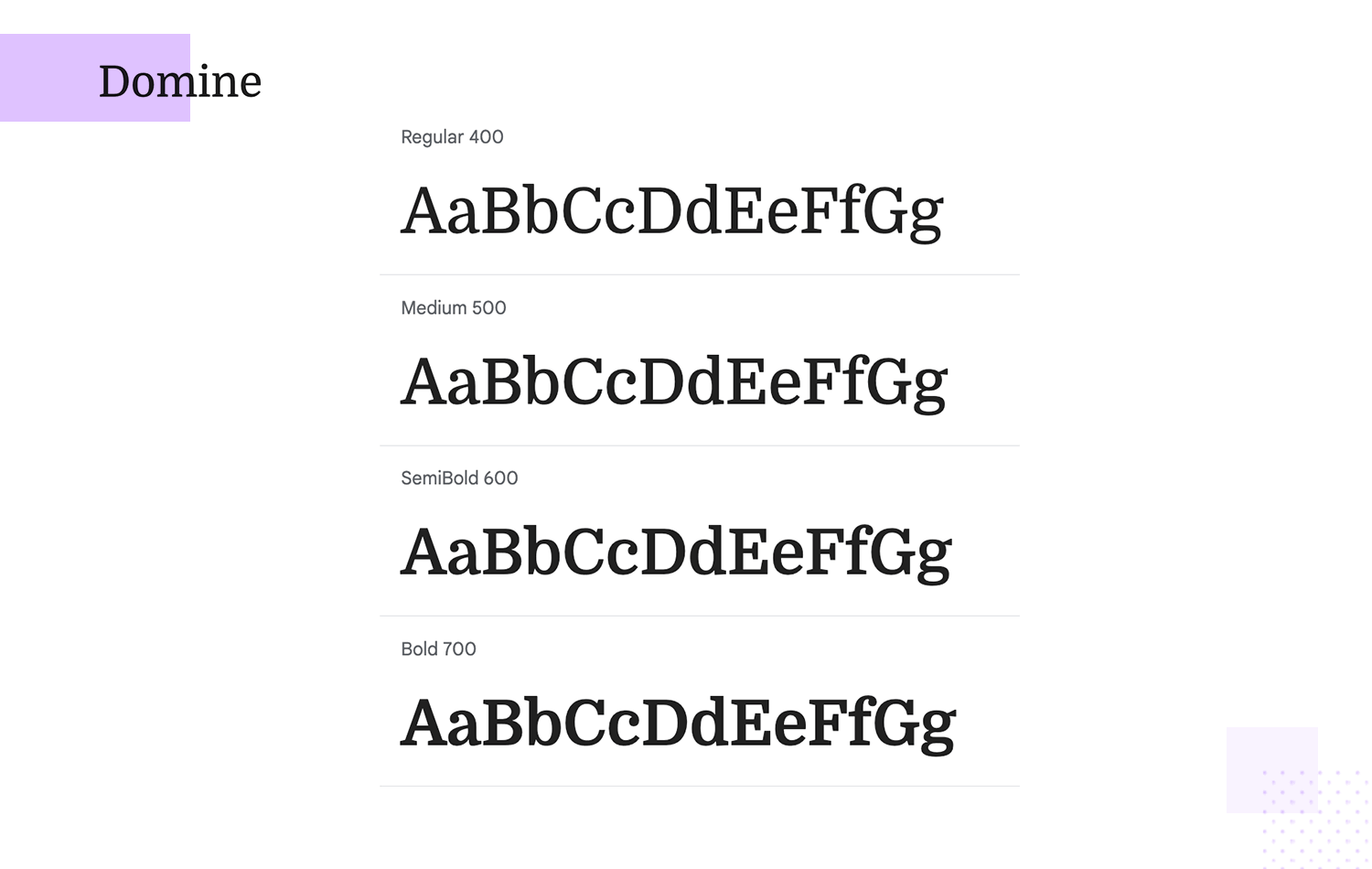
Looking for a Google font that’s both easy to read and professional? Domine is a great choice. This serif font is designed for screens, making it perfect for websites with lots of text. It’s clear and easy on the eyes, so your visitors can focus on your content.
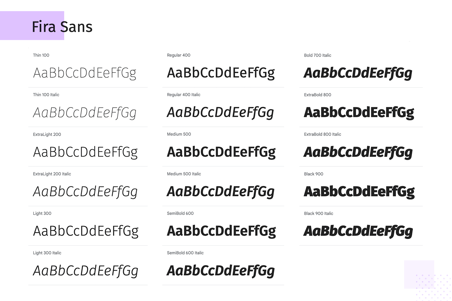
Fira Sans is a versatile sans-serif font designed for Mozilla’s Firefox OS. It offers excellent readability in various sizes and styles, making it perfect for both body text and headlines. Its modern and clean look ensures your text is easy to read and visually appealing.
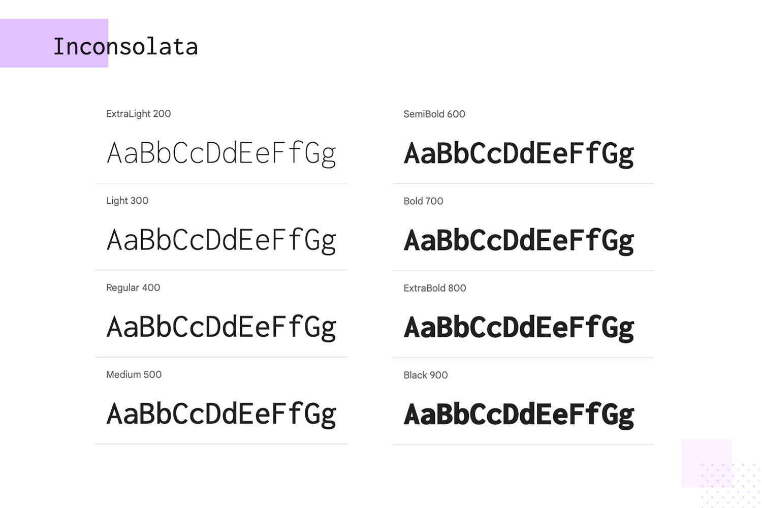
Need a font that’s easy on the eyes for long hours of coding? Inconsolata is designed just for that. This monospaced font makes code and technical documents easy to read, helping you focus on your work without strain. Whether you’re a developer or a technical writer, Inconsolata is a great choice for clear, readable text.
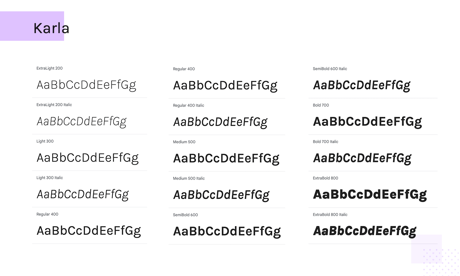
Karla, a simple and clean sans-serif font, offers both style and readability for your on-screen content. Whether you’re designing a website or crafting printed materials, Karla’s versatility and well-balanced letterforms make it a great choice for clear and stylish text.
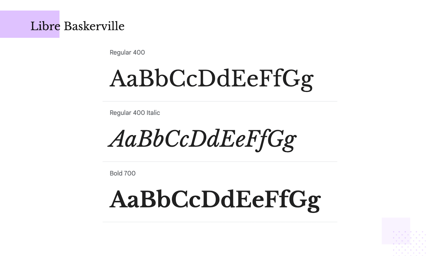
Libre Baskerville is a web font optimized for body text, offering great readability on screens. Its classic serif design is inspired by the American Type Founder’s Baskerville from 1941. It’s perfect for long texts, providing a touch of elegance and history to your content.
Design hi-fi prototypes for web and mobile apps with google fonts

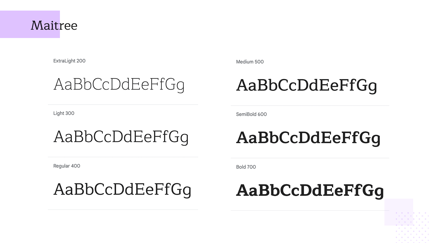
This Google font website combines the best of traditional Thai and contemporary Latin type design. Maitree’s unique character shapes make it stand out while ensuring readability. Perfect for bilingual content, it offers a harmonious blend of cultures in your typography.
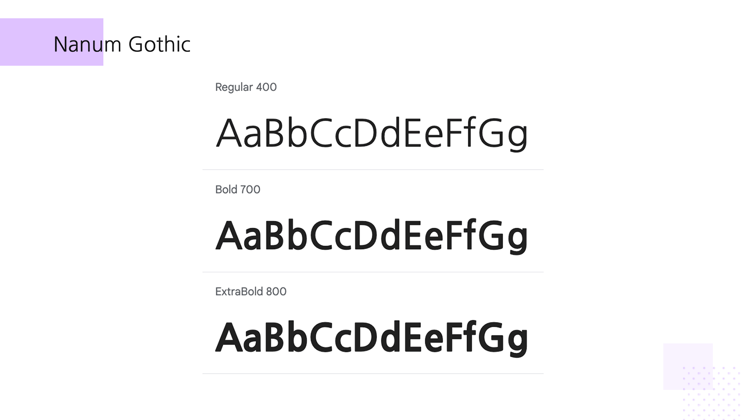
In your search for the best Google font for multilingual projects, consider Nanum Gothic. This Korean and Latin font family offers a modern, clean design that ensures excellent readability across both web and print platforms. Its versatility and clarity make it a top choice for multilingual projects.
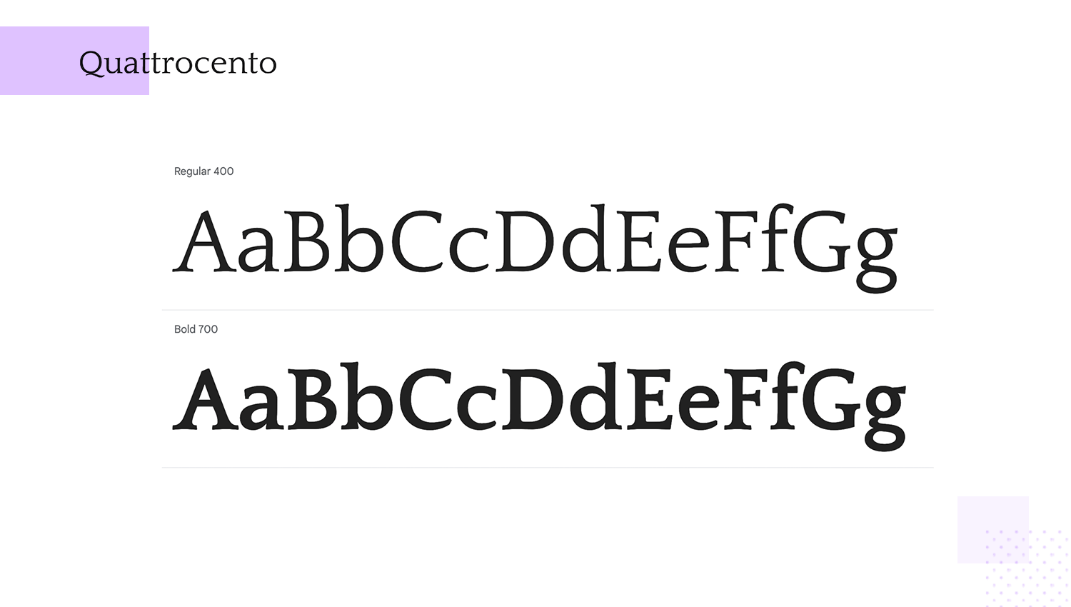
Quattrocento is a classic serif font designed for readability and elegance. This website Google font with its large x-height and wide letterforms makes it perfect for body text and headings alike. Inspired by classical proportions, it brings a timeless feel to your designs.
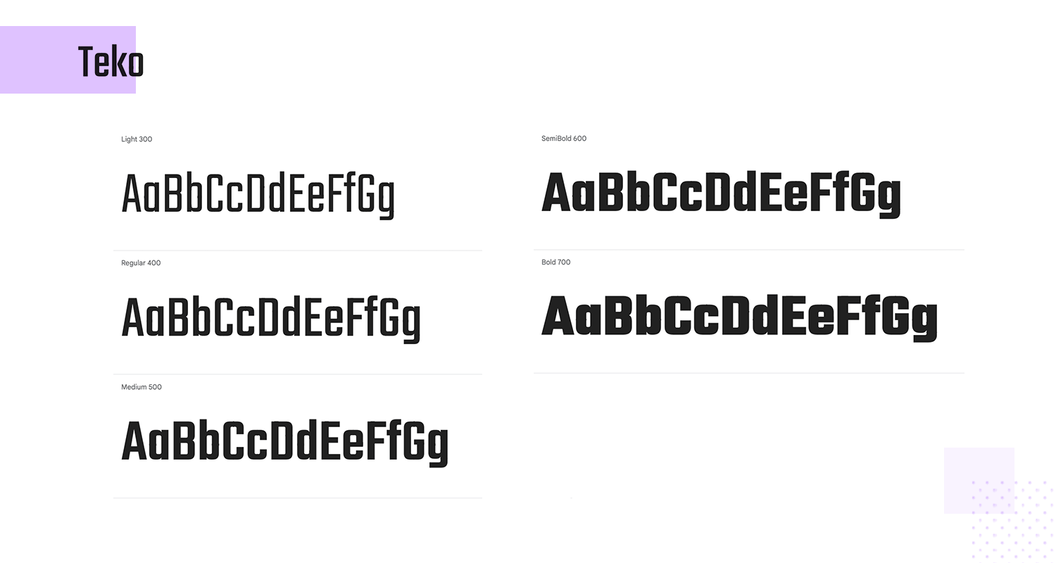
In your search for the best Google font to make your headlines, posters, or any project pop, Teko is a standout choice. This condensed sans-serif font, with its tall and narrow letterforms, is designed to grab attention. Its modern and dynamic style ensures your text won’t be ignored.
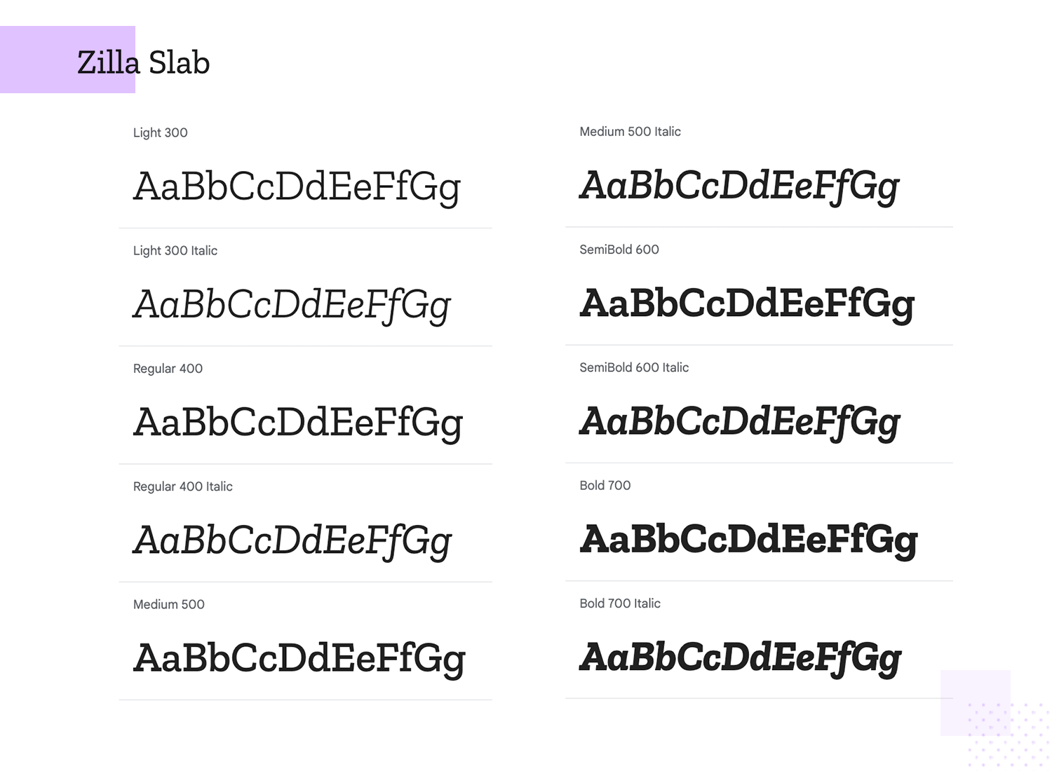
Looking for a font that’s bold and eye-catching? Zilla Slab is a great option! This contemporary slab serif font combines strong letterforms with a modern touch, making it perfect for headlines and display text. Even at small sizes, it remains easy to read, making it versatile for various design needs.
Another great thing about using Google Fonts on your website is that even if you’re just getting started with creating your website, they’re really easy to use.
Google provides a simple guide to getting started with Google Fonts for your website.
Google Fonts are an incredibly powerful and versatile resource for your website. Giving you access to over 900 fonts, Google Fonts can make your website look better while boosting its performance and improving the overall speed of the internet. Even better, Google makes it easy to get started with Google Fonts on your website.
Integrate Google Fonts into your website now and you won’t look back!
PROTOTYPE · COMMUNICATE · VALIDATE
ALL-IN-ONE PROTOTYPING TOOL FOR WEB AND MOBILE APPS
Related Content
 A fun look at different data table designs, from basic lists to smart, interactive ones, based on how complex the data is and what users need.18 min Read
 Single page design v multi-page design – everything you need to help you choose the right design for your site’s content18 min Read
 Website backgrounds can be a powerful tool in creating an experience. But what kind of experience can you convey and how? We got the full run-through for you!14 min Read
