Learn how card sorting can help you nail your website’s user experience and discover some of the best online tools!
What’s so special about card sorting? Nothing, really – it’s quite simple. It’s exactly as the name suggests: users sort cards into different groups or piles. Why do this? Because it can help us come up with a more user-friendly information architecture (IA)!
Start designing and testing new prototypes today with Justinmind
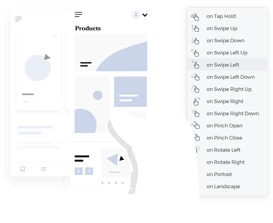
A better IA means users can navigate your website or app more easily and find what they need faster. That’s just good usability, right?
To learn how you can take advantage of this simple and effective method of user testing, read on! We’ve also thrown in a list of 5 of the best card sorting tools on the market to get you started.
Card sorting is a UX design user testing technique that focuses on establishing the best structure for an IA. That is, to make both labels and groups on websites or apps more intuitive to users by considering how they would organize the information on your site.
It’s a technique that works by way of determining the domain knowledge of your users, discovering their mental models and finding out the best way to organize your IA to cater for these mental models. That way, you can ensure they find what they need quickly and have the best user experience possible.

Image from icons8.com
Users simply sort cards with topics or menu labels into categories or groups that make sense to them. In many cases, you can even get your users to name the categories for you, rather than simply naming something without knowing if other people will understand the concept.
You can perform a card sorting test offline, with real cards, markers and a spreadsheet, or you can do it digitally and remotely, with a card sorting tool.
Card sorting is a quick, simple and cost-effective method of user testing that’s also quite reliable, depending on the number of users you perform it with.
Start designing and testing new prototypes today with Justinmind

Card sorting is one of the methods you can turn to when looking to organize the content in your website in a way that’s understandable and user-friendly. This is because you can use the results of a card sorting session to improve the information hierarchy. But how exactly does it improve the IA?
First let’s look into exactly what IA is. In short, IA is basically how you arrange and structure the content on your website, with the main goal being to make it user-friendly. This enables users to easily find and navigate to the information they need.
By carrying out a card sorting session with your users, you’re gaining an insight into not just their understanding of your website’s content, but also their mental models – all of which will be reflected on your work when it’s time to bring out your prototyping tool. The latter is a concept echoed many times throughout the UX world and it’s based around the user’s understanding of how something works, such as a website or app.
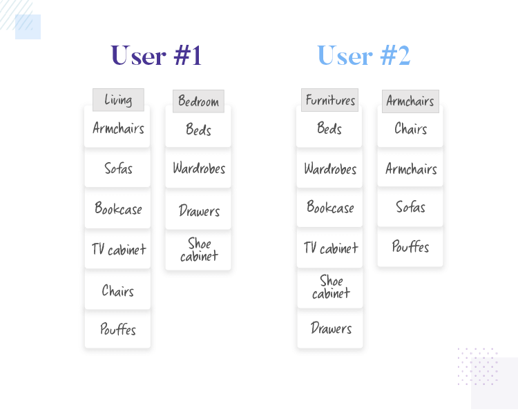
Users from the same demographic may have different mental models
In terms of the IA of your site, the user will have their own ideas and assumptions about how everything is organized. And here’s the kicker – their ideas might be different to yours. Card sorting enables you to structure your content from the point of view of the user, as opposed to your own or that of your company.
The problem that many large websites these days seem to be faced with is a severely lacking content strategy. This is in part due to, according to Smashing Magazine, a highly paid person in the office being over-assertive with uninformed opinions of how information should be categorized, labeled and organized.
Card sorting is one of the ways to beat this by using a scientific method to form a basis for the rational of how you group and categorize the information in your product.
So how does card sorting help to improve the IA of your website or app? It helps by informing you of what your users’ mental models are. It helps show you where they would naturally and intuitively go to find a certain piece of information, execute a certain task or where they’d find a certain piece of information.
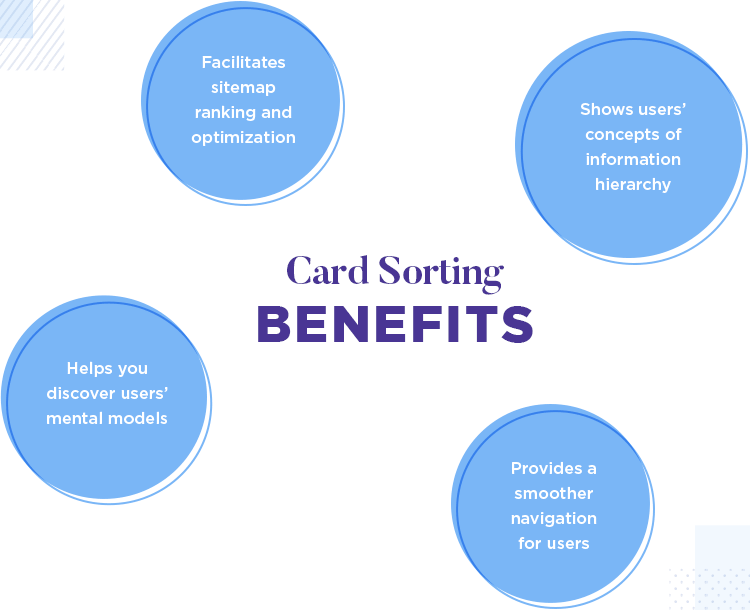
Using this information can help you make informed decisions about the kind of content hierarchy that works best on your site, along with the appropriate methods of categorization. This will help you to optimize your sitemap which will help increase both the findability and discoverability of your website.
By increasing the findability, you’re helping users navigate more smoothly around your website. You’re also boosting discoverability, which is a common usability heuristic measuring how well users can “learn” how to use your website.
Your website or app’s degree of discoverability is closely linked to how well it fits your users’ mental models.
According to usability geek, card sorting improves IA directly by helping you improve information classification and labeling on your website or app, as well as labeling menu options. Card sorting can help you decide what exactly to put on the homepage, for example, but also how to label categories and structure the navigation of your website.
Although it’s not the solution to everything, it can indeed point you in the right direction. The trick to finding the perfect IA, is to test, analyze and test again! One of the great things about card sorting is that you can use it for both new and existing IAs.
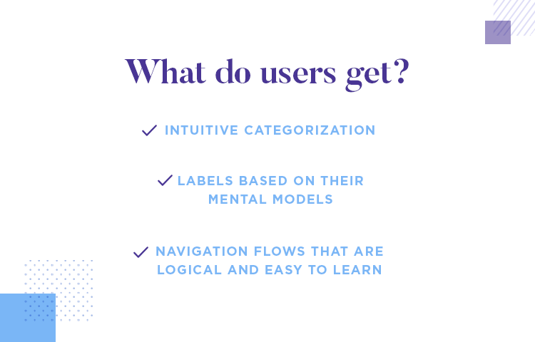
Card sorting is a great way to understand how your users think and what they expect. As a result, it will be much easier to design an IA that suits their needs as you’ll now have the appropriate compass heading.
Start designing and testing new prototypes today with Justinmind

Card sorting is a simple and straightforward method of user testing that gets results fast. However, variety is the spice of life and even the most basic techniques have their own specific variations that are worth knowing.
Open card sorting is the most simple and direct method. We say direct, because the user is actually doing all the work for you, without it feeling that way. The user simply takes a bunch of cards with information written on them and sorts them into groups that they perceive to be logical. They then categorize by adding names to these groups.
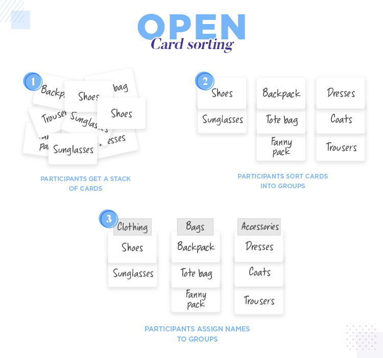
Open card sorting is a great way to gain insight into your users’ understanding of your website’s content. The benefit comes in the fact that, by letting them assign names to the groups they’ve created with your pile of cards, you get an understanding of how they conceptualize all that content.
On the other hand, closed card sorting is exactly the same – the user groups the cards into categories, except the categories are ones that you’ve created. One of the insights that this variation on card sorting can help you glean is how well existing categories, or categories that you were planning to choose, support and hold the information from the user’s perspective.
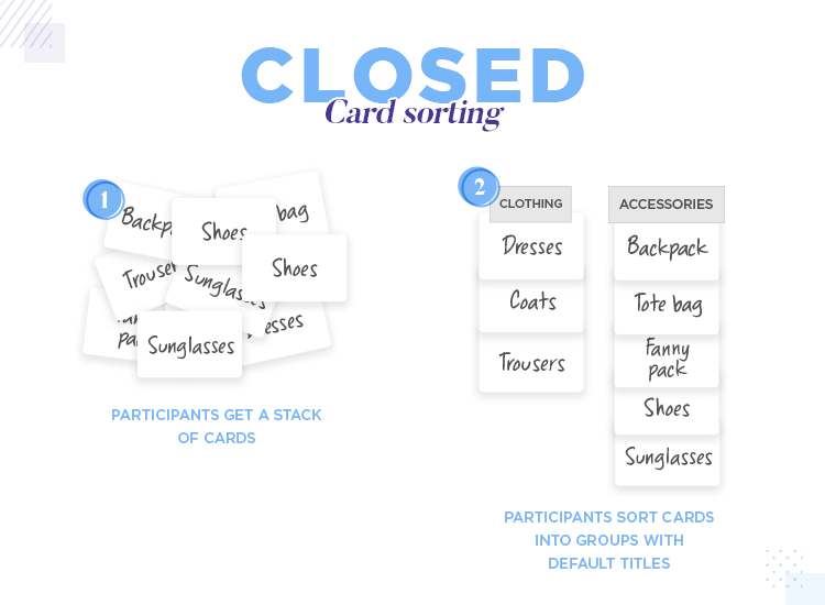
For the best results from closed card testing, we recommend that you use it in conjunction with open card sorting. That is, to let the users define the category names in the first round of testing, and then subsequently test those categories to see if they really work for all users.
Hybrid card sorting is a variation whereby you provide your users with both marked and unmarked categories. Designers normally deploy the hybrid card sorting technique when they already have certain categories established, but would like user input into how the others should be labeled.
As an example, imagine that you have all of the main categories of your website already defined, but you still need to create subcategories. Hybrid card testing would allow your users to sort the cards into the categories they believe to be relative, then divide those categories into subgroups which they would then name themselves.
Moderated card sorting involves a researcher getting extra insights from the users. Ways in which they might do this include recording the information during a session as a user “thinks aloud”. Another way is by interviewing the users post test to gain extra insight about their choices and to ask questions about specific cards, if necessary.
Conversely, unmoderated card sorting is exactly as the name suggests – the user simply does the card sort on their own and checks out. Users normally perform unmoderated card sorting online, with the help of a card sorting tool. The reason some design teams employ this method as it generally tends to be the quicker, cheaper option.
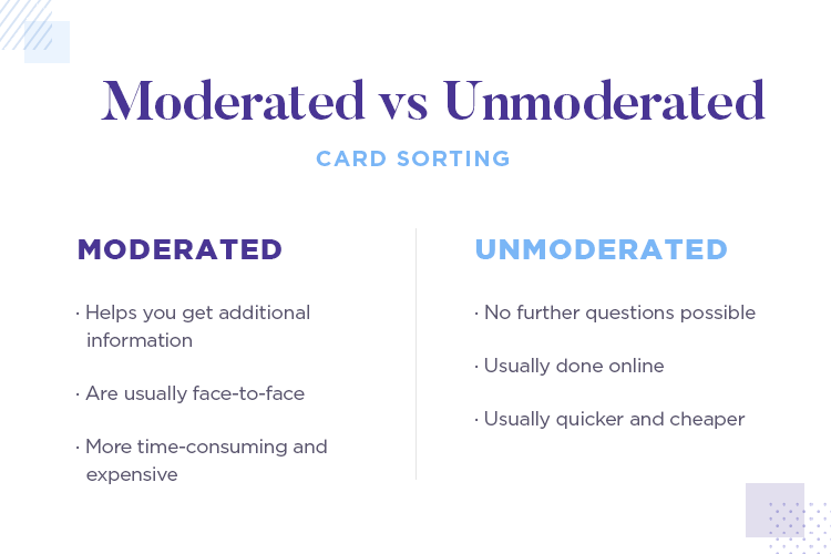
For optimum results, we’d recommend combining both moderated and unmoderated card sorting. Here’s why: imagine you have a large userbase to test on. Let’s say, 40 users. It may be more cost effective to use moderated card sorting with the first 10 users, followed by unmoderated testing with the other 30 so as to confirm the results of the first 10.
Paper card sorting is the traditional version of this user research method. As the name suggests, users take physical cards with topics or names and organize them into various piles on a large table.
Paper card sorting has the following advantages, the first being that there’s no major learning curve because there’s no technology involved. All they have to do is move cards around. The second is the degree of flexibility it offers: users can start again, reshuffle the cards, or easily look back through the piles.
The other option is digital card sorting which requires a special type of software. The advantages of this method is that it prevents physical accidents, such as cards falling onto the floor and users can easily drag and drop cards into different groups.

The other advantage is that you don’t have to manually record each group and what’s in it, saving you from the hassle of data entry. The possible downside with this is that, as with any tool, there is some degree of learning involved. That’s why it’s best to choose a tool that’s simple and easy to learn. We’ve provided a list of some of the best card sorting tools on the market below.
Start designing and testing new prototypes today with Justinmind

Eurostar provide an interesting example on their website of a card sorting test for experienced and inexperienced users. The userbase that they target consisted of both experienced web users and digital tourists. The goal was to come up with new labels for their website.
The first group regularly used the internet, booked events and trips and made purchases on ecommerce websites. In contrast, the latter group were used to going about things in a more traditional way, opting to shop in store and to purchase travel tickets and visas through a travel agent or at a desk.
The method Eurostar used to test these two groups was the open card sorting method. They were particularly clever in choosing this method because it meant that they could get an understanding of the way the two different types of user conceptualized information on their website, by naming the groups they sorted the cards into.
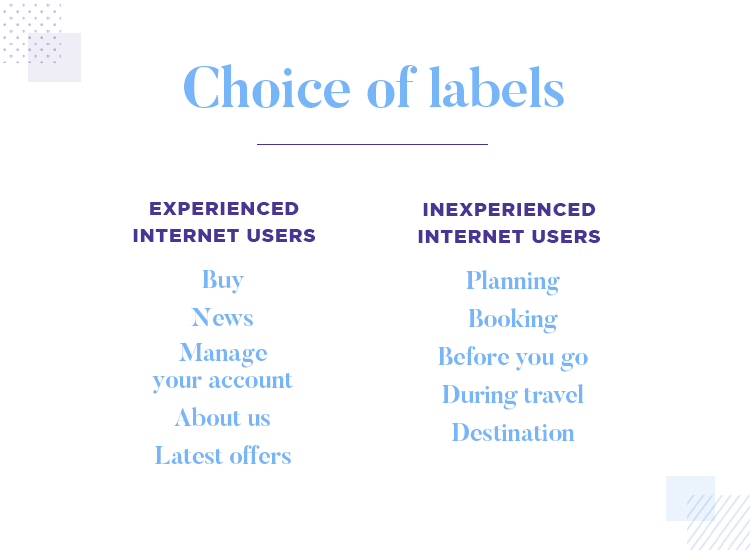
After the session ended, the resulting group names were very interesting indeed. What they found with the group of testees was that they created labels that were in-line with typical website conventions. They included categories such as “about us”, “buy”, “help”, “manage your account”, “news” and “latest offers”.
On the other hand, the inexperienced user group organized the labels in terms of real-life, chronology. They created labels such as “planning”, “booking”, “before you go”, “during travel” and “destination”
In the end, Eurostar decided it was best to obey the standard web conventions to keep their website intuitive for experienced users while, at the same time, providing more guidance for the lesser experienced users.
A UXer called Jessie Altman carried out card sorting for The Strand Bookstore in New York city. The reason he carried out this test was because it was one of the most popular stores in the city, but the website definitely didn’t share in that popularity. The customers in the store that he interviewed said that they definitely preferred coming in for the real-life experience over using the website to shop the written word.
To get to the bottom of this issue, Jessie took a look at the site and found some strange labels that he didn’t understand, such as Books By The Foot. And he wasn’t alone in that: none of the people he’d spoken to that day understood what it meant either. It turns out that what the store owners originally meant with that was bulk purchases.
So to get to the bottom of the issue, he decided to carry out both an open and closed card sorting test. The reason for this was that he wanted users to first take all the topic cards and sort them into groups that they perceived as logical.
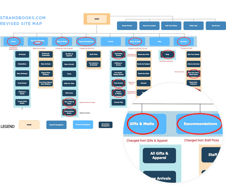
Image from Heuristics, Information Architecture, and Card Sorting by Jessie Altman
However, he also wanted to see if the current categories really were the part of the website that was causing the problem. For that reason, he performed a closed card sorting test whereby he wrote down the names of the website’s categories and subcategories onto cards. The users then had to group the index cards under the correct category and subcategory.
The results of the card sorting test confirmed his assumptions that the website’s IA wasn’t intuitive and went on to suggest several changes to the sitemap. Among those would be that he’d have a separate category for Books (sounds quite intuitive for a bookstore!) and move Media from Books & Media to Gifts. Another suggestion he made was to change Books By The Foot to In Bulk (makes sense).
Start designing and testing new prototypes today with Justinmind

Card sorting might seem like a simple technique at first, but as with any kind of results-oriented testing, it does require some planning.
There are certain tactics used across a wide range of user testing methods that also apply to card sorting. These tactics include offering incentives to testees, informing them of how long the test will take (that’s just good manners) and not interrupting the test unnecessarily or taking special care not to influence it in any way.
Apart from obvious tactics used generally for many user testing methods, here are a list of steps to get you started with this user testing methodology.
Firstly, you need to be very clear on what exactly it is you want to get out of your card sorting session. Maybe you’re in the process of designing a new website. You know what kind of content you’re going to use, but aren’t sure how your userbase would go about finding specific information on it.
Or maybe you’re updating your current website to make it more usable, by enhancing the sitemap and making it more intuitive. Perhaps you want to know if the subcategories make any sense. Whatever your reason is for testing, make sure you have that goal set and cast in stone from the start.
Aside from that, you’ll also want to make sure you choose the correct method. The right method for your project depends on a number of factors. For example, whether you decide to choose moderated or unmoderated, digital or paper testing, you’ll want to make sure that it fits in with your schedule and budget. These are the most important factors. It also boils down to how many users you want to test.
When it comes down to how many cards you should test with, you’ll generally want to aim for between 30 to 60. The most important thing is to avoid user fatigue, as this can influence their choices and hence, the results of the test.
In terms of the total number of participants you should test, you’ll generally want to aim for between 10 to 15 participants for open card sorting and about 30 to 50 participants for the closed and hybrid sorting variations. If your budget permits, you might consider moderated testing for the first 10 to 15 testees.
Lastly, and most importantly, for any kind of card sorting exercise it’s very important that you get the right userbase and do adequate research on their demographics. This will ensure that the results you’re getting from the card sorting sessions actually are pointing towards what your principal users will find more intuitive.
When setting up a paper card sorting test, consider using a spreadsheet and marking each card with a number on the reverse side of the name. This way you can demonstrate the relationship between the cards easily for quick and efficient analysis.
You’ll also want to create a file on your computer for each card sorting session so that you can start compiling a complete overview of the sitemap the users are creating. After the test, you’ll add in photographs of the card sorts or spreadsheets with recorded numbers.
Next, always make sure you shuffle all the cards before each new session begins. By doing this you’ll ensure there’s no bias based on the order the users find the cards in. If you’re performing a digital card sorting test, make sure you’ve had plenty of time to learn how the software works so you can explain it easily to your users.
Lastly, whether you’re doing digital or paper card sorting, give your users the option of sorting some cards into an unknown group or pile. At first, it might seem logical to want to make sure all the cards get sorted, but the last thing you want is for users to just start randomly allocating the cards so that they can finish the sorting faster.
After you’ve compiled all the data from your card sorting session, you’ll want to find common group names that appear (if it’s an open sorting session) or commonly used groups for a closed session.
Next, you’ll want to look for items that users frequently sort together under the same groups, as this will help you gain insights into how they categorize things in their own mind. Moreover, you’ll want to take note of how often each card appeared in each of the categories.
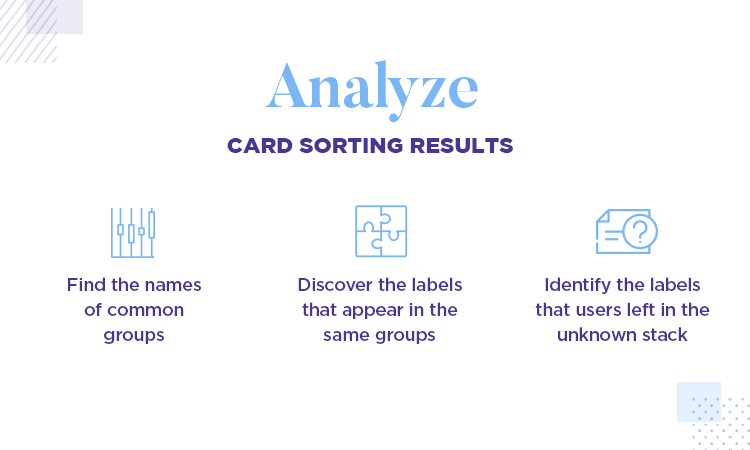
However, above all, check the cards that users frequently left in an unknown group or pile. If users often don’t know what to do with a card, it could be the names need rethinking or they belong in completely different section of website.
After analyzing the results of all your card sorting sessions, you’ll be in a much more informed position about the shape your IA should take and how best to structure the content hierarchy on your website.
Using a digital tool is obviously easier because it drills down all this data for you and puts it into useful statistics. This can help you draw conclusions as to the shape your sitemap should take and how your information architecture should work.
If you think a card sorting tool is the best way to go, check out our list below of five of the best tools on the market and choose your favorite!
Start designing and testing new prototypes today with Justinmind

Optimal Workshop boast years of consultancy experience in the user testing industry, so you can trust that you’re in good hands with their OptimalSort card sorting tool. They’ve been providing remote card sorting solutions since 2004 and have had many high profile clients such as Dropbox, Walmart, Uber, Unicef, Deloitte, IBM and the New York Times.
With this card sorting tool, you get a nice, simple UI for your users, and your results represented in graphics that provide practical and useful information. Such graphics include a similarity matrix, dendrograms and participant-centric analysis where you can see the top three average groups that users choose.
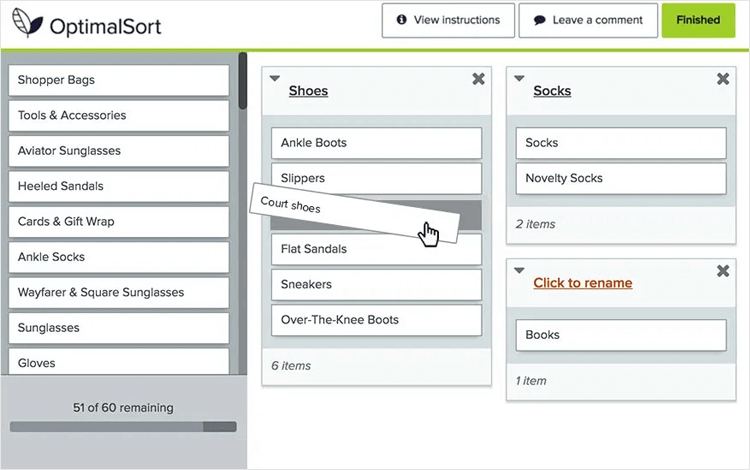
They even boast a feature where you can invite stakeholders to come and view the data in the results interface.
Before you even try out the free version, you can actually do a card sort demo yourself and try and group and categorize the menul labels of fictional telecommunications company, Bananacom!
- Pricing: with the free version you can do tests with up to 30 cards with 10 responses and 3 sessions per study, while the individual plan is billed at $166 per annum or $153 for teams.
UserZoom are big players in the user testing industry, being famed for their product’s clean and intuitive interface and fervent focus on boosting UX. However, to avail of the card sorting features of this tool, you’ll have to download the whole package.
That said, if you’re looking for a well-rounded package that allows you too keep all your user testing results in one tool and also has a neat card sorting feature, UserZoom is your tool. The card sorting feature on this tool is as good as any, giving you multiple ways to invite users to your study, including adding contacts from your own email lists by sending URLs.
Another great feature of UserZoom’s card sorting tool is that it helps you segment your users into various demographic groups by giving you the option of providing a quick demographic survey at the start.
In addition to providing a wide variety of statistics such as dendrograms, you’ll also be able to avail of both open and closed card sorting.
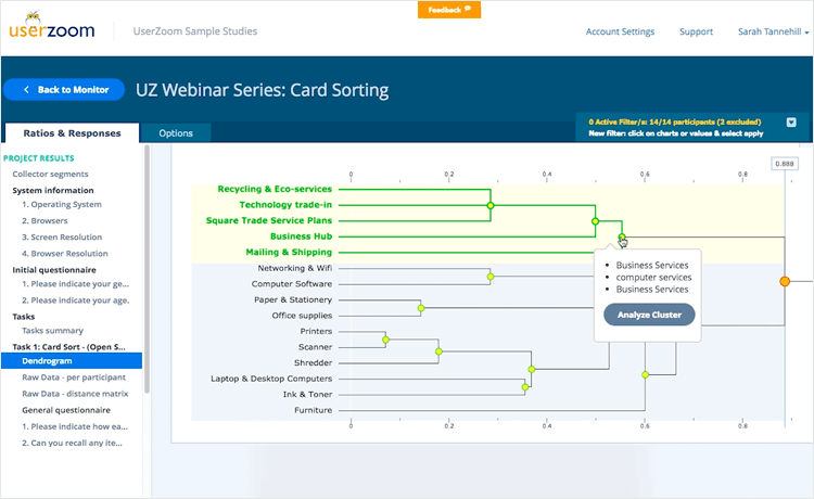
One of the great things about UserZoom is that you can use your own participants or select them from their database of over 120 million users. With their card sorting feature you’ll be able to test menu structure, the content layout of your website and the overall taxonomy. You‘ll be able to perform card sorting at any point to find cracks in your information architecture.
- Pricing: available upon request
xSort is a free card sorting tool that’s just 32-bits, but it certainly doesn’t seem like it from the UI! The only requirement is that you have a Mac as it’s not available on Windows or Linux. The whole idea of the UI is to visually simulate a real life table with cards.
For a free tool, it’s pretty complete – you can perform every variation of card sorting you want, with open, closed and hybrid options available. Participants can even create and sort cards into subgroups. As card sorting results are submitted, the statistics update in real time and you can create, read and print out reports of each session.
- Pricing: free
If you’ve ever been shopping around for user testing tools then you’ve probably come across usabiliTEST at some point. We’ve included their tool on this list precisely because of their reliable card testing feature. With built-in data and analytics, their card sorting tool offers all varieties of remote card testing: that is open, closed and hybrid testing.
The best part, however, is that you can try out the tool and get an unlimited amount of tests. The only catch? You only have 48 hours to try out everything. It’s still unique in that no other tool offers up nearly all of its features free for that length of time.
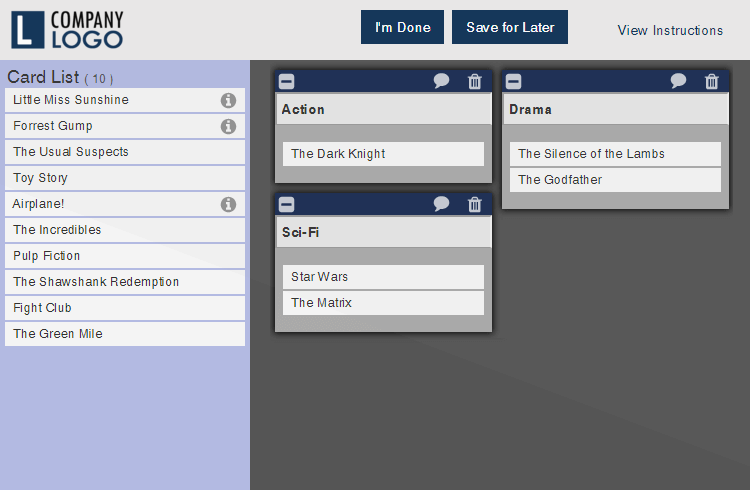
The tests themselves are handy to set up – you just fill in some fields in a form, add your company’s logo and you can even change the header to your preferred brand color. There’s also an added layer of security – all the online tests are secured and can only be accessed by means of the TLS.
UsabiliTest also allows you to track all of the answers your participants give and you can even have the tool send out automatic reminders so that they don’t forget to take the test!
- Pricing: free trial – 48 hours with all features. Afterwards, it’s $24.95 per month and $224.55 for the yearly version.
Proven By Users offers up a clean and simple UI without looking plain and underdeveloped like some of the other tools might.
Furthermore, this card sorting tool offers you the ability to set up card sorting sessions and actually see them in preview before making the tests go live. With this tool, it’s easy to get participants involved -you just have to email them with a test-unique URL and Voilà.
In the actual tests, with this tool you or the user can create card subgroups and easily duplicate cards. Additionally you can segment each user and apply filters. All of the research data is available in the graphical representations typical of card sorting tools such as matrices and dendrograms. You can also download this data in CSV format.
- Pricing: you can use the tool to collect results for a month for $29.95, two months for $54.95 and 1 year for $299.95.
As a method for testing the IA and content hierarchy of your site, you should definitely consider card sorting. It’s a simple way to gain great insights into what kind of content arrangement works for the user, so that they don’t end up frustrated or bored.
When it comes to choosing between paper or digital card sorting, it really depends on your budget and exactly how many users you plan on testing. A general rule of thumb would be that if you have to test many, remote card sorting online is the best method.
When choosing between moderated and unmoderated testing, it really depends on your budget and time. However, these two factors permitting, we’d recommend using a combination of both for best results.
