Empty states are a way to improve the user experience of your product, from onboarding to encouraging users to interact with your app. Here’s what you need to know
Empty states are screens in your UI that are not yet full of information. That is to say, they are screens which will eventually have content on them when the user populates them.
Start designing new products today. Enjoy unlimited projects.
In spite of this, empty states present an interesting UX opportunity. In fact, empty states can be used to guide your users to action, teach them about your app prototype or simply show your brand’s personality. It’s all about balancing clean design while the product is still in your prototyping tool.
You can transform an empty state into a meaningful conversation with your user and provide an engaging user experience.
In this post, Justinmind will explain what empty states are and how you can design them to boost the user experience. Let’s find out more.
Empty states are screens in the UI which appear when the application’s content can’t be shown. Empty is a misnomer because there is some type of content on the screen. In fact, empty states can show a wide variety of different content to enhance the user experience, which we’ll delve into shortly.
If you’ve ever used an application that allows you to add favorites or items to a cart, for instance, you might be familiar with an empty state. Or maybe you’ve completed a search that returns no results…
Let’s take an app like Instagram. If you haven’t added any favorite photos and you switch to the Favorites screen, you might expect to see an empty state telling you that you’ve yet to add any favorites.
Since you’ve not populated that page with your own content yet, there is none to display so an empty state, or zero data, shows.
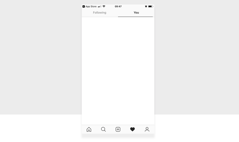
Instagram’s sad, blank empty state
However, Instagram doesn’t have an empty state on their favorites page. Instead it’s blank. They are missing an opportunity to nudge their users to start engaging with the app by adding their own.
Empty states can be designed for a myriad of reasons. Most frequently, you’ll find an empty state when:
- A user has cleared all their data (such as emptying their inbox)
- A user is new and is completing the app onboarding
- A user experiences an error (if you have no wifi connection to use an app, for instance)
Start designing new products today. Enjoy unlimited projects.

Shruthi Padala on Medium writes that many think of empty states as secondary screens that don’t require attention.
But empty states present themselves to designers as blank canvases. Screens that you can use to make your users’ experience even better.
The problem was an empty state needed a refresh because it was inconsistent with the rest of the user experience. But with only 2% of users seeing the empty state, it meant it wouldn’t be an economical or practical use of time.
This explains why empty states get neglected. Not very many users will see them and it will take a lot of time for not much reward. It’s this mindset that can damage the ultimate user experience.
In the end, Meg and Shopify decided to re-do the empty state in the face of low users and low duration. Why? Because even that 2% of people need to have an excellent user experience. It gave the experience more polish and impact.
Imagine if the user was new and exploring the app and didn’t know whether to stay or go. It’s important to design for these critical moments.
Empty states are an easy UX win. An empty state won’t be the reason that your app becomes the most successful thing in the world but it goes far in delighting the user.
A little attention to detail goes a long way and, as they say, the devil is in the details.
Tamara Hilmes, the UX writer at Spotify, reminds designers and writers that empty states, which can be an opportunity to inject personality, should always consider the brand’s and user’s goals and context.
Product designer at Deliveroo, Ryan Cordell, agrees when he says that “the right combination of words and visuals is the key to communicating with your users and helping them achieve their goals. Design teams should invest as much time, love and attention to designing the words as they do anything else on the interface.”
Equally, if not more importantly, is giving your user a next step. If you don’t then you’re not really providing any value within the empty state; it becomes merely a cosmetic addition.
If you’re tasked with designing an empty state there are some good practices to bear in mind so that you can help your user achieve their goals.
As mentioned, an empty state is an excellent opportunity to encourage users to interact with the product. You don’t want to leave them in the wilderness of your UI.
You can put a call to action button on your empty state screen, for instance. Let’s say you have a social networking app that you’ve just installed.
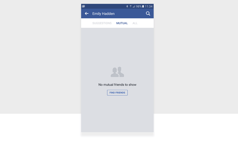
There’s a friend list tab but it’s empty. A good call to action asking your user to find and add their own friends can keep them engaged and in your app. Your call to action basically tells the user how to turn that empty screen into a filled screen. See how Facebook does it?
There is a very fine line between demonstrating brand personality and coming off as desperate, unfunny and, often, needy. That’s when UX writing is at its worst.
But your empty state is a small instance where you can inject some personality into your product. Personality doesn’t automatically mean funny. When adding humor into your UI, use it with caution. That one line quip might be fresh today but tomorrow can leave a stale taste in the UI after it becomes exhausted.
Use-friendly and approachable copy in your empty state design. Couple that with a bespoke and fitting illustration and you might be onto a winning empty state.
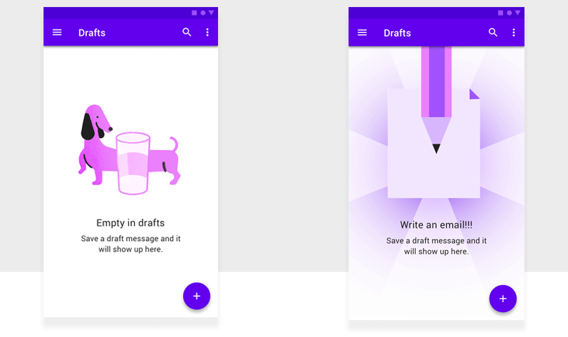
If you do decide to use both imagery and copy, make sure they’re not competing. A good image can inject enough fun and engagement into the UI so you can use straightforward and conventional copy. See how Google balances the two?
Google’s Material Design guidelines state that if you’re going to use an image make sure it:
- Has a neutral or humorous tone
- Is consistent with your brand
The tagline should then:
- Have a helpful message
- Be consistent with your brand
- Convey the purpose of the screen, without appearing actionable
Start designing new products today. Enjoy unlimited projects.

You can use your empty state to show r the user how to use your product. Empty states play a big role in the onboarding experience.
A good onboarding experience is key if you want to retain your users. Sources at Appcues say that by the end of a 3 month period, only 4 out of 100 users are using your app so UX designers need to get the onboarding experience right.
Take Dropbox. In the screenshot below you can see how they use microcopy to tell the user what the empty state is and what they can do to populate the screen: drag and drop their own files.
Material Design explains that to help new users, you can populate otherwise empty screens with starter content. This lets the user use your product immediately and makes learning your product easier.
Apps that store content like music or books, or use templated content like notes or documents can benefit from starter content. Giving your user the ability to change the starter content is a way to maintain engagement because the user is making the app their own.
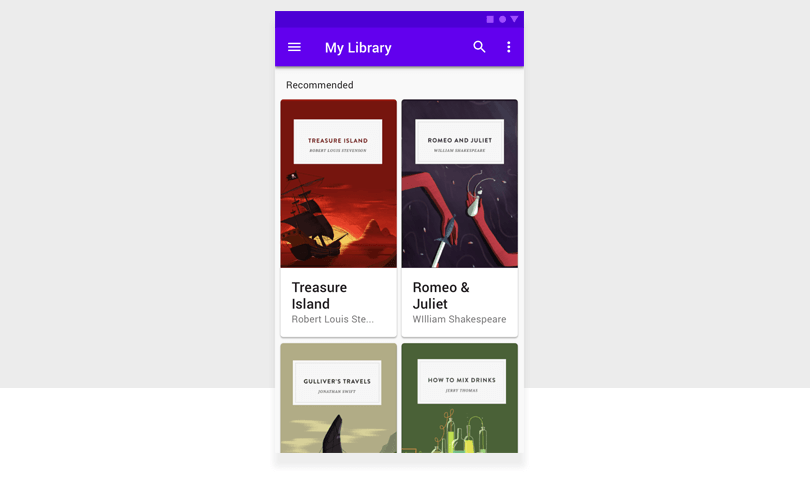
Take the reading app example from above. It’s populated using free books and from there they can explore the rest of the app.
Empty states don’t have to be empty. Use them to start a conversation with your user. A conversation that will lead to a lasting relationship between your product and your user.
By using the tactics outlined above, you’ll create an empty state that helps users achieve their goals.
PROTOTYPE · COMMUNICATE · VALIDATE
ALL-IN-ONE PROTOTYPING TOOL FOR WEB AND MOBILE APPS
Related Content
 Learn how to design better e-learning platforms with user-centered UX principles, real examples, and high-fidelity prototyping tips to boost engagement and learning outcomes.13 min Read
 Infinite scroll keeps users engaged, but it’s not always the best choice. This guide breaks down when to use it, when to avoid it, and how to design it right.14 min Read
 Learn how to design web and mobile app prototypes, how to test them and what to look for in a prototyping tool in this complete guide.15 min Read

