Thinking of designing an e-learning platform? A great e-learning platform does more than just share information, it guides users through a smooth, engaging learning journey.
From intuitive navigation to interactive features, the right design keeps learners motivated and helps them absorb content effectively.
But how do you build a platform that feels easy to use and keeps people coming back?
Prototype easily your e-learning platform with Justinmind. It’s free!

This guide will take you through the process, from key UI/UX principles to testing real interactions before development. Whether you’re designing from scratch or improving an existing platform, you’ll learn how to create a seamless, user-friendly learning experience.
An e-learning platform is an online tool designed to help people learn new skills, improve performance, and stay informed. These platforms are commonly used in educational and corporate settings, providing interactive resources that engage learners.
Popular examples include Coursera, Udemy, and LinkedIn Learning; each offering a variety of courses for both personal growth and professional development.
E-learning platforms typically fall into two categories:
- Self-paced learning: learners progress at their own speed, exploring content when it suits them best. These platforms often include quizzes, videos, and resources that users can access anytime.
- Instructor-led learning: these are guided by a tutor or instructor and often include real-time interactions, like live classes or group discussions. This method is ideal for team collaboration and active feedback.
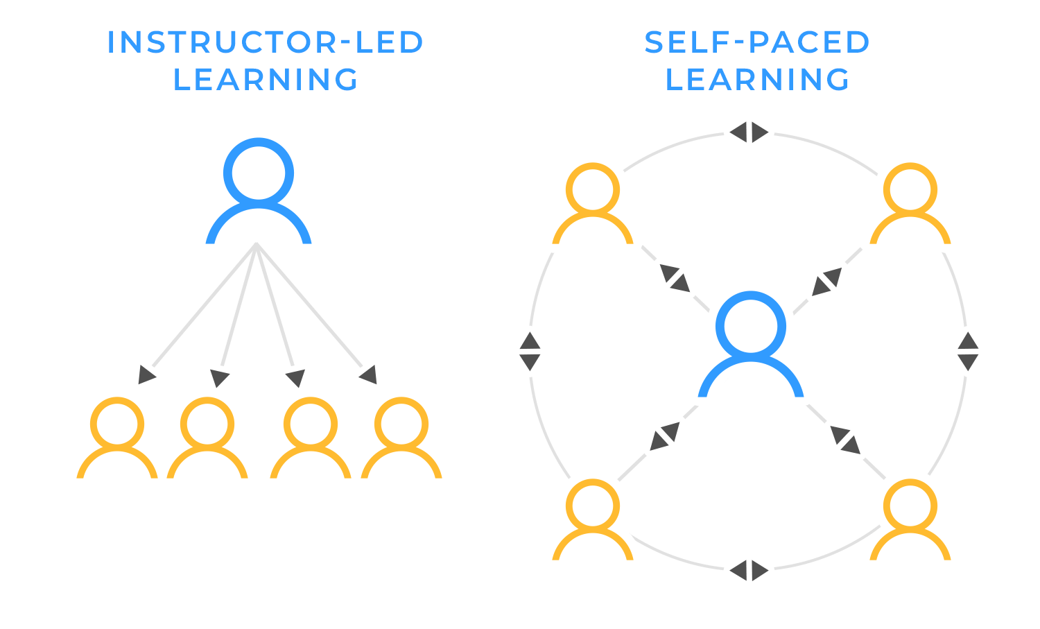
Both approaches can track learner progress, ensuring users stay on top of their learning journey.
Learning shouldn’t feel like a chore, it should be engaging, accessible, and adaptable. That’s where e-learning platforms come in. They give people the flexibility to learn at their own pace, whether it’s picking up a new skill, getting up to speed in a new job, or staying ahead in their industry.

For companies, e-learning simplifies training. Instead of time-consuming workshops, employees can learn through interactive courses, simulations, or even gamified experiences. This not only makes onboarding smoother but also keeps teams sharp and motivated. And when employees feel supported in their growth, they’re more likely to stick around.
For learners, it’s all about convenience. No strict schedules, no classroom constraints. just access to quality learning whenever and wherever they need it. A well-designed platform makes education feel less like an obligation and more like an opportunity.
Prototype easily your e-learning platform with Justinmind. It’s free!

Designing an e-learning platform goes beyond presenting information, it’s about creating an experience that’s easy to navigate, engaging, and accessible to all users. Here are some essential UI/UX principles to consider:
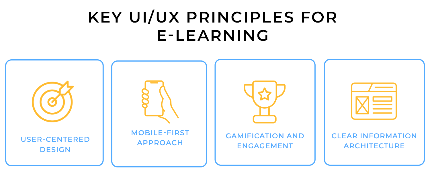
- User-centered design: the best platforms are built around the learners. That means understanding their needs, goals, and challenges to create an experience that feels natural and easy to navigate.
- Mobile-first approach: people learn on the go, whether it’s on their phone during a commute or on a tablet at home. A responsive, mobile-friendly design ensures they get the same smooth experience no matter the device.
- Gamification and engagement: learning should be motivating, not monotonous. Adding elements like progress tracking, badges, or interactive challenges keeps users engaged and makes the process feel rewarding.
- Clear information architecture: nobody wants to spend time figuring out where to find what they need. A well-structured platform with intuitive navigation helps users focus on learning rather than getting lost in menus.
- Accessibility and inclusivity: learning should be for everyone. Features like captions, screen reader compatibility, and adaptable content formats make sure all users, regardless of ability, can engage with the material.
Keeping these principles in mind makes learning easier, more engaging, and frustration-free, so users can focus on what really matters: gaining new skills and knowledge.
Not all e-learning platforms work the same way; different formats cater to different learning styles and needs. Here’s a look at some common types and the UI features that make them effective:
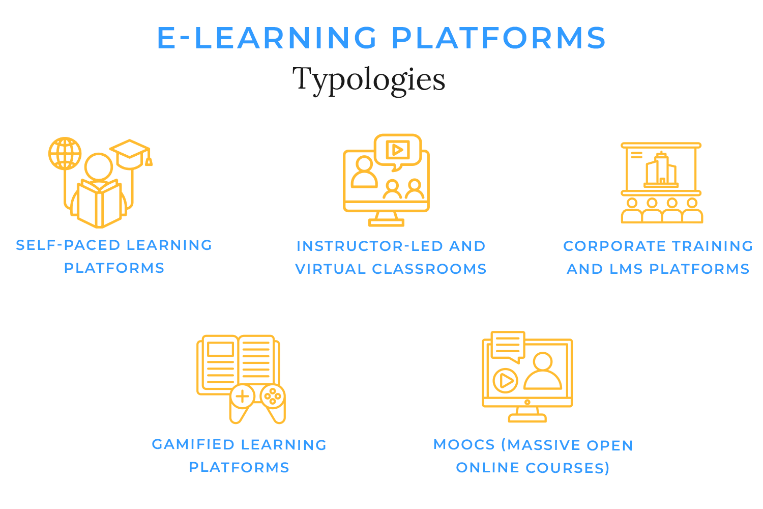
- Self-paced learning platforms: these platforms, like Udemy or Skillshare, let users learn at their own speed. UI features often include video lessons, progress tracking, and easy bookmarking so learners can pick up where they left off.
- Instructor-led and virtual classrooms: designed for real-time interaction, these platforms (think Zoom-based courses or Google Classroom) include live video streaming, chat functions, discussion forums, and shared digital whiteboards to create a collaborative experience.
- Corporate training and LMS platforms: used by businesses for employee training, these platforms (like SAP Litmos or TalentLMS) focus on structured learning paths, certification tracking, and role-based dashboards to keep employees on track with their development.
- Gamified learning platforms: to make learning fun and interactive, these platforms (like Duolingo or Kahoot!) incorporate badges, leaderboards, challenges, and progress rewards to keep users engaged and motivated.
- MOOCs (massive open online courses): large-scale platforms like Coursera or edX offer university-level courses to a global audience. Their UI typically includes structured course modules, peer discussion forums, and certificates of completion to provide a more formalized learning experience.
Each type of platform has its own approach, but the best ones all share a common goal: making learning accessible, engaging, and easy to navigate.
Prototype easily your e-learning platform with Justinmind. It’s free!

Every great e-learning platform starts with thoughtful design. It’s not just about listing courses or adding videos, it’s about creating an experience that’s intuitive, engaging, and accessible. That’s why before jumping into development, prototyping is essential. It allows you to refine the platform’s structure, test real interactions, and make sure everything works smoothly before any code is written.

- You see how real users interact with it: a prototype helps test the platform with actual learners and instructors. Are they navigating easily? Can they find what they need? Catching issues early saves time later.
- It helps fine-tune engagement features: progress tracking, quizzes, gamification; these features sound great, but do they actually improve learning? Prototyping lets you test different approaches and see what works best.
- It prevents costly UX design mistakes: spotting usability problems before development means avoiding expensive fixes down the line. Instead of guessing, you refine the experience upfront.
- It ensures a smooth experience across devices: learners might be using desktops, tablets, or mobile phones. Prototyping helps make sure the platform is responsive and easy to use on any screen.
Prototyping an e-learning platform isn’t about jumping straight into visuals, it’s about shaping the learning experience from the ground up. With Justinmind, you can build and test everything from navigation to interactive lessons before development begins. Here’s how to do it in a way that feels natural, functional, and engaging.
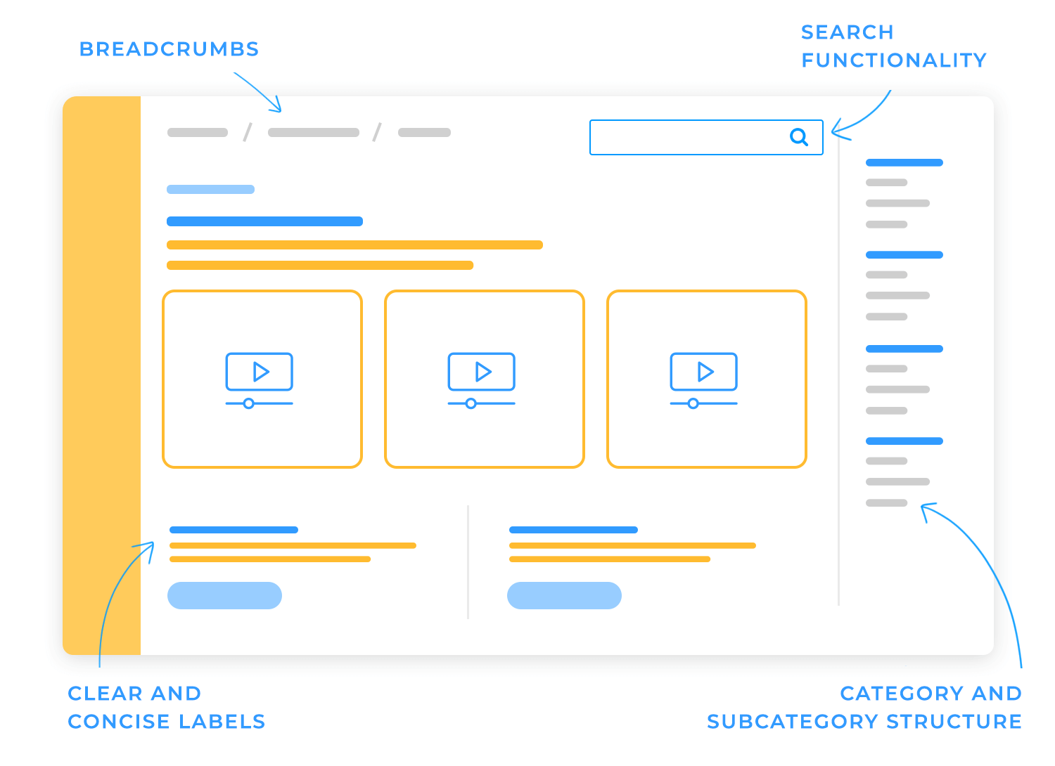
Before designing anything, think about how people will actually use the platform. Start by identifying the main user journeys:
- How do learners sign up and get started?
- How do they browse courses and track their progress?
- What does a typical lesson look like?
It’s also important to consider different user roles; learners, instructors, and administrators. Each will interact with the platform in their own way. For example, instructors might need a dashboard to upload content, while learners need an easy way to resume where they left off. Defining these interactions early on helps shape a platform that works for everyone.
Now that you have a clear vision, it’s time to sketch out the platform’s structure with low-fidelity wireframes. This step is all about layout and flow, not fine details. Focus on key screens like:
- Login and registration: keep it simple, with clear input fields and an easy way to reset passwords.
- Dashboard: a quick overview of courses, progress, and upcoming lessons.
- Lesson pages: where the actual learning happens, with support for multimedia, quizzes, and discussions.
- Assessments and quizzes: a way for learners to check their understanding.
- Progress tracking: a visual way to keep learners motivated, whether it’s through progress bars, badges, or certifications.
The goal here is to make navigation effortless. Learners should always know where they are and what to do next. Simple, clean layouts work best for this.
Once the wireframes feel solid, it’s time to add interactions. This is where Justinmind’s interactive widgets come in handy. Use them to simulate key actions like:
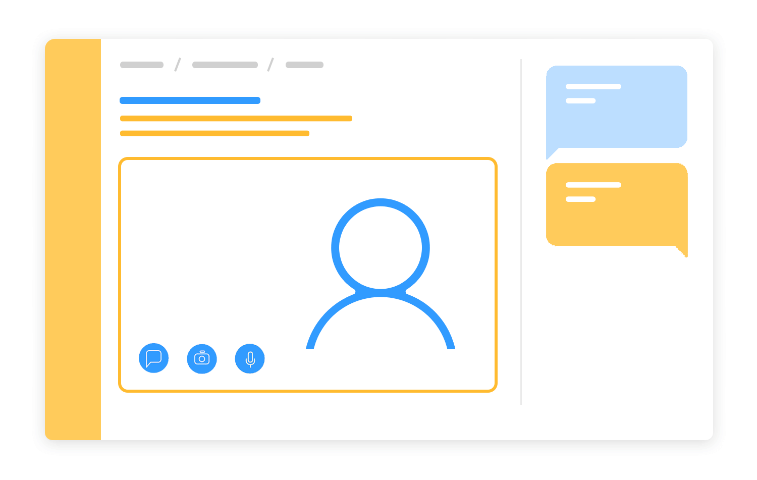
- Clicking through menus and buttons to test navigation.
- Adding input fields for quizzes, discussions, or forms.
- Using dynamic panels to switch between different content states (e.g., marking a lesson as complete).
Conditional logic can also help bring the prototype to life. For example, you can set up a rule where a quiz must be completed before unlocking the next lesson. Small details like this make the learning experience feel more real and engaging.
A good e-learning platform isn’t just text on a screen. Videos, audio, and downloadable resources make learning more dynamic, so now’s the time to prototype how those elements will work. Think about:
- Embedding video lessons with intuitive playback controls.
- Adding gamification elements like badges, progress bars, or point systems to keep learners motivated.
- Creating interactive quizzes that provide real-time feedback instead of just showing right or wrong answers.
Gamification, when done well, can make learning feel rewarding rather than like a chore. Even something as simple as a progress tracker can encourage users to stick with a course.
Once the prototype is in place, it’s time to test it with real users. Watch how they navigate, where they get stuck, and what confuses them. A few things to look out for:
- Is the course structure clear, or do learners get lost?
- Are key actions (starting a lesson, taking a quiz, tracking progress) easy to find?
- Does the platform feel intuitive across different devices?
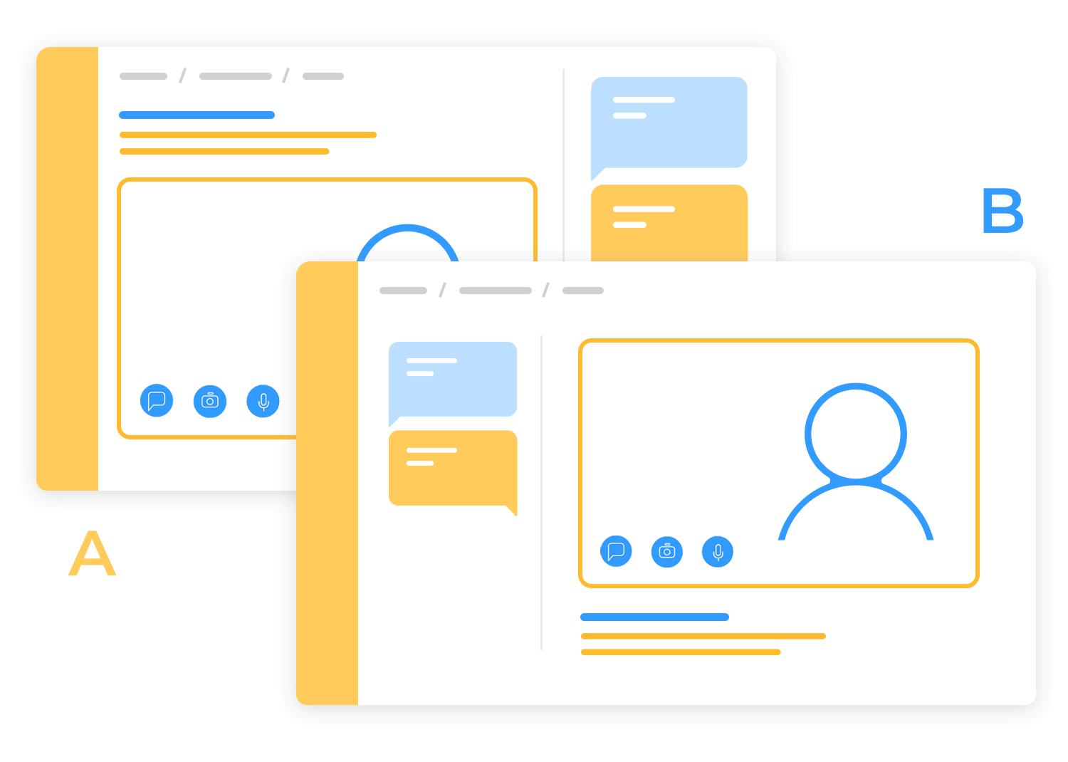
Using A/B testing, you can compare different layouts and interaction patterns to see what works best. The feedback you gather will guide refinements, ensuring the final design isn’t just functional, but genuinely user-friendly.
Prototype easily your e-learning platform with Justinmind. It’s free!

A well-designed e-learning platform goes beyond simply providing courses, it shapes the entire learning journey. The best ones make content easy to access, navigation intuitive, and the overall experience engaging enough to keep learners motivated. Here are ten platforms that get it right.
Coursera feels like an online university in the best way possible. Its clean, professional design makes it easy to find courses from top institutions. The layout is structured without being overwhelming; filters and categories help learners discover relevant courses quickly, and the course progress tracking keeps everything organized.
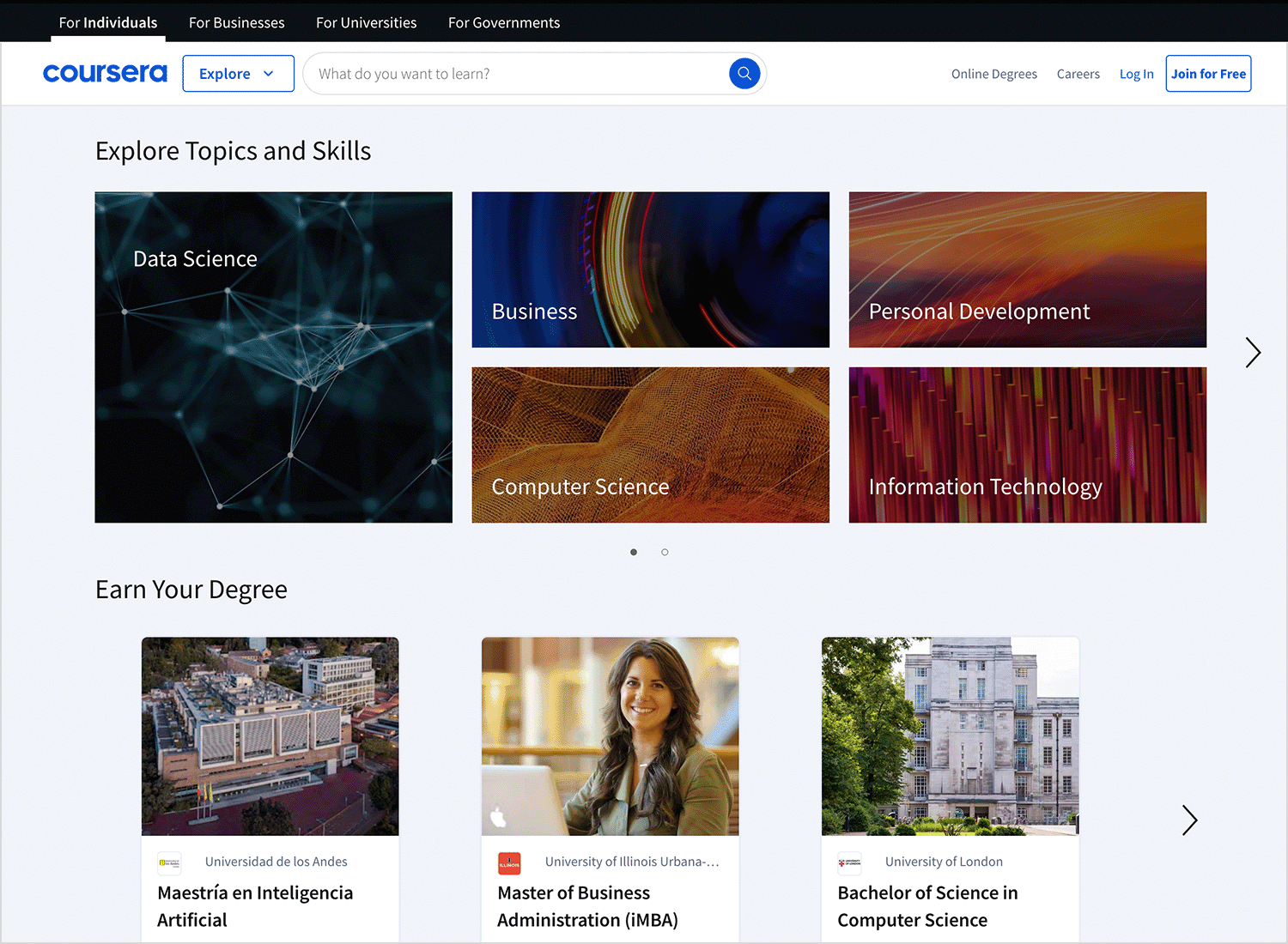
The balance between video lectures, quizzes, and peer discussions makes the experience feel polished and interactive.
Duolingo takes gamification to another level. With its bright colors, fun animations, and bite-sized lessons, it makes language learning feel less like studying and more like playing a game.
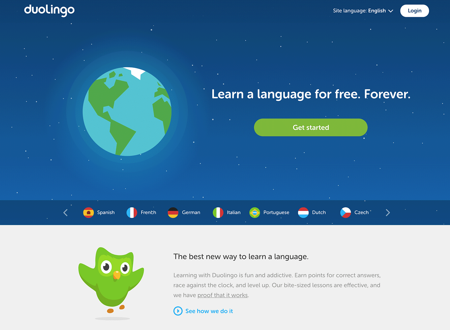
The use of streaks, badges, and progress bars keeps users hooked, and the simple, mobile-friendly UI ensures learning on the go is seamless.
Udemy’s design is all about accessibility and choice. With thousands of courses available, it could easily feel chaotic, but instead, the platform uses intuitive search and personalized recommendations to help users find exactly what they need.
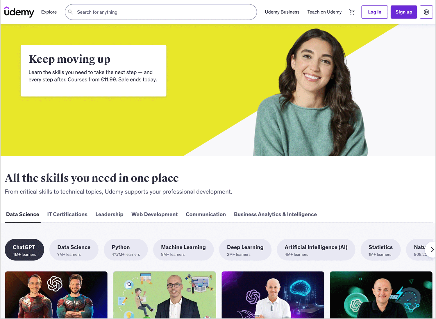
The clean video player, easy-to-read lesson layouts, and lifetime access to purchased courses make it feel like a digital library built just for you.
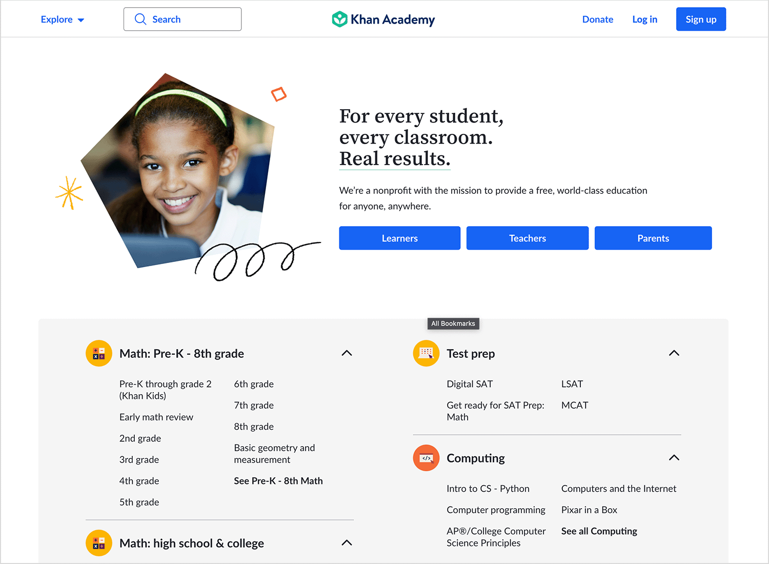
Khan Academy strips away unnecessary clutter, focusing purely on the learning experience. The interface is simple and minimal, allowing students to focus on video tutorials, practice exercises, and step-by-step lessons. The way the platform tracks progress with mastery levels makes it easy to see where you stand and what to focus on next.
Since it’s integrated with LinkedIn, this platform feels like an extension of a career-building journey. The UI is polished and professional, with a strong focus on personalized recommendations based on career goals.
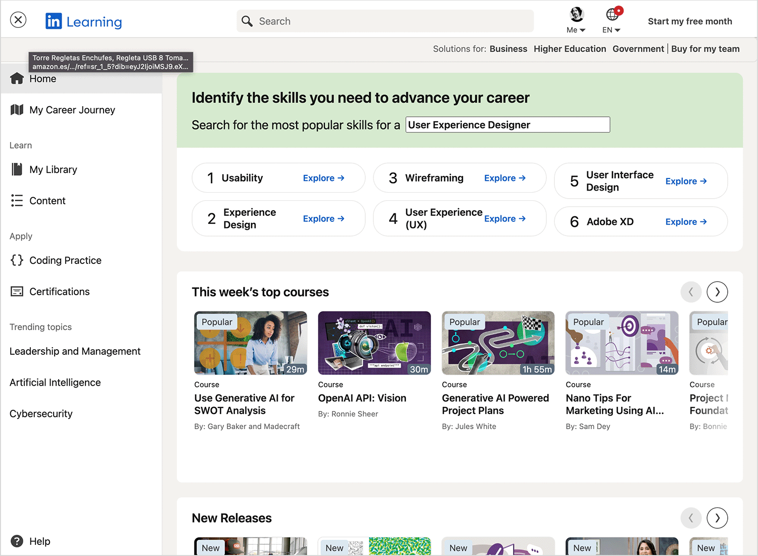
The video-based courses feel structured yet flexible, and the ability to add completed courses to your LinkedIn profile gives an extra incentive to keep learning.
Teachable is designed for course creators just as much as for learners. Its interface is sleek, customizable, and makes it easy for instructors to build and brand their own courses.
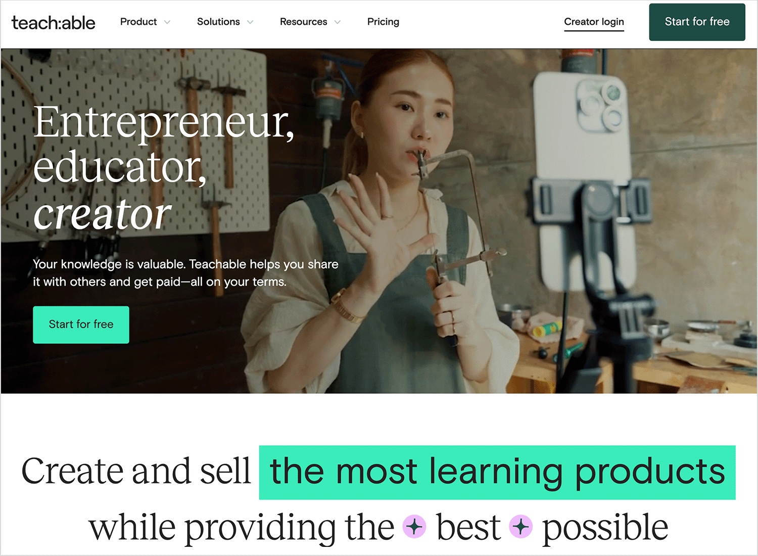
The student side of the platform is just as smooth, with simple course navigation, clear lesson breakdowns, and a distraction-free learning space.
edX brings Ivy League courses to an accessible online format, and its design reflects that balance between academic depth and usability.
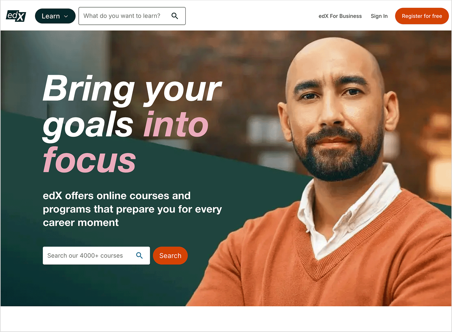
The platform organizes coursework in a way that feels structured but not overwhelming, with progress tracking, discussion boards, and interactive assignments that mirror a real classroom experience.
Skillshare’s design reflects its focus on creativity. The platform uses a visual-first approach, showcasing engaging course thumbnails and vibrant colors. The video player and project-based learning structure make it easy to follow along and apply new skills.
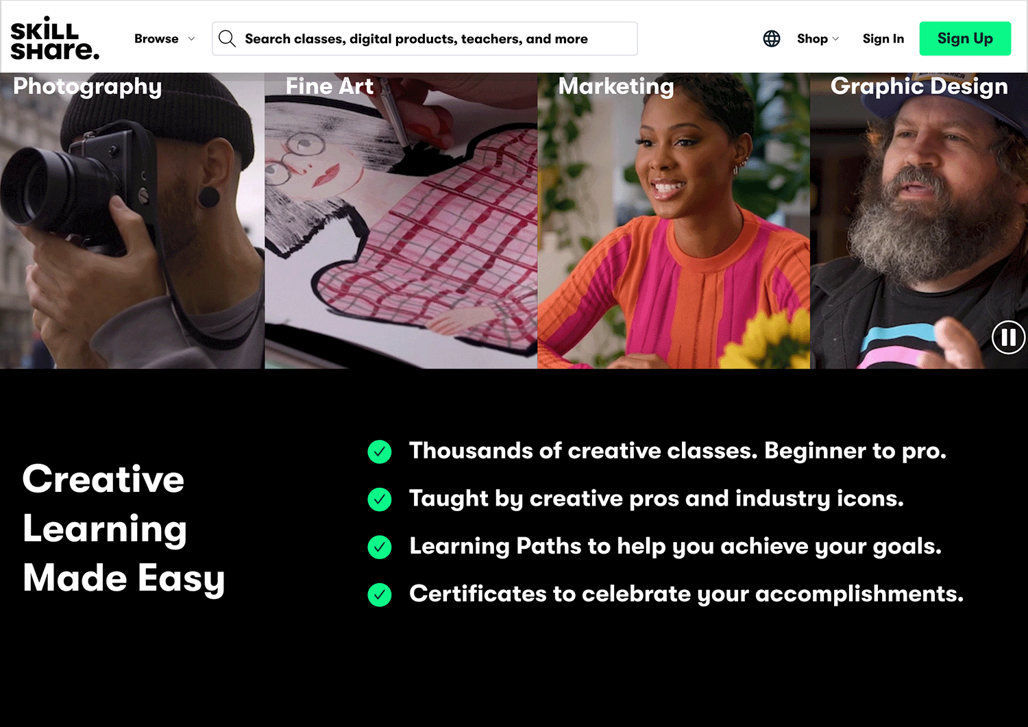
It feels casual, friendly, and welcoming. Perfect for creative professionals and hobbyists alike.
Moodle is one of the most adaptable LMS platforms out there, designed to fit different learning environments. While it’s often used by universities and companies, its real strength is in its modular design; everything from the dashboard to the lesson structure can be customized.
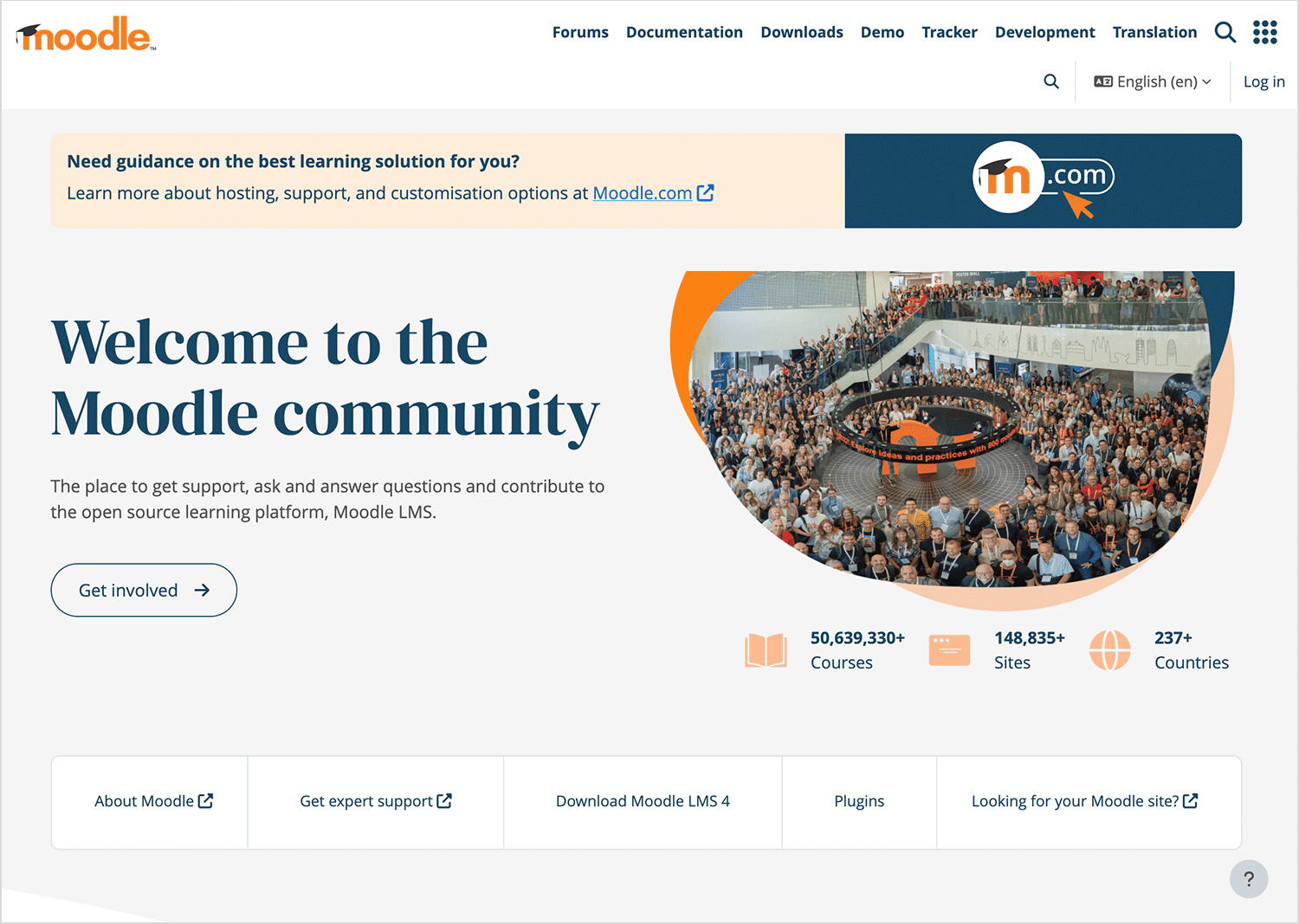
It may not be the flashiest platform, but it offers deep flexibility for institutions that need something tailored to their needs.
Last on our list, Babbel takes a more structured, step-by-step approach to language learning, setting it apart from Duolingo’s gamified style. The design is clean and straightforward, making lessons easy to follow without distractions.
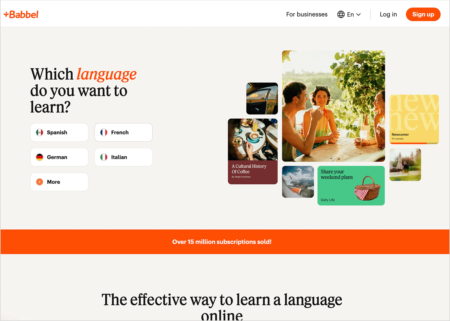
Babbel keeps users engaged by mixing real-world dialogue, grammar tips, and spaced repetition, making learning smooth and effective.
UI design for e-learning goes beyond just putting lessons online. It shapes how people learn, interact, and stay engaged. From thoughtful UI/UX design to prototyping key interactions, every detail impacts how smoothly users navigate and absorb information.
The best platforms feel intuitive, adapt to different learning styles, and remove barriers to education. Whether it’s a self-paced course, a virtual classroom, or a gamified experience, a well-designed platform keeps learners motivated and focused.
Taking the time to prototype, test, and refine ensures that the final product isn’t just functional, it creates a learning experience that’s seamless, enjoyable, and truly effective.
Prototype easily your e-learning platform with Justinmind. It’s free!

Related Content
 Infinite scroll keeps users engaged, but it’s not always the best choice. This guide breaks down when to use it, when to avoid it, and how to design it right.14 min Read
 Learn how to design web and mobile app prototypes, how to test them and what to look for in a prototyping tool in this complete guide.15 min Read
 UX research can be a driving force in design. But what methods are there? How do we approach it? Find out in this post!10 min Read

