User scenarios help you understand the user and how they interact with the product. But how is a scenario different from a persona?
Designers need to understand their users if they want to make products that people will use. By understanding them, you can help create solutions that help them achieve their goals. And when users are able to achieve their goals, they will want to use your product again – but for that, you need to truly understand the user.
Design your own user scenarios in Justinmind. Download free!

Before getting your hands dirty with your favorite prototyping tool, you should understand the people you’re designing for better. To do that you first need to map out and create user scenarios. User scenarios are an opportunity to learn, they invite us to put ourselves in the shoes of the user. Since they take the form of a diagram and/or brief story, they’re perfect for presentations, explanations and getting that vital stakeholder buy-in. It’s a win-win!
User scenarios are one of the many tools UX designers have in their arsenal. Like the others, user scenarios are a way that we have to understand what users want, how they feel and what they want from the product. It’s all about helping the design team put themselves in the user’s shoes, encouraging empathy.
On a more practical side, a user scenario tends to include who the user is and what their goal is at that moment. Generally, scenarios are concise and represent a snapshot of the user experience.
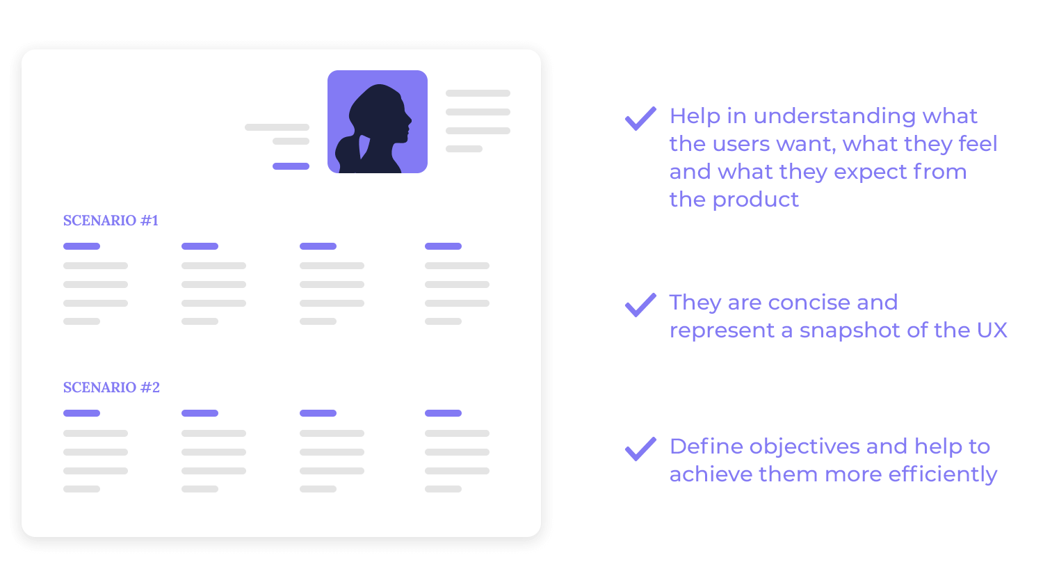
An important aspect of user scenarios is that they can help the team understand more than what the goals of the user are. Many design teams believe the main advantage of having user scenarios is that once we establish what the user’s goal is, it becomes easier to define how the user would go about reaching that goal. That is closely connected to other tools in the UX game, such as user personas.
There are different takes on user scenarios, with some designers going for more task-focused scenarios while others prefer a more complete and detailed scenario. The right fit for you will depend on how much you know about your users, and how you prefer to organize all that information.
Some prefer short and sweet user scenarios that focus only one the user goal or task. Others claim we can obtain even more benefits from a more complete scenario, with additional information about users that adds value – like their main source of income. Like many aspects of UX design, there’s plenty of wiggle room to make user scenarios that fit well for your team and project.
As we mentioned before, the biggest plus of having user scenarios is that they can give us quite a bit of insight into the user’s mind, needs, and wants – but many different research tools do that too. User scenarios are all about getting the context of use right and tailoring the experience to the user’s needs and motivations.
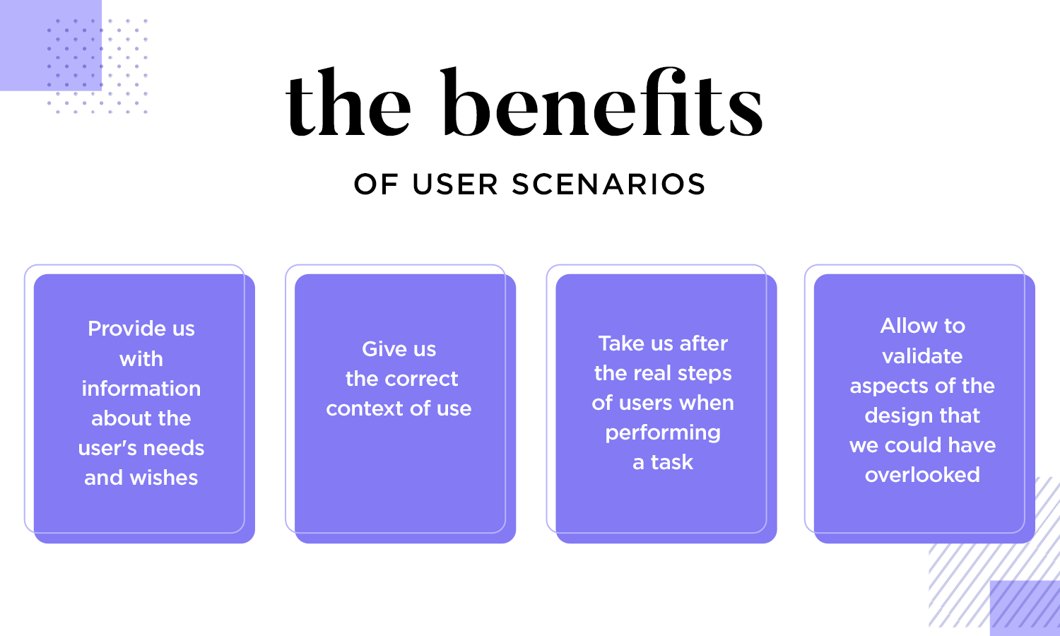
Unlike user stories, user scenarios don’t just point out the user goals. Our friends over at The Interaction Design Foundation put it perfectly: “scenarios explicitly capture what users would likely experience as they proceed toward using an ideal solution.” They are about tracing user’s steps in order to complete a task and validating aspects of the design we might have otherwise overlooked.
Goal-oriented scenarios are narratives that outline a specific objective or desired outcome for a user. These scenarios focus on the user’s motivations, challenges, and the steps they take to achieve their goal. They are often used to better understand user behavior and improve product functionality.
Imagine you’re designing a new fitness app. A goal-oriented scenario might focus on a user who wants to lose weight and get in shape for a marathon.
This scenario would delve into the user’s motivation, such as improving their health and feeling more confident, their specific goals, for example, running a 5K in three months, losing 20 pounds, plus any obstacles they might face, such as lack of time, or injuries.
Where goal-oriented scenarios focus on an outcome, activity-based scenarios are narratives that focus on specific actions or activities that users perform within a given context. Understanding these common user activities helps designers ensure that the app’s interface and features are intuitive and efficient, which makes it easy for users to accomplish their tasks.
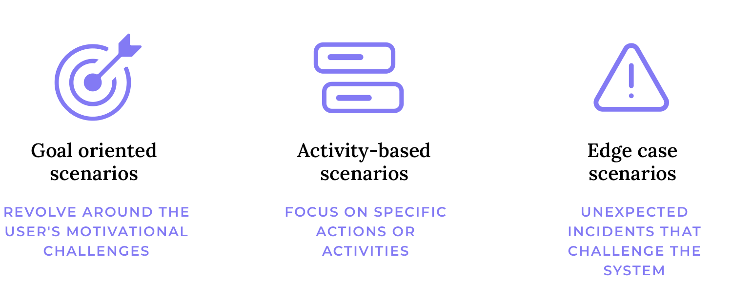
Take the same fitness app for example. An activity-based scenario might focus on a user’s daily routine. This scenario would outline specific tasks the user performs, such as tracking their workouts, logging their food intake, and checking their progress. Error scenarios
Now, consider a scenario where a user accidentally deletes their workout history. This is an error scenario that highlights a potential pain point. Designers can use this scenario to identify ways to prevent accidental deletions, such as implementing a confirmation prompt or providing a backup feature.
Edge-case scenarios, on the other hand, are situations that fall outside of the normal range of expected inputs or behaviors. They are often unexpected or rare occurrences that can test the limits of a system or process.
An edge-case scenario might involve a user who tries to log a workout that is unusually long or intense. This is an uncommon situation that could potentially cause the app to crash or display incorrect data. When designers consider these edge cases, they can ensure that the app is robust and can handle a wide range of user inputs, even under extreme circumstances.
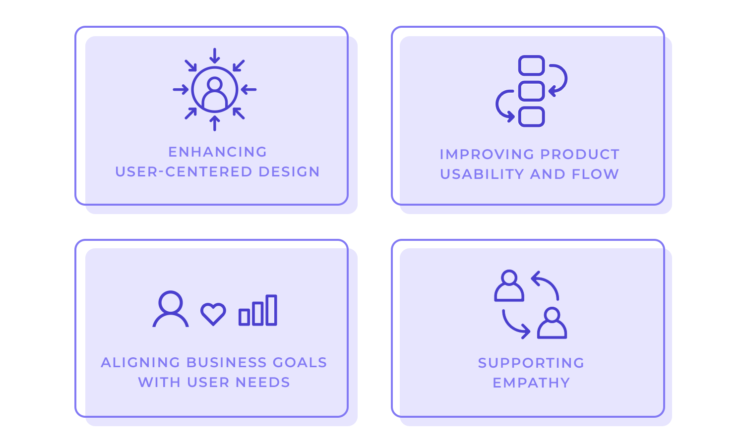
As mentioned previously, user scenarios are essential for creating products that truly resonate with users. They provide a valuable framework for understanding user needs, behaviors, and motivations. Here’s why they matter:
User scenarios help designers shift their focus from technical specifications to user experiences.
When designers put themselves in their users’ shoes, they can identify pain points by spotting roadblocks, frustrations, and moments of pure joy that users experience. This insight is invaluable for creating products that truly resonate.
They also help anticipate user needs and create products that are intuitive, engaging, and tailored to specific user goals.
Let’s take a real-world example: Imagine you’re designing a new smartphone app for ordering food. By creating user scenarios, you might discover that users often struggle with finding the right restaurant, customizing their orders, or dealing with payment issues.
Armed with this knowledge, designers can focus on building a user-friendly interface, intuitive search filters, and a smooth payment process.
Design your own user scenarios in Justinmind. Download free!

Well-crafted user scenarios help designers visualize how users will interact with the product.
By considering the user’s journey from start to finish, designers can identify potential bottlenecks, such as unexpected detours or a dead-end. Inconsistencies or confusing elements that could hinder usability can also be pointed out.
This, in turn, allows them to optimize the product’s flow and make it easier for users to achieve their goals.
User scenarios are also about aligning business goals with user needs. They help businesses identify untapped market opportunities and develop products that meet unmet needs. This can lead to innovative and differentiated offerings that drive growth.
User scenarios also enhance customer satisfaction, as when products are designed with the user in mind, customers are more likely to be satisfied and loyal.
And last but certainly not least, by investing in products that meet customer needs businesses can improve their return on investment.
Satisfied customers are more likely to make repeat purchases and recommend the product to others, leading to increased revenue and long-term success.
Creating user scenarios involves stepping into the shoes of others. This process fosters empathy and understanding for end-users, helping designers and developers appreciate the human side of product development.
Empathy can also lead to better decision-making. When teams truly understand their users, they can make choices that prioritize the user experience over technical considerations, therefore creating meaningful products that can have a lasting impact and actually make a difference in people’s lives.
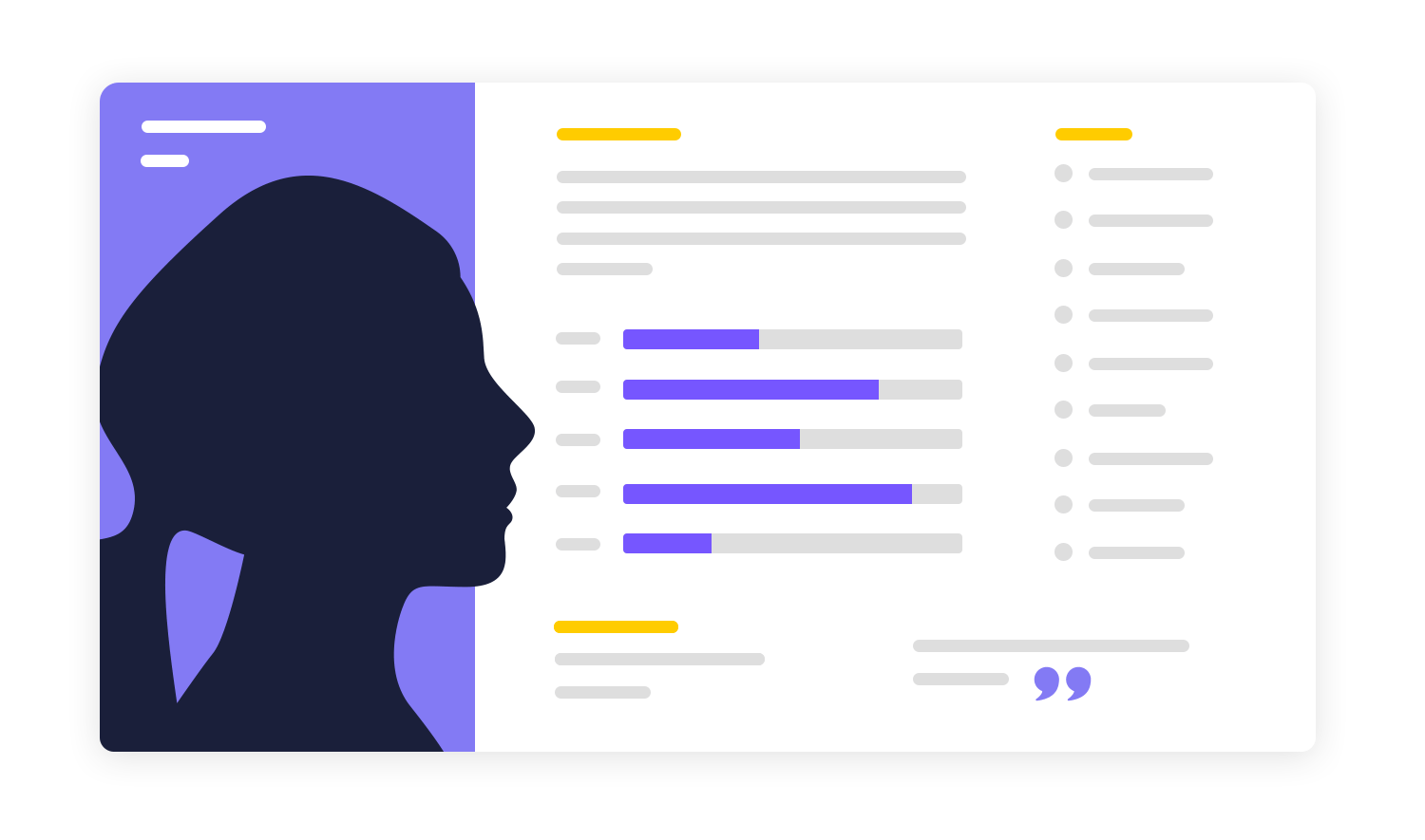
A key component of your user scenarios would be to define the user persona. A user persona is a fictional representation of a target user based on real data and research.
Remember that fitness app we were working on above? Let’s go back to it for a quick second.
Who are you designing for? Are they a busy working professional trying to squeeze in workouts during their lunch break, or a stay-at-home parent looking for family-friendly fitness activities?
Consider demographics, goals, motivations, and behavior to help you create one. Then, gather data through surveys, interviews, analytics, and market research. Remember to focus on the user and empathize with them!
Once you’ve defined your user persona, you need to identify their goals. What do they hope to achieve by using your app? Are they trying to lose weight, build muscle, improve their cardiovascular health, or simply reduce stress? Understanding the user’s goals will help you prioritize features and content that directly address their needs and motivations.
The context in which the user is performing the task is also crucial. Consider factors such as the time of day, location, and device being used.
Understanding the context helps ensure that features and functionalities are relevant to the user’s needs and situation. For example, a fitness app might prioritize features like GPS tracking and heart rate monitoring for a user running in the park, but these features might be less relevant for a user who is browsing products online at home.
The actions a user takes to achieve their goal are the steps they follow within your app. By outlining these steps, you can identify potential pain points or areas where the user might get stuck.
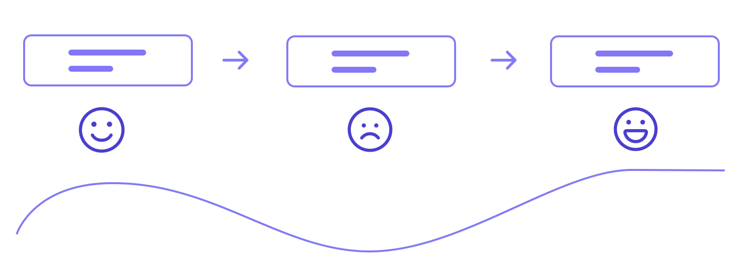
For example, a user might struggle to find their workout history or have difficulty entering their heart rate data. Identifying these challenges will help you improve the app’s usability and make it easier for users to navigate.
The outcome of the interaction is the end result of the user’s journey within your app. What do they hope to achieve? Do they want to feel healthier, more energized, or simply satisfied with their progress?
Understanding the desired outcome will help you measure the success of your app and make necessary adjustments to ensure it meets user expectations.
Before you can craft compelling user scenarios, it’s essential to have a deep understanding of your target audience.
This involves creating detailed profiles of your ideal users, which are the previously discussed user personas.
- User personas: Create detailed profiles of your ideal users based on research. Include demographics, psychographics, behaviors, motivations, and pain points.
- Segmentation: Group users based on similarities in needs, behaviors, and motivations. This helps tailor scenarios to specific segments, which improves targeted marketing, product development, and enhances customer satisfaction.
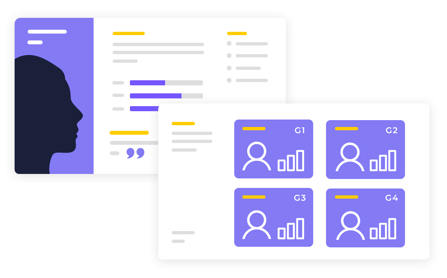
To create realistic and relevant user scenarios, it’s essential to consider the context in which users interact with your product or service.
This includes the environment and pain points users might encounter. These insights will help you tailor your scenarios to address real-world needs and improve the user experience.
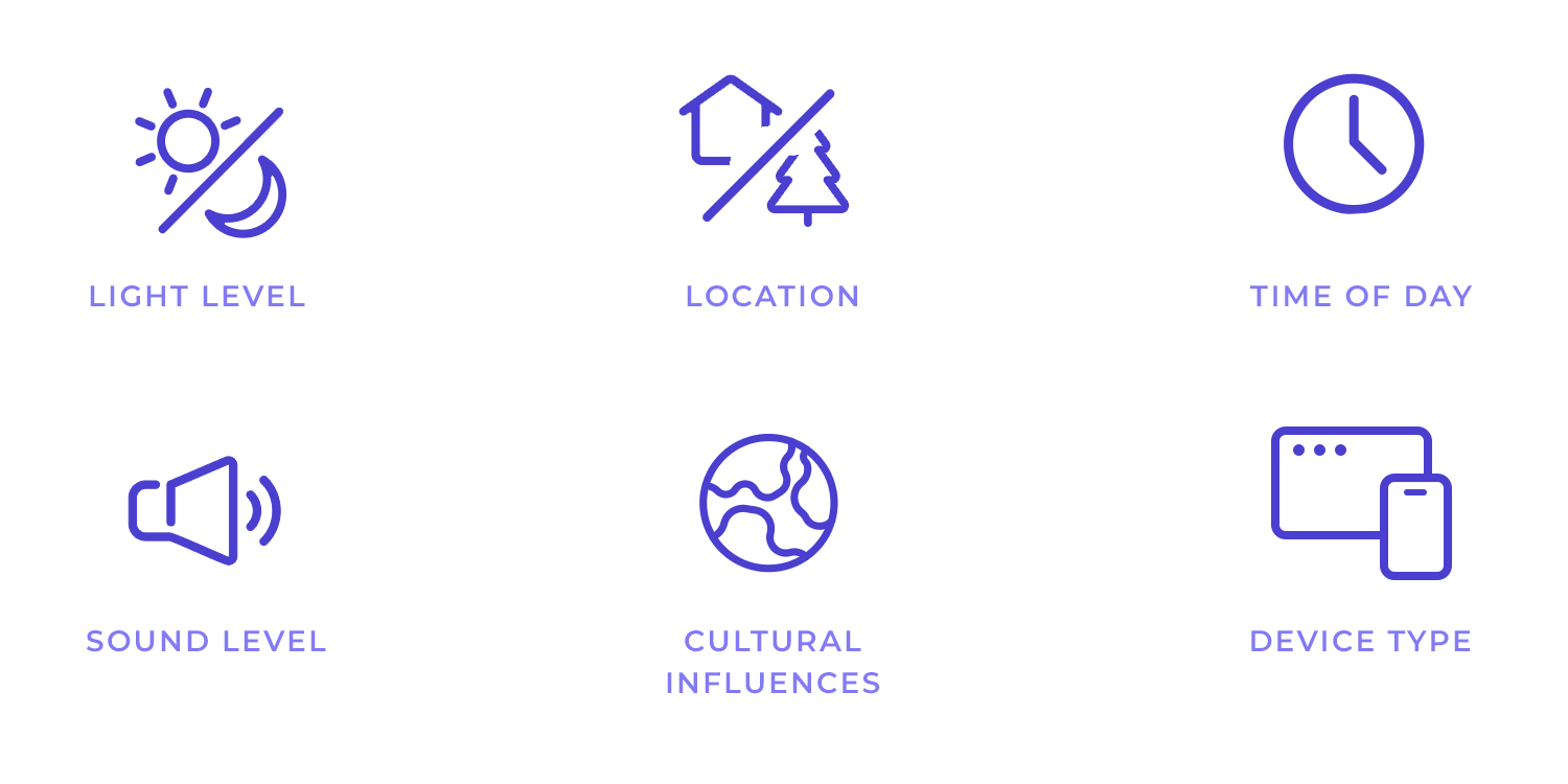
- Environment: Understand the physical, digital, and social context where the user interaction occurs. Consider factors like device, location, time of day, and cultural influences.
- Pain points: Identify the challenges, frustrations, or problems users face in their current context. These will inform the scenario’s focus.
Design your own user scenarios in Justinmind. Download free!

User goals are the driving force behind their interactions with your product or service. Clearly defining these goals ensures that your scenarios are focused and relevant.
For example, if your product is a fitness app designed to help users achieve weight loss goals, your user scenarios should focus on users who are trying to lose weight.
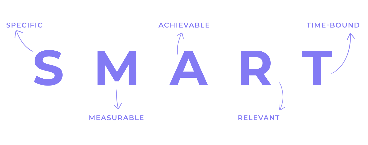
- Clear goals: Define what the user wants to achieve with the interaction. Goals should be specific, measurable, achievable, relevant, and time-bound (SMART).
- Alignment: Ensure user goals align with the product’s overall objectives. This ensures the scenario contributes to the product’s success.
Once you’ve defined your user’s goals, it’s time to visualize their journey through your product or service. This involves mapping out the steps they’ll take to achieve their objectives. Keep the following in mind:
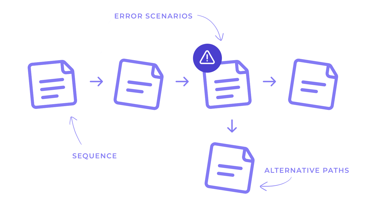
- Sequence: Detail the step-by-step actions the user will take to achieve their goal. Consider different paths the user might follow.
- Alternative paths: Include scenarios for unexpected situations, errors, or alternative choices the user might make.
- Error scenarios: Address potential issues or roadblocks the user might encounter and how they might resolve them.
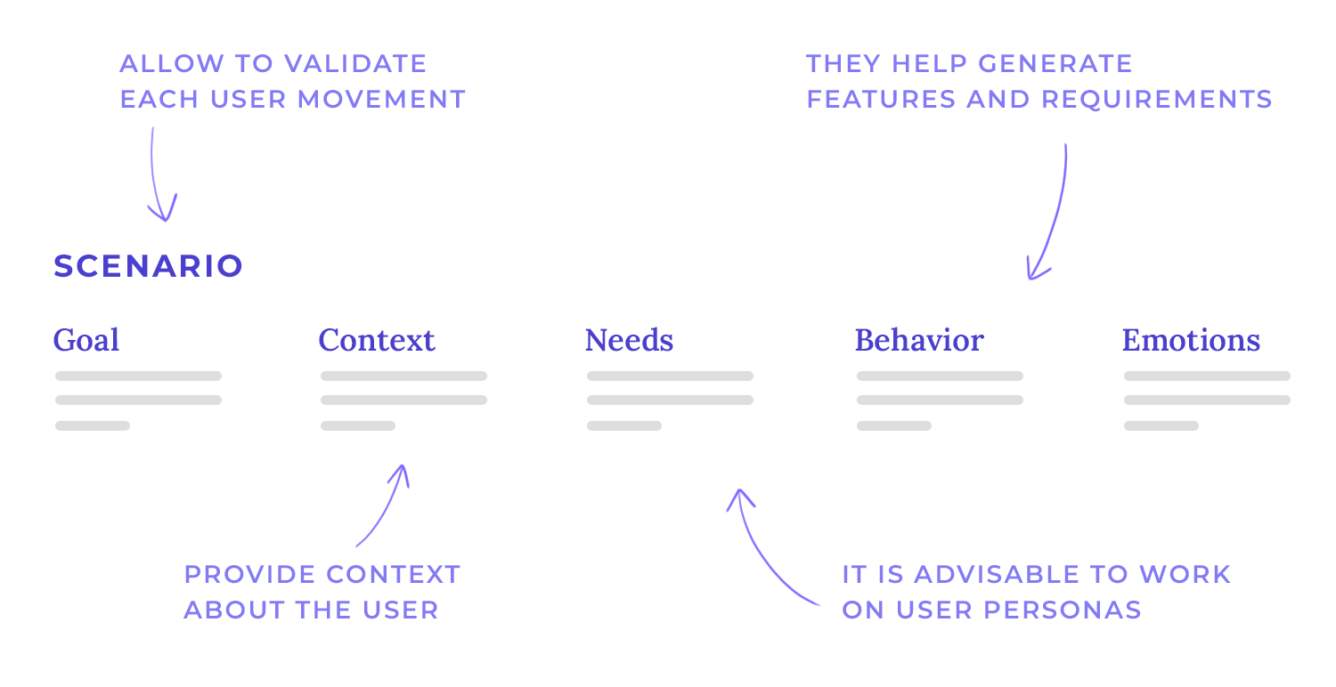
User scenarios are useful for designers because they can spark ideas, generate features and help refine any requirements going forward. They are also crucial when it comes to usability testing. With user scenarios and a professional wireframe tool, designers can make sure they cover all their bases and validate every move users make in the product.
Another interesting characteristic of user scenarios is that they give us a bit of context related to the user and how they would come to use the product. They tend to include a bit of a story that could include something like this:
“Samantha is a student who has an important exam next week. She needs to find a platform that helps her manage her time between studying for the test and her other assignments for school, to reach her goal of passing all classes.”
We’ve gone through some of the things user scenarious can include and their main function within a design project – but how can we write one from zero?
Before you can actually write anything about the possible scenario, there’s a fair amount of user research needed. You’ll want to have a clear definition of who your users are by the time you start wondering when they’ll use your product or what they’d do with it. Most teams tend to have a clear user persona (or two) before they start creating user scenarios, for example.
The process of writing user scenarios can be described as scenario mapping. This means that in order to have a realistic user scenario, the design team has to consider the possible goals and tasks, along with what that means for the user experience. This process doesn’t have to be complex but it does require a lot of consideration on possible scenarios and outcomes.
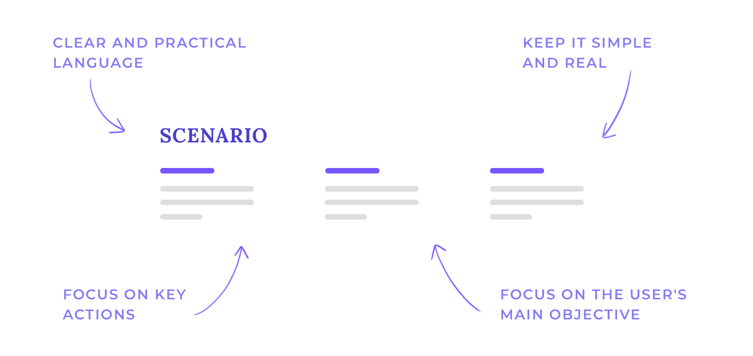
When crafting effective user scenarios, it’s essential to maintain simplicity and realism. This approach ensures that the scenario remains focused on the core user goal and avoids unnecessary complexity.
To avoid overcomplication, think of your scenario like a well-written short story. It should have a clear beginning, middle, and end, without unnecessary plot twists or subplots. Focus on the core user goal and the key actions needed to achieve it.
Use clear, actionable language that a non-technical person can easily understand. Instead of saying “The user will navigate to the dashboard,” try “The user will click on the ‘My Account’ button.”
To truly capture the essence of a user’s experience, it’s essential to use a narrative format. By weaving your user scenarios into a compelling story, you can create a connection, paint a picture of the emotional rollercoaster your user is on, from frustration to triumph.
One of the things to consider as you narrate is your storytelling technique. Imagine you’re telling a friend about a recent experience. Use vivid language and descriptive details to paint a picture of the user’s journey.
Immersion is another key element of using a narrative format. Put the reader in the user’s shoes. Help them feel the user’s emotions, frustrations, and triumphs.
To ensure your user scenarios accurately reflect the real-world experiences of your target audience, it’s essential to incorporate user feedback which involves extensive research and validation.
Don’t just rely on assumptions. Talk to real users, conduct surveys, or analyze user data to understand their needs and behaviors. And once you’ve created a scenario, test it with users to see if it resonates with them. Are there any parts that feel unrealistic or confusing?
When crafting user scenarios, it’s crucial to highlight the critical interactions that will have the most significant impact on the user’s experience. These interactions often involve critical interactions and decision points. Think about the moments that will have the biggest impact on the user’s experience. Are there any decisions they need to make, or tasks that are particularly challenging?
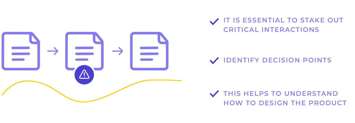
Then highlight the points where the user’s choices can lead to different outcomes. This will help you understand how the product needs to be designed to accommodate various user preferences.
To ensure your user scenarios are effective and informative, it’s essential to avoid common mistakes. Watch out for vague or general scenarios and ignoring edge cases. For example, instead of saying “The user will search for a product,” be more specific: “The user will search for a ‘blue denim jacket’ in size medium.”
You need to keep thinking about the unexpected. What if the user has a slow internet connection? What if they accidentally delete their account? Addressing these edge cases will help you create a more robust and user-friendly product.
It’s important to remember that the scenario is about the user, not the technology. The goal is to understand how the user will interact with the product, not how the product works behind the scenes.
Design your own user scenarios in Justinmind. Download free!

The following user scenario, taken from uxtweak’s blog, outlines a common user journey for a car rental website, highlighting a specific use case: a business traveler seeking an off-road capable vehicle. It’s short but effective, showcasing a relatable character and a common travel situation, while providing details about the user’s needs, context, and challenges, the action they need to take, and finally the solution to their problem, the website.
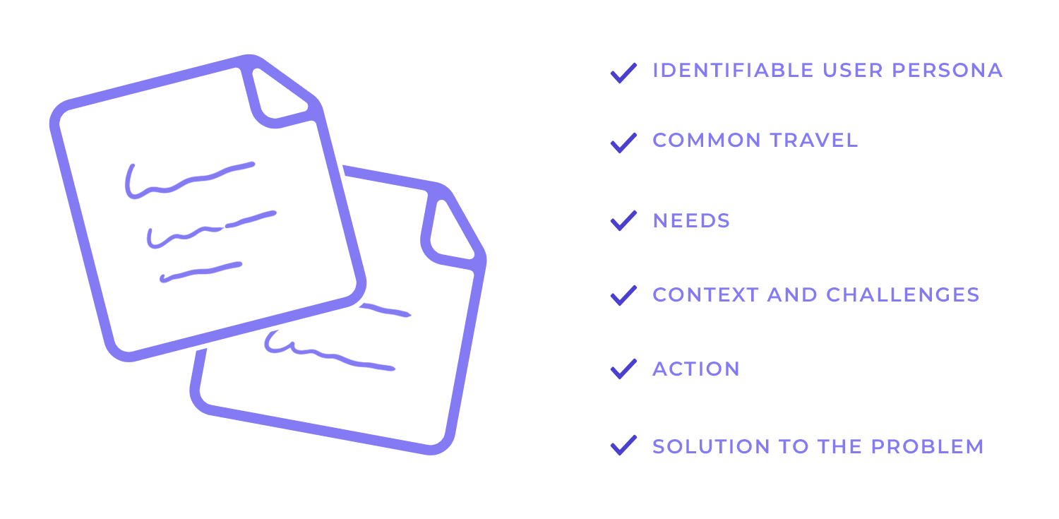
“Sheryl is a Marketing Manager in Las Vegas, and she has a business trip coming up in Northern California. The trip is half pleasure and half work, and she wants to do some hiking in the mountain trails. She knows the roads can be pretty bumpy, so she wants to rent a car that is suitable for off-road driving. Sheryl discovers our website to find the perfect car. She is unfamiliar with these types of vehicles, so she compares some models and reads the reviews to get a better idea of her best option. When she finds one she likes in the budget allotted by her company, she books it.”
The next user scenario on this list is by NNGroup. It highlights the need for Debbie, the fictional relatable character, to find an affordable room for her business trip. We get insight into her thought process and journey to booking that room.
“Detailed Debbie is going on a business trip. She needs to book a hotel room that’s affordable and has good reviews. Debbie browses the site to find a hotel for her upcoming trip. She looks closely at the various hotels to find one that meets her needs. She considers price and user ratings heavily as she shops. Debbie selects a hotel and books a room.”
Despite its clarity, this scenario is lacking in some details. It would be beneficial to expand on the user’s needs, like describing specific amenities or features that Debbie is looking for in a hotel (e.g., a fitness center, free Wi-Fi, or a particular location).
Website interaction can also be included, not necessarily in such details as which buttons she actually clicked, more like explaining which filters Debbie chose, for example, or whether or not she went through some reviews to find that perfect hotel.
Applying the changes mentioned above would make the scenario more comprehensive. This is the improved version:
“Detailed Debbie is planning a business trip to New York City and needs to find an affordable hotel with good reviews. She prefers a location near Times Square and is looking for a hotel with a fitness center and free Wi-Fi.
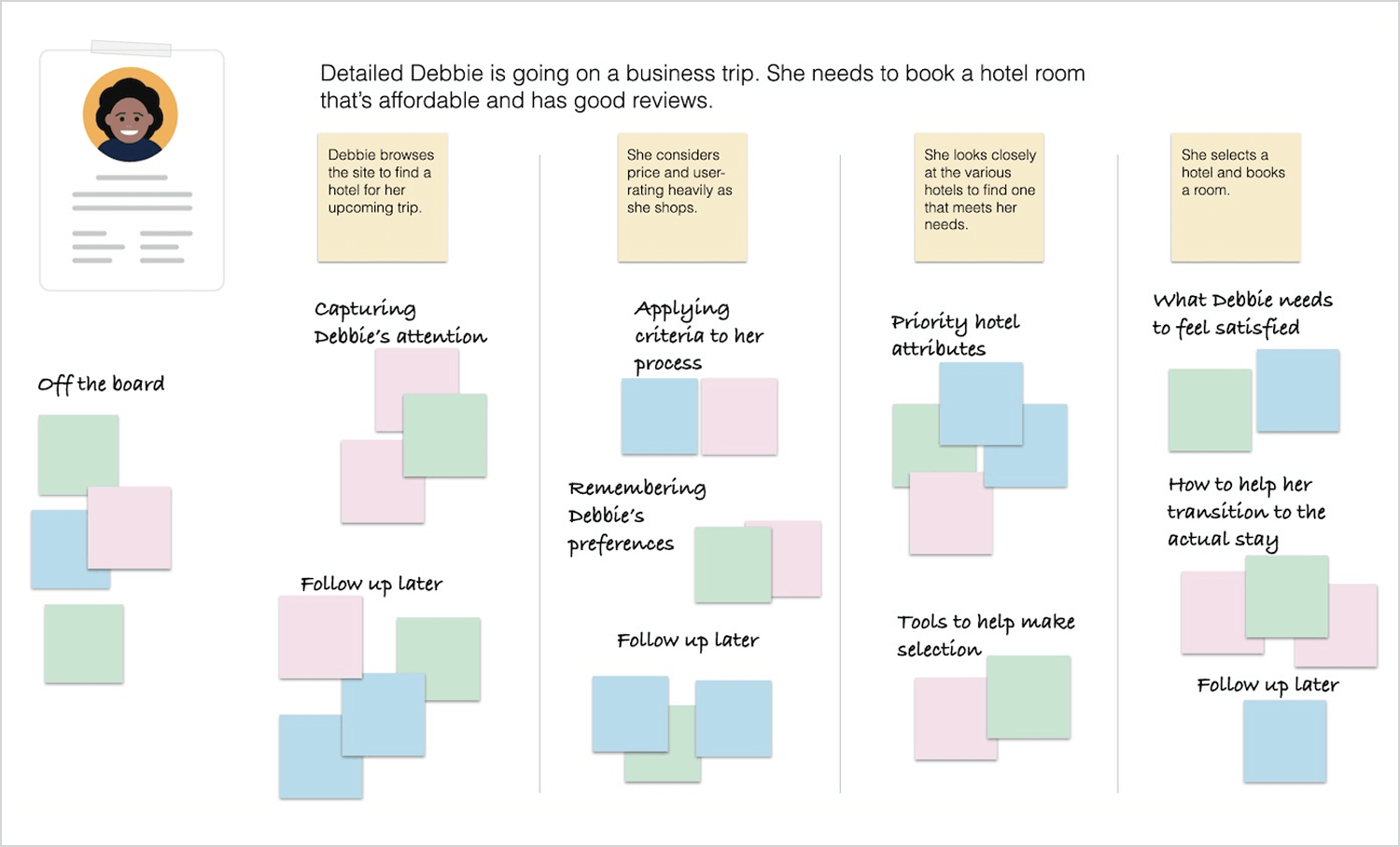
Debbie starts by using the hotel booking website’s search function to find hotels that meet her criteria. She filters the results by location, price range, and amenities. Once she has a list of potential hotels, she reads reviews to learn more about the quality of the accommodations, service, and amenities.
After careful consideration, Debbie decides on a hotel that offers a good balance of affordability, location, and amenities. She books a room for her stay and looks forward to her trip to New York City.”
This scenario by Dovetail illustrates a common user journey for a teacher using a virtual teaching platform, focusing on the initial setup process. We like it because it includes most of the information you need to know to decipher the issue and how the platform solves it by using its “invite students” feature.
“Sam has just logged into his teacher portal after waiting in morning traffic for 40 minutes. His coffee is getting cold, and he just wants his teaching platform set up before the school day starts.
As he takes his first sip of coffee, he realizes he still needs to invite the students. He rushes to figure out the system, texting his fellow teacher down the hall to see if they know how it works.
Before they can reply, Sam sees the “invite your students” call-to-action button and presses it. He sees a clear list of his students, the ability to “select all,” and the “invite” option, which he clicks.
Sam finishes sipping his coffee as he watches his students arrive in his virtual teacher portal.”
However, some details like Sam’s frustration with traffic, or the platform and then expressing relief at successfully inviting students. Also, it would have been appreciated to include platform features that make it easy or difficult to invite students, like a clear interface, search functionality, or potential for errors, to make the user experience better in the future.
Implementing the above would change the scenario to the following:
“Sam is running late for school due to heavy morning traffic. As he gulps down his cold coffee, he frantically tries to set up his virtual classroom before the first bell rings. He’s already had trouble navigating the platform’s interface, and now he can’t find the ‘invite students’ button.
Feeling increasingly anxious, Sam texts his colleague, asking for help. While waiting for a response, he notices a small, inconspicuous link at the bottom of the screen that says ‘manage students.’ Clicking on it, he finds the ‘invite students’ option.
With a sigh of relief, Sam quickly selects all of his students and clicks ‘invite.’ As his students begin to join the virtual classroom, he feels a sense of accomplishment despite the stressful morning.”
This is a long and detailed user scenario that includes much more information than a user’s identifying trait and final goal. Depending on the project, this type of user scenario can add a lot of value in setting the right environment and context of use for the product. This from our friends over at Usability.gov on user scenarios.
“Mr. and Mrs. Macomb are retired school teachers who are now in their 70s. Their Social Security checks are an important part of their income. They’ve just sold their big house and moved to a small apartment. They know that one of the many chores they need to do now is tell the Social Security Administration that they have moved. They don’t know where the nearest Social Security office is and it’s getting harder for them to do a lot of walking or driving.
If it is easy and safe enough, they would like to use the computer to notify the Social Security Administration of their move. However, they are somewhat nervous about doing a task like this by computer. They never used computers in their jobs.
However, their son, Steve, gave them a computer last year, set it up for them, and showed them how to use email and go to websites. They have never been to the Social Security Administration’s website, so they don’t know how it is organized. Also, they are reluctant to give out personal information online, so they want to know how safe it is to tell the agency about their new address this way.”
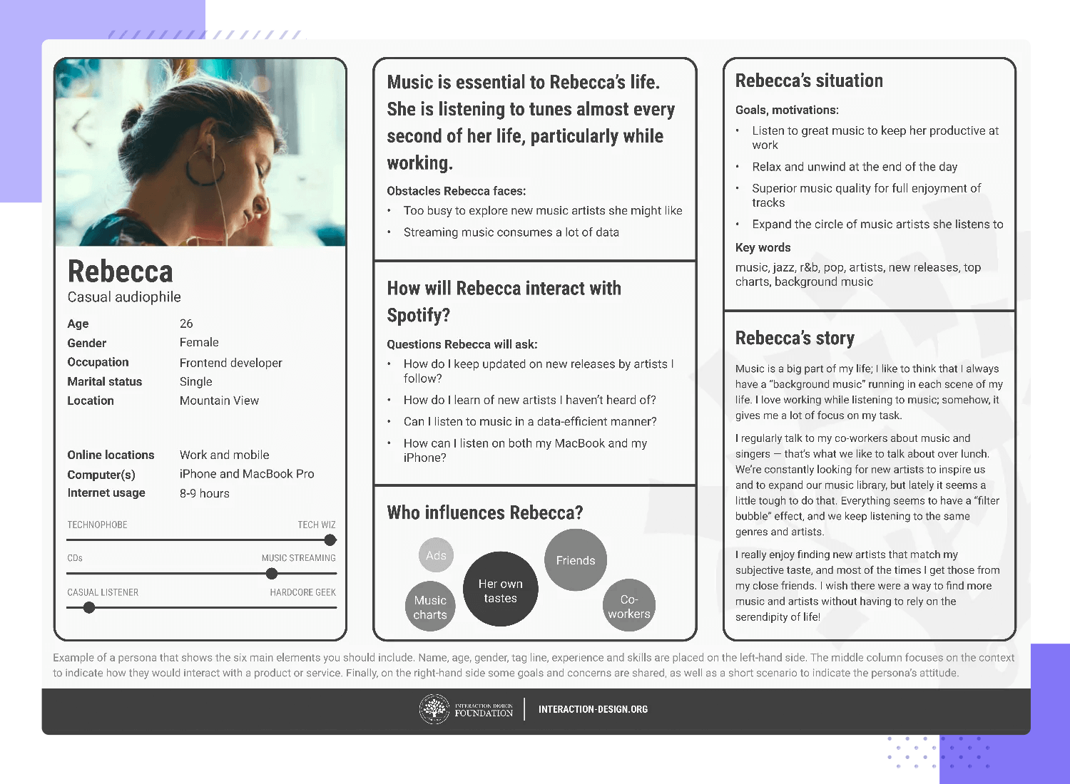
This is another rather complete user scenario from our friends at IDF. It perfectly captures the real-life struggles that motivate the user to seek a solution – as well as the main benefit he would get from it.
“Jeremy, 52, a senior manager for a medical supplies company, needs constantly updated information on purchasing-related issues while he travels between work and hospital sites so he can use/allocate resources optimally. He’s highly skilled, organized and diligent.
However, with recent layoffs he now struggles to manage his workload and is too drained to enjoy his career. He strains to handle tasks which his former assistant previously performed, stays current with issues and investigates supply-chain problems, while he tries to find alternatives that would be more economical in the financial climate.
He wants something convenient like an app to take him straight to only the most relevant updates and industry news, including current information feeds about share prices, tariffs on foreign suppliers, budget decisions in local hospitals and innovations in the medical devices he handles (mostly lung and cardiovascular products).
Instead of continuing to liaise with three other managers and spending an hour generating one end-of-day report through the company intranet, he’d love to have all the information he needs securely on his smartphone and be able to easily send real-time screenshots for junior staff to action and file and corporate heads to examine and advise him about.”
Another fine user scenario example from IDF, but this one is much more visual and concise. We love that this approach makes the scenario much easier to read while still delivering a lot of detail. It covers a lot of ground and keeps things easy to take in.
UX design may be an industry of the future, but it still allows for some things to be done by hand. While we always encourage design teams to make use of software to both make the writing process easier and pool all the information together – but scenario mapping doesn’t need to be done in a fancy platform. It just needs to be done with care, attention to detail and plenty of empathy.
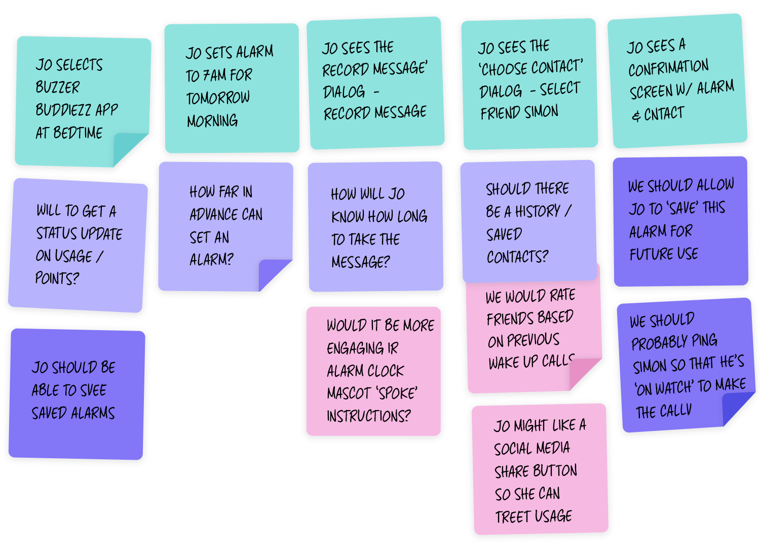
Scenario mapping. Image Credit: Apps For Good
This is a very complete user scenario created by Usabilla on Pete, an avid reader. It highlights how users’ motivations and goals may change according to their daily life, and how that can impact the website in question. Let’s check it out.
“Pete Haller (32, single) works for the corporate communication department of Daimler Chrysler. He loved it in the beginning, but his job is no longer a challenge for him. However, he is scared to reorient because his status and financial security is very important to him. Pete is very organized and can’t stand chaos or inconvenience.
In his free time, he reads a lot of books. Books help him to keep his mind busy and especially professional literature offers him the challenges he misses at work. The last couple of weeks, Pete has really been into medical books. Because of a family history, he is especially interested in kidney diseases.
Pete is looking for an easy to read book for non-professionals that explains different kidney diseases including symptoms, methods of treatment, and possible long-term effects. He does not want to spend more than $30 and if available he prefers used books to save money. He visits Amazon.com to find the right book.
Pete is handy with computers but since working with them all day long, he wants to use them as little as possible when he is at home. Convenience is very important for Pete. He knows exactly what he wants and he expects to quickly find several options that he can choose from. He does not expect the payment process to be difficult or the shipping to take longer than two days. Pete likes to read expert statements and short recev ssions from other users to find out which book is the right one.
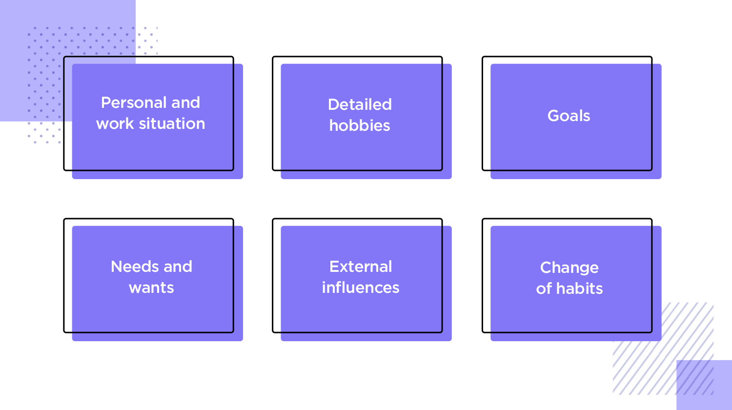
Pete used to go to his local book dealer. He enjoys walking through town after work and pick up his purchases. Lately a friend has recommended amazon.com to him. His friend was very enthusiastic about all the features Amazon offers and above all how convenient it works. This made Pete curious and he wanted to try it out. He also sees the advantages of going home directly after work, and even if he likes going to the bookstore, ordering his books from his desk at home is way more convenient. He wants to try and order his next book online.”
Scenarios are a useful UX design artifact that can help you cultivate empathy for your user and design the best solutions for them. They can be used to figure out where to do usability testing and understand key tasks in a product.
When you map your scenarios intelligently to your users’ journey, you can create a user experience that they’ll want to repeat. And in the end, that’s what it’s all about.
Design your own user scenarios in Justinmind. Download free!
