All your user testing doubts answered, from user testing best practices to unorthodox testing methods
As the old saying goes – knowledge is power. With user testing, you’ll have the kind of knowledge you need to make a positive impact on UX design and create user experiences that your users can truly love and enjoy.
In this post, we’ll get into what user testing is, why you need it, how to do it and what impact it can have. With so many different types, tools and factors that impact your user testing, it’s only natural to feel a bit overwhelmed. But never fear – This guide should break it all down for you.
- What is user testing?
- What are the benefits to website usability testing?
- What methods of usability testing are there?
- Website usability testing workflow
- Website user testing best practices
- Mobile app user testing
- User Testing: 6 methods you hadn’t thought of
- User testing: enterprise software
- 5 tips to improve enterprise software usability testing
Usability testing is a UX design technique which evaluates how users interact with a product or a service using a series of different methods.
It’s nothing new – usability testing has been around for decades. But back in the 1970s, when IT systems were first starting to show their potential to change how we work and live, usability testing was a very different game.
Those early user tests were carried out face-to-face in anonymous hotel rooms with a smorgasbord of stopwatches, VHS tapes and hefty paper reports. Like almost everything from the 1970s, the core of usability testing remains the same even if the methods and technology have changed – now there’s mobile usability testing and website usability testing to consider.
For more: If you’re interested in how user testing was conducted way back in the day, check out Mads Soegaard's article on the The History Of Usability.
Nowadays, however, things have changed considerably. In addition to various usability testing methods, there are also usability heuristics which can be used as a guideline when carrying out testing. Today, we have all the theory, tools and guidelines we need.
Regardless of how you go about your user testing, your study is likely to fall into one of three categories:
- Exploratory: The early stages of website development to assess how effective and usable a design or prototype is. You can also get some insight into a user’s thought process and understanding of different aspects, such as navigation flows.
- Assessment: This category is an evaluation, carried out midway through production. Think real-time trials which are used to understand satisfaction and overall usability.
- Comparative: This category implies the comparison of two or more web designs and dives into their strengths and weaknesses.
Usability testing is invaluable when it comes to UX design. Not only can it give you insight into whether or not your users like your website but there are additional benefits that shouldn’t be overlooked:
Reduce development costs. The common estimate, defended by Jakob Nielsen in his article Paper Prototyping, is that it’s 100 times cheaper to make a change to your website before any code has been written compared to after the code has been completed. That’s why prototyping your website and doing usability testing on that is so crucial – done properly, it means you’ll have fewer reworks and save money along the way.
Improve retention rate. Even once your product is online, you can keep improving with user testing. It allows you to understand why people are leaving your website, for example. When you know why they’re leaving, you can put in place design solutions to alleviate the problem and get rid of friction.
Understand user behavior. Imagine you’ve got your website up and running but no-one is clicking your enticing call to action button, or they’re struggling to locate the search function. Carrying out usability testing can help you change elements of your website to align with user behavior.
Fresh eyes identify unseen problems. Users who aren’t involved in your project may identify problems that were previously overlooked or hadn’t been discovered. Your team is most likely going to suffer from bias and can’t be relied upon to be objective in their analysis.
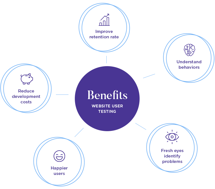
Happier users. When you carry out tests, you’re smoothing out any kinks in the design process. Involving real people and identifying what frustrates them can lead to happier users overall – which can boost retention, improve the UX and hopefully guarantee that people will come back for more.
There is a wide array of tools and tactics we can employ when user testing. Between heatmaps, eye-tracking studies, A/B tests and everything else – it can be hard to find the right one for you to use in combination with your website prototyping tool. You can find in-depth information about them in the chapters of this guide.
For now, let’s go over some key traits of any user testing you carry out. Most user tests out there can be broken down into:
The test is done under specific conditions, and is carried out with the active help of a moderator. This moderator tends to be a UX Researcher, who takes notes and establishes the pace of the entire test.
This type of user testing is widely popular, because it can deliver some truly powerful insights into the minds of users – and how they perceive your product. The presence of the moderator can be a huge help with picking up certain cues such as facial expressions, and using these cues as a door to dig deeper.
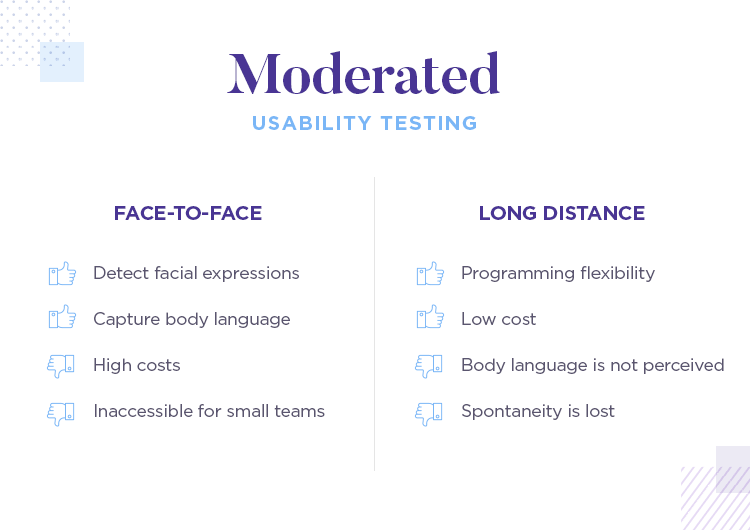
The issues with moderated user testing, however, tend to relate to budget and time constraints. Having a moderator does push up the cost of the entire user testing process – which renders it inaccessible to many small design teams out there.
This has been remedied by the rise of remote moderated user testing, which makes use of testing tools that do everything from a distance. This makes the entire testing much cheaper, as well as allow for more flexibility in scheduling and testing.
It does, of course, have its downsides. The fact that the moderator only sees the user on a screen can make the body language difficult to interpret, is an example.
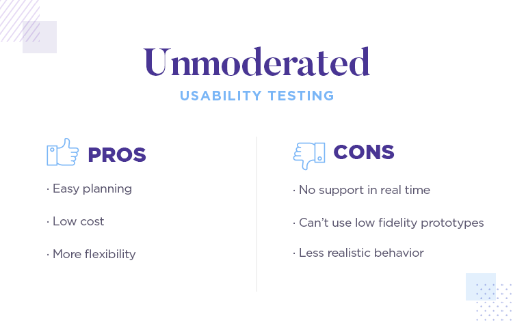
This is where there is no moderator present but online tools are used to facilitate the sessions – these are particularly beneficial if you have dispersed users or want greater flexibility. And so, if you’re in LA but your users are somewhere in Canada, doing a remote unmoderated test might be your best option.
Moderated and unmoderated user testing share a lot of traits, but their main difference (the moderator) has huge implications. Planning, for one, becomes a huge factor. Even a question that is slightly confusing might affect your entire user test, as participants won’t have anyone there to help them proceed.
Having a good usability testing workflow in place can save you time so you can spend your time doing what you do best: designing. The process can be broken down into:
No test is going to go well if you don’t know what you’re looking for. Make sure to have a firm understanding of the scope. This is important, because it will show you what to prioritize and how your test should be structured.
For existing products: This implies doing some research into the state of things. Gather data on what aspects of your product could be improved to narrow down on possible updates.
You might want to test the navigation flow of your site, the position of a call to action button or even just the web copy. The important thing is to know exactly what you’ll be testing, as well as where you want to take your design.
But how do you measure improvement? It’s key that you define key metrics that will help guide your user testing. Things like goals and standards work better when specific, for example: “Current conversion on this product page is 7% but we wish to raise it to at least 10%”.
Who is your desired user? You can find this out by creating some user personas. Knowing who your audience is will strengthen the design process and allow you to understand the parameters of your designs.
This will dictate the kind of participants you recruit for your user testing. Recruiting participants can be easier or more complex depending on the kind of users you need, how you carry out the testing and what it is that is being tested.
For example: Testing senior high school students can be easy if you’re in their geographical location - or very complex if you’re on the other side of the world.
Luckily, many user testing tools out there help with recruitment of participants. UserZoom, for example, has a large database with possible participants. The trick here is to have a defined idea of who your users are, so that you can find them in these databases according to demographics or behavior.
Using real life users is going to give you more accurate information that you can use as you iterate through the design process. Don’t forget that you can use the testing tools integrated with Justinmind to get instant feedback.
Guidelines are needed to help your users through the test. Presumably, you’ll have some goals in place that you want the user to achieve on your website. Maybe you want them to sign up to something or learn about the services you have on offer?
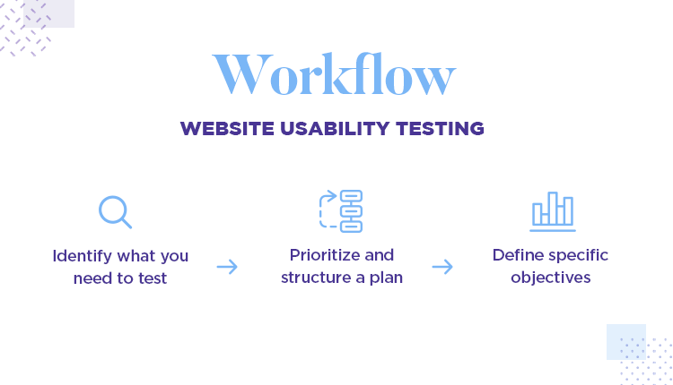
Whatever the goal, write it down. These goals can then be turned into task scenarios which can encourage action from your users. The key here is to come up with tasks that require users to interact with the areas you want to test, so you can see user’s trail of thought as they use the product.
Depending on what you want to test, your tasks can vary greatly.
Now you can put all your learnings into writing. This is a very important part of your user testing process, because it will transmit everything you’ve learned. Your user testing report will most likely be read by people who don’t have a UX background, but who do influence your product. These could be marketing people, business analysts, visual designers or others.
You’ll have uncovered the errors (both critical and non-critical), understood the likes, dislikes and how long tasks take on your product. It’s usually better to list them out according to priority, with the critical mistakes being the first to be corrected.
Another good piece of advice for your reporting is make use of visual aids to communicate statistics and data, such as graphs and pie charts.
Testing your website’s usability can seem like a daunting journey. But it doesn’t have to be. When you break down the process, follow the above work flow and employ some handy best practices, you’ll soon see the fun of collecting interesting data for informed iteration.
A usability test plan can keep you on track and avoid any serious mishaps along the way. In a plan, you can outline the tasks, metrics, roles, goals and problem severity.
This is key because without a plan, things can go wrong. And they often do. Usability.gov has a free usability test plan template which you can download and use. Having a plan is always preferable to going in blind, because you save time in making simple decisions along the way. It also helps you stay on track, making sure you don’t lose sight of the ultimate goal.
Testing isn’t a luxury in UX design; it’s a necessity. Therefore, when you are creating your web design, you should try to test often. This is part of why running small-scale tests can be a huge help, so you quickly validate parts of the design as you progress.
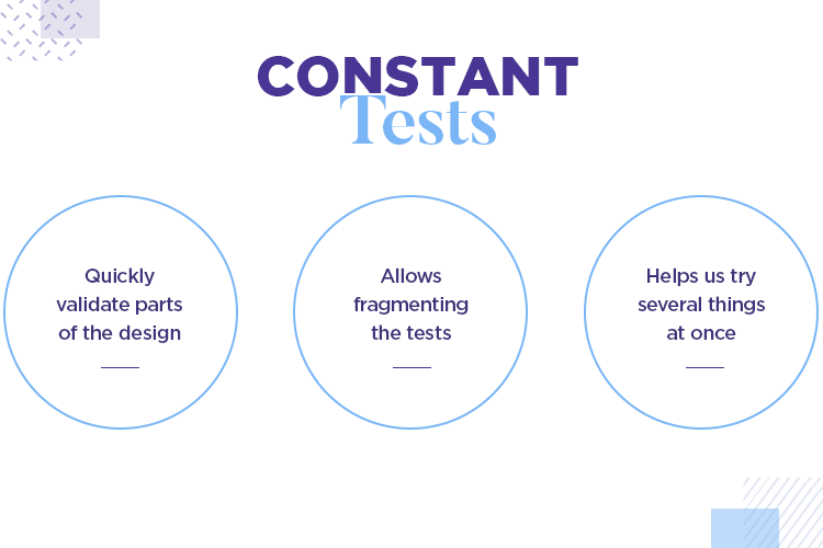
The idea behind testing often means you can focus your time and energy on testing a few things at a time. This breaks down the usability testing process into more manageable chunks and allows you time to really analyze the results.
What do you plan to do during the test? This isn’t the time for spontaneous improv. Creating a script can keep your mind on the task at hand and give structure to your testing sessions.
In a script, you want to make any notes for yourself, as well as an explanation for how the test is going to go including information about the tasks at hand and any closing remarks. The script should be complete, so you can refer back to it during the user testing.
Check out this user testing script template to help you plan properly.
Go through the test yourself before doing it on any real life guinea pigs. Alternatively, grab the attention of someone who works with you and have them take the test. This will help you discover any issues so that your users can have a smooth testing session.
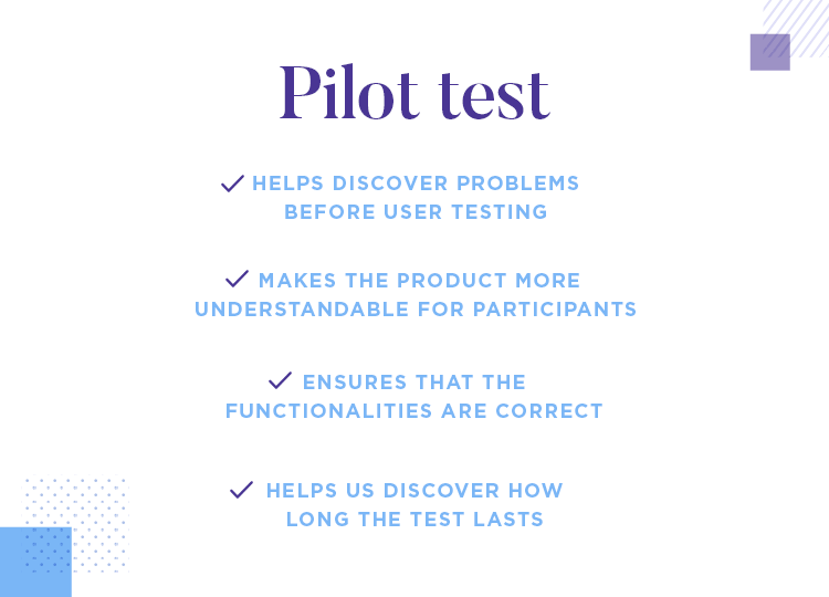
Pilot tests are important: If you plan on carrying out remote user tests, you want to run a pilot. There can’t be any confusing tasks or questions. Participants will be on their own, so be careful in the planning ahead.
Here you’ll be able to ensure the functionality is a go-go, your script makes sense and discover just how long the test takes. You can make the required adjustments at this stage, too.
Having team members observe testing sessions can be insightful. If your team is observing how users go through the testing then they’ll be able to empathize with them and understand where they struggle and where they succeed.
Essentially, this stage is about letting your team understand the needs of your users. This can be beneficial to them as you continue to make iterations. For example, if a testing session reveals a need to change a feature, having developers in the room would give us more clarity on what would be needed to make that change.
After you’ve created your prototypes, done your tests and got the team involved – you’ll be able to present any findings from the testing sessions. This includes what works and what doesn’t work. When debriefing, it’s a good rule of thumb to say why something works or doesn’t work.
Using user flows can help illustrate your user’s journey more accurately. In a user flow you can highlight what your user is supposed to accomplish, the steps they need to take to accomplish any given goal and whether or not your users have enough information to accomplish specific tasks.
A lot of app user testing stays the same as classic website-oriented testing. The theory behind the testing, its motives and benefits, the planning and goal-setting. Most factors remain the same – with a few crucial differences, of course. Let’s explore some of these differences and see how they compare to a good old website user test.
Phrases like “test early and often” are repeated constantly in all UX-oriented platforms. The truth behind it points to the exponential growth of the cost of making changes to the design, the further the design is in the development process. In order to avoid a nasty surprise late in the game, UX designers try to test the design early when it’s still a wireframe.
But that does come with some complications. It’s only logical that participants behavior will be less and less realistic with the missing details of the product. The lower the fidelity, the less real it feels to the user. That implies, for example, that testing your prototype remotely would be difficult as participants are likely to ask questions for guidance.
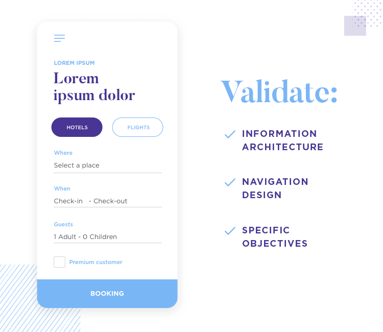
But where does that leave low-fidelity prototypes of mobile apps? And how can we focus our usability testing? The main concern you can deal with at the early stages is validating to crucial aspects of your design: information architecture and navigation design.
Both of these will be the building blocks of your app. They go to the very center of making your app usable and useful. You’ll want to define very specific goals and establish certain standards so you can immediately see a success or failure with each test.
A common way to validate your navigation would be to place your prototype in front of participants and ask them to reach a certain screen or page. If the user clicks the right buttons, the test continues. As soon as the participant clicks on the wrong button, the test ends. When the test ends, the participant is asked to elaborate on why they decided to click on that button.
The final outcome is a report in which the navigation is turned into a funnel. As users drop off and get lost, they become leaks in the funnel, showing where the main issues are within the product.
To focus your eye more on information architecture, you may want to keep this funnel structure to your reporting but change the task slightly. Instead of asking participants to make their way to a certain screen, ask them to accomplish something such as making a purchase or finding a piece of content.
If you want to make sure you’re taking a user-centered approach to app development, there’s no better way than dabbling in a bit of Participatory design. Participatory design is when end-users are involved from the very early stages of the design process, working collaboratively with the design team to define the product.
Instead of trying to put ourselves in the users’ shoes, we put them in ours as designers. Of course, leveraging this methodology correctly takes some organization.
Hats off to David Zax writing in Fast Company for this truly unorthodox approach of testing apps with drunk people. As Zax points out, a decade ago it made sense to user test your software in sterile office environments, but with the explosion of mobile computing people’s software use has grown legs and walked right out of the office.
Now, your mobile software will in all likelihood be used anywhere but the office or home.
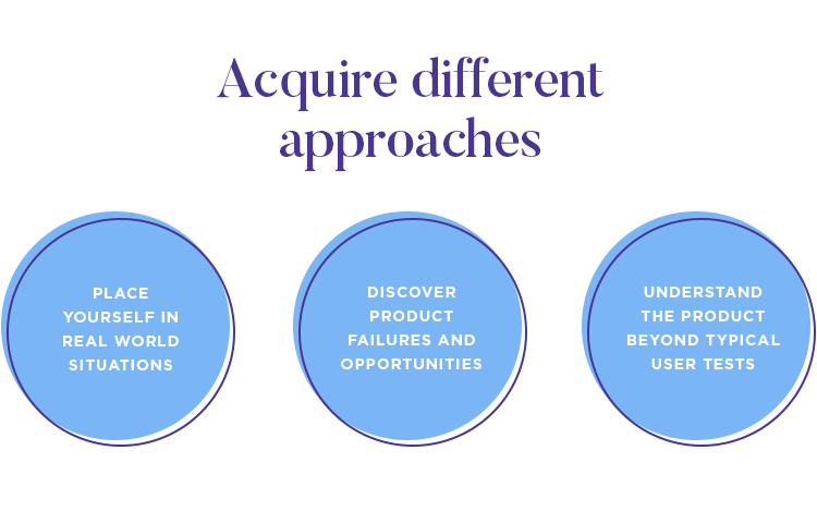
So why not do user testing in the wild? Dave Lieb did just that, taking his app Bump on a bar crawl to be tested on users who were, thanks to a couple of drinks, “a little cognitively depleted or impaired—not unlike the typical multitasker”.
The experiment revealed some key flaws in assumptions the designers had made about how much brain energy users wanted to commit to learning the app.
Obviously we’re not suggesting that you get users sauced before breaking out the A/B Test… but putting yourself and your testers in real world situations might just reveal something that takes your software from meh to awesome.
Interactive prototypes have pretty much revolutionized user testing. But how about being even more savvy and user testing also on static wireframes? If you assume you need to be at the fully functional prototype stage to do user testing, then think again.
Prototyping tools like Justinmind can be great for introducing user testing at any stage of the design process: running your low fidelity mockups past users can help you identify potential problems with navigation flows that you may not have perceived, and reveal counter-intuitive user interface elements.
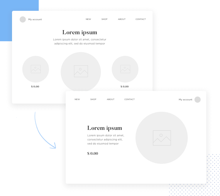
Also, if your mobile or web app is already up and running and you just want to introduce an aesthetic change, running this change past users in lo-fi mockups will help users focus on key elements.
Prototypes help you introduce user testing at various stages of the design process, helping you round out your testing strategy without blowing your budget or running over schedule.
Particularly useful at the conceptual design stage, Triading is a great way of revealing your users’ reactions and emotions. The methodology is deceptively simple – you are trying to get the user to compare and evaluate 3 different alternatives, without influencing them through your questioning.
For example: Present them with three different designs or prototypes – A, B, C – and ask them to tell you what differentiates one of the designs and why.
So you’re not asking “which one do you like best?”, which closes down analysis; you’re asking them to tell you what is important and why. Keep asking them more and more focused questions until you get to their core needs and desires. They might end up surprising you with what they really need from your software.
We’re inspired by the example of language app Duolingo, which uses data collected from its community of users to make frequent tweaks to the content and organization of the app. Interviewed in Fast Company, founder Luis von Ahn explained how Duolingo uses A/B Testing to see how people learn languages, and change the app experience based on that info.
Duolingo turned user testing into “large-scale data-driven learning”, in von Ahn’s words, and transferred to users the power to create their own language courses within the app.
It’s not just software startups like Duolingo that can take a fresh approach to user testing. Take the example of Microsoft, who wrote the rule book on using adjective cards to access users’ deepest desires. It’s super simple but super revealing.
The user is exposed to a piece of software, then given a 118 cards with adjectives written on, and asked to describe the experience using 3-5 of the cards. Then get the user to explain why they chose what they did. We told you it was simple!
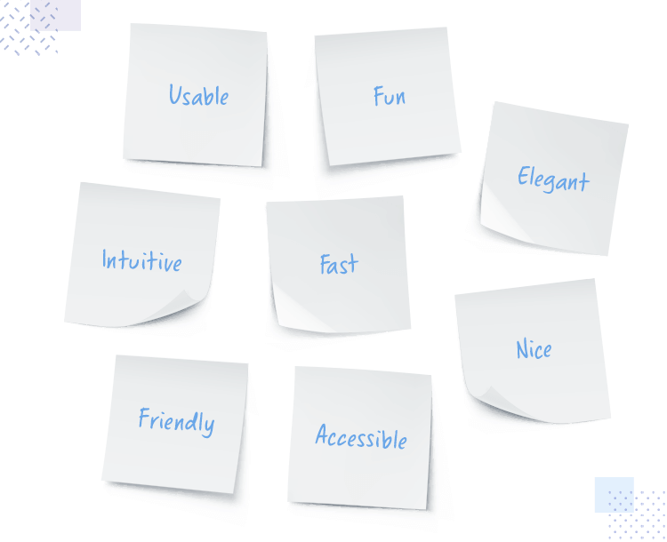
This approach can help reveal the more intangible elements of your UX, such as ‘fun’ and ‘desire’, feelings that you might want to instill in your users but not yet have figured out a test for.
There are several factors that complicate the task of ascertaining the usability of an enterprise application.
Firstly, when testing an enterprise software, organizational experience has equal weight as individual user experience. Back in 2005, Jakob Nielsen described enterprise usability as “how the system impacts the company over time, including issues in administration, installation, and maintenance,” and his words still ring true.
Any user testing of an enterprise software has to look beyond the single user’s ability to manage an interface or complete a task. It has to dive into Total Cost of Ownership (TCO) to the organization as a whole, cross-departmental interactions and long-term impacts. Instantly, user testing becomes more complicated.
Add to that recent changes in the modern workplace such as Bring Your Own Device (BYOD) trends, which mean that hugely complex, highly secure systems and software have to be multi-device friendly. Enterprise clients often need software to function on numerous servers, storage and OS platforms, all of which need to be tested both pre- and post-installation for usability issues.
But none of these factors reduce the centrality of usability to the enterprise software experience; testing is hard but vital. These 5 tips and techniques provide a baseline for effective enterprise software usability testing, leading to actionable results.
It would be pretty much unthinkable to launch a consumer-facing app onto the marketplace expecting users to read a manual or attend a training course before using the product. When it comes to enterprise software, this rule is not so hard and fast.
Yes, enterprise software has to be intuitive; but some training of users may be the norm in an enterprise thanks to the irreducible complexity of global systems.
This means that throwing user testers into an enterprise usability test cold can produce skewed results – testers can’t know if a difficulty arises because of usability glitches or just because of a lack of basic training. The key is to give testers the foundational knowledge they need to navigate an enterprise app, without coaching them to ace usability tests.
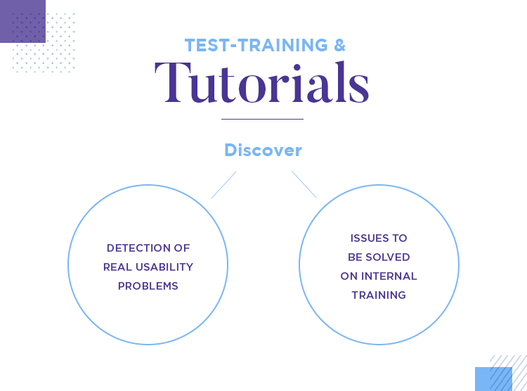
That’s where test-training with hi-fi prototypes comes in. Once an interactive prototype of a final product solution is created using a prototyping platform like Justinmind, these hi-fi prototypes can then be used by testers to create tests that have training-like activities built in.
For example, instead of asking a participant to do a task once, ask them to do it twice – the first time will be like a training run, the second time will be a truer test of intuitivity. Also, creating mini ‘tutorials’ based on the prototyped solution is a great way to provide a controlled introduction to the UI without participants being tempted to ‘coach from the sidelines’.
By adding elements of training into user tests before the software is coded, developers can separate real usability problems from issues that will naturally be ironed out during in-house training.
Thanks to their aforementioned complexity, there’s a lot that can go wrong when using enterprise software. That’s why all enterprise usability tests should include ‘improper use’ tasks.
Will the software react gracefully when a user goes down the wrong pathway? Will its error messages be explicatory and actionable for all users? The user testing stage is an opportunity to ask user testers to ‘fail’ and then work their way out of a problem.
Building error messages and reverse pathways into an interactive prototype allows testers to watch users solve problems without raising testing costs.
Procurement and QA departments in any large enterprise will be well versed in assessing this Total Cost of Ownership (TCO) for any product bought in. But what does it have to do with user testing?
Enterprise software can be measured not only on its impact on the individual user, but also on its organizational impact. TCO estimation is a way for testers to get an angle on the organizational usability of a software.
Roundtables involving IT departments, administrators and the C-suite should be organized to facilitate openness, discussion and a bird’s eye view – to ensure full commitment testers can establish some ‘roundtable rules’ before things get going. No phones, no interruption of colleagues, or similar.
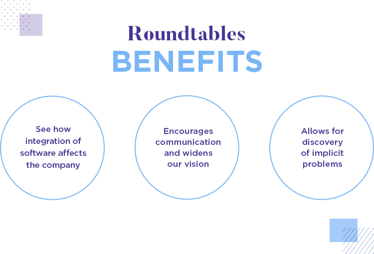
The idea is to break open wider issues around usability that may have been only implied or even concealed previously.
‘MVP prototyping’ might seem like an oxymoron, given than traditionally prototypes are non-coded mockups and MVPs are the code seedling from which will blossom the finished product.
However, a fully functional prototype of even a complex enterprise system can be created on advanced prototyping platforms. This MVP mockup will have the look and feel of the proposed application, but can be built in a matter of days based on initial requirements gathering.
This means usability testing can start earlier and at a lower cost than on coded MVPs, hopefully resulting in less reworks when it comes to the development stage.
Usability testers might sometimes feel that teams fail to act on their advice. A fix for that is to ensure that results are presented comprehensively, with advice on how to solve problems and carry out relevant actions.
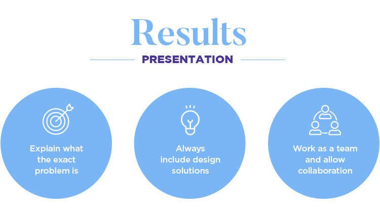
The first thing to avoid is vague wording. Make sure everyone knows exactly what and where the problem was, present with visuals and multimedia evidence garnered from usability test tools.
Once the exact problem has been explained – “the user failed to locate the log-in button” rather than “log-in was confusing”, for example – it’s good practice to include design solutions. Don’t assume that the development team are all-knowing and all-seeing; a new perspective might make the difference between a great software and an average one.
Work with the development team, don’t lecture them, and build relationships that will result in positive outcomes over the long term.
User testing is a non-negotiable today. No matter how many sleepless nights designers spend trying to understand their users, it’s nearly impossible to have that level of empathy. Users are, ultimately, people with their own likes and preferences. When attempting to create something your users will enjoy, there’s no alternative but to see how they react to the product.
Hopefully, though, with all the knowledge in this list as well as the right tools at your disposal, your user testing studies will go smoothly.
