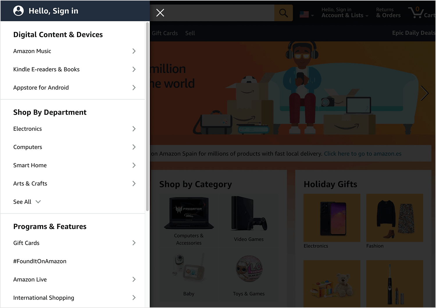
Good UX requires that all information is logical and within reach. Check out this complete guide and leave no user lost behind!
Start wireframing your Information Architecture. It's Free!

Whenever we use any website or mobile app, we are faced with an interface that lays down information to us as we need it or look for it. It’s something we are all used to – most users don’t even notice that all the content inside that website has been carefully organized for them.
The organization and division of content is known as information architecture (IA), and it is a crucial aspect of UX design. Without proper sorting, most users would be lost and confused when navigating your website or app – rendering the real value of your product moot. After all, what good is an awesome feature if users can never find it?
To make sure you have your content well structured and presented to users in the best possible way from the website wireframe stage, we here at Justinmind decided to bring you a guide to IA. Check it out.
Information architecture can be surprisingly difficult to define. This is in part because while other subjects such as content writing can be narrowed to a specific job title – the writer – the field of IA stretches across many professions. In truth, everyone involved in product development applies information architecture methodologies at some point – be it in a wireframe or in a mind map.
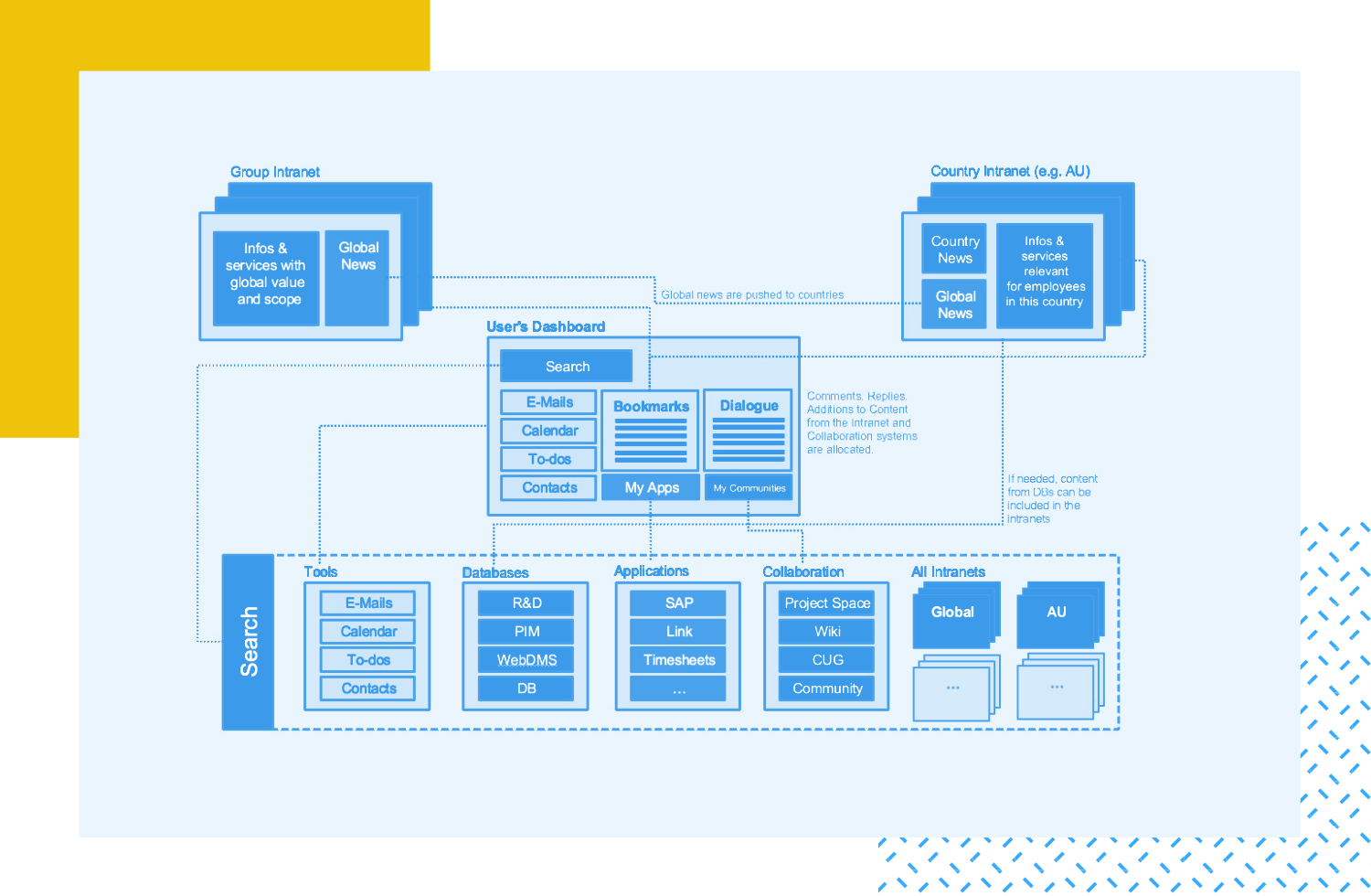
Most websites and apps will need their content divided into parts, it can both be understood by users in a quick manner, and be organized so the user can find all the features the product has. Sometimes, this is done so smoothly that users never stop to think about how the information is organized for them.
That is the case for websites such as Google Drive or Medium, which must think carefully about how they present information to the user – or risk getting several features lost in a sea of random buttons and links, that users won’t ever follow or enjoy.
In other cases, you can see that the use of architecture in information is extreme and clearly noticeable – as well as very difficult to pull off. It’s the kind of thing that requires ingenious design, a good wireframe tool and constant testing.
No. There is a strong connection between the two, but while UX involves a great deal of Information architecture the two aren’t exactly the same thing.
UX is much broader, and includes several aspects of the user’s experience that IA never touches – such as making sure the interface is pleasant, and responds to certain psychological needs of the user. In contrast, information architecture is much more focused on the user’s goals and cognitive effort usage.
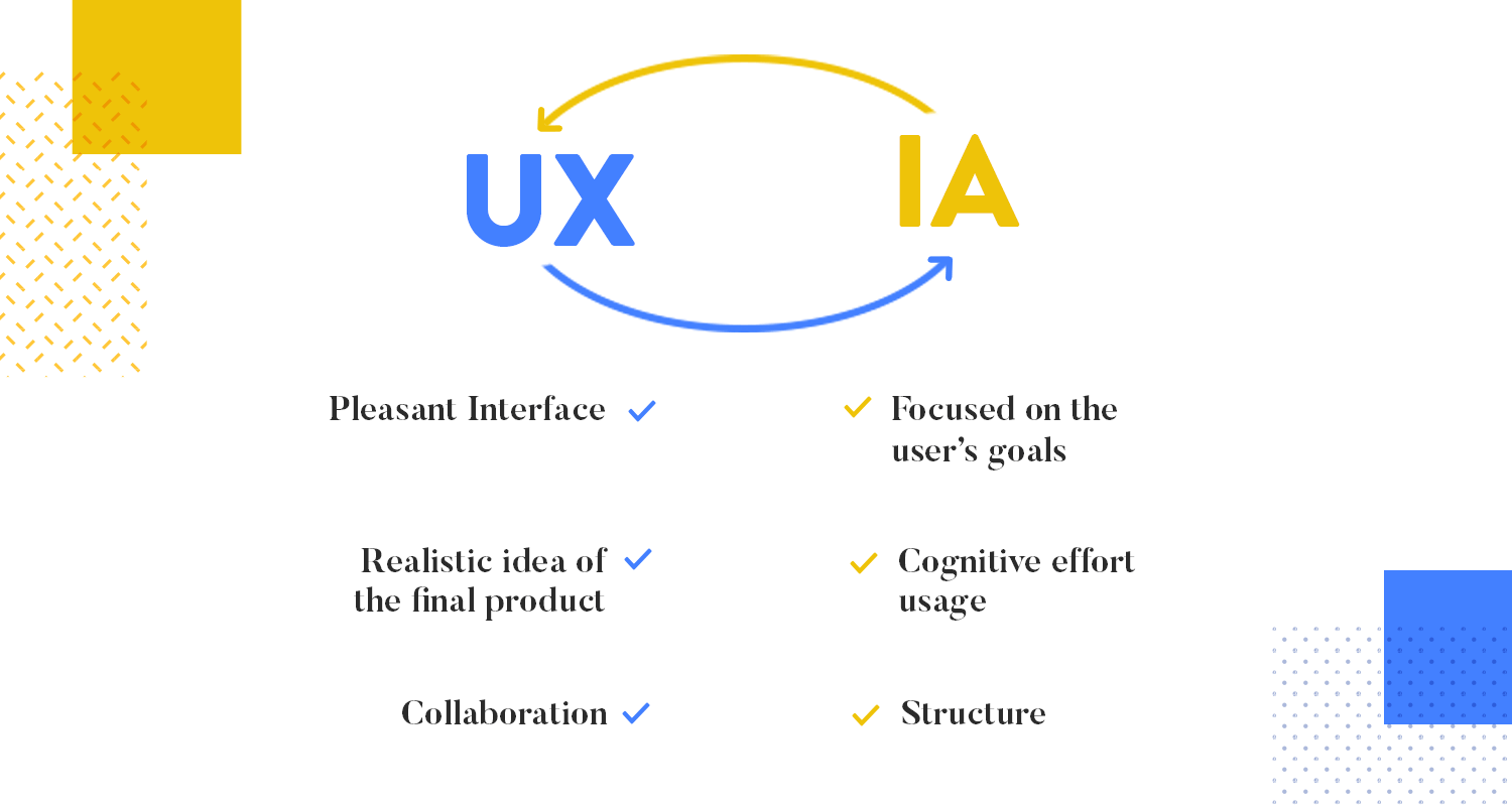
Here is how the two concepts are closely linked: without good IA there is no logical and effective user experience. It works as a foundation on which the interface can be developed, opening the door to all the other aspects of UX design we all know and love.
We ought to make a small distinction here, however. IA needs to be a solid base on which you can build the user experience, but it cannot work as the whole project. Once you know how you can take the user by the hand around your product, you need to add flare and work on other things, such as interaction design that combined with your IA, can deliver an amazing experience.
Information architecture is what makes using your product possible – and this couldn’t be any more evident than in video games, in which there is a whole new world with its own set of rules and history. This means that a vast amount of information about this universe needs to be presented to the users if they hope to advance in the game.
You’ll notice, however, that all this information is never presented at once but rather in small bits as you progress along the game. First, you have the introduction that sets the scene, usually presenting the main character and a little bit of backstory. From there, new information is displayed in digestible bits, so the player discovers this world slowly. This is what we refer to as progressive disclosure.

Ubisoft's Assassin's Creed.
Those little dialogue/content boxes that feed the user new information whenever a certain level is reached, or an action is done is IA – at its finest. But how do we decide what we tell the user from the beginning? How do we give the right amount of information, so the user’s curiosity is fed but not overwhelmed?
Start wireframing your Information Architecture. It's Free!

These eight basic principles can serve as a guide to any UX designer trying to make sense of their product. Originally conceived by EightShape’s founder Dan Brown, these principles say that information architecture in itself is the practice of designing structures – and give you a few pointers on just how to do that. Check them out.
This principle regards how you see your content. Brown says that instead of looking at your content as something stiff and inanimate, like an object, you try and see it as a living thing – with its own lifecycle, behaviors and characteristics.
The reason why this is a relevant principle in IA is that it allows you to treat your content with the flexibility it requires. If you see your content as its own being, it becomes easier for you to see possible relationships that content has with other data, to see different ways in which you can present this content to the user.
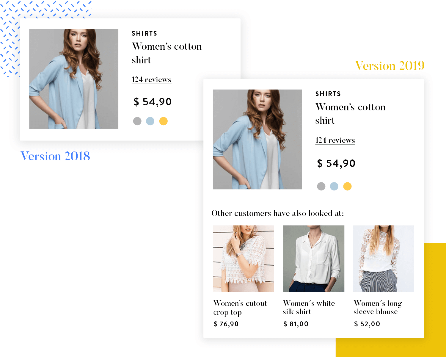
A useful trait of this principle is that it embeds the content lifecycle into your architecture, preparing you for times when that content will boom and then mature – this happens surprisingly often with content that is more sought after seasonably.
Brown gives us the example of a recipe website, in which recipes can relate to each other as complementary, or become more relevant in certain times (like turkey filling recipes around thanksgiving).
Brown refers to the epic work of psychology “The paradox of choices” by B. Schwartz – in which we learn that people have the illusion that they want to have as many choices as possible. Most UX designers will know that to not be true – and Schwartz and Brown agree.
Here’s the thing about giving your users lots of choices: the more choices we can make, the more cognitive power it takes for us to actually make that call. It can even cause anxiety.
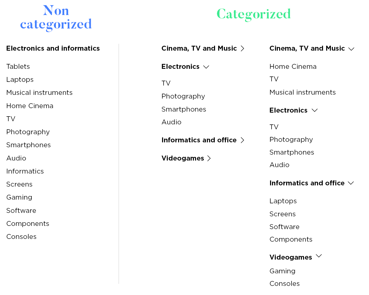
Brown gives the example of a corporate intranet, where it is custom for big companies to display large amounts of information, with little regards for categorizing content or information architecture in general.
The result is that people waste vast amounts of time looking for that little piece of data they actually want, or just give up on using that intranet altogether.
Doesn’t sound like something you want to happen to your product, does it? That’s exactly what IA aims to avoid.
It’s recommended that you make your lists (all of them!) shorter, especially at the higher hierarchical levels. This is also something you want to bear in mind when designing a matrix structure for your content – users can only choose from a certain amount of options before they stop enjoying themselves, and start actively making effort to use your product.
This principle deals with the fact that people can only process new information in a certain way. What we mean by this is that people don’t deal well with unexpected, or unwanted information – this is a concept called progressive disclosure.
It means that in your information architecture, you need to organize your data so that people can not only absorb it at a normal rate, but so that they can anticipate further information before it’s presented. In your UX design, this means thinking about the brief bits of information you give away in any type of list or grid that acts as a gateway to the detailed content.
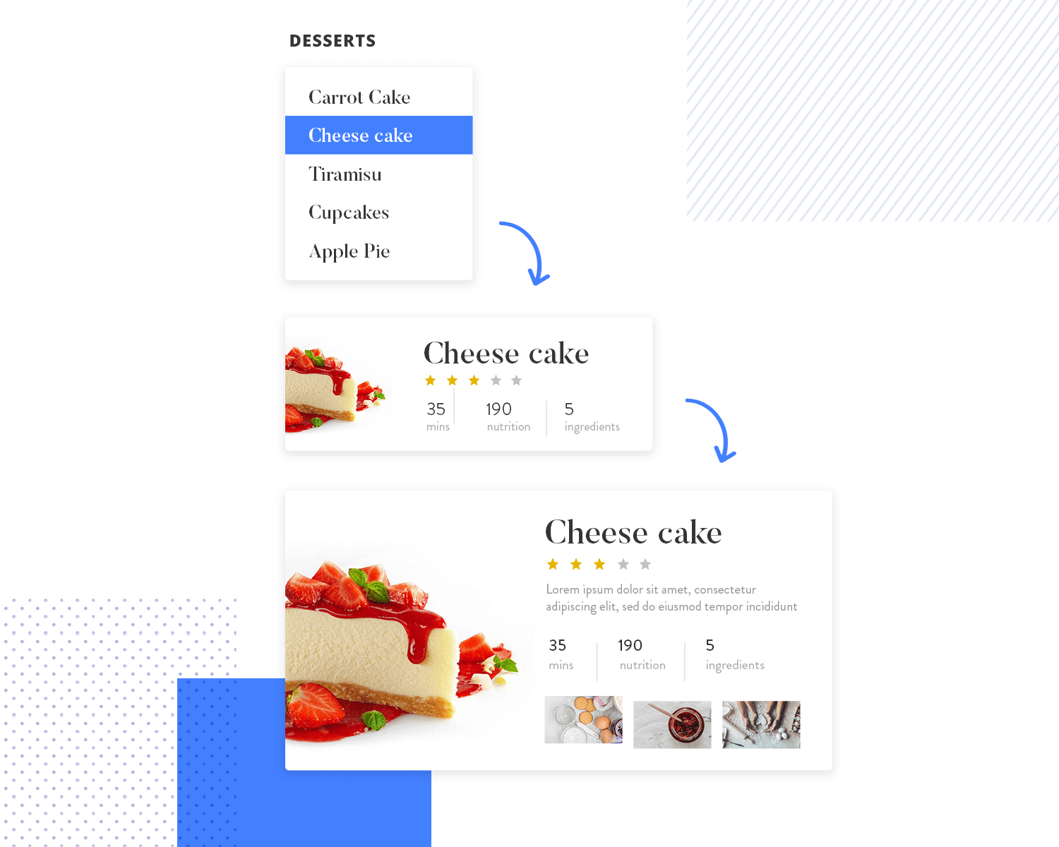
Let’s go back to Brown’s recipe website example. You can’t hope to display the full recipe on all the pages the users navigate through – but how do you decide what to show when listing out possible recipes?
Type of cuisine is a good indicator of the dish, but it falls short of giving the user a clear picture of what they can expect in that recipe. Your design should select just enough information to help the user decide if they want to click on that recipe or not.
This principle refers to the psychology of how humans categorize things. Ultimately, we are able to categorize concepts by creating a list of examples that help us group different concepts together, no matter the criteria behind this grouping.
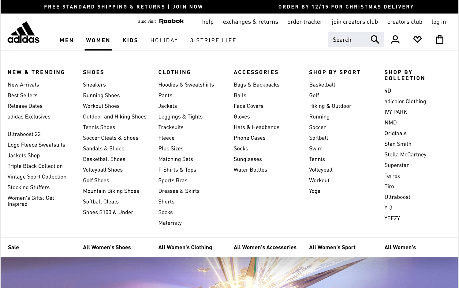
When it comes to applying this to your information architecture, think of the way you display category lists on your app or on your website. Each category needs an example of the type of content that inhabits that category – you can use the biggest, most commonly used subcategories.
Brown says it’s wise for any designers to assume that people will reach your website via another page that isn’t your homepage.
This can have surprising consequences on your webpage design, but less so on mobile app design – the idea that your website has several doors that users can come through. This leads Brown to make two main recommendations regarding your information architecture:
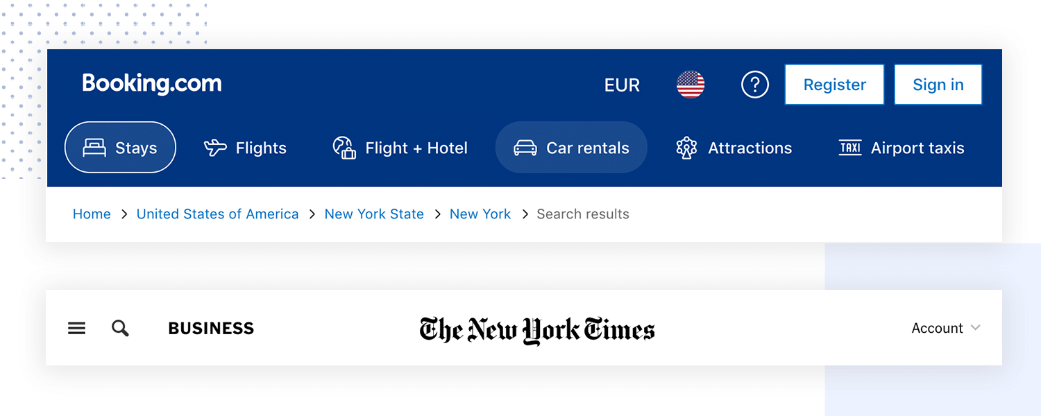
Always tell people where they are. Your website will have so many destination pages, and visitors can come through just about any of them. Therefore, it’s important that you reflect the website map somewhere the user can see – so if you just followed a link from Google to a blog post, you should be able to see what category that blog post is and other similar content.
This is important to give brand new users an idea of logic within a large structure, as opposed to a large lake filled with little bits of content, each random in its own fashion.
Your homepage shouldn’t be the whole website. The difference between a homepage that is too long and tries to do everything to a good one is simple. A good homepage should give the user a clear sense of your purpose, of the things that can be found on your website as a whole, but it shouldn’t try to display all the available and detailed information to the user.
This comes from the fact that even among a small group of similar people, you’ll still find that people have different ways of looking for information. Some people will type the general topic of the data they are looking for (such as beachwear, for example) while others will naturally go for the type of data they want (like bikinis).
This is important to your design and IA, because you need to account for this in your search system. This is a fine line to walk, because it comes with a catch: the more ways to find information you give users, the more likely it is that they become overwhelmed or distracted.
Brown states that your navigation shouldn’t simply include all the content in your website. Many design teams get carried away with adding navigation menus everywhere on the website – making the menu itself seem lacking in logic. And information architecture is all about logic in user experience.
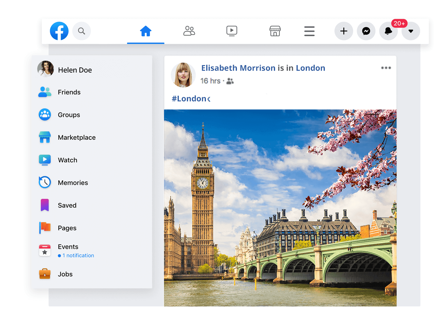
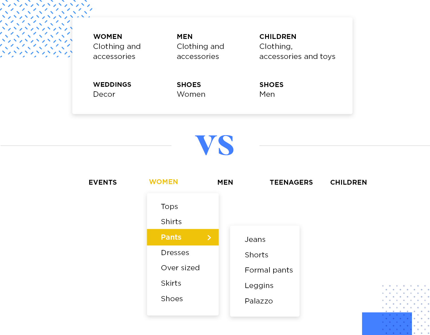
Instead, Brown recommends you have a strategy in your menus and have different menus for different types of information when possible. One menu for blog post topics, and a separated marketing menu (where you list out the services the company offers) for example.
This will improve the usability of your website, even if it removes a button that goes straight to that contact page.
Remember that IA is all about separating things according to their correct category, so the user knows exactly where he is and where to find the desired information – not creating a web of links that connect every little piece of information to the homepage.
This is a rule that anyone working with content should bear in mind: the amount of content in your product is likely to grow over time.
It’s fairly logical – putting up content on the internet keeps becoming cheaper. As a whole, digital content increases exponentially every year, and you should assume your content will follow in the same footsteps.
Start wireframing your Information Architecture. It's Free!

Before diving into information architecture, it’s crucial to understand the who and the where: the users and the context in which they’ll interact with the information. Here’s a breakdown of the three key concepts:
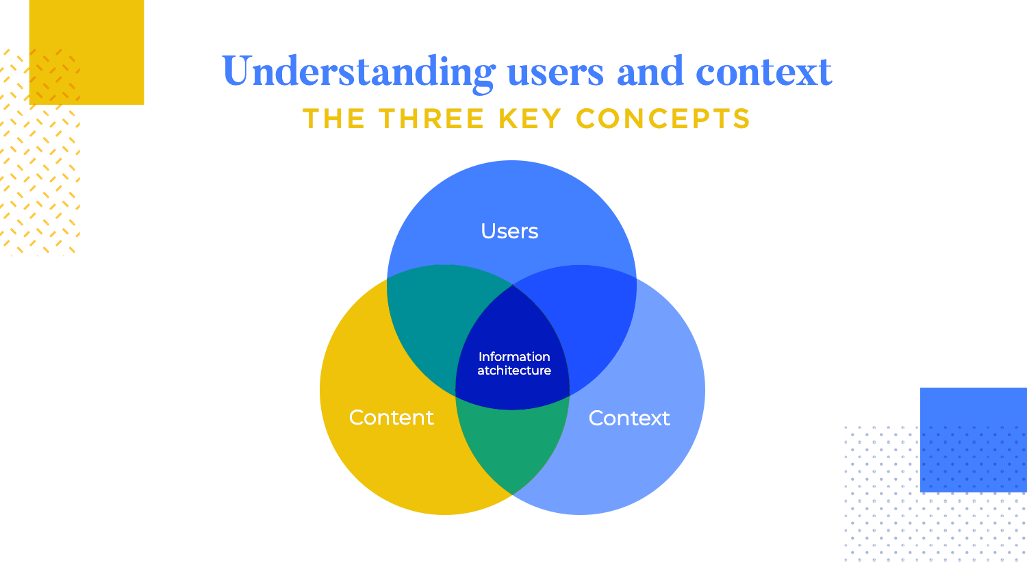
User research is like detective work for the design world. It’s all about uncovering the who, what, and why behind your target audience. There are multiple tools in this investigative toolbox to help you find your user personas. In-depth interviews, either one-on-one or with groups, allow you to have focused conversations with users, delving into their goals, frustrations, and thought processes.
For broader data collection, surveys cast a wider net, reaching a larger sample size through online questionnaires. These research surveys can provide valuable quantitative data on user preferences and behaviors.
Finally, after gathering this user data, you can transform it into personas. These are fictional characters that represent your target user groups, helping designers to step into the shoes of real users and build empathy for their needs and motivations.
By using this mix of user research methods, you can gain a comprehensive understanding of your target audience, informing user-centered design decisions.
Uncovering user needs is the cornerstone of user-centered information architecture. Through user research, you can delve into the core reasons why users interact with your information. This research focuses on three key areas: user goals, user behaviors, and pain points.
By understanding what users are trying to achieve with the information (their goals) and how they typically search for it (their behaviors), you can tailor your IA to their natural information-seeking process.
User research also sheds light on the frustrations (pain points) users encounter while searching. Identifying these roadblocks allows you to remove them from the IA, creating a smoother and more satisfying user experience.
Don’t just think about the information itself, consider the context of use as well. This refers to the environment and circumstances where users will be accessing your information. Imagine a user on a crowded train trying to navigate a complex website on their phone – not ideal!
Understanding the devices users will be on is crucial. Desktops and laptops offer more screen real estate for complex information, while mobile phones require a more concise and user-friendly approach.
The environment also plays a role. Will users be in a quiet space where they can focus on detailed information, or will they be in a noisy coffee shop needing to scan quickly for key points?
By considering these contextual factors during the IA design process, you can ensure your information is presented in a way that is optimized for the environment and device users will be in, maximizing accessibility and understanding.
Information architecture (IA) is the art and science of organizing information in a way that’s easy for users to find, understand, and navigate. It’s the foundation for a great user experience (UX). Here’s a detailed breakdown of key best practices to elevate your IA:
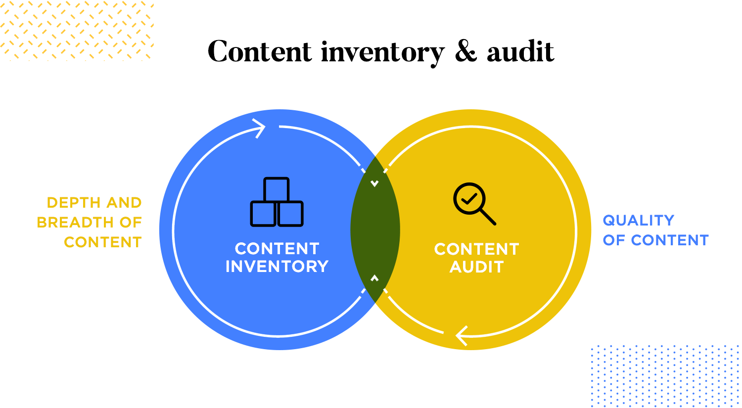
Before building your information architecture, it’s crucial to understand your existing content. Here’s a two-step approach to take stock:
- Gather All Content: This is a comprehensive sweep of everything you offer. It includes website pages, articles, documents, videos, images, and any other information users can access. Don’t forget downloadable content like white papers or case studies.
- List and Categorize: Create a master list of all content items. Include details like title, format (text, video, etc.), creation date, and a brief description of the content’s purpose.
- Use Spreadsheets or CMS: Organize your inventory for easy access and manipulation. Spreadsheets can be helpful for smaller projects, while Content Management Systems (CMS) offer robust features for managing and publishing large volumes of content.
- Evaluate quality: Assess the accuracy, completeness, and timeliness of your content. Does it meet current industry standards and best practices? For example, are your articles well-researched and factually correct? Are your videos high-quality and up-to-date?
- Check relevance: Is the content relevant to your target audience and their needs? Would they find it valuable? Analyze user behavior data to see which content pieces resonate and which ones fall flat.
- Identify redundancy: Are there duplicate pieces of content that can be merged, consolidated, or removed? Streamlining your content reduces confusion for users and prevents them from encountering outdated information.
- Analyze performance: Look at metrics like user engagement (time spent on page, number of scrolls) and bounce rates (percentage of users who leave a page immediately) to identify underperforming content. Content with low engagement or high bounce rates might need revision or removal.
Once you know what content you have, it’s time to organize it in a way that’s intuitive for users. Here’s where hierarchy comes in:
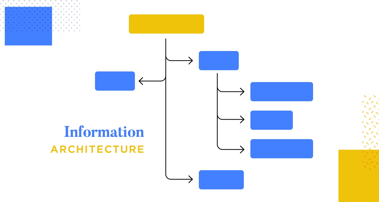
Imagine an information pyramid. Broad categories, like main sections of a website, sit at the top. These categories then branch out into more specific subcategories, like subpages within a section. This hierarchical structure allows users to progressively navigate from general topics to more detailed information.
- Start with main categories: Identify the broad categories that encompass all your content. These categories should be clear, concise, and easily understood by your target audience. For example, an e-commerce website might have main categories like “Products,” “About Us,” and “Support.”
- Refine with subcategories: Break down main categories into smaller, more specific subcategories. Maintain a logical flow between categories and subcategories. For instance, the “Products” category might have subcategories for “Clothing,” “Electronics,” and “Home Goods.” Each subcategory could then have its own set of sub-subcategories for even more specific product types.
- Limit the number of main categories: Aim for 5-7 main categories to avoid overwhelming users.
- Maintain consistency: Use the same hierarchical structure throughout your website or application.
- Test your hierarchy: Conduct user testing to see if users can easily find the information they’re looking for.
Now that you have your hierarchical structure, it’s time to decide how you’ll categorize your information within each level. This is where organization schemes come into play. These are different methods for grouping content within categories and subcategories. Choosing the right scheme depends on the nature of your information and user needs:
Alphabetical
The alphabetical organization scheme excels for short lists or glossaries where users have a specific term in mind. Its strength lies in fast and efficient retrieval. Imagine a phone book – you can instantly find a specific person’s listing by going to the corresponding letter section. This familiarity with alphabetical order makes it easy to navigate and find information without any special training.
However, it’s important to consider the limitations. Alphabetical organization isn’t ideal for browsing or very long lists, and including cross-references to synonyms or related terms can be helpful for users who might not know the exact term they’re looking for.
Chronological
The chronological organization scheme excels at presenting information that unfolds in a sequence, allowing users to grasp the progression of events, concepts, or product iterations. Imagine a historical timeline – it clearly portrays the past by laying out major events in chronological order. This scheme is also intuitive for information that naturally follows a timeline, like software updates or product releases. Users can easily track changes and see how things have evolved.
Additionally, knowing the information is listed chronologically allows users to anticipate where to find specific details. For instance, someone looking for the latest software update can expect to find it at the beginning of a chronologically organized list. Keep in mind, though, that this scheme relies heavily on clear and accurate dates. If dates are missing or unclear, users might struggle to navigate and find the information they need.
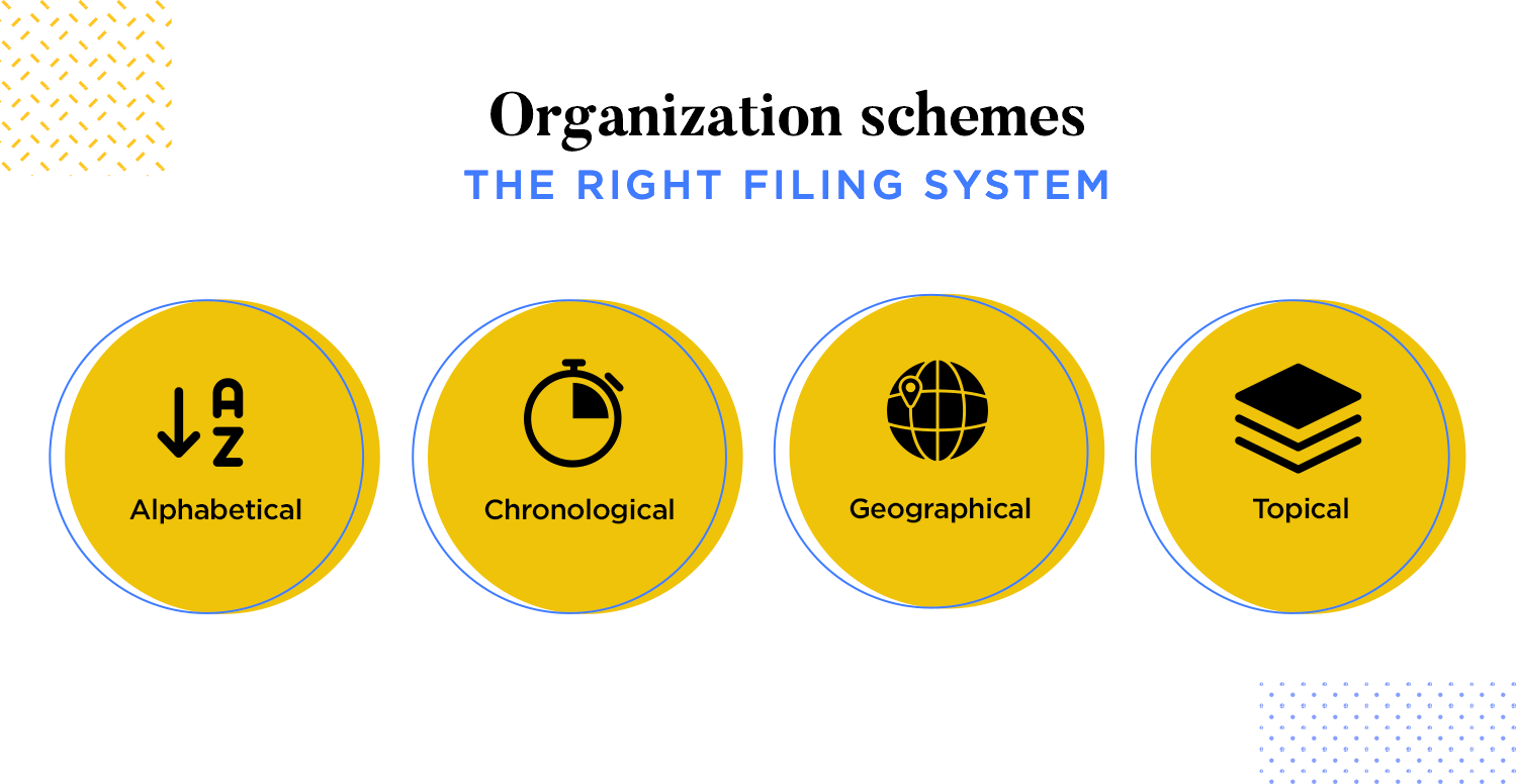
Geographical
The geographical organization scheme shines for location-centric content, allowing users to explore information based on their current location or desired destination. Imagine a travel guide app – with a few taps, users can discover nearby attractions, restaurants, or hotels based on their GPS coordinates. This geographical organization empowers users to make informed decisions by enabling them to compare options within a specific location.
For instance, a real estate listing website organized geographically lets users see available properties in their preferred neighborhoods. It’s also important to consider that this scheme often relies on user location data. Users who are privacy-conscious or those in areas with limited GPS reception might face challenges finding information.
Topical
The topical organization scheme reigns supreme in its versatility. It seamlessly categorizes almost any type of content, from news articles to educational resources, making browsing and discovery a breeze for users. This scheme aligns perfectly with how people naturally think about information, leading to an intuitive and user-friendly experience.
Furthermore, its flexibility allows for easy expansion and refinement as your content grows. New subtopics and categories can be added to keep your information architecture relevant and scalable. However, maintaining consistency throughout your information architecture is crucial. Inconsistent labeling with topic categories and subcategories can disorient users and hinder their navigation.
The organizational structure is the act of making sense of your content. This is when you mark the connection between different pieces of information, and try to come up with a framework that helps the user understand all those connections among all the information your product has.
Once the framework has been implemented, it makes it easier for the user to foresee where certain information will be as there is a logic to the distribution of all the content – a classic aspect of any usability test. In their book, Morville and Rosenfeld set out three different frames you can use on your information architecture.
Hierarchical structures
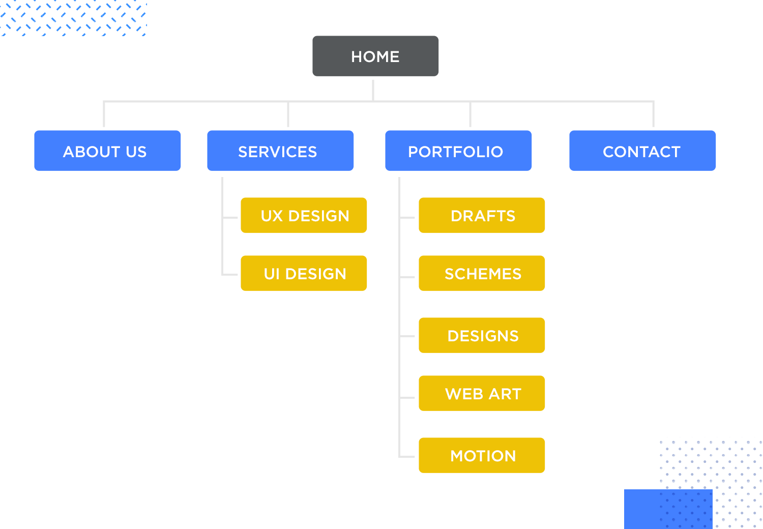
Also known as tree structures, this would mean using a trickle down-effect, in which you use broad categories at the top, and more specific and smaller subcategories the user can navigate through.
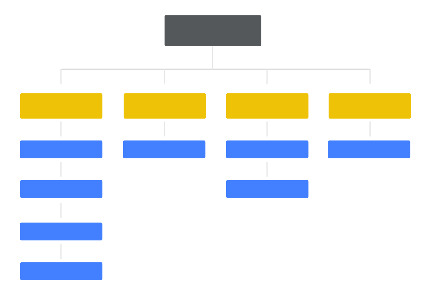
Visualization of a hierarchical structure.
This visual hierarchy works well to convey the importance of different pieces of information, as it displays them in a ladder of relevance.
Sequential structures
This form of information architecture organizes your content to create a certain path for your user. This means the user will have to follow certain steps, and take in only the information that is presented to them at that moment.

This works well to avoid giving too many choices to users, and have them become frustrated or overwhelmed by all the possible choices at their disposal.
Matrix structures
This is somewhat contrary to sequential structuring. While sequential organizing aims to take the user by the hand down a series of designated steps, matrix structures will let the user choose their preferred means of navigation. This translates into giving the user access to all the information in the form of links and buttons, and letting them decide.

You could say that the matrix structure allows the user to create their own path in your product, by giving the user all the possible directions and features.
Your labeling system is a way for you to convey a lot of information with a single word. The reason why we have labeling systems at all is because it helps users find content by concept, as opposed to navigating around your whole product looking for the piece of information they want.
Think of a regular commercial website. When you look for ways to contact that business, you could be after a whole set of different information. Are you looking for their phone number? Their contact email address or actual physical address? You’ll find all this information under the same label in the website interface: the contact page.
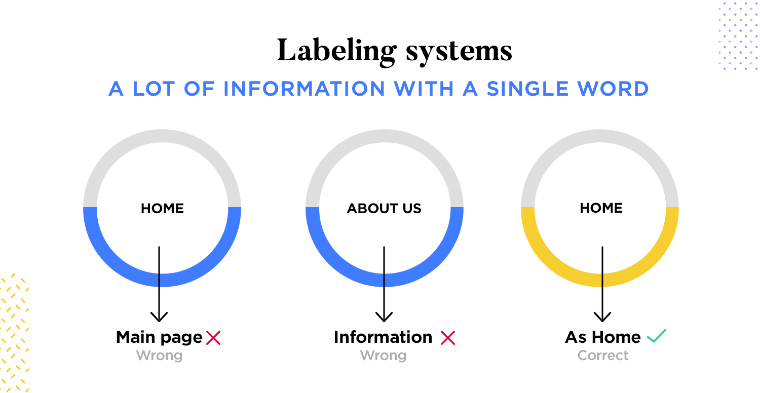
Ensuring consistent labeling is vital for a seamless user experience throughout your website or application. This means using the same terms for the same concepts throughout. Don’t confuse users by using synonyms or jargon interchangeably – imagine a website that flips between “cart” and “basket” for checkout! Consistency also applies to voice and tone. Are you aiming for formal or informal? Playful or serious?
Maintaining a consistent tone creates a smooth and cohesive experience for users. Finally, visual consistency ties everything together. Use consistent formatting and design elements like font size and color for your labels. This creates a sense of order and makes it easier for users to scan and identify the information they need.
Clarity is key for effective labels. Strive for labels that are crystal-clear and leave no room for misinterpretation. Ditch the technical jargon and overly complex language. Instead, focus on using clear, concise, and easy-to-understand terms. For instance, instead of the phrase “Utilize the search function,” opt for the simpler “Search for what you need.” Remember, your labels should be specific to the content they represent.
Avoid generic labels that could apply to anything. Instead, use clear and concise wording that accurately reflects the content it describes. Finally, take a user-centered approach. Consider your target audience and the language and terminology they’re familiar with. Labels that resonate with your users’ understanding will guide them effortlessly to the information they seek.
Beyond clarity and consistency, consider incorporating conventions to enhance your labeling strategy. When possible, follow established labeling practices within your industry. For instance, e-commerce websites typically use standard terms like “Add to Cart” and “Checkout.” This familiarity creates a smoother user experience. Accessibility is also crucial. Adhere to accessibility best practices by using descriptive alt text for images and ensuring sufficient color contrast for visually impaired users.
Finally, user testing is invaluable. Conduct tests to see if your labels are clear and understandable. Ask users if they can interpret the labels and find the information they need. This feedback can help you refine your labeling strategy for optimal clarity and ensure your information architecture is truly user-friendly.
In terms of information architecture, the navigation system is less about having a great interface and more about how the user can move through pieces of content or information. It’s important to always remember that IA is all about finding ways to help the user navigate the information in order to reach their goal.
Your navigation system should, in a way, be the opposite of your content. You want rich content that can be complex as long as it’s useful and enjoyable to the user. Your navigation design should always be as simple and as straightforward as possible, while still getting the user to any possible desired information.
Global navigation, the ever-present guide on your website or application, ensures users can find their way around with ease. These navigation elements, typically residing at the top (horizontal) or side (vertical) of your interface, appear consistently across all web pages.
For an effective global navigation system, prioritize clarity and consistency. Use clear and concise labels for navigation elements, and ensure these labels remain consistent throughout your website.
Prioritization is also key. Base the order of navigation design on user needs and website goals, making sure the most important sections or features are easily accessible.
Finally, design your navigation for scannability. Limit the number of options and use clear visual cues to differentiate between them, allowing users to find what they need at a glance.
You can find more about creating a great navigation system by reading Karafilis’ post on Smashing Magazine.
Imagine you’re driving on a road trip. Global navigation is like the highway system, efficiently getting you to major cities (the main sections of your website or application). But once you exit the highway and enter a city, you need a more detailed map to navigate the streets. Local navigation takes over here, providing that fine-grained guidance within specific sections.
Local navigation focuses on wayfinding within these sections, offering more targeted navigation options relevant to the user’s current context. Sub-navigation menus might appear, bursting with subcategories or related products on an ecommerce website’s product category page. On a news website’s politics section, a local navigation sidebar might display subcategories like “US News,” “World News,” or “Op-Eds.” This contextual relevance helps users delve deeper and explore related information without feeling lost in a vast website.
The beauty of local navigation lies in its ability to enhance findability. By providing more targeted navigation options tailored to the current section, users can easily find the specific information they seek.
Local navigation also reduces cognitive load. By presenting relevant and organized navigation options within a specific section, users don’t have to sift through a maze of generic navigation menus.
Contextual navigation goes beyond static menus by anticipating user needs and suggesting relevant content or features. It analyzes user behavior and the current context, like the page a user is on or their browsing history.
This allows it to recommend content that aligns with the user’s potential interests. Imagine browsing a travel website and seeing curated suggestions for things to do or places to stay based on your chosen destination.
These well-timed suggestions can spark user curiosity and encourage them to explore deeper, leading to a more engaging and satisfying journey. Additionally, contextual navigation can help users discover hidden gems or content they might not have found otherwise.
For instance, an e-commerce website might suggest complementary products based on your current selection, streamlining the discovery process and helping users find exactly what they need. By anticipating user needs and personalizing the experience, contextual navigation transforms your website or application into a dynamic platform that fosters exploration and discovery.
Breadcrumbs are a user-friendly navigation element that goes beyond simply getting users to their destination. They act like a map, providing a visual cue for users to understand their current location within the website’s information architecture.
This is particularly beneficial for complex websites with nested layers of content. By seeing the “breadcrumbs,” users can grasp how they arrived at their current page and the broader context of the information they’re viewing.
Breadcrumbs also empower users by giving them a sense of control over their navigation journey. They can easily see their location within the website’s hierarchy and navigate back to previous sections if needed, eliminating the need to rely solely on the browser’s back button, which can be especially helpful for users who delve deep into website content.
This transparency fosters a more user-friendly and intuitive experience, reducing frustration and keeping users engaged.
Much like you would expect, having a search system can come in handy when you have lots of data in your product. Just like your labeling system, your search also has several different aspects to be considered, which you might not think of straight away.
Let’s imagine a website for your regular e-commerce retail business. Your first impulse might be to simply create a search bar that holds all the possible pieces of data. It’s imperative that you resist that impulse.
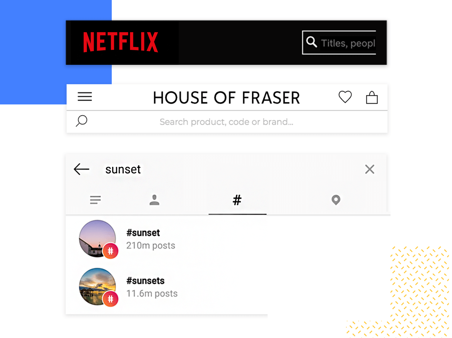
An effective search system ensures that users can quickly and efficiently find the information they seek within your website or application. Here’s a breakdown of the key elements:
The true power behind a user’s successful search lies in the search algorithm, the unseen engine that sorts through your website’s content. An effective search algorithm prioritizes relevance, ensuring the most relevant results rise to the top.
This goes beyond just keyword matching, but also considers factors like content similarity and even user intent. To further enhance search accuracy, the algorithm should recognize synonyms and related terms. This ensures users find the information they need even if their phrasing isn’t identical to the exact keywords on a page.
Finally, the algorithm should work hand-in-hand with filters and facets, allowing users to refine their search results based on specific criteria. This way, users can narrow down their options and pinpoint exactly what they’re looking for.
Filters and facets are the tools users wield to refine their search journey after the initial query. These features allow users to drill down into the results and unearth exactly what they need.
- For optimal usability, keep the filter and facet labels clear and concise, using terminology that aligns with how users naturally think about the information they’re seeking.
- Don’t make them decipher a code! Logical organization is also key. Structure the filters and facets in a way that makes sense, allowing users to navigate and refine their search based on different criteria in a hierarchical manner.
- Finally, visual cues are your friend. Use icons, checkboxes, or drop-down menus to differentiate between filter options. Clear visuals make it easier for users to understand their search refinement options at a glance.
Once you’ve gathered, structured, and labeled your content, it’s time to make your information architecture tangible through diagrams and wireframes. This step translates your well-thought-out structure into a visual format, ensuring that what makes sense on paper aligns with what users will experience on the screen.
Think of diagramming as creating a roadmap for your website or app. It’s a way to show the relationships between different sections, pages, and pieces of content. Start with your main categories at the top and branch out to subcategories and subpages. This creates a visual hierarchy that’s easy to understand at a glance. Tools like flowchart software or even simple whiteboard sketches can help you lay out these connections clearly.
When diagramming, focus on simplicity. Too many overlapping paths or complicated structures can overwhelm not just you but your users too. Each line and box should have a clear purpose, guiding users through logical paths. Keep in mind that this diagram isn’t just for you, it’s for your entire team to align on how users will navigate through the content. The clearer your map, the smoother the development and design processes will be.
Wireframes are like blueprints for your web pages or screens. They help you visualize where information and elements will sit without the distraction of color or detailed design. Picture it as sketching out the layout of your living room before deciding on paint colors or decorations. The purpose here is to prioritize content placement and flow.
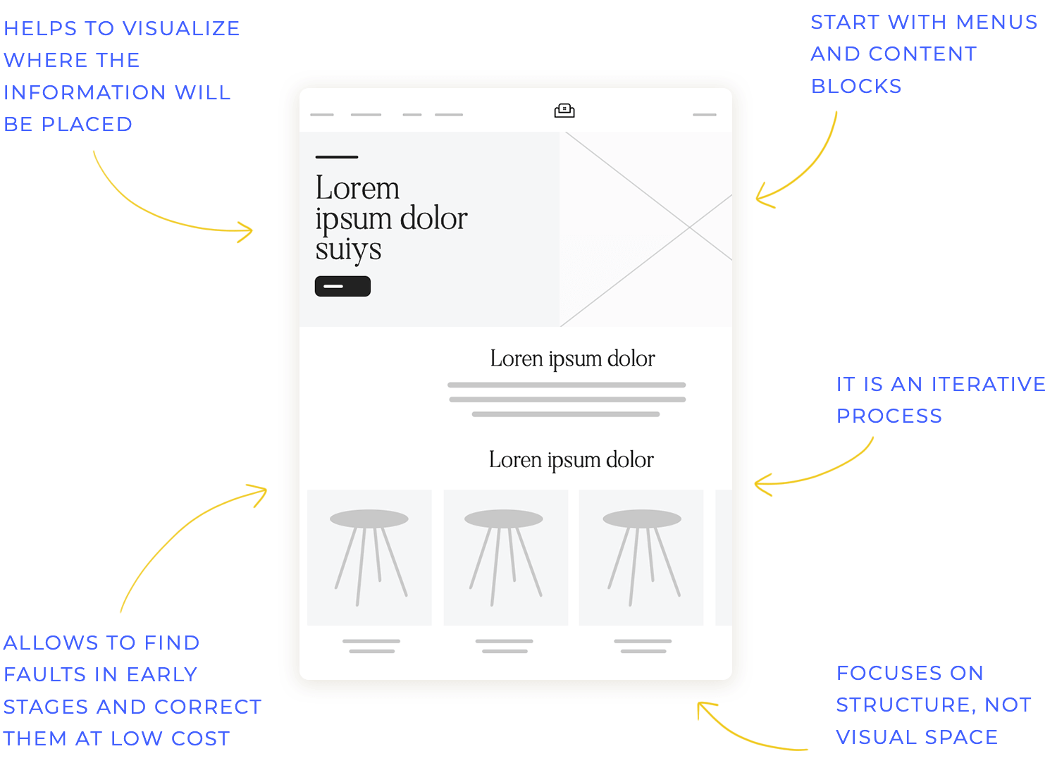
When wireframing, start with the main elements that align with your IA, such as navigation menus, breadcrumbs, or content blocks. This helps ensure that your structure supports user navigation seamlessly. Tools like Justinmind, Figma, or even simple paper sketches are great starting points. The goal is to create a space where users can intuitively find what they need, with your IA serving as the backbone for these placements.
As you refine your wireframes, remember that this is an iterative process. Gather feedback, tweak placements, and always test with users if possible. This step helps bridge the gap between theoretical planning and practical user experience, making sure your IA isn’t just well-organized but also user-friendly in practice.
With a clear diagram and well-thought-out wireframes, you’re not just visualizing your IA – you’re breathing life into it, preparing your project for the next stages of design and development. This brings us to the next crucial step: validating your IA through user testing.
During testing, you can observe if users can intuitively navigate the structure to find the information they need. Information findability is another crucial aspect. Testing exposes any issues users might have in locating specific content within the IA hierarchy. And last, but certainly not least, user testing helps gauge the overall usability of your IA. Read on to find out what are the best practices to conduct user testing:
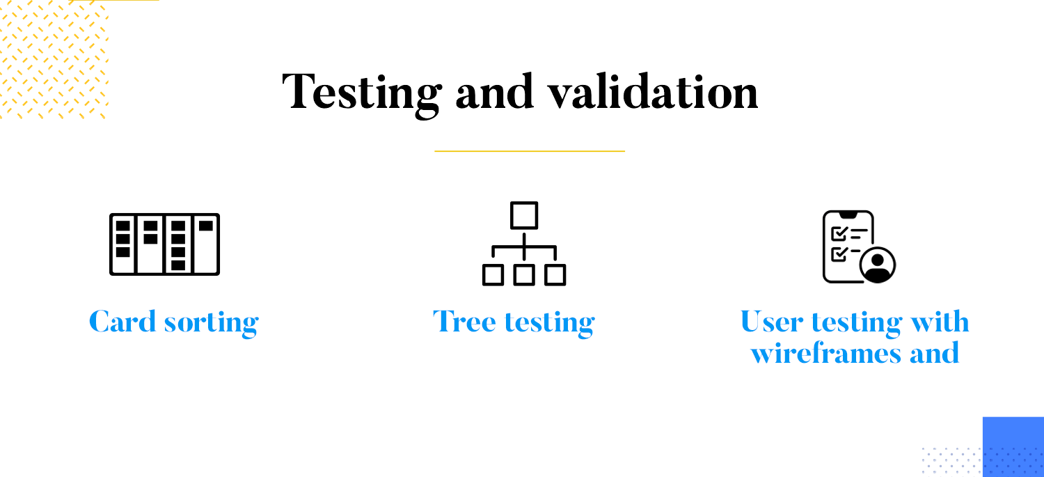
The card sorting technique helps you understand how users categorize information. Users are presented with cards containing labels for different content elements and asked to group them in a way that makes sense to them. The resulting groupings can inform your IA decisions about content organization and labeling.
This method assesses the findability of information within your IA hierarchy. Users are presented with a tree-like structure representing your website’s navigation and asked to complete tasks by finding specific pieces of information. The time and difficulty they encounter reveal potential flaws in your IA organization.
This involves directly observing users interacting with your wireframes and prototypes. Watch how they navigate the interface, identify areas of confusion, and gather their feedback on the overall information architecture.
Start wireframing your Information Architecture. It's Free!

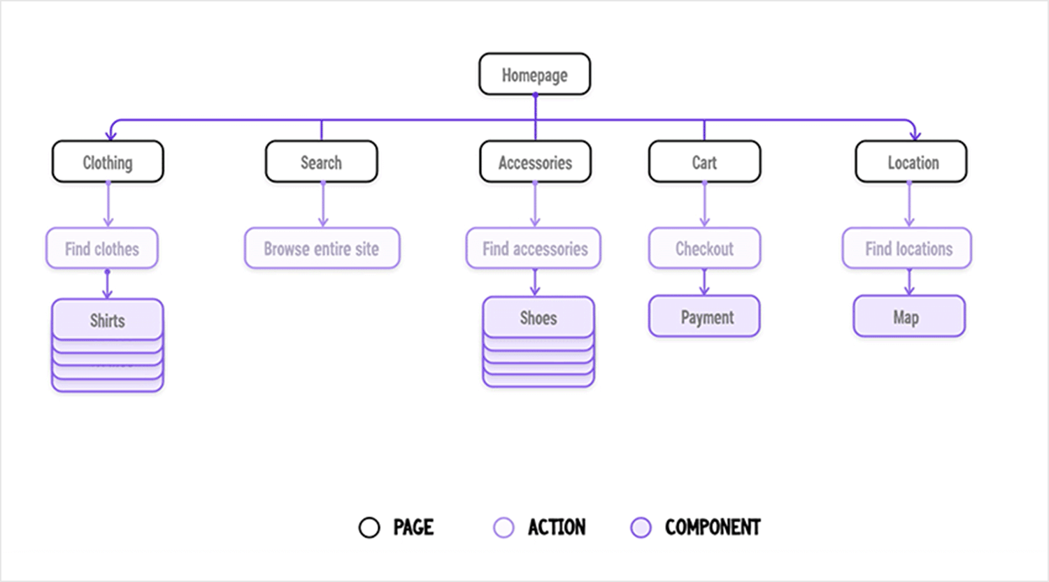
This e-commerce information architecture example isn’t just about shoving products in your face. It prioritizes a user-friendly experience (UX) with a super clear layout that works for any kind of browser. Think of the homepage as your main hub, with clear categories like “Clothing” and “Accessories” branching out for people who know exactly what they want.
The search bar lets you ninja-skip navigation and find exactly what you’re looking for in seconds. This IA basically reads your mind, offering multiple ways to find what you need, plus it has sections like “Find Locations” and “Cart” that make taking action seamless.
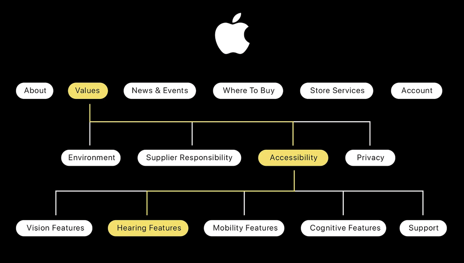
Forget about cryptic website layouts – this ia for apple is basically a sleek organizational blueprint for an Apple product website. Imagine it as a mind map for all things Apple. Users can start at the central hub, “About,” which likely offers a company overview and mission statement.
From there, the sitemap branches out based on what users are after. Need product info? Dive straight into sections like “iPhone,” “Mac,” or “iPad” to explore features and specs. These product sections likely lead to even deeper dives for tech enthusiasts.
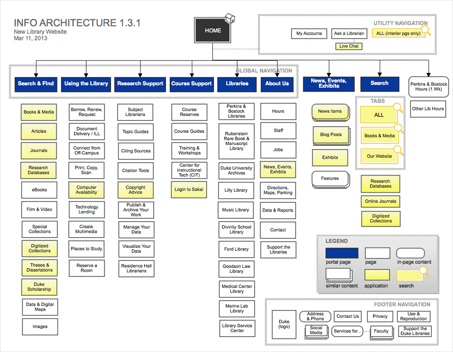
Forget about endless library stacks – this isn’t your grandpa’s way of finding information. This information architecture example of a modern library website is a super helpful guide for navigating the library’s treasure trove of knowledge.
The IA prioritizes user needs with categories like “Find & Use the Library,” “Research Support,” and “Course Support.” This makes it a breeze for students to find exactly what they need, whether they’re just starting their research or drowning in a specific course.
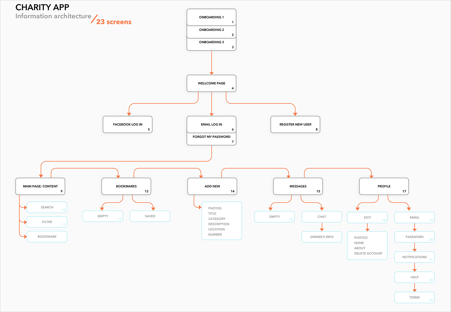
Think of this charity as an example for information architecture that connects users with causes they care about. The “Main Page Content” acts as the central hub, likely offering an overview of the app’s features and the charities it supports. From there, users can jump straight into action. The search function helps them find specific charities, while bookmarks allow them to save interesting ones for later.
But it’s not all about browsing. Digging deeper, users can explore sections like “Photos” and “Descriptions” to get a richer understanding of each charity’s mission and impact. Even cooler, features like “Add New” might allow users to add undiscovered charities, while “Messages” could potentially connect them directly with the organizations themselves.
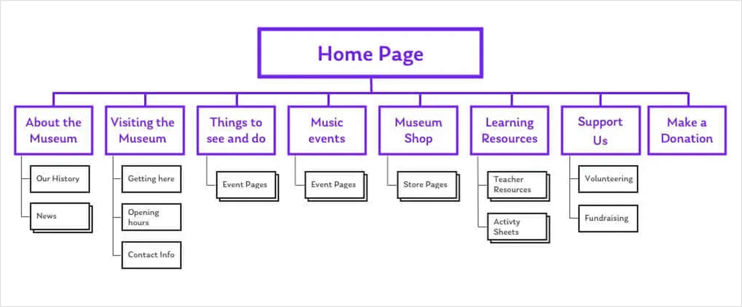
For visitors who know exactly what they want to see, the museum IA example offers sections like “Exhibits” and “Collections.” These sections are likely treasure troves allowing users to explore specific exhibits or dive deep into the museum’s permanent collections by category. Find your must-see masterpiece or browse a specific art period – the choice is yours!
But what if you’re feeling more adventurous? No worries! The IA also caters to the curious wanderer. Sections like “Events Calendar” and “News” keep visitors in the loop about upcoming exhibitions, talks, or special events. Maybe you’ll stumble upon a hidden gem or discover a new artistic movement you never knew existed.
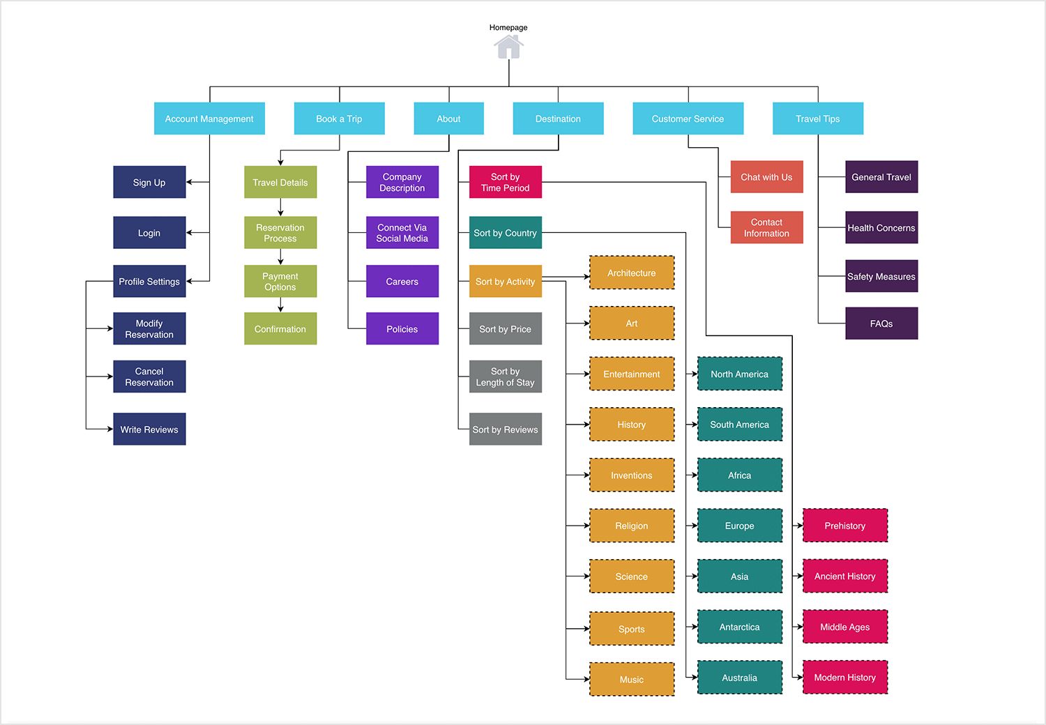
This example does a great job of showing how a travel website can be organized to make navigation easily. It starts with broad categories branching out from the homepage, each one leading to more detailed subcategories that guide users through the site step by step. For instance, one section focuses on account management, making it easy for users to handle everything from signing up to adjusting their profile. Another area walks users through planning a trip, ensuring they can smoothly move from selecting travel details to confirming their booking.
What’s nice here is the thoughtful design that supports exploration, whether users want to browse travel tips, manage bookings, or reach out for help. The layout shows how breaking down information into clear, connected pieces can create a user experience that feels intuitive and helpful.
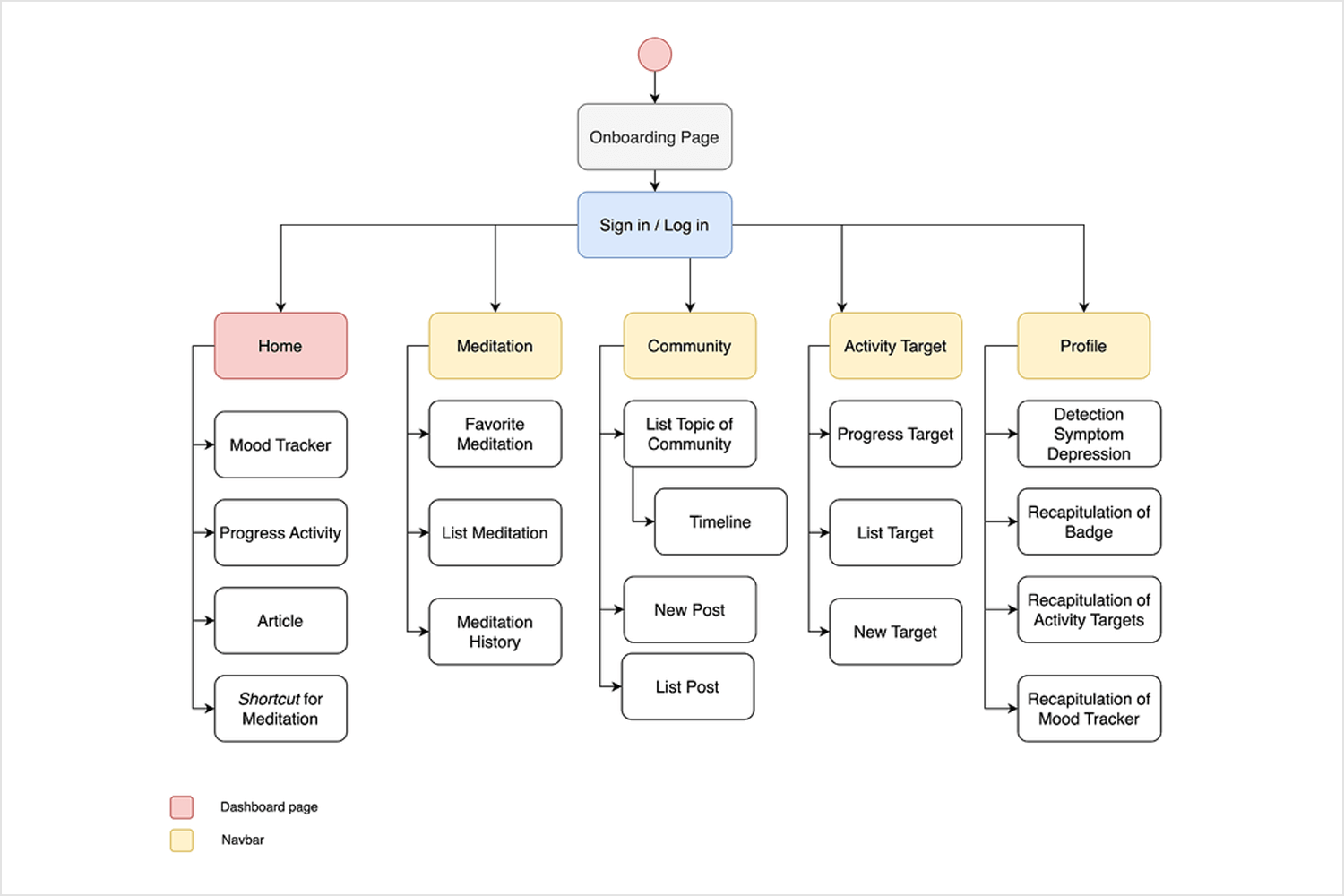
When you look at this setup, it’s easy to see how users can move through a wellness app effortlessly. It all starts with an Onboarding Page that naturally leads into Sign in/Log in, setting the stage for everything else. From there, users can explore key areas like Home, which acts as their main hub with mood tracking and articles to check out. The meditation section is perfect for those looking to revisit favorites or track their meditation history.
The community area feels inviting, with options for engaging through posts and a timeline that keeps everyone connected. Activity Target motivates users by letting them track progress and set new goals, while the Profile section brings it all together, showcasing health insights and progress recaps.
This kind of layout makes sure users can navigate smoothly, finding what they need to support their well-being and stay connected.
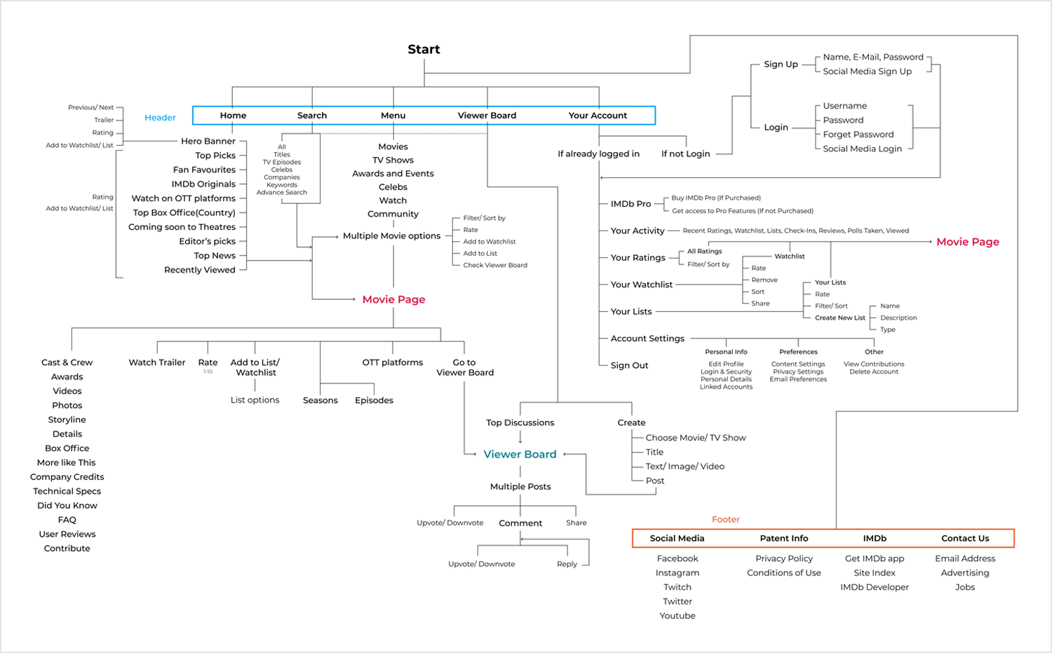
This diagram breaks down how the world’s largest movie database – IMDb – organizes its content for easy navigation. It starts with main areas like Home, Search, Menu, Viewer Board, and Your Account. Each of these branches into more specific sections. For example, Home features top picks and new releases, while Menu offers detailed browsing options for movies and TV shows.
The Viewer Board is all about user interaction, allowing posts and discussions, and Your Account handles personalized features like watchlists and ratings. This setup helps users quickly find what they need, whether they’re browsing for something to watch or managing their account. It’s all about balancing exploration with personalization.
Here’s how Spotify’s information architecture comes together. The platform starts with Home and Search, offering personalized suggestions and curated playlists to make discovery fun and easy. Your Library is all about giving users quick access to their saved music and podcasts, organized in a way that feels intuitive. Settings cover the essentials, like playback and device preferences, and Now Playing ties it all together with tools for a seamless listening experience – think shuffle, skip, and queue options.
Spotify’s layout is all about making sure users can navigate smoothly and enjoy their music without any hassle.
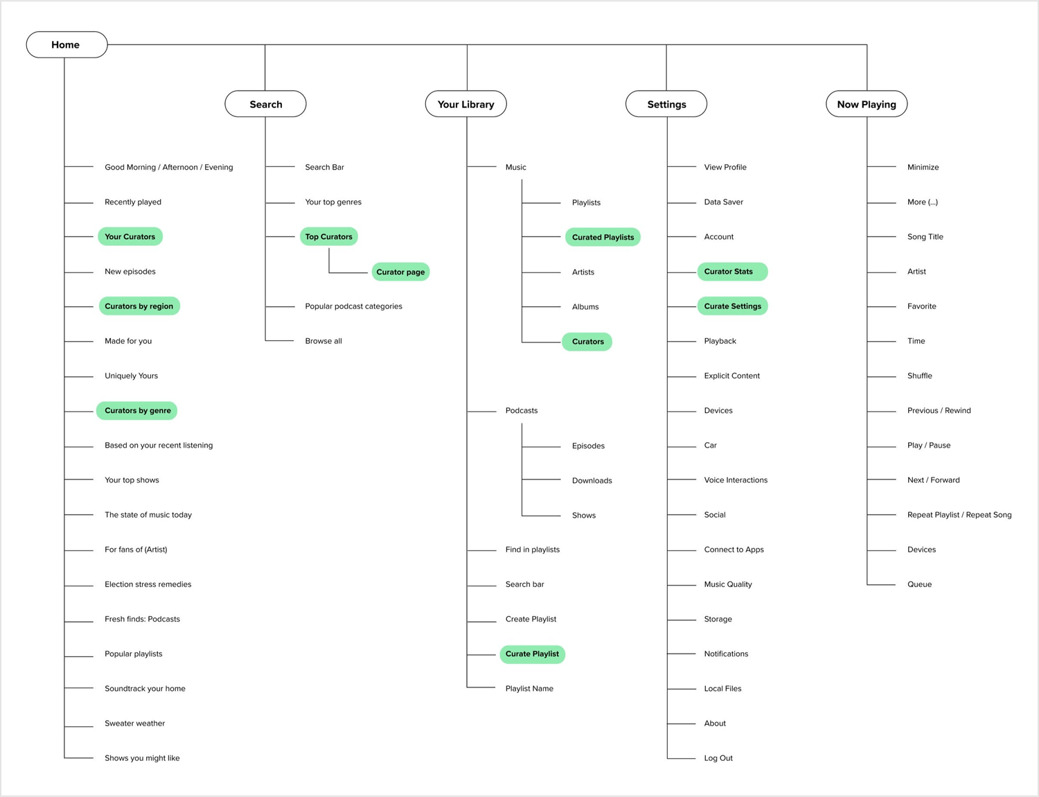
Source: Allison Myers
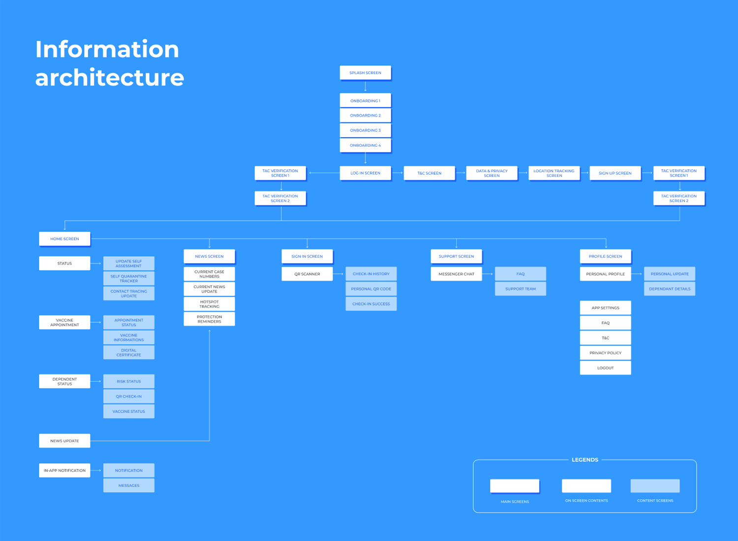
And last on our list, we have the information architecture of what looks like a public health tracking app, possibly designed for COVID-19 or similar health purposes. This structure starts at the Splash Screen and takes users through onboarding, login, and essential setup screens like terms and privacy agreements. Once inside, the app branches into main areas such as the Home Screen, which includes tools for self-assessment, vaccine appointments, and status updates.
The News section keeps users informed with the latest updates and protection reminders, while the Sign In area provides quick QR scanning for easy check-ins. There’s also a Support section that connects users to help through chat and FAQs, and a Profile section for managing personal details and app settings.
This architecture is all about making health information accessible and user-friendly, ensuring that everything from updates to support is just a few taps away.
Information architecture is vital if you want users to understand your product enough to enjoy it. You want to create a structure that your users can not just understand but also predict – so people don’t need to go in circles looking for information and can learn their way around your product easily.
Remember that good information architecture and good UX design go hand in hand – be it in delivering a blog post to a reader, or helping a new player get settled in your open-world video game.
Rule of thumb: Pay attention to detail, and don’t bombard your users with more information or more decisions than they can handle.
Using your product should feel natural and not like running a marathon, or looking around the house for a phone charger you haven’t seen in two days. Take every opportunity to test your information architecture in your user testing – make sure people don’t get confused or frustrated with the way information is presented to them.
When you have a lot of information, it can be very tough to present all this information in a way that makes sense. But humans have always found ways to make sense of information, and you should be able to reflect that in your design with the right planning – so don’t panic!
Just breathe and go back to the root of everything: what is the user’s goal at any point in time? How can you help the user reach that goal in the easiest way possible?

