The hero image trend in web design is still going strong. Don’t believe us? Just take a look at the top-half of this page.
How a website is designed directly influences how a user feels about the brand behind the site. Using a hero image on your site can help to establish trust among new visitors and even convert them into customers, by helping them buy in to your site’s concept. The same can be said for creating a persuasive prototype in your prototyping tool.
Design and prototype hero images for your website
Sounds great. But what makes an awesome hero image website? That’s what you’re about to find out!
Today Justinmind is going to show you how to make the most of large web banners, looking at 40 inspiring examples. So read on if you want to know the secrets to designing beautiful and persuasive hero image website prototypes.
A hero image is a large or oversized web banner image that is pinned to the header section of a webpage, usually towards the top of the page. Because of its prominent place in the site’s visual hierarchy, the hero header is often the first thing users see when arriving on a website. Over the years, it’s become one of the most widely used and beloved UI patterns out there.
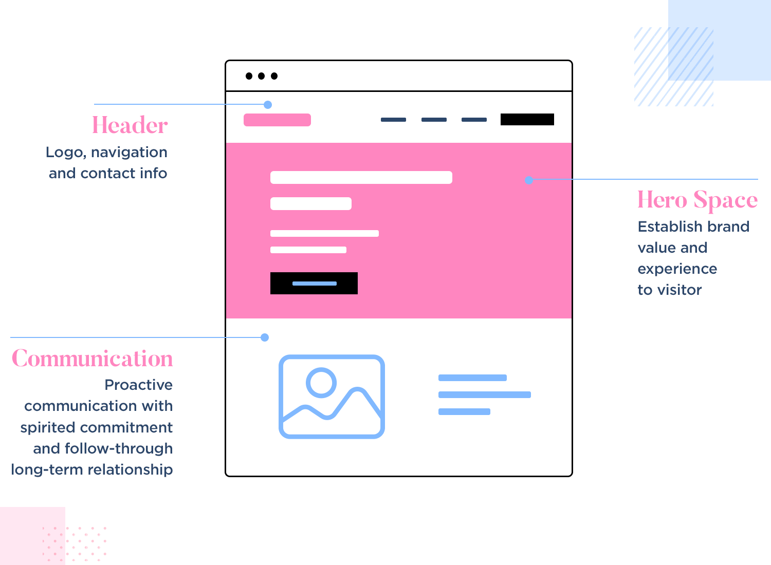
Often lending context to a specific feature or content block, the hero header is positioned in close proximity to the content that it relates to. It’s usually placed as a background layer underneath the header text or above the content block it corresponds to.
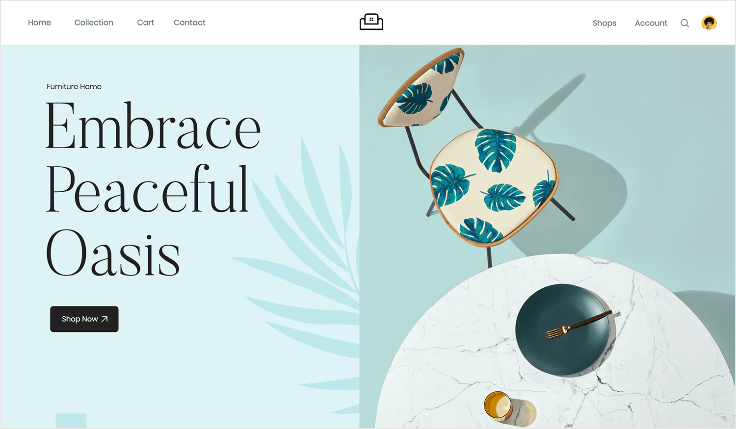
Picture yourself sinking into a plush armchair, surrounded by the soothing hues of a tranquil oasis. That’s the vibe Justinmind’s furniture webshop template exudes right from the hero image. The clean lines, subtle colors, and eye-catching chair design create a captivating scene that invites you to step into a world of comfort and style. It’s like a digital daydream, promising a home filled with pieces that aren’t just functional but truly beautiful.
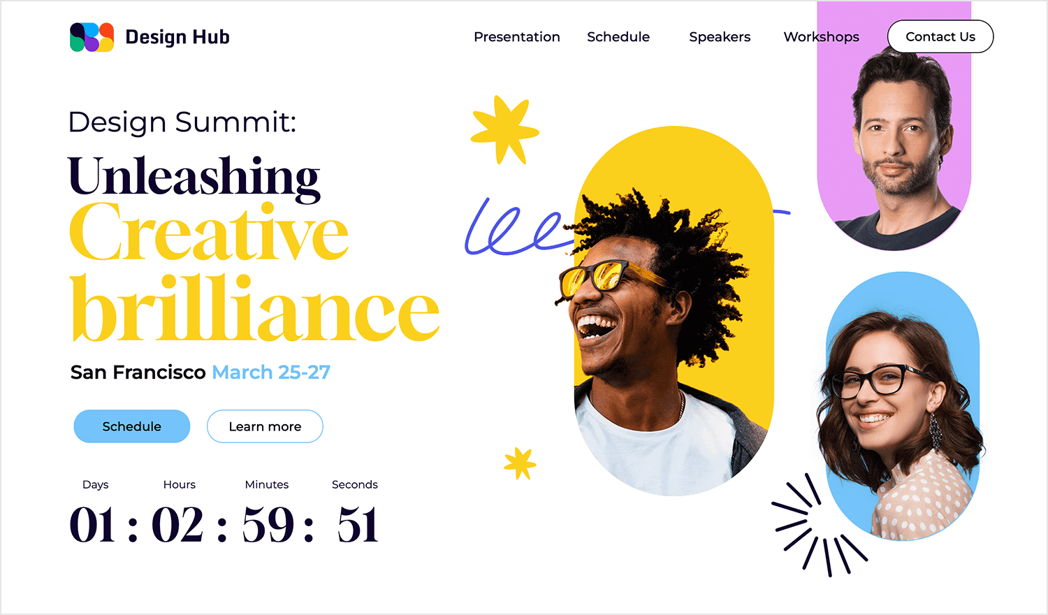
The buzz of a creative conference, the energy of passionate minds coming together to share ideas – that’s the vibe captured in the hero image of this design summit web template. Bold colors and vibrant employee photos create a visual feast, while the countdown timer adds a touch of excitement. It’s like a digital invitation to a party of innovation, promising a day filled with inspiration and connection.
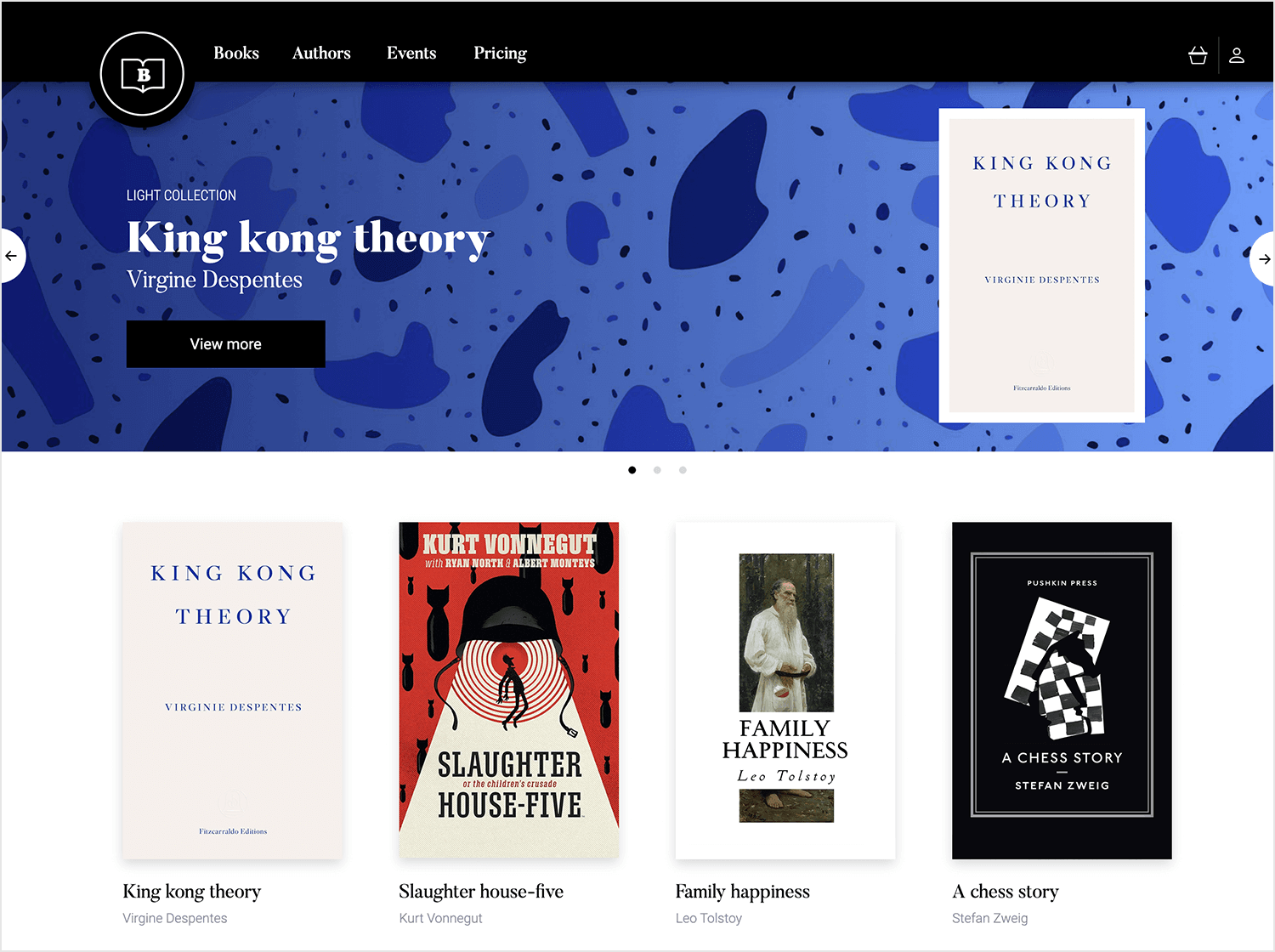
This bookstore hero image throws the user into a world of words, where every page is a new adventure. The bold blues and abstract shapes create a visually captivating scene, while the featured book, “King Kong Theory,” beckons with its intriguing title. It’s like a digital window into a literary wonderland, inviting you to explore and discover your next favorite read.
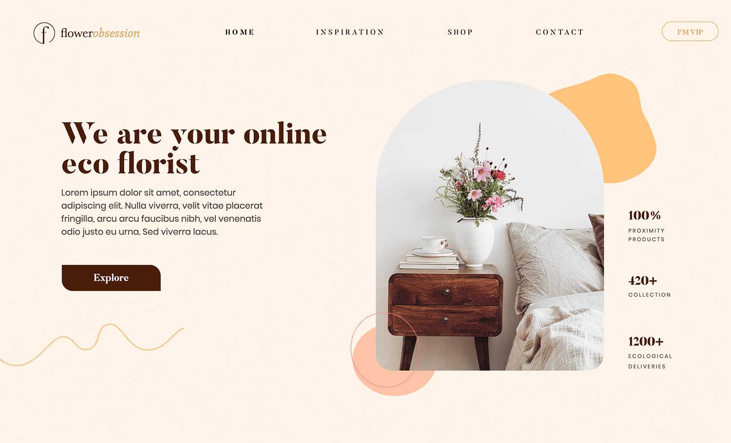
You can practically smell a room filled with the delicate scent of freshly cut flowers with this hero image. The soft colors, elegant bouquet, and stylish bedside table create a scene that’s both inviting and inspiring. It’s like a digital bouquet, promising to bring a touch of nature and beauty into your home, all while supporting eco-friendly practices.
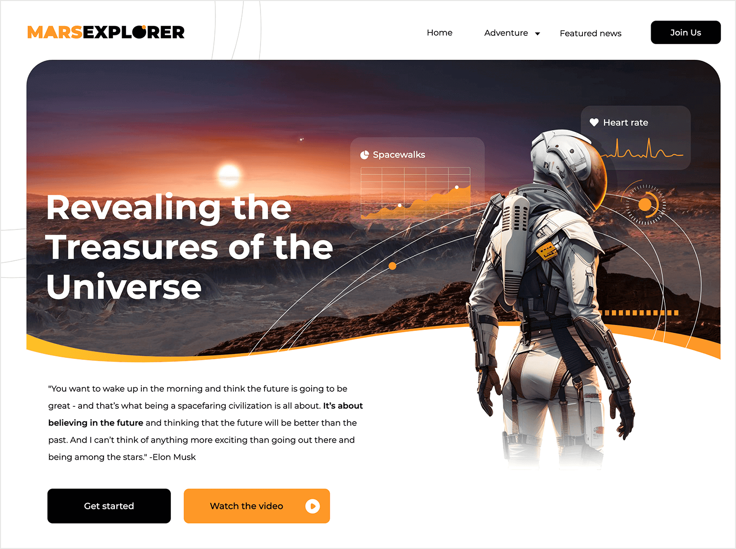
Blast off into a cosmic adventure with the Mars Explorer web template. The astronaut, bathed in the glow of a distant planet, invites you to join the mission. The vibrant colors and dynamic design create a sense of excitement and anticipation. It’s like a digital spaceship, ready to transport you to the farthest reaches of the universe. Are you ready to explore the Red Planet?
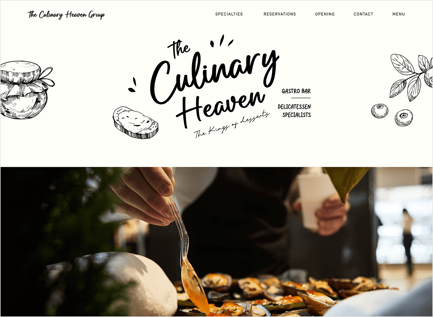
Imagine the aroma of freshly baked bread wafting through the air, the sweet tang of homemade jam spread across a warm slice. That’s the experience promised by the hero image of this restaurant landing page. The hand-drawn illustrations and elegant typography create a scene that’s both inviting and mouthwatering. It’s like a digital appetizer, whetting your appetite for a culinary adventure at The Culinary Heaven.
Ready to share your knowledge with the world? This e-learning website template has everything you need. The vibrant blue background and 3D illustrations create a fun and engaging atmosphere, while the call to action invites you to embark on a journey of discovery. It’s like a digital classroom, filled with endless possibilities. Take education to new heights with this hero image example!

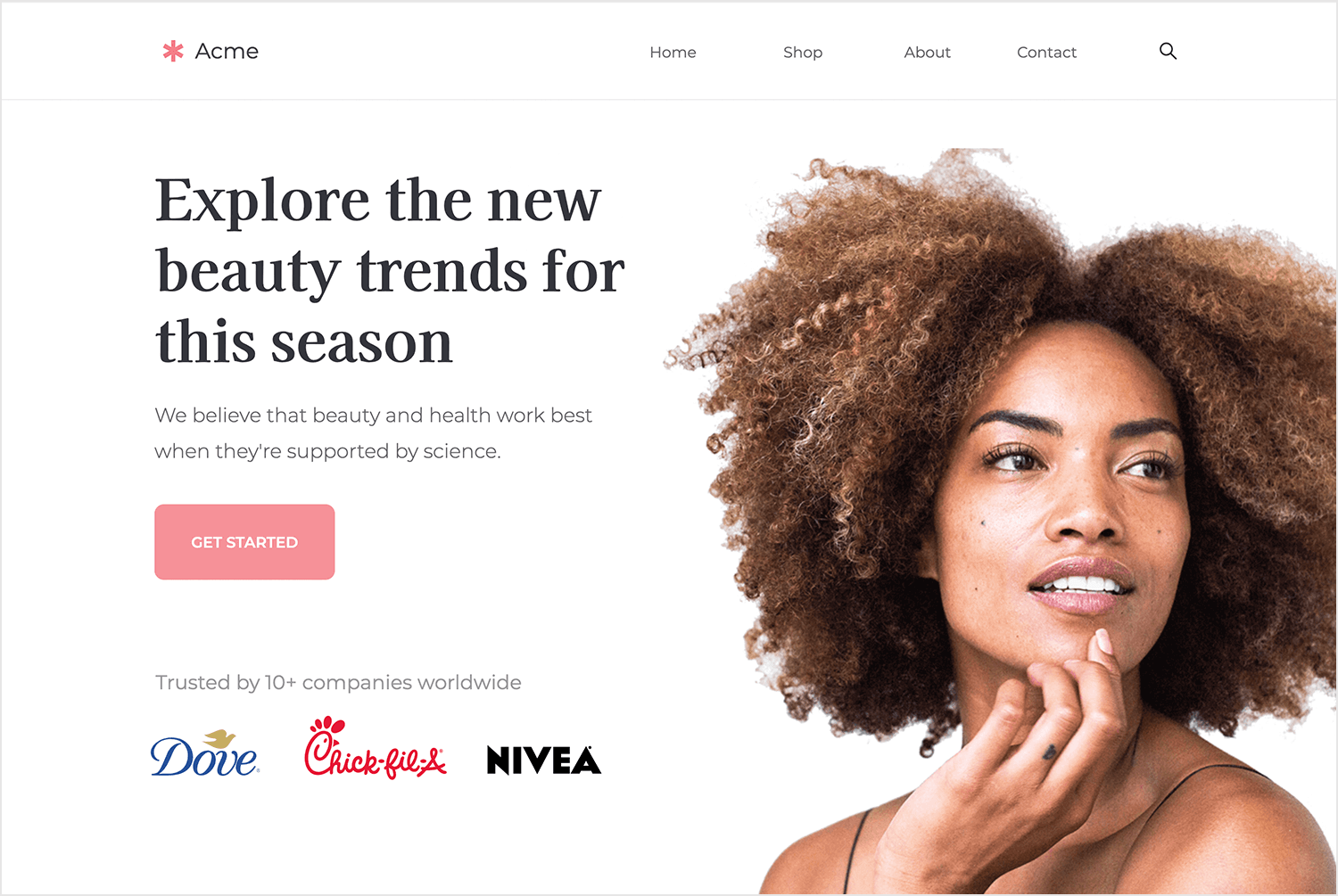
There’s nothing better than waking up feeling refreshed and radiant. That’s the promise of this beauty products online store. The stunning model, the exciting trends, and the trusted brands create a scene that’s both inspiring and aspirational. It’s like a digital beauty salon, inviting you to discover your new favorite products and elevate your beauty routine.
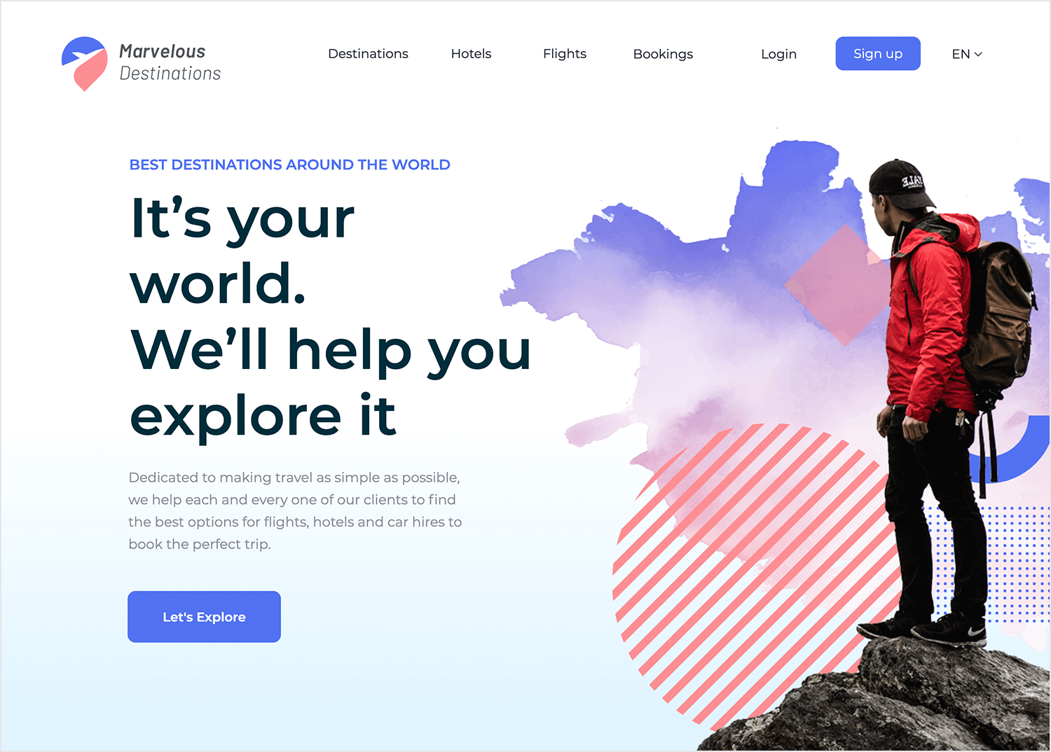
This travel agency hero image puts you right on a mountaintop, the world laid out before you like a vast canvas. The hiker, silhouetted against the breathtaking clouds, invites you to join the adventure. It’s like a digital passport, ready to transport you to the most incredible destinations. Are you ready to explore the world?
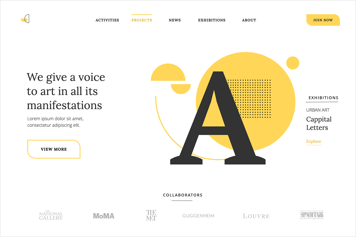
Step into a world of creativity and inspiration. This art agency homepage’s hero image captures the essence of artistic expression with its bold colors and dynamic shapes. The stylized letter “A” invites you to explore a universe of art, from the classics to the cutting-edge. It’s like a digital gallery, showcasing the beauty and power of human creativity. Get ready to be inspired!
Surfrider Foundation is a site dedicated to the protection and enjoyment of the world’s oceans, waves and beaches through an activist network. As soon as you land on the homepage, you’re immediately brought up to speed regarding the foundation’s mission statement, activities and news – all thanks to the interactive carousel header.
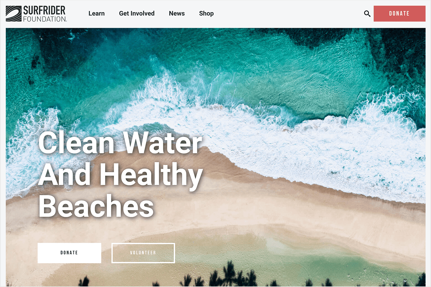
The carousel flicks automatically through four slides, each containing a full-width hero image and header text. The combination of large images, clear type and simple slide effects focuses your attention on the most important and current information about the foundation, without having to click anywhere. You can also flick through the information at your own pace too, using the left and right arrows on the sides of the carousel.
Gradients are making a comeback, according to Smashing Magazine. We’re seeing more and more multi-tone effects on website homepages, particularly in large, hero headers. Take this example for instance:
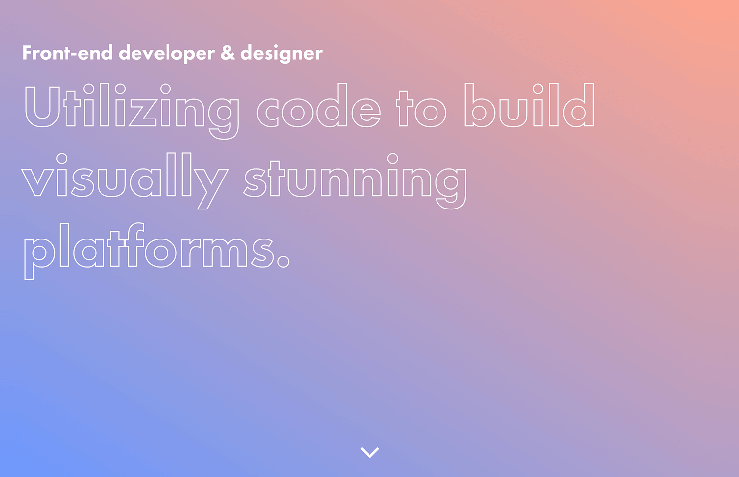
Creating gradients involves the gradual blending or transitioning between colors, mimicking distance from or proximity to a light source. In big header design, it’s common to use super gradients, which transition between two or more colors (like in our example above).
Gradients allow web designers to make more colors available by creating more color tones. According to UX Planet, they help to make a bold statement, create a mood and channel user emotions, and make the on-screen elements they’re combined with more memorable. Perfect for hero image websites.
Using video is a great way to create dynamic headers that attract and keep users engaged. As Jason Beever from How To Get Online tells it: “Watching a simple moment in motion can create a tremendous impact on how users will perceive and engage with your brand.”
In fact, statistics shared by Forbes show that embedding a hero background video can help boost your conversion rates by 80% and influence a customer’s purchasing decision by 90%.
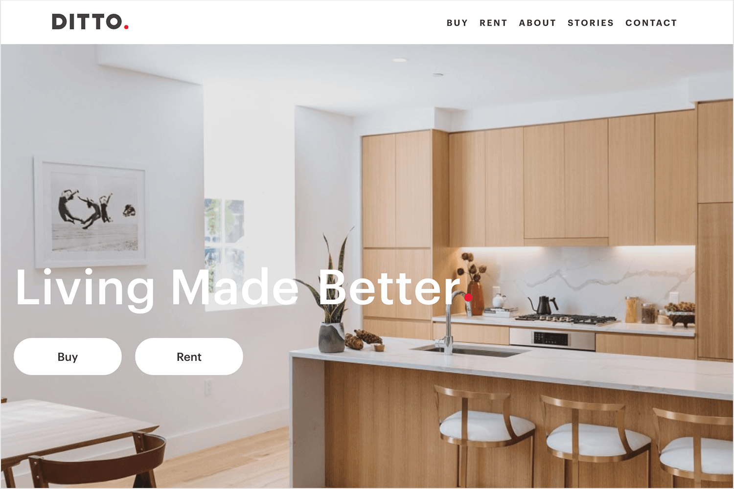
In the below example, property development company Ditto Residential uses a series of full-width video clips in their hero area. The header reads “Building places that inspire”, and the video clips show instances of home and office life, with some very content dwellers. Here, video is a way to demonstrate the product, allowing visitors to visualize what it might be like to live or work in these types of properties.
The right use of type can make your hero images explosive. Take a look at this example:
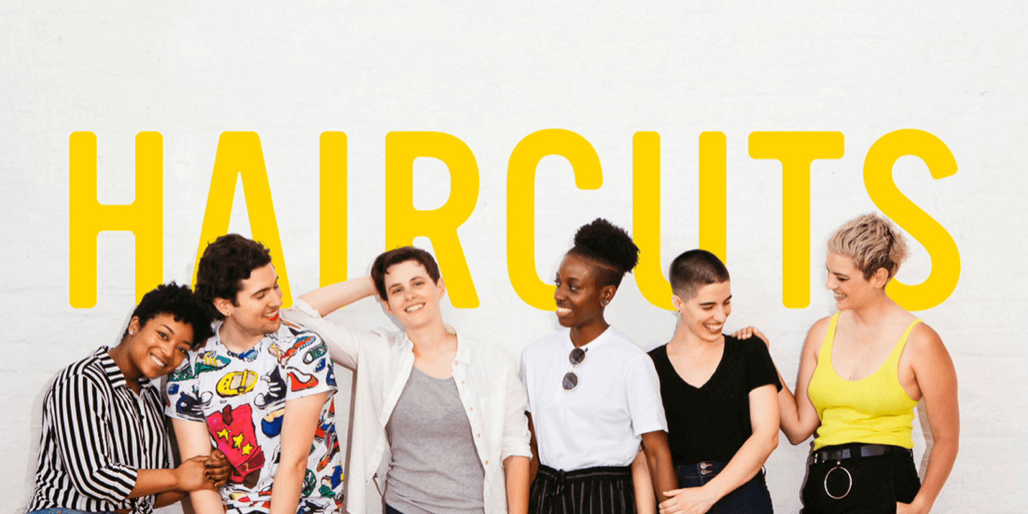
Although brightly-colored, the text “HAIRCUTS” doesn’t overpower the image, nor does it fade into the background. Placed directly above the body of the image (the busiest part of the image), it adds depth to the visuals below, and draws the user’s eye to the center of the screen. Now that’s teamwork.
We all know Apple nails it with design, and this back-to-school hero image is no different! Featuring a MacBook and iPad with lively speech bubbles saying is clean, fun, and unmistakably Apple. Plus, the “Shop” button is right there, ready to take you on a shopping spree. This hero image captures attention and makes you want to dive right in!
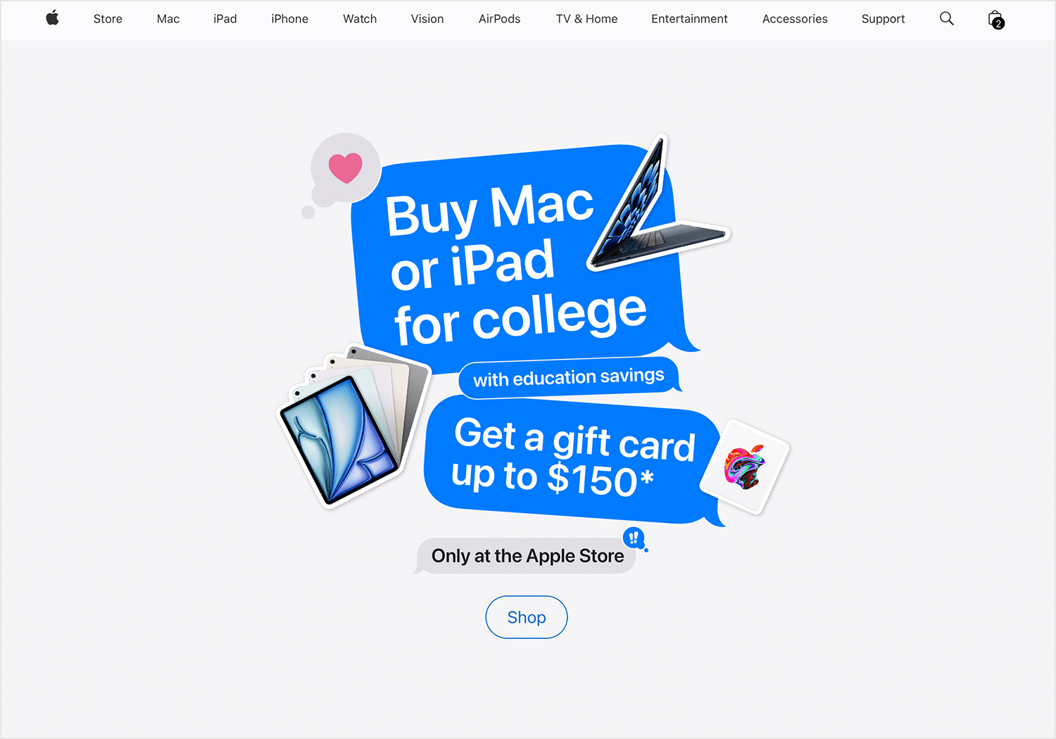
Apple tends to use “chromeless” images. These images aren’t full screen, but are borderless and have a clear background. They are either fixed in position or float to a specific location on the page. Backgrounds tend to be white, with contrasted, near-black header text to accompany. It’s a design that could be described as a minimalist website.
Design and prototype hero images for your website

Most hero images you’ll see online are photographs. However, another approach to consider is using illustrations. Colorful, textured illustrations help to explain a theme or establish a motif as well as decorate your hero space. And as Nick Babich explains, they give you more control over image specifications.
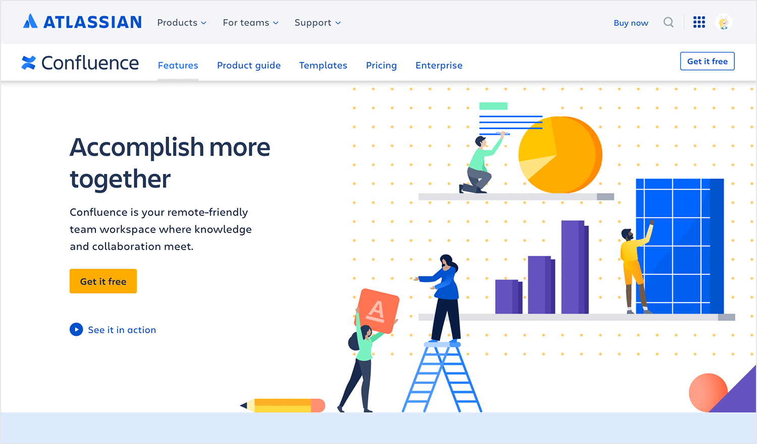
In this example, the illustration provides visual reference to what the site offers in order to help the user buy in on the concept.
Often, the hero header will contain a Call-to-Action (CTA). When this is the case, it’s important to have visual harmony between the hero image, the content and the CTA button.
When content is placed on top of the hero image, designers usually adjust the contrast of the image. This is to ensure that the content is readable and the CTA button is located and used.
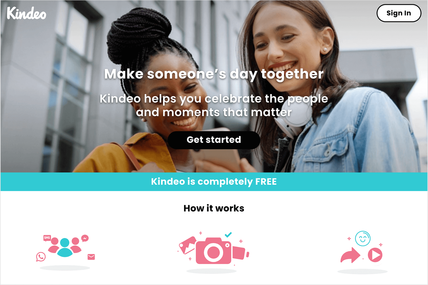
In this example by Kindeo, the hero image lends design support by enhancing the user flow leading to the CTA button, which is placed front and center. The image has been darkened so that it simply complements the white text and light-green CTA button on top. Darken your photos, lighten your type – that’s the trick!
Anyone who’s into their Instagram filters will love this tip: texture. Texture is the best way to give a flat photo some depth, warmth and feeling. If you intend for your hero image to take center stage or differentiate it from other elements on the page, texture is the way to go.
Take a look at this example:
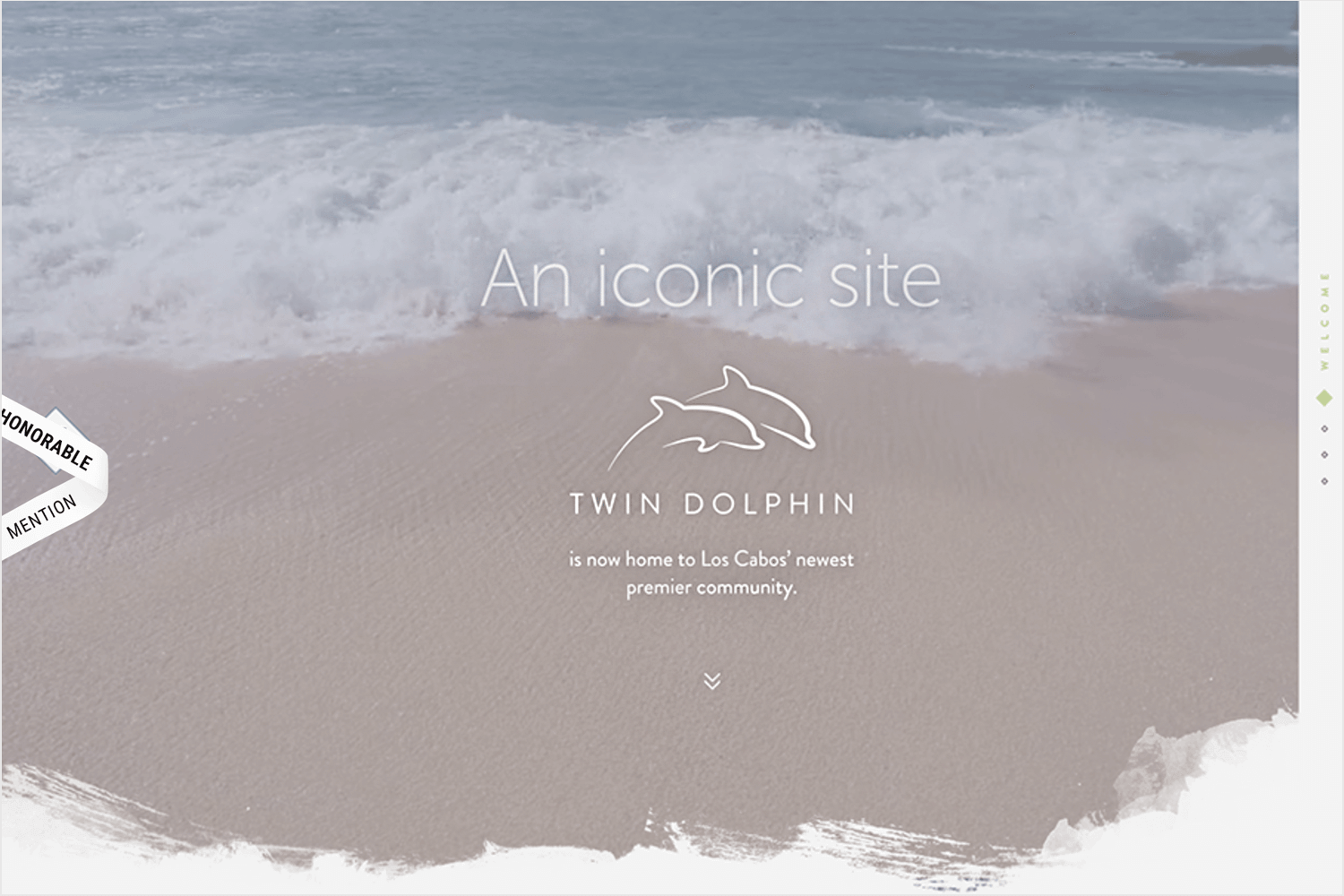
We love the use of crashing waves beneath the header text, the granular texture of the sand, and brush strokes in this big background image. What a great way to introduce visitors to a beach resort website.
Learn more about designing the perfect image for your hero header here.
This is another example of an interactive hero image. Heco Partners, a Chicago-based design agency promise to “turn information into experiences that people care about”. When you arrive on their Homepage, these are the words you’re met with, above a rolling wave.
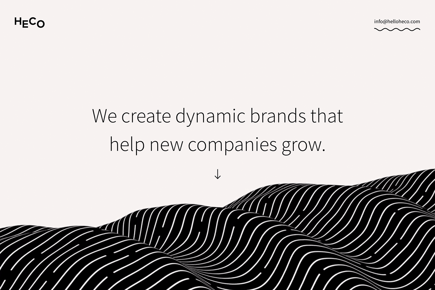
This full bleed hero not only flows upon loading the page, but as you scroll down, you’ll see scroll-triggered parallax effects. Pretty cool! Learn more about designing with parallax on our post.
This one’s simple but effective: space. You can’t design your hero image without thinking about space. Space is what gives your design room to breathe, as well as create emphasis.
To make the content in your hero area stand out, set a margin on all sides of the canvas and center your content on top of the hero image. Just like that your visitors will automatically be drawn to the center of the hero, right where you want them to look. Told you it was simple!
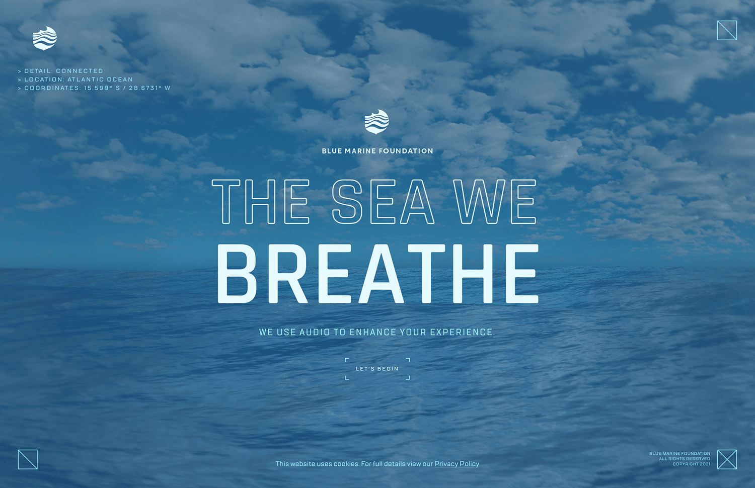
Learn more about designing with space in this post on UI layout.
This design is brought to us by legendary design studio Tubik. It should come as no surprise that they created an incredible hero image website that goes beyond a powerful image. The header of the entire page is taken up by awesome photos that illustrate the main selling point of the company – but it’s the scrolling that caught our eye.
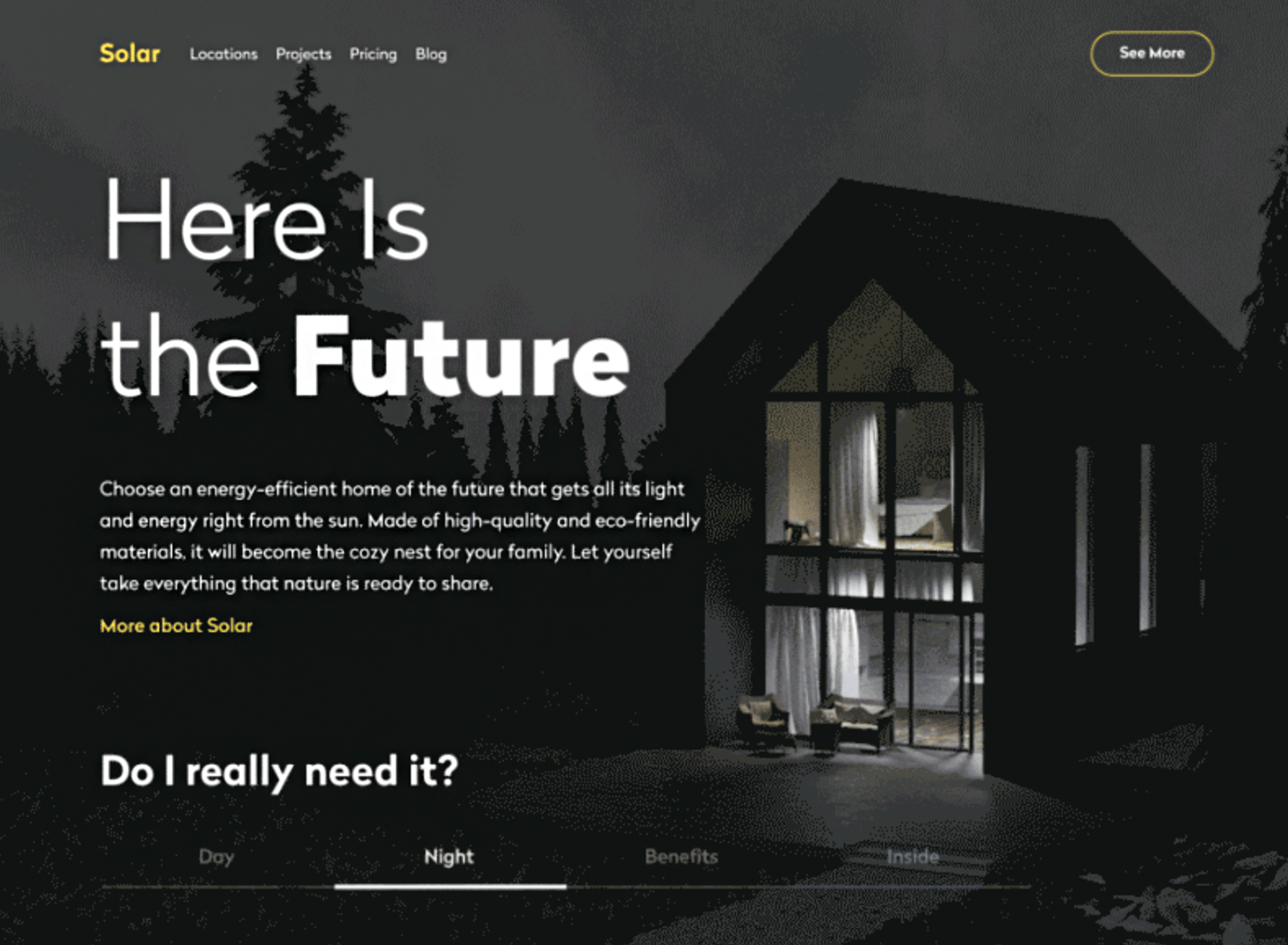
This hero image example uses horizontal parallax, through a horizontal tab system to divide the screens. It’s engaging and dynamic, creating a website that immediately brings users into its experience. We love the pops of yellow and contrast between the two main images. Tubik delivers once more!
Charbonnel is a luxury real estate company. Its website follows the classic luxury brand playbook: clean lines, minimalist style with beautiful images. While the website itself offers a great user experience, it’s the hero image in the homepage that we love.
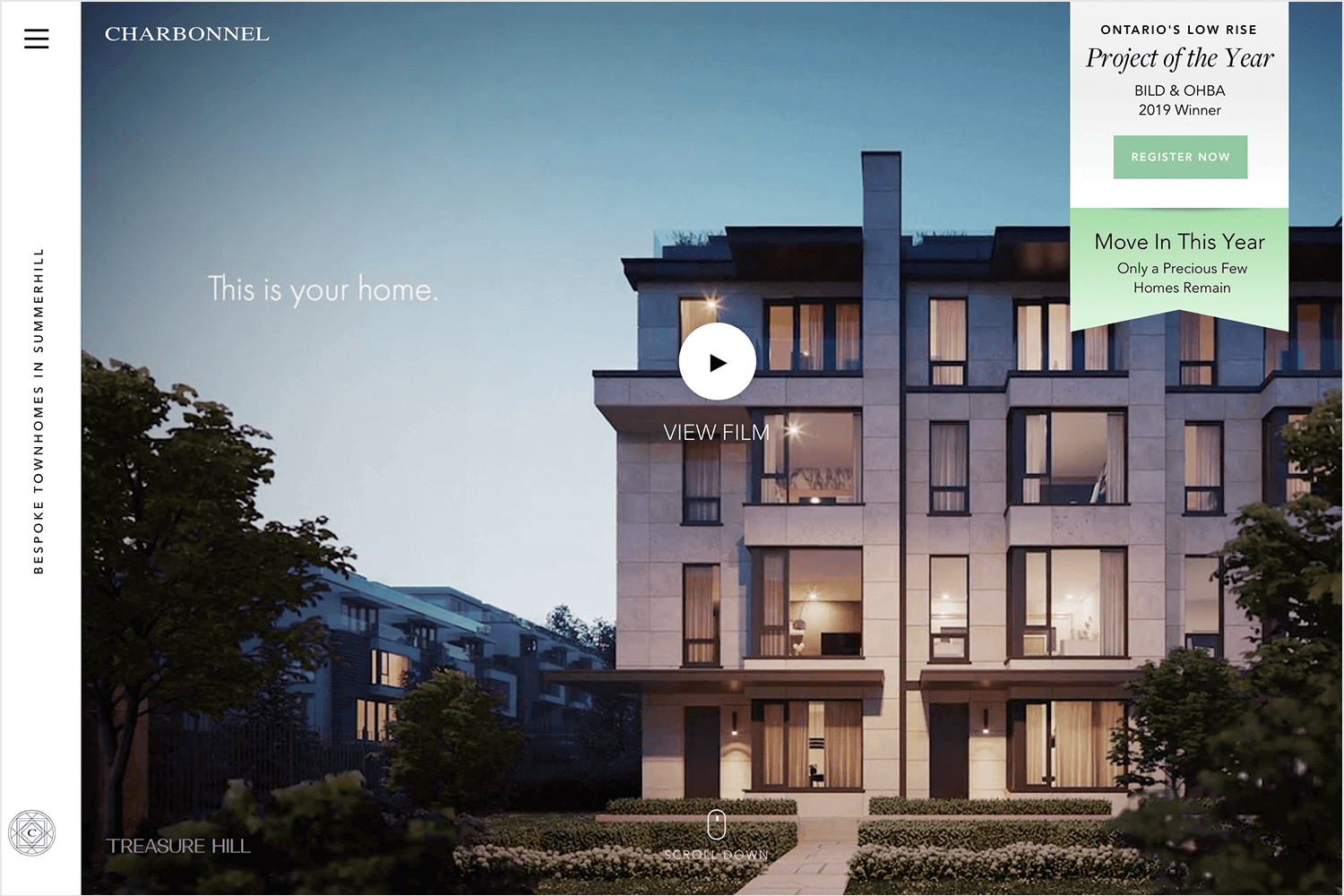
Instead of an image, Charbonnel dedicates the hero image area to a video. The video itself makes for a powerful selling pitch, creating an interactive and dynamic hero image example. The video doesn’t start playing automatically, which respects those users who don’t appreciate automatic videos anywhere – unless you’re Netflix, of course. We love that, even when the video doesn’t start playing, the static image still delivers a great impact.
Design and prototype hero images for your website

Now, let’s swing over to Samsung’s site. Their hero image really catches your eye with a slick black background and sharp, bold text promoting their VIP Advantage membership. The perks are clear: Care+, free installation, and earning points for every dollar spent. Plus, there’s a “Join now” button that’s hard to miss.
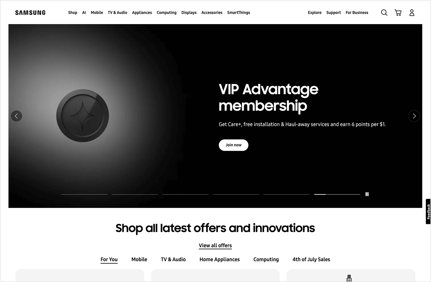
This hero image is all about simplicity and effectiveness, making you feel like you’re getting something special right from the get-go.
Airbnb is at the top of the UX game in many ways. From using typography to reinforce their brand personality to building a UI that entices users to seek adventure – Airbnb knows UX that converts. This hero image example is particularly interesting, because it also shows the practical aspect of hero image websites.
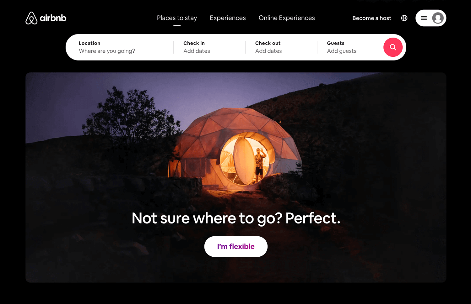
With the pandemic of 2020, tourism saw its market all but disappear. Airbnb, while heavily affected, used its hero image to change the sales pitch. The brand used a custom illustration that paints a picture to users: you don’t need to go far to have a vacation. The UI components combined with the illustration create a very compelling homepage, making it a wonderful example of smart UX design.
Nike has been known to rely on a hero image in order to quickly create new campaigns, often tailored for that specific time such as encouraging people to register to vote. This gives the website a lot of flexibility, making Nike a store that is always interesting upon first glance. While there is no carousel, the hero image is often split into several combined images, like the example below.
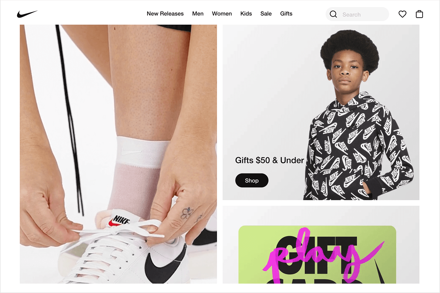
Once more we see a fantastic use of typography. In this case we have a big and dramatic font that adds on to the main message of empowerment. It’s on-tone and showcases UX design that delivers emotional messages using a hero image (or two!).
Campos Coffee is another company that made a brilliant change in the sales pitch with the pandemic of 2020. Previously, the website used a hero image to evoke the tropical forest that their sustainable product comes from. It was about creating a feeling that users could be transported to the rainforest with a cup of their seriously good coffee – that’s the power of good marketing and a hero image website.
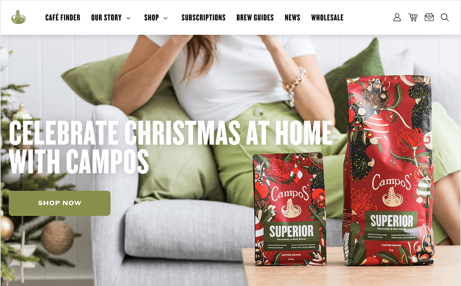
Fast-forward to 2020 and Campos Coffee uses a different hero image to paint a new picture. The hero image itself is quite simple, with the soft tones of the color palette matching the branding. Now, the picture users get is one of convenience and safety, highlighting how easy customers can have their coffee delivered to their doorstep.
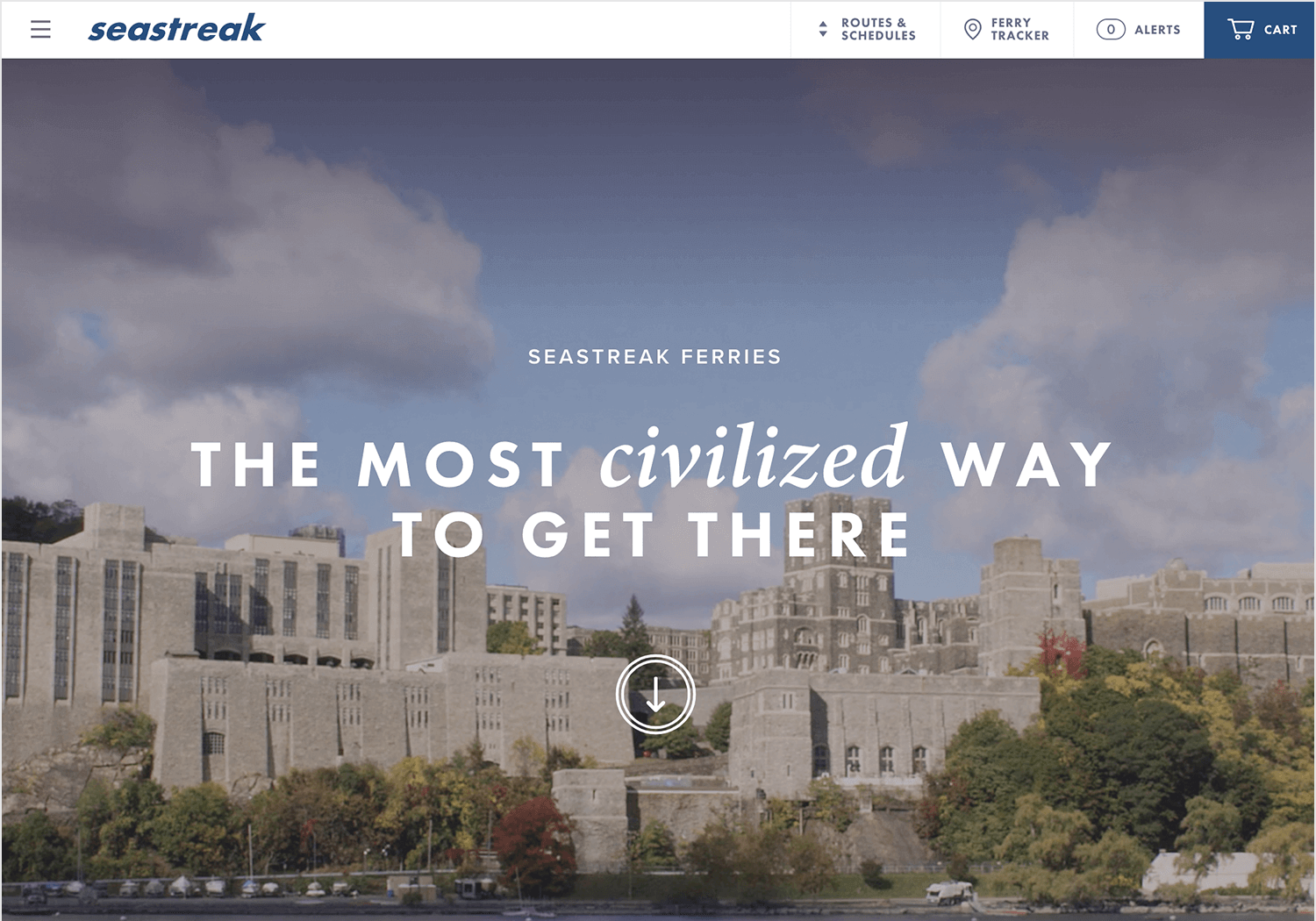
Sea Streak is another hero image website that uses a video instead of a static image – and does it right. In this case, the video doesn’t have any sound and relies only on the visually impactful photography. The beauty of this hero image website is that the video is there to evoke emotion and to support the text that is in the top center.
Pollen London is a digital branding agency that has a hero image website worthy of notice. The header part of the webpage has a black and white video that perfectly captures the hectic, young and vibrant environment of digital marketing. The video itself is fast-paced, which can seem like a bit too much for some designers out there, but it creates an undeniably unique user experience.
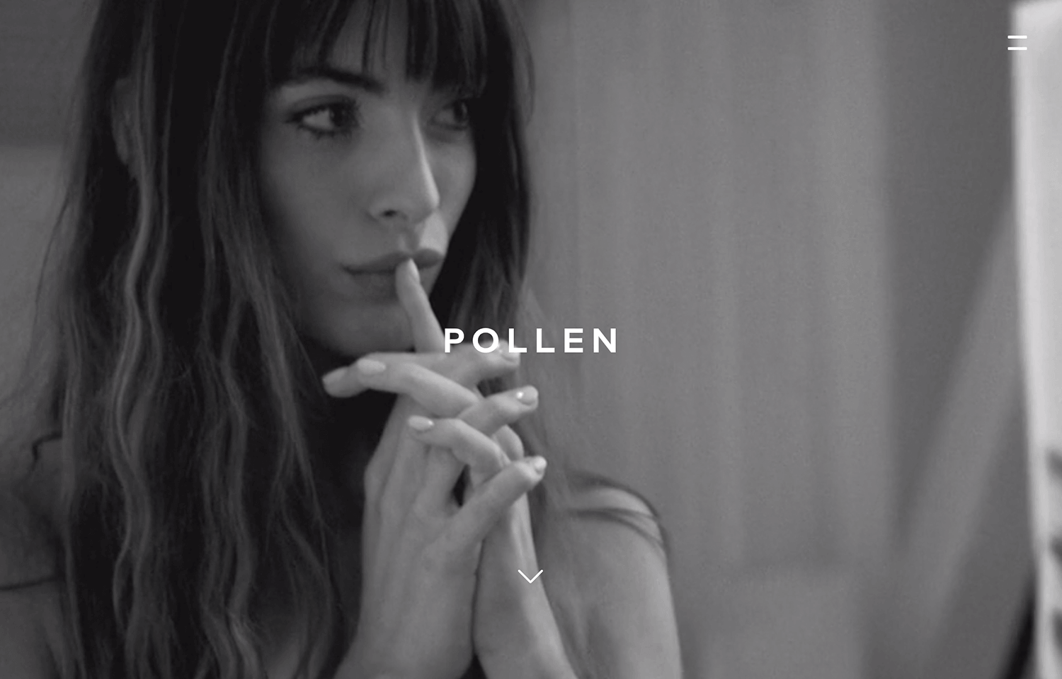
This is a truly minimal take on hero images. A small and simple hamburger menu to the top-right of the screen, the brand name and a small arrow that signals the option of scrolling downwards. That’s all there is. It’s big and loud, and shows that a hero image can be truly powerful.
Design and prototype hero images for your website

This hero image website is a great example of a UI that gets to the point and brings users into the experience. In this case, we have a carousel-style display that can be adapted to any of the on-going exhibitions of the museum. When this post was being written, the exhibition in question was on Monet – with the signature use of color and texture making the page both functional and visually stunning.
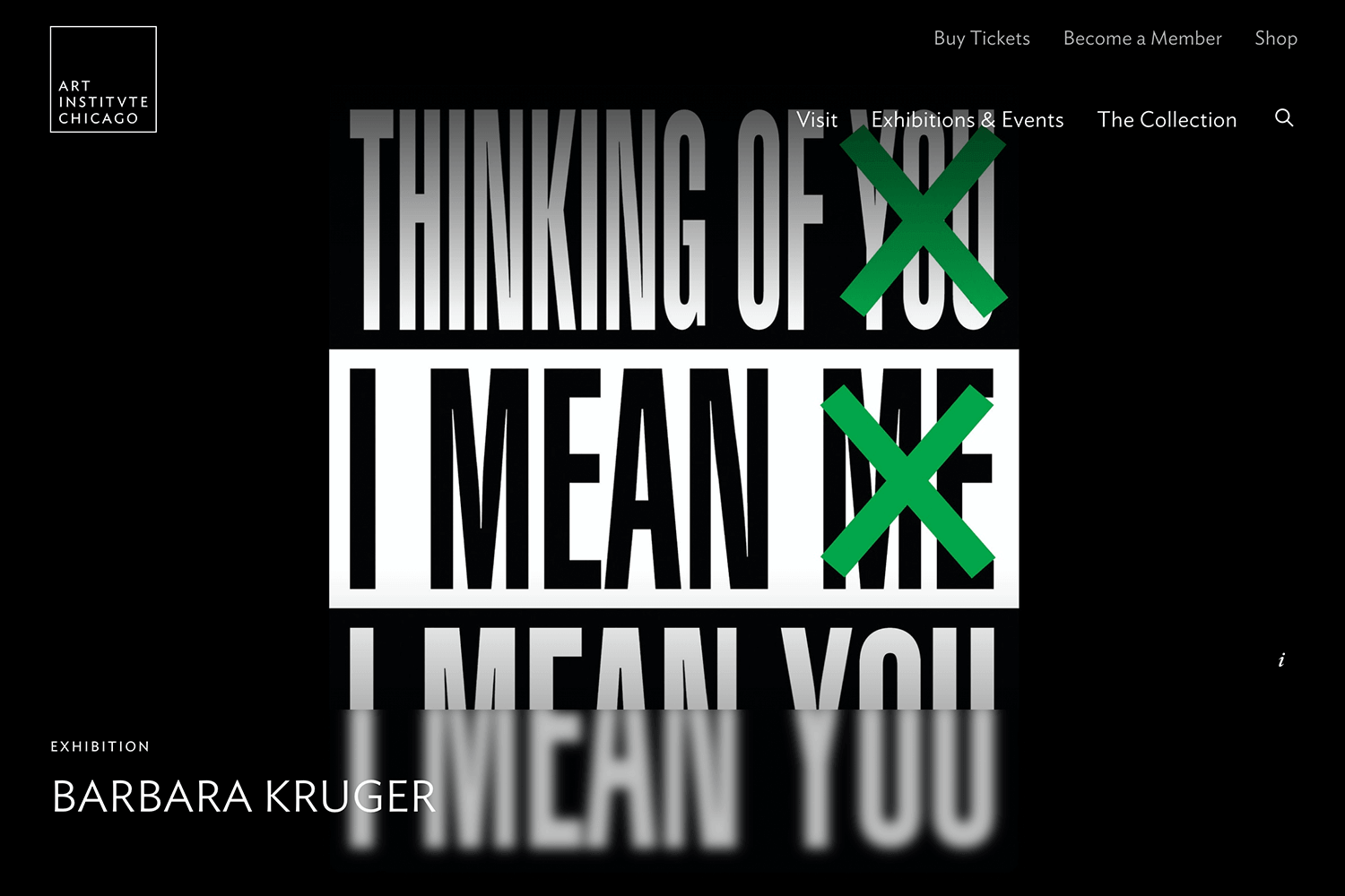
We love that the hero images all add to the experience, but never take away from the navigation bar at the top right. A nice detail is that users can pause the video of the hero images, making it possible to stop the movement in the hero images. Very thoughtful!
Tesla is such a famous brand at this point, it shouldn’t come as a surprise that their hero image website is done well. The general style reminds us of the other big names on this list, especially Apple. This hero image is all about showcasing the model Y, and using UI components to make it easy for users to start the purchase process.
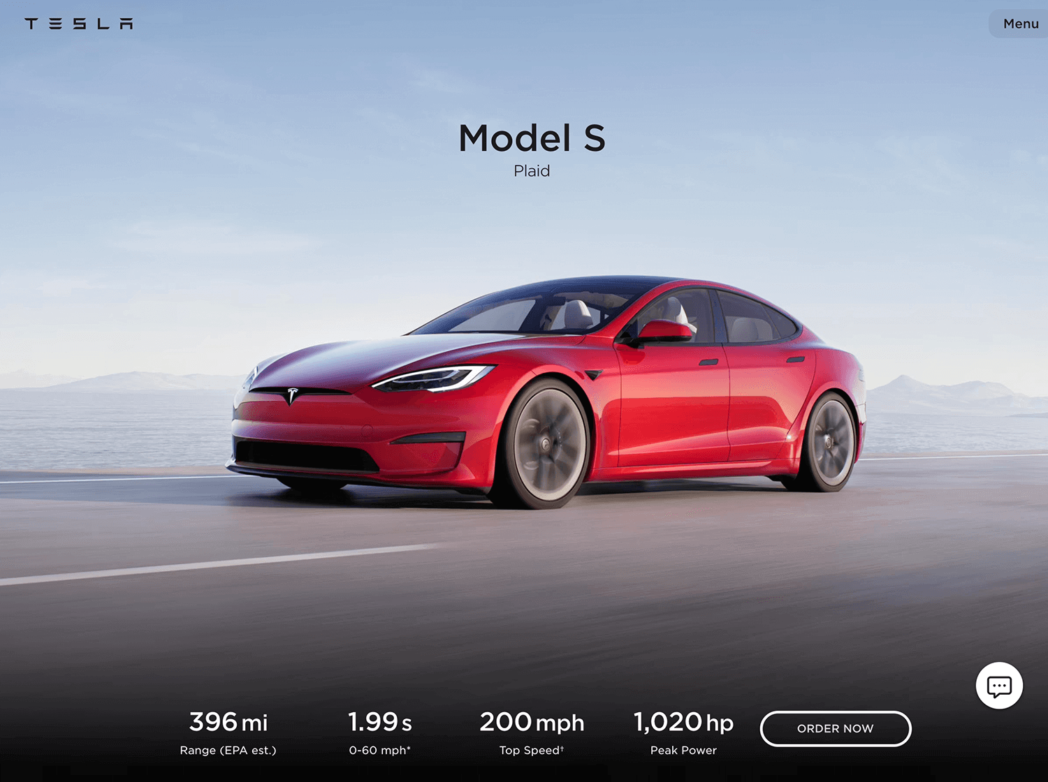
We love the use of concise copy and the CTAs. The buttons are well-designed, so that they are visible but play a supporting role to the hero image of the car. Altogether, Tesla shows us that a hero image doesn’t have to be complex in order to work, but rather needs to deliver the selling pitch.
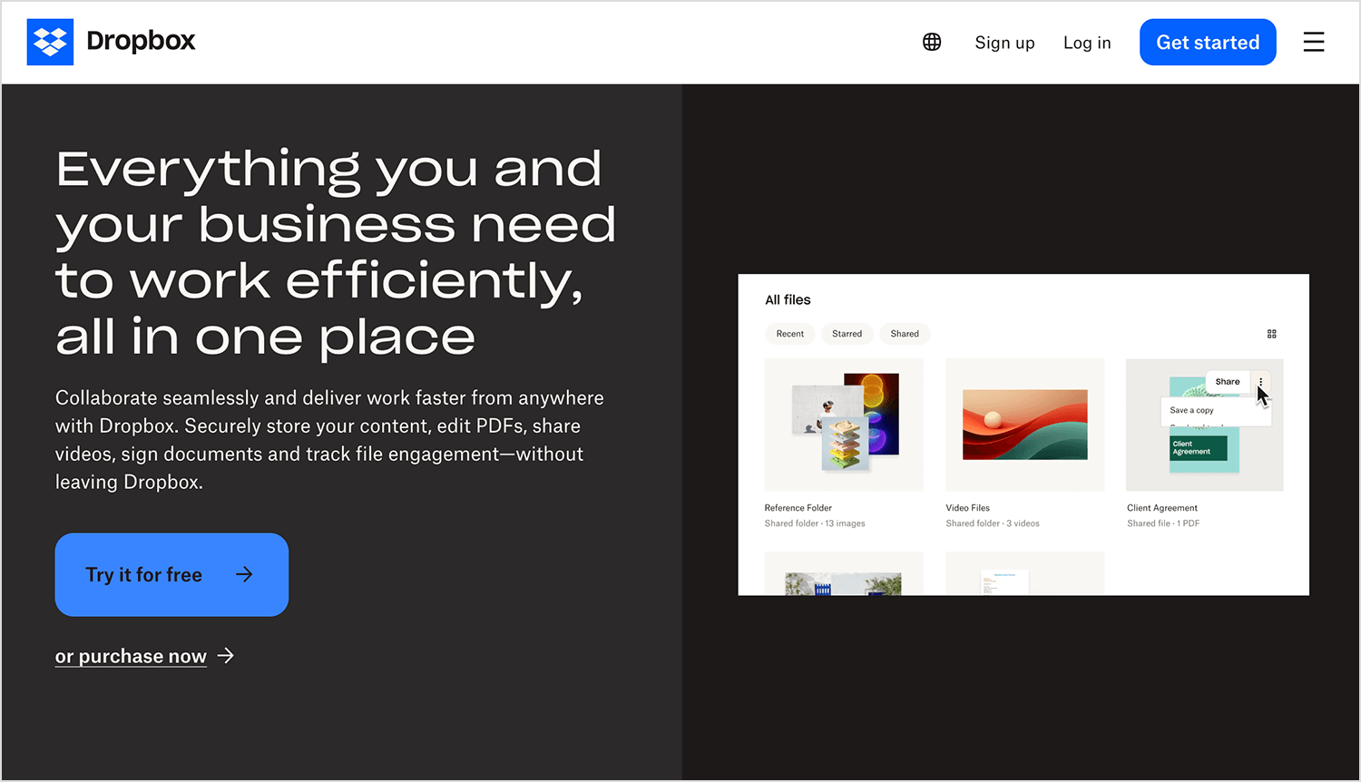
In this example, Dropbox shows in its hero image how easy it is for teams to work together on stuff. The picture has a clean design with a document being edited and approved, and clear text that says Dropbox can store, share, and organize your files well. The bright blue button that says “Try it for free” is easy to see and lets people try out Dropbox themselves.
Same Same Studio’s hero image is anything but ordinary, despite what the name might suggest! This colorful showcase instantly grabs your attention with its bold illustrations and striking product photos, giving you a taste of their creative flair.
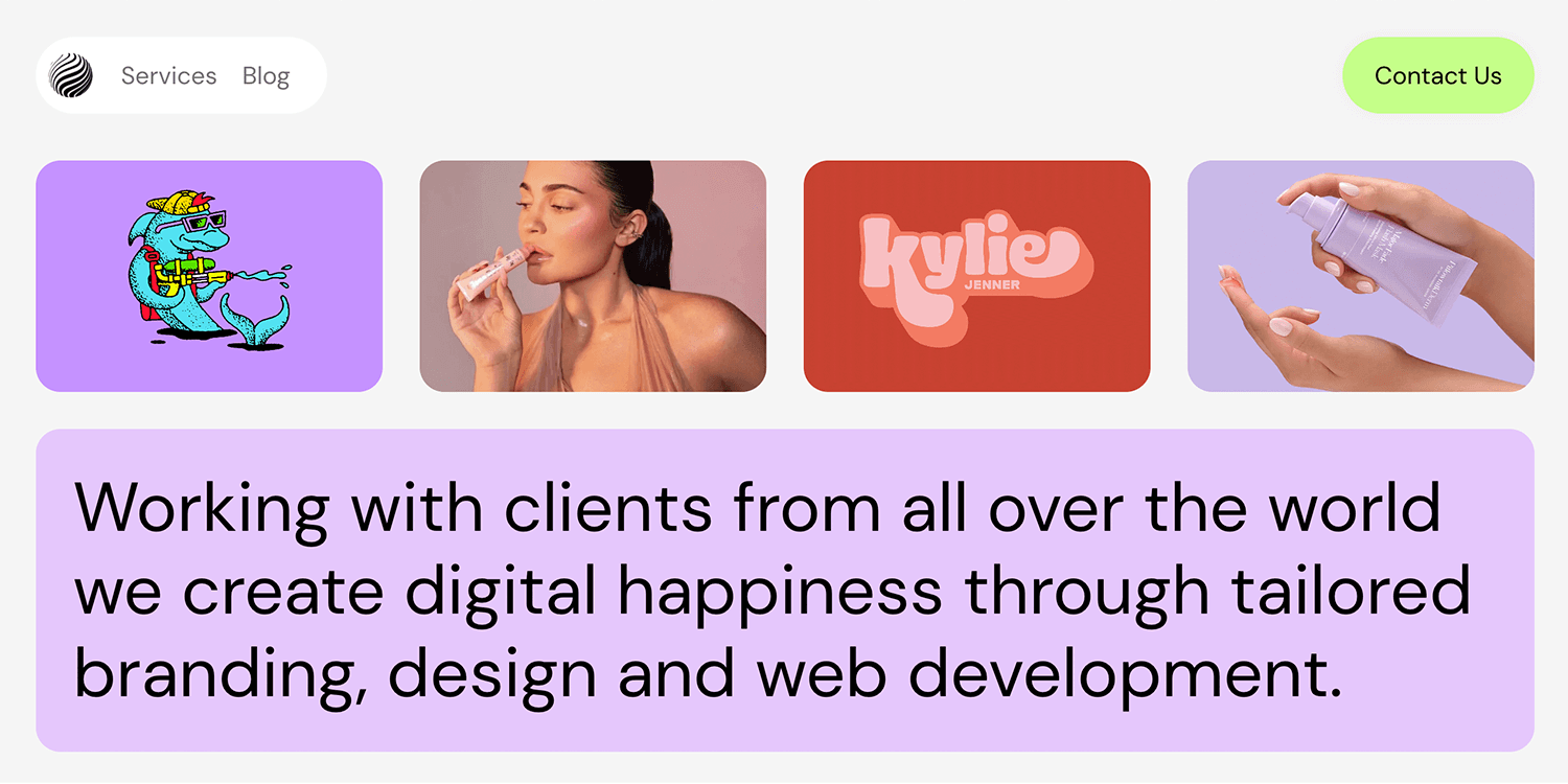
This hero image example is a perfect blend of creativity and functionality, making it clear they’re anything but “same same” in the design world!
This hero image example for DAMAC Hills townhouses shows how fancy their houses are. It’s a bright picture of a beautiful, modern house with lots of green space around it. The picture shows how peaceful and high-class these 4-bedroom houses are, perfect for both relaxing and feeling important. The clear “Learn More” button lets interested people find out more, making it easy to imagine living a luxurious life in this amazing community.
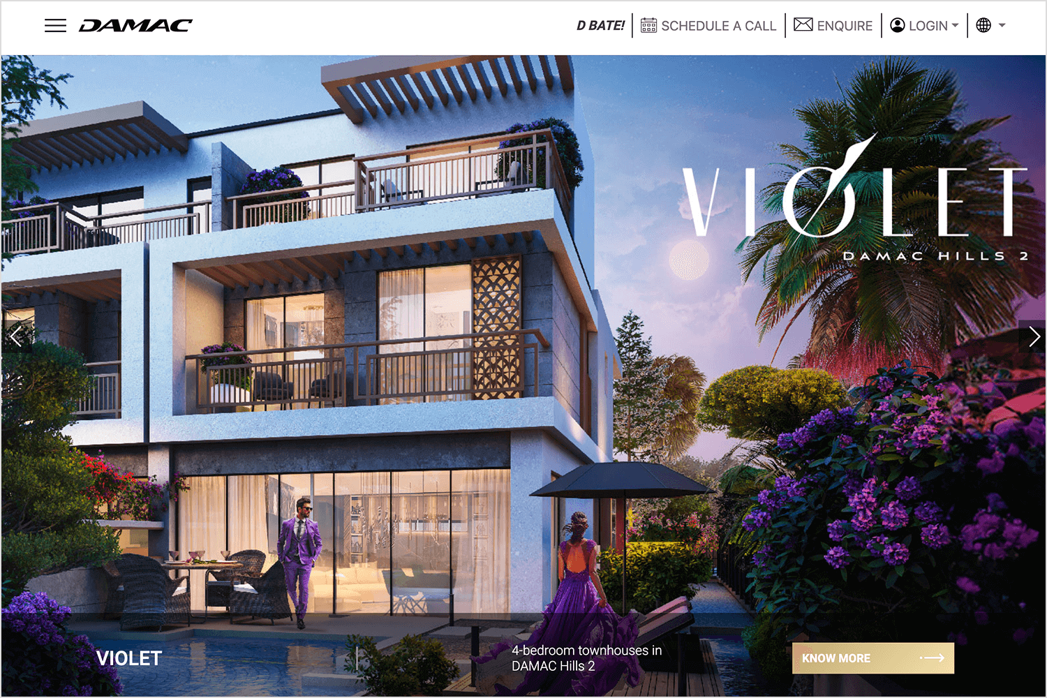
DAMAC really captured the idea of super nice living with this interesting and pretty picture.
In this case, GoPro for 4th of July sale is a great example of showing off effectively their discount! The bright blue background makes the big deal clear: “$150 OFF HERO12 BLACK + SUBSCRIPTION.” The picture of the GoPro camera looks cool, with streaks of light in the background like something exciting is happening. The button that says “Shop Now” lets people buy the camera right away.
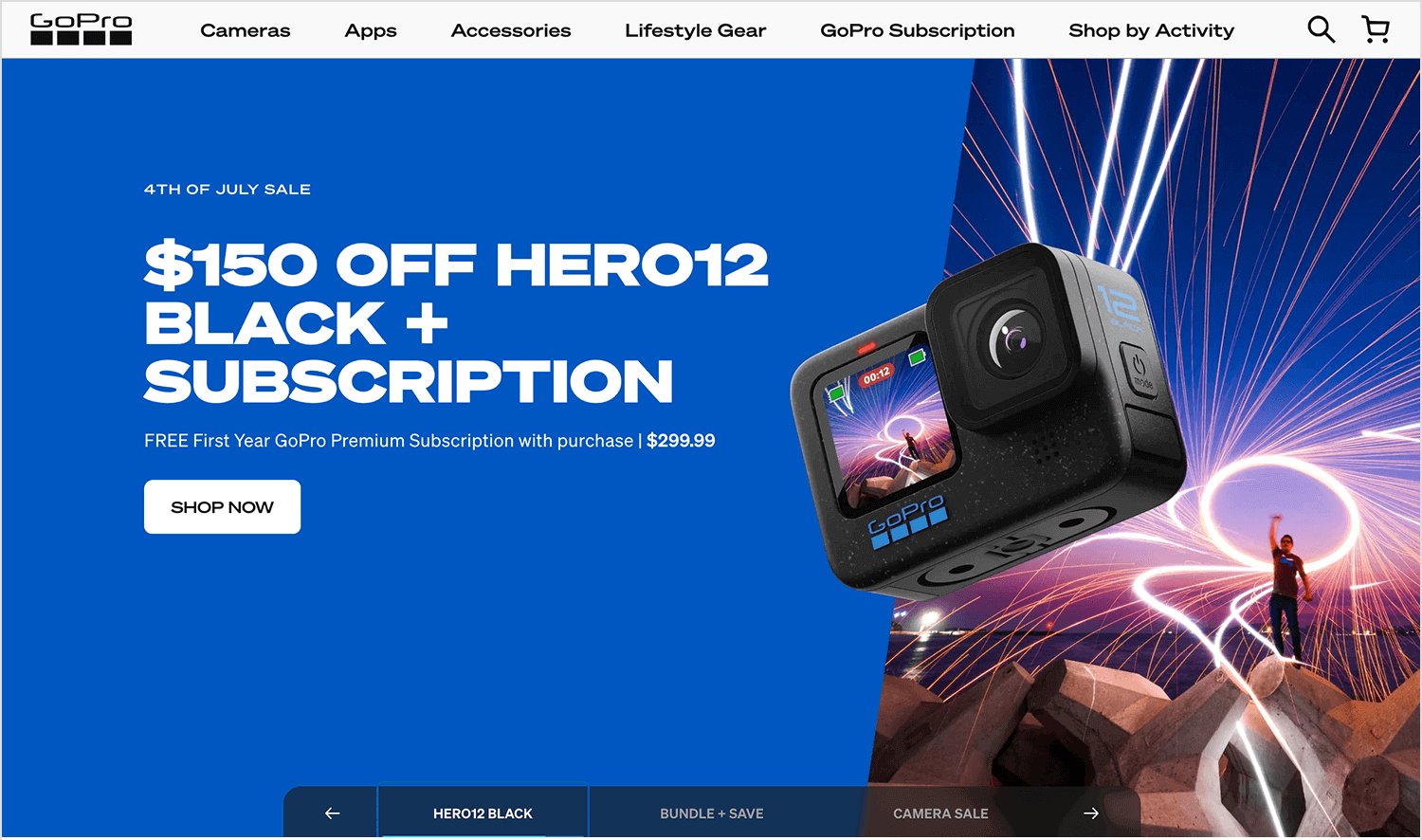
This hero image example is eye-catching and makes people want to buy the camera, making it a great example of how to advertise a sale.
Storyblocks‘ hero image example is a bold invitation for creators to take their video editing to the next level, and do it quickly! The background explodes with color, instantly grabbing your attention and setting a creative mood. The clear message, “Create better video, faster than ever,” stands out in bold white text, motivating you to jump in. Right below, a search bar beckons you to explore a treasure trove of video templates, audio clips, and images. The pops of yellow, including the “Join Now” button, add a touch of energy and guide you towards getting started.
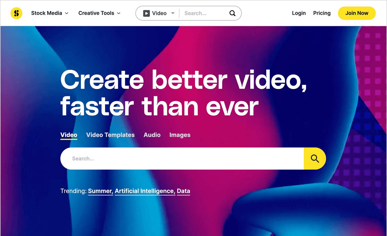
This hero image effectively communicates Storyblocks’ mission: to empower creators with the tools they need to shine. It’s a visually striking and engaging example of web design that gets straight to the point.
De Leeuw, an artist from the Netherlands, created a website to show off her art and sell her products. This example of hero image features beautiful hand-drawn plants and birds, giving a personal touch to the site. The big text, “WALLPAPERS & WALL ART,” stands out against the detailed background. This invites visitors to explore her unique wallpapers. The “Shop Now” button fits nicely into the design, making it easy to use.
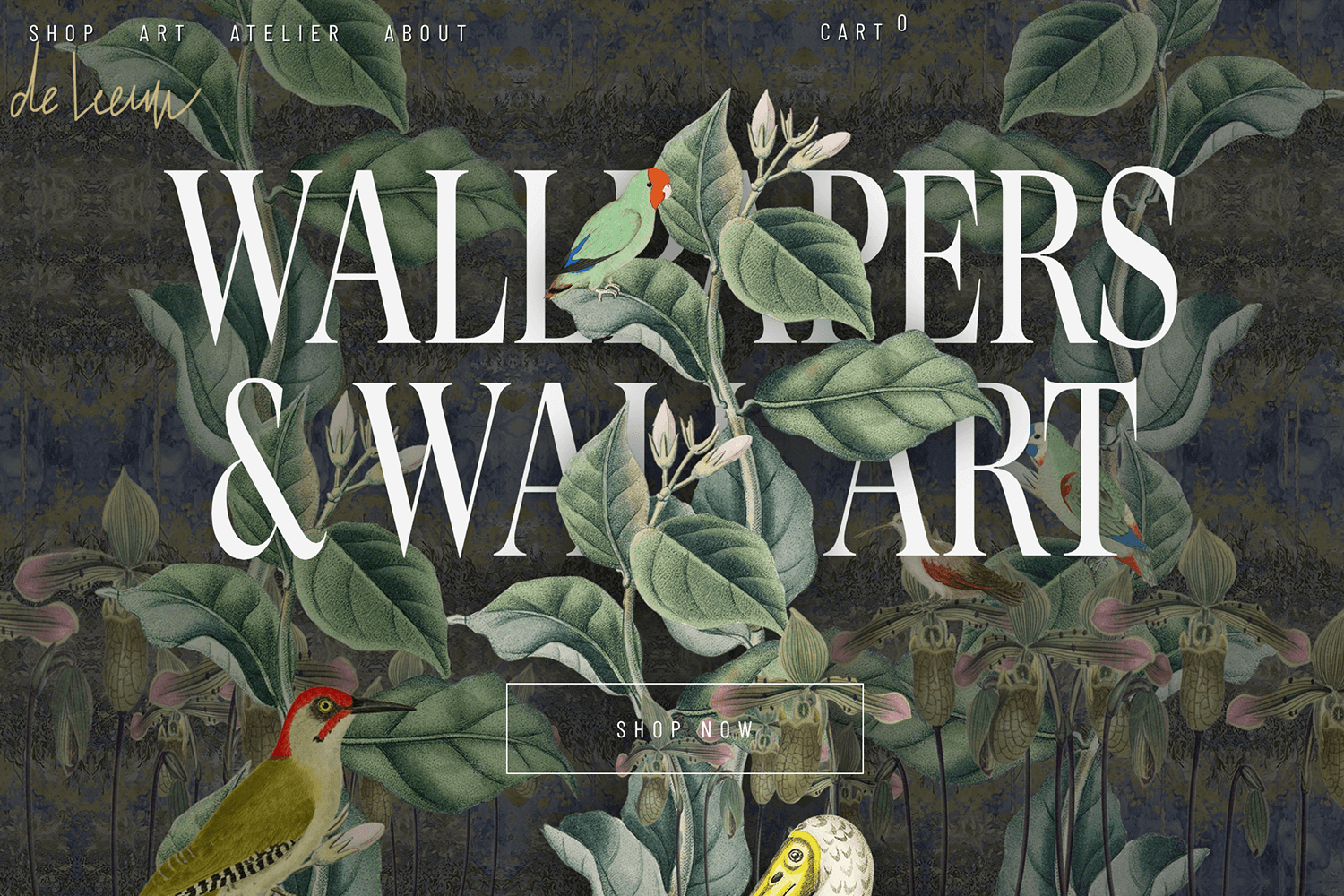
De Leeuw’s hero image is a perfect mix of art and practicality, showing off her work and making it easy for people to buy her custom wallpapers.
Rob Ida’s hero image features a beautiful classic car with the words “Craftsmanship at Every Turn.” The calm background makes the sleek car pop. This image highlights Rob Ida’s focus on high-quality, detailed car design. The simple layout draws your attention right to the car, showing their commitment to excellence.
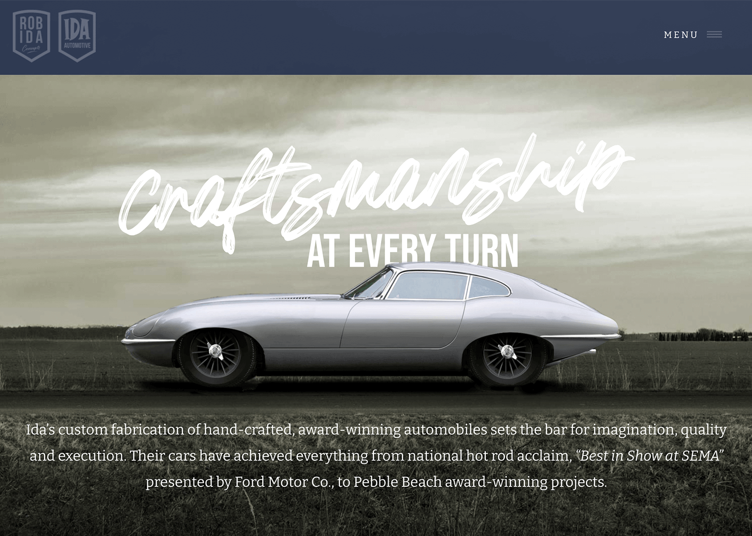
This hero image is eye-catching and elegant, inviting viewers to admire the skill and artistry of Rob Ida’s work.
Design and prototype hero images for your website

Visit Synthesized, and you’ll be drawn in by the sharp typography and sleek graphics. The hero image prominently features the headline, delivering a clear message about their core offering. The design is clean and modern, using simple database graphics and plenty of white space to keep things visually appealing.
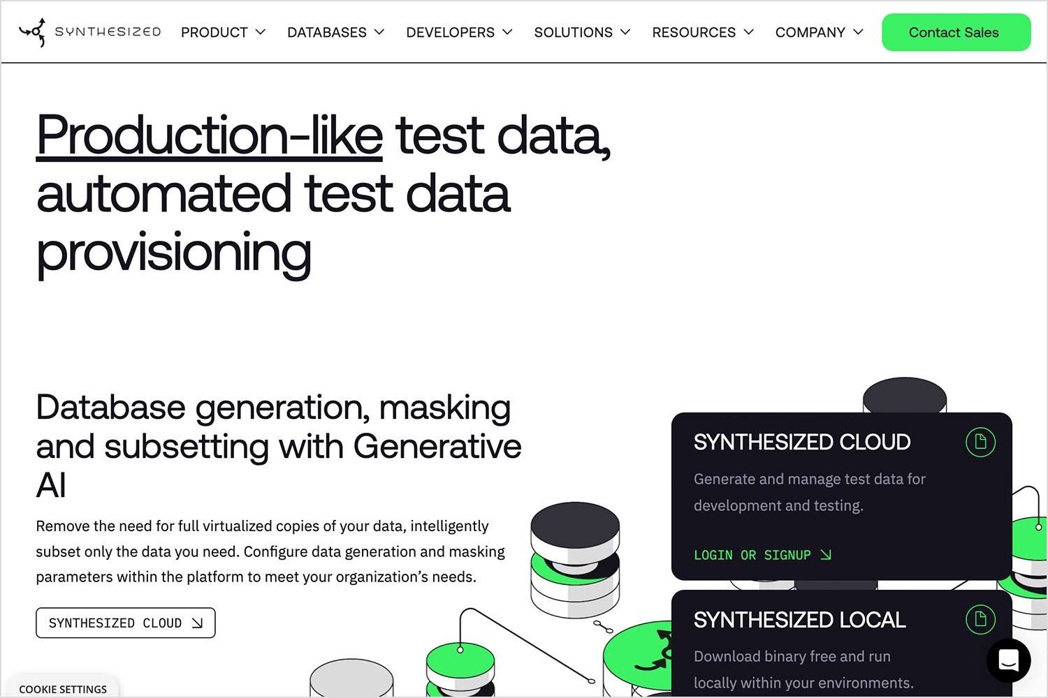
These elements work together to grab attention, clearly communicate Synthesized value, and encourage visitors to dive into their data management solutions.
With Ahrefs’s hero image website you’ll be immediately struck by the bold, blue background and crisp typography. The hero image prominently shows the message, “Everything you need to rank higher & get more traffic,” making it clear what Ahrefs can do for you.
The design is simple yet effective, with a fun star icon and mountain graphic adding a bit of personality. The bright orange “Sign up for Ahrefs” button stands out, inviting users to take action.
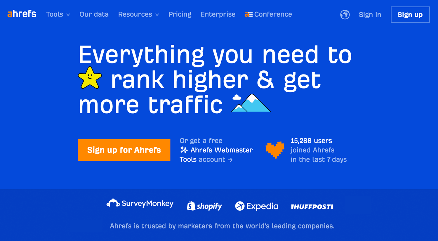
This hero image example effectively combines engaging visuals with a straightforward message, encouraging visitors to dive into Ahrefs’ SEO tools.
Wrapping up our list is Bed Head’s eye-catching hero image. The cool black-and-white photos and strong design grab your attention right away. The big headline promotes their new Bed Head Artistic Edit, and the bright green button makes it super easy to click and find out more.
The mix of bold images and unique textures really shows off Bed Head’s creative and edgy style.
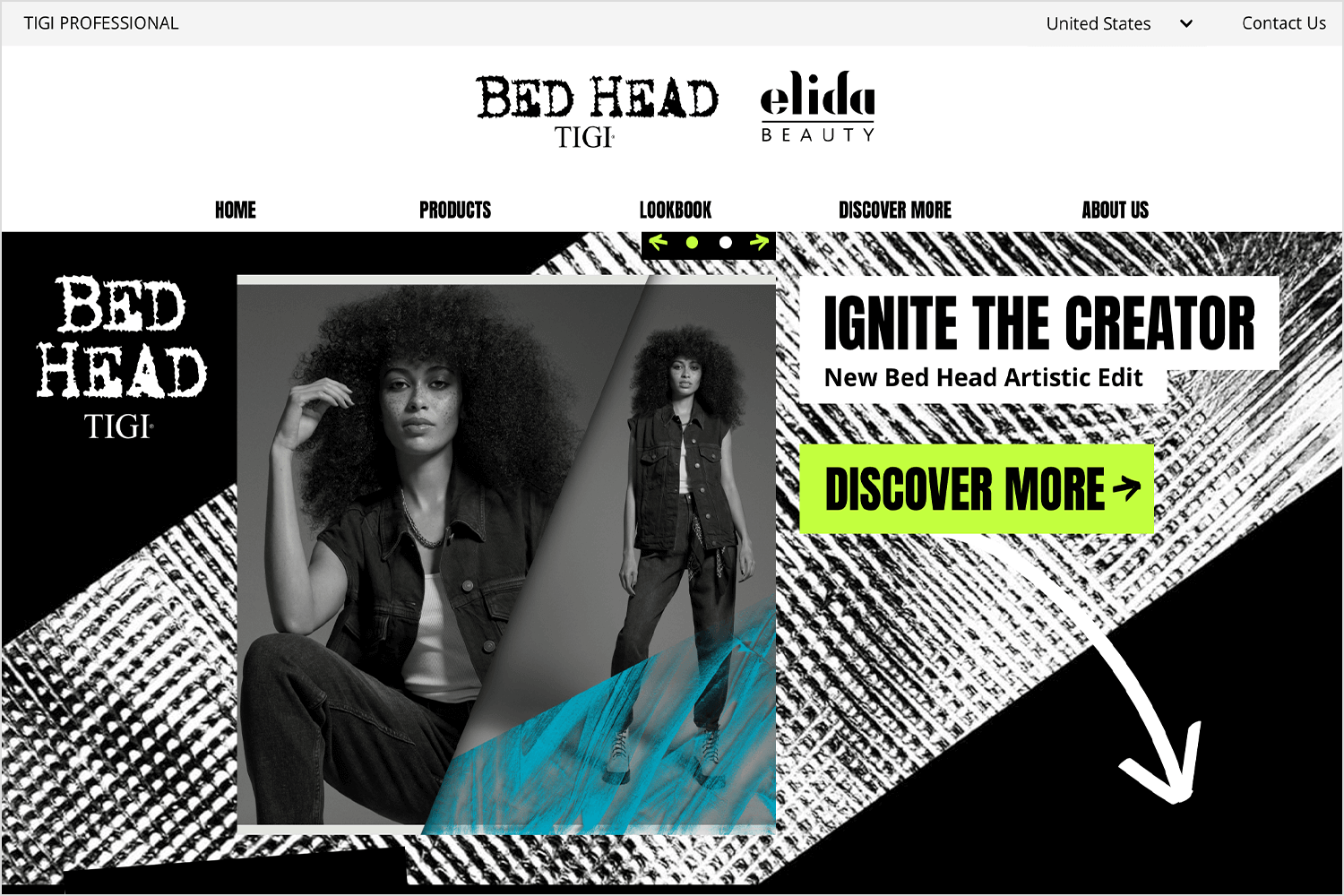
This hero image example isn’t just visually striking but it also invites visitors to check out their latest collection, making it a great example of simple yet powerful web design.
As Conversion Xl reminds us, it only takes 50 milliseconds for users to form an opinion about a website. That’s why you need to make sure that your site is easy to read, clear and delightful. Using a hero image is a good way to ensure users can identify with and relate to your site.
Large, oversized images grab the user’s attention as soon as they land on a page. They also help users identify the brand’s unique selling point (USP) and form an opinion about the brand as soon as the page loads. Many web designers create hero images using photos of real human faces. This helps designers to personify users, as well as enable users relate to the brand, according to Webflow.
And in an attempt to create more personalized experiences for web users, some designers opt for animated hero images (using videos, sliders or carousels). This helps draw users in as soon as they arrive on the site’s homepage, and makes the experience feel more crafted. Here’s an example.
With all the benefits of hero image websites, it’s no wonder they have become such a popular web design trend. Next we’ll take a look our favorite hero image examples, including some interactive headers!
With all the benefits of hero image websites, it’s no wonder they have become such a popular web design trend. Next, we’ll take a look at our favorite hero image examples, including some interactive headers!
But first, let’s explore how you can create your own stunning hero images. A great hero image can supercharge your website’s user experience by grabbing attention and instantly conveying your message.
Here’s some tips to create hero images that will stop visitors in their tracks.
Your hero image is the first thing visitors see, so it needs to make a great impression. Use high-resolution images that are crisp and clear. Avoid pixelated or blurry pictures, as they can make your site look unprofessional.
Make sure your hero image is relevant to your brand and the content of your page. The image should align with your website’s message and target audience. For example, a travel blog might use pictures of beautiful places, while a tech company might use pictures of cool gadgets.
Putting words on your hero image can make it stronger, but people need to see them clearly. Use different colors for the words and the picture so they stand out. Keep the message short and to the point, like a catchy title or an instruction telling people what to do next.
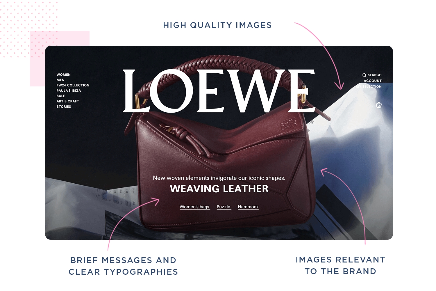
Including real people into your main image can also make your website more user-friendly. Images of normal, happy people can make people feel good and trust your brand more. This is especially useful for websites that want visitors to believe in them.
Videos are also powerful and can be even more interesting than pictures for your hero image. They can show a lot in a short time, even if your message is a bit tricky. Just make sure the video is clear and doesn’t make your website take too long to load. Videos that start playing automatically without sound and have words at the bottom are easiest for people to watch.
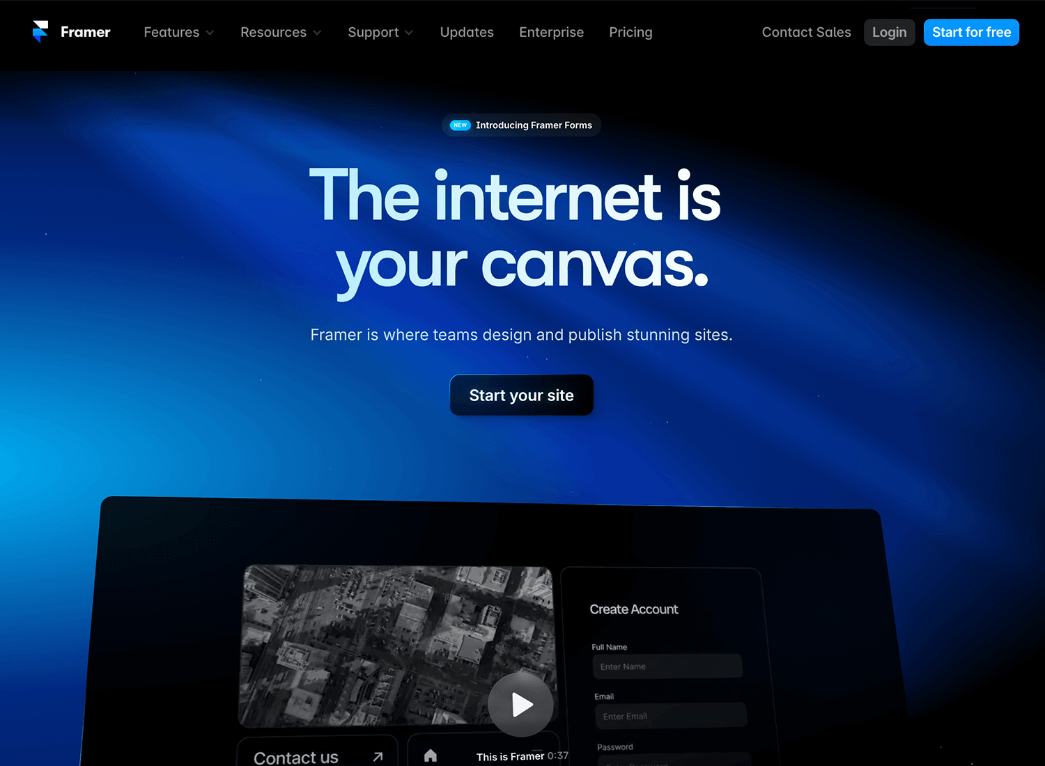
Keep your hero image clear and simple – sometimes less is really more! A simple picture with one main thing to look at is easier to understand than a busy one. This way, visitors can quickly see what your website is about without feeling confused.
Don’t give up on the first picture you try. Play around with different hero images to see which one people like the most. There are tools that can help you test this, and they’ll show you what works best for getting visitors interested and taking action on your website.
Big pictures can slow down your website. Make sure your hero image loads fast but still looks good. Faster loading times make your website more enjoyable to use and can even help it rank higher in search results.
Put a bright “action button” on your hero image to tell visitors what to do next. Make it easy to see and use clear words like “Shop Now,” “Get Started,” or “Download Now.” This will help them take the first step towards what you want them to do on your website.
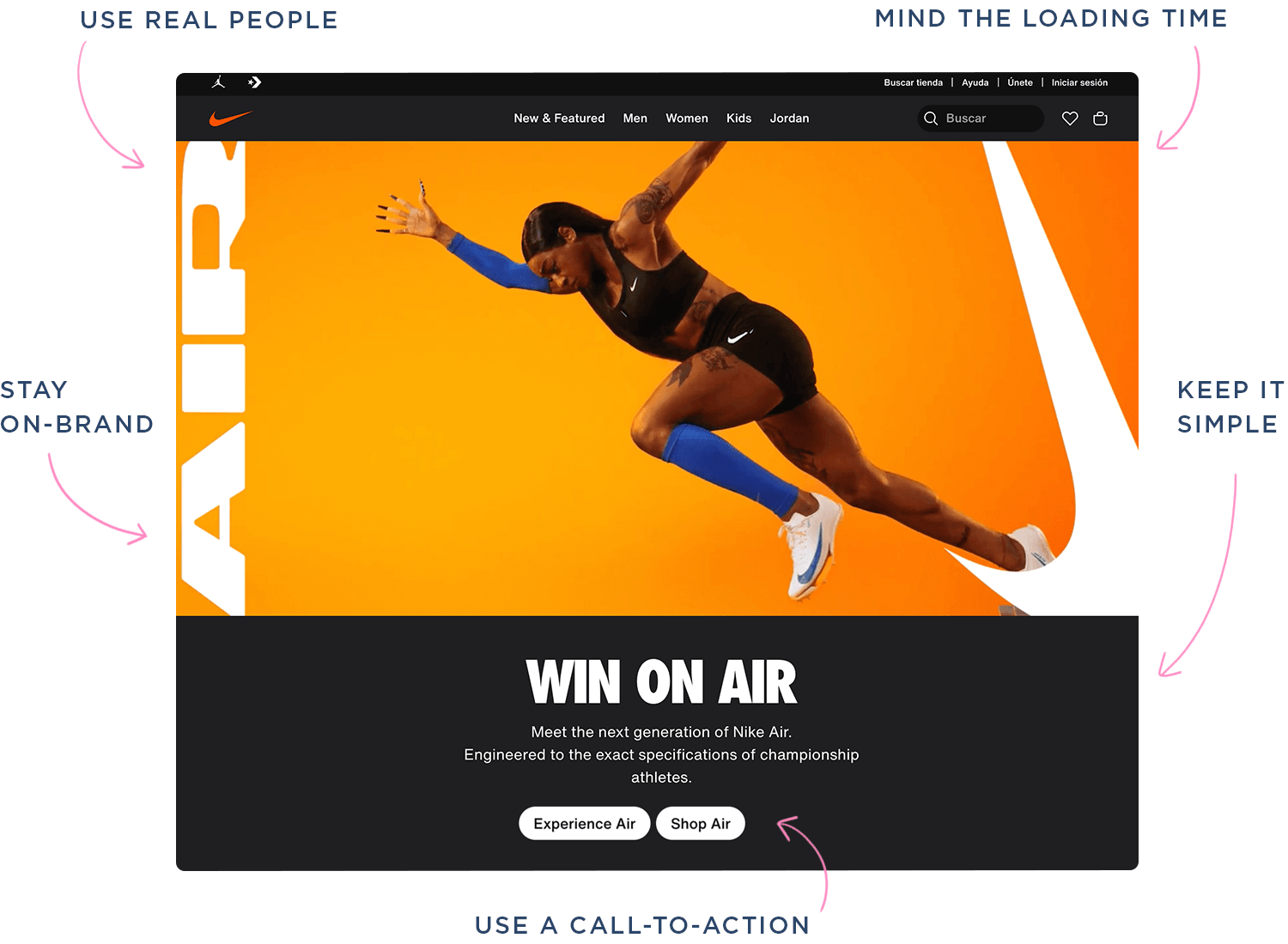
Finally, make sure your hero image matches the overall feel of your website. Use similar colors, fonts, and design styles as the rest of your site. This helps people remember your brand and makes your website look put-together.
Design and prototype hero images for your website

Including a hero header in your website can be a great way to focus the user’s attention as soon as they land on your website. Large and oversized web banners come to life on screen and can help your users make sense of your content.
To take advantage of this web design trend, it’s important to take hero design best practices into account. We hope these examples have you given you some insight into what a strong hero image design looks like.
Now it’s time to create your own. We don’t mean to toot our own horn, but we think Justinmind is the best tool around for creating hero banners. If you haven’t tried us out, remember you can try us for free here!
PROTOTYPE · COMMUNICATE · VALIDATE
ALL-IN-ONE PROTOTYPING TOOL FOR WEB AND MOBILE APPS
Related Content
 A fun look at different data table designs, from basic lists to smart, interactive ones, based on how complex the data is and what users need.18 min Read
 Single page design v multi-page design – everything you need to help you choose the right design for your site’s content18 min Read
 Website backgrounds can be a powerful tool in creating an experience. But what kind of experience can you convey and how? We got the full run-through for you!14 min Read


