
Login page designs should be easy to understand and require no thought from the user. Here are 40+ to inspire your next design!
Following our article on awesome sign up forms, we’re taking a closer look at inspiring login forms that have great UX and make signing in a cinch.
When it comes to a good login page design, you want to make it as easy for your users as possible to gain access to your product or service.
Design website login form pages with Justinmind

One hurdle too many and you’ll frustrate your users. To prevent frustration, here are 40 login page designs that we love. Use these as inspiration for when you prototype and validate forms!
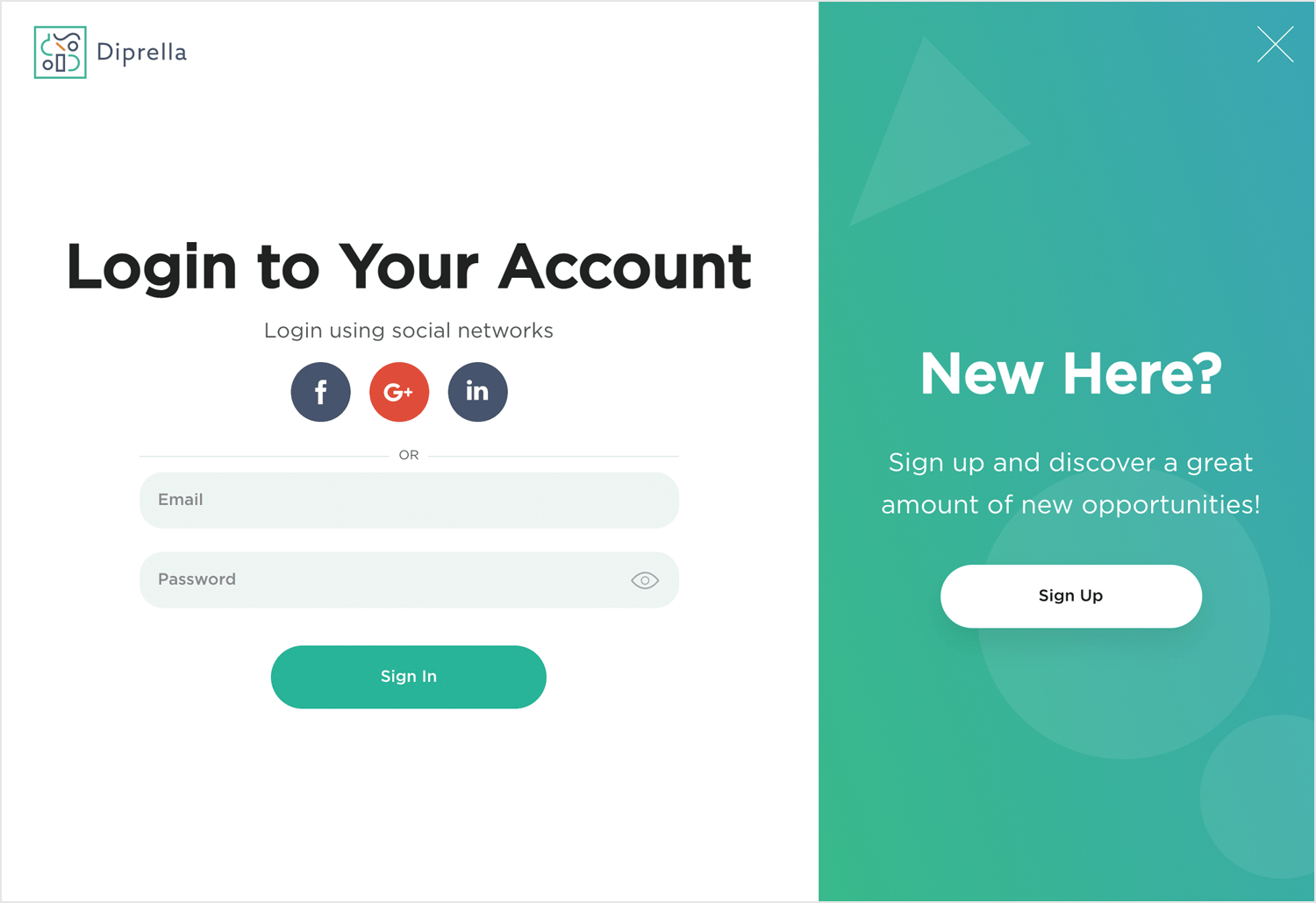
Ready to dive in? InsideBox‘s login page, by Justinmind, is built for a breeze. It keeps things refreshingly simple, just like a well-designed login page. Two clear fields for your email and password are all you need to get started. A friendly “start your journey” message welcomes you, and a pre-filled email example ensures you know exactly what format to use. Plus, a handy “show password” option lets you see what you’re typing for added security. It’s everything you need for a smooth and inviting login experience.

Forget cluttered forms – this prototype example login page is designed for a refreshingly simple experience. It’s clear and concise. Just enter your name, email, and choose your area of interest to personalize your journey. Straight to the point, this login page makes sure that all users can identify the main fields and fill them out respectively. Also, the illustration of the girl reading with her cat is inviting, making you want to sign up and get cozy with your favourite book and furry friend. We love this login page example!

LemonPie’s login page is designed for ultimate ease. This page keeps things clear with just two fields: your email address and a password to secure your account. The reassuring message “Keep your data safe” sits above the form, letting you know your information is in good hands. The login page example also illustrates the much sought after 2-step verification process that ensures safe access to the platform. Easy peazy LemonPie squeezy!

TheCubeFactory login page, welcomes you back with a friendly and sleek look. On the left, the login form is kept simple, just your email and password. Need a quicker way in? There’s a “Remember for 30 days” option, and if you forgot your password, a quick link is right there. You can even choose to “Sign in with Google” for a faster experience.

Kryptonite keeps it simple and clear. Right on your phone screen, you’re greeted with a warm “Welcome to our app.” Creating an account is quick, you just fill in your email, set a password, and repeat it to be sure. The “Sign up” button is big and easy to spot. Not ready to create an account yet? No worries, there’s a “Sign in” link at the bottom. With its clean design and smooth flow, Justinmind makes getting started with Kryptonite very easy.

TrackTV’s login page is all about getting you in quickly. With its bright yellow header, it instantly catches your eye. The form asks for just the basics: your email and password. Want to save some time later? Click “Remember for 30 days.” Forgot your password? No problem, there’s a quick link to reset it. You can also skip the typing and sign in with Google. And if you’re new here, just hit the “Sign up” link at the bottom. Easy, friendly, and smooth, just how login should be!

CubeFactory keeps it simple. Sign in with Google or use your email and password. Need a reminder for next time? Just check “Remember for 30 days.” Forgot your password? The link is right there. On the right, a calming image and a message saying, “Bring your ideas to life.” Not signed up yet? Click “Sign up” at the bottom. Easy and welcoming!

This login page is all about simplicity. Enter your email and password, or save some clicks by signing in with Google. If you forgot your password, there’s a link for that. Plus, the “Remember for 30 days” option means less hassle next time. Ready to join? The “Sign up” button is waiting for you at the bottom.

Sometimes less is more, and this page nails it. With just an email and password field, you get straight to the point. The clean, minimalist look keeps distractions away. Forgot your password? No big deal, the link is right where you need it. And instead of a big button, there’s a smooth arrow to guide you forward. Not signed up yet? “Sign Up” sits neatly at the bottom, waiting for you. Simple, stylish, and to the point.

This login page makes things feel welcoming. The greeting says, “Hello, welcome back to your account,” setting a friendly tone. It’s all about easy access here, just enter your email and password. Want to save time next time? Check the “Remember me” option. Forgot your password? The link is right there for a quick reset. The bold “Login” button stands out, ready to go. Not a fan of typing? You can also sign in with Facebook, Google, or Apple. Simple, friendly, and hassle-free.

This login screen welcomes you back with a friendly message: “Welcome back to your favorite exercise app!” It’s designed to be simple, just enter your email and password, then hit that bold blue “Sign In” button. If you’ve forgotten your password, there’s a gentle reminder link right below. The curved design at the bottom adds a nice, refreshing touch, making the whole experience feel relaxed and motivating.

Who can resist that stack of pancakes? This login screen sets a cozy, inviting tone. A friendly “Hello again!” greets you, making it easy to jump back in. Just pop in your email and password, and hit that bright purple “Login” button. Need to reset your password? The link is right there. If you’re new, simply tap “Sign up” at the bottom. It’s warm, welcoming, and gets you where you need to go.

Bold and straightforward, this login screen gets right to the point. With a bright blue background and a simple icon, it invites you to “Speak, friend, and enter.” Just pop in your email and password, and you’re set to go. The black “Sign In” button stands out, making it easy to spot. There’s even a small info icon next to the email field, in case you need a little help. Clean, sharp, and no-nonsense.

Clean, calm, and to the point. Tolker’s login screen keeps things simple. With a soft gradient background and rounded login button, it feels modern without trying too hard. Just pop in your username and password, and you’re ready to chat.
No clutter, no distractions, just a sleek way to get back to your conversations.

This login screen feels cozy and welcoming, just like the space in the background. It greets you by name and keeps things simple: username, password, and a gold “Login” button. Forgot your password? There’s a quick link for that. Need an account? Just tap “Sign Up.” Clean, calm, and easy.

BrightPay keeps things clean and professional. Set against a dark background, the white login card stands out with a simple “Sign in” header, followed by two easy fields: email and password. Want to stay logged in? Just check the “Keep me signed in” box. Forgot your password? There’s a quick link to help you out.

It’s an easy, and straightforward login that gets the job done fast.
MindNest’s login screen is clean, modern, and super easy to use. You can sign in with your email or phone number, or skip the typing and go straight in with Google. The bold black “Log In” button makes it clear where to click, and there’s a soft nudge to reset your password if needed. The playful “account” styling up top adds a nice little flair. Simple, friendly, and efficient.

Craftly feels fun right from the start. The bright colors and playful shapes make it feel light and creative. You can sign in with Google or just type in your email and password, totally up to you.

There’s a little checkbox if you want to stay logged in, and the bold purple button makes it easy to know what to do next. Simple, friendly, and a bit of fun, just like the app itself.
SaleSkip’s login page strikes a balance between clean aesthetics and user-friendliness. It uses a modern blue and white color scheme with a subtle geometric background for a fresh feel. A friendly greeting with a star icon sets a welcoming tone, while a clear blurb highlights the value proposition of SaleSkip.

The login page itself is straightforward with clear labels for email and password, and a sleek button to “Login Now.” For added convenience, there’s also a social login option with Google. Finally, a discreet “Click here” link takes forgetful users to password recovery. Overall, this login is clean and as aesthetically pleasing as it is user-friendly. 100% recommend!
Bondroy’s login page isn’t your typical snoozefest. It’s like the cool older sibling of login pages – edgy and functional at the same time. The left side uses a black and white color theme with diagonal stripes, creating a clear and modern design. On the right, we see a more user-friendly approach taken. Labeled fields for email, password, and a “Remember me” checkbox ensure a smooth login experience. Additionally, a “Reset password” link is provided for account recovery needs.

Finally, a prominent “Sign In” button is positioned for easy access. New user registration is available through a dedicated link, while existing users have the option to sign in using their Google or Twitter accounts for added convenience. A winner in our eyes!
We are in absolute love with this login page example. Something about that color hits home, doesn’t it? As for the login page itself, it cuts to the chase, offering a clean design that’s easy to navigate. No crazy graphics or funky fonts here – just a clear layout that gets you on your way to travel planning. The welcome message is friendly and straightforward, letting you know they’re happy to see you back.

Login options are simple: continue with Google for lightning speed, or enter your username and password like a boss. Need a password reset? They’ve got your back there too.
Tasky’s login page example, found on Dribbble, exemplifies a UX design that seamlessly blends aesthetics with functionality. The lilac color scheme, often associated with tranquility, creates a calming atmosphere during sign-up, especially for new users. This sense of ease is further reinforced by the clear and delightful stick figure illustration holding up a to-do list.

There is no need for another image in our opinion since it’s a bit more cluttered this way. However, the layout does prioritize the login form with email and password fields. All in all, Tasky has won our hearts with this login page example.
This Nike concept login page brings the heat (pun intended) with a bold purple color scheme that pops against crisp white elements. It’s sleek and modern, just like their kicks. The Nike swoosh takes center stage, both at the top and within the login page, keeping the brand front-of-mind. Plus, they’ve got a sweet image of a Nike shoe to grab your attention.

Despite all the style, the page stays user-friendly. Plenty of white space and a clean layout keep things from feeling cluttered. The text is modern and easy to read, perfect for athletes on the go. Functionally, it’s a slam dunk. The form fields are straightforward, and there’s a handy “Forgot Password?” link just in case. Social media login options are there for extra convenience. And that big “Login” button practically begs you to “Just Do It!”
Design website login form pages with Justinmind
Dive right into your feed with Instagram’s effortless app login page. It perfectly complements their focus on beautiful visuals with a minimal and intuitive flow, getting you back into your Insta world faster than you can say “double tap.”

With just the minimum amount of info (your username and password) and you’re back in the loop, scrolling through photos and videos from friends and favorite creators. They ditch the clutter and extra fields that slow users down, and they even let you log in with your existing Facebook account, eliminating the need to create new credentials. We love you Insta!
Streamline your access to the digital world with Google’s signup process. With all the winning characteristics of a good login page, it prioritizes clarity and ease of use. Enter your name and create your password – that’s it!

No need for complex layouts or excessive information. Google also lets you use your existing email address for added convenience, bypassing the need to create a new one specifically for their services. You go Google, paving the way for excellence as always!
Mirroring the platform’s emphasis on instant engagement, signing in to X (formerly known as Twitter) takes less time than saying the name of the platform itself!

The social sign in options with your Google or Apple accounts makes life so much easier don’t they? X knows and prefers that, which is why they offer it as the first sign in option. The second option is the old school way of entering your phone number, email or username. Both are valid, but we believe the first option wins in our humble opinion.
Pintrest is all about finding that aesthetic that you can’t help but connect with. That’s why there’s pressure on them to present information clearly and concisely while ensuring that it catches the eyes of creatives. Standards are high, and they live up to the challenge at every opportunity.

Just enter your email address or username and password, or simply sign in using Facebook or Google, and get ready to dive into a world of endless inspiration!
Craving a cozy Parisian flat or a vibrant beach bungalow? Airbnb’s login is as smooth as a freshly made bed. Ditch the password struggles – use your existing Google or Apple account for instant access.

Just a few clicks and you’re back in the Airbnb haven, ready to explore unique listings or manage your hosting adventures. It’s the perfect jet lag cure – skip the wait and dive straight into planning your next unforgettable escape.
Check out Slack’s login for a masterclass in UX efficiency. Designed to mirror their core function of streamlining teamwork, it gets you collaborating ASAP with minimal effort.

They achieve this with a killer combo of features: a lean login requiring only email and password, familiar integration with Google and Apple accounts to bypass new login creation, and even magic links for easy access on new devices. The interface itself is clean and clutter-free, with a clear and intuitive flow that minimizes the need for exploration or instructions.
Zoom’s login page hosts familiar login options like Google, Apple, Facebook or other SSO accounts that further streamline access. The interface is clean and intuitive, prioritizing user experience with clear instructions and a straightforward joining process.

However, security isn’t sacrificed – meeting passwords, two-factor authentication, and waiting rooms ensure only authorized participants join, making Zoom’s login a well-rounded solution for a smooth and secure video conferencing experience.
Microsoft’s login experience juggles the needs of a vast user base, from casual Outlook users to corporate professionals. This translates to a multi-faceted approach that balances accessibility with robust security. Users can leverage their familiar Microsoft account for a unified experience across services.

The interface adapts to the chosen login method, displaying relevant options, while features like conditional access and multi-factor authentication ensure security without disrupting the flow.
Netflix is everyone’s first streaming platform love. It continues to exceed expectations when it comes to UX and UI design and this is reflected in their login page. We love the contrast of business and fun. Business being their solid black login form put against a fun selection of their movies and series, presented in true streaming platform fashion.

Your options are to either sign in with your email or mobile number or using a sign-in code. You can also request a new password from the same block and ask it to remember you so you don’t have to go through the login process each time you want to binge-watch all of Bridgerton. (Yes, we are obsessed too.)
You want to do your shopping as quick and efficient as possible. Amazon knows that. That’s why their login page is straight to the point. Sign in with your email or phone number and hit continue, enter password and boom, you’re in!

The white space provided in this login page is intentional, making sure that only the essential information is displayed even asking if you might need any help logging in. It also links you to Amazon Business for easy access and higher efficiency.
Need a quick peek at the latest news or trending threads? No problem! Reddit lets you explore content freely without needing an account. For those who want to join the conversation, creating an account takes less than a minute to get done. Just add a username, email, and password – that’s all it takes.

The interface prioritizes user experience with a clean layout, clear options for both account creation and anonymous browsing, and a “Remember Me” function for frequent visitors. And to make it all a well rounded success, multiple device compatibility ensures a smooth transition between screens.
For developers, GitHub’s login is like a well-oiled compiler – designed for speed and efficiency. Just like their focus on developer productivity, logging in gets you coding and collaborating in a flash.

Minimal fields – username/email and password – keep things swift, while familiar login options via existing GitHub accounts or Google/Apple eliminate the need for separate credentials. Two-factor authentication is readily available for security-conscious developers without hindering the login flow.
Design website login form pages with Justinmind
PayPal takes the minimalism prize. You wouldn’t know which site you were on if it wasn’t for the small PayPal logo at the top of the login.

What’s interesting and unusual about this login page is that it’s in two parts. You enter your email then hit next to go to a screen to change your password.
We don’t know the science behind why PayPal’s broken down their sign in process like this, especially since it takes longer than normal.
Linkedin’s login page is of a simple design – you won’t find any background images or animations. The thing is, a login page doesn’t need to be ultimately interesting. It’s a simple means to an end, which makes for a perfect page for a distraction-free design.

Linkedin reflects that in the simplicity of their login page design. With a little friendly and motivating copy, the possibility of using your phone number to login and the option to show the password – it checks all the right boxes.
It gets the job done and offers users validation should they need it. What else do we need from a login form?
Uber uses some cool, on-brand illustrations on their sign in page.

Users won’t be on a sign up page for long (if you’ve designed it well) but using illustrations add visual interest and give a little life to an otherwise bland screen.
Here users can sign in with either their email or mobile phone number. Easy!
National Geographic has a standard login form – no surprises here. There are few elements worth commenting on because it’s a good example of a login form.

Title case is common among American and Canadian businesses and National Geographic have gone with tradition.
What we like about this page is the copy “Need help signing in? Visit our support center.” Good copy uses language that’s familiar to its readers and we can imagine this line coming straight out of someone’s mouth.
When it comes to quick and easy login pages, Medium just might take the prize. In fact, users aren’t immediately asked for their email, username or any password. Access to the platform can be gained based on your access to other popular platforms, like Facebook or Twitter.

If users want, they can choose the Sign in with Email option, sticking to a more classic approach. The modal login format of the sign-in page design makes for a minimalist experience, with white being the dominant color.
Much like Paypal, The Washington Post also splits their login form into two steps. The login page itself is quite simple, with the form taking the center of the stage.

It’s worthy of note that users can login with their Amazon account. With both the e-commerce giant and the news platform belonging to Jeff Bezos, we should have seen it coming!
Design website login form pages with Justinmind
Spotify’s login page design is simplicity itself. Users see a white background, with no illustrations or any other graphical element. Spotify gives users the alternative to login using Facebook, as well as the option to stay logged in.

What we like about this login form is that it enjoys inline validation in both the username and password fields, offering a bit of usability-friendly guidance to users. Another type of validation pops up above the login form after a failed attempt. All validations enjoy color and other visual cues.
Dropbox’s login form is located right on their homepage. The login form, on one side of the page, asks you to sign in using your Google account or Apple. They also include fields to fill out your email and password.

The other side of the page includes an illustration of an employee “signing in” to work. Very clever! The result is a beautiful contrast that clearly splits the screen, and keeps the login form from looking bland.
Mailchimp recently went through a rebrand as it begins to mature into a fully-fledged marketing platform. Their login page is similar to their old one with a few minor changes.

One is the injection of personality. Their illustrations are weird and fitting. What’s great about this login page is you can login as you would on any login page but there’s a chance to learn something new: how to build better relationships with your audience—something that many users of Mailchimp presumably want to do.
Even though the copy is minimal on this login page it’s still clear and consistent as you can see in the forgot password/username section.
Sephora uses a modal window for its login page design. We love that they use a smart choice of words. Users can differentiate between logging in and signing up – it boils down to the question “New to Sephora?”. If you have an existing account you can go ahead and use your email address and password to sign in. And if not then you hit that create account button where you are taken to another page to do exactly that!

We also really appreciate the extra mile in the validation of the email input field. It doesn’t just let the user know something is wrong with the typed email, but also includes the correct format of any given email. It’s a tiny detail, but some users out there in the virtual wild were thankful for the extra help.
Ted’s login form page also splits the screen down the half, using plain white for the area of the form and colorful tones for the opposite side of the page. The login form itself is simple, giving users the option to login with their Facebook or Google accounts.

This is another example of a login form page that separates the login process into two steps. We are always happy to see a validation in the form that makes the correct format to write out the email address crystal clear!
Social login is great because it lets people sign in to a service with one click. There’s no need to fill out any forms or type your password. Skillshare give their social login pride of place at the top of the login form.

But if you don’t want to do that then right below you can type in your email and password. This login form gets the job done.
Squarespace takes their login form to the limit of minimalism. It’s stripped-back with no distractions, kinda what you want in a login form.

With login forms, you don’t need to convince people in the same way as you do with a sign up form so creating an environment where people can sign in without any frustrations is essential.
Squarespace opts to use social media icons for their login instead of the usual call to action buttons that you see in other forms. They work well with the design and add to that minimal approach.
The Evernote login page sticks to a simple design, free of colorful distractions or any animation. The login process is broken into two, with users giving their passwords on the second step. Alternatively, users can login with their Google account.

The login form itself sticks to the point, showing users only the label of the input field and the brand slogan. The login form also gives users the option to stay logged in for another 30 days – giving a specific window of time to stay logged in is an interesting detail.
Design website login form pages with Justinmind
This login page design also makes a play for the contrast between a colorful side, and a plainer side where we can find the form. Dribbble has a vertical separation of the screen, showing users a colorful illustration done by a Dribbble user. It goes without saying that the illustration is quirky and colorful much like the concept of Dribbble itself.

When it comes to the login form, we appreciate that the labels of input fields don’t disappear once the user starts typing. Users also have the option to login using their social media.
The validation of the login form pops up after a failed attempt, but doesn’t specify exactly what went wrong. While we are always happy to see a bit of text and not just the use of color for validation (color blindness is a common issue!), we wish there was just a bit more detail for confused users.
Mangools login page design is predominantly white, but still manages to deliver splashes of color that stick to the brand identity. While there isn’t an option to login using social media platforms, given the business nature of the tool it is forgivable.

The validation that pops up following a failed attempt to login works to help users, showing them the correct format of emails. We love that the login form has both labels and placeholders with an example of what users should put in that field. Points for usability!
A great trait of the page is that with the small but powerful graphic shapes in the background, one almost gets a sense of motion. It’s a smooth way to make the login page design enjoyable, while not distracting the user from the login form.
Yet another login page design that splits everything down the middle vertically. AWWWARDS uses a picture for the left side that perfectly captures the allure of the platform, luring us into a crowd of anxious attendees – all waiting to hear who won a certain award.

The login form, to the right side of the screen, is simple and to the point. Users get a visual validation of the username/email input fields, as well as the option of staying logged in. As always, options to login using social media are welcome! The color scheme is a nice touch.
Headspace is a meditation service. Their login page is what you might expect from a company that wants you to find inner peace.
It’s minimal and the colors are muted. The type and composition of the elements is well constructed and spacious. The login form breathes.

The login page gives us three ways to log in. One of those, interestingly, is Spotify. Headspace puts their audio material on Spotify so it makes sense that users can log in with those credentials – this shows Headspace knows and cares about their audience and wants to make life even more convenient for them.
Design website login form pages with Justinmind
Charles Schwab is a bank and brokerage firm. Their login form page is simple—as are the majority of login forms—and is nothing out of the ordinary.
What’s nice about this form is the ‘4 quick tips to better protect your account’ copy. It shows the bank cares about you and your security. The advice is actionable meaning you can put it into practice as soon as you’ve read it.

We also really liked this login form’s Start Page drop down menu. You can do a lot with your bank and there’s a lot of information to digest when it comes to online banking and investing.
This feature allows the users to choose which page to start on. That means they’re less likely to get lost when navigating which has the potential to frustrate your users.
We saw this sign in page on Dribbble by Selecto and thought it looked awesome.
The animation combines both the sign up and the sign in pages which is a nice touch. As you’d expect, there are social login icons and indicative placeholder text – all helping the user do what they want to do.
Login forms are an exercise in making your users’ lives easy. Social logins, placeholder text, and clear labels are some of the ways you can create a user-friendly login form. Use the 40 above as inspiration. Now, start prototyping!