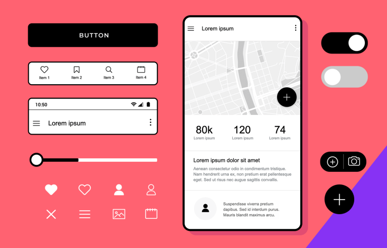
Here at Justinmind, we know wireframing is an essential aspect of mobile app design. Good mobile wireframes can save time and money, and keep your users at the forefront of the app design process.
When wireframing your mobile app, having a UI component library of ready-made icons and screens is a lifesaver. That’s why we’re excited to introduce our Mobile Wireframing UI library!
This library has over 150 mobile device-ready UI elements just waiting to be worked into your next app project. In today’s post, we’ll show you how to get started designing mobile wireframes, whether you’ve been using Justinmind wireframe tool or are brand new to the app!
Let’s begin!
Wireframing speeds up your design process, and helps you visualize screen layouts and UI elements, intended user actions, relationships between screens and visual branding elements and prioritize content.
But how is creating a wireframe for your mobile app different to creating one for your website? Well, remember that web and app design are not interchangeable, and mobile designers have a lot to keep in mind.
For instance, mobile designers need to pay close attention to the UX of their app design and information hierarchy so that users don’t miss the most important content. They may also need to create content for different operating platforms (iOS or Android) – which can mean double the work compared to wireframing a website.
In addition to this, mobile designers will need to think harder about page speed, now that Google has made it a primary factor in mobile search. Designers will need to keep image file size down without losing quality and keep an eye on the amount of content placed in each screen.
Creating an app wireframe with a UI framework specifically designed for mobile will help you tackle all of these issues without losing any time.
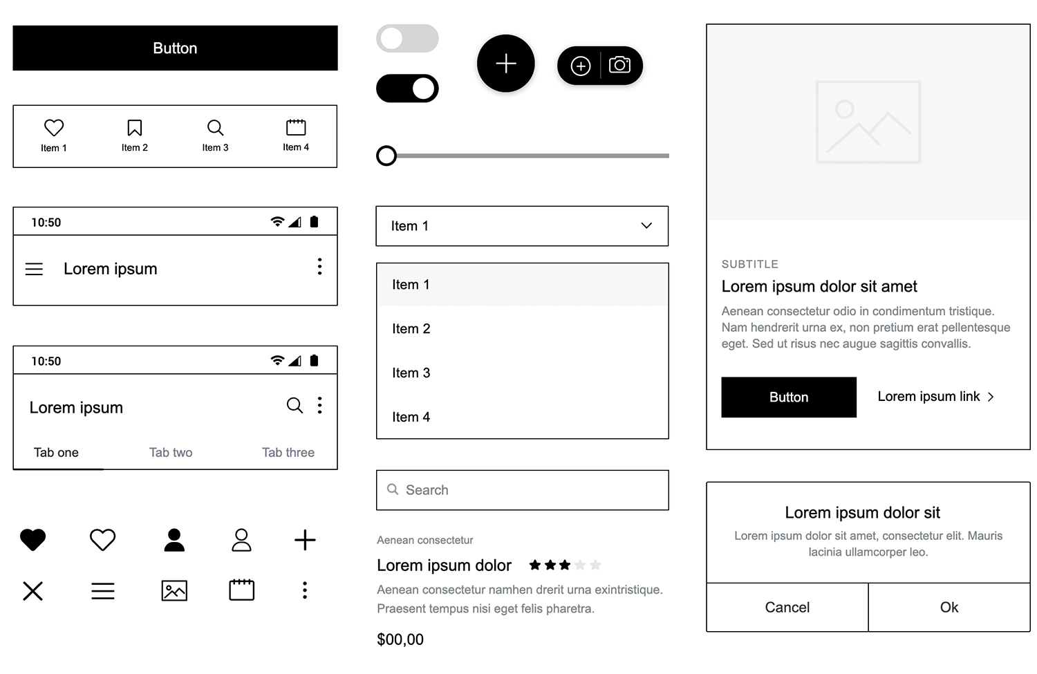
For starters, Justinmind’s Mobile Wireframing UI library contains mobile UI elements that can be used for both iOS and Android, rather than elements adapted from web, all UI components in this library have been designed with mobile devices in mind and crafted specifically for smaller screen sizes. The icons, slide menus, dialogs, buttons, etc are all mobile-ready designed according to common mobile UI patterns and interface guidelines.
It also means that you don’t need to adapt web elements to fit your mobile app prototype. Unlike other mobile UI frameworks that have been scaled down from web equivalents, your Mobile Wireframing UI design system has been built from scratch using standard dimensions. No need to worry about how web elements will reflow or images will scale on mobile device screens!
Justinmind’s Mobile Wireframing UI components library is a set of pre-built, mobile-ready UI wireframe elements, icons, layouts and templates. All of these elements have been crafted specifically for mobile devices, so whether you’re designing for iOS, Android or both, this mobile UI framework will help you get started the right way.
Let’s take a look at the elements inside our latest UI library.
Our Mobile Wireframing UI library is made up of 150+ icons, UI components, headers and footers, content blocks, navigation menus and layouts, templates and complete examples.
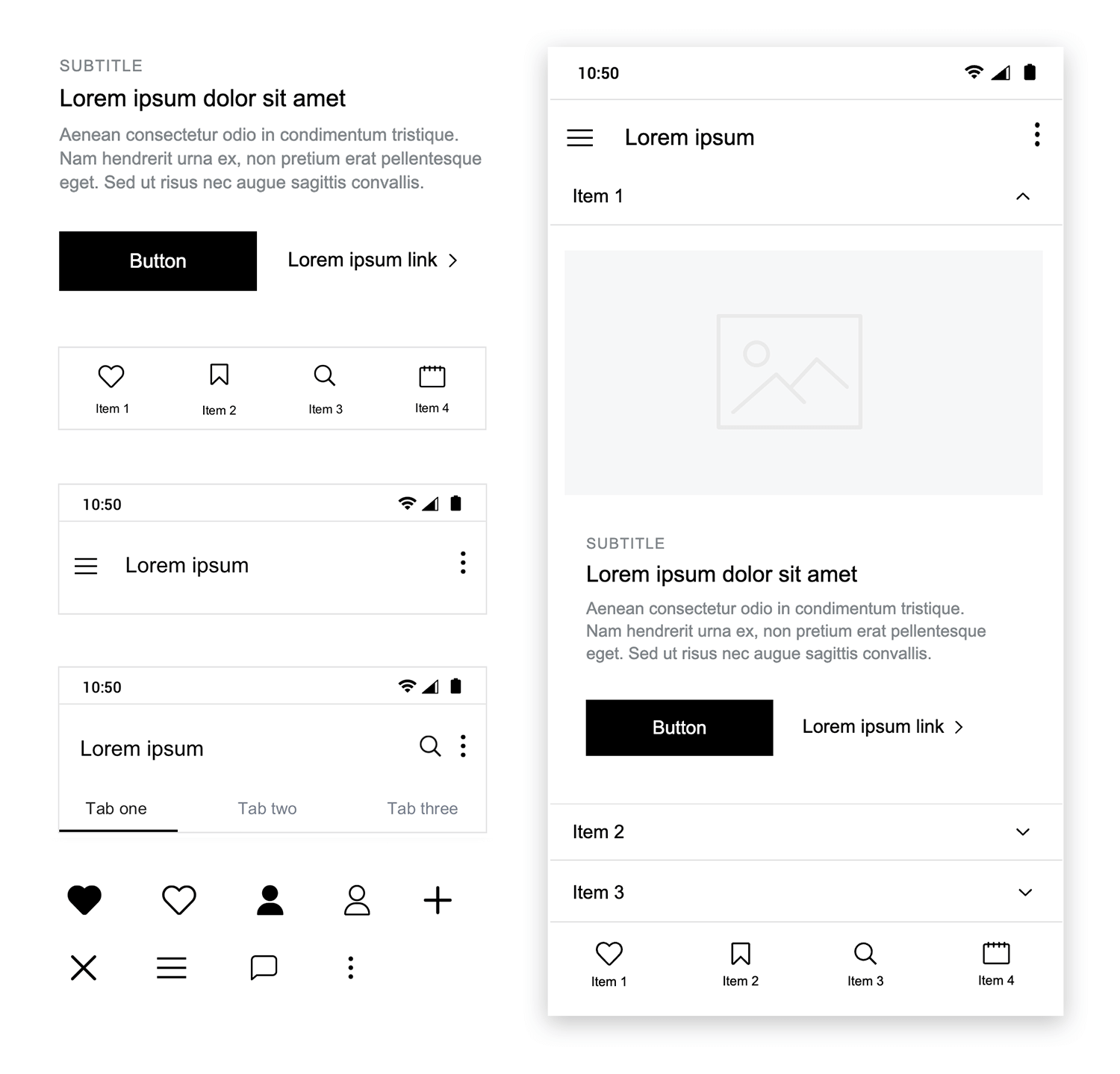
Your Mobile Wireframing UI library is divided into categories so that you can find everything you need easily.
Here’s a list of the library’s categories and all that’s included in this UI design system:
- Basic components: most popular headings, buttons, slide menus, carousel cards, headers and navigation bars.
- Headings: different size headings for titles and subtitles.
- Buttons: advanced labels and buttons, such as dark and light buttons, social media login buttons, and other buttons for specific layouts
- Forms and Controls: sign up forms, and registration forms. Search fields, toggles, different types of select boxes, slide bars, and a map widget as well as fully functional popular cards ready to use as is or to easily customize to fit your design
- Headers and Footers: mobile headers and footers ranging from data dashboards and simple display headers to larger headers with search options and additional functionality.
- Menus: a set of menus, including slide menus, dropdowns and lists among others.
- Navigation: a range of navigation bars and content tabs
- Cards, Lists and Grids: cards and blocks for displaying features as well as different list options for any list elements. Readymade screens including images and buttons and a features screen
- Banners and carousels: a set of slideshows and carousels with interactions
- Reviews, notifications and dialogs: rating elements, a range of notification displays, dialogs and popups
- Chats: chat boxes to create chat mobile app screens
- Icons: the most commonly used mobile icons and symbols such as hamburger menus, social networking icons, like buttons, search icons, etc
Mix and match different UI elements, layouts and screens to wireframe the perfect mobile app with this UI framework. Remember that this UI library will help you wireframe apps for all mobile platforms.
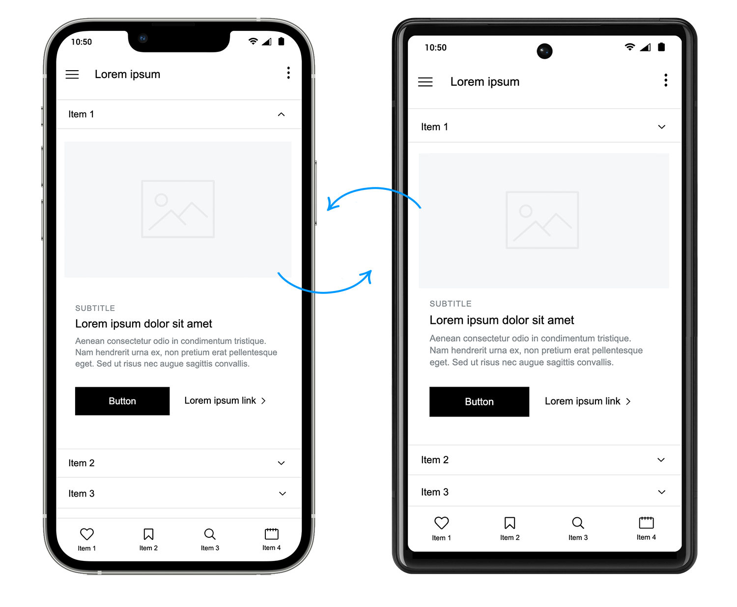
All of the Mobile Wireframing UI library’s components are 100% customizable. They’ve been created using atomic design elements, allowing you to break them down and build them up again according to your design specifications and the mobile device you’re designing for.
To keep icons and UI elements as standard and customizable as possible, we created this UI library using iPhone 11 Pro dimensions. Instead of using the larger-than-life iPhone X, or the comparatively smaller Android specs, we decided on the iPhone 11 Pro which can easily be scaled up or down depending on the OS you’re working with.
In the second part of this post, we’ll show you how to wireframe your own mobile app using Justinmind’s mobile UI framework. Follow these 4 steps to get started with Justinmind’s Mobile Wireframing library:
- Download the Mobile Wireframe UI library from our free interactive UI components page
- Open Justinmind and create a new mobile prototype
- Import the UI library into Justinmind
- Have fun designing your mobile app wireframes!
In our example, we are going to wireframe a social riders app that allows users to track, record and share their activities and connect with other riders.
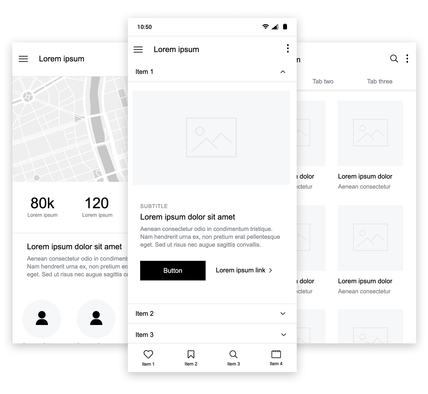
Here’s an idea of what the app prototype could look like when finished:
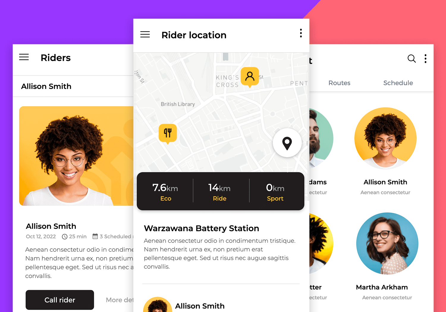
Our iPhone app wireframe will have three screens: a dashboard displaying a summary of the user’s location and activity along with a map, a user profile screen and a final screen that allows the user to connect with other app users.
Note that we’ve used an iPhone 11 Pro mobile app wireframe in our example, but when you create your wireframe, feel free to choose from any of the device templates available in Justinmind or to enter your own device dimensions.
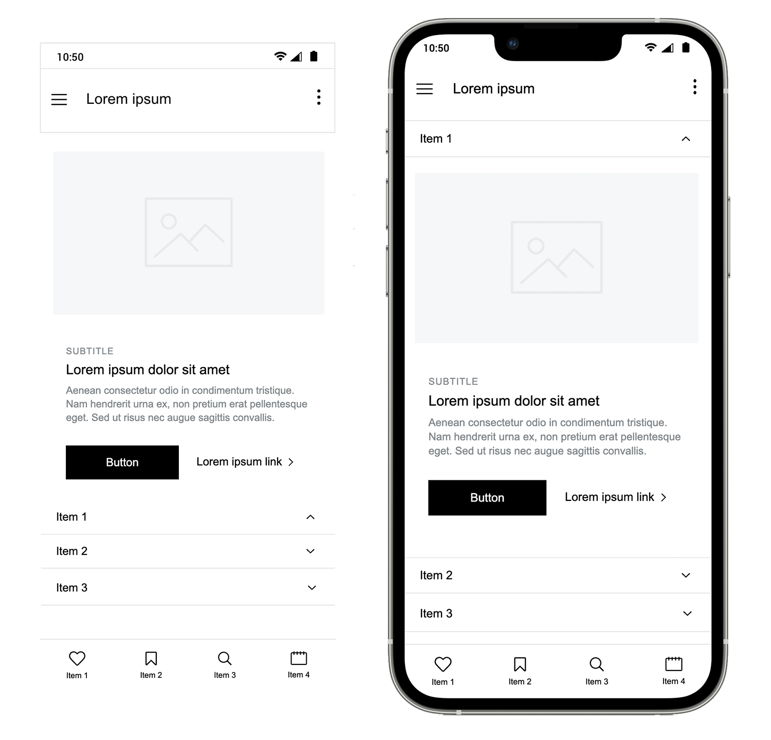
Let’s start with the mobile header and navigation toolbar. The Mobile Wireframing UI library contains a selection of headers and navigation bars to choose from. To follow our example, use the “Header 1” and “Navbar 4” widgets that can be found in the Headers and Navigation categories of the Mobile Wireframing UI library.
Notice that this header includes a hamburger menu icon which would introduce a slide menu – so make sure you have a look at the Menus options in this UI library.
Drag your chosen header to the top of the canvas, and your navigation bar to the base of the canvas. Notice that the UI elements within both the header and navbar can be modified depending on how you want your app to look.
To remove or replace a UI element, simply select it from within the component and click “Delete” on your keyboard or right click to delete. You can then pick another widget from the Libraries palette to replace it if necessary.
To create the content in the body of this screen, we’ve used a combination of a Select listbox (in the Forms and controls category) with a Simple card (in the Cars and grids category). Just drag and drop them to the canvas and reposition them to match our example.
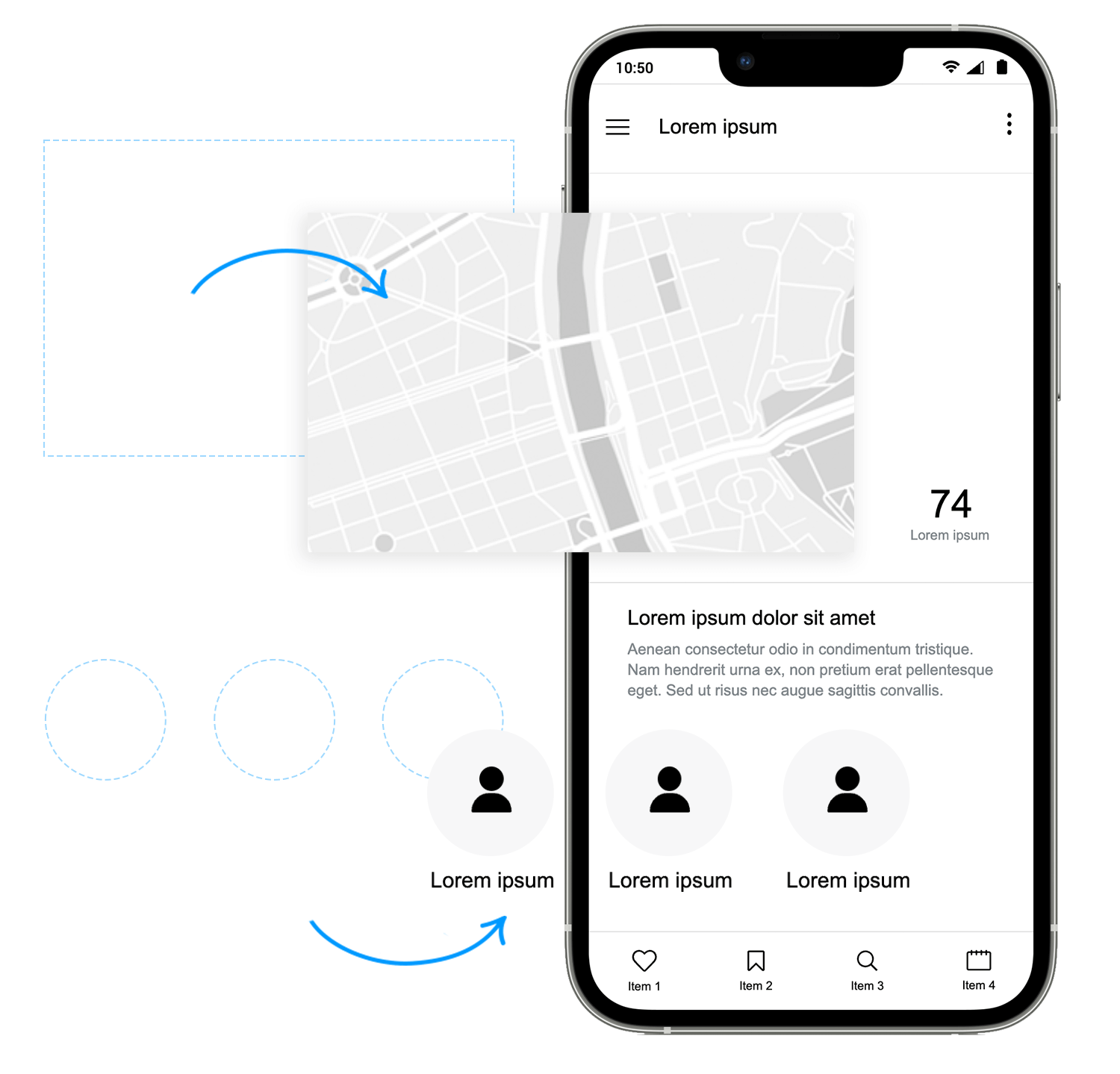
For this second screen, you can add your screen’s header and navigation bar again since we’ll be using the same header and navbar mix as in the initial screen.
Tip: if you decide to use a combination of UI elements in multiple screens of your mobile wireframe, you can save time by creating a template. Elements that you include in your template will appear in every new UI wireframe screen you create. Learn more about wireframing with templates here.
This screen contains a map to allow the user to visualize their journey. To match our example, drag the “Map” component to the canvas from the Forms and controls category and place it below the header.
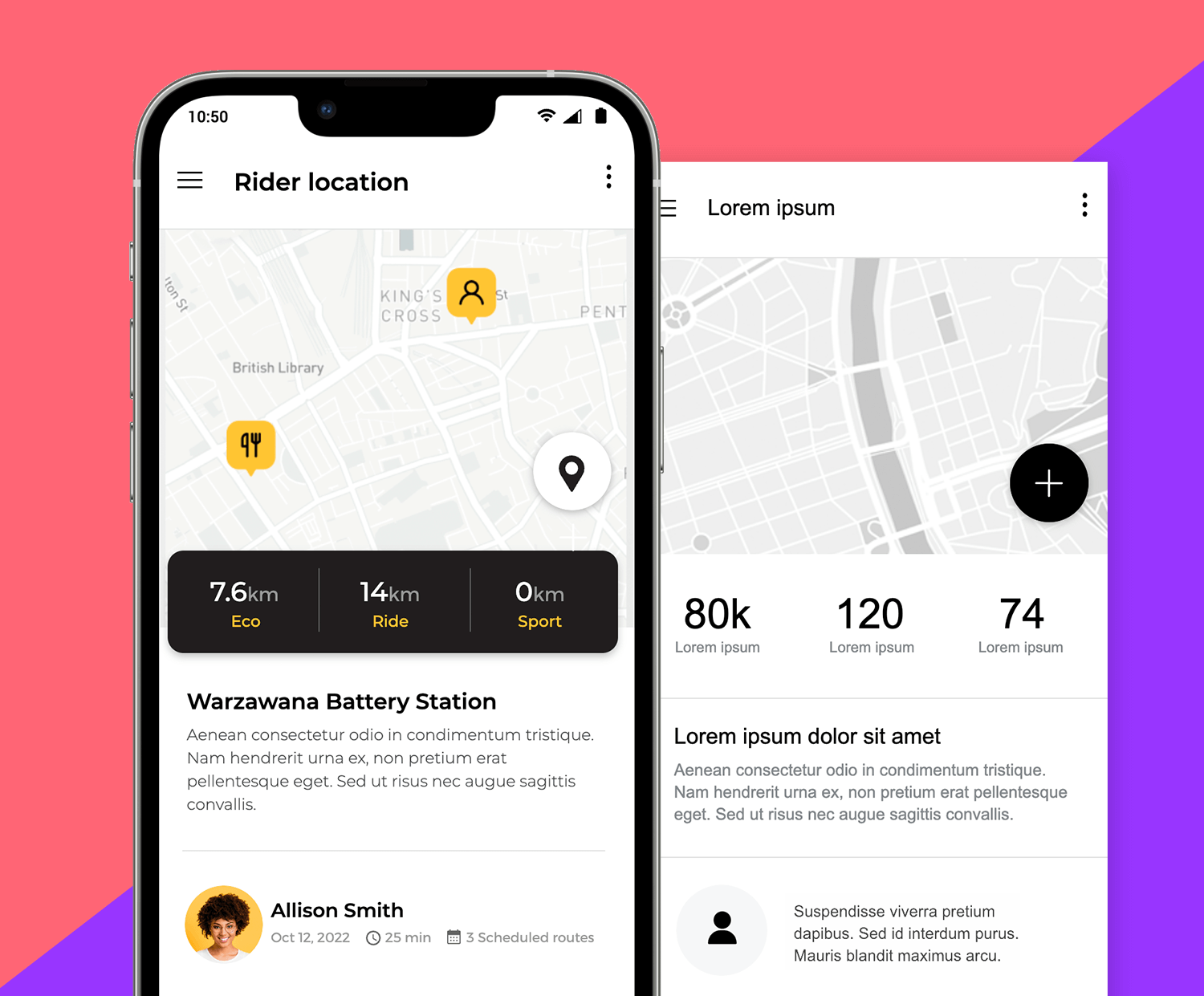
Then, drag a “Horizontal card” and a “Users carousel” widget to create the content for the riders location screen. Next, drag the “Data dashboard” that you’ll find in the Headers category and delete the text elements at the top, leaving only the data, and resize.
Finally, drag the “add” widget form the Buttons category and place it on the map to create a floating action button; you can also add as many icons as you need on the map for restaurant or other user’s locations – anyone see the Material design creeping in?
Your screen should look something like the image below on the left. The image on the right is a preview of what your wireframe could look like once you have created a high-fidelity wireframe of your design.
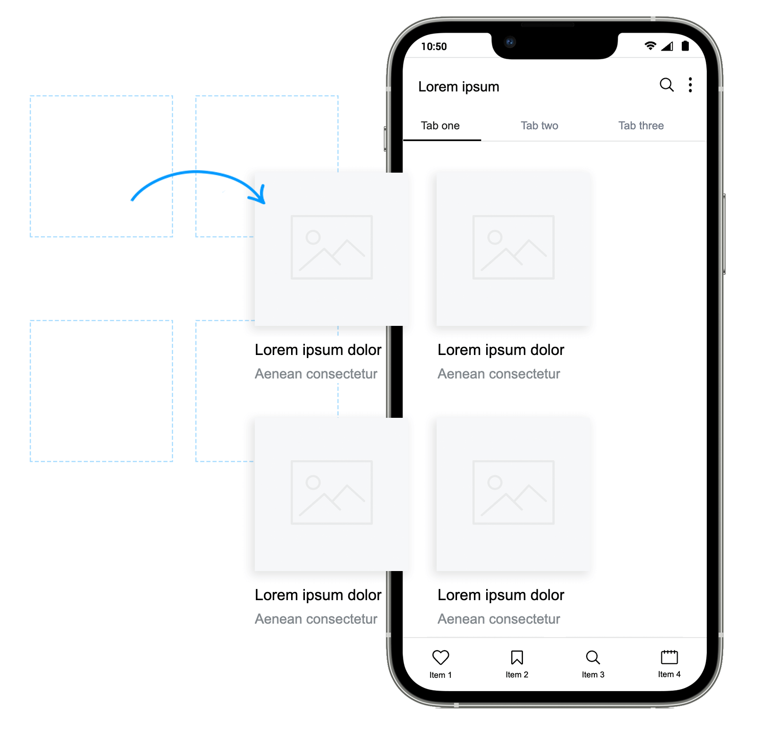
Now, let’s create the last screen that allows the user to connect to other app users and plan and discover activities.
For this screen we’ve used a “Header with tabs” and our previous navigation bar. Then we added a “Simple grid” from the Cards and grids category of the Mobile Wireframing UI library to create each user profile.
And that’s it! You can refine it better and easily customize it, but you can see how easy it is to wireframe your app with Justinmind’s Mobile Wireframing library and how libraries can help you to significantly cut wireframing time.
If you’d like more information on how to design a dashboard, check out this post.
Wireframing your mobile app with our free mobile UI framework is a great way to ensure a speedy, error-free design process.
Now that you’ve tried it, are you ready to make your own? try out our free ready to use UI elements and components to make quality app wireframes, and save time and resources in the process. Download our Mobile Wireframing UI library and start your mobile project off right with the best wireframe tool!
PROTOTYPE · COMMUNICATE · VALIDATE
ALL-IN-ONE PROTOTYPING TOOL FOR WEB AND MOBILE APPS
Related Content
 Justinmind 10.7.5 now includes Samsung Galaxy S25 & S25+ simulators, allowing designers to create high-fidelity prototypes with accurate dimensions and real-world interactions.1 min Read
 Justinmind 10.7 is here with the iOS 18 UI library, new device frames like iPhone 16 and Pixel 9, and integrated design templates for seamless prototyping. Experience smoother workflows and intuitive design.3 min Read
 Justinmind's groundbreaking innovations in prototyping technology have earned it the prestigious Proddy Award for Best Prototyping Product of 2024.4 min Read
