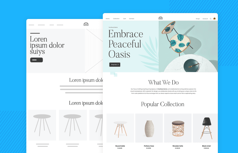
Low fidelity prototype or high fidelity wireframes? Which one should you choose and when? All the answers plus great examples!
The fidelity spectrum for wireframes and prototypes is vast. The UX design workflow will typically include paper sketches, basic low fidelity wireframes and/or high fidelity, interactive wireframes or prototypes.
With smart technology thriving in the digital sphere, high fidelity wireframes offer designers powerful visual and interactive attributes to bring their designs to life. But this doesn’t mean that paper is dead. Low fidelity wireframes remain a quick, effective and practical design route – and this whimsical video shows us why paper should never be neglected.
So, is there an ideal way to use a website wireframe in the UX design process? In this post we’ll discuss the difference between low fidelity and high fidelity wireframes and why a combination of both can improve your UI/UX design.
Create low and high-fidelity wireframes with Justinmind. It's free!

A low-fidelity wireframe is a simple sketch of a user interface that helps you plan out the basic structure and layout of a website or app. These wireframes use basic shapes like rectangles and circles to represent elements such as buttons, text boxes, and images, without worrying about details like colors or fonts.
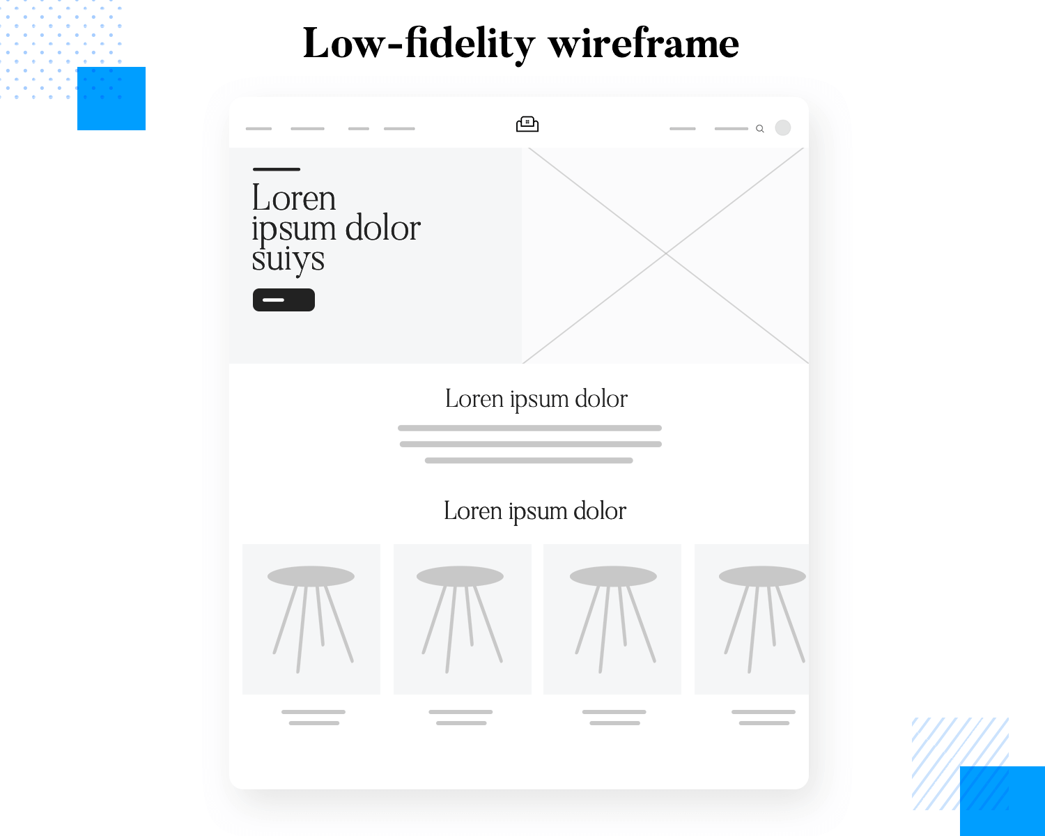
The main goal is to focus on how everything is organized and how users will interact with it. They’re quick to create, often with pen and paper or basic digital tools, and they include notes to explain what different parts are supposed to do.
You’ll want to use low-fidelity wireframes early in your design process, like when you’re brainstorming ideas or getting feedback from your team or clients. They’re perfect for workshops and initial user testing because they let you explore different layouts and gather feedback quickly without getting bogged down in details. This makes them a cost-effective way to test and refine your ideas before you start adding in the visual design elements.
You’ll want to use low-fidelity wireframes at the very start of your design process, especially when you’re brainstorming ideas. These wireframes allow you to quickly sketch out different concepts and layouts without committing to any one design. This helps in generating a variety of ideas and exploring different possibilities without spending too much time on each one.
Low-fidelity wireframes are also useful for getting feedback from your team or clients. Because they are simple and easy to understand, they make it easier for others to provide input on the overall structure and functionality. This feedback can be gathered quickly and easily, helping you to make necessary adjustments early on.
These wireframes are perfect for initial user testing as they let you explore different layouts and see how users interact with them. You can test the basic navigation and usability without getting bogged down in visual details. This allows you to identify any major issues with the design’s structure or flow before investing time in detailed design work.
Using low-fidelity wireframes is a cost-effective way to test and refine your ideas. Since they are quick to create and modify, you can make changes based on feedback and testing results without a significant investment of time or resources. This iterative process helps ensure that your design’s structure and functionality are solid before you start adding in the visual design elements.
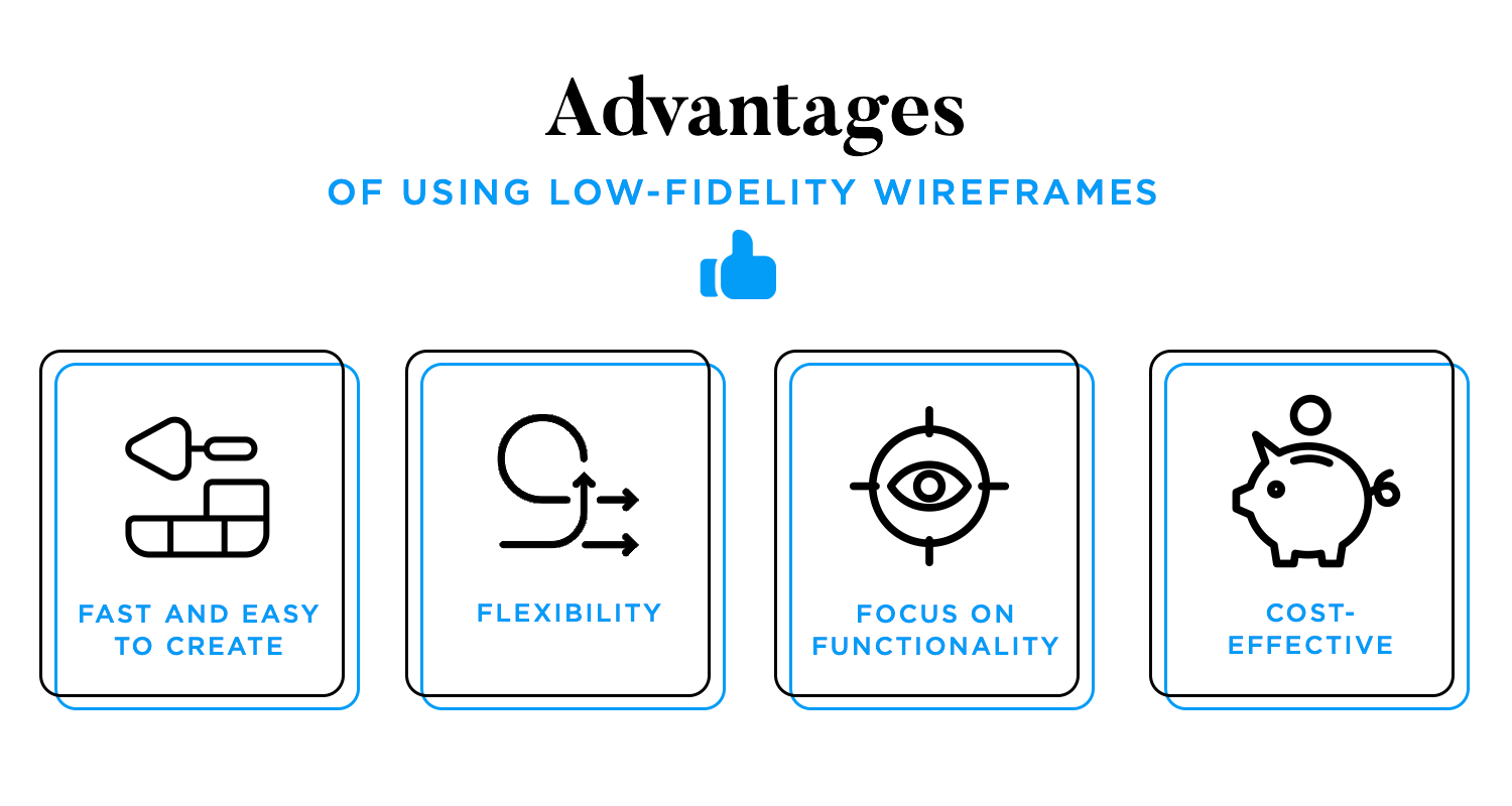
Low-fidelity wireframes can be quickly drawn by hand or with simple digital tools, allowing you to rapidly sketch out different ideas. This speed enables you to explore a wide range of concepts and layouts without spending too much time on any single one. If an idea doesn’t work, you can easily scrap it and move on to another.
Their simplicity makes low-fidelity wireframes highly adaptable. You can quickly iterate on them based on feedback from team members or stakeholders. This flexibility is crucial in the early stages of design, where ideas are still fluid and subject to change.
By stripping away detailed design elements, low-fidelity wireframes help you concentrate on the core functionality and user experience. You can focus on how users will interact with the interface and ensure that the basic layout and navigation are intuitive and effective.
Creating low-fidelity wireframes requires fewer resources compared to high-fidelity wireframes or prototypes. They don’t need specialized software or extensive time investment, making them an ideal choice for the initial stages of development when budgets and timelines are often tight.
Using low-fi to map out your UI at the beginning stages does come with its limitations. Being as it’s basically a sketched out storyboard, much is left to the imagination. So you don’t end up feeling discouraged or demotivated by the results of a low-fidelity prototype, read on to know what limitations to expect.
Low-fidelity wireframes are, by nature, simple and lacking detailed visual design elements. This can make it difficult for stakeholders to envision the final product’s look and feel, potentially leading to misunderstandings about the design’s aesthetics and overall impact.
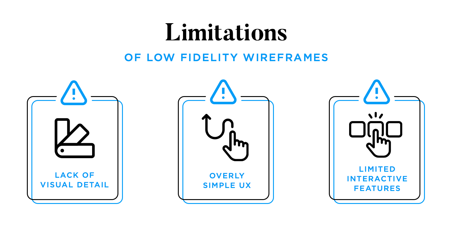
By focusing primarily on layout and basic structure, low-fidelity wireframes may oversimplify the user experience, overlooking finer details and nuances of user interaction. This can result in important aspects of the design being missed or undervalued during the initial stages, necessitating more revisions later in the process.
These wireframes often lack interactive elements, making it harder to fully test and understand user flows and navigation. Without interactivity, it becomes challenging to spot issues related to user experience and functionality that only emerge when users can engage with clickable prototypes.
By understanding these strengths and weaknesses, design teams can effectively leverage low-fidelity prototypes to create more refined and user-centered high-fidelity designs later on.
High-fidelity wireframes are advanced mockups that offer a realistic portrayal of a website or application’s user interface. They include intricate details such as specific typography, color schemes, imagery, and interactive elements like buttons and menus. High-fidelity wireframes often simulate the actual user experience, including hover states, clickable elements, and dynamic content. This level of detail helps in visualizing the final product more accurately and allows for thorough testing of design and functionality.
High-fidelity wireframes are essential in the later stages of the design process when you need to work out the finer details of the layout and user interface. They help in refining the design to ensure it meets the desired standards and requirements by specifying exact dimensions, color schemes, typography, and content placement.
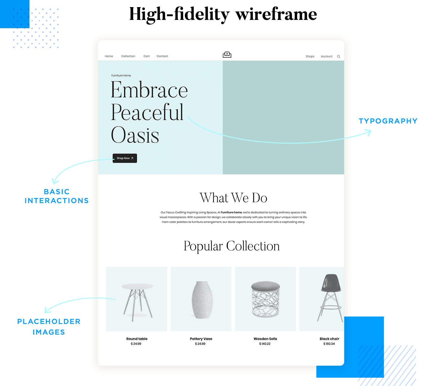
When presenting to clients or stakeholders, high-fidelity wireframes offer a clear, detailed, and realistic view of what the final product will look like. This level of detail helps in effectively communicating the design vision and the user experience, making it easier for clients and stakeholders to understand and visualize the end result.
Create low and high-fidelity wireframes with Justinmind. It's free!

Unlike low-fidelity wireframes, they include detailed design elements and interactions that closely mimic the final product. This allows for more accurate testing of user interactions, navigation flows, and visual elements. Testers can provide feedback on specific aspects like button placements, color contrasts, and overall usability.
High-fidelity wireframes play a crucial role when transitioning the design to the development team. They provide all the necessary details, such as exact measurements, font styles, colors, and interactive elements, ensuring that developers have a clear and precise blueprint to follow. This reduces the risk of misinterpretation and errors during the development phase.
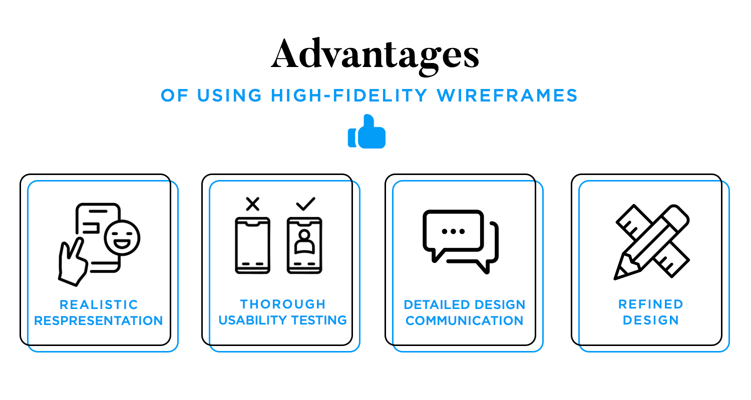
High-fidelity wireframes offer a detailed and realistic view of the final product, helping stakeholders and team members visualize the design accurately. This clarity aids in better decision-making and alignment on the project goals.
They allow for comprehensive usability testing, including specific interactions, user flows, and visual feedback. This ensures that any usability issues are identified and addressed early, resulting in a more user-friendly product.
These wireframes help in effectively communicating detailed design elements to clients, stakeholders, and developers. This ensures everyone involved has a clear understanding of the design vision and reduces the likelihood of miscommunication.
High-fidelity wireframes help in refining the design, ensuring all elements are precisely positioned and styled to meet the project requirements. This level of detail leads to a polished and professional final product.
High-fidelity wireframes help in refining the design, ensuring all elements are precisely positioned and styled to meet the project requirements. This level of detail leads to a polished and professional final product.
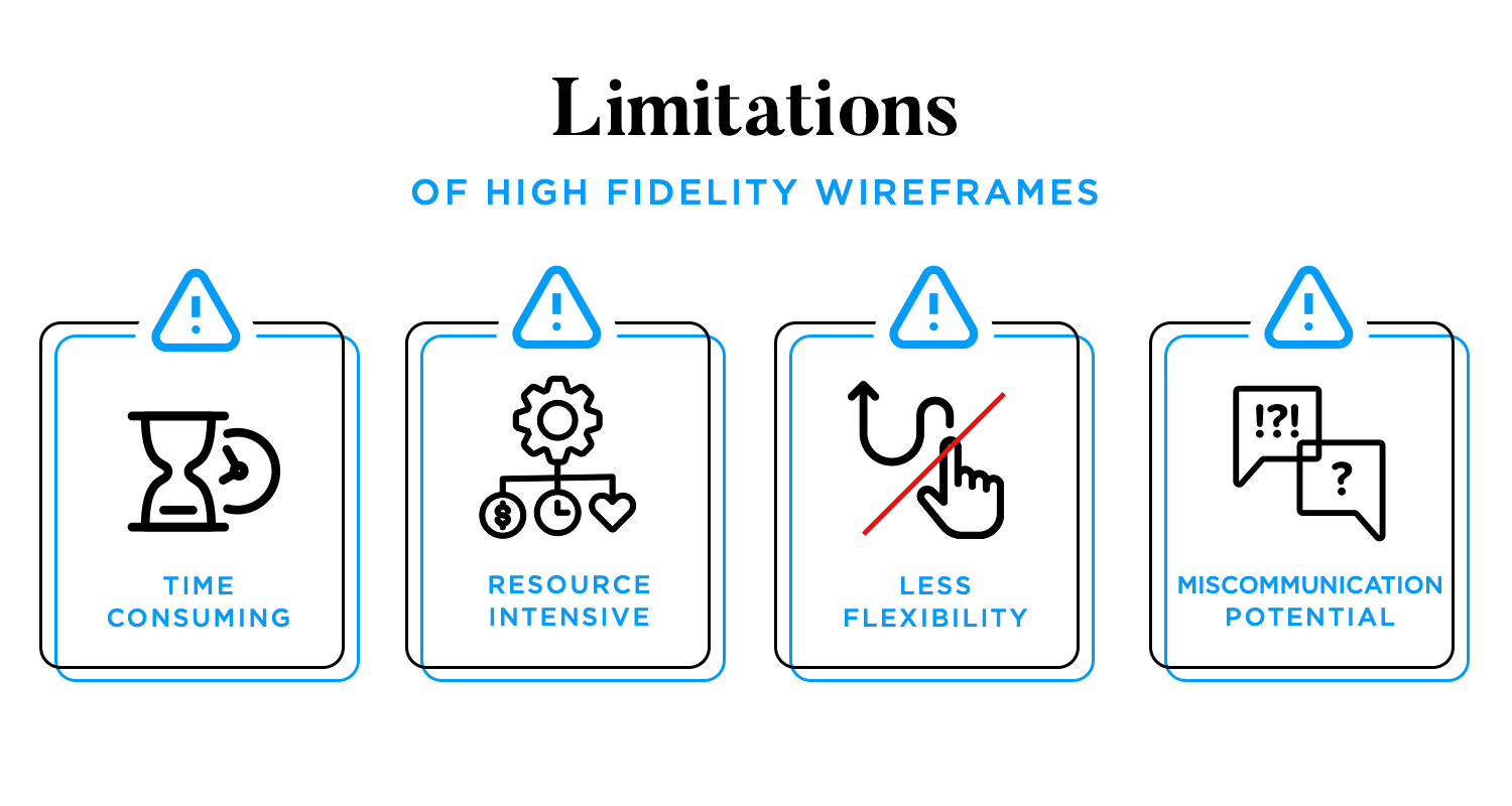
They often require advanced design tools and software, as well as skilled designers. This makes them more resource-intensive compared to low-fidelity wireframes, potentially increasing costs.
Making changes to high-fidelity wireframes can be more challenging and time-consuming, as the design is more detailed and complex. This can make it harder to iterate quickly based on feedback.
If not properly managed, there can be a risk of miscommunication between the design and development teams. If the wireframes are not sufficiently detailed or clear in their specifications, it can lead to discrepancies during implementation.
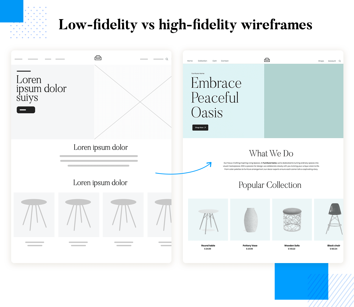
Low fidelity wireframes on a detail level are simple, abstract representations of the design (think sketches) focusing on basic layout and structure without detailed elements. They use placeholders for text and images, providing a rough draft of the interface. High fidelity wireframes, on the other hand, are detailed and polished, closely resembling the final product. They include specific fonts, colors, images, and interactive elements, offering a comprehensive view of the design.
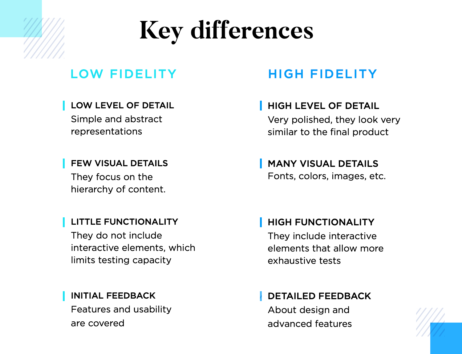
Low fidelity wireframes lack visual details and aesthetics, focusing instead on the arrangement and hierarchy of content. This simplicity helps keep the focus on functionality and user experience without being distracted by design details. Whereas high-fidelity wireframes feature high levels of visual detail, including design elements like typography, color schemes, and imagery. They provide a realistic preview of the final product, making it easier for stakeholders to visualize the end result.
Low-fidelity wireframes typically do not include interactive elements, limiting the ability to test user flows and navigation thoroughly. They are best for initial conceptualization and basic layout planning. However, high-fidelity wireframes often include interactive components, allowing for more extensive testing of user interactions and flows. They can simulate how the user will interact with the final product, providing a more complete understanding of functionality.
The simplicity of low-fidelity wireframes encourages early-stage feedback on core functionalities and usability. Stakeholders and users are less likely to be distracted by visual details, allowing them to focus on the overall experience and structure. High-fidelity wireframes also allow for detailed feedback on both design and functionality. However, they are more suitable for later stages in the design process when it’s time to fine-tune details and interactions based on comprehensive user and stakeholder input.
Create low and high-fidelity wireframes with Justinmind. It's free!

- Brainstorming: Low-fidelity wireframes are excellent for brainstorming sessions as they offer a quick and flexible way to explore design ideas. Their simplicity allows designers to focus on the core concepts without getting bogged down in details, fostering creativity and facilitating rapid iteration.
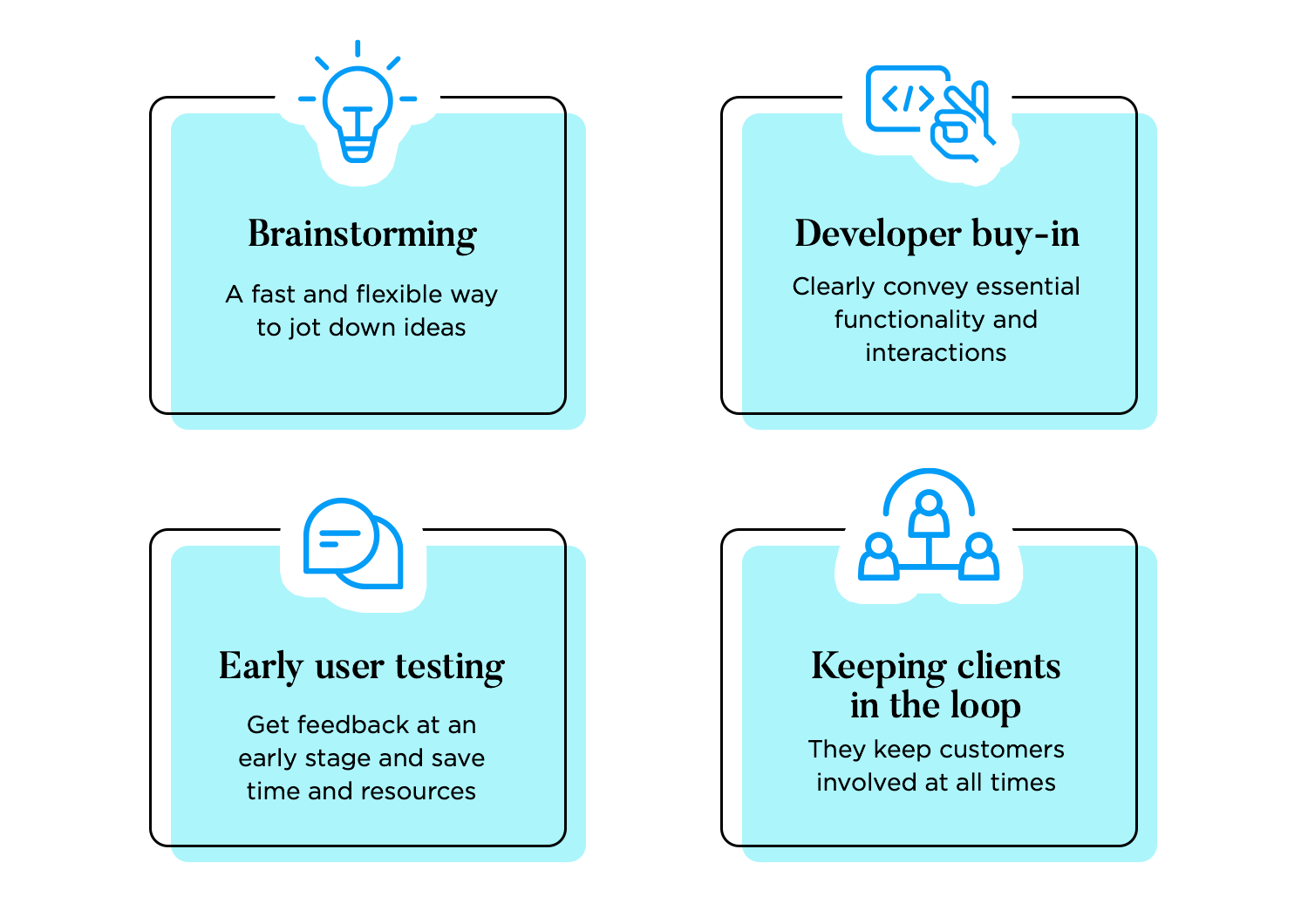
- Developer buy-in: They can help secure developer buy-in by providing a basic blueprint of the product’s functionality and layout. While not as detailed as high-fidelity wireframes, they still convey the essential elements and interactions, enabling developers to understand the project scope and technical requirements early on.
- Early user testing: These early stage wireframes allow designers to gather feedback on fundamental usability aspects before investing significant time and resources. Their minimalistic design focuses on functionality and flow, making it easier to identify potential issues and refine the user experience iteratively.
- Keeping clients in the loop: They have been proven to be useful for keeping clients informed and involved throughout the design process. By presenting simplified representations of design concepts, clients can provide input and make decisions based on functionality and structure without being distracted by visual aesthetics, ensuring alignment with their goals and preferences.
- Achieving basic functionality: Use high-fidelity wireframes once the basic functionality of the design has been established. These detailed wireframes include specific UI elements and refined layouts, allowing for a clearer understanding of how the final product will look and operate.
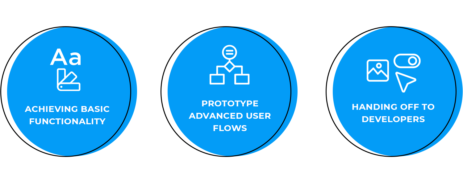
- Testing more advanced interactions: They are ideal for testing more advanced interactions and user flows. High fidelity wireframes provide a realistic representation of the user interface, enabling designers to gather precise feedback on the usability and functionality of interactive elements.
- Handing off design to developers: These wireframes include detailed specifications, visual elements, and interaction guidelines, ensuring that developers have a comprehensive and accurate blueprint to follow during the development phase.
The low fidelity wireframe keeps it simple with basic shapes and lines, focusing on where things go rather than intricate details, which is common for early-stage designs. This one shows a work-in-progress route on a map, marking the stops and showing the times accurately.
This paper prototype example demonstrates a simple yet effective way to visualize and test user interface designs in a low-fidelity format, allowing for quick iteration and feedback gathering in the early stages of the design process.
The design in this high-fidelity wireframe employs vibrant colors, clear typography, and icons to enhance visual hierarchy and aid in user comprehension. Additionally, the use of realistic data and content suggests a focus on simulating real-world usage scenarios. Overall, the wireframe showcases a polished and detailed representation of a digital product’s UI design.
This high-fidelity prototype appears to simulate an e-commerce auctioning platform. The design features a clean and modern layout with various interactive elements, such as dropdown menus, buttons, and checkboxes, suggesting that users can engage with and manipulate data within the interface.
Design low and high-fidelity wireframes with Justinmind. It's free!

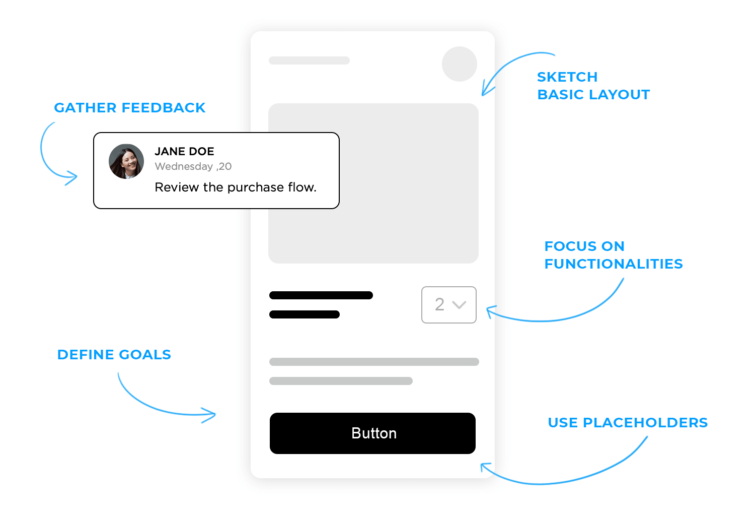
- Define the Purpose: Identify the primary goals of the wireframe. Are you brainstorming ideas, gathering initial feedback, or outlining the basic structure?
- Sketch Basic Layouts: Start with simple sketches on paper or using a digital tool. Focus on the overall layout and arrangement of elements without detailing.
- Use Placeholders: Incorporate placeholders for images and text to represent where these elements will be positioned without focusing on content.
- Focus on Functionality: Highlight the core functionality and main user interactions to ensure the basic flow is understood.
- Gather Feedback: Share your low-fidelity wireframes with stakeholders to gather initial feedback and make necessary adjustments.
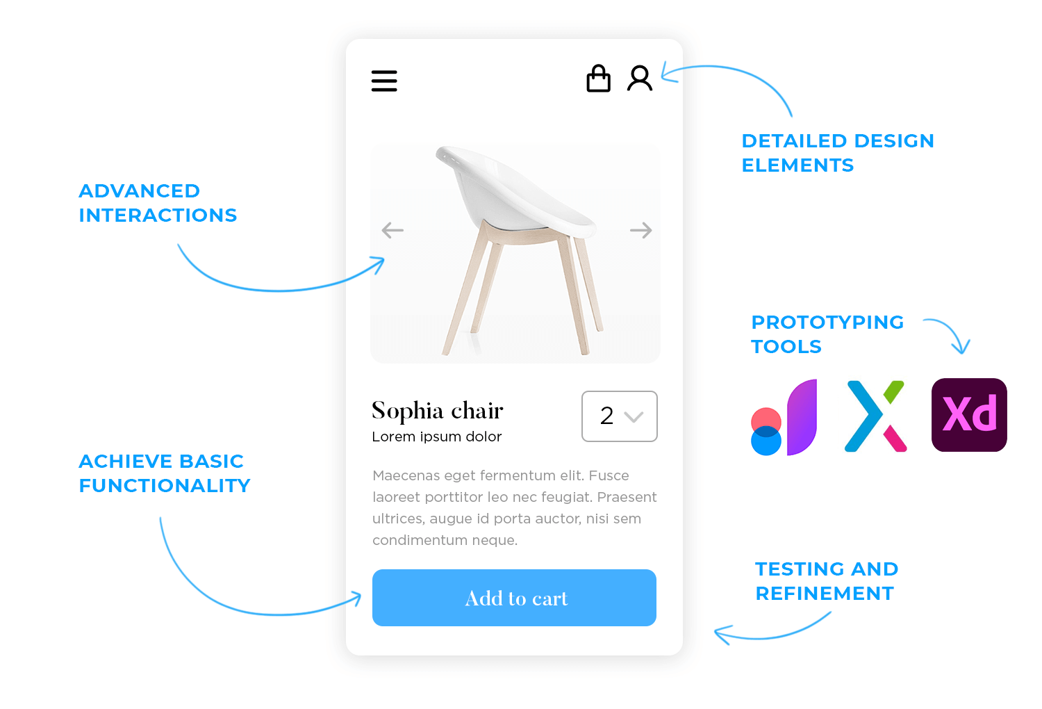
- Achieve Basic Functionality: Once the basic structure and functionality are agreed upon, it’s time to start adding more details.
- Detailed Design Elements: Begin converting placeholders to actual content. Add typography, color schemes, images, and detailed UI elements.
- Advanced Interactions: Incorporate more advanced interactions and animations. Ensure these interactions are intuitive and enhance the user experience.
- Prototyping Tools: Use prototyping tools that support high-fidelity wireframes to create interactive prototypes, which allow for more thorough testing and feedback.
- Testing and Refinement: Conduct usability testing with the high-fidelity wireframes to gather detailed feedback. Refine the design based on this feedback to ensure it meets user needs and expectations.
In a nutshell, low fidelity wireframes are simple, abstract representations; focus on layout and structure; use placeholders for content. They are used when brainstorming design ideas, gathering initial feedback, securing developer buy-in, early user testing, and keeping clients informed about the basic concept.
On the other hand, high fidelity wireframes are detailed, realistic representations. They include specific UI elements, actual content, and visual details, enabling advanced interaction testing.
High fidelity wireframes are used when basic functionality is achieved, testing advanced interactions, and handing off the design to developers.
When deciding which fidelity level to use, consider your project’s requirements and design goals. Low-fidelity wireframes are best for early stages of design where flexibility and speed are essential. They help in quickly iterating on ideas and gathering broad feedback. High-fidelity wireframes are suitable for later stages where detailed feedback, precise user interaction testing, and a clear guide for development are needed. By choosing the appropriate fidelity level, you can effectively balance speed, cost, and quality to achieve your design objectives.
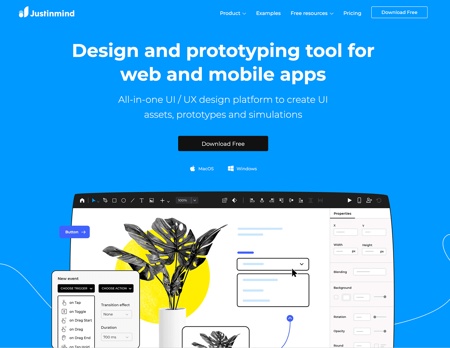
Meet Justinmind, your go-to tool for all things wireframing and prototyping! Whether you’re working on low or high-fidelity designs, Justinmind has got you covered with a wide array of UI elements, interactive components, and handy templates to get your projects off the ground. Its standout features include interactive prototypes, mobile and web wireframes, collaboration tools, extensive widget libraries, and usability testing capabilities. Perfect for designers and developers who want a comprehensive tool to create detailed, interactive wireframes and prototypes.
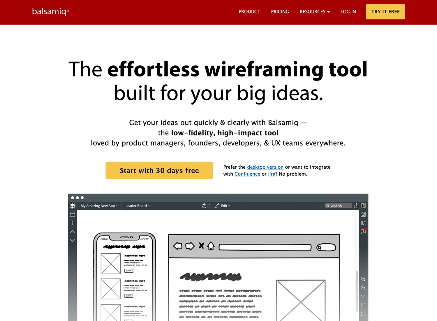
Balsamiq is the perfect tool for creating low-fidelity wireframes in a snap! Balsamiq makes brainstorming and iterating on designs fun and easy, without getting lost in the details. Enjoy drag-and-drop simplicity, sketch-style elements, collaboration features, and the ability to export your wireframes as PDFs or images. It’s an ideal choice for teams and individuals who need a straightforward tool to quickly brainstorm and iterate on UI designs.
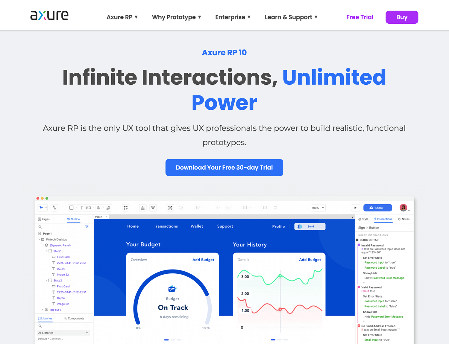
Axure RP is like a Swiss Army knife for wireframing and prototyping, perfect for both low and high-fidelity designs. It’s packed with powerful features that let you create complex, dynamic prototypes with ease. Imagine interactive prototypes, conditional logic, dynamic panels, advanced animations, collaboration tools, and detailed documentation—all at your fingertips. This makes Axure RP a fantastic choice for professionals who need to craft detailed and interactive prototypes with advanced functionalities and user interactions.
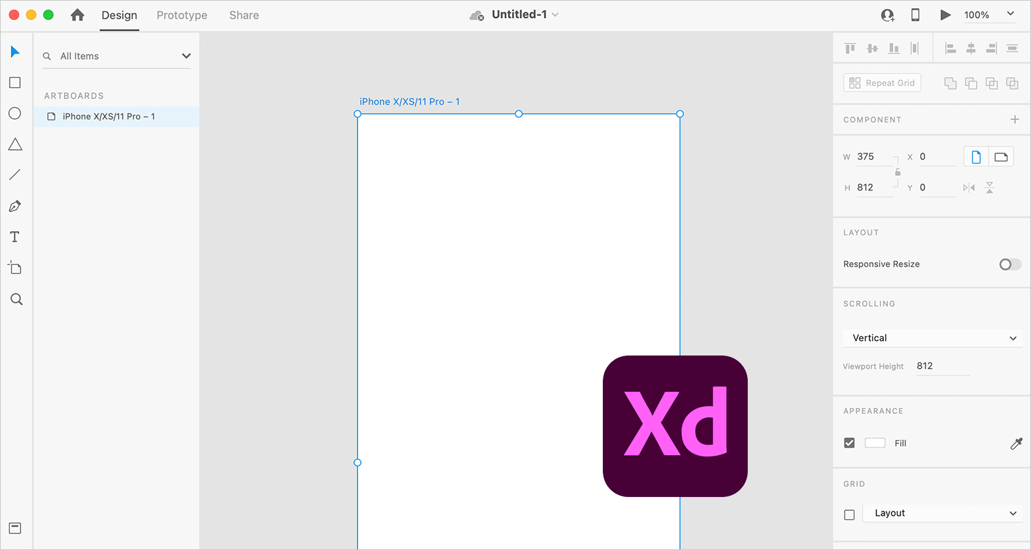
Adobe XD, by Adobe, is your friendly, versatile design tool that can handle everything from wireframing to high-fidelity design. Seamlessly integrated with other Adobe Creative Cloud products, Adobe XD offers vector-based drawing tools, interactive prototyping, voice commands, and plugins for extended functionality. Whether you’re creating simple wireframes or detailed visual designs, Adobe XD has got you covered. It’s perfect for designers who want a versatile tool that works beautifully with their existing Adobe toolkit.
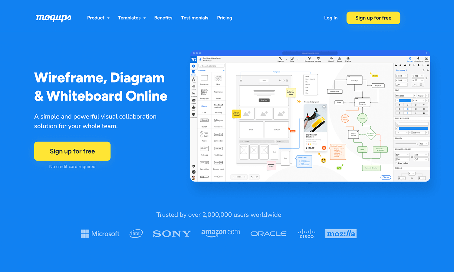
Meet Moqups, your user-friendly, web-based companion for creating wireframes, mockups, and prototypes. Moqups makes it easy to design with its intuitive drag-and-drop interface, built-in stencils, and real-time collaboration features. You can even manage version control and create both low and high-fidelity designs seamlessly. Ideal for teams who want a simple, collaborative tool that supports the entire design process from wireframing to prototyping.
The real difference between low fidelity and high fidelity prototypes is merely the degree of detail involved. Instead of focusing on how much detail a prototype should have to be high or low fidelity, it’s more helpful, and practical, to think about what goals need to be satisfied at each stage of the design process.
In web and app design, you need to pin down basic functionality and screen, user flows and screen layouts before you move on to more advanced UI design and interaction. So rather than choosing between low fidelity or high fidelity, it’s more helpful to simply see them as different stages of the design process. Much like in writing, where you begin with the first draft, then start to refine it through subsequent revisions.
