The ultimate guide to mobile app animations
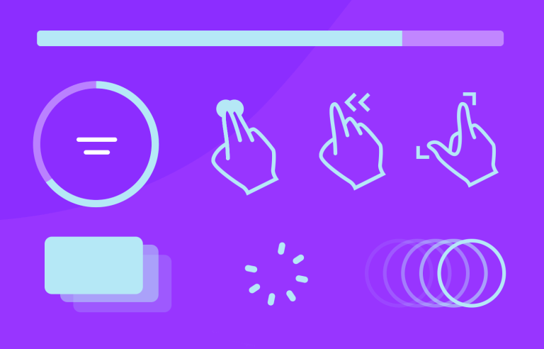
Animations aren’t just about making things look cool, they’re about creating moments that feel smooth, human, and, honestly, fun to use.
Think of the last time a button’s subtle hover effect guided your click or how a screen transition made navigation feel effortless. Those are the magic touches that elevate a design.
In this guide, we’ll explore the ins and outs of mobile app animations. You’ll find real examples to spark your creativity, tools to help you bring your ideas to life, and practical tips for making animations work for your users, not against them.
Start designing mobile app animations with Justinmind
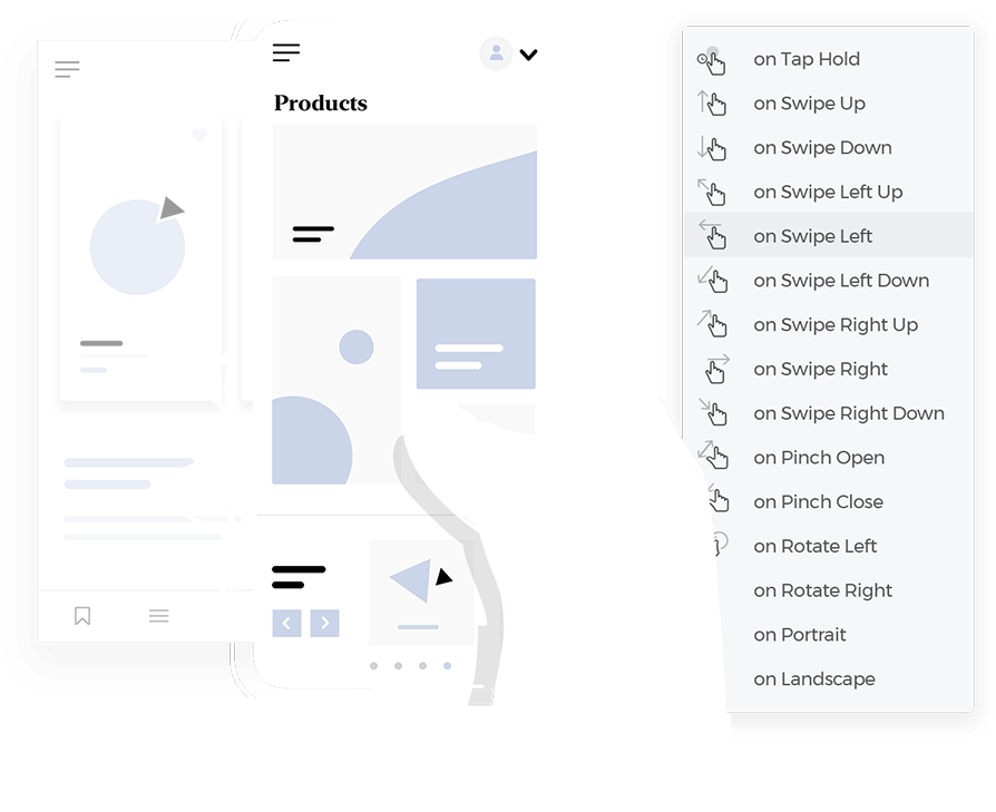
So if you’re designing the next big app, animations can help you craft something people love to interact with. Let’s dive in and bring your designs to life.
Animations are the secret ingredient that make using mobile apps feel natural and enjoyable. It’s all about adding movement and transitions to user interfaces to make interactions clearer, smoother, and more engaging.
When you tap a button on a mobile app and it briefly highlights, or when a screen slides into view instead of appearing instantly, that’s animations at work. It’s there to guide, inform, and sometimes even delight, all while making the experience more intuitive.
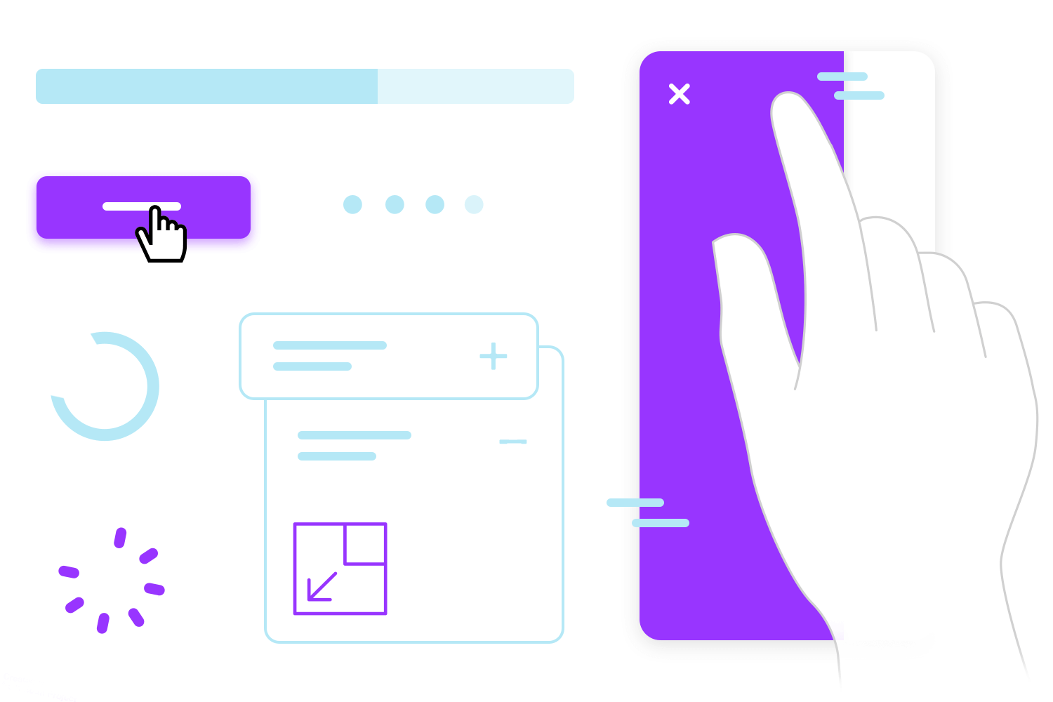
These animations play a crucial role in communication. A spinning loader in a mobile app tells you the system is processing something. A swipe gesture accompanied by a smooth transition helps you feel connected to the flow. Even small details, like a card expanding to show more content on a mobile screen, can make complex interactions easy to understand.
Mobile app animation isn’t just about looking good, it’s about function. It reduces confusion, provides feedback, and ensures users feel in control of their journey through the app. Done right, these movements create a seamless experience that feels both smart and human.
If animations matter for UX design, it is because they’re a bridge between users and the digital world. They provide clarity in moments where static elements might leave room for confusion. For example, when you fill out a form in a mobile app and the next screen smoothly slides in, that motion reassures you that your input has been received and something is happening.
Good mobile animations keep users grounded. Without them, transitions between screens or changes in the interface can feel abrupt, like jumping from one app section to another without a clear flow. A simple screen fade, swipe transition, or even a subtle bounce can act as a guide, showing where you’ve been and where you’re going next.
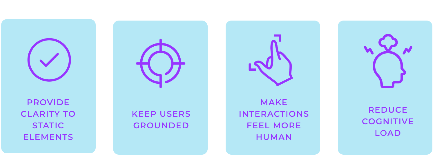
Animations also make interactions feel more human. They are a key part of broader UI design principles, making sure that interactions feel intuitive and engaging. For example, when a success message animates with a cheerful pop, it transforms a functional moment into one that’s memorable. That little bit of personality can go a long way in making an app or website design stand out.
But it’s not all about delight. Animations can reduce cognitive load, helping users process information more easily. A subtle highlight might draw attention to an error field, or a progress bar might visually break down how far along a task is, so users aren’t left guessing.
In a few words, animations aren’t just decorative; they’re functional, engaging, and essential to crafting a great user experience. When done well, they enhance usability, making digital interactions feel effortless and intuitive.

App animation plays a unique role in mobile design, adapting to the strengths and limitations of smaller screens and touch interactions. Instead of hover states or scroll-triggered movements, mobile animations rely on gestures like swipes, pinches, and taps to create intuitive, responsive experiences.
Basically, mobile app animation makes apps feel alive. It adds personality, transforms static layouts into engaging experiences, and invites users to explore. Just simple touches, like a button responding to a tap or a menu smoothly expanding, make interactions more satisfying and natural.
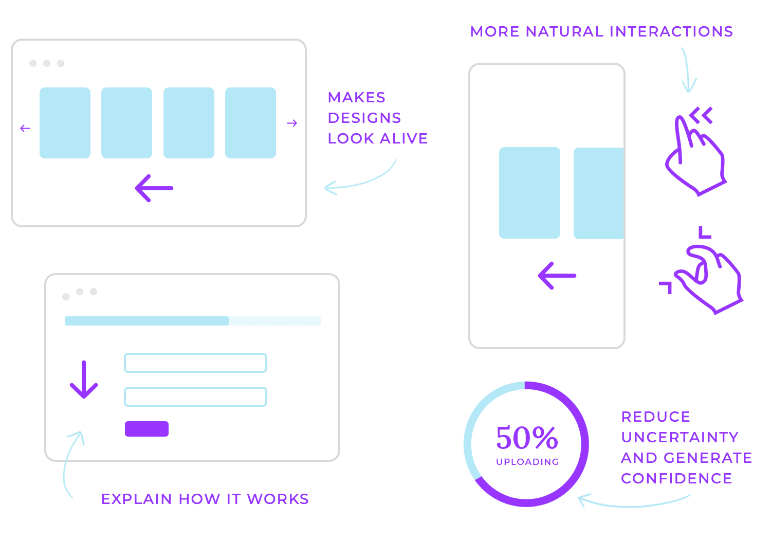
Animations also have a practical side: they show users how things work. A loading spinner signals progress, transitions between screens explain movement through the app interface, and micro-animations highlight important changes like new notifications or errors. These visual cues reduce uncertainty and build confidence, making navigation more intuitive.
Beyond just looking good, mobile app animations bridge the gap between aesthetics and usability. They make apps more approachable, guiding users without overwhelming them. When done thoughtfully, they create experiences that feel polished and purposeful, where every movement adds value, not distraction.
Start designing mobile app animations with Justinmind

App animations come in many forms, tailored to the platform and how users interact with it. Here’s a breakdown of some popular types:
- Gesture-based animations: respond to swipes, pinches, and taps with actions like cards flipping, menus expanding, or items being dismissed.
- Loading indicators: spinners, progress bars, or creative animations keep users informed while content loads.
- Navigation transitions: sliding or fading between screens helps users follow the app’s flow without losing context.
Each of these animations isn’t just for show, they’re designed to guide users, reduce friction, and make digital experiences more interactive and enjoyable. Whether it’s a button glowing under a cursor or a screen sliding into place, the right animation can elevate any design.
While animations can elevate your design, it’s all about balance. They should feel like an organic part of the experience, not distractions. When designing for mobile, keeping a few best practices in mind guarantees that your animations improve usability while still looking great.
Start with usability, then add aesthetics: animations are there to guide and inform users in subtle ways, not just to decorate. Think about what the animations need to communicate (clarity, progress, or focus) and how they improve interaction. Once that’s clear, you can add style to make it visually appealing.
Keep them fast and smooth: nobody enjoys laggy or sluggish animations. A quick, fluid motion not only keeps the experience enjoyable but also respects the user’s time. Think of loading spinners that run efficiently or screen transitions that happen in the blink of an eye. They should feel effortless, almost invisible in how natural they are.
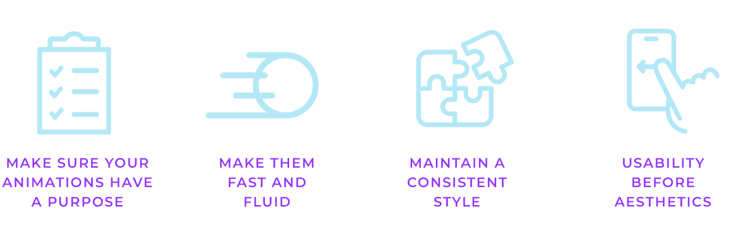
Make every animation meaningful: a good animation isn’t random; it’s intentional. For example, a subtle bounce might indicate success, while a shake could highlight an error. These movements carry meaning and communicate with users in a way that’s easy to grasp. Avoid adding animations just for the sake of it; they should always serve a purpose.
Maintain a consistent style: whether you’re working on an iOS or Android app, the animations should feel like they belong to the same family. Consistent timing, easing, and design language across screens create a cohesive experience. A button slide in a mobile app should feel as intuitive as a swipe gesture in navigation.
Start designing mobile app animations with Justinmind

Let’s explore some fantastic examples of mobile app animations and see how they make apps more engaging, intuitive, and user-friendly.
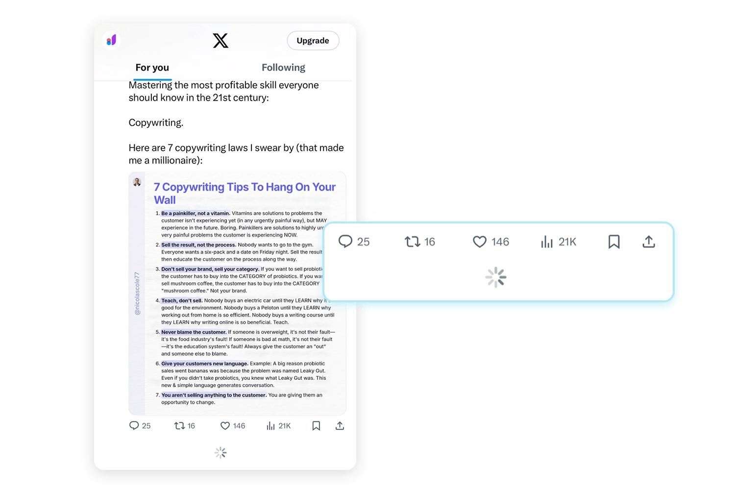
On mobile, animations are tailored to touch gestures and smaller screens, enhancing interaction in subtle yet effective ways. A great example is Twitter’s pull-to-refresh animation. When you swipe down to refresh the feed, a small spinner appears, giving instant feedback that new content is loading. It’s a simple but intuitive way to keep users engaged while they wait.
Netflix’s splash screen is a perfect example of how an app can make a great first impression. As you open the app, the iconic red logo smoothly animates into place against the black background.
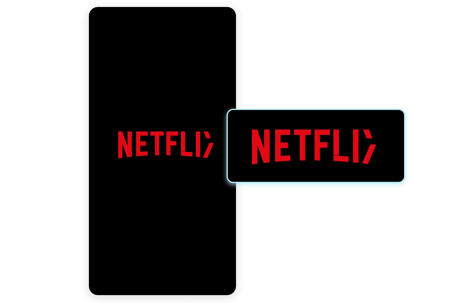
It’s clean and effective, it feels polished and keeps you engaged while the app loads in the background. It’s not just an animation; it’s a moment that reinforces the brand and sets the tone for what’s to come.
Here’s a fun mobile app animation example from McDonald’s mobile app. While the app loads, you’re greeted with a playful animation of a drink and burger tray coming together.
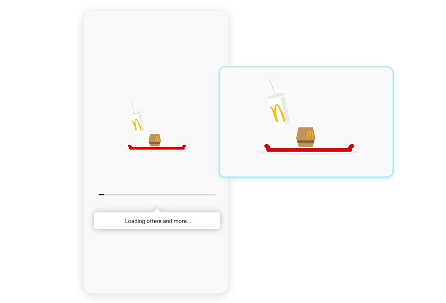
It’s simple, but it makes the wait feel less dull and ties perfectly to the brand. Instead of staring at a boring loading bar, you get a little moment that feels engaging and on-brand. It’s a small touch, but it makes a difference.
Here’s how Pinterest keeps things smooth and engaging. After the splash screen, the logo stays centered while the feed begins to load in the background. Before the content appears, a skeleton screen is displayed, faint outlines of the feed that hint at what’s coming. This skeleton isn’t static; it transitions fluidly, making the process feel dynamic and part of the overall experience.
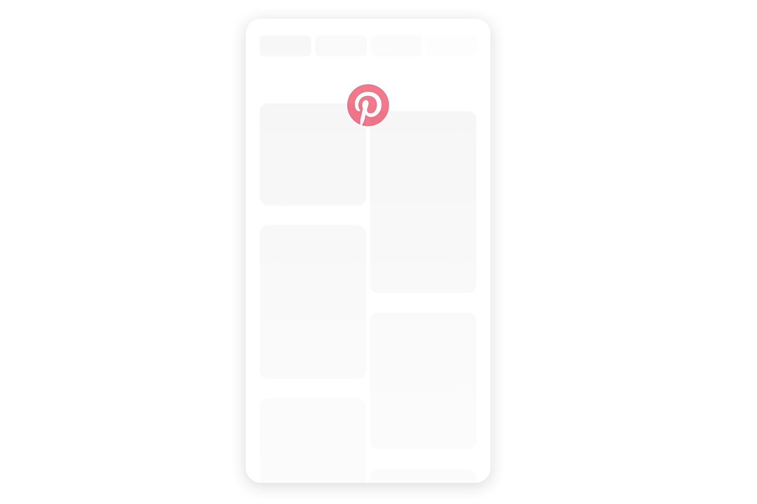
The subtle movement of the logo, combined with the skeleton’s graceful animation and the gradual reveal of content, creates a seamless and natural transition. It’s a small but effective detail that keeps you engaged, making the wait feel almost invisible.
The splash screen from Uber’s app design takes a different approach. The bold lines and clean logo come together with smooth, understated motion, making the opening feel modern.
It’s not just about filling the loading time, it’s about making an impression that reflects Uber’s sleek, professional identity. Neat, direct, and impactful.
Another example of a good mobile animation is from Watch Faces Club. As the app loads, the logo takes center stage, paired with a subtle progress indicator. It’s easy but does the job, letting you know the app is getting ready while keeping the screen visually interesting.
This kind of animations isn’t just about filling the wait time; it reinforces the brand and creates a smooth, professional entry into the app.
Careem is an example of animation done right. Careem’s ‘We don’t operate here’ screen is a great example of how a little human touch can go a long way. Instead of just bluntly stating that the service isn’t available, they use a subtle animation of their logo and a progress bar.
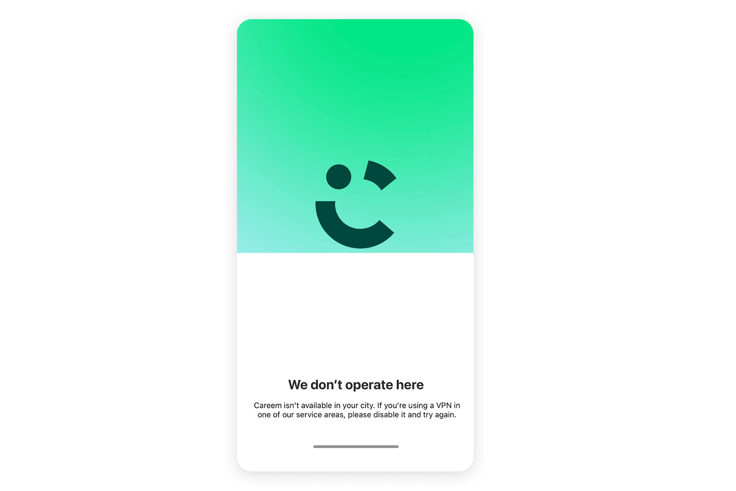
This straightforward touch softens the blow of the disappointing message. It feels thoughtful and keeps the experience on-brand, even though the user might be frustrated. This is a smart way to use animation to maintain user trust and keep them engaged, even when the news isn’t good.
Apple’s Pages app gets it right too. Every time you start typing or switch between sections, there’s a subtle animation. It’s like the app has a personality, making the whole experience feel smooth and polished. You barely notice it, but it makes a huge difference in how easy and enjoyable the app is to use.
Following on from the examples of loading animations, this BBVA animation is another fantastic example of how to make even the boring bits of using an app feel special. Those smooth color shifts and the way the logo gracefully moves around just create such a relaxing and professional feel.
It’s not just about making you wait a little longer, it’s about using animation to remind you what a cool brand BBVA is and keep you interested while you’re waiting. All these little details really come together to make the whole experience feel super smooth and well-thought-out.
Shazam does a really cool thing with mobile animation. That little pulse on the ‘Tap to Shazam’ button is so subtle, but it really draws your eye. It’s like the app is gently encouraging you to tap it. The animation makes the app feel more alive and responsive, just like how Shazam instantly identifies songs.
It’s a perfect example of how a small animation can make a big difference without being distracting.
Finally, let’s look at this great finance app concept from Dribbble. It shows how mobile animations can make even numbers and charts exciting. The way the charts smoothly change and the buttons gently bounce when you tap them makes the app feel really polished and fun to use.
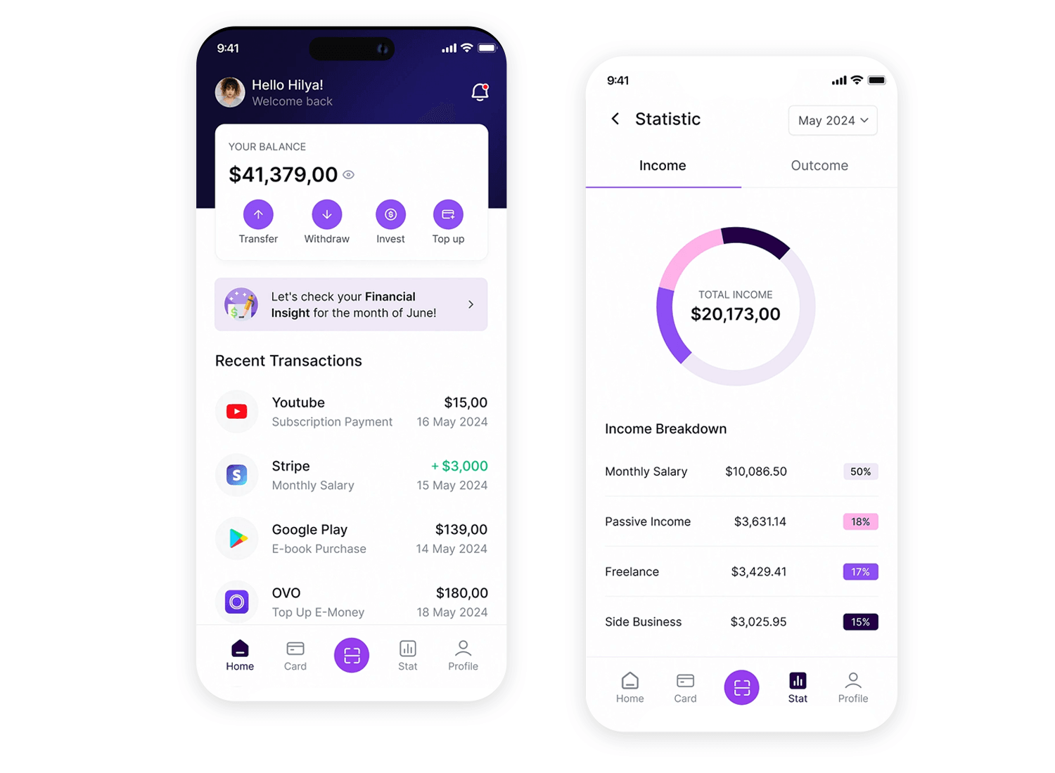
It’s a great example of how animations can turn a boring app full of numbers into something you actually enjoy interacting with.
Start designing mobile app animations with Justinmind

Choosing the right tools is key to creating really smooth and engaging animations for your apps. They provide everything you need to craft smooth, engaging animations. Let’s explore ten of the best tools out there.
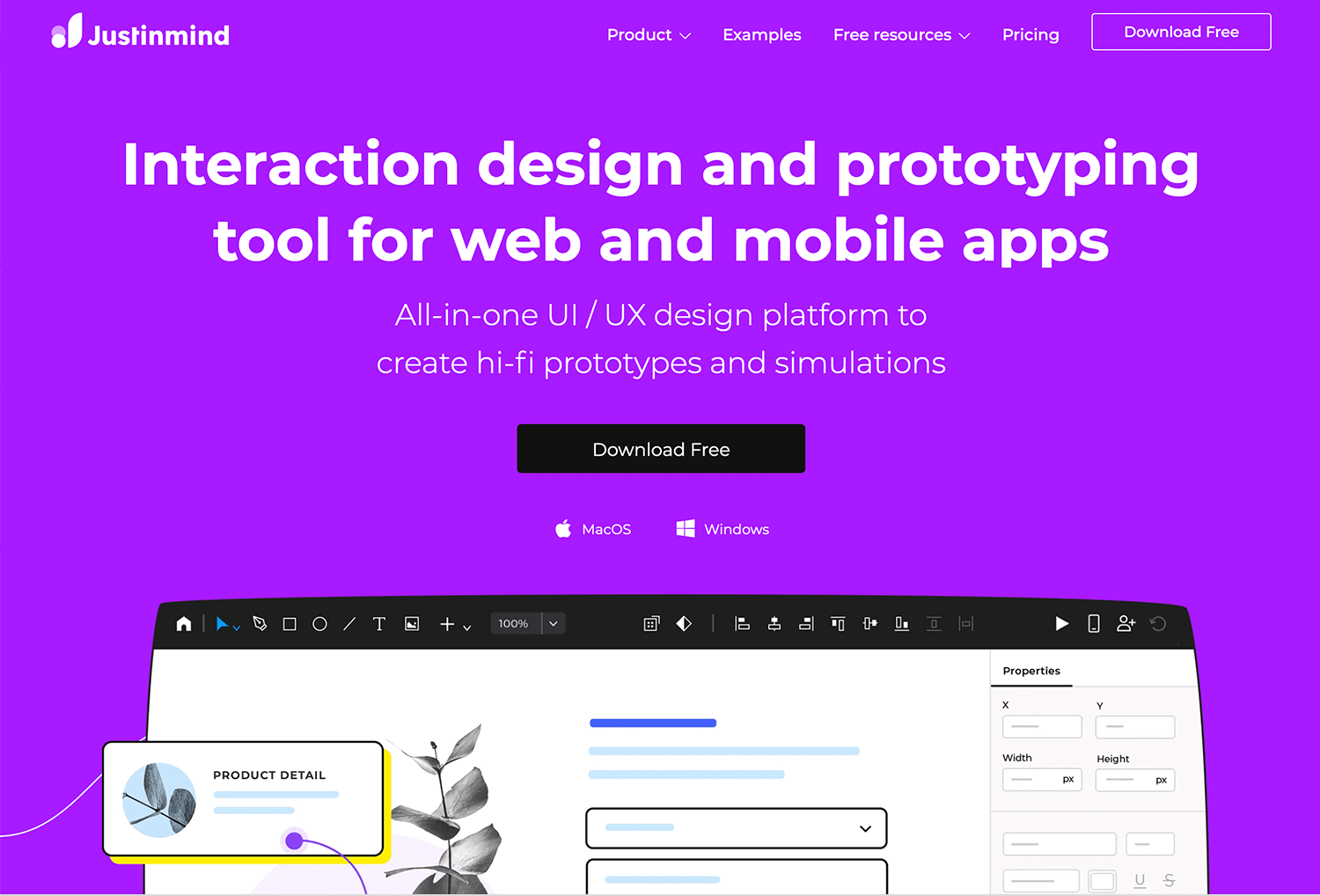
Justinmind is an all-in-one prototyping tool that’s perfect for designing and animating interactive prototypes for both web and mobile. What sets Justinmind apart is how easy it makes creating high-fidelity prototypes with functional animations, like transitions, hover effects, or loading screens.
You don’t need to code a single line; the drag-and-drop interface lets you map out entire user journeys and test your designs on real devices.
Advantages:
- Intuitive, beginner-friendly interface.
- Built-in animation tools for transitions, overlays, and micro-interactions.
- Extensive library of templates and UI components.
- Real-time collaboration features for team projects.
- Supports integration with other tools like Sketch and Adobe XD.
Disadvantages:
- Some advanced animations may feel limited compared to motion-specific tools.
- The learning curve for detailed prototyping can be steep for absolute beginners.
Price:
Justinmind offers a free plan for basic prototyping. The premium plan starts at $19/month per user.
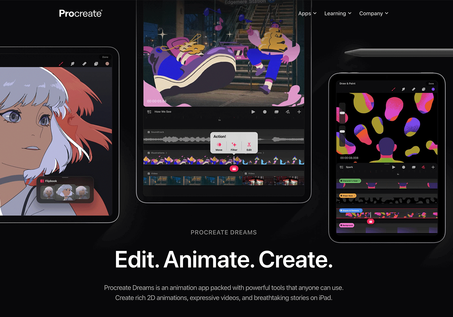
Procreate Dreams is a mobile-friendly animation tool built specifically for iPads, making it an excellent choice for designers who want to create fluid animations directly from a touchscreen device. It’s perfect for sketching out motion concepts and refining app animations.
Advantages:
- iPad-based animation tool with Apple Pencil support
- Powerful frame-by-frame animation system
- Intuitive timeline for motion design
- Great for prototyping on-the-go app animations
Disadvantages:
- Not designed for direct app integration (more for concept creation)
- Only available on iPad
Price:
One-time purchase $22.99
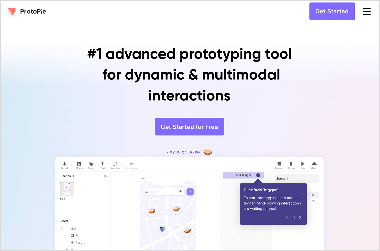
ProtoPie focuses on creating highly interactive prototypes with complex animations and logic. It’s ideal for validating ideas before development.
Advantages:
- Allows for advanced interactions and conditions.
- Great for demonstrating app flows and animations.
Disadvantages:
- Overkill for basic animations.
Price:
There’s a limited free version. The basic starts at $25/month for individuals.
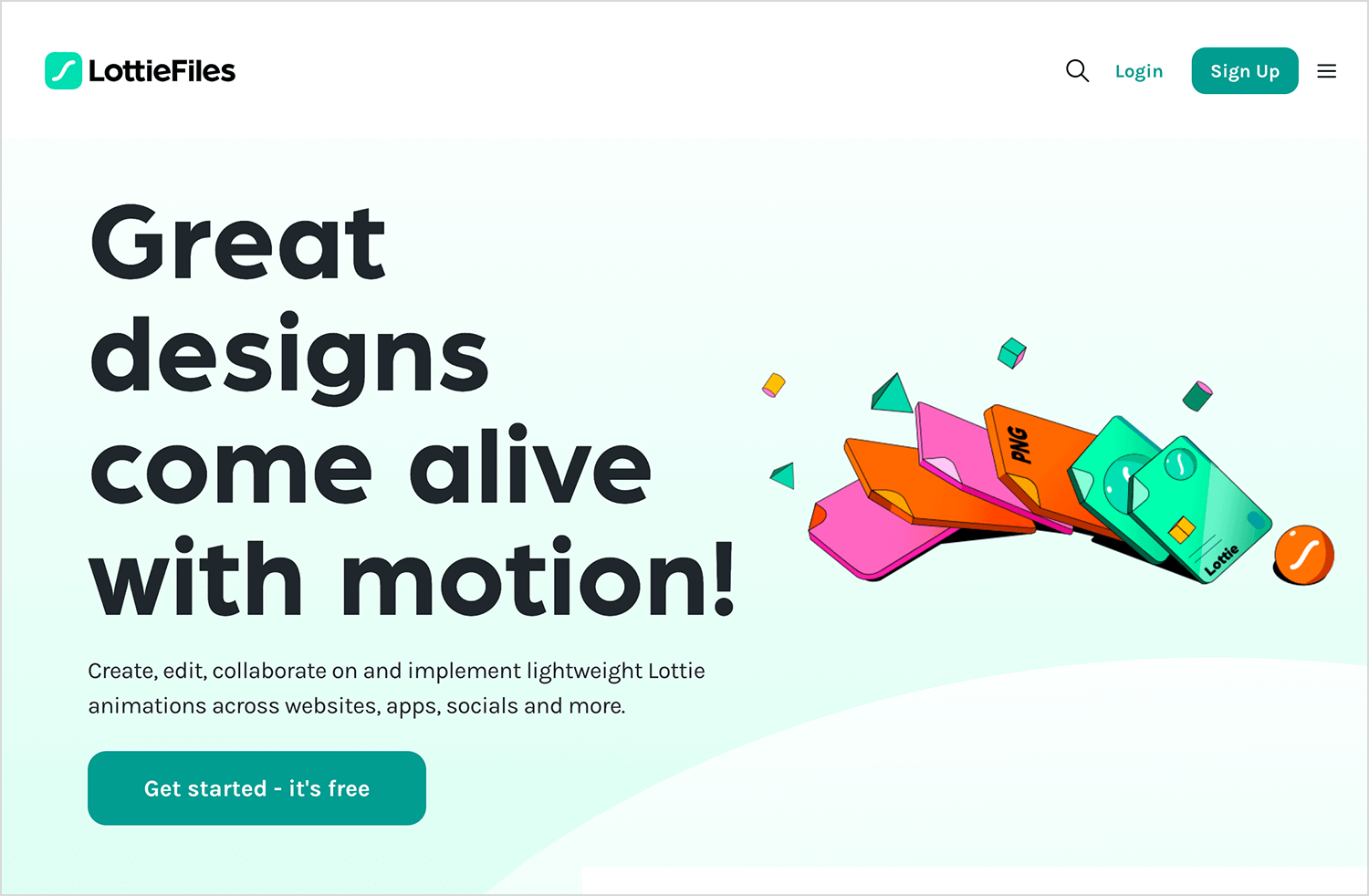
LottieFiles is the go-to tool for lightweight animations. It works with JSON-based animations, which can be easily embedded into web and mobile apps without affecting performance.
Advantages:
- Optimized for web and mobile.
- Easy integration with code.
Disadvantages:
- Requires animation creation in tools like After Effects.
Price:
Free for basic use; premium plans available starting by $19.99
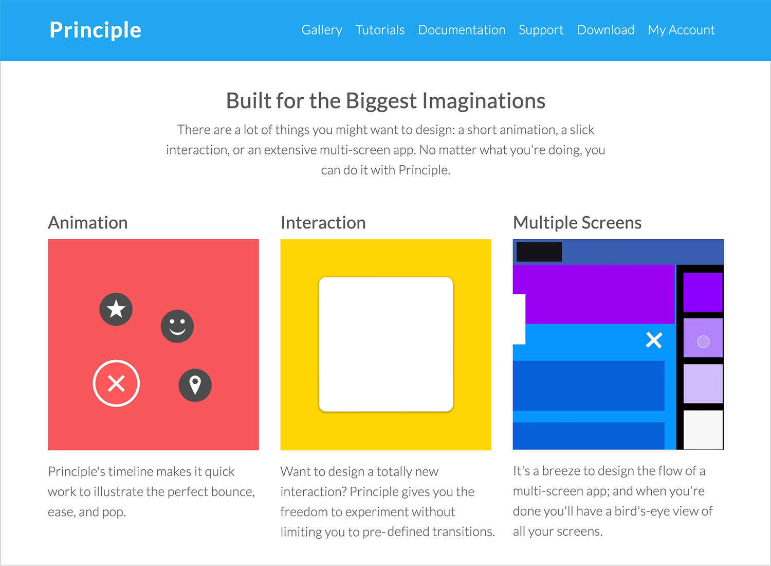
Principle is a prototyping tool that specializes in creating highly interactive and animated designs. Its timeline-based interface makes it easy to design and test animations.
Advantages:
- Focused on interaction and animation.
- Great for prototyping transitions and flows.
Disadvantages:
- Mac-only.
Price:
$129 for a one-time license.
Start designing mobile app animations with Justinmind

Framer is both a design tool and a prototyping platform. With built-in support for animations and code-based interactions, it’s perfect for creating realistic prototypes.

Advantages:
- Code-based customization for flexibility.
- Smooth workflow for animations and interactions.
Disadvantages:
- Requires some coding knowledge for advanced features.
Price:
Free for individuals; paid plans start at $15/month.
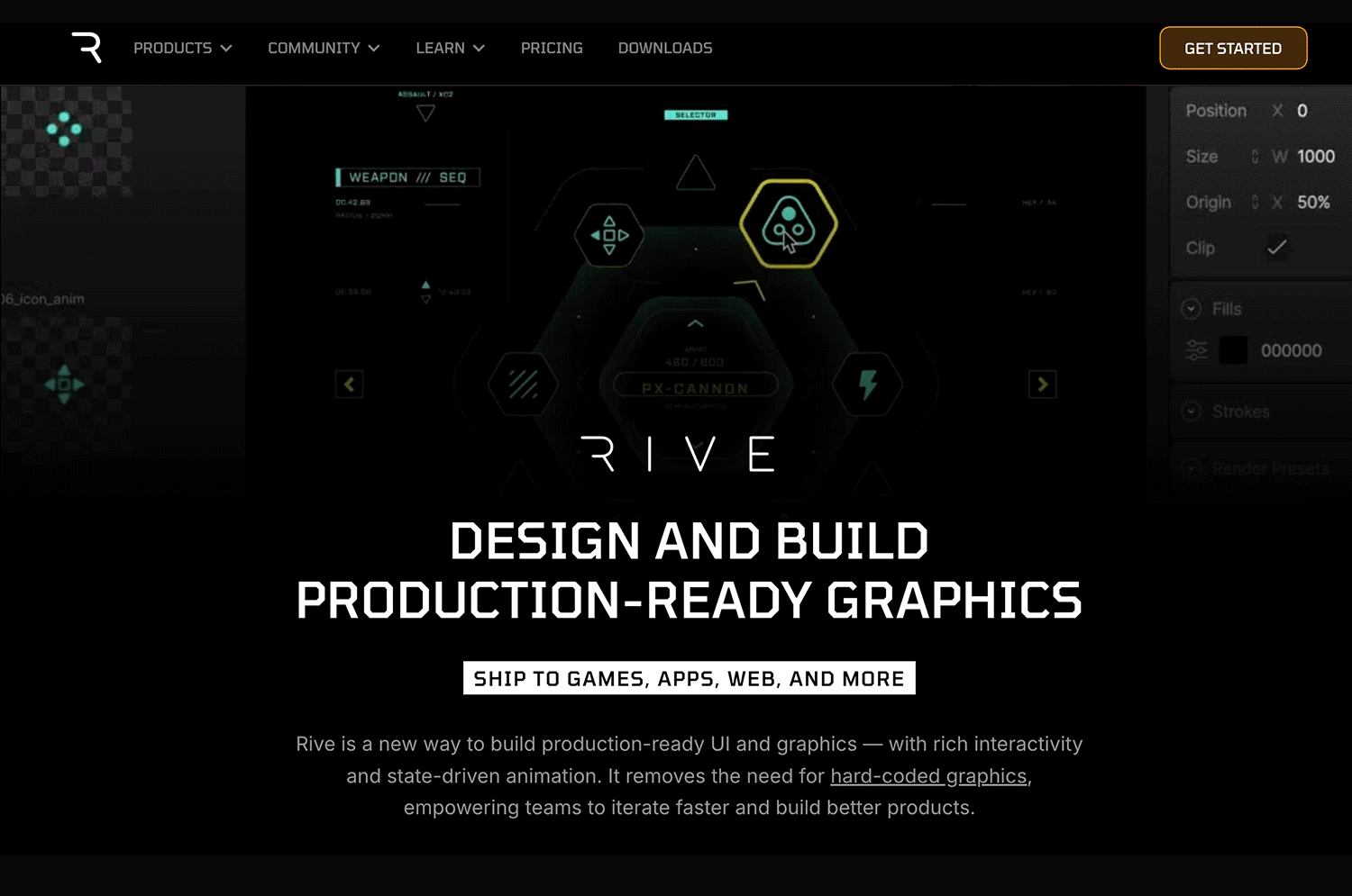
If you ever wish your mobile app animations could feel more dynamic and fluid without slowing things down, that’s where Rive comes in. Unlike traditional frame-based animation tools, Rive is all about real-time interactivity. It lets you create sleek, lightweight animations that respond to user interactions on the fly, whether it’s a button press, a menu expanding, or an onboarding animation that flows smoothly.
Advantages:
- Real-time, state-machine-based animations
- Lightweight and optimized for mobile performance
- Works across multiple platforms, including iOS and Android
- Open-source runtimes for seamless integration into apps
Disadvantages:
- Requires some learning curve for developers to implement animations in mobile apps
- Not as beginner-friendly as some other UI prototyping tools
Price:
Free plan available, Pro starts at $32/month
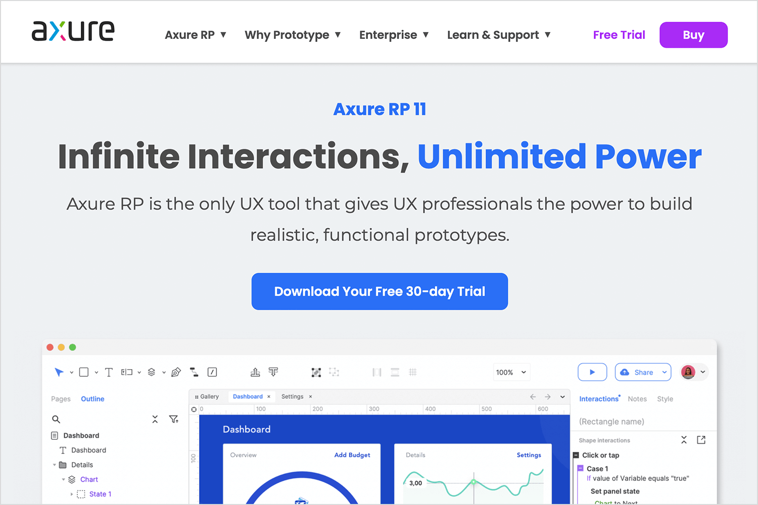
Axure RP is known for its robust prototyping features, including animations and dynamic panels. It’s excellent for creating complex user flows with animations.
Advantages:
- Supports detailed interactions and animations.
- Great for UX designers who need depth.
Disadvantages:
- Interface can feel overwhelming.
Price:
Starts at $29/month per user.
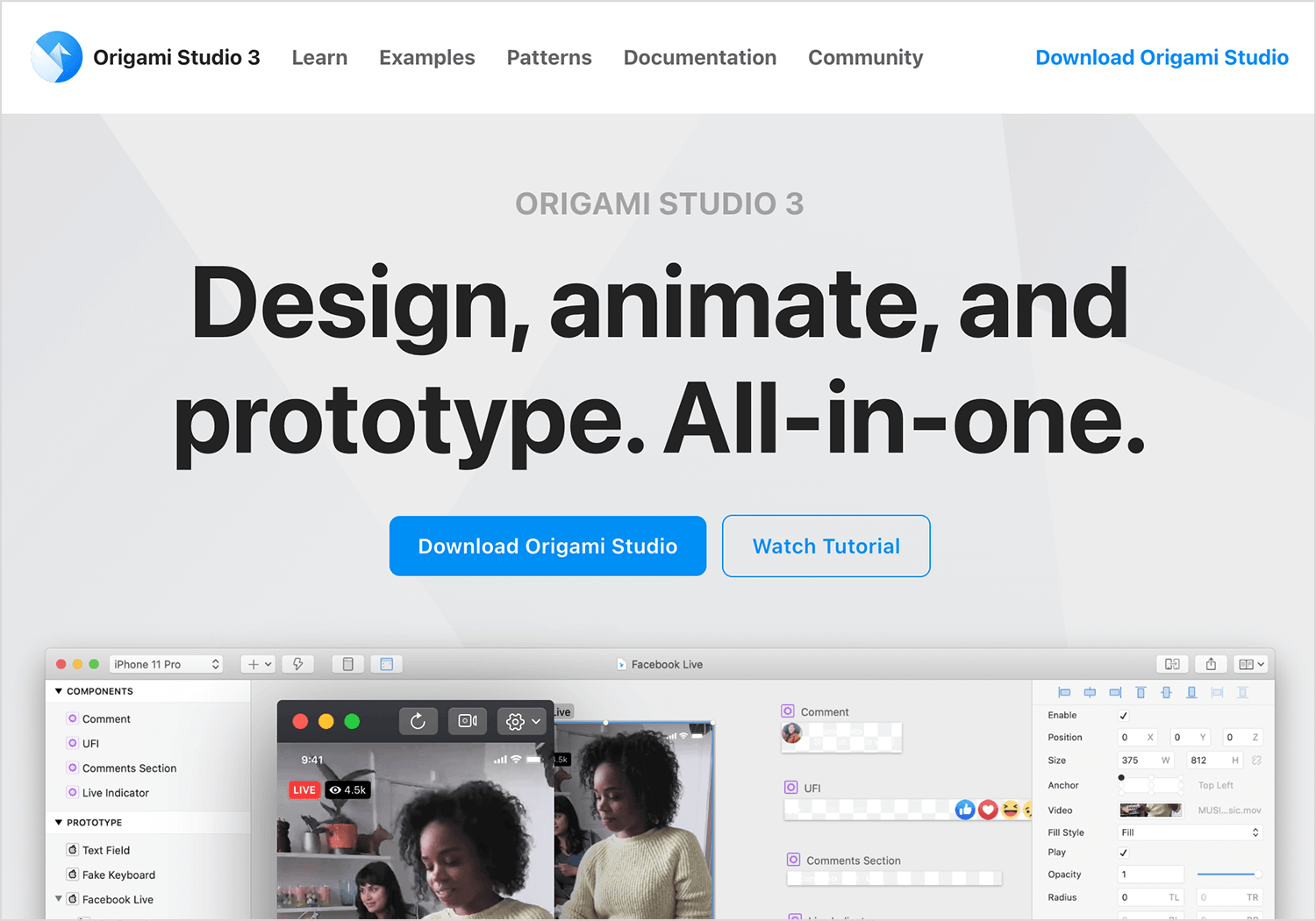
The free tool created by Facebook is designed specifically for creating advanced animations and prototypes. Origami Studio is perfect for mobile app designers who want to experiment with transitions, interactions, and complex animations.
Advantages:
- Powerful features for detailed, interactive animations.
- Great for exploring transitions and gesture-based interactions.
- Free to use
Disadvantages:
- Steeper learning curve for beginners.
- Lacks collaborative cloud-based features.
Price:
Free
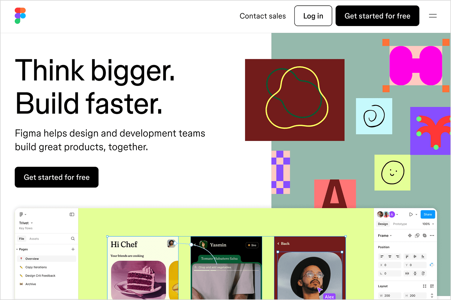
Figma is another popular choice, especially for teams. It’s great for designing static UI and adding lightweight animations to transitions. With its “Smart Animate” feature, you can create smooth interactions between frames.
Advantages:
- Cloud-based for seamless team collaboration.
- Easy to use for creating basic animations.
- Free plan available.
Disadvantages:
- Limited animation capabilities compared to motion-specific tools.
Price:
Free for individuals; paid plans start at $15/month per editor.
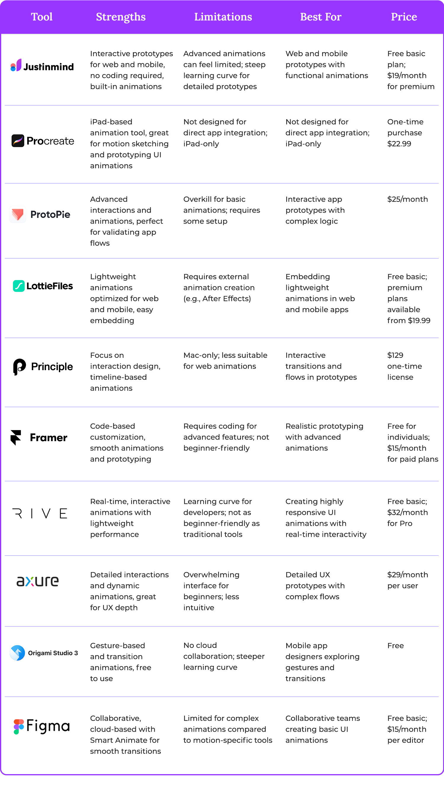
App animations are more than just eye candy, they’re tools that enhance mobile experiences by making interactions smoother, clearer, and more enjoyable. Whether it’s a subtle transition that guides users seamlessly through an app flow or a dynamic loading animation that keeps engagement high, these movements play a vital role in modern mobile design.
From the examples we’ve explored to the tools we’ve highlighted, it’s clear that adding animations doesn’t have to be overwhelming.
At the heart of it all, great animations aren’t just about aesthetics, they’re about functionality, engagement, and storytelling. They bridge the gap between design and usability, helping users navigate mobile interfaces effortlessly while adding a touch of delight along the way.
So, as you step into the world of mobile app animations, remember: it’s not about doing more; it’s about doing it thoughtfully. A well-placed animation can turn a good design into something truly memorable. Now, it’s your turn to experiment, create, and bring your designs to life.