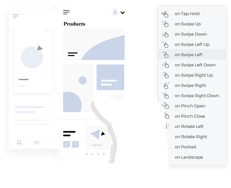
Slide menu design guide with 15 awesome examples

Ever notice how many UIs use slide menus? They're everywhere! These handy little elements have become super common, and for good reason.
They’re a neat way to keep things tidy while still giving us access to lots of options – think of them as the organized drawers of the app world. In this article, we’ll explore all about slide menus – from the basic dos and don’ts (like making sure they’re easy to find and use) to some clever tricks for making them even better.
Design awesome slide menus for web and mobile with Justinmind.

We’ll also peek at what the future might hold for this essential element in UI design. Whether you’re a design pro looking for inspiration or just starting out with UI design tools and trying to figure out what all the fuss is about, this guide is packed with helpful tips and examples to help you create beautiful and easy-to-use slide menus. So, get ready to slide into the world of slide menus!
Slide menus are a popular way to handle navigation, especially on websites and apps designed for phones and tablets. You might have hearn of one type of slide menu already, the hamburger menu (dubbed as such because the icon that opens them often looks like a burger).
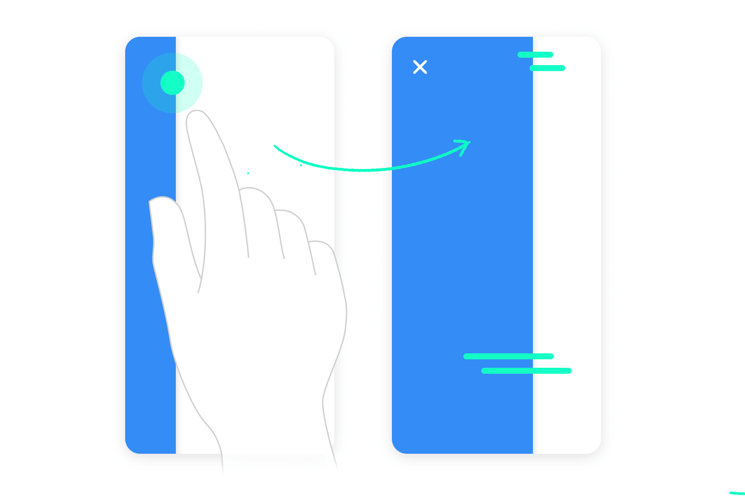
They’re basically a hidden panel tucked away off-screen, ready to smoothly glide into view with a tap, click, or swipe. This clever design keeps things tidy by hiding navigation choices until you need them, maximizing the space for the actual content you’re there to see.
These handy menus are super common for mobile navigation, offering a compact way to present lots of options without cluttering smaller screens. They’re also great for saving space in general, keeping things clean and focused. Beyond main navigation, slide menus often house settings, account details, or other secondary features within an app, keeping everything neatly organized and accessible when you need it.
Slide menus offer a bunch of advantages, especially for mobile experiences. They’re fantastic for organization, allowing you to neatly present a large number of navigation options in a compact and easy-to-access format. This directly leads to a better UX design, particularly on smaller screens where every bit of space is precious.
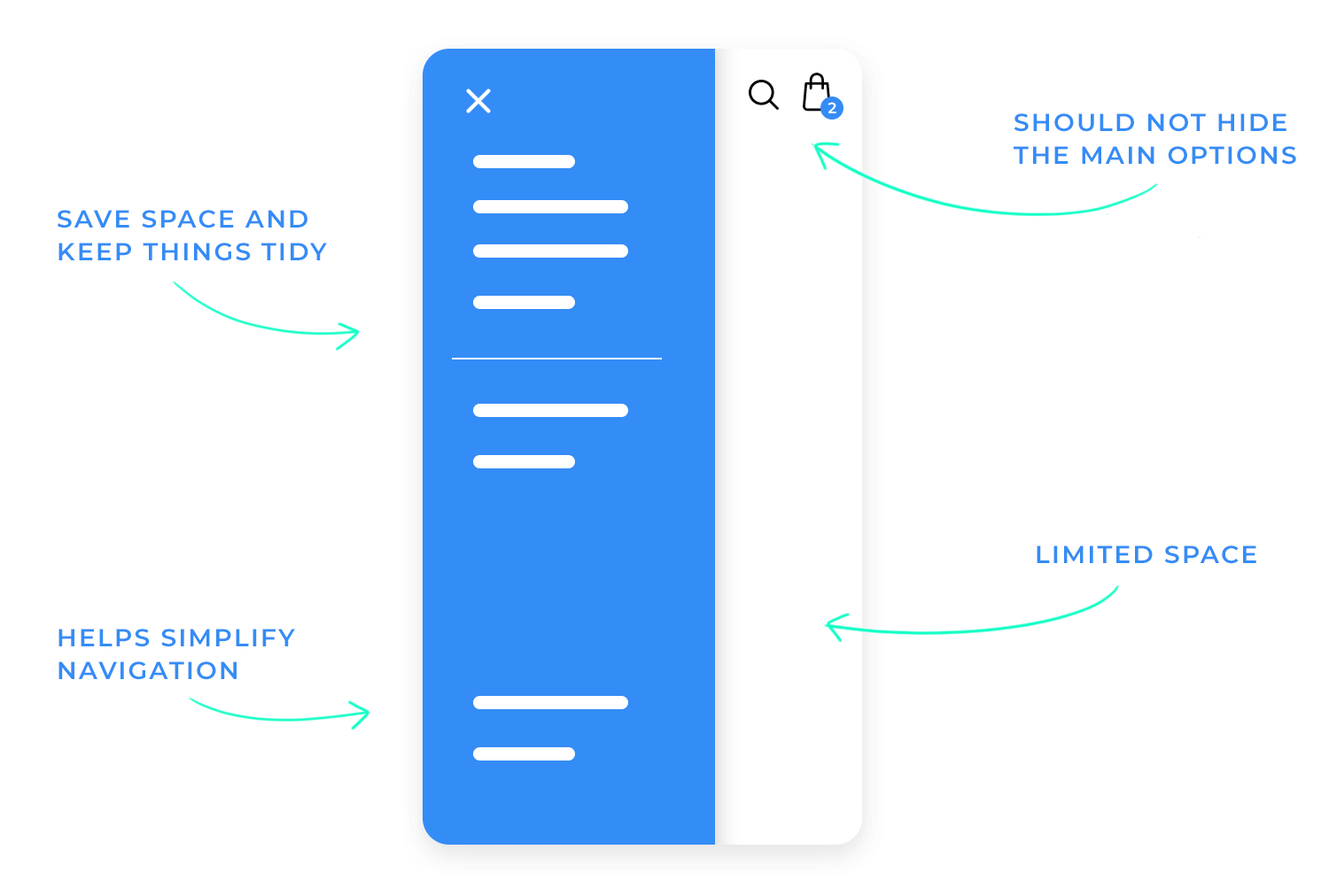
From a space-saving perspective, slide menus are a real win. They maximize the content area by letting it take center stage. When designing with a mobile-first approach, it’s important to make sure the trigger for the menu (like that familiar “hamburger” icon) is large enough and easy to tap.
Smooth animations for the sliding motion add a touch of polish, and of course, accessibility is key. This means ensuring the menu works well with keyboard navigation and screen readers, and that it doesn’t disrupt the flow of the app or website. More about these below.
The standard hamburger menu, with its three horizontal lines, is the classic and most recognizable type of slide menu. Typically found in the top-left corner for easy thumb access on mobile, it offers two main navigation structures: single-level, which presents a straightforward list of options, and multi-level, which uses nested menus for more complex navigation.
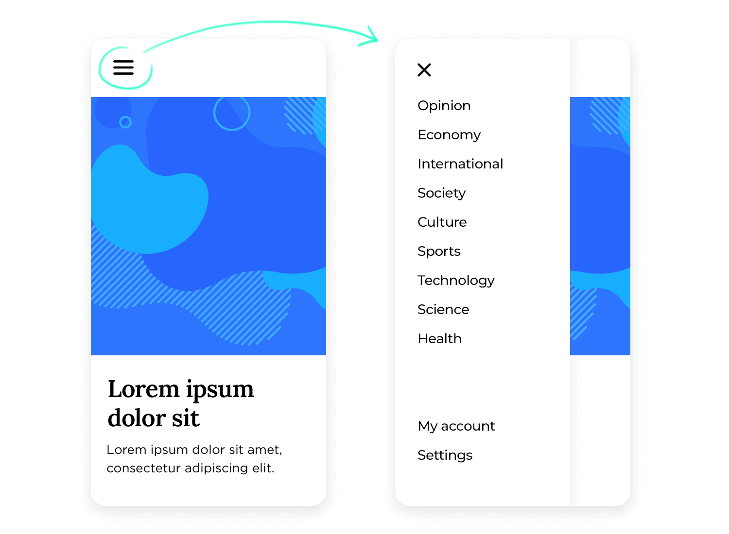
Multi-level menus are great for organizing tons of stuff, but they can also get a little overwhelming if not designed carefully. When the menu pops up, it has two main options: it can either float over the top of what you’re already looking at (like a see-through layer), or it can push the content aside to make room.
Floating, or overlaying, is easier to build, but pushing the content over a bit keeps everything visible (just shifted a tad), which can feel a little more polished and smooth.
When it comes to using slide menus across different devices, there are two main approaches. One way is to go “mobile-only.” This means you use the slide menu just on smaller screens like phones.
Then, when someone views your website or app on a larger screen like a tablet or desktop computer, you switch to a traditional navigation bar, the kind that sits at the top of the page and shows all the options at once. This approach was common in the past, acknowledging the big difference in screen real estate between phones and larger devices.
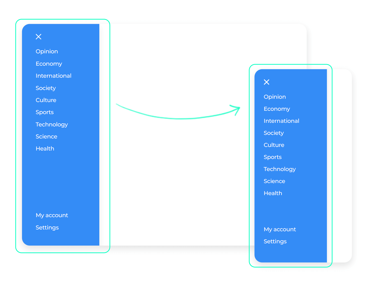
However, there’s another approach that’s becoming increasingly popular: the “responsive” approach. This means you stick with the slide menu, even on tablets and desktops. It adapts to the larger screen, sometimes appearing slightly differently, but the core functionality remains the same.
This consistent experience across all devices is what makes it responsive. This approach is gaining traction because of “mobile-first” thinking, which emphasizes designing for mobile devices first and then scaling up to larger screens. Which is how you should be thinking!
Think about how you use your phone – you’re probably swiping all the time! That’s why lots of apps are using this natural gesture to make opening slide menus super easy. Instead of just tapping a tiny icon, you can often just swipe from the edge of the screen.
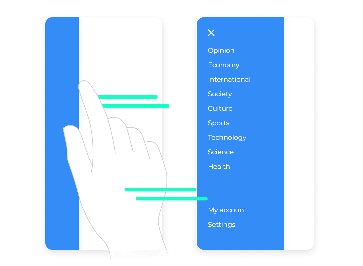
It’s like pulling back a curtain to reveal the menu! This feels so intuitive and smooth, especially on touchscreens. It’s a quick, fluid motion that just makes sense with how we naturally use our phones.
Think of the slide menu as a secret door. You want people to easily recognize the “handle” to open it. That’s where the clarity comes in. The classic “hamburger” icon (those three horizontal lines) is like a universal symbol for “menu,” so most people instantly get it.
But don’t overcomplicate things! Keep the menu options concise and easy to understand. Avoid jargon or overly complex wording. You want users to be able to quickly scan the menu and find what they’re looking for without getting lost or confused.
Imagine walking into a store where the aisles change layout every time you visit. Frustrating, right? The same principle applies to slide menus. Consistency is super important for creating a smooth and intuitive experience. Stick to the same side (either left or right) for the slide menu throughout your entire app. This way, users always know where to find it.
Also, make sure the icons and fonts within the menu look the same across all screens. When things are consistent, users don’t have to think twice; they just know where to go.
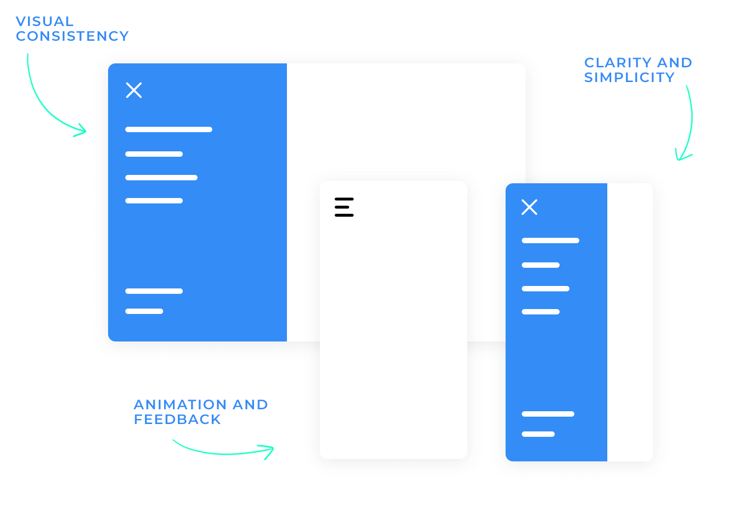
A truly great slide menu isn’t just a static list; it’s smart and adaptable. It understands what you’re doing and shows you the most relevant options. This is what we mean by “adapting to the user’s context.”
Imagine this: you’re using a music app. If you’re currently listening to a playlist, the slide menu might show options like “Queue,” “Add to Playlist,” or “Share.” But if you’re browsing artists, it might show “View Albums,” “Related Artists,” or “Start Radio.” See how the menu changes to fit what you’re doing?
This also applies to your role within the application. Think of an e-commerce website. A regular customer might see options like “My Orders,” “Wishlist,” and “Settings.” But an administrator would see additional options for “Manage Products,” “View Sales,” and “Customer Support.” This keeps things clean and avoids overwhelming users with irrelevant options.
Finally, a well-organized menu groups related items together logically. It’s like organizing your kitchen: you keep pots and pans near the stove, and dishes near the sink. In a slide menu, this might mean grouping all account-related options together (“Profile,” “Settings,” “Logout”) or all communication-related options (“Inbox,” “Sent,” “Drafts”).
This logical grouping makes it much easier and faster for users to find what they need, boosting both usability and efficiency.
The hamburger icon is a classic, but sometimes it might not be the best fit. Think about it like this: you’re telling a story, and you want to choose the right words to create the right mood. The same goes for your menu icon. A simple “Menu” label can be more direct and easier to understand, especially for users who aren’t as tech-savvy. Or, you could use a vertical ellipsis (those three dots), which is a subtle and elegant way to indicate a hidden menu.
And let’s not forget about the importance of a good show! As we mentioned previously, smooth animations for opening and closing the menu make the whole thing feel more polished and responsive. It’s like watching a well-choreographed dance instead of a clumsy shuffle.
These visual cues provide clear feedback to the user, letting them know that their action has been registered. It’s a small detail, but it can make a big difference in how the user perceives the overall quality of the app or website, not to mention the product.
Readability is key! Imagine trying to read a menu written in faint grey on a white background. It’d be like trying to read a whisper in a crowded room – impossible! That’s why good color contrast is absolutely crucial. Make sure the text color stands out clearly against the background. Think bold, vibrant colors that are easy on the eyes.
And when a user taps on a menu item, it needs to give them that “Aha! I did it!” feeling. That’s where highlighting comes in. Change the text color, add a subtle background color, or even add a checkmark next to the selected item.
These visual cues provide instant feedback, letting the user know their selection was registered. It’s like a little pat on the back, validating the user’s efforts, which is always welcome!

Font matters too! Using the right font size and weight makes a big difference. Make sure the text is large enough to be easily readable, even on smaller screens. And use bold or slightly larger fonts for headings or subheadings to create a clear visual hierarchy.
Think of it like a table of contents in a book – it helps users quickly scan the menu and understand the structure. All these elements not only improve the visual appeal but also contribute to accessibility, which is key!
Using clear fonts and a well-structured information architecture makes the menu easier to use for everyone, including those with visual impairments. It’s about making your menu inclusive and user-friendly for all.
Just like you’d use your brand colors on your website or storefront, bring those colors into your slide menu! It makes the whole experience feel more cohesive. If you have a logo, consider including a small version in the menu, perhaps above the menu items or in the background.
Remember those style guidelines you created for your brand? Consistency goes a long way! Make sure the fonts, spacing, and overall look and feel of the menu align with your brand’s visual identity. This creates a consistent and professional experience across all touchpoints. It’s like extending your brand’s personality into the digital realm.
Design awesome slide menus for web and mobile with Justinmind.

We can’t start talking about interaction design without discussing how essential it is to use a clear, tappable icon or button. But don’t feel chained to the hamburger if it doesn’t quite vibe with your overall design. A simple “Menu” label can be just as effective, especially for users who might not be as familiar with interface conventions.
Or perhaps another icon perfectly captures the essence of your app. The thing to keep in mind is clarity and intuitiveness: users should understand at a glance that tapping or clicking this element will reveal more options.
For mobile apps, adding gesture controls, like a swipe from the edge of the screen, can be a real game-changer. It feels incredibly natural on touchscreens and provides a quick, fluid way to access the menu—almost like a shortcut.
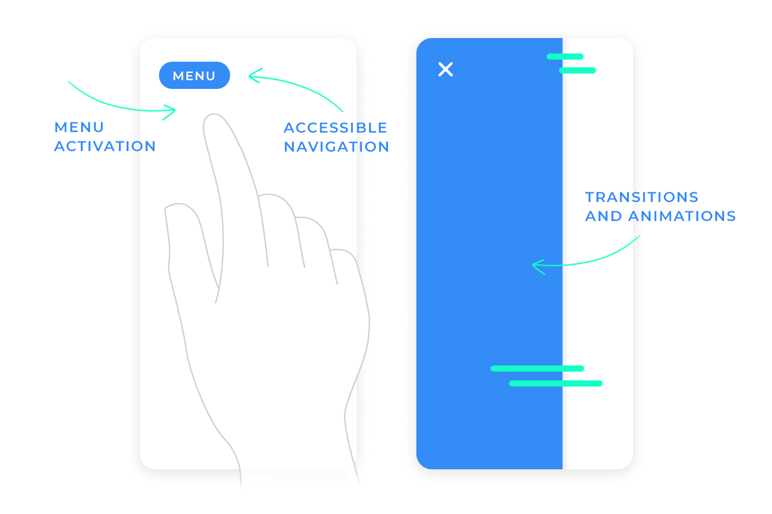
Once the user triggers the menu, you don’t want it to just appear out of thin air! Smooth, subtle animations are key here. Imagine the menu gracefully sliding into view, not abruptly popping onto the screen.
This animation provides visual context, giving users a sense of where the menu is coming from and how it fits within the overall interface. Similarly, a smooth closing animation provides a sense of completion, signaling to the user that the menu is now hidden.
But speed is important too! Animations shouldn’t feel sluggish or delayed. No one wants to wait for the menu to slowly crawl onto the screen. It should feel responsive and snappy. Carefully managing the animation duration is crucial—too fast, and it might be missed; too slow, and it becomes frustrating.
You’re aiming for that Goldilocks effect—an animation that’s just right, providing visual feedback without slowing down the user experience
We can’t talk about interaction without talking about accessibility. It’s not just a nice-to-have; it’s a must-have. Ensuring your slide menu is fully navigable using a keyboard is crucial for users who can’t use a mouse or touchscreen. This means users should be able to tab through menu items, use arrow keys to navigate submenus, and press Enter to select an option.
Equally important is screen reader support. Screen readers are assistive technologies that help visually impaired users understand what’s on the screen. Providing proper markup and labeling ensures that screen readers can accurately convey the menu structure and options to these users.
Finally, make sure those tap targets (the clickable areas for menu items) are generously sized. This makes it easier for everyone to interact with the menu, especially on touchscreens and for users with motor impairments.
Clear focus states (visual cues that show which menu item is currently selected) are also essential for both keyboard and mouse users, providing clear visual feedback and making navigation much easier.
The foundation of a usable slide menu is a well-defined structure that starts with a solid foundation: grouping sections and features together logically. This involves logically grouping sections and features together. Think about how users will intuitively navigate the content and organize the menu items accordingly.
Prioritize frequently used items by placing them at the top of the menu, making them easily accessible. For example, if “Home” is the most important page, place it at the very top. This prioritization makes it easy for users to find what they need quickly and efficiently. It’s like placing the most important items at the beginning of a list – it helps users stay on track and reach their goal with ease.
Just like a growing business needs to adapt its office space, your app or website needs to accommodate growth. Your content and features are likely to evolve over time. That’s why it’s crucial to design a menu structure that can scale gracefully. Imagine trying to cram more and more files into a tiny filing cabinet – it quickly becomes a mess!
Think ahead. How will you integrate new sections or features into your existing menu? Can they fit neatly into existing categories, or will you need to create entirely new top-level sections? Planning for future growth ensures that your slide menu remains usable and effective, even as your content expands.

One of the biggest mistakes is assuming users will automatically know there’s a hidden menu. Relying solely on a hamburger icon without any accompanying label (like “Menu”) can be confusing, especially for less tech-savvy users. It’s like hiding a door without a doorknob – you know it’s there, but you don’t know how to open it! Similarly, failing to provide any visual cues that a menu even exists leaves users guessing.
Think about it: how would you know there’s a secret compartment in a piece of furniture if there were no clues? You might miss it entirely! That’s why it’s important to provide subtle hints. Consider incorporating subtle animations around the hamburger icon when you hover over it, or adding a slight shadow to indicate that it’s interactive. These small visual cues help draw attention to the menu’s presence and encourage users to explore.
Cramming too many options into a single drawer creates a cluttered and overwhelming experience. Users are bombarded with information, making it difficult to quickly scan and find what they need. It’s like searching for a needle in a haystack!
A related mistake is failing to categorize items logically. Randomly listing options without any clear organization is like throwing all your clothes into a pile. It’s frustrating and inefficient to navigate. Grouping related items together, like putting all your shirts in one drawer and all your pants in another, makes the experience much more intuitive and user-friendly. Users can quickly scan the menu and find what they’re looking for, just like finding the right drawer in your dresser.
A lack of visual or auditory cues can leave users feeling unsure if anything has happened. Did the menu actually open? Did their selection register? It’s a frustrating experience.
Slow or glitchy transitions also detract from the user experience. Imagine the menu stuttering and jerking as it slides in—it feels clunky and unprofessional.
Smooth, responsive animations are essential for a polished and satisfying interaction. They provide visual feedback, confirming to the user that their action has been registered. It’s like the difference between a smooth, well-oiled machine and one that’s rusty and clunky.
Design awesome slide menus for web and mobile with Justinmind.

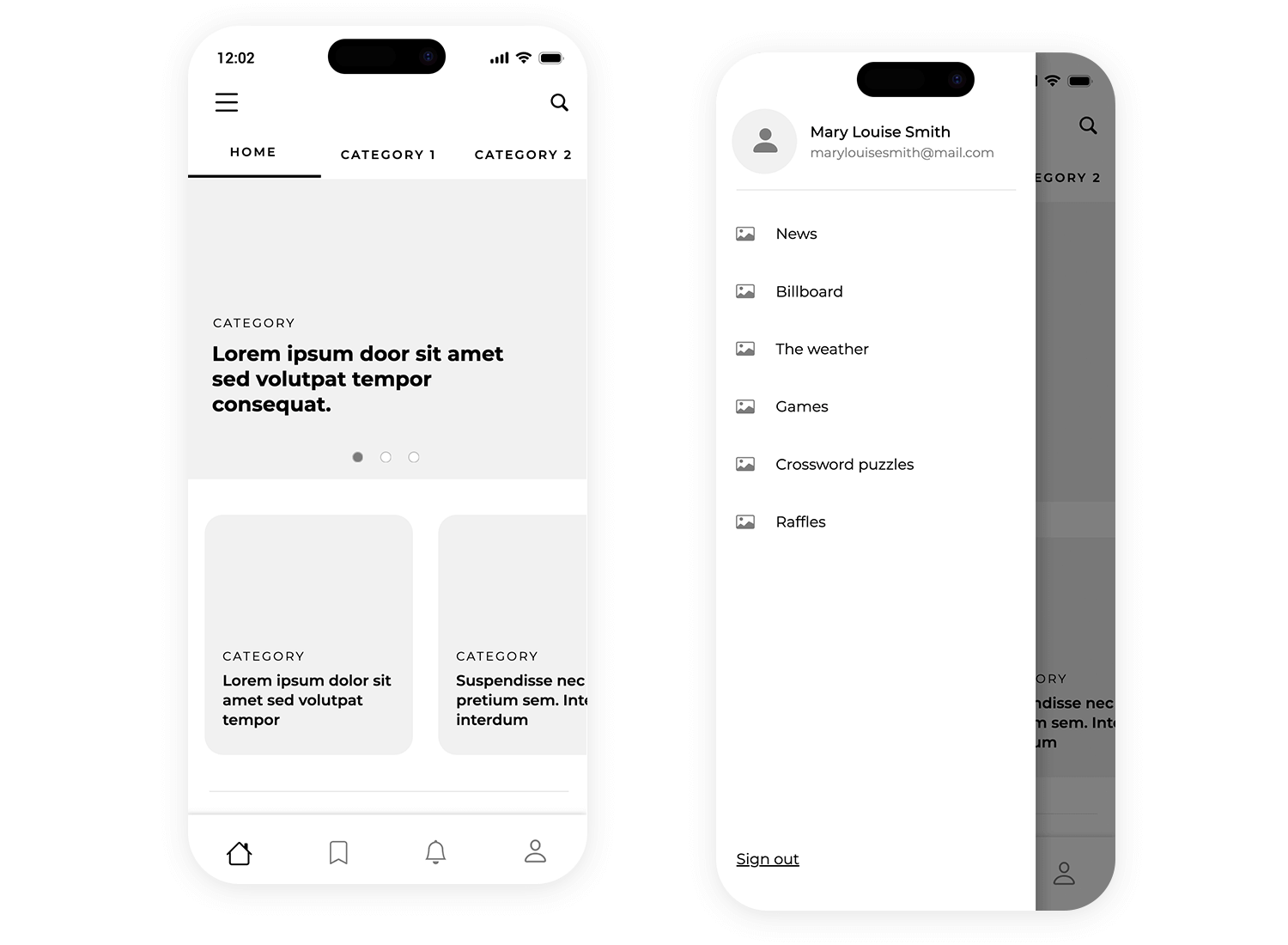
Check out this neat slide menu by none other than the great designers behind Justinmind! It’s a great example of how to keep things tidy on a mobile screen. At the top, there’s a handy user profile section with Mary Louise Smith’s info. Then, below that, you’ve got a clear, easy-to-read list of options each with a cute little icon to help you find what you’re looking for fast. It’s a super user-friendly slide menu example that helps users navigate your app easily.
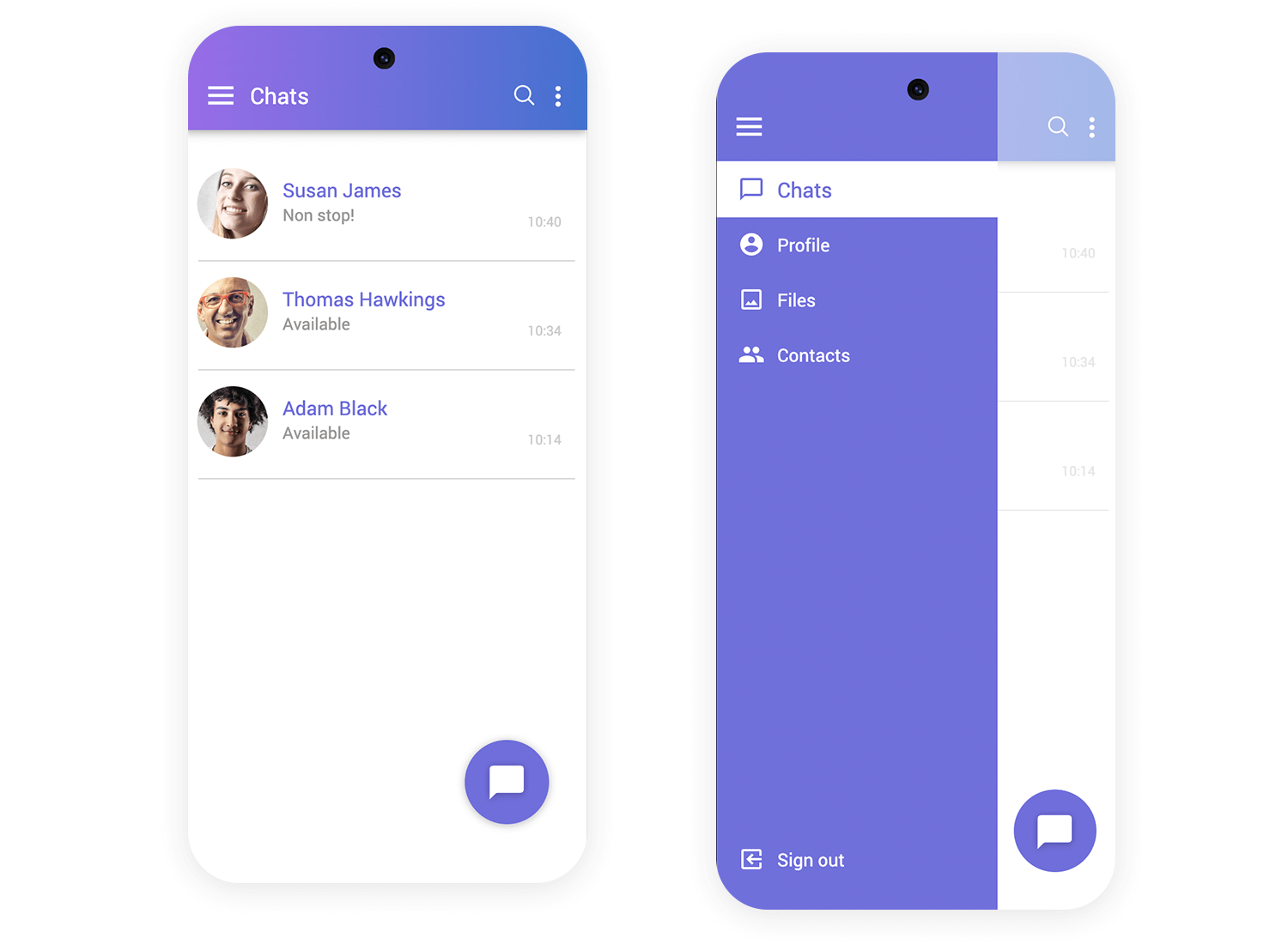
This is a clean and simple slide-out menu from the Justinmind Android messaging app prototype in Justinmind. It uses a cool purple background and nicely spaced text to make it easy to read. It’s a straightforward design that keeps things organized and accessible, perfect for a messaging app where you want quick access to different sections.
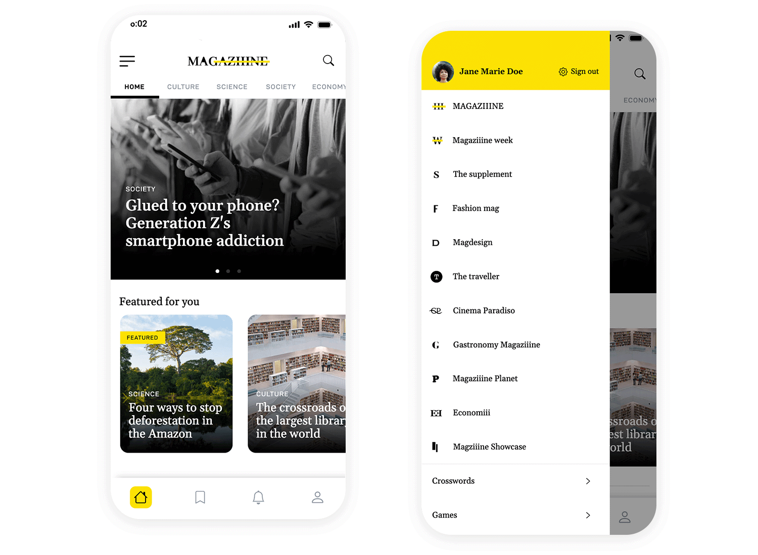
This app, also put together by the designers at Justinmind, uses a left-hand slide menu to keep things tidy. It opens with a tap and shows different sections, each with an easy-to-spot icon. The user’s profile and quick sign-out option are right at the top. Extras like Crosswords and Games are at the bottom, keeping the main options clear. The slide menu makes navigating the app simple and clutter-free.
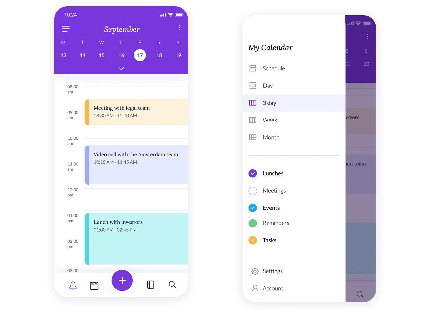
This slide menu example makes navigating this app super simple. With just a tap, you can switch between views like Day, 3 Day, and Month. It’s all laid out in a way that makes managing your schedule a breeze, with color-coded sections for Lunches, Meetings, and Tasks. Plus, Settings and Account are right there at the bottom, so everything you need is just a tap away.
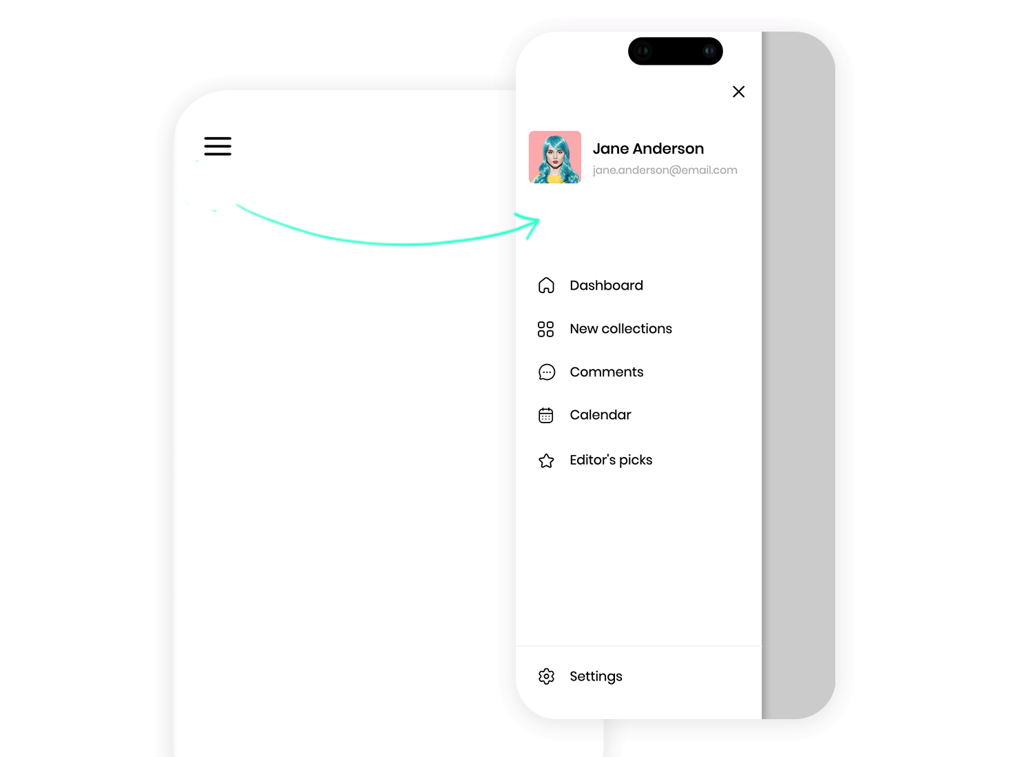
Looking for smooth navigation? This slide menu keeps everything within reach. You can quickly hop to the Dashboard, browse New collections, or check your Calendar. Your profile is featured right at the top, adding a personal touch, while options like Editor’s picks are neatly tucked at the bottom. It’s a clean, organized way to access all the app’s key features without any clutter.
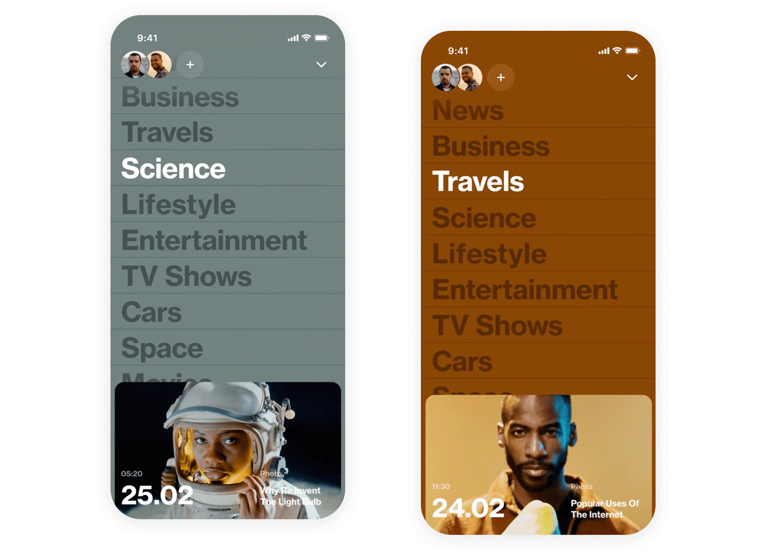
This insane News Reader slide menu example keeps navigation super simple and organized, which is perfect for mobile! The main menu is a clean list of categories like News, Business, Travel, and more, each with a cute little icon. Plus, there’s a section for “Popular Uses Of” with articles, suggesting some curated content. And the best part? It looks great whether you’re holding your phone tall or wide – it’s all about easy navigation!
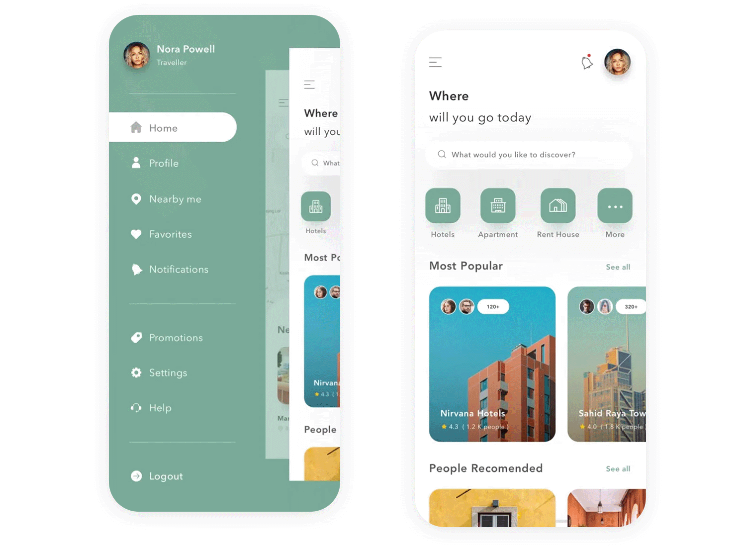
This clean and modern slide menu, designed by Pixelz for a hotel search app, keeps things simple and user-friendly. At the top, you’ll find Nora Powell’s profile info, a nice personal touch. Below, the menu is a straightforward list of options like Home, Profile, Nearby, and more, each with a clear icon so you can quickly find what you need. It’s a tidy and efficient way to navigate the app, keeping the focus on the beautiful hotel photos and search options on the main screen. Perfect for planning your next getaway!
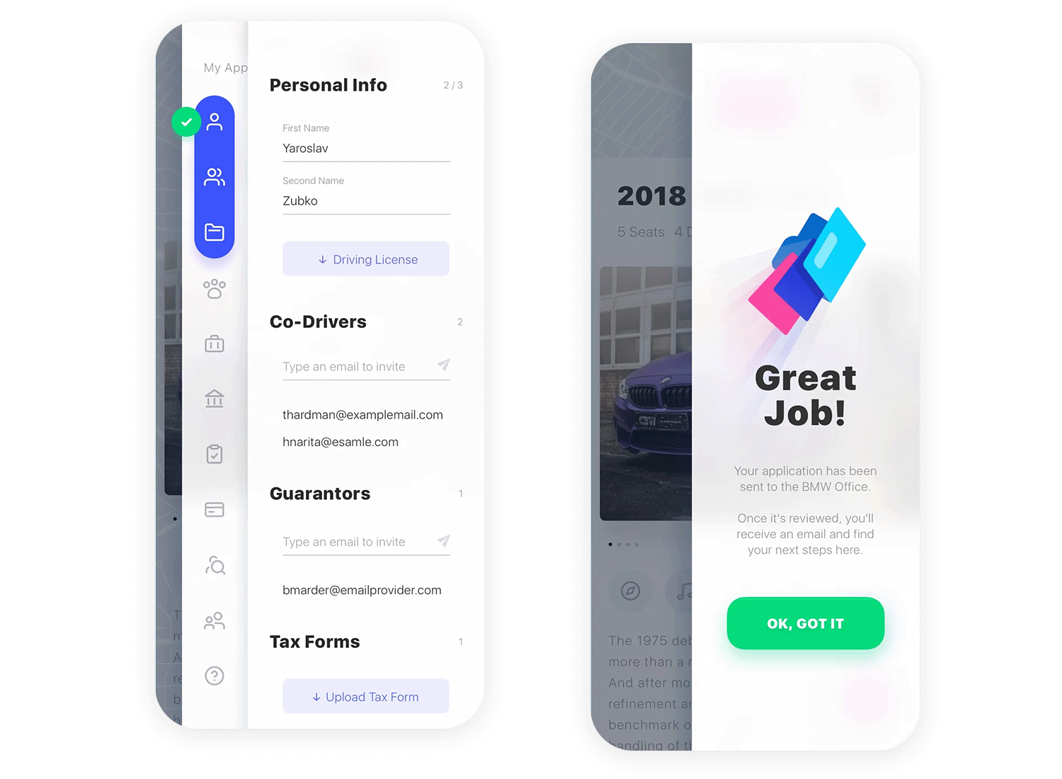
This slick two-step slide menu by Zubko Studio is a super smart way to organize a lot of information! You first see big categories like “Personal Info” and “Financial Details.” Tap one, and bam, the specific forms pop out. It’s clean, efficient, and makes even complicated stuff feel easy. Plus, the smooth animations make it a joy to use!
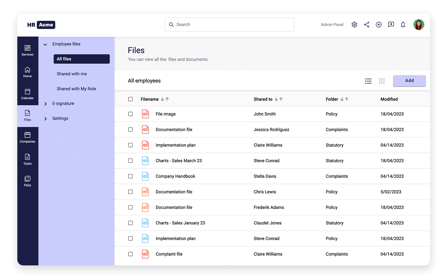
Let’s take a peek at this nicely organized slide out menu example by Justibmind! It’s got a clean, dark sidebar that makes the light text pop, so everything’s easy to read. Plus, there are cute little icons next to each item, like Services, Home, and Calendar, which helps you find what you need in a flash. See how the “Files” section is open, showing all the different file options? That’s a clever way to pack a lot of info into a small space
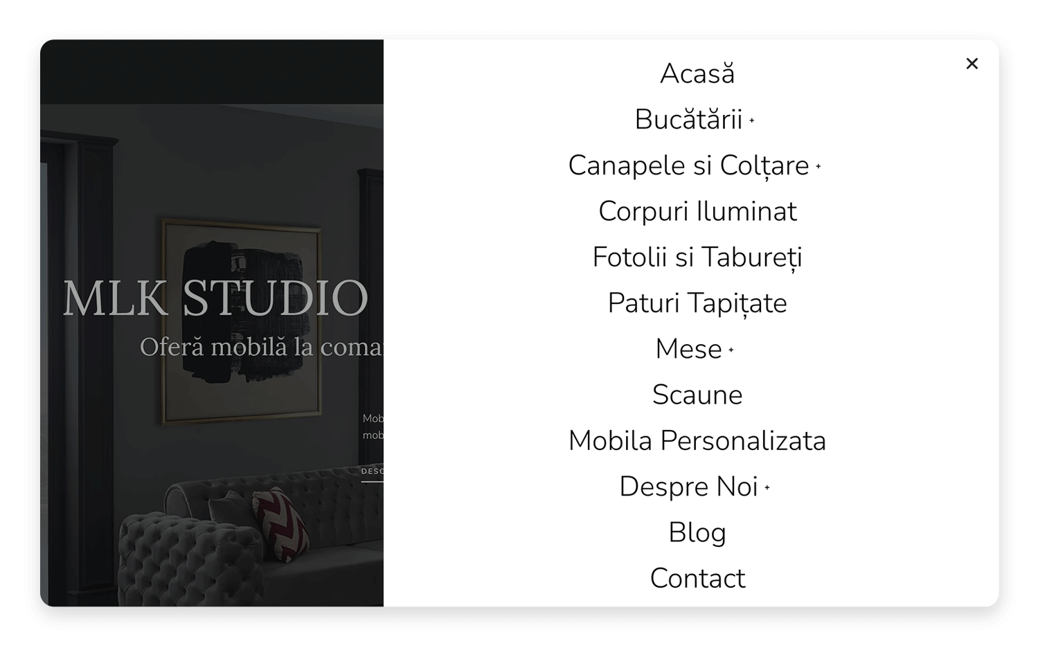
The MLKStudio website has a really neat menu that makes exploring the site a joy! It pops out from the side and fills the whole screen, so you’ve got tons of options without feeling cramped. The clean white background contrasts nicely with the darker hero section, making the menu easy to read and a pleasure to use. Some of the menu items even have a little plus sign next to them, which means even more goodies are hiding underneath!
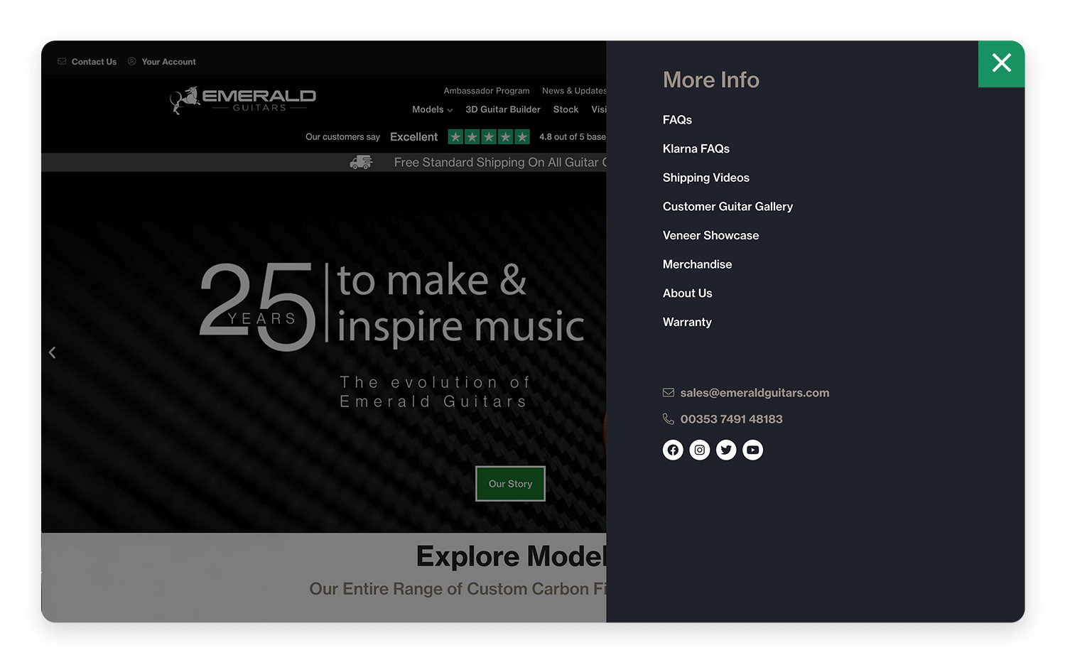
This clean slide menu by the designers behind Emerald Guitars keeps everything nice and organized! You’ve got clear categories like “Personal Information,” “Co-Drivers & Guarantors,” and so on, making it easy to find exactly what you need. It’s a straightforward and user-friendly way to navigate, especially when you’ve got a lot of information to share.
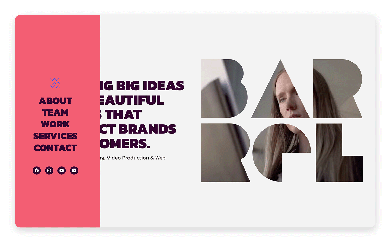
Barrel Marketing‘s website has a really cool, dynamic menu that perfectly matches its bold style. It slides out smoothly from the side, making navigation a breeze without getting in the way of all the eye-catching visuals. The menu’s background color ties in perfectly with the site’s vibrant design, from its bold fonts and bright colors to its fun illustrations and videos. It’s a cohesive and visually striking experience that really grabs your attention and makes the brand memorable.
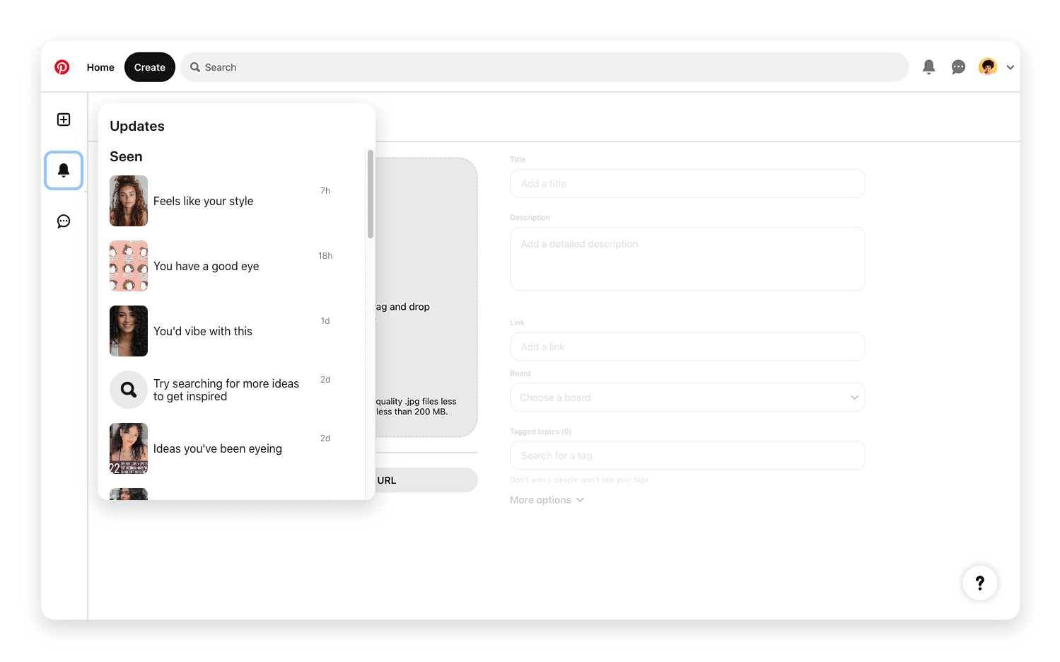
This Pinterest slide menu example is all about keeping your inspiration organized! At the top, you’ve got quick access to “Updates,” so you can see what’s new. Below, there’s a handy “Seen” section that keeps track of the Pins you’ve already checked out – super useful for revisiting ideas you liked.
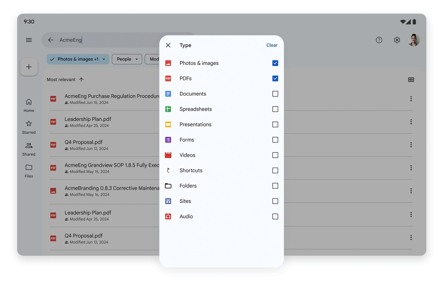
Just like Dropbox, the Google Drive app prioritizes showing the user all their most recent files. Whether they were created with Google Docs or Google Sheets, the app clearly shows the user what they’re probably looking for first. The rest of the secondary navigation options are hidden.
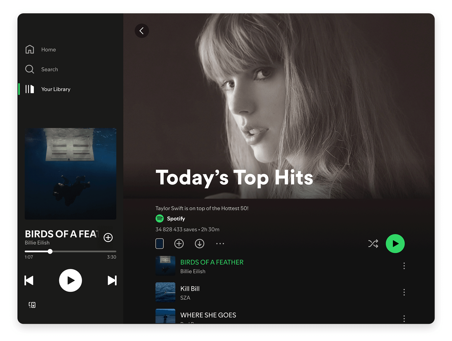
This Spotify slide-out menu is your quick guide to all your music! Up top, you’ve got the essentials: Home, Search, and Your Library, so you can easily jump to what you need. It’s a clean and simple way to get around the app and dive into your favorite tunes. Happy listening!
Prototyping tools like Justinmind are invaluable for creating interactive slide menus. In Justinmind specifically, you can create these by using panels that slide in and out of view. You’d typically:
- Create a Panel: Design your menu within a dynamic panel. This panel will contain all your menu items, icons, and styling.
- Create a Trigger: Use a button or icon (like the hamburger icon) to trigger the menu.
- Add an Event: In Justinmind, you’d add an “On Click” event to the trigger. This event would use the “Move” action to slide the panel into view (e.g., move it from off-screen to its desired on-screen position). You can also add animations (like easing effects) to make the transition smooth.
- Create a Close Trigger: Similarly, you’d add a close button or use an “On Click Outside” event on the main screen to hide the menu again.
Justinmind provides UI kits that include pre-built slide menu components, making the process even faster. These kits can offer various styles and interactions, which you can then customize to fit your design.
Design awesome slide menus for web and mobile with Justinmind.

Contextual menus dynamically change based on where you are in the app, your role, or even your login status. For example, on an online store, if you’re browsing products, the menu might show quick links to your cart and checkout.
But if you’re in your account area, it might switch to show things like your order history and saved addresses. Similarly, in an admin dashboard, a regular user would see options relevant to their daily tasks, while an administrator would get extra controls for managing users and settings.
And finally, think about login status: a logged-out user sees “Login” and “Sign Up,” while a logged-in user gets quick access to their profile and a “Logout” button.
Sometimes, one navigation pattern just isn’t enough. That’s where hybrid approaches come in, combining different patterns for a richer experience. A very common example is pairing a slide menu with a bottom navigation bar, seen in many popular mobile apps. Take the following examples:
Instagram cleverly combines a bottom navigation bar with a slide-out menu to provide a streamlined user experience. The bottom bar acts as the primary navigation hub, offering instant access to the core features users engage with most often: their home feed, search, Reels (short videos), the Shop, and their profile.
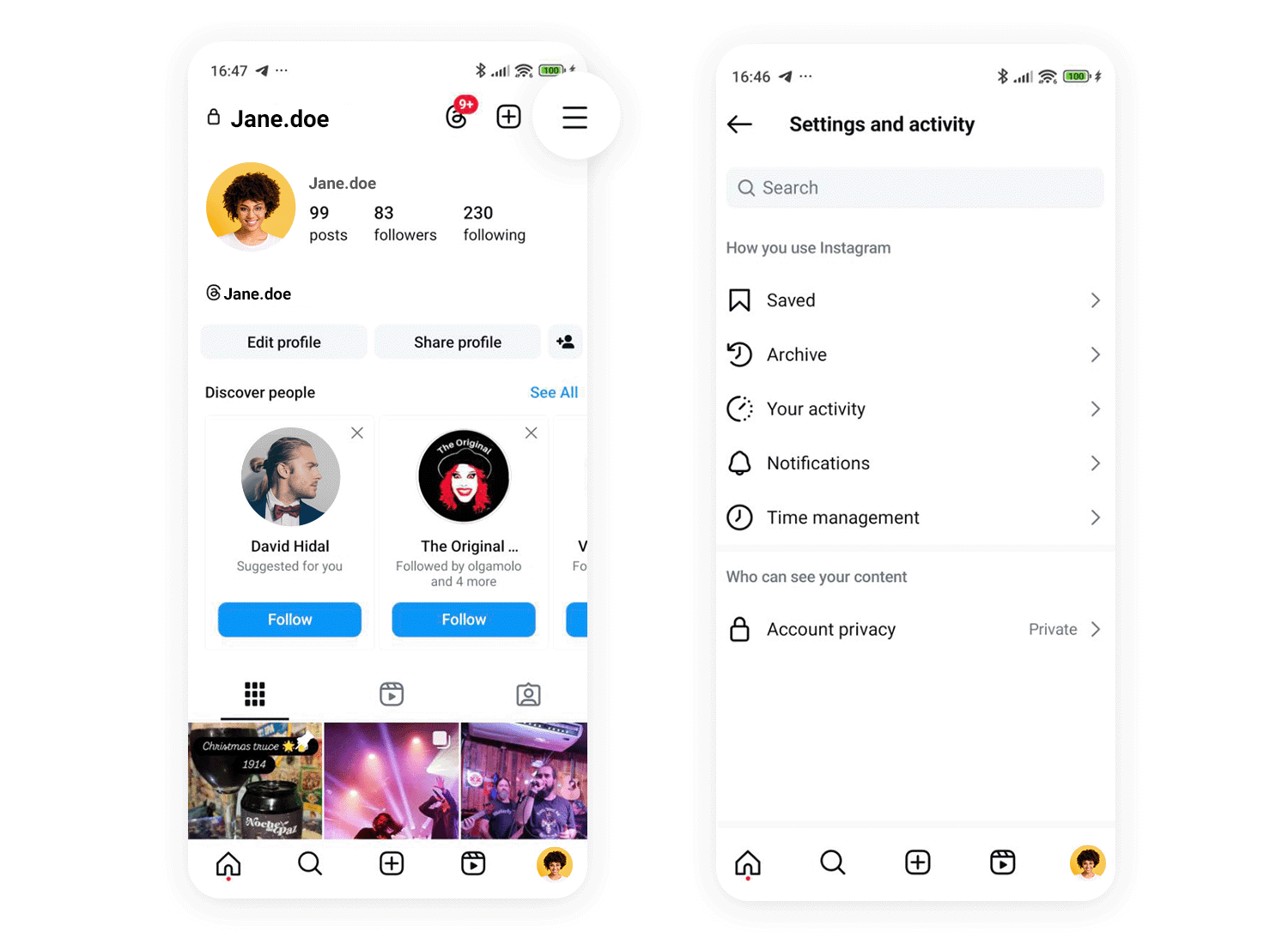
This constant visibility ensures these key functions are always at the user’s fingertips. For less frequently accessed features and settings, Instagram uses a slide-out menu, accessible by tapping the profile picture in the top right corner. This menu houses options like Settings, Activity, Archived posts, and Insights, keeping the main interface clean and focused on content consumption and creation.
Gmail, especially with its newer Material You design, also utilizes a hybrid navigation approach. A bottom navigation bar allows users to quickly switch between different communication modes: Mail, Chat, Spaces, and Meet. This provides a clear and efficient way to manage various forms of communication within the app.
For managing accounts, organizing emails (through folders like Inbox, Sent, and Drafts), and accessing settings or help resources, Gmail employs a slide-out menu, accessible via the familiar hamburger icon in the top left. This separation of core communication functions and secondary management options keeps the interface uncluttered and ensures users can easily find what they need, whether it’s checking their inbox or adjusting their account settings.
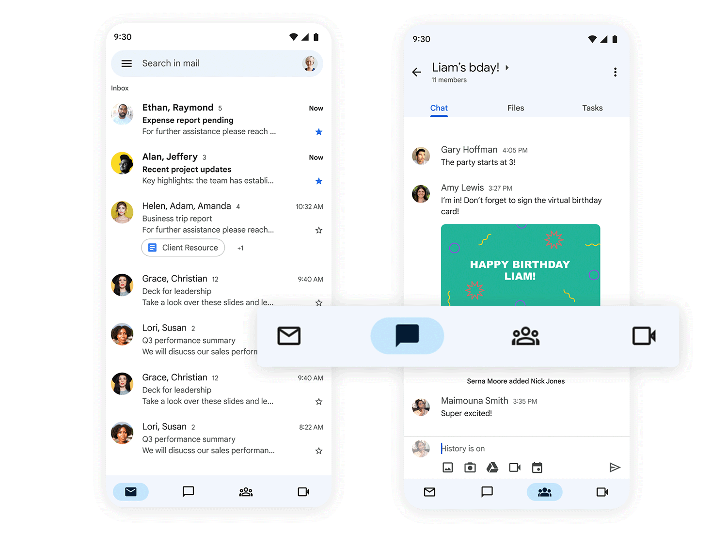
Combining different navigation styles, like a bottom bar with a slide menu, is a smart move when you’ve got a lot going on in your app or website. Using different patterns helps create clear categories and prioritize what’s most important.
This is especially helpful on mobile, where screen space is precious. A bottom bar can handle the everyday essentials, while a slide menu neatly tucks away less frequently used options, keeping things clean and focused.
This hybrid approach makes navigating much smoother and more intuitive. It’s like having a well-organized toolbox – you have the tools you use most often right at hand, and the others are neatly stored away but still easily accessible.
The future of slide menus is looking bright, with exciting new technologies on the horizon promising even more intuitive and personalized experiences. Imagine a world where you could navigate your app entirely hands-free, simply by using your voice! You could say “Open my profile” or “Show me the latest news,” and the menu would respond instantly, like a helpful digital assistant.
AI is also set to revolutionize how we interact with menus. AI could learn your habits and preferences, personalizing the menu options to show you what you’re most likely to need.
Even more futuristic are predictive menus that anticipate your next move, dynamically rearranging or suggesting options based on your past interactions.
This kind of intelligent adaptation could drastically improve navigation efficiency, making apps and websites feel truly tailored to each individual user, anticipating their needs before they even think of them.
So, as we’ve seen, slide menus are a really handy way to keep things tidy and organized in our apps and websites, especially on smaller screens. From that familiar “hamburger” icon to more clever, context-aware versions, they offer a great way to manage navigation without cluttering the interface. But like any design tool, it’s just about using them wisely.
It’s not just about hiding a menu behind an icon; it’s about thinking carefully about how people will use it, making sure it’s clear, consistent, and easy for everyone to access. When done well, slide menus can really boost the user experience, making it a breeze to find what you’re looking for. And with exciting new tech like voice control and AI personalization on the way, it’s clear that slide menus will continue to evolve and play a key role in how we interact with technology in the future.
Design awesome slide menus for web and mobile with Justinmind.
