Microsoft Office Fabric UI kit: for code-free design
Design Office UI Fabric prototypes for Microsoft Office and Office 365 with Justinmind. It’s super easy and totally code-free.
Justinmind’s Microsoft Office Fabric UI kit is our mobile-first, front-end framework for prototyping Office and Office 365 web experiences. Giving you full access to the complete Office UI Fabric user interface kit, our UI kit makes it easy to create rich Office UI Fabric experiences for Microsoft Office apps, with no coding necessary.
Designed by the OneDrive and SharePoint Design Studio, the Office UI Fabric framework enables development communities to create Office Add-ins and Office 365 web apps that integrate seamlessly with Office. It’s like Bootstrap for Office.
But for the designers out there looking to create web and mobile experiences around Office and Office 365, Justinmind offers a code-free solution. The first step is a prototype. In this post, take a tour of Justinmind’s Office Fabric UI kit and learn how to create a Microsoft SharePoint Intranet using the UI kit.
Before getting started, make sure you’ve got Justinmind prototyping tool downloaded.
Microsoft Office UI Fabric is Microsoft’s official UI framework for creating front-end experiences that complement Office and Office 365.
Office UI Fabric has been built with React components, which are part of the open source Fabric Core elements package. The React components have reusable patterns and focus on styling instead of JavaScript.
“Fabric React is a responsive, mobile-first collection of robust components designed to make it quick and simple for you to create web experiences using the Office Design Language.” NPM
Many React UI components are used in Office web products to improve brand alignment, maintain consistent functionality across browsers and provide a point of reference for the evolving Office and Office 365 products.
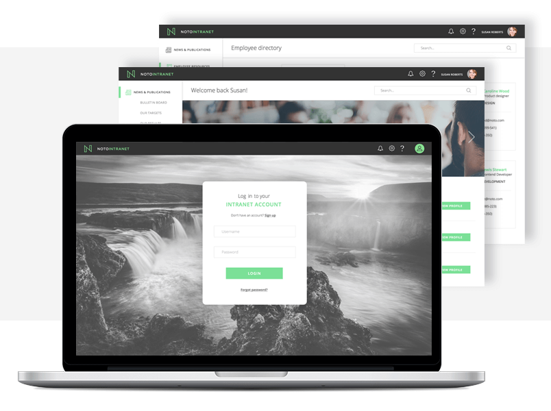
Justinmind’s Office UI Fabric kit is based on the design and layout of the robust, up-to-date components of the Office UI Fabric framework. Take a look below to see the building blocks available in Justinmind’s Fabric UI kit – including inputs containers such as the Button, TextField and Checkboxes, layout elements like the CommandBar, Dialog, ContextualMenu, Callout, and Panel widgets, and navigational elements such as Breadcrumb, Dropdown and Slider features – that all take on Office styles and functionality.
Here’s a list of the full range of visual and interactive components available in Justinmind’s UI Fabric kit:
- Breadcrumb
- Button
- Callout
- Checkbox
- ChoiceGroup
- ColorPicker
- ComboBox
- CommandBar
- ContextualMenu
- DatePicker
- DetailsList
- Dialog
- DocumentCard
- Dropdown
- Facepile
- GroupedList
- Image
- Label
- Layer
- Link
- List
- MessageBar
- Modal
- Nav
- Overlay
- Panel
- Persona
- Pickers
- PeoplePicker
- Pivot
- ProgressIndicator
- Rating
- SearchBox
- Slider
- Spinner
- SpinButton
- SwatchColorPicker
- TextField
- Toggle
- Utilities
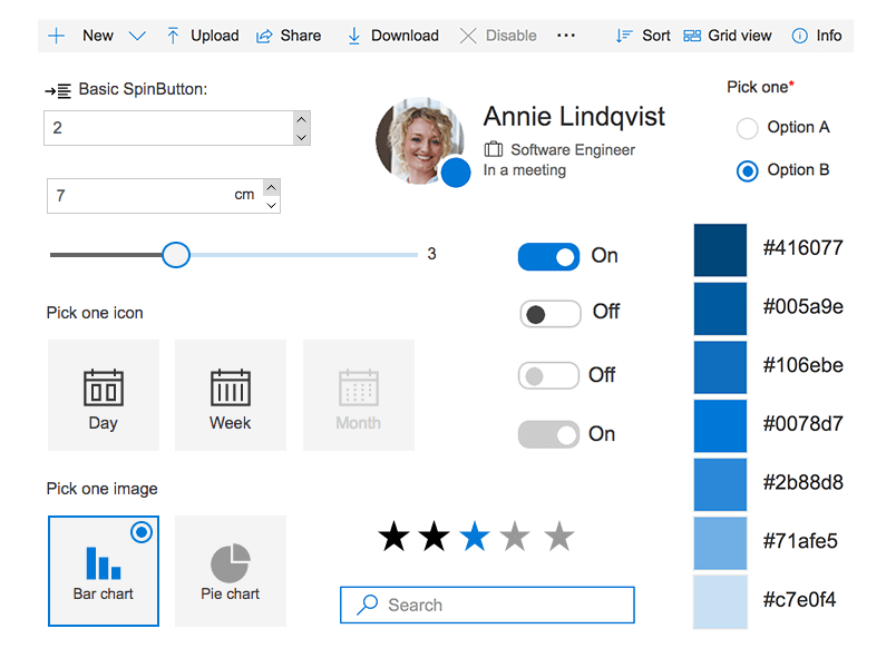
Justinmind’s UI kit also contains Fabric themes so designers can maintain styles in their Office prototypes. Users can build both web prototypes for simulation in web browsers, Windows and Mac desktops, as well as mobile devices including iOS on iPad.
Take a look at the full UI kit.
It’s super easy to integrate the Office UI Fabric kit into your Justinmind web and mobile prototypes. Just follow these simple steps:
- Download the Justinmind prototyping tool
- Download Office Fabric from our UI kits page
- Open Justinmind and create a new web prototype
- Import the UI kit into Justinmind
- Have fun designing Microsoft Office Fabric apps!
Office Fabric helps designers speed up the design process and maintain design consistency when building Office products with an extensive collection of pre-built UI and navigation components. Designers can use Office UI Fabric to create compelling apps and sites that are usable, useful and have delightful UX for any of the following Microsoft products:
- Office 365
- Outlook
- OneDrive
- SharePoint
- Office Mix
- Project
- Delve
- Microsoft Dynamics
- Visual Studio Online
By prototyping these experiences with Justinmind, designers produce mock user interfaces. These models are rich with visual input and customizable UI elements as well as interaction when combined with Justinmind’s Events system. Justinmind’s Office UI Fabric kit allows designers to reproduce the look, feel and behavior of Office products quickly and easily and test them in real-time.
Designers can create the form of their Office low-fidelity wireframes with the Office UI Fabric kit and build them up into clickable, high-fidelity prototypes with realistic behavior using the drag-and-drop interactive components.
The Microsoft SharePoint platform is primarily used by developers to create intranets with branded landing pages, custom content and navigation, and training materials. It can also be used as a content management system (CMS), team collaboration system, or business intelligence (BI) platform. Baked with Office Fabric, SharePoint’s navigation features and layout help employees stay up to date with company news, events and documentation.
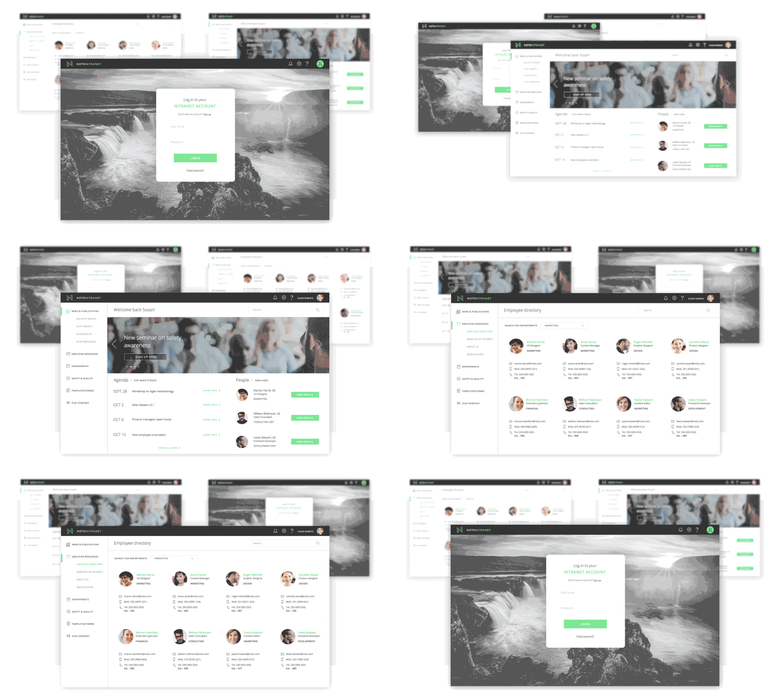
As intranet portals often provide enterprise information and resources such as learning materials, UX designers need to ensure that the portals are accessible and easy to interact with. By leveraging Justinmind’s UI Fabric kit, you can prototype a SharePoint intranet that is visually pleasing and easy to navigate.
In this section of our post, we’re going to show you how you can design a SharePoint intranet within a Justinmind prototype using UI Fabric components and styles. Have no fear, designers, this needs no coding experience!
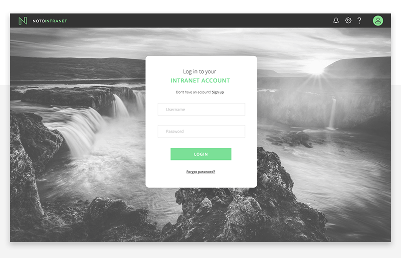
In our example, we will create an intranet portal login page, homepage with scroll effects and a employee directory area with interactive options.
Let’s start with the login page. Note that a landing page, such as the login page, is an essential cog in the onboarding wheel and designing it requires some attention to detail. This is why prototyping really helps to get ideas off paper and into an interactive tool like Justinmind.
- To get started, open Justinmind and create a new Web prototype with the predefined specs. Create a second screen – this will be the home screen that the user will arrive on once they’ve logged in. Name the first screen ‘Login’ and the second ‘Homepage’.
- From the Fabric Widget Library, add TextField widgets for the Username and Password input fields to the first screen.
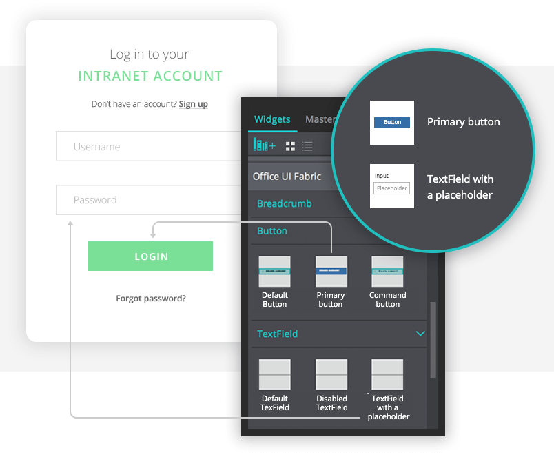
In the Fabric framework, the TextField component enables a user to type text into an app. We suggest using the text box with a placeholder. This will allow you to add a label to the text boxes so users know what to input.
- Tip: change the Type in the Properties tab to ‘password’ so that when the user inputs their password, it will be encrypted.
- Add a Primary Button from the Fabric kit to the bottom of your login form and rename it ‘Login’. It should be a primary button because it’s your main Call to Action (CTA).
- Customize the second screen of your prototype as preferred. Make sure it’s clear to the user that they have logged in successfully, by using Fabric’s Dialog or Success MessageBar for instance.
- You’ve just created the layout of your login form. Let’s bring it to life with Justinmind’s interactive Events and Conditions.
- Go back to the first screen and add an ‘On Click’ + ‘Link To’ event to the ‘Login’ button. Link it to the second screen.
- Then, add a condition to the Event by clicking ‘add condition’ on the left of the event. Add the following expression in the expression builder:

Now when the user clicks on the button, they will navigate to the homepage.
Bonus: add a ProgressIndicator or Spinner widget to show the completion status of the login operation if it’s likely to last more than 2 seconds.
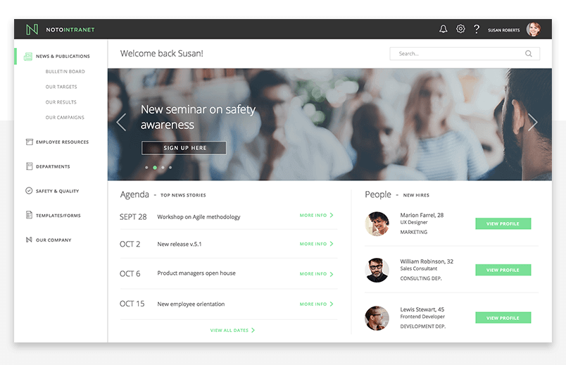
The first thing your homepage needs is a solid navigation system. Navigation should be coherent and consistent so that readers will digest and act on your business message, according to the experts over at Kissmetrics.
Luckily, the UI Fabric kit has a complete set of pre-built navigation elements to make sure you can make the most of navigation in your intranet prototype. The navigation elements to choose from include a drop down menu, breadcrumb (indicating the current page’s location within a hierarchy), search box, checkbox (allowing users to switch between two mutually exclusive options), pivot (for navigation frequently accessed pages), and a Command Bar (typically used in Microsoft Office Excel, Outlook and Word).
In our intranet homepage, we’re going to add a vertical dropdown menu (a list in which the selected item is always visible, and the others are visible on demand by clicking a drop-down button). From the UI Fabric kit, drag the Basic dropdown widget to the canvas – add the equivalent of these widgets to the total number of main menu options on your homepage. Place these vertically down the left-hand side of the canvas.
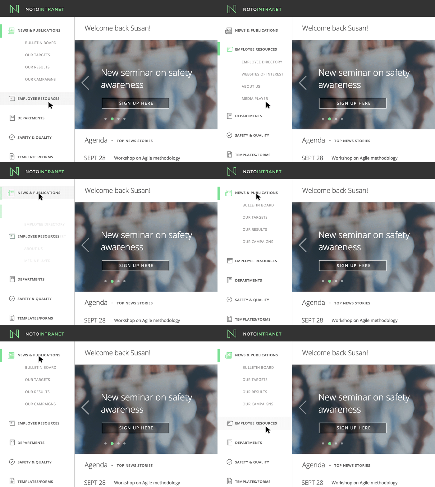
In our example, we’ve got 6 main menu options (news & publications, employee resources, departments, safety & quality, templates/forms and our company), so we have used 6 of these widgets. Customize your dropdown menu as preferred.
You will need to add a new screen for each target page from the drop down and add linking events to connect your pages together. You can use transition effects to make your menu even more interactive. Remember to keep your navigation consistent by making your navigation accessible from any point on site with a fixed menu (below).
Find out more about prototyping a dropdown menu.
Tip: According to the Nielsen Norman Group, people prefer role-based personalization over company-wide portals. This means designing for different personas: managers, employees, C-level etc. Consider this when designing your prototype, and remember that your Office Fabric UI kit is totally customizable exactly for this purpose!
Now we’re going to make our menu sticky so that the user can see and interact with it no matter how far down the page they are.
From Justinmind’s Parallax elements UI kit (available by default in the Widgets tab), drag the ‘Pinned layer’ to the canvas. Rearrange the drop down menu items so that they are within the pinned layer element. The scrolling interaction is pre-defined within the parallax element. You can also read our tutorial on how to customize sticky scrolling.
Alternatively, you can explore the world of prototyping scrolling functionality with Justinmind.
Personalizing the visual components of your Justinmind prototype is really easy thanks to the Fabric framework:
- All the image UI elements are labelled by size and alignment so positioning them on the canvas and measuring white space is easy.
- For your homepage, you’ll want to include a logo and possibly an image, such as a Hero image, as a header or background element.
- Choose colors from the Fabric Theme widget to keep your branding on fleek.
Next we’re going to create an employee directory for our Employee Resources area. This area will display department contact information.
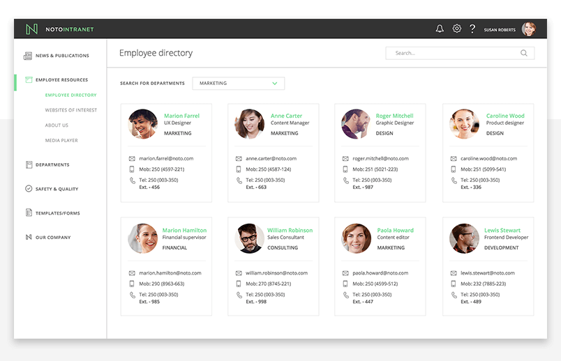
There are a few ways you can create an employee directory with Justinmind’s Office UI Fabric kit. You could use the PeoplePicker, typically used to select one or more entities, such as people or groups, along with the Persona feature to render an individual’s avatar and presence. This is a great option if you need to display and store details of several employees.
However, if you have a small number of contacts, you may prefer to use the grid structure. The grid is a great way to display contacts visually, breaking items down and creating additional pages for them automatically.
Drag the grid to the canvas and customize it with contact avatars and their information. Place it within a dynamic panel and add additional panels for each new contact. Then, add ‘On Click’ + ‘Set Active Panel’ events, choosing the relevant panel each time, so that the relevant contact is displayed when the user clicks on their avatar.
You might also like to add a search box and a slider filter from the Fabric UI kit for a more personalized navigation experience.
Go ahead and check out our tutorial f you’d like to customize your list with options such as editing, favoriting or sharing contact information.