Quantitative vs qualitative testing: validating our steps

Qualitative and quantitative testing can seem like different worlds, but which one is right for you? Is quantitative testing for everyone? Read on to find out!
User testing the product isn’t just about making sure you catch fatal flaws in your design. Yes, we want to identify areas where things go wrong and fix any issues. With that said, user testing is much more than simply having a functional product. It’s about maximizing everyone’s return on investment and elevating the design until everyone’s happy with the performance.
Design and test hi-fi prototypes for web and mobile apps. Try it free!

Qualitative and quantitative testing are two sides of that same coin. Both seek to perfect the design by putting users and the product face-to-face. But aside from that crucial bottom line, both methods differ greatly.
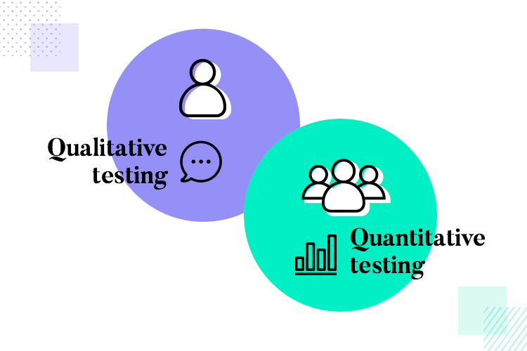
One aims to get to the individual traits of each user persona, taking notice of the small things and engaging in a conversation about the experience. The other analyses general trends and looks for troubled areas, analysing the collective behavior of users. What does each one offer? Does every project need both methods?
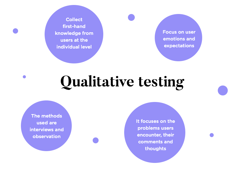
A qualitative user test is all about gathering first-hand knowledge about how users interact with the product or prototype. The focus is on the quality of the knowledge you gather, with an emphasis on how the user’s emotions and expectations evolve through the experience. This is what most of us go through in any product development, such as good old interviews and observation of task completion.
It’s true that most of the methods of testing designs are, in fact, qualitative. It’s about catching the details, going as far as you can with the resources you have. Most teams will dedicate serious time, money and effort into heatmaps, questionnaires, A/B tests and so on. This is when you want to get into how users felt, the problems they experienced and their comments, along with their thoughts the entire time (the so-called think-aloud protocol).
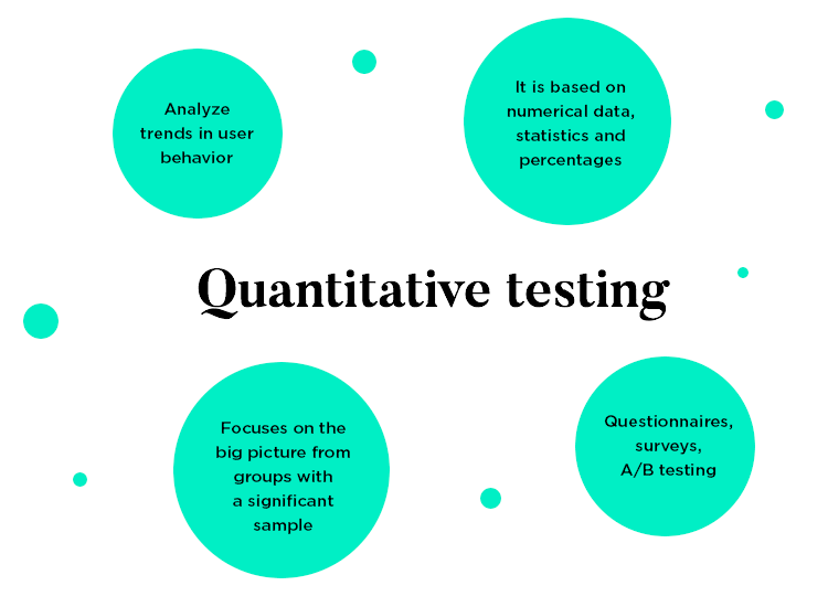
On the other hand, a quantitative user test looks for strength in numbers. This is about finding weak spots and leaks in the experience by catching trends in user behavior. A quantitative test requires a large volume of users to take the test, which makes for a generally more expensive endeavor.
In theory, pretty much any type of user test can be quantitative. Generally, the methods we use for quantitative testing tend to be task-oriented and skip all the individual questions, focusing on the big picture. This means that, more often than not, a quantitative user test is an unmoderated test that seeks to validate the key base of the design. Crucial things like navigation design or meeting business requirements are common topics for these studies.
But how many participants make for a quantitative test? Like many things in the UX design world, there isn’t one single right answer. Some teams will call a 100 participant study quantitative. Our friends over at the Norman Nielsen Group suggest a group of more than 35 is acceptable in their article on quantitative research methods. This will depend on how deep the project’s pockets are, how much time we have to validate the things we need to and how far along the project itself we are.
The main goal here is to identify areas where all users behave similarly, such as where the navigation flow for a task fails. For us here at Justinmind, when we say “quantitative study”, we tend to mean large scale studies with more than 200 participants. The ultimate goal here is to find trends, which means that if you go too small with your participant pool you may compromise the statistical accuracy of your test.
Quantitative and qualitative tests should never be used interchangeably. Each one has its own positives and negatives, and serve different purposes.
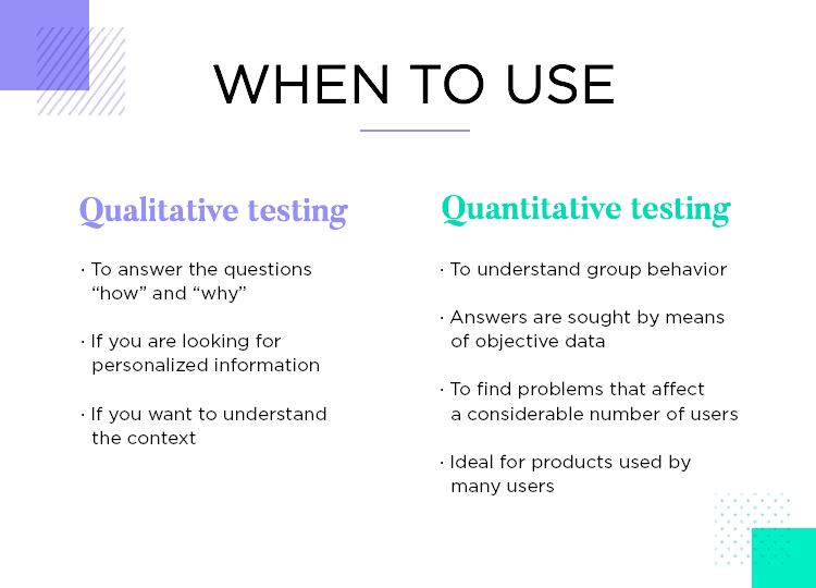
A qualitative test brings the user closer to the team and seeks insight from a more personalized test. You tend to have an actual conversation or at least get a lot of context from users. Afterwards, the team revisits what we learned from users and apply that to the design. This is about asking questions like why and how, taking close notes of what users think.
Since there are many different ways to go about qualitative testing, from heatmaps and tree tests to a simple list of tasks, there’s a lot of margin here. Each team will choose to make the most with the resources they have, with many engaging in constant testing in one way or another. This is the kind of test that can be put together quickly, especially when unmoderated.
Qualitative test questions you want to answer: Why did you pause there? Why do you think that didn’t work? What did you expect to happen there? How did you feel when you clicked that?
A quantitative test is all about objectivity and group behaviour. It doesn’t concern the individual thoughts of participants, forsaking the context around the user action. These tests are helpful in identifying areas where things go wrong, but don’t help us understand why that is. All we know is that at that point in the experience, many users have issues or fail to complete their tasks.
Because of the higher number of participants in quantitative tests, the costs can mount up rather quickly. On top of a saltier price tag, it’s true that it doesn’t give you much context for what causes the issues we find – so why do teams do it at all?
The answer is that if you have a large project, such as a banking app, validating the crucial features is definitely worth the cost. Can you ever imagine launching a banking app for a brand like Bank of America or Chase without making sure that users can do the basics and find their way around the app?
For apps that need to cater to hundreds of thousands of users, a qualitative test isn’t enough. What if there are other user personas out there we haven’t considered? What if the groups we used for the qualitative tests don’t go far enough? Can we afford to miss any detail? Companies that go for tests with 200+ participants aren’t willing to take any chances.
Quantitative tests in practice: Many teams go years without ever engaging in quantitative testing. It can be excessive for more niche products, smaller brands or even medium-sized companies. Usually, quantitative tests are for the big leagues.
Design and test hi-fi prototypes for web and mobile apps. Try it free!

The methods for qualitative testing of a product are widely known to design teams out there. You’ll recognize some classics of the world of usability, being implemented by UX researchers every day.
In both moderated and unmoderated testing, most design teams will have a list of tasks which users need to complete. It’s true that there is a whole world to discover when it comes to unmoderated and moderated tests. But for now, suffice to say that either one is appropriate for qualitative tests.
The key thing is to choose your tasks with care and invest in a tool that lets you get plenty of context and information from each participant even with unmoderated tests.
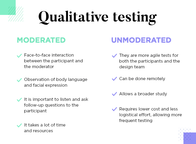
Generally, a moderated test implies face-to-face interaction between the participant and the moderator. This means that the moderator is right there to hear what the user thinks and feels, and is ready to ask follow-up questions that reveal more. There’s real value in observing participants’ body language and facial expressions, which is a major benefit of moderated qualitative tests.
On the other hand, unmoderated tests are more practical for participants and for the design team. It doesn’t require face-to-face interaction at all, which decreases costs and logistical obstacles to the test. This opens the door for a bigger study, more frequent testing and a steady project that validates its every move.
Both of these methods are here to validate the general architecture and structure of the product.
In tree testing, we present participants with a simple visual representation of the information architecture of the product. Participants are given an item or a piece of information and asked to place within one of the branches of the tree.
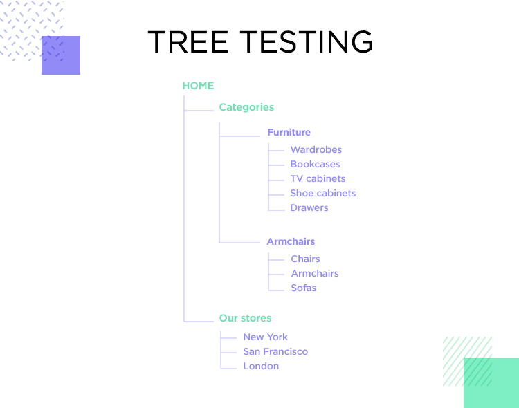
This will test the logic of your structure, by seeing how easy it is for participants to label and categorize the piece of information they are given. If they take too long or doubt between two labels, this can be seen as a red flag that says the architecture of the product isn’t as logical and clear as we thought.
In card sorting, we ask the opposite of participants. Instead of putting concepts into labels and categories we created for them, users create their own categories as they see fit. We give participants a series of cards with items or concepts on them, which are to be grouped as logically as possible by users.
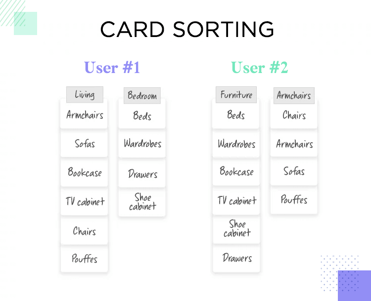
This points not just to what structure makes sense, but also to the user’s mental models and reasoning. Consider a list of furniture from sofas to stools. Participant one creates two categories: Living Room and Bedroom. Participant two has a completely different take on it: two categories are created called Seats and Tables. Which one is more valid to the rest of our users? Do all our labels make sense?
Design and test hi-fi prototypes for web and mobile apps. Try it free!

Both A/B and multivariate testing can be a powerful way of improving the user experience. It takes different versions of the same design and seeks to compare how users react to them.
The theory of A/B testing is very simple: we present two versions and we can select a winner according to user behavior. It’s a very practical way to find the right direction, especially if we invest in a good tool that takes note of everything users do and then presents us with the results in a visual way.
A/B testing basics: We split traffic into the page in question into the two versions, and compare the performance of both. Usually, the version with the higher conversion rate is declared the winner.
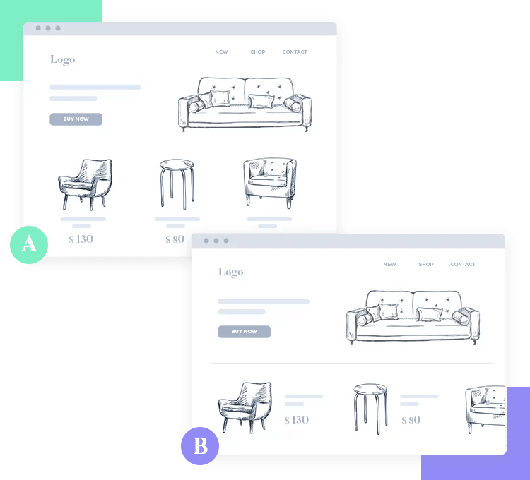
Multivariate testing works in a similar fashion, but instead of comparing two different versions, we compare several at the same time. This can be a handy way of narrowing down on what kind of design your users prefer from many options.
With that said, do bear in mind that the more versions we compare, the more traffic we need for the study to be statistically sound. This means that for big multivariate studies that seek to compare 4, 5 or 6 versions, we’ll need a lot of traffic. This makes the connection between multivariate testing and quantitative testing very strong.
Both these methods can be easily set up with their respective tools to create large-scale quantitative studies. Additionally, both can give lots of insight into how users process and react to your interface design. Remember that it’s always a good idea to have a professional prototyping tool at hand for quickly creating and comparing designs.
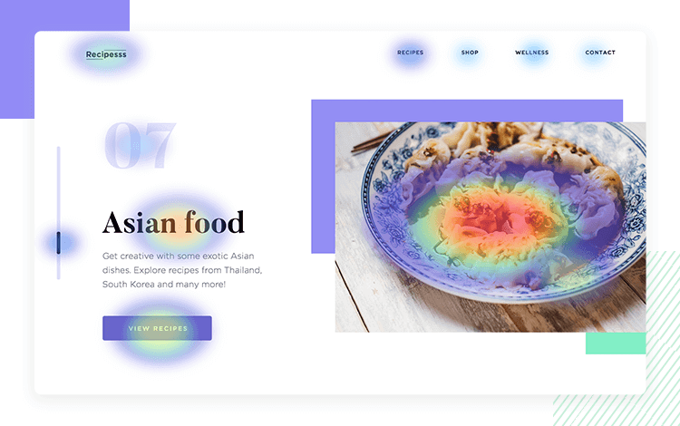
Eye tracking studies are all about identifying what users focus on. When first interacting with an interface, we have moments where our eye focuses on a component for long enough that we can process it. We also have other moments where our eyes scan the whole thing, and we get an understanding of what to expect without ever truly focusing on anything.
Heatmaps will tell us what parts of the interface users focus on the most, translating this data into a literal heat map where “hot” areas are those that got all the attention of participants. These hot areas are basically all of participant’s behavior added up into one conclusive representation of what they all dedicated their attention to.
Design and test hi-fi prototypes for web and mobile apps. Try it free!

You can use the following user testing tools to test both live products and in conjunction with your prototyping tool, some of which has integrations with Justinmind.
UserTesting has been widely used and loved by UX research teams all around the world. We love that it is a reliable tool that can store large sums of data and present it all in a visual way that we can grasp.
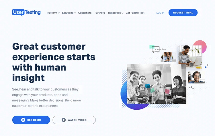
Among our favorite features is the Highlight Reel, which allows us to go back to important points in any interview with users. It helps teams to look back and spot the facial expressions and body language of participants, making it a perfect tool for qualitative research. UserTesting is quite powerful in bringing participants in, even when done remotely, so that the team can understand their feelings and dig into their expectations.
- Pricing: available upon request
While not as widely known as UserTesting, Lookback shouldn’t be overlooked as a great qualitative testing tool. We love that Lookback also makes the most of video interviews with users and recordings of participant’s facial expressions.
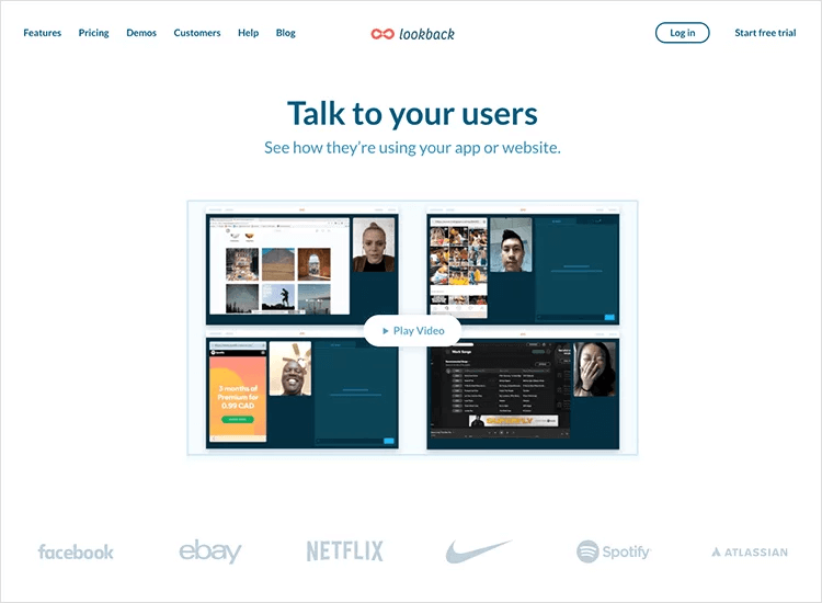
We love that Lookback allows the design team to timestamp video recordings of tests, making it much easier to catalog each time something went wrong or a participant got confused. It also offers great value for teams that are distributed across the globe, with team members having the possibility to watch a broadcast of the test recordings, no matter where they are.
- Pricing: from $49/month to $99/month
Sometimes, you don’t need a fancy usability testing tool with an endless list of features. Qualitative testing is about understanding the thinking process of participants – understanding how the interaction with the product affects their emotions and expectations. In that sense, a tool like Zoom can be of real value.
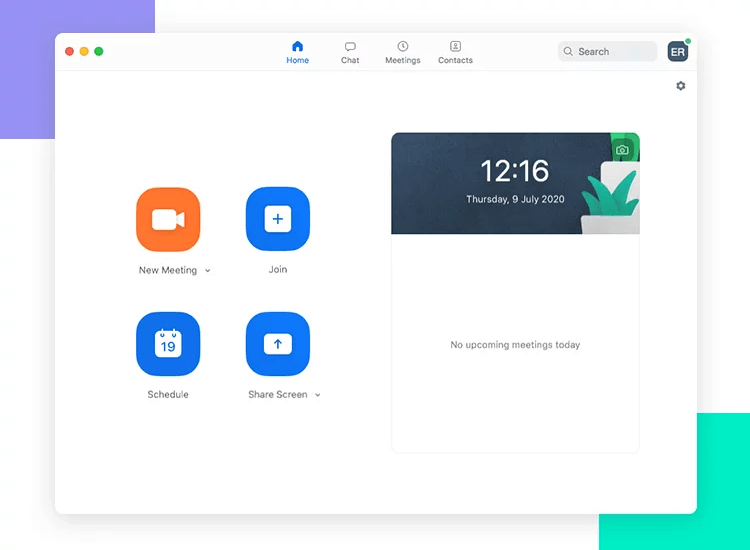
We love that Zoom is as straightforward as it can be, with a simple URL being the address to the meeting or test session in question. The video keeps its quality even with shady internet connection where other platforms would result in choppy videos that lead us to miss the details. Zoom can help the design team get up close and personal with participants, making for a sound way to interview and observe participants.
- Pricing: Free until 100 participants
FocusVision is a versatile usability testing tool that is prime qualitative research material. It’s great for live interviews and diary studies. This is all about getting the design team to remotely interview participants and even allows for focus groups with a mix of present and remote participants. Also exciting is the fact that it supports a 360 degree view of participants in interviews, boosting the context we get from each interview.

It’s a wonderful tool that tries to maximize what we can learn from each interaction with the participants, giving the team both the means and the platform to gather data.
Pricing: Available upon request
Design and test hi-fi prototypes for web and mobile apps. Try it free!

VWO is a staple in the A/B testing industry. The tool itself is wildly complete, enjoying features that allow for quick testing and represent a small learning curve for design teams. The tool supports both simple A/B tests as well as full-on multivariate tests that compare many different designs.
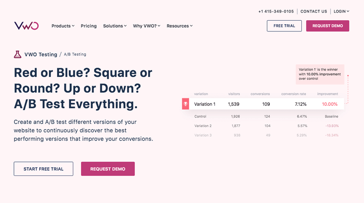
Users sing praises for the tool’s easy interface and SmartStats – the tool’s visual way of translating the data it gathers with the tests. With a simple and quick setup, VWO can deal with huge sums of data and make it easy to draw conclusions from it all. It’s perfect for quantitative testing!
Pricing: from $199/month for the testing package
Another pretty big name from this list. Userzoom is quite powerful in the sense that it gives us a lot of freedom to orchestrate test studies and helps us scale them.
The platform itself allows teams to bring in their own participants, but also offers the possibility of simply using their database of participants – all 120 million of them! It makes for a perfect platform for large-scale quantitative studies, helping you recruit all the users and making sense of all the data you obtain from the study.

Even better? Userzoom is fully integrated with top prototyping tools such as Justinmind. Combining the power of powerful quantitative testing and high-fidelity prototyping can boost any UX project, making for a design that was carefully validated at every turn.
Pricing: available upon request
Quantitative testing is all about observing the common trends in behavior. That includes all sorts of testing methods we can scale, including surveys. Less illuminating than all-out interviews with users, surveys can still be revealing when analysed in bulk. That’s why we decided to include SurveyMonkey, a widely used survey tool.
This opens the door to surveys about how users might feel with respect to a certain design, about the idea for the solution and even the main features of the product. In that sense, a simple survey tool can still help us find the right path. The great thing? Their surveys are easy to put together and even easier to share. It makes for a very handy tool to have in your quantitative toolbox!
Pricing: Free plan available, Flex plan starts at $22/month
Hotjar makes for a very flexible tool that definitely adds value to any project. Thought of as a tracking tool for existing products, it makes for a great ally when it comes to quantitative testing. Hotjar makes easy work out of heatmaps, but also offers other features that can offer the best from both worlds: quantitative and qualitative features.
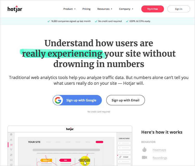
Focusing on more quantitative features, we absolutely love the heatmaps feature of the tool which includes click, scroll and tap heatmaps. We also like the polls and surveys features, which also point to serious quantitative power. As the cherry on top of the testing cake, the tool also supports interviews and session recordings.
Pricing: Free plan available. Prices start at $29/month
Testing a product design isn’t just about having a functioning product. Both qualitative and quantitative ways of testing aim to reveal weak spots in the design, helping the design team understand what users think and feel.
Qualitative testing is the equivalent of placing a magnifying glass over the user experience, seeking to understand even the smaller details. It looks at the individual expectations and feelings of participants, creating a more defined image of what the final user actually wants. With the classic testing methods we know and love, most of the usability tests we do are qualitative.