UX research can be a driving force in design. But what methods are there? How do we approach it? Find out in this post!
There’s lots of talk about UX research. Designers all around the world count on UX researchers in order to see the path that leads to a successful product. But when does the research start? When does it end? What are the methods at our disposal?
Design wireframes and prototypes for your UX research with Justinmind

Let’s take some time to look into a big name in the UX industry that can often be misunderstood. In this post, we’ll go over exactly what UX research is, what methods there are and what it all means for the final design. Lastly, we’ll also take a look at what it takes to be a UX researcher, as well as some online courses that designers can take to become more fluent in this aspect of UX design.
UX research is the process of understanding users; their needs, behaviors, motivations, and pain points to design better products and experiences. It helps teams make informed decisions, reducing guesswork and ensuring that products are intuitive, efficient, and user-friendly.
This research happens at every stage of the design process. It starts with early exploration, like user interviews and competitive analysis, to define user needs. As the project progresses, usability testing and behavioral studies help refine designs. Even after a product launches, continuous research ensures it evolves based on real user feedback.
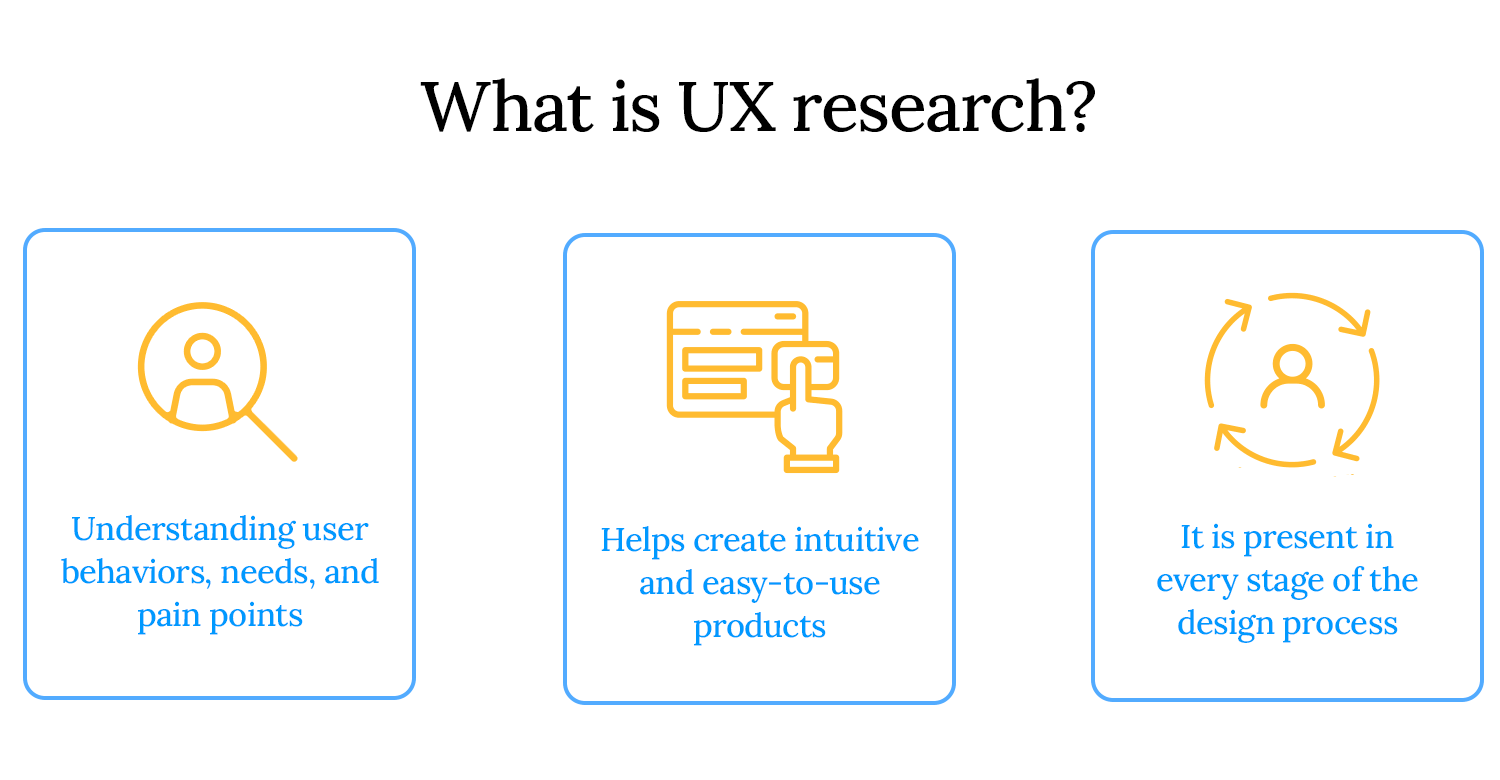
At its core, UX research is about solving real problems for real people. It uncovers opportunities, eliminates friction, and ultimately leads to products that users love.
User experience research isn’t just a step in the design process, it’s a business strategy. Companies that prioritize UX research build products that resonate with users, drive engagement, and outperform competitors. Here’s why UX research is more important than ever:
- The rise of data-driven decision-making: businesses today don’t have to rely on guesswork to make decisions. Data does the heavy lifting. UX research gives teams real insights into how people use their products, helping them make smarter choices based on actual user behavior instead of assumptions.
- AI and machine learning in UX research: with AI-powered tools, researchers can now analyze large amounts of data, identify patterns, and predict user behavior. While technology can enhance research, human interpretation remains essential for understanding emotions, motivations, and context.
- Ethical UX research and inclusive design trends: good UX research goes beyond usability, it ensures accessibility, inclusivity, and ethical responsibility. From designing for diverse user groups to respecting data privacy, modern UX research focuses on creating fair and inclusive digital experiences.
- How companies use UX research to boost conversion rates: understanding user behavior leads to better business outcomes. UX research helps companies optimize website flows, reduce friction in checkout processes, and refine onboarding experiences. All of which directly impact conversion rates and customer retention.
A UX researcher is responsible for uncovering user needs and translating them into actionable insights that guide product design. They help teams make evidence-based decisions by studying how users interact with products and identifying pain points.
Key responsibilities:
- Conducting user interviews, surveys, and usability tests
- Analyzing qualitative and quantitative data to find patterns
- Collaborating with designers, product managers, and developers
- Presenting research findings in a way that influences design decisions
- Ensuring ethical and inclusive research practices
Design wireframes and prototypes for your UX research with Justinmind

UX research comes in different forms, each serving a unique purpose. Some methods focus on numbers and trends, while others dive deep into user emotions and motivations. Some help teams generate new ideas, while others test and refine existing ones. Here’s a breakdown of the key types of UX research and how they fit into the design process.
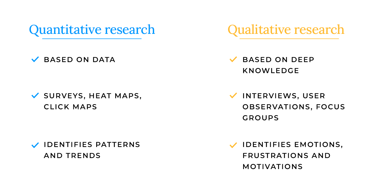
These two approaches help answer different questions about users.
- Quantitative research is all about numbers. It looks at large data sets like survey results, heatmaps, and analytics to identify patterns and trends. It helps teams understand what is happening, such as how many users drop off at checkout or how often a feature is used.
- Qualitative research focuses on deeper insights. It includes methods like interviews and user observations to understand why users behave the way they do. This approach captures emotions, frustrations, and motivations that raw numbers might miss.
Both types of research work best together: quantitative shows the big picture, while qualitative helps explain the story behind the data.
- Behavioral research observes what users actually do. Usability testing, session recordings, and eye-tracking studies fall into this category. It helps uncover usability issues and understand real user interactions.
- Attitudinal research focuses on what users say they think or feel. Surveys, interviews, and focus groups help teams collect opinions, expectations, and feedback.
Sometimes what users say and what they do don’t match. Behavioral research guarantees teams see the full picture instead of relying only on self-reported answers.
Research isn’t just about testing, it also helps generate new ideas.
- Generative research happens early in the design process. It helps teams explore user needs, discover pain points, and identify opportunities. Methods like field studies, user interviews, and diary studies help shape the direction of a new product.
- Evaluative research comes later and focuses on refining designs. Usability tests, A/B testing, and surveys help teams validate decisions and improve the user experience before launch.
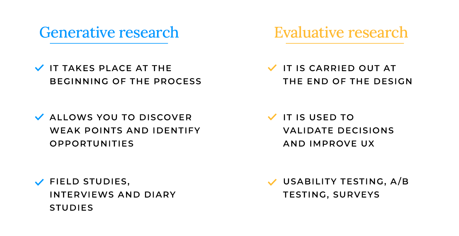
Think of generative research as setting the stage and evaluative research as fine-tuning the performance.
Not all research happens face-to-face, especially after the shift to remote work and digital collaboration.
- In-person research offers rich, real-time observations. Seeing users interact with a product in a controlled setting (like a usability lab) allows for detailed feedback and body language cues.
- Remote research makes testing more flexible and accessible. It allows researchers to reach a wider audience, especially users in different locations. Remote usability testing, unmoderated studies, and online surveys help teams gather insights without geographical barriers.
UX research isn’t just about gathering data, it’s about choosing the right methods to uncover real user needs and improve design decisions. The right approach depends on the stage of the project, the type of insights needed, and the resources available.
Some research methods focus on user behavior, others on user opinions. Some help generate ideas, while others validate solutions. Here’s a look at the most effective UX research methods and when to use them.
One of the most valuable UX research methods, user testing helps teams see how people interact with a product in real-world scenarios. It reveals usability issues, pain points, and areas for improvement.
When to use it: throughout the design process, from early prototypes to post-launch optimizations.
Key takeaway: observing real users in action helps teams make design decisions based on actual behavior, not assumptions.
Before committing to development, prototypes and wireframes allow teams to test ideas, refine user flows, and validate concepts.
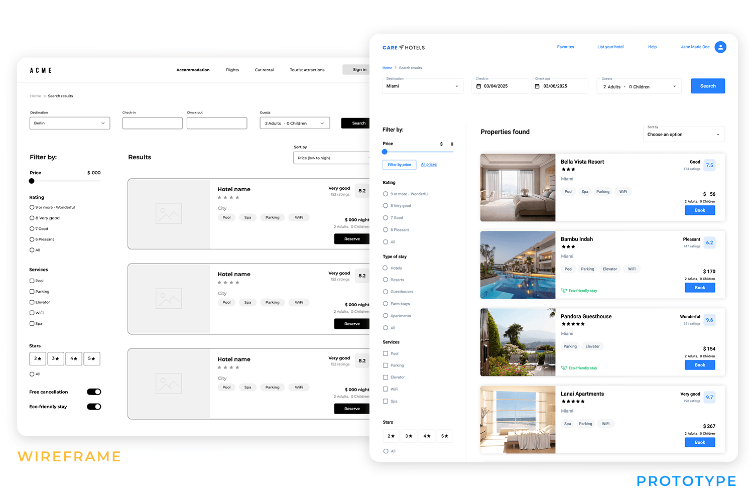
When to use it: early design stages to explore structure, layout, and interactions.
Key takeaway: testing prototypes early helps catch usability issues before they become expensive fixes.
Talking directly to users provides deep insights into their motivations, needs, and frustrations. Interviews offer in-depth, one-on-one feedback, while focus groups provide broader discussions on user expectations.
When to use it: at the start of a project to define user needs and refine concepts.
Key takeaway: understanding user perspectives early leads to designs that better align with real needs.
Research findings are more effective when translated into actionable tools. User personas represent key audience segments, user stories describe real-world scenarios, and use cases map out specific interactions with a product.
When to use it: after initial research to align teams on user needs and design goals.
Key takeaway: making research insights tangible keeps users at the center of design decisions.
Testing different versions of a design helps determine what works best. A/B testing compares two variations, while multivariate testing examines multiple elements at once.
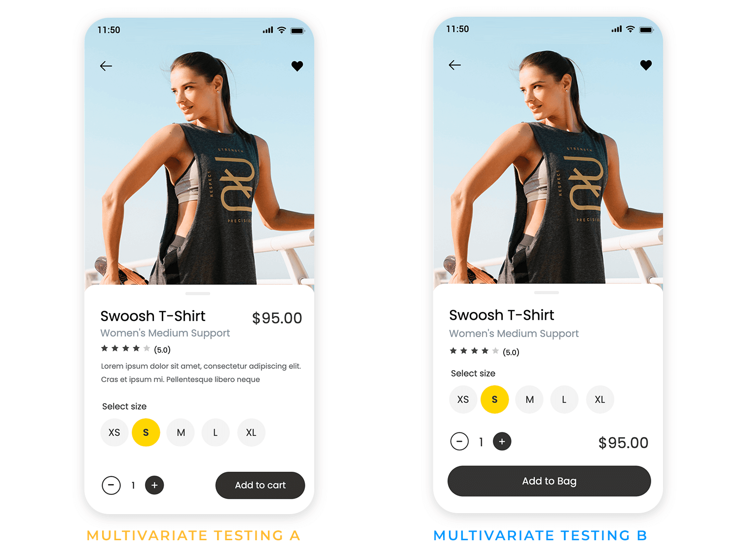
When to use it: when optimizing UI elements, content, or workflows in a live product.
Key takeaway: data-driven testing helps refine UX research findings into practical design improvements.
Some user behaviors and challenges only emerge over time. Diary studies and longitudinal research track users over days, weeks, or months to capture ongoing experiences.
When to use it: for products that involve long-term engagement or evolving user needs.
Key takeaway: studying users over time reveals insights that short-term research might miss.
AI-powered tools can analyze large data sets, identify patterns, and predict usability issues. While automation speeds up UX research, human interpretation remains essential.
When to use it: for large-scale research, trend analysis, and usability monitoring.
Key takeaway: AI can enhance UX research but should complement, not replace, human insight.
Good UX design serves everyone. Accessibility research ensures products are usable for people of all abilities. This includes testing with assistive technologies, improving contrast and readability, and designing for different input methods.
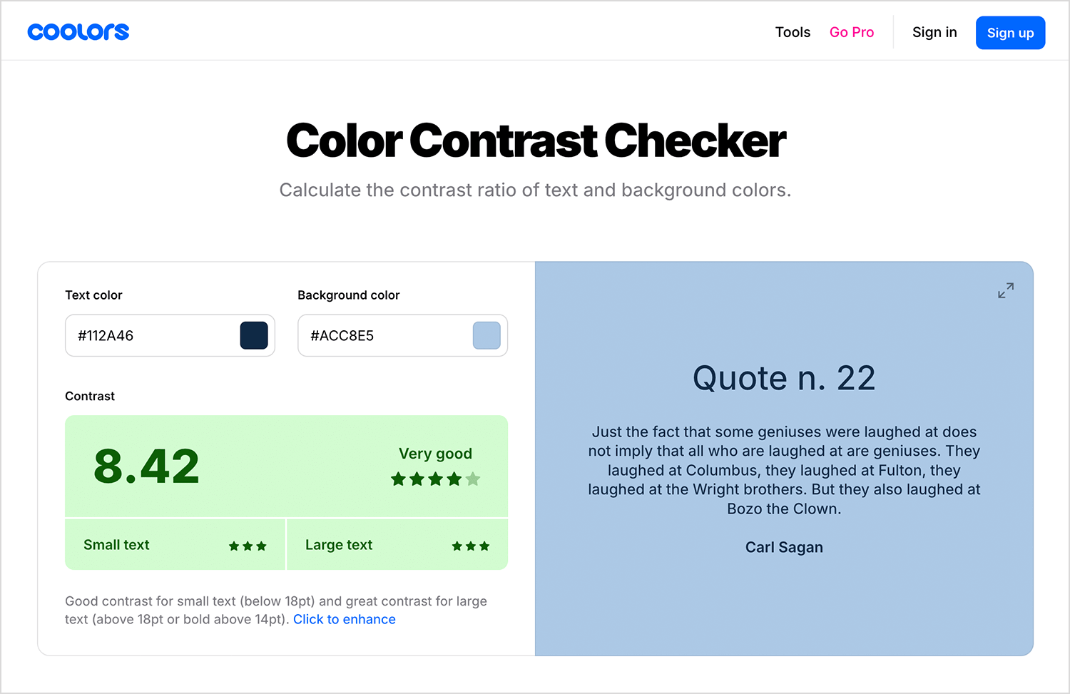
When to use it: at every stage of design and testing.
Key takeaway: inclusive UX research leads to better products for all users, not just a select few.
Design wireframes and prototypes for your UX research with Justinmind

- Choose the right UX research method: each stage of the design process requires different research methods. Early-stage interviews and diary studies uncover needs, while user testing and A/B testing refine solutions.
- Recruit a diverse user base: testing with a single type of user can lead to biased results. Recruiting participants from different backgrounds, abilities, and usage patterns leads to more accurate findings.
- Reduce bias in research: leading questions, observer influence, and personal assumptions can skew UX research results. Keeping research neutral ensures reliable insights.
- Follow ethical and privacy guidelines: transparency matters. Always obtain informed consent, protect user anonymity, and comply with GDPR, CCPA, and other data privacy laws.
- Use AI to support, not replace, UX research: AI tools can speed up analysis, but human judgment is necessary to interpret results. Use AI for pattern detection and large-scale insights, but rely on researchers for deeper understanding.
- Combine multiple research sources: no single UX research method tells the full story. Triangulating data from different methods like combining qualitative interviews with quantitative A/B tests leads to well-rounded insights.
- Make research actionable: UX research should lead to clear design improvements. Synthesizing findings into concise reports, visuals, and recommendations helps product teams turn insights into real-world changes.
Having the right tools can make UX research more efficient, insightful, and actionable. Whether you’re creating prototypes, running user tests, or leveraging AI for deeper analysis, these tools help streamline the process.
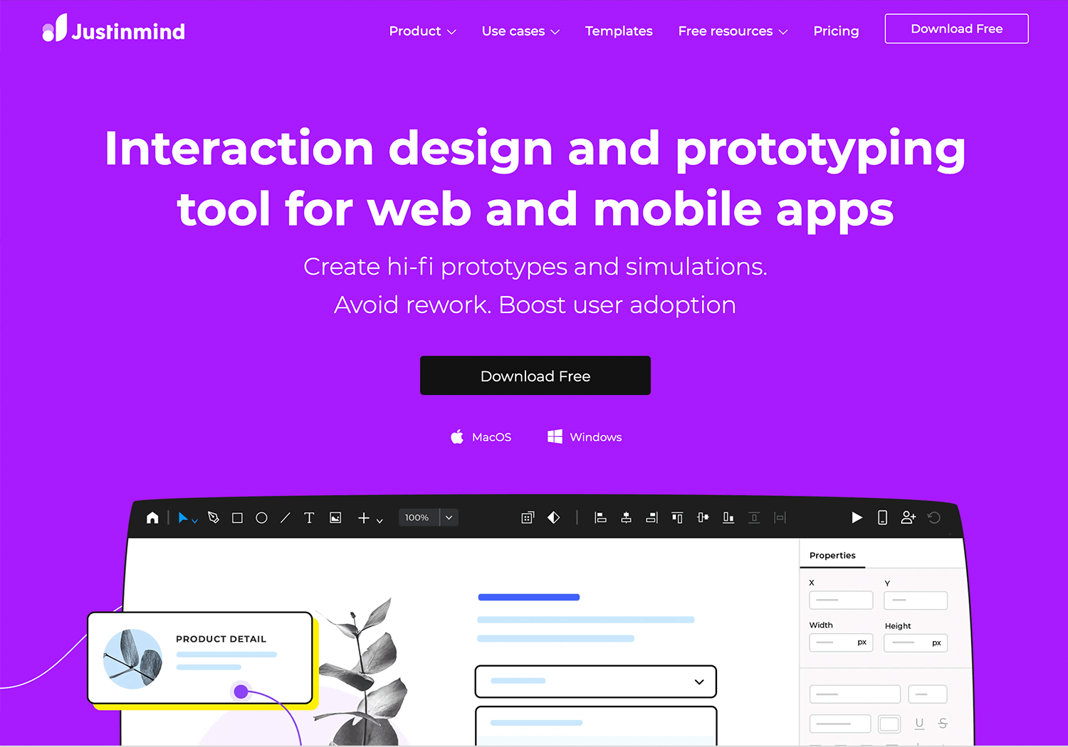
Justinmind is a comprehensive prototyping tool that allows designers to create interactive wireframes and high-fidelity prototypes without coding.
Advantages
- Supports both low and high-fidelity designs.
- Offers a wide range of UI elements and templates.
- Facilitates collaboration with team members.
Disadvantages
- Can have a learning curve for beginners.
- Performance may slow down with complex prototypes.
Pricing
- Free plan available; paid plans start at $19/month.
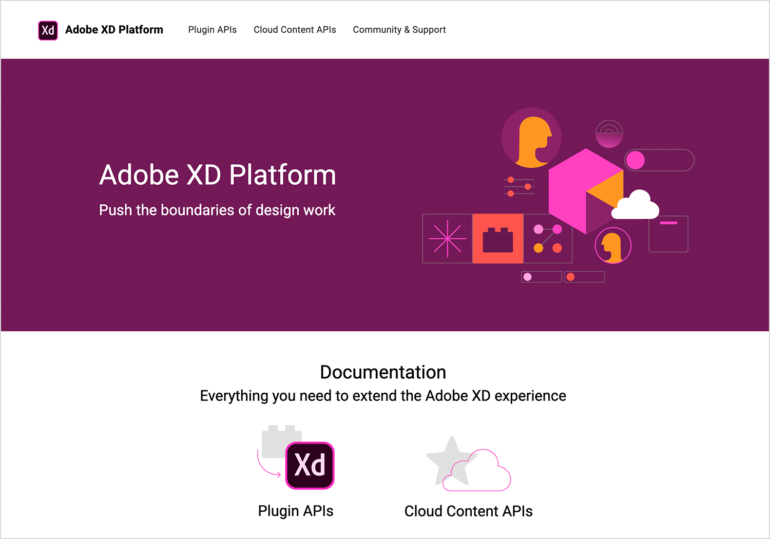
Adobe XD is a vector-based tool for designing and prototyping user experiences for web and mobile apps.
Advantages
- Seamless integration with other Adobe products.
- Supports voice prototyping and responsive design.
- Regular updates with new features.
Disadvantages
- Some features require Adobe Creative Cloud subscription.
- Limited third-party integrations compared to competitors.
Pricing
- Free plan available; paid plans start at $9.99/month.
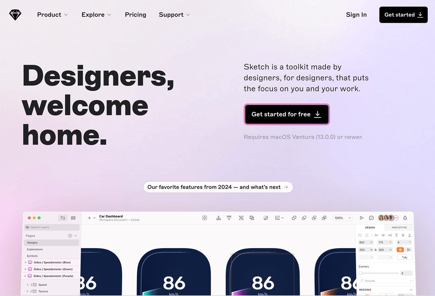
Sketch is a vector-based design tool primarily used for UI and UX design, offering robust prototyping capabilities.
Advantages
- Intuitive interface tailored for designers.
- Extensive library of plugins and integrations.
- Strong community support.
Disadvantages
- Mac-only application.
- Lacks built-in real-time collaboration; requires plugins.
Pricing
- $10 per Editor per month, billed yearly.
- Or $12 per Editor per month, billed monthly.
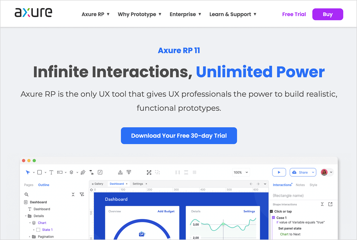
Axure RP is a powerful tool for creating wireframes, prototypes, and documentation, suitable for complex projects.
Advantages
- Supports advanced interactions and conditional logic.
- Offers detailed specifications for developers.
- Suitable for complex and data-driven prototypes.
Disadvantages
- Steeper learning curve.
- Higher price point compared to other tools.
Pricing
- Pro plan at $29/month, or team plan at $49/month.
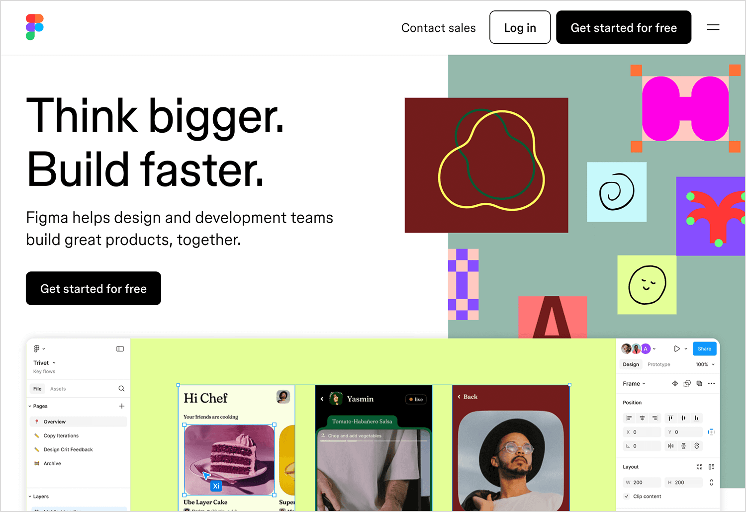
Figma is a cloud-based design tool that enables real-time collaboration for designing interfaces and prototypes.
Advantages
- Real-time collaboration capabilities.
- Accessible from any device with a browser.
- Extensive plugin ecosystem.
Disadvantages
- Requires a stable internet connection.
- Advanced features may require a learning curve.
Pricing
- Free plan available; paid plans start at $15/editor/month.
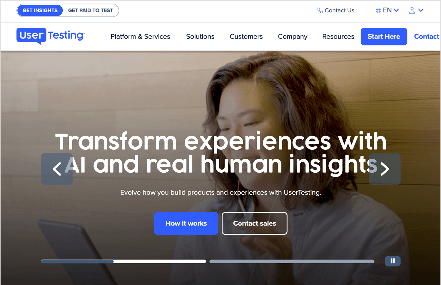
UserTesting is a platform that provides on-demand human insights, allowing companies to see and hear the experiences of real users as they engage with products.
Advantages
- Access to a large and diverse panel of users.
- Quick turnaround for feedback.
- Supports both moderated and unmoderated tests.
Disadvantages
- Higher cost, which may not be suitable for small businesses.
- Limited customization in participant selection.
Pricing
- Custom pricing based on enterprise needs; contact sales for details.
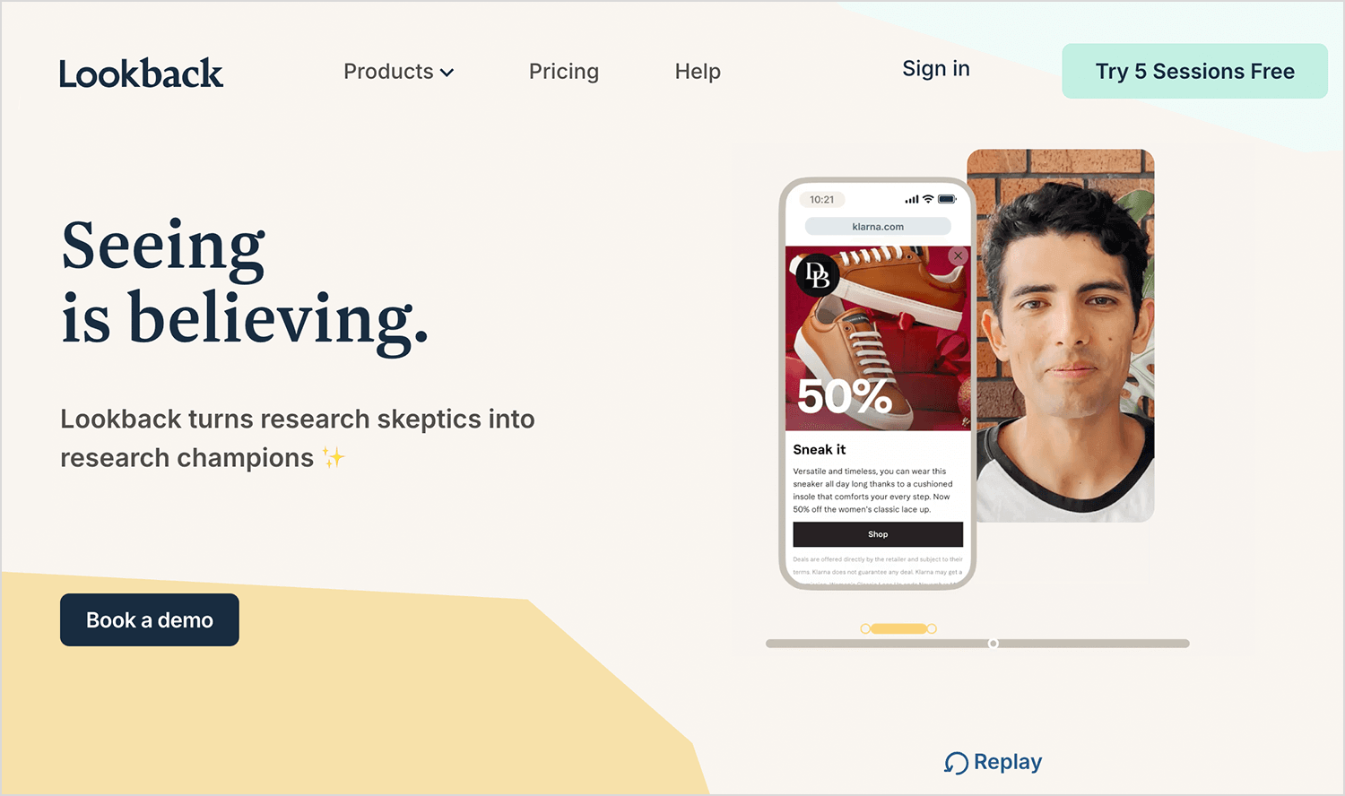
Lookback is a user research platform that enables teams to conduct live moderated and unmoderated research sessions with real users.
Advantages
- Supports live (moderated) and self-guided (unmoderated) sessions.
- Allows real-time collaboration and observation.
- Records sessions for later analysis.
Disadvantages
- Requires stable internet connection for live sessions.
- Some users report occasional technical glitches.
Pricing
- Free trial available; paid plans start at $25/month.
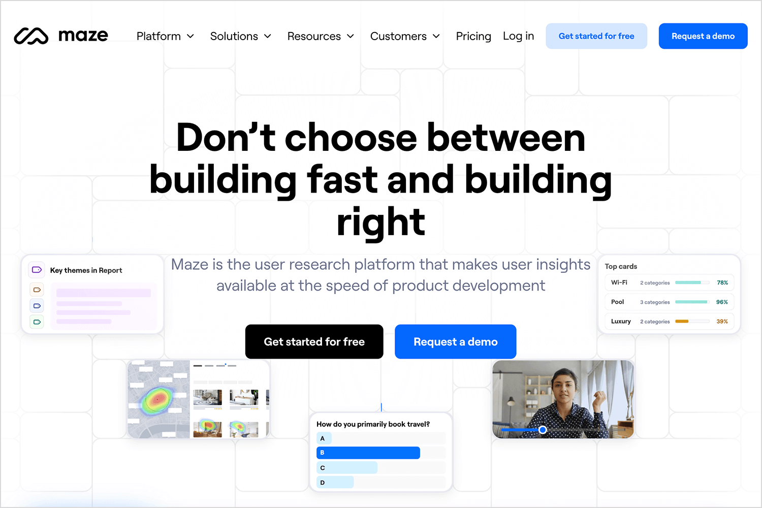
Maze is a rapid testing platform that turns your prototypes into actionable insights from real users, helping teams test and learn quickly.
Advantages
- Integrates with design tools like Figma, Sketch, and Adobe XD.
- Provides quantitative data with actionable metrics.
- Supports unmoderated testing with real users.
Disadvantages
- Limited qualitative feedback options.
- Some advanced features locked behind higher-tier plans.
Pricing
- Free plan available; paid plans start at $99/month.
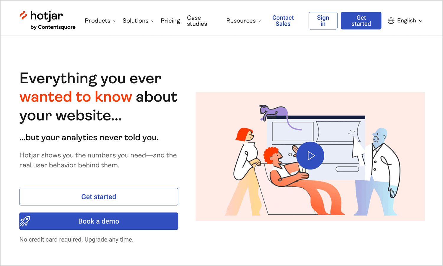
Hotjar is a comprehensive user behavior analytics platform that offers tools like heatmaps, session recordings, and surveys to help understand how users interact with websites.
Advantages
- Provides heatmaps and session recordings to visualize user interactions.
- Offers in-the-moment feedback tools like surveys and polls.
- Seamlessly integrates with various platforms, enhancing its versatility.
Disadvantages
- Features are divided into separate packages (Observe, Ask, Engage), which can be costly when combined.
- High costs for high-traffic sites.
Pricing
- Free forever with limited features, or plans starting at $32/month.
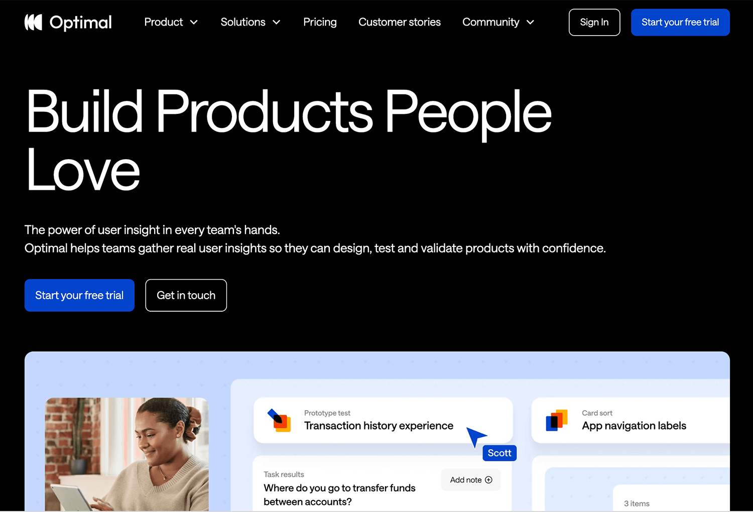
Optimal Workshop is a suite of user research tools focused on improving information architecture and usability through methods like card sorting and tree testing.
Advantages
- Excels in information architecture research with dedicated tools.
- Intuitive design makes it accessible for researchers of all levels.
- Provides detailed insights and visualizations to inform design decisions.
Disadvantages
- Primarily targets information architecture, which may not cover all UX research needs.
- Some advanced functionalities require extra payments.
Pricing
- Plans starting at $107/month.
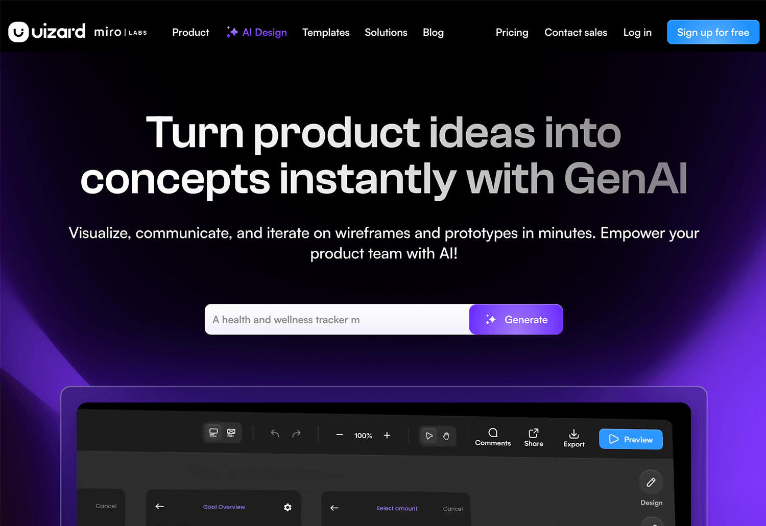
Uizard is an AI-driven design tool that transforms hand-drawn sketches into digital wireframes and prototypes, streamlining the design process.
Advantages
- Quickly converts sketches into editable designs.
- User-friendly to both designers and non-designers.
- Facilitates real-time teamwork on design projects.
Disadvantages
- May not cater to complex design needs.
- Some users might require time to adapt to its functionalities.
Pricing
- Free including basic features., or plans starting at $12.
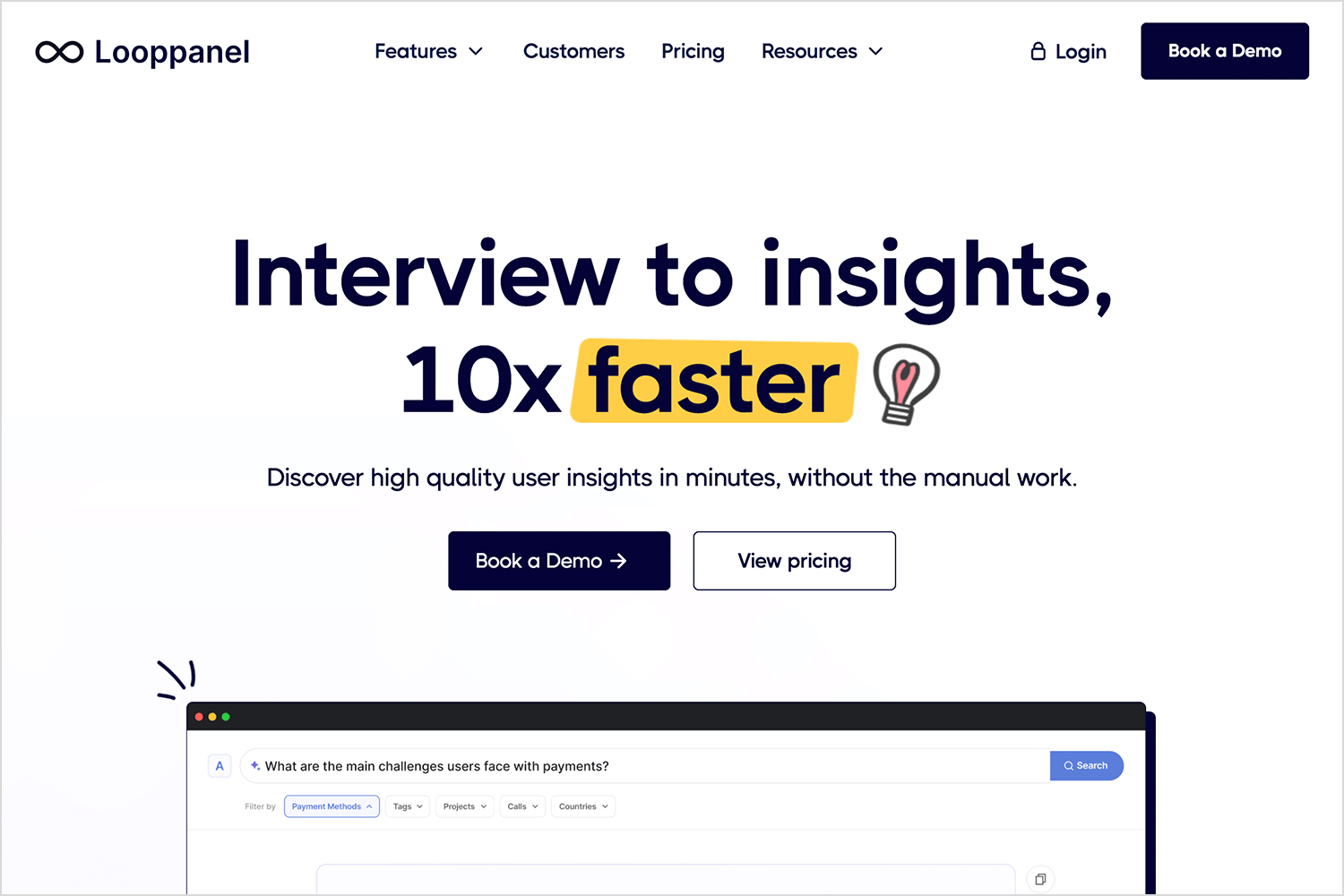
Looppanel is an AI-powered UX interview assistant that automates transcription, detects sentiment, highlights key themes, and generates concise summaries.
Advantages
- Real-time transcription and analysis.
- Sentiment detection for understanding user emotions.
- Automated summarization of key insights.
Disadvantages
- Relatively new in the market; may lack some advanced features.
- Pricing details are not publicly disclosed.
Pricing
- $30 per month (equivalent to $324 per year, offering one month free).
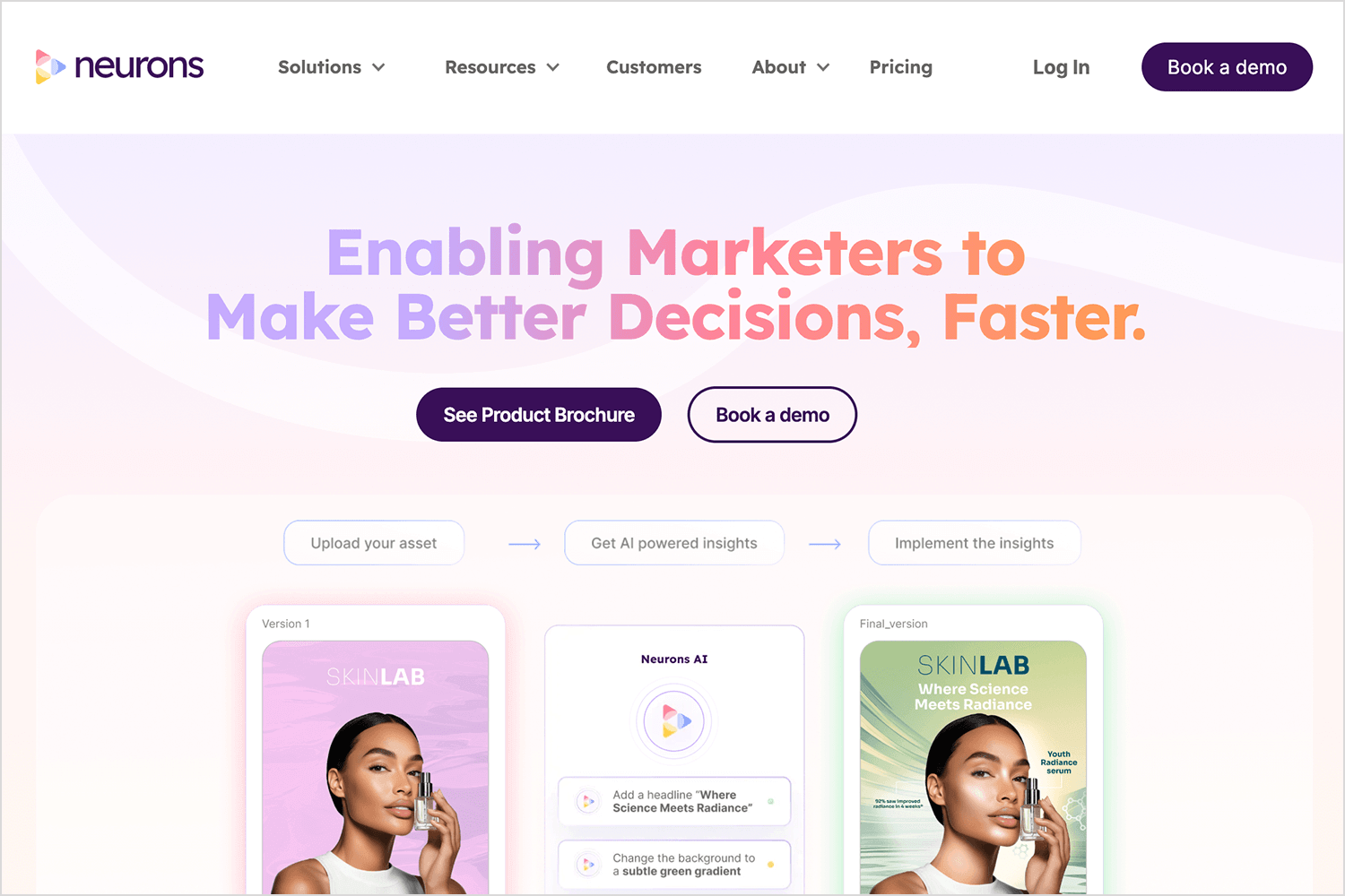
Neurons combines neuroscience and machine learning to offer predictive insights into user behavior, allowing designers to test and validate prototypes effectively.
Advantages
- Predictive AI for one-click validation of designs.
- AI-generated heatmaps to identify user attention areas.
- Benchmarking against industry standards.
Disadvantages
- Custom pricing may be high for small teams.
- Requires learning to interpret neuroscience-based insights.
Pricing
- Custom pricing based on team size and requirements.
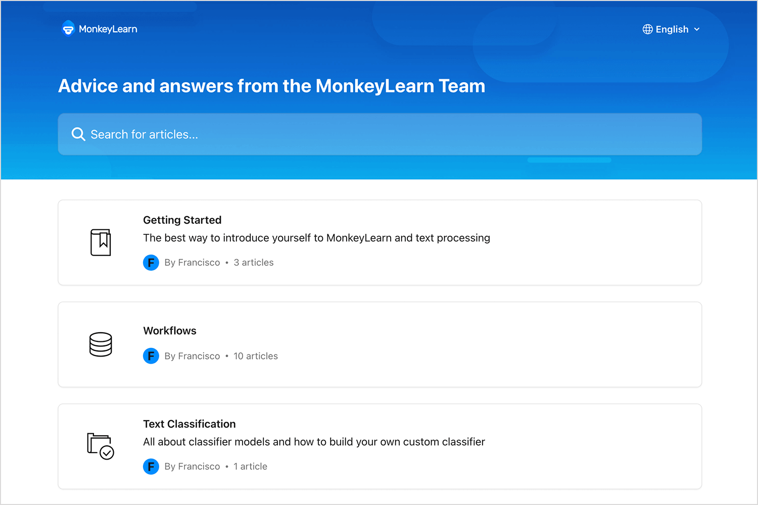
MonkeyLearn is an AI-powered text analysis tool that helps UX researchers perform sentiment analysis, keyword extraction, and topic classification on user feedback.
Advantages
- Customizable text analysis models.
- Real-time data processing.
- Integration with various data sources.
Disadvantages
- May require technical expertise to set up custom models.
- Pricing can escalate with high data volumes.
Pricing
- Free plan available; paid plans start at $299 per month.
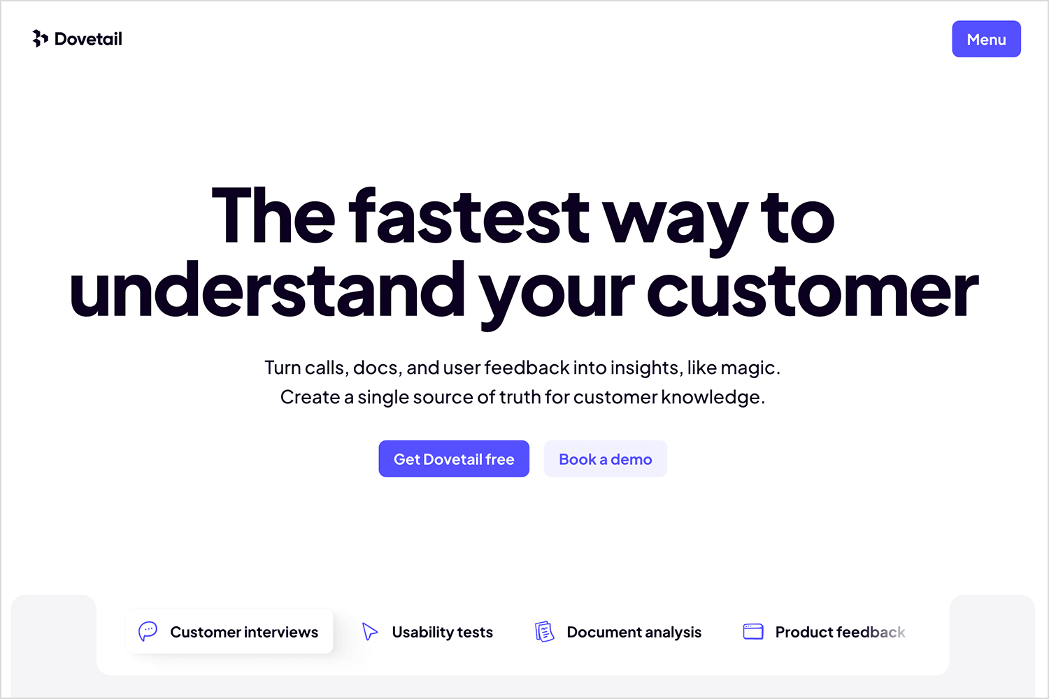
Dovetail is a research repository that uses AI to organize, tag, and analyze UX data, facilitating efficient synthesis and collaboration.
Advantages
- AI-powered tagging for faster research synthesis.
- Collaboration tools to share findings with teams.
- Automated themes and keyword detection.
Disadvantages
- Pricing may be high for small teams.
- Some users may prefer more customization options.
Pricing
- Free plan available; paid plans start at $29 per user per month.
Design wireframes and prototypes for your UX research with Justinmind

If you’re looking to break into UX research or level up your skills, the right course can make a big difference. Whether you’re aiming for a UX researcher job at a top company or just want to refine your approach to user insights, learning from industry experts can give you an edge.
There’s no single path to becoming a UX researcher. Some come from psychology, others from design or data science. The good news? There are plenty of courses and certifications tailored to different experience levels. From hands-on user testing to mastering research methodologies, these programs can help you build a solid foundation (and boost your resume for those UX researcher jobs).
Let’s look at some of the best courses out there.
The usability testing and UX research course can be found on Udemy. Taught by Matthew Nuzum, this online class seeks to condense 20 years of UX research experience into a class designers can take in their own time. It covers everything from the theory and basics of UX research and different methods, all the way into practical matters like writing unbiased questions.
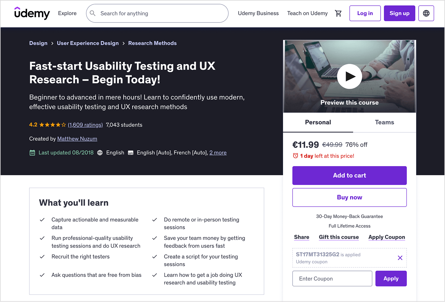
- Price point: $100 (full price)
This course is a part of a larger education from the Norman Nielsen Group. The UX certificate covers all the main aspects of UX design and students, but offers a more focused option for those who are looking to dive into the research. Altogether, NN Group offers about 13 courses that focus on UX research. Students only need to take 5 out of the 13 in order to obtain the UX research specialty.

- Price point: $3573 per person
This online UX research course can be found in Coursera, one of the most well-established distance learning platforms out there. The research and prototyping course is all about learning to quantify what makes a good user experience, exploring different methods – with a focus on translating data into actionable insights. Students praise the course for its attention to detail, with classes available in many languages.
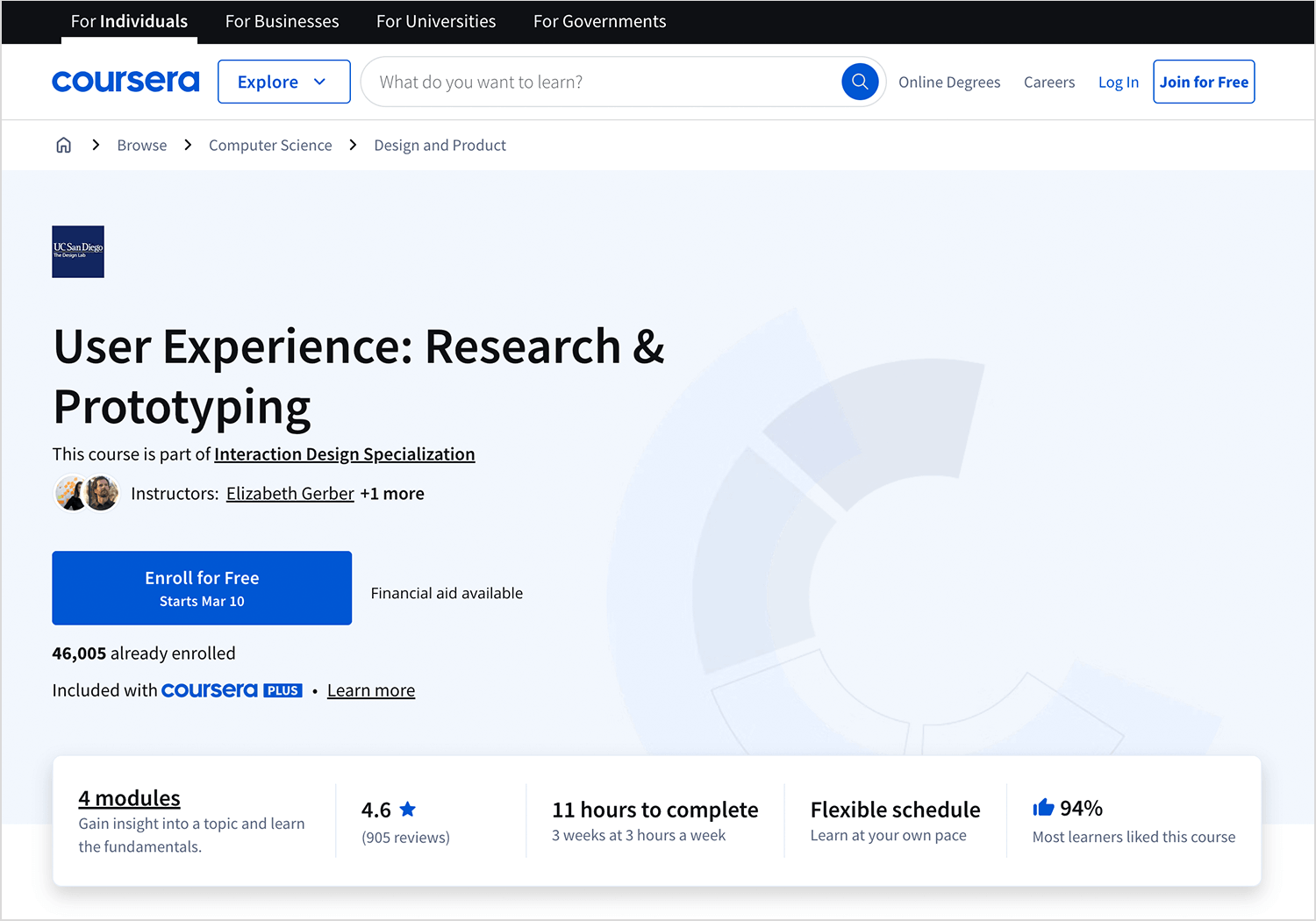
- Price point: starts at $39 for monthly subscriptions
Taught by HEC Montreal, this UX research course can be found in EdX. The course focuses on teaching students how to collect data that is relevant to the project in any design phase, using empathy and statistics to find the best solutions. One of the best things about this course is that, since it’s offered on EdX, anyone is free to pursue it for free. Those of us who want a more visible result for the course can add an official certificate for a fee.
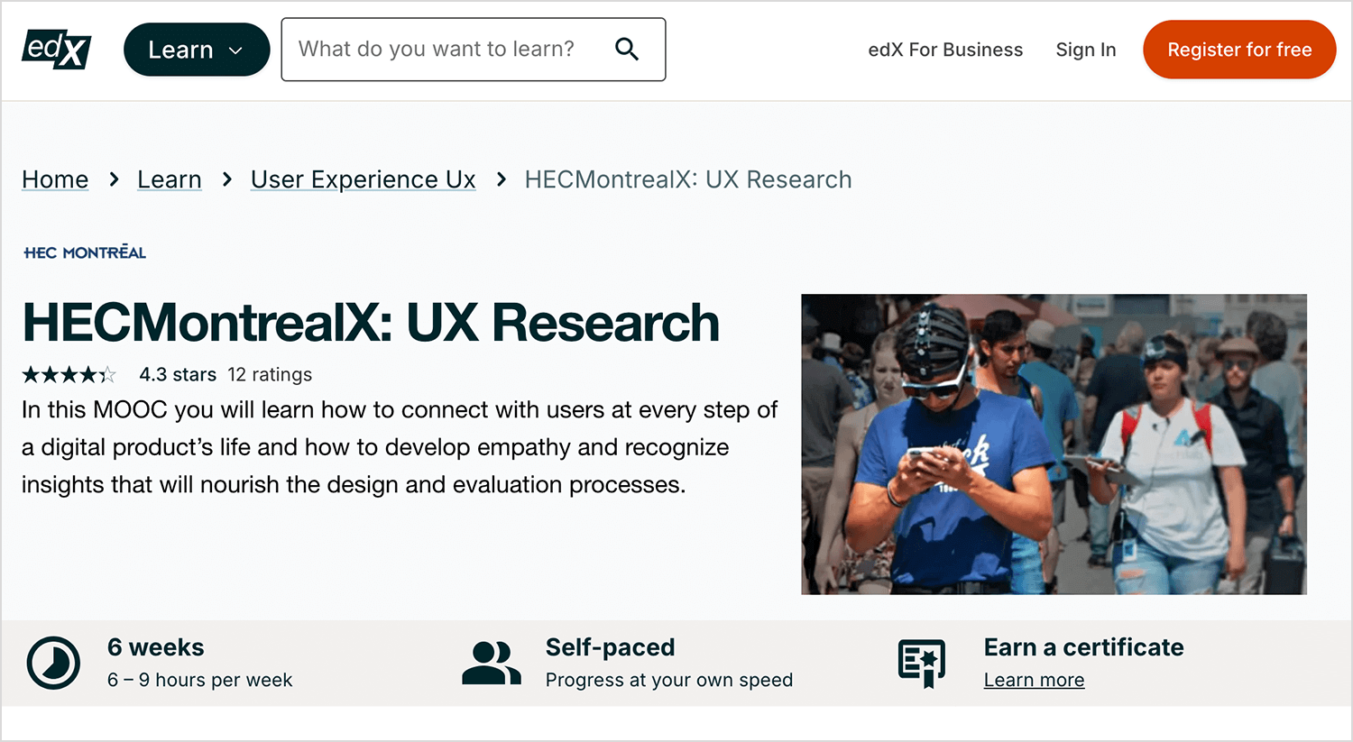
- Price point: $225 for a certificate
We love that this course takes a more specific look at UX research: doing things on a large scale. It’s not often that design teams have to handle vast amounts of data in a huge research study – but it’s possible. Big projects can choose to study a lot of users in order to create a product that doesn’t disappoint, and this course helps us prepare for that.
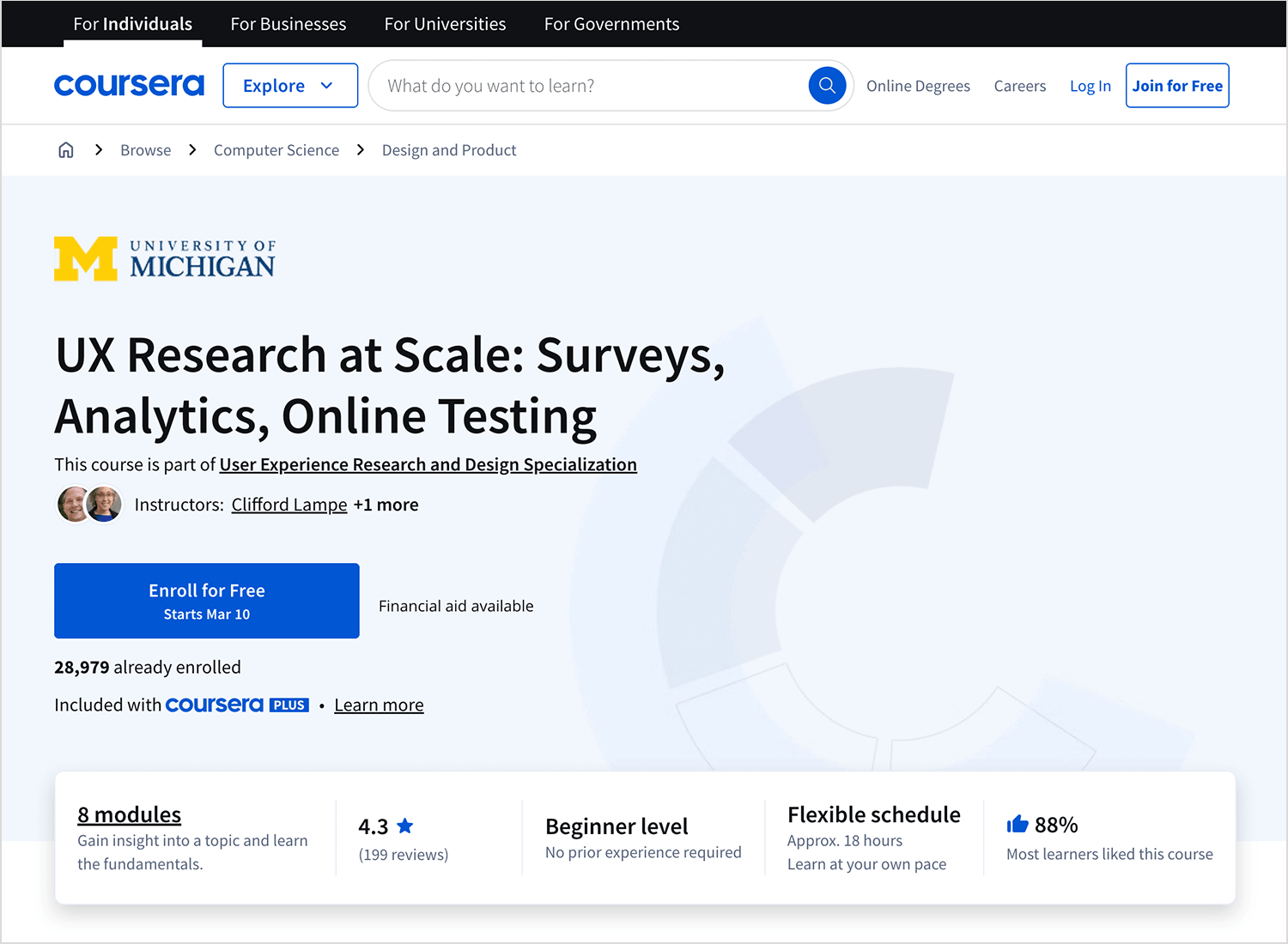
Ultimately, there are few ways to research with lots of participants. The UX research at scale course aims to prepare students for everything survey-related. From choosing the right participants, writing the right questions and analyzing the results – this course has it all.
- Price point: starts at $39 for monthly subscriptions
Design wireframes and prototypes for your UX research with Justinmind

UX research is absolutely crucial in any project. It has the power to help us understand the waters before we jump in, giving us the right context. With every step of the way, UX research is all but a philosophy which the design team lives by. It’s about understanding how people feel, seeing all the factors at play and finding the right path.
Hopefully, with this post you’ll be more familiar with the main research methods and be ready to fine-tune any project that comes your way! Never forget that in the UX game, the user makes the rules.
PROTOTYPE · COMMUNICATE · VALIDATE
ALL-IN-ONE PROTOTYPING TOOL FOR WEB AND MOBILE APPS
Related Content
 Learn how to design better e-learning platforms with user-centered UX principles, real examples, and high-fidelity prototyping tips to boost engagement and learning outcomes.13 min Read
 Infinite scroll keeps users engaged, but it’s not always the best choice. This guide breaks down when to use it, when to avoid it, and how to design it right.14 min Read
 Learn how to design web and mobile app prototypes, how to test them and what to look for in a prototyping tool in this complete guide.15 min Read

