What is user-centered design in practice? How does any designer create user-centric products? Read on for the full story on what user-centered means!
User-centered design is all the talk in UX design. Ultimately, every designer dreams of creating a product that users truly love – and user-centered design seems like a great way to reach that goal. But what is user-centered design, really? What are some factors that separate user-centered products from the rest?
Design user-centered web and mobile products with Justinmind. Download it for free!
In this post, we set out to shine a new light in a familiar concept that can often confuse designers due to how often people throw the term “user-centered” around. Remember to keep your prototyping tool at hand in case you get struck with inspiration!
User-centered design (UCD) is a design approach where the main focus is the user, everything revolves around understanding their needs, goals, and challenges. This means every step of the design process, from initial concept to the final product, considers how users will interact with it. Instead of making assumptions, designers gather real insights from users and create solutions that fit their preferences and behaviors.
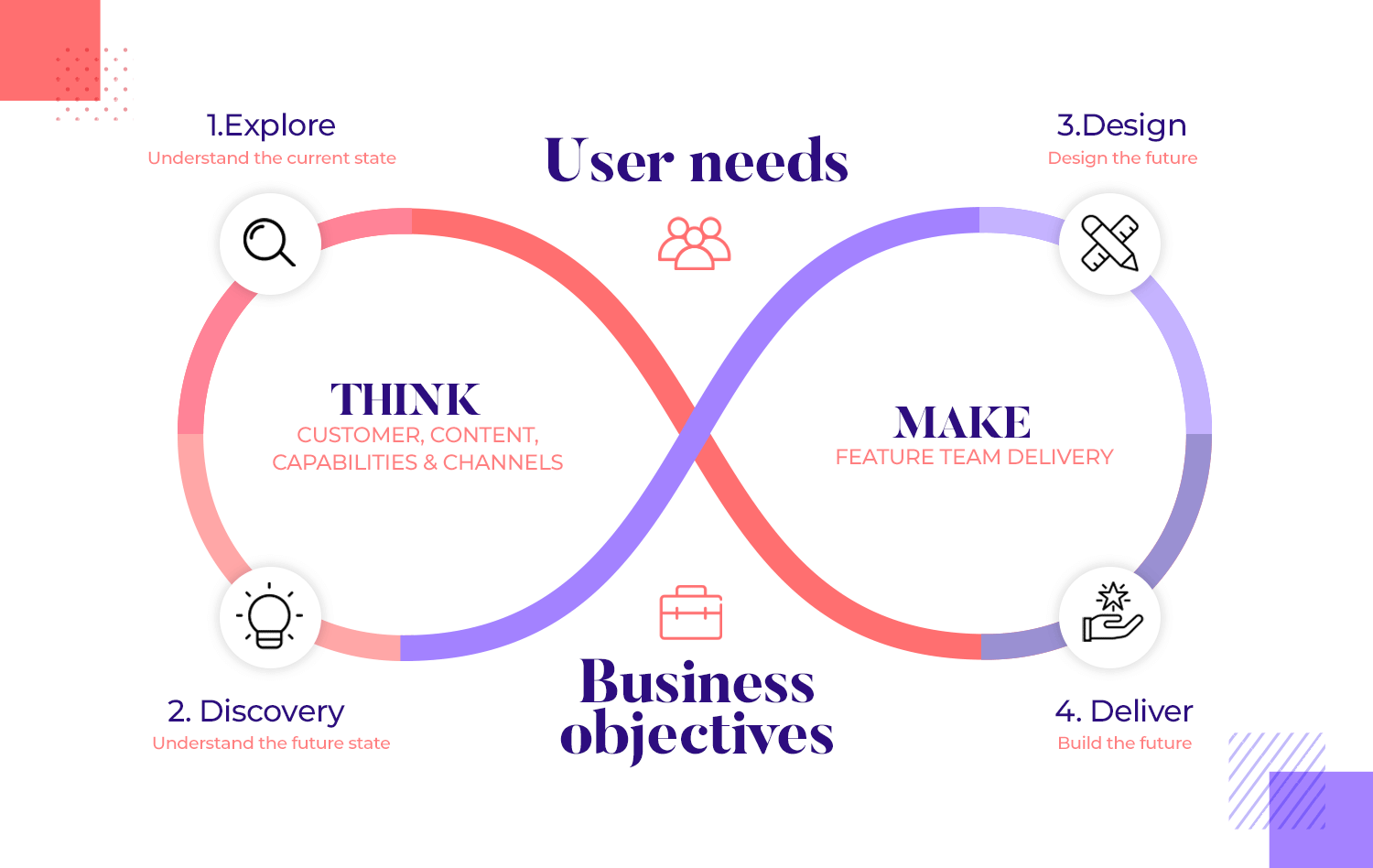
At its core, UCD is all about creating products that work for people, not just look good on paper. It’s a way of ensuring that designs are not only functional but truly meet the expectations of the end user.
But why does this matter so much? That’s where the benefits of UCD come in.
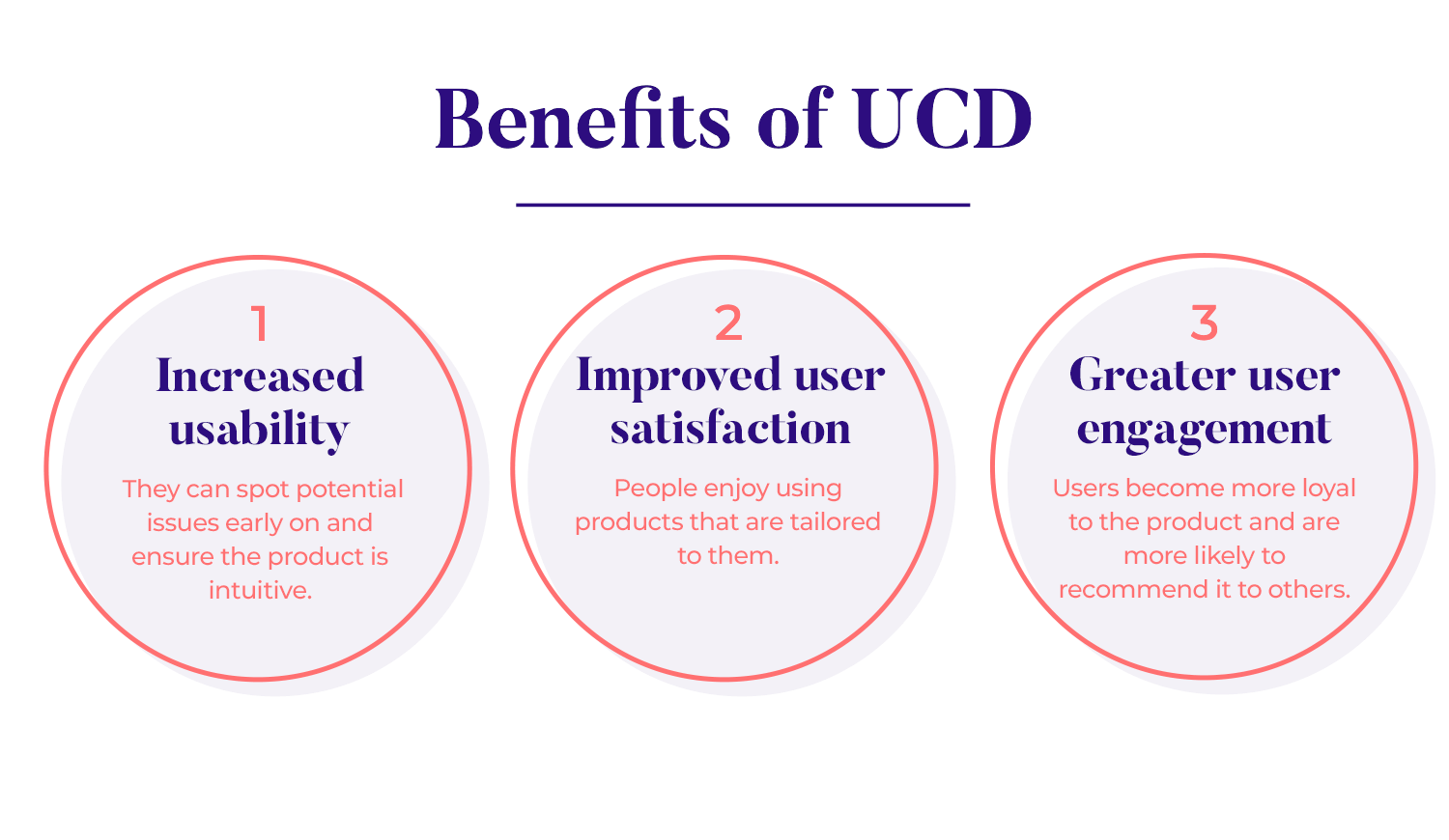
One of the main goals of UCD is to make products easy to use.When designers keep the user involved throughout the process, they can spot potential issues early on and ensure the product is intuitive. This results in fewer mistakes, less frustration, and a smoother overall experience for users. When a product is usable, people are more likely to stick with it and enjoy their experience.
When users feel understood, they feel valued. UCD helps designers develop products that address real needs, leading to higher satisfaction. People enjoy using products that are tailored to them and designed with their preferences in mind. A well-designed user-centered product gives users a sense of confidence and trust in the product, enhancing their overall experience.
When a product is easy to use and satisfying, users naturally become more engaged. They spend more time interacting with it, explore more features, and are more likely to return. UCD fosters this deeper connection by focusing on creating experiences that feel personal, relevant, and enjoyable. As a result, users become more loyal to the product and are more likely to recommend it to others.
When talking about design, you might hear the terms “human-centered design” and “user-centered design” used interchangeably. While they sound similar, they aren’t quite the same. Both approaches focus on creating products that work for people, but there’s a key difference: who they’re designed for.
Human-centered design looks at creating solutions for humans in general. It considers the needs of people as a whole, but it doesn’t necessarily dive into the specifics of particular users. It’s a broader approach that aims to make products work for everyone, not necessarily a specific group.
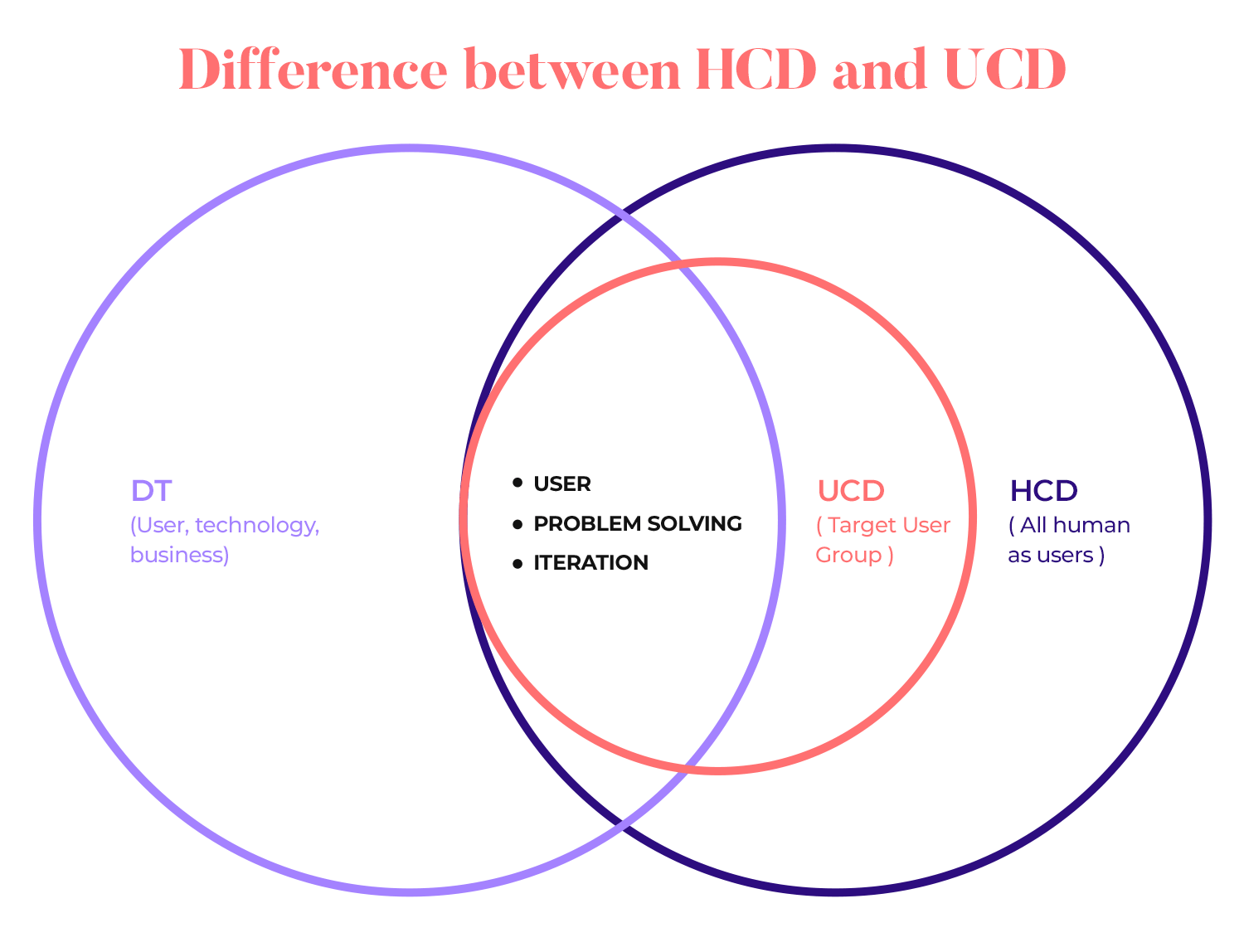
On the other hand, user-centered design (UCD) is much more focused. UCD revolves around designing for a specific group of users. The goal is to understand who the users are, what problems they face, and how to make the product work specifically for them. In UCD, you’re not just thinking about humans in general, you’re thinking about your users.
For example, imagine designing a smartphone app. A human-centered approach might aim to make the app accessible to everyone, but a user-centered approach would go deeper, designing features specifically for your target audience, whether it’s busy professionals, students, or parents. UCD helps create more tailored experiences by focusing on user needs, preferences, and behaviors at every stage of the interaction design process.
In both approaches, the user’s experience is important, but UCD takes it a step further by emphasizing real users’ input throughout the interaction design principles and process. This makes UCD a crucial part of creating better user experiences, as it allows designers to build solutions that genuinely reflect what users need.
If you want to see user-centered design examples in action, check out companies like Apple or Google, where user feedback plays a huge role in product development. These are prime examples of how understanding users can lead to products that are not only functional but also deeply engaging.
When you focus on user-centered design, you’ll notice that the more users are involved, the better the results. This way, the product isn’t just useful, it’s something people actually enjoy using, building a real connection between them and the design.
Design user-centered web and mobile products with Justinmind. Download it for free!

At the heart of user-centered design (UCD) are a few key principles that guide the entire process. Let’s take a closer look at what they are:
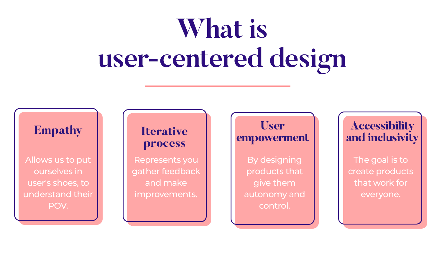
The first principle is all about empathy, to really get to know your users on a deeper level. It’s not just about knowing what they want, but understanding how they feel, what motivates them, and the challenges they face. When you put yourself in the users’ shoes, you can design products that truly meet their needs. And remember, this involves active user involvement, where their voices are heard throughout the process.
UCD is never a one-and-done kind of approach. It’s an ongoing, iterative process, which means that after every design phase, you gather feedback and make improvements. This helps ensure that the product evolves and gets better with each round of user input. It’s about continuously refining and perfecting the design until it truly works for the people using it.
Another core principle is empowering users by designing products that give them autonomy and control. This means creating interfaces that are easy to navigate and let users feel confident while using them. When users have control over their experience, they’re more likely to engage with the product and feel satisfied.
Lastly, UCD emphasizes accessibility and inclusivity. The goal is to create products that work for everyone, no matter their abilities. This means ensuring that your design is usable by all types of users, including those with disabilities. Inclusive design makes sure no one is left out and everyone can enjoy the same seamless experience.
Now that we’ve covered the core principles of user-centered design (UCD), let’s jump into the actual process. UCD follows a structured approach, ensuring that every stage focuses on the user’s needs. The lifecycle is built to gather insights, define requirements, and improve the design continuously. It all starts with research and gathering requirements, the foundation of any user-centered project.
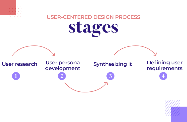
In this first stage, the goal is to understand who your users are and what they need. Before you can design a product that truly works for them, you need to collect as much relevant information as possible. This stage is about uncovering insights through careful research and translating them into clear requirements for the design.
The core of user research is getting to know your users, what motivates them, what challenges they face, and what they hope to achieve. The process begins by establishing research goals.
These goals should align both with the users’ needs and the business objectives. Defining clear goals helps guide your research, ensuring you gather useful and actionable information.
Next comes user persona development. Personas are fictional profiles that represent your different user groups. These personas are based on data like demographics, goals, and pain points. When you create these personas, you make sure that your design stays focused on real people with real needs.
There are several research methods you can use to gather insights:
- Interviews give you direct feedback from users, offering detailed insights into their thoughts and experiences.
- Surveys allow you to gather broader data on user attitudes, helping you understand trends and preferences across a larger audience.
- Ethnographic studies involve observing users in their natural environments. This helps you see how they interact with products in real life, revealing behaviors they might not mention in an interview.
- Diary studies capture user interactions over time, giving you a more comprehensive view of how they use your product on a daily basis.
Once you’ve gathered all this data, the next step is synthesizing it. This means looking for common themes and insights that will shape your design. When you identify patterns in user behavior, you better understand what your users need from the product.
With the research in hand, it’s time to turn those insights into specific user requirements. This phase is all about making sure you have a clear understanding of what your users need and how the product can help them.
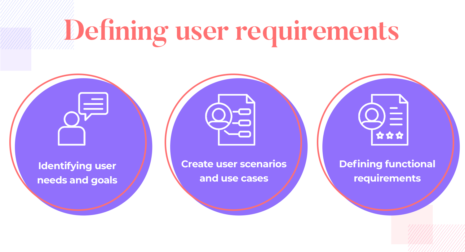
Start by identifying user needs and goals. Look at the insights from your research and map them to specific needs, what are users trying to accomplish, and what challenges are they facing? This step ensures that the design is focused on solving the right problems.
You’ll also want to conduct a task analysis. This involves breaking down the actions users take when interacting with your product. Understanding these tasks helps you improve the efficiency and clarity of how users complete their actions, making the experience smoother.
To visualize how users will interact with the product, create user scenarios and use cases. These are stories that show how users engage with your product in different situations. They help you see how the design works in real life, making sure it supports users in achieving their goals.
Finally, all of this research and analysis leads to defining functional requirements. These are the specific features and functionalities your product must have to meet user expectations. This step translates user needs into actionable design elements, ensuring that the final product aligns with what users want.
Once the research is done and user requirements are clear, it’s time to dive into the creative part of the process: ideation and concept development. This stage is where ideas start taking shape and the initial vision of the product begins to form. The goal here is to explore different design possibilities and develop concepts that align with user needs.
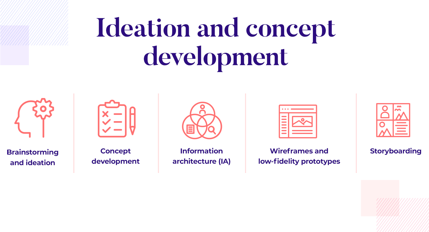
The ideation phase is all about generating ideas. Using the insights gathered from the user research, the team comes together to brainstorm solutions that meet user requirements. This is where creativity flows, there’s no such thing as a bad idea during brainstorming. It’s about coming up with a wide range of possibilities before narrowing them down to the most promising concepts.
Once you’ve gathered enough ideas, the next step is concept development. This is where the team takes those raw ideas and starts shaping them into concrete design concepts. Initial sketches and rough layouts are created to visualize how the product might look and function. These early designs are rough, but they help set the direction for the project and allow the team to explore different approaches before settling on one.
With the design concepts in hand, it’s time to focus on information architecture. IA is all about organizing the content and structure of the product so that users can navigate it easily. This step involves mapping out how different pieces of information are connected and ensuring that the overall layout makes sense. Good IA helps users find what they need without frustration, making the product intuitive and easy to use.
After organizing the information, the next step is creating wireframes. Wireframes are simple, low-fidelity versions of the product’s layout. They show the basic structure and placement of key elements without worrying about visual details like colors or fonts. Wireframes help designers focus on the functionality and flow of the interface, ensuring that the user experience is smooth from start to finish. These early prototypes allow for quick iterations and feedback without investing too much time in high-fidelity designs.
Finally, storyboarding comes into play. Storyboards are visual representations of how users will interact with the product in specific scenarios. They map out user flows, showing the steps users take to achieve their goals. This helps the team visualize the user experience and make sure that the product supports users at every stage. Storyboarding is particularly useful for identifying any gaps or potential challenges in the user journey.
Once the design concepts are developed, it’s time to bring them to life through prototyping and iteration. This stage is all about turning ideas into tangible, interactive versions of the product so that they can be tested and refined. The goal is to create something that users can interact with, gather feedback, and make improvements based on what you learn.
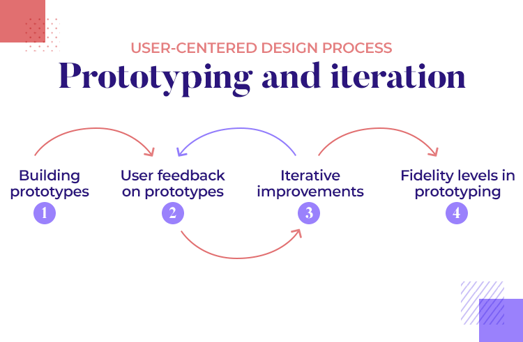
The first step is building prototypes. At this point, the design team creates interactive, high-fidelity prototypes that resemble the final product as closely as possible. These prototypes allow users to experience the product’s functionality and flow, helping the team identify what works well and what needs adjustment. Building a prototype gives the design a more realistic feel, making it easier for users to provide meaningful feedback.
Once the prototype is ready, it’s time to gather user feedback. When you test the prototype with real users, you understand how they interact with the design and whether it meets their needs. This feedback is incredibly valuable at this stage because it highlights areas for improvement before developing the final product. Users might find things the design team didn’t anticipate, and their insights help shape the design into something that truly works for them.
With feedback in hand, the design team enters the iterative improvements phase. This is where the design is continuously refined based on what users have shared. It’s a process of making changes, testing again, and improving over time. Iteration ensures that the product evolves with user input and becomes better with each cycle. Instead of aiming for perfection from the start, iteration allows the design to grow and improve gradually.
Not all prototypes are created equal, and the fidelity levels of a prototype depend on the feedback goals. Prototypes can range from low-fidelity (simple sketches or wireframes) to high-fidelity (detailed, interactive designs). Adjusting the fidelity of your prototype helps balance speed and detail. For example, low-fidelity prototypes are great for quick feedback early in the process, while high-fidelity prototypes are better for testing specific features and interactions later on.
After building and iterating on your prototype, the next crucial step is usability testing and refinement. This stage helps ensure the design works as expected and offers a smooth user experience. Usability testing involves real users interacting with your product while you observe how they navigate and complete tasks. By testing this way, you can spot any issues and refine the design for better results.
There are several approaches to usability testing, and choosing the right one depends on your goals:
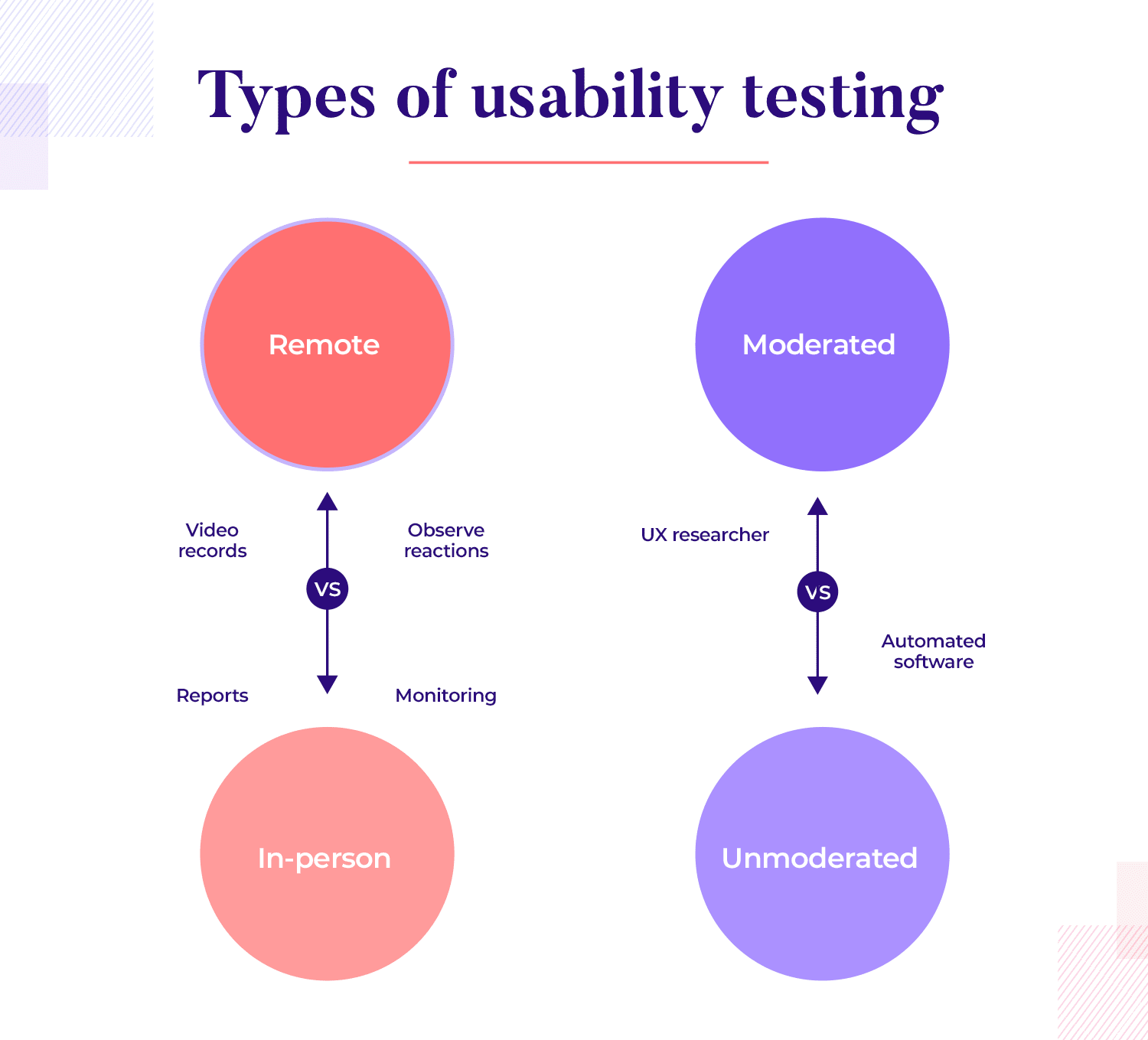
- Moderated vs. unmoderated testing: in moderated testing, a facilitator guides users through the process, asking questions and giving prompts. This is helpful when you want more detailed feedback. In unmoderated testing, users go through the tasks on their own, allowing for more natural interactions. Both methods provide valuable insights, but each serves different purposes depending on what you want to learn.
- Remote vs. in-person testing: remote testing allows users to participate online, which can be more convenient and reach a wider audience. In-person testing, on the other hand, offers a chance to observe users’ body language and reactions face-to-face, which can give you deeper insights into their experience.
Design user-centered web and mobile products with Justinmind. Download it for free!

To get the most out of usability testing, it’s important to plan carefully. Start by defining scenarios and tasks for users to complete, these should reflect real-world situations they would encounter when using your product. You’ll also want to establish metrics, such as completion rates, time on tasks, and any errors users might make. These metrics give you a clear picture of how well the design performs and where improvements are needed.
During usability testing, it’s important to gather both qualitative and quantitative data. You’ll be tracking things like completion rates (how many users successfully complete tasks), errors (any mistakes they make), and time on tasks (how long it takes users to complete actions). This data provides a solid foundation for analyzing the product’s usability and identifying areas where users struggle.
Once testing is complete, the next step is to analyze the results. Look for patterns in the data that reveal where users had difficulty or where the design could be improved. These insights help you identify specific areas for refinement. After analyzing, create a report summarizing your findings and suggest iterations based on the feedback. This process ensures that the final product is as user-friendly and efficient as possible.
Once the design has been tested and refined, the next step is implementation and evaluation. This stage is all about making sure the design comes to life as intended and preparing for the final launch. It involves close collaboration with development teams, gathering final feedback, and ensuring everything is in place for a successful rollout.
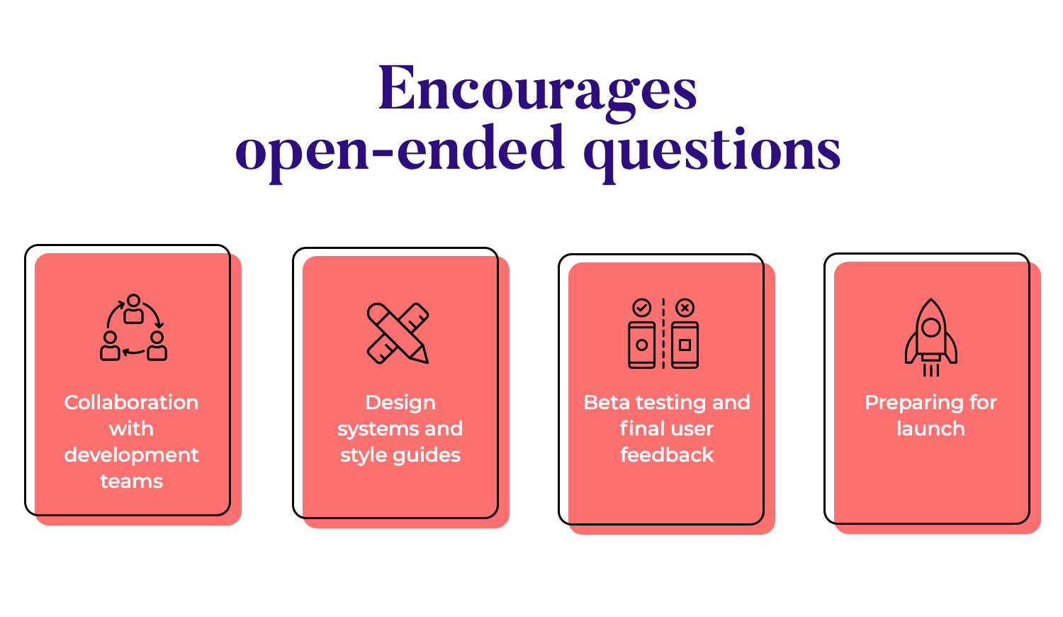
At this point, collaboration with the development team becomes essential. The goal is to make sure the design is implemented with fidelity, meaning it matches the original design as closely as possible. Clear communication during the handoff is key, designers need to provide detailed specs and assets to ensure the developers understand how the design should function and look. This stage is all about teamwork, making sure everyone’s on the same page to bring the design to life without losing any important details.
To keep consistency throughout the product, design systems and style guides come into play. These tools help establish uniformity in design patterns, colors, components, and overall style. When you create a design system, everyone, from designers to developers, follows the same rules, making the product cohesive and polished. This also helps speed up development since there’s no need to reinvent the wheel for each feature or screen.
Before the official launch, beta testing is crucial for catching any last-minute issues. This involves releasing the product to a smaller group of users to gather final feedback. It’s a chance to see how the product performs in a real-world setting and get input from users that might not have been involved earlier in the process. Any final tweaks or improvements can be made based on this feedback, ensuring the product is as polished as possible before going live.
Finally, it’s time to prepare for the launch. This stage involves making sure all requirements are met and that the product is ready for deployment. It’s a matter of double-checking that everything works as it should, both on the design and technical side, so that the launch goes smoothly. Once everything is in place, the product can be rolled out to users with confidence that it meets their needs and delivers a great experience.
So, what does user-centered design look like in action? Let’s take a look at some examples of how different companies have embraced UCD to create meaningful products.
UserZoom, a popular usability study platform, stands out by letting data guide their design decisions. With a user base primarily made up of UX designers, they face high expectations. Through constant user feedback and data-driven iterations, UserZoom ensures they meet those demands. As their product manager, Sarah Tannehill, explains, their process is all about listening to users and adapting the design accordingly.

Fjord’s work in Nepal illustrates the importance of truly understanding the problem before designing solutions. Initially tasked with reducing newborn mortality due to hypothermia, they discovered the issue wasn’t a lack of incubators, but getting newborns to hospitals in time. Their user-centered approach led to the design of an insulated carrier, giving parents a better chance of reaching medical care. You can read more about this in the full lFjord case study.

The ultimate solution Fjord came up with was a carrier that insulated the newborn, giving parents a greater chance of reaching the hospital in time. That is user-centered design at its most simple – using research to get to the root of the problem.
Check out the full post for a fascinating story that shines a light not just on why defining the problem is crucial – but also how any team can cater to users in stressful situations. Essi walked us through a project for Welfare Children who were wards of the state for various reasons – making for a touching case study and shows that thoughtful design can change user’s lives.
Imagine designing for people floating in space, where even simple actions can feel like a mission in itself. At NASA, designing tools for astronauts comes with some unique challenges. UX designer David Luetger shared how their team relies heavily on data to guide the design process. Collecting and organizing data from such a specialized group, people in space, requires extra care.
This data-driven approach ensures that every design decision supports the astronauts’ needs in a practical way. You can learn more about how NASA uses UX research in this NASA UX case study.

Coursera, the popular online learning platform, uses prototyping throughout their design process to turn ideas into real, testable designs. Geoff Schuller, their Senior UX Designer, explains how this method allows them to gather user feedback early and make improvements along the way.
This approach makes sure that new features really enhance the learner experience. If you want to dive deeper, check out our Prototyping Coursera interview with Geoff Schuller for all the details.

At Gap, they’ve mastered the art of moving quickly with lean experimentation. Their UX team, led by Marek Szeszycki, focuses on testing ideas fast. The goal? Quickly drop the bad ideas and keep improving the good ones. This process allows them to stay user-centered while designing for retail, making sure they’re always working on ideas that really resonate with their customers.They rapidly prototype and gather feedback to ensure their design decisions are always backed by data.
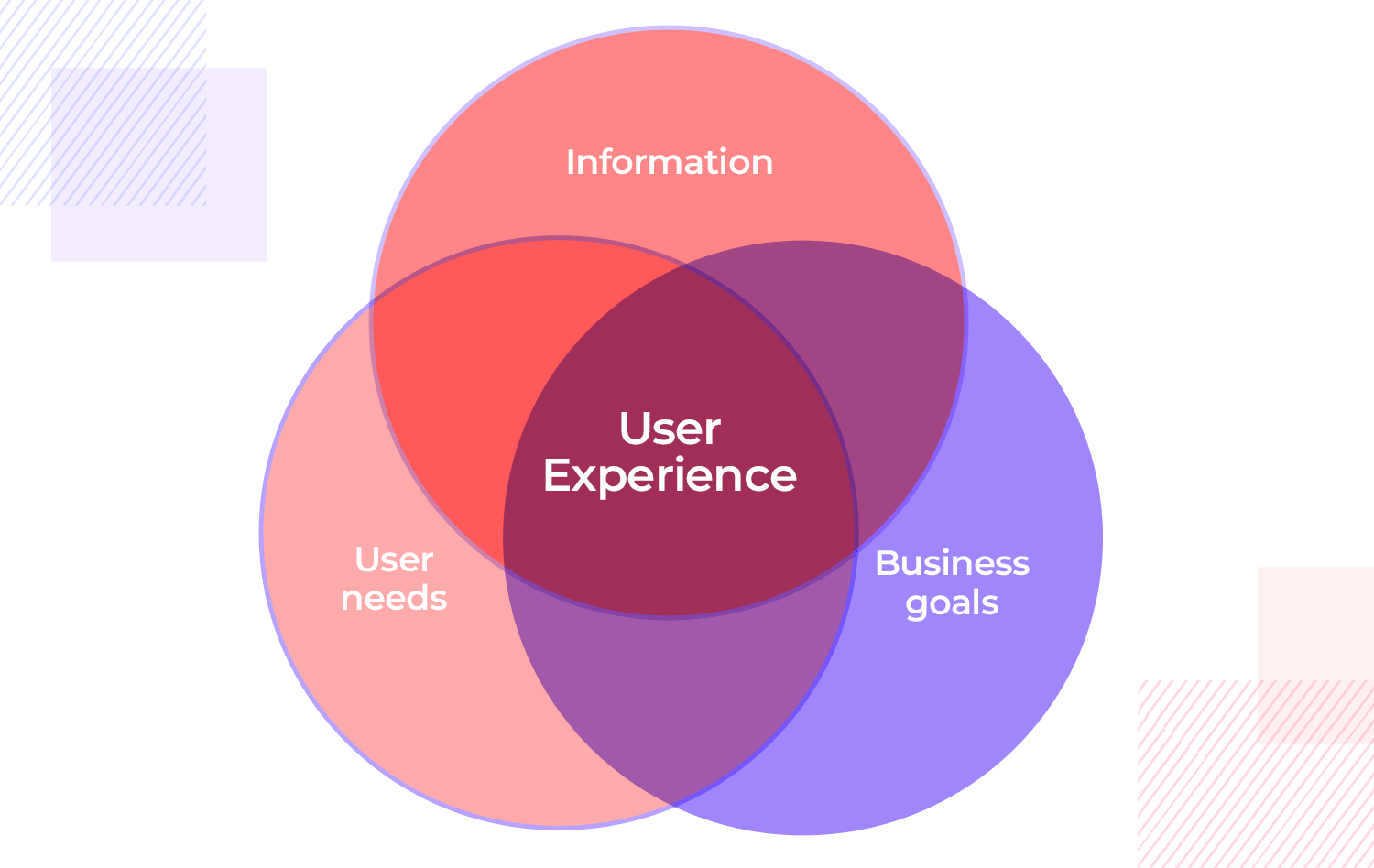
ser-centered design delivers incredible results, but let’s be honest, it’s not always smooth sailing. Have you ever found yourself torn between what the business wants and what users actually need? It’s a common struggle in UCD. Balancing both sides can sometimes feel like you’re being pulled in different directions.
For example, it’s not unusual for design teams to clash with business goals. Maybe the business wants to push for features that drive sales, but the users are just looking for simplicity and ease of use. The key to getting through this? Communication. It’s about finding that sweet spot where improving usability can actually benefit the business too. When you start seeing user needs as opportunities, it becomes a win-win situation.
Then there’s the issue of bias – designers, like everyone, have their own perspectives. Ever catch yourself assuming something works for users just because it works for you? We’ve all been there. That’s why it’s important to rely on user data and feedback to guide the design, not just personal assumptions. Staying grounded in what users really need keeps things on track.
And while we’re talking challenges, let’s not forget collaboration. Getting designers, developers, and product managers to all work together can get messy. You might have a beautiful design, but then developers hit a wall trying to implement it. The trick? Regular check-ins and keeping communication open. When everyone’s aligned, the whole process moves a lot smoother.
Finally, the reality of tight timelines and limited resources hits. Sometimes there just isn’t enough time or budget to do all the research and iterations you’d like. In those cases, it’s all about priorities. Focus on the most crucial parts of the user experience first. Quick, low-fidelity prototypes can save time and allow you to gather feedback fast, without draining all your resources.
Design user-centered web and mobile products with Justinmind. Download it for free!

To wrap things up, user-centered design clearly drives better products and experiences.When you focus on what users truly need and want, you improve usability and build solutions that deeply resonate with your audience. This user-first approach sets your designs apart.
Remember, great design is never truly finished, it’s always evolving with your users, and that’s what makes the journey so exciting. Staying adaptable, open to feedback, and committed to understanding your users will help you keep improving. In the end, it’s empathy and iteration that lead to products people love and find easy to use.
PROTOTYPE · COMMUNICATE · VALIDATE
ALL-IN-ONE PROTOTYPING TOOL FOR WEB AND MOBILE APPS
Related Content
 Learn how to design better e-learning platforms with user-centered UX principles, real examples, and high-fidelity prototyping tips to boost engagement and learning outcomes.13 min Read
 Infinite scroll keeps users engaged, but it’s not always the best choice. This guide breaks down when to use it, when to avoid it, and how to design it right.14 min Read
 Learn how to design web and mobile app prototypes, how to test them and what to look for in a prototyping tool in this complete guide.15 min Read

