UX case study of Noom app: gamification, progressive disclosure & nudges
Noom promises users that they’ll never need another diet app. Does the user experience back up this ambition?
If there’s one thing in life that has a crappy user experience, it’s dieting. But weight-loss app Noom aims to change all that. Using a combination of gamification, intuitive nudges and effective data visualization the app aims to help users “meaningfully engage, make better food choices and successfully change their behaviors for the long term.”
Does the UX design live up to those grand ambitions or is it as appetizing as a low-fat ready meal? The Justinmind team (who are of course in no way on a diet…) took a closer look at Noom’s UX.
Design awesome onboarding prototypes for your mobile apps
Noom’s USP: Is it the answer to users’ prayers?
Noom sells itself as a lot more than a calorie counting app. Its USP is that it won’t just help you lose weight; rather, the app aims to help users make a long-term lifestyle change. To do that it focuses on the psychology of weight loss, and on offering a range of customized plans based on user lifestyle.
Noom’s logo and landing page – is the branding coherent?
Noom’s logo reflects the app’s objective well. The brand name is all lowercase, which is both easier to read and perceived by users to be friendlier.

The font is also figured in a pointillist style, making it feel light and airy, just like potential users probably want to feel.
The landing page (Noom is an app but many people sign up on desktop before being sent along to the app store) is simple and aimed squarely at the target user – young women. We’re particular fans of the button CTA, which is on point, speaking exactly to both users’ needs and Noom’s USP.
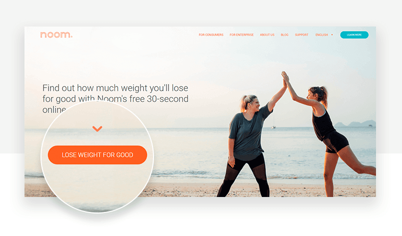
The header copy also emphasizes two great things – the evaluation is free, and it’s fast.
Check out how to prototype login forms on our guide.
Getting on board
A good onboarding experience must do two things: demonstrate the value of your product, and get users hooked in.
Noom starts out well. The first step users take after clicking the CTA is to identify their ideal weight.
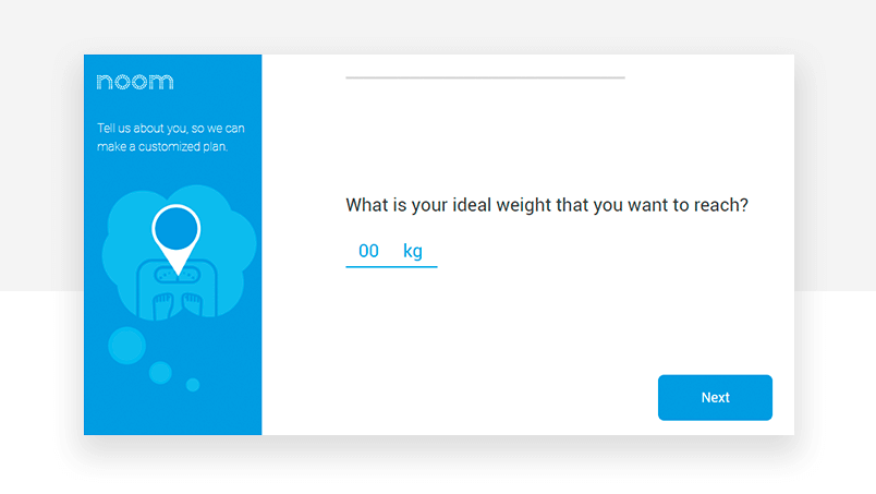
The app is putting its value front row center: stick around and you’ll achieve your goal.
Users then go through a series of questions about their weight-loss ambitions and lifestyle. This is so Noom can build the “customized plan” they pride themselves on, but with over 12 steps in the onboarding it can get a little old. Motivation wavers – “yay, a positive lifestyle change!” can quickly morph into “why am I filling out this stupid onboarding form again??”
We’re guessing that maybe the guys at Noom know the onboarding is a little arduous. At both step 5 and step 11 they give you a dose of social proof. Maybe their UX team found that people were bailing on the process around this time.
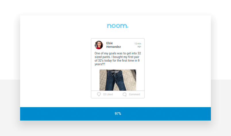
Social proof – the psychological phenomenon that leads people to imitate the behavior they see in their immediate surroundings -can be leveraged by UX designers in various ways. Case studies, trust icons and, as in the case of Noom, cleverly placed user success stories, can assuage user anxiety and reduce purchase abandonment.
Check out this tutorial and learn how to prototype a grocery app.
Streamlining forms compensates for an input-heavy onboarding experience
Noom’s payment form design has just two fields. Hallelujah! This compensates for the bazillion questions about Justinmind’s back problems (ouch!) earlier on. Also, the mail we signed up with is pre-filled in the form, and the order details are clearly stated without any nasty surprises.
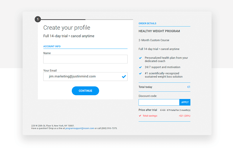
You can prototype a smart form that recycles user data like this in Justinmind in just a few steps.
On the second page of the form, the payment page, there’s also a handy countdown timer that lets you know how long you’ve got to complete your purchase. Handy, but also provides a light sense of urgency that probably helps Noom’s completions.
Check out our guide on UI wireframes and see how you can replicate their strategy in your own designs.
Getting into the app – first impressions
From here it’s time to get started using the app. The splash screen is super boring, showing nothing more than an asymmetrical circle spinning on its axis. It does the job but a little joylessly.
The homepage gets straight down to business with a series of tasks for the user. Across the top there’s an animation illustrating your calorie allowance and consumption for the day.
The day counter along the top is equipped with horizontal scroll, but that’s not very obvious and we wonder how long it would take some users to figure out they can scroll back and forth through the program’s days.
In general the first time you open Noom you get the impression that the app is intuitive and fun to engage with.
Help users build healthy habits
Research has shown that almost 30% of healthcare patients don’t understand their medication recommendations. 50% don’t understand the dietary recommendations given by medical professionals.
The Noom team hope to circumvent that problem by breaking down information into bitesize chunks. Every day the app shows users habit-forming tasks on the home page – Weigh in, Log your meals, and Reach your step goal.
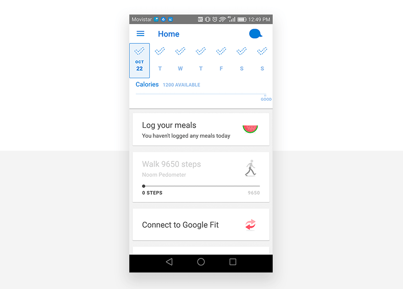
The information is structured in vertically stacked UI cards, in which different nuggets of information are aggregated every day. Card interfaces are normally non-hierarchical, as Nick Babich points out in Smashing Magazine, but the vertical stack allows Noom designers to prioritize certain tasks on different days, giving users extra information about the activities they should be prioritizing.
This kind of gentle Noom nudges will help keep even the biggest slackers on track. We should know 😉
DIscover a brand new style of design with our post on neumorphism!
Reward users with visual progress markers
We know Thomas Edison probably wasn’t talking about dropping pounds when he said it, but losing weight is definitely 99% perspiration, 1% inspiration. The Noom interface aims to keep you motivated through the tough times by setting up small rewards for your efforts.
One great example is the checkmark at the top of the day’s tasks. This checkmark is vaguely outlined; only when the user completes all the day’s tasks does the checkmark get filled in. It’s a small thing but it visually marks progress and persistence.
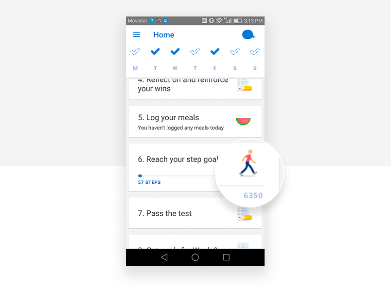
Noom also shows data in visual formats rather than numbers. We love the way the app visualizes how close the user is to realizing their ideal step count for the day – a simple progress bar with a clean icon works wonders.
Gamify to make information stick
The app takes a lightly gamified approach to weight loss. This is really Noom making the most of their value add – this isn’t just an app to count calories, this is an app to change your behavior.
Gamification – bringing gaming elements into non-gaming apps – can increase motivation and keep users hooked into the product longer. Building challenges and rewards into the application, adding competitive elements and using progressive disclosure to introduce new features are all gamification techniques that work in non-game apps.
Noom takes advantage of a lot of these gamified elements. The most obvious are the app’s daily quizzes, which test what users have learned so far in their Noom journey.
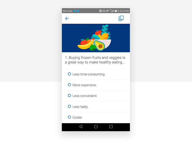
The quiz format is fun and offers users a small reward (a virtual high-five) when they get the questions right. It’s a fun way to make information stick and increase the chances of implementing long-term lifestyle changes.
Noom also uses progressive disclosure, a technique taken from video games that involves revealing just the necessary information at any given moment and no more. Noom users are introduced to the app’s features as the days unfold rather than all at once.
For example, users meet their personal Coach, the “Goal Specialist”, after a few days getting used to the main app features. Then, two weeks into the program, they’re placed with fellow Noomers in a chat group aimed at mutual support.
By revealing features progressively, the Noom UX team avoid overwhelming users and keep them entertained longer.
But it’s not all peachy UX in the Noom-iverse…
Of course, Noom has its UX weaknesses. Some of the screens are super text-heavy, leaving the app feeling more like a Kindle copycat than a health app. While the copy is fun and on-brand, this doesn’t compensate for having to do multiple thumb-scrolls to get through your day’s diet tasks.
But the biggest UX no-no for us is the Stop my subscription user flow. To stop using Noom you have to get in direct touch with your coach and request subscription termination from them.
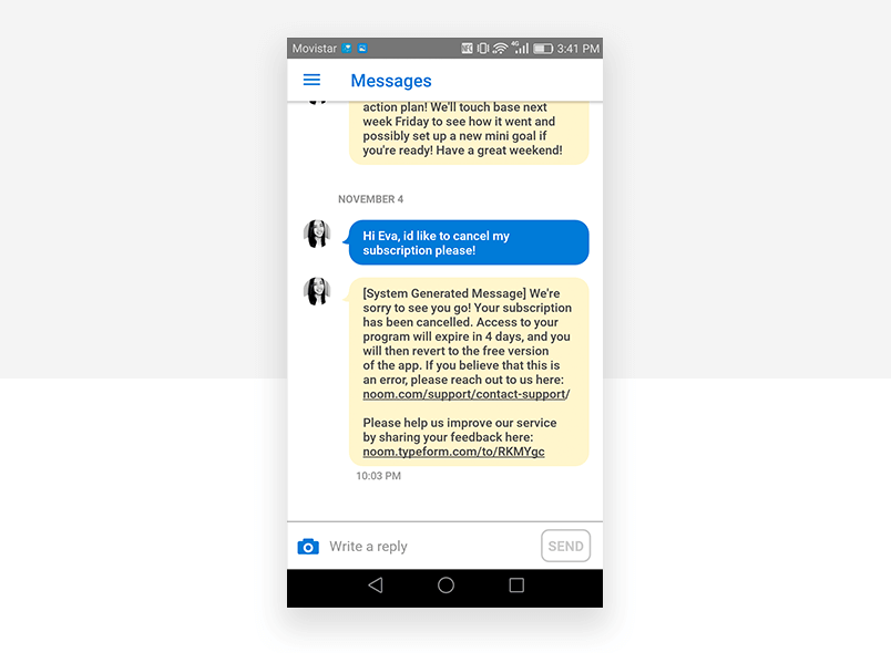
This element of “personal interaction” (yes, we know Coach Eva is really a bot, but anyway) when you’re unsubscribing from a paid service is uncomfortable. Feels like Noom is trying to make the process as socially awkward as possible to put people off unsubscribing. Also, what is that “system generated message” thing right there?? Coach Eva seems to have turned into a zombie all of a sudden.
Noom UX case study – that’s a wrap, folks
Overall, Noom offers a unique USP in the world of weight-loss apps, and it does it with a lot of charm. The interface is visual and attractive, the experience is customized from the get-go, and gamification keeps users hooked in even when their motivation drops.

Related Content
 Learn how to design better e-learning platforms with user-centered UX principles, real examples, and high-fidelity prototyping tips to boost engagement and learning outcomes.13 min Read
 Infinite scroll keeps users engaged, but it’s not always the best choice. This guide breaks down when to use it, when to avoid it, and how to design it right.14 min Read
 Learn how to design web and mobile app prototypes, how to test them and what to look for in a prototyping tool in this complete guide.15 min Read
