UX design has changed all of our lives forever - but what does it entail, exactly? What do designers do to create incredible products? Read on and find out!
UX design is all around us. It’s a booming industry, with digital products growing ever more important in people’s lives. Demand for UX designers has never been higher and shows no sign of slowing.
Design wireframes and hi-fi prototypes with Justinmind for Free. Unlimited projects!

The world of UX design is wide and diverse, including things like navigation design but also usability testing. It creates entire experiences for people, solving problems and creating digital bridges. It’s exciting, fast-paced and ever-evolving.
That’s why we created this full guide on UX design. We bring you a full introduction to the UX game, going from the basic theory going all the way to interviews and presentations by real designers. Let’s dive in and find out what makes UX design one of the most exciting industries right now.
In broad strokes, UX (user experience) design focuses on the interaction between humans (users) and a product via an interface.
In fact, UX design doesn’t even need to be limited to digital products. Everything that people use needs UX, from microwaves to that little button you need to push to cross the street. We use so many things every single day, that it can be easy to overlook the things that make it easy for us to do it all. A microwave can indeed have terrible UX – a common example is button icons that don’t really explain much, leaving users confused. The experience of using a microwave tends to be easy by design.
Truly, UX design is about creating good and meaningful experiences for users – usually, in digital products such as websites and apps. Creating an app implies much more than throwing several elements in a few screens and hoping a developer can bring it to life. UX design is about creating products that shape themselves to the lives and needs of users, and that doesn’t come easy.
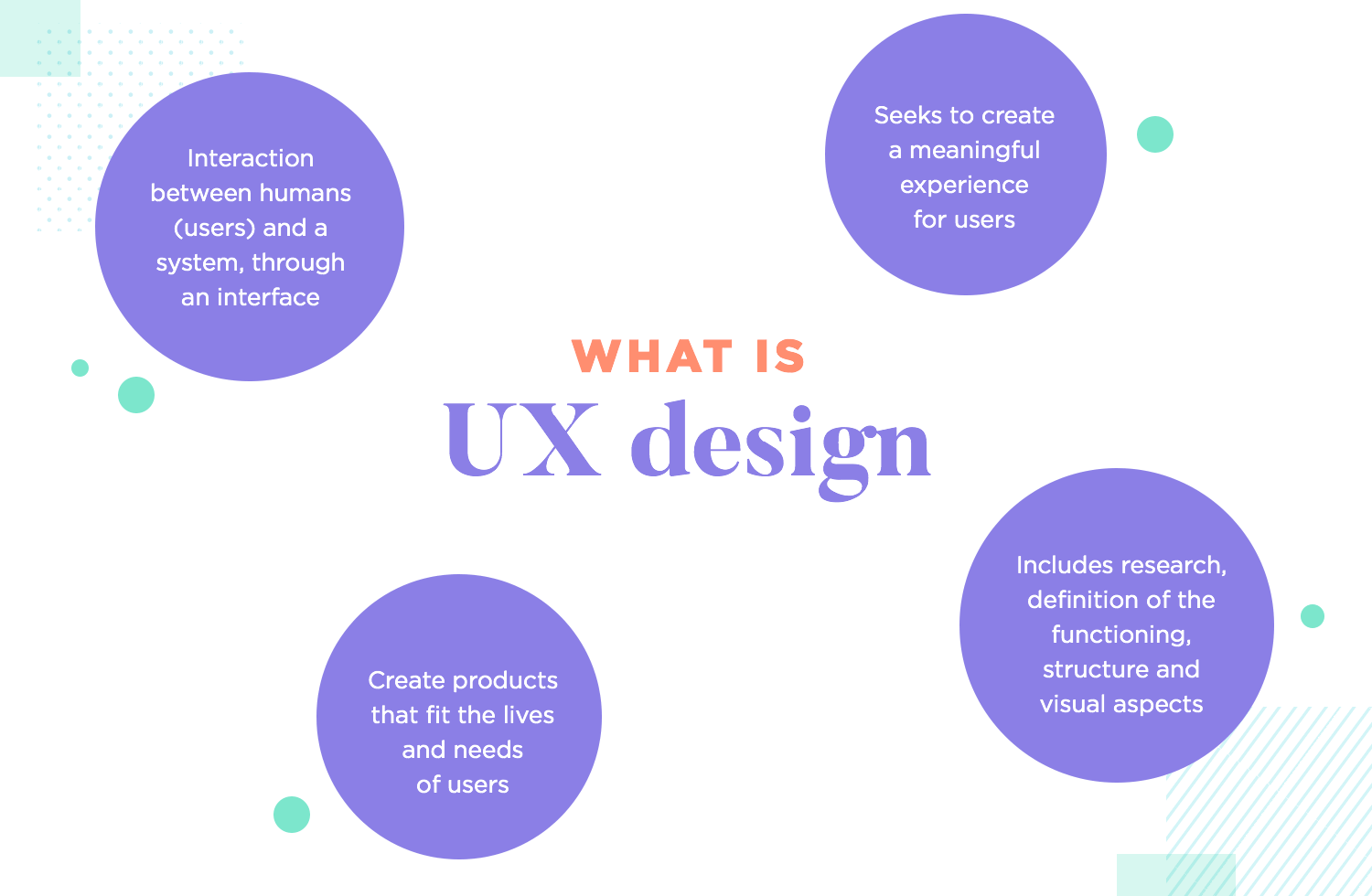
UX design can branch out and touch many different aspects of websites and apps. The crucial bits that users will come face-to-face with, like the buttons and navigation. The pillars that act behind the scenes, like user journeys and the research that helps us understand what people need. UX can be considered an umbrella that covers every little characteristic of any given app.
It’s true that because UX design can be a broad topic that covers a diverse world, it can be tough to pin it all down to a precise definition. With that said, there’s a rather straightforward goal that all UX has in common: to provide a good user experience.
But what makes a good experience? That will depend on who the design is for. Good quality UX design always comes from products that fit users like a glove. Generally, you can expect a good experience to be practical, enjoyable and straightforward.
When you’re excited about that cool camera on Amazon, it can be easy to overlook how easy and fast the checkout process is. In truth, that checkout process is the result of a large UX team that worked hard to simplify the process so that users hardly need to think at all when checking out. No effort, no delays and no confusion. That’s good UX.
UX design is really broad, so it can be confusing to contemplate all the things that it includes or touches.
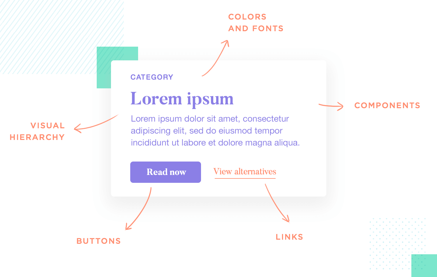
UI design: There’s always confusion between UI design and UX design. Where’s the line that separates the two? The fact is that UI design concerns itself only with the interface, including things like the layout, buttons and visual hierarchy. It does not include things like interactions, animations, usability testing or user stories, all of which are strictly UX design territory. Ultimately, both UI and UX design have to work together in order for any product to truly succeed
UX research: Knowing what users need and want doesn’t just happen. Design teams invest money, time and effort into qualitative and quantitative studies to better understand users. Teams use certain methods of research, like competitor analysis, to create documents that help designers in their work. These documents are materials like user personas, user stories or user journeys. UX research is generally about understanding users and finding the right path for the project.
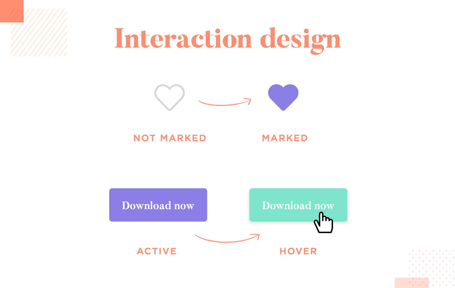
Interaction design: This is largely about defining the behavior of the product when people interact with it. Examples include things like what happens when you click a button, the change in color of Instagram’s heart icon, or how some elements move to indicate their clickability. Interaction design can be a broad topic, but there’s no doubt that it’s crucial in helping users to complete tasks.
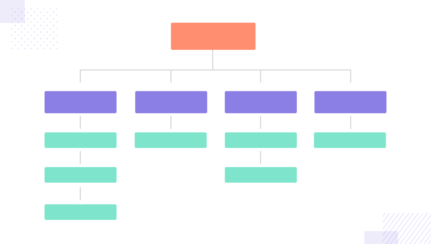
Information architecture (IA): This is about creating a product that people can understand and use, as opposed to confusing users who can’t ever complete a task or find what they’re looking for. Information architecture is generally about dividing content and organizing everything in a logical way, so that users don’t need to stress about finding a store item or break sweat over locating a contact form.
Navigation design: Commonly referred to as the backbone of the design or the highways through which users move around the product. Navigation design is about getting users from point A to point B without any frustration, with minimum effort on behalf of the user. Failure to provide sound navigation can result in stressed users who abandon your product without ever completing a task – a true UX design catastrophe. It’s worth noting that navigation and IA go hand in hand when it comes to creating a quality experience for users.
Usability testing: Usability is all about investigating how users experience the product and react to the design. This is all about observing real people and verifying if their behavior was what the design team had intended. Usability testing is a world in itself, with extensive methods of testing that are deserving of undivided attention. Check out our guide on usability testing for a much closer look.
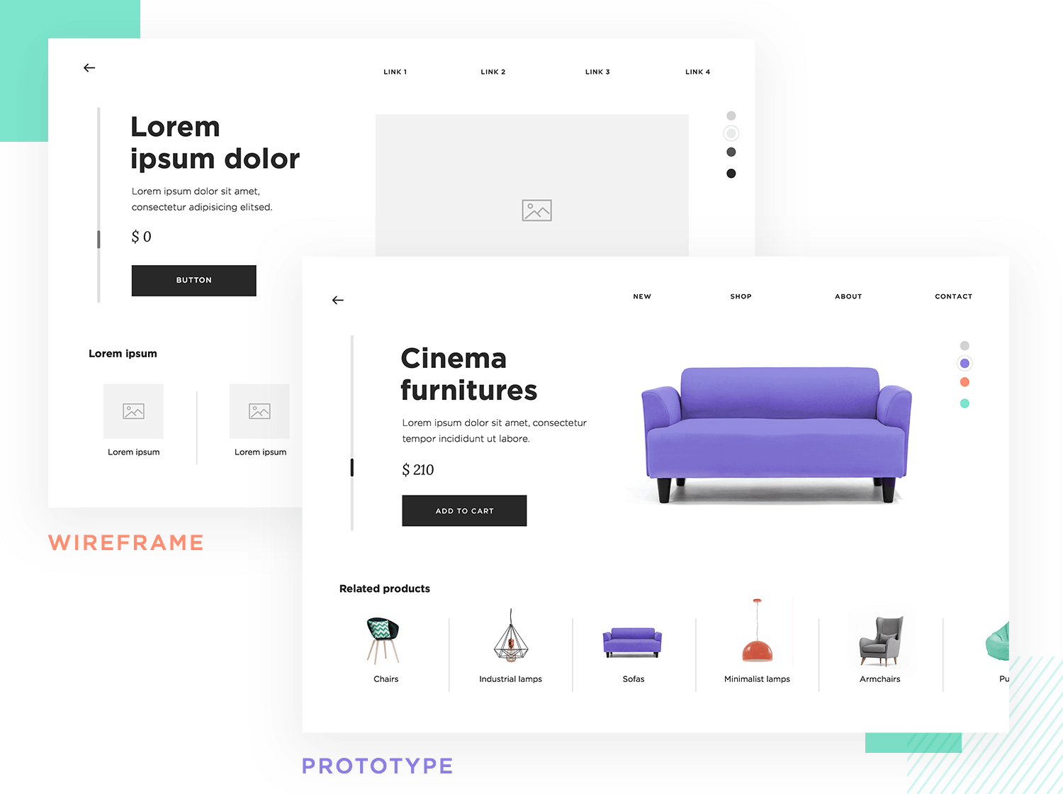
Prototyping and wireframing: Prototypes and wireframes are the embodiment of all that hard work that design teams invest in projects. They capture the looks, feel and functionality of the final project and are used to test the design on real users. Wireframes tend to be all about functionality, focusing on things like navigation and layout. Prototypes are more high-fidelity, including all the details of the final product from interactions to the visual appeal. Having a professional UX design tool is a must.
Design wireframes and hi-fi prototypes with Justinmind for Free. Unlimited projects!

There are many different takes on what the true fundamentals of UX design are. Generally, these are all crucial parts of UX design that we must apply to each and every product we create. From making sure that new users can learn about your product to the very idea of usability. Let’s take a closer look.
This is the most basic aspect of UX design that newbies absolutely need to understand. Before any actual design can be done, the design team has to put their own assumptions and opinions aside in order to do some crucial research.
First, who we are designing for. Who are our users? What do they do, how do they live? This stage comes hand-in-hand with understanding the problem our product will solve. These users will be made into one or more user personas, which will stay with the team for the entire project. Having a good user persona is important because it will help the design team stay objective and encourage empathy. This is the time to understand the users, their pain points and their behavior.
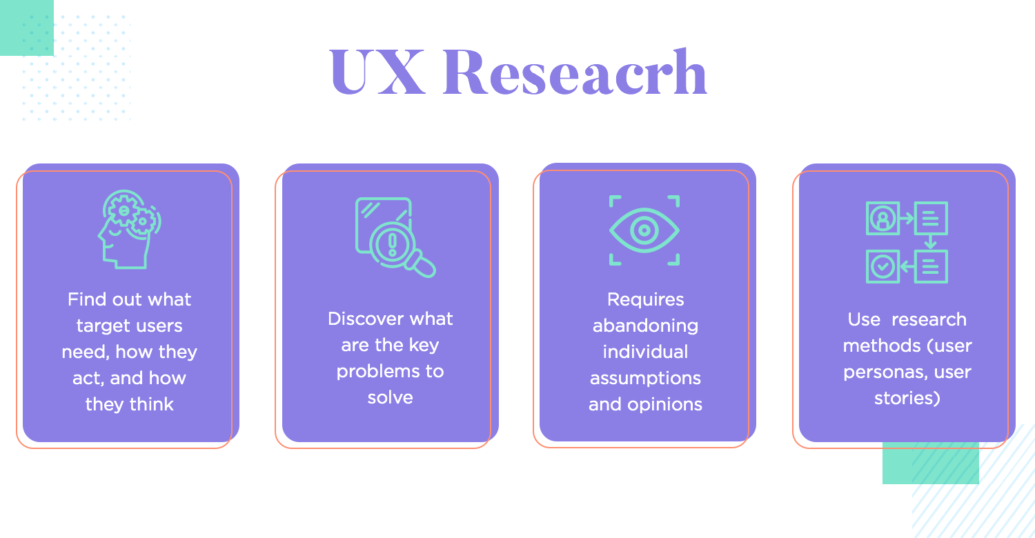
Just as important, the team also needs to solve a real-life problem with their product design. You want to ask questions like: how often does the problem happen? How frustrated are users with it? What would they be willing to pay in order to be free from it? Remember that truly impressive solutions solve impressive problems. If the chosen problem isn’t a big deal, chances are that the solution won’t be either.
As you may have guessed by now, these are all highlights of the initial research stage of any project. Understanding people’s behavior isn’t easy and it certainly doesn’t happen overnight. The research is a long process that involves things like interviews, analysis and lots of digging.
Often called a pillar of UX design, user-centered design is all about creating a tailored experience for your users. The entire concept encourages designers to change their mindset when it comes to who they’re designing for.
The argument goes that all products are human-centered – as in, created for humans. But your product won’t be used by all humans. Your users are a specific group of people, with specific mental models and preferences and needs. These details are the designer’s bread and butter, marking the very things that need to be reflected in the product design.
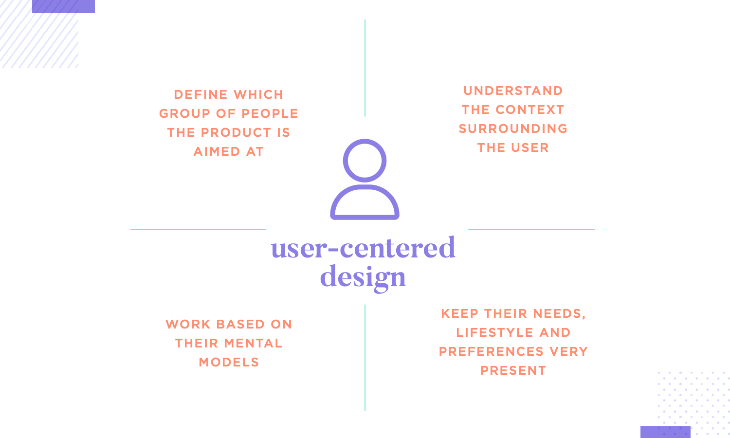
User-centered design isn’t just about understanding a problem that we mean to solve. It’s about understanding the context that surrounds that problem. In theory, this will result in a product that truly fits users like a glove, because it adapts itself to their mental models. In practice, this means that the initial user research will be extensive and painsome, because it acts as a base on which everything else is built on.
From the research, the design team will start to understand the users and their troubles. All this information gives context to the problem and the things that surround it, leading the designers to understand the very people they are designing for. This is also called requirements gathering. Once all this information has been gathered, we start to see a certain change in mentality.
Designers now go from digging up details and information, to trying to make sense of all this information – trying to apply it to the design. Decisions need to be made, such as how to approach the problem or how to reflect the users’ needs in the product. These important decisions all play a part in the strategy of the product.
We start to see details in the future solution like both primary and secondary features, technical capabilities start to be discussed. The strategy needs to be carefully planned out, because it needs to check several boxes: business needs, user needs, as well as usability.
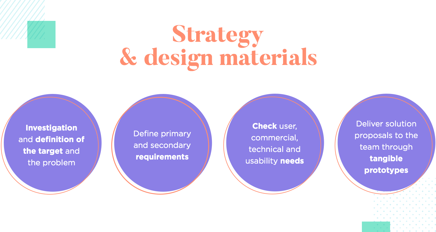
This dance of strategy is about dreaming up a product that can be financially sustainable, solve the user’s problem and deliver a sound experience. On top of that, a crucial part is also communicating all of this to internal teams and keeping everyone on the same page – which brings leadership and communication into the mix.
Once we know more or less where we are, where we want to take the solution and a possible path there, comes the time to apply all this strategy. The design team needs to create tangible deliverables that both capture factors, like who the user is, as well as the essence of the solution, like a prototype.
These deliverables can include everything from mind models, user personas, user stories and journeys all the way to the wireframes of the bare bones. Eventually, everything comes together in a prototype that increases in fidelity as the project progresses. As the pieces come together, there are several rounds of testing to validate everything.
Usability is how we make sure that the reality of the product matches our expectations. After all, every designer out there ultimately wants to deliver a good experience to users. Each decision they’ve made, every little detail was carefully planned so that the user can enjoy it all – but things often get out of hand. This happens most frequently when designers lose sight of the user and start designing for themselves – this is a one-way road to bad usability.
So, how can we make sure that the design stays true to its users as things progress? As it turns out, we do that the same way we make sure users can actually use the design. We test, test, test and test again.
Usability testing is the only way designers have of validating the work they’ve done so far, and it can only be realistically done with a prototype. The more details the prototype has, the more realistic the experience of test users will be – which leads to more accurate results. Sure, you can test a bunch of boxes and white backgrounds, but you have to take the results with a grain of salt. Once the details come into play, you can start to trust people’s reaction and behavior during tests.
The truth is that usability is a continuous process that happens over and over again. It can take many forms, from moderated testing where we come face-to-face with users, to unmoderated tests that include thousands of test users. Designers can use it to explore new directions to take their work, to compare the performance between available options or to catch areas to improve in an already-existing design. It’s a world of its own.
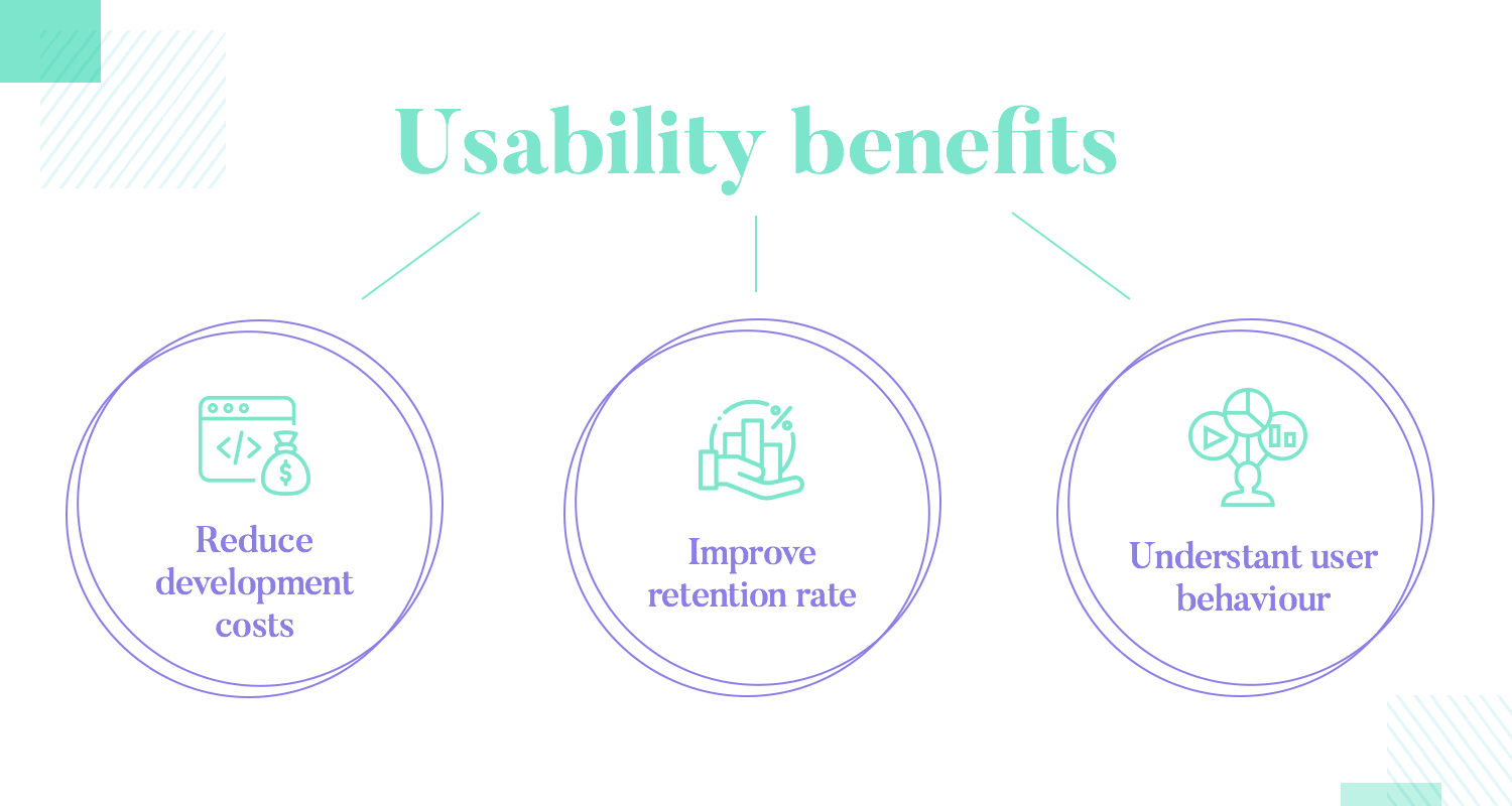
Despite the sheer volume of methods, tools and factors that all come into play when we discuss usability, a few things remain true for all. Those things are the benefits and reason why no designer worth their salt foregoes testing. Check it out:
Reduce development costs. It’s no secret that changes made to the design before any coding is done are cheap. Changes made once the code is in are troublesome and very expensive. That’s why designers rush to test everything so that everyone can be sure that the final design won’t have any catastrophic failures that require changes to the product.
Improve retention rate. Even once everything is online, usability testing goes on so that you can better understand the performance of the product. Why are people abandoning your app? Why do visitors leave your website without buying anything? Testing can be a great way to identify holes in your sales funnel, so that your design team can start fixing the issue.
Understand user behavior. Understanding how your users react, process and feel about the design is important. User testing can act as a window into the minds of the users, where you can take an objective look at their behavior and draw conclusions from the data.
On a similar note, we have the matter of accessibility. This refers to specific testing and design measures that we can take in order to make sure that all users can use the product. This focuses on users with disabilities, most likely those who will use the product with the help of some assistive technology. Check out our full guide to accessibility testing for a full run-through.
These are all but a classic. The Norman Nielsen Group created 10 rules that apply to all products that UX designers get their hands on. These are known to be quite tough to respect, especially all at once in the same product. With that said, these rules act as a standard when it comes to great usability, effectively setting the bar for all designs.
Visibility of system status. This is a way of saying that users need to know what is happening at all times. Since humans can’t truly talk to machines, it’s up to designers to indicate that commands have been registered, that something’s loading or that some data is being retrieved. Absence of system status usually results in confused users pressing the same buttons over and over.

Match between system and the real world. This points to the fact that digital products, in a certain way, need to match the physical reality where we live. Buttons need to look like buttons, written text must feel like a normal conversation and information needs to be offered in a reasonable way.
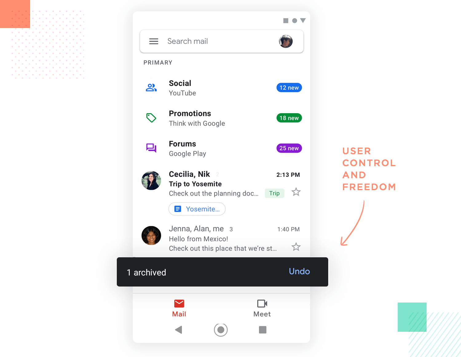
User control and freedom. People need to be in control of what happens in the product as well as to have freedom from their own mistakes. People will often regret buttons clicked or text sent, and it’s up to designers to help users to be free from the consequences of these mistakes. Things like undo buttons come into play here.
Consistency and standards. Trying to push boundaries and innovate is great – but there’s a right way to do it. When it comes to UX design, it’s important to remember that users spend a lot of their time using all sorts of digital products. These products have set their expectations, and trying to go against these expectations can be disastrous. Users expect a hamburger icon to be a menu and instead of fighting this assumption, use it in your favor.
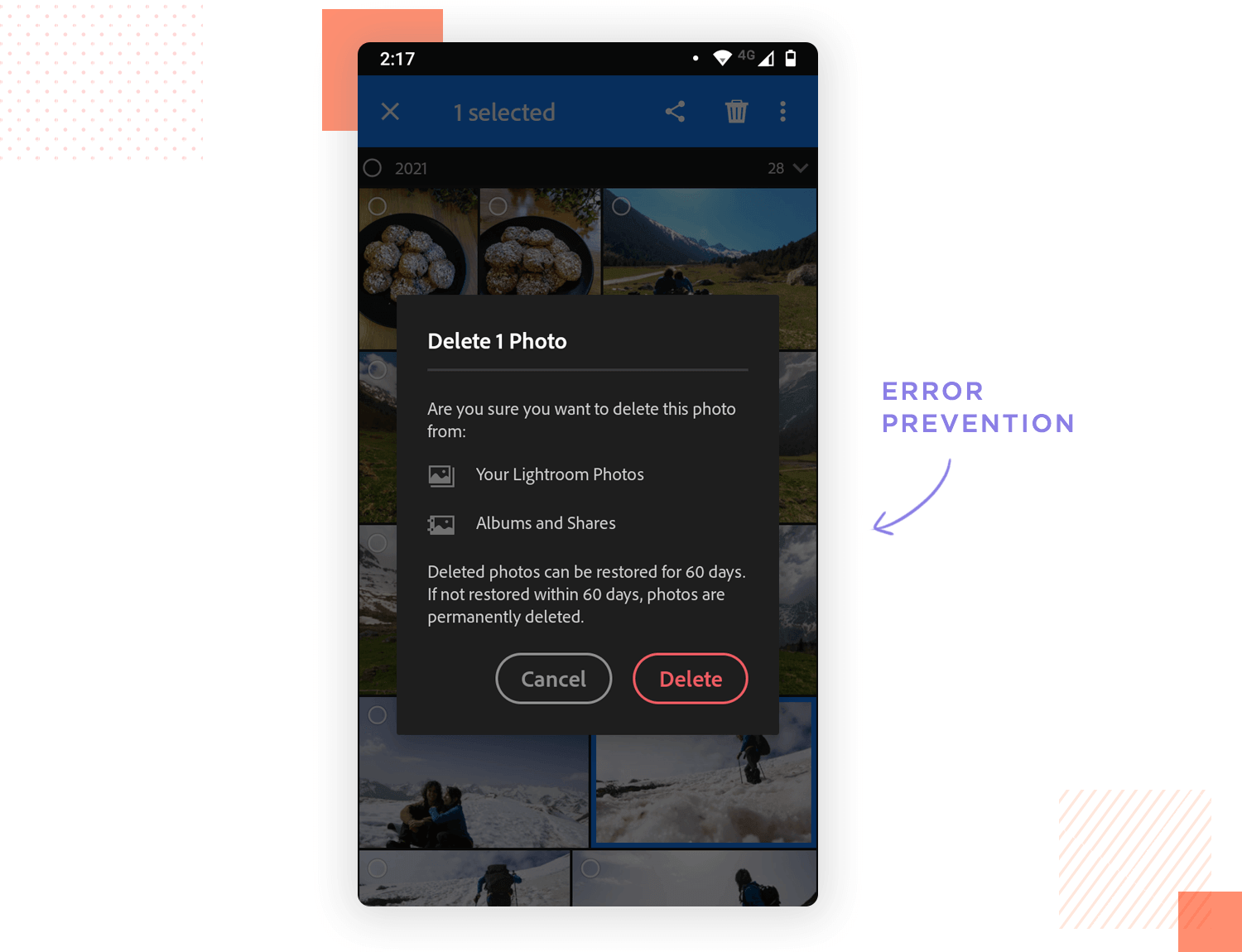
Error prevention. Just like you want to help users recover from their mistakes, you also want to minimize the margin for error. This is all about testing the design and finding areas that are the most error-prone and adjusting accordingly. Rather than it be a slip due to inattention or a conscious mistake, you want to have users simply enjoying the app and not making an active effort to not make mistakes.
Recognition rather than recall. People have terrible long-term memory. It’s a fact of life. And so, it’s important that you don’t expect users to remember anything they’ve seen on the product interface. Any information that is important should be either shown to users or be easily retrieved.
Flexibility and efficiency of use. New users are likely to spend time exploring the product and using the most obvious path to complete their tasks. With that said, you want to create shortcuts that add a certain flexibility to the design for those who aren’t novices. If people will be using the app repeatedly, you want it to be efficient.
Aesthetic and minimalist design. This isn’t quite the same as the popular style of design, but rather a more functional standard for any screen. You absolutely don’t want to include useless information or things that don’t need to be in the interface. These extra elements can mess up the visibility of the screen and create a cluttered look. At any point in time, include only the things that are necessary in the design.
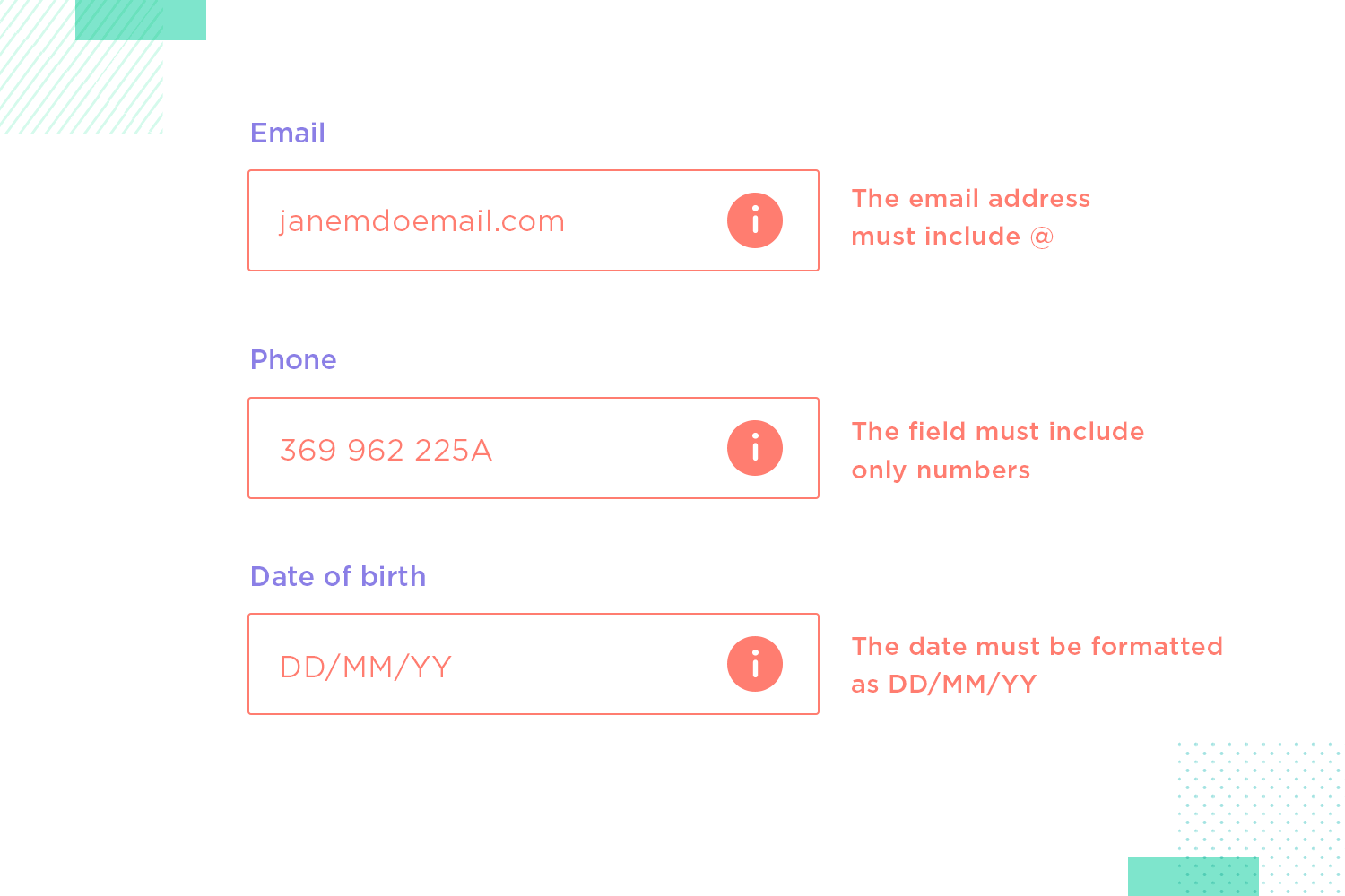
Help users recognize, diagnose, and recover from errors. This heuristic basically concerns error messages found in the product. The days where a simple “Try again” showed up on the screen are long gone. Good UX design helps people understand what went wrong and points them towards a way to recover. You want descriptive messages that give context to users.
Help and documentation. Ideally, you want a product to be easy so that users don’t need any help. However, for many products out there that is just not feasible. Take a tool like Justinmind’s prototyping tool. Yes, users can learn to use it on their own – but they may need help with certain features or specific tasks. You want to have documentation that is easy to understand and easy to search, for users to be able to see the actual step-by-step breakdown of any given task.
Design wireframes and hi-fi prototypes with Justinmind for Free. Unlimited projects!

The most important thing about your website is the reason that your users come in the first place. So it’s natural that you’ll want to remove as many barriers as possible to helping them achieve what they came to do, whether that be finding products or information.
Keeping your website design minimalist in detail can help towards achieving this goal. Make sure there are no superfluous details that can distract the user from finding whatever it is they need to find. Cluttering the screen with lots of irrelevant controls and content can distract the user from the main task at hand. Only include what needs to be on a given screen at that moment, i.e. the content or products your user is looking for, along with navigation options.
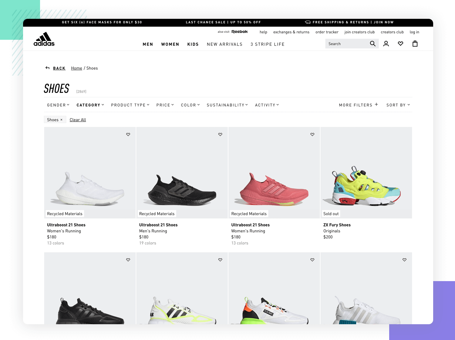
If it’s an ecommerce website design, you’ll want to ensure that the user finds the products they’re looking for as quickly as possible, and that while they’re browsing, there’s as few distractions as possible.
Maybe you’re designing a hotel website and want to captivate the audience. Can you use eye-catching hero imagery and storytelling videos? Certainly. But just make sure the user can find what they need immediately, with a big gaping call to action saying BOOK NOW.
Remember: Simple and intuitive layouts tend to work the best when it comes to the UX principles of effectiveness and efficiency. There’s a reason no one wants a return to what web design was like in 2001!
A user walks into a bar and says they understood your interface at first glance. And if they’re not joking, then it’s because you nailed Krug’s 1st law of usability. This UX principle states that a UI should be self-explanatory which makes for easy learning.
Make your website design as simple to navigate as possible. Have the main navigation menu at the top in which users can access the most important features, product or content of your website. Hide less important options in subcategories.
Above all else, make sure you’re adhering to users’ mental models. A mental model is an idea that a user has of how something works. Most people, when they see an arrow in a field, understand it’s a dropdown menu and most understand the pagination metaphor. However, it always helps to test your designs on your target users just to be sure. Your idea of how something works might not be the same as your users’.

Lastly, one of the most natural ways to facilitate quick learning of your website is to be consistent in your use of elements and language. This reduces cognitive load for the user as there is less to interpret each time.
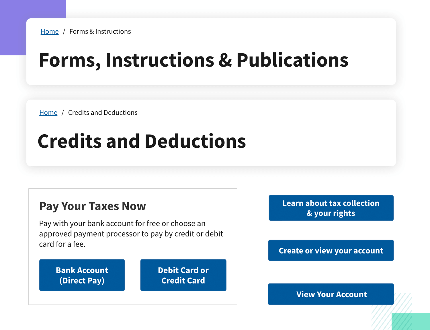
For example, let’s say that you use an orange button to add an item to a shopping cart and a green button to proceed to checkout. Maintaining this color combination throughout your website will create consistency. Likewise, if you use a date picker on one form, it makes sense to repeat this through all forms on your site.
The UX principle of efficiency is all about focusing on the speed with which your users are able to carry out their tasks.
Always think about how you can reduce the number of clicks, strokes and scrolling to an absolute minimum for each task. A good rule of thumb is that most tasks shouldn’t take longer than two minutes for the user to complete.
Another trick to boost the speed with which users carry out tasks on your website is by grouping similar content or elements together, and by grouping similar questions together on forms. You can also speed things up a notch by regaling users with accelerators.
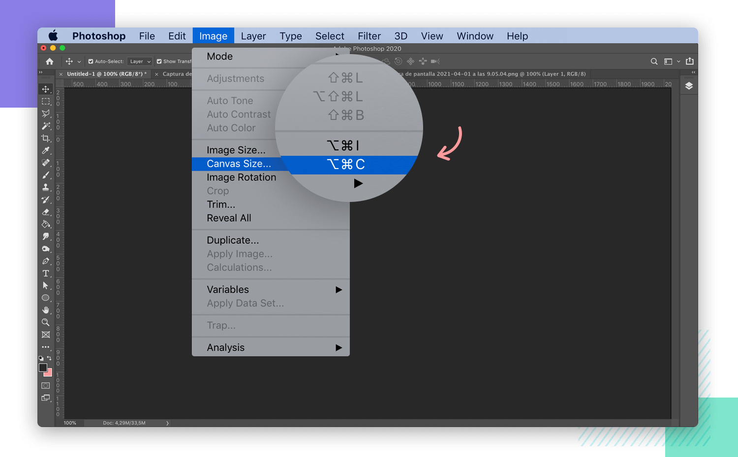
You may also want to factor in power users when it comes to the UX principle of efficiency. Users who will be using your website frequently, or who use other similar products will appreciate not having to perform the tasks at the same speed as newbies.
A solution to this is to use accelerators. These are any controls that help users literally speed things up, usually by using keyboard shortcuts. Everyone knows the universal accelerators ctrl+c and ctrl+v. If possible, examine the other tools that your user base uses.
This will not only help to demonstrate the mental models and UI metaphors they’re already likely to understand, but will also help you to copy any accelerators used in those products as well, so in doing that, you’re minimizing the learning curve as much as possible.
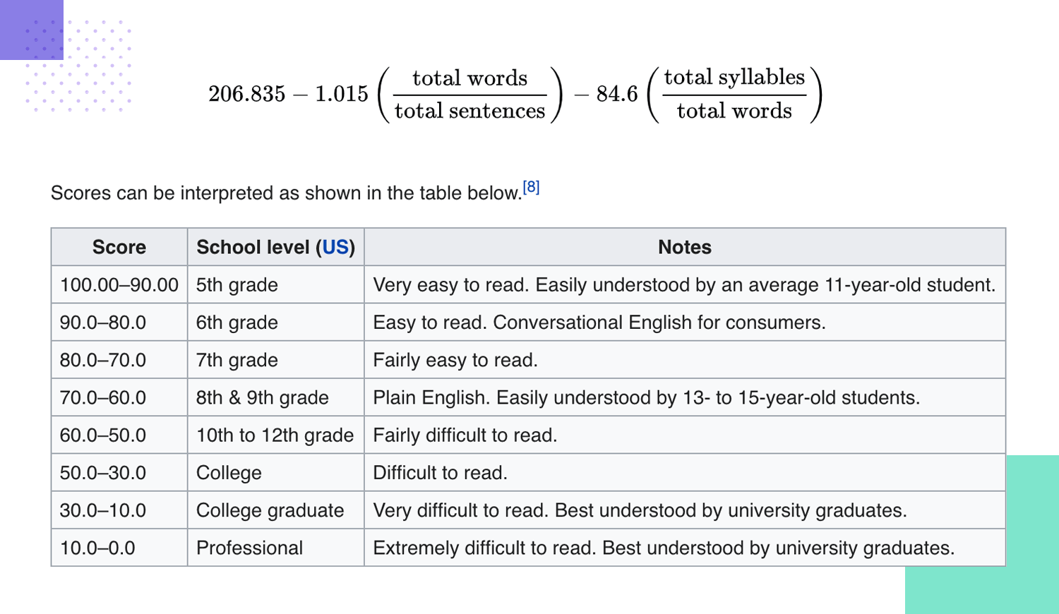
Using clear and simple language is an important principle for website UX design that will help your users get the job done faster. It’s as simple as that. The International Design Foundation recommends using language that could be aimed at 6th graders.
If you’re not sure on how complex the language is that you’re using, you can measure it using any of the myriad Flesch-Kincaid scale readers on the web, such as Grammarly and Pro Writing Aid. These will tell you the level of reader that would be suited to reading your text.
By using clear and simple language, you help increase not just your users’ comprehension, but also accuracy in carrying out certain tasks. Remember – with today’s fast-paced lifestyle, users are often in a hurry and tend to have shorter attention spans. There’s no benefit in using convoluted jargon or trying to be wordy.
Make sure instructions are as clear as day and helpful. An example might be when filling in forms. Error messages that appear on-time before a user enters in too many details.
It should be useful and explain what the problem is. For example, “credit card number too long” or “credit card number invalid”, or “please enter a date before 2015”.

Another important factor to take into consideration is to make sure that the copy you write on CTAs is clear and concise. This depends a lot on your brand, product and target audience, but mostly, you’ll want your CTAs to be clear and simple.
Start with an action verb and state very matter-of-factly what will happen, such as “subscribe to monthly newsletter” or “download app”. Sometimes catchy, yet descriptive CTAs also work, but you need to know your audience well. UX writers often take on the task of designing and refining the language used in digital products. Check out our guide to UX writing to learn more.
Deciding on the way to prioritize your content will help you design an information architecture that suits your users and helps them find their way around your site and get to the content that they need much faster.
Sometimes the best way to learn both how to prioritize your content for your users, but also how they would logically expect it to be organized on your site is through card sorting. Determining the optimum information architecture before beginning any design work will also help you decide on the content that’s most relevant to your users.
When users come to your website, they’re looking for something. Making sure your content’s relevant to your target users is an important UX principle focusing on effectiveness.
One way you can do this is by ensuring that menu and navigational items reveal the most sought-after content or content categories immediately, and in an order that makes sense to your visitors.
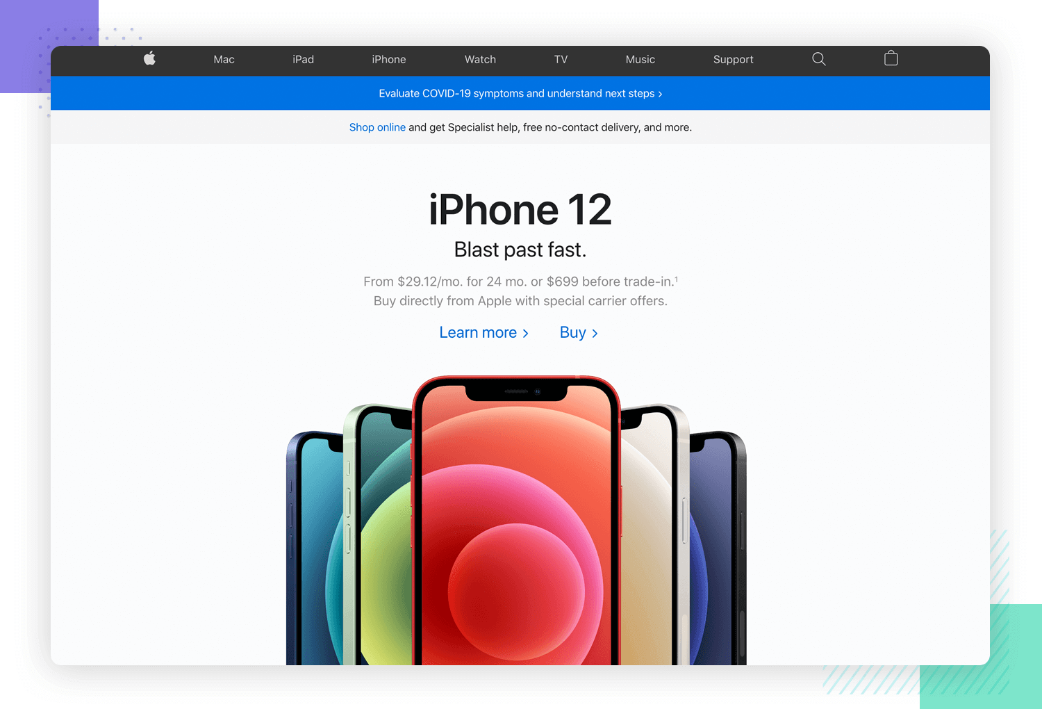
In the case of an ecommerce, you might want to place your most popular categories starting from left to right in the menu bar at the top of the screen, or as the first options in an overflow menu.
Your website UX should be as error tolerant as possible. This is an important UX principle because your users aren’t robots and everyone can make errors, especially when in a hurry. To increase efficiency, you should help your users correct any systematic error they make as soon as possible.
Imagine the scenario where they’re filling in a form. If a user makes one mistake in a field or leaves that field blank, a very unhelpful response would be to simply refresh all the fields and make them start again. This would be unproductive and frustrating for the user.
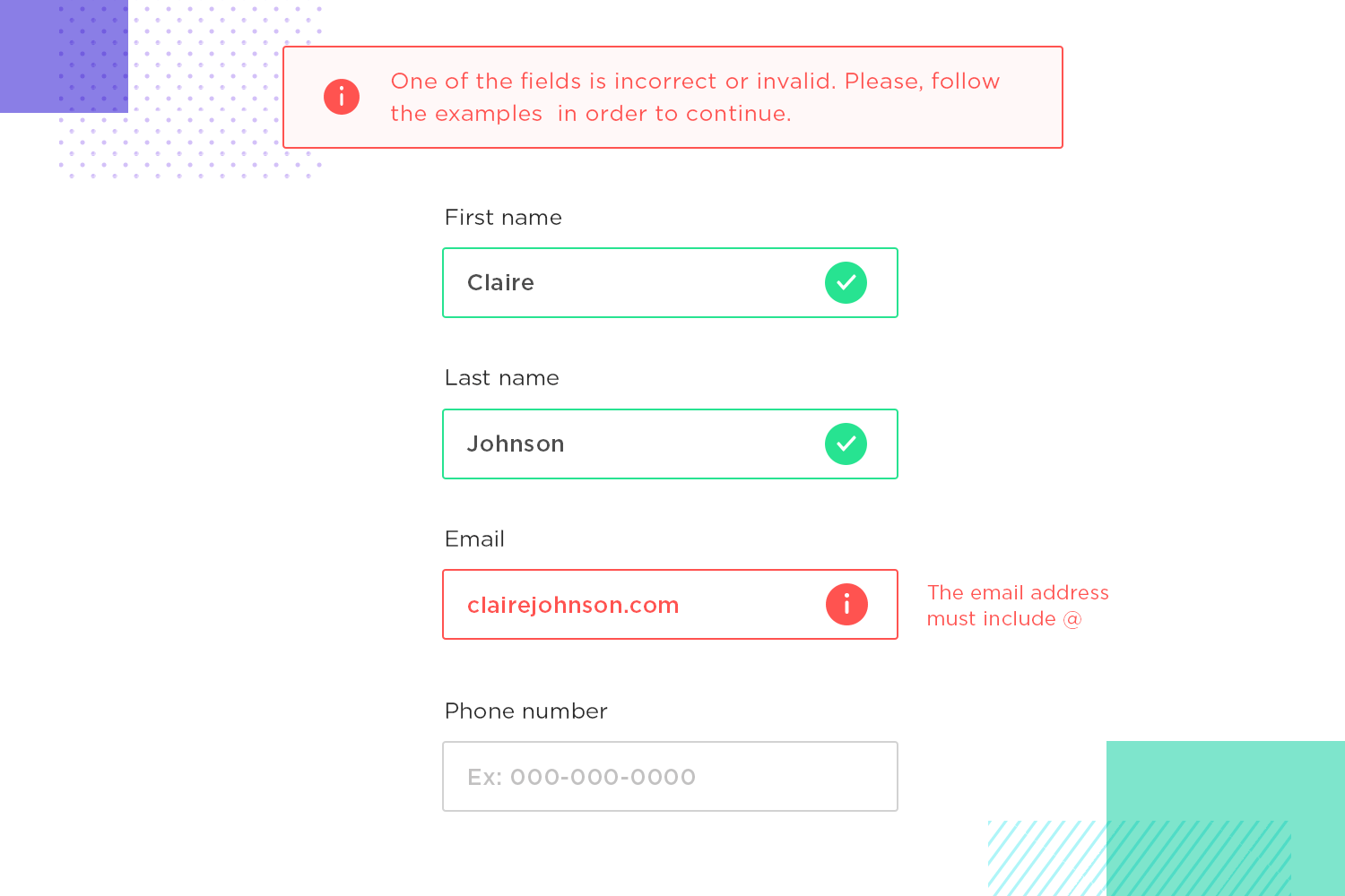
Sticking to the UX principle of error tolerance, we could retain the correct information in all other fields, while highlighting the field with erroneous data. We could further help the user by providing some clear inline instructions, such as “please enter a valid email address”. Even more helpful is when the user attempts to submit a form with an error, if it’s a long form, that the page automatically scrolls back up to the offending entry, without the user having to go back and search for it.
Our guide to form design has everything you need to know about the tricky but worthwhile pursuit of good form design.
Another way of making sure your website is error tolerant is by including warning messages whenever a user is about to perform a potentially risky action such as “by leaving this page, your transaction will be canceled” or “are you sure you want to abandon the contents of your cart?”.
Helpful 404 page design is something that every single website out there should have. While it’s true that we should do everything in our power to ensure that users don’t land on this page, the truth is you can’t always prevent it, no matter how hard you try.
To prevent frustration and to keep users on your site, your 404 page should provide as much help as possible to guide the user to where they need to be. Providing a bit of entertainment at this stage is optional but highly recommended to earn engagement points.
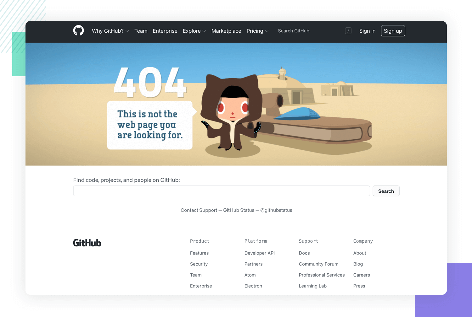
A good example here is Github. On their 404 page they have a search bar, a sign in form and a few navigational options below, in addition to an entertaining hero image. Giving the user the freedom to continue their search is less frustrating than simply showing them there’s been a 404 error. You’re saying “there’s been a problem, but here’s a possible solution” as opposed to simply “there’s been a problem, suck it up”.
One of Nielsen Norman’s ten usability heuristic evaluations states that a product’s status should always be clear to the user. That is, it should always communicate what’s going on in any given moment, as well as what’s transpired.
For instance, we can see the system status visibility UX principle in action when we hover over links and they automatically underline. It’s also evident when we hover over a button and they change color to a) demonstrate they’re clickable and b) to show which button the user is about to select if they’re in close proximity with others.
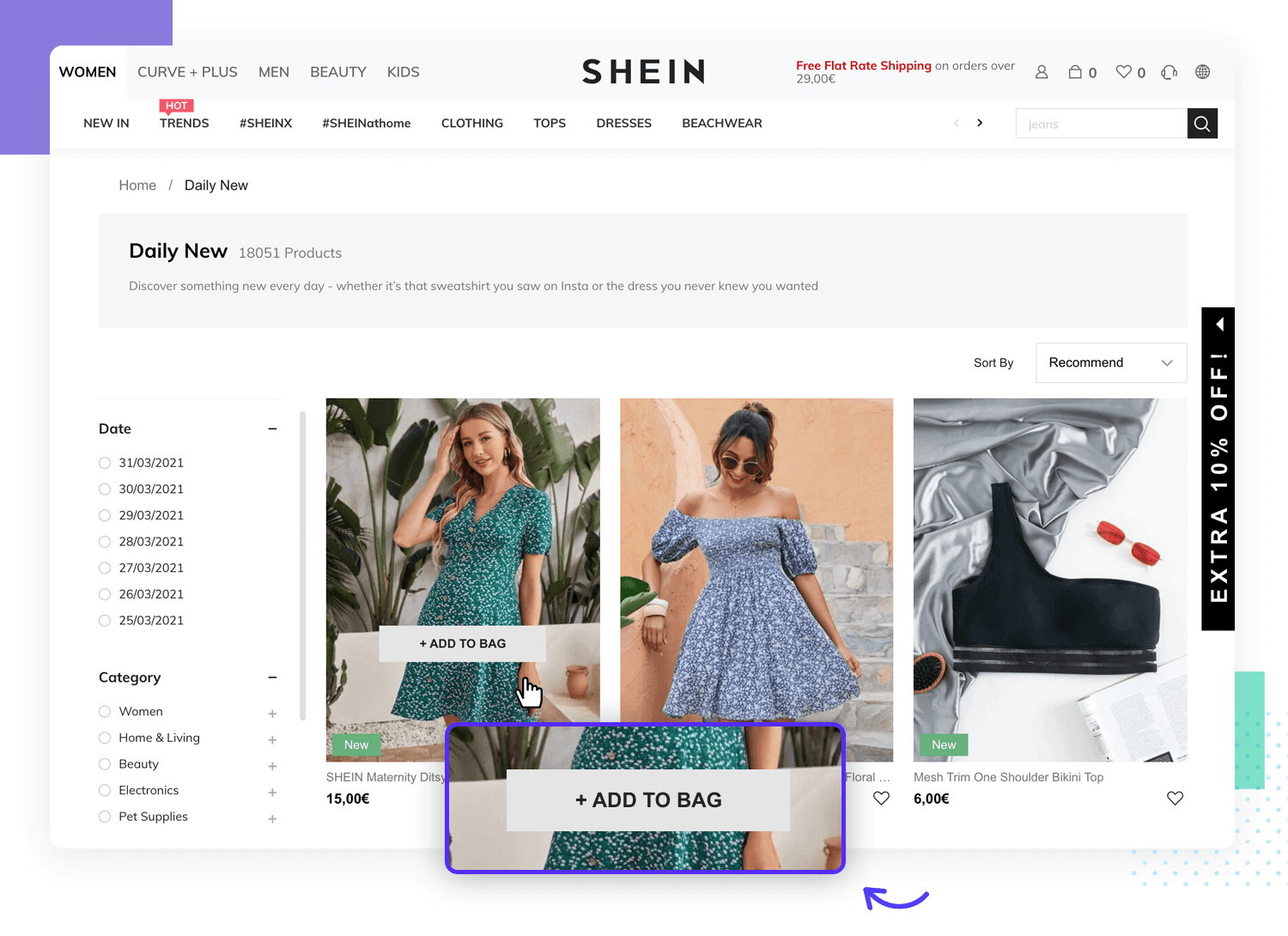
Yet another example of this principle in action is when the system wants to confirm to a user which actions have been completed. The simplest example to portray this concept might be the Gmail inbox that shows unread email as highlighted and read emails greyed out.
Freedom and flexibility is a UX principle that’s rooted in effectiveness. Especially when it comes to ecommerce design. Not allowing your users adequate flexibility leads to abandoned shopping carts.
To put this website UX principle in action, let’s say your user’s browsing a product range, but they haven’t created an account yet. Instead of forcing them to create one before they can add anything to the cart, just let them add the items for that session.
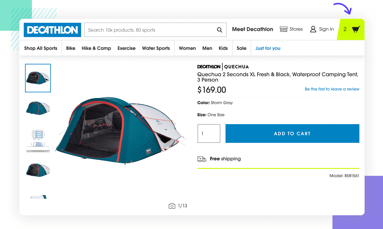
Sometimes users do this merely to save products for later reference. But if they’re forced to sign up and fill in forms, that’s a great way to start seeing those bounce rates increase.
When they wish to proceed to checkout, that’s when they should sign up. The same goes for browsing. Make sure they’re free to continue browsing and simply show the depicted number of items that are in the cart.
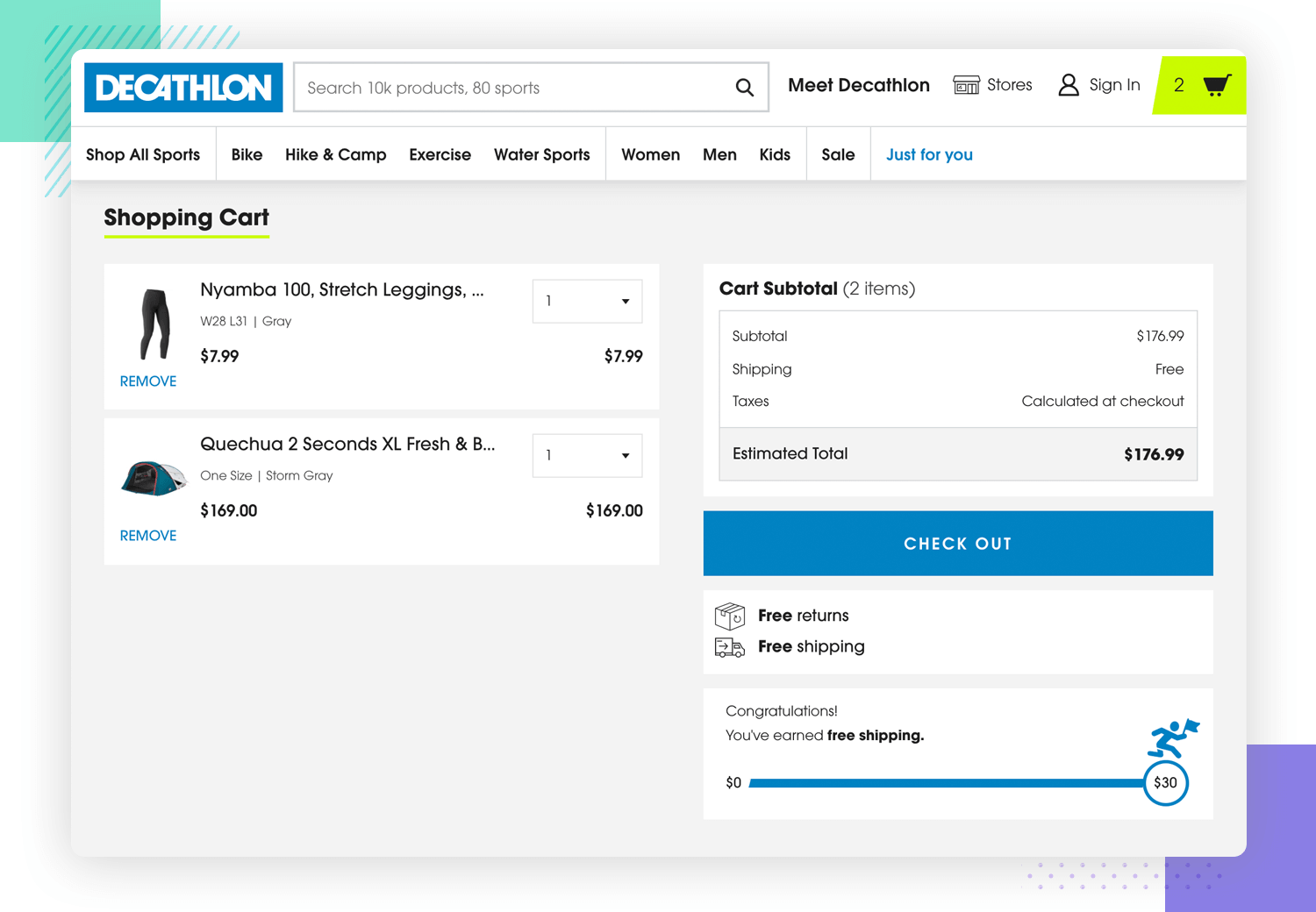
Decathlon is a good example of this, where the user, even before signing up for an account can see the subtotal of items they’ve added, then close the window to continue browsing and adding items.
Design wireframes and hi-fi prototypes with Justinmind for Free. Unlimited projects!

Content prioritization is one of the most important app UX design principles due to the limited screen real estate available. Most usability principles dictate that we should always prioritize our content based on our users, but on mobile, this design principle is even more important.
To do this, we need to ensure that only necessary content is displayed on each screen. If it doesn’t need to be there, take it out because it’s using up precious screen real estate and giving the interface a cluttered feel. Make sure there’s a tighter focus on core features and make sure that each page revolves around no more than one primary feature.
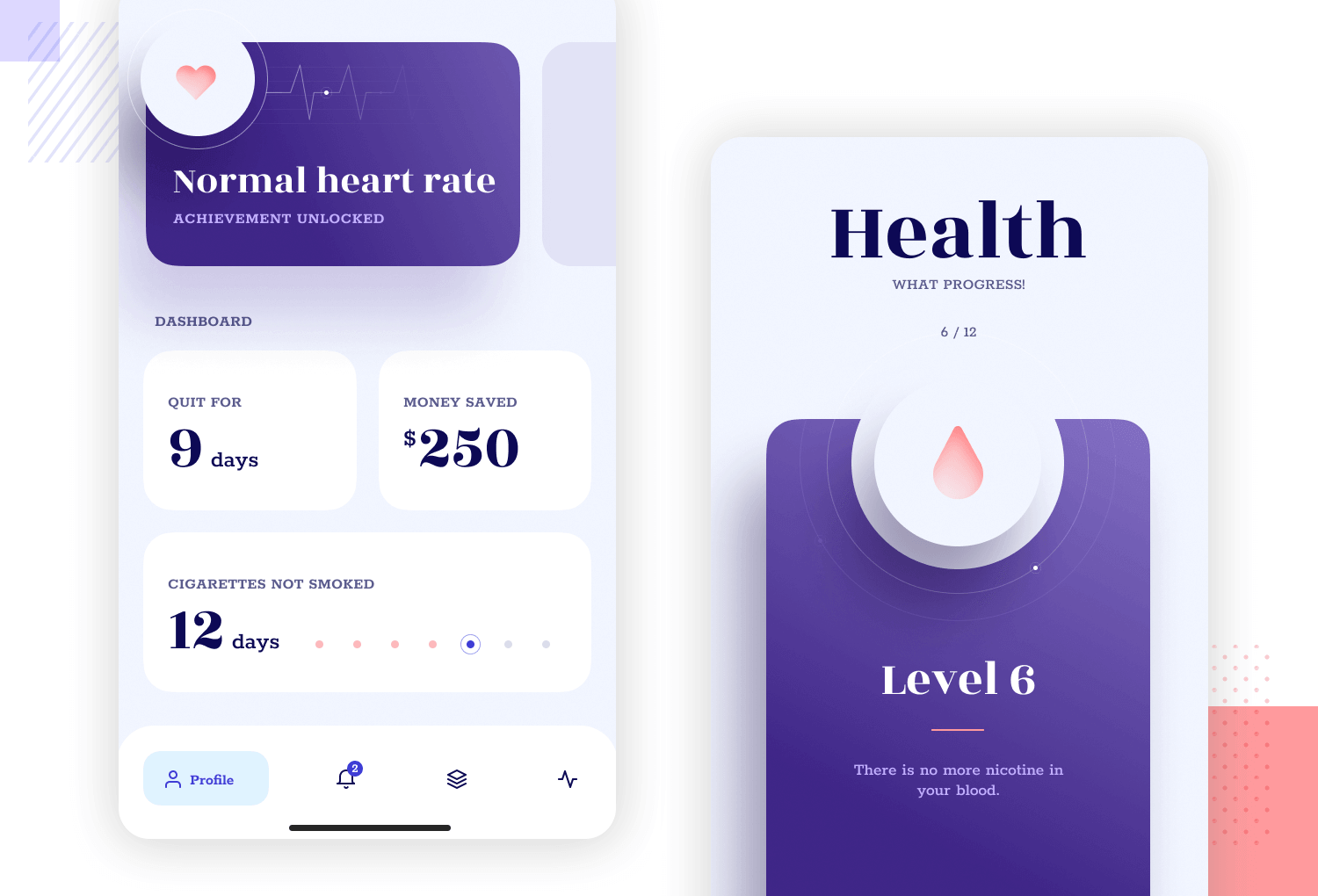
Thank you for (not) smoking - Andrey for Zajno Crew
For your content to be effective, you should ideally plan it out before you start designing the UI with your wireframe tool. This will involve carrying out a bit of user research beforehand and getting a list of product requirements, as well as devising an information architecture. Once you do this, you can start designing basic screen flows for each of your core features or content.
The onboarding stage is an imperative app UX principle that makes all of the difference when it comes to user retention.
Provide a brief walkthrough of the most basic core features of your app. Have the user perform a quick task using these features. Rewarding them during each step will activate the reward center of their brain, causing a small dopamine hit. Even if the reward just takes the form of an unexpected or quirky microinteraction, or gamifying the experience and giving them points (but making it easy).
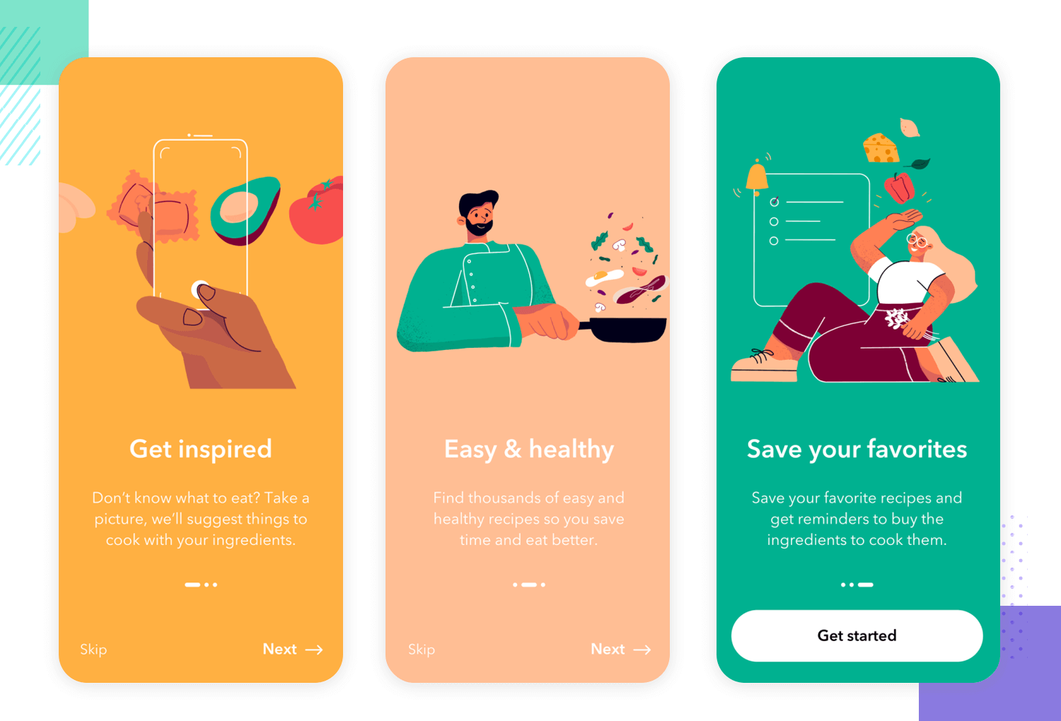
Remember, each and every interaction your user has is a chance for learning. Reveal secondary and tertiary features progressively, the more comfortable your user gets with your app. Loading screens are also a great way of teaching your users about extra features as they wait for a page or a feature to load.
This is also a good stage to ask them about notifications. Your app is a guest on their device and in their lives, afterall. Let them choose if they want to receive notifications as soon as they sign up on your app during the onboarding process.
Making elements like buttons clickable is a crucial UX principle relating to efficiency. When the mobile interface isn’t cluttered up with superfluous content, you’ll be able to capitalize on that space by ensuring any elements that your user will be interacting with are sufficiently large enough.
By elements, we’re referring to buttons, CTAs, sliders, toggle buttons and the typical expand and minimize options for accordions and dropdown lists. Our post about button design teaches you all the fundamental concepts underpinning this important mobile UX design principle.
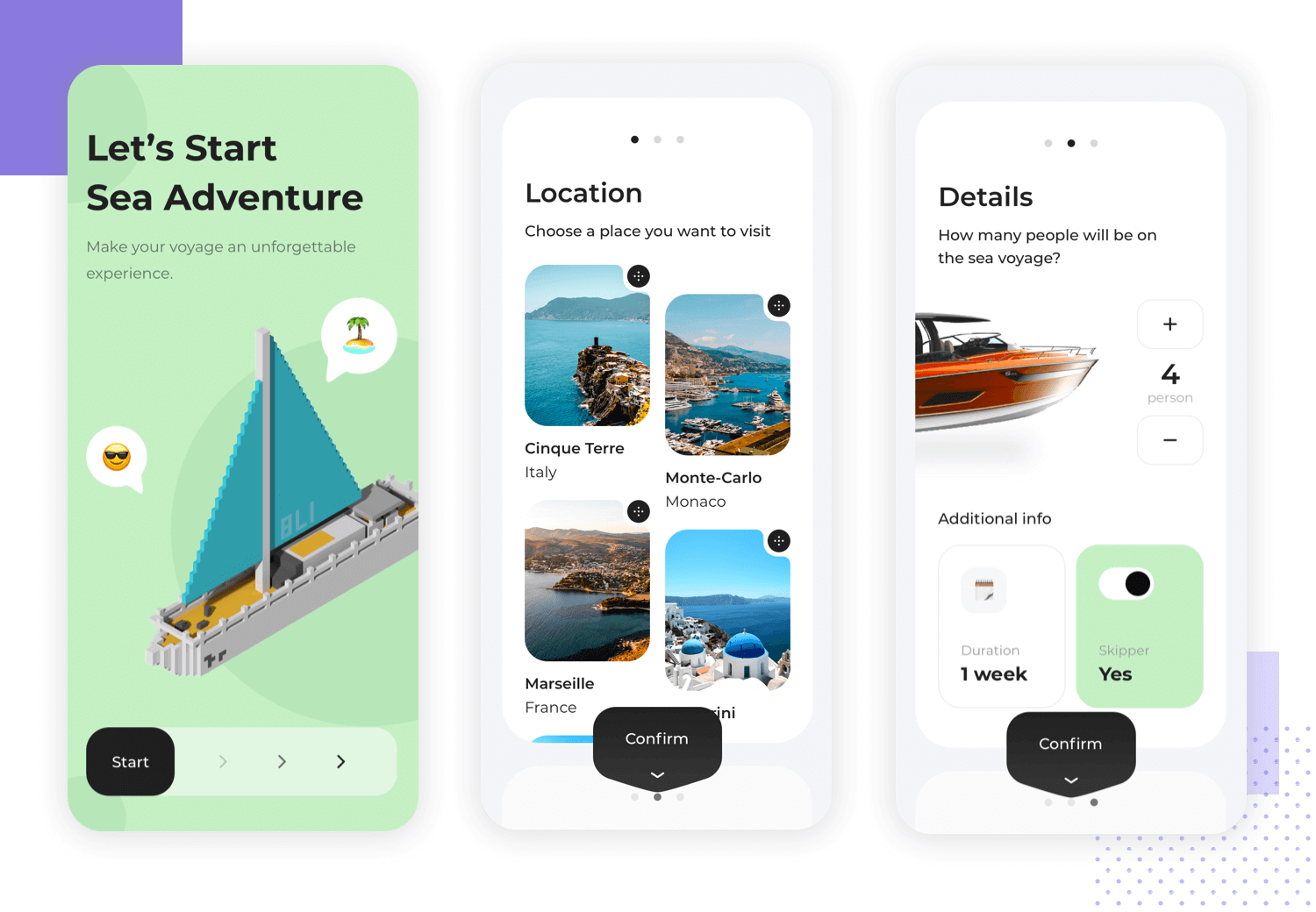
A typical rule of thumb to follow for this app UX guideline is to ensure that the buttons you’re designing are at least larger than the average finger diameter which is 15mm. To learn more about how to design buttons for an awesome user experience, check out our post on button design.
The UX design principle of legibility is crucial when it comes to mobile app UX design. Just because the screen size is smaller doesn’t mean that your text should be. Afterall, people’s vision doesn’t suddenly get better according to the device they’re using, so it makes sense to use an adequate font size.
In addition to size, you should also strive to ensure that you’re using a font that’s readable. You can implement branding, personality and style with your fonts, but always make sure it’s readable.
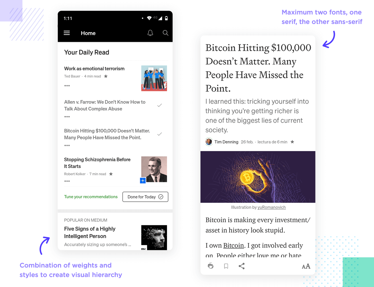
For optimal readability, we recommend going with a sans serif font for most text, including instructions, blog content, messages, alerts and buttons. Helvetica and Proxima Nova are some of the most prolific examples out there. For titles you can use a serif font to distinguish, such as Garamond or Times New Roman. Ideally though, you shouldn’t really be using more than two font families, and those families shouldn’t differ greatly.
See our guide to mobile app fonts to learn the best options for fulfilling the UX principle of legibility. If you need to create some variety in the fonts you use, you can always use different weights and styles, such as bold and italic as well as vary the size a little bit.
The position of the controls on a mobile interface relative to the user’s hand is an app UX principle that will set you up well with your users.
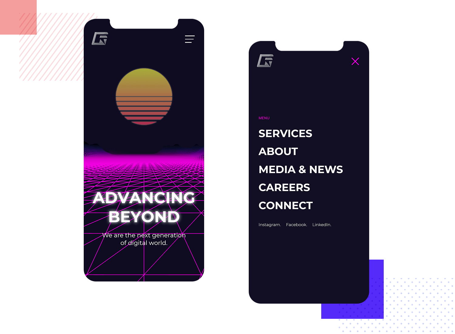
Groovrick Web Design - Abdul Rauf for Rauf Tech
When it comes to things like hamburger menus, the general consensus is to have them at the top right, as normally people hold their mobile devices in their right hand and navigate using their thumb or a finger. For this reason, you’ll often see the typical back-to-top button affixed to the lower-right side of the interface, in addition to other controls, like the typical floating “compose” icon to compose a new email in Gmail.
Minimizing data input on mobile is exceptionally important and a great way of boosting efficiency minimizing errors. On mobile apps, people will be on the move and will have less time. In some cases, they may have less dexterity than if they were seated at a desktop with a keyboard and mouse.
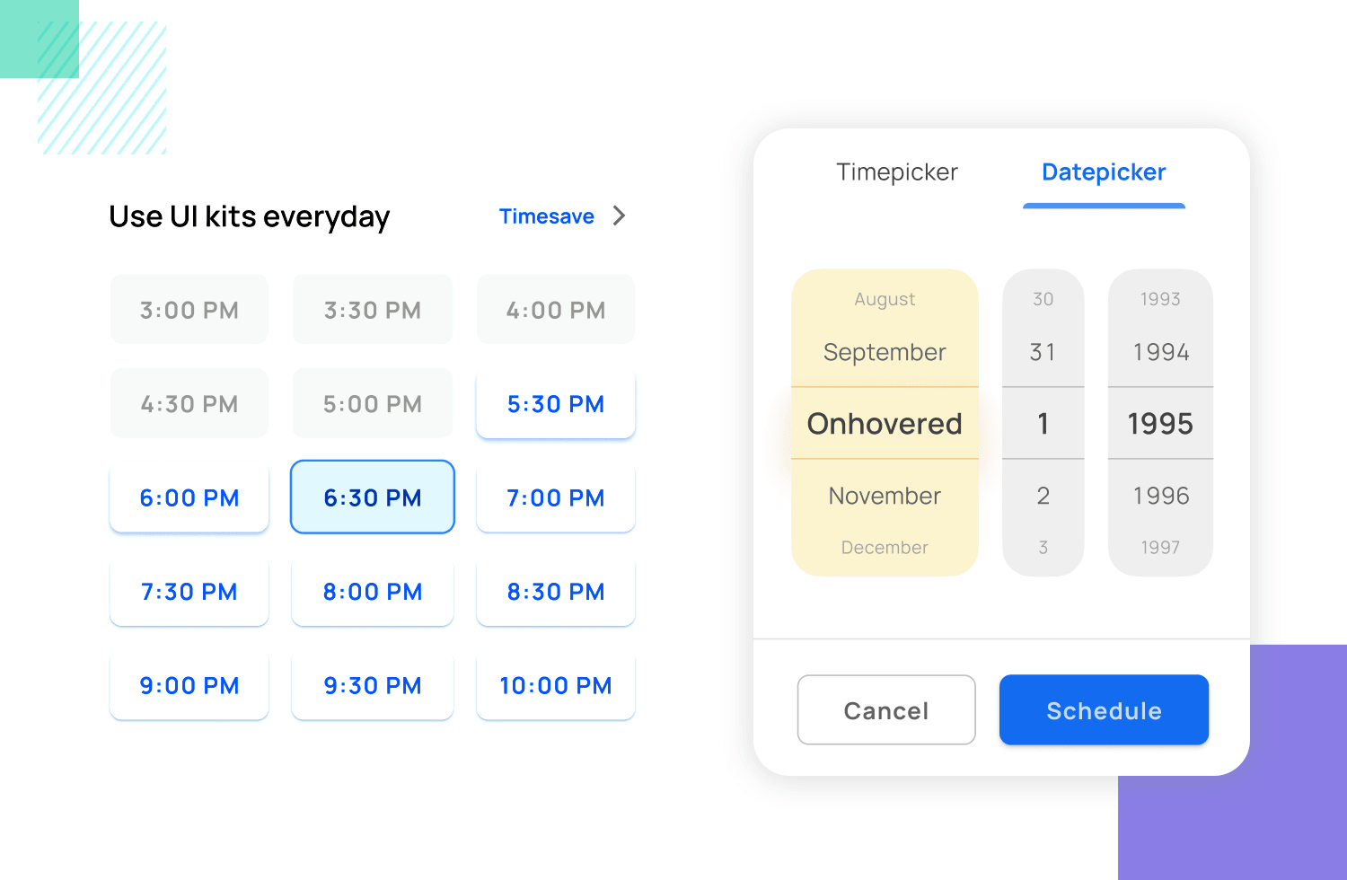
When it comes to forms, try and automate as many data entry features as possible. Make it possible for the app to remember emails and passwords. For search bars, apply an auto-predict feature where possible and use dropdown lists for date pickers or multiple choice questions.
As we mentioned above, when designing for platforms like Android or iOS, you should always take into account the following systems: human interaction guidelines for iOS and material design for Android.
The reason for this is because you should design your app to behave like an iOS or Android app. For example, iOS users will expect the navigation of an app to behave differently to that of an Android user. They will also expect it to look different – it should merge seamlessly into the iOS environment.
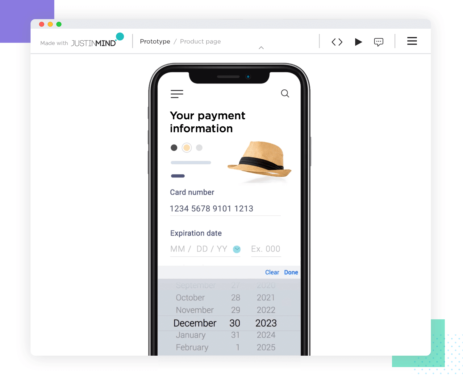
The other most important thing to ensure is that your app’s controls never interfere with native controls. For example, always use the native iOS dropdown list when designing apps for iOS devices and, as we mentioned above, never interfere with the docked menu bar on Android devices.
When you’re creating the screens and interaction design that your mobile app UX design will have, you’ll need to take into account that many users will be on the move. For this UX principle, it’s helpful to design for someone standing up on a crowded bus, subway or train.
When you factor users’ motion into your design, minimizing the need for data input as we mentioned above makes sense. But your mobile app should ideally also provide adequate contrast to suit the various lighting conditions the user might find themselves with.
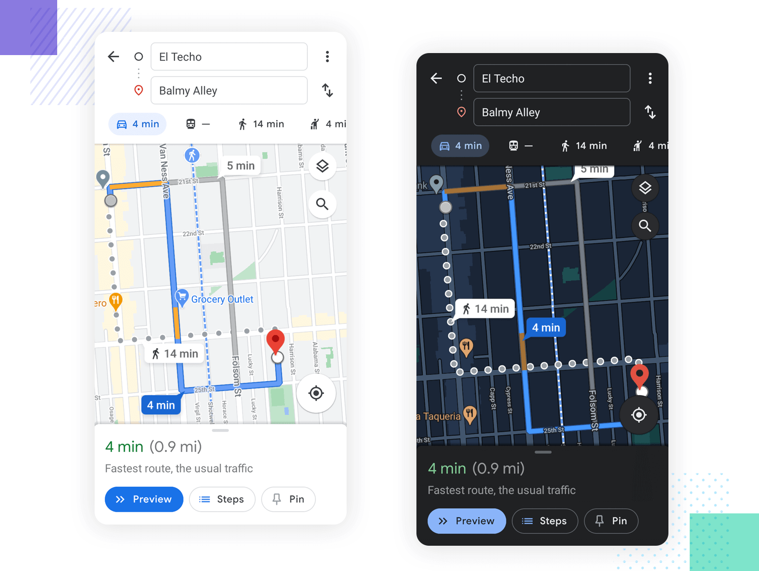
On a particularly sunny day, meaning there’ll be lots of glare. Ensuring there’s adequate contrast between background, elements and text will help boost usability and effectiveness.
However, you’ll also need to account for situations where there is low lighting. Having a bright, glaring screen in these situations isn’t optimal and can tire out a user’s eyes fairly fast. For this reason, it also helps to have a dark mode setting for your mobile app UX. Make sure that you think carefully about how your brand’s color palette and logo will work both with light and dark backgrounds.
Users have different devices these days and you’ll want to ensure that their experience across the full range of channels they use is the same. To do this, it’s important to see where in your user journey your app fits into their lives and on which device they might be using your product at which time.
Make sure that you design with a special grid to ensure that the content and the UI layouts of your devices can scale down perfectly. A good example is the one below. Make sure that when it comes to branding, that your product echoes it across all of the touchpoints your user will have with it.
We at Justinmind are of the opinion that the TETO UX principle, ‘Test Early Test Often‘, should be applied to every web design project, whether it be moderated or unmoderated. If you begin user testing right from the wireframe design phase, you’re more likely to find and fix problems earlier on in the design process: saving time and undoubtedly a few headaches along the way.
Put yourself in the user’s shoes: you wouldn’t take a new car home without taking it for a spin, or buy a new pair of jeans before making sure they fit just right—the fact is, you want to make sure that you’re getting what you want. After all, the User is King, so consider letting them test your site before letting your coders loose.
Check out the many user testing tool integrations Justinmind has to allow for regular testing and iteration.
We believe a prototype is the best communication tool between users and the software development team. Prototyping your design gives you the opportunity to see where it works and doesn’t by testing, tweaking and adjusting as you go.
Learn more about how you can test out design principles with our guide to the 15 best usability testing tools on the market.
As you’ve guessed by now, UX designers need to wear many hats and have a diverse set of skills in order to succeed. It’s true that demand for UX designers is only bound to increase over time, but the UX industry is fast-paced and very dynamic. Let’s take a look at some of the key aspects of any UX designer worth their salt.
Being a good UX designer takes more than a good eye for visual design. You can check out our post on top skills for a UX designer for a more complete list. With that said, here’s a quick look at some key skills that can make or break any designer.
Know your UX research. UX designers often work with UX researchers, but in small teams it can fall to the designer to conduct the research that supports the entire project. Even if you tend to go for big companies that already have a research department, you still have to understand the basics of why research is so crucial as well as how to reflect findings in the design.
Communication and empathy. These two go hand-in-hand when it comes to both being able to see things from the user’s point-of-view as well as communicating with the design team. On the one hand, you need empathy in order to put yourself in the user’s shoes and design something that is truly tailor-made. On the other hand, you need empathy and communication skills to transmit design decisions and rationale – both to the design team and any external stakeholders if need be. UX design is all about people.
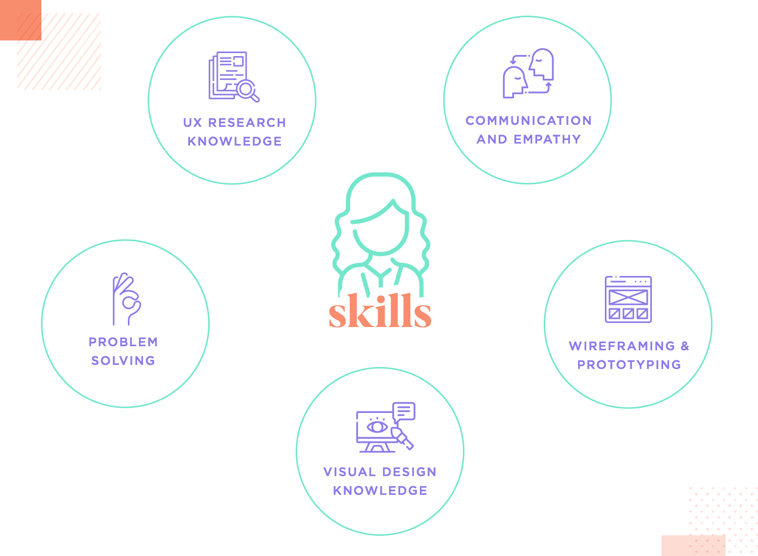
Problem-solving. This is key in UX design, because it often works to build bridges and solve issues in one way or another. Rather it be a huge problem that goes to the core of the product or a minor issue in the navigation design, UX designers are very skilled at seeing past the issue and ideating solutions that innovate and elevate the design.
Wireframing and prototyping. These two are crucial, because they are the embodiment of all the hard work that the design team invested into the project. As a designer, you need to know your way around a prototyping tool that allows for the team to build on the design as well as test it thoroughly. You need to know how to create user flows, navigation systems, add interaction and detail to the prototype.
So, what do designers actually do on a daily basis? This can be a difficult question, because it can vary a lot depending on what company we focus on or what specific area of the design the professional operates in.
In the UX design industry, big companies have teams that include UX designers, information architects, UX researchers, UI designers, engineers and marketers. The UX is broken down and divided into parts, so that each team member has a specialty where they shine bright.
In contrast, smaller companies have UX designers that have to wear all the hats and basically handle the entire experience design on their own. In this case, UX designers will deal with the information architecture, interaction design and research – spearheading everything UX-related with the help of a Product Manager.
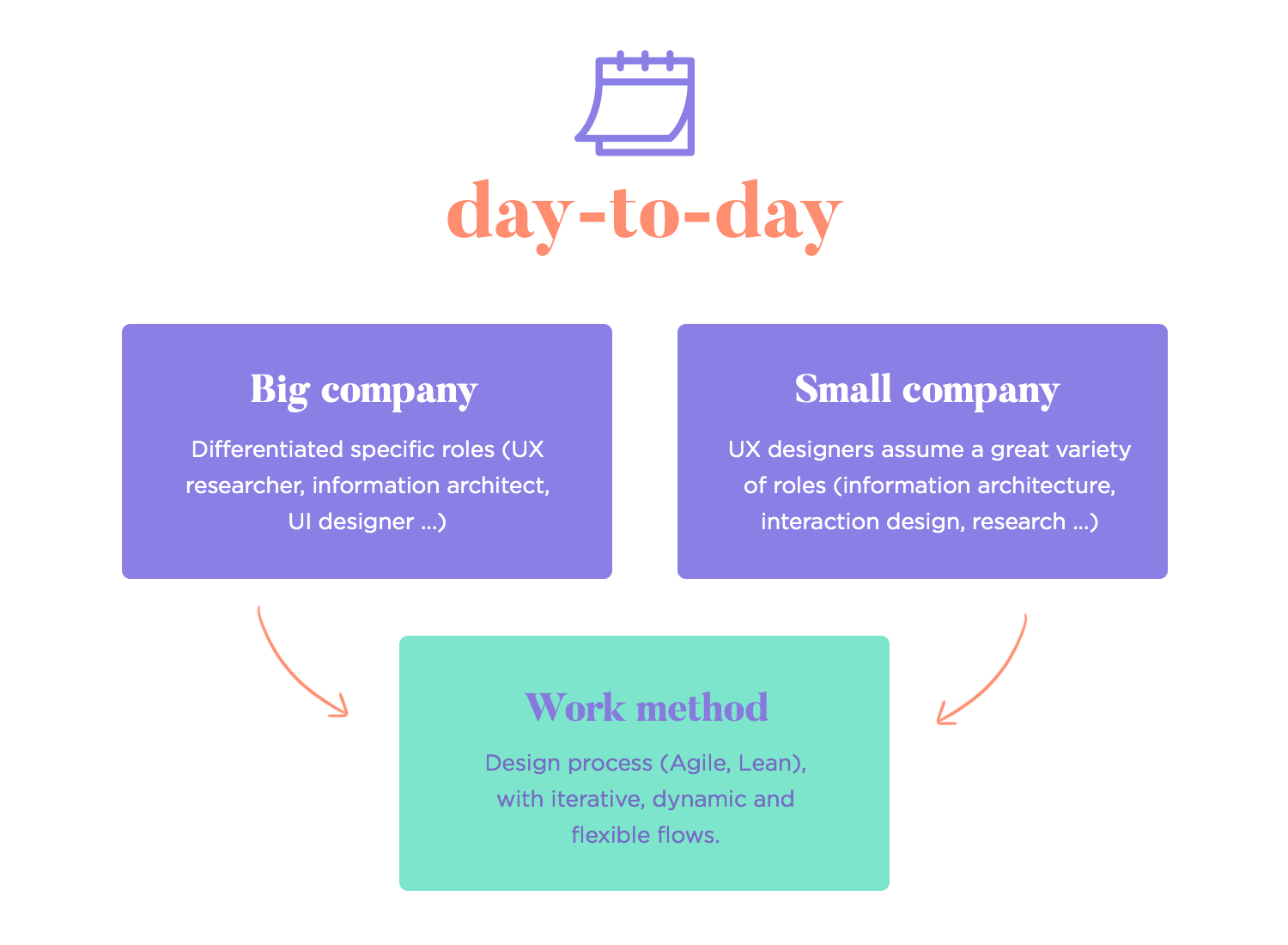
Another thing that will dictate what a UX designer does on a daily basis is the very design process in their company. For example, the Agile Sprint method is very popular in UX design teams – heck, we use Sprints ourselves here at Justinmind. That means that work is divided and prioritized in a certain way, with periodic meetings that get everyone together to discuss progress made as well as next tasks to be approached. It’s flexible and dynamic.
Other popular workflows for UX designers can include design thinking flows or the Lean approach. Regardless of which one your design team uses, it will likely dictate what you work on and when.
There are many great articles and interviews with UX designers where they share their daily tasks, sometimes down to the very hours of the work day. We love this article on What a UX designer does by our friends over at the Builtin. Another wonderful article is A day in the life of a designer, by our friends at CareerFoundry. Both make for excellent reading material, especially for those considering making the leap into UX design as a profession.
The differences between a UI and a UX designer will often depend on the company. In theory, the line between one and the other is the divide between functionality and visual design.
A UI designer deals with everything related to the visual aspect of the interface, particularly focusing on creating the layout and visual hierarchy throughout the product. It falls to the UI designer to wireframe the initial design, as well as creating and maintaining the pattern library and any style guide there may be. Anything related to colors, fonts and imagery is the UI designer’s responsibility.
Sometimes, the interaction and animation may also fall to the UI designer. This will largely depend on the size of the design team and how the product manager chooses to divide the work between UI and UX designers.
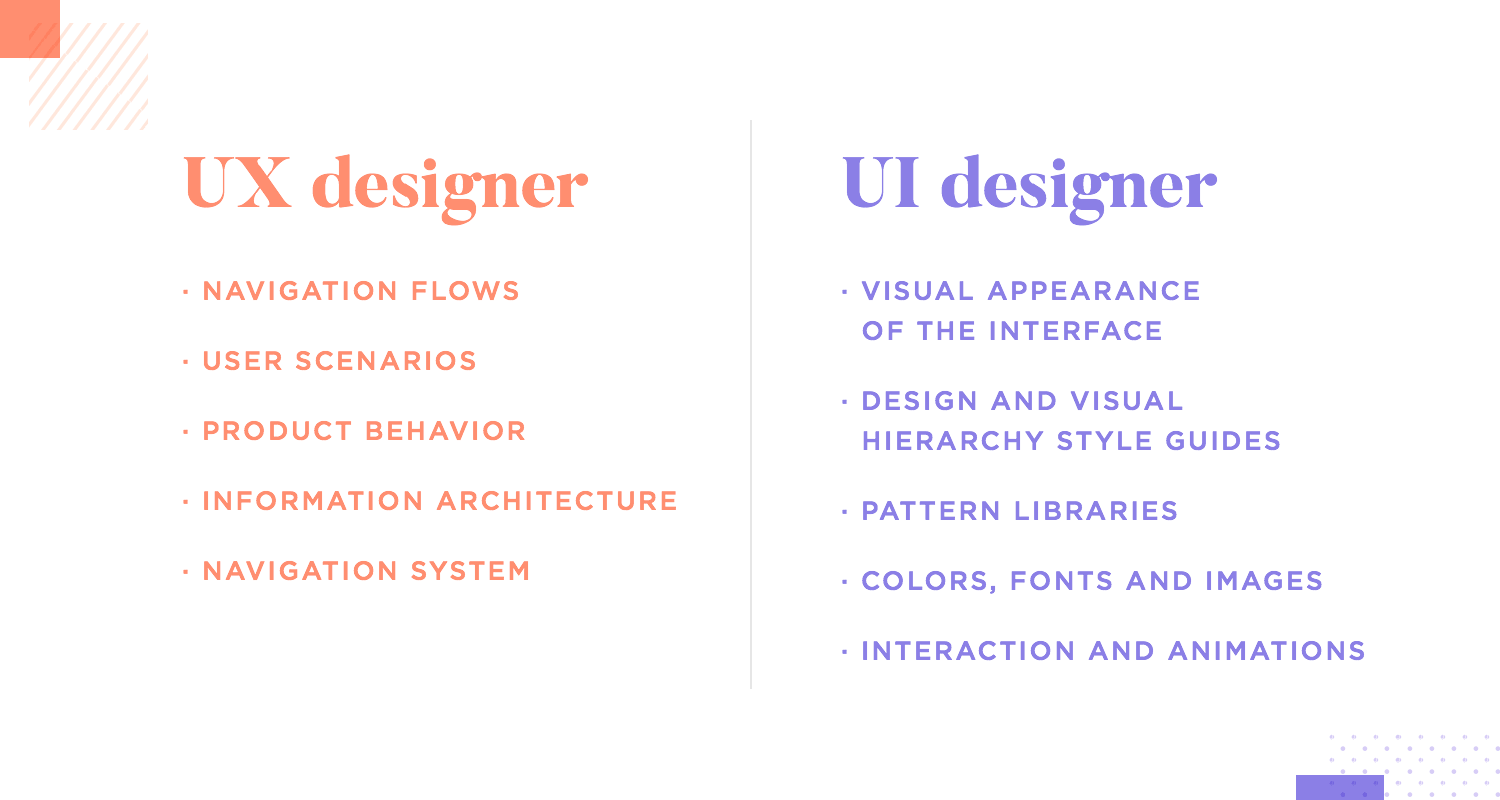
In contrast, a UX designer deals with the functionality of the product. The navigation flows, the user scenarios, the behavior of the product. Things like the information architecture and general navigation system tend to fall to the UXer.
Together, both UI and UX designers elevate wireframes into full-blown high-fidelity prototypes – both in terms of how it looks as well as how it behaves.
While these two roles are often performed by the same person, especially in small teams, most big names on the internet separate them.
Generally, a UX researcher has to carry out studies and do lots of work before the UX designer can even start to create a solution. The researcher deals with setting the scene and giving the designers all the information they need. Things like who they’re designing for, what the user needs are and what pain points there are.
In contrast, the UX designer aims to find creative ways to design, using the research as a guide. The design team deals with wireframing and prototyping the design, with the help of the UX researcher. The UX designers will depend on several materials that are either created by the researcher or in close collaboration with researchers – like user personas, user stories and so on.
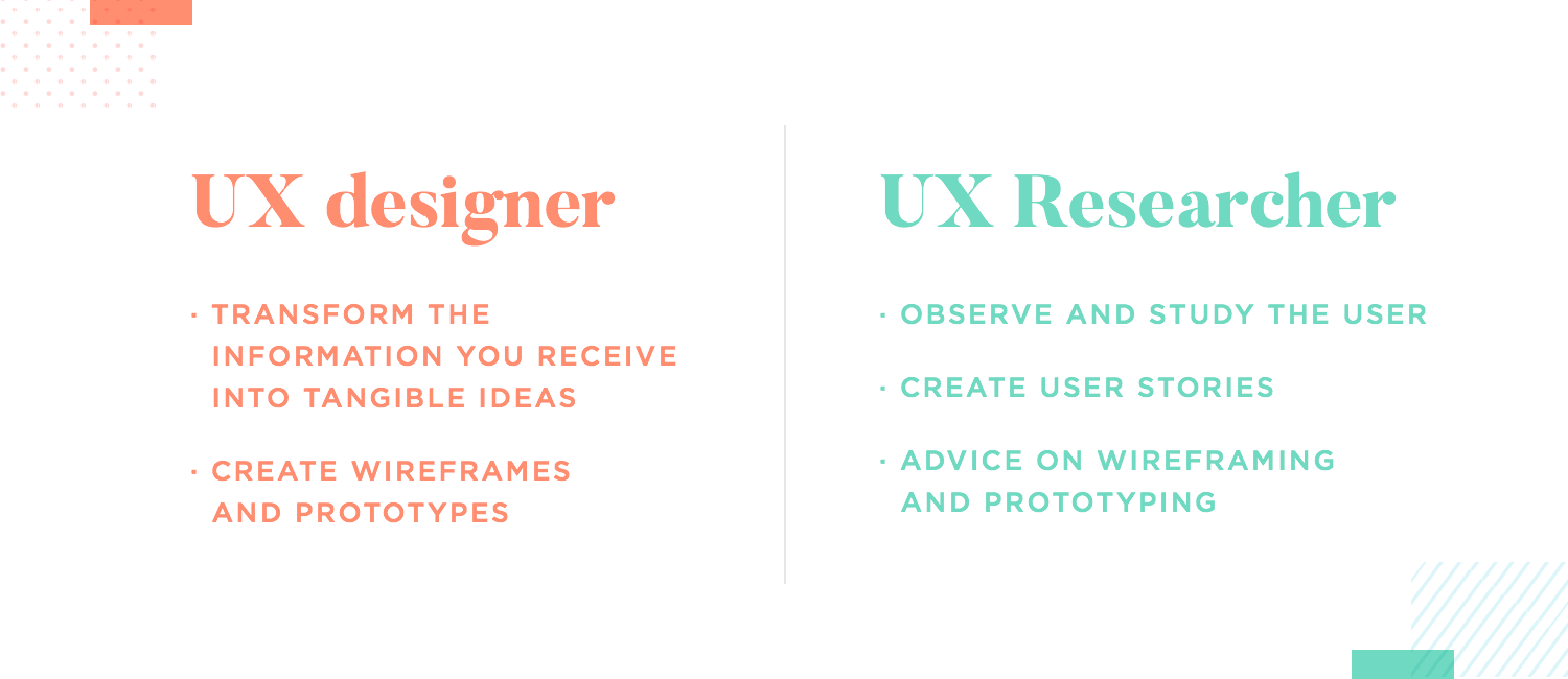
Once there is a prototype, it falls to the researcher to carry out usability tests and once again, study how users react to and behave with the prototype. The UX researcher seeks also to understand the weak points in the prototype, translating the entire study into a report that can be passed back to the designers.
The design team, armed with the user testing results, will adapt the design and apply the recommendations made by the researcher. This basically consists of a cycle that goes on until the very end of the project, with iteration and testing being the norm.
Design wireframes and hi-fi prototypes with Justinmind for Free. Unlimited projects!

UX Talks are events held by Justinmind that showcase incredible people from the UX design industry. Some of these focus on areas like prototyping, UX research or discuss practical things like creating a portfolio of designs. Ultimately, these offer interesting insight into the industry and the companies, as well as acting as wonderful learning material. You can find many more over at Learn UX design.
NASA is such a huge name, we won’t even bother introducing it. The fact is, our team welcomed Ron, interaction designer from NASA, to share his insights into UX design and the important role it plays in modern space travel. It’s an eye-opening talk, because Ron and his team design for space engineers that will be dependent on the product for crucial tasks.

The general goal was fairly simple: to make back end products easy and intuitive for the people that use them. We love that Ron discussed both the theory of UX at NASA and the practical side of it, including two real products his team created for astronauts. This talk is out of this world, both for experienced designers and newbies.
This UX talk is all about using data in order to keep improving products even after they’ve been released. We welcomed Sarah Tannehill, Product manager, and Anna Barba, UX designer at Userzoom to discuss how UX research works at Userzoom. The user testing software has made a huge name for itself, with designers all over the world relying on it for their work. Suffice to say, these folks know what they’re talking about.

This UX talk is a wonderful presentation for new UX designers. It really captures the philosophy of letting the data speak for itself, as well as the art of reflecting the results in the design. Anna and Sarah walk us through the entire process of UX research at Userzoom, even taking the time to explain the right mindset that folks at Userzoom cultivate in their team. It goes to show how powerful research can be, when applied the right way!
Seven experts from Facebook – four product designers and three content strategists – joined us to discuss how a truly great experience comes from both content strategy and UX design. The role of content can often be overlooked in smaller companies, making for a certain imbalance in the final design. However, at Facebook, content is taken seriously.
This UX talk is a wonderful window into the world of one of the biggest names on the internet today. The speakers walk us through the general process of content strategy at Facebook and how it collaborates with the design team. It’s interesting stuff that might change the way you look at your own design process!
Creating a portfolio that showcases your work is absolutely crucial for any UX designer. It’s a powerful way to show your strengths and skills, especially when done right. That’s why we invited Kristine Yuen, Design Manager, and Ulrika Andersson, Senior UX Designer at Linkedin for a talk. Together, they gave us the roadmap for creating a perfect UX portfolio.

From a matrix that helps designers organize their points, to putting together the right case studies and even a recipe for a perfect About Me section – this UX talk is a must for all designers.
Expanding and growing a product can seem very complex at first. As the product grows, new features come into play and updates come and go – creating a perfect storm of design inconsistencies. That’s what folks at Wells Fargo discovered over time: keeping things coherent requires a design system. We welcomed a group of designers from Wells Fargo to share the lessons they learned when they decided to make the jump into a full system.
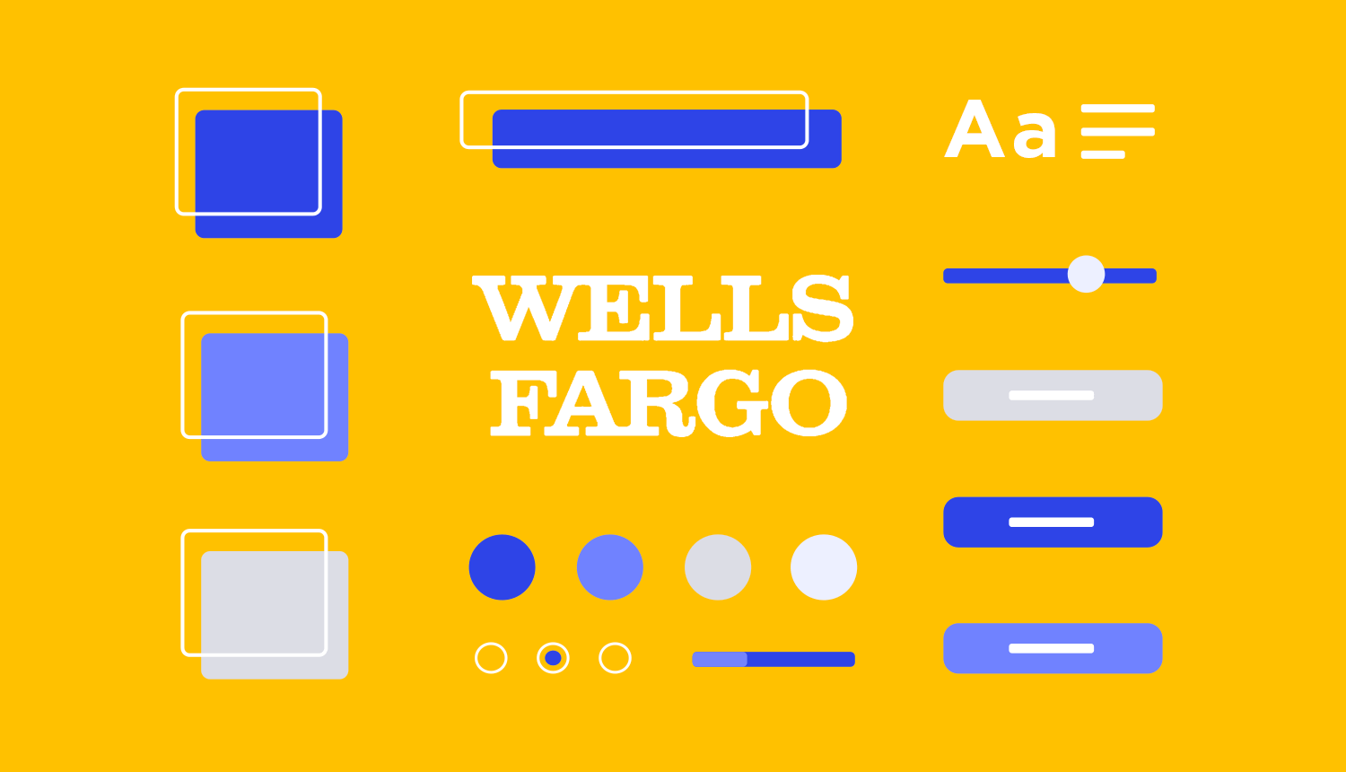
This UX talk on Wells Fargo’s design system is very interesting indeed. It walks us through the factors that pushed folks to create a design system in the first place, as well as the challenges they encountered along the way. Taking a look at both the theory of a design system and the practical steps they took, along with the outcomes that came from all this hard work. It’s a true lesson in growing a UX design in a way that makes sense for everyone.
UX design is all about creating things that people can truly enjoy and rely on. It’s about understanding who you’re designing for and listening to what users tell you, while still innovating and using plenty of creativity.
Hopefully, you’re now well suited to embark on your own adventure in the world of UX design! Be it to further your studies, to create your own portfolio or jump right into the job search for a UX job. No matter what path you choose, it’s likely to be exciting and we at Justinmind are cheering for you!
PROTOTYPE · COMMUNICATE · VALIDATE
ALL-IN-ONE PROTOTYPING TOOL FOR WEB AND MOBILE APPS
Related Content
 Progressive disclosure is about helping users get invested before getting to the nitty gritty. Read this post to discover a new way to approach complex features!8 min Read
 Step into a world of innovative UX ideation techniques to help you get your creative juices flowing. We explore a range of methods to help you generate fresh ideas and solve complex design challenges through mind mapping, role-playing, dot voting, and more.19 min Read
 Calendar app design can be simple or complex. In this post, we show you 25 of our favorites and how you can make a start on your own27 min Read
