Product updates are common - but only real data leads us to updates that users can love. Userzoom shares their roadmap for constant improvement!
Userzoom is a user testing platform that is used by many players in the UX game, both big and small. It’s made a name for itself due to its intuitive interface and smart features, and works to deliver a reliable testing tool for UX designers everywhere. It’s particularly powerful when combined with an advanced prototyping tool such as Justinmind!
It’s no wonder, then, that we were super excited to welcome Sarah Tannehill, Product manager, and Anna Barba, UX designer at Userzoom. We were anxious to learn how the folks at Userzoom manage to keep improving on an already great tool, and how their UX research shapes their product.
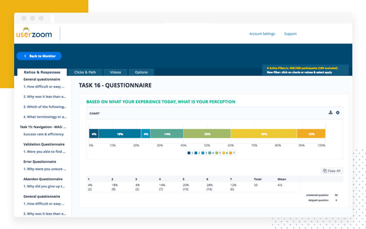
Turns out that UX research is a key concern at Userzoom. They work to not only gather data – but rather use data for every single decision in the design process. This kind of data-driven UX design has earned some great results, and we got to hear all about how they got there.
Live from SF! UserZoom teaches us about User research
Posted by Justinmind Prototyping Tool on Tuesday, 15 May 2018
Userzoom is, officially, a cloud-based software for running studies. In practice, however, it became clear that their tool is much more than a simple place for studies. It offers a viable means to conduct usability testing with real users, and helps UX teams make sense of the information they find with the study.
Logically, this tool is aimed at UX designers and other professionals in the sector. Sarah points out that this fact is crucial, as designing for other designers isn’t the same as your usual product design. Users who work with usability themselves have high standards when it comes to the tool, and tend to offer plenty of feedback – especially regarding the aesthetic side of the tool.
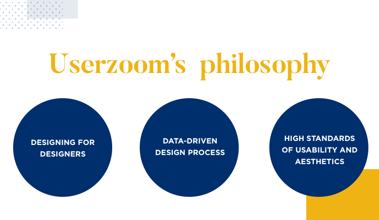
This refined taste can be difficult to pin down and define. After all, people have different standards and preferences even within a specific group. This is a perfect example of why using data for decision-making is key: your understanding of what is best may not fit in with the user’s idea.
These 3 simple concepts are key ways of thinking that the team at Userzoom tries to apply to every project, at every turn. They guide researchers so that they never lose sight of what is important, of what Userzoom is trying to achieve.
Lean. Sarah admits that one of the biggest issues with UX research is that, often, results simply come in too late. That’s why the research methods need to be fast and practical, and researchers need to be quick on their feet.
Intentional. With time being one of their most precious resources, the team can’t afford to deviate from what really matters. Every single question needs to be on-topic, and focus is to be maintained. The goal remains the same throughout the research, and everything the team does needs to tie back to those goals.
Impactful. For the research to have a real impact, you need a clear view of both what it will take to get to where you want to go – and what you stand to gain once you’re there. Once you reach the goal, how can you measure the impact this whole process had? How can you define the profit after all that hard work?
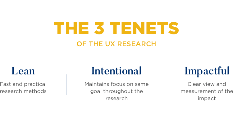
These 3 tenants offer general guidance to everyone in the team – but the actual activities that make up the research can vary. You can find classic activities such as workshops or diagramming, but it is important to stay in the right mindset throughout all the activities. These tenants or concepts are things you don’t want to forget at any point.
Crucial: No matter what activity, you always want to keep in mind questions such as “What is the ROI going to be?” or “If we change this, what will the key metrics be?”
UX research is a whole endeavor that is complex by definition – it’s affected by many factors, it touches many different types of professionals. It involves a lot of people across different teams – such as researchers, designers and developers. And so, it can be easy to lose sight of why we are doing all this, and where we wanted to get with the research.
This is quite an interesting characteristic of UX research at Userzoom. Every quarter, the team sends out a survey to their customers, accompanying the quarterly release model they follow. The survey tends to ask the same questions every time, and focuses mostly on customer satisfaction.
It’s true that the survey works as a gateway through which there is a stream of valuable feedback from users, and that in itself is a massive win for Userzoom. But many companies have such surveys, and feedback is the benefit we all want from them. Sarah makes an important distinction here: one of the greatest things about having this survey was the way it affected the workflow.

The pre-defined pace of 3 months helped the team plan ahead. The biggest result was a better and more efficient way to allocate time – especially when it came to research and validation. This may seem like a small detail, but time allocation is likely to have a huge impact on any UX research process, and doing it efficiently is always preferable.
Both our speakers started out the case study by painting a picture of their starting point: after talking to stakeholders, it was brought to their attention that the analytics area of their tool could be better. That made perfect sense, as that specific area of the product had been left untouched for about 10 years!
And so, they had their new goal: to fix Userzoom’s analytics.
Even though they had a defined area within the product they were going to work on, it was still a lot of work. There was a lot that could be changed about analytics, and many ways those changes could go. Tackling all these doubts and questions would have been impossible without a process, a path the team could follow towards a better product.
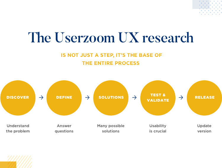
Hence, the Userzoom research and design process. Inspired and based on the design thinking model, their version has the following phases.
- Discover: time to gather information. You want to understand the problem and the details that are involved. You want to gain perspective.
- Define: you want to answer questions like “who exactly are we designing for?” and “what exactly are we developing?”.
- Solutions: With all the information they have, the team dreams up many different possible solutions for the problem at hand.
- Test and validate: Usability is crucial, and needs to be carefully tested. All the assumptions and decisions from previous phases are validated.
- Release: Finally getting updated version of product to users. Sometimes, a certain feature will be released for a percentage of users, as another way to test and validate the design.
Sarah points out that it’s a common thing to have conversations about what metrics are key even as the changes are released to users. In her eyes, this goes to show that UX research isn’t a step in product development – but rather something we engage in throughout all of product development.
This is a time to gather information. You want to understand what the problem is, and all the other issues that are connected to it. With the previously mentioned quarterly survey, the team explores what possible studies they could carry out – areas they can explore to find the root of the problem.
“One of our objectives is to launch new studies - for us, that’s a big indicator of market value”
Sarah Tannehill - Senior Product Manager at Userzoom
They offer users a list of possible features or changes they could make to the product, and ask users to rank them. The team looks for patterns – they’ve found that there is a direct connection between the improvements they make and the trends on the list.
The result from this phase was a list of top issues that needed solving. Analytics, the most prominent one, needed a new way of conveying data. Folks at Userzoom are aware of several studies that identity a clear connection between look and feel and credibility – which meant the interface and experience were crucial.
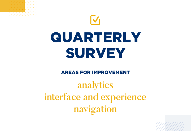
The list also had other issues – and for the team, those can be tricky to separate. In the product, everything is connected. Navigation was an issue on the list. More specifically, the navigation between questions could be improved.
For Sarah, this illustrated how one issue often feeds into or is closely related to others: their ultimate goal with analytics was to help customers tell a story with data. Surfing between different questions played a central role in telling that story, and unified both the navigation and analytics issues.
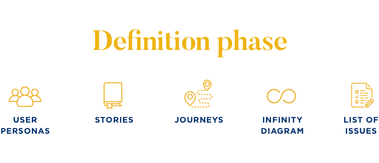
This is the time to define exactly what it is the team is dealing with, and what the final destination is. During this phase, the team sets out to create all sorts of supporting material for research such as user personas, stories or journeys.
With all this material, along with information from the previous phase, they can identify the real pain points users experience with the product. The team also makes use of more classic tactics to pin down exactly what needs to be done, such as putting all the items on the list of issues in an infinity diagram.
Often, the main problem will be composed of smaller problems as the navigation situation perfectly illustrated.
For Sarah and her team, it’s important to get these smaller issues organized into groups and let the developer team know what those groups are. These issues can be considered smaller projects within the large project – and the developer team needs to know what areas will be affected by the imminent changes.
The outcome of this phase is a list of issues the team will tackle, ranked by order of priority. The list is meant to eliminate the question of “what do we do first?”.
This phase can be done either within Sarah’s team, or collaboratively with more people across Userzoom’s workforce. This part of the process can be done in person or online, connecting teams in different locations.
integrated with your favorite testing tools
The solutions phase is all about dreaming up possible ways to fix the problem. The team discusses and comes up with some alternatives that would get the job done – then creates a few clickable mockups that can go through some usability testing.
General tip: It’s important to keep your options open at this stage, and have more than a single solution at hand.
In this case, they ended up with two possible solutions to the issue. With the two possible solutions at hand, the team could run some tests and compare the performance of each one. Remember: you want to let the data guide your decisions.
Right. At this point in time, Sarah and her team had two viable options in their hands – but how can you assess which one is best? As it turns out, your definition of the best option will boil down to what is more important to you. To Sarah and Anna, usability was the priority.
Their answer was to carry out a click test. They sent out the two versions in the form of clickable mockups to users with a simple question: “You want to add a filter. Where do you click first?”.
The results were clear. Using heatmaps, there was one clear winner. As she showed the audience two heatmaps side-by-side, Sarah pointed out that in one of the maps, clicks were spread around the screen.

Through this example, our speakers illustrated that testing and validating is crucial in UX. While the solutions phase leaves us with several options the testing phase is meant to point towards the right solution.
This phase ends with developer handoff – which Sarah was reluctant to call handoff due to their involvement along the way too. She makes it clear that having developers take part in the research and design is key – they have valuable input, such as realistic estimations of what is within Userzooms technical capabilities.
“Their input is critical on if we can actually execute.”
Sarah Tannehill - Senior Product Manager at Userzoom
After all that hard work, the Userzoom folks went for one last type of testing. After presenting the design to users, they asked users the following question.
How do you agree with the following statements:
- I can analyse the data from Userzoom easily
- I can present results directly from Userzoom to my stakeholders
They wanted to keep an eye on the answers, and observe any changes in trends following the release of the new analytics to all users. As mentioned before, even at this point in the game, Sarah and Anna still discussed what were the right metrics that would indicate success or failure.
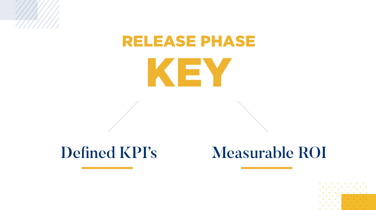
That is one of the main outputs of the release phase. You want to have a set of defined KPIs – those will make a huge difference when presenting the design to stakeholders. By using a measurable ROI, you can turn something conceptual and abstract into something tangible and measurable.
Userzoom’s UX team is an example to us all in how the right process can have a huge impact on product design. By carefully researching their every move, the platform manages to impress users who have very high standards for both aesthetics and usability – which is no easy task, to say the least.
Data plays a central role in how Sarah and Anna make their decisions, and ensures that they don’t deviate from what people really want and need from Userzoom. That, folks, is data-driven design done right!
PROTOTYPE · COMMUNICATE · VALIDATE
ALL-IN-ONE PROTOTYPING TOOL FOR DATA-DRIVEN UX
Related Content
 Carousels are everywhere, from hero banners to product galleries, but do they actually work? Learn best practices, alternatives, and how to design intuitive, engaging UI carousels.21 min Read
 Is your website or app underperforming? A UX audit can uncover hidden usability issues and unlock your product's true potential. Learn how to conduct a comprehensive audit, from stakeholder interviews to user testing, and transform your user experience.45 min Read
 Want to build a chatbot that feels natural and actually helps users? This guide covers chatbot design, UI, AI, and conversation flow to make it seamless.22 min Read


