Everything you need to know about UX Strategy and identifying your project’s goal – expert advice from Justinmind and Jaime Levy
Strategy. The very word implies decision, direction and goals. But is it really like that? Does having a UX strategy inevitably lead to outcomes exceeded, rising profits and all-round office high-fives?
The truth about UX strategy is probably a little less glamorous, but just as empowering.
Get the ultimate co-designing tool for free. Unlimited projects!

In all likelihood, your UX strategy is going to be a good old fashioned typed document aimed directly at a particular product or platform, produced after a lot of data-based research, discussion and stakeholder brainstorming. The strategy document will, in tandem with existing strategies such as business development, IT and marketing, be the guiding light for product creation in the enterprise.
UX strategy has been defined in a variety of different ways by the experts.
- Jaime Levy tell us that it’s about identifying your project’s goal through your UX strategy.
- Senior User Experience Researcher David Juhlin talks about 5 levels of UX strategy that align UX and business strategy.

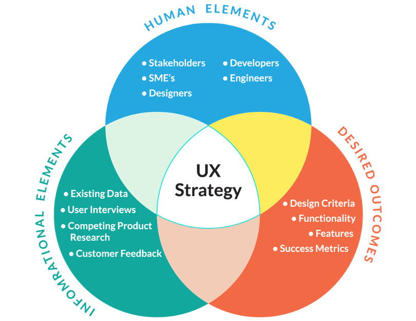
Image credit: Sherif Amin
Whichever way you look at UX strategy, it all boils down to why and how you’re going to implement user experience in your software.
Defining your UX strategy involves planning your requirements around user goals and stakeholder business strategies. According to Tim Loo at Foolproof, strong UX strategy will include the following:
- The status of your user experience as it stands
- A vision of how you wish to improve your UX
- Your anticipated gains from improving your UX
- A list of the metrics you’ll use to measure the ROI of your UX activities
- A plan of your team’s workflow
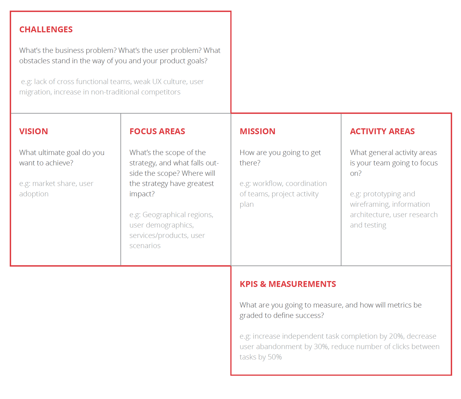
You’ll probably want to include 4 main parts in your UX Strategy – vision, mission, activity areas and KPIs. What you don’t want to include are concrete actions – the strategy document is a conceptual guide, not a prescriptive to do list. It outlines where you’re going, not every little thing you’re going to do along the way.
Get the ultimate co-designing tool for free. Unlimited projects!

UX strategy means killer design strategy. By defining every aspect of the user experience before initiating the design phase, you’re giving your team direction for all aspects of the design. This means fewer misunderstandings, and less rework and resource wastage during the design process.
If that’s not enough of a reason to jump on the UX strategy bandwagon, here are some more incentives:
- To keep up with user behavioral patterns. As technology transforms and improves ever more rapidly, so does user behavior and adoption of new tools and features. Companies need to continue to predict user expectations and deliver digital products that delight users.
- To align different product teams around a shared product vision. This will help teams maintain consistency across UX touchpoints, features, and devices so that the user always has connected, frictionless experiences.
- To ensure that you have a plan to measure your successes and yes, your failures.
As UX guru Jaime Levy has it, UX strategy is “the intersection between user experience design and business strategy”; it’s a way to figure out if the experience offered by a product or enterprise is helping achieve stated business goals. Do the product and brand fit the market, and do they move in sync with the market?
Like any strategic endeavor, a UX strategy should be designed in phases:
The temptation to dive right in and get this thing strategized already will be intense – but hold on. A well-designed strategy is founded on a bedrock of data-driven research and learning. So Phase 1 of designing a UX strategy is what we call Knowledge & Learning. Let’s look at some of the things this phase includes.
First of all, the big existential question – why do you need and want a UX strategy? This isn’t about people, profits and productivity, but more an attempt to answer specifically in your organization: what has been going wrong that prompted the call for a UX strategy, or what new goals are you aiming to score once the strategy is in place?
Second, the searching questions – where are we now? What are the opportunities available right now, and what are the resources we have on hand? What useful research has already been done in the enterprise? What’s the state of current internal software, as well as customer-facing applications, sites and software?

What we mean by this is that you need to know exactly where the company stands, so you can have a realistic view of what you can do. You need to know what your resources are in order to predict if that goal is a prudent target or something so out of reach that any effort will fall short of getting you there. You want objectives that are measurable, realistic and above all sustainable.
Third, the future-forming questions – what new resources or skills will you need to make the strategy work? This may be anything from a new in-house UX team to new hardware, or the adoption of new work patterns.
Get the ultimate co-designing tool for free. Unlimited projects!

So you’ve done a lot of soul-searching and figured out the internal goals, restrictions and opportunities behind your UX strategy plans. Now it’s time to gather information about the specific UX environment in your business sector.
You want to carry out a study in your sector, in order to assess not only the internal environment but also the external environment of the enterprise. This is important because it gives you some sort of point of reference, or a benchmark as to what you need to do to compete.
What do your competitors do in relation to their UX? What’s their main strategy? What is their main focus, what are they trying to deliver?

This will help you see what your competition has been doing that could also be applied to your UX, which can be considered a level which you must match if you hope to compete. That being said, simply copying what the competition is doing is hardly ever enough – you want to know what they are doing, because it will paint a picture of what users expect from your company.
Another potential benefit of analyzing your competition’s UX strategy is that you may come to identify gaps that they haven’t seen or filled yet – which should represent a massive opportunity for you to drop in and swoop users off their feet.
At this stage, it’s good to remind yourself who this is all for – the user. Your strategy can’t focus only on the business aspect, but rather place the user in the center of the UX design philosophy.
So, with all the information from Phase 1, plot out a vision, mission and KPIs; or if you prefer, an overall objective, some design concepts to get you there, and some metrics to help you gauge progress. This is when we need to make an important distinction, which can often be confusing: your goal should be SMART, not your KPIs.

A goal can be incredibly vague and difficult to define – which is a terrible way to guide your business actions.
So, most business today try to establish goals and objectives that are SMART, as in a goal that is Specific, Measurable, Achievable, Relevant and Time-restricted. It’s important that your goal respects those standards – otherwise it will fail in giving the enterprise a real direction.
The KPIs are the way you have of measuring your performance, so you can check and see how close or how far you are from reaching that goal, or how fast you’re moving towards that objective. Building KPIs into the UX strategy is the most effective way to validate that you’re doing what you set out to do, as these metrics will illustrate if your action got you closer or further away from that ultimate goal.
Enough with the research and planning, it’s time to roll out your UX strategy.
Ideally, the strategy document is going to be short (if you can make it one/two sheets of paper, all the better), concise and clean. If your UX strategy document stretches out for longer than 3 pages, you’re probably including elements that don’t belong there or you’re elaborating too much on elements that should be clear and to the point.
Gather together all relevant stakeholders and present them the strategy; make the case for why you need it, and what you’re going to achieve by fulfilling its mission. It’s important to give stakeholders meaningful information, such as a real dollar-estimate of the ROI from UX.
While you may have a clear picture in your head of the real and tangible benefits of investing in UX, you need to account for the likelihood that the very concept of UX might be foreign to stakeholders. Top management, investors or employees across the company might have a hard time seeing what UX design has to do with anything – which is understandable, given it is a relatively new concept.

We recommend you use real-life examples and numbers as much as possible, so stakeholders have some sort of reference point as to the impact a UX strategy can have on any given company. Once you get them to see that UX has very much tangible consequences and benefits, you can start throwing in numbers to help them see how that would apply to your enterprise specifically.
Don’t be afraid to get feedback from stakeholders and refine the strategy accordingly; even UX experts with years of experience can miss a trick, so it’s important to keep an open mind and see how you can elevate your pitch to surpass the negative feedback.
And by that, we mean that most stakeholders will give you a reason why they don’t agree or illustrate on why they don’t see the value in your pitch. It’s up to you to look into their concerns and create a UX strategy that takes those concerns into account.
The end result will, most likely, be a strategy that is better suited for the needs and resources of the company – something that works for everyone.
It won’t be easy as the going back and forth between what is ideal and what is possible will put some strain on stakeholders involved in the project, but rest assured it will be worth it. Your UX strategy will guide every action you take, so you definitely want to invest time and sweat into it until you get it right.
Post the final strategy up in the office wall, pin it in your project management software and make it a reference point for the team. You want it to be readily available for anyone, in your UX team or not.
You also want to take the time to go over the document with your employees and team members, to make sure there is absolutely no doubt as to what it means and the message it aims to convey.
As your UX friendly update rolls out, be flexible. Don’t be afraid to tweak the strategy if the competition or market changes, if you get new information thanks to testing on prototypes, or if your stakeholder requirements shift. Prototype ways to fulfill your mission concepts and validate them as you go.

Validating your strategy is of the utmost importance. Regardless of how much effort you put into your UX strategy, it will probably not be perfect. There is nothing wrong with making mistakes or wrong assumptions early on as your roll the strategy out – but one should never let that be the end of it.
Just like a brand new product will have user personas that need to be validated by real users, so does your strategy. You want to identify potentially problematic areas and iterate on the strategy until you reach something the company can rely on.
Closing your eyes and assuming you did everything right is a high-risk move, which we do not recommend – it makes for unpleasant surprises in the end.
The way you go about validating your UX strategy will depend on the goals the strategy sets, and means you have available to get you there and so on.
Generally, you want to find key metrics that help you see how the enterprise has progressed towards those goals and keep comparing them to ideal scenarios. You want to understand why some metrics fell short of expectation, or why the team has had an unexpected success in that other metric.
Most importantly, keep evangelizing about the UX strategy during project and product life.
Share it and make it the baseline for design decisions and discussions. You want input from the team, from stakeholders and any users involved at play here. Don’t be afraid to use every tool in the book, be that focus groups with users, staff meetings and reviews or anything that will get you precious information regarding the UX strategy – laying the ground work for your wireframe tool.
“UX strategy is the intersection between user experience design and business strategy”
Jaime Levy - UX guru
Get the ultimate co-designing tool for free. Unlimited projects!

Synthesize all the information gathered in the 4 phases into a 1-2 page document like the example below. This is what an UX strategy should look like:

Here are some of the most effective tools for defining a contextually appropriate, business-facing UX strategy.
- Stakeholder interviews: One of the central tools to defining UX strategy, stakeholder interviews allow you to truly understand everyone’s needs. Apply Kim Goodwin’s iconic stakeholder interview checklist to the process.
- Prototyping tools: Prototyping tools will help you refine UX requirements and keep everyone involved on the project onboard, as well as streamlining the design-test-iterate part of the workflow. Bonus points if you find a prototyping tool that allows for a real design system (saving the designers a lot of headaches and wasted time) like Justinmind.
- User interviews: Whether you follow the descriptive, inferential or evaluative approach, user interviews will get you one step closer to appreciating the UX impact of the enterprise’s existing product, thereby opening the door to strategizing a better product.
- Sector expert interviews: Particularly useful if you’re designing a software for an unfamiliar industry – seek out influencers and mine them for information.
- Competitive analysis tool: The only way to ensure a competitor-beating strategy is to audit the competition’s products, software, websites and apps. The resulting report will be foundational in defining UX strategy.
- Concept maps: Visual maps of the mental models the UX team will follow in an enterprise, always helpful.
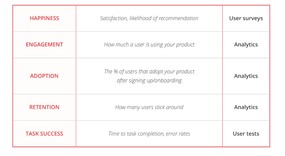
- Google’s HEART framework: An outstanding tool for measuring and improving UX of any product. The acronym stands for Happiness, Engagement, Adoption, Retention, and Task Success and allows UX designers to measure the success of the strategy against key metrics. Google uses it to make sure that every move they make agrees with their goals and adds to the bigger-picture strategy.
Our simplified HEART table is a good place to start; Google has more in-depth information.

While it might seem like all this trouble only results in a sheet of paper on the wall, don’t be fooled. Having a true direction and an a document to guide your actions is priceless. No matter how clear an objective you have in your mind, you need the UX strategy to set the path in front of you and the rest of the team.
Just like Alice in Alice in Wonderland, your UX design team might find themselves feeling lost in their work. A simple “you can reach anywhere if you walk long enough” isn’t a good philosophy – as your enterprise, much like Alice, cannot walk in no particular direction until some type of destination is reached.
You need a destination, and the resources that can get you there are precious and finite.
Save your UX design team the frustration of walking while reaching nowhere, and establish a solid foundation with an ultimate objective – let it be a constant reminder to all team members that they are all contributing to reaching that goal. Once you know where you want to get to, you’re much more likely to get there than if you blindly ran in circles, hoping to reach your objective.
