What are user personas for and why should we use them? Where do we start when creating one? All your questions answered in this guide!
Back right up. Who are we designing our products for again? No one has all the sure-fire answers to designing a wildly successful product, but there are methods out there that are definitely more likely to help you do it. One of those methods includes knowing who you’re designing for in the first place by creating user personas.
Start prototyping for your users today with Justinmind
This post will explore how user personas can act as a design compass while using your wireframe tool, along with the steps for creating one. You’ll also find some great tools to quickly and easily put one together!
The user persona was developed in the 90s and continues to be a key tool for gaining insights into a product’s target audience, their habits, and preferences. It’s widely used by UX design teams and marketing departments across the world.
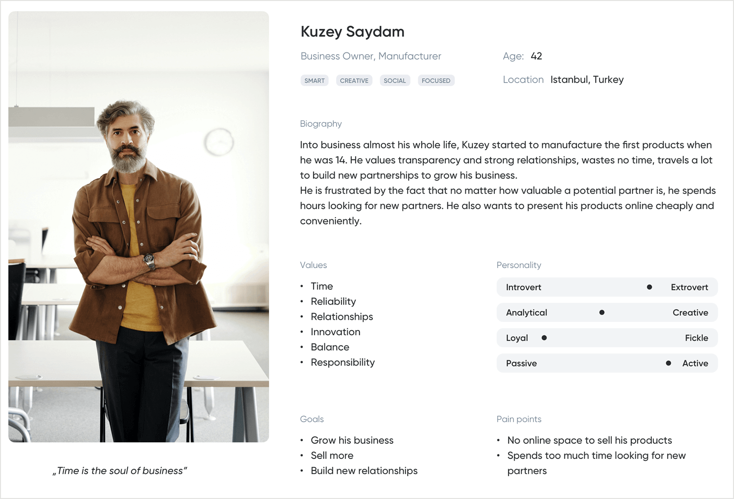
They are representations of your app or website’s user base segments. They act as benchmarks for design and help teams create the optimal user experience. These are fictitious profiles based on the type of people who are the main users of your app.
The user persona normally consists of both a fictional name and a picture of the person. This is followed by a short bio, along with a description of their age, gender, occupation, hobbies, likes and dislikes, which are non-fictional and based on real aggregated data.
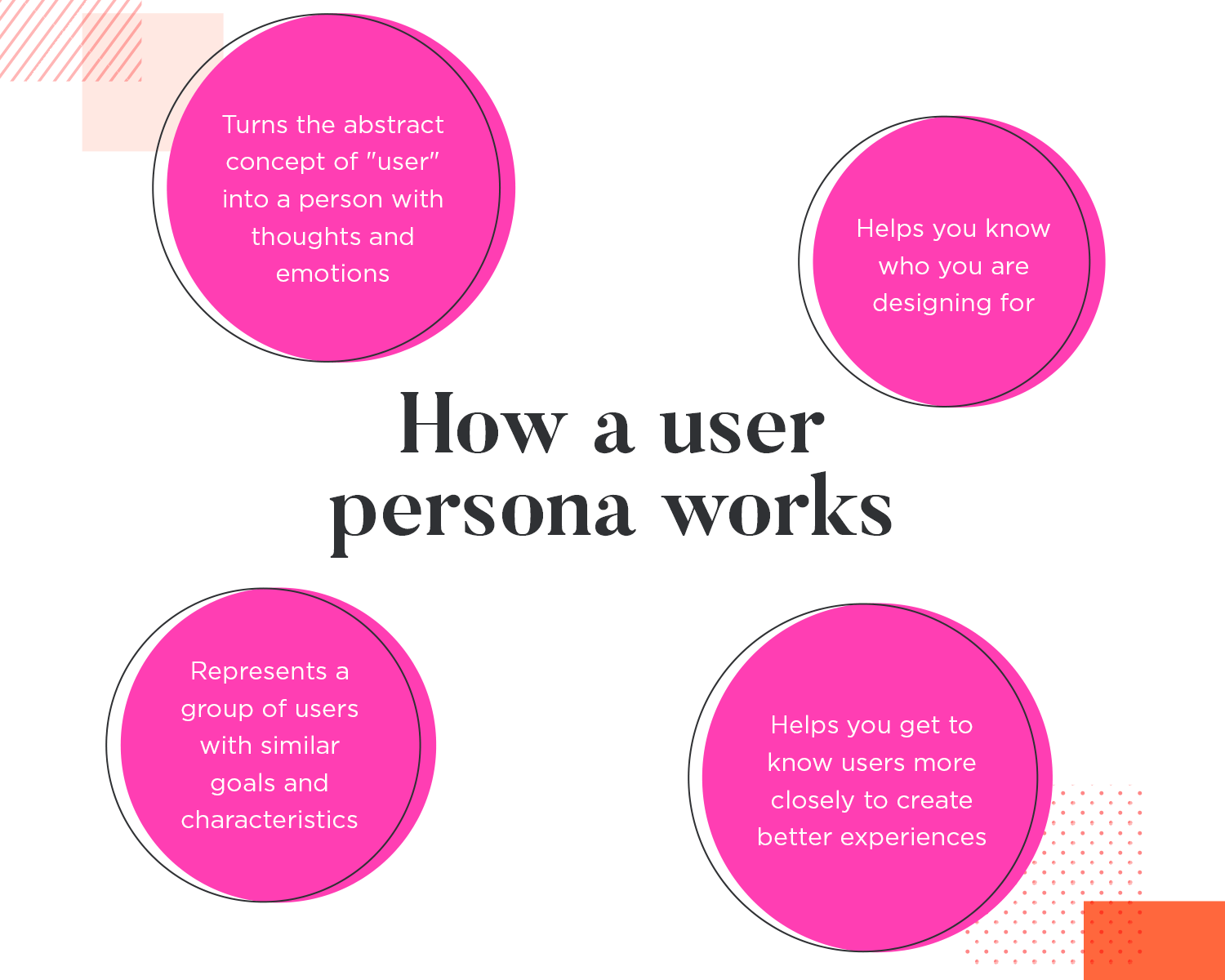
It’s like a character in a story, turning the abstract idea of “the user” into a relatable person with thoughts, feelings, and emotions. This helps teams remember who they’re designing for, especially since users of other products might not be the same as those using your own. These personas represent groups of users who share similar traits and goals, guiding the design process to create the best user experience.
In a big company, user personas make sure that design decisions actually fit what users need, not just what the business wants. When teams use these personas, they can create designs that really click with the people they’re meant for.
Picture hanging user persona profiles on the office wall, uploading them to UX research tools, or emailing them as PDFs for colleagues to check out. This keeps everyone focused and the product on track. These personas serve as a guide, making sure all design decisions are centered around the user, leading to a more user-friendly product.
Let’s say you’re designing a cooking app that helps users find and create healthy recipes. Before you dive into the design, you’d want to develop a user persona to represent your main audience – maybe it’s busy people who are into fitness and wellness and prefer quick, nutritious meals. Doing this upfront saves you time and ensures your app is perfectly tailored to their needs.
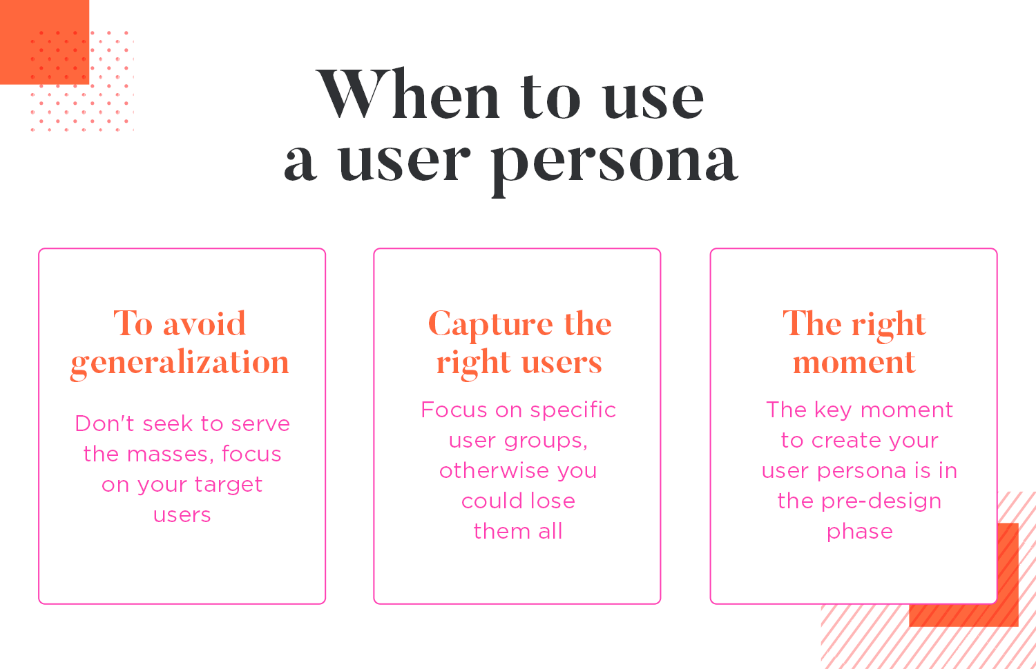
Now, you might think about adding a survey feature when users first download and open the app. This survey could ask them about their lifestyles, hobbies, exercise routines, weekly budget, and so on. While this seems like a good idea, it can actually slow things down and frustrate users who just want to get to the recipes. For the user, it means the added interaction cost of actually filling in the survey and answering the questions, instead of getting straight into what they downloaded the app for: recipes!
You then realize that the time to do the survey was before the design even started. User onboarding must be quick, otherwise you risk losing them. The worst part is that they might even be your ideal users. You don’t want to lose these users by trying to cater to the masses because it’s precisely these users that will generate the most revenue for your product.
That’s why you should always create your user persona before the design begins, not after. Use it during the design stage, not in the development stage. Sticking to this rule will save you time and money and ensure your product resonates with your users. Even your MVP should be tailored to the right ones.
You can learn more about the role of user personas in any of these awesome UI UX design tutorials.
Start prototyping for your users today with Justinmind
Building on the concept of user personas, lean personas is a faster, more focused way to understand our users. They align with agile methods, which we at Justinmind have adopted.
The lean persona offers a streamlined version of the traditional user persona. It focuses on the most essential information about a user base, using less data to give significant insights. They rely more on qualitative insights and can be quickly updated based on existing analytics, making them a cost-effective tool in dynamic market conditions.
Now that we understand what a user persona is, let’s explore how they can significantly enhance the design process. Instead of trying to develop a detailed cooking app tailored to every user on the planet, find the users who will want to use your app in the first place, and tailor it accordingly.
Creating user personas for main user groups saves time and ensures the app is concise and intuitive for those users.
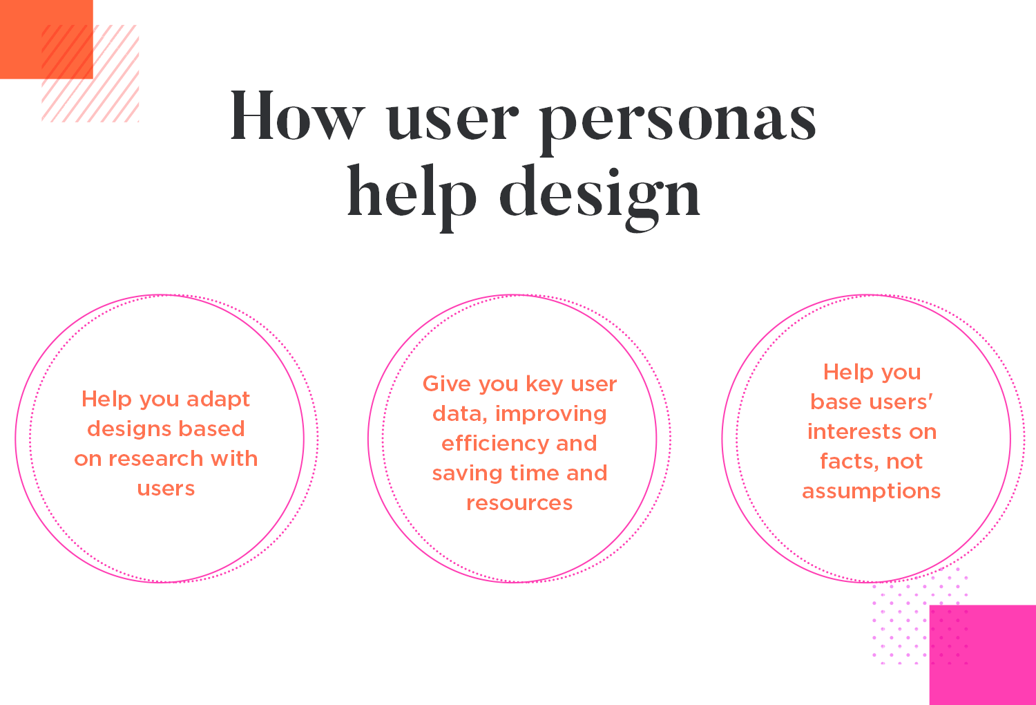
User personas save time and increase design efficiency. Netflix is a great example of an organization getting its product right for its users. It avoids the outdated approach of trying to satisfy everyone, instead focusing on films and series based on research.
Building on the design advantages, creating a user persona therefore adds real substance to your value proposition. Not only does it help demonstrate that your app could likely be a success and achieve more shareholder buy-in in addition to getting approval from managers and CEOs, it also helps prevent the classic “design by committee” conundrum.
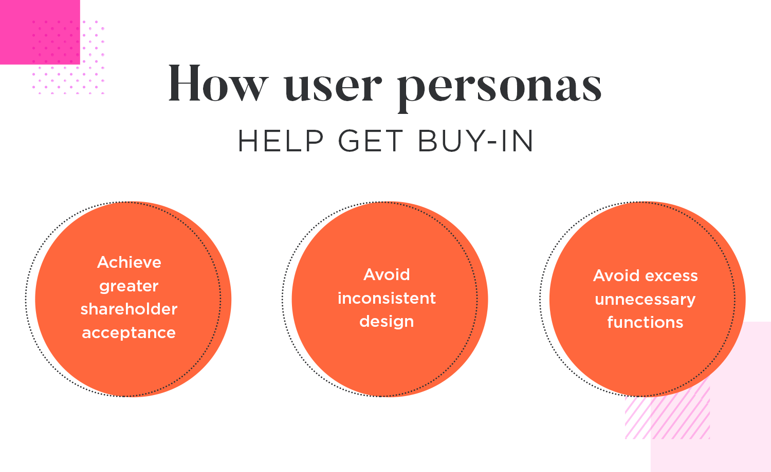
They help prevent inconsistent product design by getting buy-in from stakeholders, avoiding feedback from the wrong people.
Start prototyping for your users today with Justinmind
So, we’ve talked about why user personas are important for design and stakeholder buy-in. But how do you actually create one? You could compare user personas to novelists’ characters profiles; they’re not essential, but without character profiles, it’s going to be very difficult to maintain a consistent character throughout the story. The character will seem flat and will often go off plot.
Creating persona examples will make defining your website or app’s product requirements, and subsequently designing it, much easier. Why? Because it entails doing proper research into your main user base segments.
Before you begin gathering data about your ideal users, you should first ask yourself three crucial user questions:
- Who is my ideal user?
- What are the current behavior patterns of my users/potential users?
- What are the goals and pains of my users?
Asking these questions will help you plan and shape your user persona research. The third question is the most important, as it will define the reason your product will exist in the first place. You can expand on the third question in the following way.
What do your users want to achieve long term and short term, and why? How important are these goals in their lives? How are they currently trying to achieve them?

Then, what stands in the way of their goals and frustrates them? Have they ever tried to solve these pains before and, if so, how? If they managed to find a solution, did it work and would they do it again, or would they prefer a better solution?
Many wonder about the approach to research they should undertake when researching a user persona. Should the approach be quantitative or qualitative? The answer is that usually the best ones are created out of both inputs. Why shun one method for another when they can be combined?
Quantitative data will make your user personas more understandable, while qualitative data will make them more believable and will help your team identify with them on a personal level.
For quantitative testing, you’ll be trying to gather as much data as possible about your potential user base segment. This involves collecting data such as facts about their day-to-day lives: where they live, the industry they work in and how many times they use certain apps like yours.
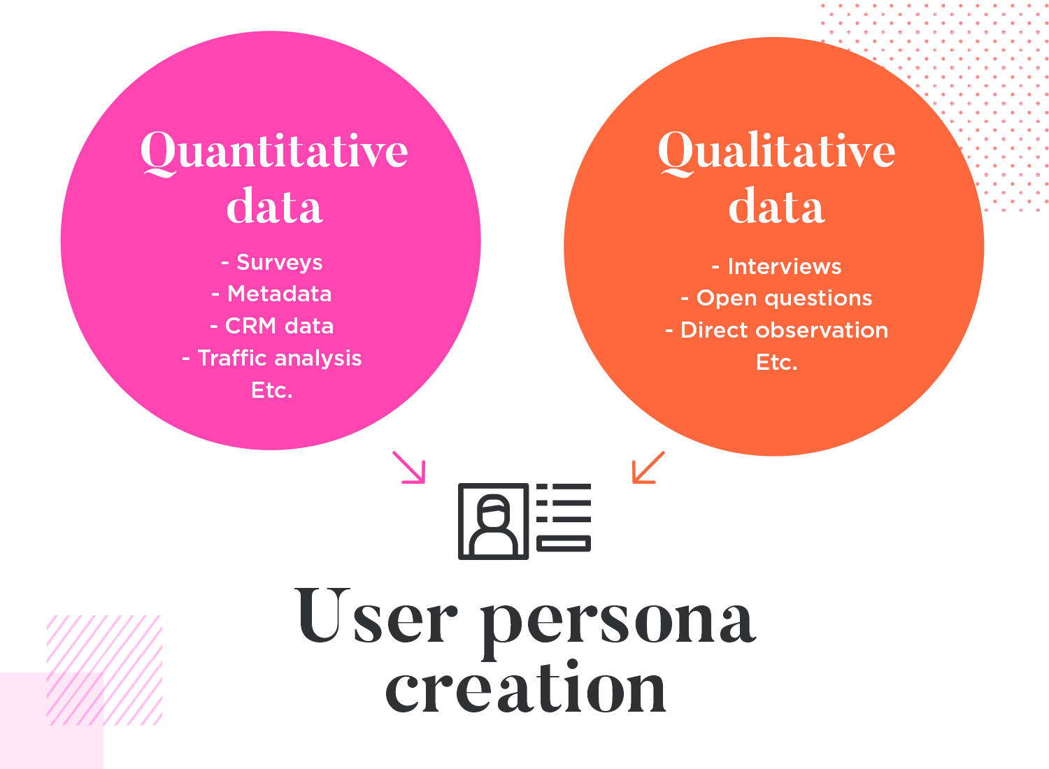
If you have a product that already exists and want to improve it, then the chances are that you will already have some quantitative data available to you in the form of transactional data, such as purchase orders, CRM data and site traffic analysis. However, if you’re designing a new website or app, then you can use the following methods to acquire quantitative data:
- Polls
- Closed-ended survey questions
- User testing data (based on other products)
- Meta data: age, gender, etc.
Acquiring qualitative data requires a slightly different approach. It means observing their behavior patterns, their subjective mental models, their emotions and body language. The best way to gauge these aspects is to try the following:
- Interviews (observe personality body language and emotions)
- Open-ended questions
- Shadow their day-to-day tasks
- Observe how they use other products
Note: Include psychographics – behaviors, attitudes, opinions, and motivations are what make your personas human.
Direct interviews with your potential users and using surveys with open-ended questions helps reveal more about their thought and behavior patterns.
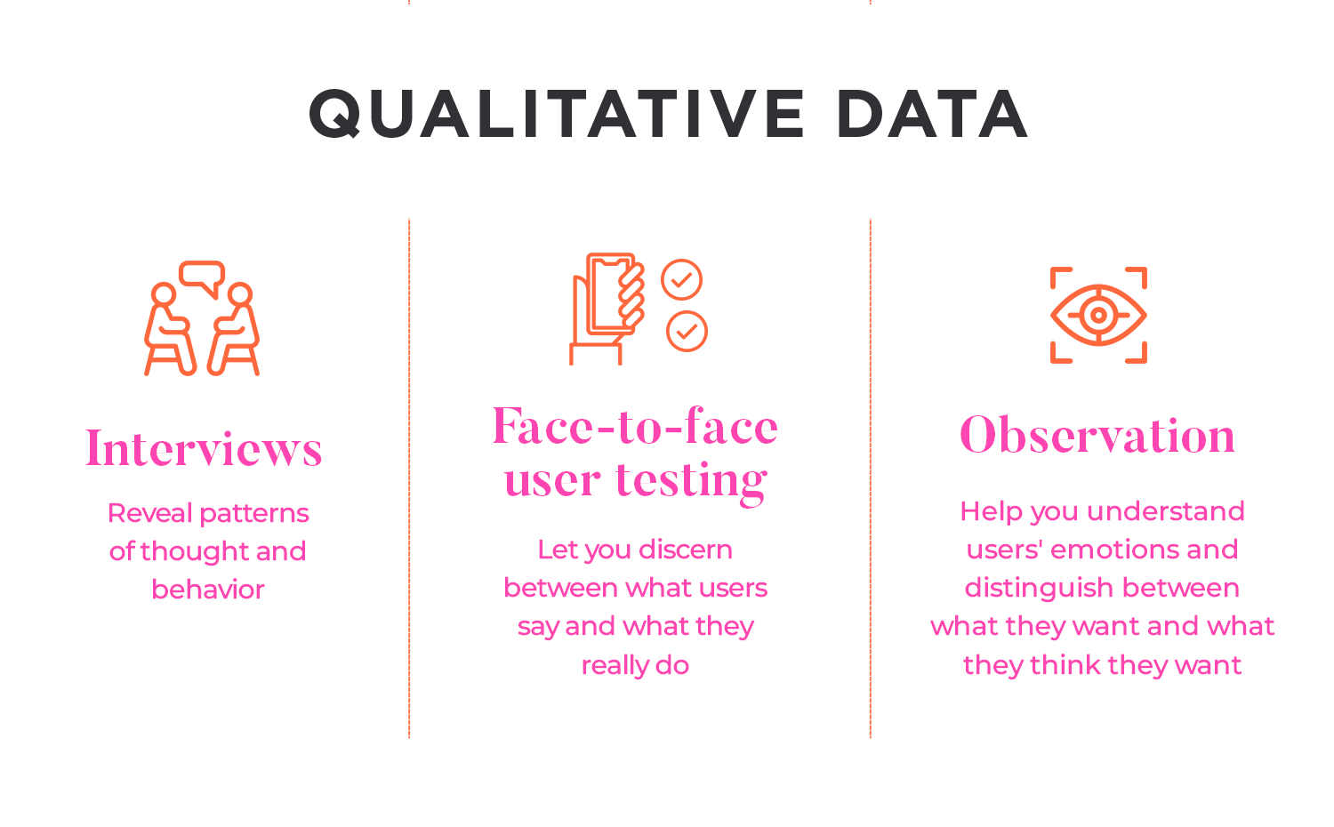
Shadowing users as they complete their tasks shows how they currently approach their challenges, and whether or not their approach can be improved, i.e. what tools and methods they use. It also shows if there are any differences between what the user does, thinks and says if you compare it to interview data.
Once you generate enough data, you’ll need to create a visual representation of it to make it easier on the eyes. There are many ways to do this, but perhaps among the most helpful are spreadsheets or affinity diagrams.
For survey and user testing results or CRM data, you could display the relevant facts in a Google Sheet.
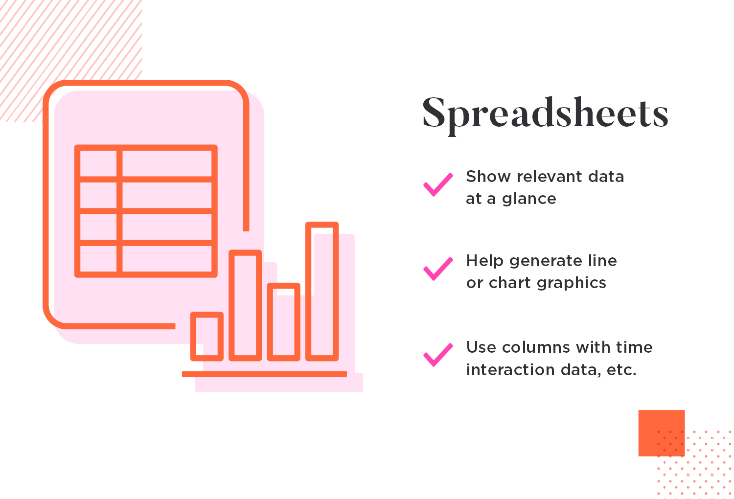
You could then break the data down further by visually representing it with the use of line graphs or charts. Depending on what exactly it is you need to find out from your user base, or if you’re designing to improve an app or website, you might also use columns for pages most visited, time spent on that page, elements interacted with, etc.
Affinity diagrams that use sticky notes are a simple but effective way of taking both quantitative and qualitative data and ordering it into different sections.
If you put the information on different color sticky notes for each section, it helps add further clarity to the visual representation.
Another aid to the design process is the empathy map. These can also be composed of both qualitative and quantitative data and can also be used in conjunction with your user persona after it is created, essentially making it a by-product of the persona.
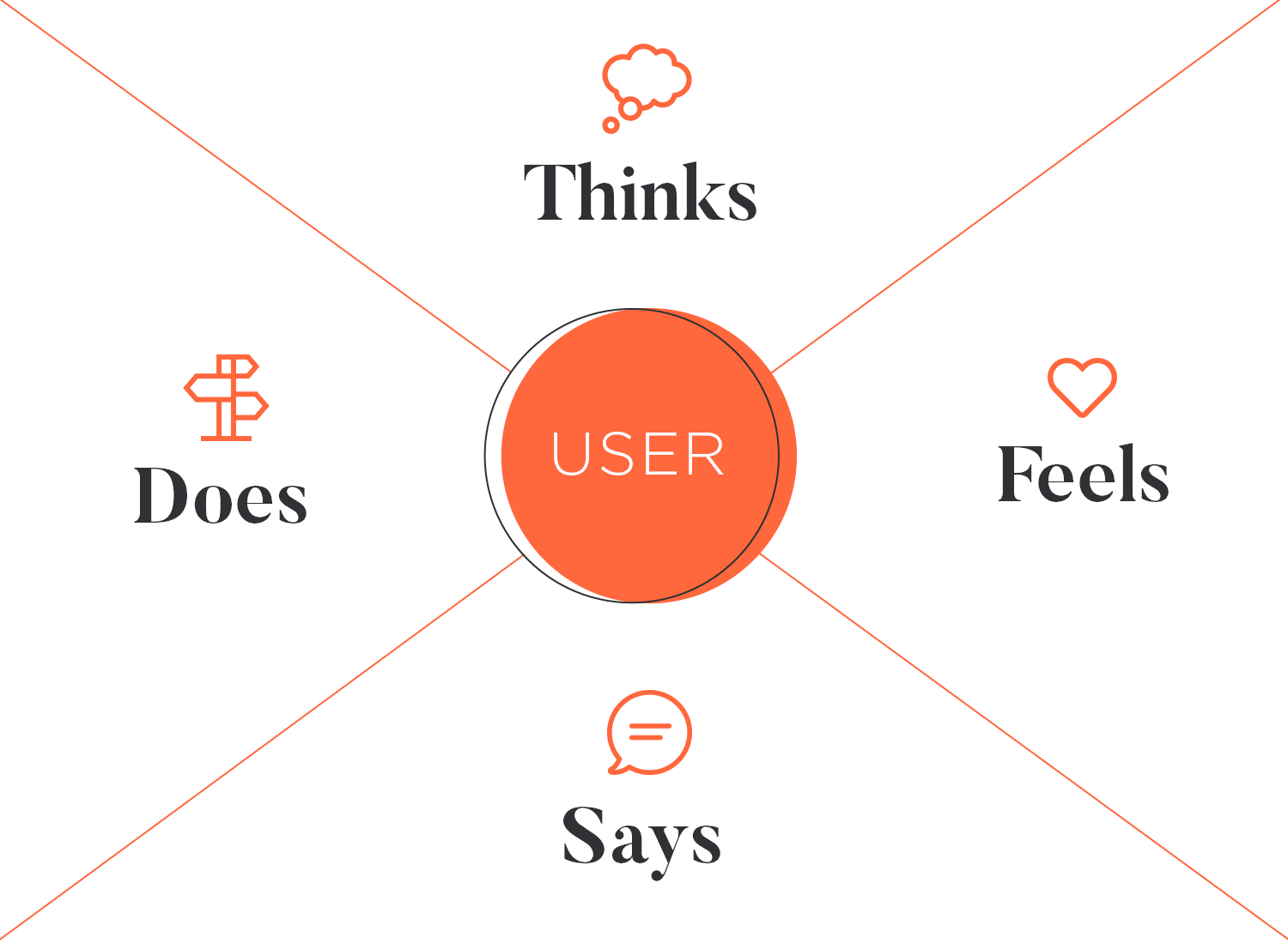
Empathy Map - by Pedro Sanoja
Empathy maps revolve around the target user and are usually broken down into four sections: what they think, feel, say and do.
Other important elements that should make up your user persona include their influences – what affects his or her opinion (this can be a family member, a blog, certain trends or abstract ideas such as UX design). Don’t forget to categorize all your user persona data under different headings! Take this list as an example:
- Personality
- Bio
- Motivations
- Goals
- Pains
- Behavior
The less personas you have, the easier it is to design for each one. Sometimes you may find that two groups can be fused into one user persona if they share enough similar attributes, but in other cases this may not be possible.
Note: Keep user personas simple. Less is more. The goal is for everyone on the team to quickly grasp who we're designing for. Overly complex personas can be hard to remember and use
When it comes to designing for more than one, it might be useful to think of a Venn diagram where some features of an app overlap and are shared between personas and others are used only by distinct personas.
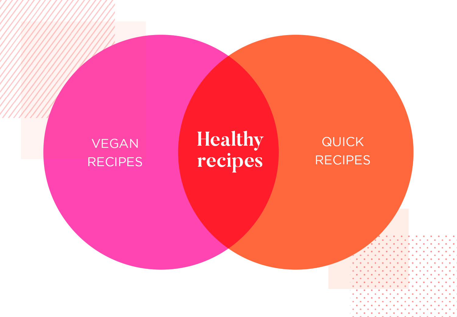
The app might be designed to completely satisfy two personas, but have the features set out in a way that each persona would easily and intuitively be able to find the section that’s important to them.
Your user persona will need a fictional name and photo. The name should be one that is fairly common (think more along the lines of “John Smith” rather than “Hubert Cumberdale”). The person in the photo should reflect the average age of users in that group, while the clothes they wear should also reflect their occupation and personality. A short bio adds some context to the character by briefly summarizing their background, profession, hobbies, frustrations and goals.
Each persona should obviously be different, easily distinguishable and memorable. Bold color schemes are one way to do this. Think about matching the colors in the image with the general theme of the document.
The bottom line is designers and developers should be able to internalize the persona to the point where it’s easy to recall what they represent. Check out Justinmind’s very own user persona template below to get a feel for what they should represent!
Start prototyping for your users today with Justinmind
The moment has come! It’s time to explore our selection of 60 awesome user persona templates and decide on which design best suits you.
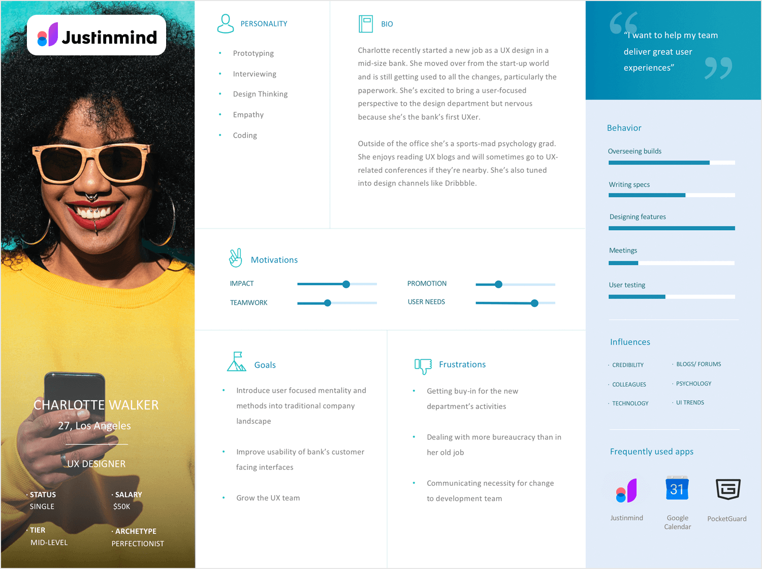
First up on the list is our template of a UX design persona. In this user persona template we’ve provided all the important demographic information on the left-hand side superimposed on a colorful photograph of our persona to give an instant impression of lifestyle and personality.
In our example, motivations are in the center to help the end user work towards a design that helps the persona achieve what they aspire to, while having the goals and frustrations close to hand to build a design that answers their pains. She echoes the type of person we at Justinmind are setting out to help with our prototyping tool.
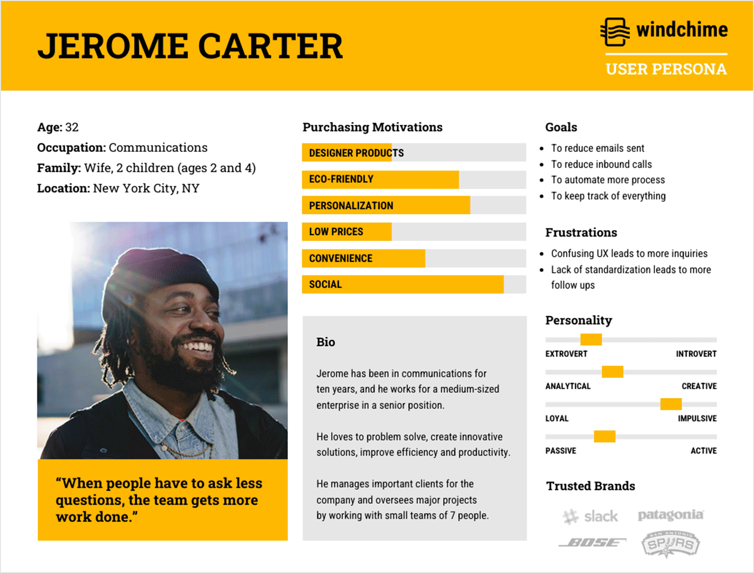
This user persona template from WindChime captures Jerome Carter, nicknamed “The Communicative Optimist,” through a lively blend of visuals and concise text. Jerome’s engaging photograph, paired with vibrant colors and clear icons, quickly highlights his key attributes and motivations.
The quote, “When people have to ask less questions, the team gets more work done,” serves as a professional mantra, reflecting his emphasis on efficiency and teamwork. The layout efficiently organizes his goals, frustrations, and purchasing preferences, making it easy for users to grasp his persona at a glance.
This template exemplifies a clear and visually engaging way to present a user persona, ensuring that essential characteristics are immediately apparent and memorable.
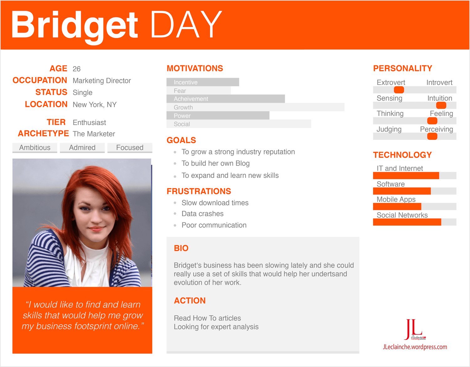
While being a little busier than the previous templates, this project manager persona template from Fake Crow is put together in such a way that the main characteristics jump out.
We like it because there’s an attention-grabbing, bold and bright color scheme at play, making this person look interesting and vibrant.
Goals, frustrations and motivations take center stage and there are plenty of graphical representations to provide a quick overview at a glance.
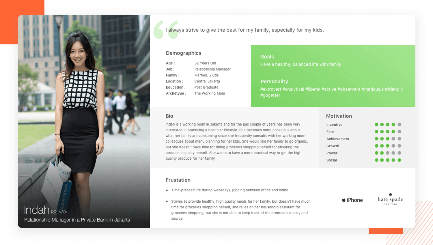
This example clearly illustrates what this 32-year-old mom of two is all about – food. Explore this banker persona template focused on a healthy lifestyle, which is very evident from the graphical images of ingredients that can be seen to be quite healthy. It is clear already, before reading any text, what is on her mind.
A quote at the top of the user profile of this persona template shows what her core focus is – providing a healthy diet for her children. Money isn’t an issue, but time is. The brand logos clue us in that she is a modern and fashionable consumer, possibly indicating that she isn’t afraid to try new stuff in the kitchen.
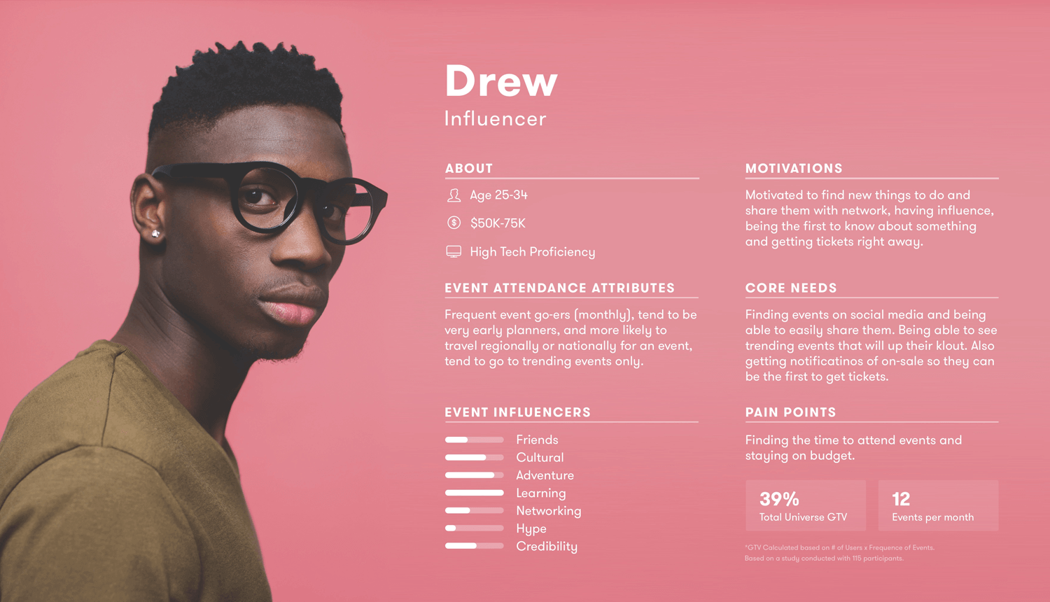
Here we have another great user persona example from Universe User Personas, using color to grab attention, with white font standing out against a pink background.
The end user is drawn into the persona with the large image that places personality at the forefront.
What we like about this influencer persona template is that there is plenty of graphical display using icons, large numerical representations and bar charts to offset the text which is succinct and gets straight to the point. Each section is clearly labeled for clarity and quick absorption of information.
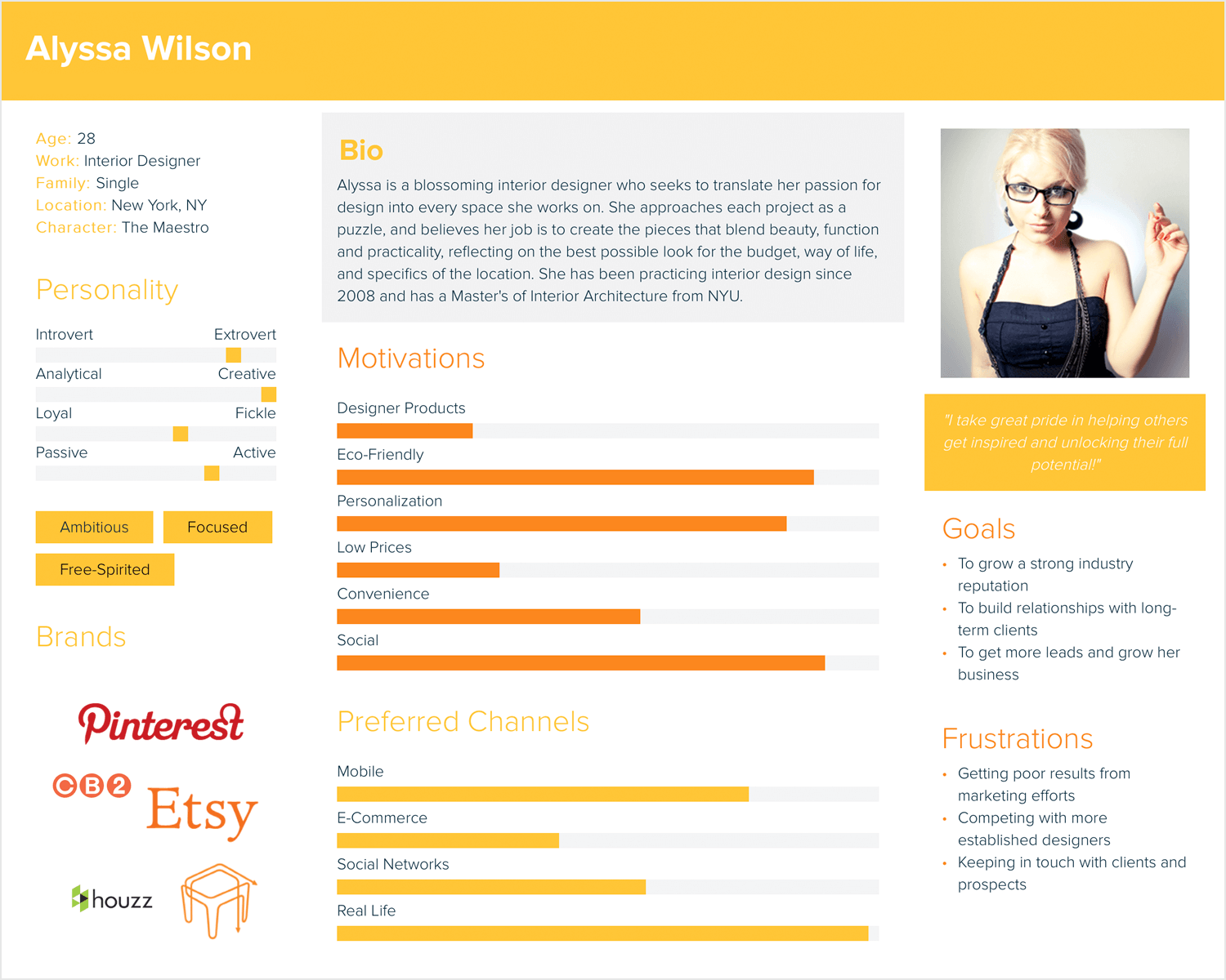
This persona template about an interior designer from Xtensio is all about grabbing your attention. Its loud yellow and orange color scheme screams for attention.
The photograph in this one is strategically located on the right of the persona template, drawing the eyes across the page, making the observer take in the whole page, before returning to the left-hand side to read the details.
A quote lies just under the photograph, helping the end user associate the persona’s mindset and philosophy with her image.
The motivations and preferred channels stand out in a clear and colorful bar chart representation and the brand logos represent the user’s browsing habits.
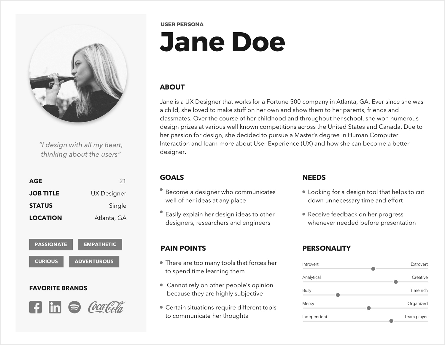
Meet Jane the UXer, an interesting take on a user persona. This template shows just how creative you can get with your designs.
Remember, your persona should always fit the project you’re working on. Some details will be essential, while others might not be necessary.
What’s great about this user persona template is how it draws you in with an objective design, highlighting Jane’s design skills and standards. We love the way it gives a snapshot of her personality and life, from her creative spark to her team player attitude.
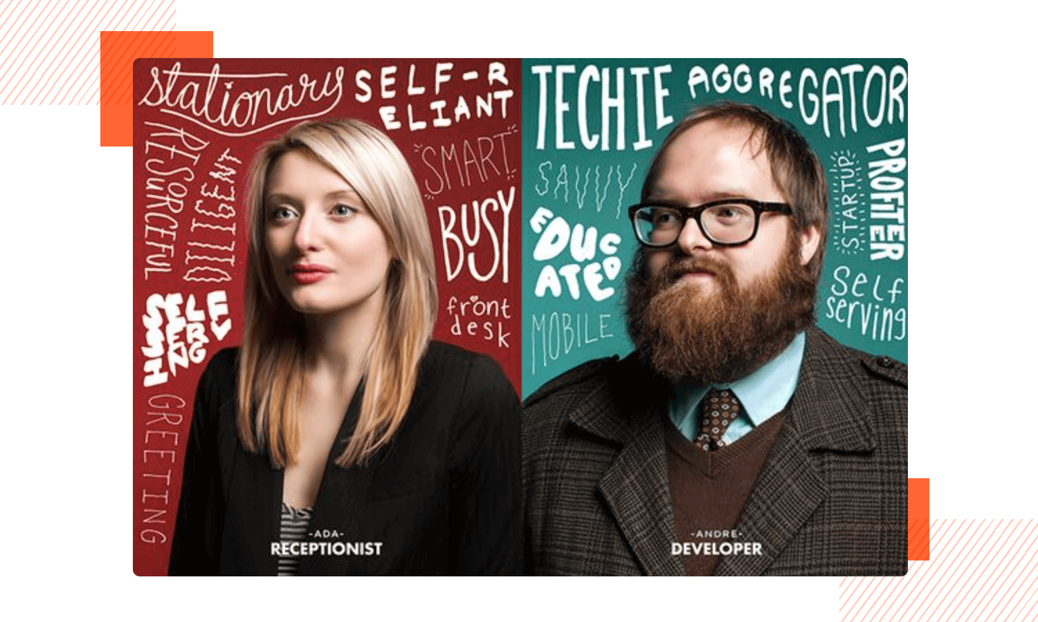
Mailchimp’s user persona template, like in the previous example, uses a scattering of nouns and adjectives based on research, laying everything out in a way that makes it fun to discover more about that persona.
A lot of space is dedicated to the image in these simple but powerful persona templates, with the characters sharply dressed according to their profession. Everything is laid out against a bold backdrop of color which can help serve as a memory aid for the adjectives and nouns.
Like in the above example, Mailchimp’s persona templates are aimed largely at creating a solid concept of the person in the end user’s mind, rather than relaying copious details.
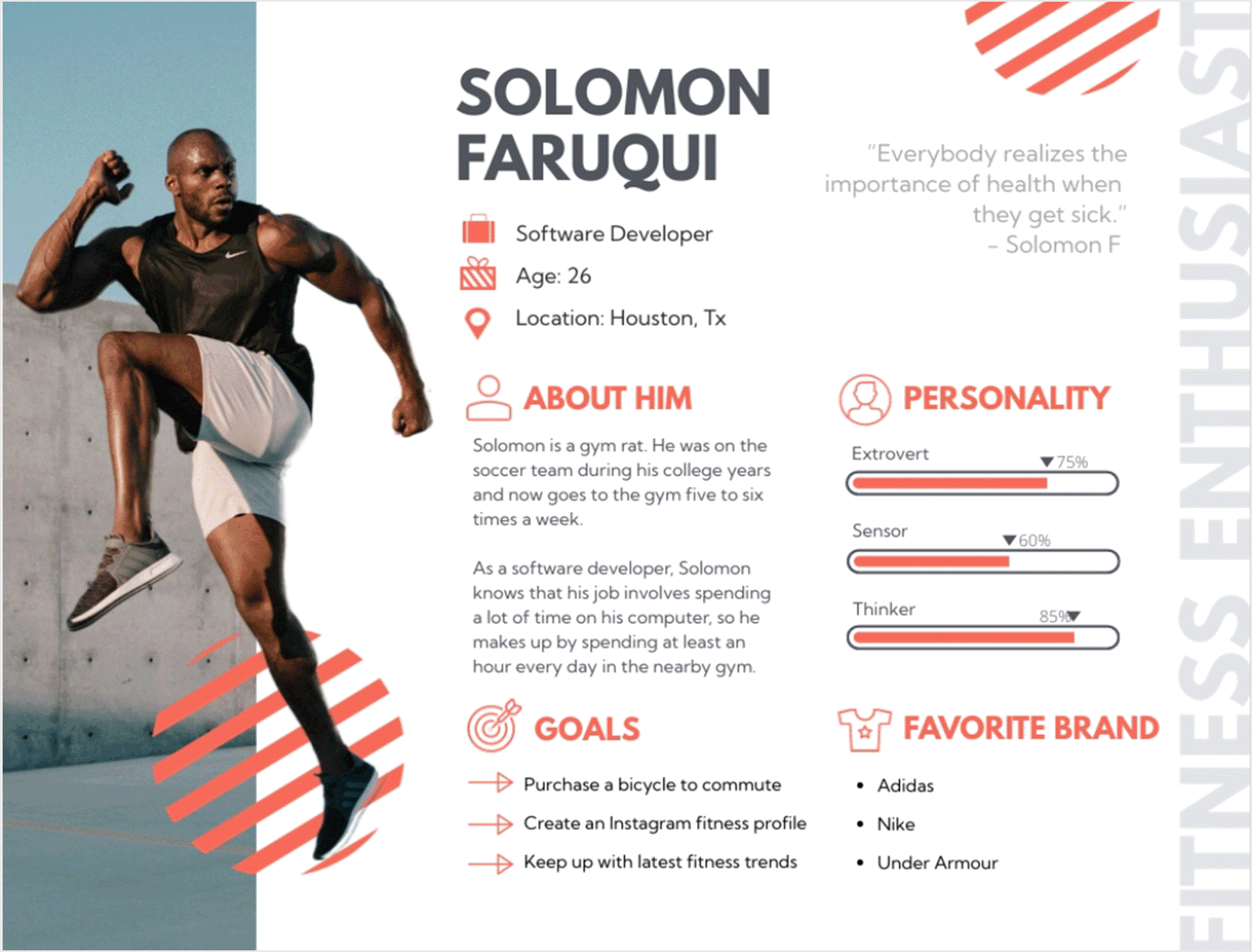
What stands out in this active technologist persona template is how it showcases Solomon Faruqui, combining his work as a software developer with his passion for fitness. The design is lively and draws you in.
It features a striking image and a quote that highlights his dedication to staying fit. The template organizes his personality traits, goals, and favorite brands in a clear way, making it quick and easy to see what he values and enjoys.
Overall, this template is a great example of using design to clearly and effectively present someone’s key characteristics. It’s a helpful tool for teams to quickly get to know their users.
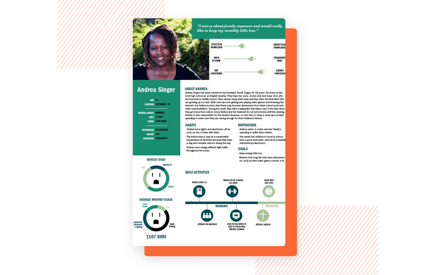
In a similar way to the above example, look at this innovative user persona template with graphical timelines from Behance uses striking graphics to help absorb information about the person with plugs as scalers and electrical outlets as pie charts, that you can easily substitute for something else.
Another element that makes this example stand out is the fact that it incorporates the use of a user timeline, which is a useful way to gain a lot of information about the user with very little text.
Right in the center are the bio, motivations, goals, and habits for whenever the end user wants to go into more detail; otherwise, the graphical representations serve to provide insights at a glance.
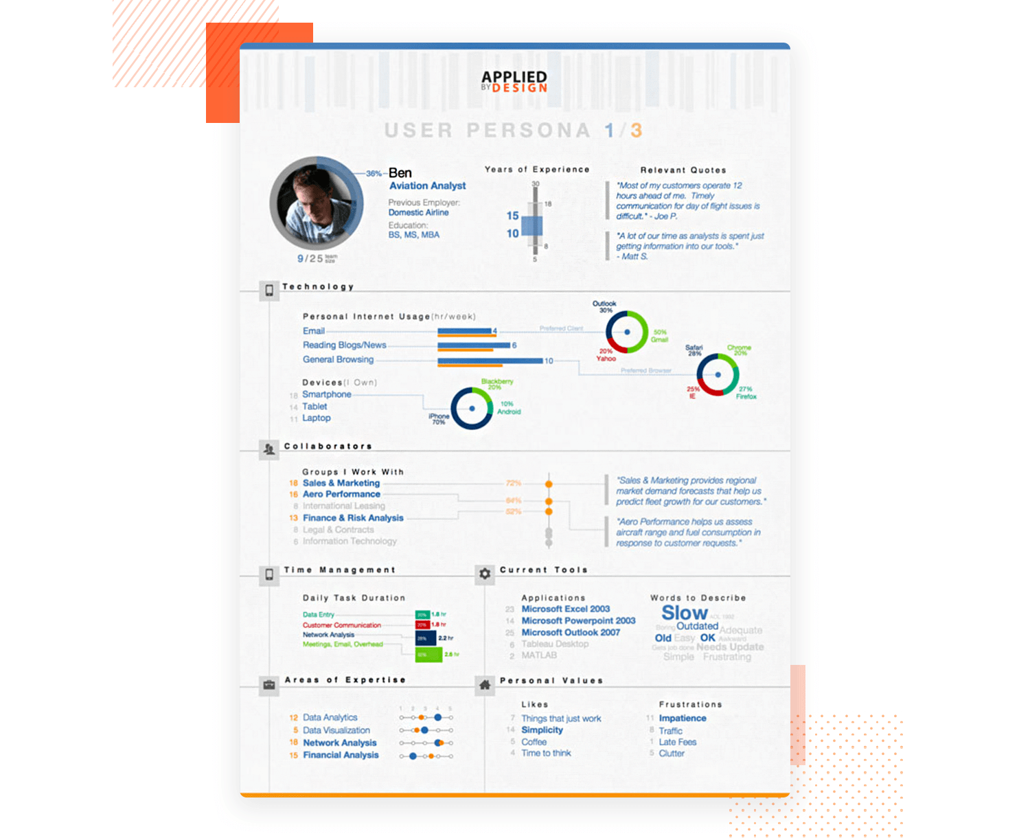
This data-driven user persona template from Applied By Design is packed with data because they really dug deep with their research. It’s got tons of analytical info, but it’s laid out in a way that’s easy to understand and remember.
The template uses colors, bar charts, pie charts, icons, and numbers to show all the data. Everything is clearly labeled and organized, making it super easy for end users to find the info they need at any stage of the development process.
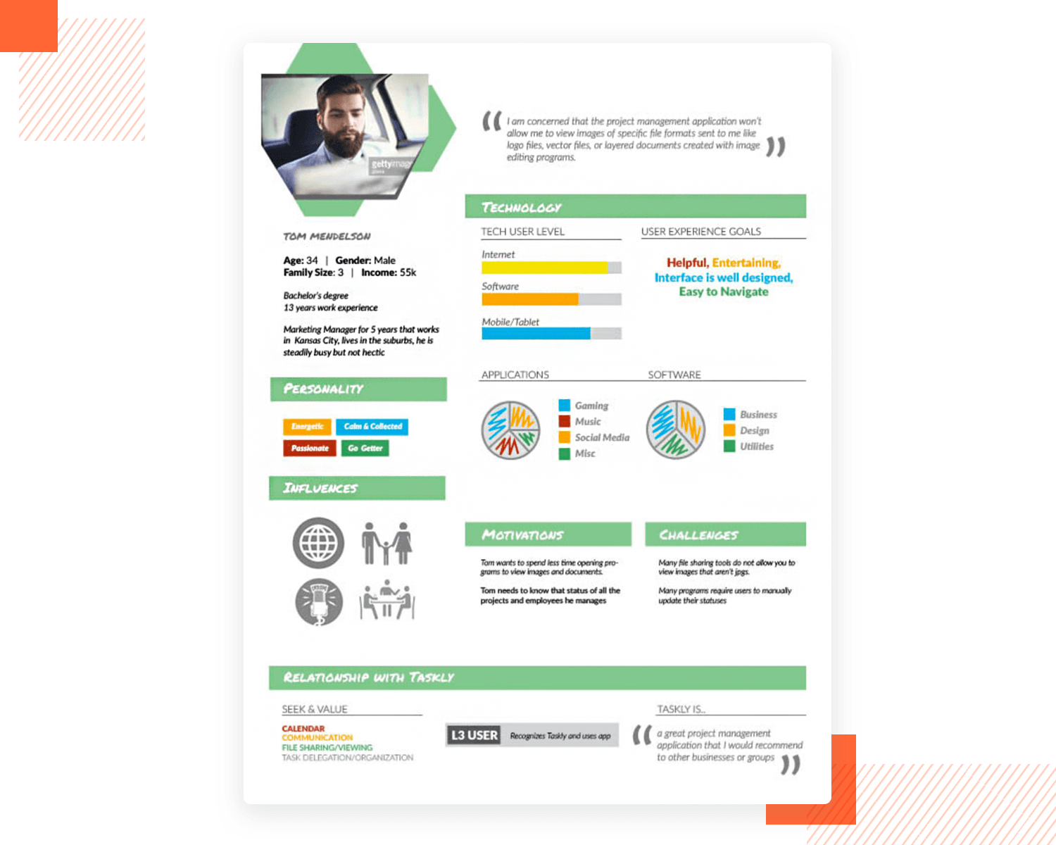
This template from Behance of a marketing manager’s user persona could be a great way to represent a current userbase, though it could also be used before an app or website is developed.
The overall design features hint at someone who is very tech savvy. The colorful graphics not only make the visual data more interesting, but they also help make it easier to memorize the statistics.
Another thing we like about this example is that it switches it up a little – some sections are denoted by text, some by graphical statistics and one – is represented entirely by images.
Start prototyping for your users today with Justinmind
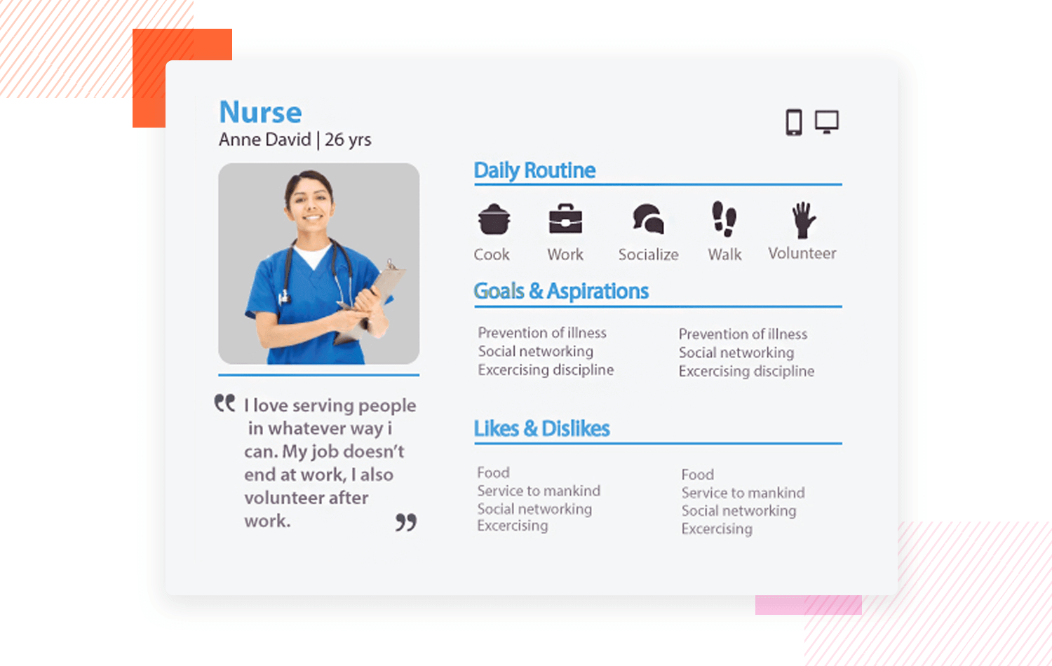
Sometimes it’s best to keep it simple. This easy nurse persona template works if you’re trying to convey information about a persona’s daily routine, job, hobbies, likes and dislikes but in as brief a way as possible.
The “daily routine” section displays a wealth of information about a day in the life of the persona in question, using just icons and single word descriptions. The quote just below the image sums this all up pretty well.
All in all, it’s a great example that provides useful insights while, at the same time, being easy to remember.
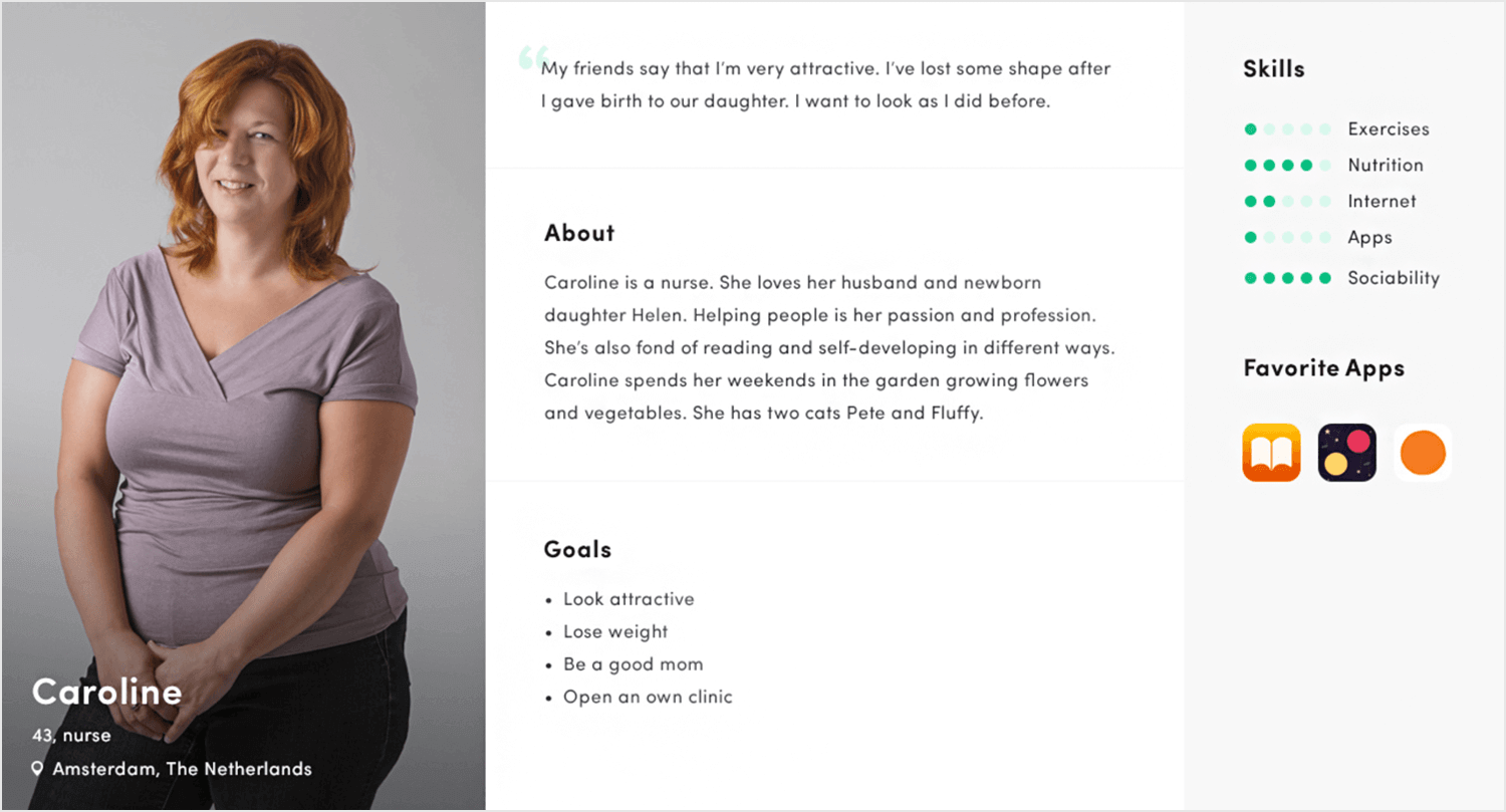
In this example from Alexey Tretina of a mainly text-based user persona template, we can see a minimalist design at play that’s not just informative, but easy on the eyes and easy to remember.
The template includes a photograph of a friendly female nurse and a quote and bio that sum up her life perfectly at the age of 43, in addition to her goals being clearly listed out.
Her skills are clearly highlighted through the use of shape rating and the “favorite apps” section give a indication as to her mobile habits.
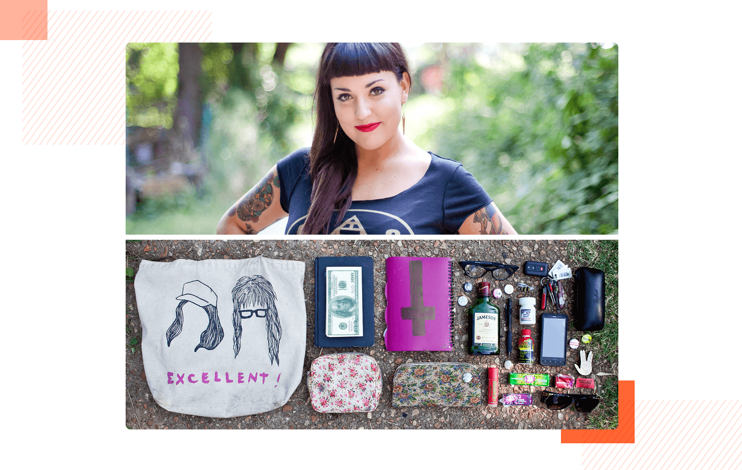
This imaged-based design template from Jason Travis is a unique take on the user persona. When we said that the sky is the limit – we weren’t kidding!
Depending on what type of app or website you’re designing, sometimes it may make more sense just to use visual representations. After all, an image can tell a thousand words!
In the above example, we have a photograph of the persona in her everyday life. She has an alternative appearance and judging by some of her belongings, she likes partying and having fun. The fact that her money is laid out suggests that she enjoys spending and consuming.
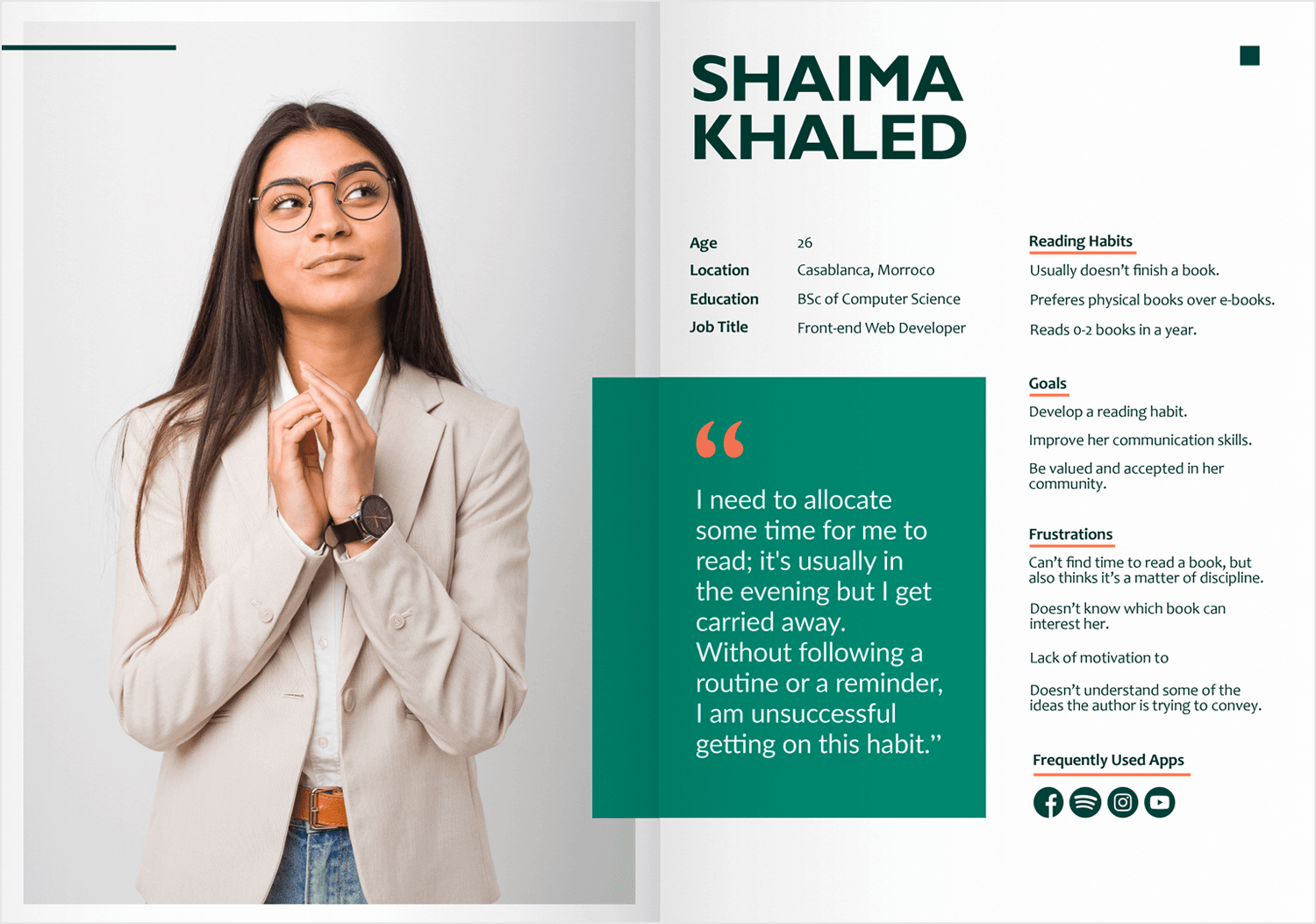
What we like about this reader habit user persona template is the fact that everything starts with an attention-grabbing quote that sits right in the middle of the document, in addition to an image of the persona.
Normally, we might think the quote is a little long and contains subjective information, but that isn’t the case with this one; it’s readable, succinct and defines the entire tone of the template. It’s complemented by other details such as reading habits, goals and frustrations that develop the information provided in the quote a little further.
This template is yet another perfect example of a way that a design team can get to know their users at a glance, as scanning this template takes at most ten seconds, yet provides you with everything you need to know.
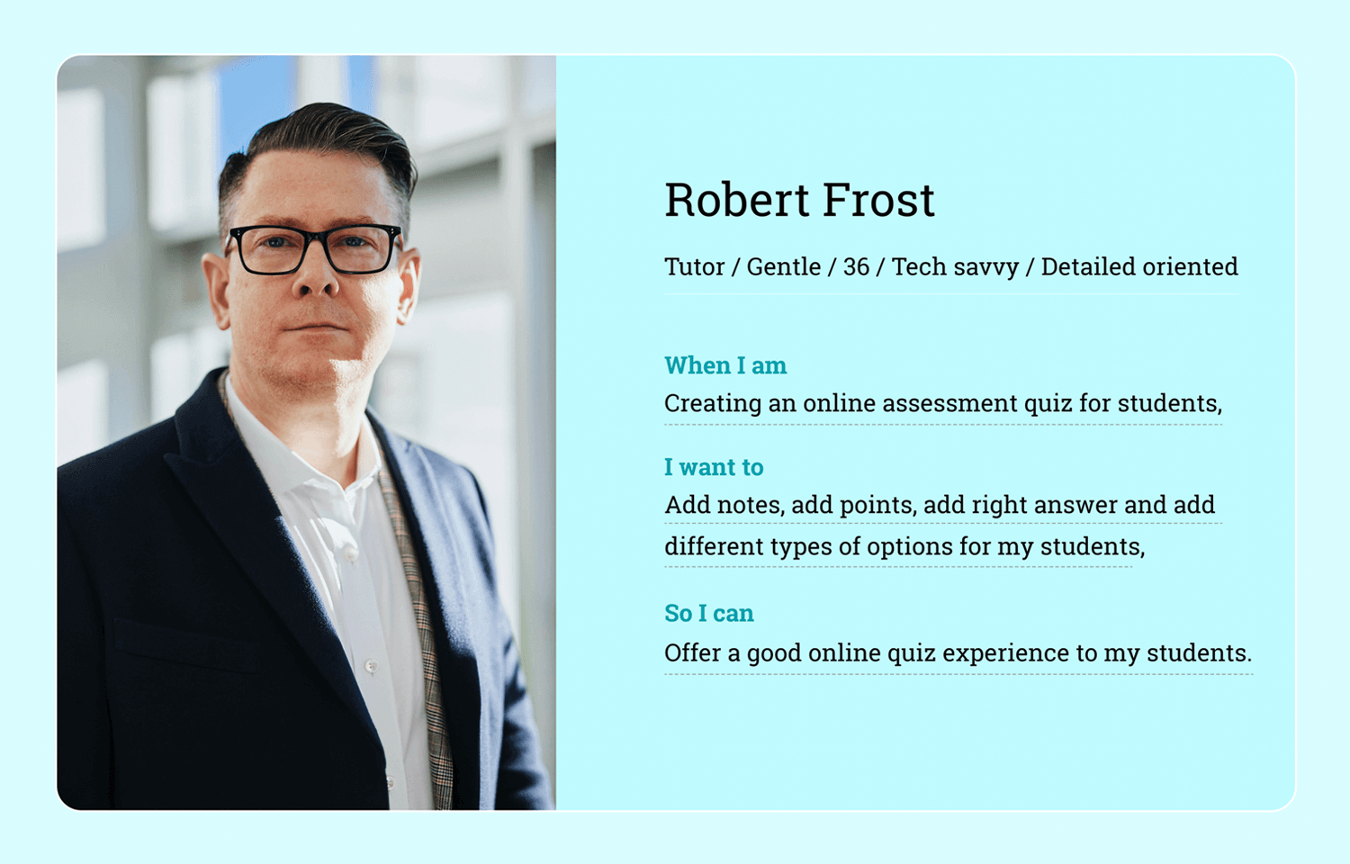
This nutrition expert persona template is a great example of keeping it lean and simple. It features a large picture, a name, a small bio, and a sentence for the persona’s main goals and motivations.
What stands out about this persona is the “When I am…I want to…So I can…” structure. Robert Frost, the health and nutrition tutor in this template, aims to improve his students’ survey experience. The relaxing turquoise blue color reflects Robert’s gentle nature.
The combination of the simple sentence structure, picture, quick bio, and color scheme makes this persona memorable and easy to reference during the design process.
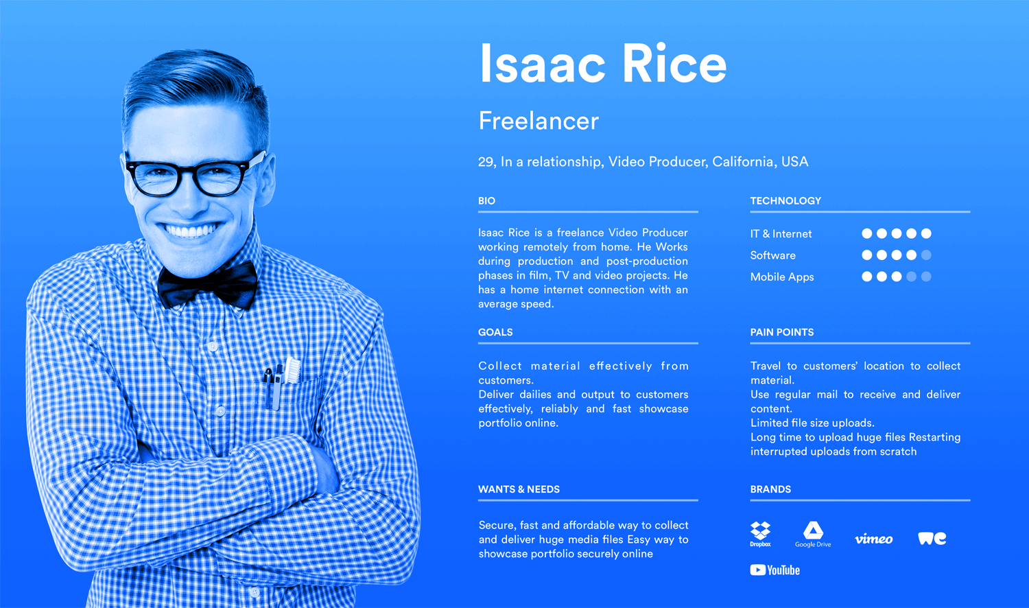
Here’s an example that stands out from the rest. Isaac Rice, the freelancer, is blended nicely into the cool, intellectual blue background.
This user persona template also doesn’t mess around and gets straight to the point with Isaacs’ goals and needs. We also like how it provides bullet points to reflect the different types of software that he uses, along with the main brands of the products that he uses so we can get a feel for what kind of UI he would feel comfortable with.
No matter what modification you might make, this template provides you with a great layout. The fact that the image is also colored along with the rest of the document makes it easy to remember the persona and is great for if you’re using more than one because, that way, you associate each persona to a color.
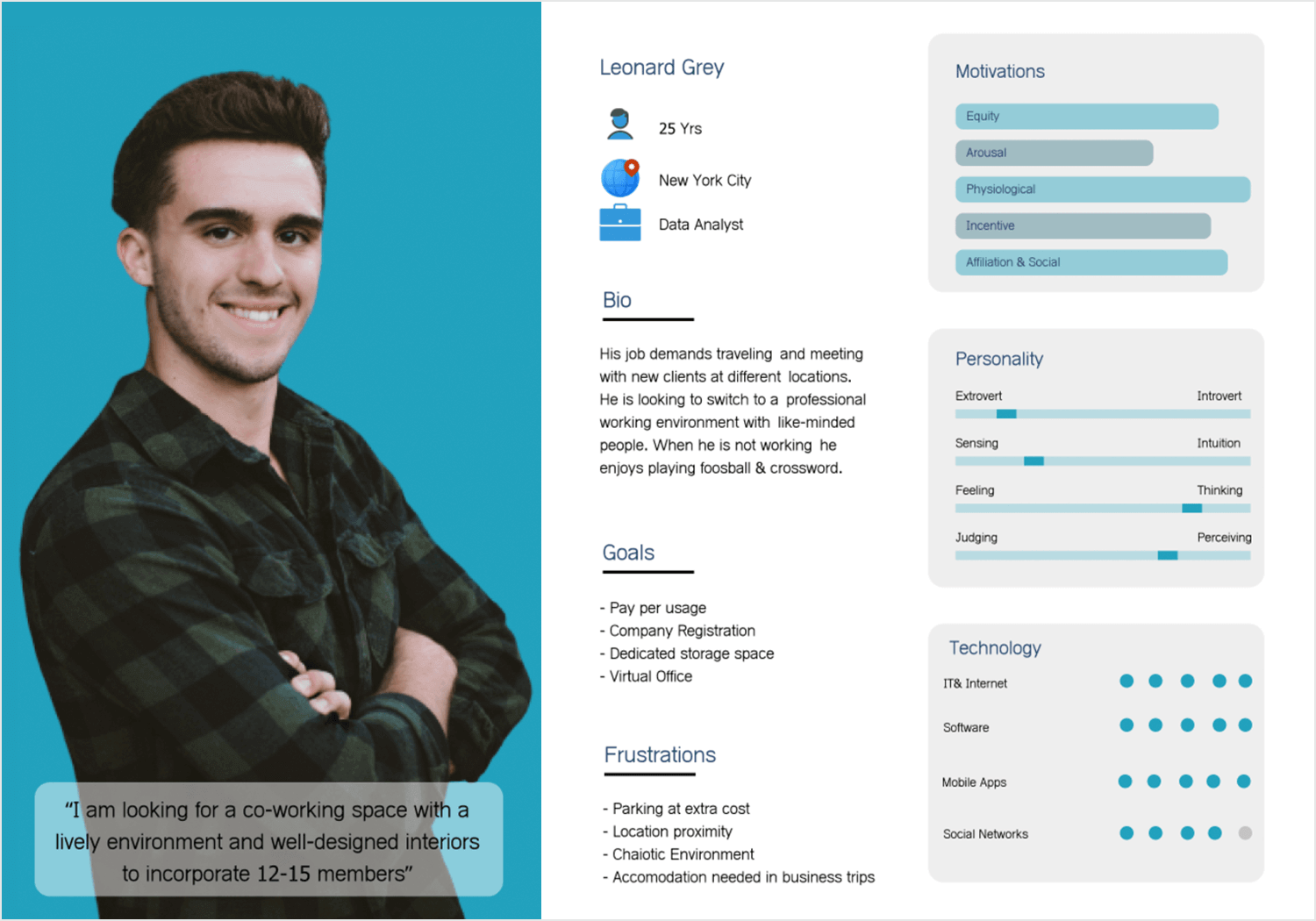
This data analyst template largely represents the young working professional. Over a third of this user persona template is designated to a charismatic photo of a young data analyst, with a quote that sets the tone for the rest of the document.
This example gets stuck-in explaining the most important parts, such as a short bio, along with Leonard’s goals and frustrations with text.
In true hierarchical fashion, slightly less immediately important categories are denoted with lively infographics, such as Leanorad’s personality, technology used on the job and his motivations, to make them easier to retain and revise at a glance.
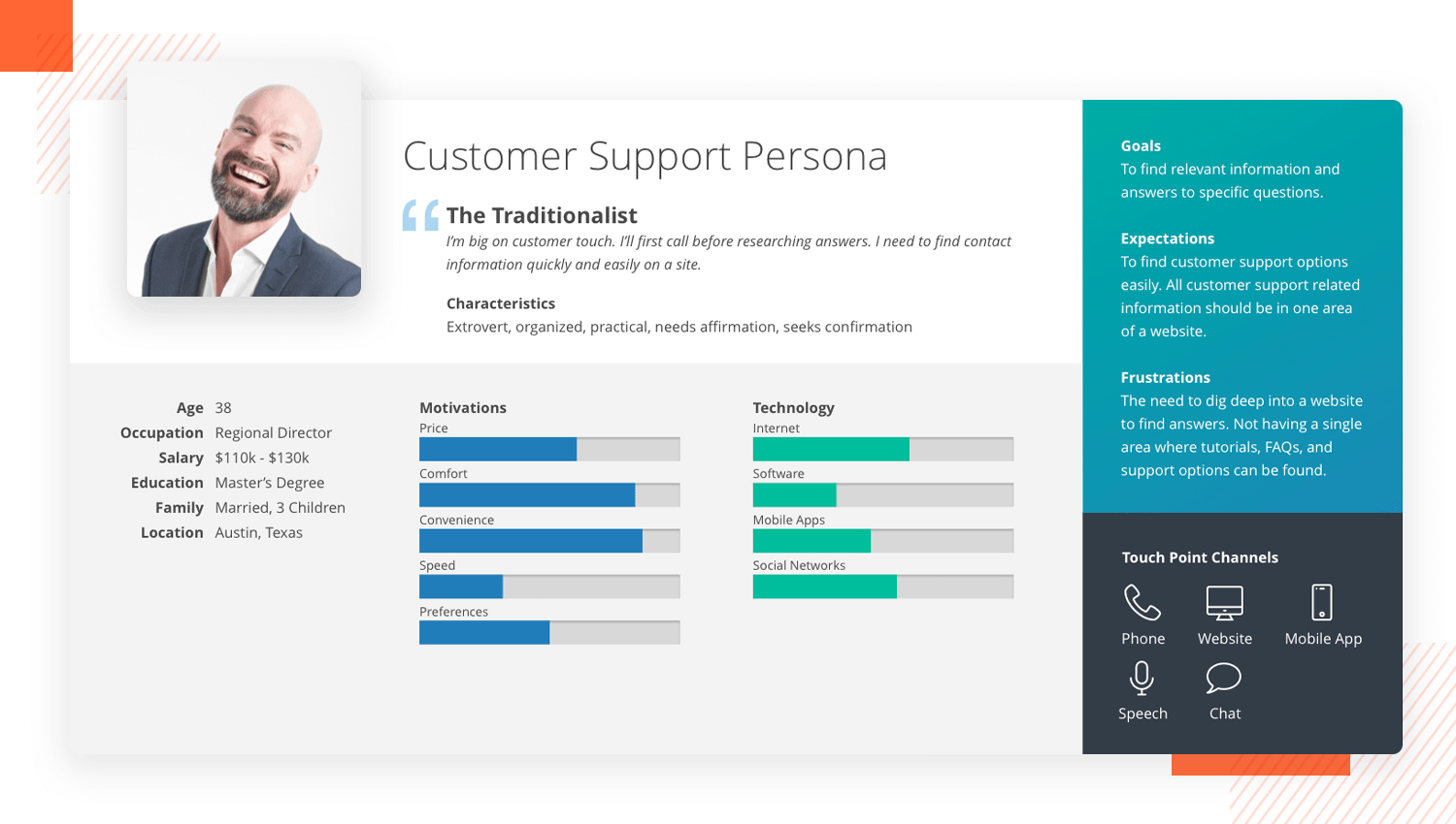
We’ve gone ahead and decided to include this customer support user persona template as it is a little different from the rest. How? It gives front stage to colorful bar chart graphics to make this regional director’s motivations and tech use easy to remember.
Instead of a paragraph or two of a bio, this example kicks off with a quote from the persona to define the rest of the document. Interestingly, the goals, expectations and frustrations are left to a small section to the right of the document. This shows us that the other stats are meant for quick glances while designing, whereas the goals and motivations require more close reading.
The touch points for which this person interacts with his customers through are also included. However this can be adapted to add in other details, like brand logos or the types of technology that the user persona uses on the job.
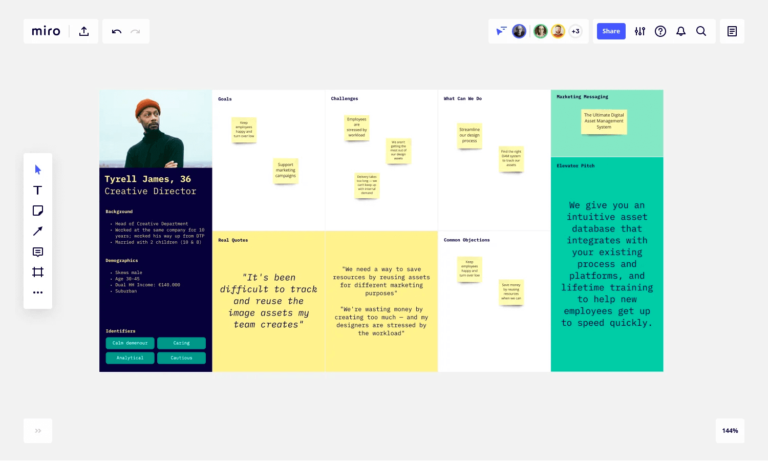
Getting creative when it comes to design deliverables, whether it be user personas or mood boards, is only ever a good thing. Especially when that deliverable needs to be instantly memorable for multiple people working in a team.
This post-it persona template takes its inspiration from an office environment with typewriter text and the persona’s goals, challenges and objectives adjourning separately marked sections of a whiteboard.
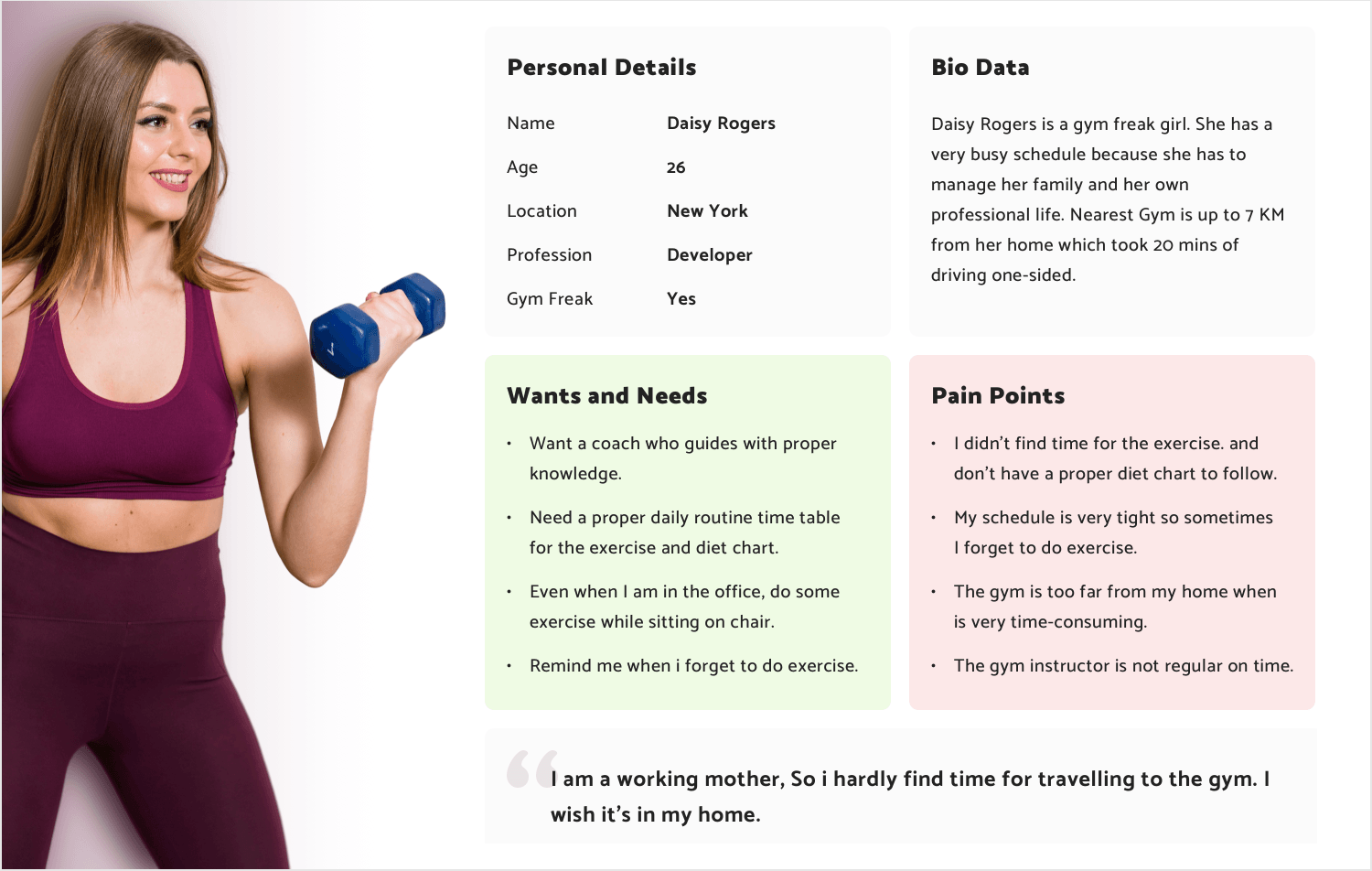
What we love about this fitness template is its neat layout and subtle yet effective color scheme. So, why is the color aspect so important here? Because when a user persona is associated with one or two colors, it becomes easier to remember. In this case, complementary pastel colors highlight the user’s needs and pain points, matching the colors in the image.
The rest of the information is set against a soft grey background, with a prominent quote at the bottom of the document. This leaves a lasting impression of the user persona and her key pain point in your mind.
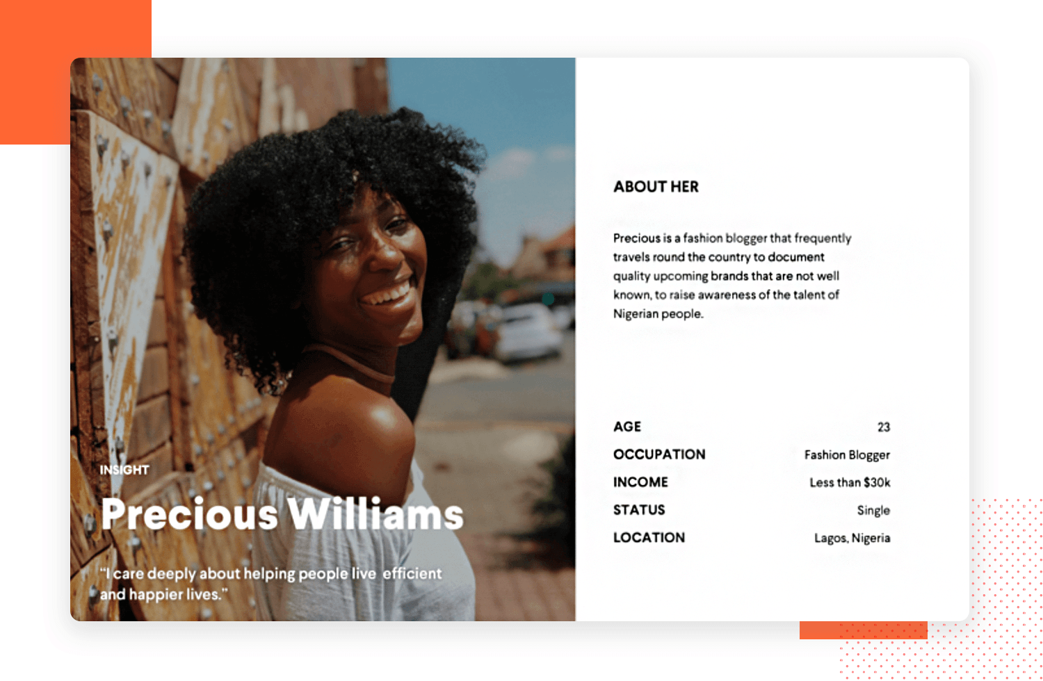
We chose this example of a fashion blogger lean persona with a strong maroon background because it’s able to convey a lot of information in a minimalist way. It also leaves a pretty strong impression in the mind, making it an easy document to recall. Strong colors and imagery work wonders when it comes to user personas. After authenticity, memorability is the most important factor.
A quote, a small paragraph bio that’s simple and easy to read, along with some basic details about the persona are the rest of the elements that make it up.
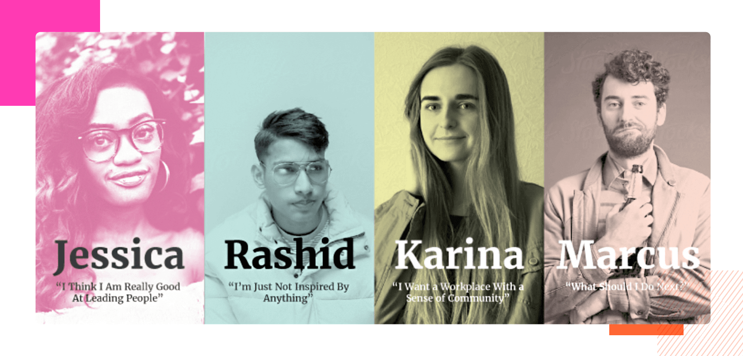
This quick-reference persona is a slightly different approach to a lean user persona. This one goes incredibly lean indeed and is probably aimed at a very wide userbase. While many designers might disagree with having only an image, a name and a quote, others might argue that it’s all you need when you combine them with other design deliverables, such as user journeys and storyboards.
What we particularly like about this template, however, is the fact that it gathers up some interesting pictures, applies a clear color scheme to them and makes the essence of their characters easy to remember. If this is a little too lean, one option might be to develop more detailed personas for each character and then use this document as an at a glance reference to help refresh all of the personas in your mind as you design.
Start prototyping for your users today with Justinmind
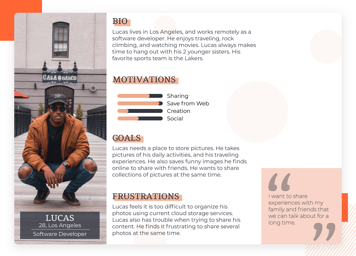
This example of software engineer follows all the right rules when it comes to grabbing the reader’s attention and making and forging an impression on the mind. The designer in this case starts with a strong photo to the left which already starts to tell a story. Each section is then clearly highlighted with easy-to-read paragraphs, while progress bars depict the user’s motivations.
All of the content is neatly arranged in an F-shape pattern and according to what the human eye is drawn to first. A large quote encapsulating what the user persona is all about affixes the bottom right corner and shouts for attention, as that is the last place the eye will fall. Everything just seems to call out in just the right amount of detail. We also like the recurring soft pastel color scheme throughout.
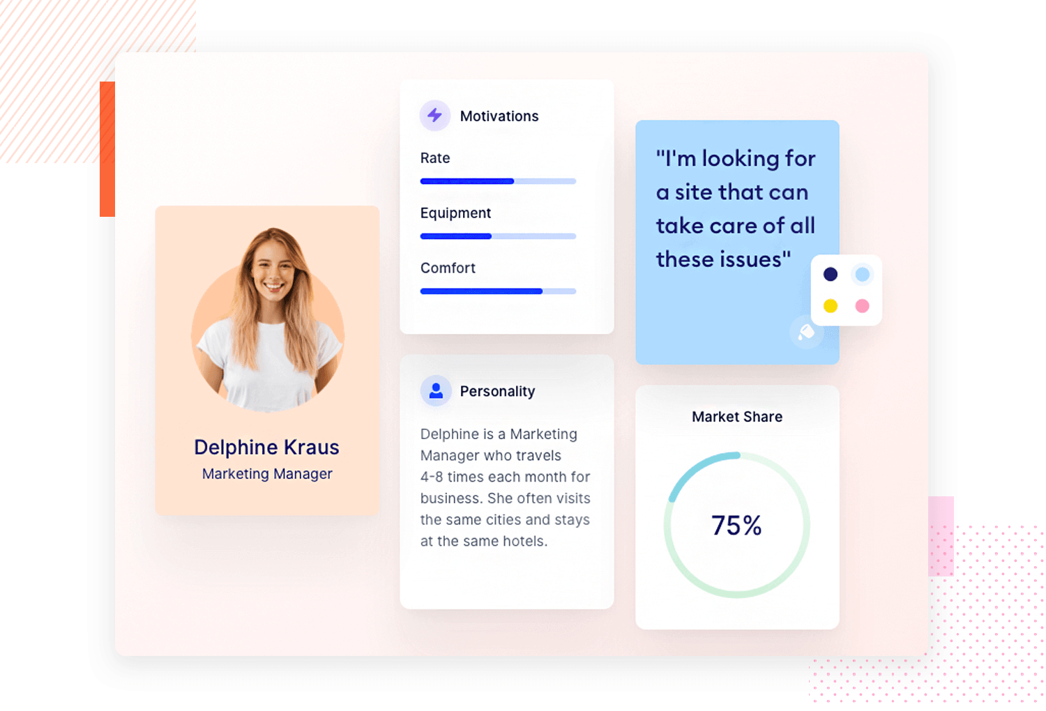
In this digitally-inspired user persona template of a Marketing Manager, we can see that it’s been inspired by the traditional cut-out projects but given a clean, modern, digital refinement to reflect the persona’s environment.
What we like most though, is the way it uses striking imagery and graphics offset against faint pastels so that they make an impression. It also gives just the right information. It’s a medley of clean and neat information that’s easy on the eyes and quickly absorbable.
After all, if your teammates don’t remember anything about a particular user persona, or simply remember that there was too much information, then it failed to have the desired impact.
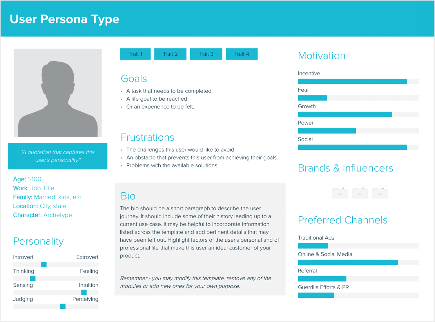
This brilliant blank and instructional user persona template from Xtensio, leaves everything blank but includes useful placeholder text to help you get started inputting information.
If you’ve never created a user persona template before, this is an excellent starting point. The placeholder text isn’t just Lorem Ipsum; it provides helpful instructions on the kind of details you should include.
In this way, it’s not only useful for filling in your persona information but also for guiding the type of information you should be collecting about your users during your research.
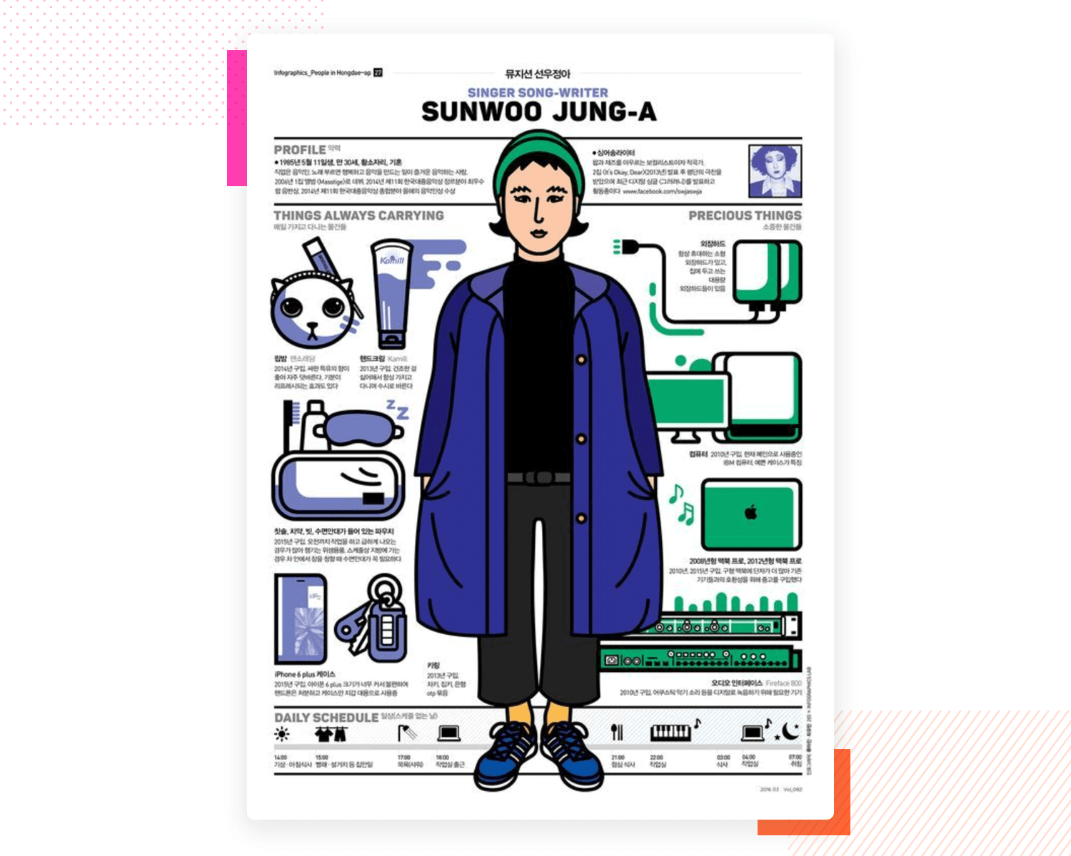
This comic-book style template throws up an interesting and unique way to approach a user persona template. It strives to create a visual that’s fun to look at and can instantly give you an idea about the kind of lifestyle of the persona and what kind of products they’d be interested in.
Obviously, personas like this would be more time-consuming to put together, but they do make an incredibly memorable and fun browsing experience, as they’re full of personality. One thing we particularly like about how the information is divided in this template is the precious things and the things the persona is always carrying.
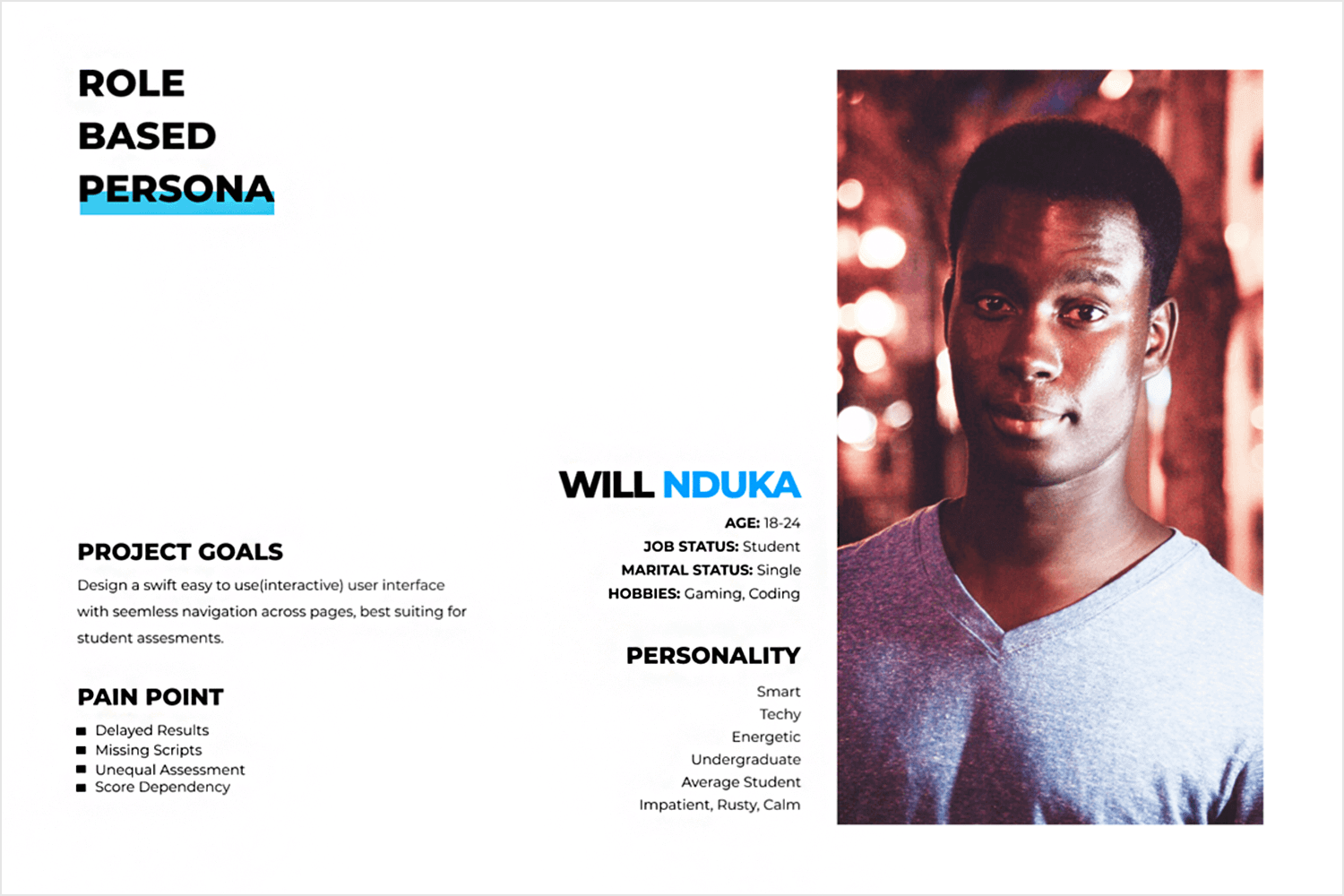
Here we have a great example of a lean minimalist user persona. The designer of this template has clearly thought about the distribution of elements on the visual-based on the way the average person scans a document.
This template uses an electric blue color scheme and neatly arranged text, making it quick and easy to scan. It provides all the information you need upfront, along with a powerful photo. Interestingly, the photo is not on the left as usual, but it still stands out. Starting the text on the left helps balance the design and highlight the details. The only thing missing is a quote to complete it.
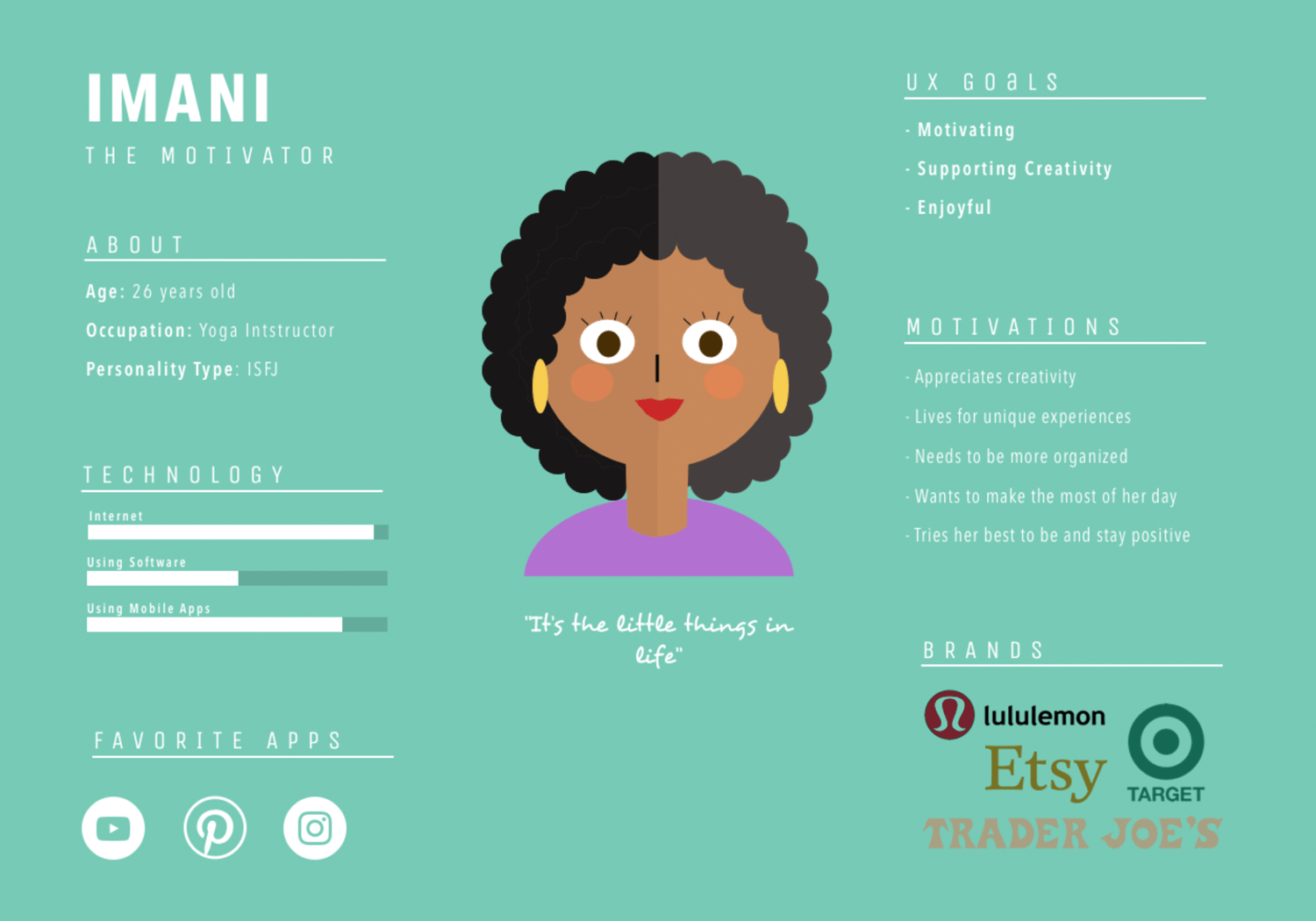
Just like what we mentioned above, rules are often merely guidelines in the design world. Yes, while photos of real people do tend to garner more attention and boost memorability, this vector user persona template has gone against that and attributed a fun cartoon sketch of the user instead.
The cartoon is plain, simple and colorful, making it easy to remember. Text is sparse, with only the necessary information included. Visual elements are aplenty, with progress bars showing the user’s competence in different areas of technology, while favorite apps and brand logos give an at-a-glance share of the market they’re in and the technology they’re used to. Lastly, the quote is included just below the user persona, in a differentiating, fun font.
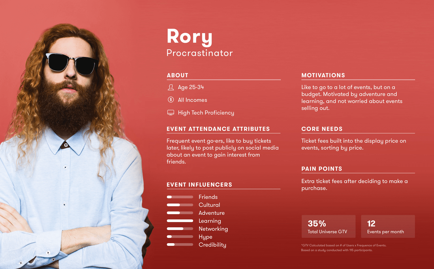
This colorful and detailed procrastinator user persona template by Arthur Chayka is all about a young and modern person, focusing on his behavior surrounding events and concerts. We like that the user template itself is colorful and fun because it reflects the personality of the user.
This persona example has all the basic information that designers would need to have a sound understanding of who this user is, along with his motivations and pain points. One of the most important elements in this user persona template is the user’s core needs, the things he values the most.
This visually engaging trip mate user persona template by RH captures a UI designer, who loves to travel. One of the best things about this example is the use of space and visual elements to convey information.
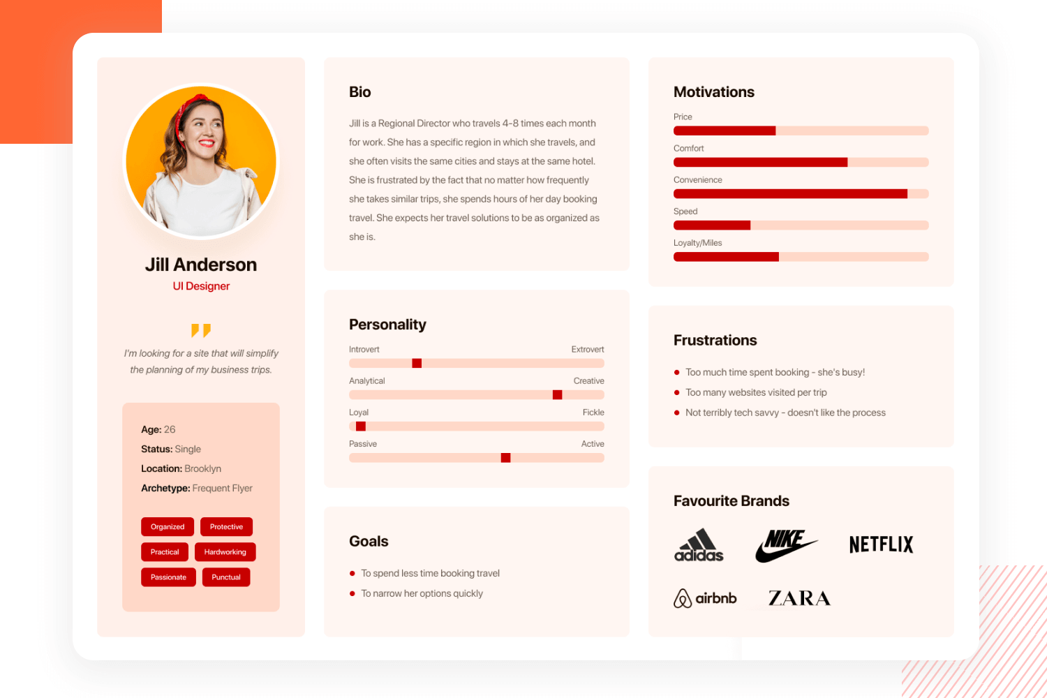
Firstly, we have clear dividers when it comes to different aspects of the user traits, with a great visual hierarchy that makes it all easy to read in a second. Secondly, the use of visual elements like bars and tags make it even easier to grasp who this person is, what they like and what they want.
This food shopping user persona template by Shir Avraham brings us Assaf, who likes to shop for food in a market and to dine in restaurants. We like that the style of the template itself reflects the personality of the user, with a modern, casual but elegant feel.
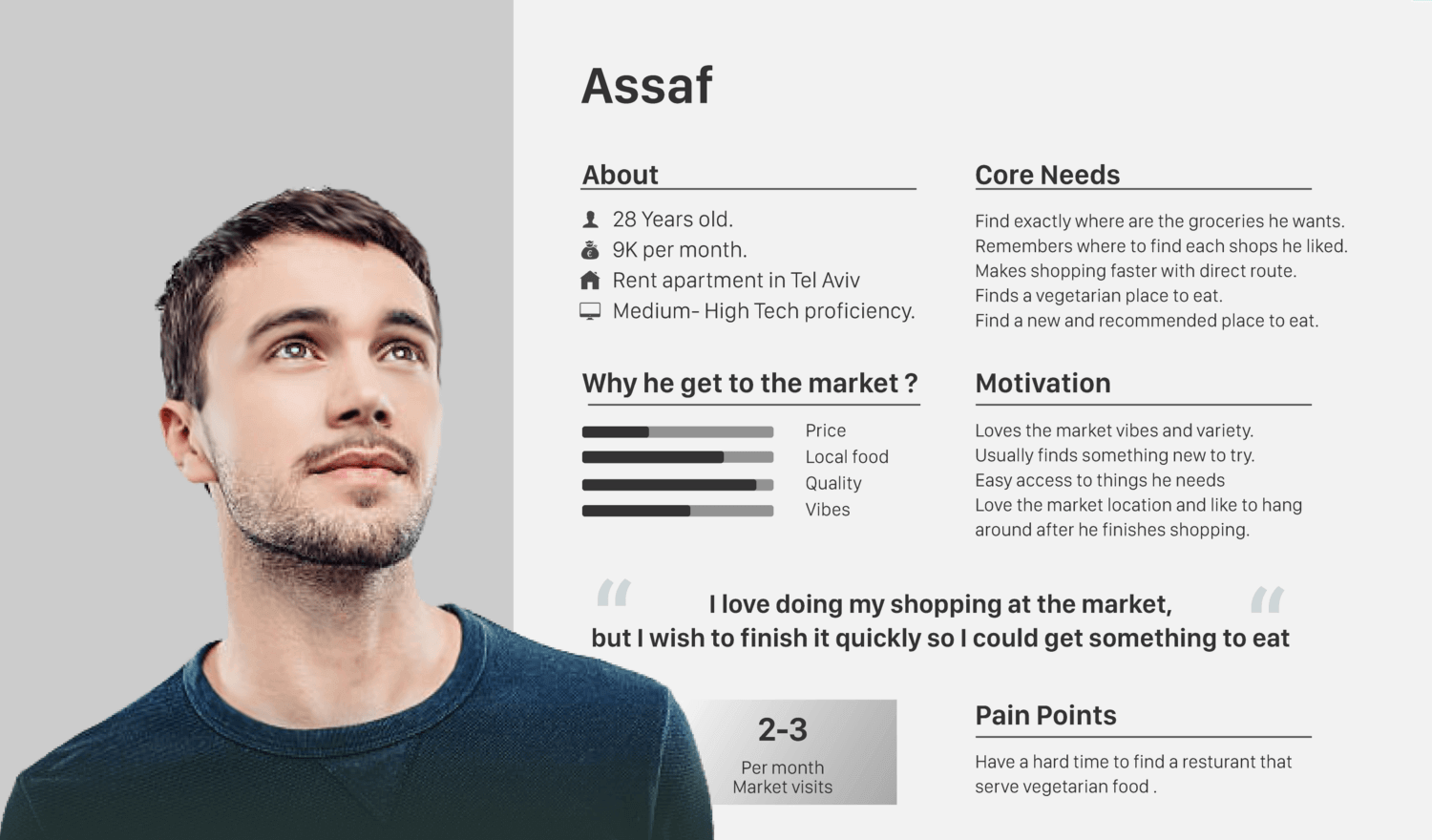
It’s true that this user persona doesn’t pack as much information as some of the others on this list, but the end goal is achieved just the same. It conveys a clear idea of who this person is, even if it doesn’t include every minute detail.
This dynamic and professional hardworking manager user persona by Xtensio represents a typical mid-level business manager. She travels frequently, she’s active and highly motivated by convenience. It’s a clear picture of who this person is, with quite a few details and a great deal of insight.
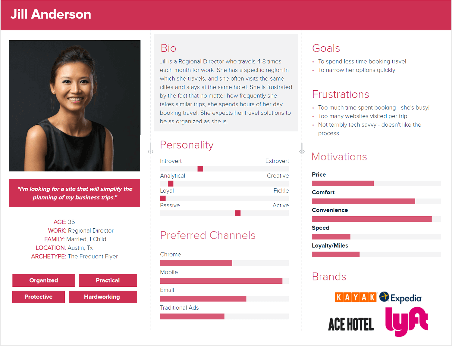
The design of this template itself feels colorful but professional. It’s bright and easy to read, with plenty of visual ways to convey information. It feels like a no-nonsense design, much like the persona herself.
This is a bright, young and fun template by Ofer Ariel. It brings us a student who works as a waitress. She’s a pro at social media and is currently trying to improve her house decor, which she shares with her husband. The persona doesn’t give us a lot of details into her life before school, work or husband – but does all that matter?
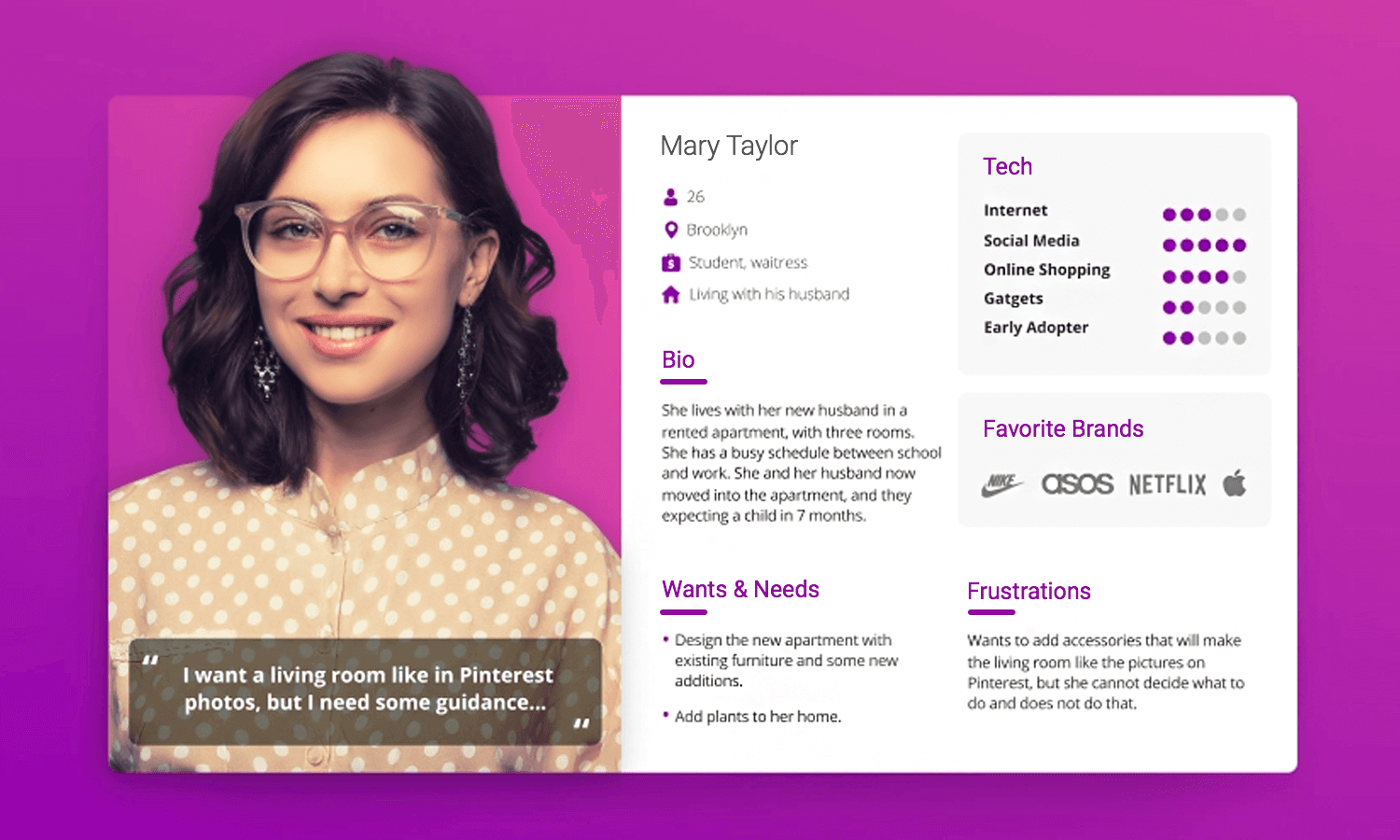
We like the general distribution of information around this vibrant working student template, making it easy to read it. This persona representation focuses on her wants, needs and pain points – all of which are useful to designers.
We included this unhappy graphic designer user persona example by Bappy Mithun because of the general design, even if some of the information in it is contradictory. We like that the template itself feels modern and edgy, which could be a great way to reflect a designer who likes to push boundaries with her work.
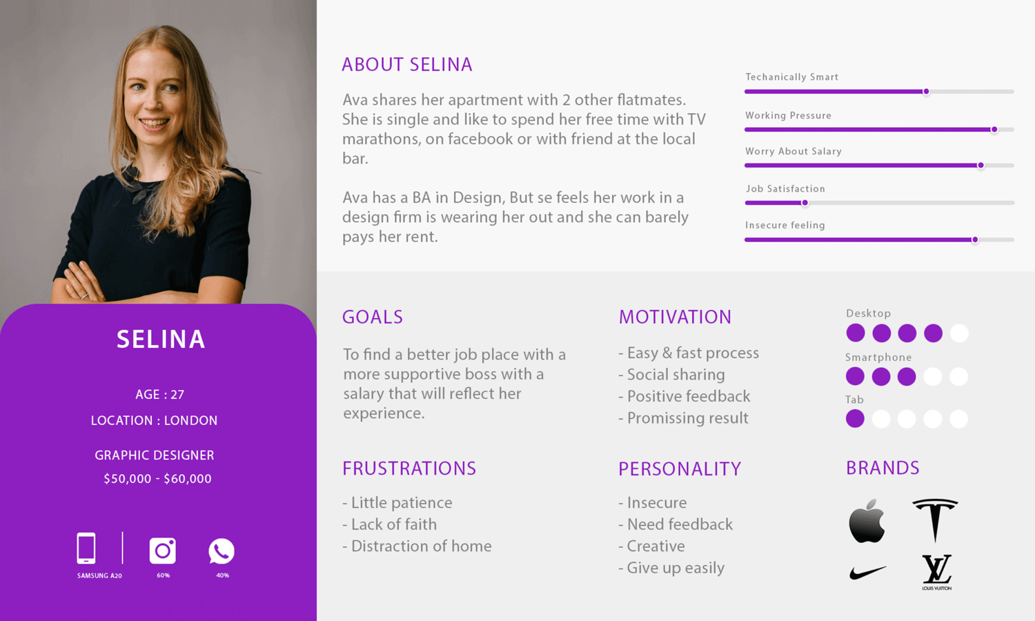
This template focuses on how the designer relates to her craft and her job. It shows us with progress bars her state of mind, using other visual means to convey why her current job isn’t a good fit for her. Since this also relates to her and her technology of choice, we appreciate that the template includes which devices she uses on a day-to-today.
This persona example by Shreya Singh brings us a visual designer who loves her team and her work, but is frustrated with her morning routine. We like that this template is simple and to the point, without any flash visuals or fancy colors.
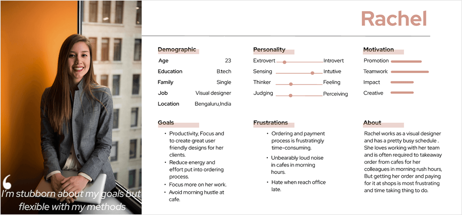
We like that despite the lack of in-depth details, all the information presented is useful to any design team. It sticks to her daily life, her feelings and the things she dislikes.
Zakir Hussain Butt brings us a young designer template who is looking for a more scientific approach to health and wellness. With this example, we get a complete picture of who Zakir is and how he relates to technology in general.
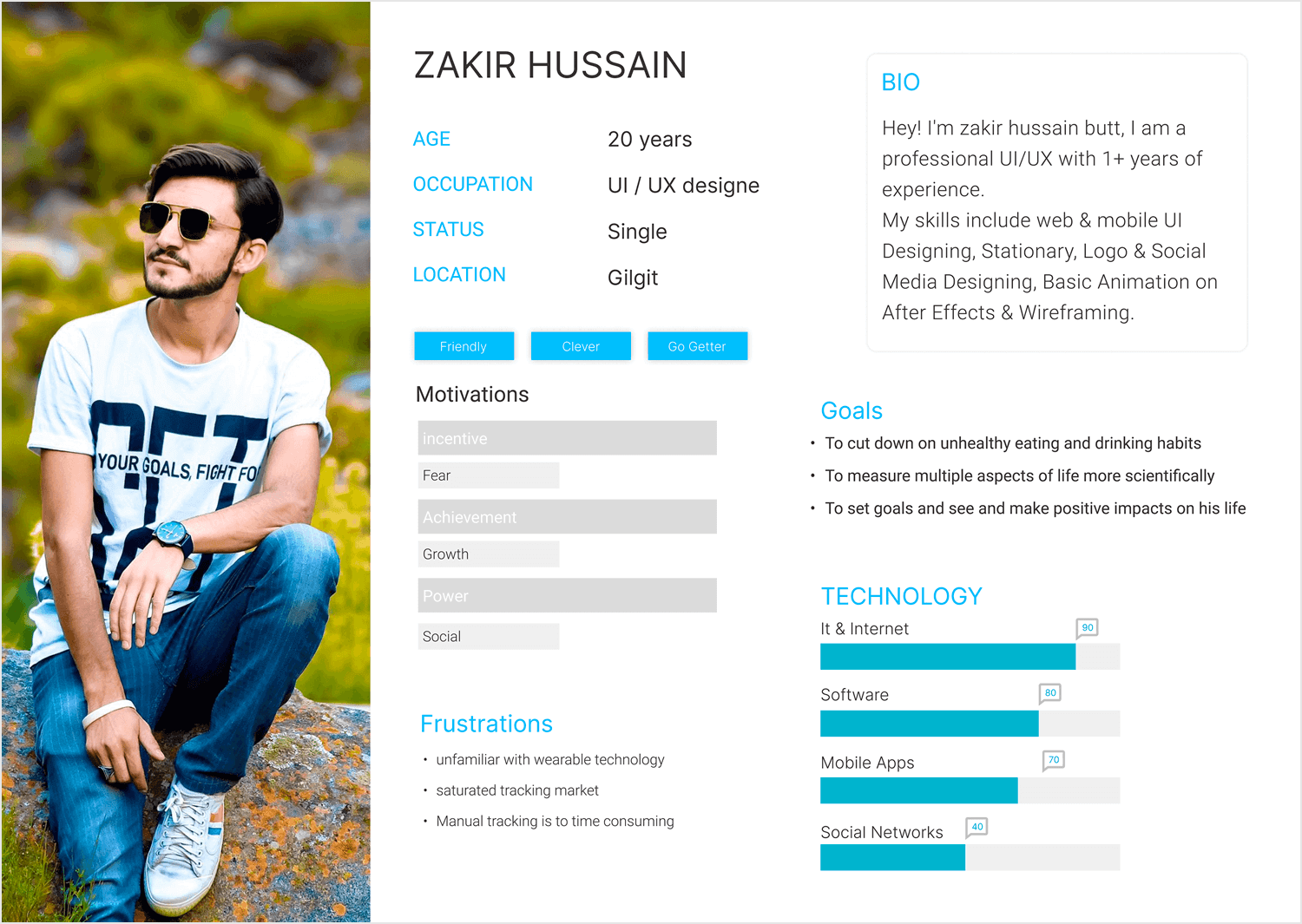
We like the use of bars, tags and bullet points. This makes the information easy to find specific information quickly, with this user persona template offering a minimalist and modern feel. It’s to-the-point and doesn’t waste space on information that isn’t relevant.
Brittany is a young influencer and brand ambassador who is on her way to an important event. We love that this user persona by Dana Girolami is quite different and unique. It doesn’t focus on her habits or tastes. It shows us, instead, her schedule and timeline. It’s an interesting approach, because it’s all about Brittany in relation to this event.
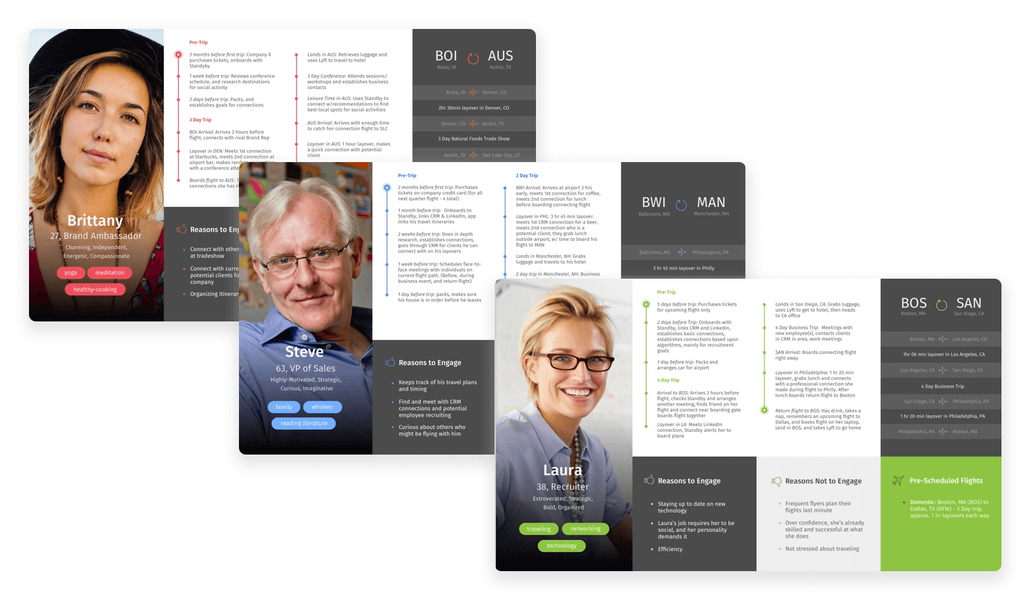
It’s true that something like this wouldn’t work for most projects out there. Most design projects do need crucial traits like preferences and pain points. With that said, there is a use for user persona templates that take a different route – it’s just a matter of finding the opportunity in the right project.
Start prototyping for your users today with Justinmind
Jasmine is a single mother who currently works part-time in preparation to begin her journey as an engineering student. In a more traditional approach, this user persona template by Valerie Diaz de Arce brings us Jasmine’s goals, motivations and struggles. It’s a clear snapshot of her life today, with glimpses of future plans.
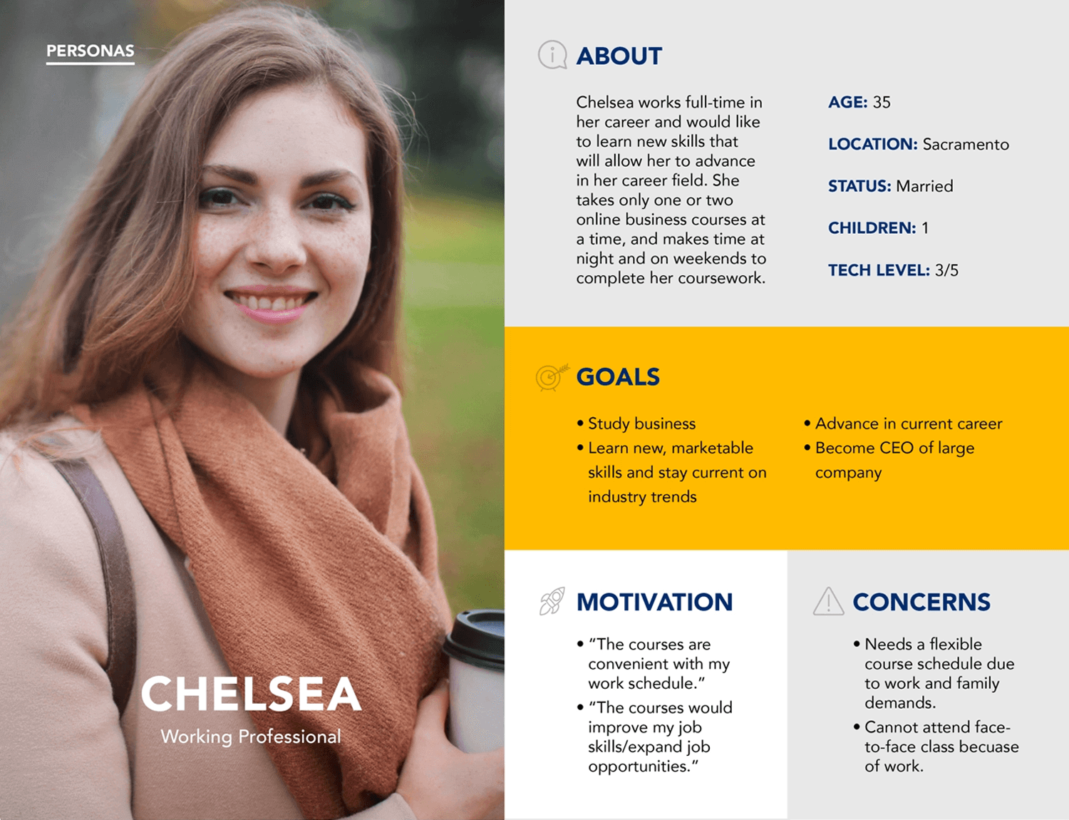
We like the design of this template. The information is given to us in small bits, using graphic elements and whitespace to let each section breathe. It’s easy to read and feels modern, techy – a perfect fit for an aspiring engineer!
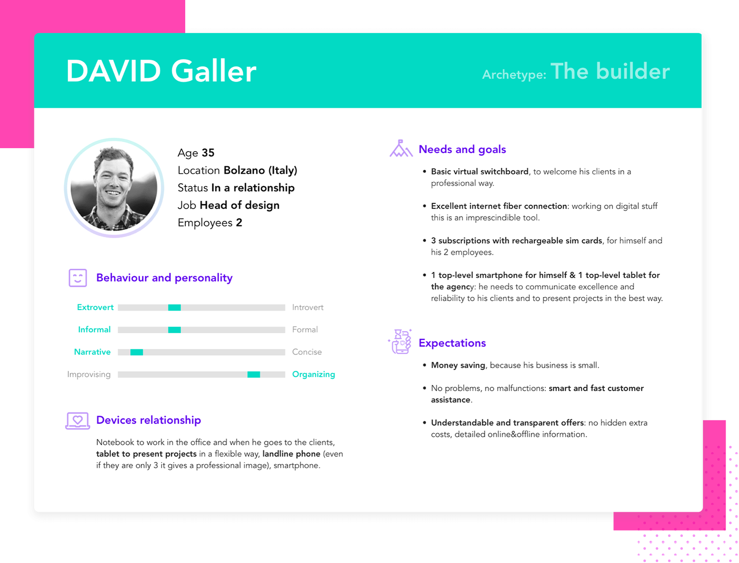
This persona template by Laura Bisio is a good example of how an archetype label can help you give a general idea about the user before getting into the details. With great use of white space and icons for categories, it gives a lot of information at a glance.
The 4 categories give detailed insights that provide specific information that make the persona actionable by giving clear goals.
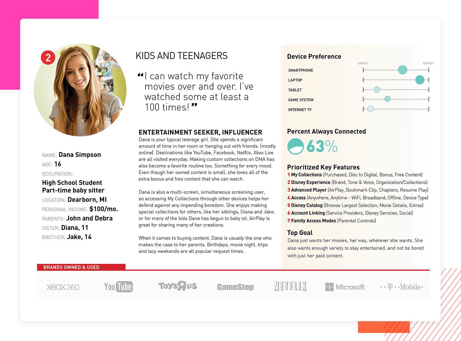
Another example is this detailed parent subscriber template, which is part of a four-persona collection created for Disney’s digital movie applications by Greg Carley. It’s clear that a significant amount of research and data went into crafting each profile.
This particular template provides valuable insights into the specific needs of the end user. A notable feature is the quote at the top of the page, positioned next to the picture, offering a quick understanding of the user’s perspective. Using quotes, especially real ones, is an effective way to provide accurate and realistic insights.
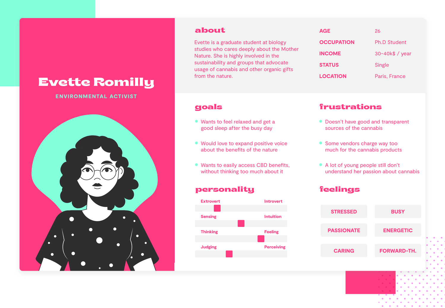
Branding agency Insigniada bring us this persona template with the necessary insights so that you can improve your user experience. With 6 categories to provide end user information and details, this design is the perfect mix of text and visuals.
It uses the cartoon alternative instead of the most commonly used real person photo that works perfectly with the color palettes and the rest of visual elements. Although it uses a cartoon, it manages to give an accurate representation of who the end user really is. This activist persona template is good for climate and nature friendly projects, or any holistic and sustainable services website or app.
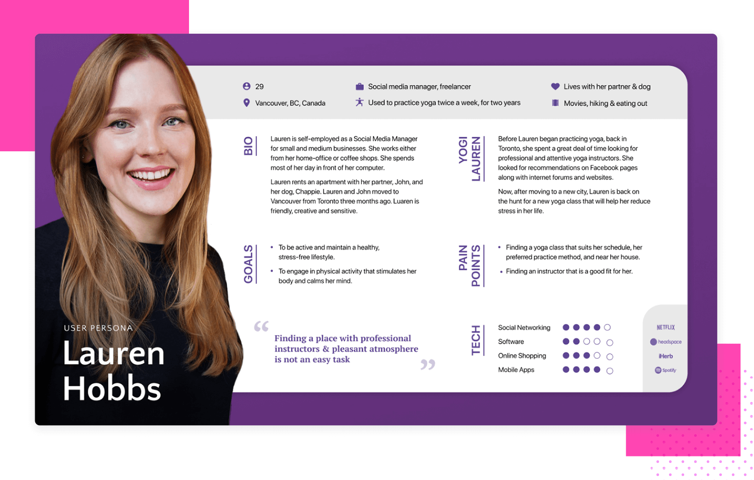
This template by Tal Arbeli covers all the key data and can be used to create a complete persona profile and build potential end users from there. This template includes a quote, a favorite brands and logo section which make all the information more personal and compelling.
This is an example of everything you need to know about Lauren ‘the yogi’, it sums up all the data in 7 categories that are organized in an easy to read format.
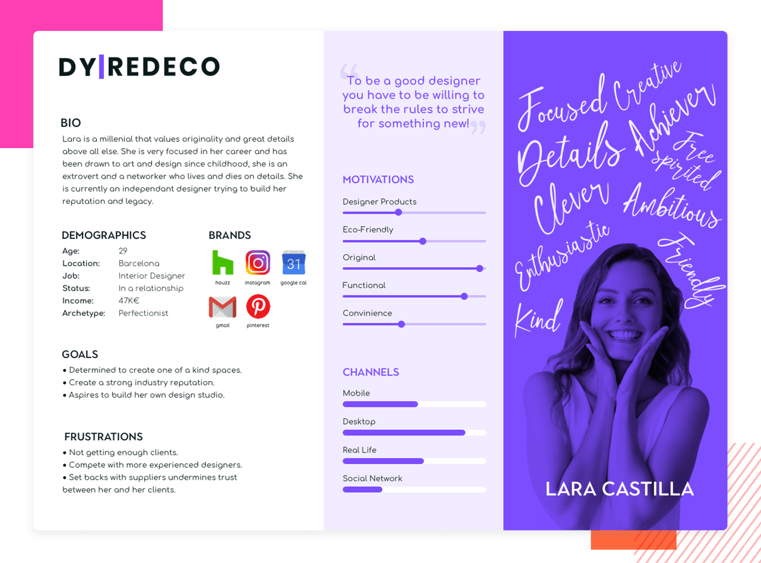
This template addresses all key questions about the younger millennial user, with aesthetics that perfectly match the described profile. It’s modern, fun, and effectively summarizes the user with a few keywords in the photo background.
Created by Maria, this example is particularly useful for networking, marketing strategies, or even home decor and similar projects. A standout feature is the ‘Channels’ category, which clearly summarizes the user’s methods and approaches to achieving their goals.
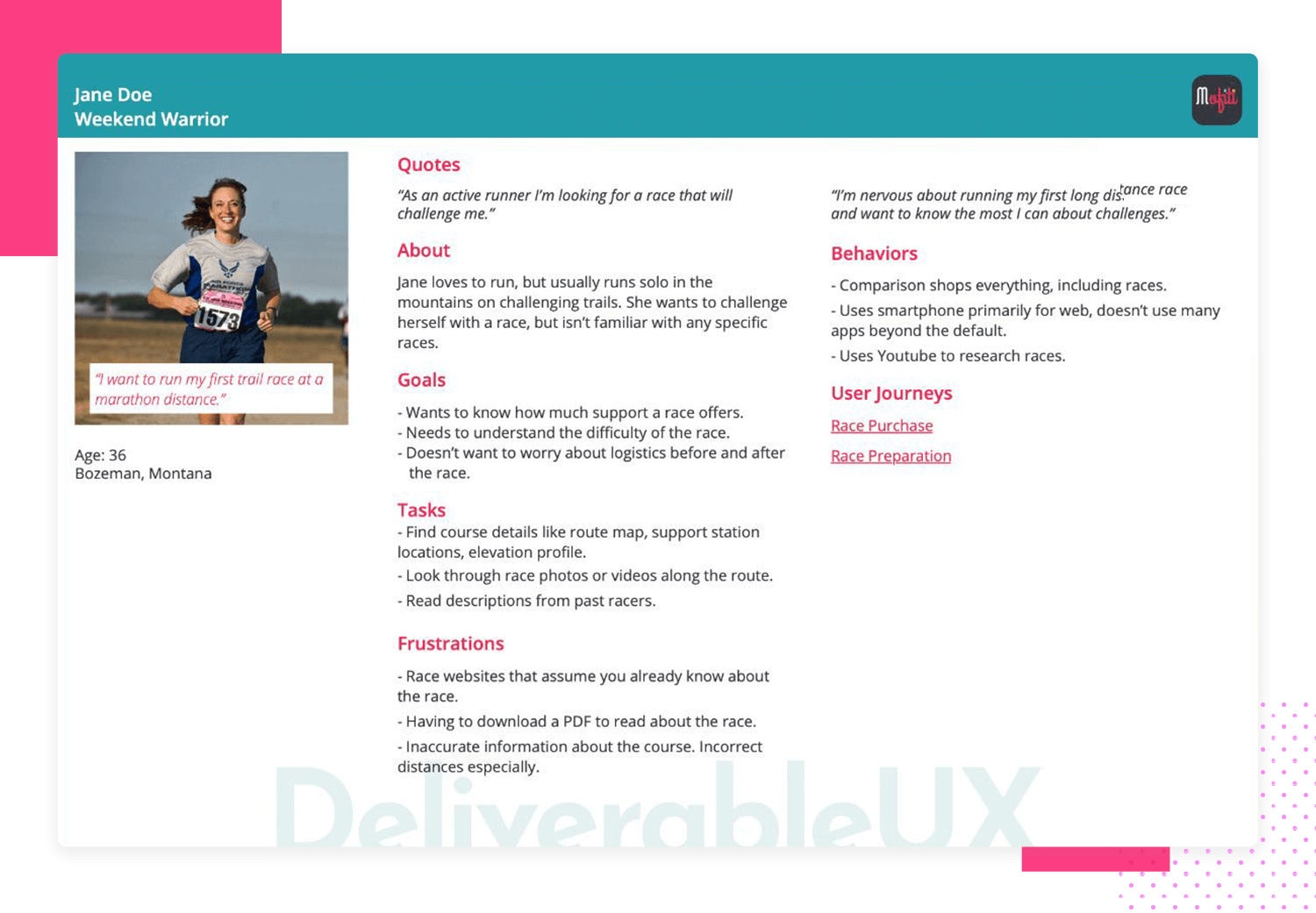
This fitness enthusiast user persona template by Deliverable UX has a written ‘About’ section, that specifically describes their uniqueness and current situation. We could describe this template as a day in the life of Jane Doe, including her background, goals, methods to approach her goals, pain points and purchasing behavior. We also get a glimpse of her communication channels and a ‘User Journeys’ section for ‘cross-reference related user journeys and research’.
The user photo is a real photo that does a great job describing the persona. It may not be the most beautiful image you’ve seen, but it certainly does the job describing the end user.
This completely and easy to understand example is perfect for any physical activity project which incorporates routes descriptions and recommendations as well as workout progress and social networking. However, it can be adapted to similar profiles or design goals based on your own research.
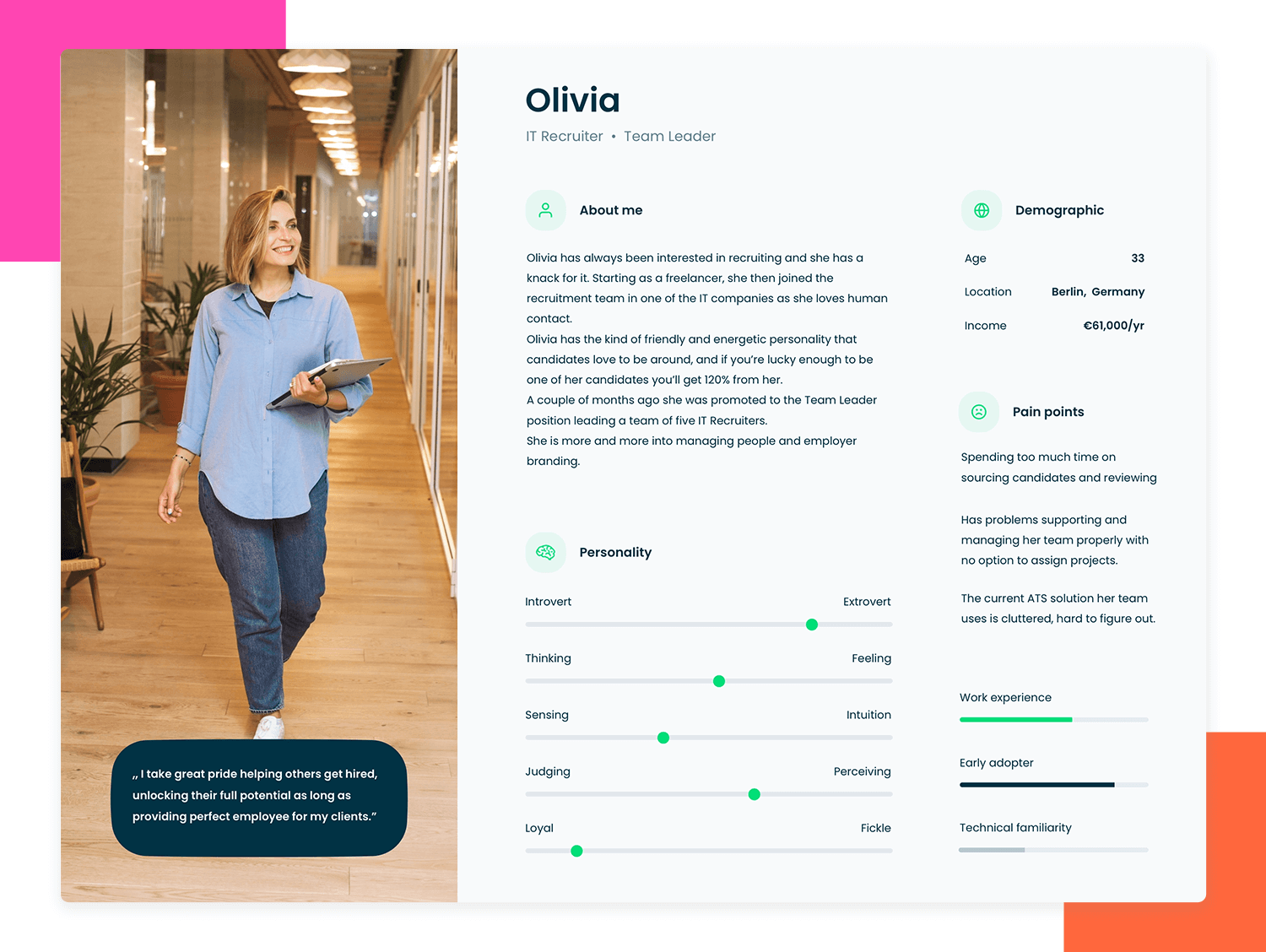
In this example, Olivia is introduced, a team leader in a recruiting company. In this template you have only the most basic demographics, but all the additional information is made available in the ‘About me’ section. It is pretty obvious that other categories such as personality and pain points are very well researched and information is clearly summarized and well organized in a visually appealing way.
The quote and user picture complete this detailed IT recruiter user persona from Dribble by Lucas Swierad for a successful and memorable end user that can help you and your team improve your project design.
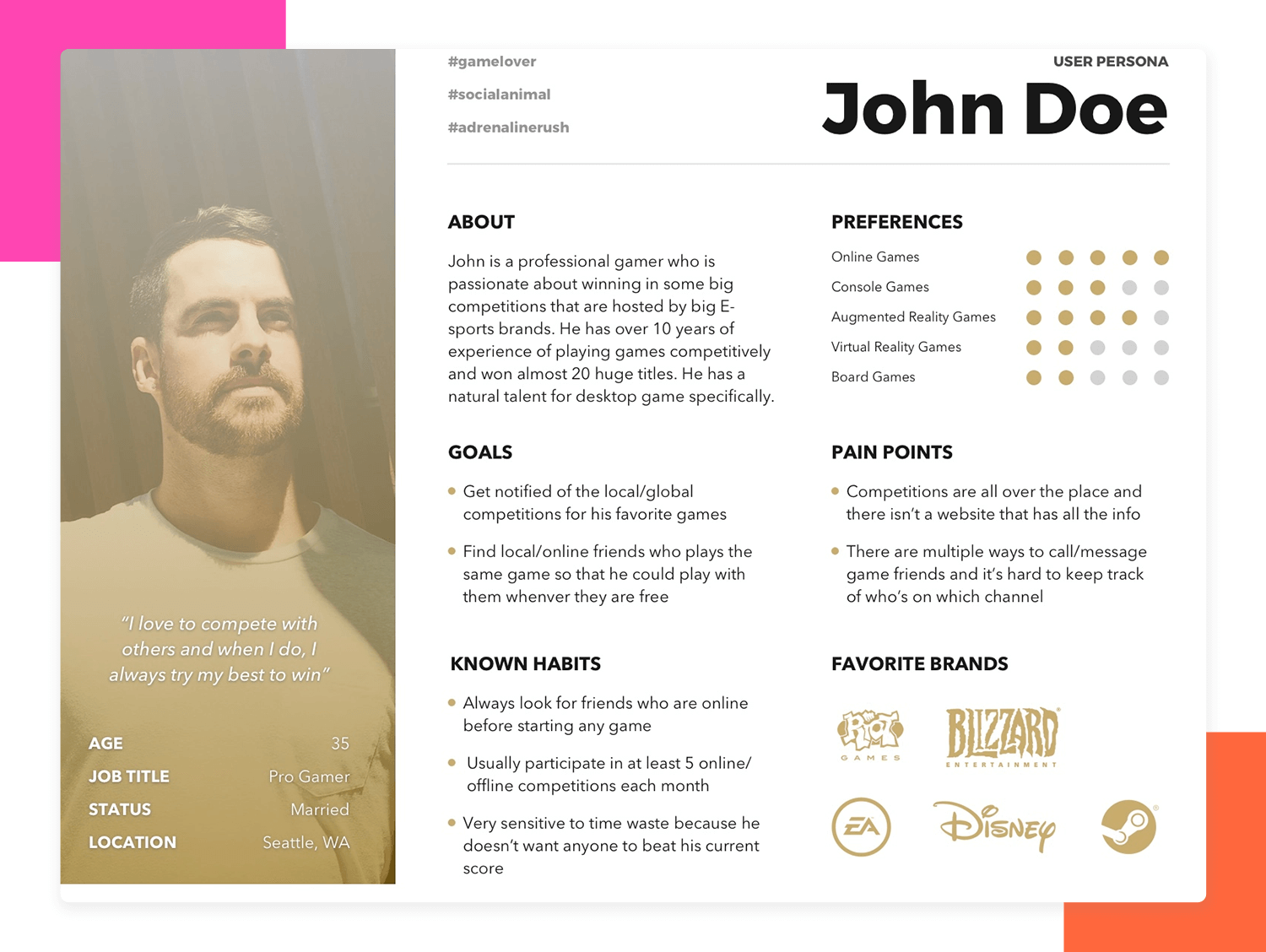
The Gamer persona template is another one by Geunbae “GB” Lee, it is a solid template that enables us to quickly identify the key attributes of the end user all while making it memorable. Using just enough icons to convey visual information clearly and hashtags to describe John at a glance.
This design includes specific categories such as Known habits, preferences and favorite brands where designers can fit their research findings. It is easy to understand and gives a clear and organized view of the insights gathered, including information on the persona’s habits and behaviors. This template can be a great tool to present and identify key opportunities.
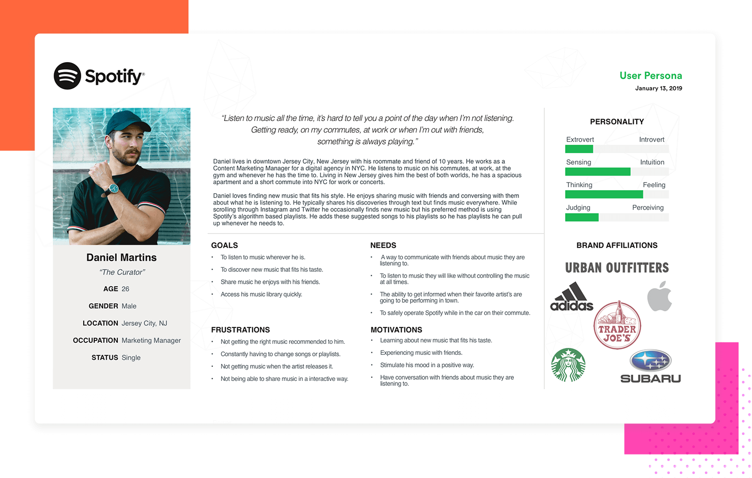
Another example is this active music user persona by Kevin Santos, which excellently details the research behind ‘Daniel,’ the curator. At a glance, you can see the extensive effort put into creating this ideal profile for a music service app. Daniel, a young professional in NYC, has a deep passion for music and enjoys sharing it.
His goals, needs, frustrations, and motivations are clearly laid out in the center of the page. The template makes smart use of white space, with the user’s photo and categories for personality and brand affiliations standing out. These two colorful content blocks provide key information at a glance. A descriptive quote at the top sets the stage, making this a thorough and inspiring user persona.
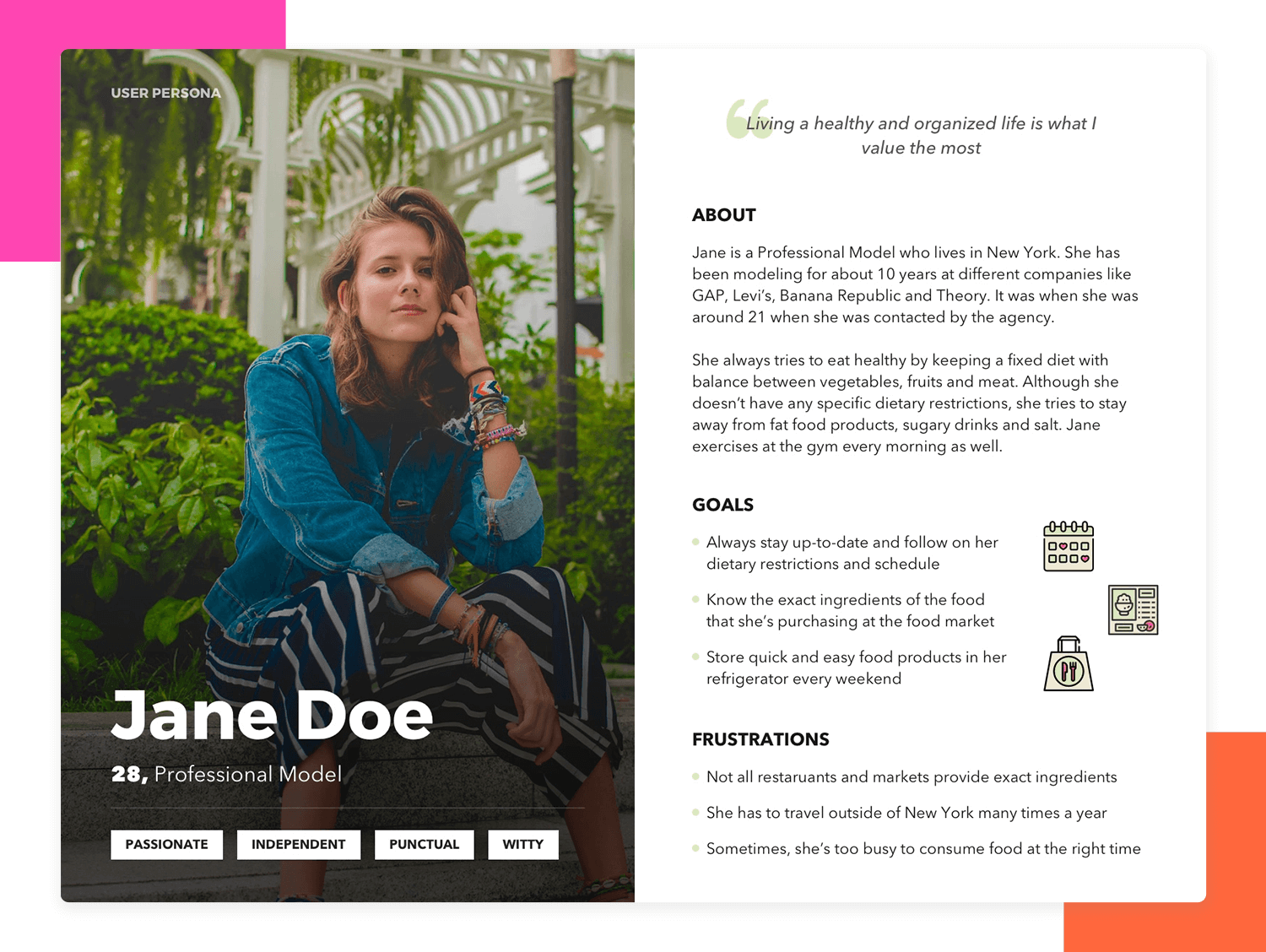
This template by Geunbae “GB” Lee about a professional model, outlines the ideal goals of the end user as well as their frustrations which would be the main barriers to accomplish those goals. It includes just enough narrative in the About section to capture the most relevant attributes in this persona. You’ll also see a short quote is provided to better understand the wants and needs of Jane Doe. The large photo of the user includes the demographics and a few keywords that best describe Jane.
What we like about this example, is that it is straight to the point and does not include a lot of details, which works perfectly as a first draft. There is plenty of room for you to fill out with your own research data.
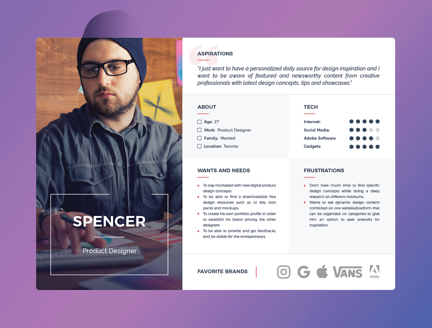
This product designer template provides a quick view of Spencer’s needs: inspiration, research tools, and a platform to showcase his work. The layout includes sections for a quote, demographics, needs, and frustrations.
It’s excellent for understanding user motivations and challenges. The template is easy to read, making it useful for various products and services.
Understanding Spencer highlights common designer issues like tight deadlines and finding inspiration. This template helps create solutions to address these problems effectively.
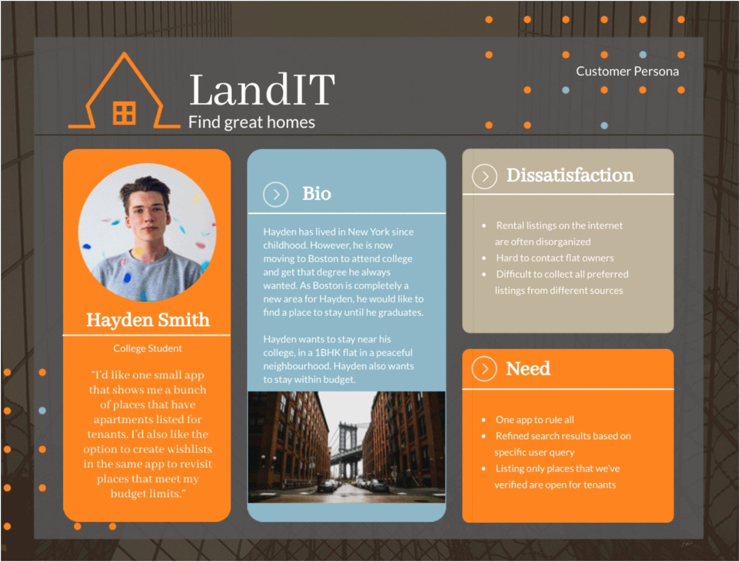
This template delivers a modern take on visualizing the ideal real estate customer. It offers a mobile-friendly layout, trendy icons, and stylish content blocks that instantly convey the fast-paced nature of apartment hunting.
But Hayden isn’t just about speed, he’s about smarts too. That’s why this user persona template places his “Needs” front and center. No more wading through pages of text to understand his frustrations. A quick glance reveals his longing for a curated selection of apartments and the ability to create wishlists for easy revisiting.
Start prototyping for your users today with Justinmind
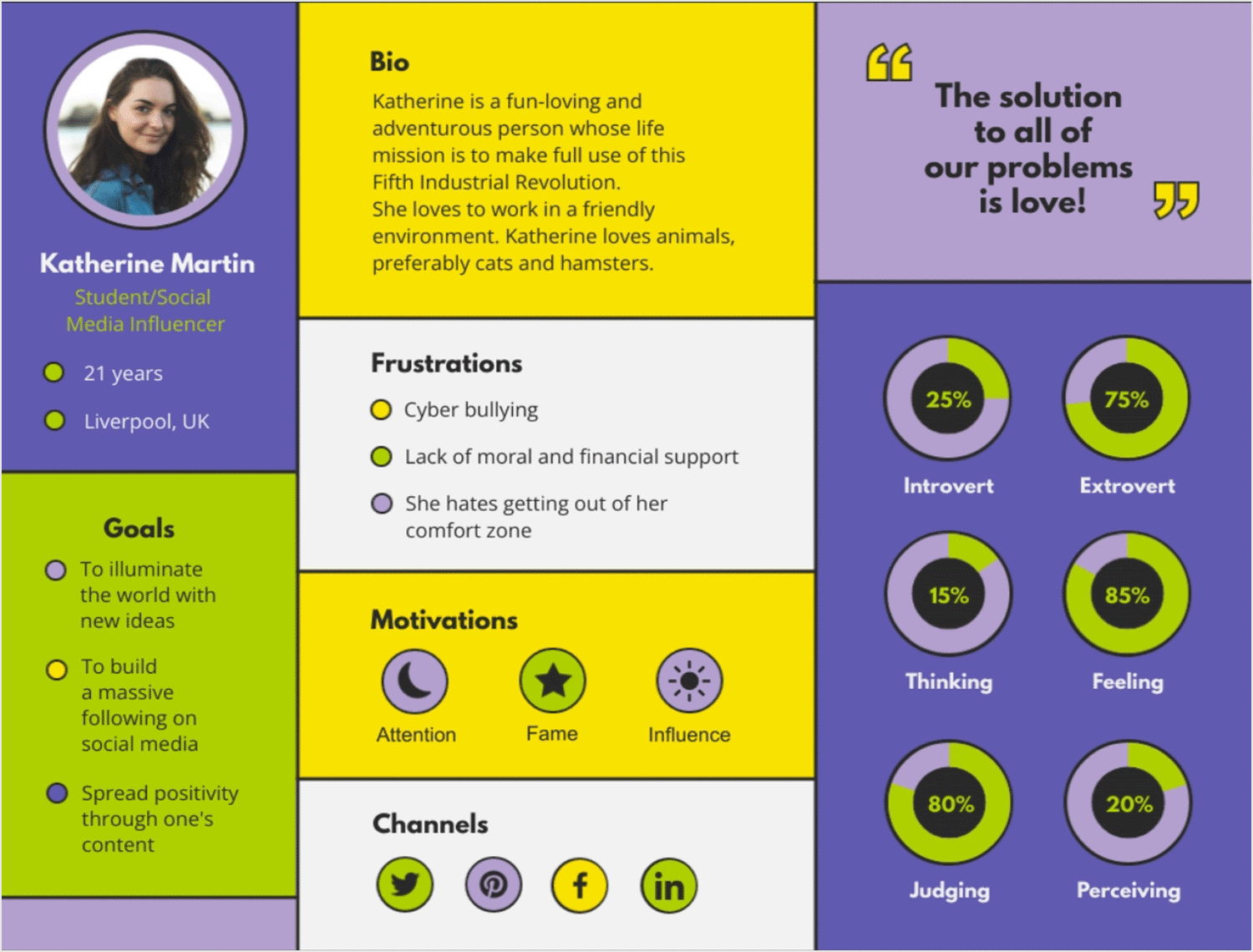
Forget boring profiles! This Gen Z customer template is vibrant and full of personality. It features a captivating image and a thought-provoking quote to capture the essence of a Gen Z consumer.
But it’s not just about looks. This template dives into motivations, goals, and frustrations, like “showcasing positivity through content” and “lack of support.” Understanding these details is crucial for creating products that resonate with this generation.
It’s not only informative but also visually engaging, with a playful layout and color scheme reflecting Gen Z’s energy. This template gets noticed, remembered, and helps you connect deeply with your audience.
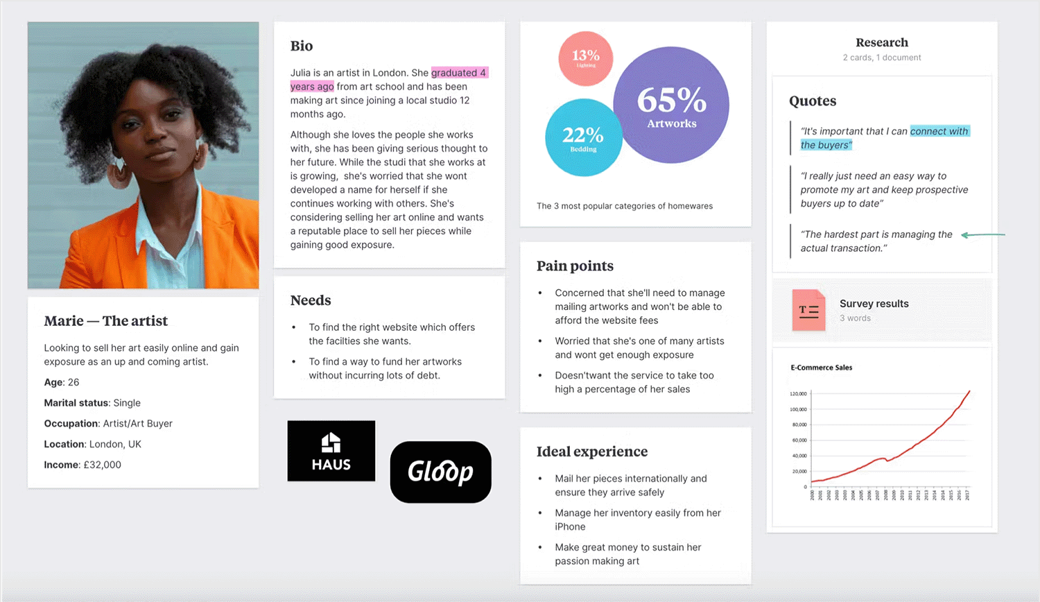
This user persona template is perfect for capturing the heart of your ideal customer. Marie, the artist in this example, represents a growing segment of creative professionals looking to sell their work online. The persona template uses a clear layout with a photo and bio to give you a glimpse into Marie’s world.
But this template goes beyond aesthetics. The “Needs” and “Concerns” sections dig into Marie’s motivations and challenges. She wants to find a reputable platform to showcase her work, but worries about managing transactions and getting the best exposure.
Understanding these specific anxieties is key to creating a user-friendly and artist-centric online sales platform.
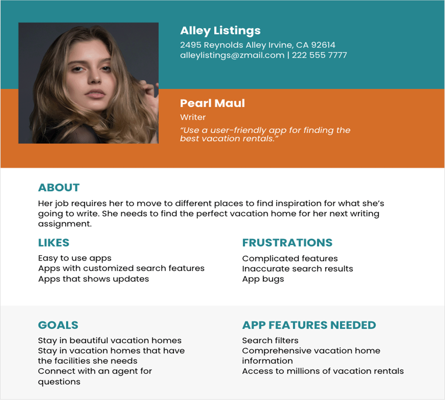
Imagine you’re Pearl, a writer who craves the inspiration of new locations to fuel your creativity. You need the perfect vacation rental, a place that sparks your imagination and provides the tools to get the job done.
That’s where a well-designed, writer-centric vacation rental user persona template comes in! This template puts you in Pearl’s shoes, highlighting her goals and also frustrations for the vacations rental platforms to tailor their offerings accordingly.
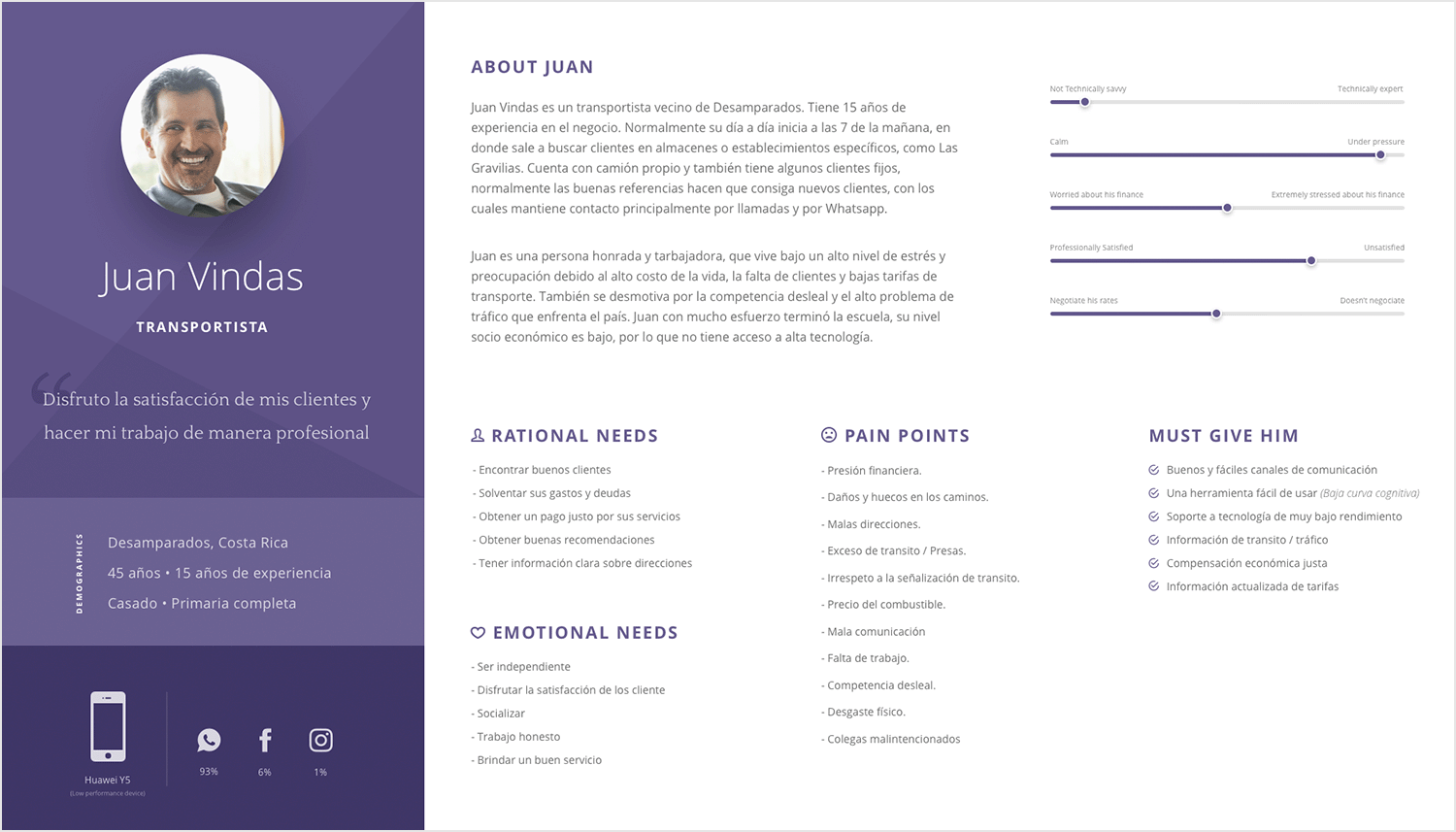
Juan Vindas’ truck driver persona template puts you in the shoes of an experienced truck driver. It highlights his key needs: finding good clients, maximizing income, and improving communication. It also covers his challenges, like high operating costs, fierce competition, and traffic congestion.
Understanding Juan’s daily struggles helps companies create solutions for independent truckers. This could mean freelance job boards, fuel efficiency tools, or real-time traffic data, all designed to support drivers like Juan.
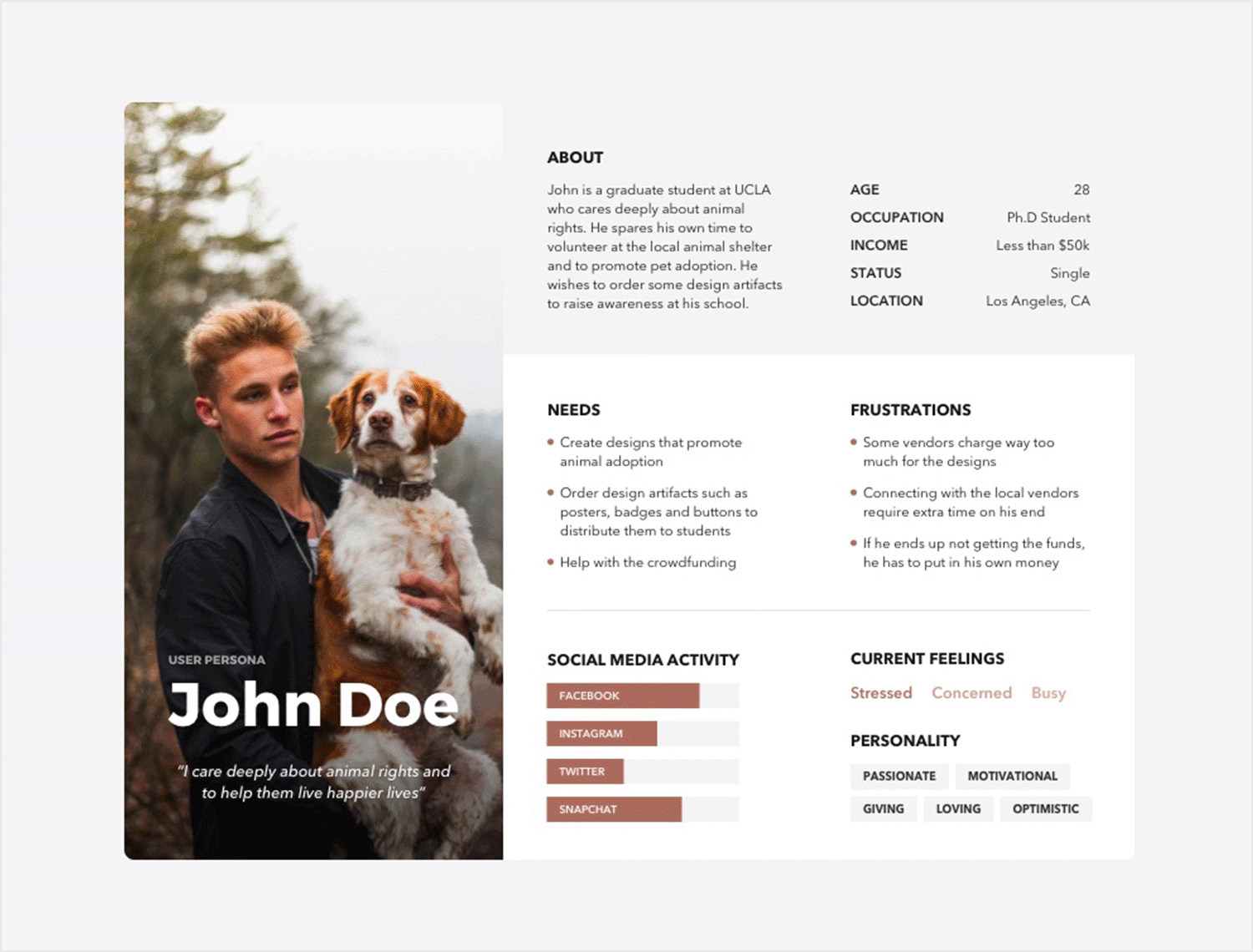
Here’s a look into the life of John Doe, an animal rights activist on a mission. By day, he’s a passionate graduate student; by night, he volunteers at the local animal shelter. This template effectively highlights John’s motivations and challenges with a clear and concise format.
Templates like this help businesses in the design and printing industry understand and meet John’s needs. This might involve offering student discounts, creating an easy-to-use online platform for ordering designs, or providing resources to connect with local vendors.
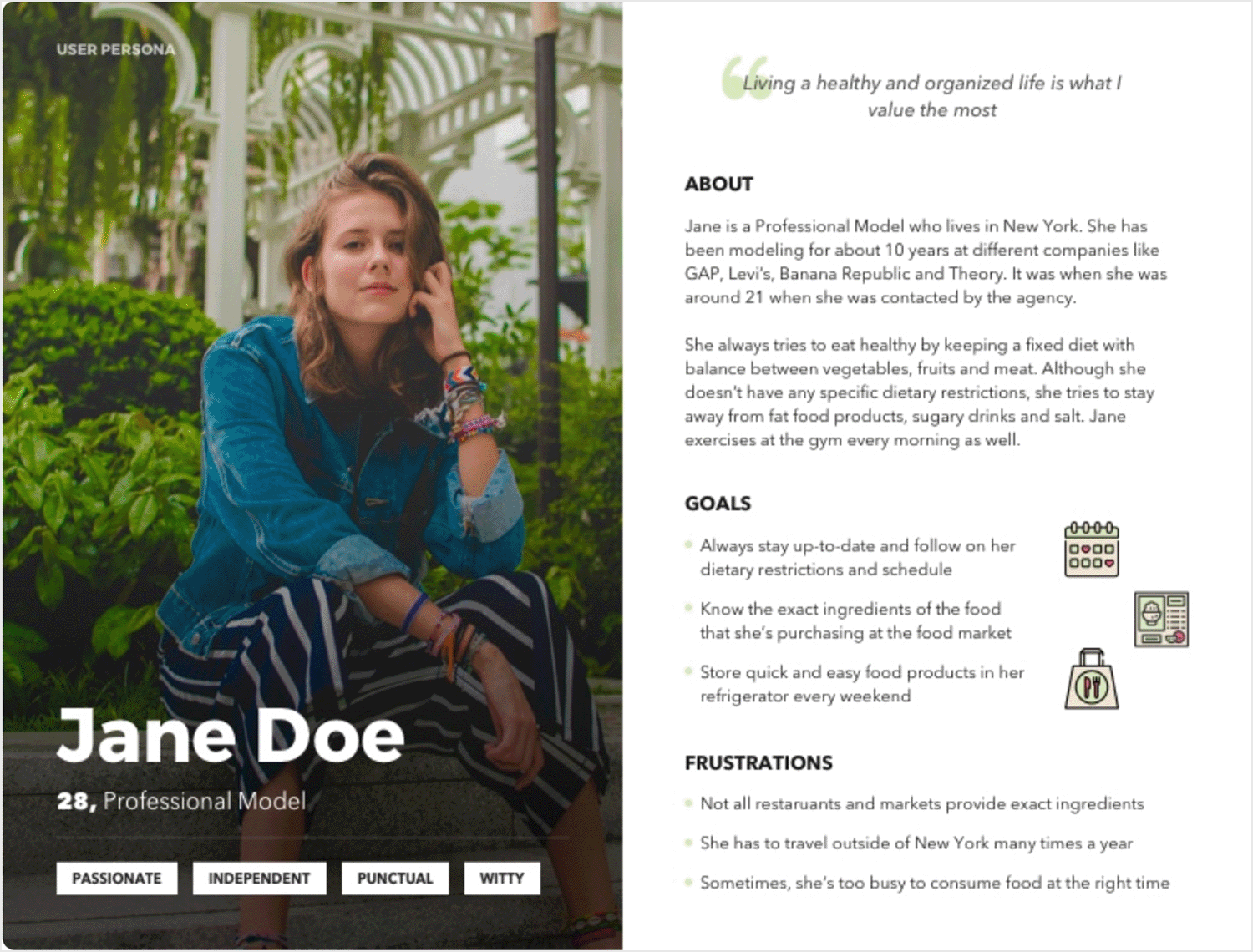
Forget boring descriptions! This model focused on health user persona template captures the essence of a health-conscious professional model. It uses a relatable image and a simple quote to give you a quick snapshot of Jane’s life.
This template goes beyond basic facts. It explores Jane’s goals, what motivates her, and the problems she faces in a demanding job. Think “wants a balanced lifestyle” and “finds it hard to eat healthy on the road.” Understanding these things helps businesses create products and services that will fit her needs.
The design is clean and easy to read, just like Jane’s approach to wellness. It’s a helpful tool for any business wanting to connect with people who care about their health, even when they’re busy.
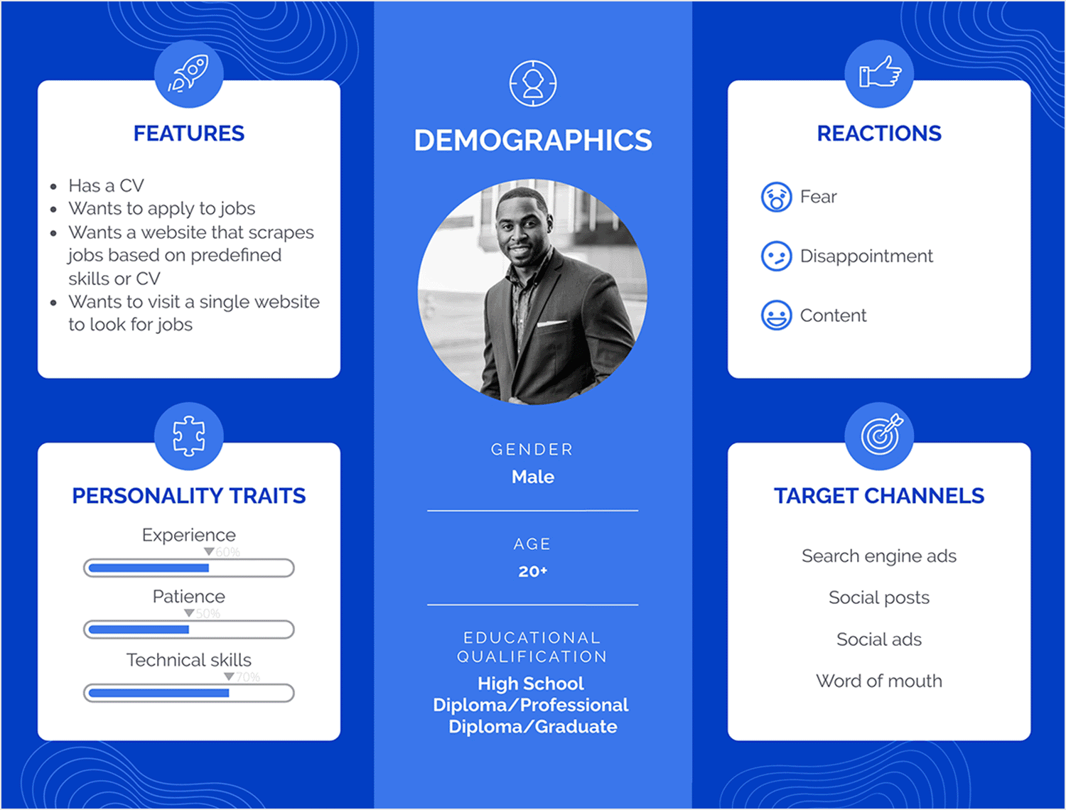
This job seeker persona template cuts to the chase, revealing the heart of what job seekers crave: efficiency and opportunity. It’s about understanding their emotional journey and the fear of missing out on their dream role.
Picture a user (primarily male, any age or education level) who wants a website that makes the job search smart and simple. Seamless CV uploads and AI-powered matching are essential. He’s frustrated by clunky websites and irrelevant listings.
This template is the key! Prioritize a smooth user experience, intelligent job matching, and clear communication.
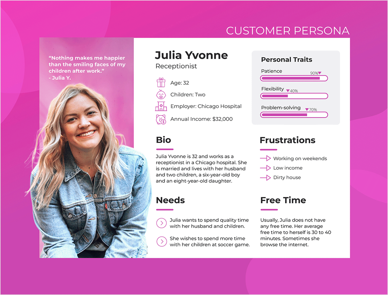
What we like about this user persona template is how it brings Julia Yvonne to life! Forget dry lists of facts. This customer persona template uses bright colors, pictures, and a relatable story to make Julia feel like a real person. It’s less about her age or job, and more about her dreams for her family, the challenges she faces every day, and her hopes for a better life.
Understanding Julia’s heart helps you make better choices for your business. You’ll know exactly what kind of products and services will solve her problems and help her succeed.
There are no straight up rules for creating user personas. You can put a physical persona together using paper and a photo, or you can make one digitally and print it out or share it with your colleagues.
However, if you’re not sure where to begin, or the right format your user persona should take (they will be different for each company and purpose), then a great starting point would be one of our user persona templates examples. These templates already have the structure predetermined and are fully editable, or you can leave certain elements in if they already match your current persona.
If you can’t find the template for you, or if you’re feeling creative, then you can try one of the following three user persona generators:
The Hubspot user persona generator makes for an exciting editing process. It’s totally free and you can just jump straight into the creation process the moment you land on the website. Select your user persona avatar from the range provided, and then continue to answer a series of questions about details like their education and where they work.
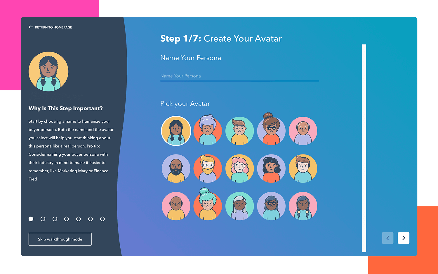
Meanwhile, Hubspot does the heavy lifting, by putting your user persona together automatically as you just answer the necessary questions.
Up Close and Persona is a persona generator that helps you generate buyer personas, which are more geared towards B2B activities. This generator works much like Hubspot – you answer a series of questions and Up Close and Persona generates the deliverable for you.
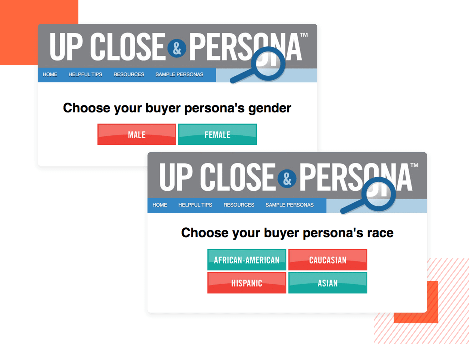
The questions you have to answer when generating buyer personas with this tool tend to be more financial-based and business-focused than with the Hubspot user persona generator.
User Forge is a great tool to generate both user and buyer personas and keep them all in one place. You set up a “workspace” where you can then create user personas by answering a few questions in a popup window and adding them to your workspace. The beauty is that you can revisit your workspace and update the personas whenever you need to.
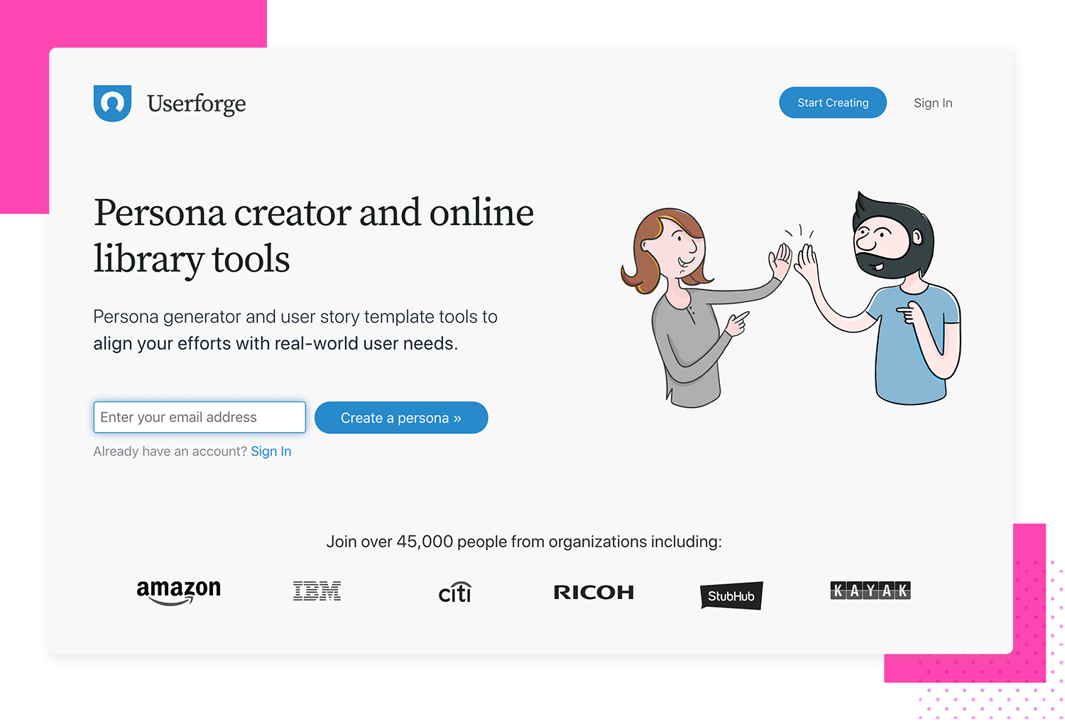
One thing that separates User Forge from the other user persona generators is that, in the same workspace, you can also create user stories and story maps with the personas you generated.
User personas are a fundamental part of ensuring the success of your website or app. It’s important to make sure you choose the correct design for your persona, and to ensure that the information it conveys is relevant and beneficial to all teams involved in the development and design process.
If done right, personas can capture your attention and forge a memorable impression in your memory, so that they’re with you every step of the process.
Without a doubt, the user persona plays an important – if not fundamental – role in UX design. Whether it’s a consumer app or enterprise software – designing with a user persona in mind is always going to increase its chance of success. The reason is that you’re giving the user what they need as opposed to what you think they want.
An added bonus is that user personas are also a great way to get interdisciplinary departments on the same page, as well as obtain client and stakeholder buy-in.
Unless you’re designing an app or website for yourself, what’s the point in designing anything without first consulting your users?
PROTOTYPE · COMMUNICATE · VALIDATE
ALL-IN-ONE PROTOTYPING TOOL FOR WEB AND MOBILE APPS
Related Content
 Learn how to design better e-learning platforms with user-centered UX principles, real examples, and high-fidelity prototyping tips to boost engagement and learning outcomes.13 min Read
 Infinite scroll keeps users engaged, but it’s not always the best choice. This guide breaks down when to use it, when to avoid it, and how to design it right.14 min Read
 Learn how to design web and mobile app prototypes, how to test them and what to look for in a prototyping tool in this complete guide.15 min Read
