Voice user interfaces are a growing presence in the UX world - but what makes a good voice UI? Check out these key usability guidelines and find out.
Times are a-changing. Oh, if Bob Dylan only knew that asking a small metal box to turn on the coffee maker while you shower would be reality by now. It is true that voice user interface design is all but futuristic in nature – even if the concept of voice commands to digital products has been around for a while.
Voice user interface design has been a hot topic for the past few years. With the rise of Alexa and Google Assistant among others, people are growing increasingly open to this new technology. As designers, it may be time now to look more closely at voice user interfaces – and what marks a good one from a terrible one.
There are many unknowns when it comes to voice user interfaces (VUIs). As you would expect from such a young field, we are continuing to learn new things about voice UI design and UX design everyday. In the meantime, however, let’s go over what we do know – and put that knowledge to good use. That means you should keep your favorite prototyping tool open as you read!
Voice user interface design makes our lives so much easier. It’s like having a personal assistant who can understand you and lend a hand whenever you need it.
They let us talk to our devices, like phones and smart speakers, to get stuff done without touching a button. You can, for example, tell your phone to call a friend or ask your speaker to play your favorite song.
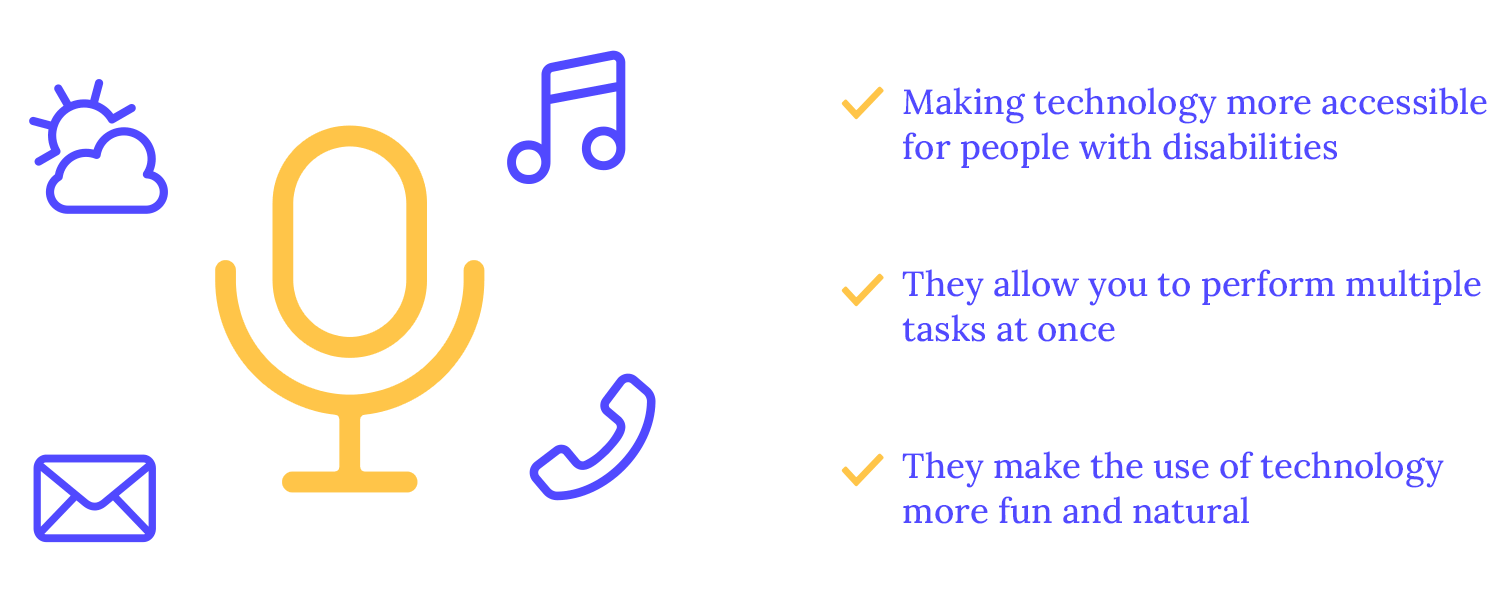
These voice user interfaces make technology more accessible for people with disabilities, such as those with visual impairments or motor difficulties. They also let us multitask, like controlling our music while cooking or checking the weather while driving. Plus, they make using technology more fun and natural, without all the clicking and tapping.
Voice technology is getting smarter and more popular! We’re seeing a big rise in devices like smart speakers and other voice user interfaces that let us talk to our tech. This is thanks to improvements in how computers understand and respond to human language.
While the concept of voice-controlled technology dates back to the mid-20th century, the modern era of voice assistants began in the early 2010s with the introduction of Siri by Apple.
Since then, advancements in artificial intelligence and natural language processing have led to the development of more sophisticated voice user interfaces that we get into a bit later. These virtual assistants – you might already have guessed which ones – have become increasingly integrated into our daily lives, powering smart speakers, smartphones, and other devices.
As this technology keeps getting better, we can expect a future where talking to our devices is the norm.
It’s just like in real life! When speaking to a friend, for example, they listen to your words, break them down into smaller parts, and understand their meaning. Voice recognition technology works similarly but with machines.
When you speak to a voice user interface, the device first captures your voice. This raw audio is then processed to remove noise and other disturbances. Next, the audio is broken down into smaller units called phonemes, which are the basic sounds of language.
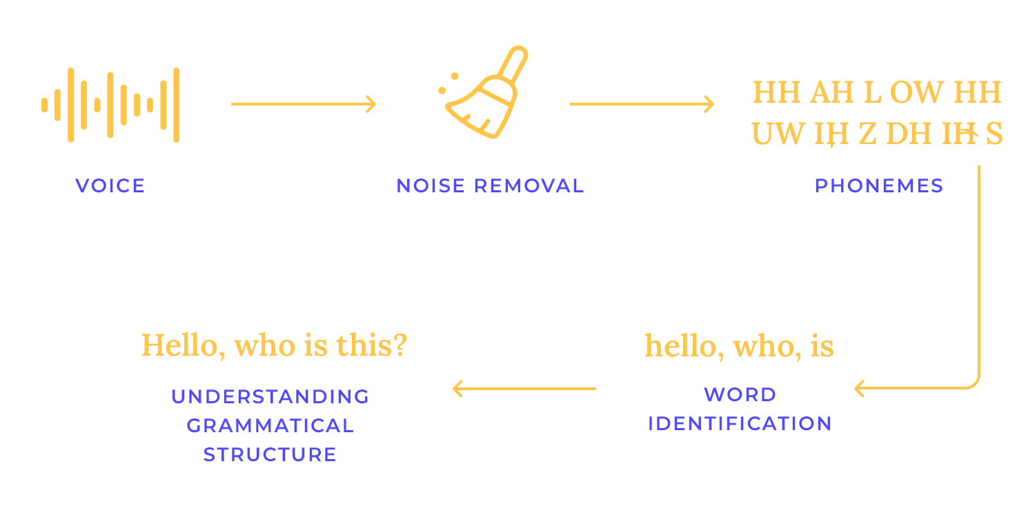
Natural Language Processing (NLP) takes over from here. It analyzes the sequence of phonemes, identifies words, and understands the grammatical structure of the sentence. By recognizing keywords and phrases, the voice user interface can determine the user’s intent and generate an appropriate response.
Speech synthesis is a fancy way of saying that there’s a robot reading out loud for you. You can also refer to it as text-to-speech technology. The system takes written words and turns them into spoken language.
For example, when you ask a voice user interface to read you a news article, the text of the article is fed into a speech synthesis system. How does this happen?
First, the system breaks down the text into smaller units, converts them into sound signals, and then combines them to produce a natural-sounding voice reading the article aloud. Sounds complicated, but, really it’s not!

Let’s say you’re asking a friend to do something. You don’t just yell out “Do something!” You say something specific, like “Play some jazz music.”
Voice user interface design works similarly. When you say “Play some jazz music,” the assistant recognizes that you want to play music (the intent) and identifies the type of music you want (the slot). This allows the assistant to find and play the right music for you.
It also doesn’t hurt to ask politely, in case they turn on us one day. You don’t want to be on the receiving end of the system’s wrath. It would be wise to add a “Please” or “Thank you” every now and then.
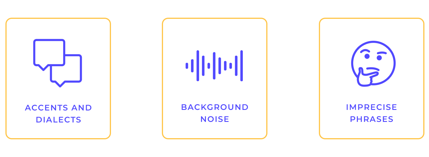
While voice user interface technology has made significant strides, it still faces several limitations. One of the primary challenges is accent and dialect recognition. Voice recognition systems may struggle to accurately interpret accents and dialects, leading to misunderstandings and errors.
Noise in the background can also make it difficult for the assistant to understand your commands. Another challenge is when people don’t say exactly what they want.
If you give a vague or unclear command, the assistant might not be able to understand what you want. That’s why it’s important to be clear and specific when talking to a voice assistant.
To overcome these limitations, ongoing research and development are focused on improving voice recognition accuracy, noise cancellation techniques, and natural language understanding capabilities.
Voice user interface design hinges on clear communication. You can ensure that consumers can comprehend and respond to prompts with ease by using straightforward language. Users are guided through activities effortlessly by clear and concise directions.
For instance, instead of saying “Initiate the music playback sequence,” a voice user interface might say, “Play some music.” Mimicking natural conversation makes the interaction design more intuitive and enjoyable.
Ultimately, as with all of your connections—electronic or personal—prioritizing clear communication leads to efficient and satisfying interactions.
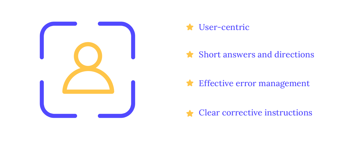
User-centered language must be given top priority to provide genuinely intuitive voice user interface experiences. We can close the communication gap between humans and machines by utilizing language that is familiar and natural. For example, a voice user interface may say, “Looking for Italian food nearby?” rather than, “Please initiate a search query for the nearest Italian restaurant.”
Brief prompts and answers maintain users’ attention and prevent them from being overloaded with information. Effective error handling and clear corrective prompts ensure a smooth user experience, even when mistakes occur. By guiding users toward successful outcomes, we can enable them to accomplish their objectives efficiently.
Imagine listening to a long, rambling explanation. Wouldn’t you get bored and lose focus? Same thing applies to when a voice user interface communicates with users.
To keep them engaged, it’s important to be concise. Short and sweet responses are much more effective. For example, instead of saying, “The current weather conditions in Tokyo are mostly cloudy with a high of 15 degrees Celsius and a low of 8 degrees Celsius,” a voice user interface could simply say, “It’s mostly cloudy in Tokyo today, with a high of 15 degrees and a low of 8 degrees.”
No system is perfect, and errors can occur in voice user interface interactions. Designing for graceful error handling is crucial to maintaining a positive user experience.
When errors happen, provide clear and concise error messages that inform the user about the issue and offer guidance on how to proceed. For example, if you say “Play some music” and the assistant doesn’t understand, it could say, “I’m sorry, I didn’t get that. Could you please try saying that again?”
Also, you should consider implementing features like automatic error recovery or self-correction to minimize disruptions.
We all need to admit it at some point. Apps can be confusing, right? But what if the app guides you through each step? How much easier could things be?
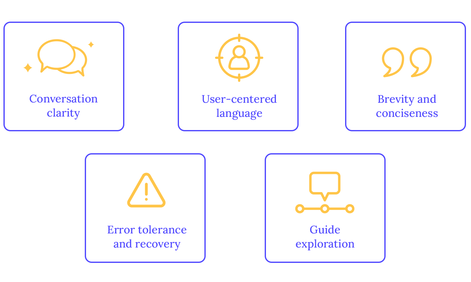
The same goes for voice assistants. When users are new to a feature or task, the voice user interface can provide step-by-step instructions. For example, if a user wants to set up a recurring reminder, the assistant could say, “First, tell me what you want to be reminded of. Then, tell me how often you want to be reminded.” This makes complex tasks much simpler and more accessible.
It’s crucial to start with a deep understanding of the target user to create an engaging and informative voice user interface design. Are they tech-savvy millennials or older adults? Are they primarily interested in entertainment or productivity?
Conducting UX research is essential to uncover the specific needs and goals that users hope to achieve through voice interaction. This involves identifying users’ challenges and frustrations, such as interacting with complex menus or long forms. What problems do they face when using traditional interfaces?
To design a truly effective voice user interface, you have to envision real-world user scenarios where voice user interface interaction can make a difference. For example, when applied to healthcare, a voice user interface could streamline appointment scheduling, provide access to medical information, and offer personalized health advice. When you put yourself in the shoes of your target users, you can unlock a whole bunch of potential voice user interface solutions.
Voice commands
Voice commands provide a hands-free and efficient way to interact with devices and applications. You can say things like “Turn on the lights” or “Play my favorite song” and your device will respond. It’s a convenient and hands-free way to get things done. This can significantly improve productivity, especially in multitasking scenarios.

Information retrieval
Voice user interface systems can quickly and accurately retrieve information from a vast array of sources, including the internet, databases, and personal calendars. You can ask them questions like “What’s the weather like today?” or “What’s the latest news?” or even complex topics like history or science, and receive immediate, relevant answers.
This capability can save time and effort, especially for tasks that require searching for specific information. It’s like having a knowledgeable friend always at your fingertips.
Transactional interactions
Voice user interface technology can streamline complex transactional interactions, such as making purchases, booking appointments, or transferring money. You can say things like “Order a pizza” or “Book a hotel room” and the voice user interface will take care of the rest.
By using voice commands, users can complete these tasks more efficiently and conveniently, without the need for manual input or navigation through complex interfaces. It’s a convenient and efficient way to get things done, especially for people who have difficulty using traditional interfaces.
Notifications and alerts
Voice user interface systems can deliver timely and relevant notifications and alerts, ensuring that users stay informed without being overwhelmed. For example, a voice user interface can remind you of a doctor’s appointment or alert you to a traffic jam on your commute. Voice user interface can improve user experience and decision-making by taking a non-intrusive, personalized approach.
You have to use everyday language and avoid overly formal or technical terms to make voice user interface interactions feel more natural. Also, adding a bit of personality can make the interaction more enjoyable.
A voice user interface could crack a joke, share a fun fact, or simply respond with a friendly tone. This can help build a connection with the user and make the experience more engaging and human-like.

Let’s say you’re catching up with an old friend you haven’t seen in a while and you two have a lot to share. Of course they can’t start with point Z without covering point A. So, you might start by asking one question, and your friend would respond, and then you’d follow up with another question or request.
This is similar to multi-turn dialogues in voice user interface. To handle these effectively, the voice user interface needs to remember the context of the conversation and guide the user through each step. For example, if a user asks, “What’s the weather like tomorrow?” and then follows up with, “How about the day after?”, the voice user interface should be able to understand the context and provide the weather forecast for the subsequent day.
If a user provides an unexpected response, the voice user interface should handle it gracefully. For instance, if the user asks for a restaurant recommendation but then suddenly changes the topic, the voice user interface could politely acknowledge the change and ask if they’d like to continue with the restaurant search or discuss something else. Like in real life!
Clearly defining turn-taking is crucial for smooth VUI interactions. To avoid confusion, voice assistants use techniques like audio cues and silence detection. This way, the system can effectively signal when it’s listening and when it’s speaking.
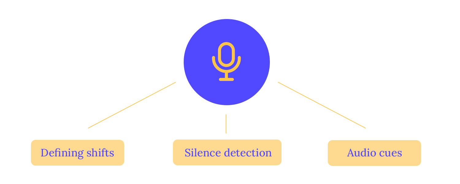
For example, when you ask a question, the assistant might play a sound to indicate that it’s listening. Once it’s finished processing your request, it will communicate it.
Interruptions and pauses are common in human conversation. To handle them gracefully, the VUI should be designed to acknowledge interruptions and respond appropriately.
Implementing a silence timeout can help determine when the user has finished speaking or is no longer engaged. If the user’s input is unclear, the system can rephrase the question or request clarification. Here are some examples of what this looks like:
User: “Hey, can you set a reminder for…” pauses
Voice user interface: “Sure, what would you like to be reminded of?”
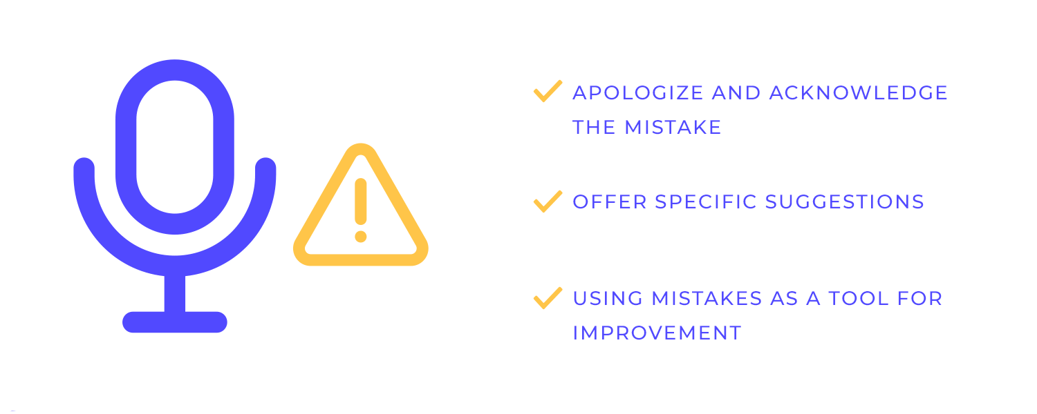
Error handling is a critical aspect of VUI design. By anticipating common errors and implementing effective recovery strategies, you can minimize user frustration and maintain a positive experience. For example, they might misinterpret a command, fail to recognize a word, or not understand the full context of a request. To handle these situations gracefully, the VUI should be designed to:
- Acknowledge the error: A simple apology can go a long way in maintaining a positive user experience.
- Provide clear guidance: The VUI can offer specific suggestions or ask clarifying questions to help the user correct the error.
- Learn from mistakes: The VUI can use the error to improve its understanding of language and context in the future.
Confirmation and feedback are needed to ensure accuracy and transparency in VUI interactions. By prompting the user to confirm their intent or choices, you can reduce the likelihood of errors. Additionally, providing feedback on the system’s actions helps to build trust and transparency.
In practice, this is like when you ask a voice assistant to perform a task, and it then asks for confirmation to ensure it’s doing the right thing. For example, if you say, “Order a large pepperoni pizza,” the assistant might say, “Did you want a large pepperoni pizza?” This helps prevent misunderstandings and ensures that your request is carried out accurately.

When the VUI encounters a misunderstanding or an incomplete request, it’s important to re-prompt the user in a polite and helpful manner. Avoid using accusatory language or blaming the user for the error. Instead, use empathetic language and offer clear guidance.
For example, the VUI might say, “I’m not sure I understand. Could you please rephrase your request?” or “I can help you with that. Please specify the date and time.”
Offering help options empowers users to take control of the interaction and seek assistance when needed. This can be achieved through various methods, such as providing a “help” command or offering a list of available commands. By providing easy access to help, you can reduce frustration, which is the worst.
One of the key elements of a successful VUI is the ability to maintain context throughout a conversation. When the VUI remembers the user’s previous requests and responses, it can provide more relevant and personalized experiences. For example, if a user asks for the weather, the VUI can then follow up with a question about their travel plans to a specific location.
Personalizing responses based on user preferences and history can make all the difference in the VUI experience. Analyzing user data helps the VUI tailor its responses to individual needs and preferences.
For instance, a VUI can greet you by name, recommend products based on past purchases, and even adjust the volume and speech rate according to your preferences!
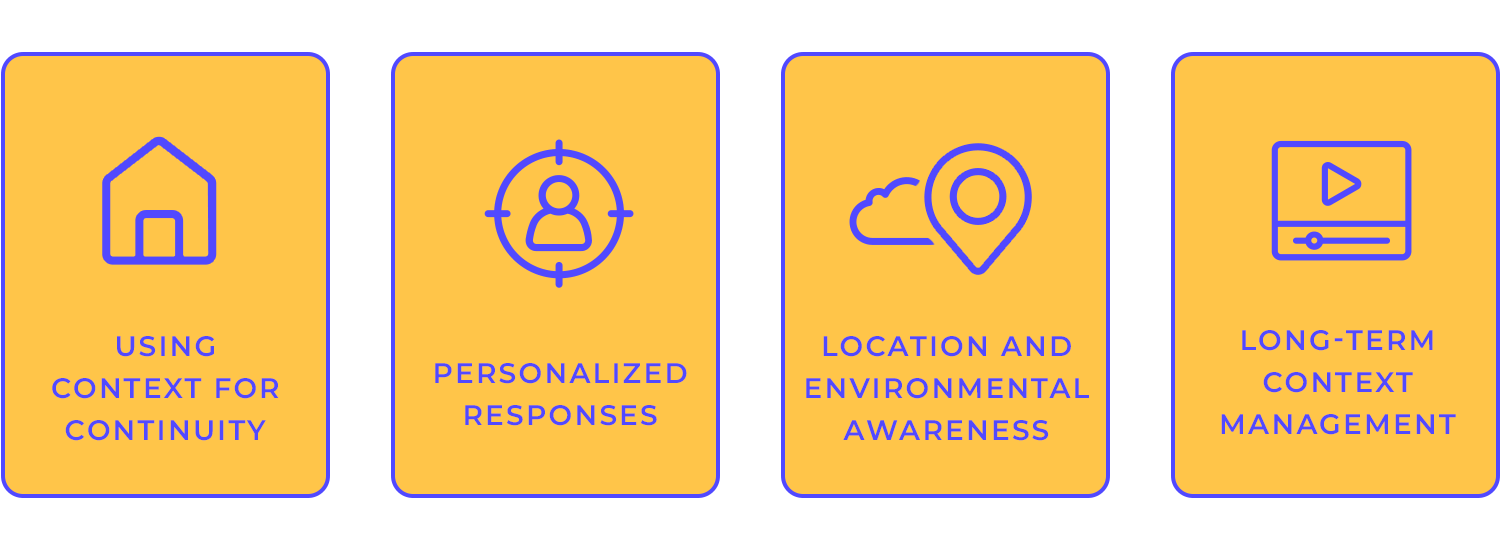
Picture this: you’re driving to work and your voice assistant tells you about a traffic jam ahead, suggesting a different route. Or perhaps you’re looking for a place to eat and your assistant recommends a nearby restaurant based on your dietary preferences.
These are just a few examples of how voice user interface can leverage location and environmental data to provide contextually relevant information and services. By understanding your location and preferences, voice user interface can offer tailored suggestions and make your life easier.
For instance, if you’re traveling to a new city, your voice user interface can provide information about local attractions, transportation options, and nearby restaurants. It can also help you navigate unfamiliar streets and find the best places to visit.
Long-term context management involves storing and retrieving information about the user’s interactions over time. This can be used to improve the voice user interface’s ability to provide personalized recommendations and anticipate your needs.
For example, if you often listen to jazz music, the voice user interface might suggest jazz playlists or artists. Or, if you’re in the middle of a task and need to pause, the voice user interface can remember where you left off and continue the task when you’re ready. Such delightful experiences!
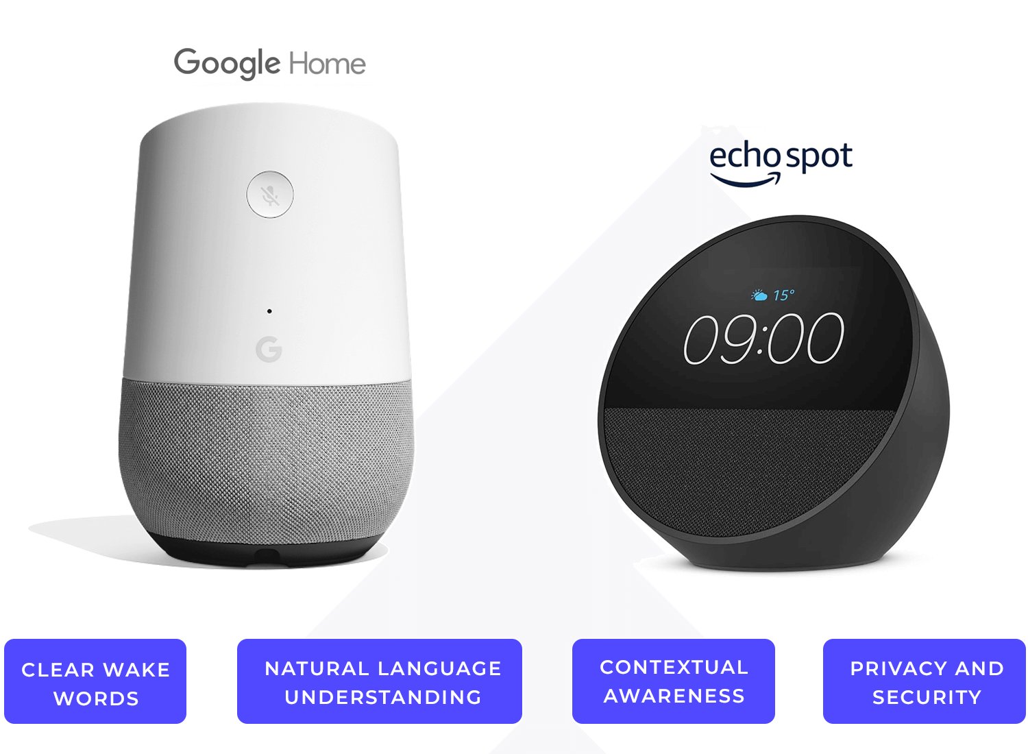
Smart speakers like Amazon Echo (Alexa) and Google Home have popularized voice interactions in the home. These devices are optimized for hands-free operation, allowing users to control various devices and services with voice commands. Key considerations for smart speaker VUI design include:
- Clear wake words: Using distinct wake words like “Alexa” or “Hey Google” to trigger the device.
- Natural language understanding: Interpreting complex voice commands and fulfilling user requests.
- Contextual awareness: Understanding the user’s intent and providing relevant responses based on the context.
Privacy and security: Ensuring secure data handling and protecting user privacy.
Mobile apps have also embraced voice interactions to enhance user experience. For instance, Google Assistant and Siri allow users to perform tasks like making calls, sending messages, and setting reminders using voice commands. These voice user interface-powered apps seamlessly integrate with the device’s features and user interface, providing a hands-free and efficient way to interact with the phone.
- Seamless integration: Integrating voice commands with the app’s existing features and user interface.
- Contextual awareness: Understanding the user’s current task and providing relevant voice commands.
- Error handling: Gracefully handling errors and providing clear feedback to the user.
- Accessibility: Designing the voice user interface to be accessible to users with disabilities.
In-car VUI systems, such as those found in Tesla vehicles and Ford Sync, prioritize safety by limiting the number of voice commands required to complete tasks. These systems use clear and concise prompts and voice confirmations to minimize distractions and reduce the risk of accidents.
- Minimal distraction: Limiting the number of voice commands required to complete a task.
- Clear and concise prompts: Using clear and concise language to avoid confusion.
- Voice confirmation: Confirming critical actions to reduce the risk of errors.
- Quiet environment: Optimizing the VUI to function effectively in noisy environments.
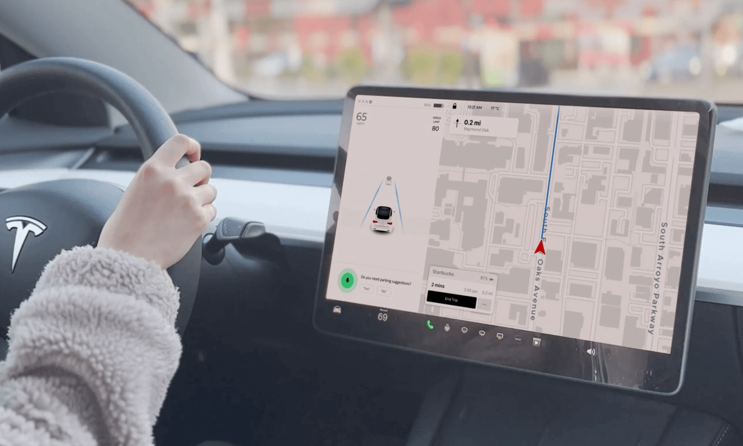
User Scenario with Tesla Model 3’s Redesigned Voice User Interface (VUI). Photo by Diana Lu.
Wearable devices and IoT devices, such as smartwatches and smart thermostats, often rely on voice interactions for convenience and efficiency. By using short and concise commands, these devices can provide quick and relevant information while minimizing battery consumption.
- Short and concise commands: Keeping voice commands brief and to the point.
- Clear and concise responses: Providing concise and relevant information.
- Battery efficiency: Optimizing the VUI to minimize battery consumption.
- Privacy and security: Protecting user data and ensuring secure communication.
One of the major challenges in VUI design is the inherent limitations of speech recognition technology. Accents and variations in pronunciation can significantly impact the accuracy of voice recognition systems.
To overcome these challenges, developers use language models to help the assistant understand different accents and dialects.
These techniques help voice assistants to better understand and respond to user commands, without discrimination.
When you use a voice assistant, you’re sharing personal information, like your address or your credit card number. It’s important to trust that the company behind the assistant will protect your data, which requires robust security measures, such as encryption, secure data storage, and access controls. Additionally, transparent data practices and clear privacy policies are essential to build trust with users.
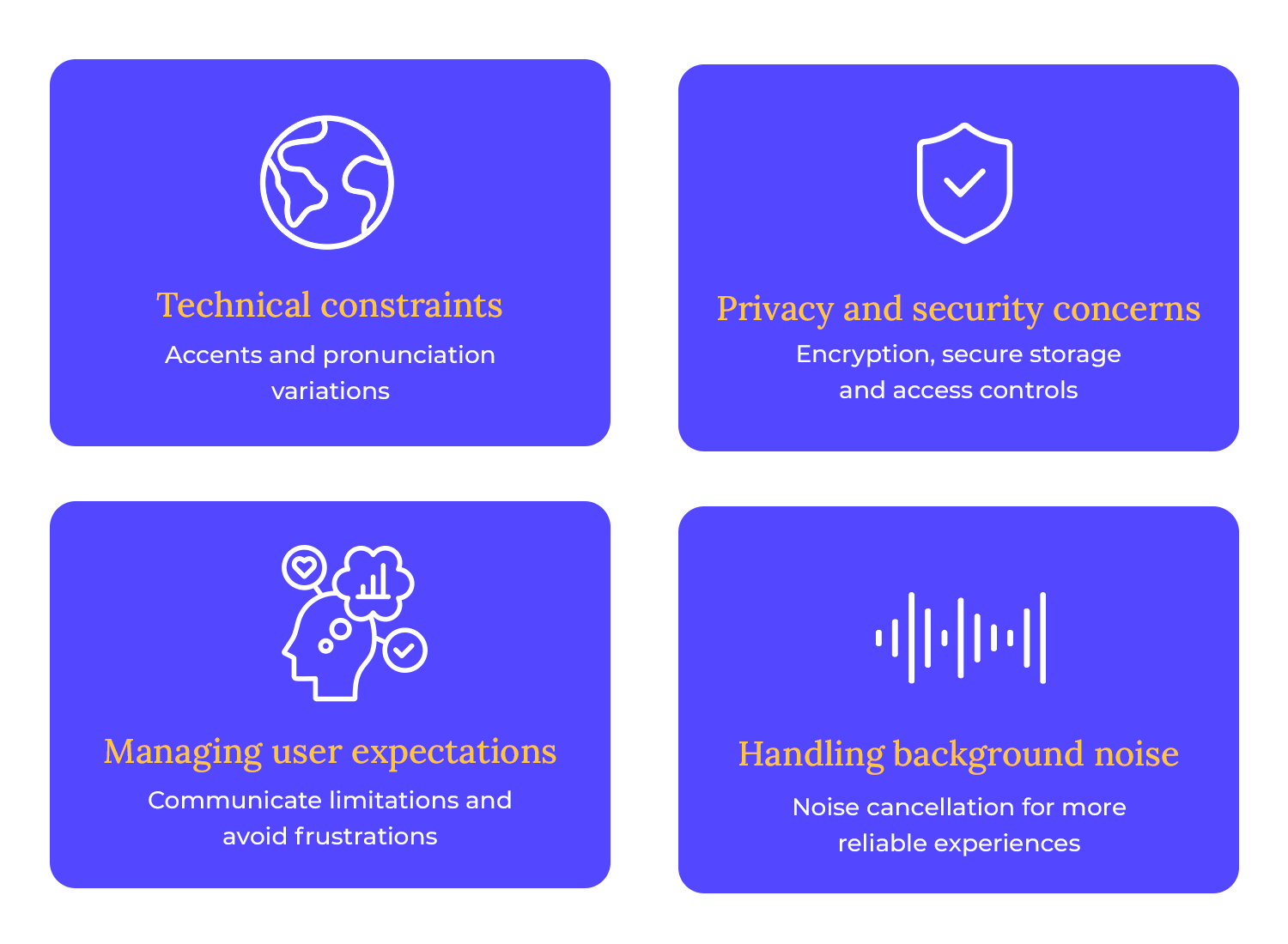
Setting realistic expectations for VUI capabilities is crucial. While VUI technology has advanced significantly, it’s important to avoid overpromising and underdelivering. By clearly communicating the system’s limitations and capabilities, users can form realistic expectations and avoid frustration.
Ever felt like your voice assistant is tuning you out? Well, background noise can be a real party pooper! But don’t worry, developers have got your back. They use special noise-canceling magic to help your assistant hear you loud and clear, even in a crowded room.
Voice user interface design is truly futuristic. There is still so much left for us to discover when it comes to the potential of this field, and all that it can truly grow to be. Just like UX design was taking shape and evolving on to new things, so too is voice user interface.
By understanding the principles of voice user interface design and addressing its challenges, we can create voice-powered experiences that are not only efficient but also enjoyable. So, let’s embrace the future of voice and continue to innovate and improve the way we communicate with our devices!
PROTOTYPE · COMMUNICATE · VALIDATE
ALL-IN-ONE PROTOTYPING TOOL FOR VOICE INTERFACES
Related Content
 A fun look at different data table designs, from basic lists to smart, interactive ones, based on how complex the data is and what users need.18 min Read
 Single page design v multi-page design – everything you need to help you choose the right design for your site’s content18 min Read
 Website backgrounds can be a powerful tool in creating an experience. But what kind of experience can you convey and how? We got the full run-through for you!14 min Read


