Website backgrounds can be a powerful tool in creating an experience. But what kind of experience can you convey and how? Read on to find out.
The background of your website is a huge part of the user experience. It can elevate your design, transmit emotions and stories and add a huge amount of value. It’s an essential part of your website’s UX design.
Create interactive website prototypes with Justinmind. It's Free. Unlimited projects!

There are so many different roads designers can take when it comes to the background of their website. From pleasant color gradients, unique and interactive illustrations or videos that paint a picture, to a single image that occupies the entire screen. Each one of these roads leads to a different set of benefits for users and designers.
But which one is right for you?
In this post, we’ll guide you through designing a website background with your prototyping tool that reflects the personality of your brand and how you can play to your strengths using the background as a tool. Let’s dive right in!
Alright, picture this: you’re building a digital home for your ideas or business. Your website background is the very foundation, the walls that set the stage for everything else. It’s more than just a splash of color; it’s about crafting an atmosphere. A gentle gradient might whisper calmness, while a bold image shouts energy. Think of it as the mood lighting for your online space, instantly setting the tone and drawing people in.
Beyond aesthetics, it’s a powerful branding tool, weaving your visual identity into the very fabric of your site. Consistent colors and patterns become your signature, making you instantly recognizable. Plus, a thoughtful background guides the user’s eye, enhances readability, and separates content, ensuring a smooth and enjoyable journey.
It’s not just about filling empty space; it’s about creating a memorable experience, a digital environment that resonates with your audience and helps them connect with your message. Essentially, your background is the silent storyteller, enhancing every aspect of your website’s purpose.
Picking the right background can really make your website look and feel great. Here are some popular choices.
Solid color backgrounds are simple and clean. They make your content pop and keep your site looking neat. Pick a color that matches your brand and makes sure your text is easy to read. Solid color backgrounds also help your site load faster.
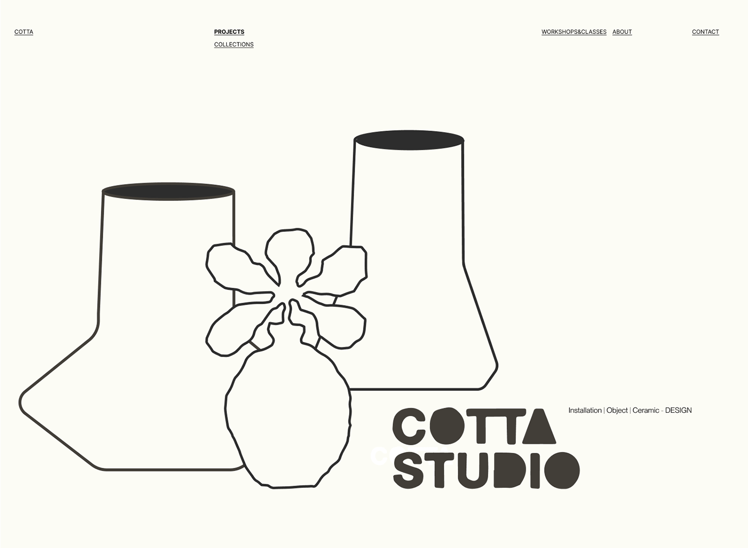
https://www.cotta-studio.com/
Gradient backgrounds are a great way to add color and style to your website. They can be soft and dreamy or bright and exciting. You can use them to make your site look modern and help visitors focus on important parts of the page.
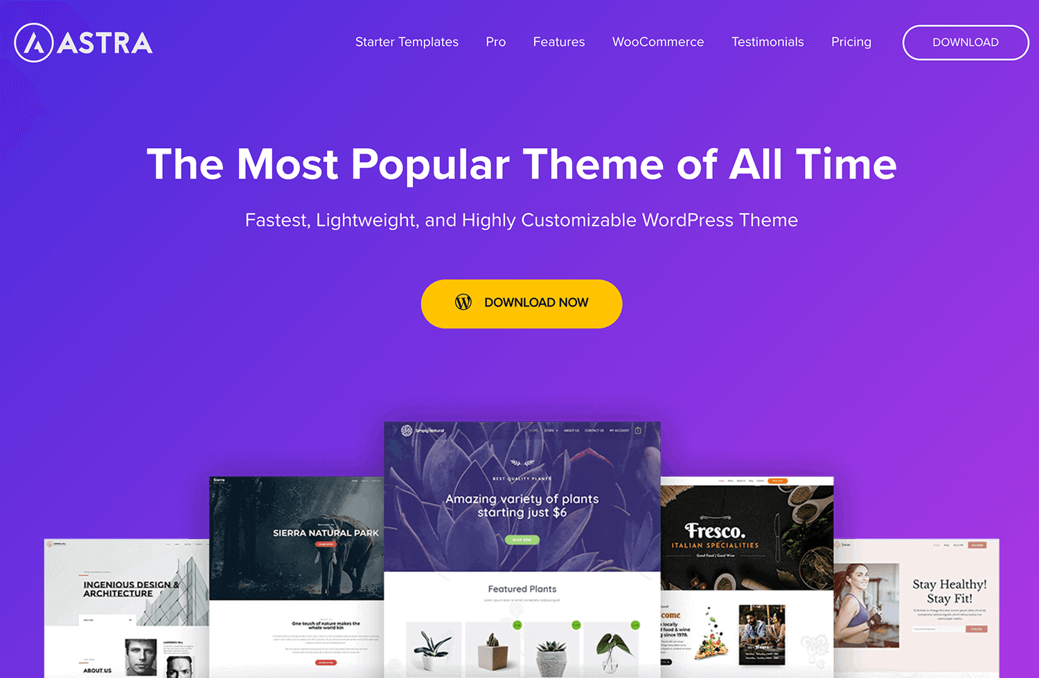
Template by Astra
Image backgrounds are perfect for visual storytelling. Use high-quality images that fit your brand and message. Make sure the images don’t overpower your text. Compress them to keep your site running quickly. Image backgrounds can make your site feel more engaging and lively.
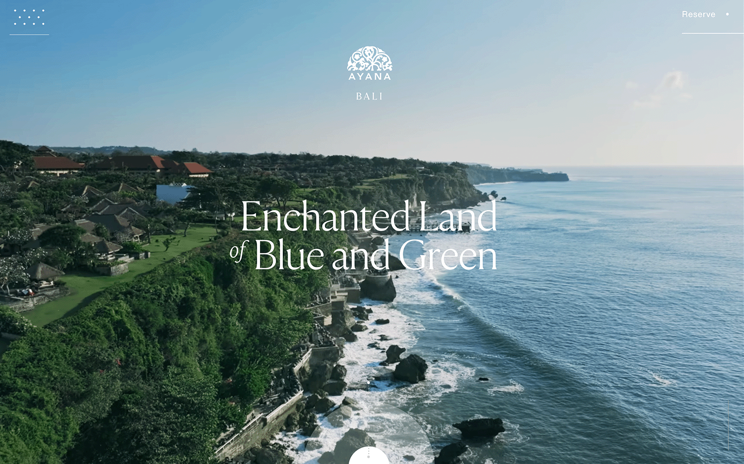
Video backgrounds bring your site to life with motion. They’re great for catching attention and showcasing your brand. Just remember to keep videos short and optimize them to avoid slowing down your site.
Compress your videos, aiming for 720p at 24-25 frames per second. Test different sizes and frame rates to see what works best for your setup. A looped video can add a dynamic feel without being too heavy.
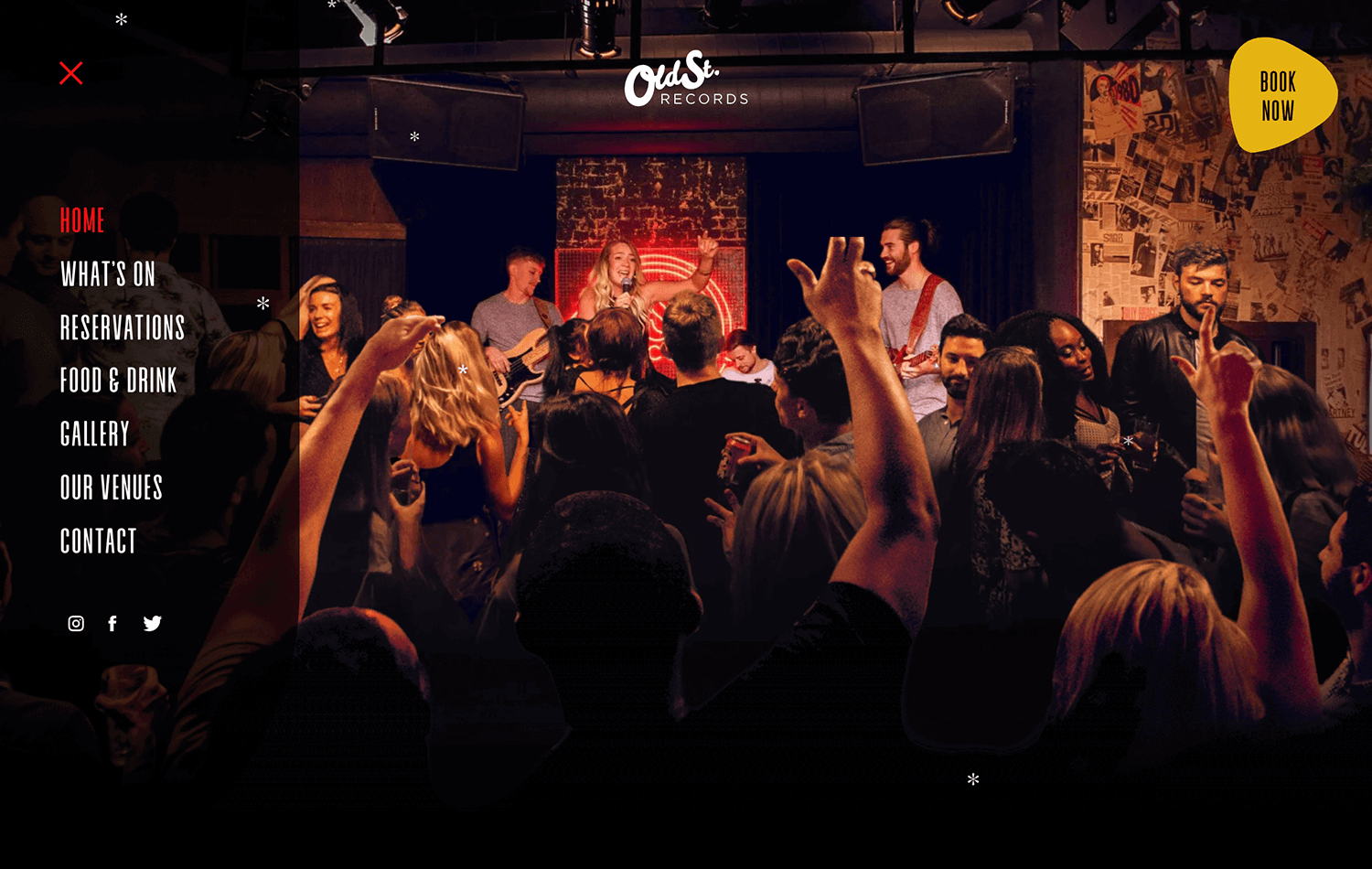
Old St. Records
Patterns and textures can give your website personality. They can be subtle or bold, but they always add interest. These backgrounds can make your site look unique and interesting without distracting from your main content.
The parallax effect creates a sense of depth by having background images move at different speeds as the user scrolls. It’s a powerful tool for visual storytelling, ideal for portfolios or landing pages that aim to immerse the user. However, it’s crucial to optimize for performance, especially on mobile devices, to ensure smooth transitions.
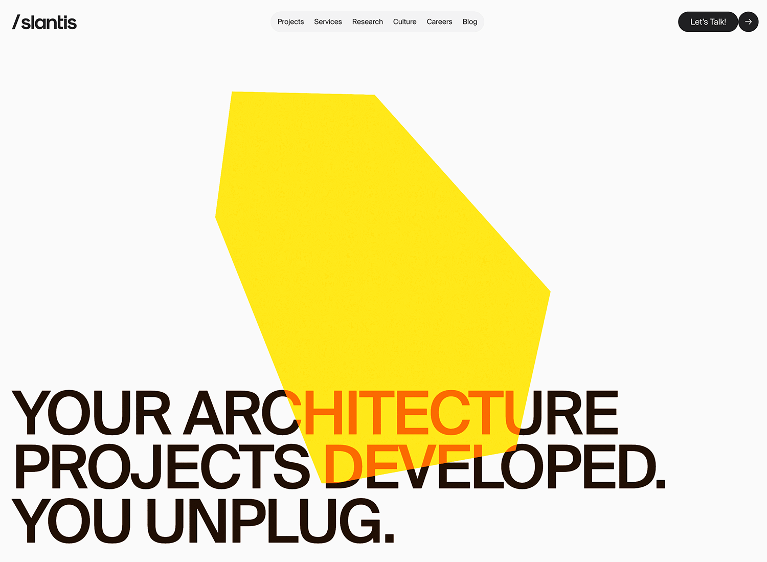
https://slantis.com/
These backgrounds go beyond static visuals, engaging users with dynamic elements like particle systems, animations, or 3D environments. They offer a unique and memorable experience, perfect for experimental websites or portfolios that showcase interactive design skills. However, they require careful consideration of complexity, performance, and accessibility.
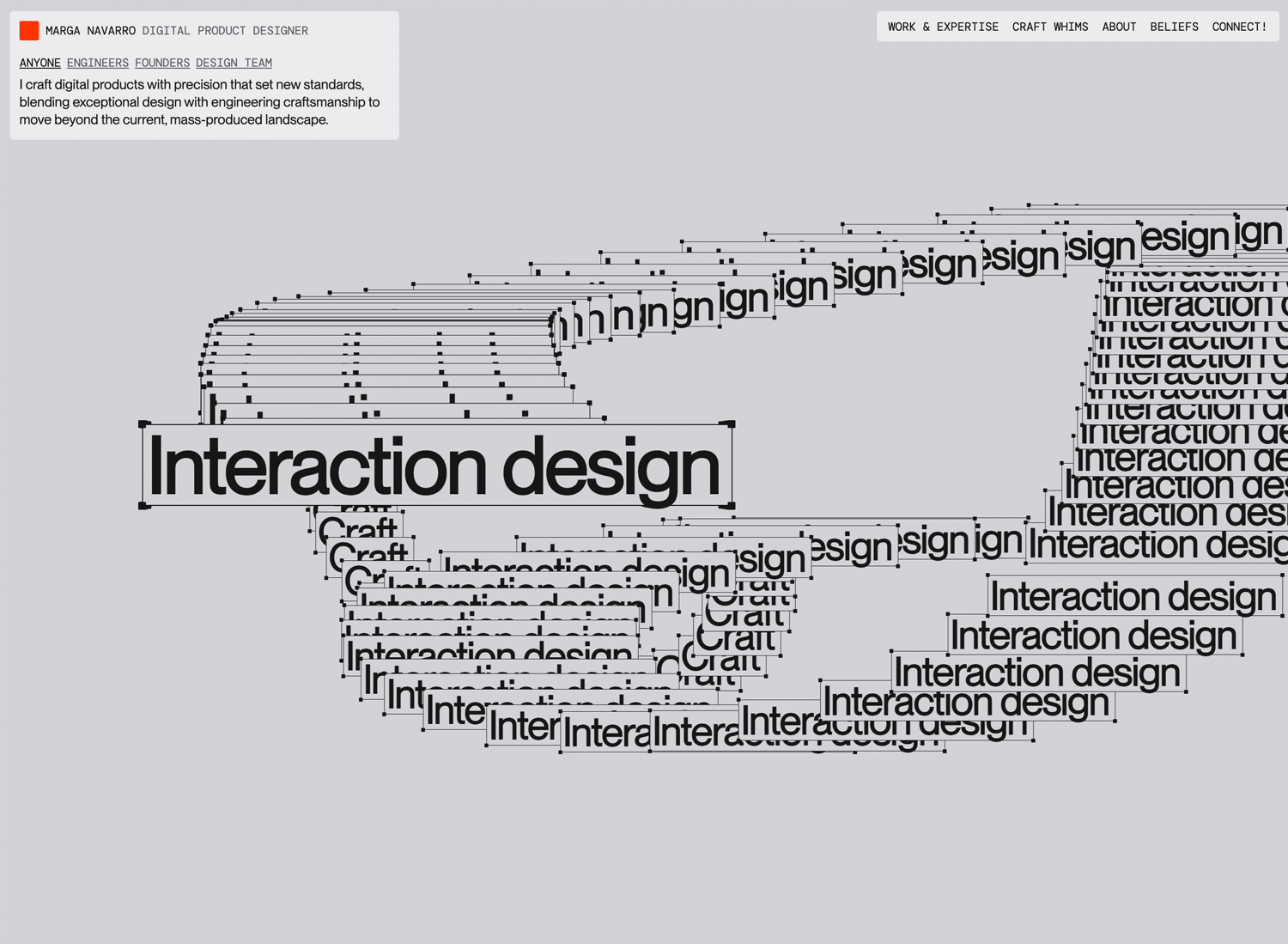
https://www.itsmarga.me/
Cinemagraphs combine the stillness of a photograph with subtle, looping animations, creating a captivating and artistic effect. They are excellent for showcasing products, setting a specific mood, or adding visual interest to websites for photographers, fashion brands, or restaurants. Key considerations include file size, loop smoothness, and ensuring the movement remains subtle.
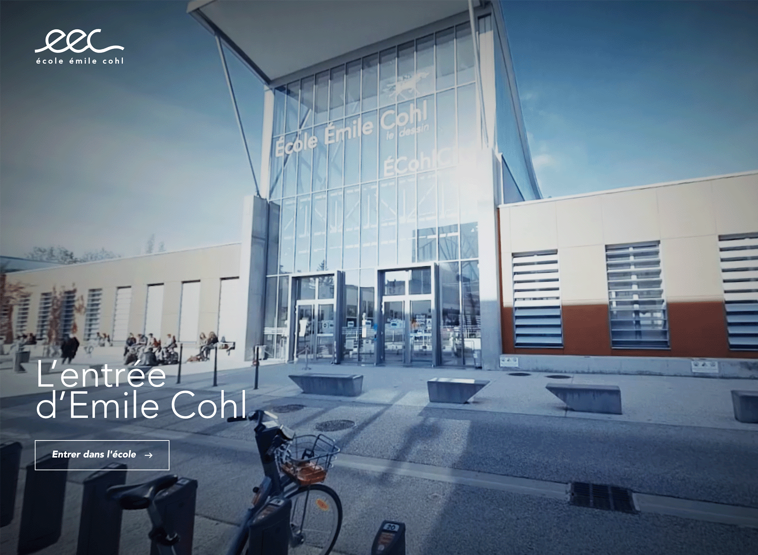
These backgrounds provide an immersive view of a location or environment, allowing users to explore a space virtually. They are well-suited for travel websites, real estate, or virtual tours. However, it’s essential to prioritize user controls, loading speed, mobile compatibility, and intuitive navigation within the panorama.
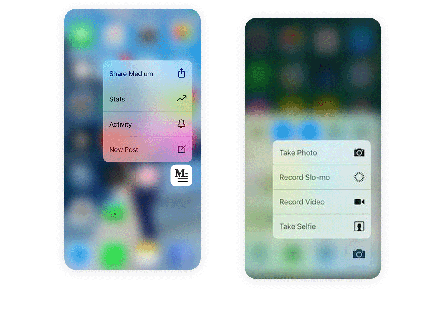
Think of blur effects like a gentle spotlight for your mobile app. They’re perfect for those moments when you want to draw the user’s attention to a specific element, like a pop-up message or a modal window. By subtly blurring the background, you create a sense of depth and focus, making the foreground content stand out. It’s a clean and modern way to guide the user’s eye.
But remember, mobile devices have limited processing power, so it’s crucial to keep the blur radius reasonable and optimize performance. A light, elegant blur is usually more effective than an overly heavy one. And for dark mode, remember to test how your blur interacts with darker colors, ensuring that text remains easily readable.
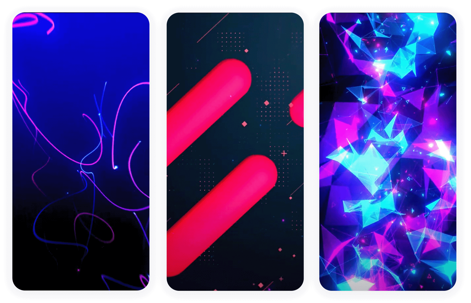
Animations can breathe life into your mobile app, adding a touch of dynamism and personality.
But on mobile, less is definitely more. Subtle, looped animations, like gentle pulses or flowing gradients, can create a captivating atmosphere without draining the battery. Lottie animations are your best friend here, offering high-quality visuals with small file sizes.
Use animations strategically, like during loading screens or onboarding, to keep users engaged. Just be mindful of battery consumption and avoid overly complex or distracting animations. And always, always offer an option to turn them off for those who prefer a static experience.
Imagine your app’s background changing to reflect the time of day, the weather, or even the user’s location. That’s the power of adaptive backgrounds. They create a more personalized and immersive experience, making your app feel truly connected to the user’s world. For example, a weather app might display a sunny background during the day and a starry sky at night.
Or a travel app could show local imagery based on the user’s location. However, be mindful of data usage and user privacy. Location services should only be used with explicit user consent, and data should be handled responsibly. And remember, the transitions between different background states should be seamless and smooth, ensuring a consistent and enjoyable user experience.
Create interactive website prototypes with Justinmind. It's Free. Unlimited projects!

Now that you know the types of website backgrounds you can use, let’s talk about how to choose the best one for your site. Here are some easy tips to help you make the right choice.
Your website background should match your brand’s personality. If your brand is fun and lively, go for bright or playful colors or playful patterns. If it’s more serious and professional, choose neutral colors or subtle textures. The background should reflect who you are as a brand and what you stand for.
The background you choose should make your site pleasant to use. It should help guide users through your content without distracting them. Think about how the website background makes visitors feel and if it helps them find what they’re looking for. A good one improves the overall experience on your site.
Make sure your text is easy to read against your website background. High contrast between your text and background color is key. For example, dark text on a light background or light text on a dark background works well. Avoid busy website background images that can make reading difficult. Clear text ensures your message gets across effectively.
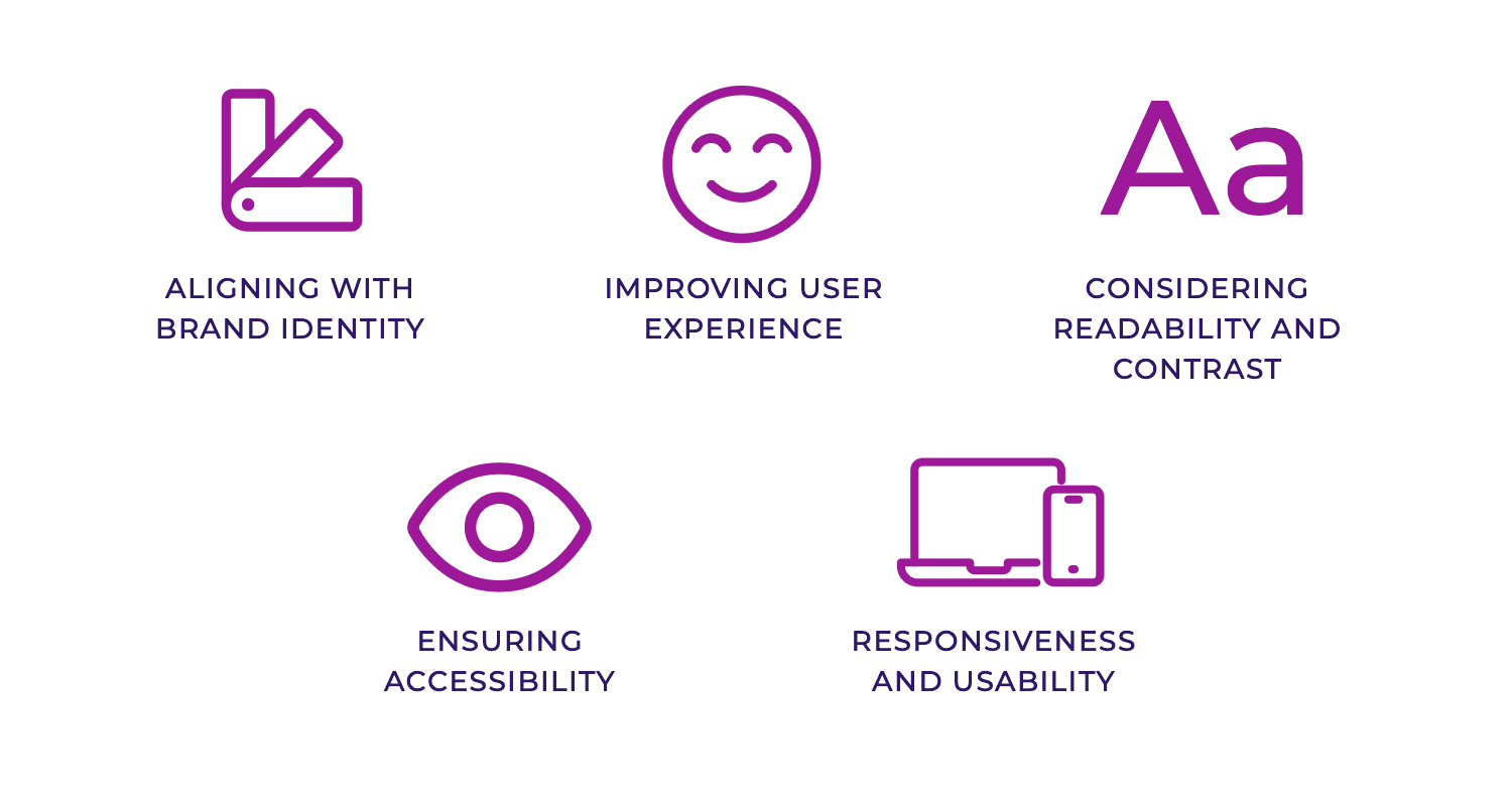
Everyone should be able to use your website, including people with disabilities. Choose website backgrounds that don’t interfere with readability or navigation. Avoid overly bright or flashing ones, as they can be problematic for some users. Make sure your website background design meets accessibility standards so everyone has a good experience on your site.
It should also look good and function well on all devices. If you’re using website background videos, consider using images for the mobile version since mobile browsers can be slower. Always provide a pause button for website background videos. Make sure you have a responsive design, offering a similar experience on both desktop and mobile devices.
A/B testing for website/app backgrounds involves creating variations (color, images, patterns) to assess audience impact. Metrics such as bounce rate, conversion rate, and time on page are tracked to determine which background performs optimally. Data analysis identifies the winning variation and its underlying reasons for success. A/B testing tools automate traffic distribution, metric tracking, and data analysis, streamlining the process.
Don’t let hefty background files bog down your site! Slash loading times by compressing images and embracing WebP, the superhero of file formats. Ditch image-based gradients and colors for sleek, speedy CSS. Tame video backgrounds with smart optimization and graceful fallbacks. Give your initial page load a boost with lazy loading for images. Finally, put your backgrounds through their paces on every device and network; a smooth experience is a happy experience.
After choosing the right type of website background, it’s important to design it well. Here are some easy tips to help you create the perfect background.
Keep your website background simple and minimalistic. Too many elements can clutter the screen and distract visitors. A clean, simple background makes sure your content stands out and your website looks professional.
Create a unified look and feel by using the same background color or pattern on every page of your website. This consistency helps visitors navigate easily and strengthens your brand identity.
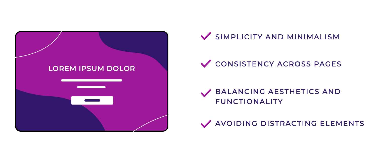
Your background should be visually appealing but also functional. It should improve the overall look of your site without making it difficult to read or navigate. Balance beautiful design with usability to ensure a positive user experience.
Avoid backgrounds that are too busy or distracting. Elements that move too much or are too bright can take attention away from your main content. Choose a background that complements your site without overwhelming it.
Follow these guidelines to design a website background that looks great and is easy to use. Keep it simple, consistent, functional, and free of distractions to give your visitors the best experience.
To inspire your own designs, here are 60 standout examples of website backgrounds.
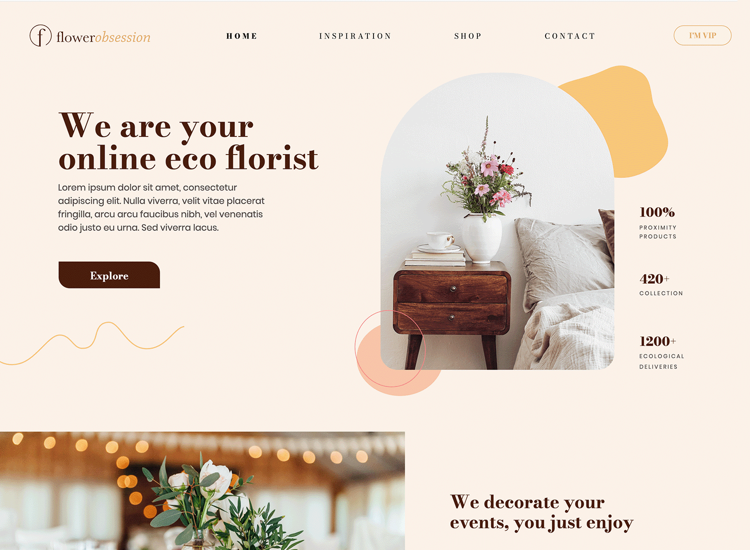
This online florist website uses a soft, off-white solid background to create a clean and airy feel, perfectly complementing the delicate nature of flowers. Subtle, organic shapes in a slightly darker tone are layered throughout, adding a touch of texture and visual interest without overwhelming the page’s content. This blend of solid and pattern provides a modern, minimalist aesthetic that allows the vibrant floral imagery and text to take center stage.
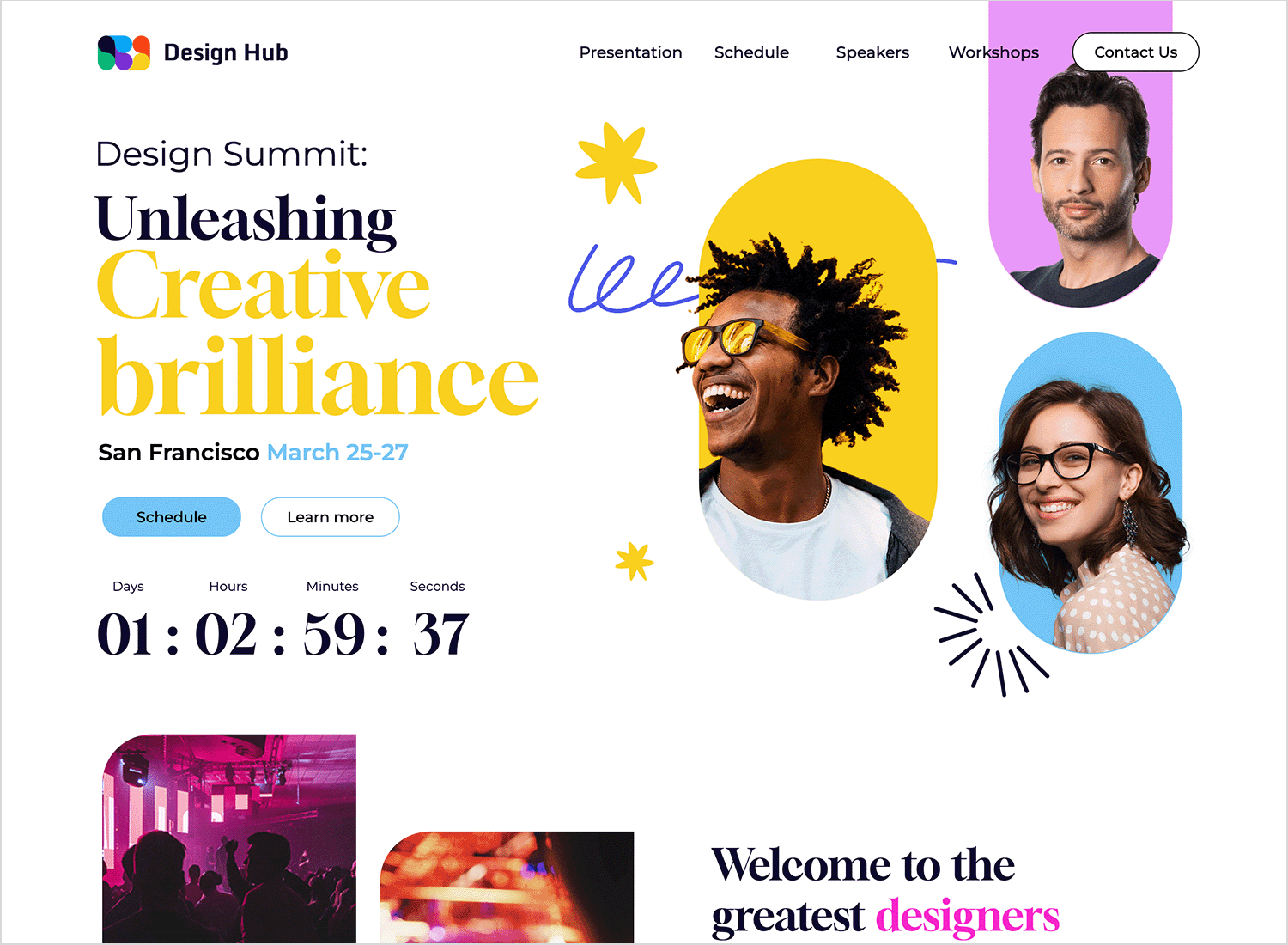
This design summit website greets you with a clean and crisp white background, providing a focused space to explore the event schedule. A burst of creativity comes from the vibrant, abstract pattern in the upper right corner, adding visual interest and reflecting the innovative atmosphere of the summit. This blend of solid and pattern creates a modern and engaging aesthetic that’s both informative and inspiring.
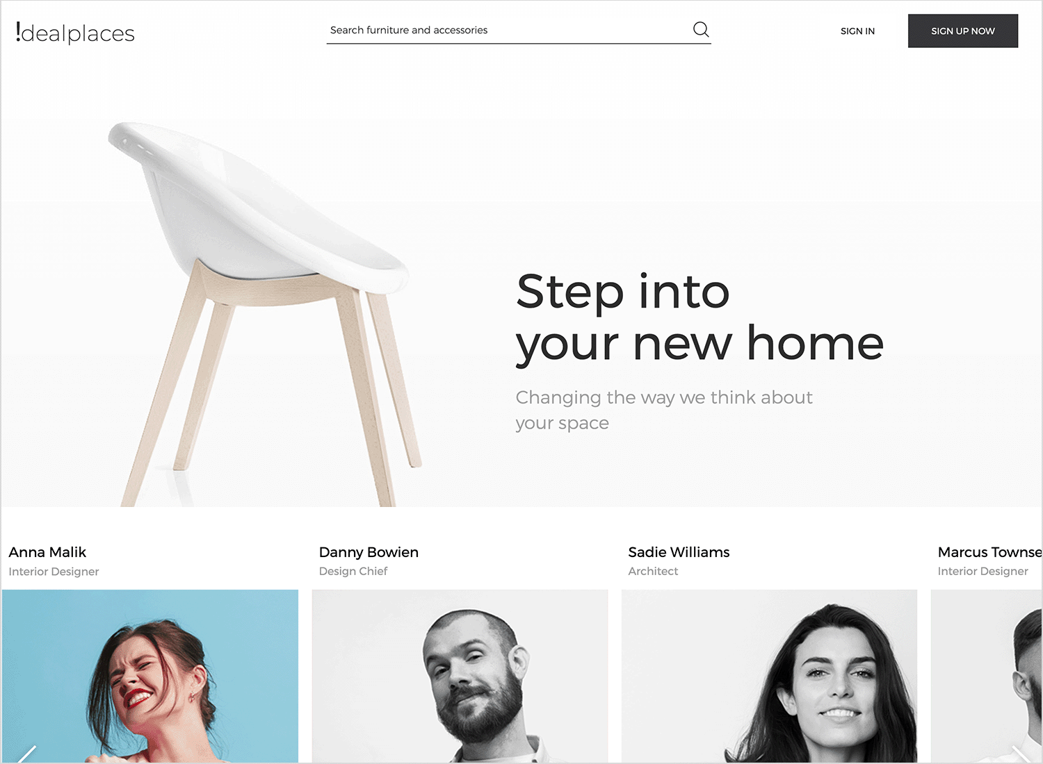
This website utilizes a clean, off-white solid background to create a bright and spacious feel, reflecting the site’s focus on home interiors. A subtle, light pattern is incorporated in the top section, adding a touch of texture without overwhelming the minimalist design. This blend of solid and pattern provides a modern, uncluttered aesthetic that allows the product imagery and text to stand out, emphasizing the site’s message of transforming spaces.
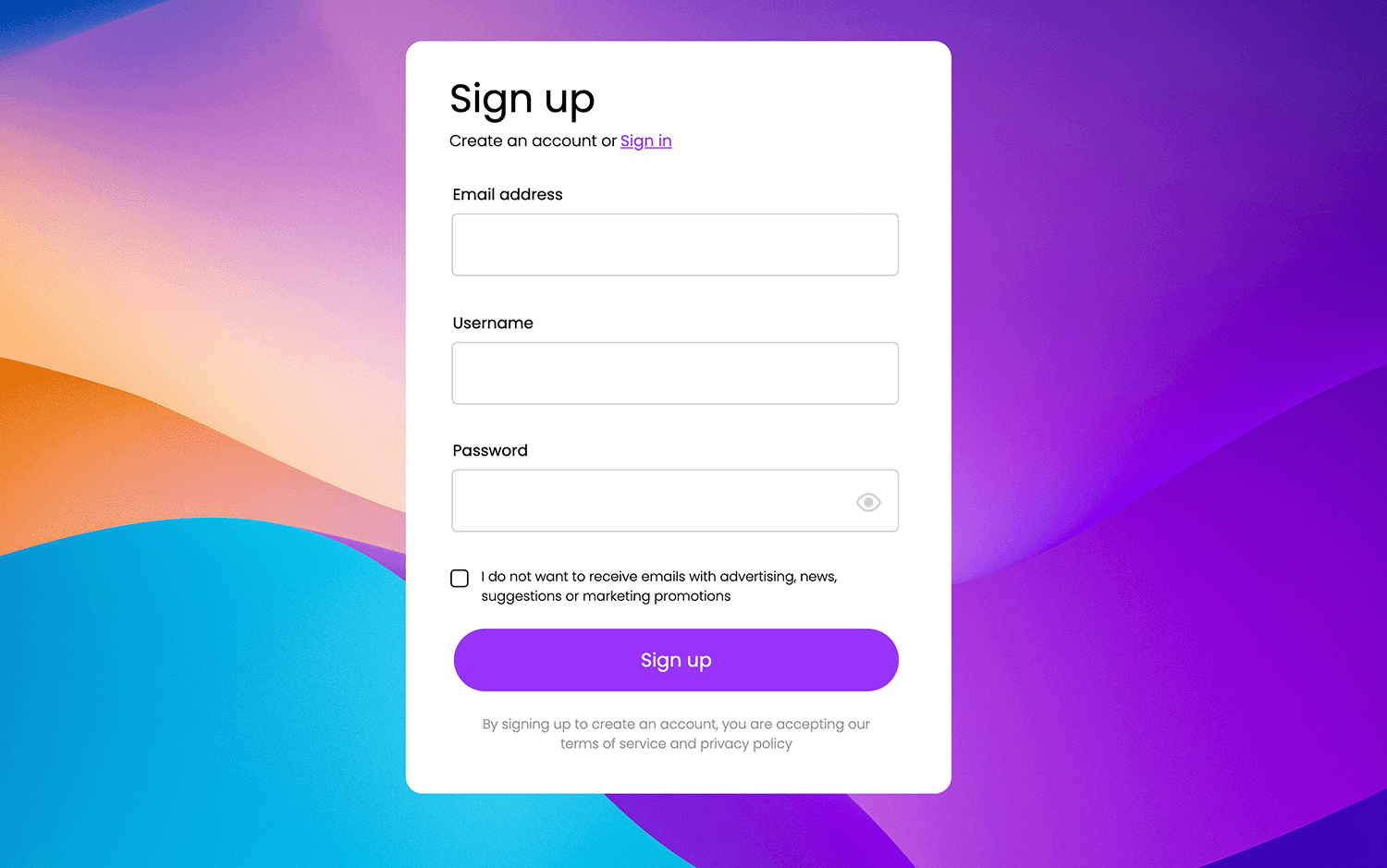
This sign-up form is presented against a vibrant, abstract background with flowing gradients of purple, blue, and orange, creating a dynamic and modern feel. The form itself is contained within a clean, white rectangular panel, ensuring readability and focus. The rounded corners of the panel and the “Sign up” button contribute to a soft, approachable aesthetic. The overall design balances visual interest with usability, making the sign-up process visually engaging without being overwhelming.
This event website features a sophisticated, dark background that sets an elegant and celebratory tone. A semi-transparent image overlay of clinking champagne glasses adds a festive touch, reinforcing the theme of the “Great opening.” The overall design conveys a sense of exclusivity and excitement, encouraging user engagement and ticket purchases.
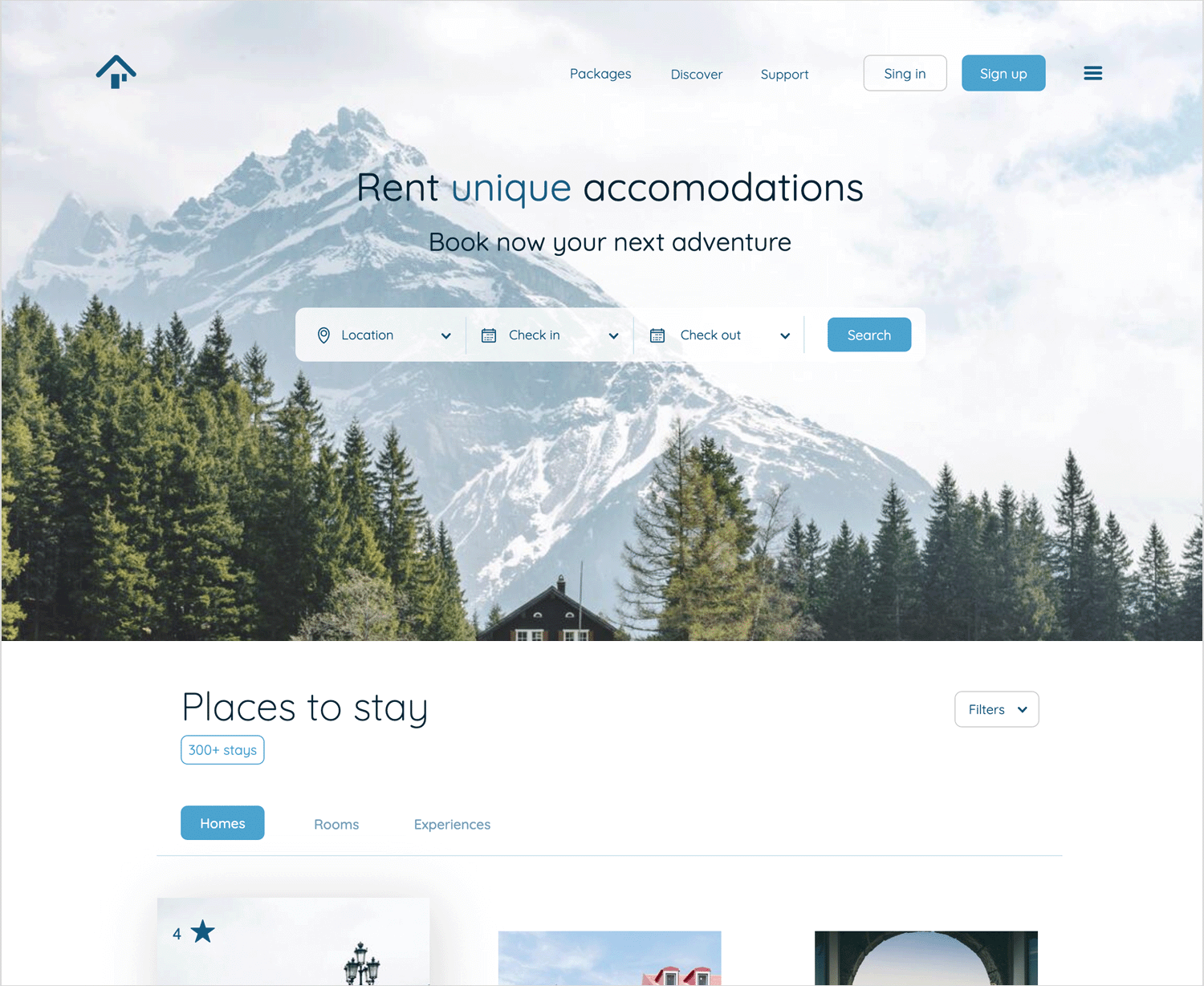
A stunning mountain landscape serves as the backdrop for this travel website, instantly conveying a sense of adventure. A semi-transparent overlay ensures text remains legible while highlighting the scenic beauty. Clean, modern design encourages users to “Book now your next adventure.”
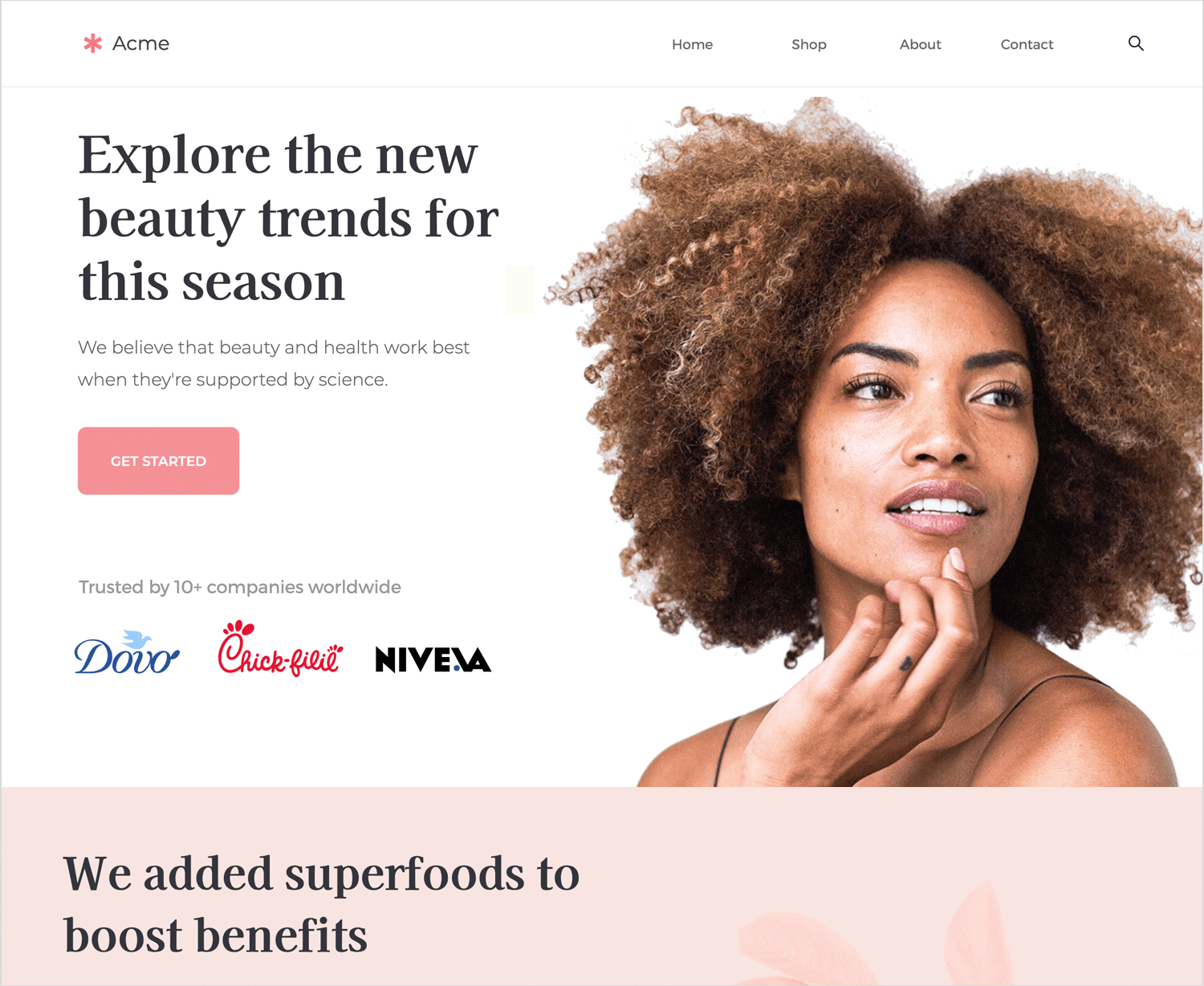
This website welcomes you with a light, airy design, thanks to its soft, off-white background. A beautiful, eye-catching image adds a personal touch, drawing you right in. The layout is super clear and easy to navigate, with friendly calls to action like the “GET STARTED” button. And check out the “Trusted by” section – it’s like a warm endorsement, letting you know you’re in good company.
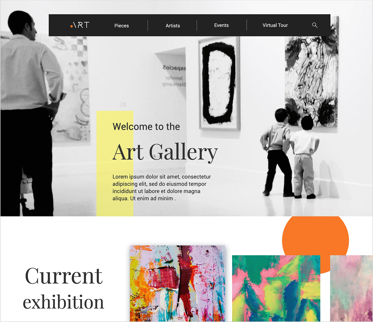
This art gallery website uses a clean, white background to provide a neutral canvas for the artwork and information. A large, grayscale image of gallery visitors adds context and visual interest to the header, while a pop of color is introduced through a yellow rectangular overlay highlighting the welcome message.
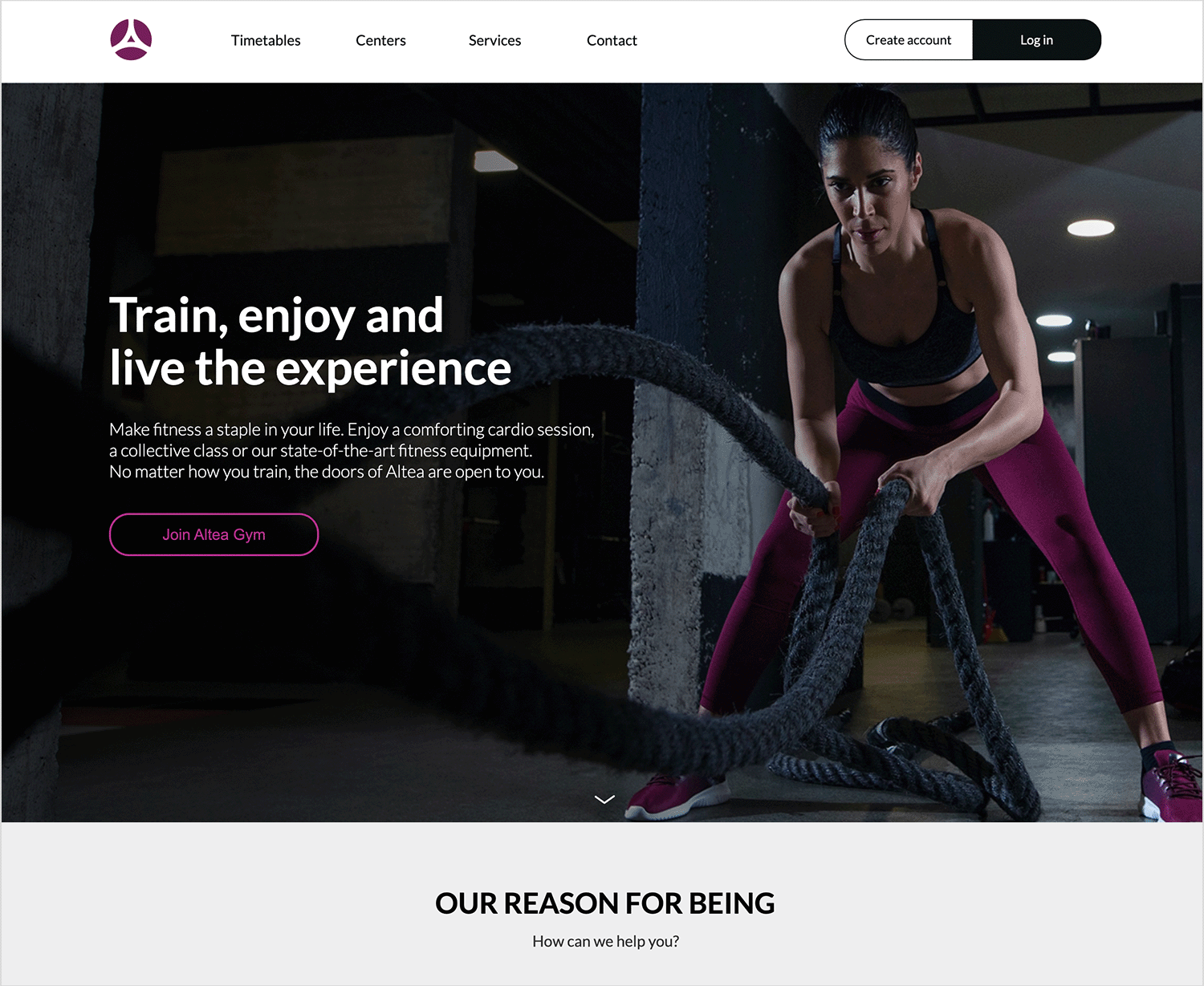
This fitness website welcomes you with an energetic image of someone working out, setting a motivating tone right away! A dark overlay makes the text pop, and the clear navigation helps you find your way around. The overall vibe is friendly and encouraging, making fitness feel accessible and fun!
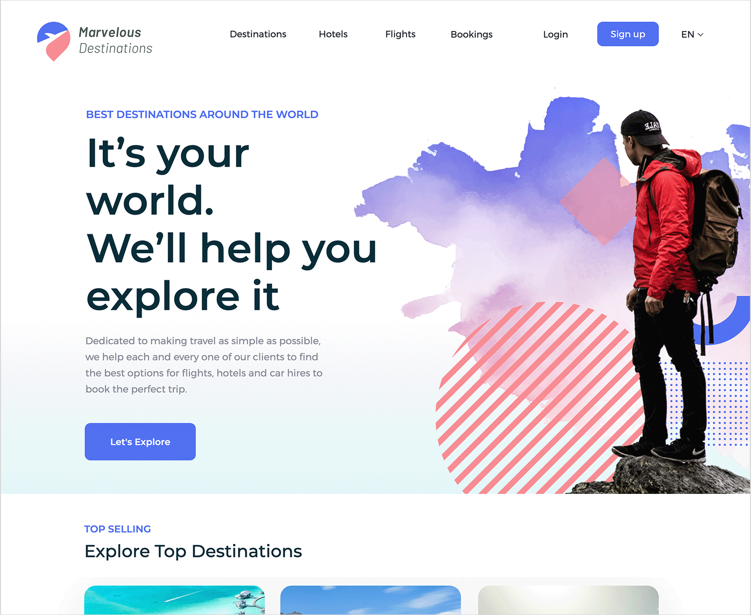
This travel website is your friendly guide to adventure! The split-screen design is like opening a door to exciting possibilities. On one side, a clean space with bold words invites you to “Let’s Explore.” On the other, a vibrant collage of watercolor art and a fellow traveler sparks your wanderlust.
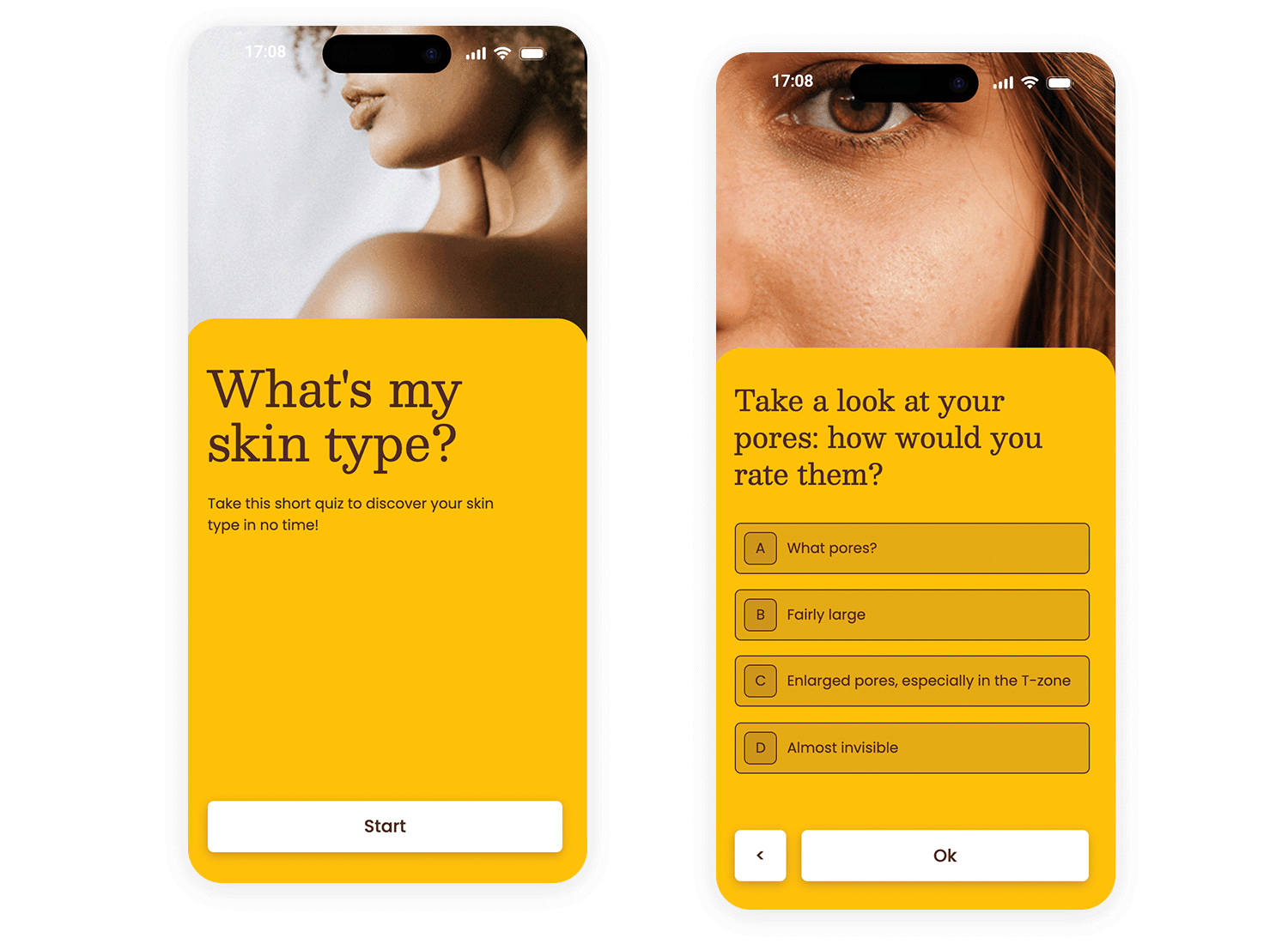
This mobile app interface features a clean and inviting design. A close-up image of a person is used as a subtle background, focusing on the skin to align with the app’s purpose. The design is simple and direct, prioritizing user engagement and ease of use.
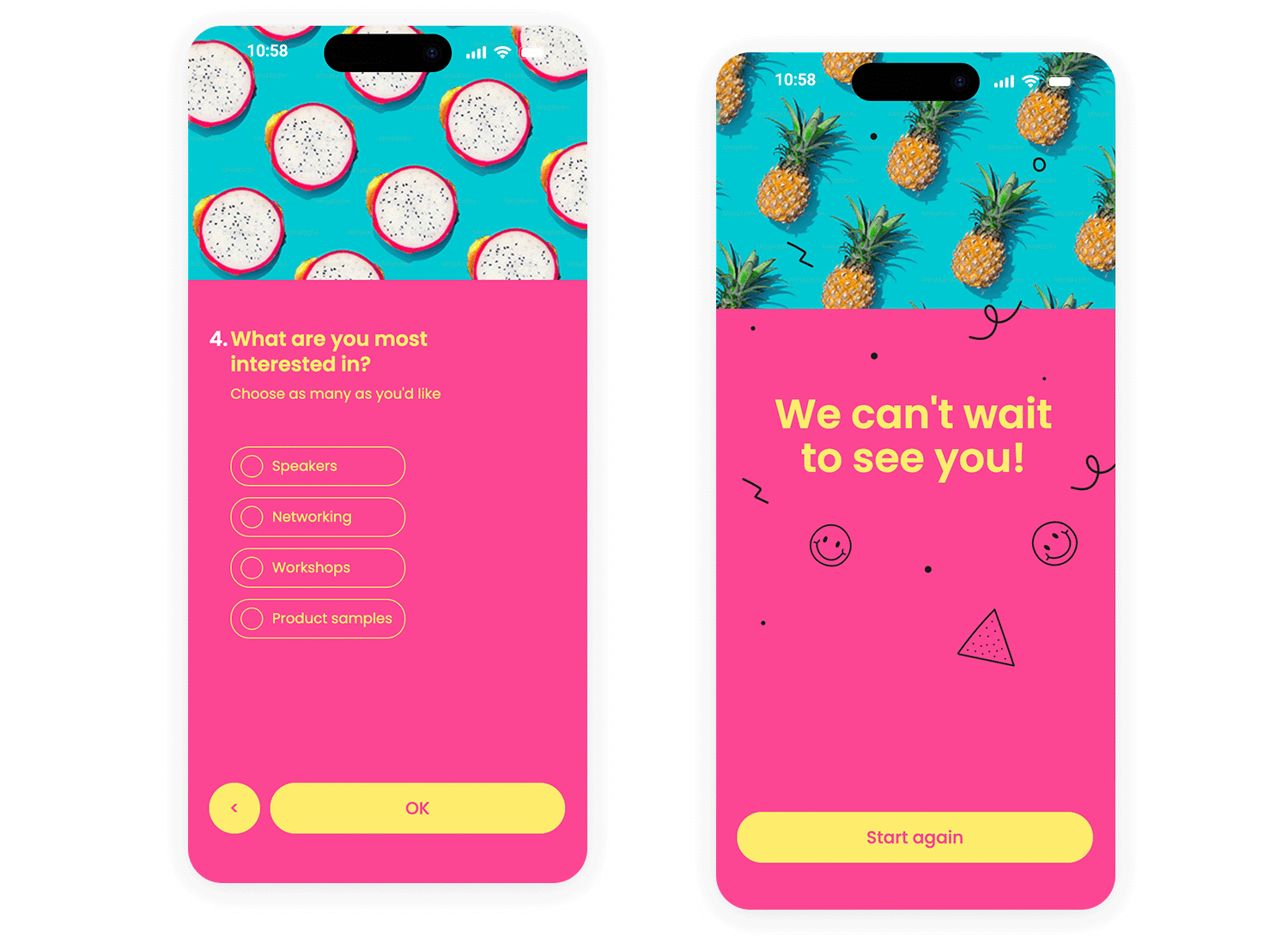
This mobile app interface features a vibrant, monochrome pink background, creating a bold and energetic feel. The survey title is prominently displayed at the top, followed by the first question. The design is clean and straightforward, with clear input fields for first and last names and a contrasting yellow button for easy navigation.
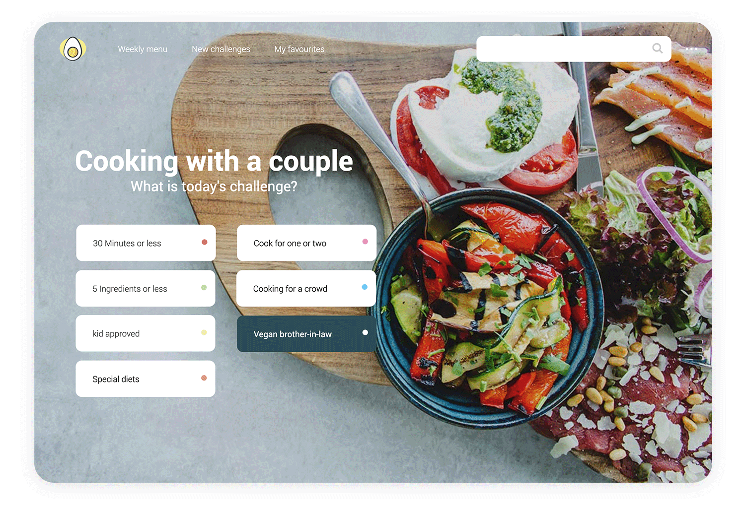
This cooking challenge interface is all about getting you inspired in the kitchen! The star of the show is the app’s delicious background image, showcasing a tempting spread of colorful veggies, fresh mozzarella, and savory salmon.
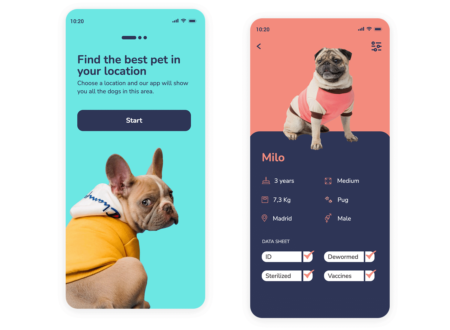
This mobile app interface features a playful design with a light blue background, creating a cheerful and approachable feel. A charming image of a French Bulldog is placed at the bottom, adding a touch of personality and reinforcing the app’s purpose of finding pets.
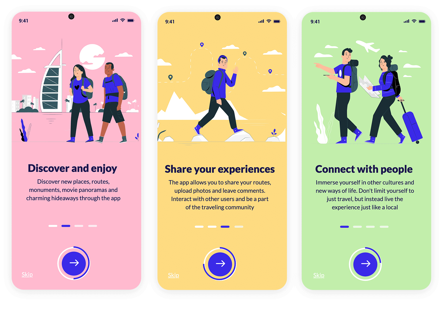
This app screen invites you to explore the world and connect with new cultures! The light green background creates a calming and welcoming vibe, while the illustration of fellow travelers sparks your sense of adventure.
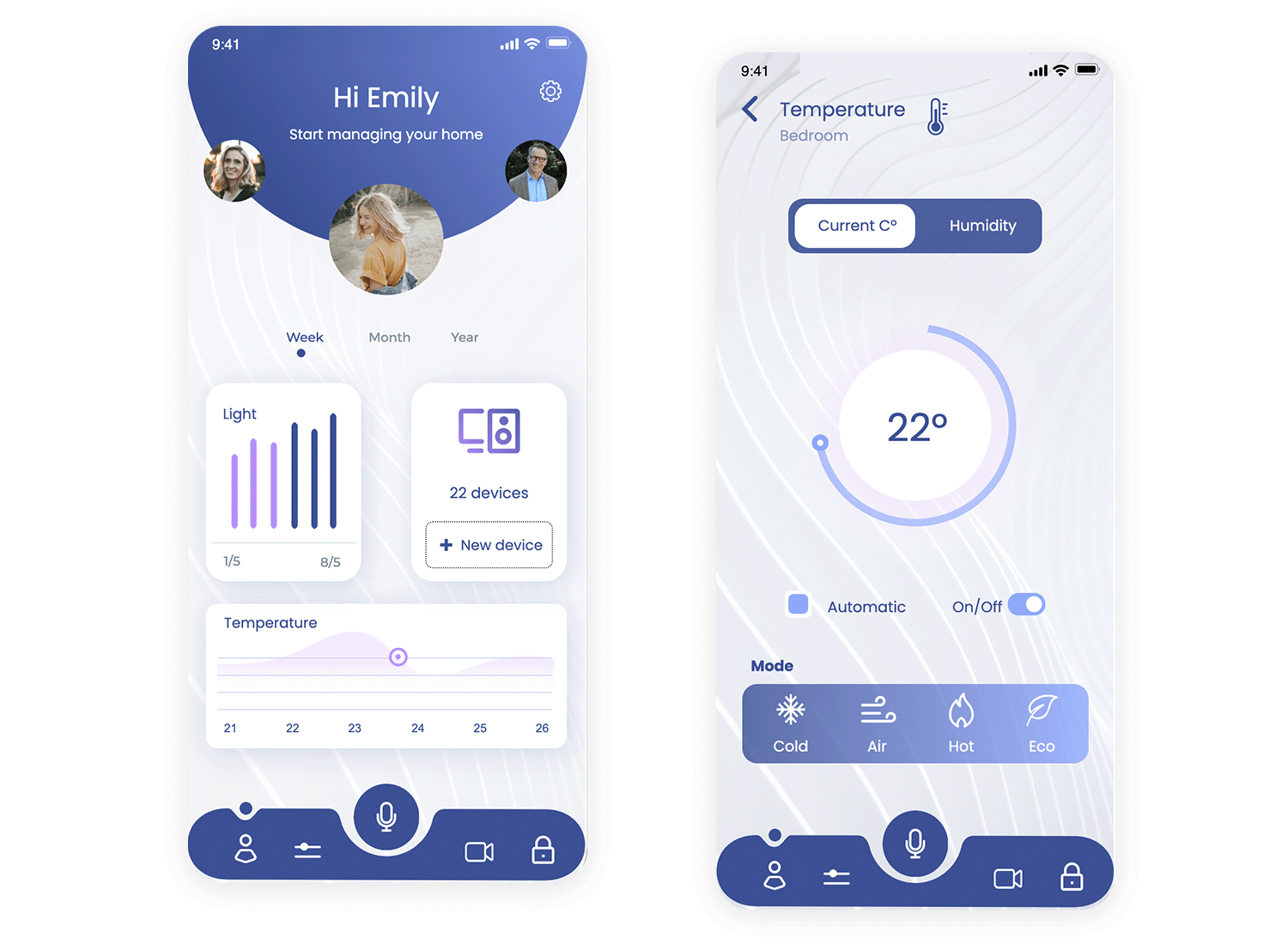
This smart home control panel app uses a dark background with cool purple accents to create a sleek and modern look. The dark backdrop makes the icons and text pop, giving it a high-tech feel that matches the advanced functionality of the app.
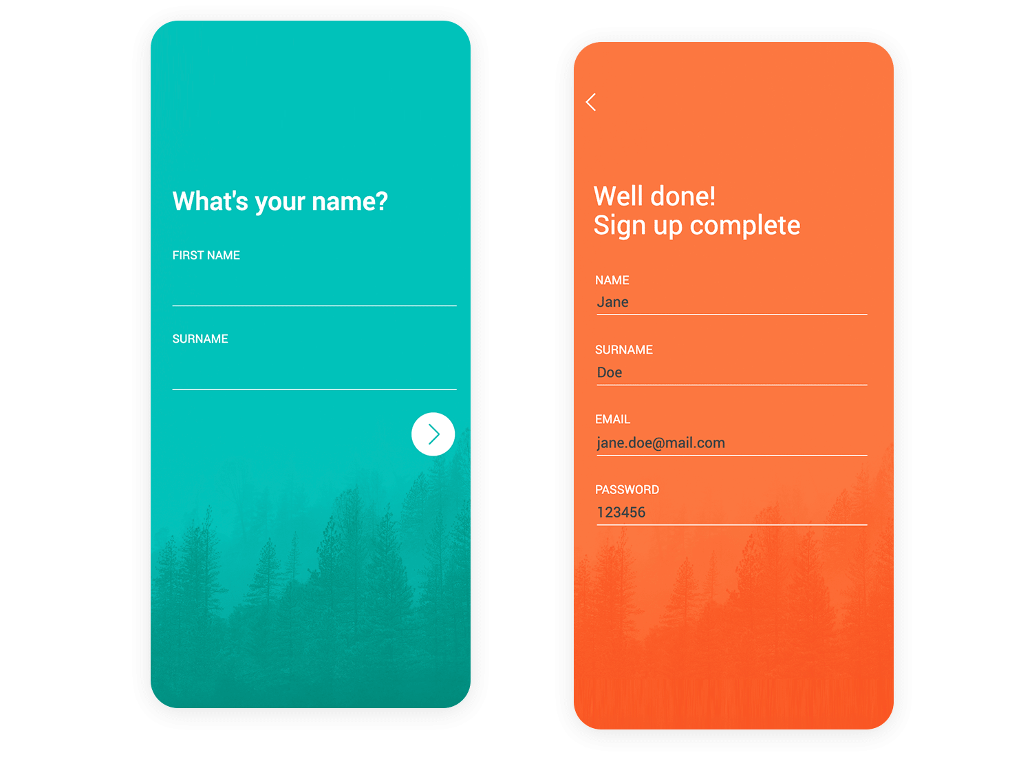
The Lonely Mountain app welcomes you with a refreshing teal background, evoking a sense of calm and natural beauty. A subtle, misty forest image peeks from the bottom, hinting at outdoor adventures and exploration.
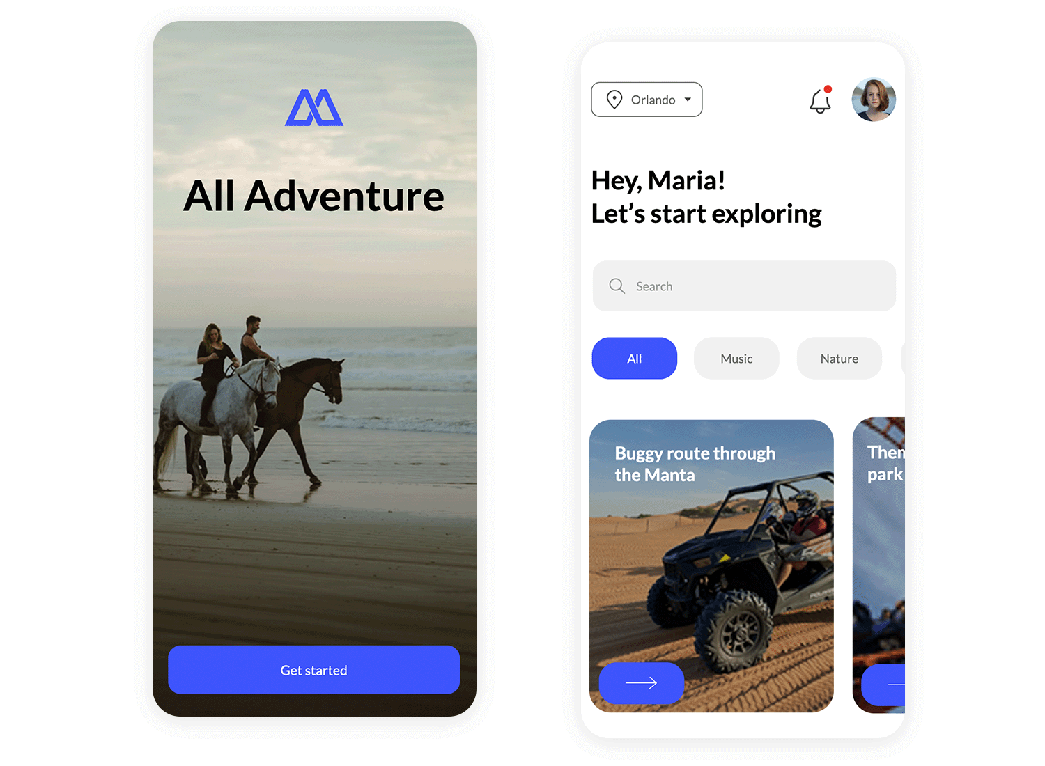
This app’s background is all about adventure! A scenic image of horseback riders on a beach instantly sets a lively, energetic vibe. It’s like a snapshot of the exciting experiences you could have. With a clear “Get started” button, the app invites you to jump right in and explore!
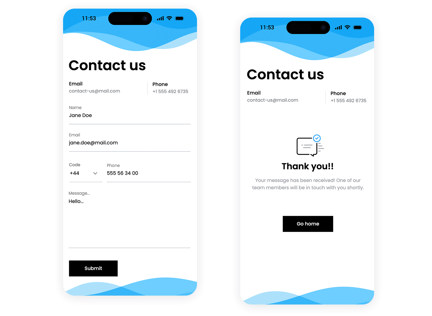
This app’s contact form keeps things simple and clear. The light background and flowing blue waves at the top and bottom add a touch of visual flair, while the focus remains on the form itself. With easy-to-use fields for your information and a prominent “Submit” button, getting in touch is a breeze.
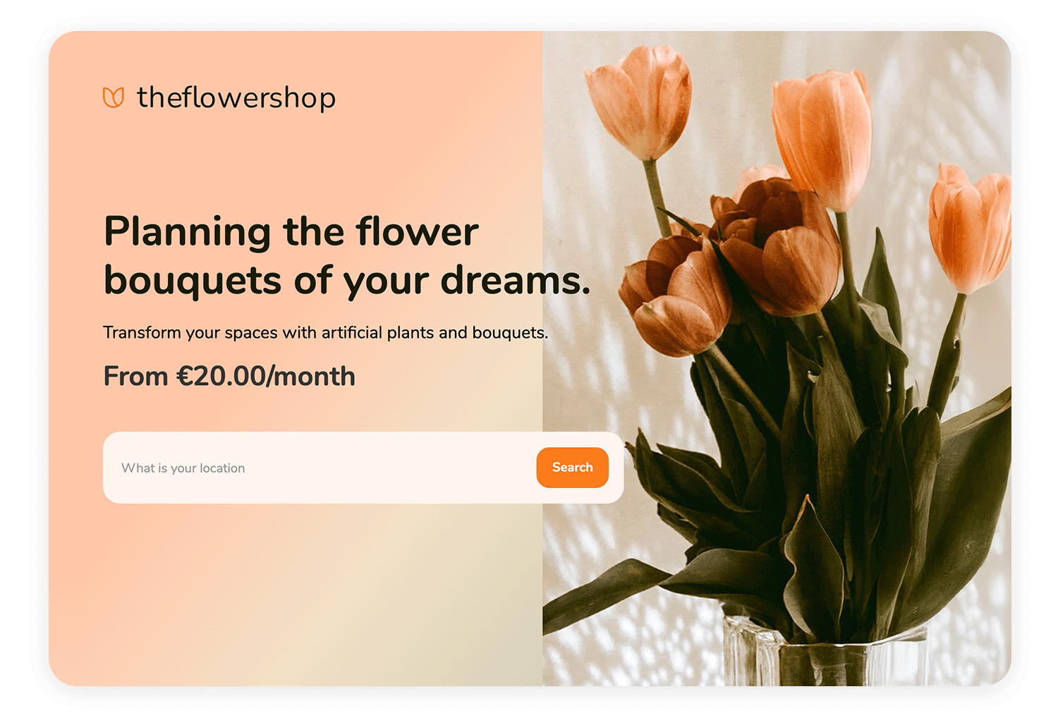
This tablet screen showcases a flower shop with a clean, split design. A soft gradient background highlights the shop’s message and a search bar, while a beautiful tulip image adds an elegant touch.
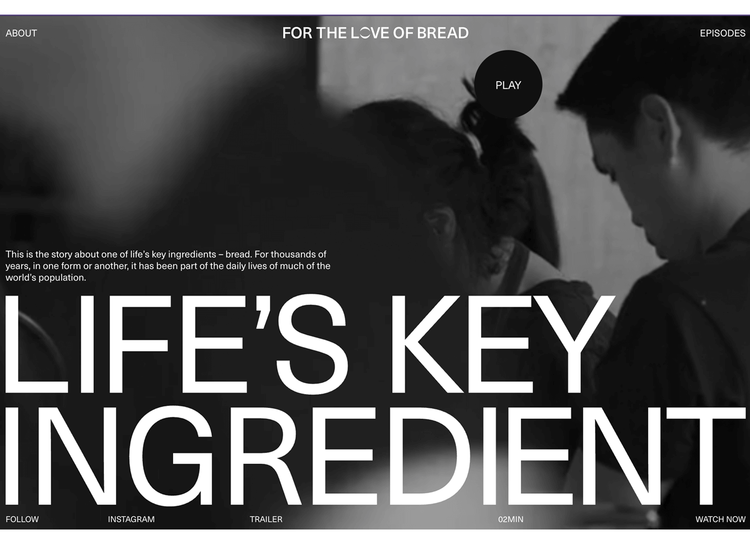
For the Love of Bread is a great example of a black and white-themed video website background. It captures the user’s attention brilliantly and, best of all, you can pause and play the background video at your convenience.
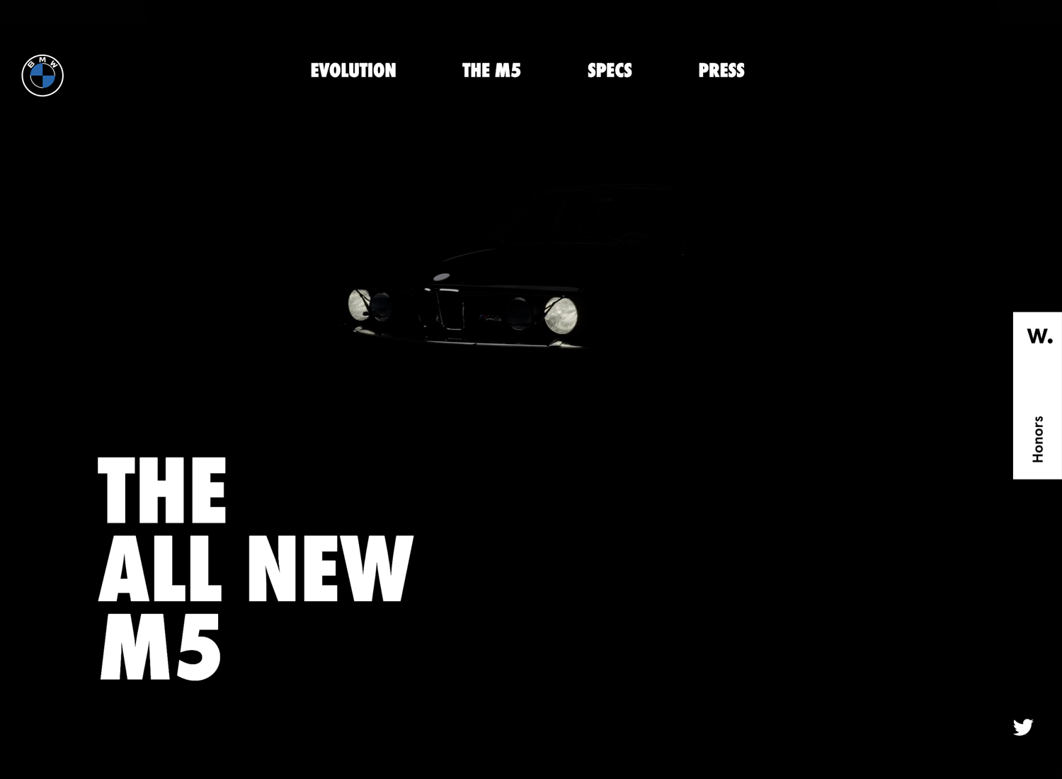
Pistonheadnerds.com knows how to attract the user and instill a sense of excitement with their black and white looped video of a BMW’s lights firing up. It adds an ambience, without disrupting the user’s experience.
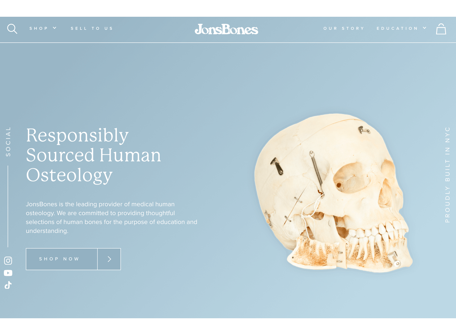
JonsBones, provider of responsibly sourced bones for medical research knows how to responsibly design a website background color gradient. It’s smooth, unobtrusive and the shaded part provides a nice contrast for the text.
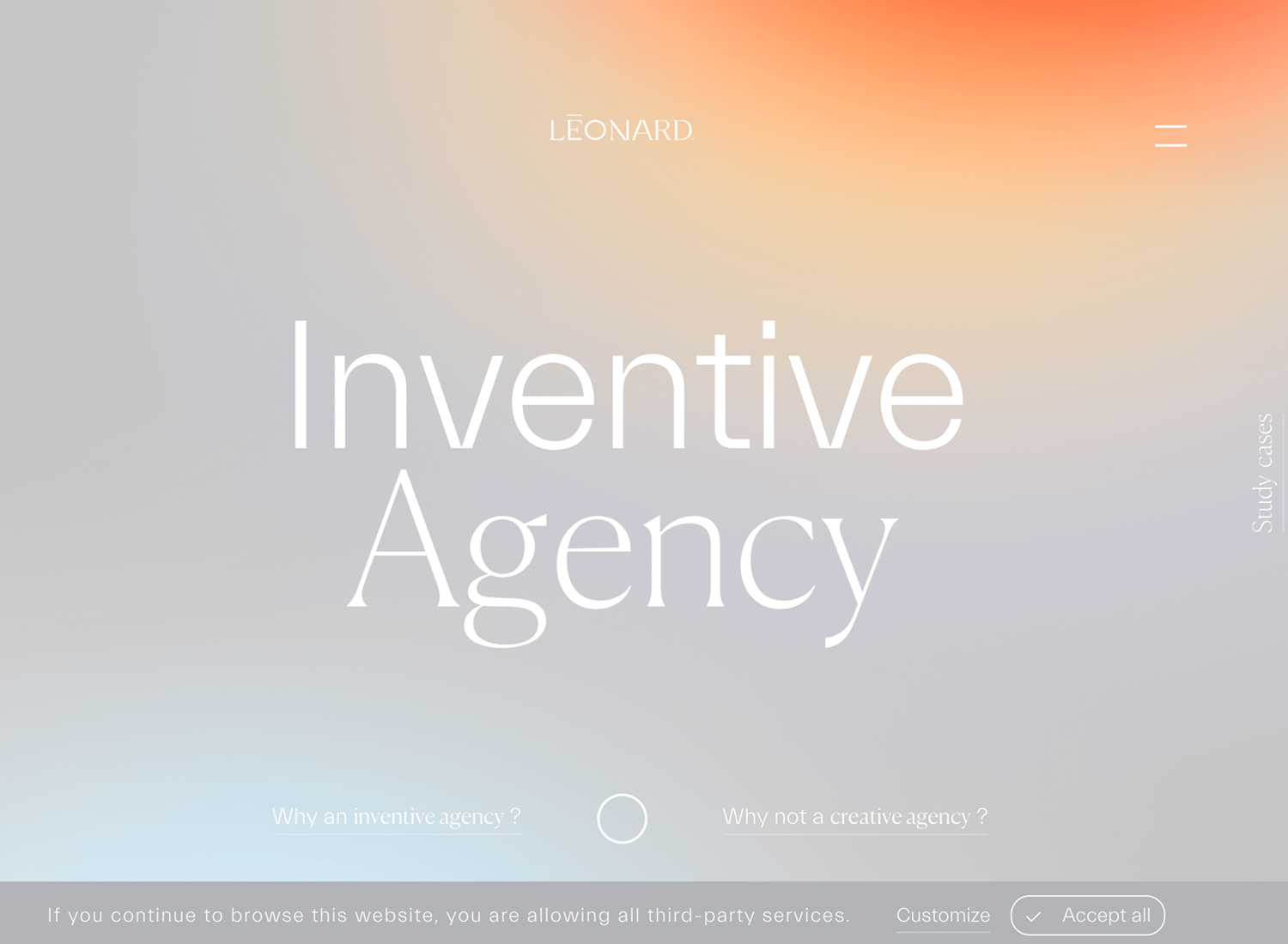
Léonard’s Inventive Agency’s website gets pretty inventive when it comes to their smooth background gradient. We love the way the warmer colors at the top of the page subtly draw attention to the logo and navigation menu.
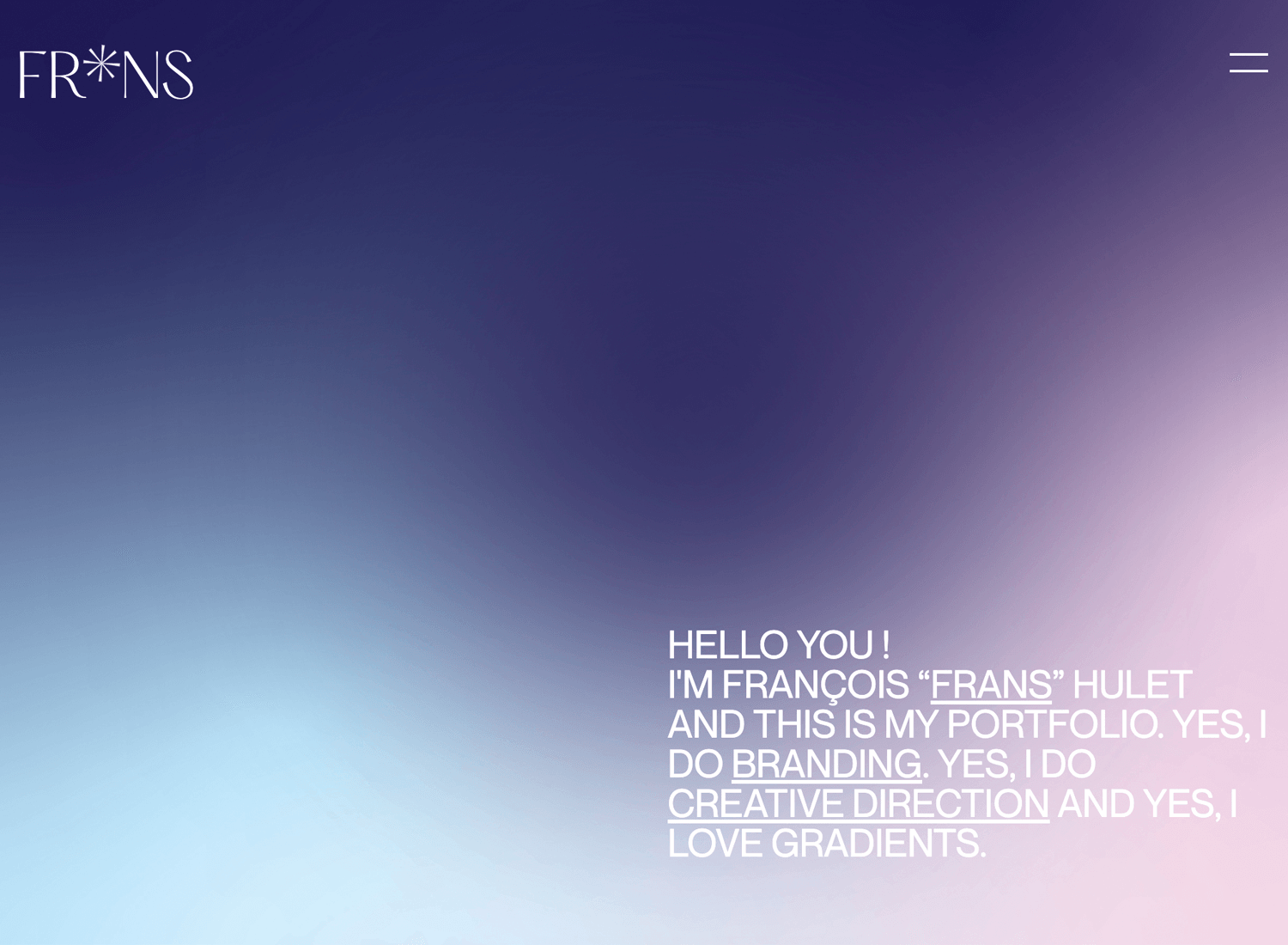
A slightly more in-your-face gradient is the one on Frans Hulet’s portfolio website. The different sections of the screen contrast sharply, with the lighter part of the gradient drawing attention to his witty paraph text.
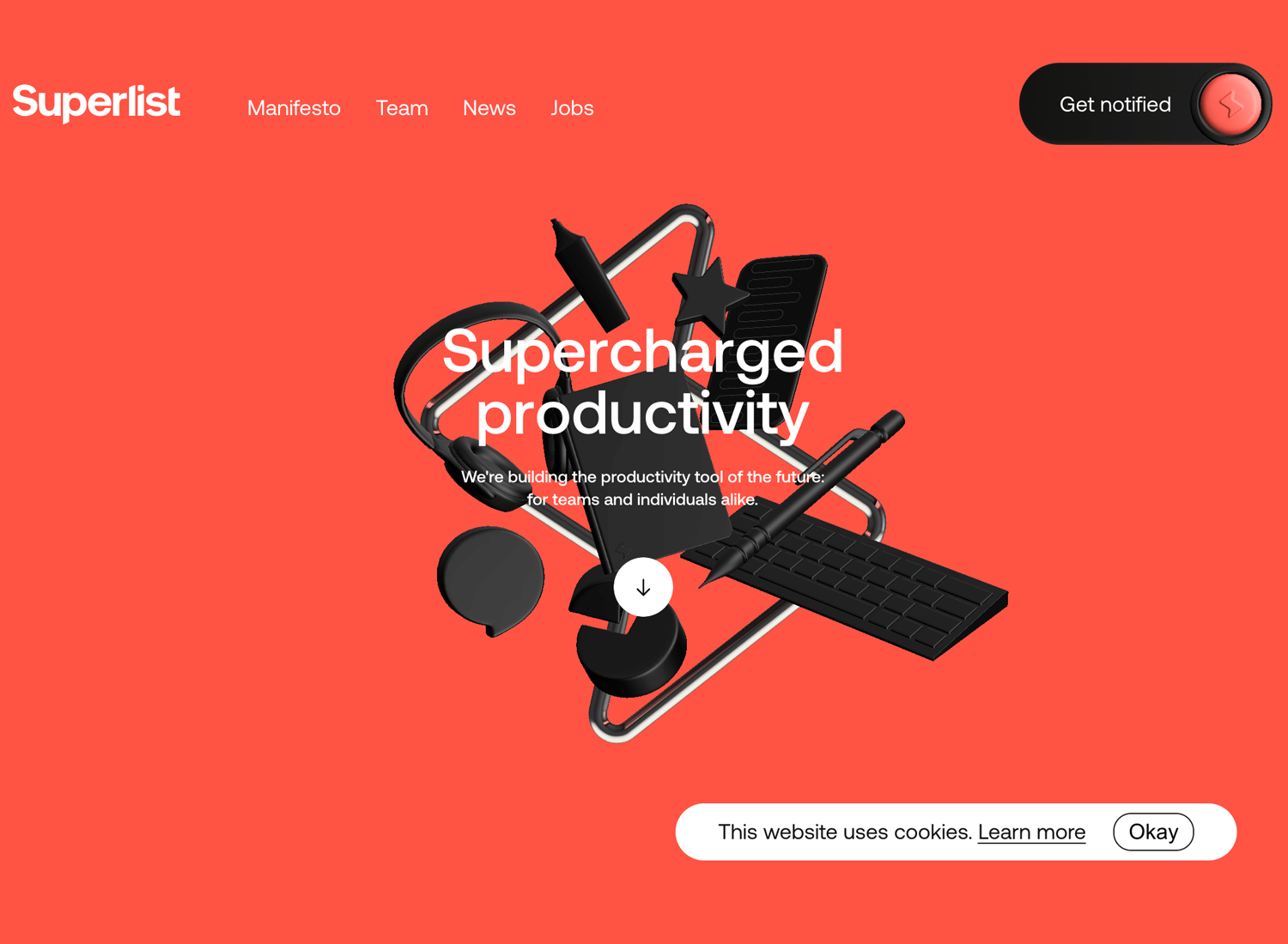
Superlist is a great example of a bold, solid website background color. Opting for the full-bodied background, superlist manage to rest their graphics, text and components nice on the background without these elements being swallowed up.
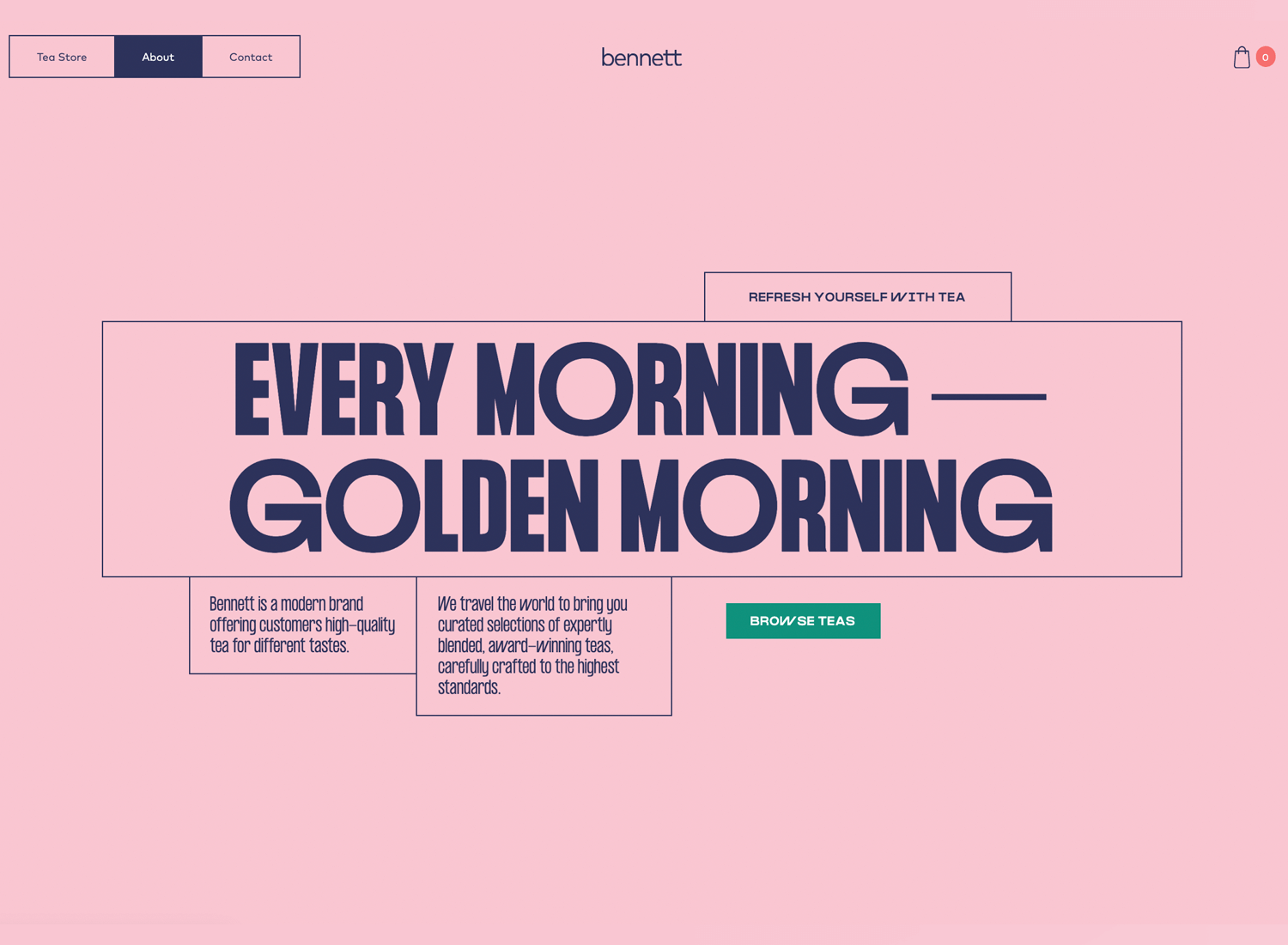
Bennett’s interesting take on the solid website background color shows how the use of thin, two-pixel highlights can be repurposed to draw attention to various text paragraphs and navigation options without them getting lost.
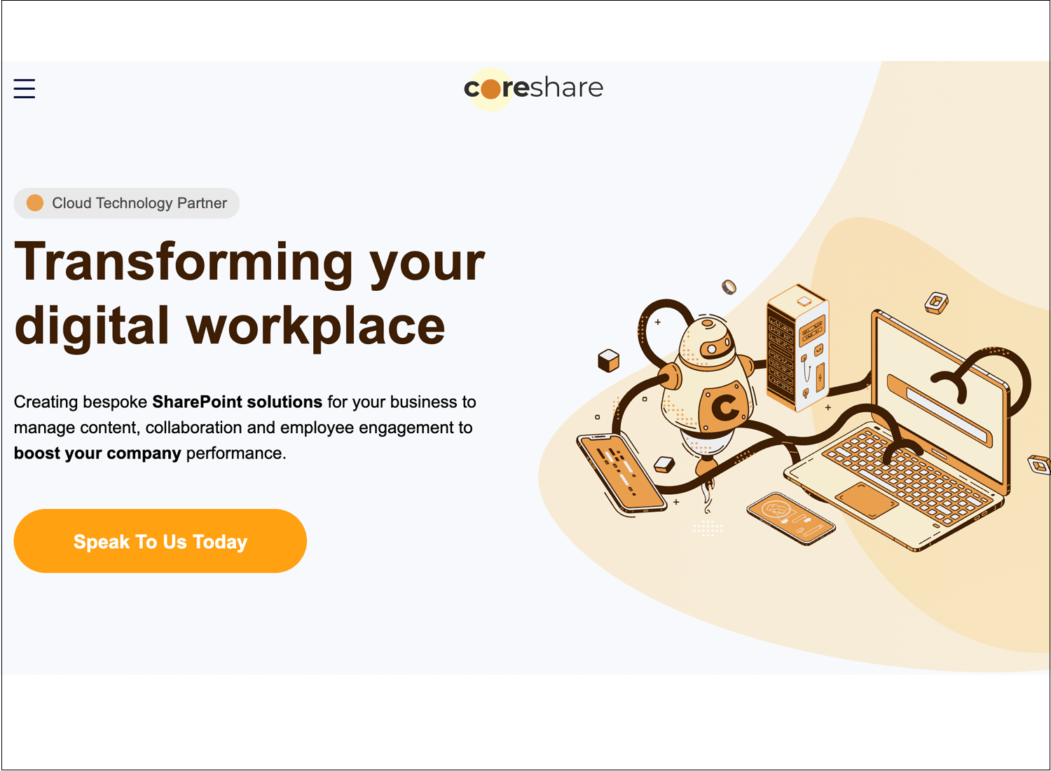
Coreshare’s website background consists of jazzy, looped animated graphics that, while they manages to capture the attention of the user, they don’t distract from the main mission statement and CTA.
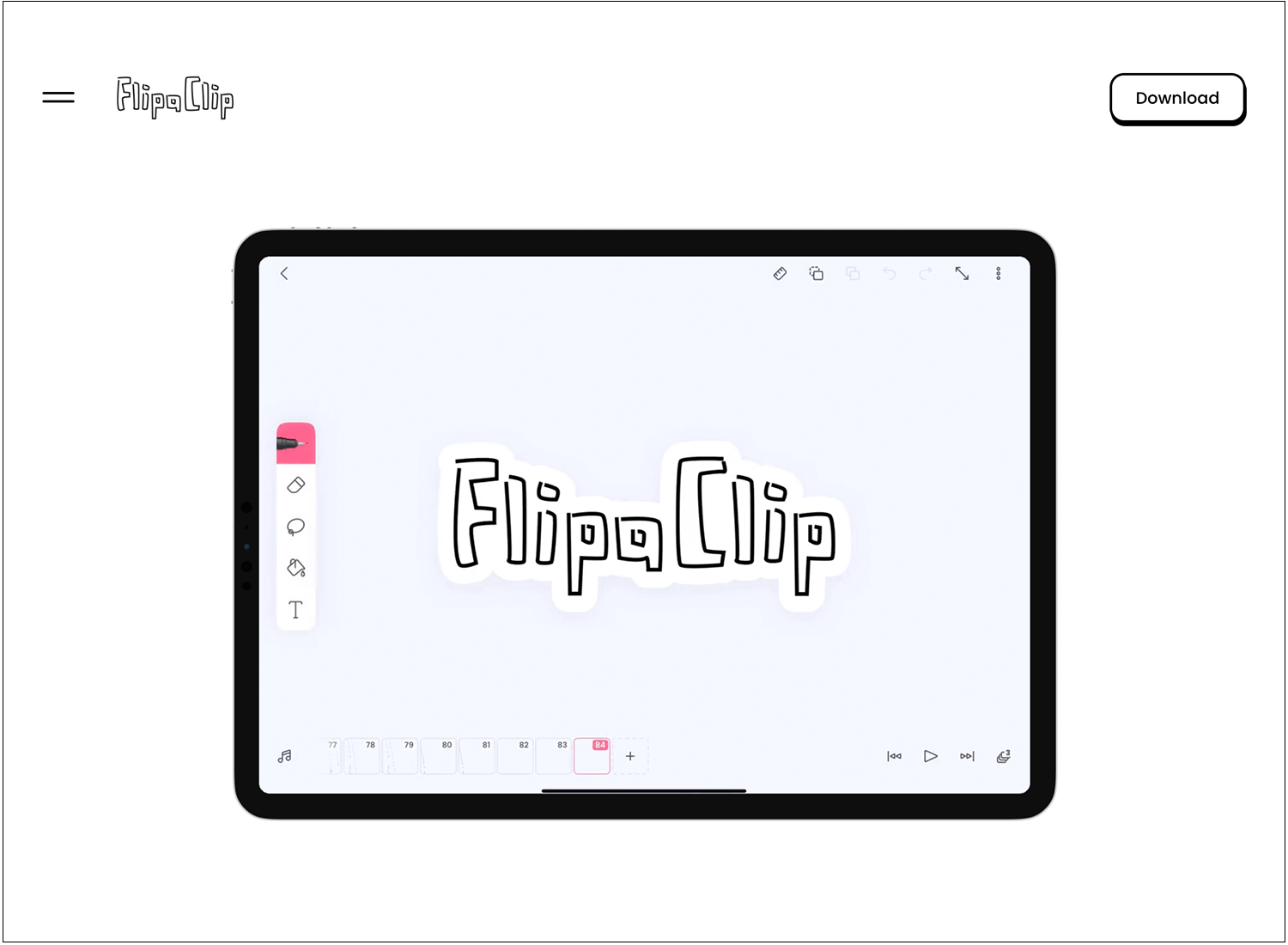
FlipaClip made a bold decision to keep their website background strikingly minimalist. As a result, everything from the navigation menu to the CTA stands out and calls the attention of the user. As the user scrolls, dazzling graphics reveals their product in all its glory.
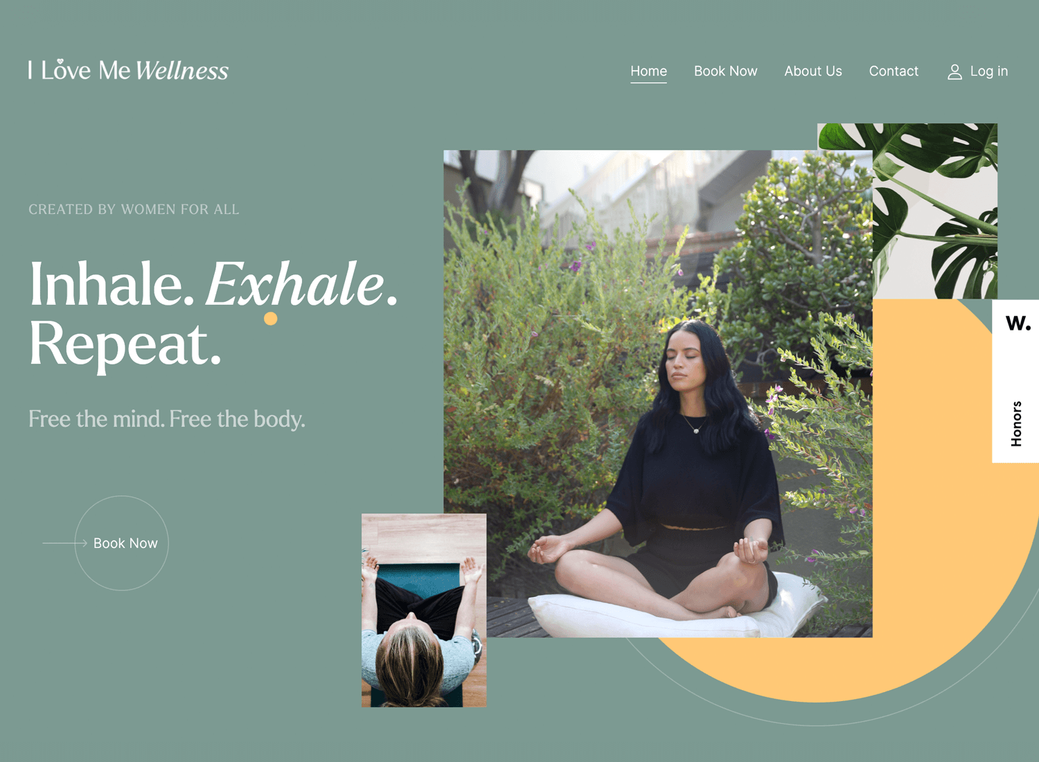
I Love Me Wellness goes for the layered approach to their website background, but not in the conventional way. The imagery is layered against a yellow content background, while the text, navigation options and CTA rest directly on the background. And it works because of the contrast.
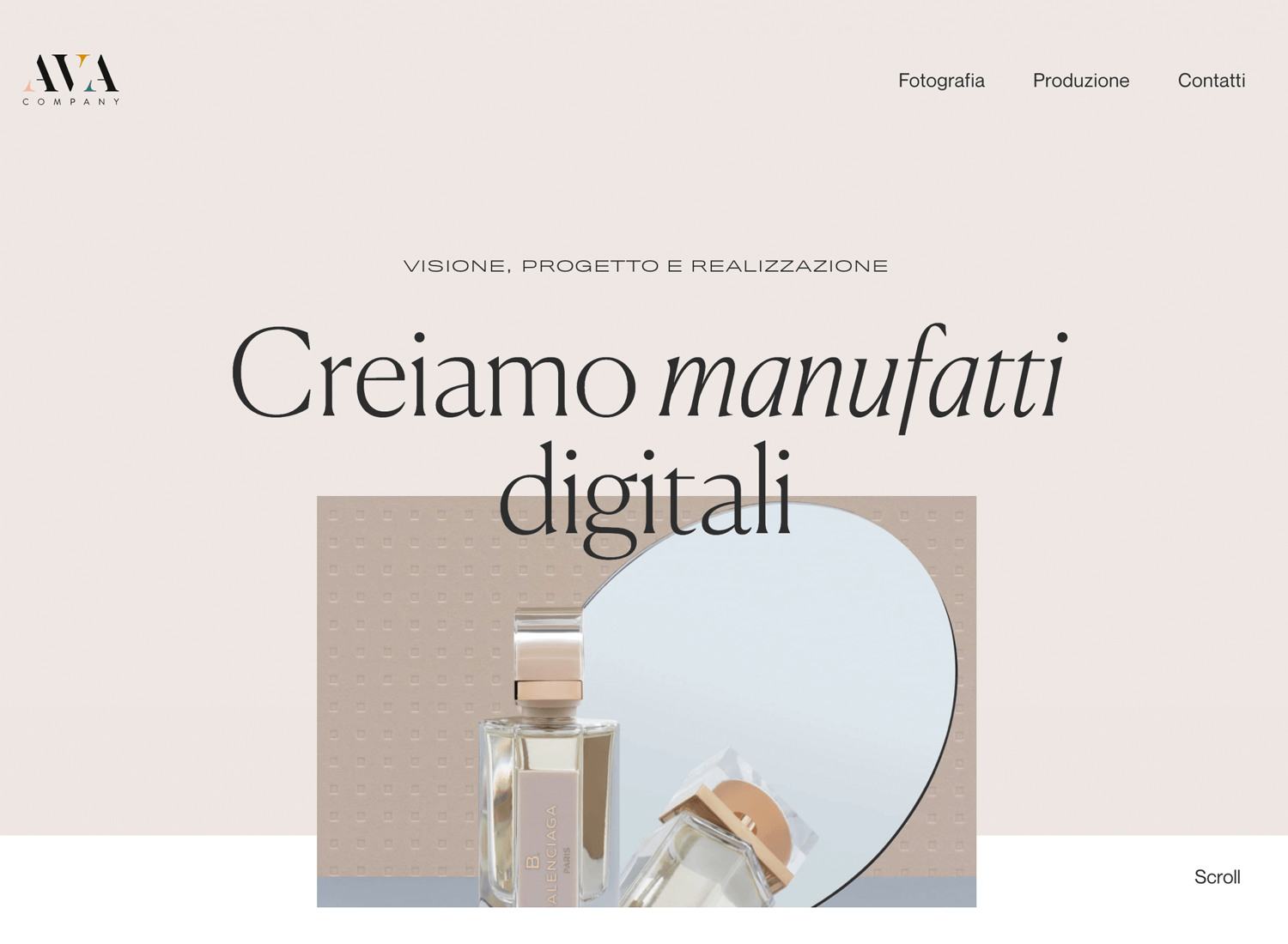
Ava Company have gone for an interesting juxtaposition of a solid background color, whilst layer the header test and imagery, with the last image bleeding down ever so slightly into the rest of the content on the page.
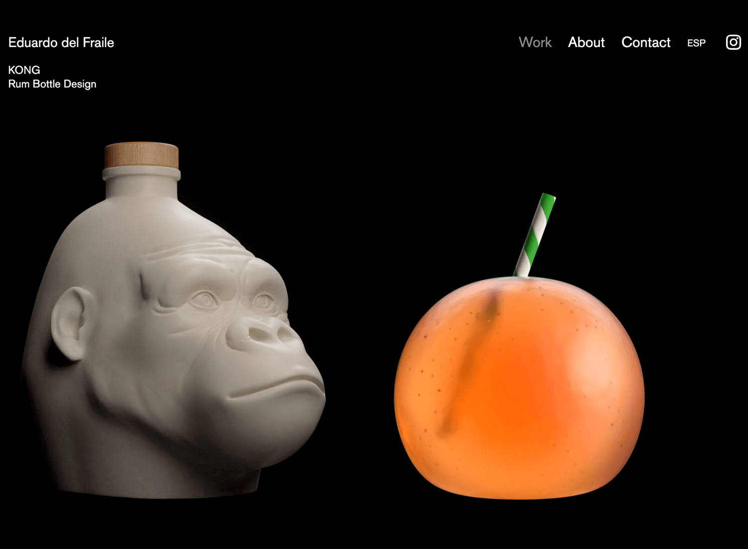
Eduardo del Fraile, being a multidisciplinary designer, has chosen an interesting way of showcasing his products in all their glory as part of the main content on the screen. He’s chosen a black void for the background, with the products emerging from the shadows, giving them the full spotlight. And it works!
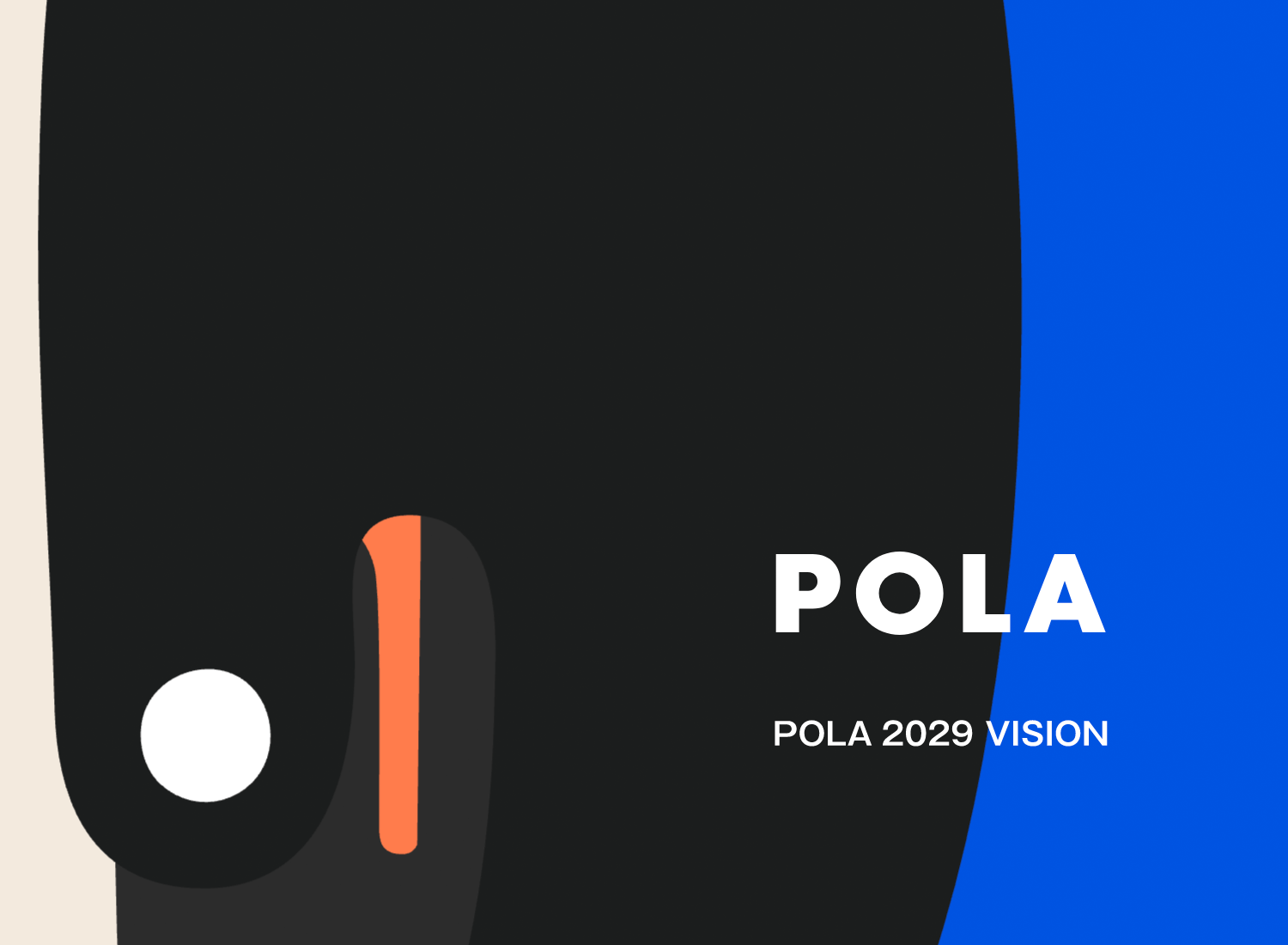
In our personal opinion, Pola’s graphic website background starts off well, with an ever-so-slight movement in the form of a looped animation. Bold colors and appealing UI patterns help grab attention. Great contrast is provided to the brand with the solid colors behind. However, as the user scrolls, there’s too much movement and distracting graphical animation.
Marcus Eriksson is a photographer and director based in Vancouver and, straight off the bat, it’s clear what kind of photography he specializes in. In his website background, he’s gone for a continuously rotating loop of powerful imagery, so that you get an instantaneous walkthrough of his portfolio. In this sense, the website background is his portfolio.
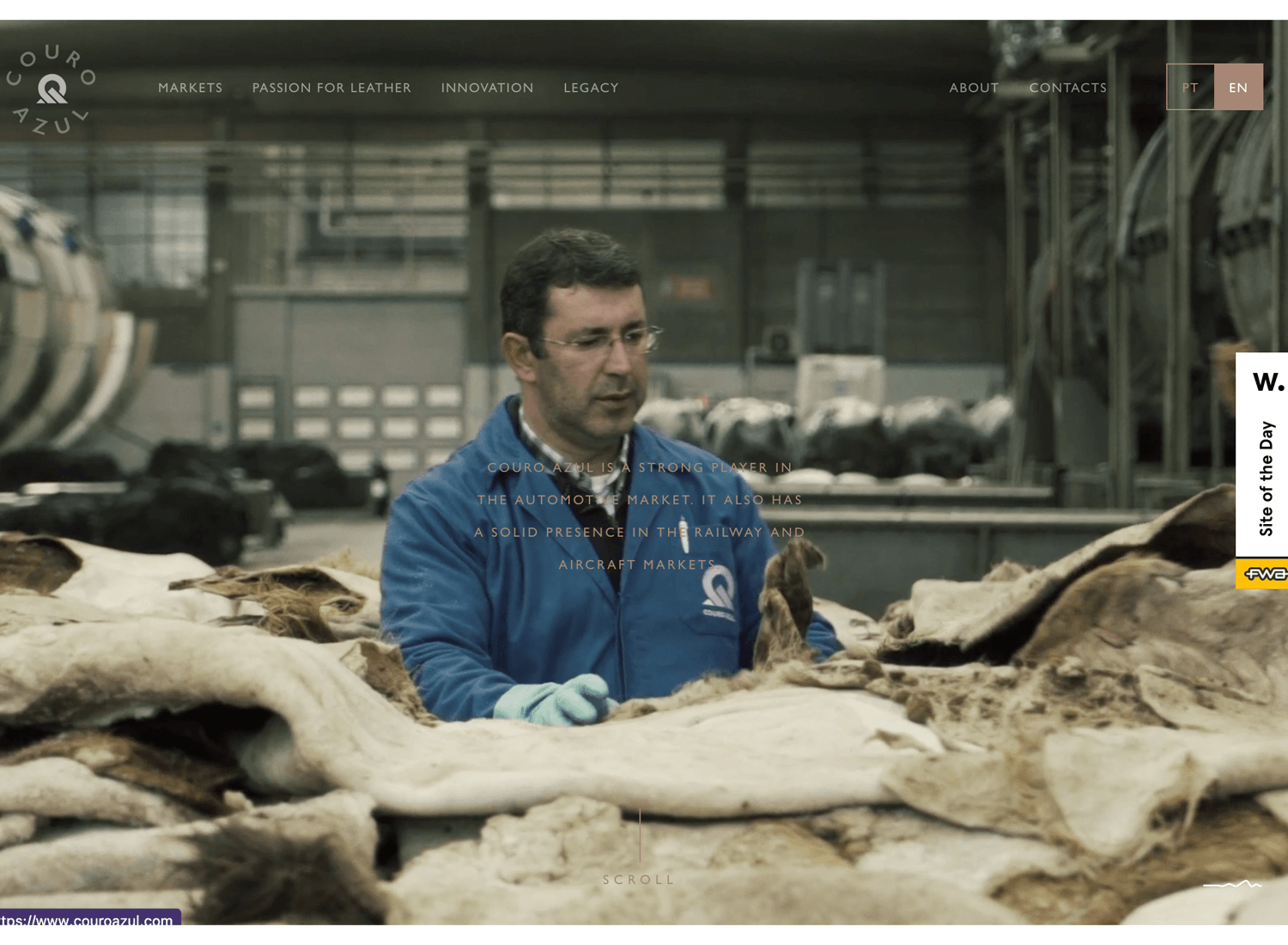
Couro Azul goes for the storytelling approach to their website background. The imagery succinctly, yet impressively, captures their raw leather production business. However, in our opinion, the text, while it matches the color scheme, could have a much better contrast with the video background.
Create interactive website prototypes with Justinmind. It's Free. Unlimited projects!

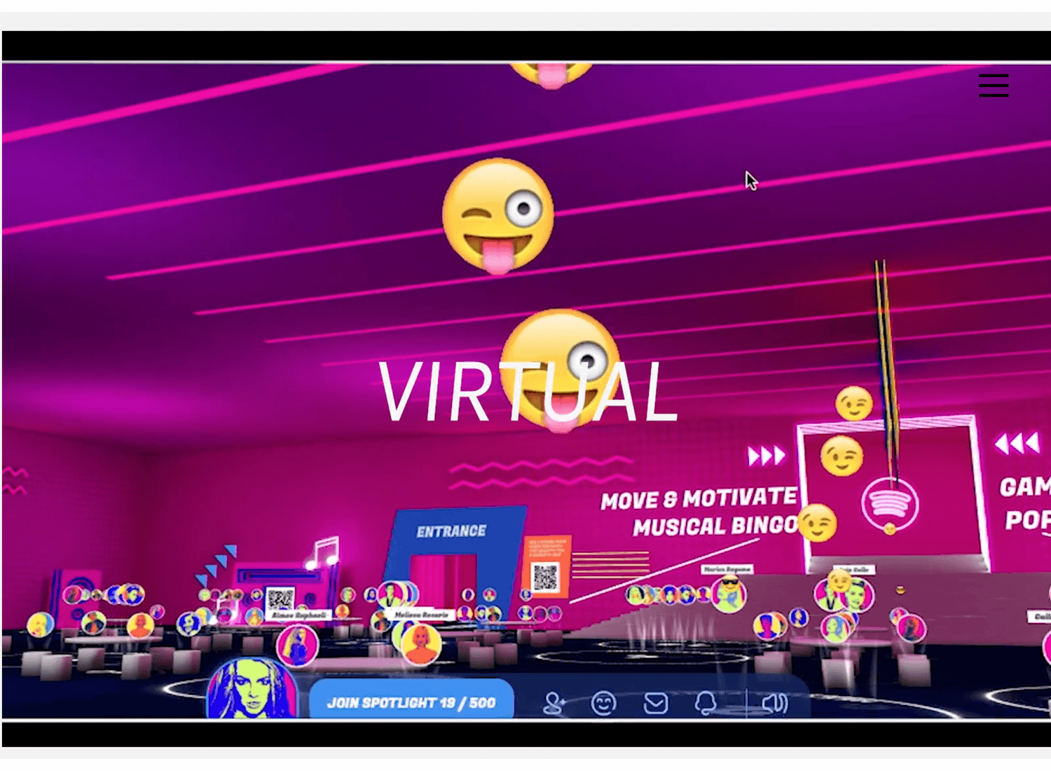
WLLX for an all-out, attention-grabbing video background. The video sequences move fast, with large white captions providing a nice contrast to narrate the story. However, we don’t like the way the logo and navigation menu disappear until the user clicks the screen or scrolls.
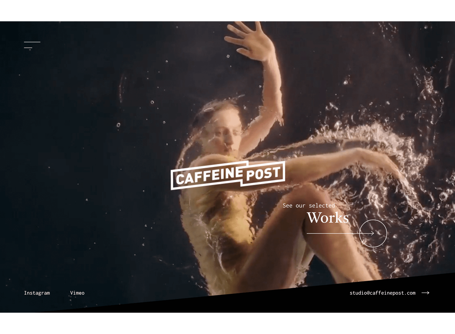
The Caffeine Post have also opted for the striking video background that draws the user in, yet provides a nice contrasting backdrop to the logo and their main CTA. The videos can pause to load though, if your internet connection’s a little slow on any given day, putting them within harm’s way of a user bounce.
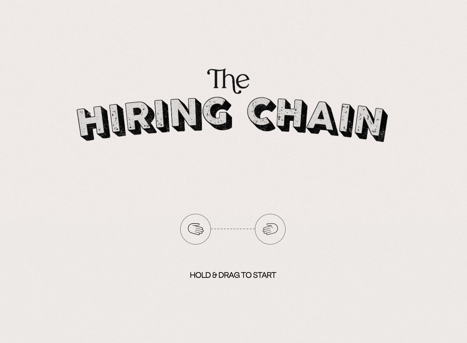
The Hiring Chain have gone for a simple, fun introduction to their website. The beige background provides a minimalist contrast to maintain this simplicity, coupled with a subtle pattern, echoing the “classifieds” section of a vintage newspaper.
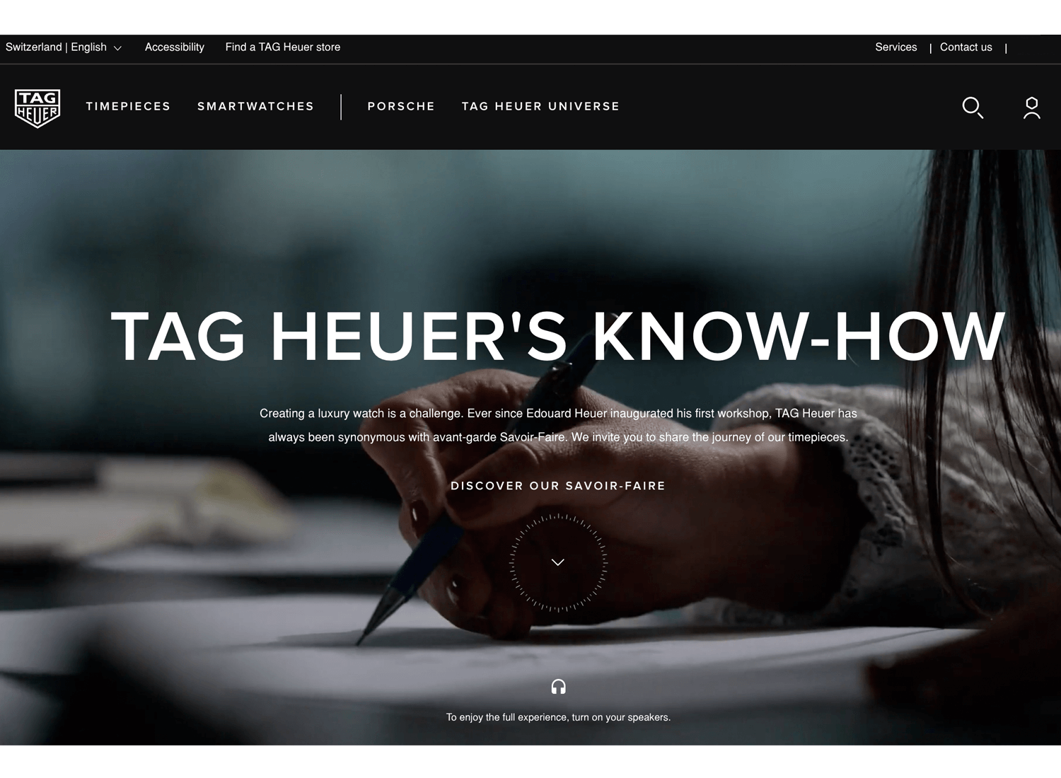
Tag Heuer have a short, looped video with recurring imagery in its footage that helps keep the page dynamic and interesting, without distracting the user too much. It also contrasts nicely with the text and we appreciate the pause button. That’s savoir-faire!
Overlays are what C8’s all about with their website background image. In order to not draw attention away from the main content on the page, they’ve used a fuzzy, static overlay to slightly grey out the image, but without obscuring it. Nicely done!

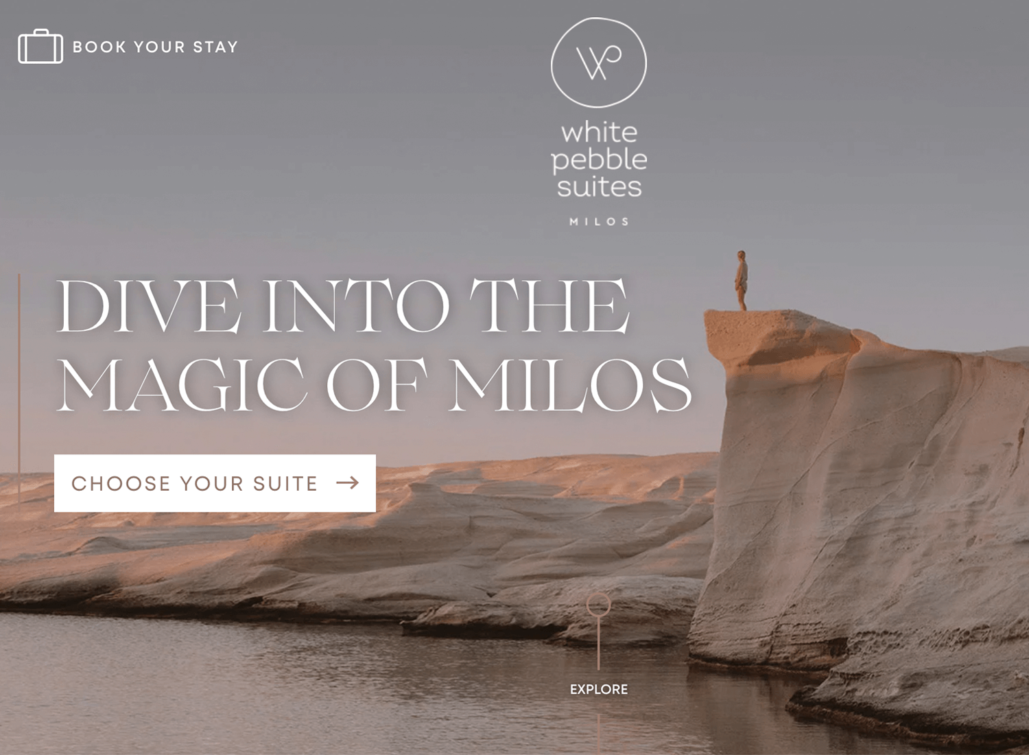
Harmony is the name of the game with White Pebble Suites. Their website background image stands in perfect unison with the feel of the website, while also enhancing their soft, pastel color scheme. What’s more, the white text, logo and CTAs stand out in perfect contrast.
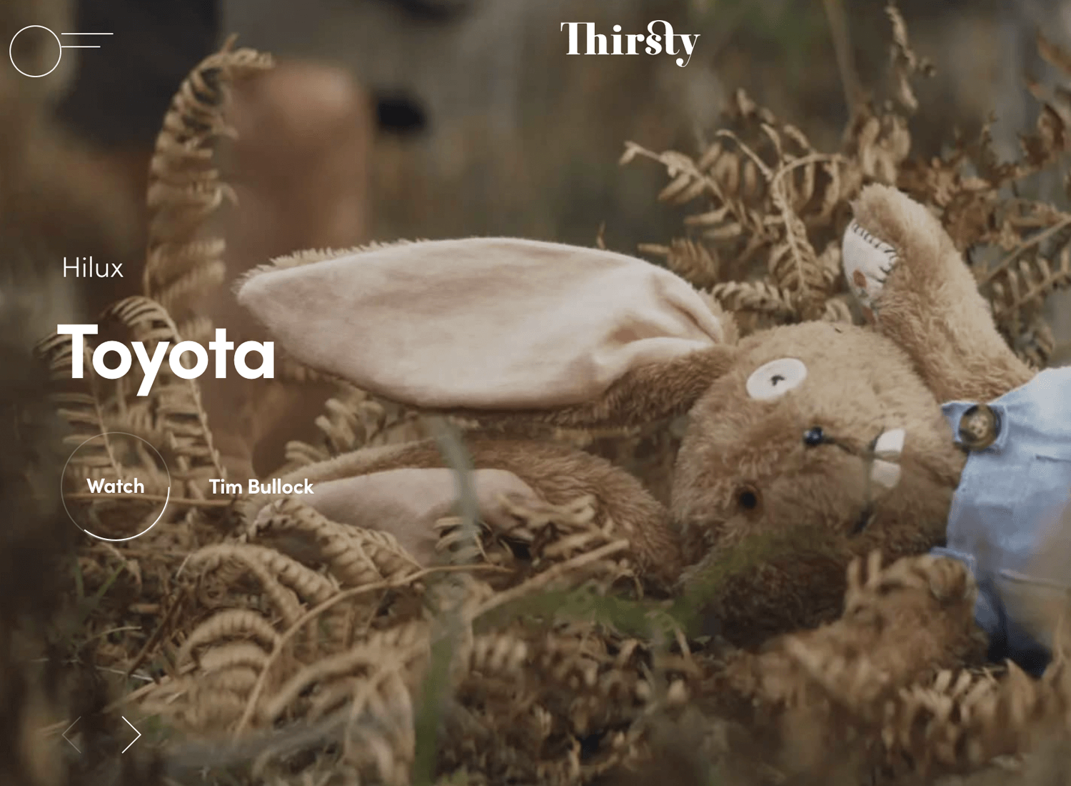
Thirsty’s captivating array of website background images draws the user in to further explore their brand stories. While each image is displayed, a clever loading bar around the CTA lets the user know how long they have until the next image and story displays. Top points for system feedback!
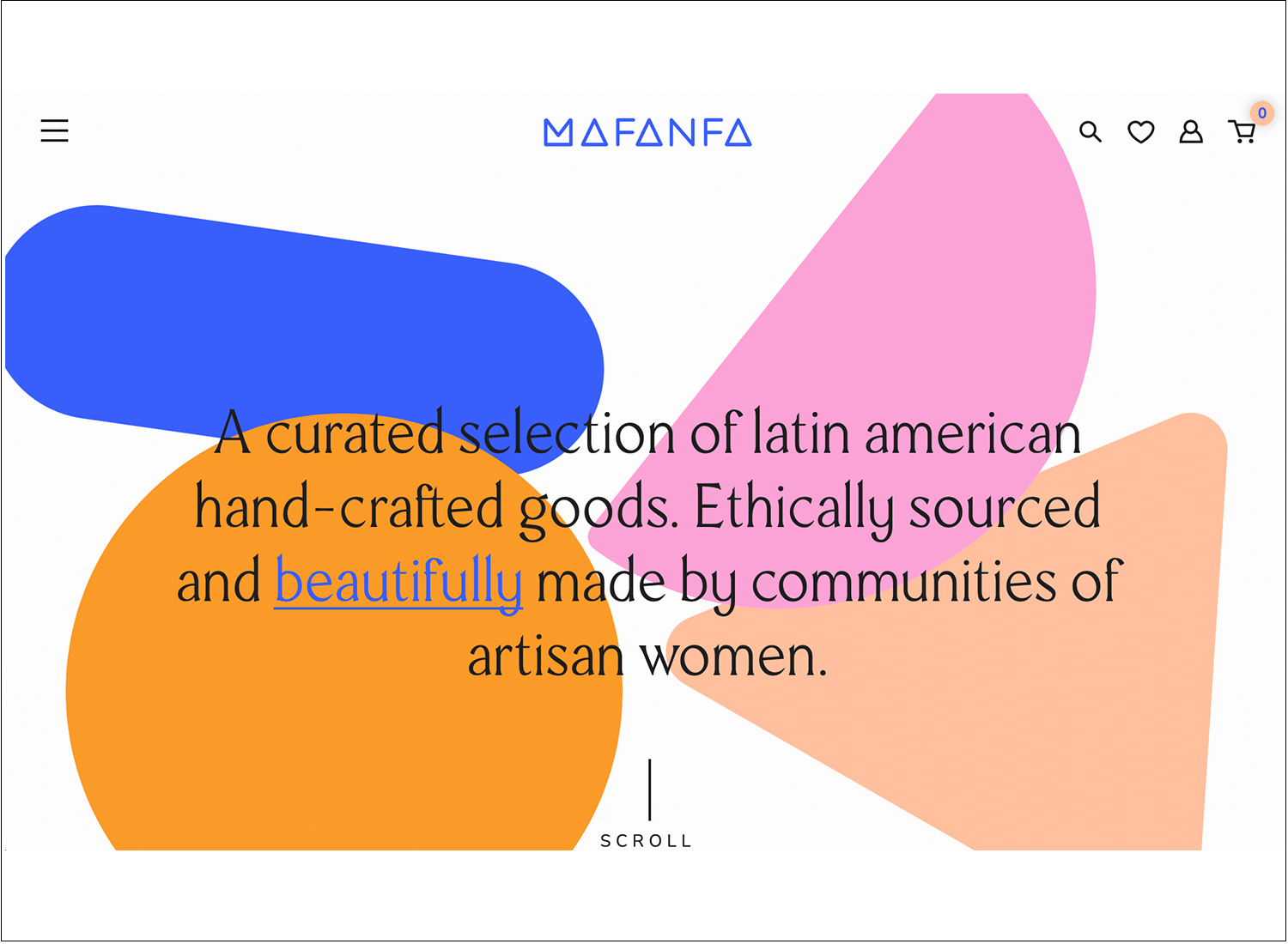
Mafana demonstrates a wonderfully crafted series of pattern layers providing a perfect content background for their opening text. This goes against a pure-white, full-body background. The only UX gripe we have is that when you hover on the left patterns, you’re greeted with CTAs saying “Go Contact” and “Go Lookbook”. The “Go” here would usually be considered redundant in UX Writing, but full points for their background design!
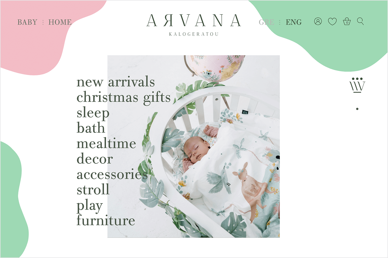
Arvana also goes for the layered juxtaposition of patterns, imagery and text. The navigation components are treated to pastel content background layers, while the main content draws focus to the center of the page, with the text element layered on top of a gradually changing image.
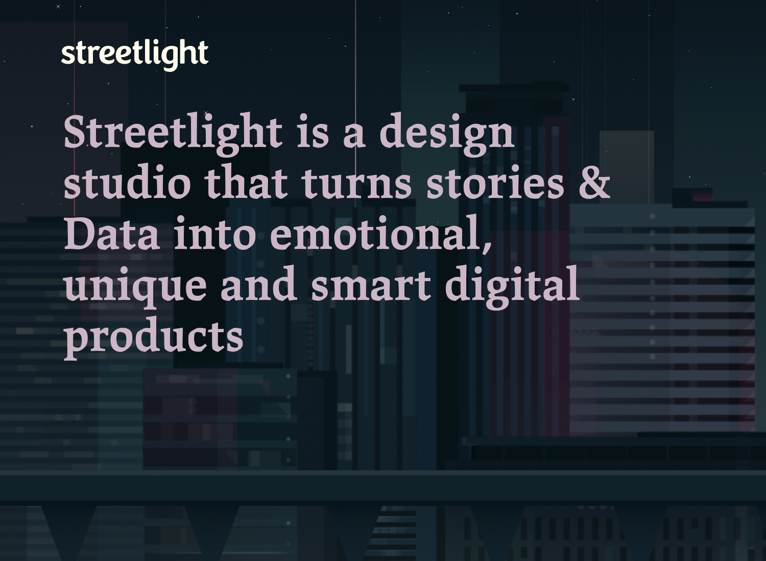
Streetlight can provide a quick crash course into how to create an interesting and unique, graphically animated background that doesn’t detract from the main content on the page. Their graphics depict a dimly lit street with a light that occasionally melts and drips onto the ground – top marks for branding! Meanwhile, it’s their text on the upper left quadrant of the page that stands out.
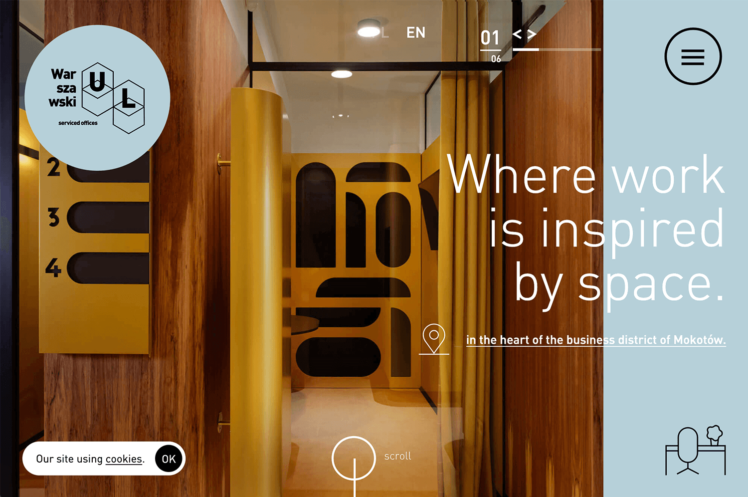
Warszawski UL uses a warm, wood-textured background with modern design elements. The large white text stands out, making it easy to read and keeping the focus on the message. The layout feels professional yet welcoming.
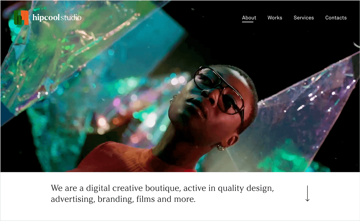
With a vibrant, colorful website background video, Hipcool Studio grabs attention and shows off their creative vibe. The simple white text is easy to read and adds to the site’s modern feel. This website background design effectively combines visual appeal with readability.
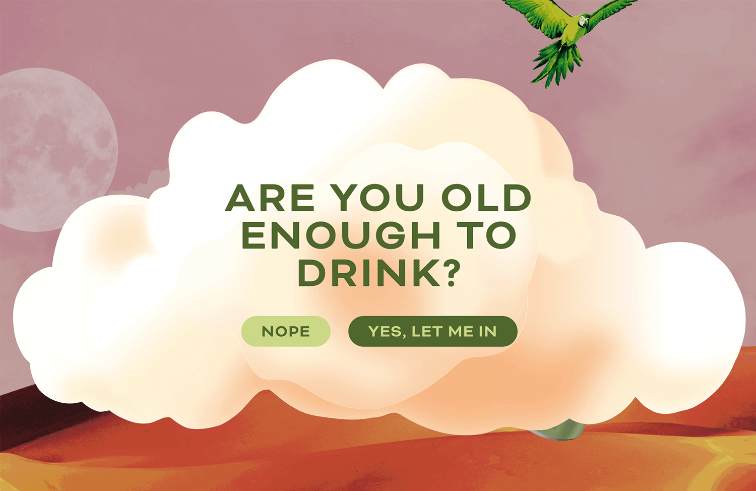
Goldling Drinks opts for a fun and colorful approach with a cloud-based background. The design is eye-catching and welcoming, with clear text that complements the cheerful tone.
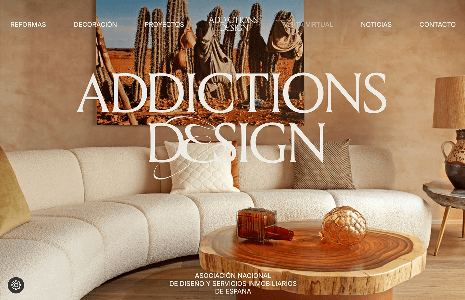
Addictions Design wraps visitors in a warm, earthy embrace through their website background. The large, elegant text stands out, perfectly aligning with their home decor focus.
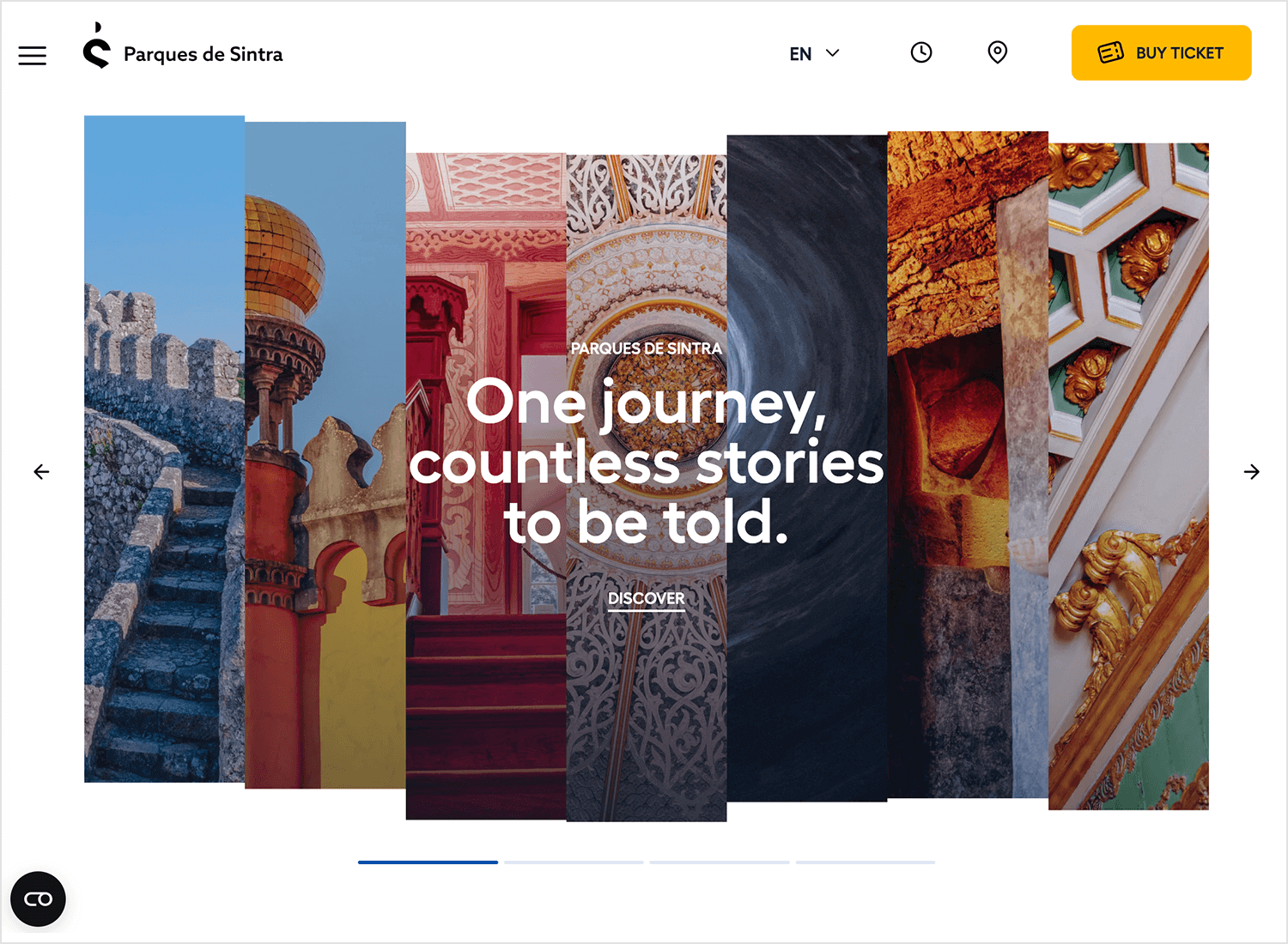
Parques de Sintra features a beautiful collage of landmarks. The bright photos draw you in, while the clear white text stands out against the colorful background, making it easy to read and explore.
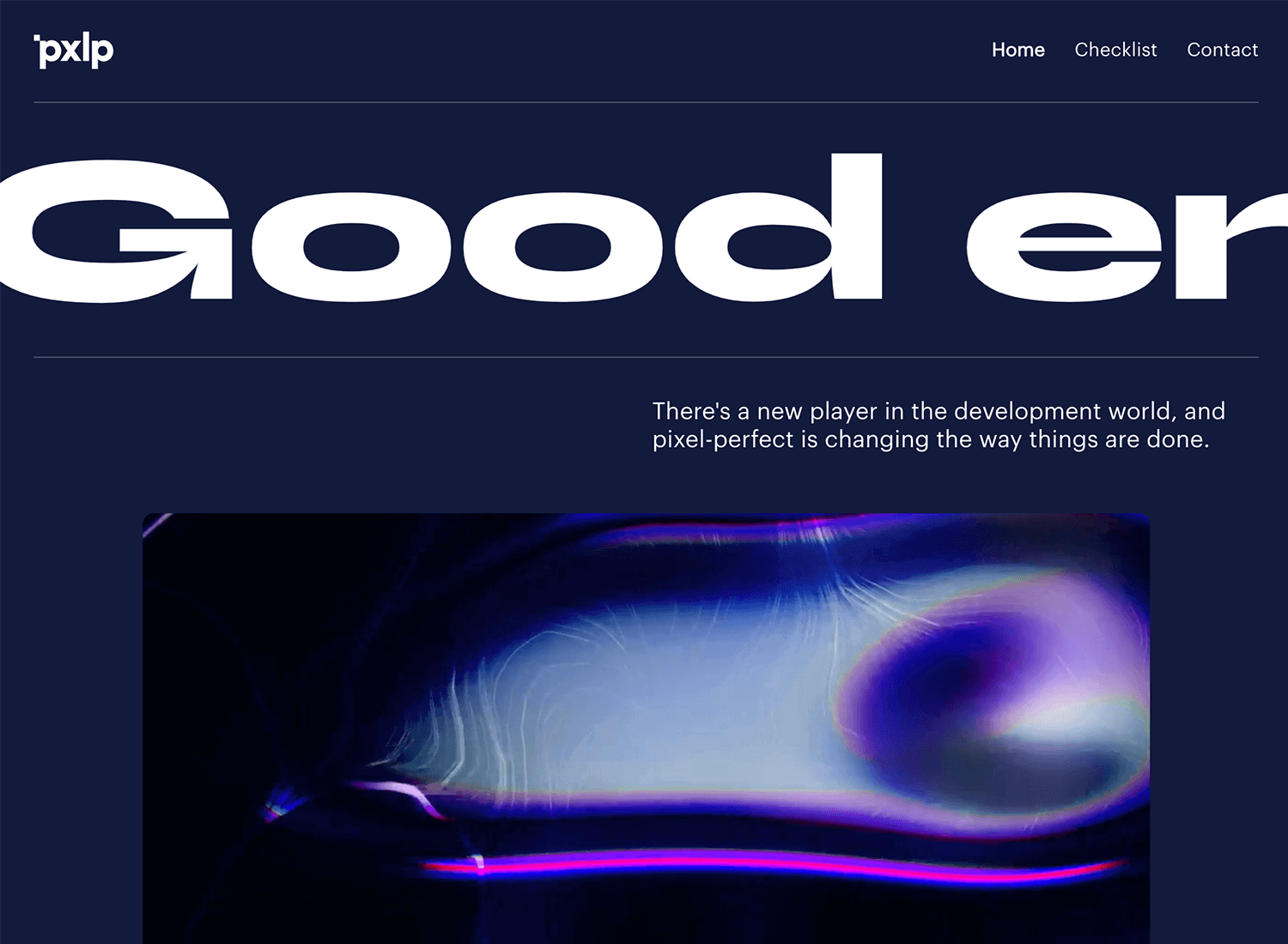
The website background of our next example uses a dark, modern style with large, bold text that grabs your attention. The contrast between the dark background and white text makes it easy to read and very striking. This design gives pxlp.dev a sleek, professional look.
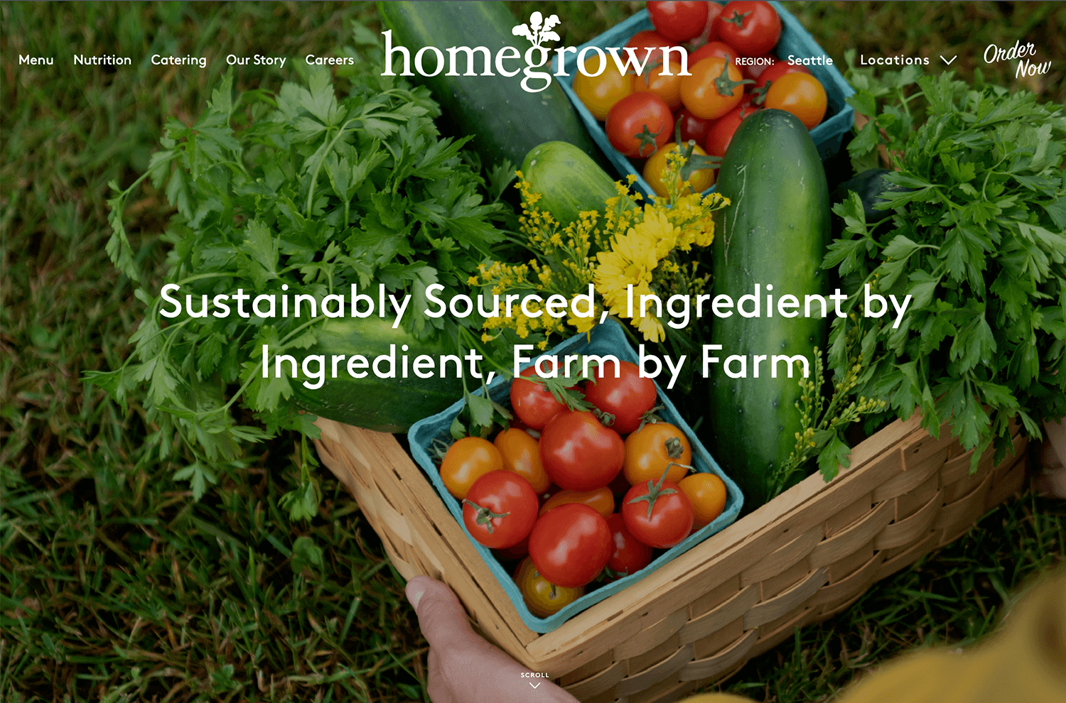
With a fresh, colorful background of vegetables, Homegrown shows its focus on sustainable sourcing. The white text is clear and easy to read against the vibrant backdrop, making the site engaging.
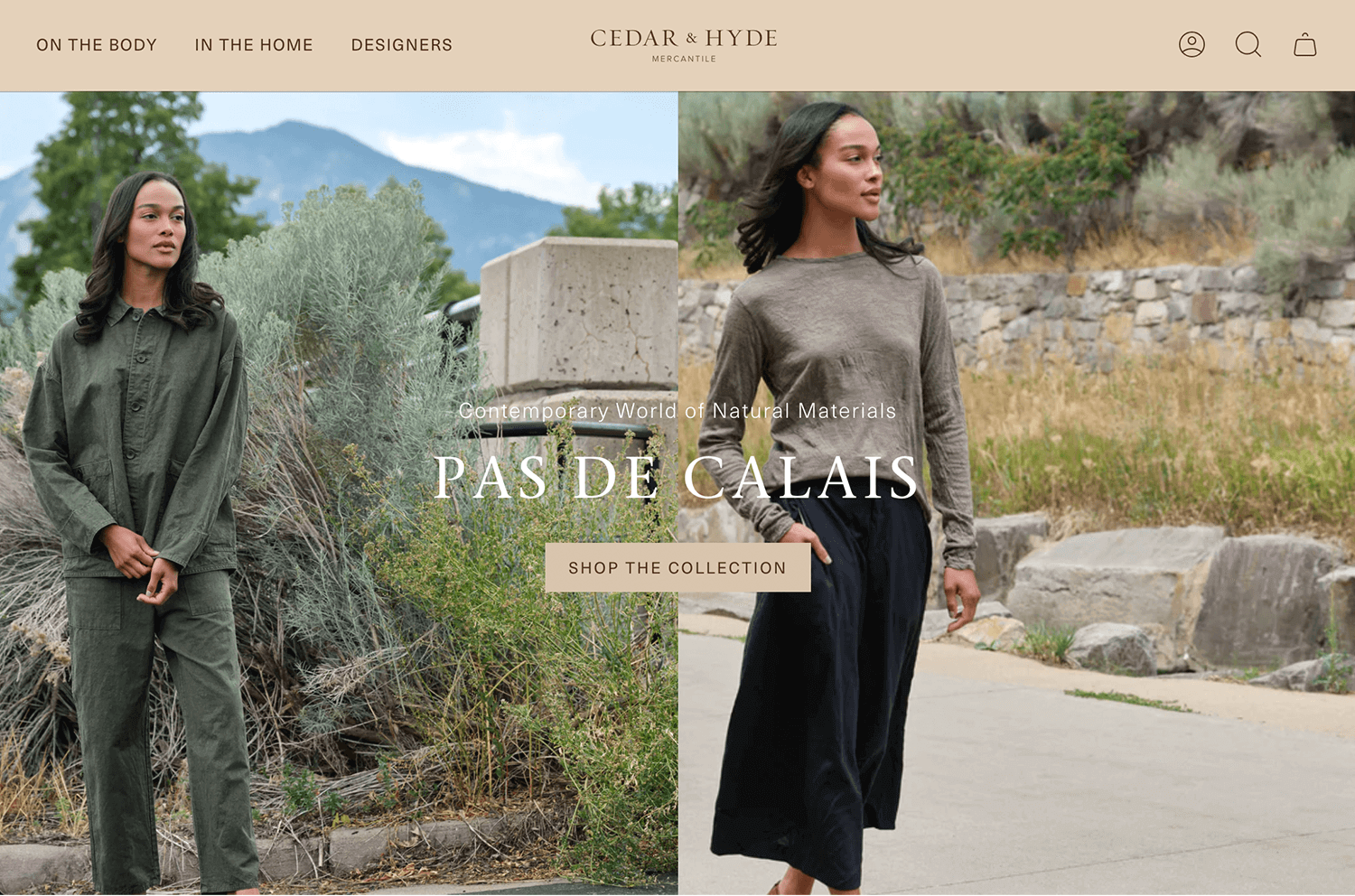
In this example, the website background design uses a natural background with earthy tones that match their fashion and home decor focus. Cedar & Hyde and its clear and elegant text stands out, making the message easy to read. The overall design feels calm and sophisticated.
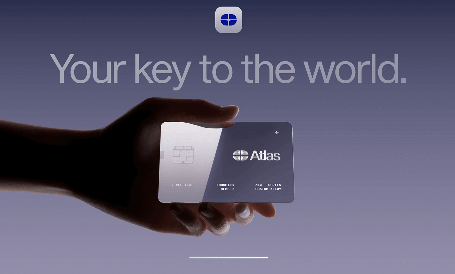
Atlas Card takes a sleek and modern approach with its website background. The minimalist design features a gradient background that smoothly transitions from dark to light, highlighting the futuristic card image. The focus remains on the card, with minimal text to ensure clarity and impact.
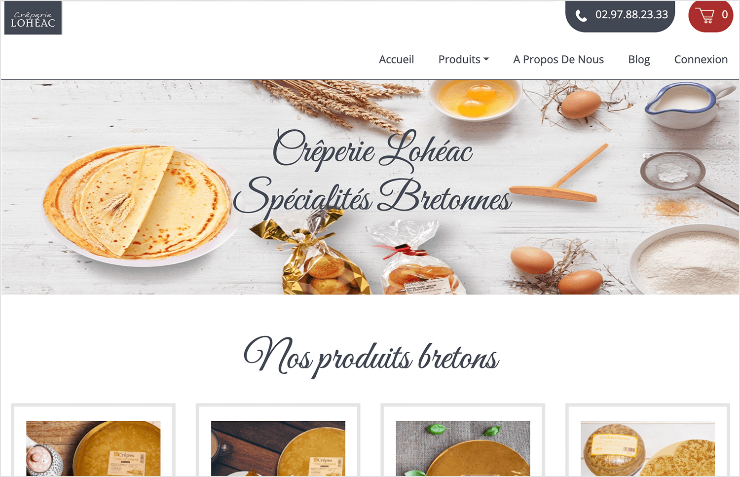
Moving from the sleek design of Atlas Card to something more homey, Crêperie Lohéac’s website has a cozy background with pictures of ingredients and a delicious crepe. The bright, inviting images make you feel right at home. The elegant text is easy to read and fits perfectly with the warm, artisanal vibe.
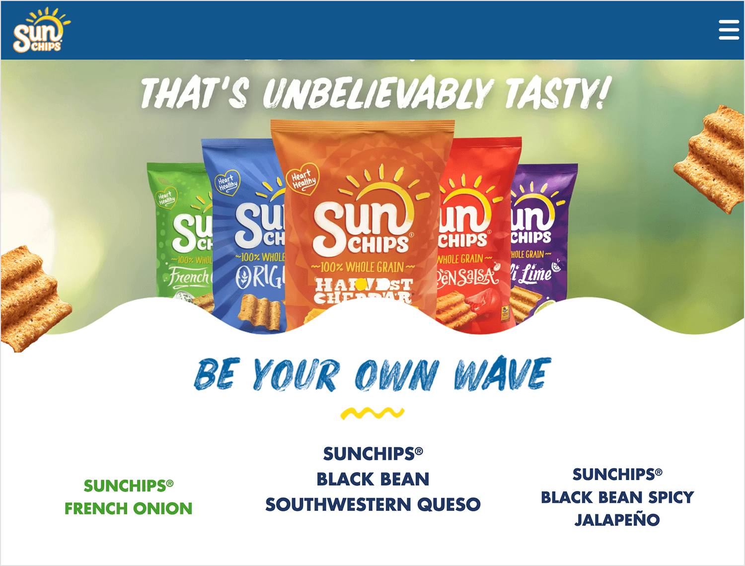
Next up, SunChips’ website uses a vibrant and fun background featuring their product and fresh ingredients like limes and chili peppers. The colorful images catch your eye and make the site lively and exciting. The playful text is easy to read and adds to the fun, energetic feel of the brand.
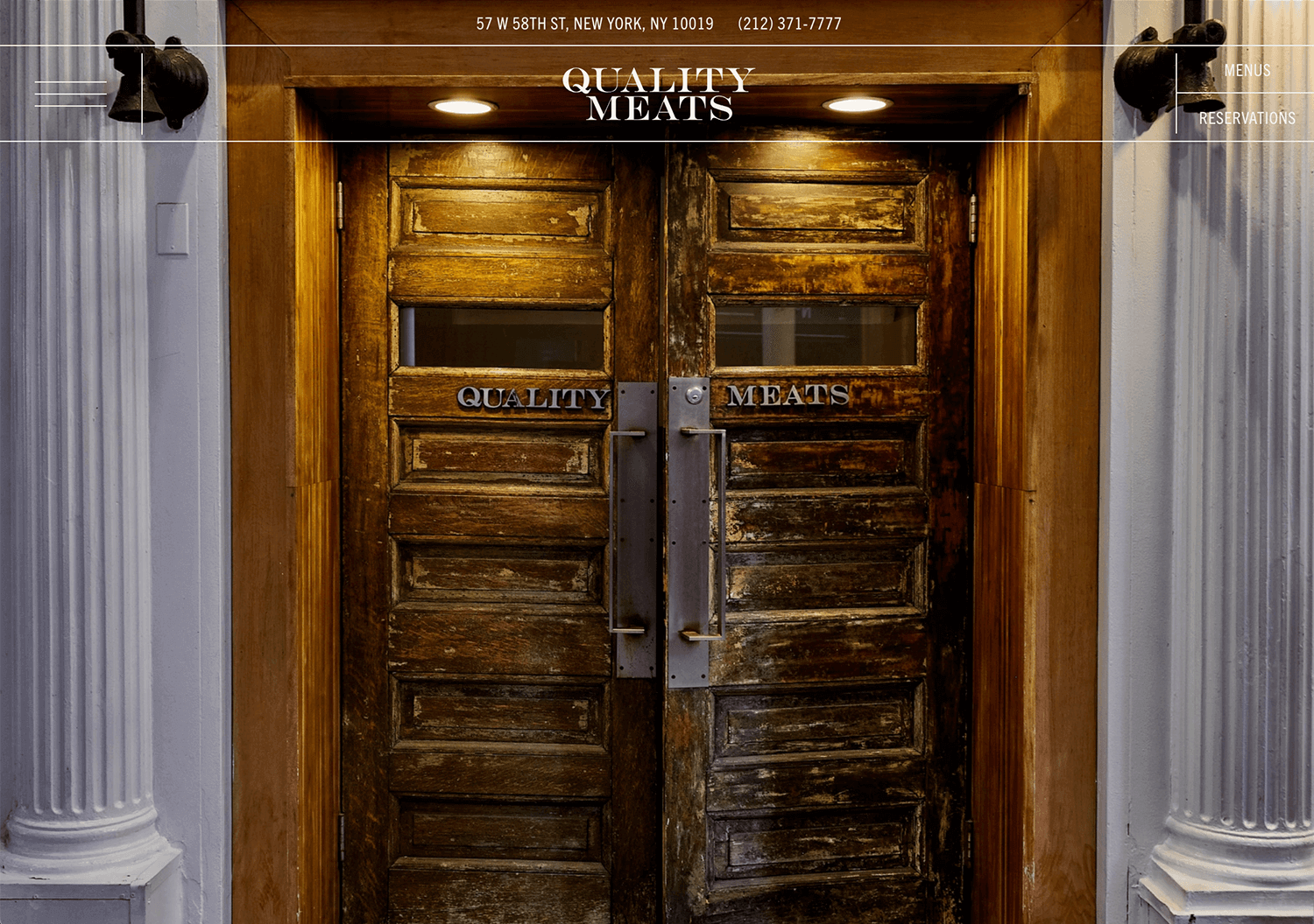
Quality Meats opts for a rustic charm with an inviting old wooden door as their website’s focal point. The warm, textured image creates a cozy atmosphere, and the simple, elegant text improves the overall impression of quality and tradition.
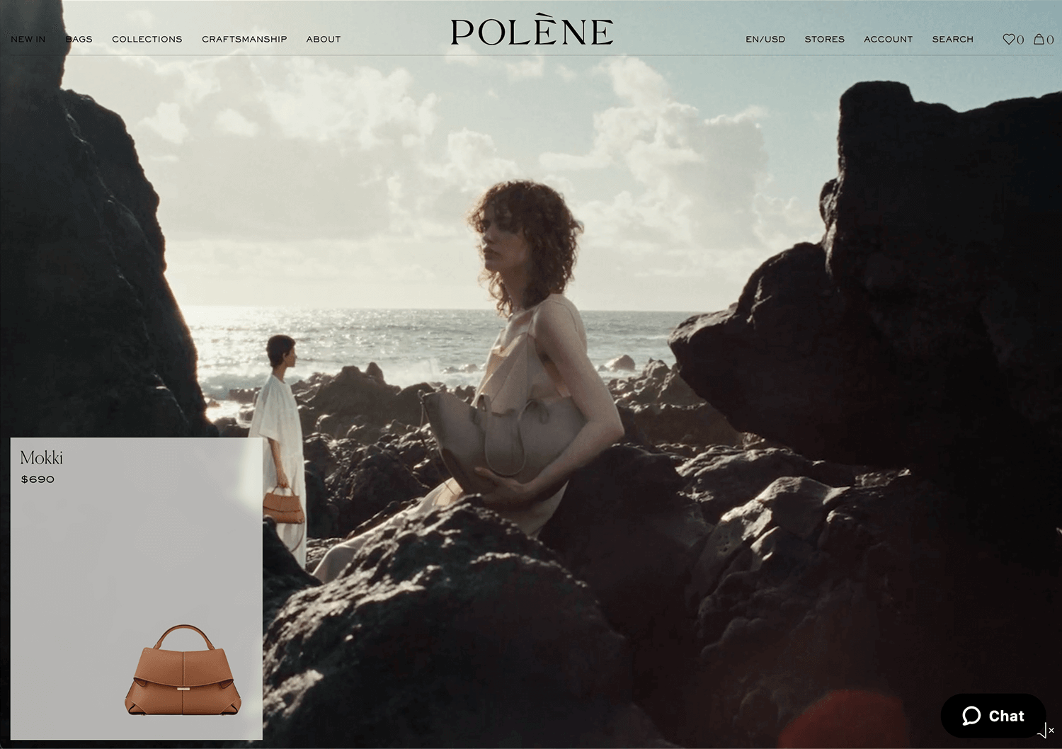
Polène’s website greets you with a striking rocky landscape background. This stylish scene really makes their luxurious handbags pop. The simple text fits right in, keeping the focus on the products while adding a touch of elegance.
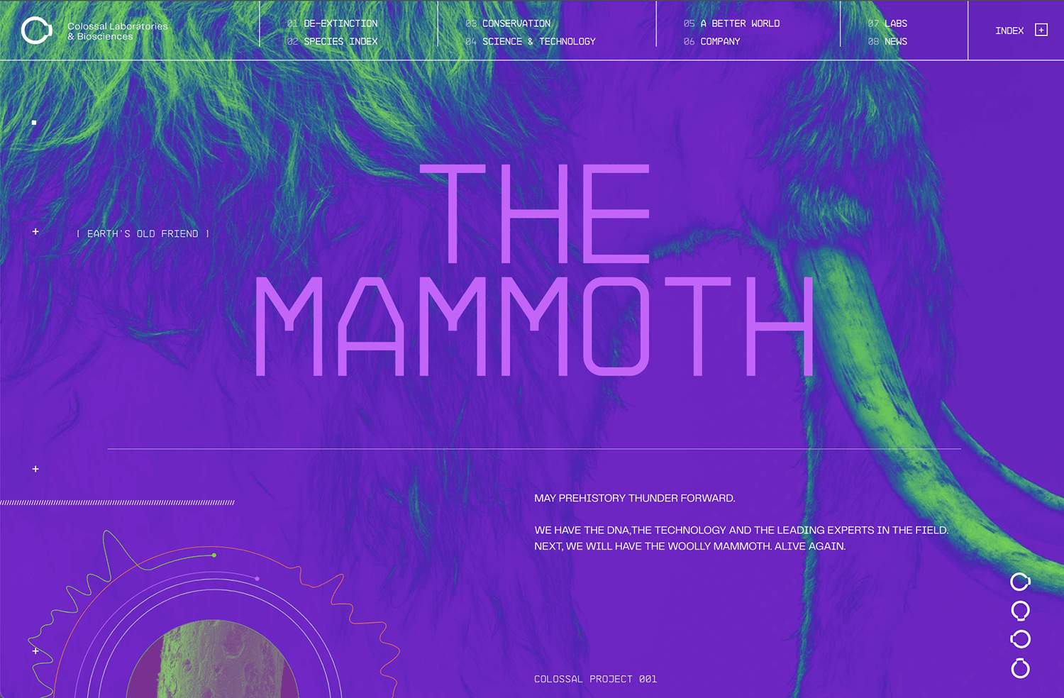
Colossal’s website for “The Mammoth” project has a bold and colorful background that grabs your attention quickly with vibrant purples and greens. The large, clean text is easy to read and fits perfectly with the high-tech vibe. This dynamic design pulls you into the exciting world of de-extinction right away.
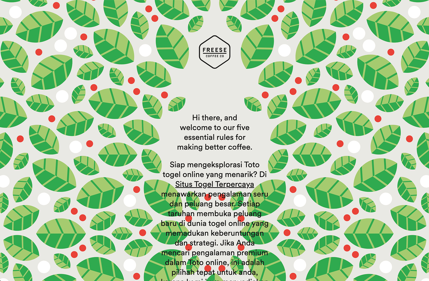
Let’s wrap up with a fun background website design from Freese Coffee.
They kick things off with a vibrant splash making their homepage a lively mix of green leaves and red berries that instantly catches your eye. The clean, central text then smoothly steers you towards their coffee expertise.
Create interactive website prototypes with Justinmind. It's Free. Unlimited projects!

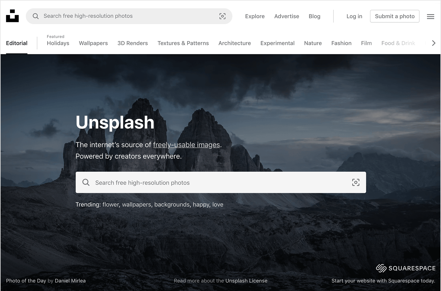
Unsplash is widely popular among web designers looking for high-quality images for website backgrounds. People seem to love that the images are free, under the Unsplash license, but still deliver the quality you’d want for your website. The images are free to use for any purpose, and crediting the platform of the photographer isn’t necessary.
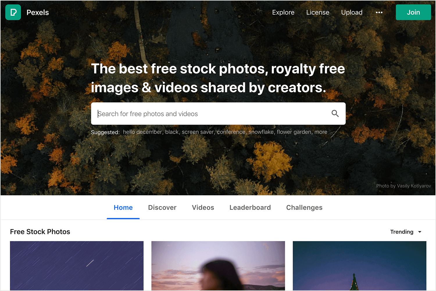
Like Unsplash, images in Pexels are under the Pexels license. This makes them free to use for any commercial or personal project, so long as you don’t try to sell the images as if they were your own. Fair enough.
Another platform that has so many images in their bank, you’re likely to find the right one for your website background. Pixabay’s images are also under their own license, and available for any end you see fit. The conditions are the same as the previous free platforms – you are free to use the images without attribution. You are not free to sell them as your own.
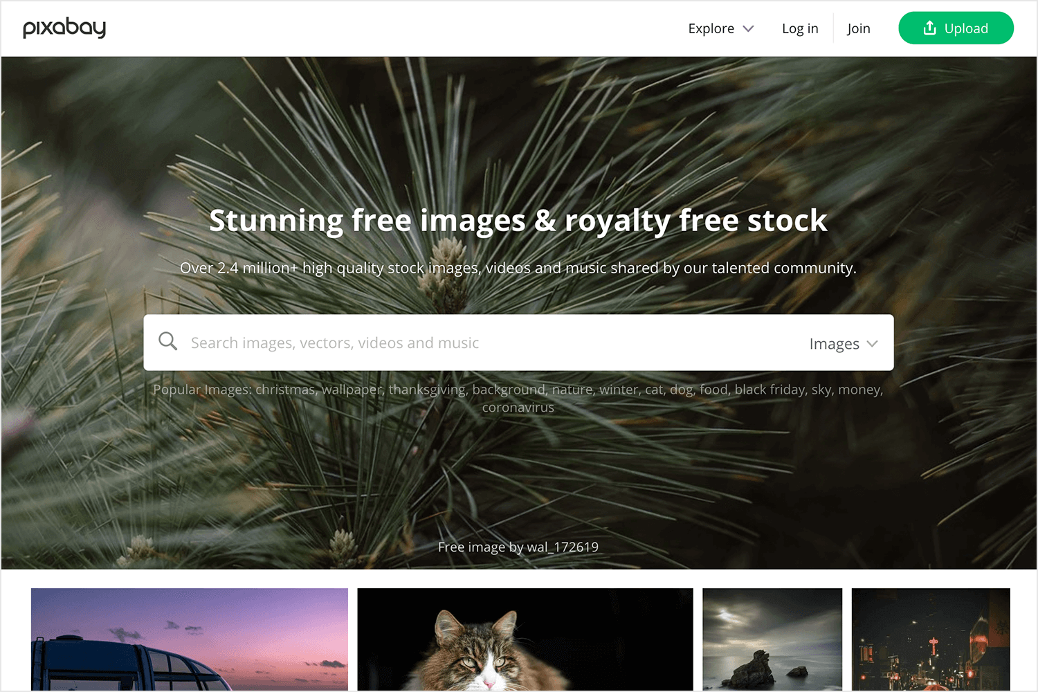
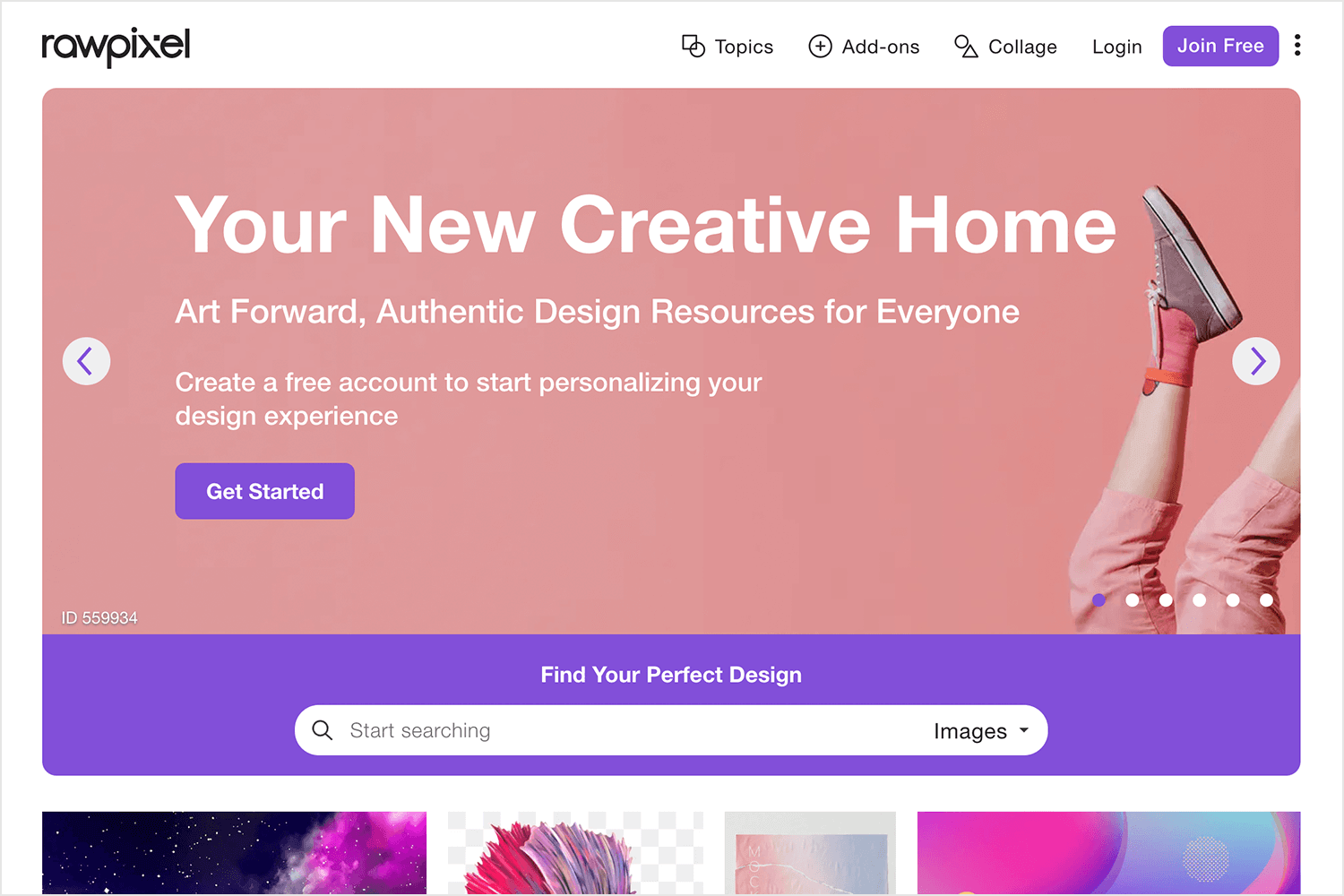
Rawpixel shares most traits with the above image banks, but has one key difference that sets it apart. While most image banks try to keep their images inspirational, Rawpixel managed to deliver images with context. Images that tell a story, that show human interaction. If your project includes something that needs a bit of visual storytelling, this platform is the one for you.
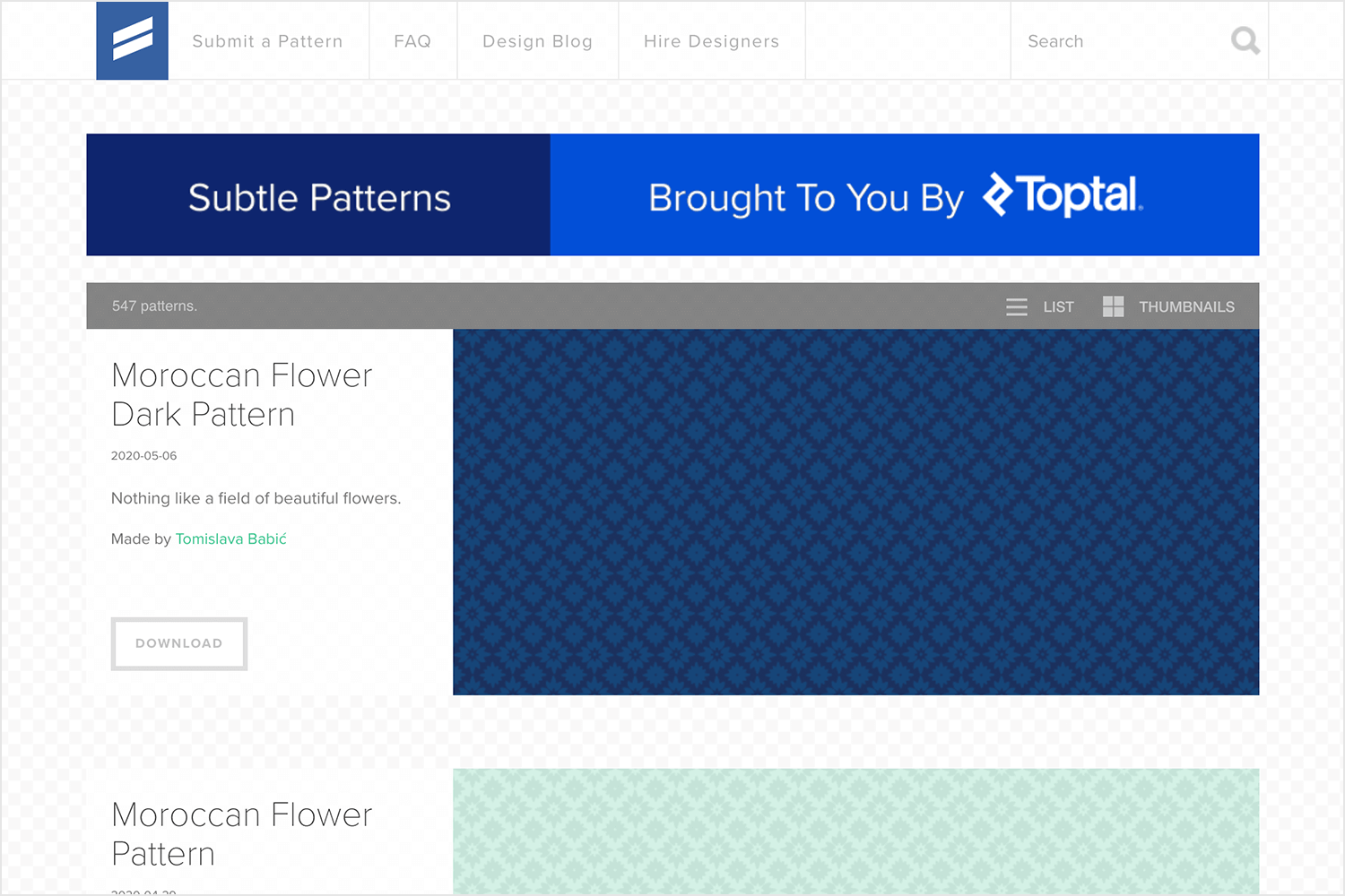
This one isn’t for everybody. Subtle patterns isn’t the platform for inspirational or contextual images. As the name suggests, these images are all about patterns that you can use to convey a certain style and feel to the website. Find everything from tiny bows to snowfall patterns!
The platform is completely free, but it does ask that users attribute the image in the code of the web page. You can find more information on their FAQ page.
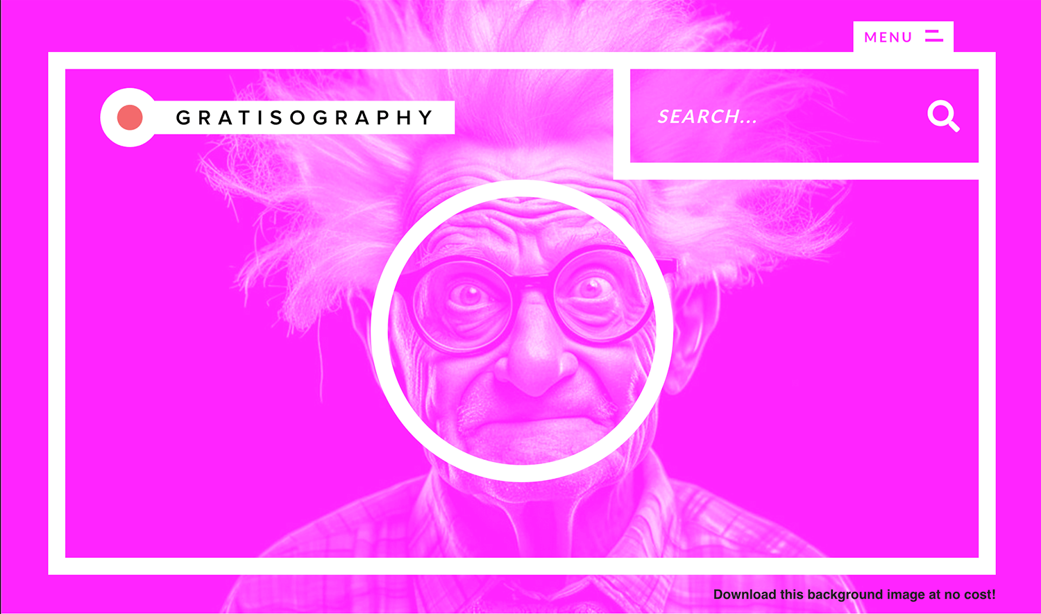
If you want something quirky and fun, Gratisography is your go-to. Their free, high-quality images are perfect for adding a unique touch to your website. The photos are all distinct and will help your site stand out.
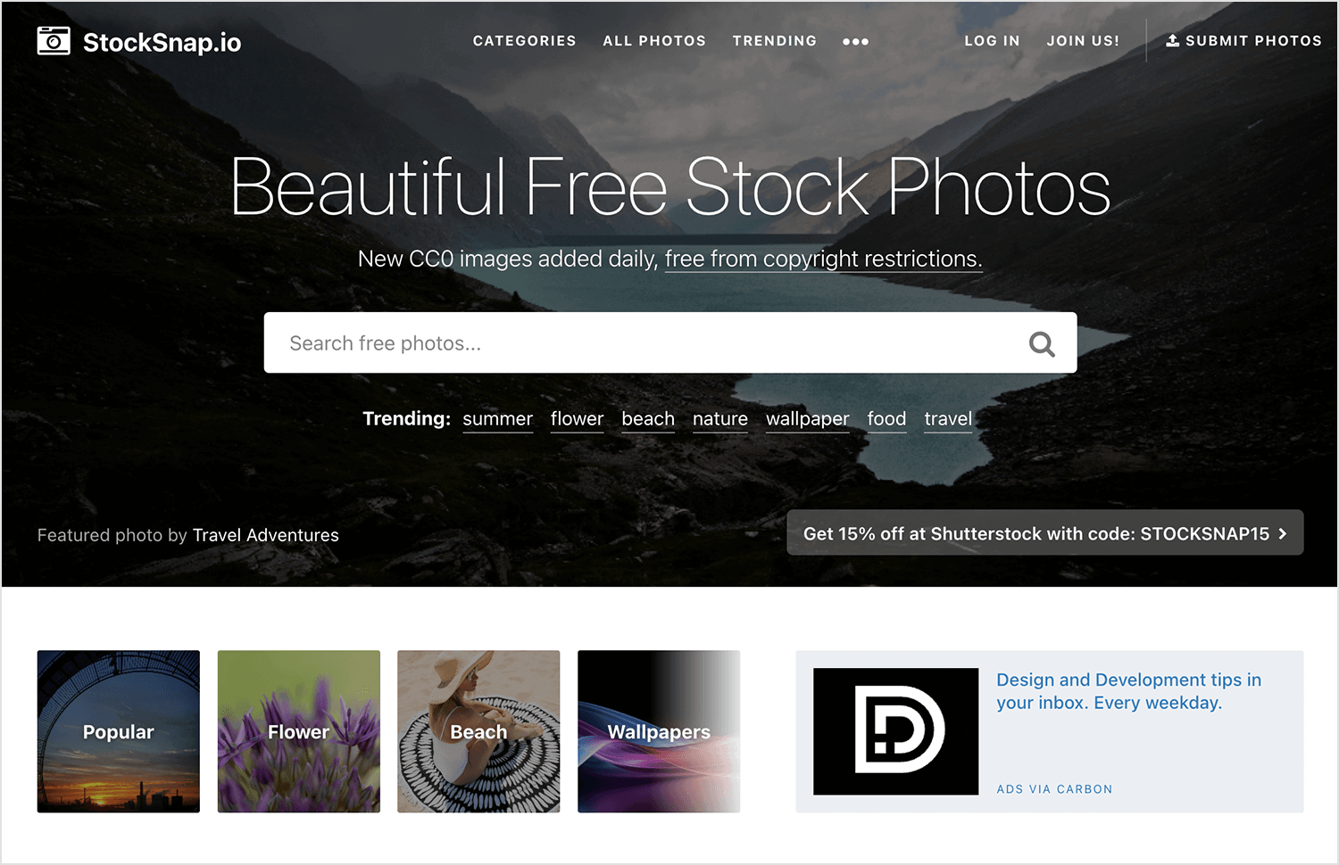
StockSnap offers a huge selection of high-resolution images, all free under the CC0 license. Great for any project, StockSnap’s images are perfect for those who want quality without the cost.
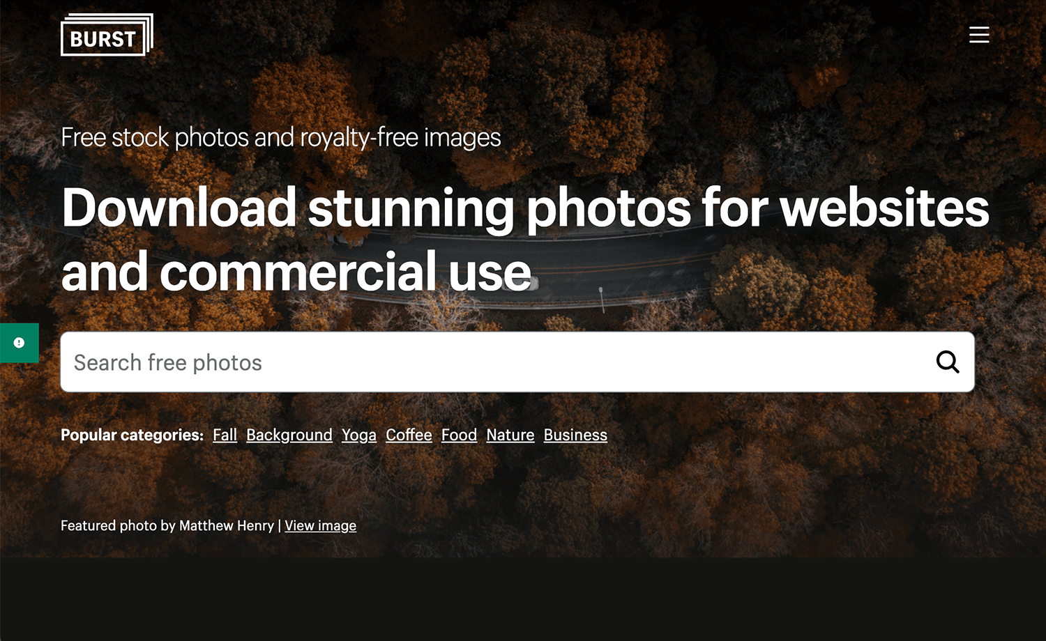
Burst is ideal for entrepreneurs. It provides free stock photos that are perfect for e-commerce websites. The images are professional and great for showcasing products.
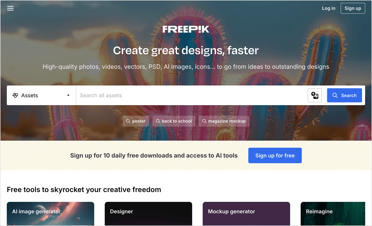
Freepik is a treasure trove of free and premium graphic resources. From patterns to vectors and photos, it’s perfect for both simple and complex projects. You’ll find just what you need to make your site look fantastic.
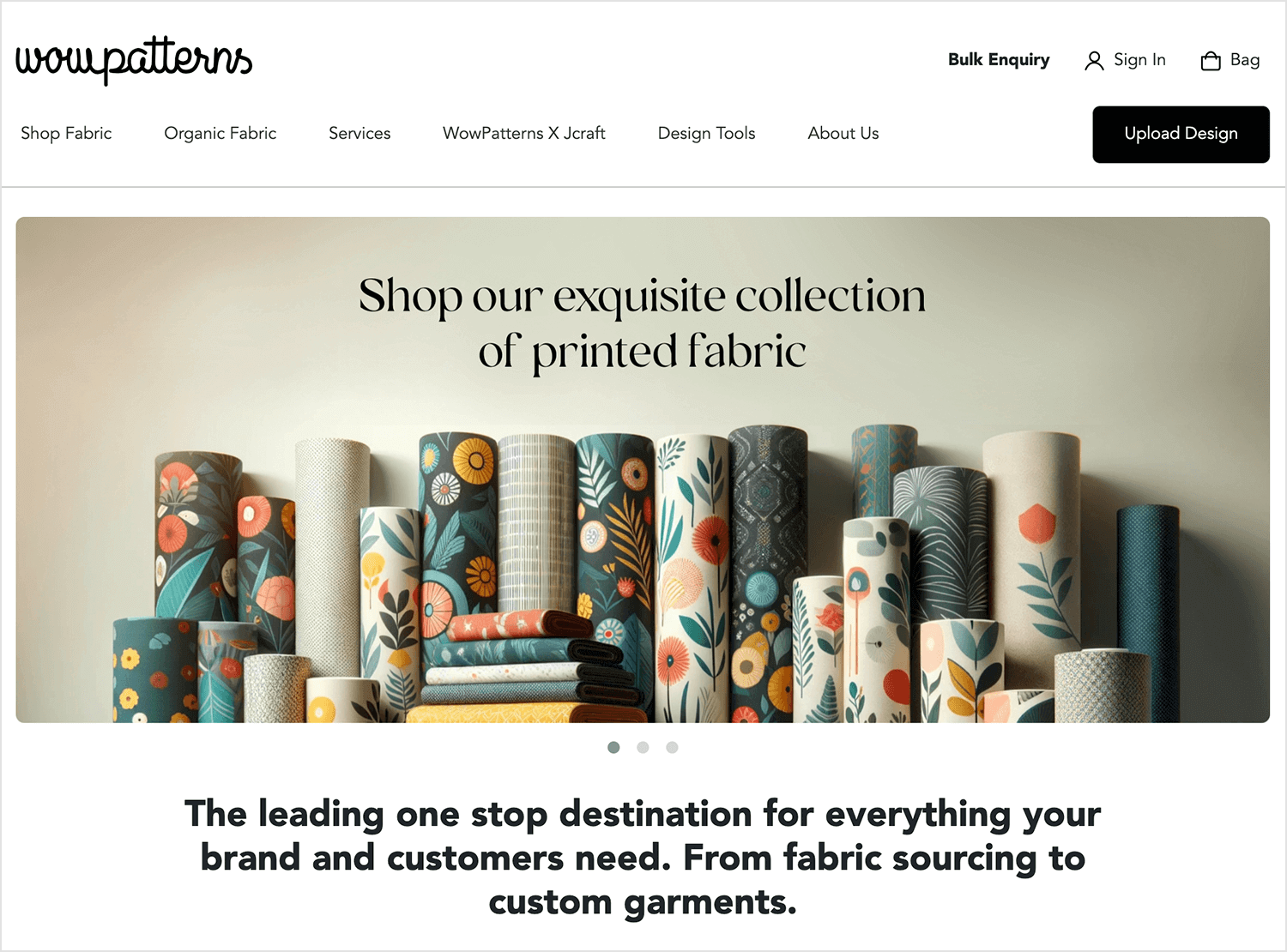
If you’re looking to add some style to your site, Wowpatterns is a great place to start. They offer a wide variety of free patterns that are perfect for personal projects. These designs can really make your website background pop and look more visually appealing.
Yes, the stock image bank we all know and love. Getty images is many designers’ go-to platform for beautiful website backgrounds and we can totally see why. Their images have an incredible range, making Getty images a great place no matter what kind of image you are after.
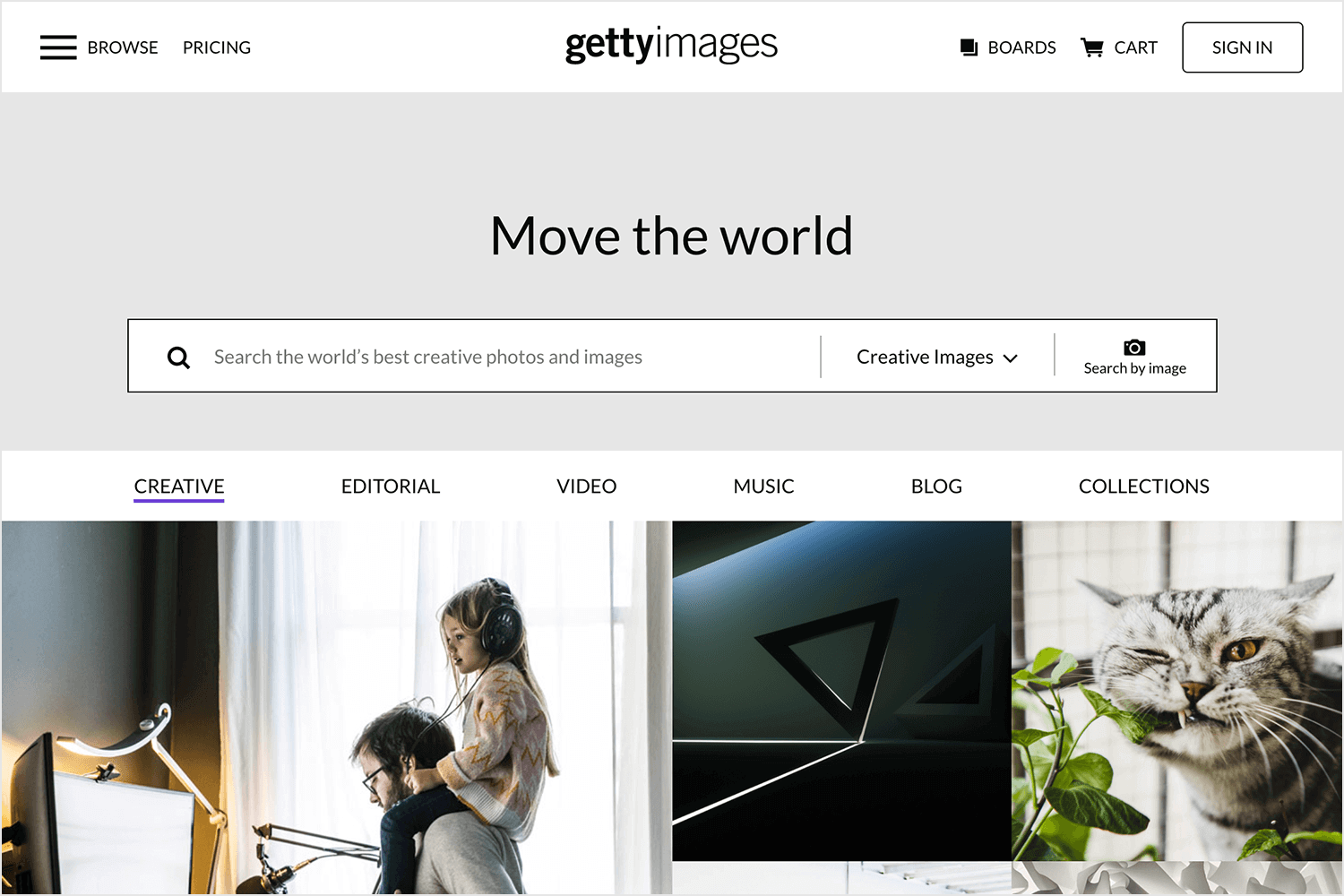
Another great plus is their search system, which helps you find the right kind of image much quicker than other stock image platforms.
The reason we included this platform is that while other bigger banks, like Getty images, have a larger array of images – they can be a bit pricey. If you don’t need that many images but won’t accept anything other than perfect quality for your website backgrounds, Bigstock might be the best option.
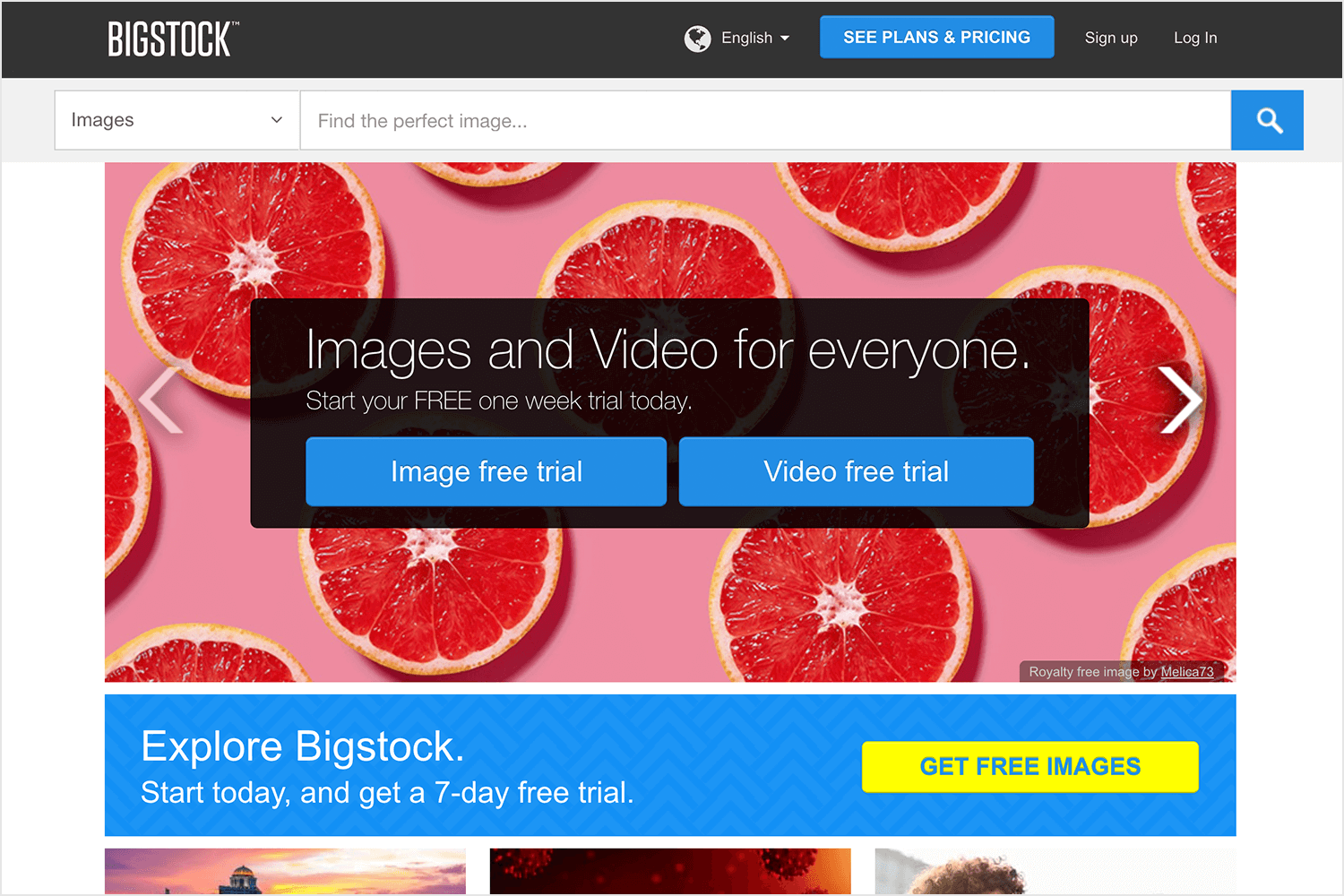
The platform has a very budget-friendly monthly subscription plan, which allows for a lot of flexibility on your end. Perfect for smaller teams or small projects.
A smaller brother to Getty images, iStock is a great image bank for website backgrounds. It offers millions of images that all check the quality box, as well as plenty of illustrations and vector images.
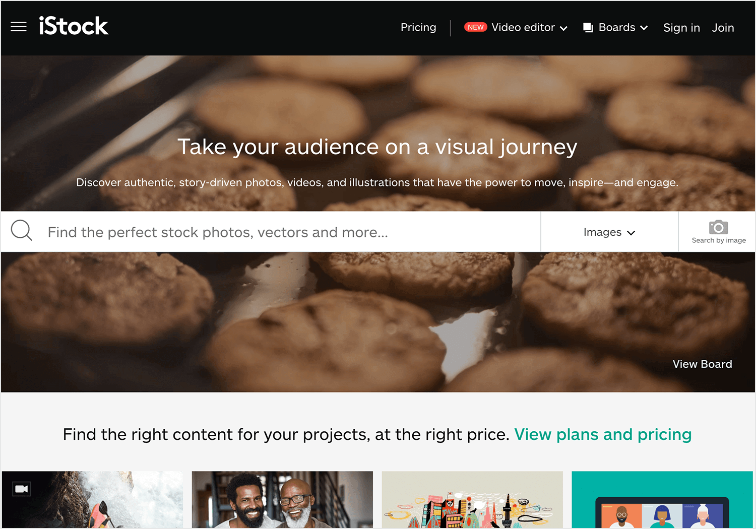
We love that you can use a credit system (you pay for credits that allow you to get images as you need them) or a subscription system for a more steady flow of images (from 10 to 750 images per month, depending on your needs).
Shutterstock is another great platform for those who need a bit of flexibility when it comes to the number of images they’ll take from the bank. The platform gives users the option to subscribe to a certain number of images per month or simply purchase credits that can buy images separately, on demand.
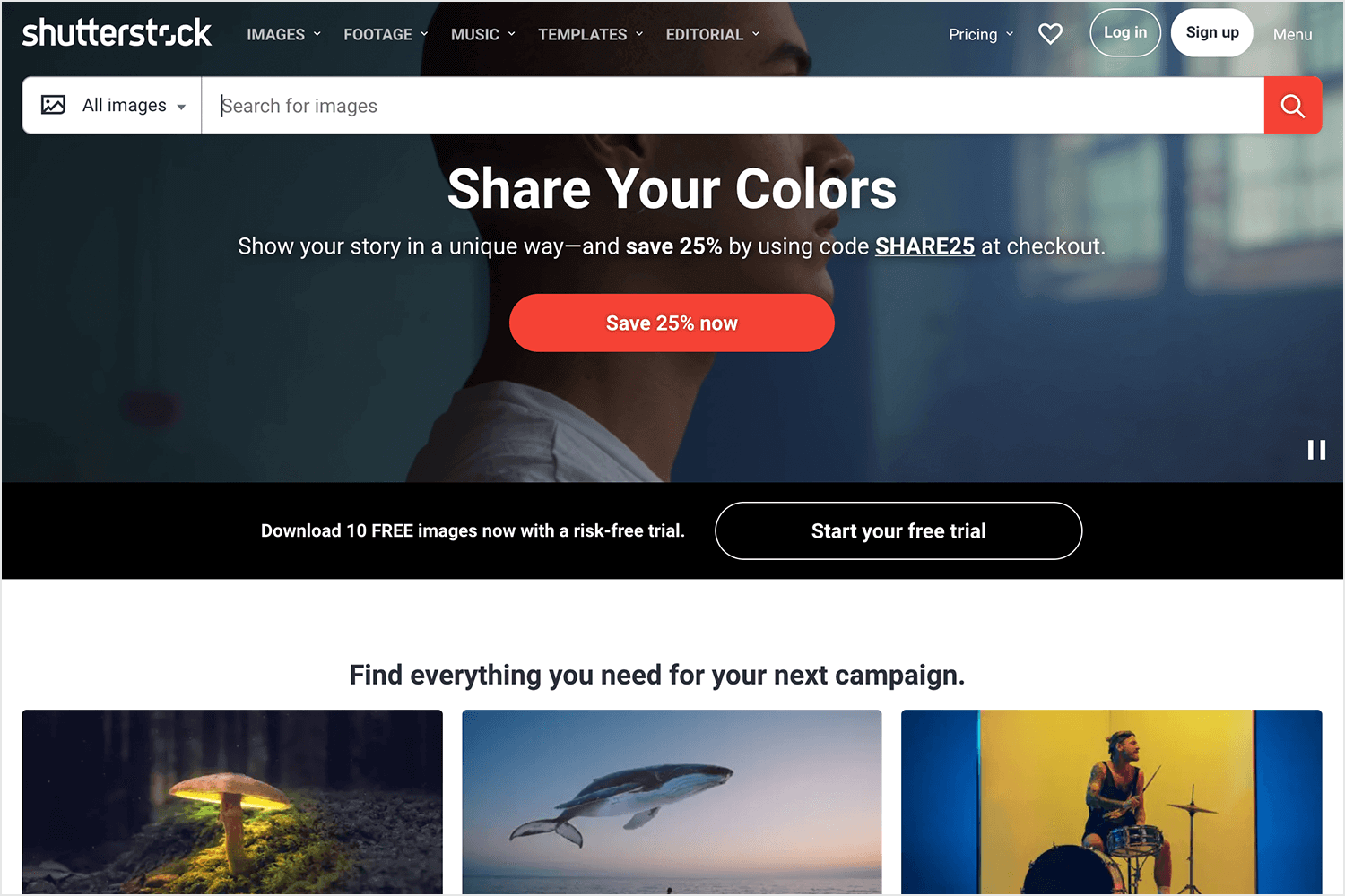
500px is beloved by its users. With a very large collection of top-quality images, this image bank also offers free images. It goes without saying, however, that the paid images surpass the free ones in quantity. Users of this platform are quick to praise the artistic value of the images, which tend to be both beautiful (such as nature shots) and realistic (pictures of social interaction).
GraphicMama offers various design bundles, including vector backgrounds for different themes. While most are paid, they also have some free samples within their bundles. Perfect for those who need specific themed backgrounds with a mix of paid and free options.
Adobe Stock is the go-to for many professionals. With millions of high-quality, royalty-free images, graphics, and videos, it’s perfect for any project. Their extensive collection makes finding the right image a breeze.
For creatives who need a constant flow of resources, Envato Elements is ideal. With unlimited downloads of stock photos, graphics, and more through a subscription, you’ll always have what you need.
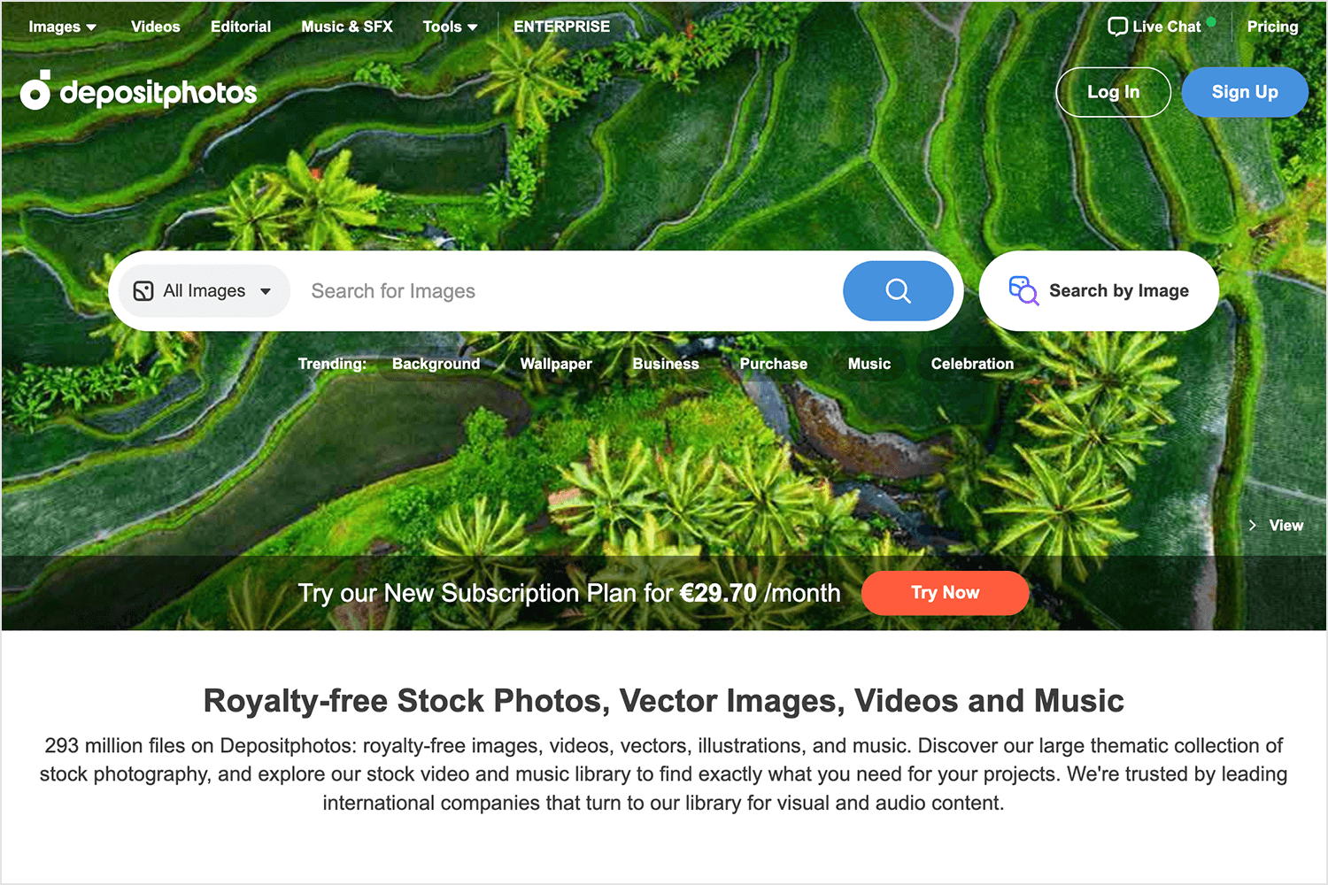
Depositphotos is a great choice if you need high-quality visuals without breaking the bank. They offer a flexible subscription model and a huge library of images, vectors, and videos. Perfect for getting the best visuals at a reasonable price.
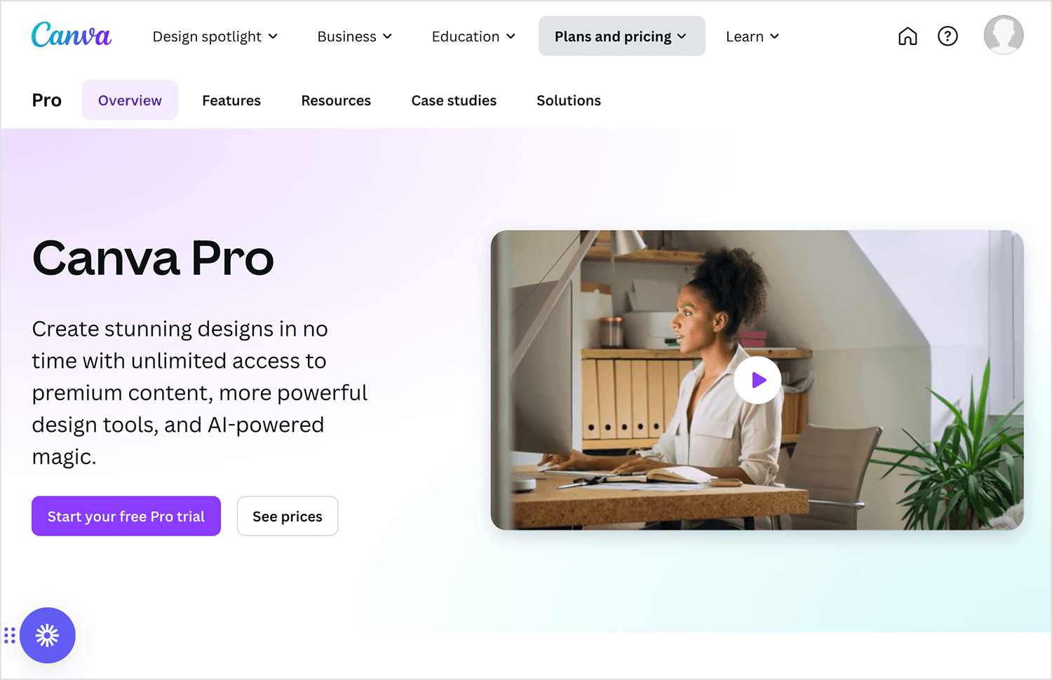
Canva Pro is one of these great tools for creating beautiful website backgrounds. It offers millions of premium photos, elements, and templates. Perfect for any creative project, it has everything you need to design something stunning.
Stunning photographs and stylish graphics can complement your website, but only if used correctly. Your website background has a huge influence on how your users will experience the entire product, so it’s definitely worth taking extra care.
It’s time to make the most of your website background, and get working on rendering those beautiful visuals!
Create interactive website prototypes with Justinmind. It's Free. Unlimited projects!

Related Content
 A fun look at different data table designs, from basic lists to smart, interactive ones, based on how complex the data is and what users need.18 min Read
 Single page design v multi-page design – everything you need to help you choose the right design for your site’s content18 min Read
 Redesigning a website? Learn how to do it right, from planning and prototyping to testing and launching, so your site looks great and works even better.18 min Read
