Wireframes vs. Prototypes vs. Mockups: what's the difference? Dispelling myths and misinformation in the web and mobile design process.
Design terminology can be confusing, but that’s no excuse for design teams to miss out on vital steps along the way. Wireframes vs. prototypes: what’s the difference?
Free wireframing and prototyping tool for web and mobile apps
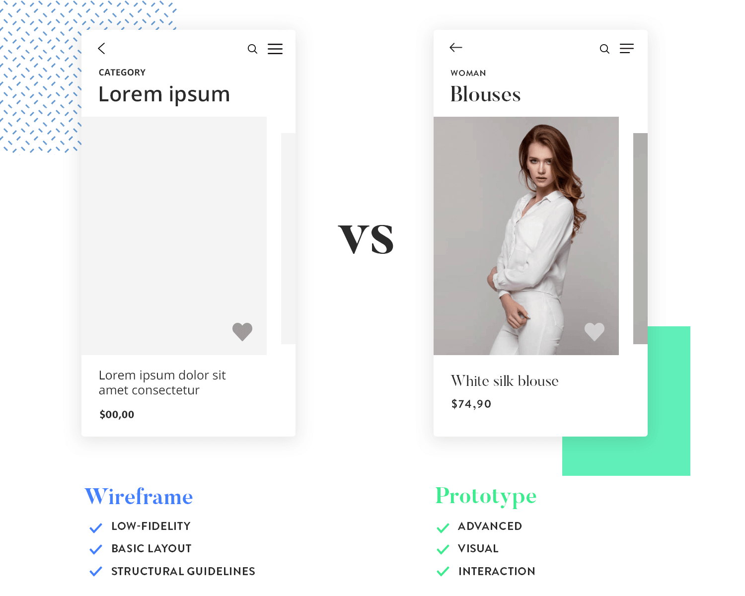
To break it down, website wireframes are low-fidelity, basic layout and structural guidelines of your web product’s layout and prototypes are an advanced wireframe with more visual detail and interaction.
Still not sure? Read on for more on wireframes and prototypes, and how to fit each into your web or mobile design process.
A wireframe is a static, low-fidelity representation of your product, and in the world of web and mobile design, a basic guideline of your website or app – the skeletal framework – for both designers and developers to follow.
However, depending on who you talk to, i.e. designers vs. developers, you’re bound to get a different answer as to what a wireframe is.
For instance, developers tend to use wireframes to better understand the core functionality of a website or app, whereas designers may use them to show the navigation flow between site screens.
“With wireframes, you dedicate time solely to answering crucial layout, structure, and organization questions before the team iterates on visual details.”
Jerry Cao - Creative Bloq
The art of wireframing is not in the details. Rather, wireframes serve as the foundation of your website or app’s visual design, and it is at this stage that you will arrange elements on the page or screen and map out the priority of content.
The wireframe’s visual characteristics are typically limited to a grayscale color scheme, lines and boxes that aim to represent the positioning and levels of visual hierarchy in the design. It does not typically include animation that allows users to interact with the design. A more intricate visual design implies going from a wireframe to a mockup. You can check out what the difference between the two is on our guide wireframes vs mockups.
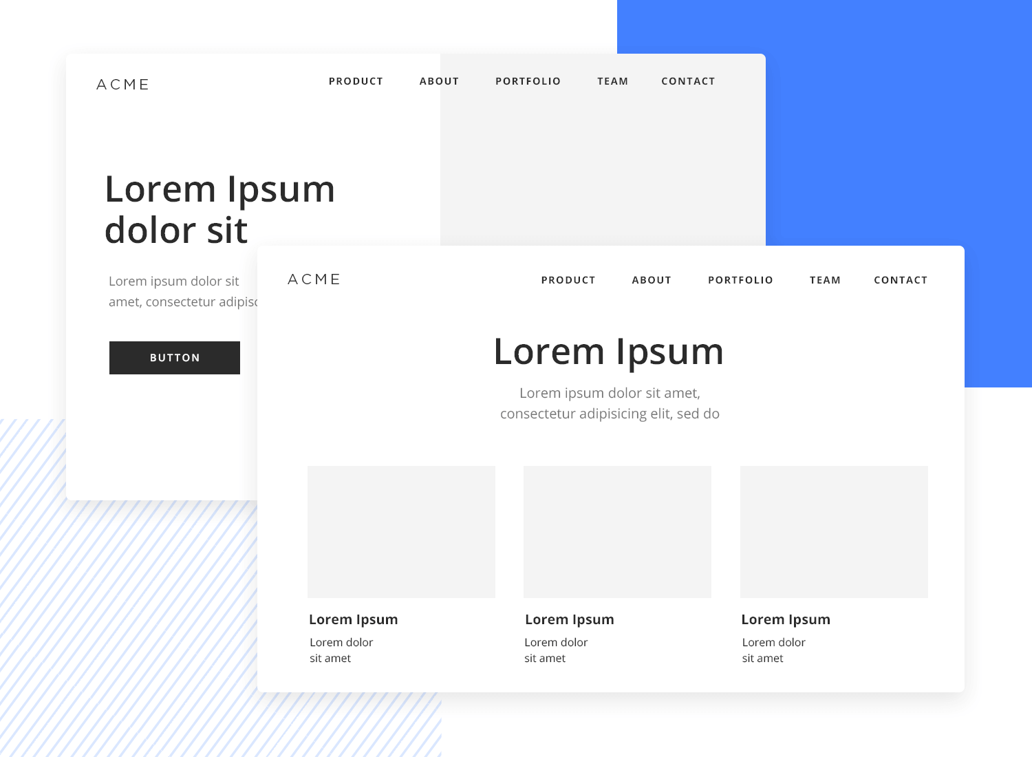
Wireframes are fast, cheap and easy to create, and quick to be approved. You can therefore, properly plan the basics before moving forward, avoiding rework.
Starting off with paper wireframes, your initial sketches will be low fidelity, low cost, and low energy.
When you build up to digital wireframes, using a wireframe tool such as Justinmind, Wireframe.cc and MockFlow, your designs will remain low cost but with the added benefit of building up fidelity, if only slightly, so that you can visualize the core structure on screen.
By maintaining a simple structure, with only the main features and core visual guidelines in place, wireframes allow you to focus on the big picture.
Creating pixel-perfect designs at the early stages of the design process make no sense. You’re going to be exploring many different iterations before you reach your final design.
Quick tip: Don't waste energy on the nitty gritty ahead of time. Save those thumb muscles!
Wireframes are easy for stakeholders to visualize and digest from early on without getting bogged down in the details. Stakeholders are going to want a clear picture of the final product in mind before they give the OK to the engineers.
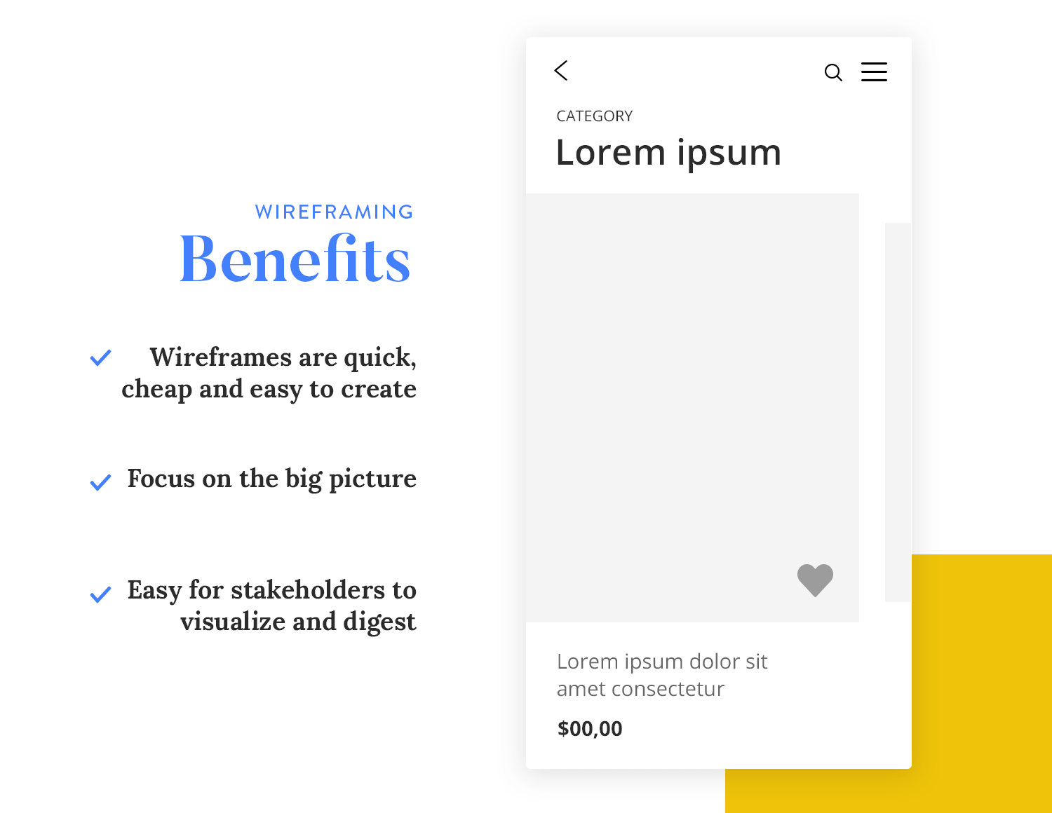
But whilst you’re working on defining the visual layout and functionality, without including genuine content at this point, online UI wireframes can be a great way to keep them in the loop.
Free wireframing and prototyping tool for web and mobile apps

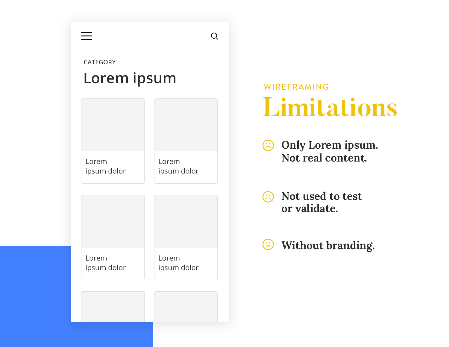
One of the major disadvantages of wireframes is that they don’t contain real content, without which it is very difficult to establish a final layout for the screen. Here are a few things to take into consideration in relation to this. That’s especially true for low-fidelity wireframes.
“Wireframes create a false sense of security about the completeness of the work”
Christina Wodtke - Eleganthack
One of the great things about wireframing is that you can visualize your product without spending too much time on the details.
It’s for this reason that many wireframes include placeholder text, such as lorem ipsum. Lorem ipsum allows the reader to get a feel for how text will appear on a screen, without being distracted by actually reading the content.
The downside is that when you finally add real content, you may find that you have to rearrange, resize or remove UI elements. Our advice is to use placeholder text only where absolutely necessary because they can create design-content disharmony.
Wireframes are not typically used to test or validate your product design. Why? Because they’re static and have little to no interaction, therefore there is very little that you can achieve with them in terms of assessing functionality, user flow or overall user experience.
The visual representation of branding is essential to any design, helping you to define the brand persona and the visual display, as well as helping to set your product apart.
Brand design refers to the unique identity of your brand, characterized by a logo with your chosen colors and fonts. Unfortunately, the humble wireframe doesn’t serve the purpose of visually representing this.
But that’s not to say that wireframes completely neglect the visuals. It’s just that they only visualize the overall layout and core structure. For example, during the wireframe phase, you will be choosing the space needed between the main groups of components, such as the header and footer, body and sidebar of a webpage.
You can check out a few wireframe examples and see what other designers do to present their work to stakeholders.
But what happens when your client wants to click that button-looking thing or flip between screens? Well then it’s prototyping to the rescue!
A prototype is a mid-to-high-fidelity design model of the final UI of your website or mobile product. As well as offering a more detailed look at the visual attributes of your design, prototypes usually include the first user interaction.
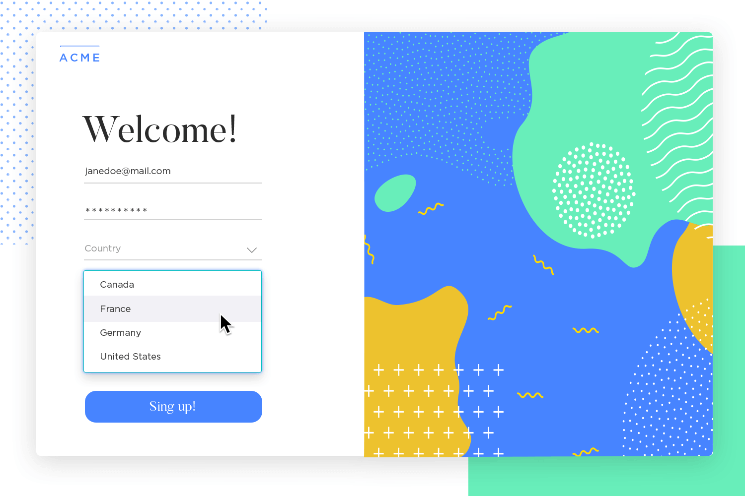
Sure, you can add some, albeit very limited, interaction in clickable wireframes – where you can click elements on the screen – but with prototypes, you can demonstrate and validate the complete functionality of the design by adding events, animations, variables and advanced interactions.
The general idea of a high-fidelity prototype is to represent as close to the final product as possible. Understanding the difference between wireframes and prototypes is crucial here; wireframes are basic structural guides, while prototypes offer interactive and detailed representations.
Test your prototypes with real users, using real devices, and iterate to your heart’s content! User testing is an essential step in the design process and we believe that no coding should be attempted until a potential user group has evaluated the design.
Some prototyping tools are now integrated directly with usability tools and/or user research platforms, allowing you to easily work testing into your design process. Justinmind, for example, is integrated with Validately – along with several other tools.
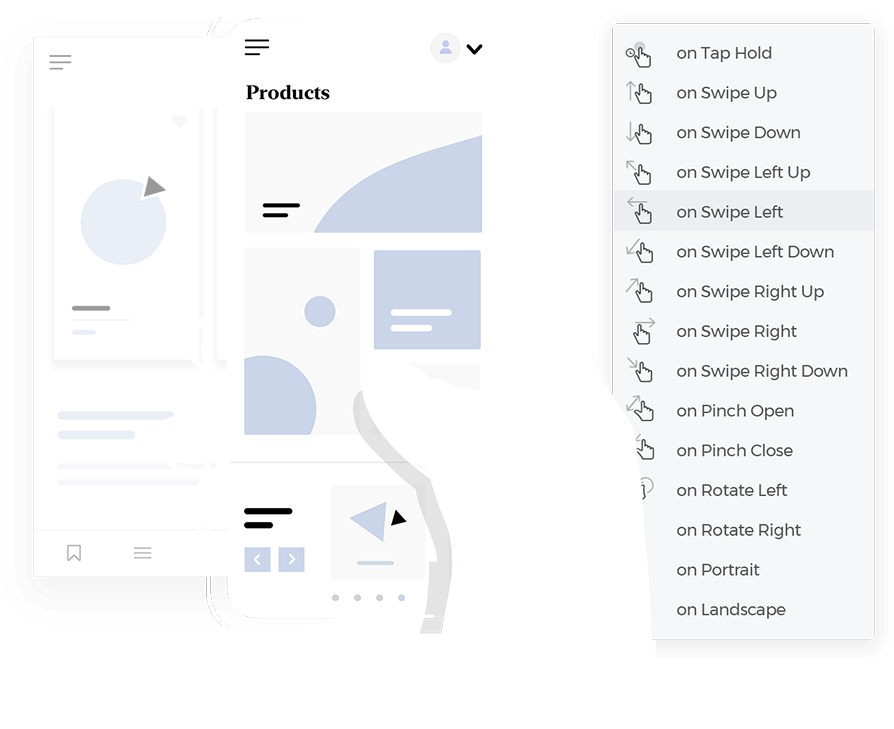
The prototype’s interactive, clickable and workable design gives users a realistic idea of the final product. With advanced UI features and elements in a smart prototyping tool, you can add video, HTML, flash as well as an extensive range of animations, effects, transitions and mobile gestures. The more realistic a prototype, the more accurate the feedback!
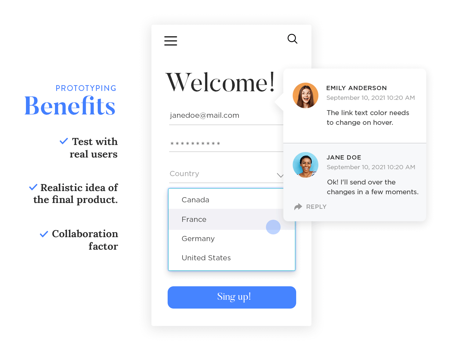
The collaboration factor. Do not underestimate the importance of teamwork in the design process. Whether it’s presenting your designs to colleagues to get everyone on the same page, or getting your team together to work on a feature simultaneously, a prototype that can be shared is invaluable to the workflow.
The difference between wireframes and prototypes is highlighted in this collaboration aspect: wireframes provide a structural outline, whereas prototypes enable detailed interactive feedback.
Free wireframing and prototyping tool for web and mobile apps

Prototypes are typically more time-consuming and costly to produce than wireframes. But this should not discourage you from completing this step. By spending some time on the prototyping phase, you can avoid additional work and misunderstandings down the line. How? By making sure everyone is on the same page about the visual attributes and functionality.
Getting your head around the difference between wireframes and prototypes helps in recognizing that while wireframes are quicker and simpler to produce, prototypes offer a deeper validation of design choices through interactive elements.
A mockup is a static, visual representation of a product, such as a webpage or an application. Unlike wireframes, which focus on structure and flow, mockups include visual design details like colors, typography, images, and styles. They provide a realistic preview of the final design, allowing designers and stakeholders to evaluate the visual appearance and consistency of the product.
Mockups are great because they show exactly how the final product will look, making it easier for stakeholders to understand the design without having to guess from wireframes or prototypes.
With detailed visuals, stakeholders can give specific feedback on things like color schemes, typography, and layout. They help in validating design choices, ensuring everything matches the brand’s visual identity.
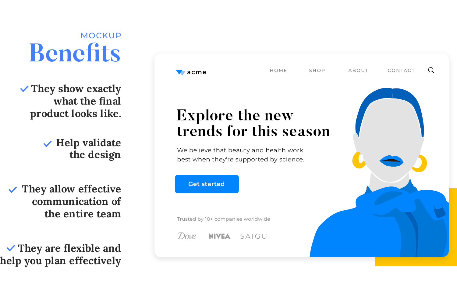
Mockups also serve as an effective communication tool between designers, developers, and clients, making sure everyone is on the same page about the visual aspects of the product. Additionally, having a detailed visual representation helps teams plan resources and tasks more efficiently for the development phase.
Mockups organize project details by helping designers uncover visual elements that clash before arriving at the final design. They refine visual hierarchies, allowing stakeholders to review the visual side of the project more effectively.
Furthermore, mockups are flexible, allowing for easy and quick revisions without requiring code, thus facilitating iterative improvements.
Free wireframing and prototyping tool for web and mobile apps

While visually detailed, mockups have several downsides. They’re static, meaning they cannot show how users will interact with the product or how it will function. This lack of interactivity makes it difficult to get feedback on the usability of the product. Creating detailed mockups can also be time-consuming, especially if changes are needed.
This can be misleading because stakeholders might think the mockup is the final product and expect it to be more complete than it actually is. Additionally, mockups are not ideal for demonstrating complex interactions or dynamic content, which prototypes can do much better.
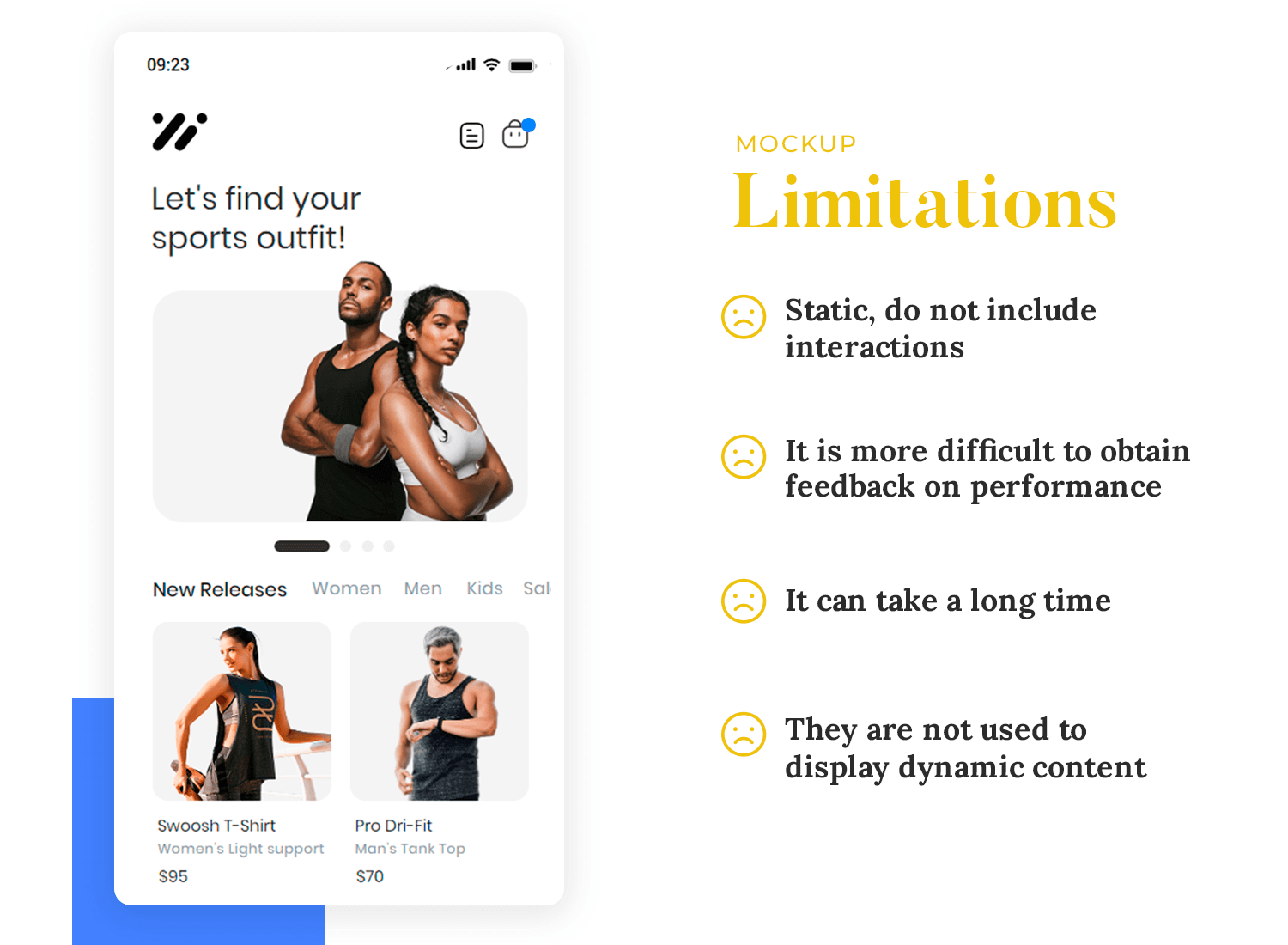
While mockups are excellent for visualizing the design, they cannot capture the flow through the system as effectively as interactive prototypes.
Critics argue that high-fidelity mockups take too long and increase development costs, but the time invested in creating them can be justified by the valuable feedback and flaw detection they provide before costly fixes are needed during development.
Being able to differentiate between wireframes and prototypes and mockups is essential for recognizing their respective roles and limitations. Wireframes provide a basic structural guide, mockups offer detailed visual representations, and prototypes allow for interactive and functional testing.
Here is a comparative table outlining the differences between wireframes vs prototypes vs mockups. This table highlights the distinct roles each type of design deliverable plays in the product development process:
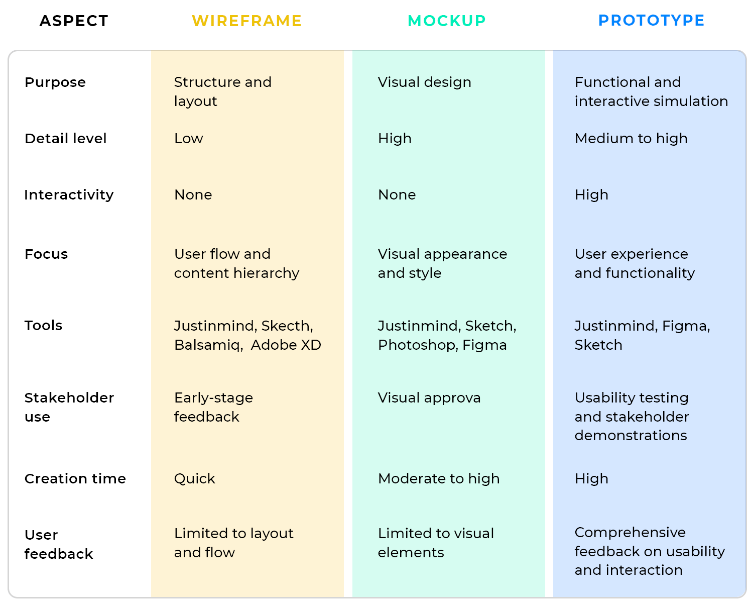
Understanding the distinctions and purposes of these deliverables helps ensure a cohesive and efficient design process, ultimately leading to a more polished and user-friendly final product.
When starting out with a design project, consider your budget, the complexity of the UI you are creating and, of course, your users!
Think about the people who will be interacting with your designs. Apart from really wowing your business stakeholders, have a think about the end-users who will be helping you to perform usability tests, and ultimately evaluate whether your product is any good.
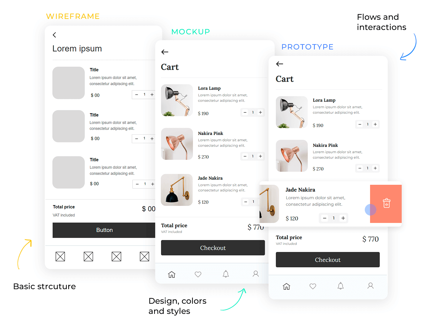
Grasping the difference between wireframes and prototypes and mockups is crucial here. Wireframes provide a basic structural guide and help outline the core functionality and navigation of your design.
Mockups add visual design details like colors, typography, and images, giving a realistic preview of the final product. Prototypes take it a step further by incorporating interactivity and functionality, allowing for user testing and validation of the complete design. Hope this helps clear up any doubts you might have had prior to reading!
