What is UX writing and what does a UX writer do? Here’s everything you needed to know about this important new role!
There’s a mysterious term that’s popped up in the UX design industry over the last few years called “UX writing”. It’s a term that frequently gets mixed up with other writing terms like “copywriter” and “content designer”. But UX writers do neither of those things. It’s a writing discipline unto itself and plays a very important role in the user experience, hence the name.
Start prototyping your ideas today. Unlimited projects!
UX writers don’t write marketing or promotional copy. They don’t plan and create blog content. Instead, UX writers play a direct part in getting users to love and stick with a product. They play a big role in a product’s design and in the prototyping process. In this guide, we’ll examine what exactly this role is, along with examples of great UX writing and how to get a foot in the door of this exciting new industry.
In recent years, more and more companies and product design teams are starting to recognize the importance of UX writing in the product development cycle. In basic terms, UX writing is the microcopy on the buttons, the words, the sentences and the paragraphs you see throughout your product.
Imagine your website or app had no words – it wouldn’t make sense. It would be like a network of roads and highways with no signs. Only UX writing is more than the signposts that point drivers to their destination. It’s more like the GPS that guides and communicates throughout the journey, in this case – the user journey.
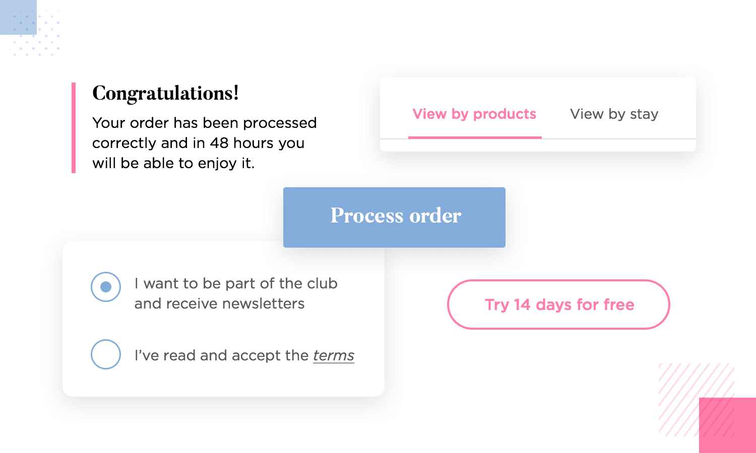
We could think of UX writing as being a conversation between your product and the user. The way you design that conversation plays a crucial part in designing an excellent user experience. And that’s exactly what UX writers are for: helping users achieve what they set out to do as comfortably and effortlessly as possible.
UX writers don’t simply write instructions and introductions. They make sure your product speaks the same language as users do. They work closely with user personas and, UX designer-style, they constantly test the copy they write.
In addition to that, they ensure the words they write reflect the voice of the brand while adapting the tone to suit the various situations the user finds themselves in throughout your product.

They also improve the user flow by creating content as if it were a conversation between the product and the user, avoiding it being reduced to a mere transactional nature. This is especially helpful in the case of chatbot and voice UI design.
Imagining the flow as a conversation between user and product helps picture the logical flow of a product or feature in addition to facilitating storytelling. Because of that, design consultant Erika Hall, is an advocate of first designing the conversation between the user and the product before planning the visual design.
Often, when there’s a problem writing UX copy, it can reveal more profound problems with the product’s design. For this reason, more and more product teams around the world are trying to ditch the Lorem Ipsum as soon as possible to start implementing UX writing.
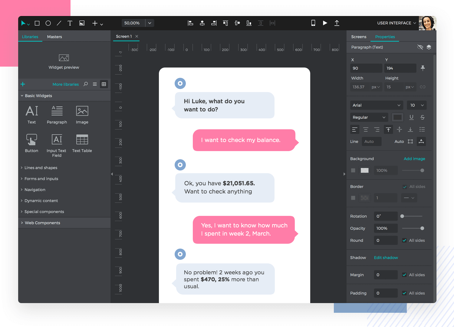
You can do this in the form of a chatbot in your prototyping tool even though it’s not a chatbot that you’re designing. This can help enormously when it comes to picturing or designing the flow of screens required to help a user complete a goal.
As we mentioned above, UX writing requires a lot of thought, therefore isn’t something you can just jump into. Screen real estate is gold in web and app design, therefore UX writers need to carefully consider how each word contributes towards the user’s goal. Before writing any microcopy, they’ll put a lot of thought into the following aspects:
- Target user personas
- Purpose of microcopy
- The context behind the microcopy
- How the copy will address the user’s problem
- The emotions of the user in a given situation
- In some cases, the physical location of a user
Imagine that the product in this case is a car sharing app and the user’s goal is to find a car that they booked using the app. They might be walking through a busy street or car park. The UX writer might decide at this point to display a reassuring message on the map that tells them they’re close to the vehicle. They’ll also have to come up with an appropriate tone.
Imagine the user gets into the car on time and everything checks out. They’re ready to turn on the ignition. A congratulatory message might read like this:
"Way to go! You’ve entered your vehicle on-time! Find the key in the glove box."
But what if the user arrives late to their vehicle? In this case, you probably won’t want the resulting message to be:
“Hey there! Looks like you’re late, guess that means you’re paying extra fees!” :)
They will instead have to adjust the tone and style of the message appropriately in order to match the circumstance and the user’s emotions as closely as possible. Consider the following amendment:
“Oops, you’re running a little late. Remember: you can always reschedule your trip from the app under the “booking” section.”
The above empathises with the user’s situation and also offers a solution, inspiring trust.
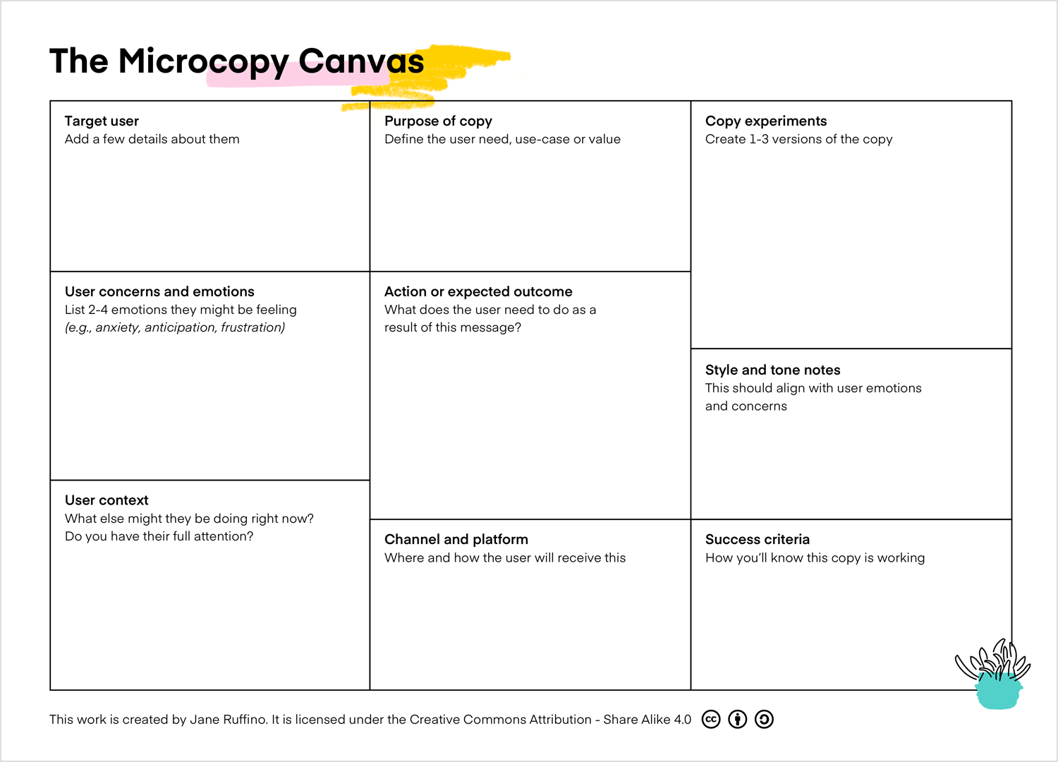
You can plan each scenario of your UX writing with this helpful UX Microcopy Canvas by Jane Ruffino. It contains all the prompts you need to plan all the reasons for your copy and can be a great supporting document to show to stakeholders and clients.
Start prototyping your ideas today. Unlimited projects!

How difficult can it be to simply guide the user through your product using words? If you speak the same language as the user, then surely it must be easy, right? Think again. Those words make much more of an impact than it might seem at first! Here are some UX writing examples and tips to help the conversation flow between your product and the user.
If you’ve ever heard anything about UX writing before, then you’ve probably come across this rule: “keep it clear, concise and useful”. It’s one of those UX writing principles drilled into UX writers’ heads everywhere and with good reason!
Imagine, a user has a problem booking a seat at a football game. There may be no more seats available in the row they want. Here are a few quick UX writing examples done in Justinmind to show what the error messages might say:
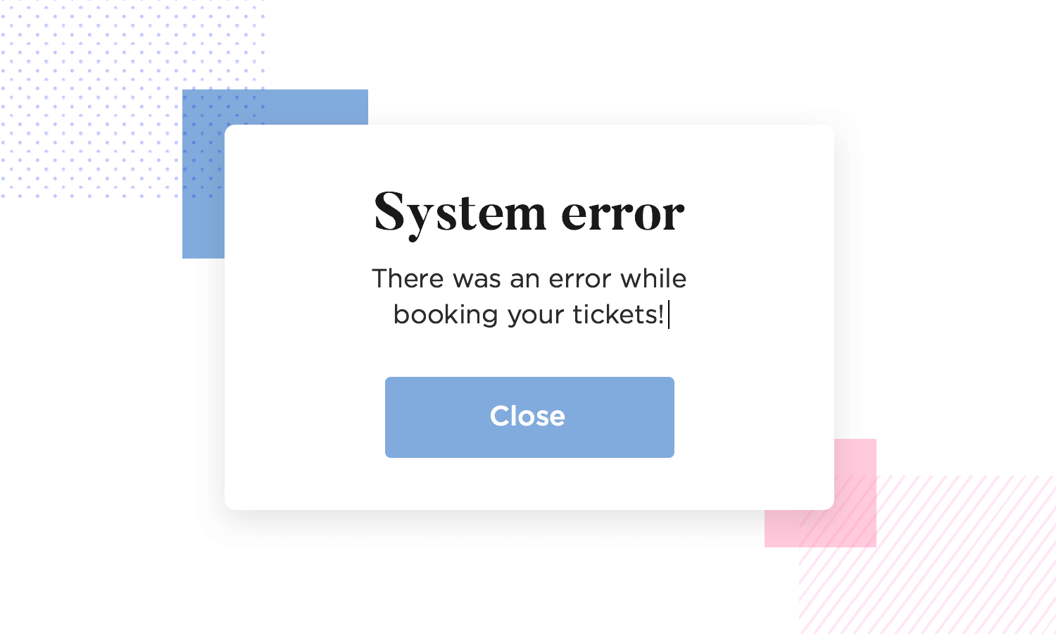
We could say that it’s original. But it’s hardly clear, it’s not concise and most certainly isn’t useful. It’s like the typical error message of once upon a time in the 90s that would simply state an error had occurred and that was that, just go pick up the pieces of your life. Nowadays, that type of message doesn’t cut it anymore.

In the next screen we can see that it’s definitely clearer and a heck of a lot more concise, but still, there’s not much more the user can do with it. Now let’s try the example below for a fit:

Here it nails the three tenets in one. Clear, concise and useful. It succinctly informs the user what’s wrong and advises them on how to proceed.
Perhaps the second most rattled off UX writing principles – the voice and tone. It’s imperative to use the voice of your company to convey your brand’s personality. That’s one side of the equation. Once you have the personality established, then you need to understand how to react and interact. That’s where tone comes in.
Tone helps us create clarity and context for the user. Imagine there’s an error signing in or they entered their credit card details wrong. The tone can immediately alert them that something’s wrong, in much the same way as the UX writing example above of the user trying to reserve a taken seat at a football stadium.
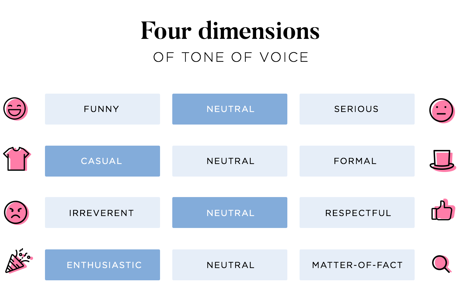
There are different tones of voice that a UX writer can deploy for when the situation calls. NNG refers to these tones as the Four Dimensions of Tone of Voice. They are:
The type of tone that you use will depend largely on the brand personality and voice, the action being carried out in the product, the outcome of the user’s actions and the desired effect you want to create. However, there are certain tones that you want to err on the side of caution with and those are “funny” and “irreverent”.
Sure, humor can be great, but even though we can try to be funny, sometimes it doesn’t work, or people have different senses of humor. Successfully deploying humor requires you to know your target audience inside out. Nonetheless, when it comes to error messages that could be quite frequent, a repeated joke can get old real quick – especially if the user’s not achieving what they set out to do!
Lastly, irreverence can be cool and trendy, but mostly you’ll want to keep it out of arm’s reach. Very few are the brands that can successfully deploy irreverence and get away with it.
Consider the order with which you arrange your text on a UI. The patterns your users read in matters and most users read in an F-pattern.
Once you know this about your users, you can start to arrange content on the screen accordingly, giving importance to titles, subtitles and always beginning your sentences with the most important word or clause first.
Start prototyping your ideas today. Unlimited projects!

Yes, it might be just a couple of words on a button but, done wrong, it can affect your entire user flow and compromise your conversion rates. Ouch!
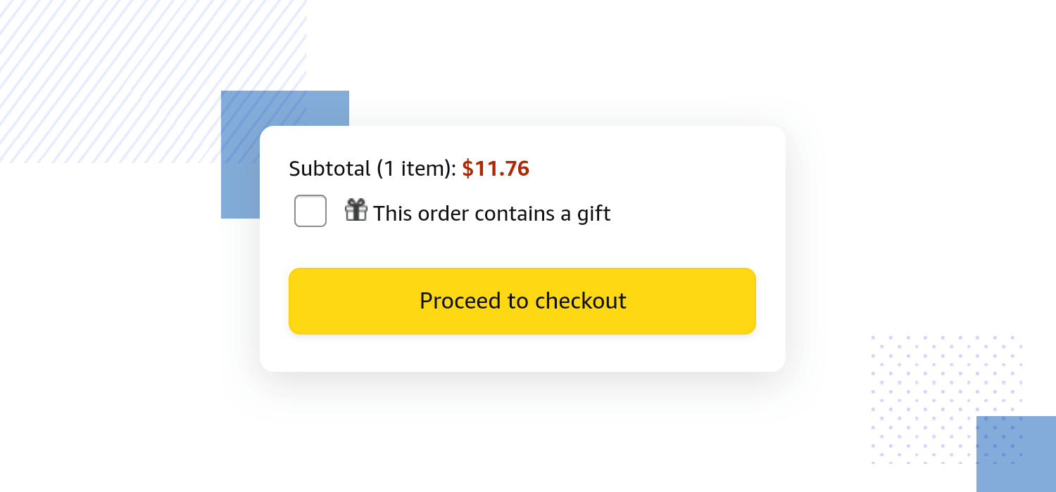
In this UX writing example from Amazon, they’ve done it right. At least when you think of all the possible ways it could’ve been screwed up. Putting “OK” or “Submit” or “Next Step” would have been unclear.
Another no-brainer is to avoid jargon-heavy text. The whole goal of a UX writer is to produce, clear, simple and intuitive copy that will help guide the user through the product and render it more accessible. It’s not enough to focus on avoiding complex terminology, good microcopy should also steer away from using complex language in general.
In the example below of a loan calculator, the UX writer chose to include a section that provides definitions of various specialist terms used in the loan calculator and called this section “words to know” instead of “terms/terminology to know”.
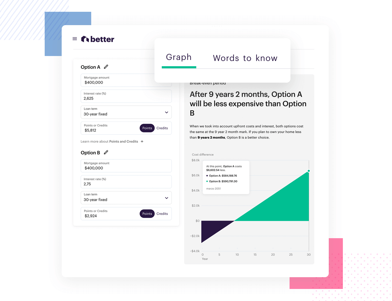
This is a great UX writing example of making language as simple and accessible as possible. It creates a seamless flow for the user throughout the app that feels natural and conversational.
Don’t label a button that does the same thing with different labels across different screens. For example, if a button downloads a file, don’t label it “Download” on one screen, then “Save file” on another.
The same goes for the voice of your product. Good UX copy maintains the same brand personality throughout all touch points your user might have with your product with slight variations in tone depending on the situation.
It’s wise to incorporate the writing into your designs early on so that as the design evolves and becomes more refined, so too does the UX writing involved. By the time you reach a high-fidelity prototype, the writing will be smooth and consistent just like the visual elements at play.
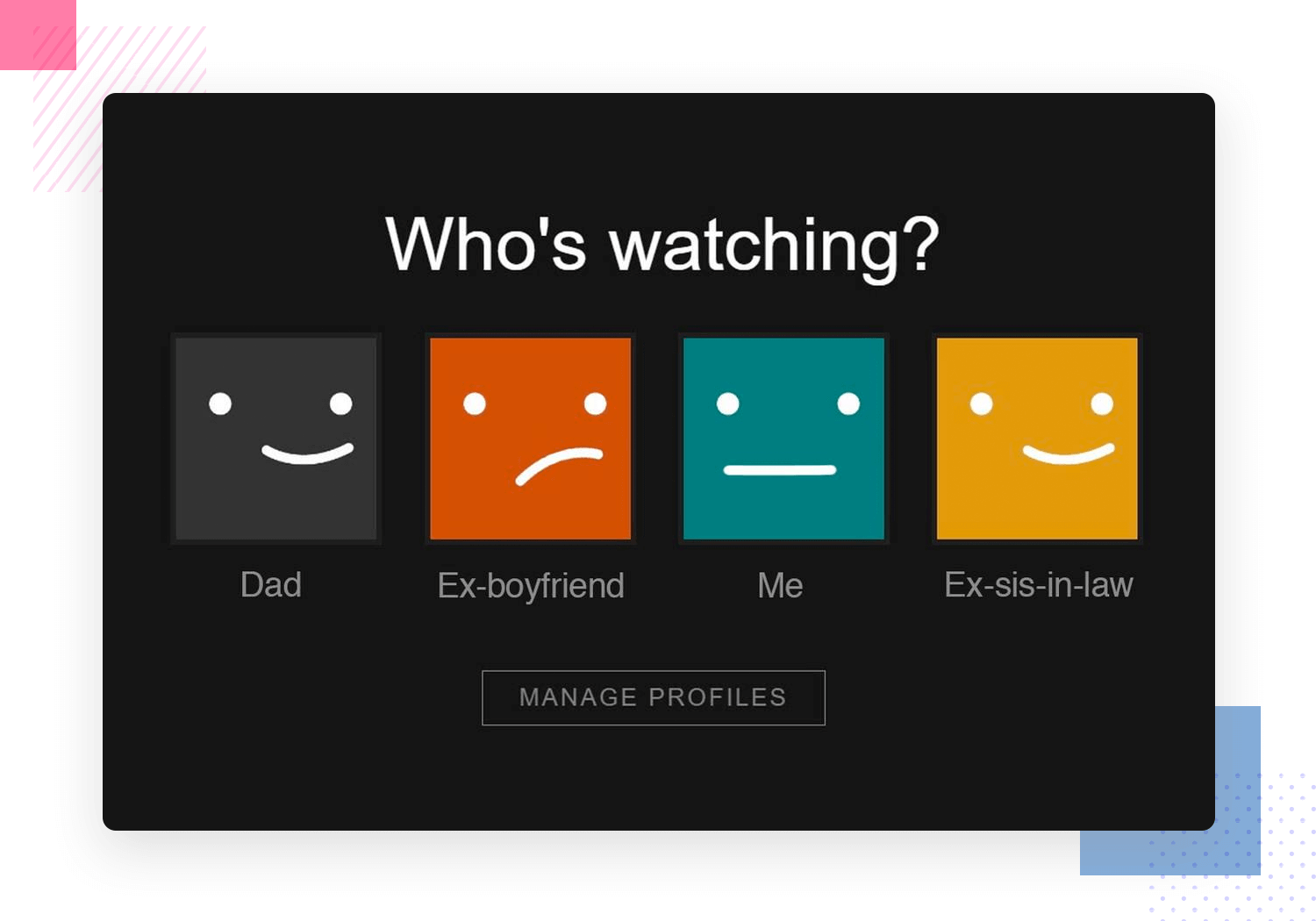
As space can often be a problem when it comes to a product’s UI, UX copy needs to be concise. Turning commands into questions can be a way of reducing words. If we take this UX writing example from Netflix below, “who’s watching?” is a much briefer way of saying “Choose an account” or “Select the appropriate audience”.
It’s faster and easier to read because it’s shorter and more conversational.
Progressive disclosure is crucial when it comes to successful product onboarding, user activation and retention.
A good UX writer will know how to break up information into different parts, revealing what’s most relevant to the user first, instead of overwhelming them. Splitting information up into bite-sized chunks and making sure users know how to use the core features of the product can set them up to discover secondary features later.
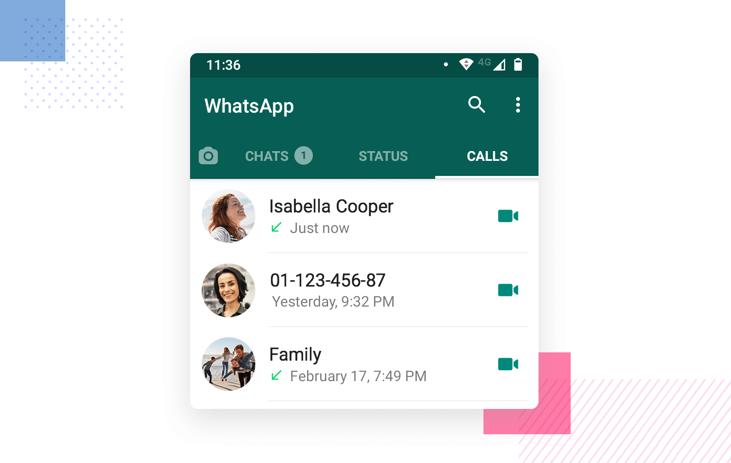
To facilitate readability in your product, instead of saying things like “two files”, say “2 files” or “5 weeks ago” instead of “five weeks ago”. Not only will you save on screen real estate, but you’ll also increase the readability of your text.
On the other hand, when it comes to dates, it’s better to use words where possible. That means saying “yesterday”, “last week” or “tomorrow” instead of something arbitrary like 3/6/2X, unless it was a while ago. It feels like a more natural conversation and demands less cognitive load on the part of the user. However, one thing, as Nick Babich states you should be careful with, is to always ensure that your app or website is accounting for the local time of the user to avoid confusion.
Start prototyping your ideas today. Unlimited projects!

While there are many pathways that can lead into being a UX writer, some of the best places to start from are the areas of Marketing, copywriting, communications, UI/UX design or Product Management. This just makes it easier to transition, however, that’s not to say that you can’t transition from other occupations with a bit of practice!
The best way, however, is to get as much writing experience as possible. You don’t have to become a novelist or prolific journalist, but you should try and understand all writing roles, and it never hurts to write some content for the web and get some experience writing marketing copy.
There’s also an abundance of new courses that can give you a crash lesson and a basic grounding the fundamentals of UX writing. Combine these with a bit of writing experience, create your own exercises or try and get some experience of certain design problems and show your work off on an online portfolio. Below we’ve included a list of courses to get you started in UX writing and some tips to design your portfolio, as well as some great books for a more in-depth look into the profession.
Price: free
Level: beginner
The UX Writing Hub’s UX writing course is done completely online and caters to all levels, from complete beginners to UX writers with all their stripes.

The course promises to help you hone your research skills, along with giving you a basic grounding in microcopy, creating consistent and high-converting copy with the right voice and tone, as well as how to create content-first design.
Price: ranges from $229 to $895
Level: beginner to advanced
UX Writers Collective, with their range of UX writing courses will help you get a professional certification with knowledge from industry experts on the matter.

Their courses boast teachers who are professional UX writers from the likes of Google, Intuit and Amazon. They promise to teach you the fundamentals of UX writing and conversational design, as well as how to test content. It’s done entirely at your own pace and best of all, they even help you build out a professional portfolio with a project that you can use to display writing samples.
Price: $36
Level: beginner
This Introductory UX writing course by Mario Ferrer from King (think Candy Crush creators) is given through Spanish but there are subtitles in other languages available, including English.

We highly recommend giving it a try, because Mario provides more than a solid grounding in how to design through language. You don’t even need to have any prior design knowledge to be able to understand the course.
Price: free
Level: beginner to intermediate
Australian-based UX writer, Laura Luck offers a free UX writing course that’s perfect for beginners and people looking to test the waters. It’s also suitable for copywriters looking to transition to UX writing.

Laura’s course promises to give you a basic grounding in the various types of UX writing as well as 5 actionable techniques that’ll help you get started writing UX copy immediately.
Start prototyping your ideas today. Unlimited projects!

Price : $3,900
Level: 3 years experience in copywriting, journalism, design or social media management.

Berghs Soc is a Swedish design institute and they offer an up-to-date UX writing course through English that is entirely online and aims to teach you how to find UX writing resources and ideation, how to interview users, how to implement voice and tone and even design content in prototypes!
Price: free
Level: beginner to intermediate
Daily UX Writing promises to help you “become a better UX writer in 15 days”. This course is great for if you’re already in the industry and want some practice, or you’re coming from another writing discipline and want to try your hand at UX writing.

Simply sign up and they’ll email you a UX writing prompt for 14 days, followed by a final, longer challenge on the last day. The best thing is this practice is entirely free.
Nonetheless, we also feel it necessary to mention that if you like Earnest Hemingway quotes, that’s a bonus because you’ll find plenty of them on Daily UX Writing.
Price: $242
Level: all levels
If you’re looking for a practical, hands-on course then Kinneret Yifrah and Merav Levkowitz’s course on Microcopy and UX writing might be up your street.

They aim to teach you typical industry solutions to creating intuitive microcopy for common UI components and elements, as well as how to define a unique brand voice and select the best words to help achieve your business goals. Every chapter has a practical exercise where you can test out what you’ve learned.
Price: free
Level: beginner
Think like an editor (content strategy and UX writing) available on Open Classrooms, like the name suggests, is for those who want a thorough overview of the full role content plays in the user experience.

This course looks at UX writing from the angle of content strategy, with a user-centric focus. The course will help you develop a critical eye when it comes to differentiating good microcopy from bad, but you’ll also come away with some more unique skills such as how to conduct a content audit and improve existing content style guides.
Start prototyping your ideas today. Unlimited projects!

Written by content strategist, Torrey Podmajersky, Strategic Writing for UX promises to teach you how to create excellent microcopy using design tools to help you construct content such as UI text and even design voice UIs.

If you’re looking for a book that covers all of the practical elements that go along with UX writing, then Microcopy: the complete guide is the one you need to save for the train.
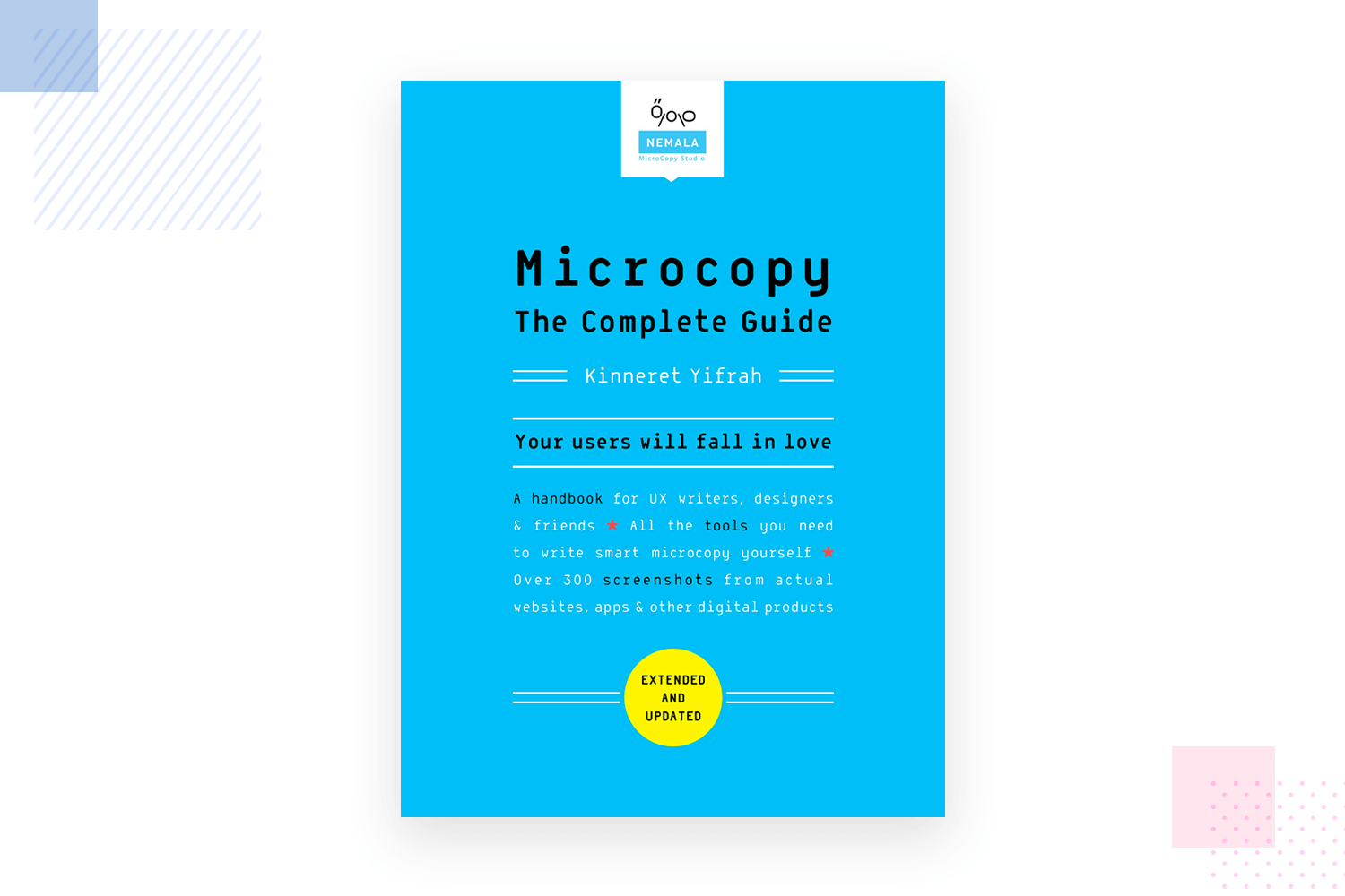
It covers everything from how to correctly deploy a tone of voice, to creating conversation content design, to CTA labels and error messages. It drives at the heart of what UX writing is all about: activating users, creating that WOW moment and retaining them.
If you need more convincing of the importance of UX writing in product design, or you’re looking for some material to help you get its importance across to team members or bosses, then Writing is Designing could do it.
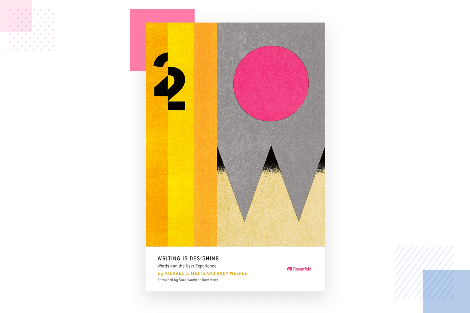
It tackles the importance of content design when it comes to voice UIs, chatbots, but also more general software design. It even goes on to point out why ux writing can require as much thought as aspects like development and branding. Interesting reading for the aspiring UX writer.
We just had to include Conversation Design by Erika Hall in this list because we feel it highlights one of the crucial driving factors behind UX writing: interaction with the user. As we’ve stressed above, approaching product design as if it were a conversation between the product and the user is paramount to successful microcopy.
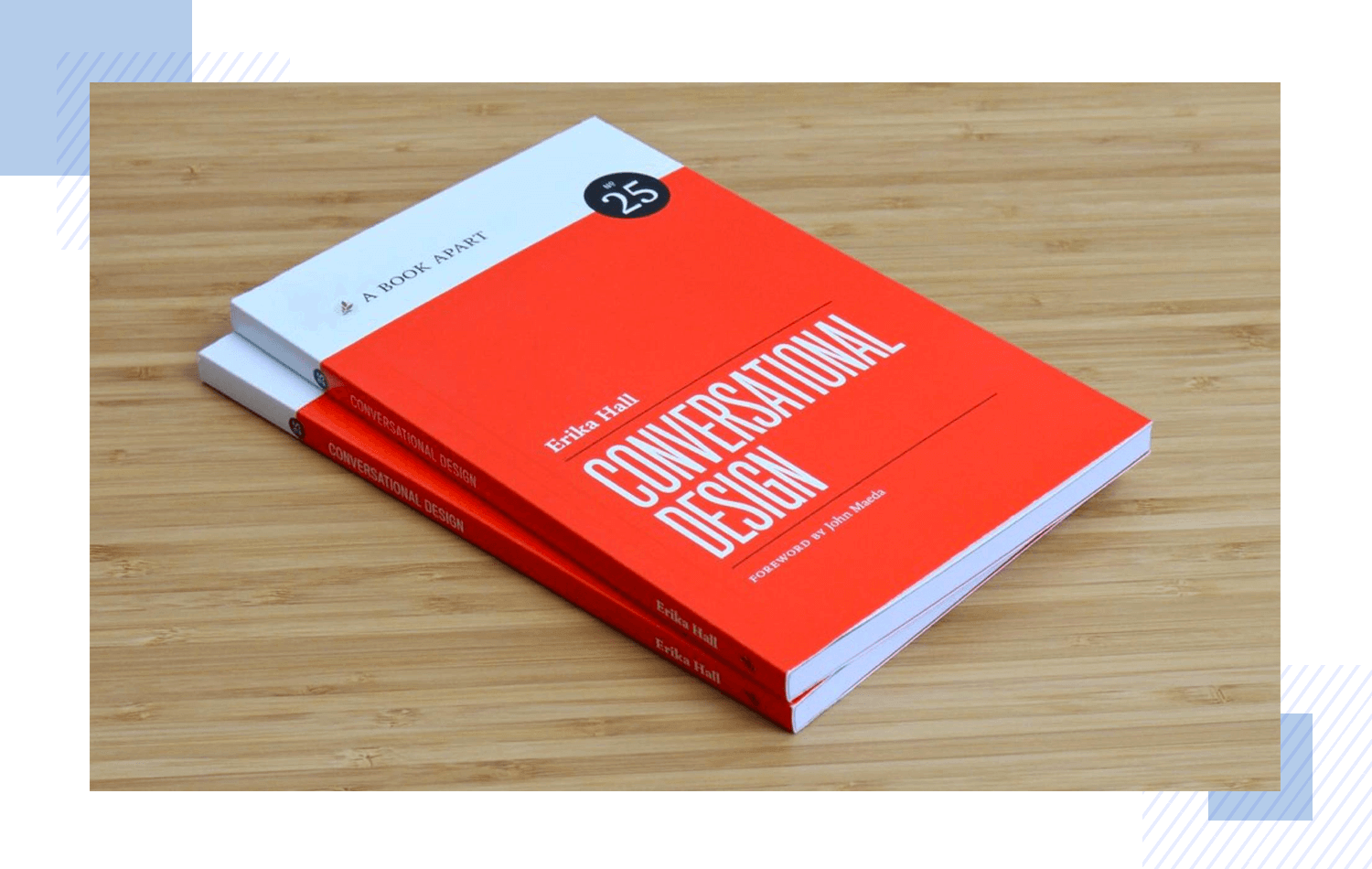
You can expect to learn more about the UX writing principles of conversational design and how to put it into practice, as well as the benefits of displaying personality in your writing, along with practical tips to implement it.
We recommend creating an online web UX writing portfolio for best results. If you’re pretty new to the profession but have previous writing experience, try to include samples of that work to show that you can write in various different tones of voice when the situation requires.
Include case studies of where you had some say in the development of a content style guide for a particular project or in a company department. If you have no direct experience writing microcopy for digital products such as websites or apps, take one of the courses above and include samples of your work from the practical exercises.

Eye-catching UX writing portfolio by Nathan Mudaliar
If you already have a bit of experience in the area, choose your best work to display with screenshots and briefly detail all of the decisions behind the content you created along with why you chose those solutions. For bonus points, include any metrics available to show the success behind your decisions.
Lastly, UX writers are expected to have some basic design knowledge. Your portfolio doesn’t have to necessarily match that of a graphic designer, but make sure that it follows basic UI design principles, catches the eye and shows off your original character. If you’re not sure about putting together a website portfolio, enlist a UI or graphic designer to help you get it started.
UX writing is not marketing. UX writing is about helping to guide the user through your product, helping them achieve the goals they set out to do with your product in the first place. It’s a discipline that strives to achieve this with clear, concise and useful language.
Lastly, it’s about making a product human, designing an interaction with the user that’s conversational in style. And as we’ve shown above, it works. Watch this space, because we feel UX writing’s going to get more and more important over the next few years and could revolutionize the design industry and the way we think about design.
PROTOTYPE · COMMUNICATE · VALIDATE
ALL-IN-ONE PROTOTYPING TOOL FOR WEB AND MOBILE APPS
Related Content
 Learn how to design better e-learning platforms with user-centered UX principles, real examples, and high-fidelity prototyping tips to boost engagement and learning outcomes.13 min Read
 Infinite scroll keeps users engaged, but it’s not always the best choice. This guide breaks down when to use it, when to avoid it, and how to design it right.14 min Read
 Learn how to design web and mobile app prototypes, how to test them and what to look for in a prototyping tool in this complete guide.15 min Read

