Ever wondered how websites and apps look so good and are easy to use? It's all thanks to layout design – the art of arranging everything you see on screen.
In the world of UI design, layout is king. It’s the art and science of arranging all the visual elements—text, images, videos, and more—within the confines of a screen. It’s a deliberate process, not just throwing things together, but thoughtfully organizing information to be beautiful and functional.
Design and prototype web and mobile apps with Justinmind. It’s for free!

In the following sections, we’ll delve deeper into the key principles and best practices of layout design, so keep your favorite prototyping tool open as you read in case you get hit with inspo from all this knowledge coming your way.
Now, without further ado, let’s get cracking!
So, what’s the heart of good layout design all about? It really boils down to three key things. First, it’s all about clarity. Think of a good layout as a friendly tour guide, gently leading the user’s eye through the information in a way that’s logical and super easy to grasp. No confusing detours!
Second, it’s about functionality. A well-designed layout makes it a snap for users to navigate, find exactly what they’re looking for, and actually do what they came to your site or app to do. No roadblocks or dead ends!
And finally, it’s about aesthetics. Layout design should create a visually appealing experience—something that looks great and perfectly reflects your brand and the purpose of your digital creation. It should be a treat for the eyes!
But layout is about more than just functionality; it also plays a huge role in engagement. A visually appealing and intuitive layout invites users to explore, stick around longer, and really interact with your content.
And, especially if you’re in business, smart layout design can significantly influence conversions, gently guiding users towards the actions you want them to take.
Investing in good layout design is a smart move that can really pay off. First and foremost, it leads to happier users! People appreciate interfaces that are not only beautiful to look at but also easy and enjoyable to use. And happy users mean good things for your website or app.
This increased user satisfaction translates directly into increased efficiency. When users can effortlessly find what they need and complete tasks quickly, they’re more likely to be happy and productive. No more wasted time or frustration!
Effective layout design also plays a key role in strengthening your brand identity. A consistent and thoughtful approach to layout reinforces brand recognition and messaging, creating a cohesive and professional online presence. It helps you build a strong and recognizable brand.
And, if you’re in business, good layout design can be a real game-changer, leading to higher conversion rates, boosting sales, and helping you achieve your other business objectives. It’s a win-win!
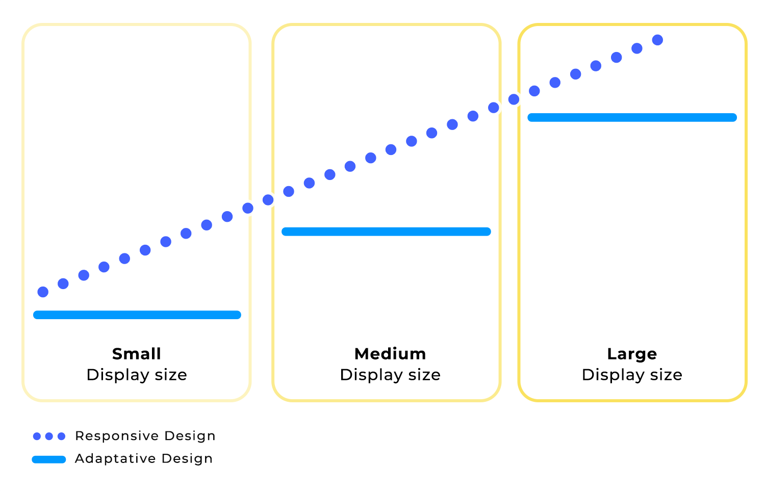
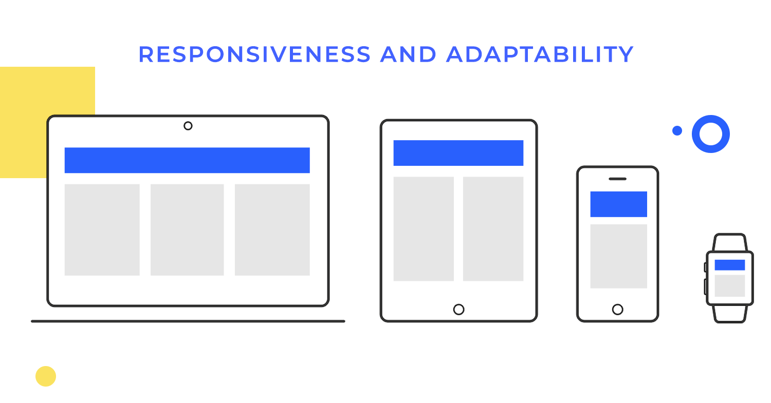
In today’s world of countless devices, responsive and adaptive layouts are absolutely crucial. Think of responsive design as a chameleon – it fluidly adapts to different screen sizes and orientations. So, whether someone’s browsing on a desktop, tablet, or smartphone, they’ll always have a consistent and optimized experience. No pinching and zooming required!
Adaptive design takes a slightly different tack. It optimizes the layout for specific screen sizes or devices. This allows you to tailor content or functionality for a truly customized user experience. It’s like having a designer create a unique layout for each type of device.
Designing for the web and mobile platforms is definitely not a one-size-fits-all situation. There are some key differences to keep in mind. Screen size and orientation are huge factors. Mobile devices have much smaller screens than desktops, and they can be used in both portrait and landscape mode. This means you need different layout strategies for mobile compared to a traditional website.
Touch interaction is another crucial distinction. Mobile layouts need to be optimized for touch input. Think larger buttons, clear visual feedback, and everything designed to make the user experience smooth and intuitive with just a tap or swipe.
Finally, consider the context of use. Mobile apps are often used on the go, in situations where users might have limited attention or time. This means mobile layouts need to be concise, focused, and super easy to navigate. You want to get the information across quickly and efficiently.
Different kinds of websites and apps naturally have different layout needs. Informational sites, for example, really prioritize a clear hierarchy and easy navigation. The goal is to help users quickly find the information they’re looking for without any fuss.
E-commerce websites, on the other hand, are all about showcasing products in the best possible light, highlighting those all-important calls to action (like “Add to Cart”!), and making the checkout process as smooth as butter.
And then there are productivity apps. These guys emphasize efficiency and organization. Think clear visual cues, intuitive workflows, and everything designed to help users get things done quickly, and in the most effective of ways. No distractions or unnecessary steps!
Imagine you’re walking into a room filled with posters. Some are big and bold, others are small and subtle. Some use bright colors, while others are more muted. Your eyes naturally gravitate towards the most prominent posters first, then you move on to the others. That’s what we call visual hierarchy in action!
In layout design, visual hierarchy is all about organizing content in a way that guides users’ attention. It’s about making sure the most important elements stand out, while less important elements take a backseat. This helps users quickly understand the information and find what they’re looking for.
Designers have a whole toolbox of techniques to create a strong visual hierarchy. Here are a few of the most important ones:
- Size: It’s pretty straightforward – bigger elements naturally grab attention more than smaller ones. Think of it like a headline versus body text.
- Color: Bold and contrasting colors are great for emphasizing key elements and making them pop. A splash of bright color can really draw the eye.
- Contrast: Differences in color, size, and shape all help to create visual interest and guide the user’s gaze. It’s about creating a dynamic and engaging layout.
- Alignment: Arranging elements in a clear and organized way creates a sense of order and naturally guides the user’s eye across the page. A well-aligned layout feels clean and professional.
When it comes to balance, there are two main approaches: symmetry and asymmetry. Symmetry is like a mirror image – one side of the layout perfectly reflects the other. Think of a butterfly or a perfectly folded piece of paper.
Symmetrical layouts create a sense of order, formality, and stability. They can be visually pleasing and calming, but sometimes they can feel a bit static. Asymmetry, on the other hand, is more dynamic and energetic. It achieves balance not through mirroring but through carefully distributing elements of different sizes and weights.
Remember seesaws? Good times. For a seesaw to be perfectly balanced, you needed to distribute the weight evenly on both sides. The same principle applies to visual balance in design. It’s all about distributing visual weight equally throughout your layout to create a sense of harmony and stability.
Now, “visual weight” isn’t just about physical size. It’s a combination of factors like size, color, texture, and even the complexity of a shape. A large, bold element will naturally have more visual weight than a small, subtle one.
To achieve balance, you might pair a large element on one side with a cluster of smaller elements on the other. Or, you could balance a visually complex element with a simpler one of similar size.
It’s like a balancing act, where you carefully consider the visual weight of each element and arrange them in a way that feels harmonious and pleasing to the eye. This creates a sense of equilibrium, preventing your design from feeling lopsided or chaotic.
Imagine trying to build a house without a blueprint. It would be chaotic, wouldn’t it? Grid systems in layout design are like those blueprints, providing a clear and organized structure for your content. They’re frameworks of intersecting lines—vertical and horizontal—that act as guides for positioning elements.
Think of them as the underlying skeleton of your design, giving it both strength and flexibility. Using a grid system isn’t about confining your creativity; it’s about giving it a solid foundation. It helps you arrange text, images, and other elements in a logical and visually pleasing way.
When text, images, and other elements are aligned consistently, whether it’s left-aligned, centered, or justified, it creates a sense of visual harmony, which we – as humans – are naturally drawn to. This significantly improves readability, allowing users to scan and digest information quickly and easily.
Consistent alignment also plays a crucial role in aesthetics. It creates a sense of order, professionalism, and polish, making your design more visually appealing and memorable.
Think of whitespace as the breathing room in your design. It’s the empty space around and between all the elements – text, images, everything. And it’s not just empty space; it’s an active design element that’s absolutely vital for both readability and aesthetics. Whitespace helps separate and organize information, making it much easier for users to scan and understand your content.
Imagine a beautifully designed book page with generous margins and spacing between the lines. That whitespace makes reading a pleasure, right? Well, it works the same way in web and mobile design. Whitespace prevents clutter, improves focus, and makes your design look and feel so much better. It’s the secret ingredient for a polished and professional look.
Consistency and repeatability in design are about creating a predictable and familiar experience for your users, no matter what screen they’re on. Maintaining consistent styles, from fonts and color palettes to button styles and icons, creates a sense of unity and professionalism.
It reinforces your brand identity and makes your design instantly recognizable. Consistent spacing is equally important. Think of it as the rhythm of your design. Consistent margins, padding, and gutters create a sense of visual harmony and make your layout easier to scan and understand. When users encounter consistent styles and spacing across different screens, whether it’s a desktop, tablet, or smartphone, they feel comfortable and confident.
They don’t have to relearn how to navigate your interface every time they switch devices. In short, consistency and repeatability are the glue that holds your design together, no matter where they interact with your product.
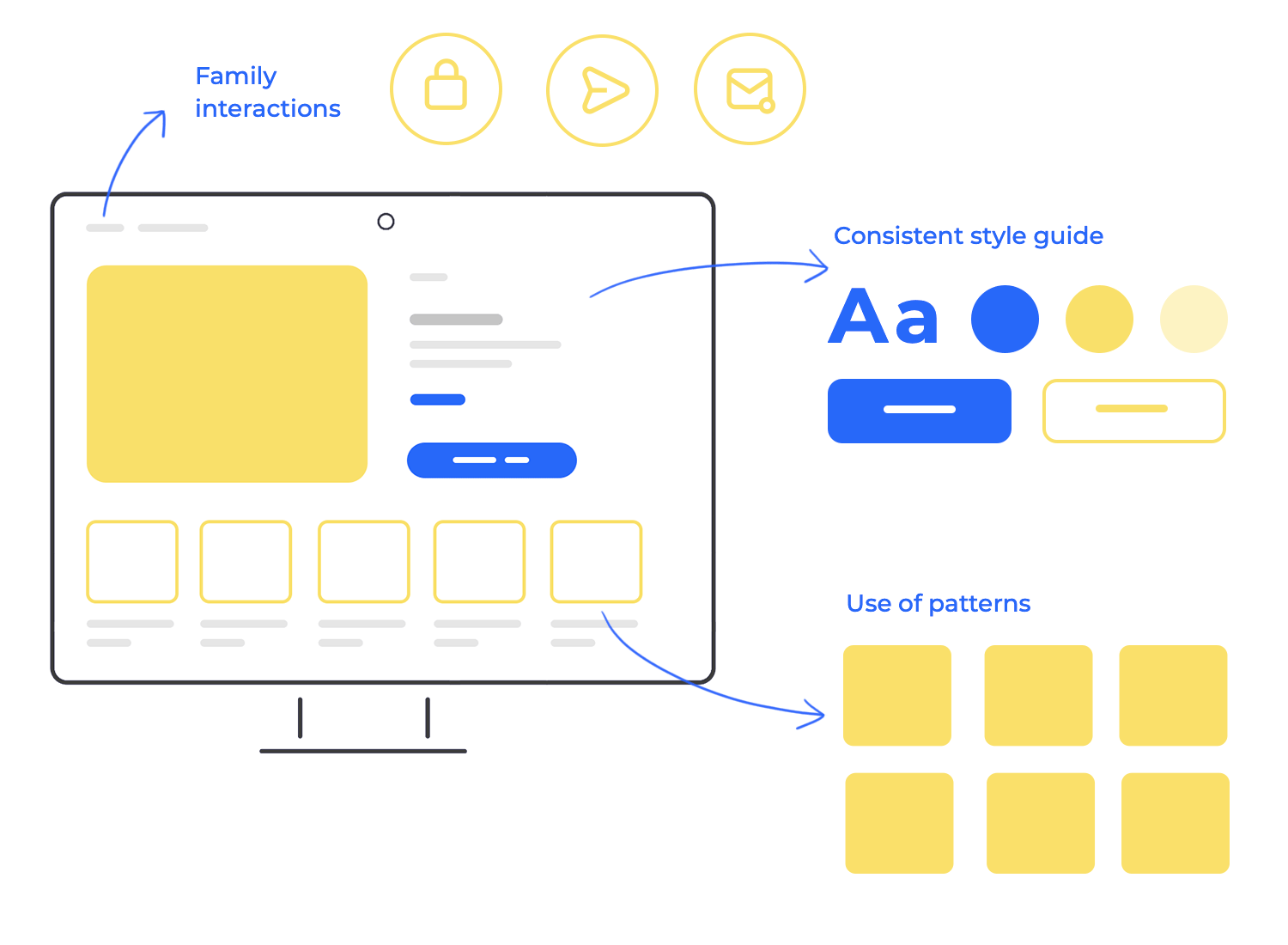
Reusing components in design means creating a set of reusable elements, from buttons and icons to navigation menus and form fields, and using them consistently throughout your design. This creates a sense of familiarity for users.
When they encounter the same button style or navigation pattern in different parts of your website or app, they immediately know how to interact with it. This reduces cognitive load and makes it easier for them to navigate and accomplish their goals.
Reusing components also contributes to a more cohesive and polished design. It creates a sense of unity and consistency, reinforcing your brand identity and making your design more professional.
And, from a practical standpoint, it can significantly speed up the design and development process. Instead of reinventing the wheel every time, you can simply grab a pre-designed component from one of your favorite UI kits and adapt it as needed.
Responsive design is like a fluid, dynamic system. It employs flexible grids and fluid images that resize and rearrange themselves gracefully to fit the screen they’re displayed on. Think of it as a shape-shifter: elements can shift positions, stack on top of each other, or even disappear entirely to make the most of the available space. A website designed with responsiveness in mind will automatically adjust its layout when viewed on a smaller screen, ensuring that content remains readable and navigation remains intuitive.
Adaptive design, on the other hand, takes a more tailored approach. It involves creating multiple, distinct layouts specifically optimized for different screen sizes or device categories. When a user visits a website, the server detects their device and serves up the most appropriate layout. It’s like having a custom-made suit for every occasion. Each layout is carefully crafted to provide the best possible experience for its target screen size.
Desktop
Your desktop is basically your digital command center. With its larger screen, keyboard, and mouse, it’s the perfect place for complex layouts and intricate interactions. Desktop users expect a rich and feature-filled experience. Usability here is all about providing a clear information hierarchy, so users can easily find what they’re looking for.
Efficient navigation is key, allowing them to move between different sections of your website or application. And, of course, comfortable mouse-based interactions are essential. Think of your desktop design as providing the full picture, giving users access to the complete range of features and content.
Tablet
Tablets occupy a unique space between desktops and mobile phones. They offer a larger screen than phones, making them great for consuming content, but they’re still portable and often used with touch input. Usability on tablets needs to balance these factors. Touch-friendly interactions are paramount, ensuring that users can easily tap, swipe, and pinch their way around your design.
Responsive layouts that adapt to both portrait and landscape orientations are also crucial, allowing users to comfortably use their tablets in any way they choose. And, just like on desktops, a clear visual hierarchy is essential for easy navigation, especially when using a finger to interact with the screen.
Mobile
Mobile devices are our constant companions, often used on the go, in situations where we may have limited attention or time. Usability on mobile is all about speed and simplicity. Concise content is key, delivering the most important information quickly and efficiently. Intuitive touch controls are a must, allowing users to easily interact with your design using their fingers. And, perhaps most importantly, fast loading times are crucial for a positive mobile experience. Think of your mobile design as a quick-access point, allowing users to easily find essential information and complete simple tasks, even when they’re on the move.
Design and prototype web and mobile apps with Justinmind. It’s for free!
In the world of mobile app design, the “mobile-first” approach has become a guiding principle. It’s a strategy that emphasizes designing for the smallest screen size first, and then scaling up to larger devices like tablets and desktops. This might seem counterintuitive at first, but it offers several key advantages.
Starting with the smallest screen forces designers to prioritize content and functionality. When space is limited, you have to make tough choices about what’s truly essential. This leads to cleaner, more focused designs that are free of clutter.
Once the mobile design is nailed down, scaling up to larger screens becomes a matter of progressively enhancing layout design. You can strategically add more content, features, or visual elements as screen real estate becomes available. This approach ensures that the core user experience remains consistent across all devices, while also taking advantage of the unique capabilities of larger screens.
The mobile-first approach also aligns with how many people interact with digital content. For many, their mobile phone is their primary access point to the internet.
When talking about mobile layout design, one-handed navigation is often the norm, not the exception. We’re constantly using our phones while walking, commuting, or juggling other tasks. Therefore, designing for one-handed use is paramount. A key aspect of this is strategically placing interactive elements within easy reach of the thumb.

Think of your thumb as the primary tool for interacting with your mobile app. The areas of the screen that your thumb can comfortably reach without stretching or shifting your grip are prime real estate for interactive elements.
These “thumb zones” are where you should place your most frequently used components, like buttons, navigation menus, search bars, and other crucial controls. Users shouldn’t have to perform acrobatic thumb stretches or resort to using their other hand just to perform common actions.
Bottom navigation bars and floating action buttons (FABs) are common and effective UI elements in mobile app layout design, particularly for enhancing one-handed navigation. They offer distinct ways to provide quick access to key features and actions.
Bottom navigation bars
These bars, typically fixed at the bottom of the screen, provide a consistent and easily accessible way to navigate between the core sections or views of an app. They’re ideal for apps with a small number of primary destinations, allowing users to quickly switch between them with a tap.
Because they’re positioned at the bottom, they’re generally within easy thumb reach, promoting one-handed use. However, bottom navigation bars are best suited for core navigation; they shouldn’t be overloaded with too many options, as this can clutter the interface and make it harder to use.
Gestural navigation has become so ingrained in the mobile experience that users almost expect it. We’re all used to interacting with our apps using intuitive gestures like swipes, pinches, and drags. It feels natural when done well.
But designing for gestural navigation requires careful thought. It’s essential to consider the context and purpose of each gesture. Gestures should be intuitive and, most importantly, consistent with what users already expect. Avoid using gestures in unexpected or unusual ways, as this can quickly confuse users and lead to frustration. Think about it: if a swipe does one thing in one app and something completely different in another, it can be disorienting.
Providing clear visual cues and feedback is also absolutely crucial. Users need to understand how their gestures are affecting the interface. A subtle animation or a change in the appearance of an element can confirm that a gesture has been recognized and acted upon.
Swiping
Swiping is a fundamental gesture for navigating between screens, dismissing notifications, and scrolling through content. The layout should be designed to support horizontal and vertical swiping, depending on the app’s structure and content. Clear visual cues, like page indicators or subtle animations, can help users understand how swiping will affect the interface.
Pinching
Pinching is primarily used for zooming in and out of images, maps, and other content. The mobile app layout design should allow for smooth and responsive pinch-to-zoom functionality. It’s also important to consider the zoom limits to prevent users from zooming in too close or too far.

Dragging
Dragging is commonly used for rearranging items, moving objects, and interacting with interactive elements like sliders. The layout design should provide clear visual feedback when an element is being dragged, indicating where it can be dropped or how it’s being manipulated.
Gesture conflicts occur when different interactive elements or areas of the screen respond to the same or similar gestures. Let’s say a button is placed within an area that also responds to a swipe gesture for navigation — users might accidentally trigger the swipe instead of tapping the button.
Here are some strategies for avoiding gesture conflicts:
- Clear gesture zones: Define clear and distinct areas for different gestures. For example, use the edges of the screen for navigation swipes and the center area for interactive elements. This helps to separate gesture zones and minimize conflicts.
- Prioritize interactions: Give priority to specific interactions over others. For example, if a user taps a button, that action should take precedence over a nearby swipe gesture. This ensures that users can reliably interact with elements without accidentally triggering other gestures.
- Contextual gestures: Use gestures that are appropriate for the context. For instance, use a pinch gesture for zooming on an image but not for interacting with a button. This helps to create a more intuitive and predictable experience.
- Visual feedback: Provide clear visual feedback when a gesture is recognized. This helps users understand what action has been triggered and prevents confusion.
- Testing: Thoroughly test your app on different devices and with different users to identify and resolve any gesture conflicts. User testing is essential for catching these issues early in the design process.
Progressive disclosure is a powerful technique in mobile app layout design for managing information overload and simplifying the user interface. It’s all about presenting information in a hierarchical way, revealing only the most essential details initially and hiding less critical content behind collapsible menus, drawers, or expandable sections.
Think of it like a layered approach to information. The first layer presents the most important details, giving users a clear overview of the content or functionality. If they need more information, they can then expand a section, open a drawer, or tap a menu to reveal the next layer of detail.

They allow you to group related information together and hide it until the user needs it. This is particularly useful for settings screens, where users might only need to adjust certain options occasionally.
In the often-cramped world of mobile screens, maintaining clarity while minimizing visual noise is paramount. This strategic approach keeps the layout design clean, and focused, and prevents users from feeling overwhelmed by a deluge of information.
Users aren’t bombarded with a wall of text or a sea of icons; instead, they’re presented with a clear and concise overview. It’s akin to decluttering a physical space, making it easier to navigate and find what you need.
Hiding less frequently used features or secondary information reduces visual noise, allowing users to concentrate on the primary tasks and information at hand. Think of a well-organized toolbox: all the tools are present, but only those currently needed are visible, preventing a cluttered and overwhelming workspace.
Mobile devices are frequently used in both portrait and landscape orientations. Therefore, designing layouts that adapt gracefully to these changes is crucial for a seamless user experience.
A well-designed mobile app layout should feel natural and intuitive in either orientation, not just one. This often involves more than simply rotating the screen; it requires thoughtful adjustments to the layout to optimize for the available space and the user’s current context.

When adapting your app for different screen orientations, content reflow is key. It’s all about ensuring that text wraps smoothly, images resize correctly, and elements rearrange themselves intelligently to make the best use of the available screen space.
A well-reflowed layout makes the transition between portrait and landscape modes seamless, almost like magic. On the other hand, a poorly reflowed layout can lead to awkward text breaks, distorted images, and a generally disjointed user experience.
Readability is paramount, no matter which way someone holds their phone. A layout design that’s easy to read in portrait mode might become cramped and difficult to read in landscape mode, and vice versa. Maintaining readability means ensuring that font sizes are appropriate, line lengths are comfortable, and there’s sufficient spacing between elements.
It’s about creating a comfortable reading experience, preventing eye strain and making it easy for users to consume your content.
The F-pattern layout is a classic and super effective design pattern, especially useful for pages packed with text or when users are exploring a lot of content. It’s based on how our eyes naturally scan a webpage – pretty clever, right? Research shows that we tend to scan in an F-shaped pattern: first, we scan horizontally across the top, then move down and scan horizontally again (usually a shorter line), and then we scan vertically down the left side.
Knowing this, designers can strategically place important elements within the F-pattern’s “hot zones.” The top horizontal bar is prime real estate for headers, navigation menus, and anything else you want users to see right away. The second horizontal bar, even though it’s shorter, is still a great spot for highlighting key content or calls to action. And that vertical scan down the left? That’s where users often look for links, sidebars, and other navigation bits and pieces.
The F-pattern layout is particularly effective for:
- Blog posts and articles: The F-pattern naturally guides users through the text, making it easy to scan headlines, subheadings, and important paragraphs.
- E-commerce product pages: Important info like product titles, descriptions, and prices can all be placed within those F-pattern hot zones.
- Search results pages: The F-pattern helps users quickly scan through the list of results.
- Content-heavy websites: Basically, any website with a lot of text or information can benefit from the F-pattern layout.
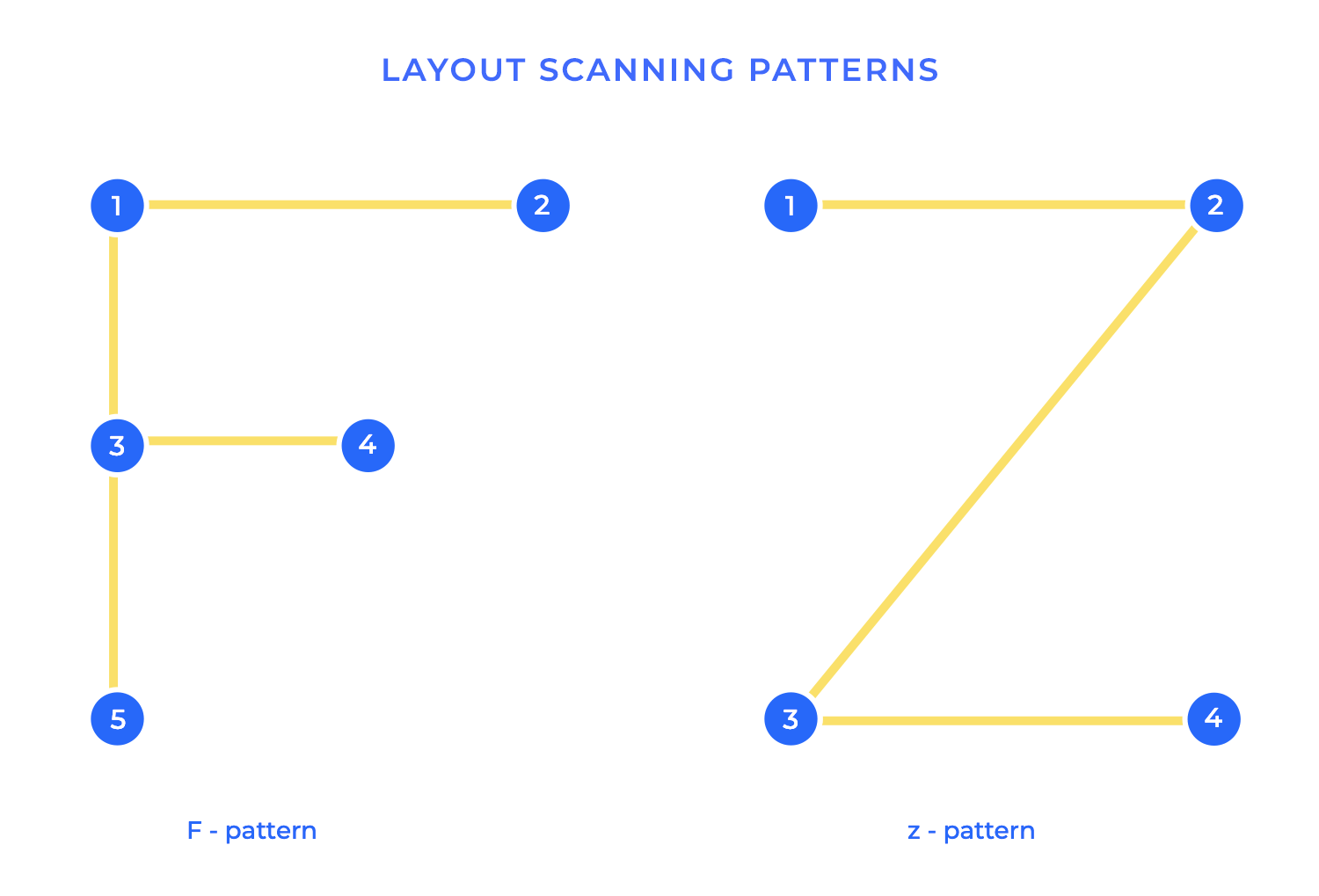
The Z-pattern layout is a simple but powerful design technique that guides the user’s eye in a Z-shaped path across the screen. It’s especially effective for designs with a clear call to action or when you want to tell a story visually. Think of it like this: the pattern starts in the top left corner, moves horizontally to the top right, then diagonally down to the bottom left, and finally horizontally to the bottom right.
This pattern is based on how we naturally read and scan content, particularly in cultures that read from left to right. Designers can use this natural eye movement to strategically place key elements along the Z-path. The top left corner is prime real estate for logos or brand messaging. The top right is often used for calls to action or secondary information. The bottom left can be used to reinforce branding or provide contact info. And the bottom right corner, the final point of the Z, is an excellent spot for a primary call to action, as it’s the last thing users see.
The Z-pattern layout is particularly effective for:
-
Landing pages: The Z-pattern can guide users’ eyes to a clear call to action, encouraging them to take the desired next step.
-
Websites with a strong visual hierarchy: The Z-pattern helps create a clear visual flow, guiding users through the most important elements in a logical way.
-
Storytelling: The Z-pattern can be used to tell a story visually, with each point of the Z revealing a piece of the narrative.
-
Minimalist designs: The Z-pattern is a great fit for minimalist designs, where there are fewer elements competing for attention, allowing the Z-path to really stand out.
Card layouts have become a popular and versatile design pattern, especially for organizing visual or interactive content. Think of them like physical cards, each containing a self-contained piece of information. These UI cards can be easily rearranged, filtered, and presented in a variety of ways, making them ideal for displaying collections of data or interactive content.
Each card typically contains a combination of text, images, and sometimes interactive elements like buttons or links. The content within a card is usually concise and focused, delivering a specific piece of information or functionality. This makes card layouts excellent for presenting information in bite-sized chunks, making it easy for users to scan and digest the content.
Card layouts are particularly well-suited for:
- E-commerce product listings: Cards can effectively showcase product images, descriptions, prices, and ratings.
- News feeds and social media timelines: Cards are perfect for displaying snippets of articles, posts, and updates.
- Portfolio websites: Cards can be used to showcase individual projects, with images, descriptions, and links to the full project details.
- Dashboard interfaces: Cards can be used to display key metrics and data visualizations in a clear and concise way.
- Mobile app interfaces: Cards are highly adaptable to mobile screens, allowing for easy scrolling and touch interaction.
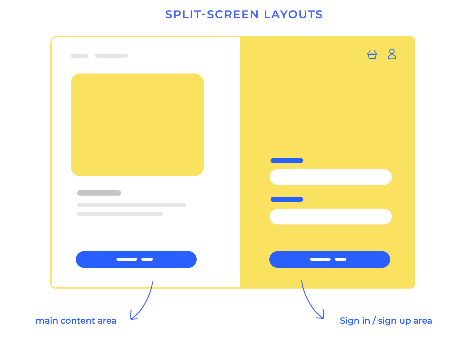
Split-screen layouts offer a dynamic way to present information, particularly when you want to showcase two distinct options or contrasting content. They’re like having two canvases side-by-side, allowing users to easily compare and contrast different elements. This is a common tactic in e-commerce or comparison websites, empowering users to make informed choices.
Beyond product comparisons, split screens excel at visually demonstrating change or impact. Think of before-and-after images, perfectly suited for showcasing the results of a photo editing tool or a home renovation. The split screen lets the transformation speak for itself. This technique is also powerful for presenting different perspectives or arguments, allowing users to see both sides of a story in news articles or opinion pieces.
Modular and tile-based layouts are all about building with individual, self-contained units (think of them as modules or tiles). These little blocks can be easily rearranged, resized, and adapted to fit different content and screen sizes, which makes them super versatile, especially for content that’s always changing or needs to scale.
These layouts are fantastic when you have a ton of content that needs to be organized and look great. Each module or tile can hold a specific piece of information – a news headline, a product image, a social media update, you name it. And because they’re all independent, you can shuffle them around to create different layouts, making it easy to prioritize certain content or adapt to different screen sizes. Think of Pinterest, with its ever-changing grid of images, or a news website with its blocks of headlines and summaries. You get the idea!
The real magic of modular and tile-based layouts shines through with dynamic content. When you add new content, modules can be easily popped into the layout without messing up the overall structure.
Design and prototype web and mobile apps with Justinmind. It’s for free!
In a world often filled with sidebars, grids, and multi-column designs, the single-column layout offers a refreshing simplicity. It’s a design approach that focuses on a single, vertical flow of content, creating a streamlined and uncluttered experience. This simplicity makes single-column layouts particularly effective for two key purposes: focused reading and minimalist designs.
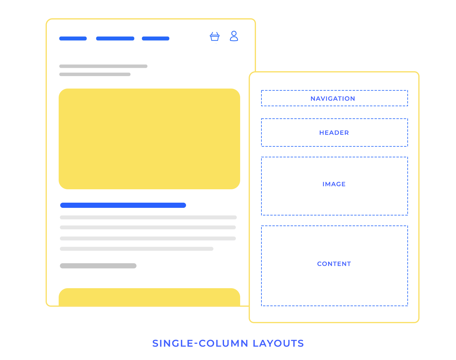
For focused reading, the single-column layout eliminates distractions. With no competing elements vying for attention, users can concentrate on the content without visual clutter.
In minimalist designs, the single-column layout reinforces the core principle of “less is more.” This approach is often used in portfolio websites, landing pages, or any design where simplicity and clarity are paramount. The single-column layout allows the content to take center stage, creating a powerful and impactful visual statement.
When dealing with a large amount of content, deciding how to present it to users is crucial. Two common approaches are infinite scroll and paginated layouts, each with its own set of advantages and disadvantages. Ultimately, the best approach depends on the type of content, the user’s goals, and the overall user experience you want to create. Consider the pros and cons of each approach carefully before making a decision.
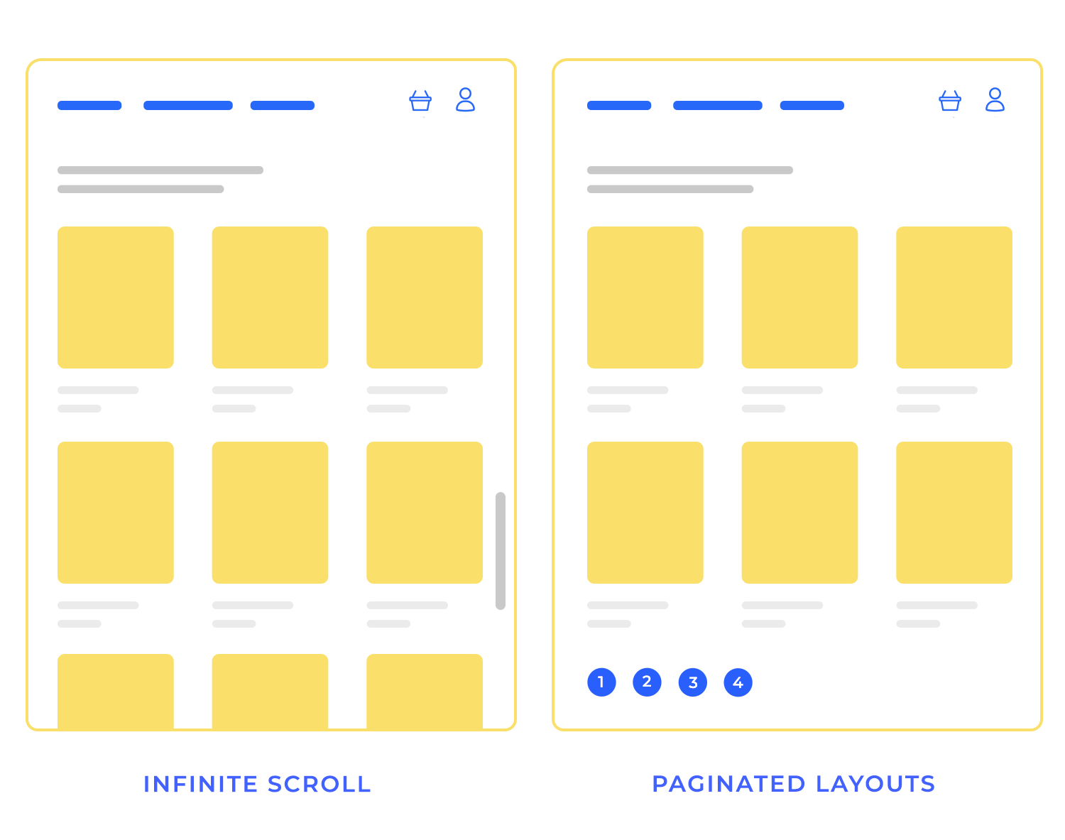
This approach loads content continuously as the user scrolls down the page. It creates a seamless browsing experience, allowing users to discover a large amount of content without having to click through multiple pages.
- Pros: Excellent for discovery, highly engaging, works well for visual content like image grids, feels modern and dynamic.
- Cons: Can be performance-intensive, difficult to bookmark specific content, challenging to implement footers or other fixed elements, can lead to “content shock” for users.
This traditional approach divides content into discrete pages, requiring users to click or tap to view the next set of items.
- Pros: Easy to bookmark and share specific pages, good for performance, allows for clear content organization, predictable loading times, facilitates footers and other fixed elements.
- Cons: Can feel less engaging, requires user interaction to see more content, may feel less modern, can be tedious for users exploring a large amount of content.
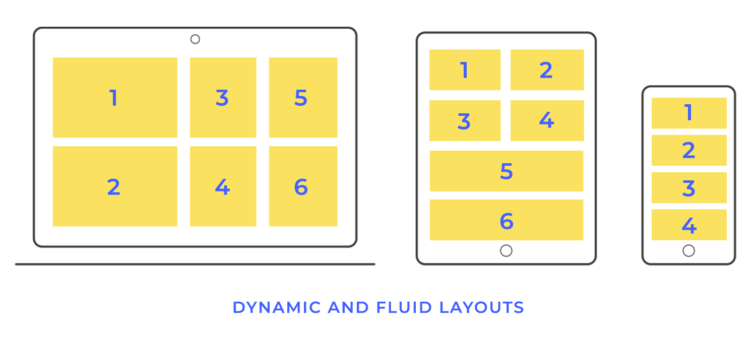
Dynamic and fluid layouts represent a cutting-edge approach to web and app design, offering a truly adaptive and personalized user experience. These layouts go beyond simply responding to screen size; they adjust and reorganize themselves in real-time based on the type of content being displayed or even the user’s behavior. This allows for a highly optimized and engaging experience, tailored to the specific context of each interaction.
Imagine a website that automatically changes its layout depending on whether you’re viewing a text article, a photo gallery, or a video. That’s the power of dynamic layouts. They can prioritize different elements, adjust spacing, and even introduce new features based on the content being displayed. This ensures that the user always sees the most relevant information in the most effective format.
Fluid layouts take this adaptability a step further by responding to user behavior. For example, a website might track how a user interacts with the page and adjust the layout accordingly. If a user spends a lot of time reading a particular section, the layout might expand that section to make it more prominent. Or, if a user frequently uses a particular feature, the layout might make that feature more easily accessible.
While grid systems provide structure and consistency, sometimes a more free-flowing and artistic approach is desired. Content prioritization without grids allows for the creation of unique and unconventional layouts, often used to convey a sense of creativity, spontaneity, or artistic expression. These layouts break free from the rigid constraints of grids, allowing elements to be placed more organically and dynamically.
Instead of relying on a grid, content prioritization in gridless layouts relies on visual hierarchy, size, contrast, and placement to guide the user’s eye and emphasize important information. Think of it as a carefully choreographed dance of visual elements, where each piece is strategically placed to contribute to the overall composition.
First up on our list of website layout design examples is our Design Summit template. It cleverly uses the Z-pattern to make sure you see all the important stuff. Your eye starts at the top left with the logo, zips across to the navigation on the right, then swoops down to the main headline and event details in the center, and finally lands on the CTA button in the bottom right corner. Works like a charm!

Our next website layout design example uses a captivating Z-pattern to draw you into the adventure. The striking image of an astronaut grabs your attention, placing you right in the heart of space exploration. The bold headline and inspiring quote from Elon Musk, positioned prominently on the left, ignite a sense of wonder and possibility.

This website layout design example is super user-friendly and makes managing employee files a pro! It’s clean and designed with a natural F-pattern flow, which guides you effortlessly. Starting at the top left with the logo, your eye moves across to the search bar and handy admin panel on the right. Then, it’s a quick trip down the left sidebar to access key sections. Be honest. You’re quite impressed by now, aren’t you?

The next website layout example on the list also uses a classic F-pattern layout. Your eyes naturally start at the top left with the cool “B” logo and then scan across the header for categories like “Books” and “Authors.” Then, it’s down the left side where you’ll find details about the specific book. The main content area, right in the center, is a captivating display of the book cover, title, and a tempting snippet of the description, inviting you to learn more.

Our furniture webshop template welcomes you with a clean and modern design, showcasing its products in a visually appealing card layout design. Each card, arranged in a friendly and approachable grid, highlights a key piece with a captivating image and a clear CTA button, making it easy to explore the collection.

This e-learning website is designed with a clean and modern card layout design, making online learning a visually engaging and enjoyable experience! Each course is showcased in its own attractive card, highlighting key details like the title, description, and upcoming dates, making it super easy to find what you’re looking for.

This CubeFactory example uses a split-screen layout design to make signing up easy-peazy! On the left, you’ll find a simple and inviting login form, perfect for returning users. To the right, the template highlights the benefits of signing up with a clear and concise message. It’s a straightforward and welcoming website design that will guide your users naturally through the signup process.

Another split-screen website layout design. On the left, a bold headline declares them “Your legal advisers for the problems of this century,” immediately establishing their expertise and relevance. It’s a clean, professional, and welcoming design that we absolutely love.

This sales dashboard website example offers a modular layout. The horizontal navigation bar keeps all the important sections readily accessible at the top. Below, the dashboard is broken down into easily digestible modules, showcasing key data points with clear charts and figures.

First on the list of mobile app layout design examples is this Z-pattern layout. As the Z-patter effect normally works, your eyes start at the top left with the sleek navigation bar, then scan across to the search and profile icons on the right. Next, they’re led down to the captivating featured image of the blog post of an awesome-looking Australian surf safari. Finally, your gaze lands on the bottom navigation bar. Fun and friendly!

This F-patterned mobile app layout design example for booking meeting rooms has a clean and simple design. You can quickly filter your preferences and the available rooms are displayed clearly with pictures and key details like capacity and size, making it easy to choose the perfect space. Go ahead, use it for your own project!

Dive into a world of captivating stories with this mobile magazine app template! It’s designed with a user-friendly F-pattern layout, so browsing is effortless. Your eyes will naturally flow from the top-left customization options, across to the settings on the right, and then down the left side where you can quickly search for topics.

Looking for a hidden gem? This second-hand app template is one of our faves with its clean and organized card layout. Each item gets its own card, showcasing a tempting picture, price, and a short description, making it easy to browse and compare. The categories up top help you narrow down your search, whether you’re after fashion finds, cool cars, baby gear, or something sporty. Plus, the handy search bar and prominent “add” button make buying and selling a snap!

This modern mobile survey mobile app example uses a clean and engaging split-screen layout to capture your feedback! On one side, a striking close-up image of an eye immediately draws you in, setting a personal and focused tone. The other side presents the survey question clearly and concisely, with easy-to-tap multiple-choice buttons in a warm, inviting yellow.

Bringing your layout designs to life requires more than just static images. Justinmind is great because it is made for prototyping. It allows you to create interactive prototypes, simulating the actual user experience. Here’s a quick guide to the key steps involved:
Here are some technical steps you might want to note down:
- Import/create screens: Import wireframes/mockups or create screens directly in Justinmind.
- Define interactions: Use events and actions to define how users interact with the prototype.
- Link screens: Connect screens visually by defining click events that trigger navigation.
- Add element interactivity: Simulate interactions like button clicks and form submissions.
- Use transitions/animations: Add polish and realism with pre-built or custom transitions.
- Simulate data/conditions: Create dynamic prototypes that respond to user input.
- Test and iterate: Preview, share, and improve your prototype based on feedback.
- Share and collaborate: Easily share prototypes for feedback and approvals.
Low-fidelity prototypes, often simple UI sketches or paper mockups, are quick and inexpensive to create. They’re ideal for early-stage brainstorming and exploring different layout ideas. Because they’re so rough, they encourage feedback on the overall structure and flow of the design without getting bogged down in visual details. They are excellent for:
- Rapidly iterating on ideas.
- Getting early feedback from stakeholders.
- Focusing on functionality and user flow.
High-fidelity prototypes, on the other hand, are much more detailed and realistic. They closely resemble the final product, including visual design elements like colors, typography, and imagery. High-fidelity prototypes are valuable for testing the usability of the design with real users and identifying any potential issues before development begins. They are great for:
- User testing and usability evaluation.
- Demonstrating the design to stakeholders.
- Providing a clear vision for the development team.

Grid systems provide the underlying structure for many modern web layouts, offering a consistent and organized way to arrange content. CSS frameworks like Bootstrap and Tailwind CSS take this a step further by providing pre-built grid systems and a wide range of other styling utilities, making it easier and faster to create responsive and visually appealing layouts.
Bootstrap, for example, offers a 12-column grid system that allows you to divide your layout into flexible columns that adapt to different screen sizes. It also provides a collection of pre-styled components, like buttons, forms, and navigation menus, that you can easily incorporate into your designs.
Tailwind CSS, while also offering a grid system, takes a different approach, providing a vast set of low-level utility classes that you can combine to create custom designs. Both frameworks simplify responsive design, ensuring your layouts look great on desktops, tablets, and mobile devices.
Layout guides and templates are incredibly helpful tools for keeping your designs consistent, especially when you’re working on big projects or collaborating with other designers.
They define the basic structure, including margins, padding, and where key elements should go. Templates take it a step further, providing pre-designed layouts for specific types of pages or content.
This ensures a consistent look and feel across your entire website or application. They’re like having a set of blueprints to work from, making the design process smoother and more efficient.
Responsive design is absolutely fundamental to modern web development. It’s all about making sure websites adapt seamlessly to the huge variety of devices people use these days.
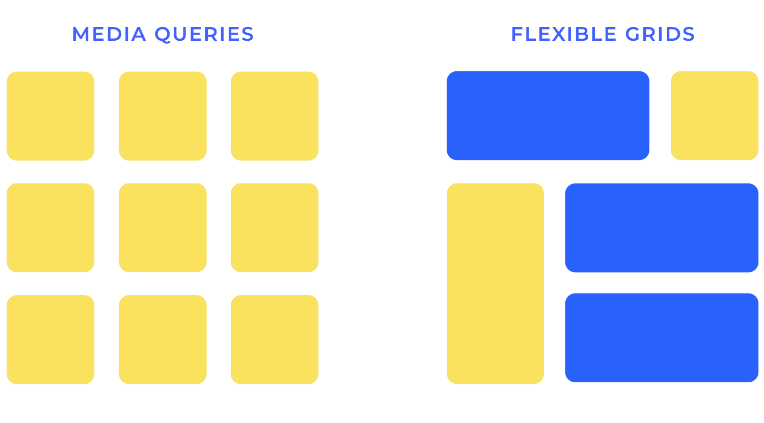
This adaptability relies on three key techniques working together: media queries, flexible grids, and breakpoints.These three elements combine to create layouts that are perfectly optimized for any screen size.
Media queries
Media queries act like detectives, allowing your website to interrogate the browser about the user’s screen size, orientation, resolution, and other characteristics. They enable you to apply different CSS styles based on these factors, essentially creating different layouts for different devices.
Think of it as having a wardrobe of outfits, each tailored for a specific occasion. Media queries allow you to select the appropriate “outfit” (layout) based on the “occasion” (screen size). For example, you might use a media query to specify that a navigation menu should be horizontal on a desktop but condense into a “hamburger” menu on a mobile device.
Flexible grids
Flexible grids are the backbone of responsive layouts, providing the structural foundation upon which your content rests. Unlike fixed-width grids that use pixels, flexible grids utilize percentages. This means the columns of your layout expand and contract proportionally to fit the screen size.
Imagine a grid made of elastic – it stretches and shrinks to accommodate the available space. This elasticity ensures your content reflows gracefully, maintaining its structure and readability regardless of the device.
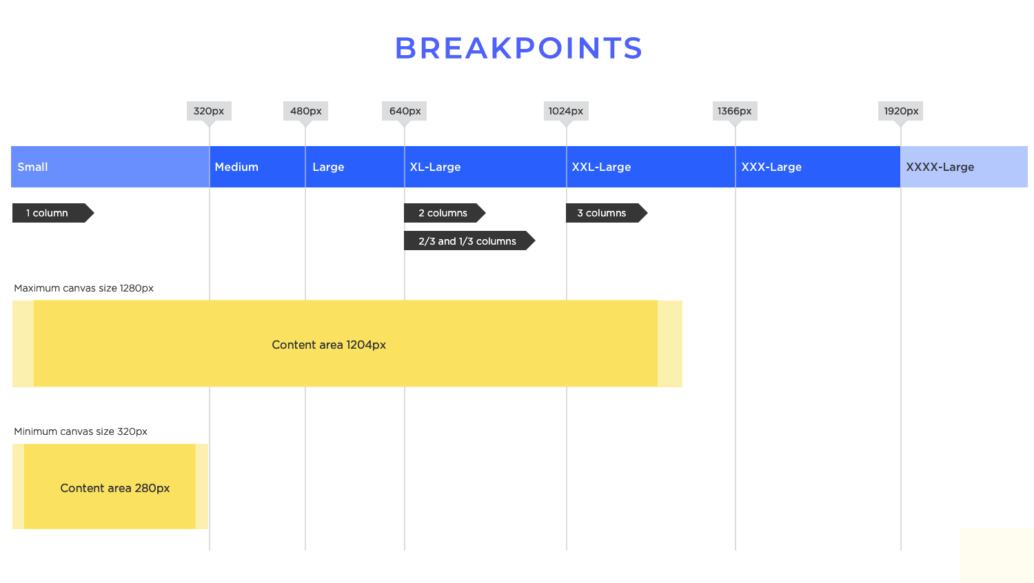
Breakpoints
Breakpoints are the strategic points at which your layout changes. They’re defined within your media queries and specify the screen widths (or other conditions) at which you want to apply different styles. Think of them as the “tipping points” that trigger a shift in your design. For example, you might have a breakpoint at 768 pixels, where your layout transitions from a three-column design to a two-column design, ideal for tablets.
These breakpoints aren’t arbitrary; they should be carefully chosen based on your content and the most common screen sizes your target audience uses.
When you’re picking fonts, readability should be your number one priority. Choose fonts that are easy on the eyes, whether someone’s viewing your design on a tiny phone screen or a large desktop monitor.
Think about things like font size, line height, letter spacing, and contrast. It’s usually a good idea to stick to just a few font families (two or three is a good rule of thumb) to keep things consistent and avoid visual clutter.
Scalable icons are just as important. They need to look crisp and clear at any size, so they’re easily recognizable and don’t get all pixelated on larger screens. Vector-based icons are perfect for this because you can scale them up as much as you want without losing any quality.
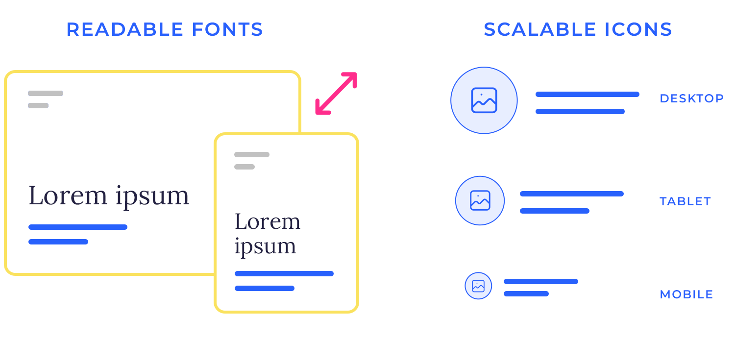
Consistency in icon placement is equally important. Use the same icons for the same actions throughout your design. Place icons consistently in relation to text labels and other elements to create a predictable and user-friendly interface.
A consistent approach to typography and text hierarchy creates a sense of order and familiarity, making it easier for users to navigate and interact with your website or app.
Design and prototype web and mobile apps with Justinmind. It’s for free!
Effective layout design is a delicate balancing act. It requires careful consideration of usability, aesthetics, and performance. A beautiful design that’s difficult to use is ultimately a failure. Similarly, a visually unappealing and highly functional design can deter users.
And a design that looks and functions perfectly but is slow to load or unresponsive can lead to frustration and abandonment. The key is to find the sweet spot where all three elements work together harmoniously, creating a positive and engaging user experience.
Users interact with websites and apps on a wide range of devices, from desktops and laptops to tablets and smartphones. Each platform has its own unique characteristics and constraints, requiring different layout considerations. Furthermore, users have diverse needs and preferences.
Designing for accessibility, considering different learning styles, and catering to various user demographics are all crucial aspects of creating inclusive and effective layouts.
The design process should always begin with a clear understanding of user goals. What are users trying to achieve when they interact with your website or app? Once you have a good grasp of user needs, you can start sketching wireframes and creating prototypes. Testing early and often is crucial.
Get your designs in front of real users as soon as possible to gather feedback and identify any usability issues. Design is an iterative process. Be prepared to refine your designs based on user feedback and testing. Continuous improvement is key to creating truly effective layouts.
Even after your design is launched, the work isn’t done. Regularly monitor your website or app’s performance to identify any areas that could be improved. Optimize images, minimize HTTP requests, and use efficient code to ensure fast loading times and smooth interactions. Accessibility is another ongoing consideration.
Regularly test your designs for accessibility issues and make any necessary adjustments to ensure that your website or app is usable by everyone, including users with disabilities.
Design is a creative field, and experimentation is essential for innovation. Don’t be afraid to explore new layout ideas and try different approaches. However, it’s crucial to balance creativity with user-centric principles. While experimenting with new designs, always keep the user’s needs and goals in mind. Test your experimental designs thoroughly to ensure that they are not only visually appealing but also usable and effective.
The world of design is constantly evolving. New trends and technologies emerge regularly, and it’s important to stay up-to-date to remain competitive. Follow design blogs, attend conferences, and experiment with new tools and techniques.
Staying informed about the latest trends and technologies will help you create innovative and cutting-edge layouts that meet the ever-changing needs of users.