Experience design and prototyping the Airbnb way: Q&A with Katie Dill

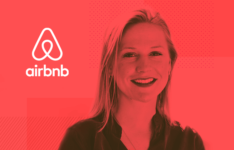
Airbnb’s Director of Experience Design Katie Dill on the Airbnb design and prototyping process, and the lessons learned from that tricky logo update.
As the Director of Experience Design at one of the most buzzed digital start-ups of recent years, Katie Dill spends her days managing a team of interaction and visual designers who, in their turn, create digital experiences for over 60 million Airbnb users worldwide.
Justinmind caught up with Katie on Skype to find out what kind of user experiences can convert a company from the humble beginnings of air beds on apartment floors to, just 8 years later, a multi billion dollar accommodation platform and 2016’s official Number 1 place to work.
You’re Director of Experience Design at Airbnb. What does that entail and what does an average day look like for you in the Airbnb office?
As the director of the team, I focus on designing the design team. This includes recruiting, strategic hiring, helping to design our systems and structures for doing things, and providing guidance and direction to the team. Largely, I spend my time thinking about people over pixels: my team is now 65, and my focus is on the team running smoothly so the designers can create great work.
You studied design and also business. How do these two different tracks combine to make you effective in UX?
Well, it’s interesting. The skills of design – the processes that all designers use to collaborate, iterate, develop prototypes, seek to solve problems by understanding user needs – all these things are completely applicable to the business world – running teams and developing strategies.
It’s essentially the exact same process, maybe with a slightly different output. My design background has made me a better leader because of that; my time at INSEAD in Singapore only helped me better understand the traditional language of business, and I think that’s made me a stronger partner for our product managers.
We love Airbnb Founder Joe Gebbia’s TED talk on designing for trust. What’s the secret to designing UIs to promote and augment trust?
I think design aids communication in its simplest form. Through the design, we’re able to help people understand the experience that awaits them, help them get to know a place before they visit, get to know somebody before they meet them.
All of these things we’re designing – the interface, the imagery, the conversation that happens through the platform – starts to build people’s trust in the experience, in the places they’re going to explore, and in the other people.
If our design wasn’t strong enough to open the door to communication between two people then that bond would never be created and it wouldn’t give people the faith to go and spend time on the other side of the world in someone else’s house, or to welcome strangers into their home.
Can you walk us through the process at Airbnb when you want to introduce or change a UI/UX element, particularly with regards to prototyping?
The testing process is done in a number of stages through the design process. In the very beginning when we’re just trying to understand what’s possible, we might do a research session to understand user needs. Then when we have an idea we might put together paper prototypes, or really lo fi digital prototypes that maybe are more smoke and mirrors than real code, just to get people’s reactions.
That helps test assumptions. And from there, once we are starting to develop higher refined ideas, we put real working prototypes in front of users to get reactions. Once we understand how they respond we’ll build it out, then we might do an AB test shared with something like 50% of users, and that way we can see the difference in user experiences.
If it looks positive then we will roll it out to everybody. This process might vary depending a scale of the change: if we’re overhauling a whole section of the product – let’s say we wanted to change our whole search experience – we would go through all the stages just mentioned; but if we just wanted to change a color or a button, we will skip many of those steps.
Airbnb has changed it look quite a lot since it launched 8 years ago – its logo change caused quite a lot of online debate, for example. Can you share with us any challenges in those redesigns and what you learned from them?
The redesign was an exciting piece of work, it was actually the first project I worked on when I joined Airbnb. They already had the new color, logo and typeface selected but they had yet to apply these new brand elements to the product. So my first job was creatively directing that effort.
It was a big effort to be sure – we changed every single pixel to bring the new product into a new design system, and it was done in only 4 months. When we first started there were only 2 designers doing everything! I think a lot of the learning that we got out of that was just understanding the undertaking better, and making sure you have the right people before going into something like that.
No one had ever done it before at the company, so understandably there wasn’t a ton of clarity around what it was going to take to get there, or how long it was going to take. And so we just worked as hard as we could as fast as we could. We didn’t end up slipping any deadlines, but i think we all would have liked to have had more time in retrospect.
We’ve had some really great responses and then some people like to have fun with what the logo looks like, and we expected all of that. At the end of the day I think everyone understands that it’s a solid, iconic shape. We had some fun joking back and forth with folks, I like to think no press is bad press, we were just excited that it was getting attention!
One thing companies seem to do now is communicate when and why they do an update. Do you think it’s now important to communicate with the user about why you’re taking the brand in a certain direction?
Transparency really matters now. We’re on Twitter conversing with our guests and hosts on a regular basis. And so yes it’s not just about shipping a product and putting it out there, it’s about a conversation. Of course, you can choose to engage or not, but I think there’s a lot of value in engaging – we learn a lot from users about what’s working and what’s not.
We also have an opportunity to tell our story and add to the dialogue. For example, we’ve put out a few ad campaigns in recent years that we’re excited about, like the Live There campaign, which talks about Airbnb’s ability to help people actually feel like they live in a place rather than just visit it.
That is us having a dialogue with the community, showing we care about our mission; this isn’t just about shipping a product, it’s about making a statement about what you believe in. So I do think this dialogue is an important part of the new reality for product companies and we’re glad to be able to do it.
Can you still maintain a personal sort of interaction with users or are you guys too big for that now?
We’ll do everything in our power to maintain a bond with our Guest and Hosts. Our global community is growing of course, and with that growth comes more variation – there is no average member. We’re going to continue to make ensure that we’re all part of one community, particularly when it comes to our hosts.
We really invest in building connections with them. For example we’re hosting Airbnb Open in LA, a 3 day festival for hosts from around the world – last year it was in Paris with 5000 hosts. It’s an opportunity for them to meet each other, for them to learn more how to be a great hosts, and a chance for us to learn how to improve the product. Its definitely not easy to maintain this connection but it’s a priority for us.
We’ve read about the user journey maps that hang on the wall of Airbnb’s head office – do they still play an integral role in understanding the user, or do you know just have too many users for one generalised journey to make sense?
That one on the office wall is an archetypal journey that is a baseline. Beyond that, we have many more journey maps, depending on what we’re investigating. For example, we might draw a journey that looks at the experience from a business traveler’s eyes, or a family, or a lone traveller.
We even look at the worst case scenario journey to uncover design opportunities, places where we can make the product and the overall experience better. There are an infinite number of variations of the user experience, and we are constantly drawing different storyboards to help us understand the experience and identify opportunities for improvement.
If you could have told you’re younger self one thing when starting out on your career, what would it have been?
That’s a good question and there’s so many things running through my mind. When I was in design school studying industrial design, one of my teachers told me, “it’s all about mileage”. He was referring to how bad I was at drawing, and he meant the more you sketch the better you get.
I didn’t want to hear that because that implied it was going to be a lot of hard work doing more of what I wasn’t good at! But of course in retrospect he was absolutely right. And what I’ve come to realize is that, beyond sketching, that holds true for just about anything.
When I started out as a young designer I was so eager to grow into leadership and all the things that sounded like they were important to leadership, like ‘strategy’, and ‘management’. I wanted to get to that as quickly as possible. But what I’ve learned is that growing in your craft and getting your core skills right is so important, and it will only make you a stronger leader in the long run.
Related Content
 Learn how to design better e-learning platforms with user-centered UX principles, real examples, and high-fidelity prototyping tips to boost engagement and learning outcomes.13 min Read
 Infinite scroll keeps users engaged, but it’s not always the best choice. This guide breaks down when to use it, when to avoid it, and how to design it right.14 min Read
 Learn how to design web and mobile app prototypes, how to test them and what to look for in a prototyping tool in this complete guide.15 min Read


