UX design portfolios are your chance to showcase your top skills and best work. Check out this post for awesome portfolio examples and websites!
UX design is a growing industry that attracts more and more people. It’s a wonderful mix of working with data and having margin to use plenty of creativity, which makes the design sector attractive to many. With that said – how do designers display their work and present themselves to recruiters?
UX Design Tool for web and mobile apps. Try it free!

The answer is the beloved and feared UX design portfolio. This is where designers showcase their skills and their experience, sharing the most crucial things about them. From awesome visuals to some serious skills with a UX design tool – designers can really set themselves apart from the rest. Some designers create intricate and delicate websites to hold their portfolios where others are to-the-point and opt for no-fuss types of portfolios. Which one are you? Read on and find out!
Job hunting is one of the most stressful experiences we can go through. The uncertainty combined with pressure to at least secure call backs can mount to crushing levels. Designers everywhere pour sweat into the search for the perfect UX portfolio – so we thought we might help them out a bit.
That’s why we invited Kristine Yuen, Design Manager, and Ulrika Andersson, Senior UX Designer, for a chat. We wanted to know what they look for in a candidate’s UX portfolio, as well as their opinion on how designers can get it right.
The result was an illuminating UX talk that had our audience on the edge of their seat, with pens at hand ready for note-taking. Let’s check it out!
LinkedIn explains how to make a great UX Design portfolio.
You can download the deck here https://www.slideshare.net/slideshow/embed_code/key/g1irAUBNoYZwZ7
A UX design portfolio consists of a series of case studies on previous projects. These aim to demonstrate how you approach the UX process, and who you are as a designer. Our speakers were keen on conveying how important these case studies are, as recruiters won’t simply take notice of your design outputs. They also care about how you think.
There are many ways designers can go about creating their portfolio – and many different elements to include in them. With that said, Kristine takes us on a walk through the most common elements that make up a designer portfolio.
The bulk of your portfolio is likely to be your case studies. Kristine recommends including 4-6 case studies – it should be a nice and even number that allows for an overview of your skills. You can always include more than 6 cases, but you take the risk of overwhelming the recruiter and diluting your strong points.
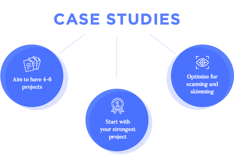
One of Kristine’s general recommendations is that you present your strongest, most comprehensive case first. This will help you make a good first impression, and mitigate the risk of recruiters only looking at your first case. Some choose to present their most recent case first, but you really want to potentialize that first impact.
It is also important that you optimize the cases for scanning, as most recruiters have a long list of candidates and limited time to analyze each portfolio – but we’ll get to that later on.
As a UX designer, you’re likely to have more than 4 or 6 projects under your belt. So how to decide which ones to include? Luckily, our speaker Ulrika came up with the portfolio matrix – and we are so happy she did.
The idea is that you list out your projects and analyze them according to a group of parameters. Here are the ones recommended by Ulrika:
- Project name
- Platform
- Business format
- Problem to solve
- User research
- Alignment
- Design approach
- Outcome
- Learnings
Once you list them all and the corresponding information as well, you’ll begin to notice strong points. This can be as simple as having many different projects that were focused on solving usability issues, or lots of experience with consumer-oriented products.
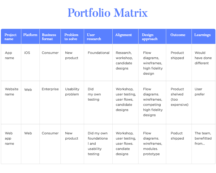
The way this matrix helps you to choose the right projects for your portfolio is that by looking at these strong points (and the weak points as well), you can balance them out. By choosing the right projects, you can showcase all of your top skills and mitigate those that aren’t as developed.
This section is a personal favorite of our speaker, Kristine. This is where you can really show who you are as an individual and not just as an employee. You can have some fun with it and try to include a snapshot of your personality such as the things that motivate you, what got you into design or what your passions are.
This shouldn’t be a repetition of your CV. That information can be easily found elsewhere and is a waste of an opportunity to introduce yourself on a more personal level. This is a great area to humanize yourself and your portfolio – recruiters like getting a feel of the personality behind the design.
It’s easy to get stuck in this section. After all, people are complex beings and it can be hard to define what part of you to convey here. In the face of this challenge, Kristine recommends starting out with a simple outline.
Before trying to get the specifics down on paper, think in terms of categories on a high level. So, instead of thinking about including either your love of photography or painting – just consider that you will have a “passions” category. Other possible categories include experiences or skills.
Once you have the main categories down, it will be easier to decide what goes into each category – and in your portfolio.
The second step is starting your narrative. As you think about what you’ll say and how you’ll say it, try to include your previous experiences – especially if you’re a career changer. Just like Kristine herself, who started out in business administration before leaping to design, many have a change of direction in their career.

In these cases, it’s wonderful to share the story behind that change. It will be a bright window into who you are and elaborate on an interesting period of your life – but it also gives you an opportunity. By going into your previous profession, you can put the transferable skills that you took with you from that profession into design.
Kristine gives the example of a nurse turned designer. Both positions demand a high level of empathy: understanding people’s pains, complaints and problems. With this distinction, you show that you bring skills to the table that other applicants may not.
This section needs to be relatable. Try to use the proper design industry language, include personal experiences and make it so that the person who reads feels like they know you a little better afterwards. The transferable skills factor can make your story very relatable to people who went through similar experiences, for example.
This should be by far the most straightforward part of the portfolio. The key to getting this right is location: recruiters should never have to look for your contact information. Kristine recommends placing your information on the footer of every screen. Another important thing is to check that your information is up-to-date, as well as checking for broken links.
Kristine shares that she is often asked about the right platform for designers, and if they should code their own portfolios. That is entirely up to the designer but she does point out that, although coding can be a real plus if you wish to be known for your coding skills, it’s not a real requirement or necessity.
That is, in part, because designers have plenty of tools available to them that mind the coding, while designers are free to mind the actual design. Here are the main platforms you can go for.
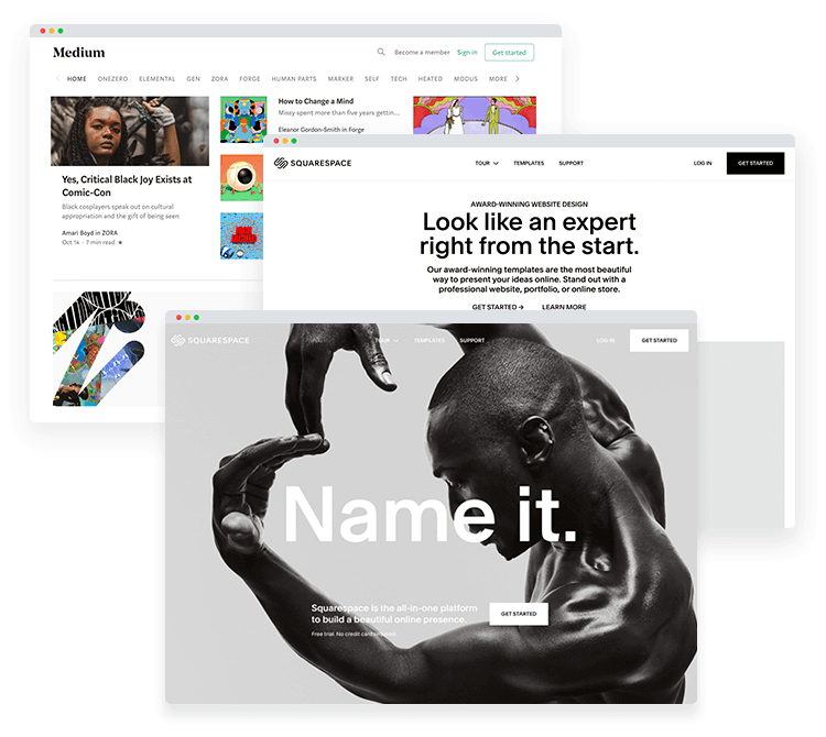
These include tools like Wix or SquareSpace, and are the most popular platform for portfolios. They are largely popular because they offer templates that are already structured for portfolios, which can be adapted to suit your style.
This type of platform tends to work better for lengthy content, such as portfolios that are more research-oriented. These include WordPress and Medium, and represent a good platform if you want to highlight your writing skills.
Platforms like Behance and Dribbble are more visual in nature, and can be used for UX design portfolios. In these platforms, however, it can be more difficult to offer context and formulate the full case studies. They are recommended for graphic or visual designers.
Kristine suggests that designers approach the making of their portfolio like they would a new UX project. That means that before you get to actually making the portfolio, you should sketch it out. This should help you get clearer on what content and information each case study will include and what it should look like.
It’s recommendable to look for a template after this sketching is done. As Kristine shared with us, it’s not uncommon for designers to choose a template and spend lots of time trying to adapt it to their portfolio – only to conclude it isn’t suitable. Getting your mind set on a template is dangerous if you’re not sure of what kind of structure your case studies will need.
Free UX Design Tool for web and mobile apps. Unlimited projects!

A case study should be a shared story of your leadership, our speaker Ulrika says – and we fully agree. Your case studies should tell the story of how you helped your previous stakeholders find a solution to a problem.
As most experienced designers will know, UX teams usually start out not actually knowing what they will design or build. There’s a huge amount of work that goes into defining the problem and making a long list of possible solutions – this process can be both demanding and confusing.
“I’m looking for signs that you can provide leadership, that you can bring the team with you.”
Ulrika Andersson – Senior UX designer at Linkedin
So how do you illustrate your part in that process? Ulrika shares some of the crucial information you need to include in the case studies to illustrate the part you played in finding the right solution.
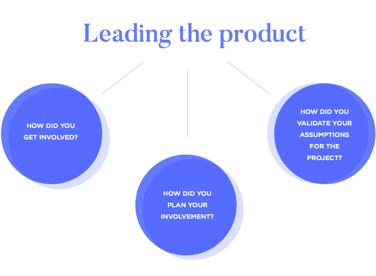
How did you get involved?
Pointing out that you noticed an issue and made a proposal for a solution can make a good impression. Saying that you were assigned to the task is also perfectly acceptable.
How did you plan your involvement?
This can be a way for you to show how you structured and planned the project. Things like setting up timelines, planning for future deliverables and defining milestones are all positive points.
How did you validate your assumptions for the project?
For Ulrika, this is all about your reasoning and thinking. It should show how you went about making decisions as the project progressed. Things like competitor analysis, searching for written studies, getting quantitative data and testing are all great points to make.
As Ulrika wisely puts it, the team is the most important asset you can have. A good leader takes the experiences and skills of team members and uses them as assets. This comes with many implications, such as allowing the team the freedom to contribute at every step of the design process.

Even if you weren’t the team manager, you can still showcase your leadership skills. For example, how did you help the manager achieve the task? How did the manager become comfortable with giving you the freedom to design and look for answers?
You can also include a view into the part that deliverables played in the team. For example, a deliverable that helped align the team. It could also be multiple variations of the same design with an explanation of how the team selected the best one – which brings us to the next point.
Deliverables can be a great way to show iteration and team dynamics. Showing variations of the same design is great, because it allows you to walk the recruiter through the thinking of the team. How did everyone come to a conclusion on the best alternative? What parameters were used in the decision-making?
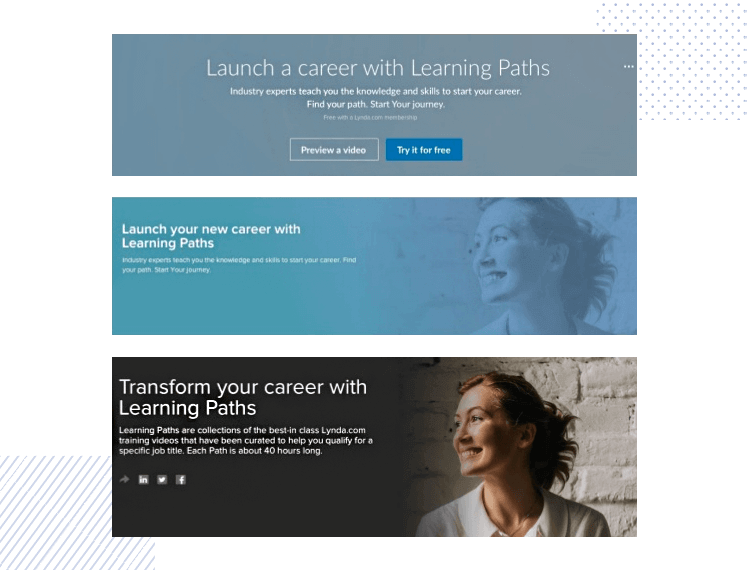
Kristine also points out that you should be prepared to go over these verbally in an interview. Recruiters can take an interest in the underlying reasons for the design, and may want to chat about how you chose one over the other.
Ulrika shares with us that career changers want to use their previous career to show they are fit to be a designer. Much like the example of a nurse turned designer, there are many different backgrounds that could boost your skills as a designer.
It’s important to keep in mind that recruiters only have 2-3 minutes to dedicate to your UX portfolio. This means that if you have two careers, you want to help the recruiter interpret your experience, your story. It needs to present the key benefits you took with you into the field of design, in a concise way.

That is not to say, however, that you need to completely abandon your previous career. If you want to present a more comprehensive view of both your careers – that is perfectly fine. Ulrika recommends that you create two portfolios: one for the career you had and one for the career you want.
This way, you’ll create two concise portfolios that will keep the attention of the recruiter, effectively telling your UX story better. If you create one portfolio that tries to cover everything, you risk creating something that won’t have a clear focus or will be too dense.
This one can be a bit tricky for those UX designers that don’t want to be perceived as solely visual designers. Even if you want to focus more on the experience design, having strong visuals is still a must.
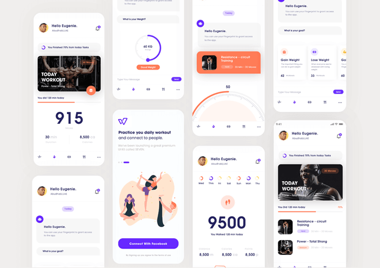
Design by Hesham Mohamed.
Strong visuals make for a big impact on the first impression of your UX portfolio. Kristine admits that having strong visuals is an easy way to get your foot in the door – but it should not be the sole reason you get the job. Let your first impression be a good one, then go on to share who you are and what makes you a good fit.
Your UX portfolio needs to be balanced. On the one hand, you want strong visuals and to show off your previous work. On the other hand, you also want to explain who you are, some of the skills you have and the kind of benefits you bring to the table. Overdoing either, however, is a big no-go.
It’s possible that you have some more visuals that you would like to include, or perhaps a text that goes more in-depth about some research you’ve done. In these cases, Kristine suggests having a separate file that recruiters can look into if they feel a need to.
You want to achieve a balance when presenting all of that to recruiters. In the end, most of them don’t actually read all of the content or look into the details – which takes us to the next point.
Once more, just to really make sure we don’t forget: recruiters have a surplus of applicants, and not enough time to look at each of them closely. That raises the need for your UX portfolio to be scannable by recruiters with a glance.
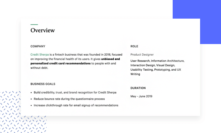
Kristine recommends that you pull out all the readability tools from your toolbox. The classics include breaking up content into sections with headers, using bold to highlight the key words and making smart use of whitespace. In broad strokes, you should be careful about your emphasis and always offer the eye some relief.
Free UX Design Tool for web and mobile apps. Unlimited projects!

It’s important for recruiters to get a sense of how you make your decisions, how you approach problems. And so, you should aim for showing your reasoning behind every decision in your UX portfolio.
The UX design process can be long and complex, which means that recruiters can’t sit down to read your entire adventure from previous projects. Your UX portfolio should include only the important bits, such as crucial turning points, key findings, or the factors that pushed the design in a certain direction.
The case studies in your portfolio can’t go on forever – you have to be concise.
It’s not that uncommon to have a complex project that had many different levels – say, a project that included a branch and another mobile branch. It’s useful to break those up into two separate case studies, and maximize the impact from both on the portfolio. That way, you get to present all the right information without overwhelming recruiters.
Locking the entire portfolio is discouraging to recruiters. Kristine herself shares that when confronted with a locked portfolio, it’s unlikely she’ll make the effort to gain access – not with a long line of applicants ready to share their work.

It’s okay to lock the parts of your portfolio that you can’t openly share. Even with a partially locked portfolio, it’s a tricky decision to make. Using a partially locked portfolio may offer some setbacks such as recruiters moving on to the next applicant in line.
However, if you’re willing to take that risk, it’s recommended that you make sure your contact information is readily available so recruiters can ask you for the access code.
Here’s a very important tip for making your UX portfolio a winner: never skip the context. It’s a vital part of storytelling. After all, a solution is only as impressive as the problem – and without the key basics, your case studies may fall flat.
Having a design in a case study that looks cool isn’t enough. In truth, recruiters won’t be able to understand the significance of the design or the project as a whole without some key pieces of information. With that said, never forget that it must be concise and scannable!
So what kind of information do recruiters need? Aim for the classics: who, what and why.
Even if your main area of work wasn’t the research, it’s still important to include it in the case studies. It shows that you understand the role research plays in the UX design game. When done right, your research part of the case study will show that you understand the connection between UX research and user-centric design.
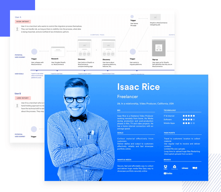
User Journey map by Janna Hagan and user persona by Mohamed Boumaiza.
Try to showcase who the users were, the methods used in the research and what you were hoping to achieve with them. Feel free to credit others who carried out the research with you. UX design is often a team effort!
This part can be found within the research section of the case studies or as its own individual part – both are alright. You’ve got to watch out for elaborating too much on this part, as research is likely to give you many insights into the project.
The key here is going for the bottom line: what insights did you get and how did they shape the design? How did you make the leap from insight to a decision on the design?
You want to show recruiters that you can analyze the results from research and correctly translate them into tangible changes to the product. This section should show your thinking and reasoning skills – and should be closely linked to your validation and iteration.
It’s potent to show that the design process in any case study wasn’t a straight line – there tend to be many sudden turns involved. Showing iterations is a great thing, because it illustrates how you go about optimizing your work. It’s a tangible result from all your research, and shows the actual impact from all the feedback you got on the design.
Kristine is a big fan of seeing how candidates improved on their design, as well as what kind of things they learned along the way.
Choosing the right way to show the final solution will depend on you. There isn’t a one-size-fits-all recipe for presenting the work – it’s a matter of preference. Kristine, for example, chooses to put the solution in the end of the case study. This gives her the opportunity to present the situation, the project, and all the necessary context to the reader first.
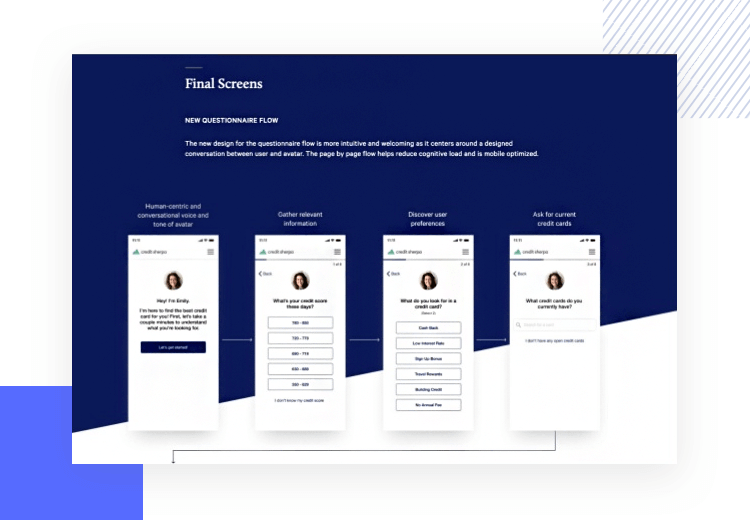
It’s also a good idea to include a snippet of the finished project at the beginning, leaving the detailed view to the end of the case study. That way, you give the recruiter an idea of where all this is going while not elaborating too much on key areas of the design.
In the end, says Kristine, just do what makes you feel comfortable. It’s not black and white, but rather with plenty of grey so you can present the solution in your own way.
You can include the end-to-end flows, which will give a nice idea into the hard work you put into the planning of the solution. There’s no need to present all the possible user paths – choose the best ones in your opinion. It’s always better to present a high-fidelity representation of your solution!
Kristine is a fan of using GIFs to show her solutions. They play in a loop and mitigate the risk of recruiters not playing a video. Not only that, but they also allow you to show off your animation skills!
Including videos is perfectly acceptable, as long as the video remains entirely focused on the UI. Kristine also points out that it’s important for videos to not have any audio and be on auto play.
Yes, but it has to be perfect. A prototype lets recruiters get into the small details to check that everything was done correctly, opening the door to them identifying even the smallest mistakes.
Quick tip: For truly high-fidelity prototypes, visual editors don’t cut it. Go for a professional prototyping tool instead.
Even small mistakes can damage that first impression you tried so hard to establish with the design of the UX portfolio. On top of that, it also makes it seem as if you hadn’t put that much thought into the solution.
Design is a never-ending process. It implies constant learning and being open to learning is a great asset to any designer. And so, it makes for a perfectly acceptable section in the case studies: what did you learn from that project?
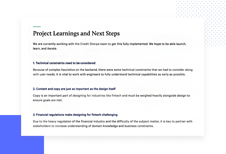
It could be anything new you learned about yourself, about UX in general or about users. You could share how a certain project changed your perspective or perhaps a hard lesson learned.
There’s nothing wrong with recognizing mistakes here, and sharing what it is exactly that they taught you. In fact, the argument could be made that by owning up to your mistakes, you demonstrate that you see these mistakes as learning opportunities and not embarrassments. This is a potent trait in just about any profession out there!
This UX design portfolio was made to be a simple website, offering the portfolio itself and an About page. The entire thing is easy to discover and offers a pleasing visual style. Vandana Pai made interactions that are brief but beautiful, with the visual hierarchy of elements being nothing short of excellent.
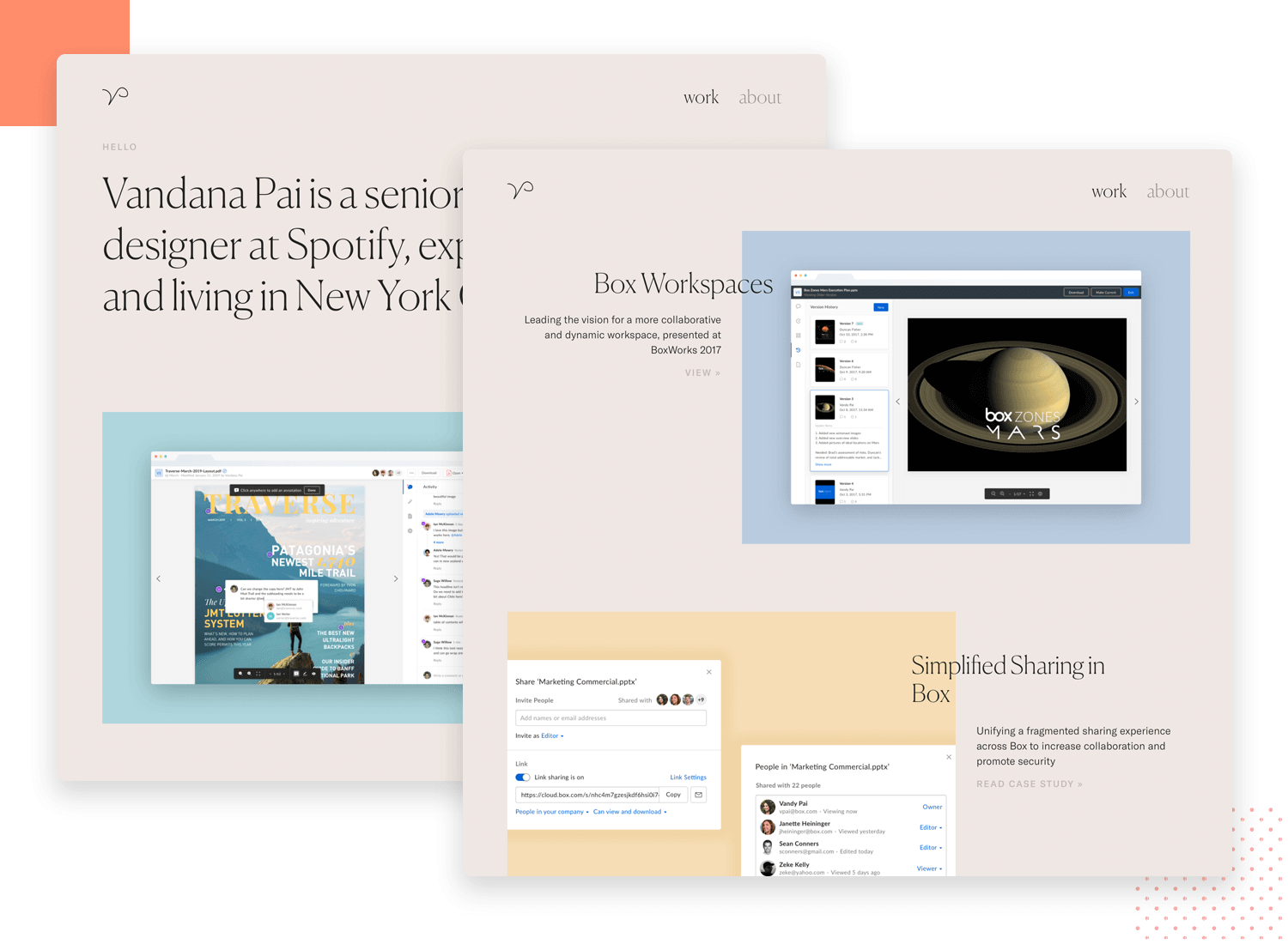
We love that the UX portfolio itself brings both the visual and the written part into play, which allows us to see and appreciate the visual design skills that Vandana brings to the table. With that said, the case studies themselves go much further than the visual, and showcase the very best of Vandana as a skilled problem-solver.
Each case study goes into great depth, giving us the context of the problem, the approach that was taken and an overview of the solution found. The information is well separated and organized, which makes it easy for the reader to absorb all that information. There’s something very proficient about the way that Vandana offers crucial details separately from the bulk of text, making it possible to get the broad strokes of it all without reading the entire case study.
This UX design portfolio feels a lot more modern and minimalist than our previous portfolio example. Karolis Kosas created a website that doesn’t include the usual About page, but instead focuses completely on the designs.
The amount of case studies and design examples is larger than some others on this list, but the way that each case study is presented is wonderful. It’s in-depth content never crosses the line into boring or overwhelming, breaking up large chunks of text into a balance that boosts the readability of the entire website UI portfolio.
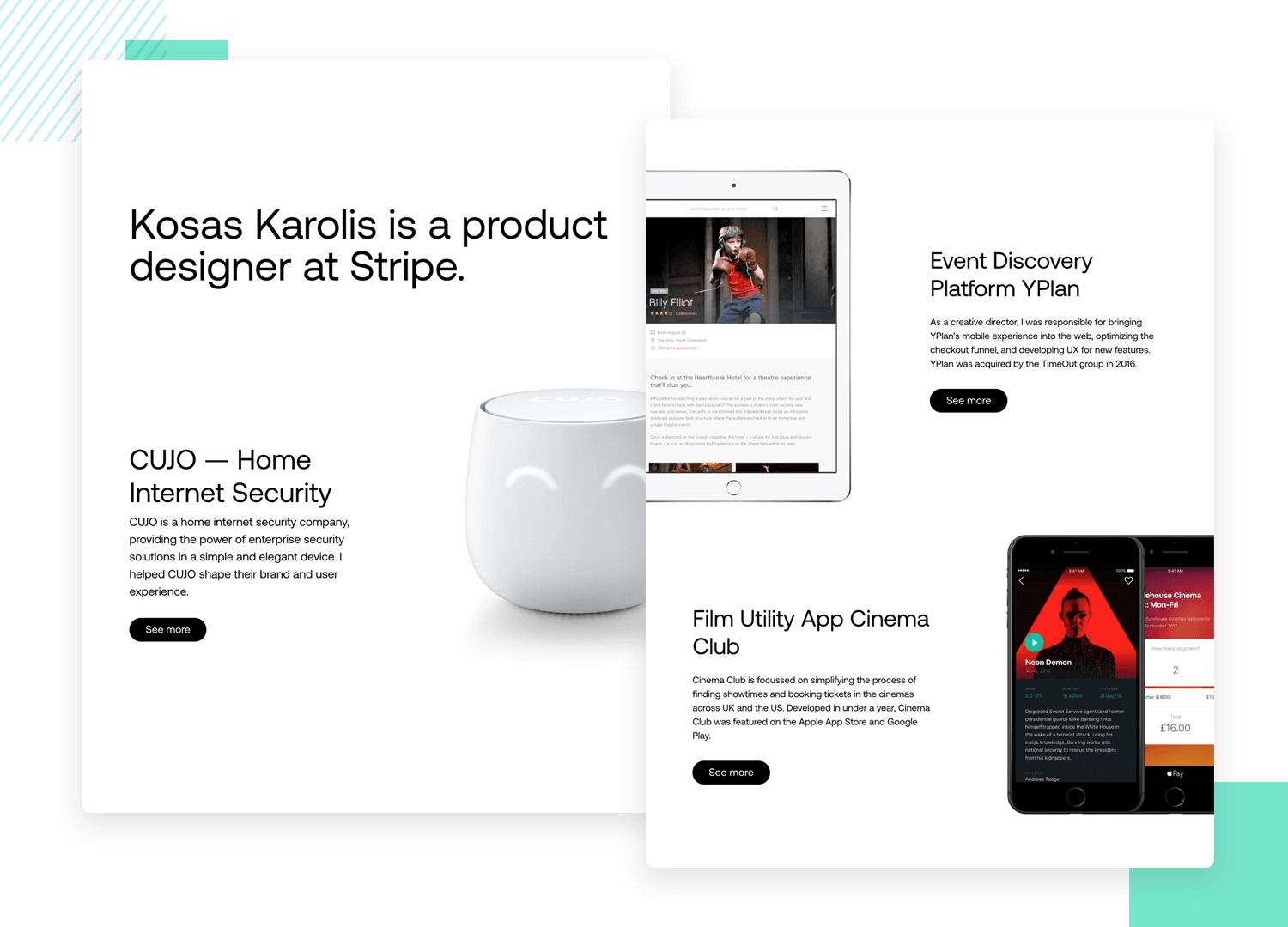
There’s that written element that helps us understand the context, challenges and factors that the designer had to deal with – which gives us a glimpse into their thinking and reasoning. When it comes to the visual element, this designer showcased the deliverables of each project, showing things like the user flow and several of the finished screens. Wonderful.
This is a UX design portfolio example that feels casual and very meaningful. Pratibha Joshi, currently a designer at Google, created a website that feels like a conversation with the designer herself. It enjoys the classic pages including an About page, Contact page and a home where the portfolio itself is located.
We love the About page. It feels personal, like it goes beyond the simple design skills but also goes into what makes her tick, what inspires her and how her life has shaped the designer she has become.
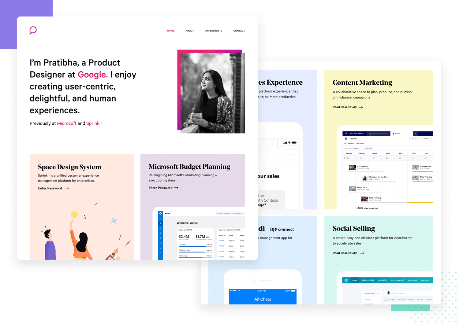
When it comes to the design portfolio itself, Pratibha separated the actual case studies from the more visual-focused prototypes. The prototypes of new techniques and fun sequences are located in the Experiments page, making it a fun way to display her sharp eye and passion for interactions.
Here’s the interesting thing about the case studies in this UX portfolio example: they’re not open to the general public. This may seem contradictory, but it’s a smart way to deal with the challenge of sharing details of projects that employers may not want on the internet. By protecting them with a password, the designer makes sure that recruiters alone can see the details, with much more control over what gets to be public.
Olivia’s UX design portfolio is colorful and full of life. Her portfolio website offers several case studies, as well as an About and a Contact pages. Her case studies are open to the public, with each one offering a great deal of detail into the project.
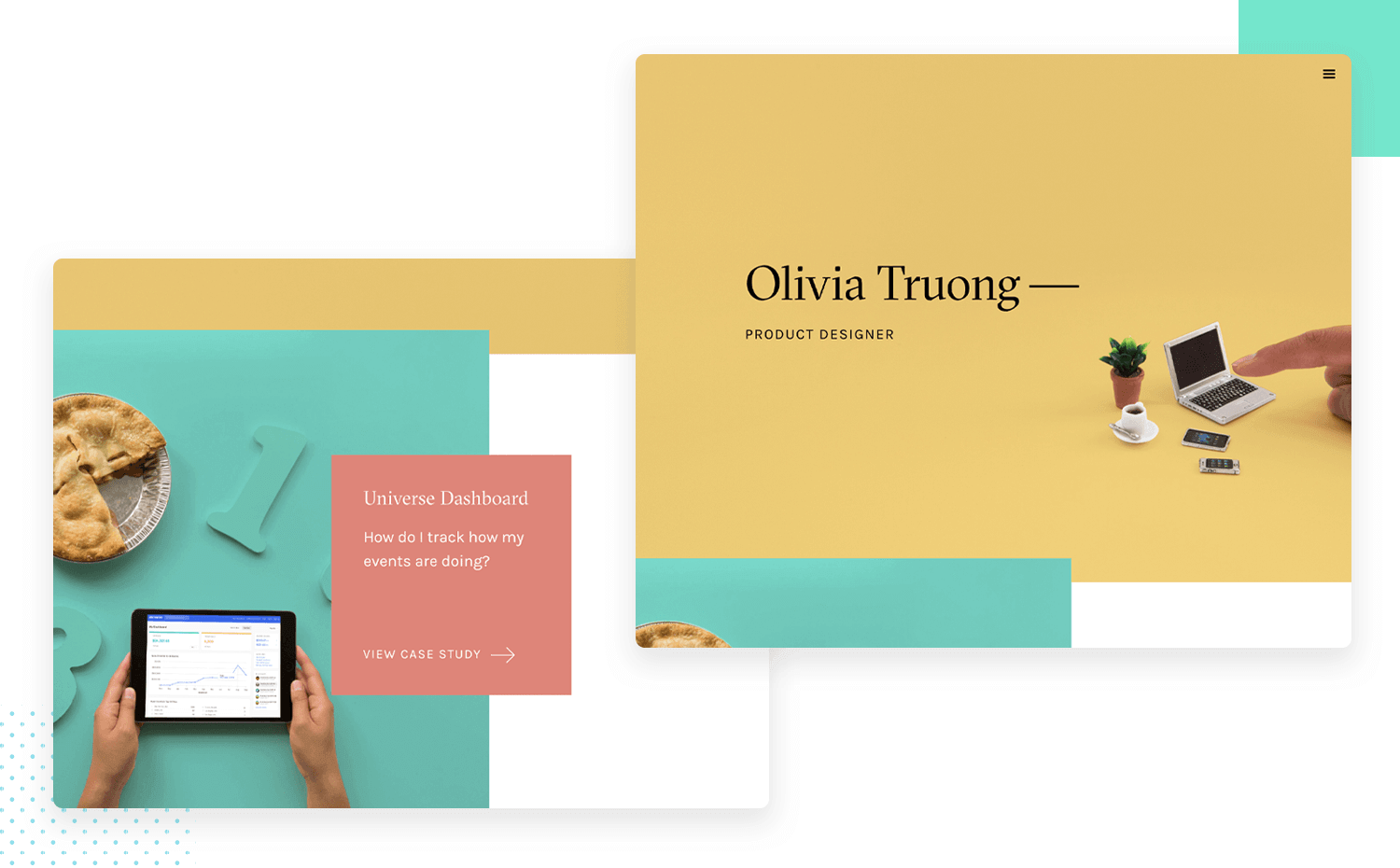
The case studies are a wonderful example of storytelling in UX portfolios. They tell a story, using visual cues to make the reading easier and even fun. By reading a single case study, we can see how she approaches problems as well as how her creativity shapes her work.
We love that at the end of the case studies, Olivia Truong shares some questions she’d still like to discover and things she’d like to expand on. This shows that for her, the work is never truly over, with UX design working as a constant evolution in which we all play a part. That, right there, is a great deal of insight into how her mind works as a designer.
Free UX Design Tool for web and mobile apps. Unlimited projects!

Amy Wu created a beautiful website for her UX design portfolio. It checks all the right boxes, with a wonderful About section and even points to her skills as a writer as well as a designer.
Her UI design portfolio has case studies that are open to the public as well as some that are password-protected. We love that the case studies focus on the visual deliverables of the project, walking us through the crucial highlights by showcasing things like the user flow and even visual representation of hypotheses.
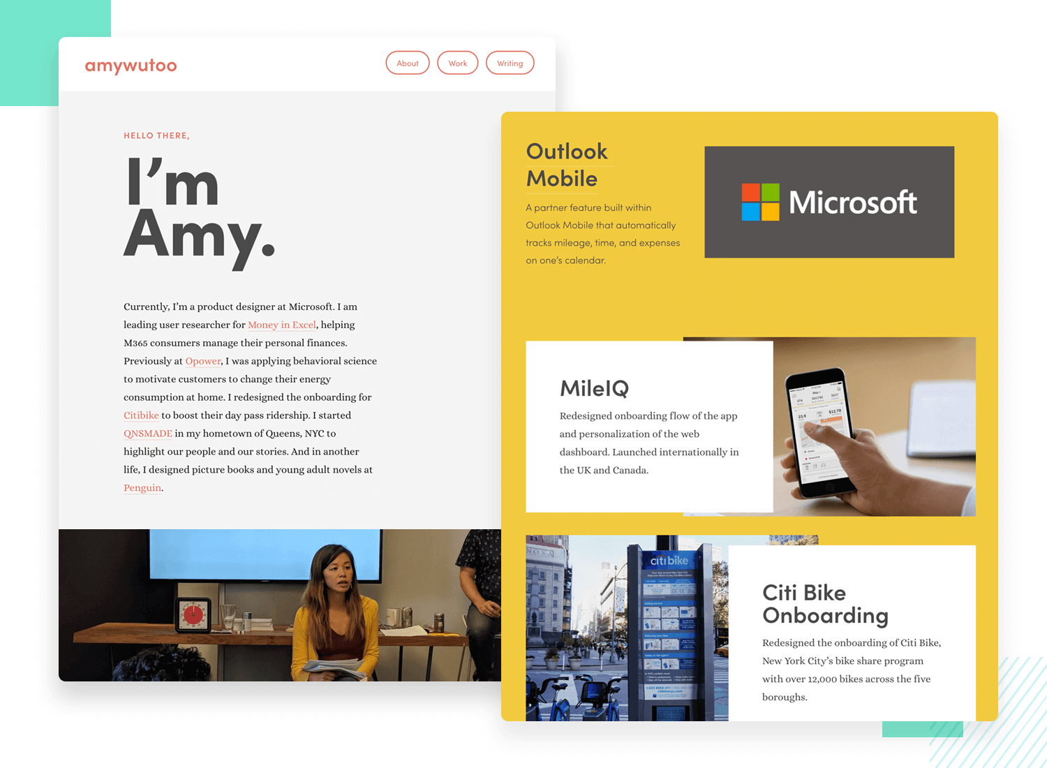
It goes to show that if you’re not into writing long pieces of content, there’s still a way for you to tell your story. It’s about creating an immersive experience, sharing the important details and showing your work in the best possible light. Amy shows us that her problem-solving and thinking skills are on point, without long paragraphs that stretch on forever. This would be an impressive take for a UI designer, where the UI design portfolio itself shows some serious skill.
Daniel Autry created a website that makes for another wonderful UX design portfolio example. There’s a sense of fluidity to the entire website, with ample empty space and a highly defined visual focus. All the details have been carefully planned, from the balanced color palette to the microinteractions all over the website.
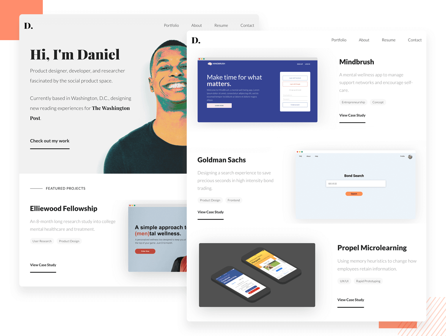
We love the way Daniel presents his case studies. Like other UI design portfolio examples, this designer clearly invested time and effort into avoiding long paragraphs, choosing to use short sentences and more visual cues.
We love that Daniel used colors to create a clear separation of sections, using typography to highlight key pieces of information. On top of that, Daniel also uses plenty of illustrations in order to make the case studies more dynamic while still delivering the crucial details.
Aurora Shao created a UX design portfolio that feels young and vibrant. The website itself is all about beautiful arrangements of visual elements, creating a unique visual identity. This, perhaps, should come as no surprise.
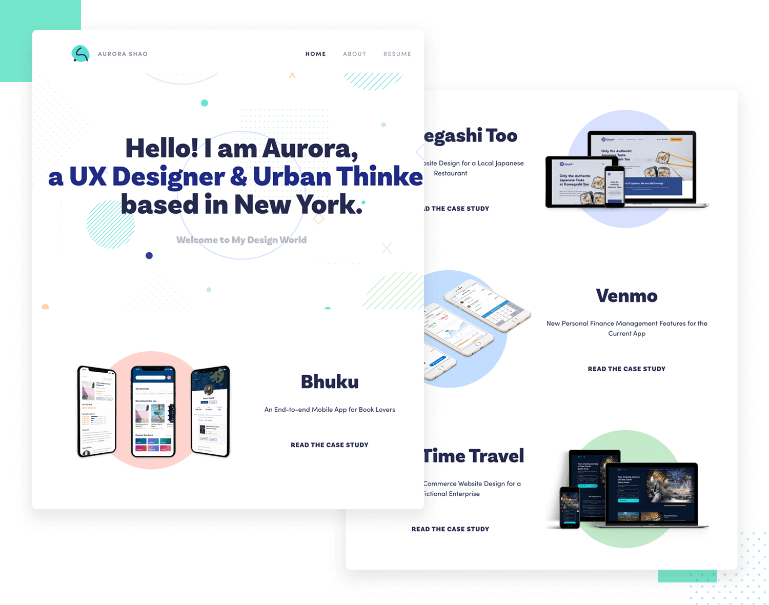
In her case studies, Aurora does a wonderful job in showcasing how diverse her skillset truly is. On the one hand, we can see a clear skill when it comes to problem-solving and simplifying complex information. It’s no secret that both these skills are highly prized in the world of UX. With her case studies, this designer breaks the main challenges down, showing analytical and critical thinking.
On the other hand, this UX design portfolio also showcases a very sharp eye for visual balance. Aurora shares tasks like interface design, creating a visual style for new projects or laying the groundwork for a design system. That, together with the UI design of the portfolio website itself, creates a clear picture of a well-rounded UX designer that checks all the right boxes.
This UX design portfolio example is different from the others, in the sense that it feels like a more tech-oriented and modern website. Siriveena Nandam has a background in psychology, where she focused on a more clinical and analytical line of work on the human mind, which is perhaps a factor in the visual identity of the UI design portfolio.
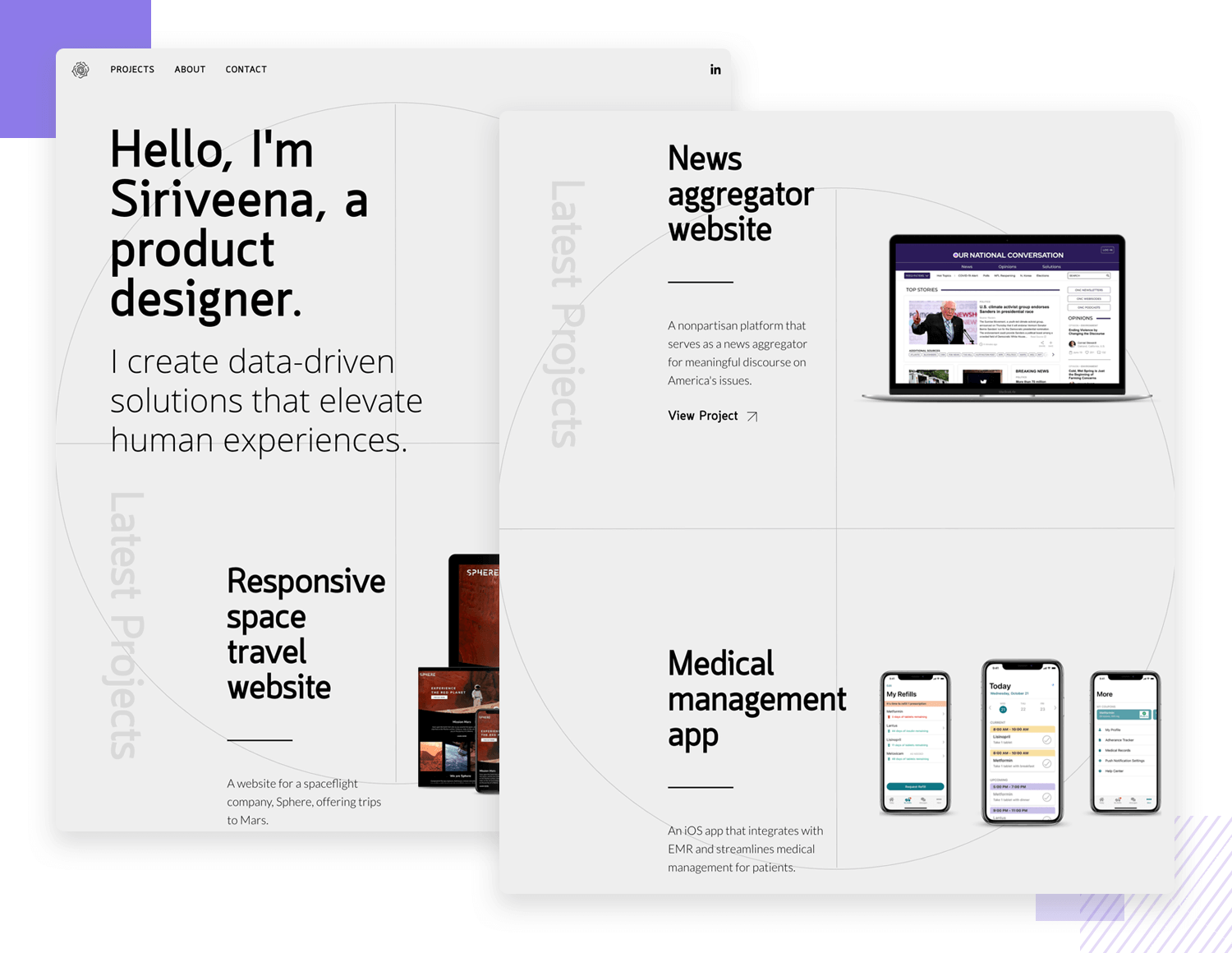
Each of the case studies goes into great depth, both when it comes to the context around the project and the specific tasks and turning points. We love that despite using quite a bit of text, Siriveena managed to create a very readable case study, breaking it up into several sections that make the whole thing easier to read.
There’s plenty of deliverables shown, from the user personas and user flows to the information architecture map, wireframes and prototypes. This creates a very detailed case study that showcases a skilled and analytical designer who enjoys the creative freedom of UX. If this was a UI design portfolio, it’d be a wonderful one.
Daniel Novykov brings us this highly dynamic UX design portfolio. The website itself feels young, friendly and vibrant. We love that Daniel created a well-rounded visual style, using different tones of grey in the background with bright splashes of color. It’s a very interactive and lively experience.
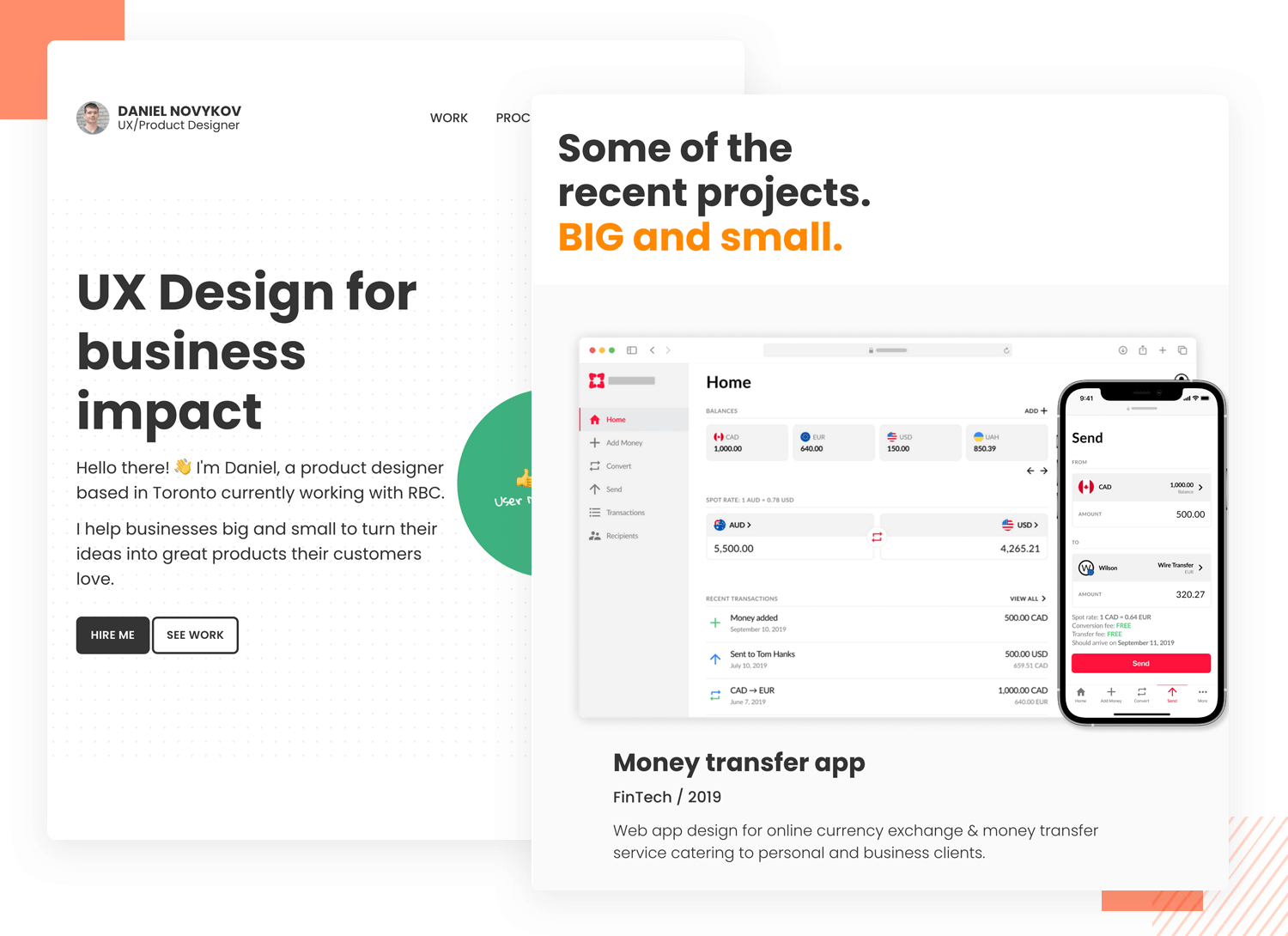
When it comes to case studies, Daniel shows a great talent for written content as well as web design. The case studies are divided into the classic stages of any UX project, from discovery to the launch – passing by every key cornerstone in between. The text enjoys paragraphs that feel like an article, keeping the communication casual while exploring the specifics of that project.
Katherine Chen’s UX design portfolio, like some other examples on this list, feels like getting to know the designer herself. The website feels casual and easy, with beautiful illustrations all around. We love that despite the wonderful UI design in her portfolio website, she let the content of the case studies shine bright and be free of fluff or distractions.
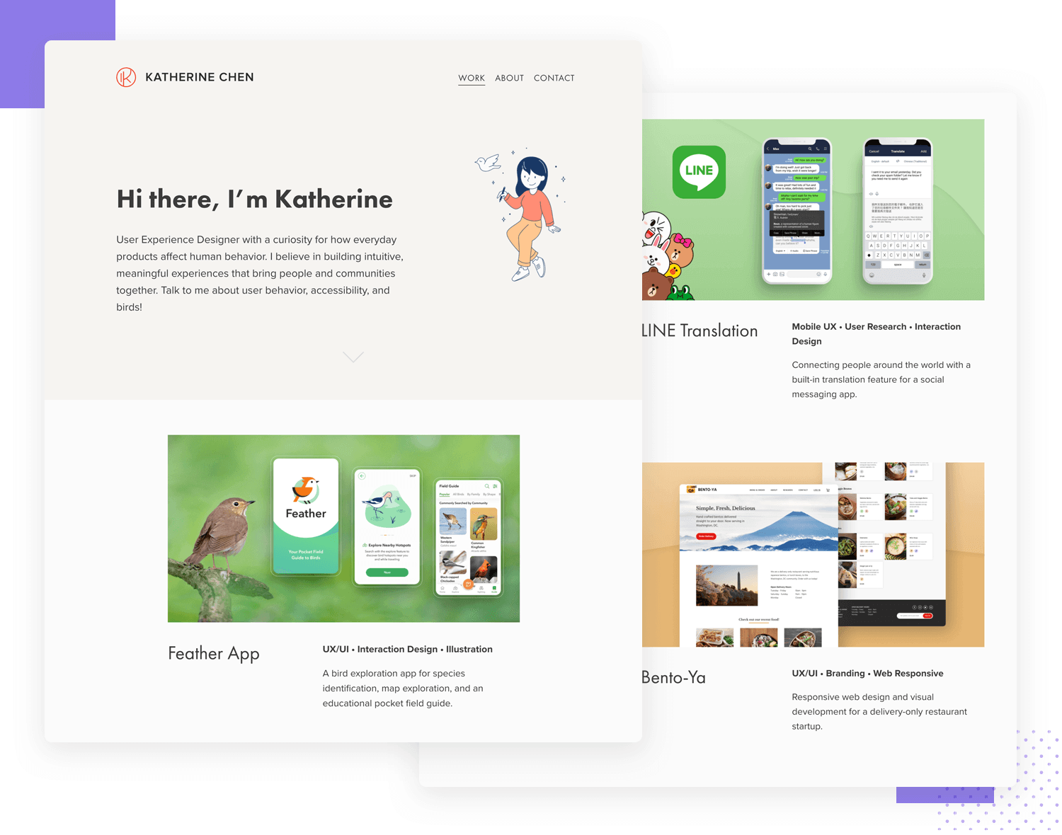
In the case studies, her writing is powerful and to-the-point. We love that Katherine introduces us not just to the project and the surrounding context, but also sharing with us how the thinking helped the design to move forward.
Sure, things like creating a user persona is often seen in UX portfolios. However, Katherine went the extra mile and helped us understand how her logic worked, how she used the context and research results in order to draw conclusions. That kind of problem-solving and critical thinking can be difficult to convey in a case study, which this designer absolutely got right.
Paula Wrzecionowska’s UX design portfolio is a great example of how to keep things simple and engaging. Her projects showcase her knack for creating user-friendly designs that look great and work even better.
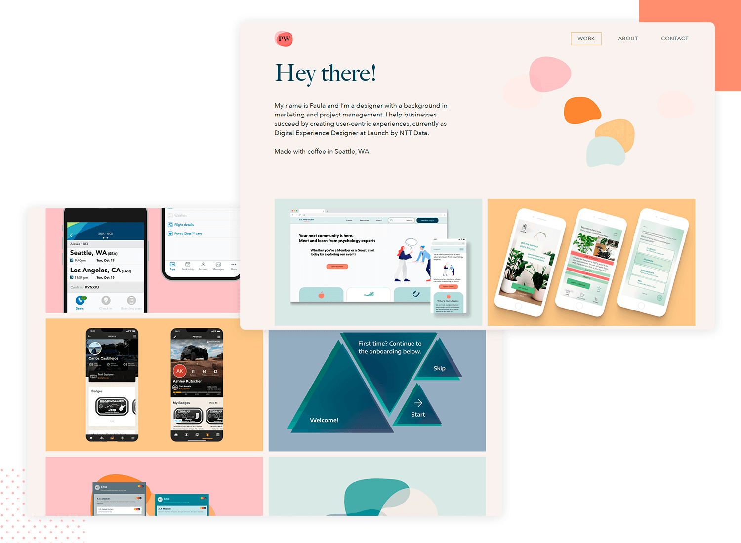
Everything in this UX design portfolio is easy to follow, making it clear that Paula knows how to connect with users. For anyone curious about UX portfolio designers or searching for portfolio examples, Paula’s work really stands out as a strong example of balancing design with usability.
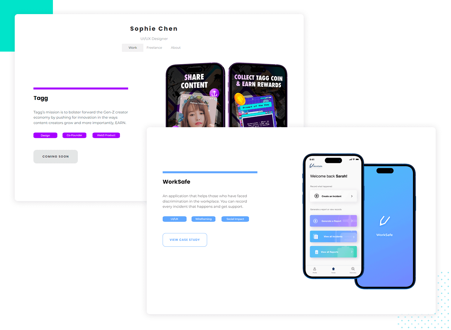
Here’s another great example of making things creative and easy. Sophie Chen’s UX portfolio example is easy to follow and well-organized, making it simple to see her skills in action. Sophie also adds a personal touch by explaining how she learned to code to improve her designs, making her portfolio not just about the work, but about her growth as a designer too.
Free UX Design Tool for web and mobile apps. Unlimited projects!

This Behance portfolio is a great example of UX/UI design that’s both simple and modern. The site is easy to use, making it perfect for showing off the designer’s work. It balances clean design with a user-friendly experience, which helps visitors quickly find what they need. If you’re looking for a straightforward way to set up your own portfolio, this example is definitely worth a look.
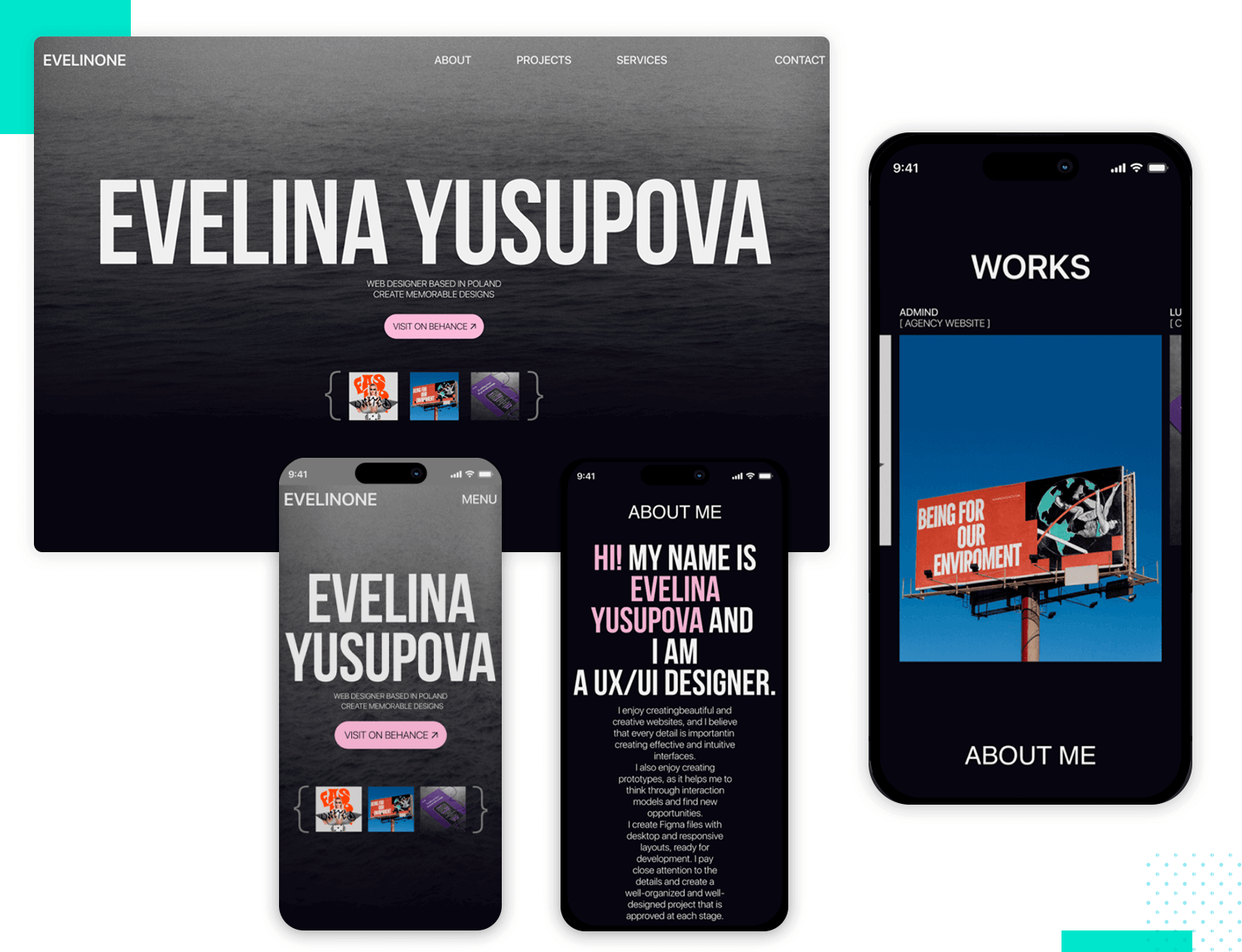
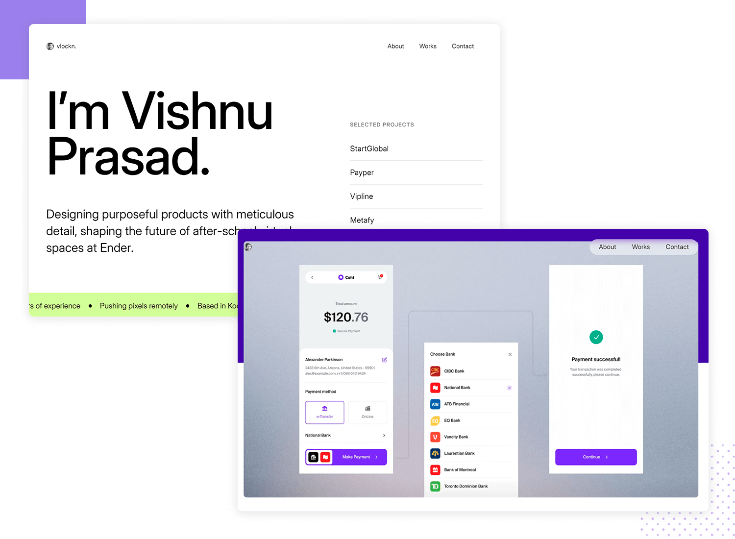
Vishnu Prasad’s portfolio example keeps things easy to see and understand. The design is simple but grabs your attention right away. His work is displayed clearly, showing his skills in creating detailed digital products.
The projects are organized nicely, so you can easily find and explore them. If you like straightforward design that gets to the point, this portfolio is a great one to check out.
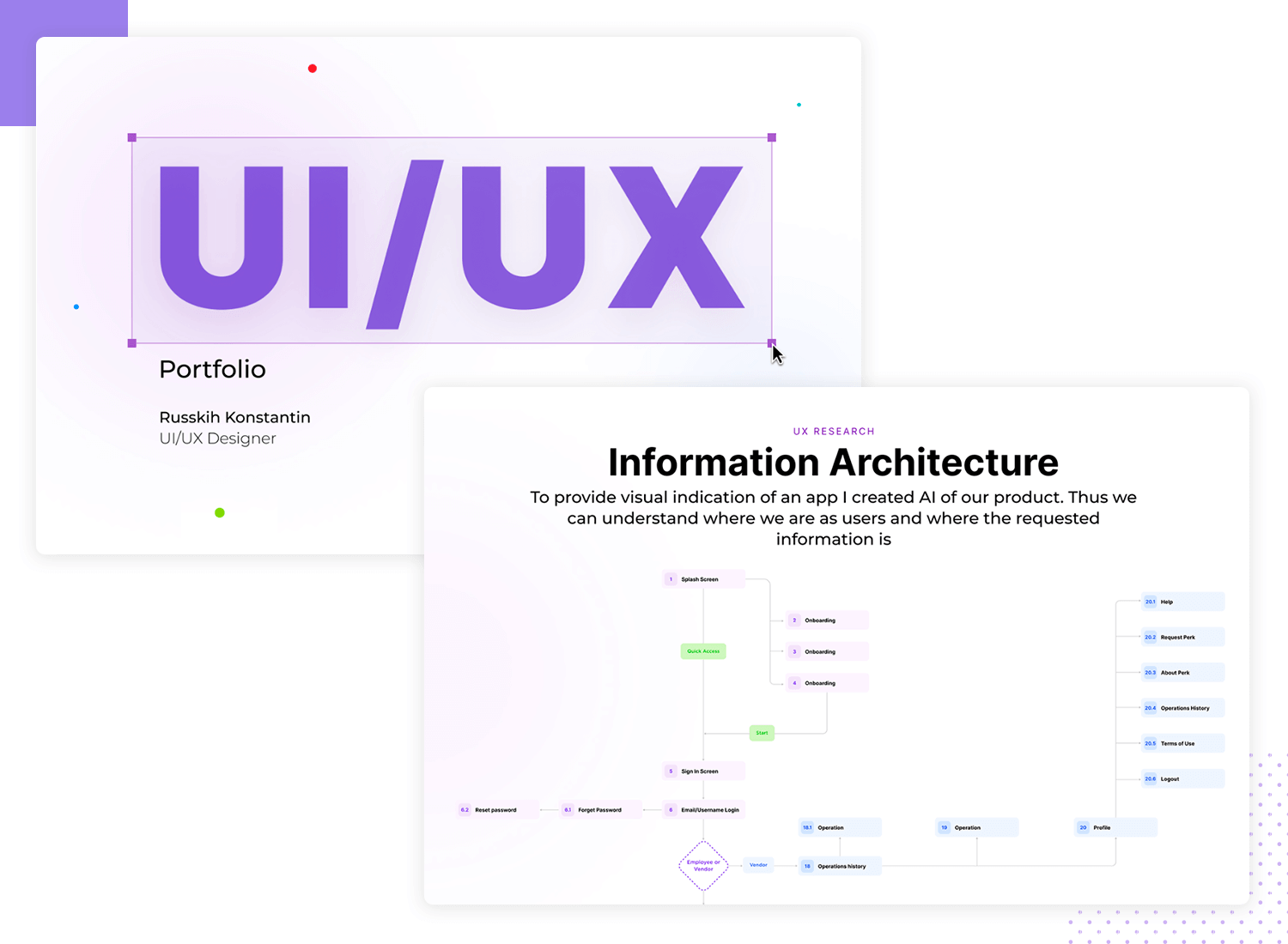
Finally, we have Konstantin Russkih’s portfolio. It’s straightforward and full of personality. Konstantin shares his love for UX and how he understands people to create great solutions.
The design is clean, with all his skills, experience, and contact details easy to find. It’s a great mix of professional and personal, showing who he is and what he does best. If you want a simple yet effective portfolio, this one is worth checking out.
UXfolio is a website editor that was created specifically with the intention of holding designer’s portfolios. The great thing about this portfolio platform is that it’s quick to set up and even to create the website itself. This makes it an attractive option for those designers looking to simply get their portfolios out there, without wasting too much time in the setup process. It’s perfectly suitable for a UI design portfolio.
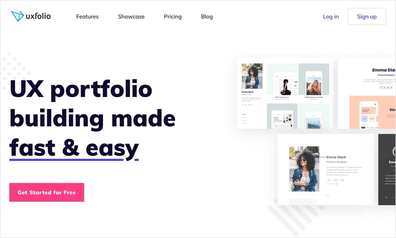
With that said, some designers claim the website editor simply isn’t customizable enough. Perhaps this shouldn’t surprise us – if there’s a group out there that can be picky about their UX, it’s UX designers. There are those who say creating a portfolio with UXfolio will limit their creativity and keep them from creating what they had envisioned.
However, there’s no denying that UXfolio has a few very attractive features. For example, their ability to allow designers to create case studies in any shape of form they wish is powerful, making it easy to display the content in a favorable way. Another good feature is the option to lock some case studies with a password, like some of the designers we mentioned on this post. If your UI design portfolio has sensitive information that may not belong out in the open, this platform can be the most practical answer.
Free UX Design Tool for web and mobile apps. Unlimited projects!

Dribbble is widely popular amongst the web design community. It’s bubbling with activity, with thousands of UX designers around the world using the platform to hold their work, creating an online UX portfolio. It’s free, easy and fun to create your UX design portfolio like this – but there are those who say this alone isn’t enough for recruiters.
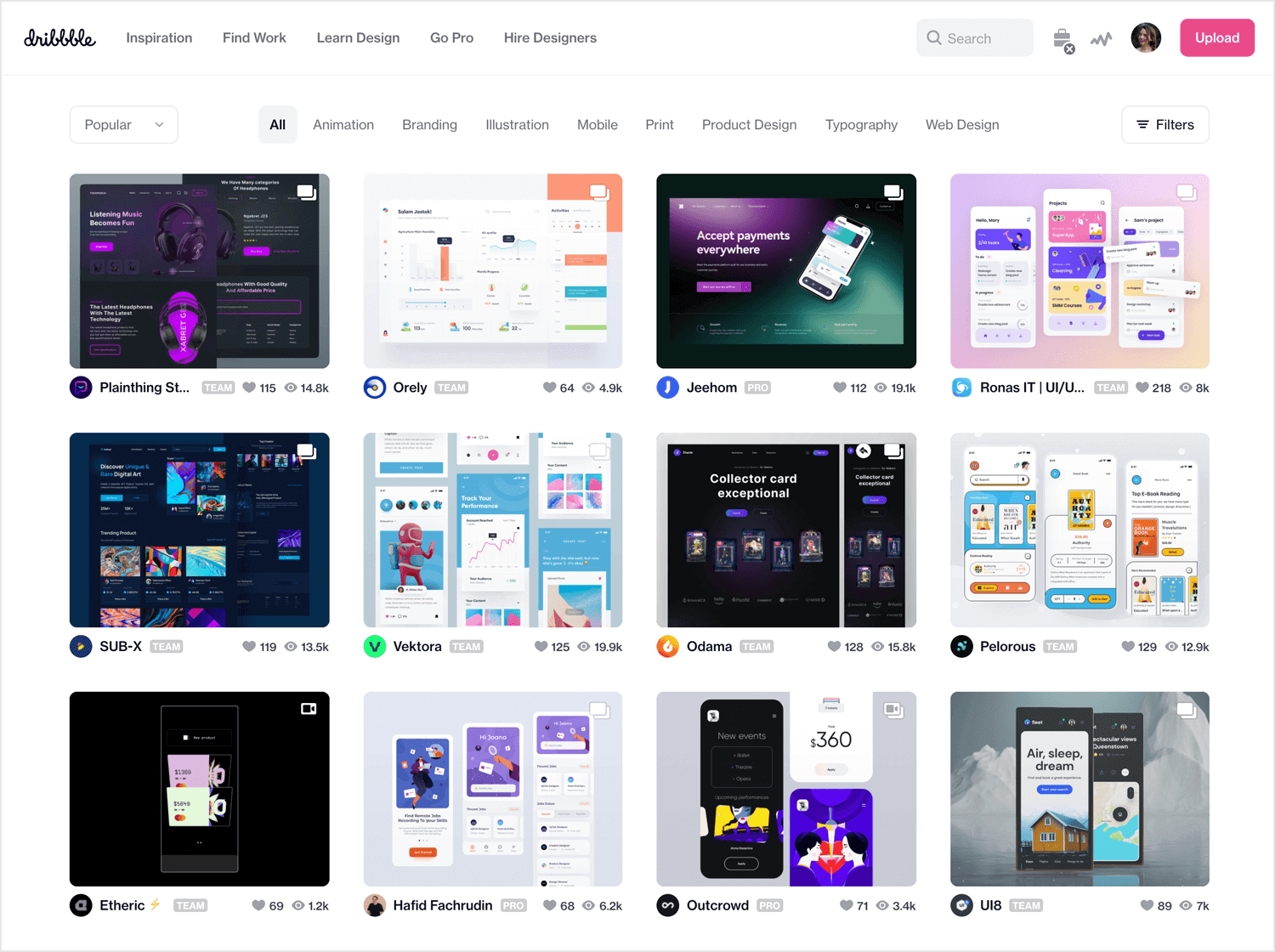
While having your beautiful designs on display for the design community does come with its set of advantages, we must never forget the true nature of UX design. It’s not about creating beautiful interfaces or awesome illustrations – it’s about solving problems and creating solutions. That’s why many designers choose to show their work on Dribbble but also have their own UX portfolio website, where they can offer case studies that share more vital details like your approach to challenges.
Precisely because of that limit of information that can be shared, Dribbble is even better suited for UI design portfolios that want to focus on the visual. Offering the ability to display several shots of previous work, UI designers can use the platform to really showcase their skill.
Now, with all that said, Dribbble can be a great option to also connect with other designers. It’s got a very active community where people can broaden their horizons and find true inspiration. Perhaps that alone is a good reason to join this social media platform.
Behance is often compared to Dribbble, in the sense that it’s also a social media platform where the design community shares their work. We find that Behance has many of the same positives as Dribbble, especially when it comes to storing and sharing your work. Once again, this kind of platform may be better suited for UI design portfolios, more than UX-themed ones.
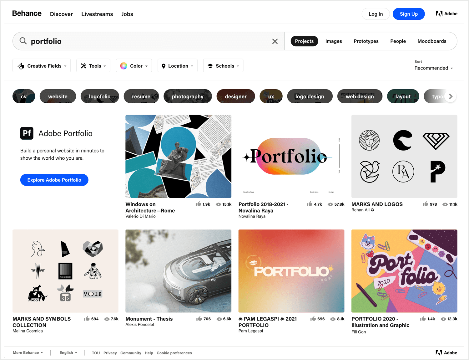
Having your UX portfolio in a place like Behance doesn’t give you too much freedom to dictate how the website looks, but it can be put together very quickly and easily. It’s free and also brings that element of making a part of a community, getting your work out there to reach a bigger public.
Like Dribbble, you can’t password-protect your posts, which means that any sensitive designs you have may need another platform to be shared with the right people. Altogether, it’s a great way to display your visuals and create a UI design portfolio.
Pixpa is a popular website builder that often receives praise for its ability to get ecommerce stores up and running quickly. The builder has plenty of templates that have a modern look as well as a lot of room to create something unique and custom for your website. This means there’s plenty of margin to create a kick-ass UI design portfolio.
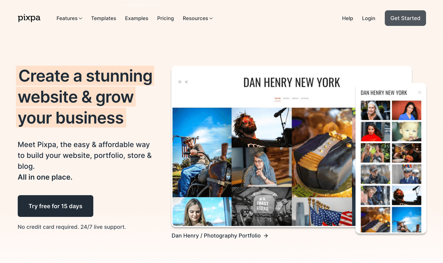
In fact, this freedom to create often turns people off from the product, especially if they’re just looking for something simple that can go online and make a couple of sales. There’s too many options for custom elements, which can be a bit overwhelming for most users. Designers, however, tend to enjoy this capacity of customization and often use the platform for their UX design portfolios.
Amongst the greatest features for designers we find that there’s an easy way to connect to other social media profiles, easy responsive features for all websites as well as a feature that helps users to create a SEO-friendly website. Altogether, this makes for a great alternative for those looking to have full control over their portfolio website.
Another platform that was specifically designed to hold content of a certain artistic nature. PortfolioBox is all about giving its users freedom and control over their work, choosing the best way to present their designs. Because of the highly visual nature of the website builder, this is a popular option for musicians, photographers and other creatives who don’t want to deal with any code at all. It’s perfect for both UI design portfolios, as well as UX portfolios.
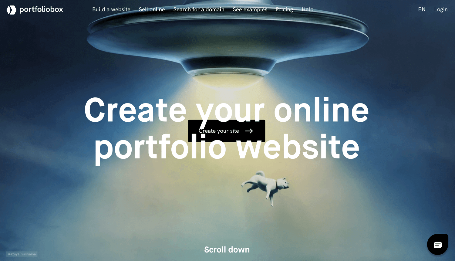
PortfolioBox is completely online, without the need to download anything. The templates offered are all very modern and clean, giving you a great base to work from. The website builder also gives you freedom to create something completely new, offering a very intuitive interface that can be learned in a few moments.
Wix is a super easy-to-use website builder, perfect if you want to create a stylish and professional UX portfolio without needing any coding skills. It offers a variety of beautifully designed templates that you can customize to match your personal style.
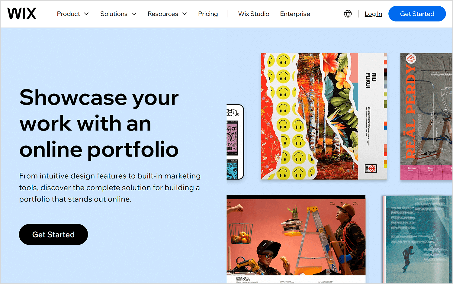
With Wix, you can drag and drop elements to create a unique layout, making your portfolio stand out. Plus, it’s great for adding features like contact forms or integrating your social media profiles, helping you connect with potential clients or employers effortlessly.
Now, let’s talk about Squarespace. If you’re thinking about what you want to do with your website, whether it’s showcasing your work, offering services, or even selling products, Squarespace makes it easy to bring your vision to life.
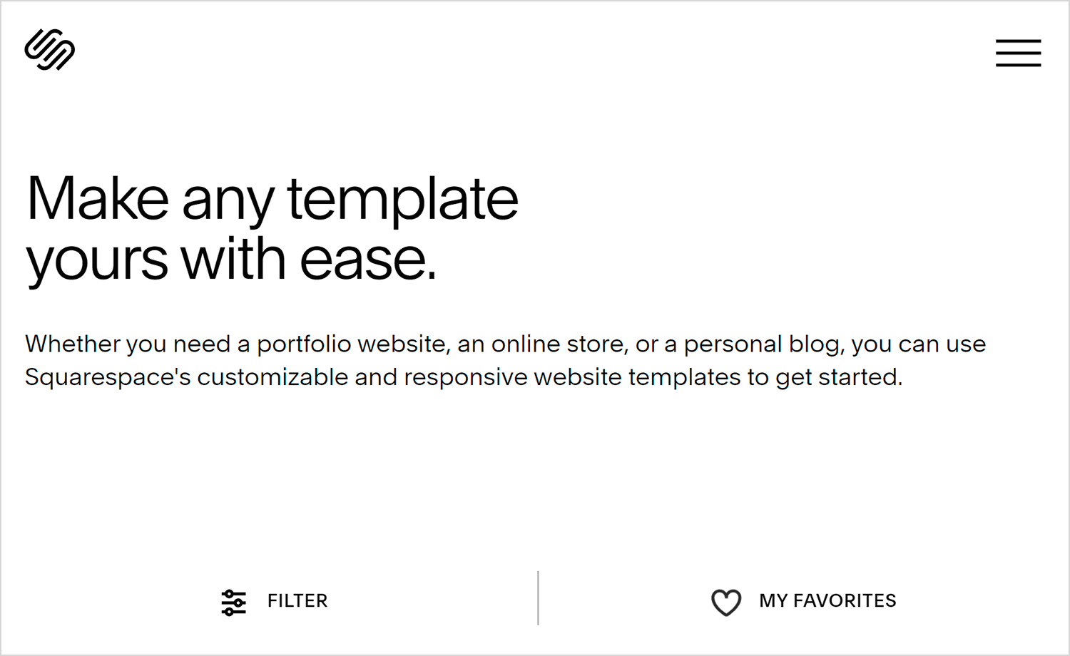
It’s like having a friendly guide right there with you, helping you build a site that fits your needs perfectly. The best part? You don’t need to worry about coding or technical stuff, it’s all about choosing what you want, dragging and dropping, and making it your own. Squarespace really lets you focus on what you love, whether that’s displaying your work or connecting with your audience, without getting bogged down in the details.
Carbonmade is a great option if you’re looking for a place to show off your work. It’s a platform that’s easy to use and packed with features, so you can create a UX design portfolio that really stands out.
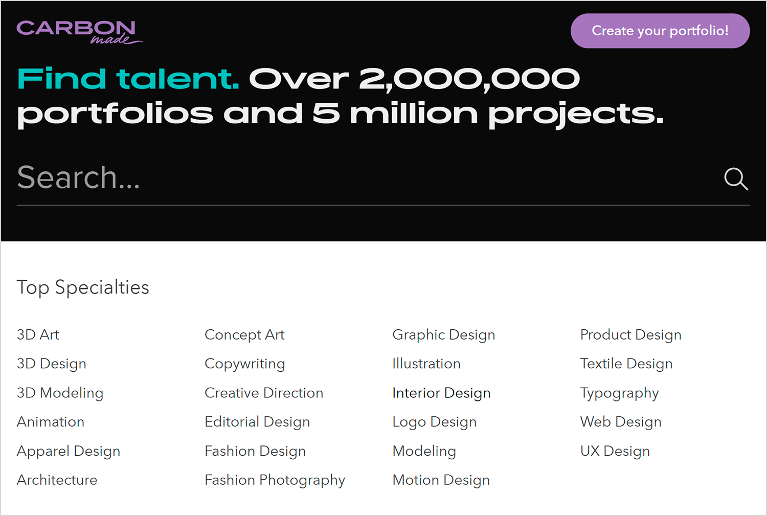
Whether you’re into 3D art, graphic design, or UX design, Carbonmade has you covered with options to showcase your specialty. Plus, with over 2 million portfolios already on the site, it’s clear that a lot of creative people trust it to display their work. If you want a platform that’s both simple and powerful, Carbonmade is definitely worth considering.
If you’re after a platform that gives you the freedom to really push your creative boundaries, Cargo is a fantastic choice. It’s designed for people who want their portfolio to be as unique as they are.
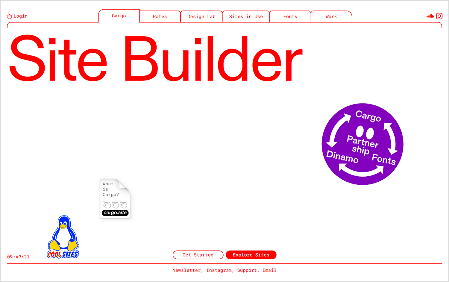
The platform is super flexible, letting you customize almost every aspect of your site, which is perfect if you have a clear vision of how you want your work to be presented. And don’t worry – getting started is pretty easy. Just explore the options, and you’ll quickly see how easy it is to create something that’s totally your own. Whether you like bold and bright or clean and minimal, Cargo lets you make it happen.
Finally, let’s talk about Webflow. If you’re looking to build a truly custom portfolio, Webflow might be the perfect fit. It’s a platform that gives you the power of a professional designer without needing to code, making it ideal for creating a unique and polished UX design portfolio.
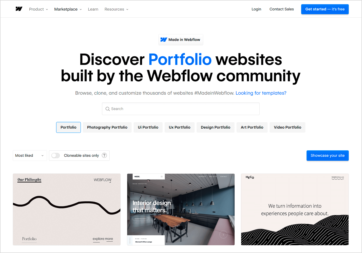
With Webflow, you can explore and even clone thousands of existing sites created by the Webflow community, which is a fantastic way to get inspired or start with a template that’s already proven to work. Being our last recommendation, Webflow really stands out for its ability to let you control every detail of your portfolio while still keeping things user-friendly. If you want to build something that’s truly yours, Webflow is definitely worth a try.
We get it. Making a portfolio for the first time can seem like a lot of work, but it can also be very rewarding. You’re creating a representation of everything you’ve become, a brief snapshot of your path so far. This is the kind of thing that can make you be surprised at yourself, when thinking about your priorities and what got you to where you are today. It’s the perfect time for self-reflection and to get honest with yourself.
And so, making your portfolio can be a truly wonderful experience where you come to terms with how far you’ve come. This is the time to define what your top skills are and how you got them, to share your communication style and how to think about design itself. With a little bit of time, effort and the right tool, you can create something you can proudly share online. Something that captures your career as well as the potential you hold.
PROTOTYPE · COMMUNICATE · VALIDATE
ALL-IN-ONE PROTOTYPING TOOL FOR WEB AND MOBILE APPS
Related Content
 Learn how to design better e-learning platforms with user-centered UX principles, real examples, and high-fidelity prototyping tips to boost engagement and learning outcomes.13 min Read
 Infinite scroll keeps users engaged, but it’s not always the best choice. This guide breaks down when to use it, when to avoid it, and how to design it right.14 min Read
 Learn how to design web and mobile app prototypes, how to test them and what to look for in a prototyping tool in this complete guide.15 min Read

