Awesome mockup designs employ a user-centered approach, visual consistency, and iterative feedback. Learn how to do it yourself!
A mockup design is like a blueprint for a digital product, offering a visual representation of its future form. It’s a snapshot that captures the essence of a website, app, or software, showcasing its look and feel. Mockups empower UX and UI designers and developers to bring their visions to life, allowing them to visualize and communicate their concepts effectively.
Design mockups for web and mobile apps with Justinmind. Try it for free today!
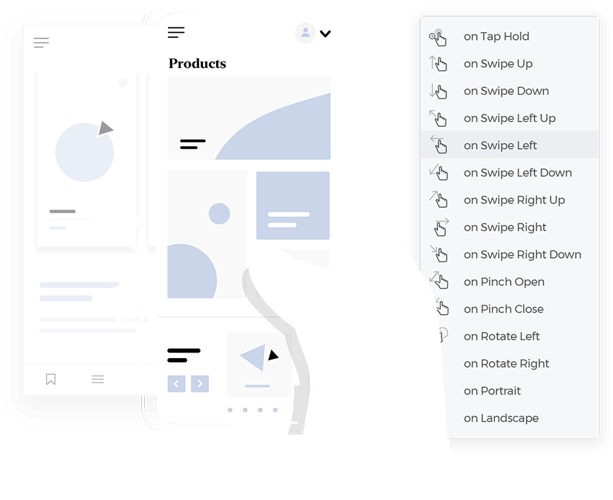
Using a mockup tool can help you create highly detailed and interactive mockups that serve as a bridge between sketching out random concepts and a tangible reality. These interactive mockups allow designers and developers to simulate user experiences which helps in providing clear guidelines for developers, ultimately enhancing the development process. Let’s go over the basics together to help you in building your very own interactive mockups for your next big project!
Mockups, also called screen mockups, help designers visualize their creations, communicate their vision effectively to stakeholders, and gather valuable feedback. Ultimately allowing mockup design teams to identify potential issues early on and make informed design decisions.
Imagine having a crystal ball that can predict the future of your design. Mockup designs offer just that! They enhance visualization, streamline communication, and accelerate development. Testing mockup designs with real users, UX and UI designers can uncover usability problems and refine the user experience. This iterative process leads to more intuitive and user-friendly products, ultimately saving time and resources.
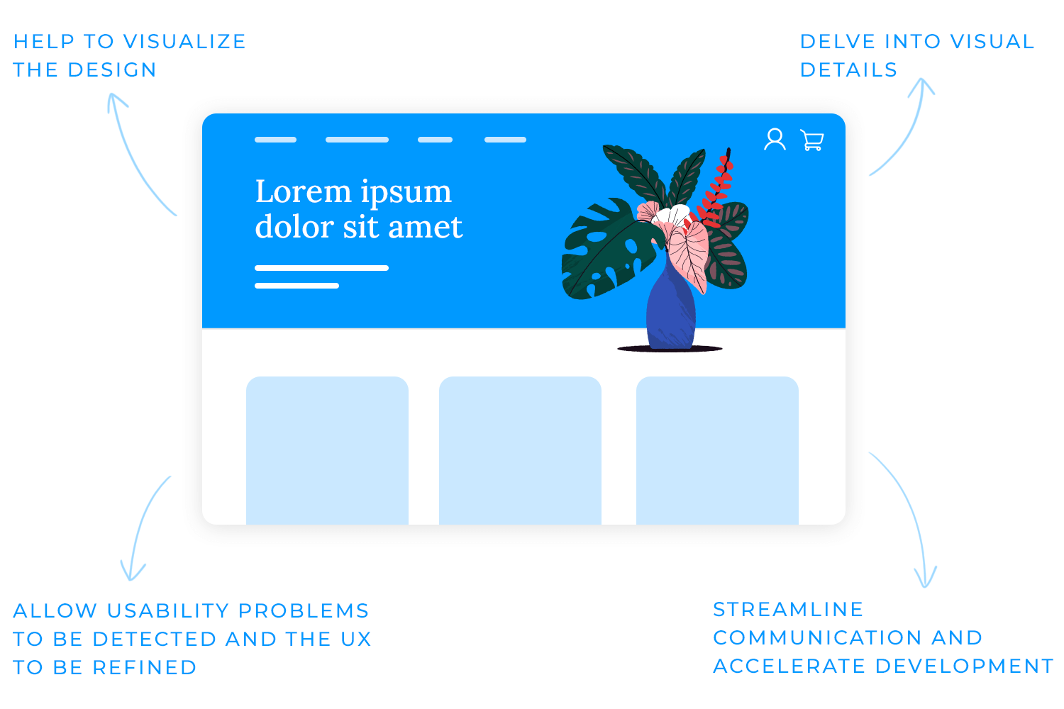
Keep in mind though, that while mockups, wireframes, and prototypes are all essential tools in the design process, they serve distinct purposes. Wireframes focus on the skeletal structure, outlining the layout and information hierarchy.
Mockup designs, on the other hand, delve into the visual details, showcasing the aesthetics and user interface. Prototypes take it a step further, adding interactivity to the design, allowing users to explore and interact with the product.
A static mockup is a fixed image that provides a snapshot of a design concept. It’s like a painting, capturing a specific moment in time. Static mockups are useful for initial feedback and understanding the overall visual style and layout of a design. They are often used to communicate design ideas to stakeholders and clients.
Interactive mockups, on the other hand, bring designs to life by allowing users to interact with the elements. They simulate real-world usage, enabling users to click buttons, scroll through pages, and experience the design as if it were the final product.
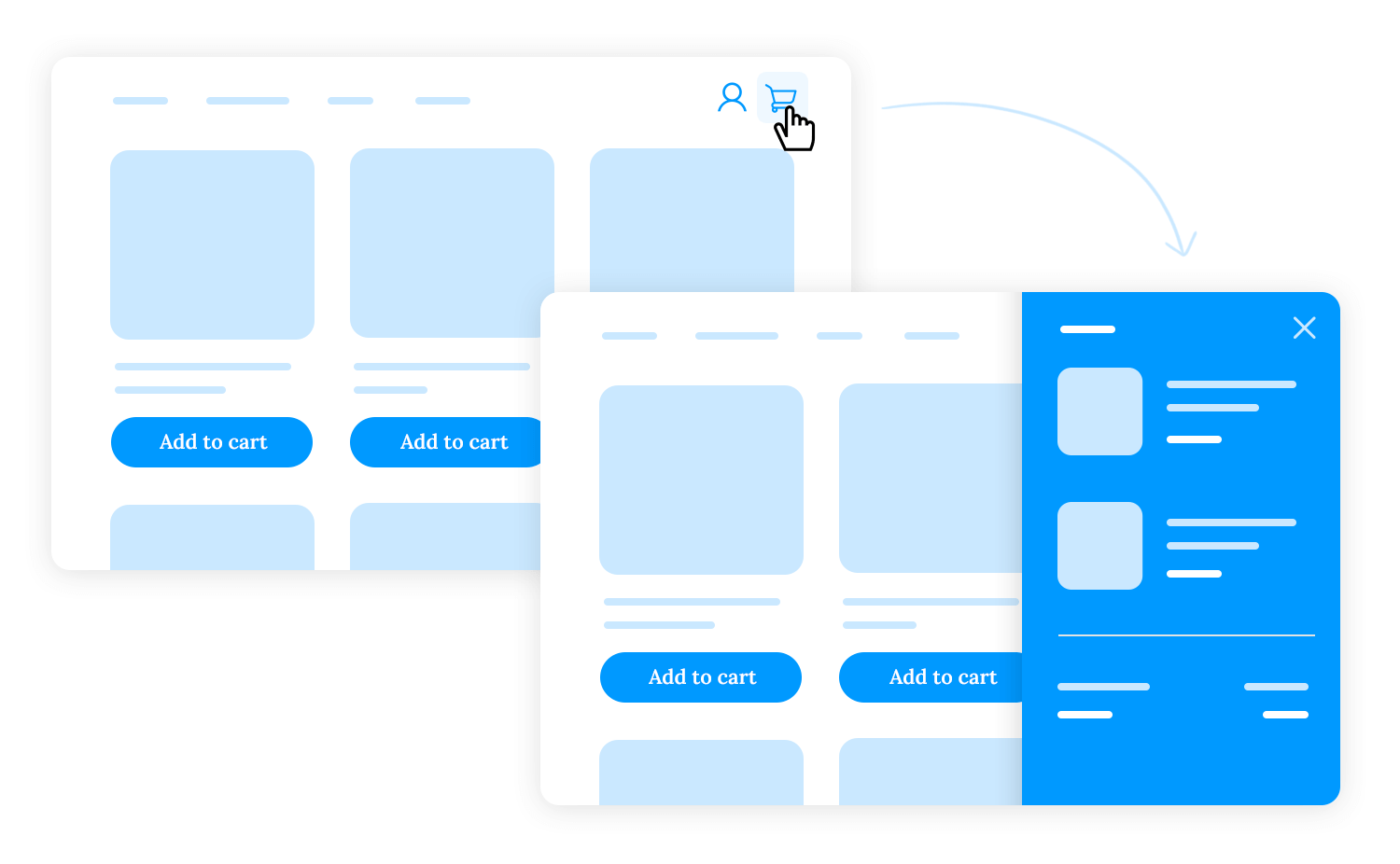
For example, an interactive mockup of an e-commerce website could allow users to browse products, add items to a cart, and proceed to checkout, providing a realistic simulation of the shopping experience.
A low-fidelity mockup design might just be a simple wireframe, sketched out on paper, or created using a mockup tool like Justinmind.
This wireframe would focus on the basic layout, outlining the main sections like the header, navigation bar, product listings, and footer.
It would help you visualize the overall structure and information hierarchy without getting bogged down in visual details.
Low-fidelity mockup designs help you quickly iterate through experimenting with different layouts and user flows. You can then gather feedback from stakeholders and potential users to refine the design before investing time and effort into a more detailed version.
A high-fidelity mockup design, on the other hand, would be a more polished representation of the website, incorporating visual elements such as color, typography, and imagery. It would look and feel more like the final product, providing a clear and comprehensive vision of the design.
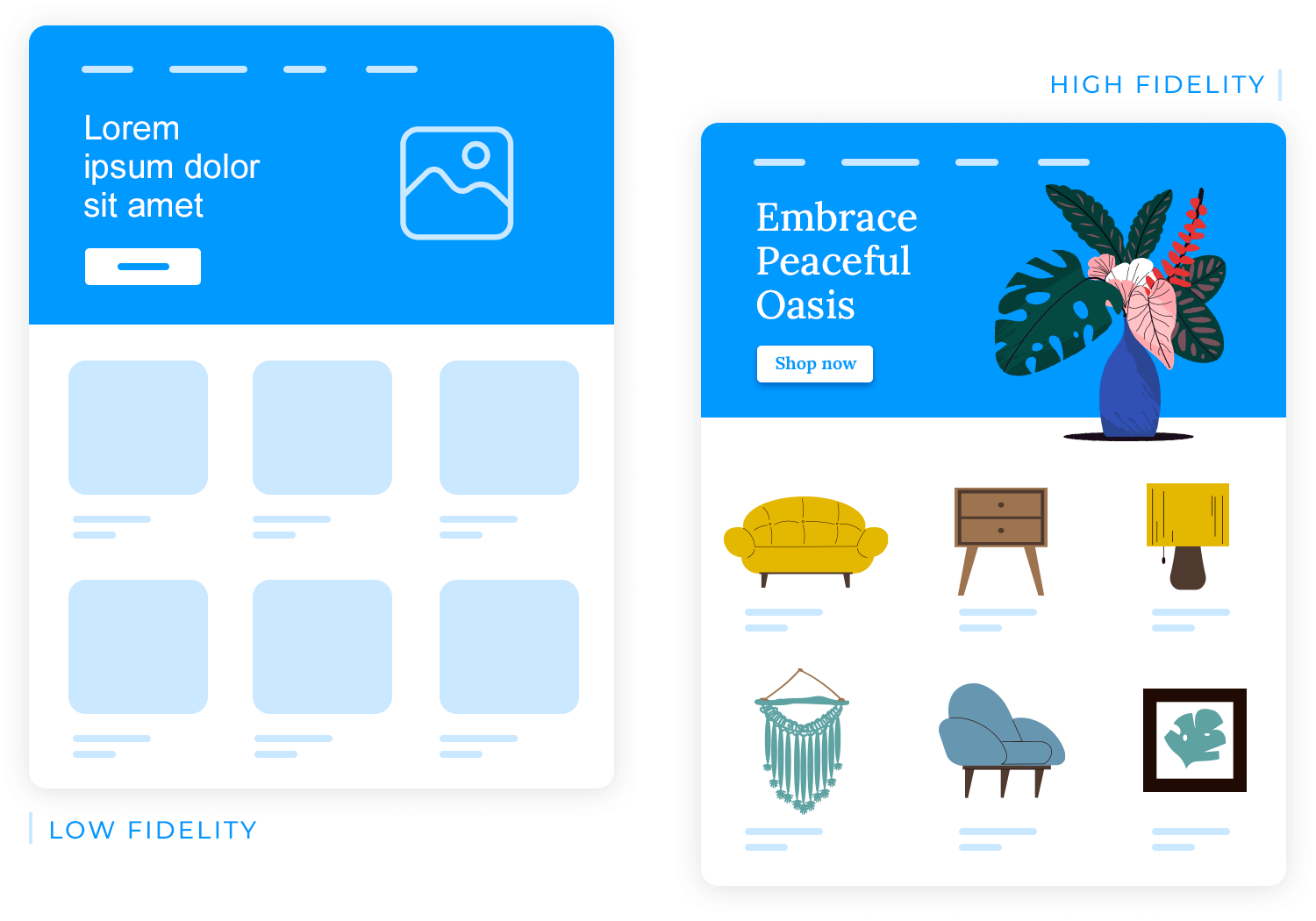
For example, a high-fidelity mockup design for the e-commerce website might include detailed product pages with high-quality images, a user-friendly checkout process, and a visually appealing homepage.
This level of detail is essential for client presentations and development handoffs, as it ensures that everyone involved in the project has a shared understanding of the design.
Just as a skilled tailor crafts clothing to fit different body types, UX and UI designers must adapt their mockup designs to suit various platforms.
Mobile mockups, designed for the smaller screens of smartphones and tablets, prioritize touch interactions and intuitive navigation. They often feature simplified layouts and large, easy-to-tap buttons to accommodate touchscreens.
Web mockups, on the other hand, are optimized for larger screens and mouse-based interactions. They can incorporate more complex layouts and detailed information, as users have more screen real estate to work with.
Desktop mockups cater to the unique needs of desktop applications, often involving intricate user interfaces and workflows. These mockups must consider factors such as keyboard shortcuts, multiple windows, and drag-and-drop interactions.
Responsive mockup designs are the chameleons of the design world, seamlessly adapting to different screen sizes and devices. For example, a responsive e-commerce website might display a full-width layout on a desktop screen, but switch to a single-column layout on a mobile device.
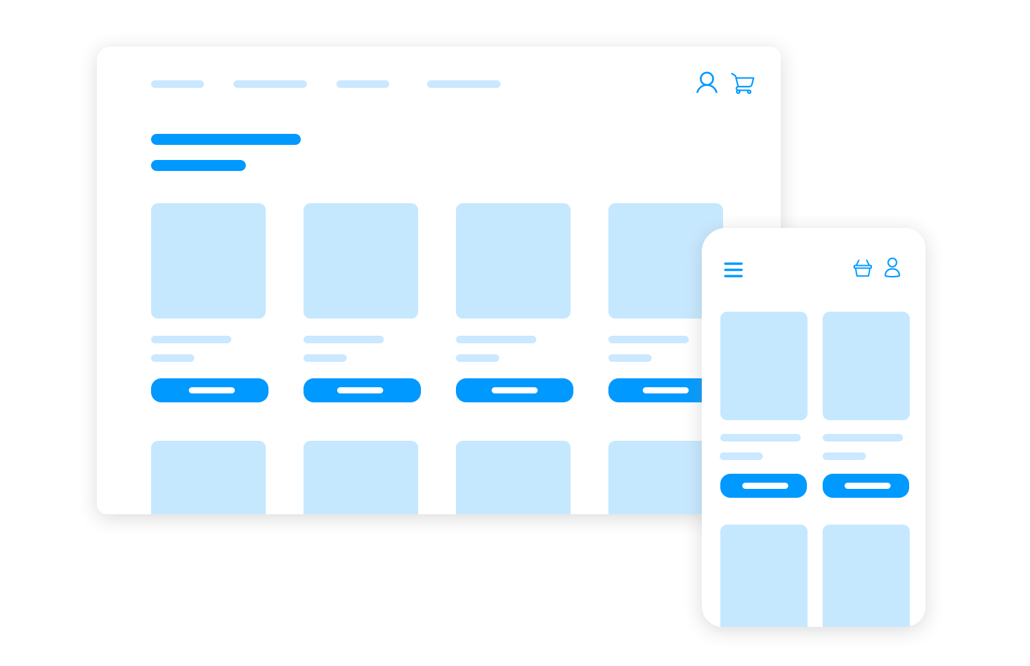
Employing responsive design principles helps designers like you create a consistent user experience across various platforms, ensuring that the mockup design looks and functions optimally on any device.
Design mockups for web and mobile apps with Justinmind. Try it for free today!

Different types of mockups serve distinct purposes and cater to various stages of the design process. In this section, we will explore the key distinctions between static and interactive, high-fidelity and low-fidelity, and platform-specific mockups.
A truly effective mockup design isn’t just a visually pleasing image; it’s a practical tool that empowers users to achieve their goals efficiently and effortlessly. To create such a powerful design, you have to adopt a user-centric approach.
This means understanding the user’s perspective, empathizing with their needs, and tailoring the design to their specific requirements.
Through thorough user research, you can gain valuable insights into user behavior, preferences, and pain points. Creating detailed user personas helps to humanize the target audience, enabling designers such as yourself to make decisions that resonate with real people when working on a mockup design.
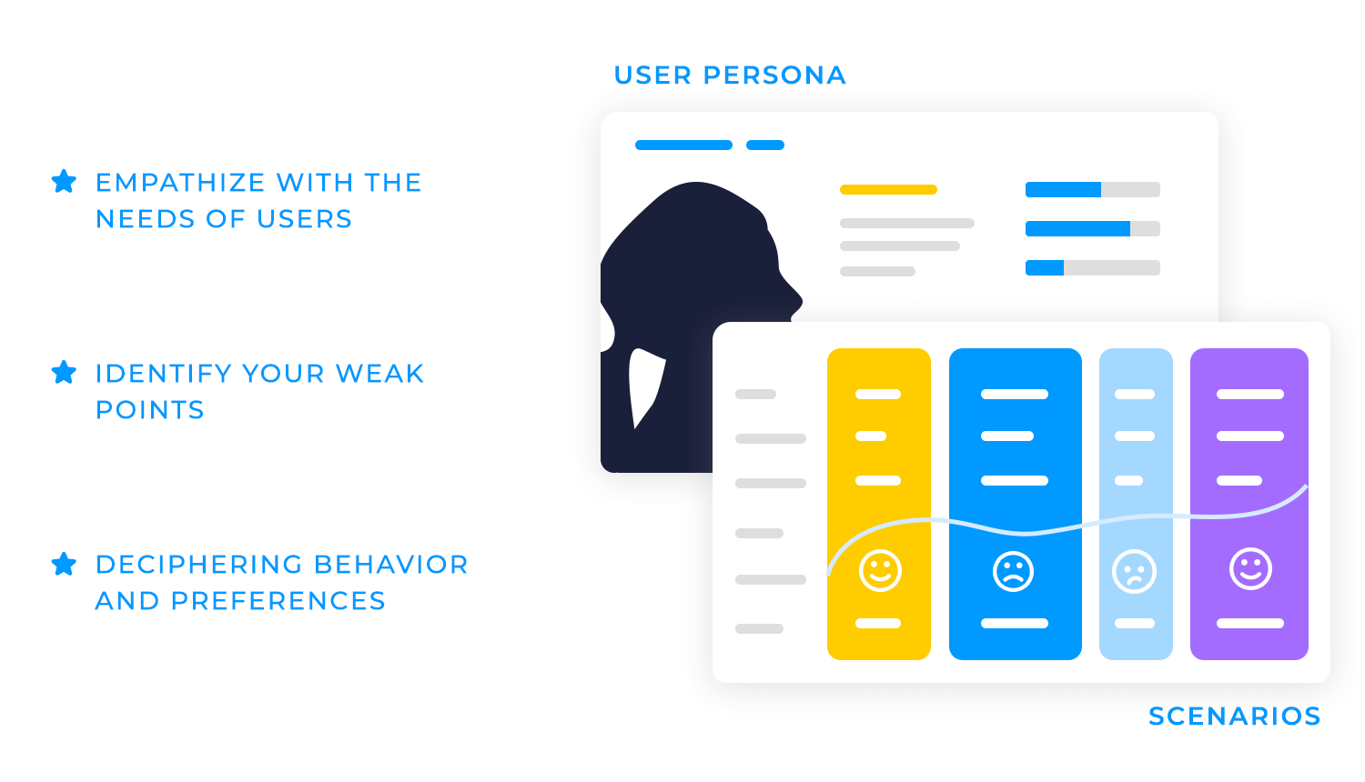
Additionally, mapping out user journeys allows UX and UI designers to visualize the user’s experience from start to finish, identifying opportunities to streamline the process and eliminate friction points.
A good mockup design should be accessible to everyone, regardless of their abilities. Prioritizing clear typography, sufficient contrast, and appropriate color choices, designers can create easy-to-read and navigate mockups.
For example, using a clear and legible font like Arial or Helvetica, ensuring sufficient contrast between text and background colors, and avoiding color combinations that may be difficult for people with color vision deficiencies can significantly improve accessibility.
Additionally, providing alternative text for images and designing the mockup to be fully navigable using a keyboard can make it accessible to users with visual or motor impairments.
A visually consistent mockup design is both aesthetically pleasing and easy to navigate. Use a consistent style guide that defines typography, color palettes, spacing, and other visual elements. A style guide is like a design blueprint, outlining the specific visual elements that define a brand.
Adhering to a consistent font family, size, and weight, designers can create a unified and readable mockup design. This ensures a cohesive and professional look and feel.
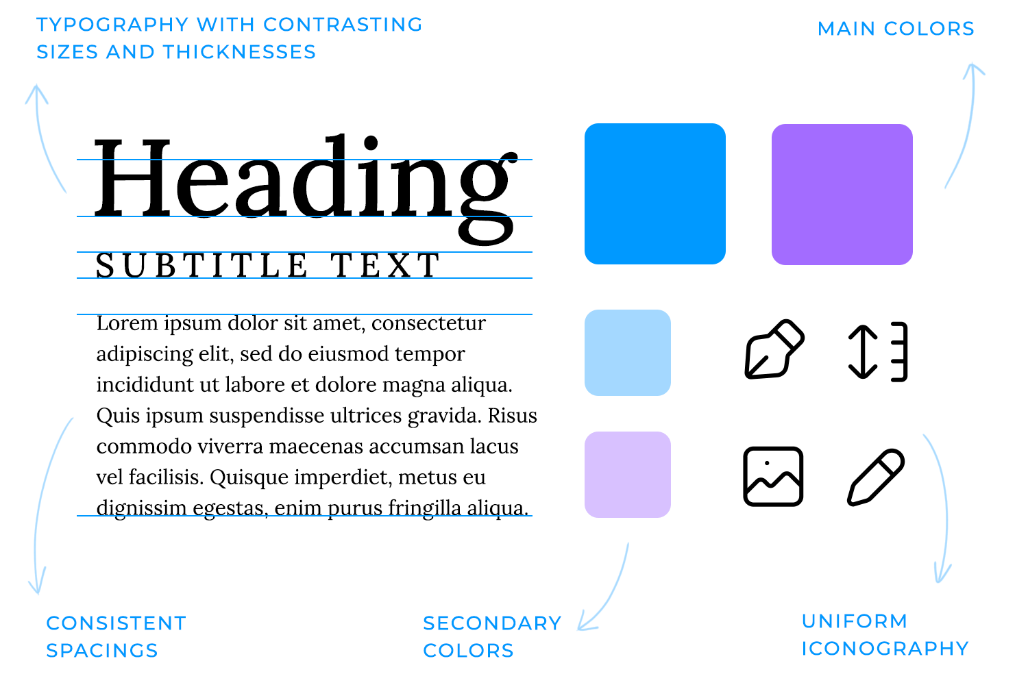
Also, a limited color palette helps to create a sense of harmony and brand recognition, while consistent spacing ensures a clean and organized layout. And don’t forget, a consistent iconography system can improve user understanding and navigation, and, not to mention, strengthen your brand identity.
Don’t just assume your mockup design will work perfectly in every scenario. To ensure a smooth user experience, it’s crucial to test your designs in real-world conditions. This involves considering factors like different screen sizes, device orientations, and varying network speeds.
You can identify potential issues and make necessary adjustments by conducting thorough usability tests. For example, a great mockup design on a desktop computer might not be as user-friendly on a small smartphone screen. Testing on a variety of devices and platforms empowers you to optimize your design for different contexts and ensure a consistent user experience.

Feedback is a valuable asset in the design process. By actively seeking and incorporating feedback from stakeholders and users, designers can refine their mockups and create exceptional user experiences.
Establishing a regular feedback loop, whether through user testing sessions, surveys, or simple team discussions, allows for the continuous improvement of designs.
But remember, not all feedback is equally important. It’s essential to prioritize feedback that aligns with your design goals and user needs. To truly optimize your mockup design, focus on actionable feedback that directly addresses your design goals and user needs, such as adjusting the layout, typography, color palette, or user flow.
Embracing constructive criticism as an opportunity for growth is key to creating innovative and user-centered designs.
Remember, the iterative process of testing, refining, and retesting is crucial to ensure that designs meet user needs and expectations.
Design mockups for web and mobile apps with Justinmind. Try it for free today!

To create visually appealing and functional mockup designs, it’s essential to focus on the core components that contribute to a successful design. These key components include:
A well-structured layout is the foundation of a successful mockup design. Leveraging grids and alignment, designers can craft visually appealing and well-structured designs that effortlessly guide the user’s attention.
Picture a website with elements scattered randomly across the page. This chaotic design would be difficult to navigate and understand.
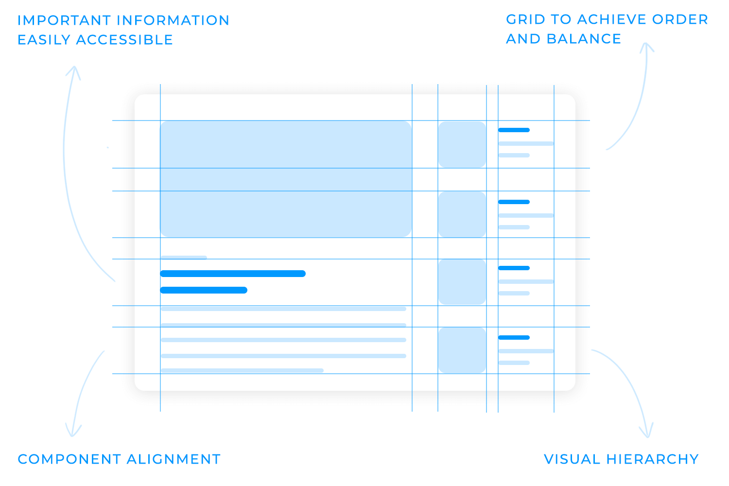
A grid system helps designers create a sense of order and balance, making the layout of a mockup design more visually appealing and easier to use.
A clear visual hierarchy ensures that important information stands out, while secondary elements complement the primary focus. For example, a prominent headline with a larger font size and bold weight can draw the user’s attention, while supporting text can be smaller and less prominent.
This strategic approach enhances user experience by making the most important information easily accessible.
A well-crafted mockup design is a harmonious blend of color and typography. The right color palette can evoke emotions, enhance brand recognition, and create a visually appealing aesthetic.
For instance, a calming blue palette can instill a sense of trust and reliability, while a vibrant red can evoke excitement and urgency.
Equally important is the choice of typography. Clear and legible fonts ensure that the content is easy to read and understand. A well-chosen typeface can enhance the overall aesthetic of a design, while a poorly chosen one can hinder readability and user experience.
With the right font and colors, designers can create mockup designs that are visually stunning, highly functional, and user-friendly. The trifecta!
Imagine you’re designing a mockup design of a mobile app for an e-commerce store. A well-designed “Add to Cart” button, with a clear call-to-action and a consistent visual style, can significantly impact the user’s shopping experience.
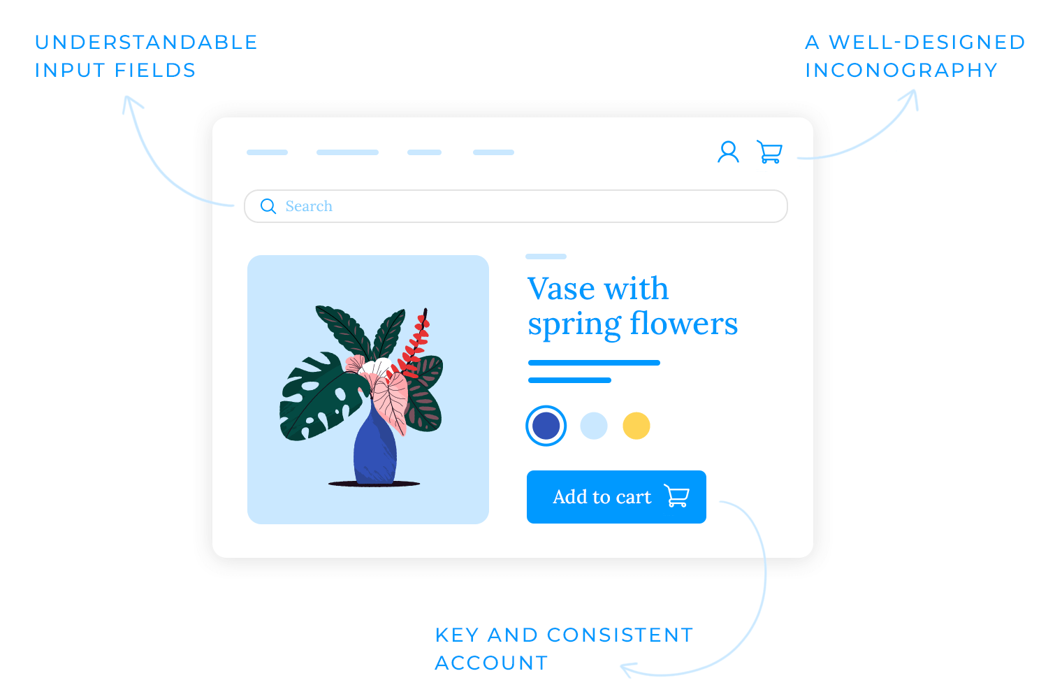
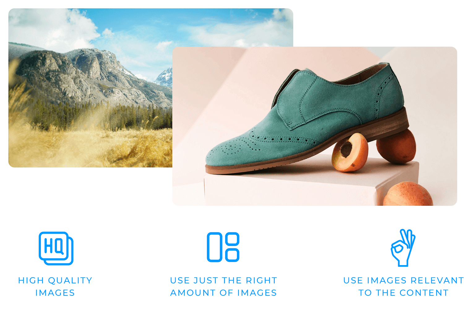
High-quality images and media can elevate a mockup design from good to great. They can enhance user engagement, add visual interest, and help tell a compelling story. However, it’s crucial to use imagery strategically. Overloading a design with too many images can clutter the layout and distract users. Instead, focus on using high-quality, relevant images that support the content and enhance the user experience.
For example, a travel website mockup design might use stunning landscape photos to inspire wanderlust, while an e-commerce one might use high-quality product images to showcase items in detail. By using imagery thoughtfully, designers can create visually appealing and engaging mockups that leave a lasting impression.
A strong visual style and branding are essential for creating a memorable and cohesive user experience. Integrating consistent brand elements like logos, color palettes, and typography reinforces brand identity and fosters trust with users. This must also be reflected in a mockup design.
For example, a tech company might use a minimalist design with a focus on clean lines and a monochromatic color palette, while a fashion brand might opt for a bold and colorful design with playful typography.
Maintaining a consistent visual style throughout all touchpoints helps designers create a strong brand identity that resonates with users. This can lead to increased brand recognition, customer loyalty, and ultimately, business success.
Design mockups for web and mobile apps with Justinmind. Try it for free today!

Before diving into the mockup design process, it’s crucial to define the purpose of your mockup. What are you trying to achieve? Are you designing a website, a mobile app, or a software interface? Once you’ve established the goal, identify your target audience. Understanding their needs, preferences, and technical abilities will help you tailor the mockup design accordingly.
For example, if you’re designing a fitness app for elderly users, you might prioritize larger font sizes and simple navigation.
Wireframes are the skeletal structure of your design. They help you visualize the overall layout and information hierarchy without getting bogged down in visual details. Use simple shapes and placeholders to outline the main sections, content areas, and interactive elements. This step allows you to focus on the core functionality and user flow.
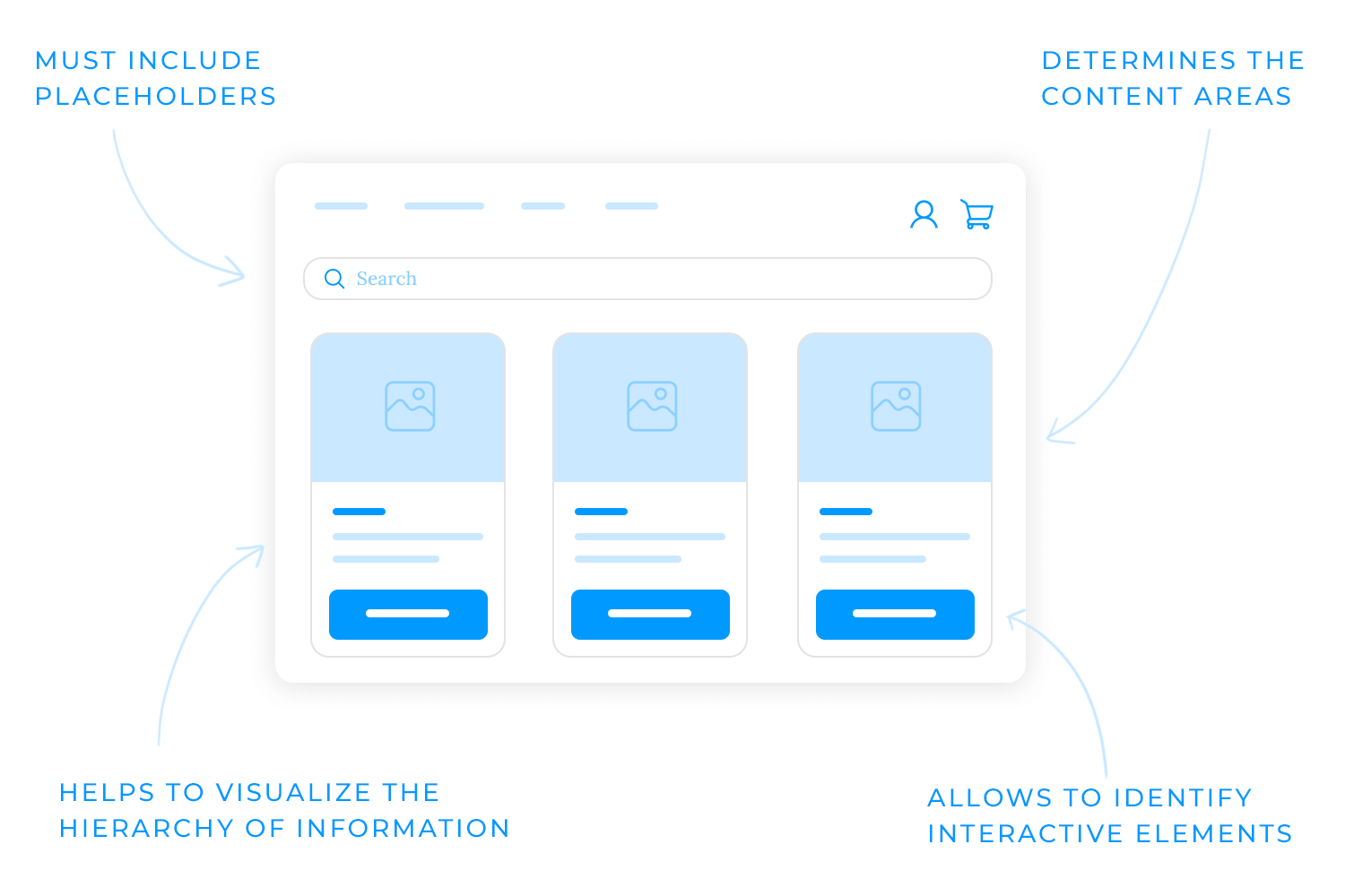
For example, a wireframe for an e-commerce website mockup design might include placeholders for the header, navigation bar, product listings, shopping cart, and footer.
This simple visual representation helps you visualize the overall structure of the website and identify any potential issues with the layout or information flow.
Imagine a website without a grid system. The elements would be scattered randomly across the page, making it difficult to read and navigate. The grid system allows designers to align elements, create consistent spacing, and establish a clear visual hierarchy.
It also provides a structured framework for organizing elements on your mockup design. It ensures consistency in spacing, alignment, and overall layout. This results in a more organized and visually pleasing aesthetic.
As touched on briefly previously, the choice of colors and fonts plays a crucial role in shaping the overall look and readability of a mockup design. A well-curated color palette can evoke emotions, enhance brand recognition, and create a visually appealing design.
For instance, a calming blue palette can instill a sense of trust and reliability, while a vibrant red can evoke excitement and urgency.
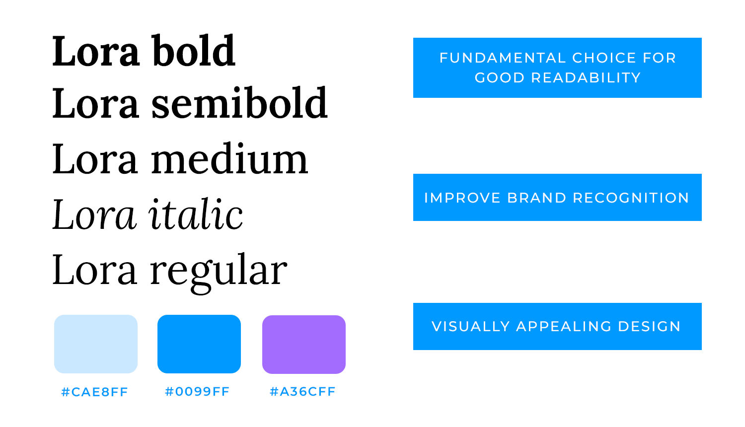
Clear and legible typography is equally important. A well-chosen font can enhance the overall aesthetic of a design, while a poorly chosen one can hinder readability and user experience.
Consider factors like font size, line height, and letter spacing to optimize readability.
Once you’ve established the foundation of your mockup design with wireframes and a solid visual system, it’s time to breathe life into it by adding interactive elements.
Incorporate essential UI components like buttons, input fields, sliders, and navigation bars to create a functional and user-friendly interface. Pay close attention to the placement, size, and styling of these elements to ensure a seamless user experience. For example, a well-designed “Add to Cart” button with clear visual cues can significantly impact user conversions on an e-commerce website.
The final step in the mockup design process involves adding the finishing touches. Incorporate high-quality images, icons, and other visual elements to elevate the overall look and feel of your design. Pay attention to details like spacing, alignment, and color contrast to create a visually appealing and professional design.
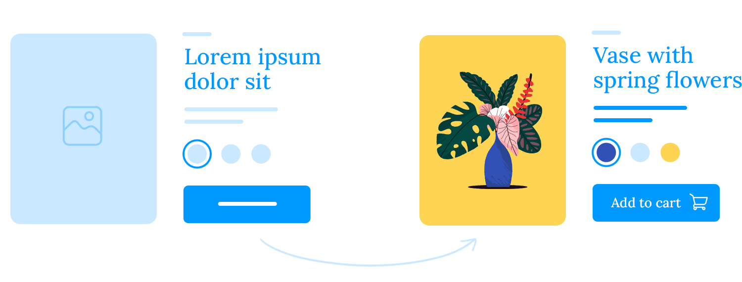
For example, using a consistent iconography system can improve user navigation and understanding. Additionally, incorporating high-quality images can enhance the visual appeal of the design and help to tell a story.
Design mockups for web and mobile apps with Justinmind. Try it for free today!

One of the most common challenges in mockup design is finding the right balance between detail and usability. While a highly detailed mockup can provide a clear vision of the final product, it can also be overwhelming for users and developers. A mockup design that is too detailed can slow down the design process and make it difficult to iterate on the design.
To overcome this challenge, it’s important to prioritize core features and functionalities. Focus on the elements that directly impact the user experience, such as the primary navigation, call-to-action buttons, and key content areas. Use low-fidelity mockups, such as wireframes, to quickly iterate on the layout and structure of the design. These low-fidelity mockup designs can help you focus on the core functionality and user flow without getting bogged down in visual details.
Finally, conduct usability tests early and often to gather feedback and identify areas for improvement. Doing this on your mockups provides invaluable insights into user behavior, enabling you to refine the design and make necessary adjustments.
Design constraints, such as technical limitations, budgetary restrictions, or tight deadlines, can significantly impact the mockup design process. It’s important to communicate effectively with developers and other stakeholders to understand technical limitations and explore potential workarounds.

To prioritize features, focus on the most critical features and functionalities that deliver the core value proposition. This approach can help you deliver a minimum viable product (MVP) within the given constraints.
Utilizing design systems can also help to streamline the mockup design process. Design systems provide a library of pre-built design components, such as buttons, input fields, and typography styles. Leveraging these components saves time and ensures consistency across the mockup design.
Different stakeholders, such as clients, product managers, and developers, often have varying opinions and expectations. To maintain stakeholder alignment, it’s crucial to establish clear communication channels and foster open and honest communication.
Creating a shared vision of the project goals and target audience can help to align everyone’s understanding. Present design decisions clearly and articulate the underlying rationale. This can help to build consensus and gain buy-in from stakeholders.
While it’s important to consider feedback from stakeholders, it’s equally important to make tough decisions and stick to your design vision. Ultimately, the goal is to create a mockup design that meets the needs of the user and achieves the project objectives.
Following these best practices and addressing common challenges, designers can create effective mockups that look great and deliver exceptional user experiences. Remember, the goal of a mockup design is to communicate design ideas clearly and efficiently and to gather valuable feedback from stakeholders and users.
When designers prioritize user-centered design, accessibility, and visual consistency, they can create mockups that empower users and drive business success. By understanding the nuances of different mockup designs, such as static vs. interactive and low-fidelity vs. high-fidelity, you can now tailor your approach to specific project needs.
Ultimately, the success of a mockup design lies in its ability to convey the vision and inspire confidence in the final product. That’s why investing time and effort into creating high-quality mockups ensure that your projects are successful and user-friendly. Happy mockup designing!
PROTOTYPE · COMMUNICATE · VALIDATE
ALL-IN-ONE PROTOTYPING TOOL FOR WEB AND MOBILE APPS
Related Content
 A fun look at different data table designs, from basic lists to smart, interactive ones, based on how complex the data is and what users need.18 min Read
 Single page design v multi-page design – everything you need to help you choose the right design for your site’s content18 min Read
 Website backgrounds can be a powerful tool in creating an experience. But what kind of experience can you convey and how? We got the full run-through for you!14 min Read
