60+ free mobile mockup templates to download plus Justinmind’s top tips for designing your own mobile app mockup
Designing a mobile app is the best way to visualize and test its look, feel, and functionality, including visual hierarchy and interactive gestures like swiping and tapping. It’s also a great way of scoring stakeholder buy-in and gives you a real MVP that you can test out on your users.
However, if you’re new to the game or simply don’t have time to start from scratch, fear not! We have plenty of templates available. Working with templates is a walk in the park because:
- Visual / information hierarchy has already been defined
- They let you focus more on brand-specific adjustments like color and font
- They help you set design priorities and gauge feasibility of client requests
- They bring you to an MVP faster
If you want to design your own mobile app from scratch, or you want the help of a template, this post is for you. Read on for the dos and don’ts of mobile app design and to discover sixty brilliant templates to use in the Justinmind mockup tool.
Your primary concern throughout the mobile design process should be your users. Users need to know exactly how to work your app, because if they get lost, they may close the app never to return.
That’s why designers build functional prototypes with built-in mobile gestures that target users can interact with. Upon completion of the first mobile app mockup iteration, users will be able to test out and give feedback on the app’s navigation flow and touch UI elements.
This will allow you to make your app as accessible and inclusive as possible.
It goes without saying that both sites and apps should be usable. But when designing a mobile app, you’ll also need to think about accommodating smaller screens by appropriately adjusting your use of UI colors, whitespace and touch elements.
Defining and testing out mobile gestures with your target audience is a good way to keep them in the loop. But what about when the user needs more guidance?
Whether they’re waiting for a page to load, refreshing their email inbox or filling out a form, your mobile app mockup needs to give the user feedback on their interaction. How? With microinteractions.
These miniature interactions take place upon a user’s interaction with an app, and offer visual and actionable cues on what’s coming. Though only engaging the user for an instant, microinteractions provide a more complete picture of the state of the user’s request.
Every user touchpoint in your mobile app relies on your mobile UI pattern, or navigation pattern. The wrong pattern will make it more difficult for your users to get from Point A to B, cause them frustration and diminish the user experience.
Users don’t respond well to change – so keep things familiar or you’ll quickly lose them.
“People tend to be unaware of an app’s navigation until it doesn’t meet their expectations.”
Human Interface Guidelines for iOS -
When mocking up a mobile app, it’s important to use a mobile pattern that users are comfortable with. This will help to ensure that their experience is as seamless as possible.
Additionally, make sure that your mobile pattern is in sync with your operating system (Android or iOS). For instance, both Android and iOS use tabbed bottom bars. But whilst Android uses the Overflow menu for additional settings, Apple and iOS use the More Options menu.
Now that we’ve discussed some tips for creating your first mobile app mockup, let’s address common mistakes to avoid. No matter what kind of mobile app you’re designing, adhering to design standards and principles is crucial.
Every mobile app needs to offer its new users an onboarding experience. App onboarding helps introduce new users to the app, walk them through features and set up their online account.
Keep onboarding short, focused and interactive to avoid cognitive load. Successful onboarding can help improve user retention and engagement.
Apps with great UX are those that save users time and effort. Mobile users are often on the go, and don’t have the time or patience to be asked for the same information twice. Default values and placeholders – such as suggestions in sign up form input fields and recent places in map apps – can be a big help.
But what’s even more important than design pitfalls? Using the right tool to mock up your app! Justinmind allows you to mock up the visual and functional components of your mobile app and then test them with real users. That’s why it’s a strong contender for the title of best mockup out there.
Here are 60+ free mobile app mockup templates to download and customize:
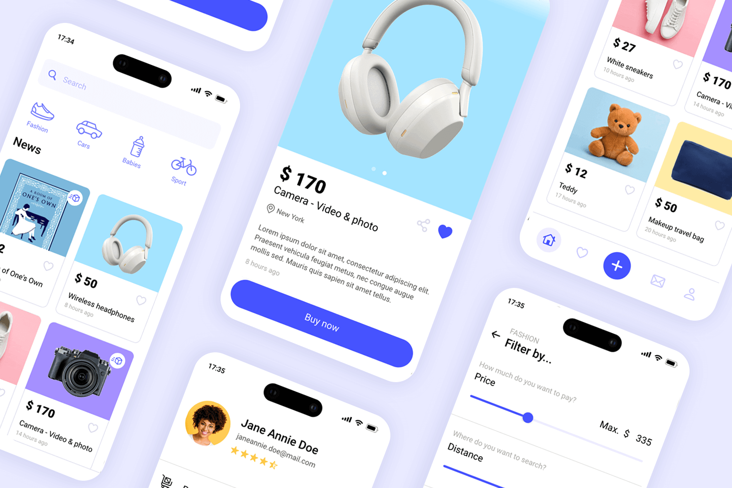
Got an idea in mind to give the stuff you no longer use a second life? This mobile template is the perfect start to create a marketplace application to buy and sell all kinds of used goods. With a simple and easy to use design, this layout comes with just enough screens to show how your final app will look and feel. All you need to do is customize the details to your brand identity! Search filters, a favorites screen as well as a messaging feature are some of the screens you’ll find in this template.
Download it free or Try it out
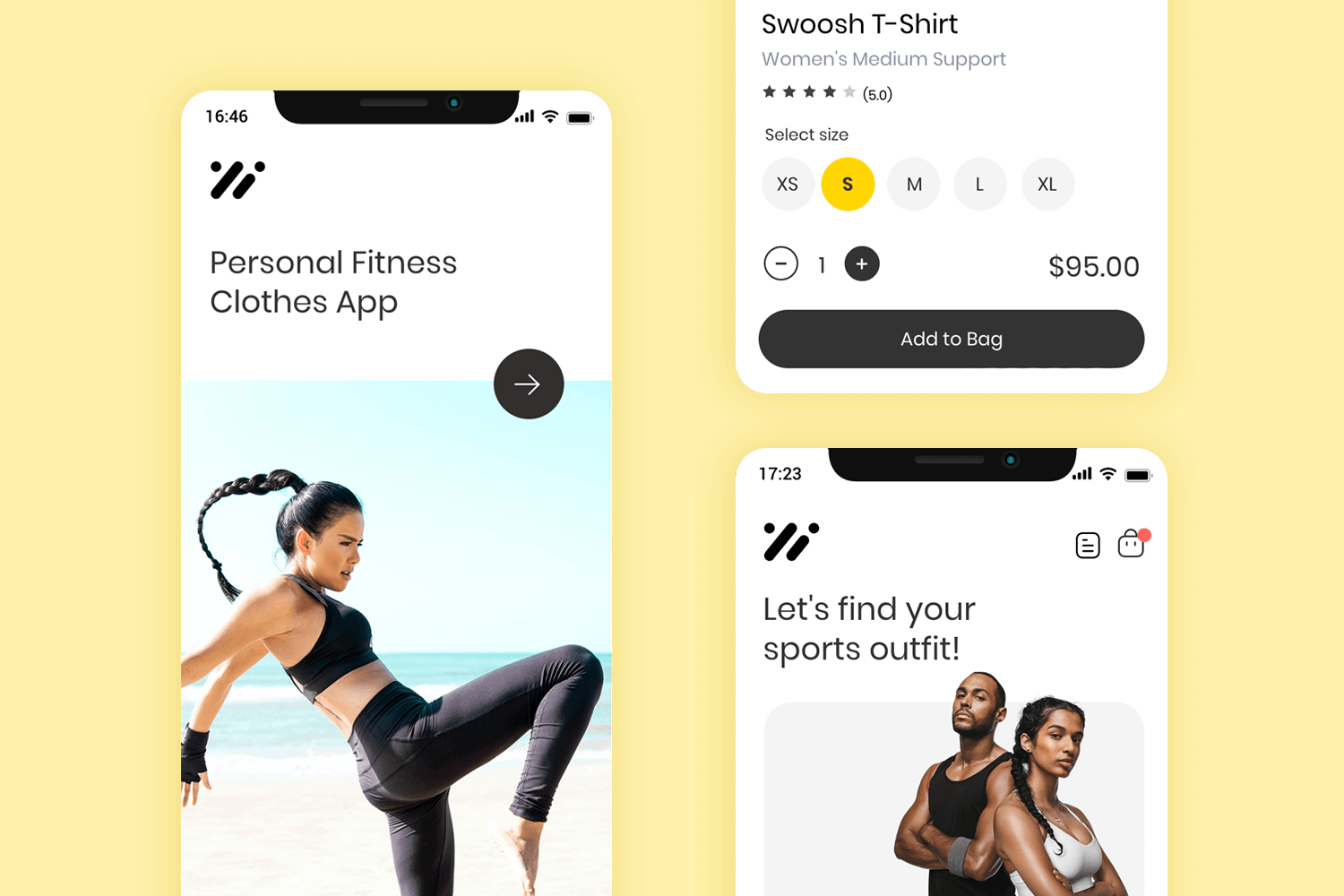
This mockup for a mobile app shop is the perfect starting point for any shopping app where items are sold. This app template focuses on selling fitness clothing, however, it can be quickly customized to fit any online shopping project. This design includes all the screens you need for a complete shopping experience, from both a sign in and sign up screen to order completion and order tracking screen, this modern app also comes with basic interaction design too.
You can click buttons, type on input fields and make use of the navigation bar. Not to mention you can rapidly edit and style the entire template to your branding and project goals.
Download it free or Try it out
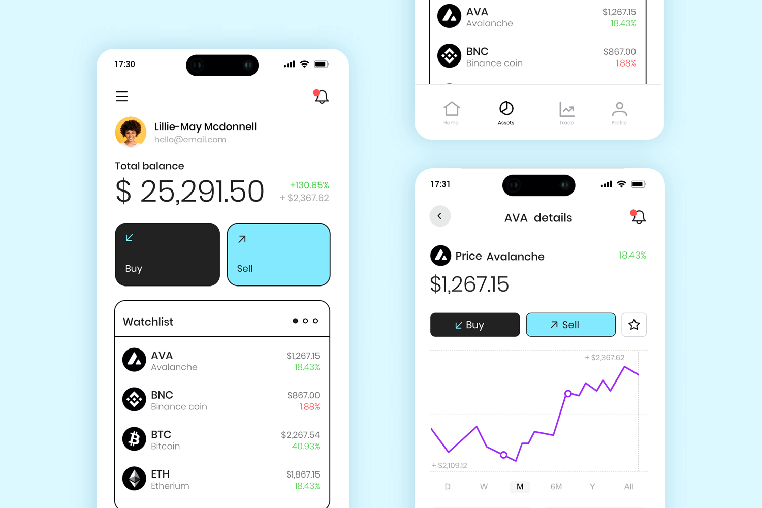
This mobile app design has been designed with usability in mind. What stands out from this design is its simple yet effective structure and flow, that makes using crypto easy. Complete with 10 ready to use screens, this template includes a few screens for a short onboarding to the product, a trade screen with the most popular cryptocurrencies, and a buy/sell page to complete transactions. This free app mockup can easily fit a cryptocurrency app or a crypto wallet, as well as any type of trading product.
Download it free or Try it out
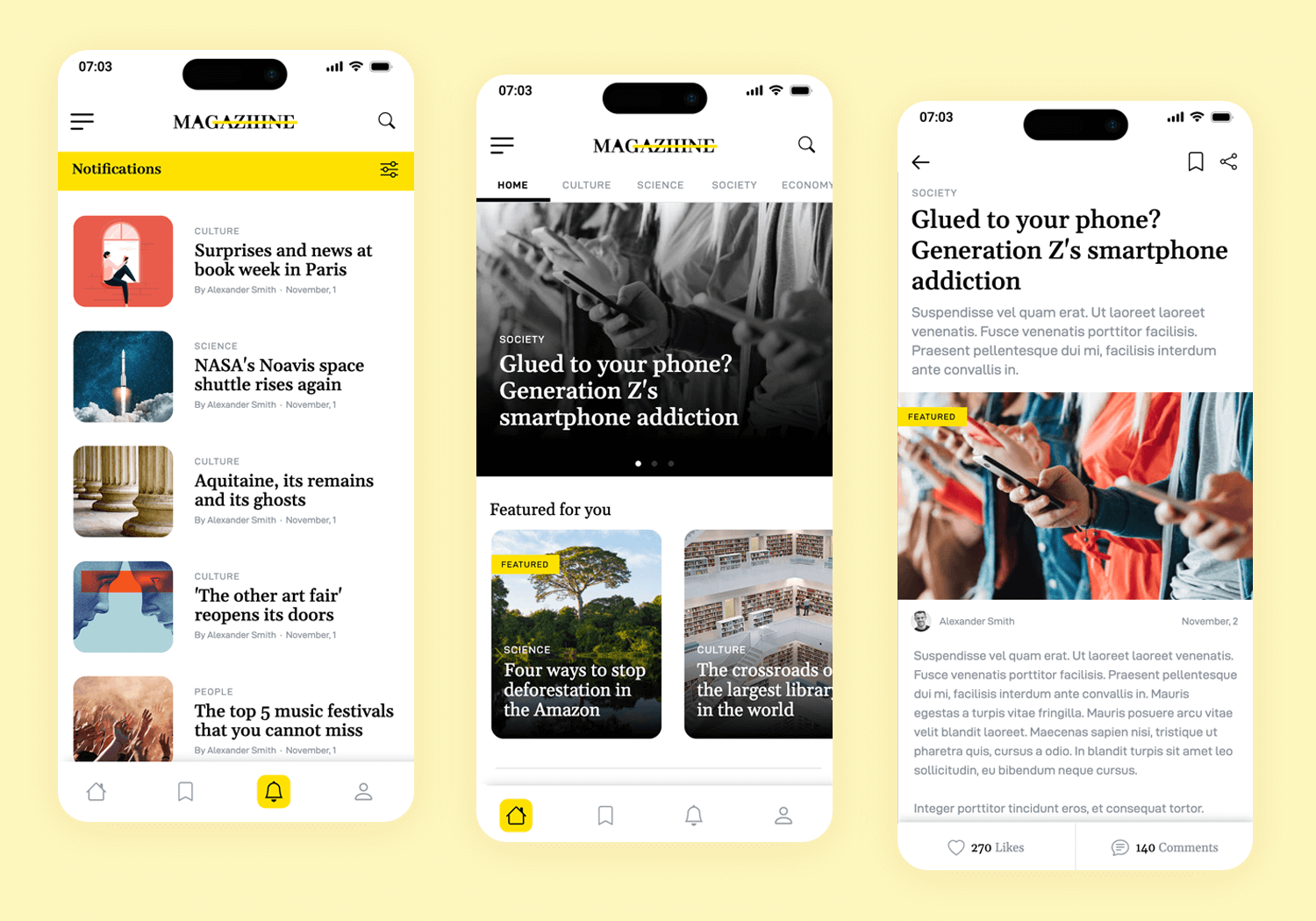
Explore the design and functionality of this mobile magazine app design, tailored for modern readers interested in a wide array of topics from cultural insights to scientific discoveries. This free template is perfect for developers seeking a sophisticated yet user-friendly interface with features like a categorized content display and visually engaging layouts. Engage users with this compelling and free mobile app mockup.
Download it free or Try it out
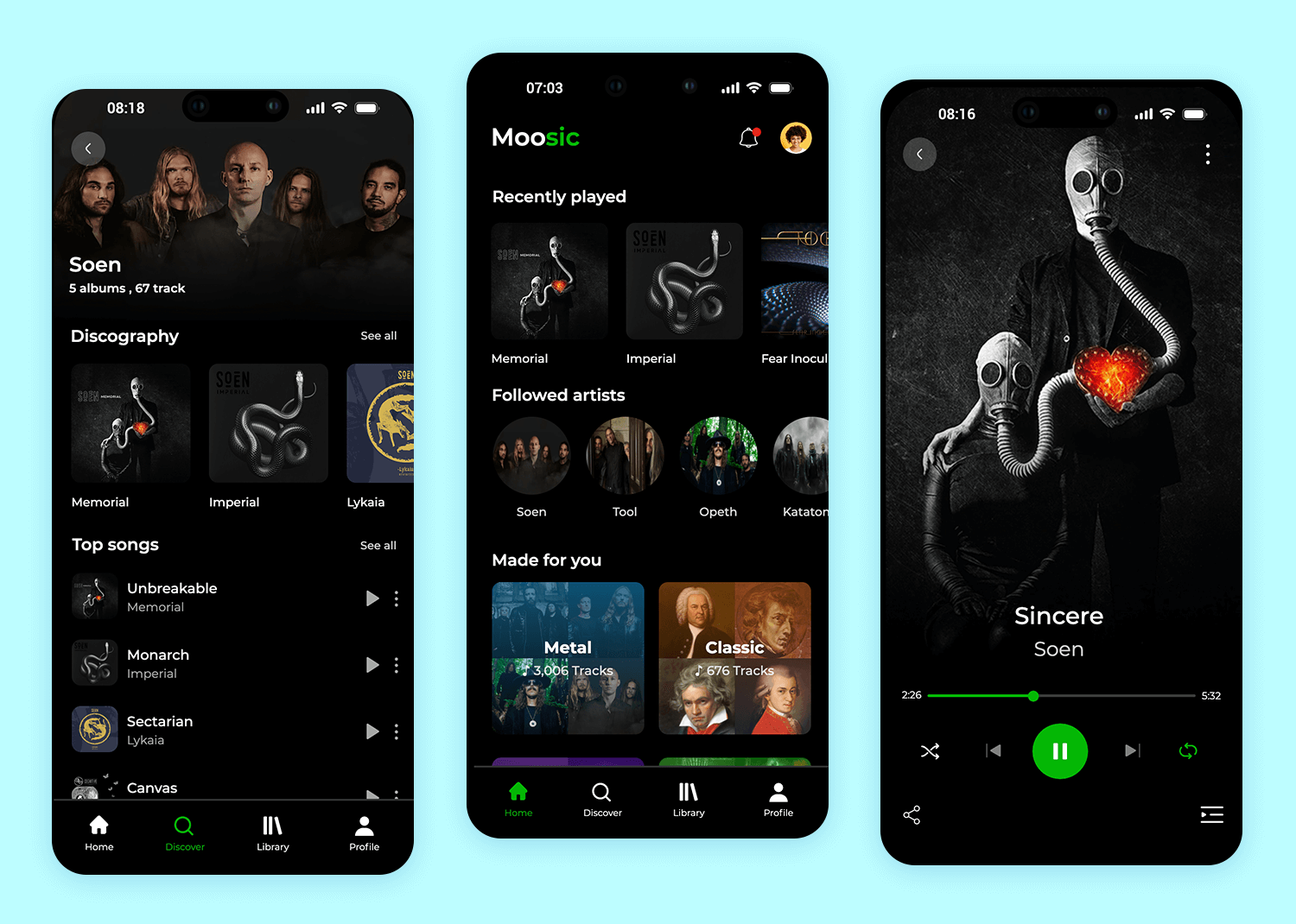
This mobile app mockup represents a sleek and modern music player app. The dark theme gives it a stylish look. The “Recently Played” section displays album art, making it easy to find favorite tracks.
The “Followed Artists” section showcases a circular layout of artist images, and the “Made for You” section categorizes music into genres like Metal and Classic, tailored to the user’s preferences.
Key screens include the Home, Discover, Library, and Profile screens.
Download it free or Try it out
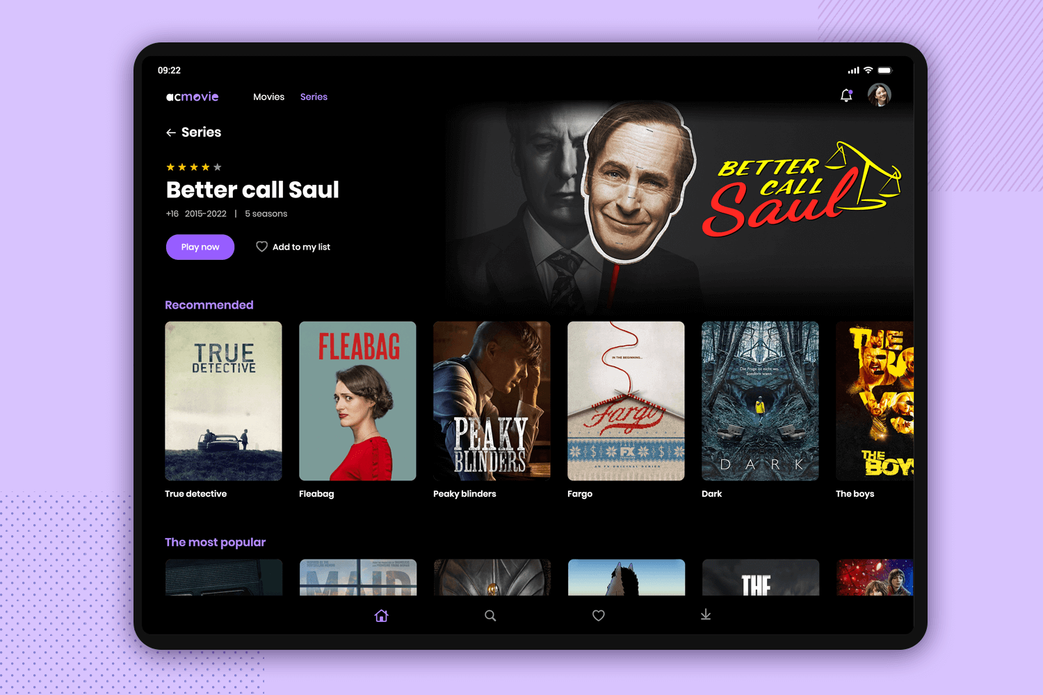
This tablet app template showcases a modern streaming service with a sleek, dark-themed interface. The main screen features a highlighted movie, complete with ratings, descriptions, and options to play or add to a watchlist.
Users can easily continue watching their favorite shows with the “Keep Watching” section, and discover new content through personalized recommendations. The intuitive layout and visually appealing design make it an excellent example of a user-friendly streaming service app.
Download it free or Try it out
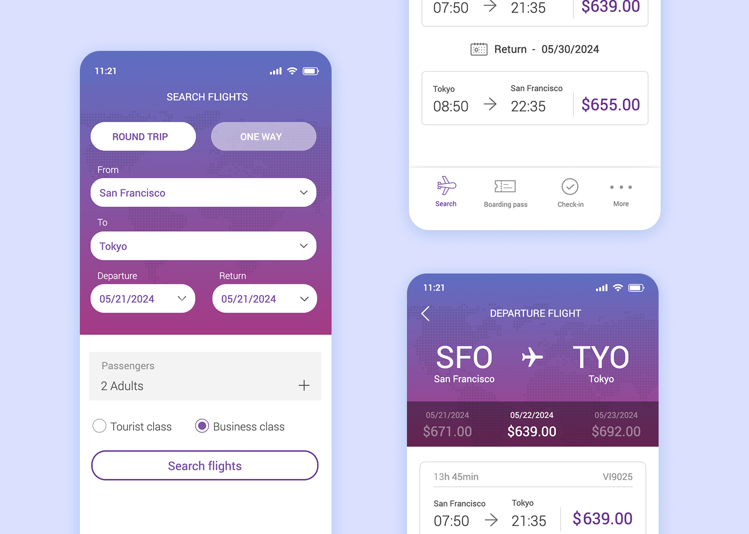
This native iOS flight booking app mockup features a date picker and multiple interactive dialogs which allow the user to easily book their travel plans. The easy-to-follow steps guide the user through the flight search and booking process, right up to displaying the boarding passes including flight information and passenger information the user entered.
Download it free or Try it out
Check out the neat transition animations as you move between the different screens: they’re subtle but still noticeable. Transitions like this help the user to understand that they’re moving forward in a process. Error messages appear as a floating layer when one or more necessary fields are left blank.
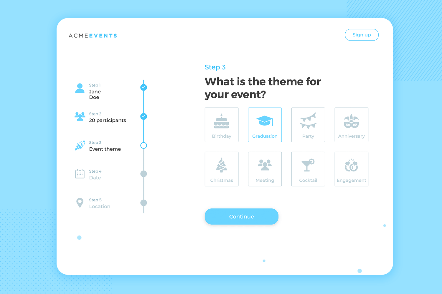
This web form mockup represents a clean and intuitive event registration process. The form is organized into clear, step-by-step sections, starting with “Your name” and proceeding through participants, event theme, date, and location.
The layout is minimalist and user-friendly, with a progress indicator on the left guiding users through each step. The design ensures a smooth and straightforward registration experience.
Download it free or Try it out
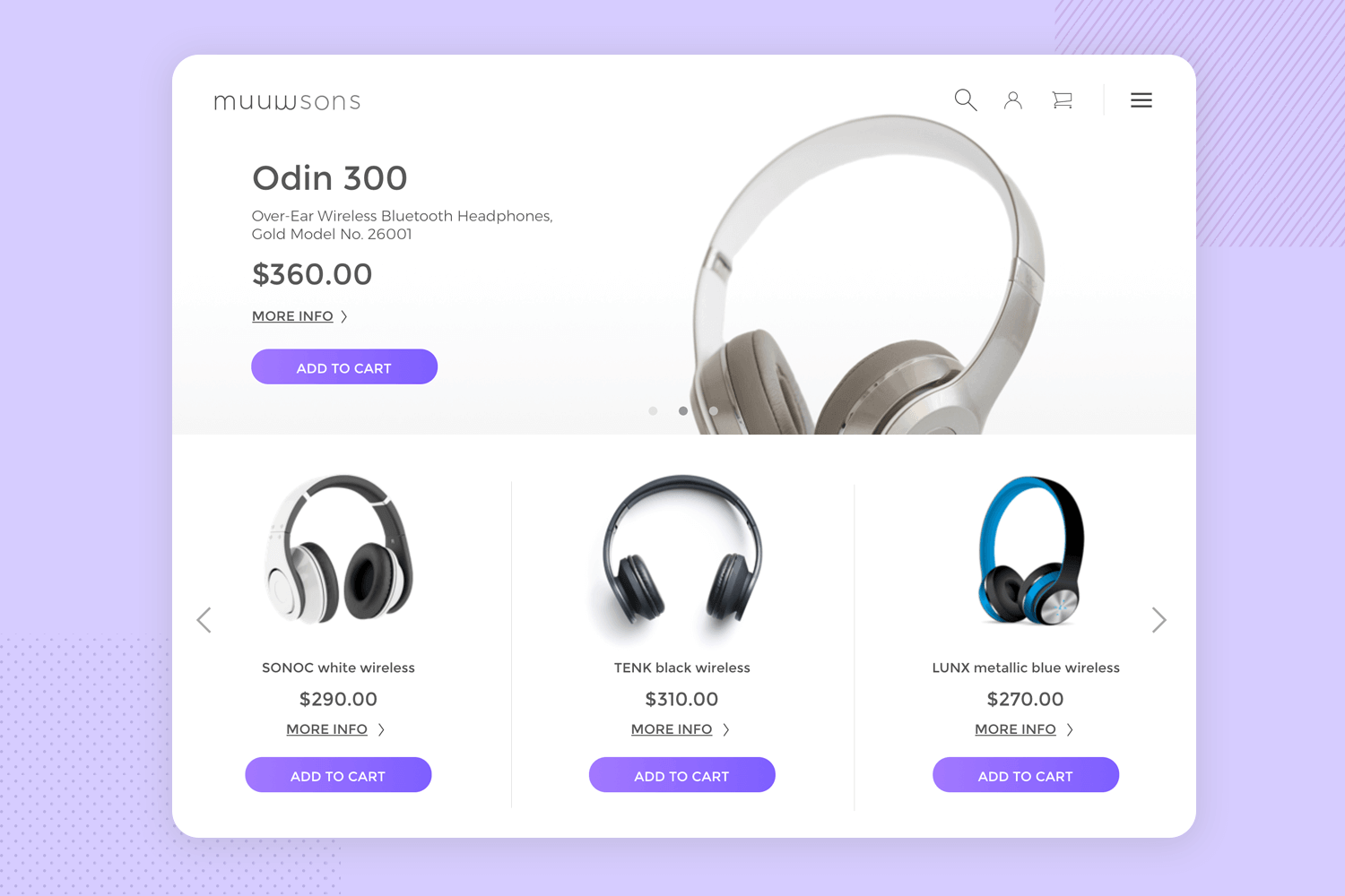
Our Store App mobile template is great for use in an e-commerce app. The screens in this mockup are already very complete, featuring a large image of each product (in this case headphones) that the user can change by browsing through a carousel of product images. Forward and Backward buttons with the relevant built-in interactions adorn each side of the carousel.
If you try adding some of the products to the shopping cart at the top right, you’ll notice that a number appears overlaid on top of the icon indicating the quantity of products that you added.
Download it free or Try it out
Clicking on “more info” beside each product will let you view the product from various angles, in a similar fashion to Amazon. There are also some color selector radio buttons that let the user view images of the product in various colors. In addition to that, you’ll notice an inbuilt modal window that pops up when you click on the cart that lets you adjust the number of products you selected using drop-down lists.
The checkout button then brings you to the checkout page where the user can fill in their details with editable text fields, select the expiration date of their credit cards with a date picker and their country from a drop-down list.
If you’re designing an e-commerce mobile app mockup, you’ll find that most of the work is already done for you in terms of visual hierarchy, navigation design, and content hierarchy, not to mention interaction. Once again, Justinmind’s in-house design team worked wonders with this template!
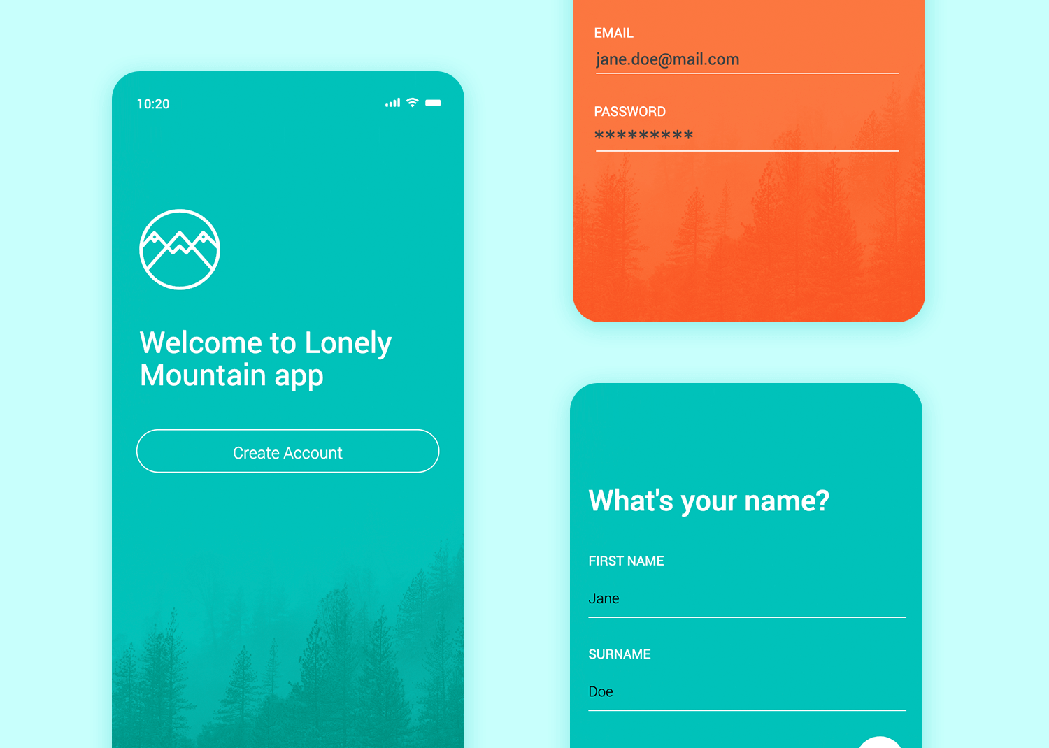
This is a great example of an easy-to-use registration form, requiring the least possible user effort. When the user inputs their name, email or password and hits return, the next screen slides in automatically negating the need for the user to scroll. Perfect for that shiny new product you’re working on!
Download it free or Try it out
Finding a lack of app templates for the apple watch? Not to worry. Copying this Apple Watch template will help you design usable and compatible Apple Watch app mockups with great UX.
Download it free or Try it out
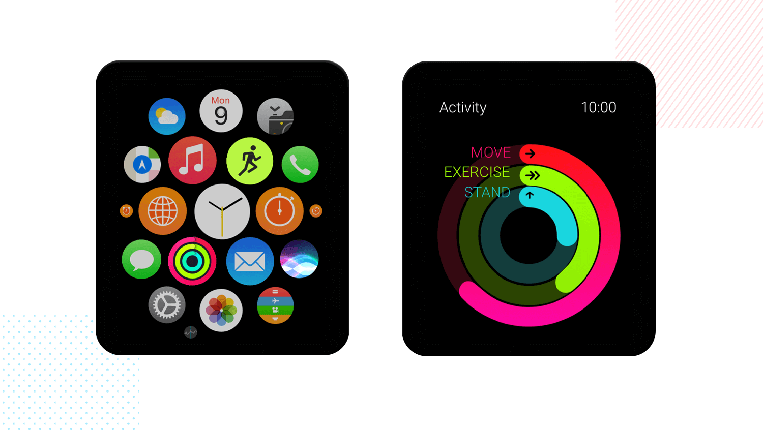
In this template you’ll find the familiar home screen of the Apple Watch, along with extra screens for Siri interactions, emulates real-life graphics for voice commands. Additionally, you find a workout screen with real timers, along with an activity screen that features a calorie counter.
Why not strap on our Apple Watch mockup to your Justinmind canvas and see what you can create with it!
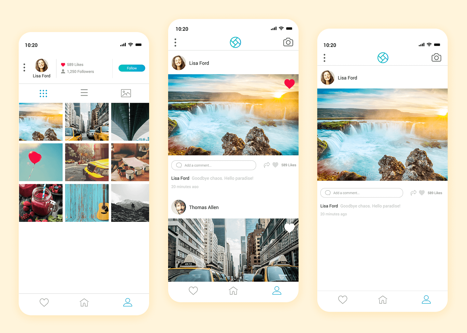
Our very own photo-sharing mobile app mockup. Get ready to rival Instagram?
After a beautifully simple login screen (hint: the username and password are hidden in plain sight… talk about reveal!), the user is taken through into a familiar-feeling photostream. The interface is scrollable, and tapping on a photo triggers a micro-interaction, complete with a UI animation.
You can click through to see a user’s profile, change the layout type, and zoom in on individual shots – note the cool transition animation here.
Download it free or Try it out
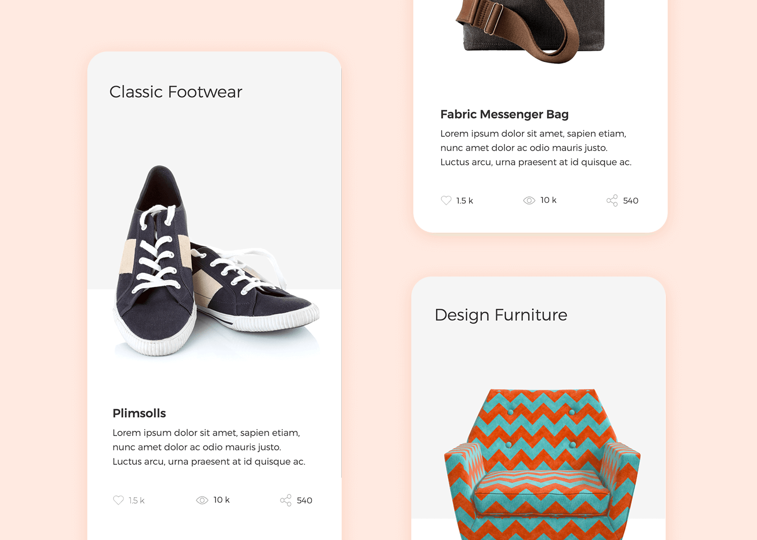
Are you looking for a minimalist template for product transitions? Our Product Transitions app template is clean and minimalist with the details in the smooth transitions between each product. In fact, like the mockup app template above, this one is also a great example of a mobile UI carousel.
Give it a try – swipe through the images and you’ll see that they already have transition interactions built-in. When the user swipes left, the product image will move left, prompting another to materialize in its place.
Below each product, there’s also a paragraph of Lorem Ipsum text you can edit to fill in a description. The template even includes like, share and view icons at the bottom of each product. Furthermore, all the visual hierarchy has already been determined by Justinmind’s in-house designers, so you can just focus on editing the content and reinforcing your brand!
Download it free or Try it out
This Bookshelf mockup app example is aimed at housing a library of digital media, featuring a sliding carousel of literature to read, along with a feature image for the main story, and a view all button.
Download it free or Try it out
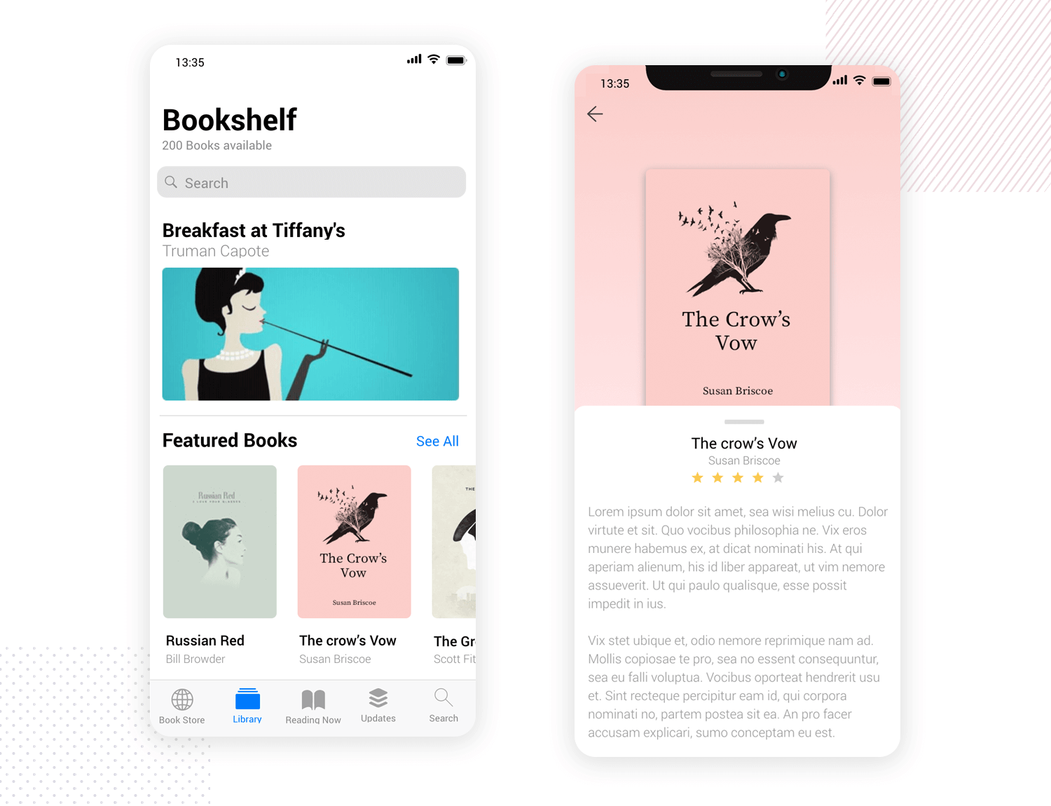
Below, at the bottom of the screen you’ll notice there’s a taskbar with the typical built-in navigation, similar to the Bookshelf app found on the App Store and Google Play.
Furthermore, each book you tap expands with a synopsis that you drag up from the bottom of the screen. Stowing the synopsis will reveal star rating and comment buttons. Why not give it a try?
This is a great mockup app template to take advantage of if you want to create a reading app or any kind where digital content can be consumed by your users.
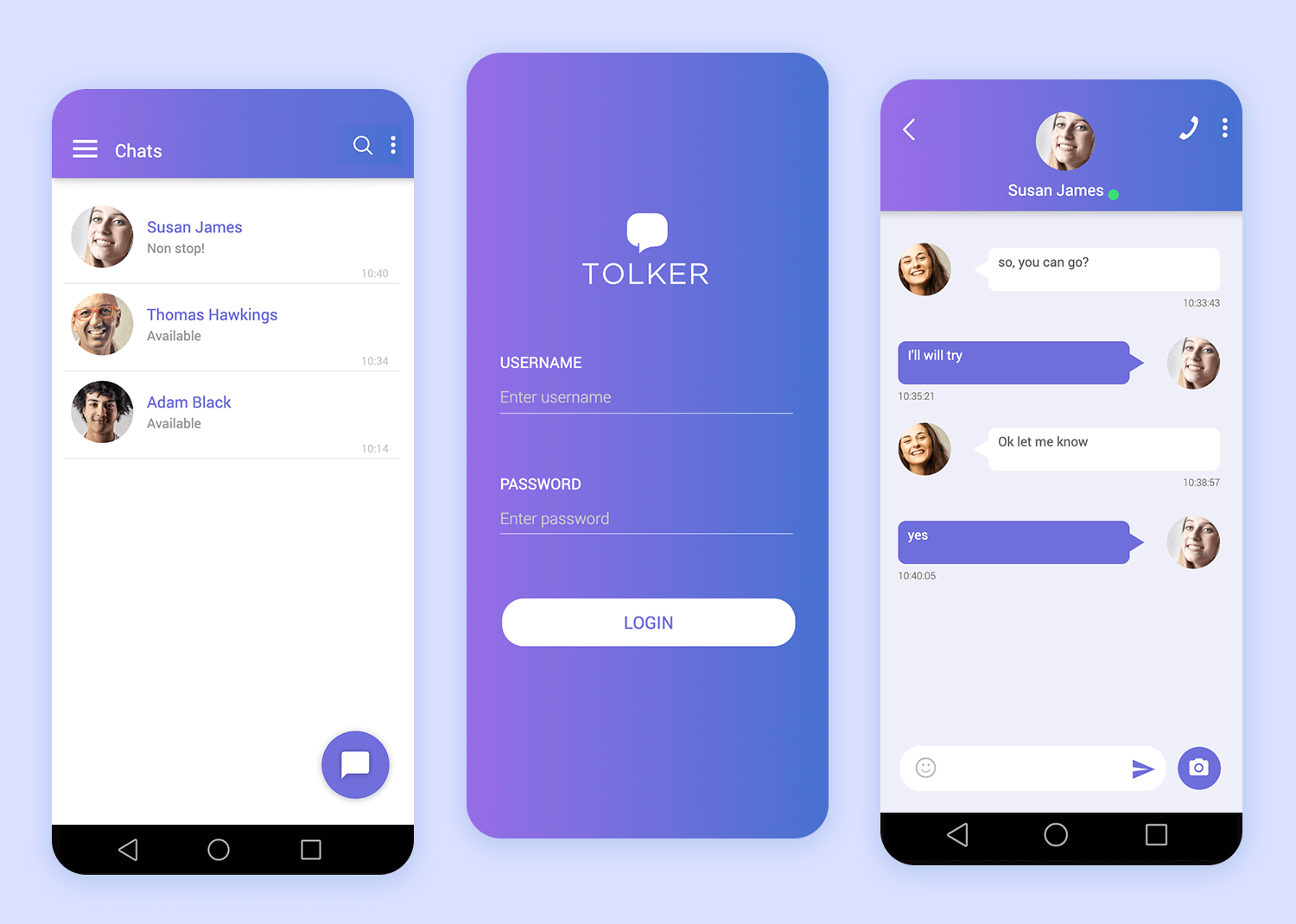
Loading up our fab messaging app mockup for Android, you go straight into a login screen, nice and simple and with a modern-looking gradient, and a big bold login button. Once logged in, you see the recent chats screen, complete with a nice animation on the big ‘new chat’ button on the bottom right.
Download it free or Try it out
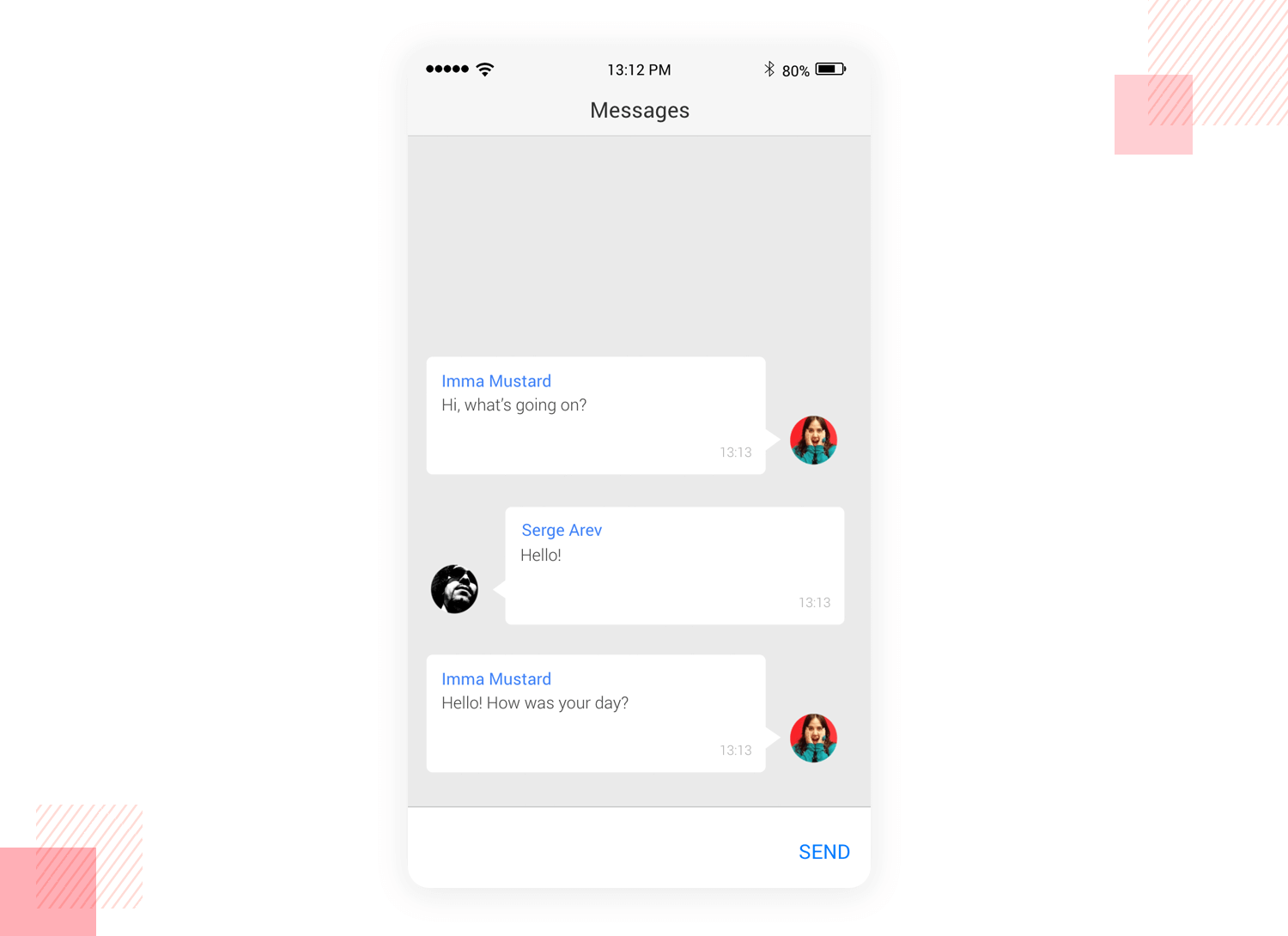
Tapping one of the chats will open it in a new screen, with a slight microinteraction animation to confirm the action. The hamburger menu on the left slides in a layer which gives you access to the Chats, Profile, Contacts and Files screens, as well as an option to sign out.
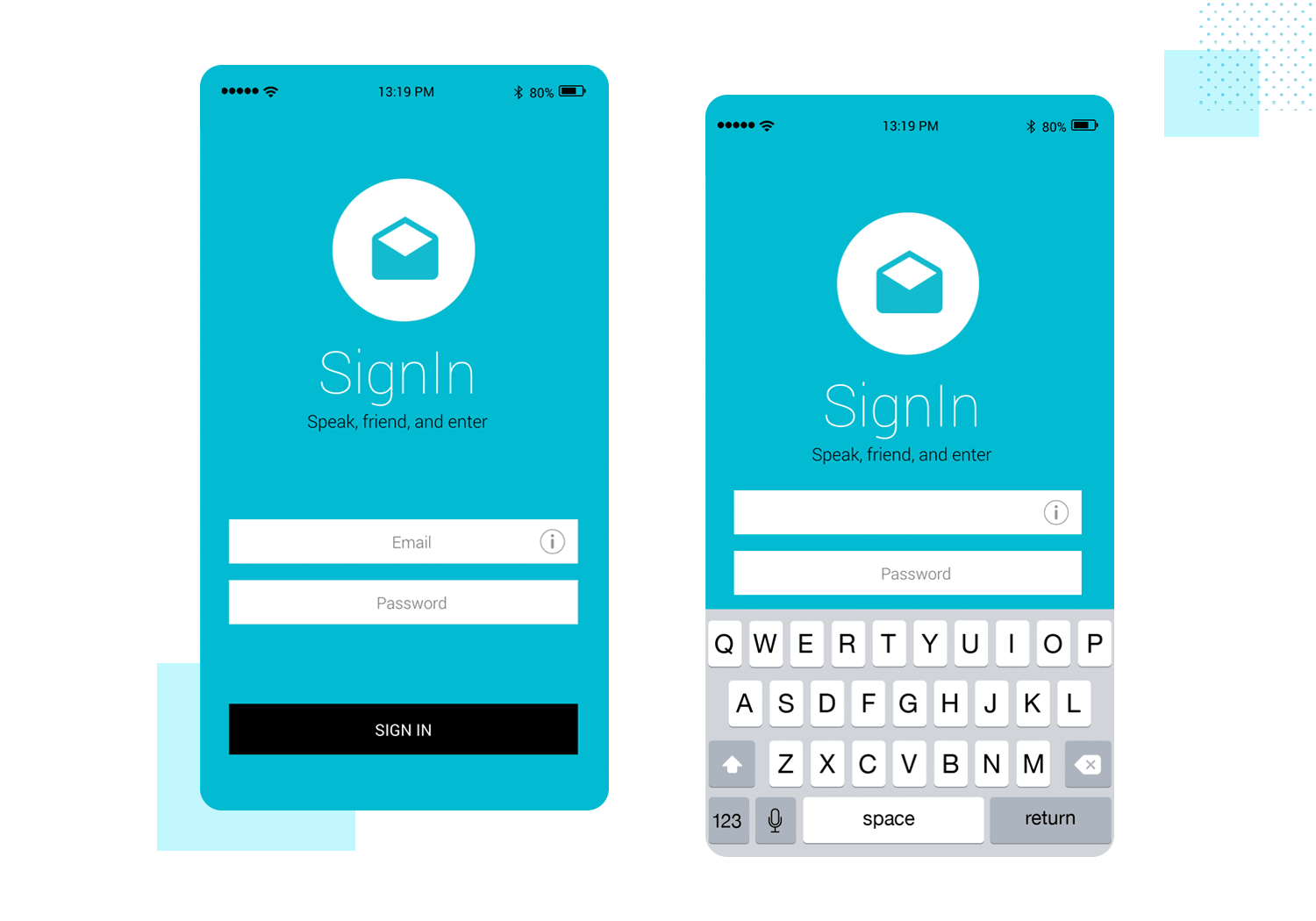
Our sign-in screen mockup uses elements from the iOS UI kit to simulate signing in to an app on an iOS device. You’ll need to use the correct credentials – if you don’t, you’ll see an error message explaining that you need to try again. Sign in successfully and you’ll find yourself in the familiar surroundings of the iPhone’s Mail app.
Download it free or Try it out
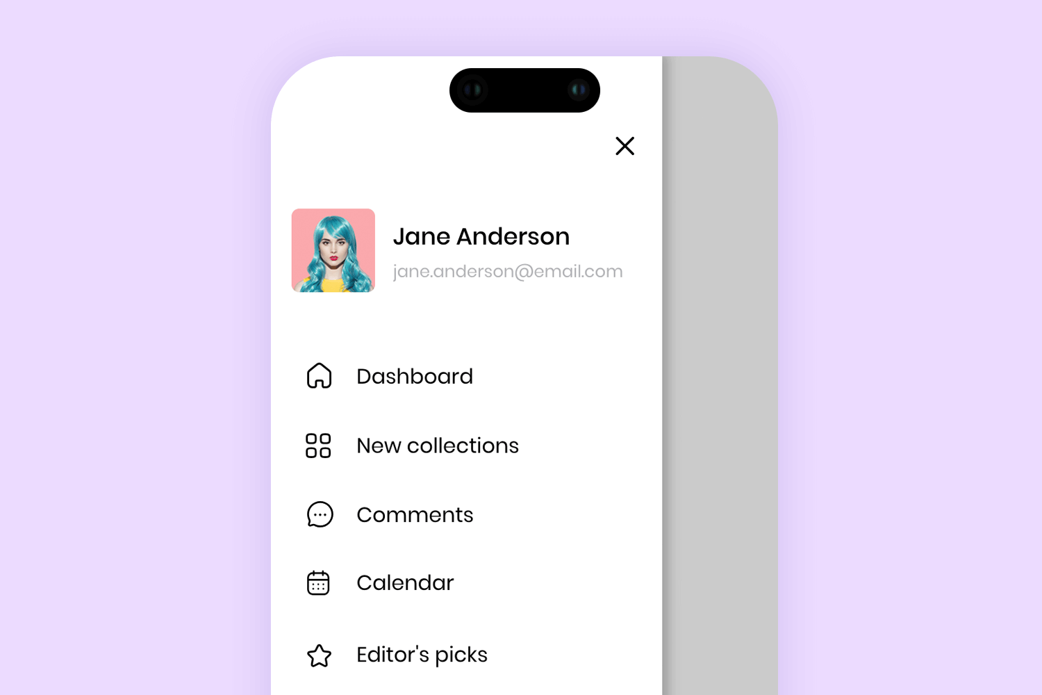
One feature you’ll see in a large number of mobile apps, particularly on Android, is the slide menu. While they’re not without their controversies, when done properly, a slide menu can add a useful series of navigation and configuration options while saving on precious real estate.
Revealed as a new layer with a smooth transition, the slide menu usually gives you access to otherwise hidden elements, like profile controls, navigation or folder options (think: Gmail) and often an advanced settings button.
Download it free or Try it out
Next up on the list is our Travel Experiences app mockup, boasting some stunning high-definition image templates and intuitive navigation for a photo sharing or blogging app.
Download it free or Try it out
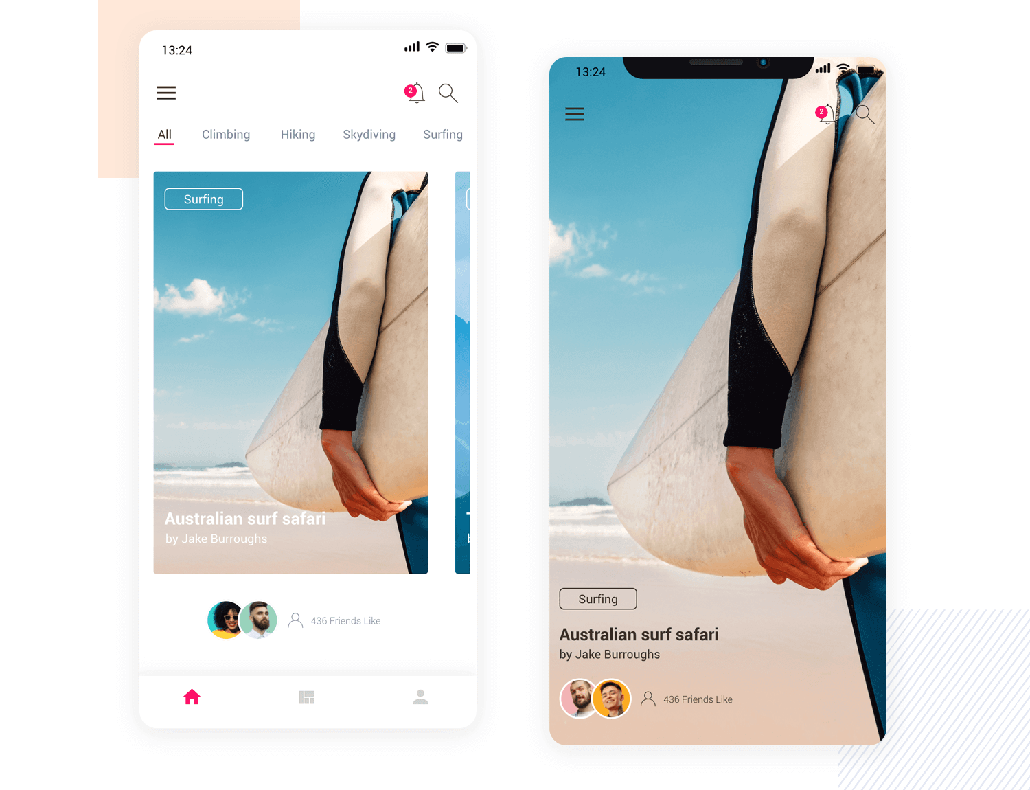
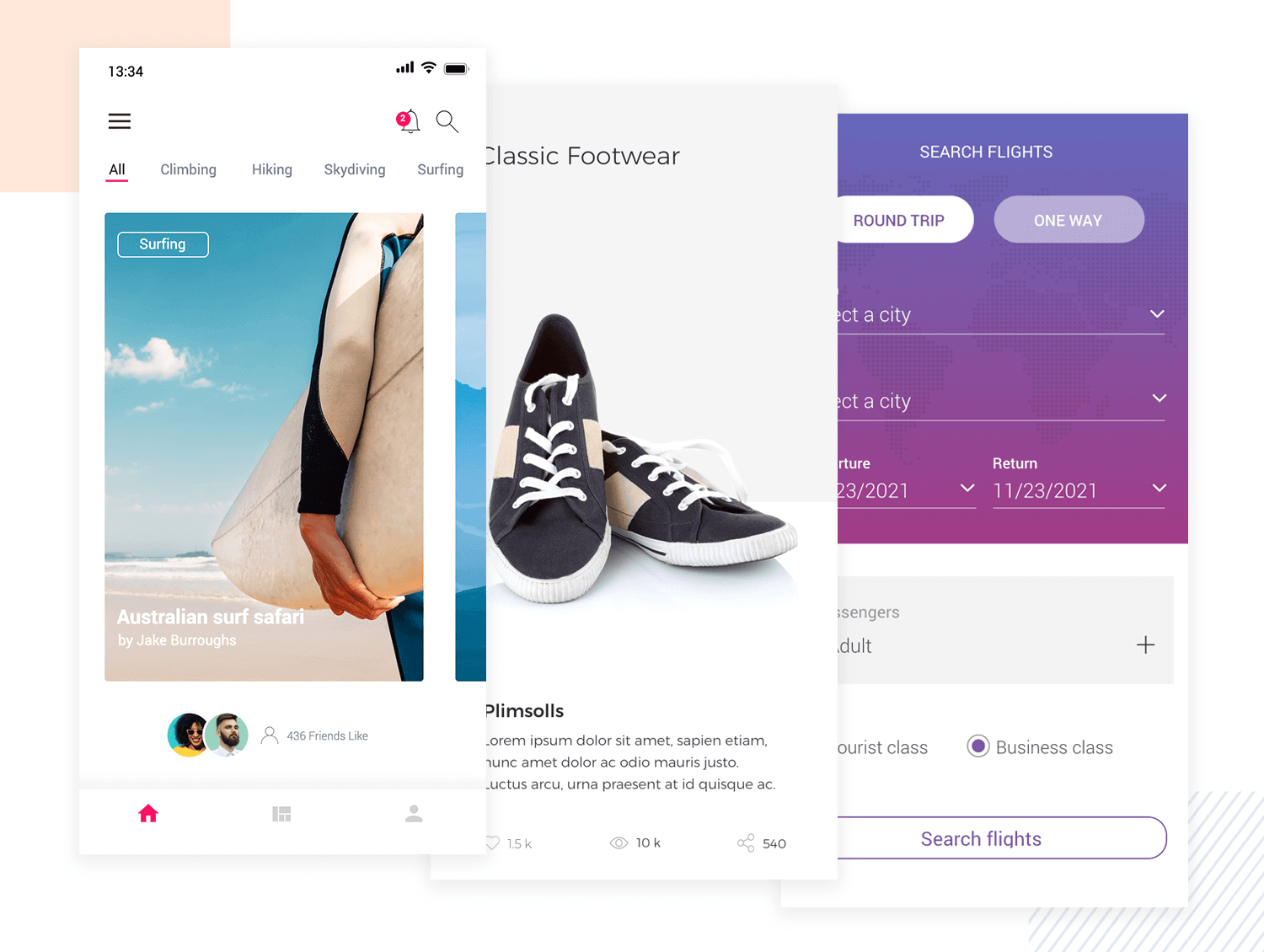
Our mobile app template is focused on sharing adventure stories and images. The main UI layout consists of an image carousel with slide left and right interactions already built in. Why not have a go at swiping through each image and selecting a story?
If the user presses the activity button, such as “surfing”, the image expands for each adventure sporting activity to full-screen. There is even a section below for likes built-in, meaning it would be a great app mockup template to start with in order to design a social app.
As a social app template, there’s actually not a whole lot left for you to do – most of the work is already done here!
Explore a sleek and modern chat experience with this mobile app mockup. The clean design features a stylish gradient header and personalized user profile pictures, making interactions feel more intimate.
Color-coded chat bubbles ensure easy conversation tracking, while the intuitive input field, complete with icons for sending messages and attaching media, enhances usability.
Download it free or Try it out
Deleting a file accidentally can sometimes have precarious consequences. That’s why something as simple as a confirmation message can really help improve UX. And that’s exactly what this Confirmation Pop-Up mobile app mockup aims to do.
This template features a list of messages from a messaging app that have been highlighted so the user can delete them by pressing the classic “X” symbol. That then prompts a modal window to pop up where they have to confirm they want to “delete” the message or “cancel” the procedure.
Download it free or Try it out
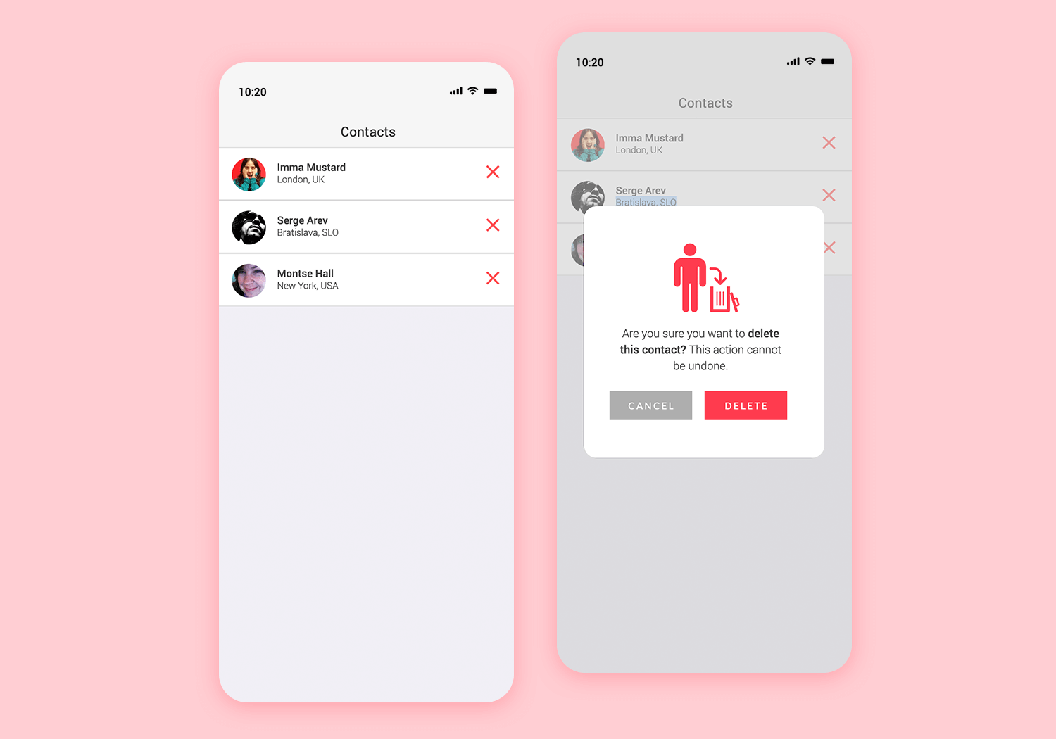
The great thing about this app template is that the color scheme and symbolization is already thought out. For example, the X is in red, the vector image on the modal window of the person and the trash can is in red and the delete button is in bold red as well. Only the “cancel” button and warning text are in red. The color scheme also provides great contrast for someone with color vision deficiency.
Even though these might seem like minor details, this mockup app template provides a functional – if not necessary – feature for any messaging, media or data-heavy app. For best results, why not combine this mockup screen with our other messaging app template?
Looking to create a photo editing app or similar feature? Or do you simply want to test out what you can do with slider elements in Justinmind? If so, you should definitely take our Before and after app mockup template for a spin.
Download it free or Try it out
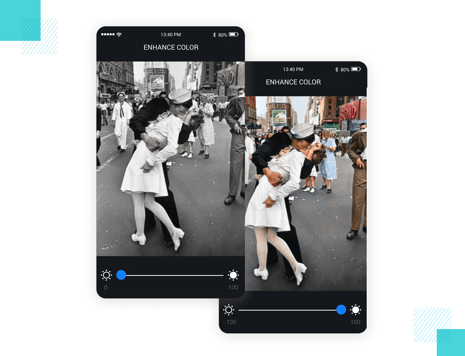
The level of interaction already built into this mobile app template is remarkable, yet the premise is quite simple: you‘ll see this app contains a greyscale photograph that you can adjust to saturate with color, merely by moving the slider from left to right and vice versa.
However, that’s not the only slider interaction you can add into your mockups in Justinmind – you can also use it to add other effects like sepia and to adjust aspects like contrast, brightness and blur.
This template demonstrates the greyscale effect for the purpose of demonstrating the power of the transition interaction that you can add into your app templates in Justinmind.
Need to mock up a mobile app that has a map screen? Then our Zoom and Pan mockup could save you quite a bit of time. It features a world map with iconic landmarks – a handy, built-in pan feature that lets the user drag the map to any continent. It also has a button with built in zoom-in and zoom-out interactions.
As we like to say here at Justinmind, it’s all in the details – our zoom button is made intuitive with a +/- symbol that changes once maximum zoom-in and zoom-out are reached.
Download it free or Try it out
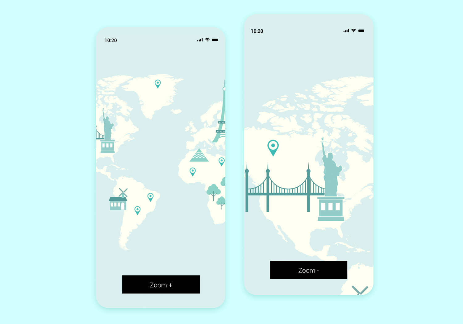
The Pan and zoom mobile app template can be a huge timesaver when you have to design map screens for your mockup – just replace it with your own map and icons. Most of the work is already done for you!
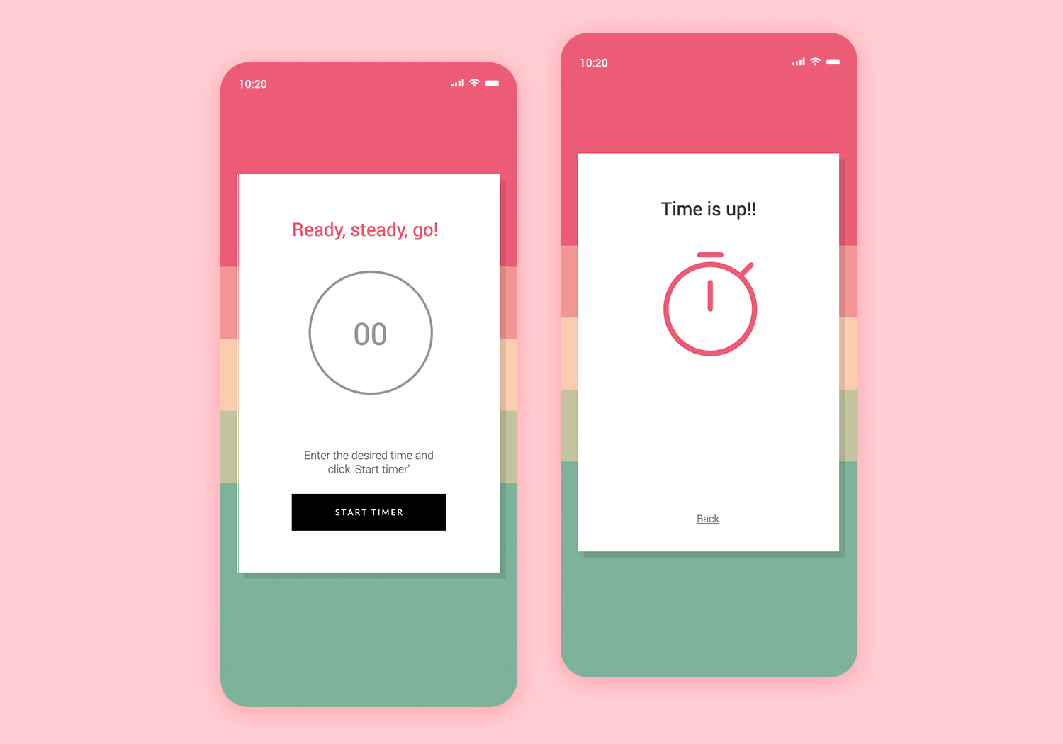
This simple and easy to customize countdown timer template is straight to the point, and can be incorporated into any cooking or sports mobile app project. You’ll find 1 screen to edit the countdown to desired time and start it, and a second screen when countdown finalizes. This example is fully interactive, give it a go!
Download it free or Try it out
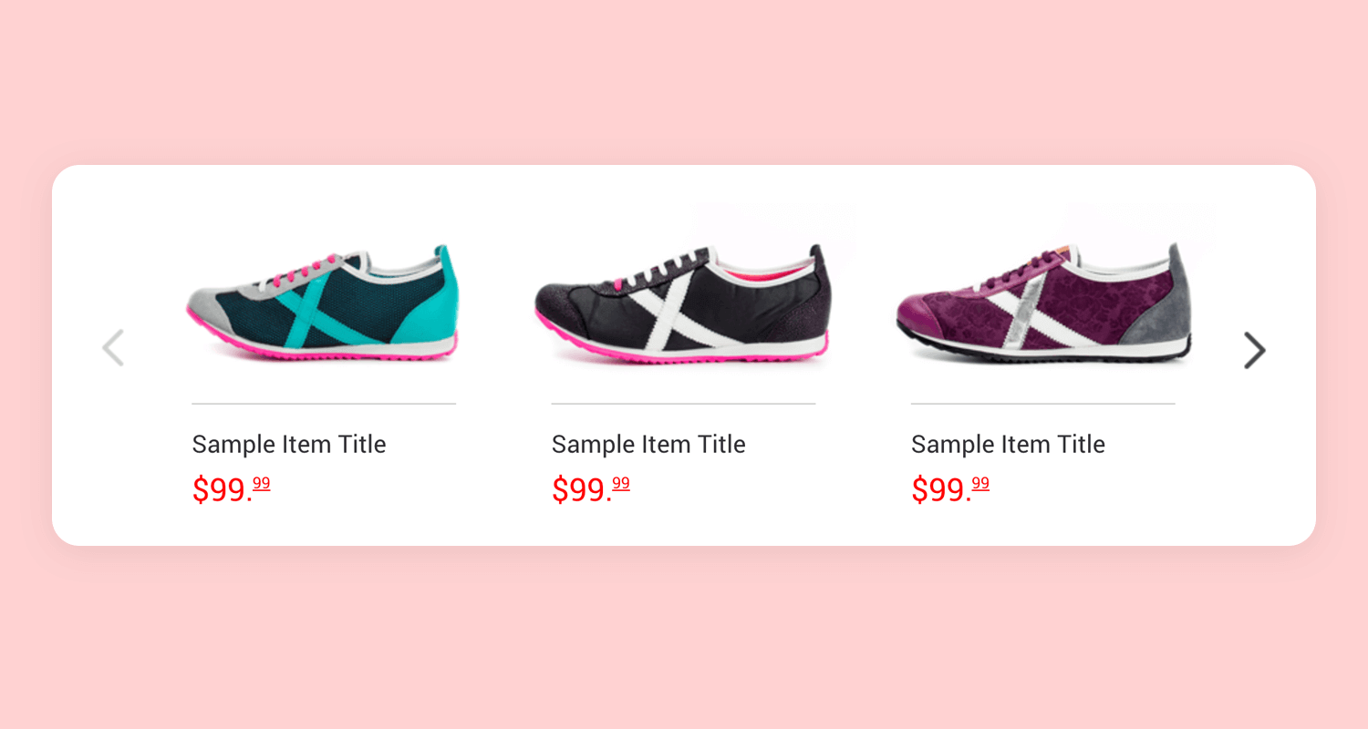
This fully functional carousel mockup is a great add on for any mobile project. Carousels are great to show multiple pieces of content without occupying much space, which makes them perfect to make the most of the limited space available in mobile devices.
Download it free or Try it out
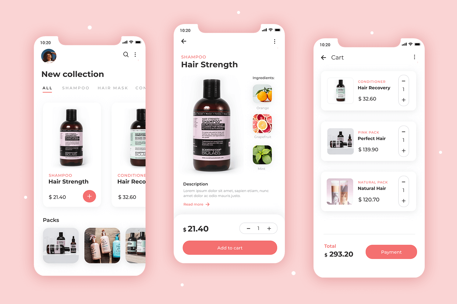
This mobile mockup represents an e-commerce for hair products. The general style is clean, with a modern feel to it. This design comes with several screens, including a product page, an items page and the cart as well as a checkout page. The Hair care e-commerce app is a classic example of a practical wireframe that can be easily adapted to just about any form of e-commerce apps.
Download it free or Try it out
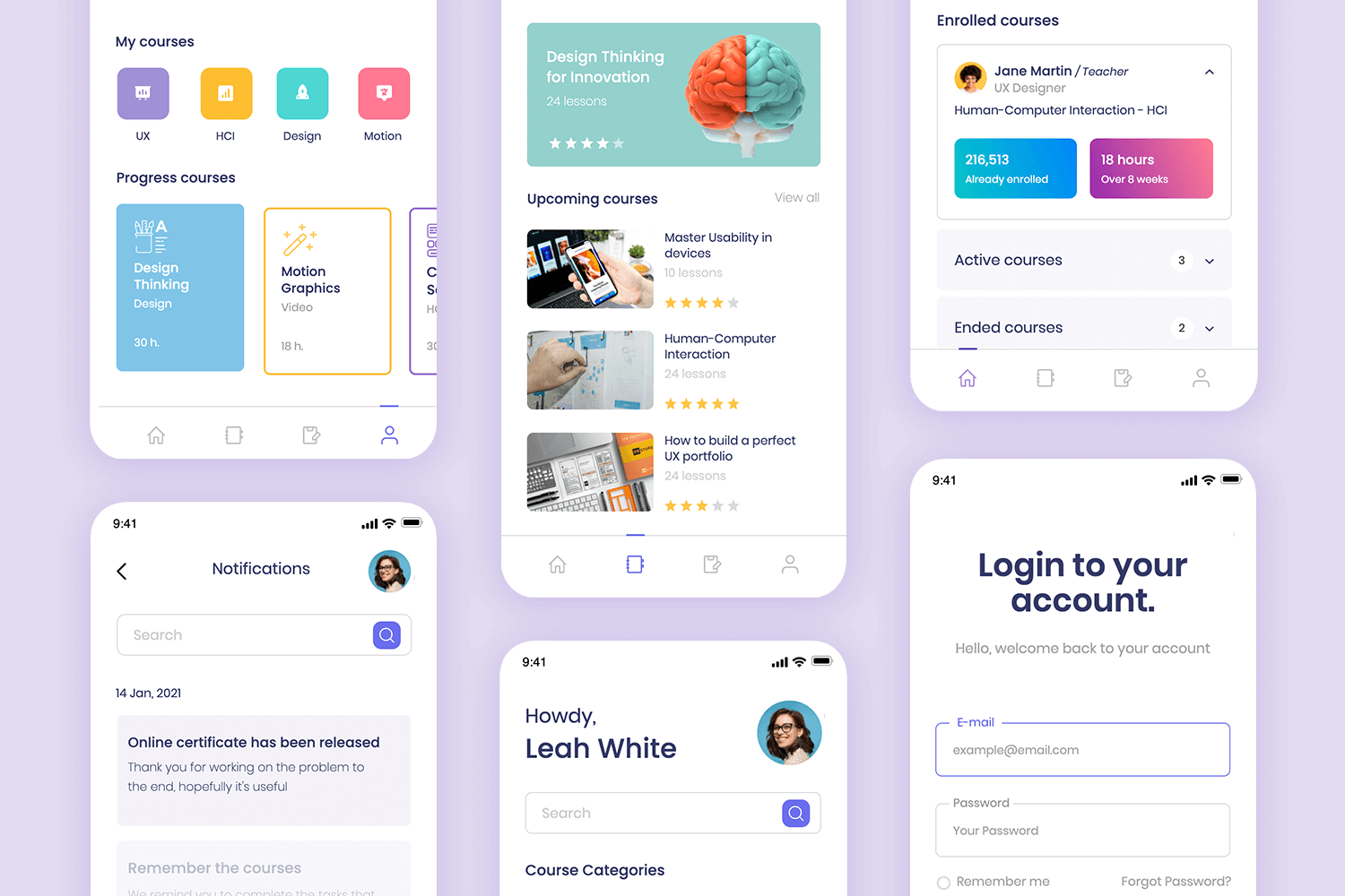
This mobile app mockup represents a long-distance learning app. The sketch comes with a total of 5 screens, including the login screen and the profile screen. We love the content structure in the My Courses screen, where the content is displayed in cards that could be easily adapted to display pretty much anything. On the Home screen, we enjoy the visual hierarchy, making a set of complex information seem easy to understand.
Download it free or Try it out
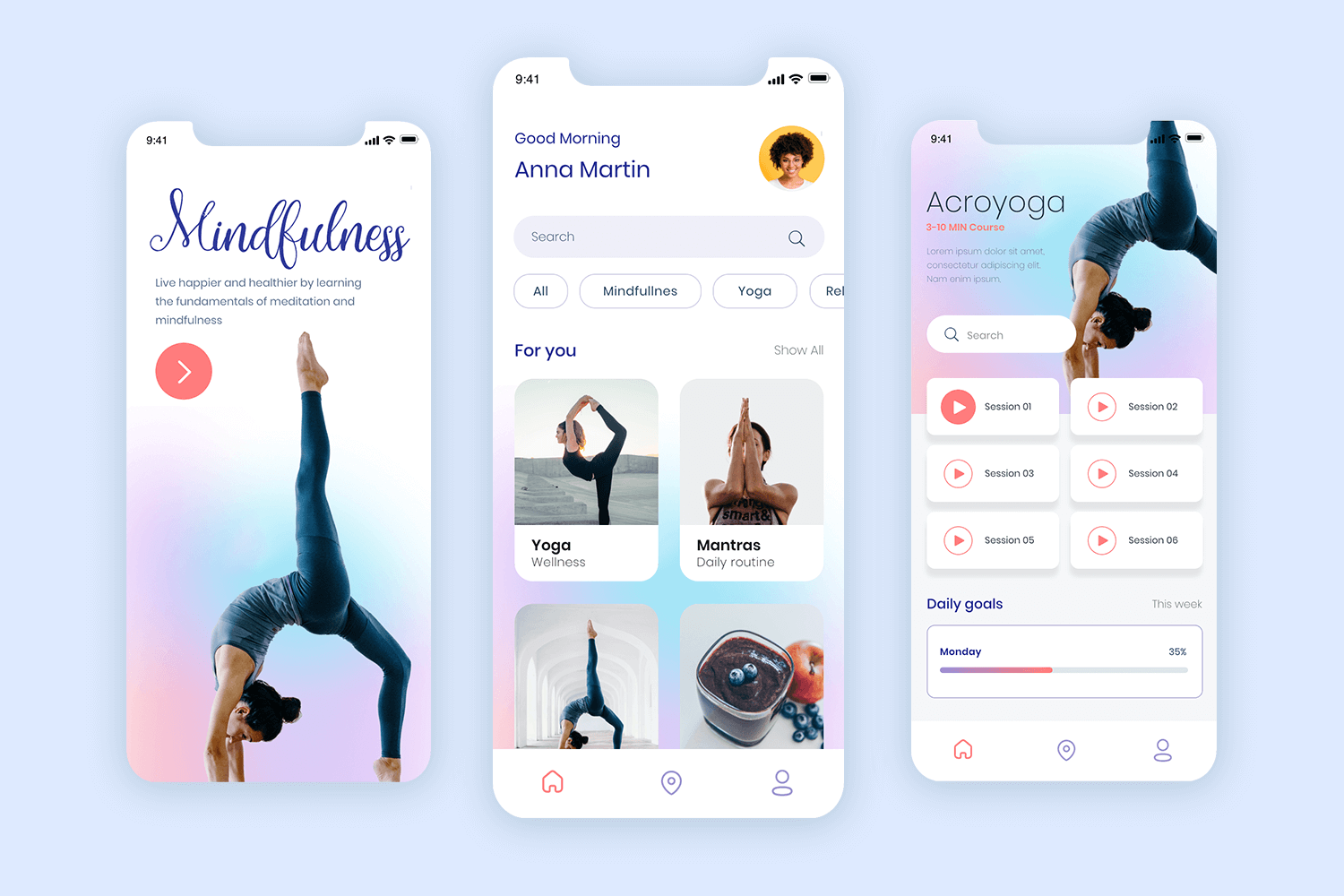
This mobile app mockup also enjoys a modern feel, but brings a young vibe into the mix. The gradient background gives the app a casual and artistic style. You’ll get several screens for the app, including the welcome screen and the homepage. The guided meditation app is the perfect option for any product that deals in wellness.
Download it free or Try it out
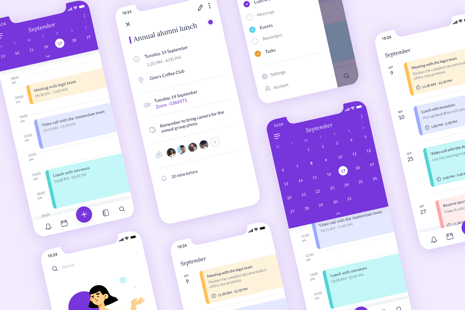
This mobile app mockup also captures a time management product but comes with more screens and more details. You can expect to find not just the calendar itself, but also other screens that aid in the creation and management of appointments and events. The Calendar and schedule app can be a wonderful app layout to use as a starting point for any product that deals with time management.
Download it free or Try it out
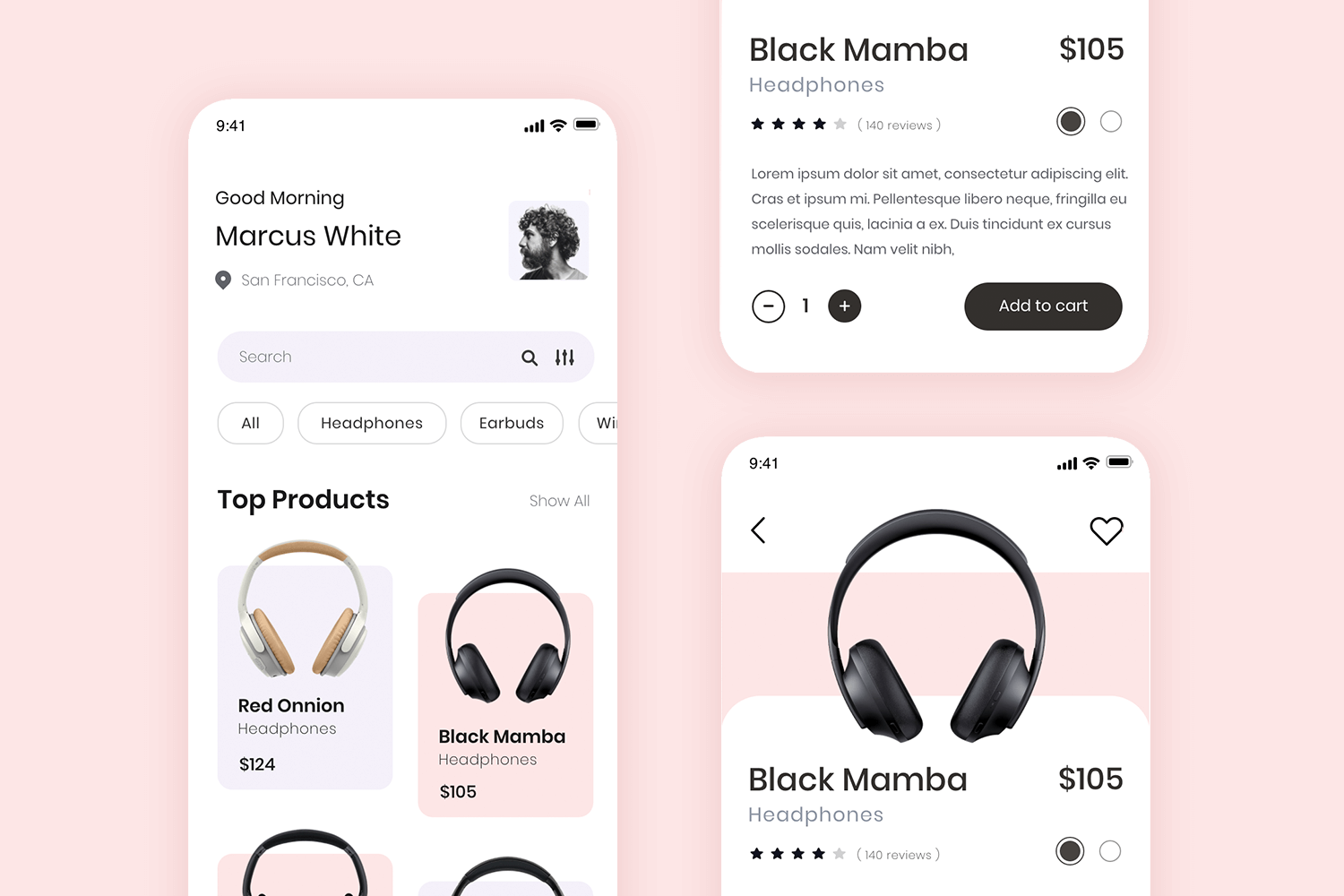
This mobile mockup also represents an e-commerce store, but unlike the others, it focuses on clean lines with a minimalist and modern style. It’s the perfect starting point for any store that focuses on tech. We love the screen that lists all the items, which enjoys a tag filtering system that allows for quick browsing.
Download it free or Try it out
This mobile app mockup is also an e-commerce store, but it goes for a more casual and young feel. There are plenty of bright colors throughout the design, with a clear visual hierarchy and efficient layout. The model comes with 4 pages, including the home page and the product page.
Download it free or Try it out
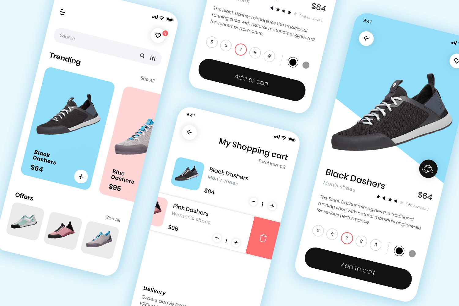
A great starting point for a modern shopping app. This mockup example includes 15 different screens that you can use as your design template and easily adapt to your project. The screens, ranging from a getting started splash screen to a smart product scanner feature, create a unified visual style and user experience by incorporating important features and intuitive navigation.
Download it free or Try it out
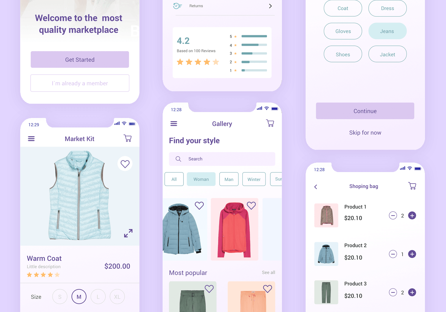
Explore this elegant social media profile app mockup, designed to offer a clean and user-friendly experience. The profile page is thoughtfully organized, featuring a profile picture, user information, and key stats such as posts, followers, and following counts.
The layout includes icons for settings and editing, making navigation intuitive. Below, there’s a section for recent posts, ensuring easy access to the user’s content.
Download it free or Try it out
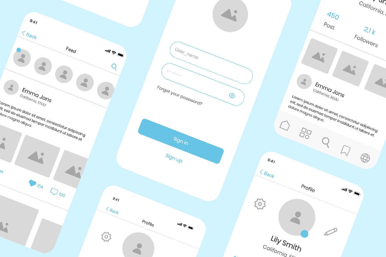
This is one of the most complete and extensive mobile app mockups on this list. It comes with no less than 10 screens, ranging from the search results to the restaurant screen. It even includes the order confirmation screen. There’s a lot here that can be easily adapted, from the general visual structure of the components to the tag filtering system. The Food delivery app is almost a full and complete design.
Download it free or Try it out
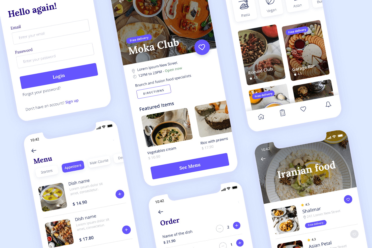
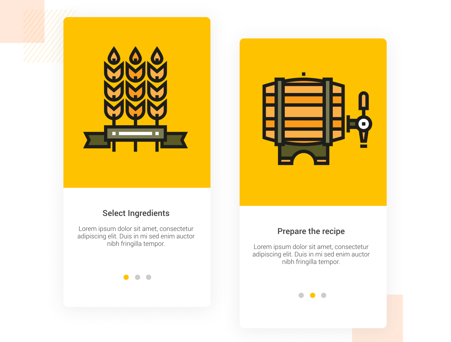
Product walkthroughs are used in onboarding, to make apps more intuitive and straightforward. Block colors, minimalist visuals and simple instructions are key to making your mobile onboarding experience run smoothly. Slide to the left or right to move between the pages in the walkthrough.
Download it free or Try it out
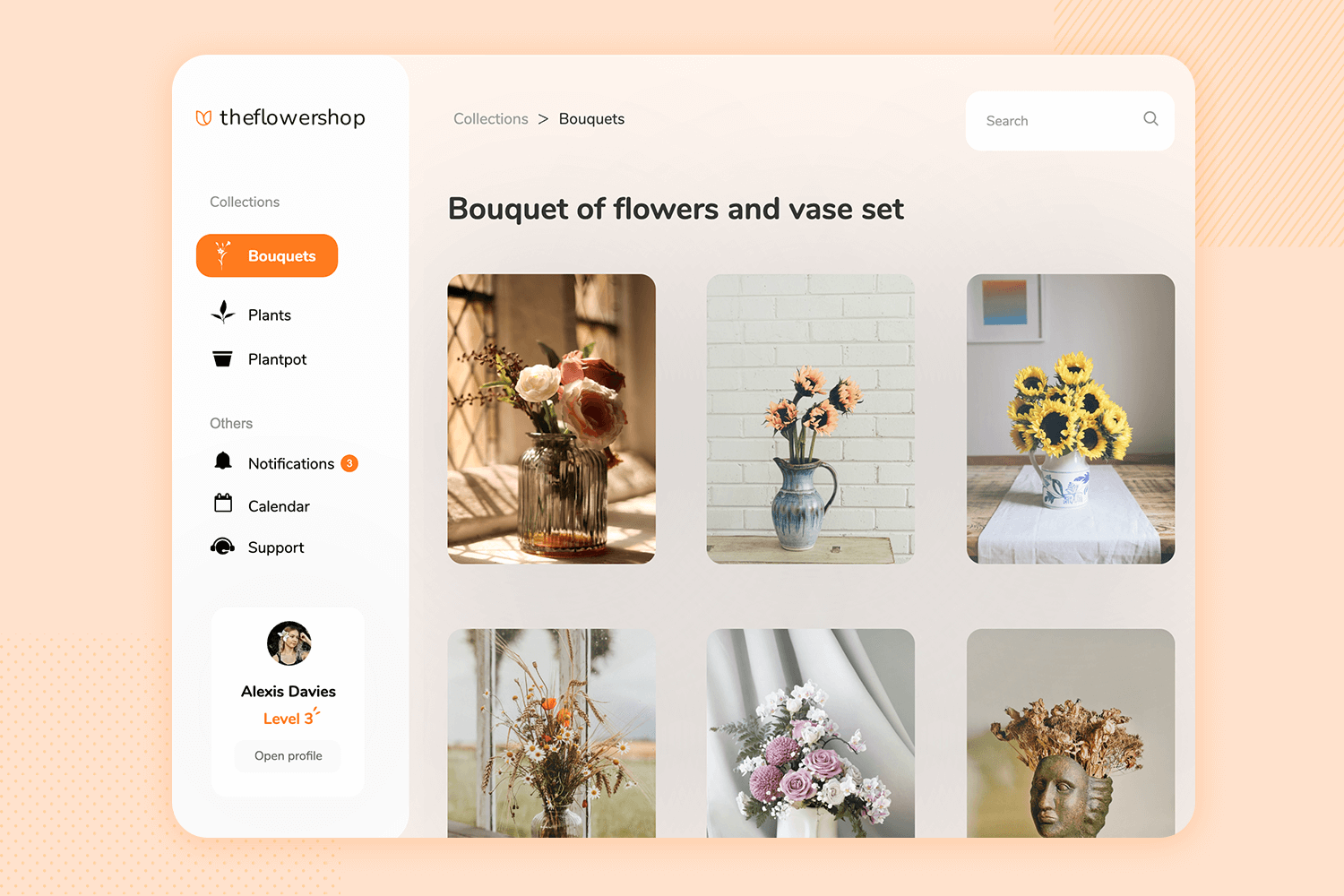
This app mockup helps you find beautiful artificial flower decorations for your home.
The main screen offers a free 3-day trial, making it easy for new users to start. You can see the features like high quality, unique designs, sustainability, and best prices, which make the service attractive.
The “How does it work?” section explains the steps clearly: choose from over 650 designs, receive your first bouquet, and easily change to a new design whenever you want. This makes it simple to keep your home looking fresh and stylish.
Download it free or Try it out
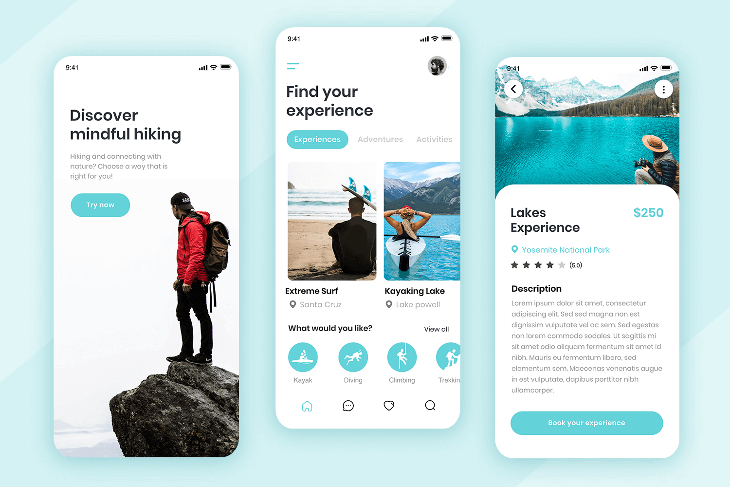
This mobile app mockup is surprisingly versatile due to its general structure. Even though the Travel ecommerce app only comes with 3 screens, they are the type of screens that can be infinitely practical. The practicality of this mockup can be clearly seen on the homepage, where the display of content could easily show a list of services, experiences or items.
Download it free or Try it out
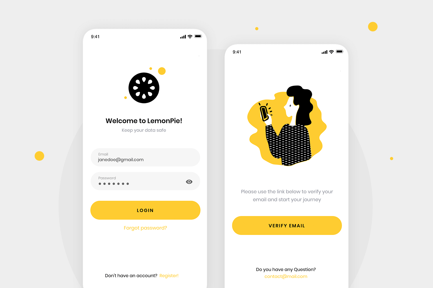
Another mobile app mockup with a fairly descriptive name. Much like the onboarding sequence mockup, this one is also short and sweet. It captures the login flow, which could be suitable for any type of app out there with minimal adaptation. The mockup comes with 2 screens, including the login screen and the confirmation screen.
Download it free or Try it out
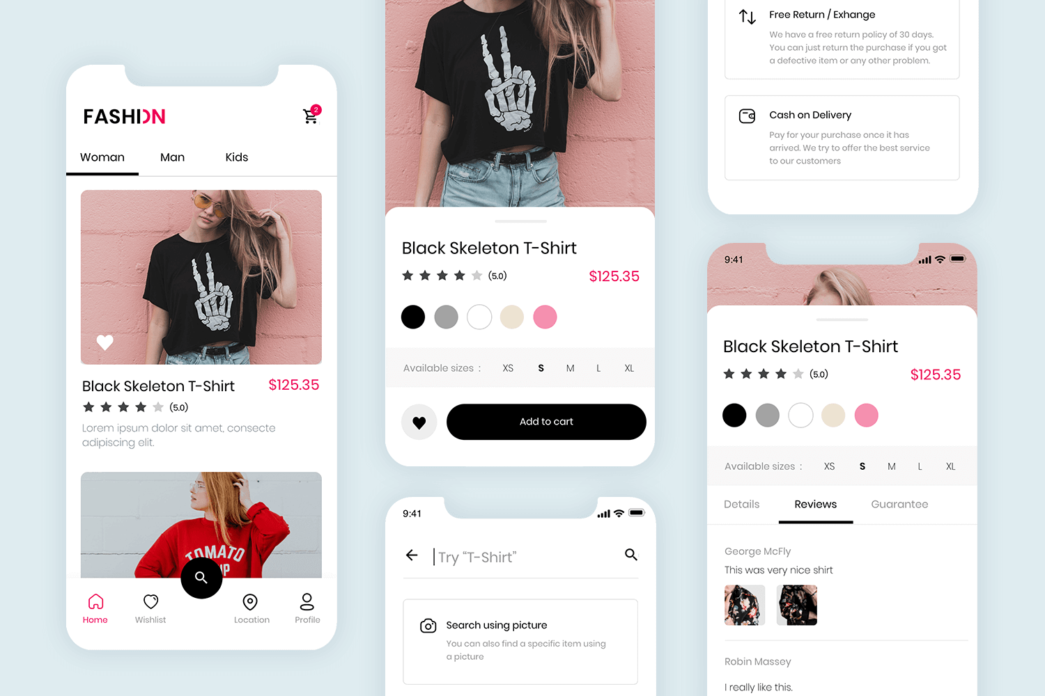
This mobile e-commerce mockup is another wonderful example of a starting point for an online store. The Fashion store app maintains the modern style but also makes it feel young and casual. You can expect to find the homepage and different versions of the product page, with some focusing on the reviews or the shipping options. There is also a search page, which includes the native keyboard.
Download it free or Try it out
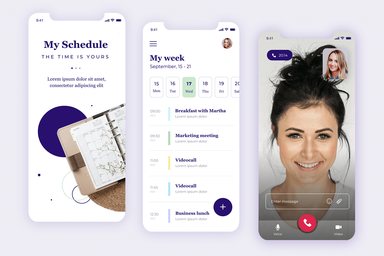
The Scheduling app mockup offers 3 screens, including the home screen, a calendar screen as well as a video call screen. The intro screen can easily be expanded into a full onboarding sequence pretty much effortlessly. The calendar screen has a wonderful content structure, showing not only days of the month but also times for specific appointments.
Download it free or Try it out
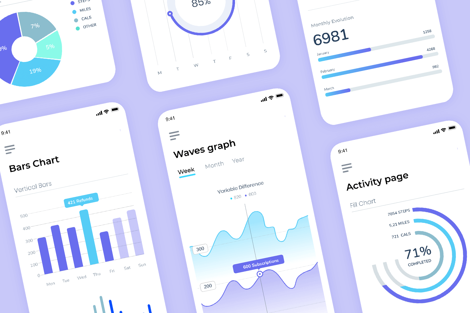
The Analytics dashboard app mockup is a great way to save some time for products that need to reveal and organize a lot of information. Each screen shows the data in a different way, from pie charts or bars to wave graphs. The screens make it look easy to display complex data, which is definitely worth borrowing from. This could be easily adapted and included in any data-heavy design you wish.
Download it free or Try it out
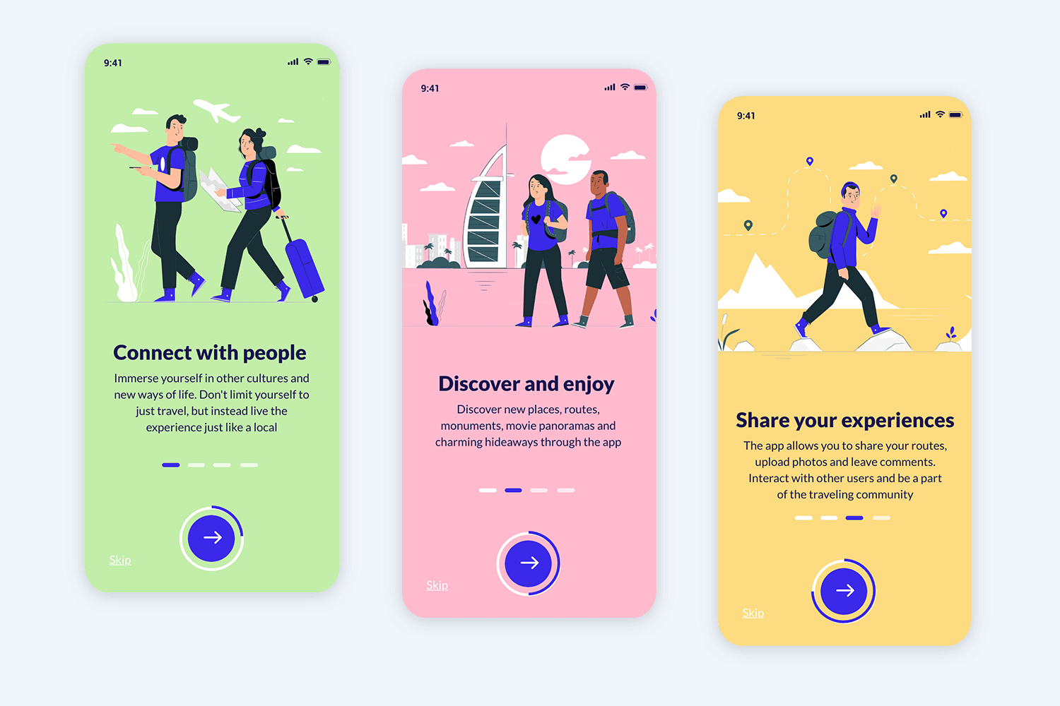
As the name suggests, this mobile app mockup is a simple but practical onboarding sequence. The full sequence comes in 4 steps, with each step offering a unique illustration with some information and a button. It’s true that this mockup alone won’t get your product to the finish line, but it can indeed be adapted and used in any project that requires an onboarding sequence.
Download it free or Try it out
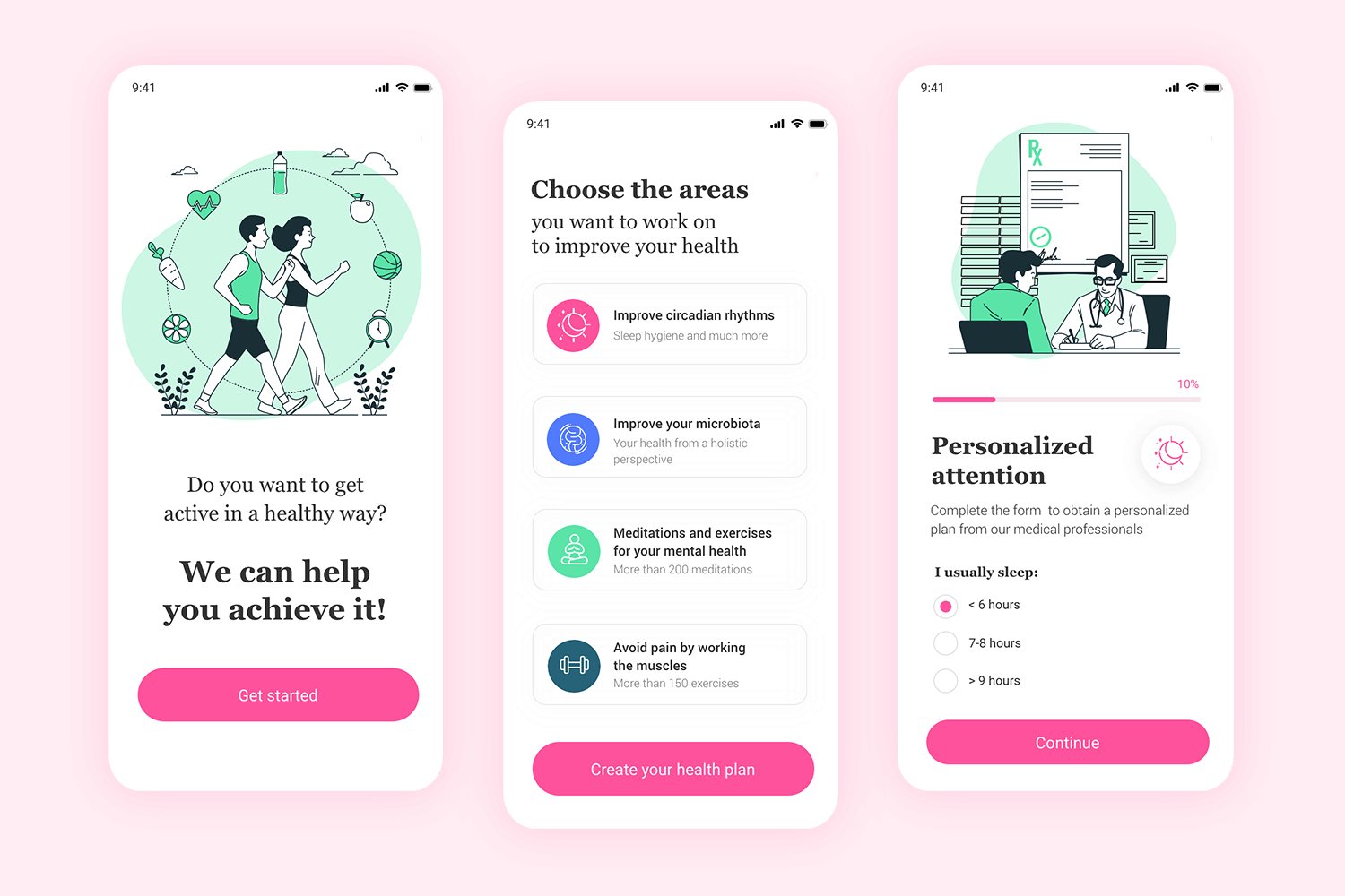
This wellness-focused mobile app mockup offers a young, casual and fun vibe. Made with dreamy green and bright pink, the illustrations and general structure transmit the idea of making fitness be a fun activity for users. We like that the mockup comes with the initial forms, where users can specify their goals and details of their motivations.
Download it free or Try it out
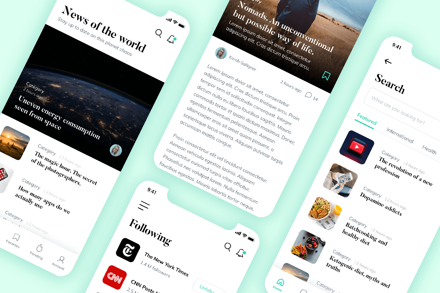
This mobile app mockup could be the perfect starting point for any product that relies on delivering a lot of written content. The News editorial app enjoys 4 screens, including the homepage and a screen for an individual piece of content. We love the simplicity of the design, which would allow users to focus on what they’re reading. It’s the perfect mockup for blogs, news platforms or any editorial-style of product.
Download it free or Try it out
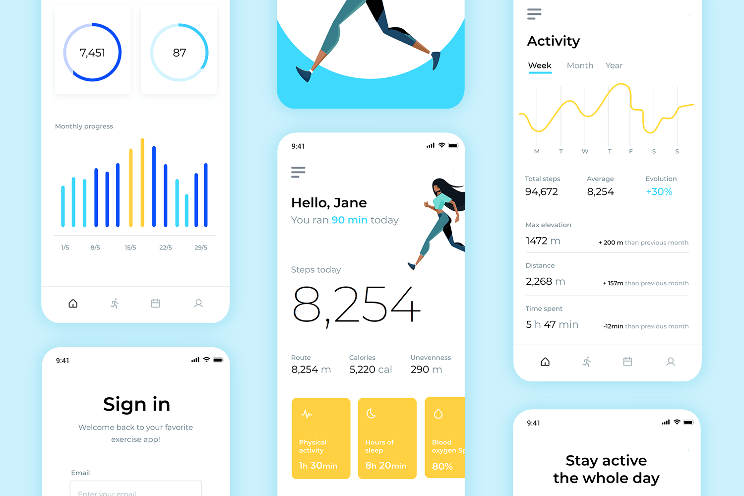
This mobile app mockup enjoys 5 different screens, each with the complete visual design and correspondent interactions. The Fitness app flow focuses on a cheerful and energetic style, with bright colors and illustrations. The onboarding screen can be easily expanded to a full onboarding sequence. Take full advantage of the visual hierarchy and wonderful layout design.
Download it free or Try it out
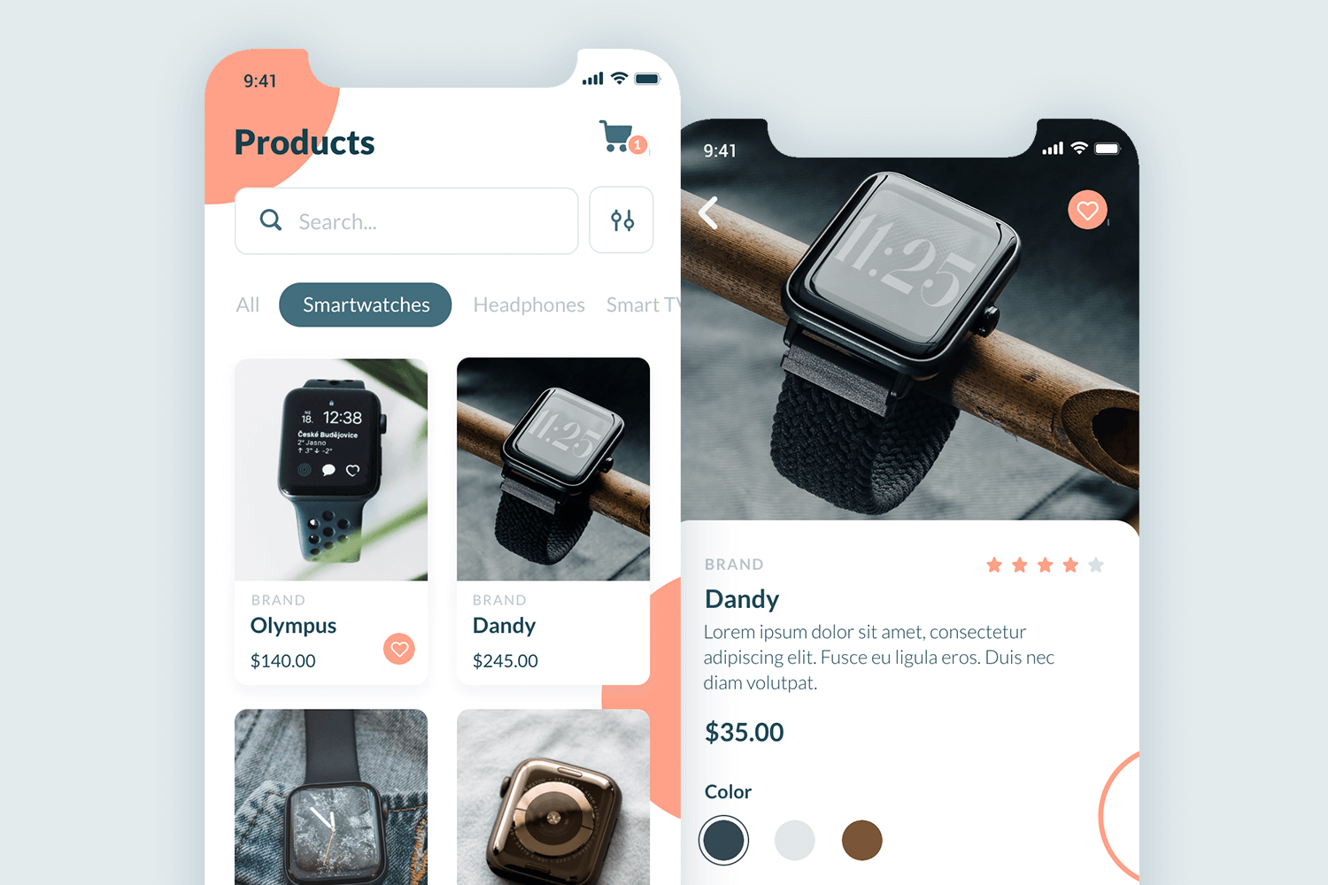
Despite bringing only 2 screens, the Wearable tech e-commerce app mockup can still be quite handy. It can be easily changed and adapted to represent any sort of online store you may need. The homepage enjoys a filtering system as well as a card grid that displays the items. We love the content structuring of the product page, which manages to offer the sizing and color options, price and description in a very reduced space.
Download it free or Try it out
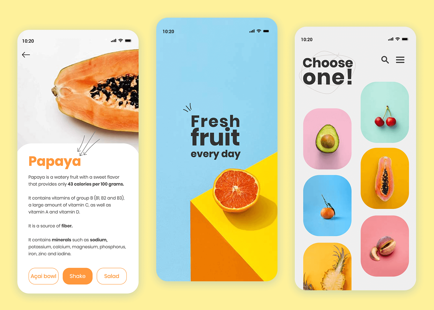
Discover a vibrant and visually appealing app mockup designed for promoting fresh fruit every day. The striking combination of bright colors and bold typography immediately captures attention, making the message clear and engaging.
This mobile app mockup is perfect for businesses looking to emphasize freshness and quality. The minimalist design ensures that the focus remains on the core message, providing a clean and modern look.
Download it free or Try it out
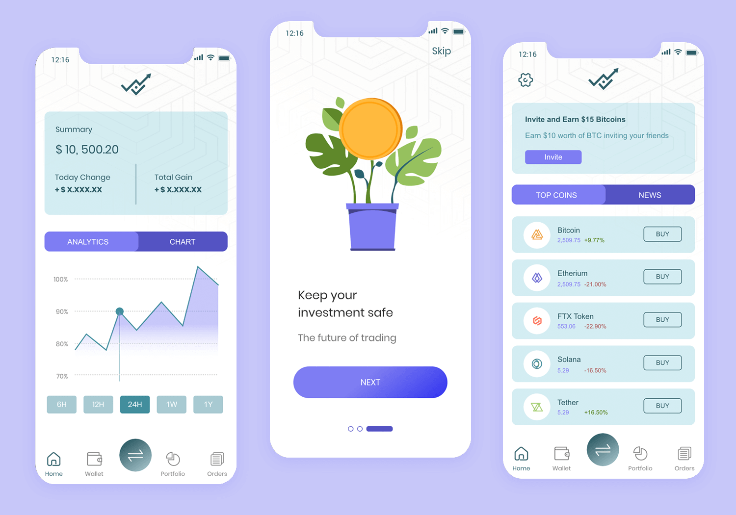
This complete trading and investment mobile app mockup includes 3 intro screens for onboarding, and 9 more screens with product features that you can easily adapt to your own product or brand. Some of the screens included in this mockup are: sign up, home dashboard, profile, and transactions.
Download it free or Try it out
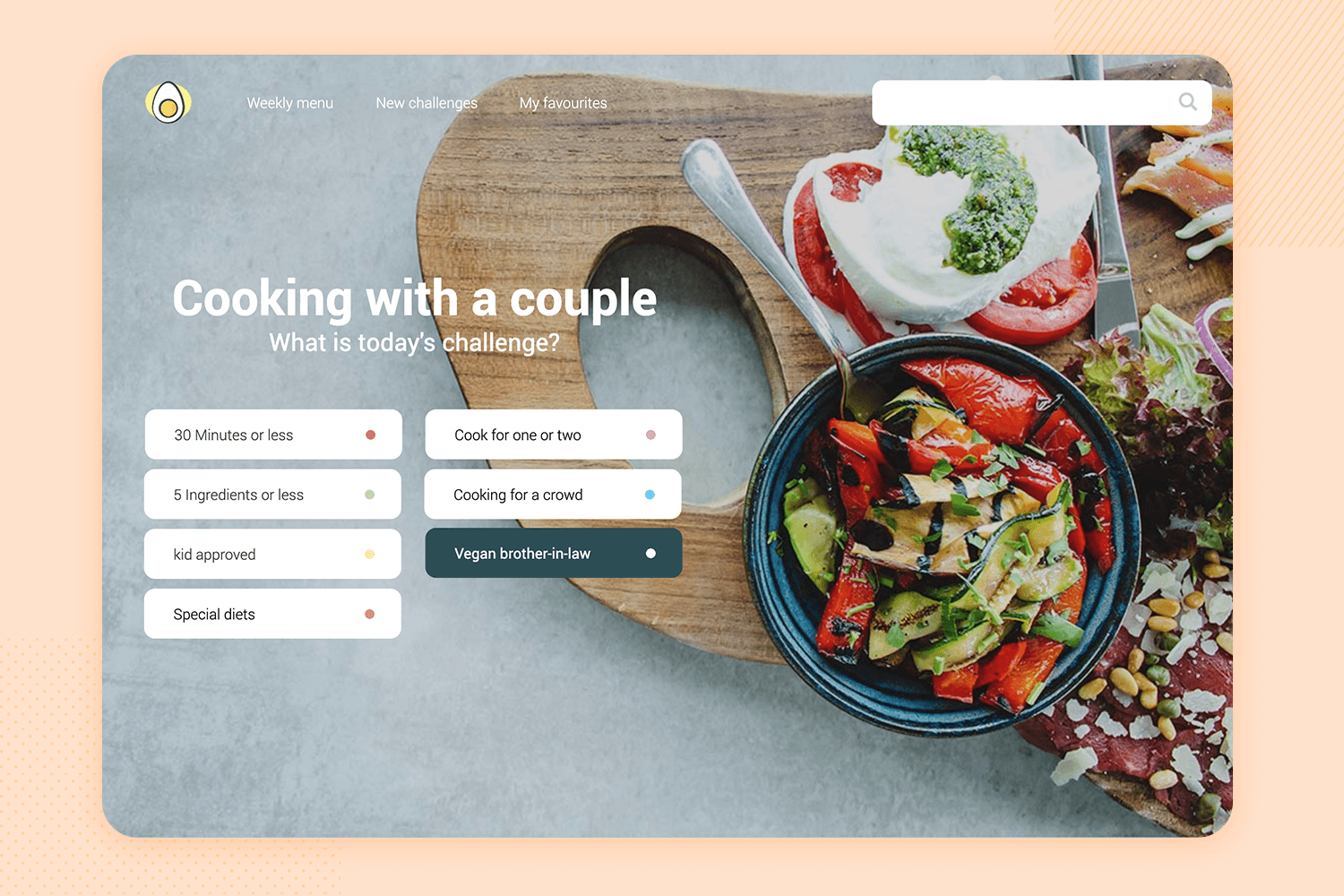
This visually appealing recipe app mockup is designed for culinary enthusiasts. The layout features a vibrant image of the dish at the top, followed by a well-organized ingredients list and step-by-step preparation instructions.
Key details such as preparation time, number of diners, and difficulty level are prominently displayed, ensuring a user-friendly experience. This app mockup is perfect for those who love to cook and want quick access to delicious recipes.
Download it free or Try it out
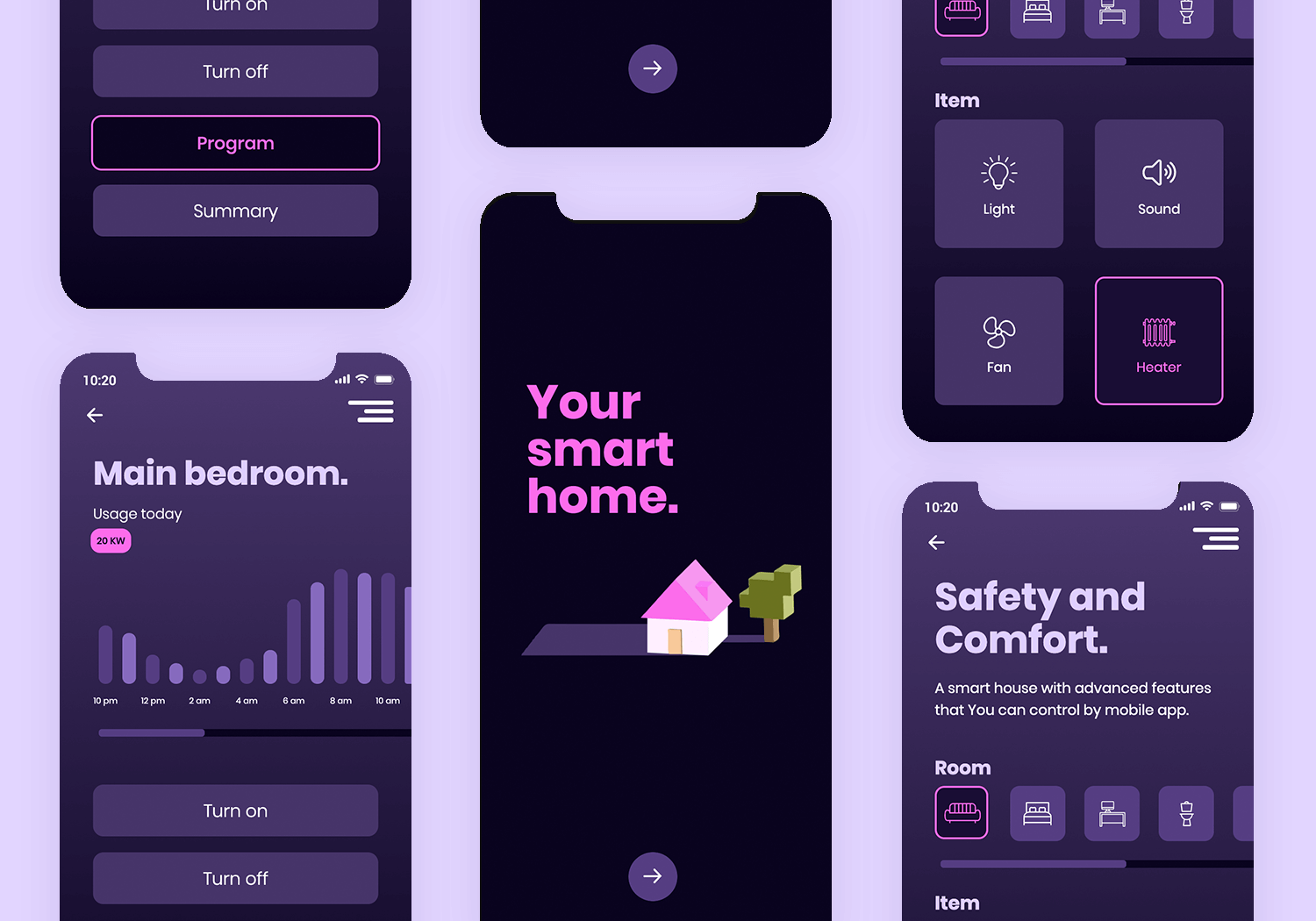
Control your smart home effortlessly with this easy-to-use app mockup. Designed with your safety and comfort in mind, it lets you manage all your home devices in one place.
Easily find what you need with controls organized by room and device. Adjust lights, sounds, fans, and temperatures with just a few taps. The app’s modern dark look makes it easy to read and enjoyable to use.
Download it free or Try it out
This simple yet complete online store app design is styled to make your products stand out. This resource includes 16 screens, including 3 onboarding screens to introduce the app and its features. In this mockup example you’ll find components such as grid view of products, a lateral menu, category filters, and multiple interactive payment gateways in the Payment screen.
Download it free or Try it out
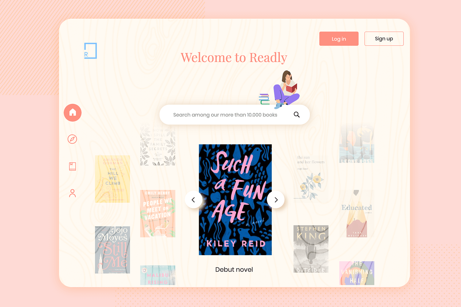
This tablet app mockup showcases a delightful e-book reader experience. The design features a warm and inviting interface, with a prominent search bar to explore a vast library of over 10,000 books.
The homepage highlights a featured book, with a carousel for easy browsing. Navigation is simple with icons for home, reading list, and user profile. The “Log in” and “Sign up” buttons are easily accessible, encouraging user interaction.
Download it free or Try it out
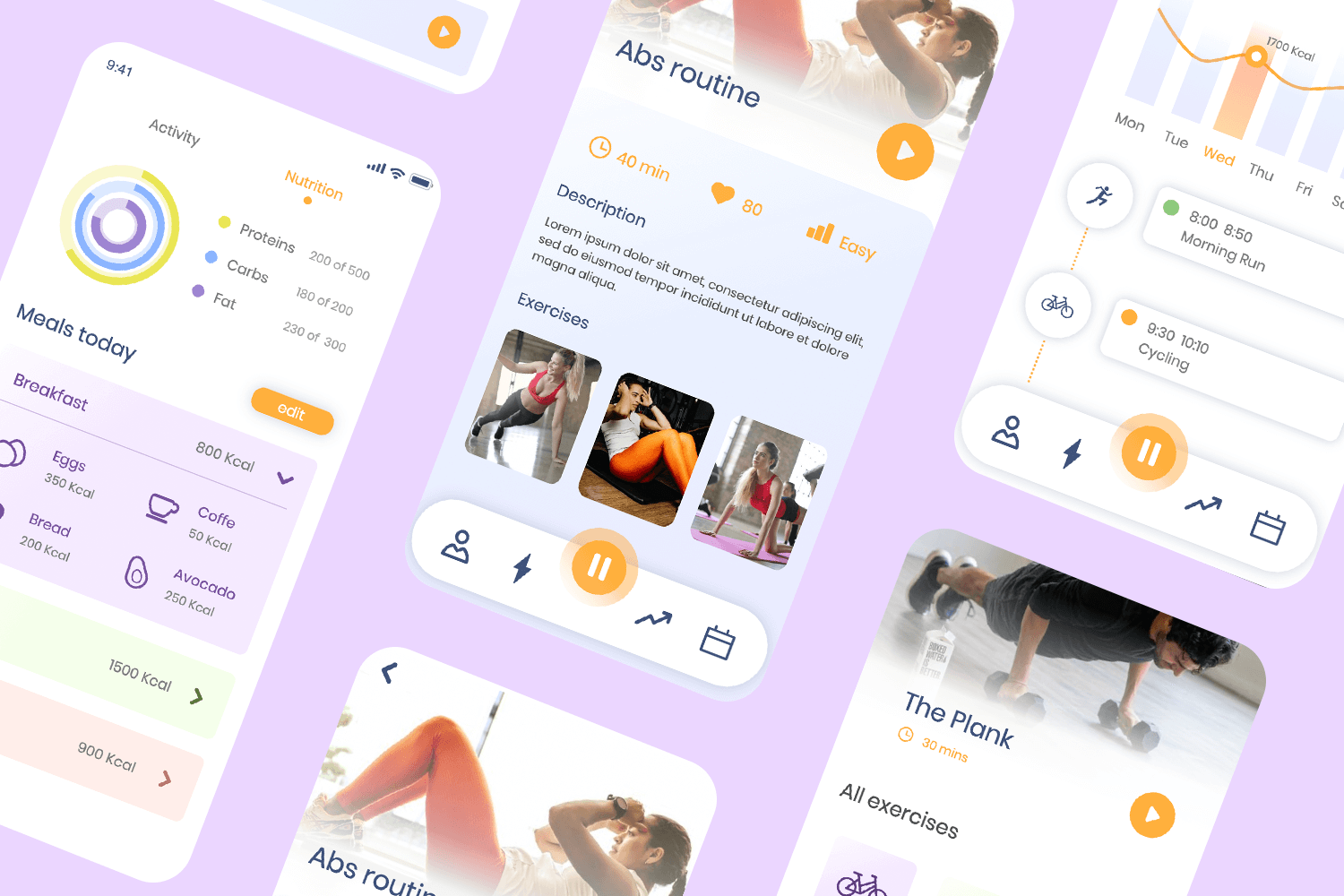
Stay on track with your fitness goals using this mobile app mockup free. It’s easy to use and helps you keep tabs on your workouts and food.
The main screen welcomes you and shows you how far you’ve come. You can see your progress over time and easily track your daily activities like running and biking.
With its simple design and helpful features, this app mockup is great for anyone who wants to get fitter.
Download it free or Try it out
This mockup is designed for a simple and user-friendly login screen. The clean design encourages easy navigation, with fields for email and password clearly displayed.
A prompt for forgotten passwords and a link to create a new account provide additional support for users. The bright “Log In” button stands out against the dark background, making it easy to find.
Perfect for a dog adoption app, this UI design provides a smooth and efficient login experience.
Download it free or Try it out
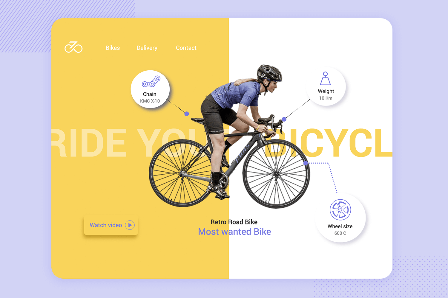
Discover cool custom bikes with this fun and colorful store app mockup. The design shows a person riding a bike, highlighting important details like the chain type, weight, and wheel size.
The app is easy to use and has sections for Bikes, Delivery, and Contact. There’s a big “Watch video” button that lets you learn more about the bike.
This app mockup free is perfect for showing off custom bikes and getting bike lovers excited.
Download it free or Try it out
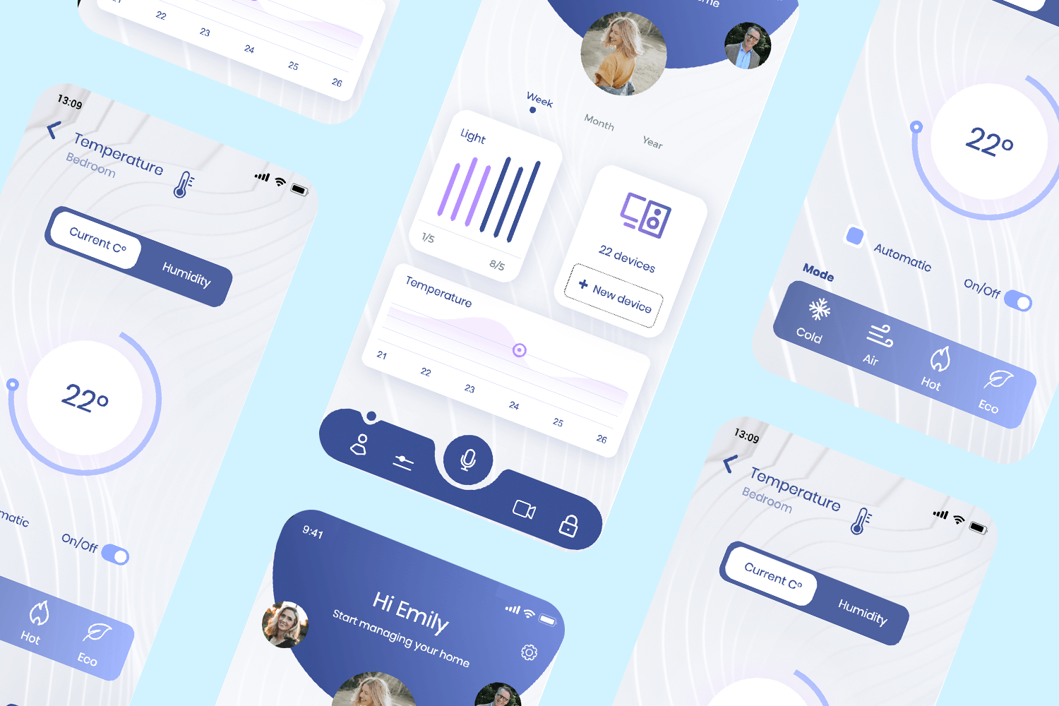
Welcome to seamless home control with this modern home management app mockup. The interface is user-friendly and visually appealing, greeting users by name and providing an overview of their home management.
The app allows users to monitor and control their home environment, including lights and temperature. It displays key metrics over different time frames; week, month, and year, offering a comprehensive view of home activity.
With intuitive navigation, users can easily add new devices and manage up to 22 connected devices. This mockup is perfect for showcasing a smart home solution that prioritizes ease of use and efficiency.
Download it free or Try it out
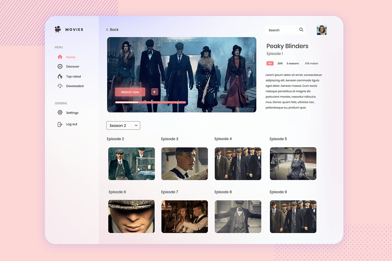
This sleek streaming service app mockup will Immerse yourself in entertainment. The interface features a captivating display of the selected show, complete with episode thumbnails and detailed information about the series.
Users can easily navigate through the menu options, including Home, Discover, Top Rated, and Downloaded, along with general settings and a logout option. The search bar at the top ensures quick access to favorite content.
This free app mockup is designed for a perfect and enjoyable user experience, perfect for showcasing a comprehensive streaming service.
Download it free or Try it out
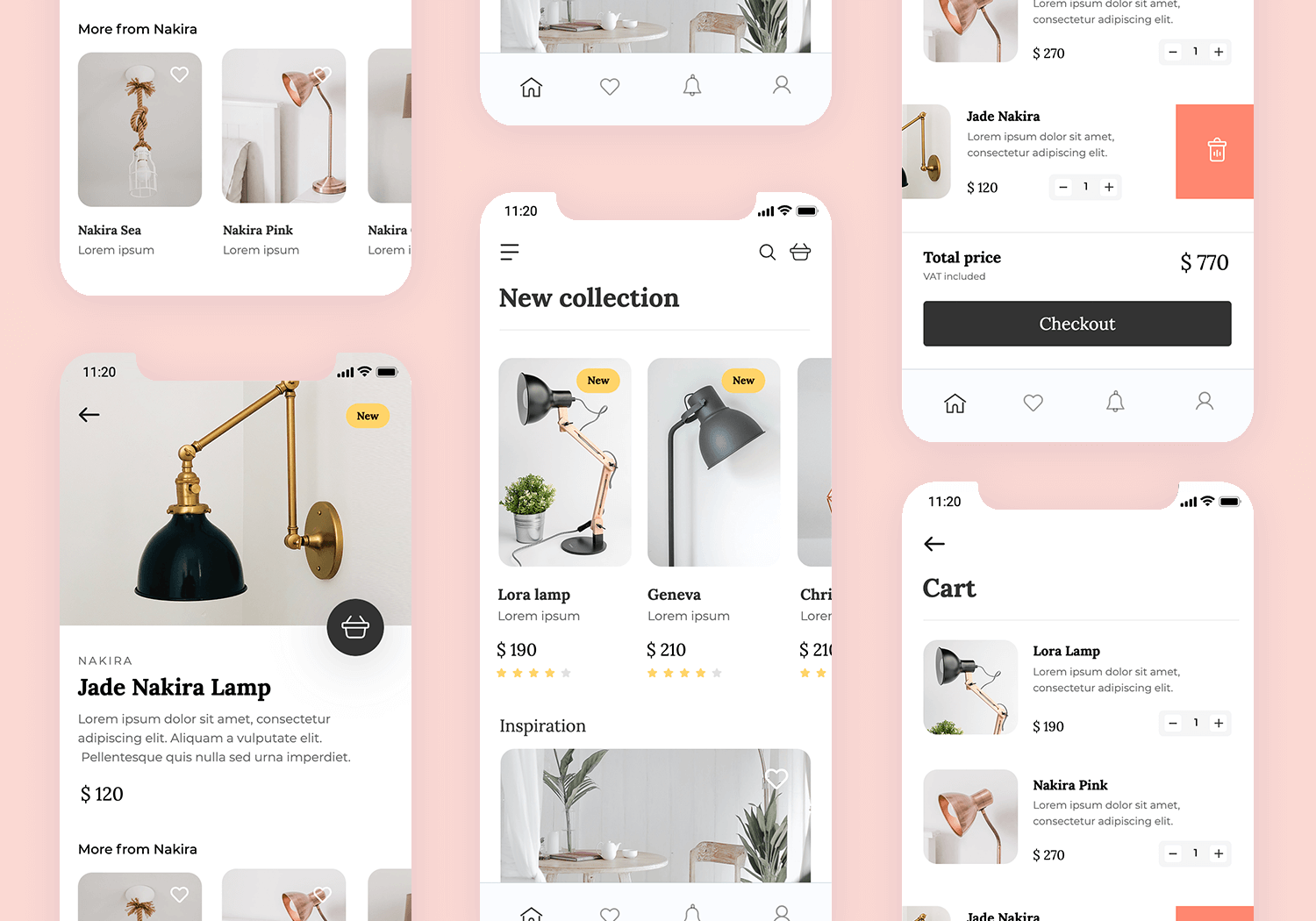
Discover the latest trends with this elegant e-commerce app mockup. The design features a “New Collection” section, showcasing a variety of stylish products with images, prices, and ratings. Each item is labeled “New” to highlight the latest arrivals.
The layout is clean and user-friendly, with a search bar and cart icon for easy navigation. Below, the “Inspiration” section offers curated content to spark ideas and improve the shopping experience.
Perfect for an online store, this app mockup ensures an ideal and enjoyable shopping journey.
Download it free or Try it out
This engaging music discovery app mockup features a clean and intuitive interface that allows users to explore new music effortlessly.
The “Discover” section highlights popular tracks from artists like Elton John and Billie Eilish.
Below, users can find new albums and today’s hits, ensuring they stay up-to-date with the latest music trends. The search bar at the top enables quick access to favorite songs and artists.
Download it free or Try it out
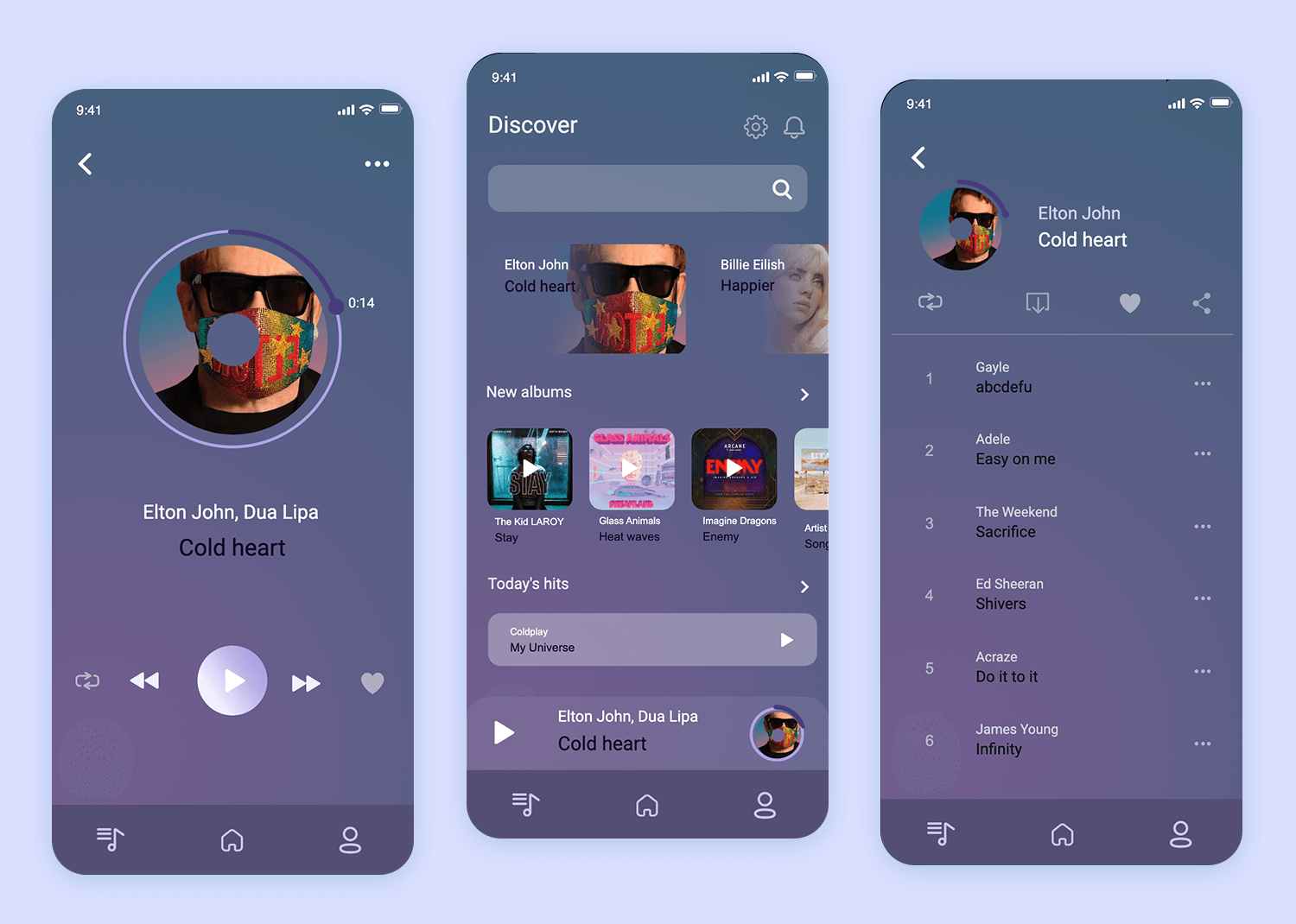
With easy navigation and visually appealing elements, this app mockup is perfect for music lovers looking to discover new tunes.
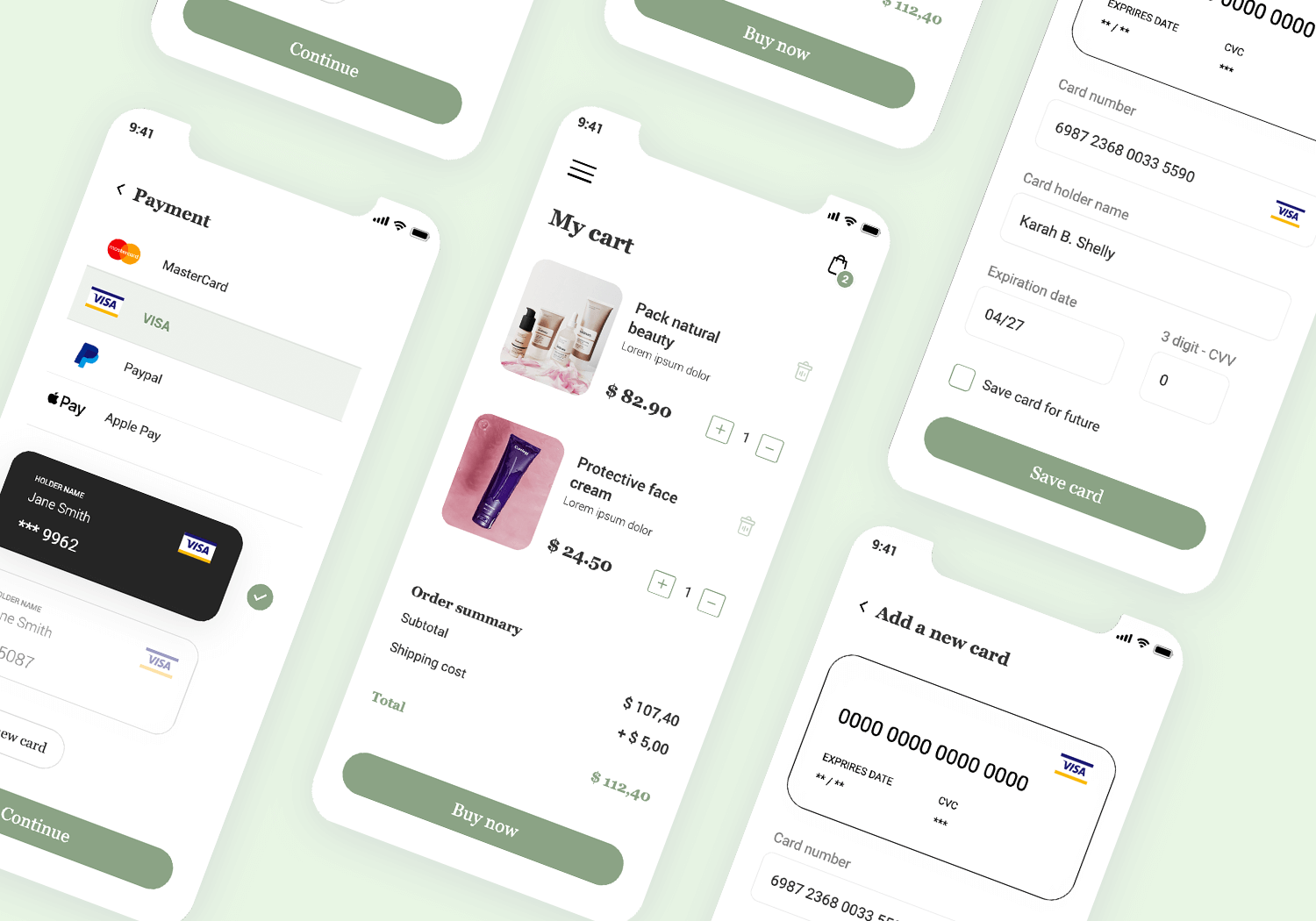
This intuitive shopping cart app prototype makes anyone manage their purchases with ease. The design features a clean and organized layout, displaying product images, names, prices, and quantities.
Users can easily update item quantities or remove products directly from the cart. The order summary at the bottom provides a clear breakdown of the subtotal, shipping cost, and total amount. The prominent “Buy Now” button encourages seamless checkout.
Ideal for any e-commerce app, this mockup ensures a smooth and efficient shopping experience.
Download it free or Try it out
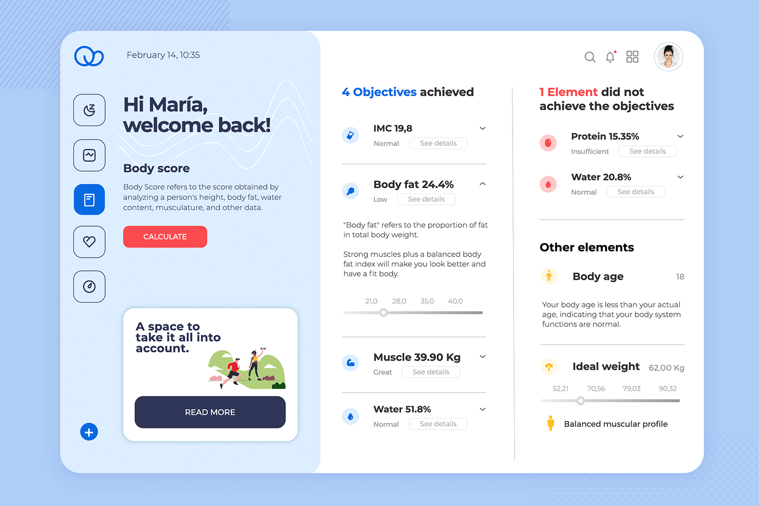
This free mobile app mockup is designed to empower your health journey. It provides a comprehensive overview of your body score, analyzing key metrics like body fat, water content, and muscle mass. The intuitive interface features clear sections highlighting your achievements and areas for potential improvement.
Easily update your body score with the interactive “Calculate” button and quickly access additional features through the convenient side menu. Whether you’re just starting or well on your way to a healthier you, this app mockup is your perfect companion for a personalized and detailed health monitoring experience.
Download it free or Try it out
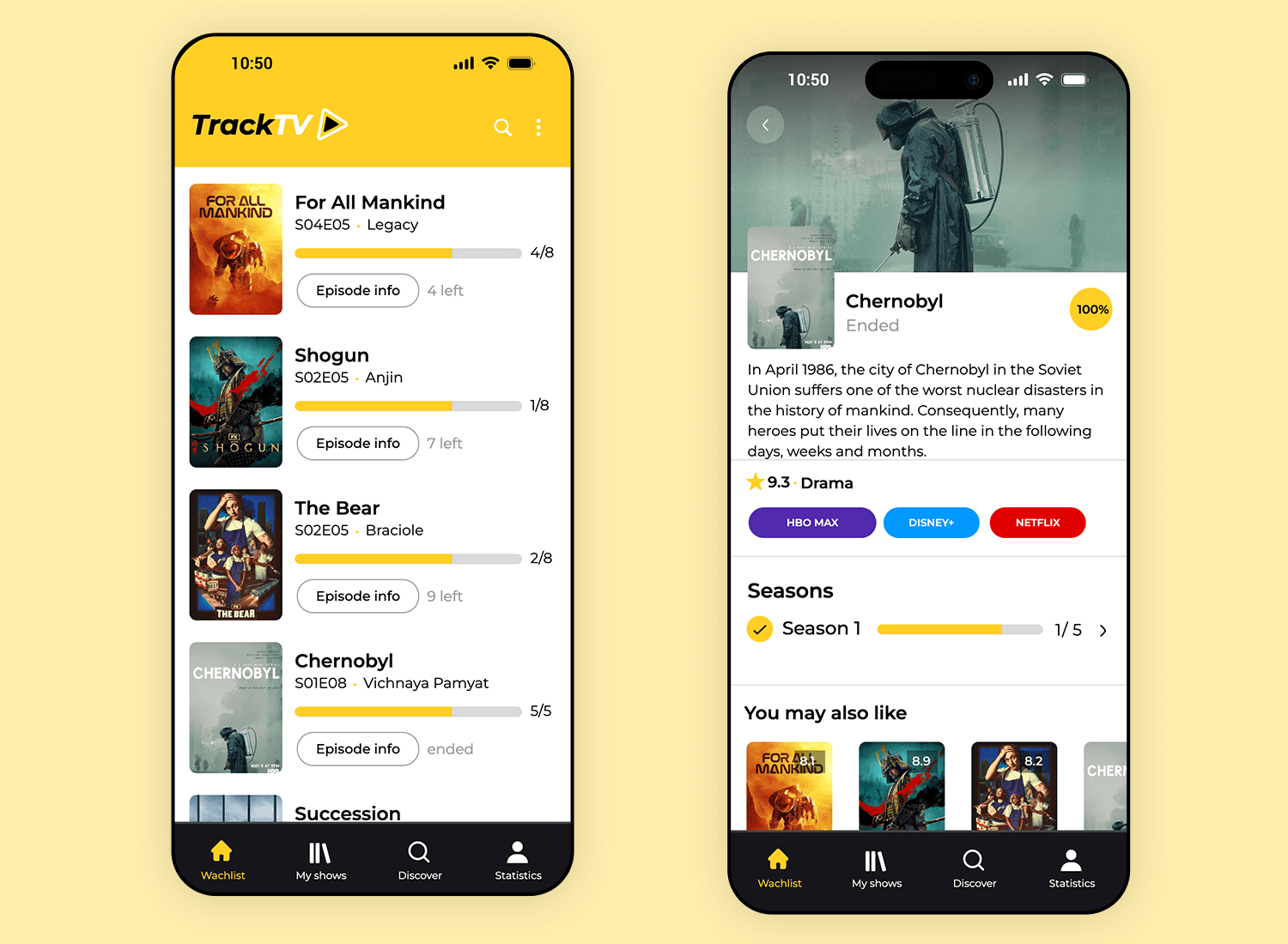
Easily keep up with your favorite shows using this TV tracking mobile app mockup. This app mockup presents a clean, user-friendly layout, perfect for any series enthusiast. The left screen organizes shows into a list view, allowing users to see their progress at a glance, while a bright progress bar shows how many episodes remain.
The right screen offers a detailed view for each show, complete with episode summaries, ratings, and streaming options, making it a versatile app mockup free for tracking and discovering series. Want to customize it? Just add your branding, adjust the colors, and you’re ready to go! This mobile app mockup makes tracking and finding new series easy and enjoyable.
Download it free or Try it out
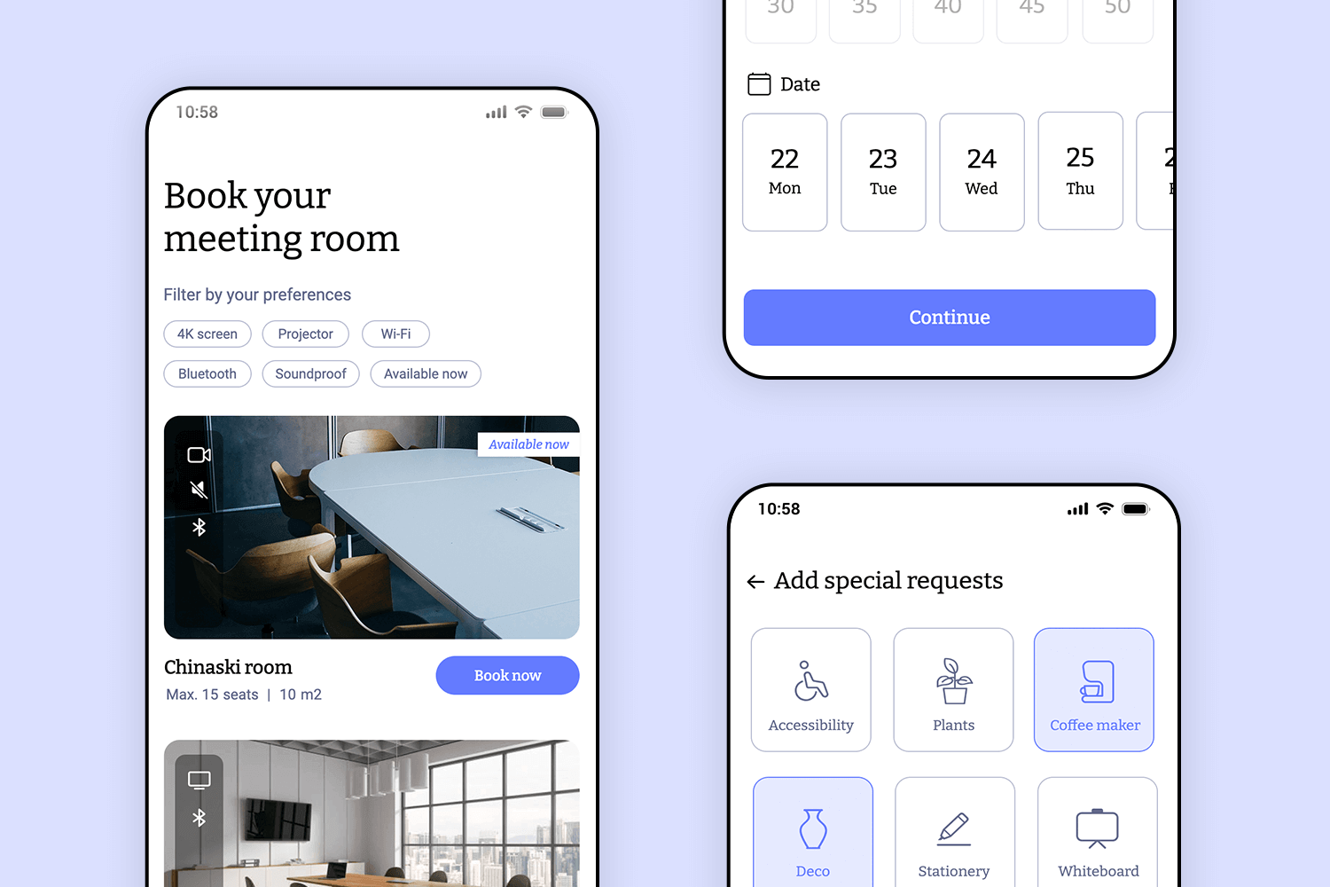
Easily book meeting spaces with this mobile app mockup. The first screen shows a list of available rooms, with photos, details like room size, and features like Wi-Fi or projectors. Just pick a room and tap “Book now.”
In the middle screen, select the date and time that works for you. The last screen allows you to add any special requests, like a coffee maker or accessibility needs. This app mockup is perfect for coworking spaces or office bookings, giving users a fast, easy way to reserve rooms.
Download it free or Try it out
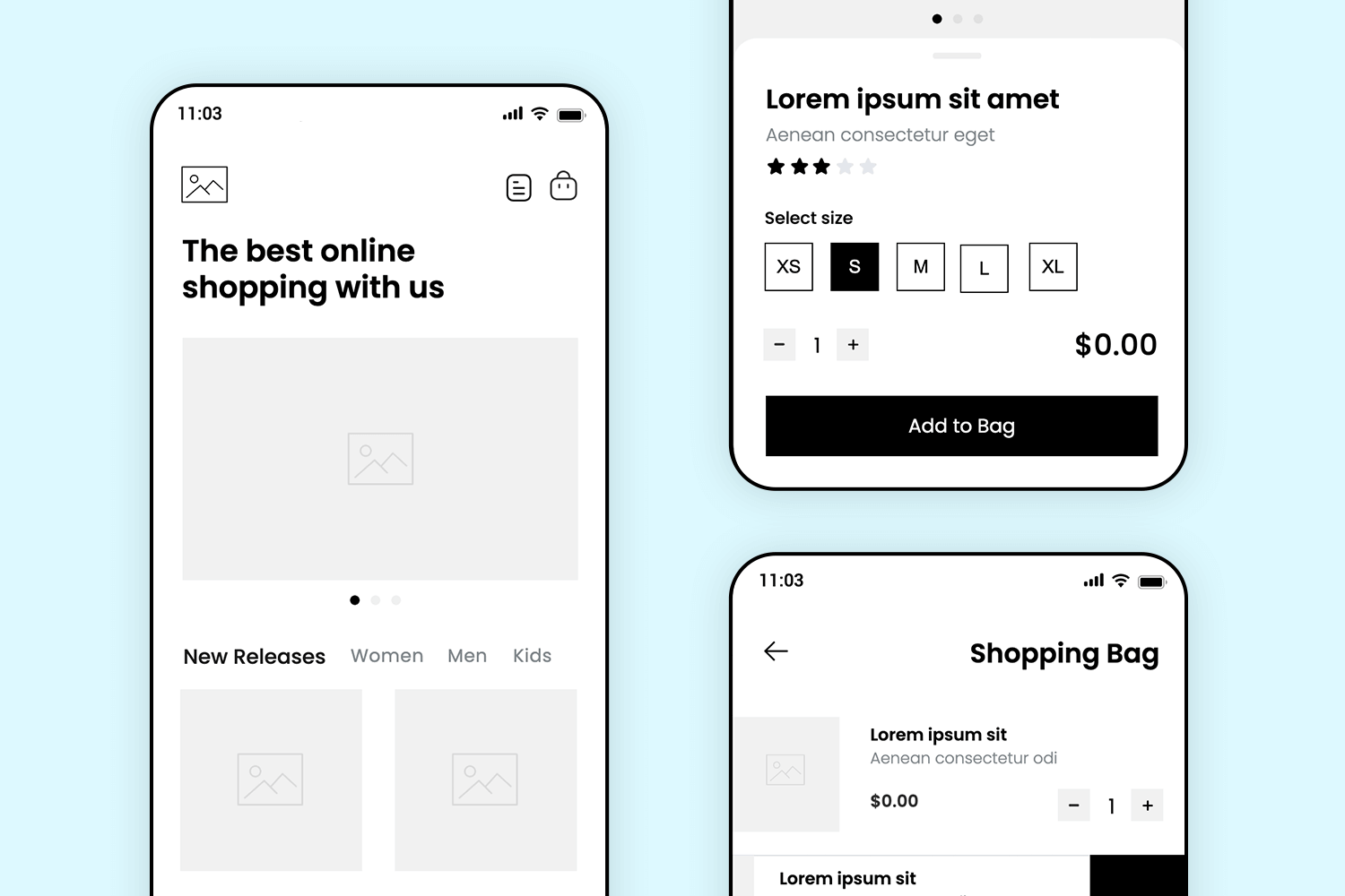
Shopping online just got easier with this mobile app mockup. It starts with a welcoming screen that showcases featured products and categories like “New Releases” for men, women, and kids, making it simple to browse.
Move to the product details screen, where users can pick their size, adjust quantity, and tap “Add to Bag” for a smooth shopping experience. Finally, the shopping bag screen brings everything together, letting users review their items and make any last changes before checkout. This app mockup combines clean design with an easy flow, ready for you to customize for any online store.
Download it free or Try it out
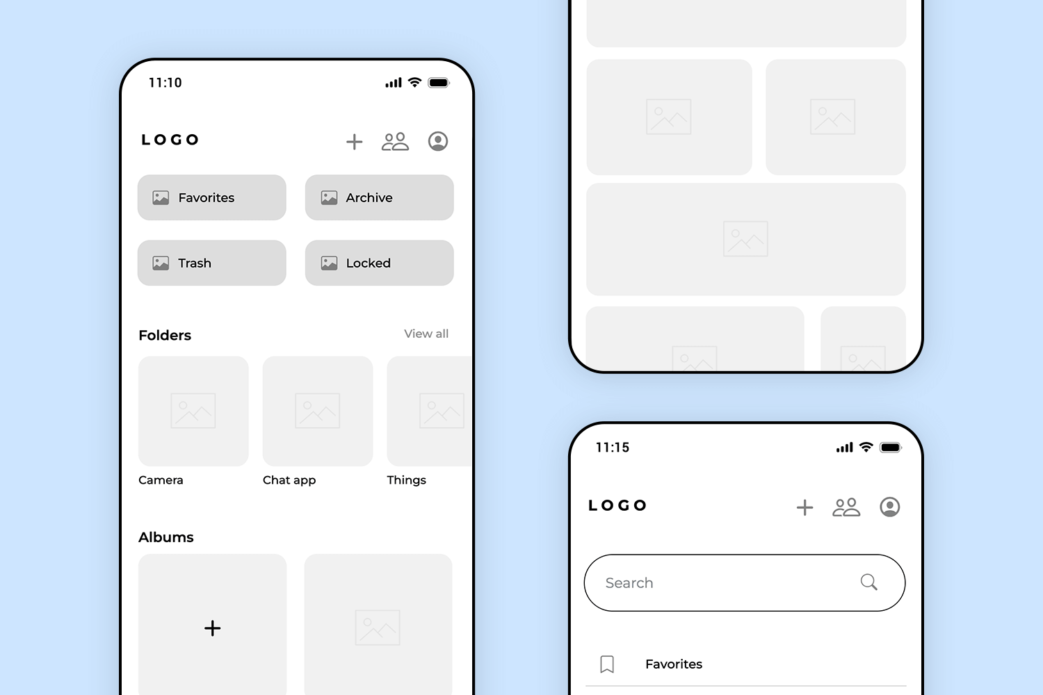
This is an example of app mockup clean and efficient. The main screen offers an easy overview of important folders, keeping everything neatly accessible. Users can quickly jump into folders or albums, finding their files easily.
On the second screen, a focused view makes browsing through files smooth and distraction-free. Finally, the search screen allows for fast file retrieval, with convenient shortcuts for commonly accessed folders. This mobile app mockup is designed for straightforward, hassle-free file management, perfect for any organizational needs.
Download it for free or Try it out
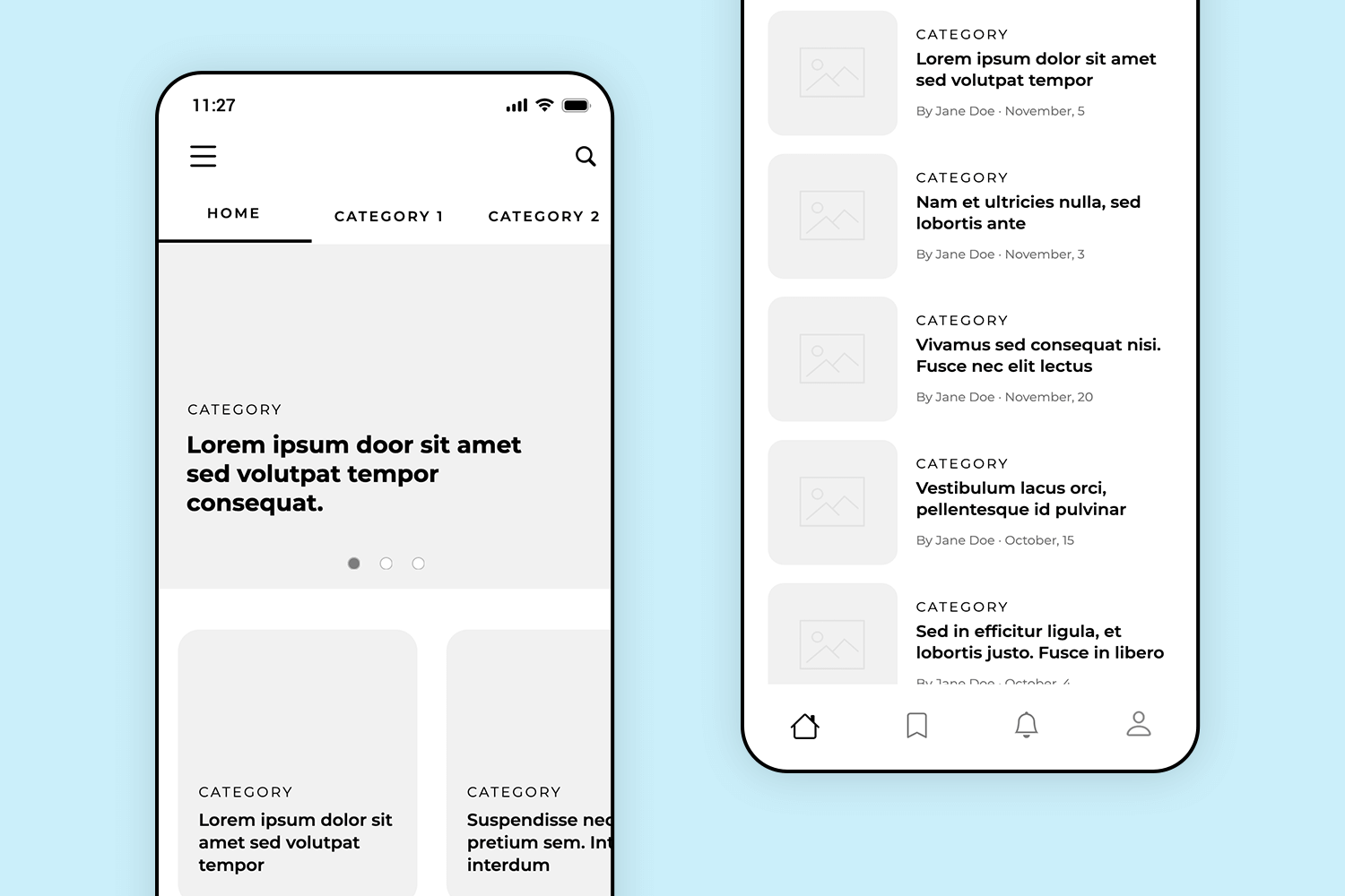
Stay informed with this sleek mobile app mockup designed for reading and exploring articles. The first screen provides a welcoming, magazine-like layout with highlighted stories at the top, inviting users to dive deeper into topics of interest. Categories are easy to browse, making it simple to explore content across different subjects.
Moving to the second screen, a list view organizes articles with preview text, publication dates, and author names, allowing users to quickly scan for stories they want to read. A great choice for news or blog apps, this mockup provides a clean and engaging way to stay informed on the latest articles.
Download it free or Try it out
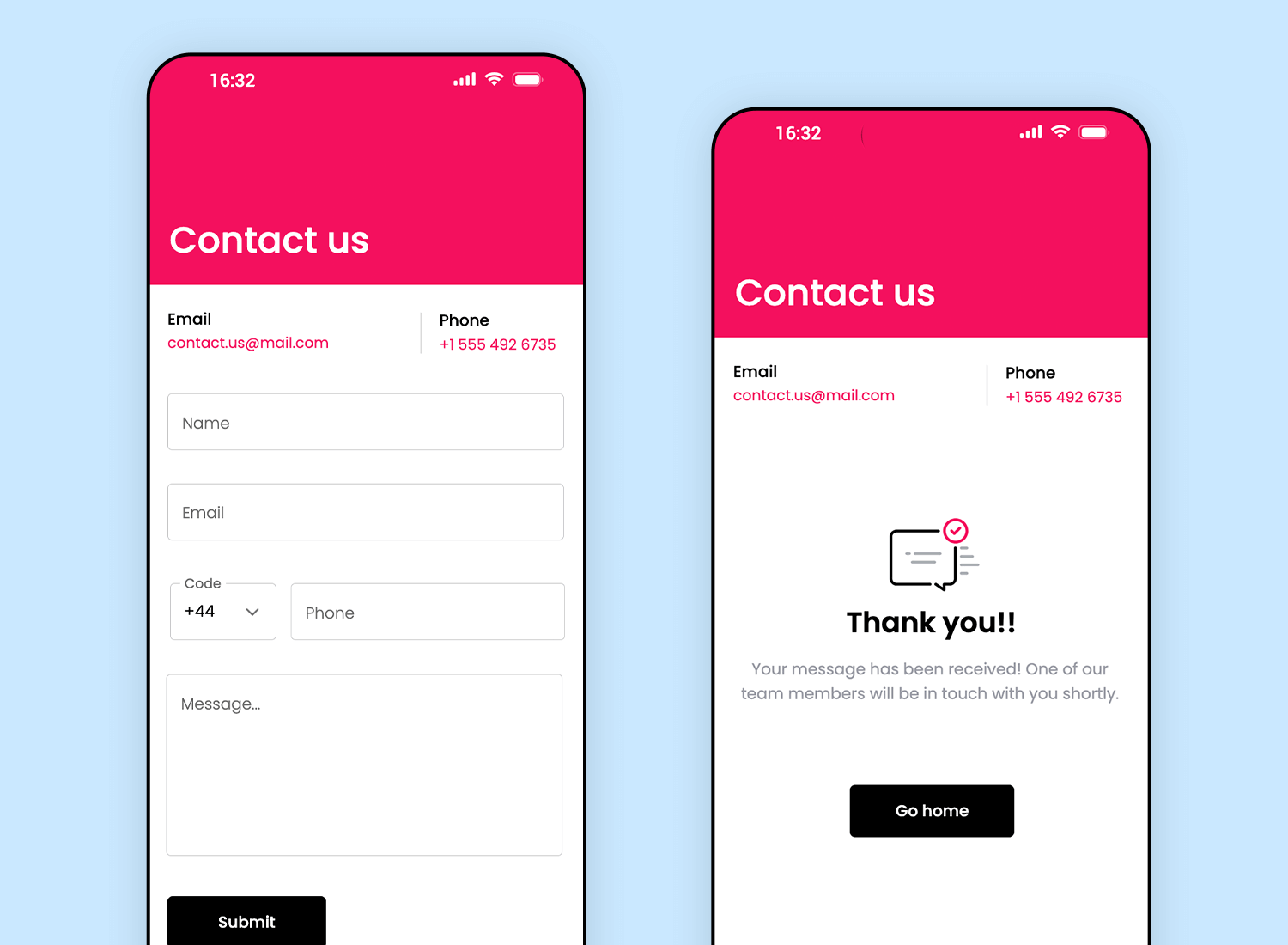
Next on our list is a design focused on straightforward communication. The first screen provides users with fields to enter their name, email, phone, and message, making it simple to reach out. With clear instructions and a clean layout, users know exactly how to get in touch.
The second screen confirms that the message has been received, displaying a friendly “Thank you!” message and a button to return to the home page. Ideal for any business app, this mockup offers a user-friendly way to facilitate contact and maintain open communication.
Download it free or Try it out
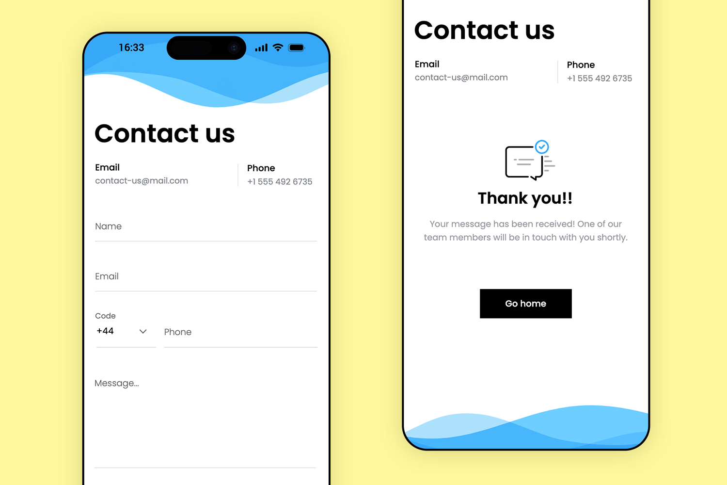
Similar to the previous mockup, this one keeps things simple and approachable. Users can quickly fill in their details and send a message with just a tap on the submit button. The layout is clean and to the point, making sure there’s no confusion.
Once the message is sent, the confirmation screen offers a friendly “Thank you!” message, letting users know their request has been received. The soft wave background adds a welcoming feel, making this app mockup a great fit for apps that want to encourage easy communication.
Download it free or Try it out
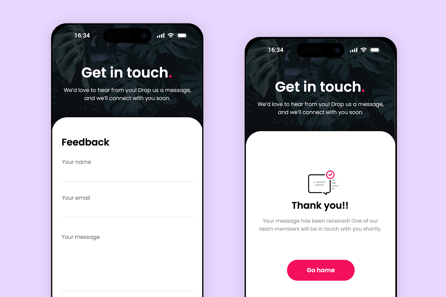
Here’s another app mockup for contact form that is all about making it easy to connect. Right from the “Get in touch” greeting, users feel invited to reach out with questions or feedback. The form keeps it simple, so there’s no fuss.
Once they hit “Submit,” they’re met with a friendly “Thank you” message that confirms their message was received, along with a quick way back to the home screen. The cozy dark background gives it a welcoming feel, perfect for any app that wants to keep communication open and approachable.
Download it free or Try it out
Designing a mobile app mockup is, or should be, a critical part of your product development roadmap. The combination of advantages that a mockup offers in terms of completing the final product to meet client requirements and user expectations, while providing your colleagues with a complete picture of how it should look and feel is unbeatable.
Download any of the mobile app mockup examples we’ve included here, take a look at how it works in Justinmind, and we’re sure you’ll be convinced.
PROTOTYPE · COMMUNICATE · VALIDATE
ALL-IN-ONE MOCKUP TOOL FOR WEB AND MOBILE APPS
Related Content
 From wireframing to responsive design, this guide provides practical, actionable advice on mastering layout design for websites and mobile apps. Learn how to create visually appealing UIs that generate the results you want!42 min Read
 Game design is all about creating a unique and immersive experience for players. Check out this post to see how UI designers do it!10 min Read
 Learn how to design seamless search experiences with smart search boxes, intuitive filters, and user-friendly results pages that help users find what they need faster.32 min Read
