Prototyping login forms for web and mobile – from forever styles to UX trends, here are our top 7 UI designs
How well your app or site converts depends heavily on smart, memorable UX. And whether it’s a website or app, iOS or material design, the login form is crucial to the user experience as it’s usually the first point of entry for attracting users.
Start prototyping new apps today. Enjoy unlimited projects!
Despite its fame, the login form is often fraught with poor UX choices that send users running for the hills. Never-ending scrolling, unknown password errors, logins that disguise themselves as registration forms – the list goes on.
But bad login design stops here. We’ve compiled a list of our favorite input fields that ooze usability and great user experience as well as show you how to prototype them.
So read on for 7 login and sign up forms that you can create to boost your conversion rates in no time. To get started, download our prototyping tool (it’s free)!
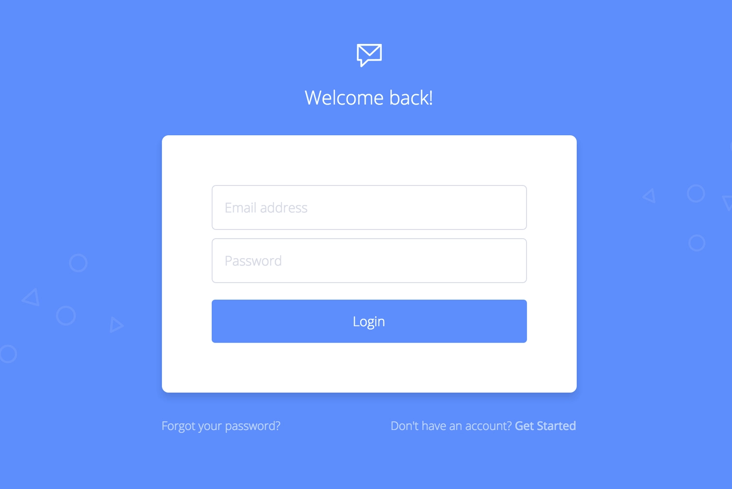
Image credit: Sebastian Petravic
This is your basic login form for web: the user enters their email address and password to gain access to their account.
If logging in is a required action for your site, then it needs to be a primary feature on your homepage. If users have to log in to access your site’s services, focus on information fields that are clear and concise. Make it easy for users to navigate to by keeping your form in clear view in the UI.
Sebastian Petravic’s login screen is a triumph of minimalist UI design. The no-noise UI, simple color scheme, and single font focus the user’s attention on the main task. The ‘Welcome back!’ message in this example adds a familiar tone to the page. The forgotten password and creating an account link complete this login experience.
Justinmind’s website prototyping tool has a range of UI libraries that contain ready-made icons and buttons to help you create the perfect login form for your web prototypes.
Try our Bootstrap library on for size. Then, use ‘On Click’ + ‘Link To’, ‘Set Value’, and ‘Set Active Panel’ events to make your form interactive and then simulate the web prototype to see it work in real-time.
Looking to create something different? Check out this tutorial on how to create a grocery app prototype.
Start prototyping new apps today. Enjoy unlimited projects!

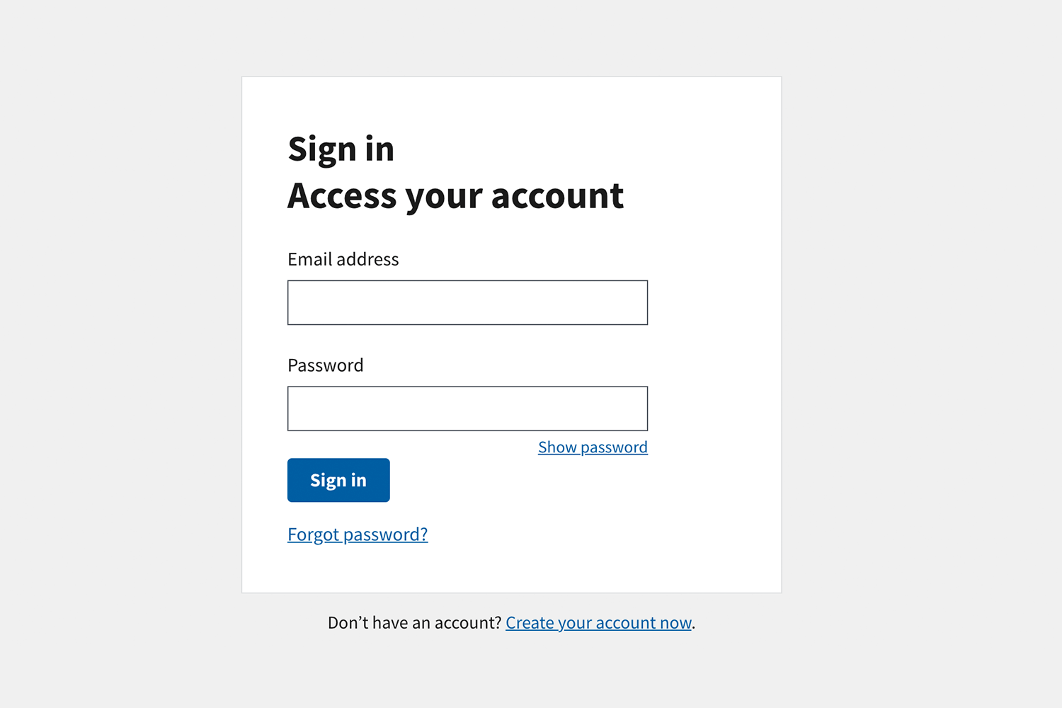
Image credit: U.S. Web Design Standards
These days we have so many passwords to remember and sometimes we enter the wrong one for the wrong site or app – making filling in forms and logins a nightmare. Not being able to see our passwords can result in characters being mistyped and then the user not being able to check inputs or correct their mistakes.
In terms of usability, the password unmask feature can make it easier for users to access their accounts and improve the user experience. It is especially useful on mobile devices when users are more likely to mistype.
Create your login form in Justinmind’s app prototyping tool as in #1. Then, place a text box on top of the password input field. Leave it blank, set the fill color to white and make it hidden in the properties tab. Add another text box and write ‘Show Password’ in it. Create a variable and name it ‘password’.
Next, add an ‘On Focus Out’ + ‘Set Value’ event to the password input field, selecting the variable you created. Set the value to be calculated and drag the variable to the expression builder in the dialog that appears. Now select the ‘Show password’ text box and add an ‘On Click’ + ‘Set Value’ event, selecting the blank text box.
Set the value to be calculated and drag the variable to the expression builder again. Finally, add an ‘On Click’ + ‘Show’ action afterward, again selecting the blank text box. And that’s it – you’ve created an unmask password option!
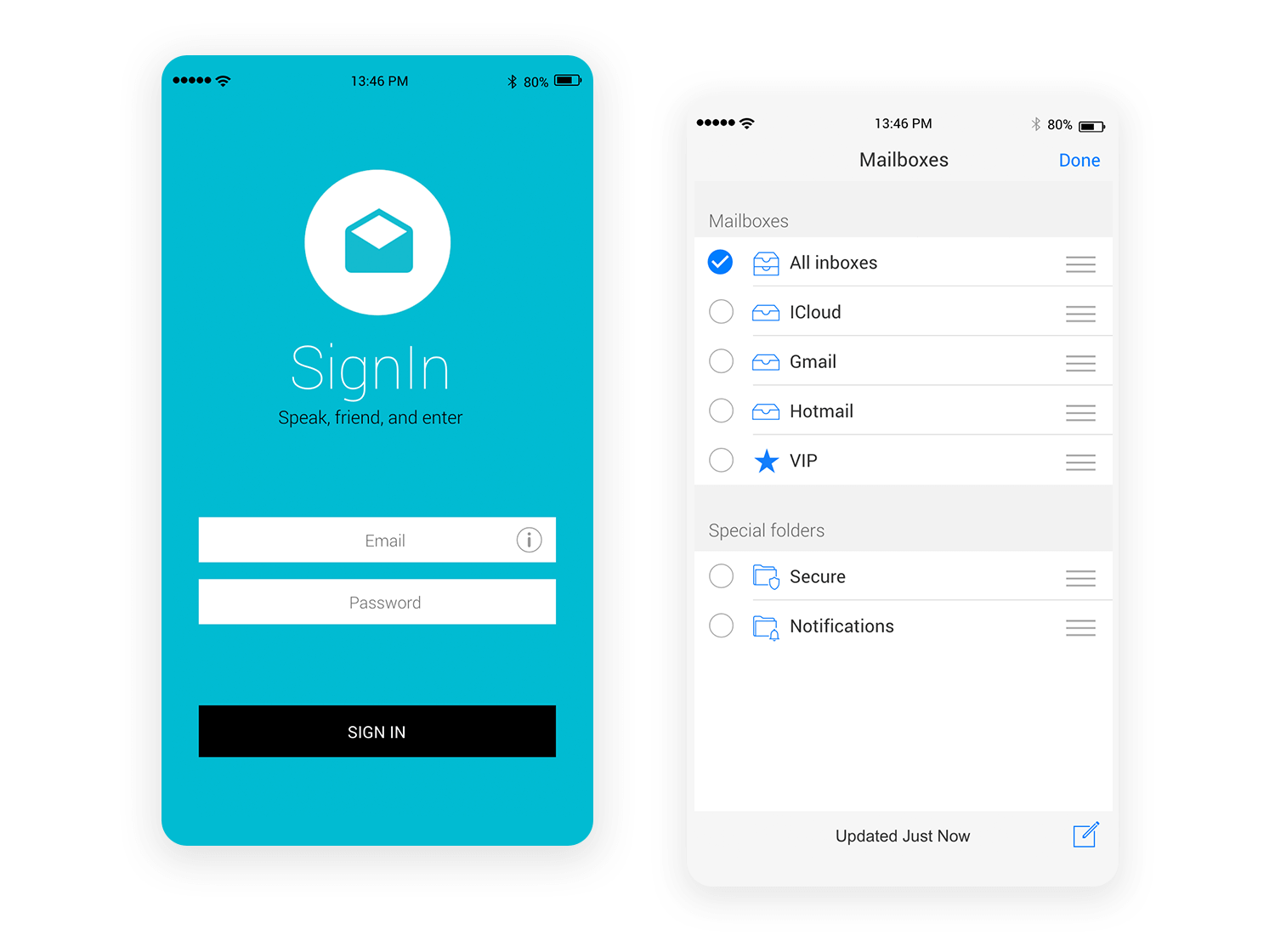
When it comes to designing for Apple, clarity, deference and depth are your 3 priorities. To maximize the impact and reach of your iOS sign-in screen, keep things simple.
For example, provide only the essential components (email and password input fields and the sign-in button) so that the user flow is clear and UI navigation is manageable. All main feature content on the sign-in page should be centered so as to capture the user’s attention on the task at hand.
Justinmind’s iOS UI kit has a ready-made sign-in screen. The kit was built with SVG vectors so you can change the color and size of each icon as needed or in line with specific industry standards. All you need to do now is add the events to make them interactive.
You can find different approaches in this post on prototyping methodologies.
Add an ‘On Tap’ + ‘Link To’ event to the sign-in button, linking it to the screen you want the user to see upon logging in – e.g. the Apple mailbox. You’ll need to create a condition so that only the correct password allows the user to log in. This would look something like this:

You can also create your own sign-in screen by dragging and dropping iOS icons and buttons to your iPhone prototype.
Tip: Create a prototype that auto-populates the password field once the user inputs their username so the app memorizes their data and they won’t have to keep inserting the same information. This refers to Apple’s User Control Human Interface guidelines – respond to a user action with intuitive adaptation.
Start prototyping new apps today. Enjoy unlimited projects!

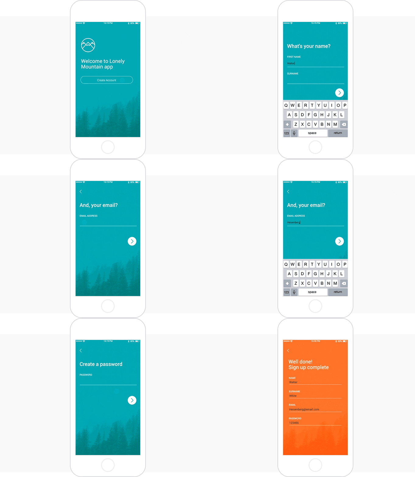
The material design screen flow validation is a common Android sign-up activity. Screen flow validation is essential when you’re creating an input form with multiple screens and is often used in banking sites for a more secure sign-up. And according to usability studies, many users prefer multi-page forms to one-page forms with multiple fields because they don’t require scrolling.
Check out our guide on how to prototype and test forms for a more in-depth walkthrough of the validation process.
Creating a screen flow validation for your android app design is simple. First, create a welcome page – this is where the user will start their sign-up experience. Create a screen for each step you wish the user to complete: fill in name, surname, email address, password. Then, create a summary page for your material design form to show the user what information they have entered, and to confirm that the information is correct.
The standard typefaces used in android material design are Roboto and Noto – both available in Justimind’s Google Fonts.
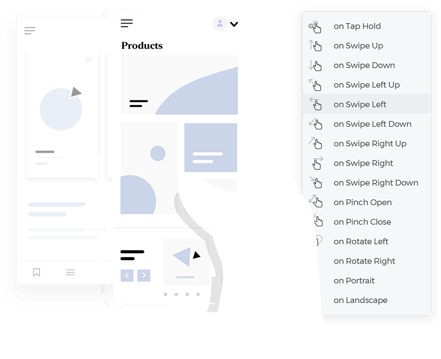
The motion Material Design guidelines motion instructs us to create transitions that are quick and precise, which respond quickly to user input, don’t keep the user waiting to complete their goal, and guide the user to the next view (more on this in the Material Design guidelines: Motion). Justinmind’s slide transition effect coupled with the mobile gestures makes it easy to replicate these movements.
This makes for a high-fidelity type of prototype. Alternatively, you could simply create an MVP instead, depending on your design needs. Another alternative is to make it even more basic and create a paper prototype instead.
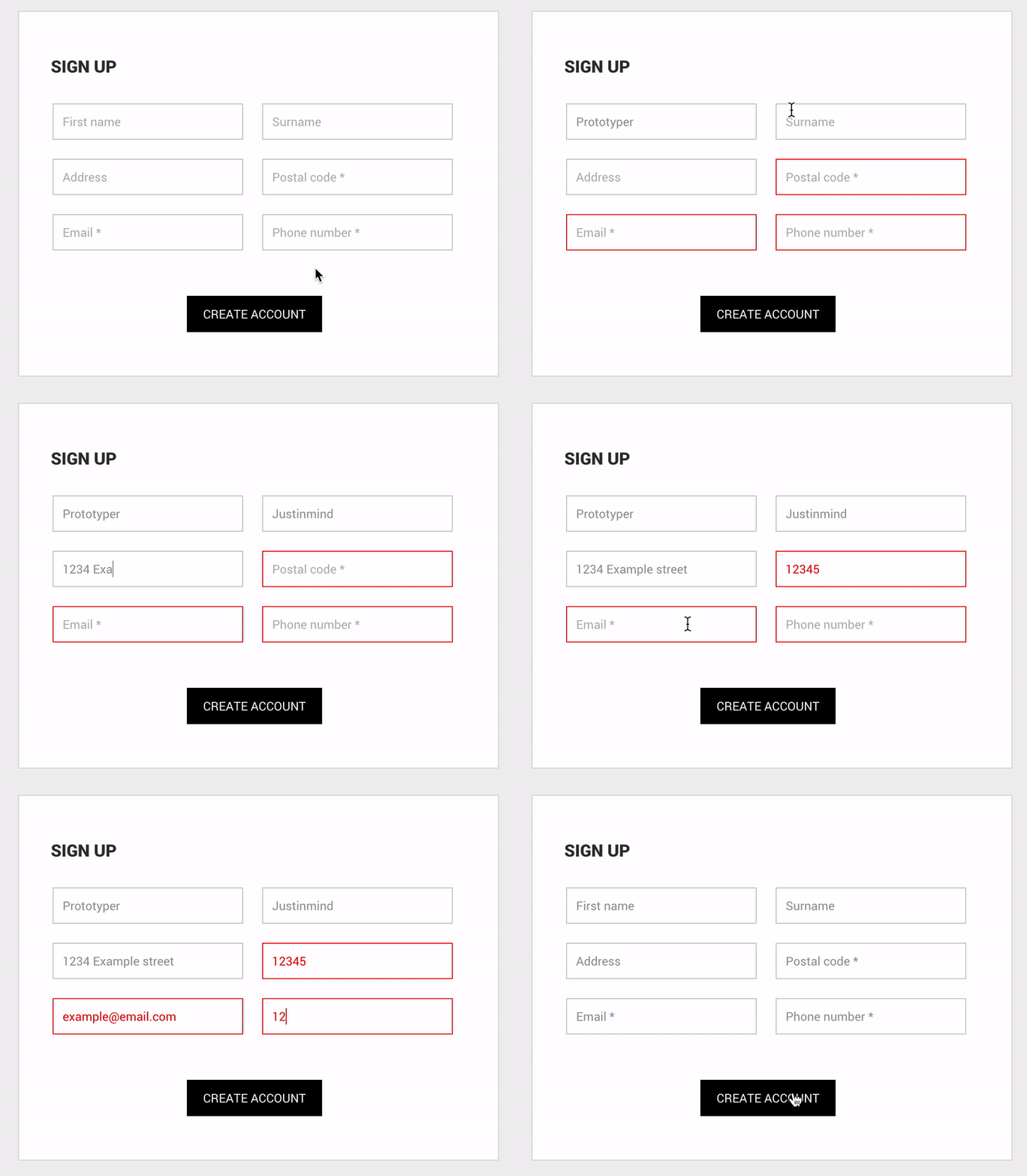
Using placeholders can be a great way of making your sign-up form more intuitive, particularly on mobile where there’s less space. Placeholders are a type of label added to an input field as a visual cue to the user. The idea is that the user knows exactly what information they need to enter into each field, so they can complete the form quickly and without guesswork. Once they’ve clicked within the input field, the placeholder disappears instantly. A usability dream.
To create a manual placeholder for your Justinmind sign-up form, you’ll need dynamic panels, input text fields, text boxes, and button widgets.
If you’re looking for a quick start, why not try out a new placeholder feature for the input text field. You’ll find it in the Properties tab when you have an input text field selected in the canvas.
Bonus tip: add an error message to your form so the user knows where they’ve gone wrong and exactly what information needs to be re-entered.
Start prototyping new apps today. Enjoy unlimited projects!

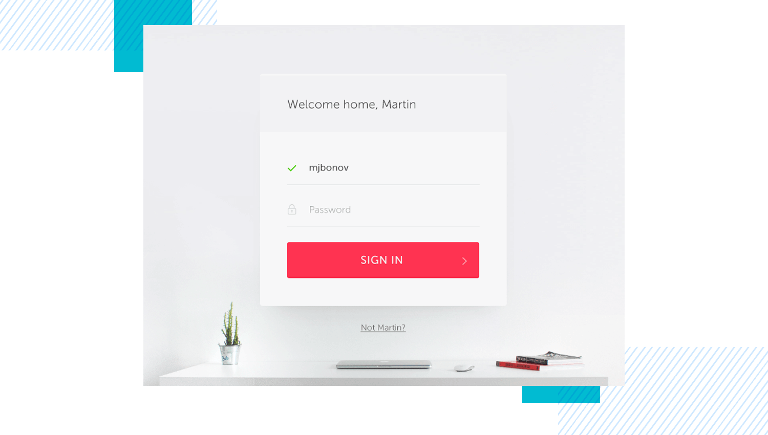
Image credit: Auth0
Microinteractions, mini actions centered around a single task, are a great way of giving the user feedback between steps in a user flow. Microinteractions in a sign-in form, such as a green tick or a loading wheel, tell the user that their information is correct or being processed.
Martin Bonov’s example of microinteration in this login form is just what you need to inform the user of their progress.
To change the appearance of or animate an element or an icon in the sign-up form, simply choose an effect and a Change Style event. When the user performs the relevant action, the change to your UI element will take effect.
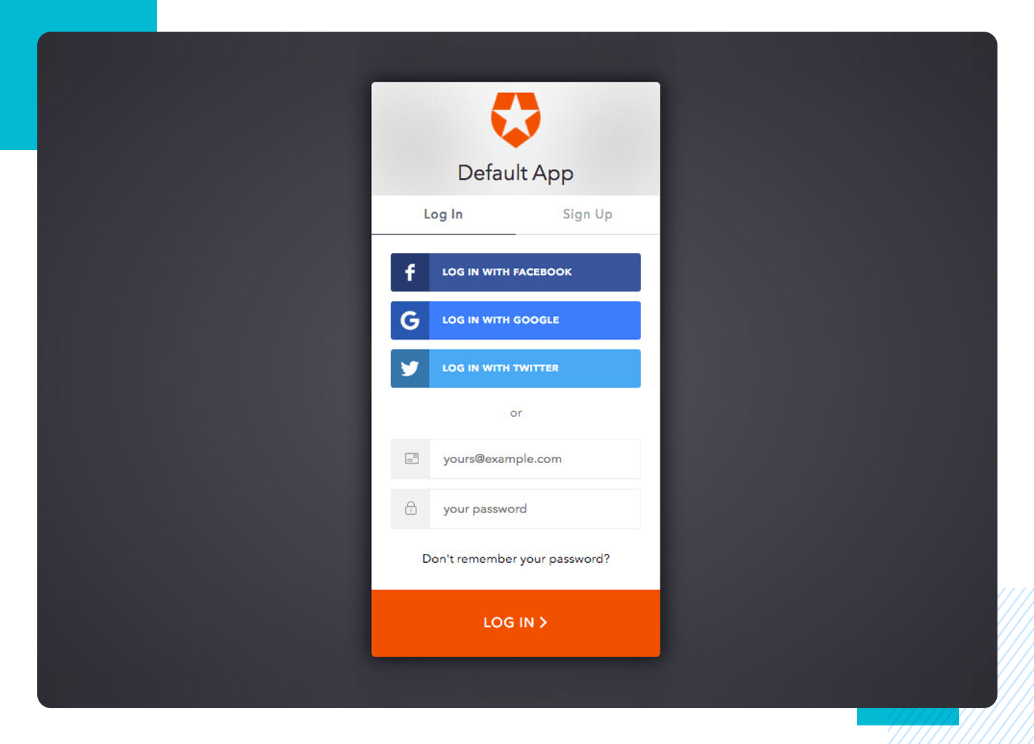
Image credit: Auth0
Giving the user the option to sign up or sign in with social accounts is a great way of eliminating the lengthy sign up form pain point. They can sign up or log in with just a click or a tap.
Auth0’s example also offers a great way to create container for users to switch between login and registration components quickly and easily.
Depending on the device you are designing for, you could either use the social media icons in Justinmind’s iOS and Android UI kits, or create your own with image widgets.
PROTOTYPE · COMMUNICATE · VALIDATE
ALL-IN-ONE PROTOTYPING TOOL FOR WEB AND MOBILE APPS
Related Content
 Learn how to design better e-learning platforms with user-centered UX principles, real examples, and high-fidelity prototyping tips to boost engagement and learning outcomes.13 min Read
 Infinite scroll keeps users engaged, but it’s not always the best choice. This guide breaks down when to use it, when to avoid it, and how to design it right.14 min Read
 Learn how to design web and mobile app prototypes, how to test them and what to look for in a prototyping tool in this complete guide.15 min Read
