Atomic Design is a way for design teams to create new products with a calculated and controlled approach. But why is it such a trend? Find out in this guide!
Designers all over the world are learning to love a more calculated approach to designing new things, but what does Atomic Design mean in practice?
Simplify your design process with atomic design systems. It’s free!

Using concepts from chemistry in web design, most design teams find that their lives are made easier. This framework is all about seeing the interface and the components that make it up with brand new eyes, gaining perspective. The process itself often results in a system that lists all the components and patterns, like a design system that holds all materials and deliverables. It’s an exciting way to approach design, nurturing creativity in a way that leaves nothing to chance.
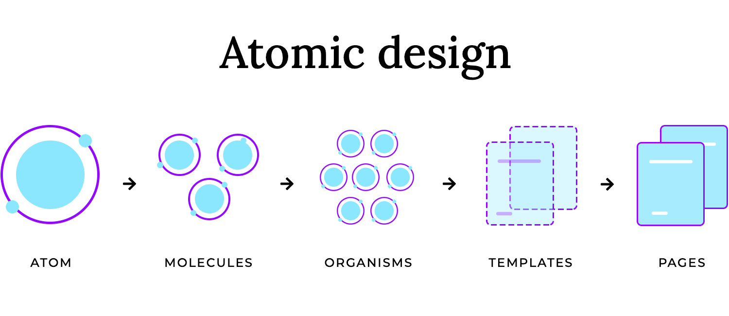
Atomic Design, introduced by Brad Frost, is a fresh way of thinking about UI design. Instead of tackling interfaces as one overwhelming whole, it breaks them down into smaller, reusable pieces, just like atoms in chemistry. These pieces, or atoms, combine to form molecules (like a search bar), which then group into organisms (like a website header). Before you know it, you’ve got a fully functioning interface that’s structured, flexible, and easy to manage.
What makes Atomic Design so exciting? It’s a framework that helps designers and developers create consistent and scalable design systems without losing creativity. It’s like building with a set of perfectly organized LEGO pieces; everything fits, and every piece has a role to play.
For modern UI and UX design, where collaboration and adaptability are key, Atomic Design isn’t just a methodology; it’s a smarter way to think about building products. It ensures every element works together seamlessly, making the entire process clearer, faster, and more fun.
Designing digital products can quickly get out of hand as complexity grows; components pile up, styles diverge, and making changes feels like pulling a thread in a tangled web. Atomic Design offers a better way forward by focusing on modularity and structure. Here’s why it’s become a go-to for UX teams.
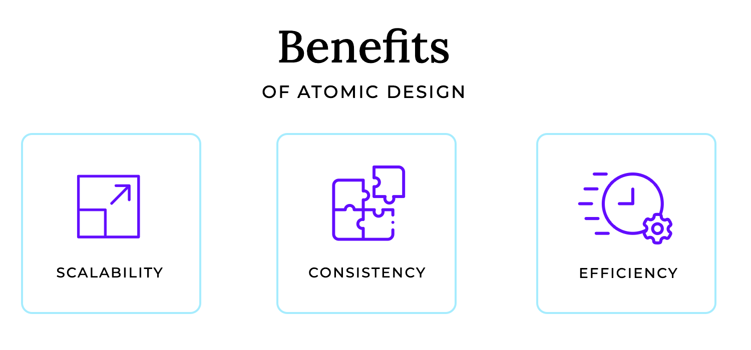
- Scalability: growth is inevitable, and with Atomic Design, it’s painless. Need to add features or expand your product? No need to reinvent the wheel. The reusable building blocks you’ve already created are designed to scale with your needs.
- Consistency: one of the biggest challenges in design is maintaining a cohesive look and feel. Atomic Design tackles this by ensuring every piece, from buttons to entire sections, adheres to a unified system. The result? A seamless experience for users and fewer headaches for your team.
- Efficiency: time and energy are saved when you’re not starting from scratch every time. Designers and developers work with a shared library of components, streamlining collaboration and cutting down on redundant work.
Traditional design often feels like piecing together a puzzle without seeing the full picture. Each screen gets designed in isolation, leading to inconsistencies and frustration when things don’t align. Atomic Design flips this by focusing on the bigger picture first. It’s not about designing screens, it’s about creating a system where every piece works together, intentionally.
At its heart, Atomic Design makes life easier for UX teams. It’s not just about structure; it’s about giving you the tools to build products that grow gracefully and look great doing it.
Simplify your design process with atomic design systems. It’s free!

Atomic Design is built on five simple yet powerful concepts that mirror the structure of the natural world. Each stage builds on the one before it, making the design process logical, modular, and adaptable. Let’s break it down:
Atoms are the smallest elements of your design; think buttons, input fields, or even text styles. On their own, they’re simple and functional. But just like in the real world, atoms aren’t meant to exist in isolation. They’re the foundation you’ll use to create more complex components.
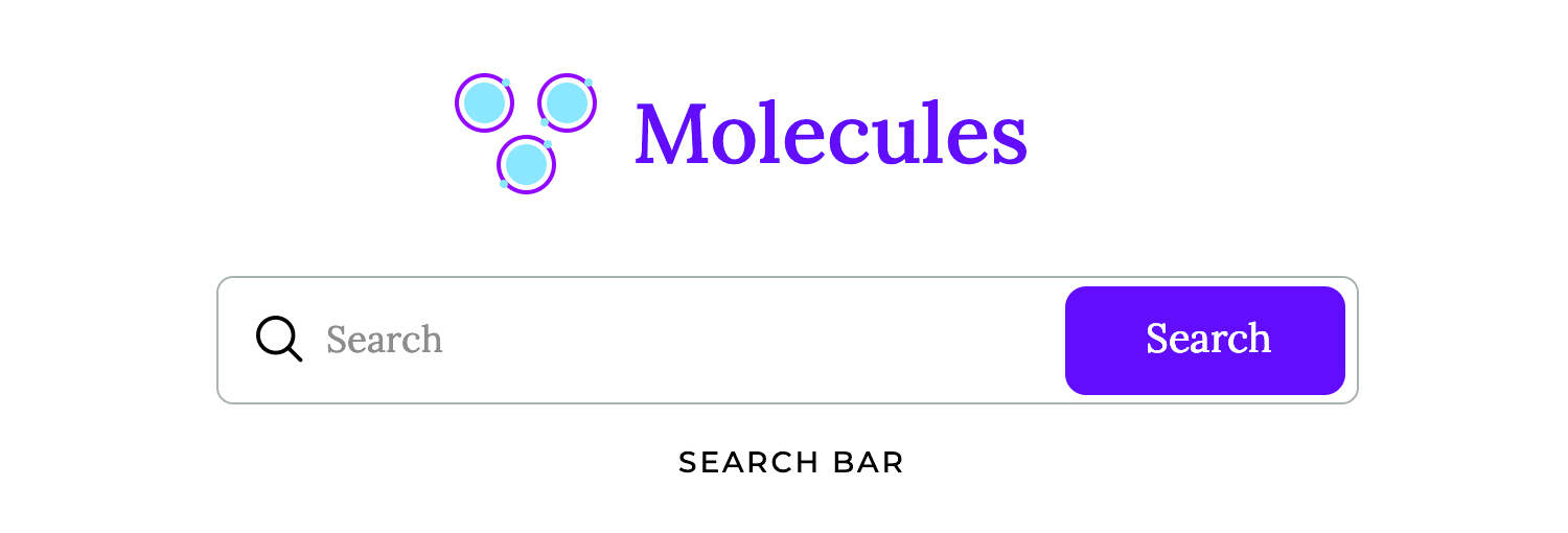
Molecules are groups of atoms working together. For example, a text input (atom) paired with a label (another atom) forms a molecule: a basic form field. Molecules are where functionality starts to take shape, showing how atoms interact in a meaningful way.
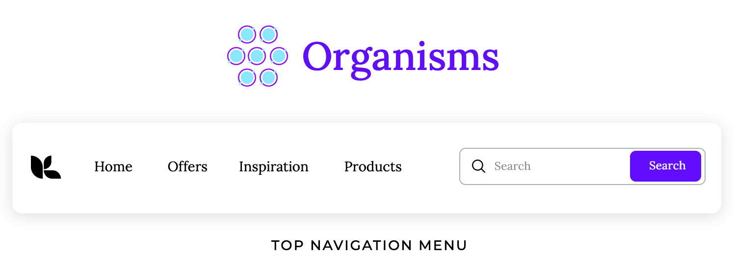
Organisms take molecules a step further. They’re made up of multiple molecules and even other atoms to create more complete sections of an interface. Imagine a website header that includes a logo, navigation menu, and search bar. Organisms are the key to building modular designs that feel cohesive.
The organisms at play can show the same molecule over and over again, like most card-based lists, or show many different molecules and atoms, like the signup and header examples. The bottom line is that Atomic Design means to create a way to design that is almost like a flexible puzzle, where designers can exchange organisms within the same page according to what is needed.
Since designers look at every single atom as imperative, by the time the entire screens are assembled the design team will have something that resembles a design system. A whole base of atoms that all respect the relevant style, molecules that point to a specific function and organisms that can be added to the screens of the product.
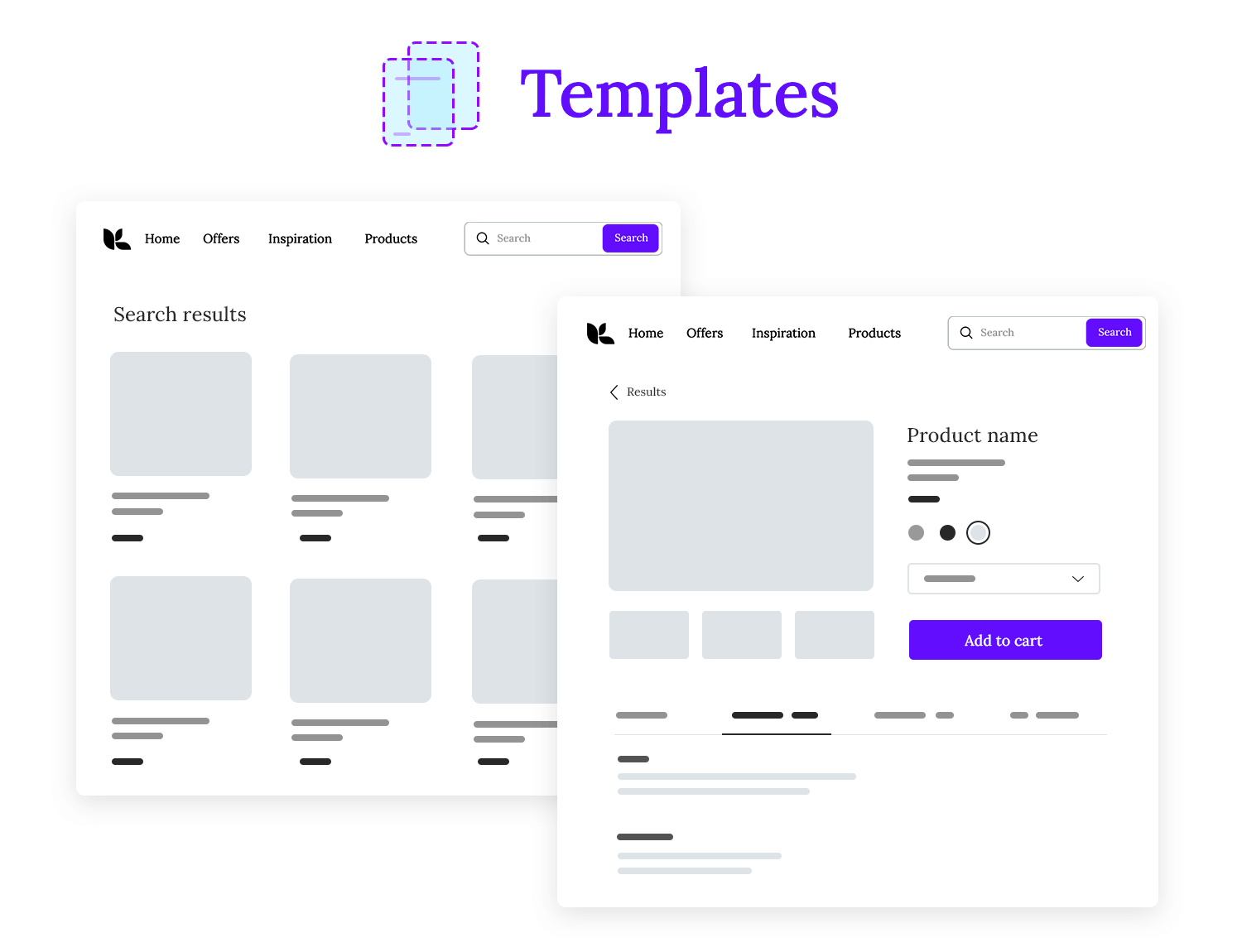
Templates bring structure to the chaos. They combine organisms into a layout, showing how everything fits together. At this stage, the focus shifts from individual components to the overall structure of a page. It’s about defining where content goes and how it flows.
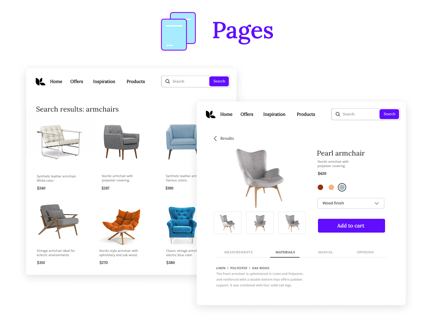
Pages are where the magic happens. They take templates and add real content; text, images, and everything users will interact with. Pages are fully functional representations of your product, ready for feedback, testing, and iteration.
Adopting Atomic Design isn’t just about using a new methodology, it’s about shifting the way your team approaches design. If you’re ready to get started, here’s how to implement it step by step.
Begin by identifying the smallest elements of your design. Think creative button designs, input fields, web or app icons, and typography. These are your atoms, the building blocks that will form everything else. Keep them simple, consistent, and reusable.
Next, bring your atoms together to create molecules; small groups of components that work as a unit. For example, a search bar is a molecule made up of an input field, a button, and maybe an icon. Focus on how these pieces interact to create functionality.
With your molecules in place, it’s time to create organisms. These are the larger, more complex components of your design. A website header, for example, might combine a logo (atom), navigation menu (molecule), and search bar (molecule). This stage is all about modularity, designing components that can be reused across pages.
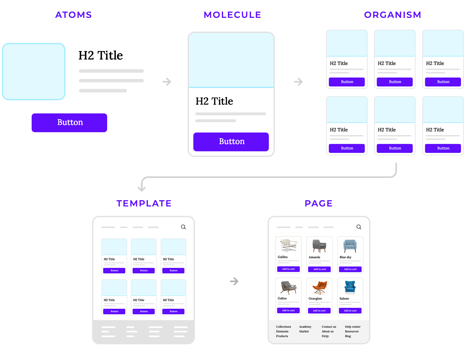
Now that your organisms are ready, use them to design templates. Templates are the skeleton of your pages, showing where content and components will go. They focus on layout and hierarchy rather than specific content, giving you a blueprint for the overall structure.
Finally, bring your templates to life by adding actual content. Swap placeholders for real images, text, and data to create fully functional pages. This is where user testing and feedback come into play, allowing you to refine and iterate.
As you build, document your components, styles, and patterns. A well-documented design system becomes a shared resource for your team, guaranteeing consistency and making future projects easier to tackle.
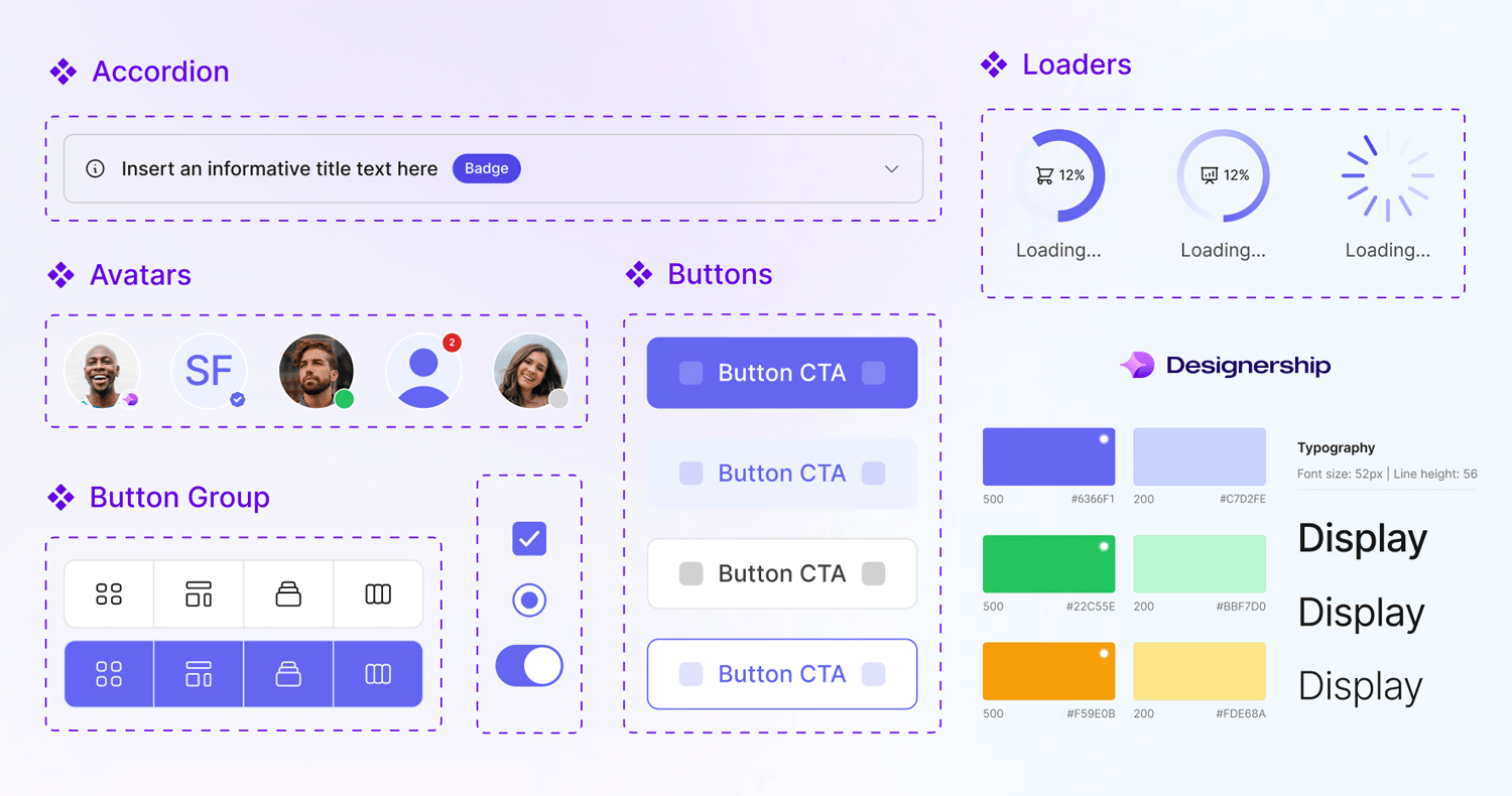
Atomic Design thrives on flexibility. Once your pages are complete, test them with users and stakeholders. Use feedback to refine individual atoms, molecules, or organisms and improve the overall system.
Simplify your design process with atomic design systems. It’s free!

After understanding the methodology and principles of Atomic Design, you might be wondering how this approach translates to real-world applications. How do companies and platforms leverage Atomic Design to build scalable, consistent, and efficient interfaces?
Now, we’ll explore some of the most noteworthy examples of Atomic Design in action.
Justinmind’s UI components are a clear example of Atomic Design in use. Here, elements like tabs, links, and icons act as the smallest building blocks, or atoms. When combined, these atoms form molecules, like tab groups or the breadcrumb navigation, that make the interface more structured and functional.
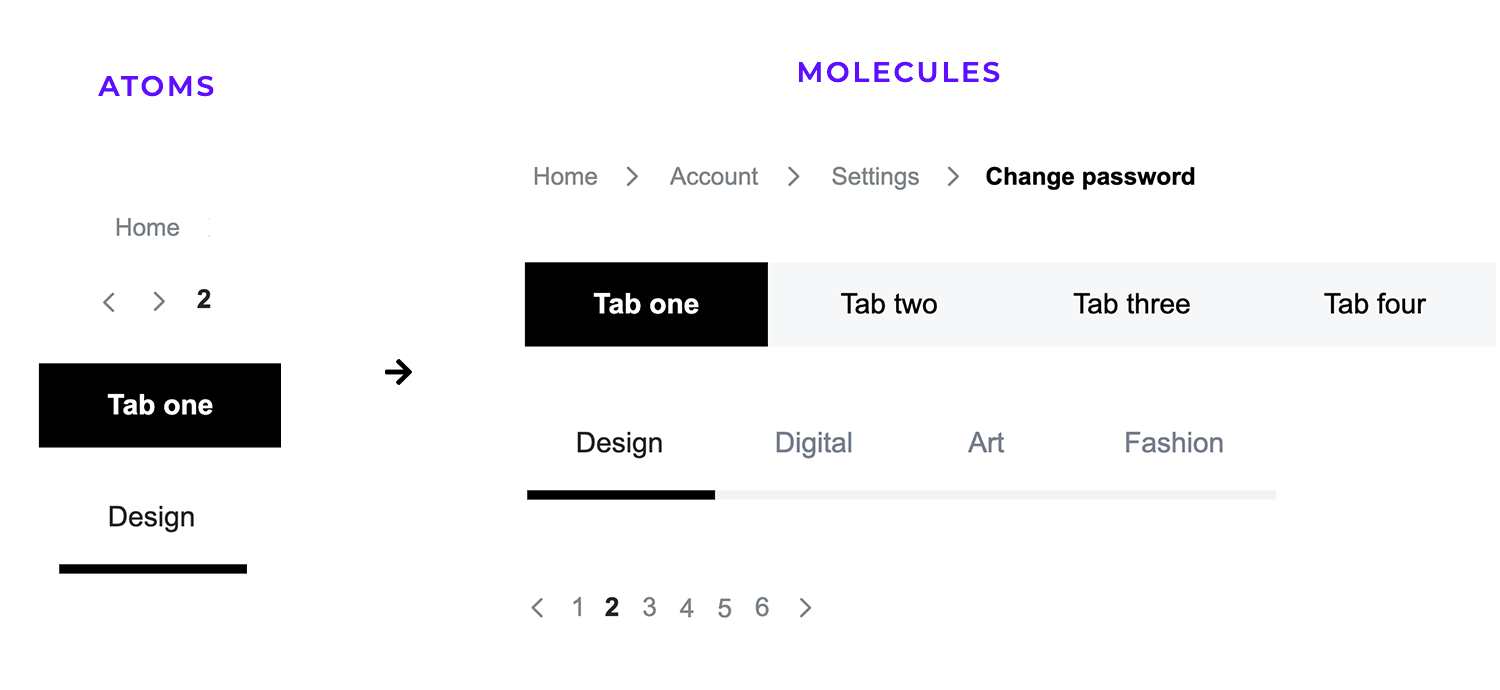
It’s a simple but effective design. Each piece fits together naturally to create a navigation system that’s both easy to use and easy to update, showing just how powerful reusable components can be.
Shopify’s Polaris design system is also a great example of Atomic Design in action. The Account Connection card works as a molecule, built from atoms like buttons, icons, and structured text. It even includes interactions, like changing states when the button is pressed.
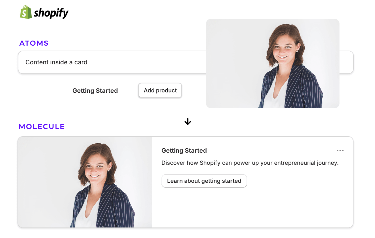
Shopify combines smaller elements into a card, making their design system flexible, consistent, and easy to scale, showing how Atomic Design works smoothly.
Another good Atomic Design’s example is this from OneReplay. Their feature cards aren’t just pretty, they’re built with purpose. Each card is a molecule, carefully combining icons, text, and visuals to deliver a clear message. When these cards come together, they form an organism that organizes information seamlessly.
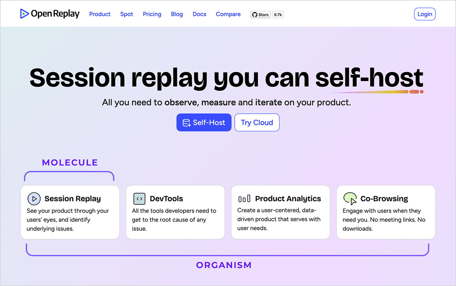
This example does a great job of combining structure with flexibility. Each card is self-contained yet works perfectly as part of the bigger picture, showing how Atomic Design can make even complex interfaces feel simple and approachable. It’s a smart design at work.
In this case, TechCrunch provides another great example of Atomic Design in action. The navigation bar at the top acts as an organism, bringing together menus and links for seamless navigation. Meanwhile, the main layout combines bold features like the spotlight story with smaller, consistent molecules like the headline list.
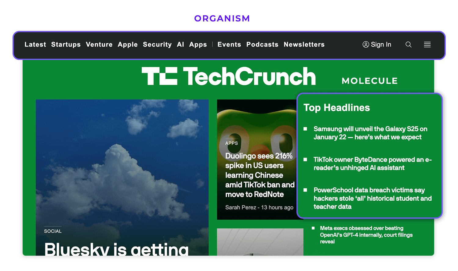
This balance creates a design that’s both structured and flexible, making it easy to update while staying cohesive.
IBM’s Carbon Design System is another fantastic example, and the last on our list, of how Atomic Design brings order to design complexity. The component library is like a designer’s toolbox, filled with ready-to-use pieces like checkboxes, dropdowns, and date pickers. Each element is built to fit seamlessly into bigger designs, making it easy to create consistent interfaces without starting from scratch.
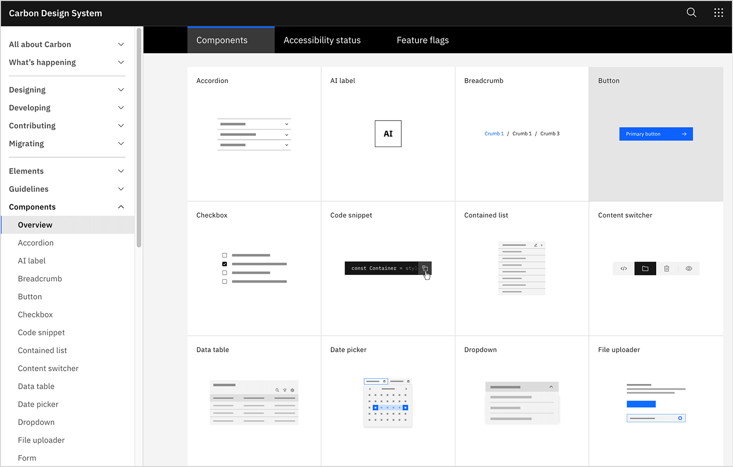
The beauty of this approach is how easy it makes things while keeping everything consistent. Everything is laid out in an organized way, so teams can quickly grab what they need and get to work. It’s a great reminder that good design doesn’t just look great but it also makes life easier for the people creating it.
Simplify your design process with atomic design systems. It’s free!

Atomic Design has changed the way we think about building interfaces. It’s not just about creating something that looks good, it’s about designing smarter, breaking things down into small, reusable parts that come together to create something bigger and better.
By starting with the basics, like atoms and molecules, and building up to full pages, Atomic Design gives teams a clear path to follow. It makes scaling designs easier, ensures everything stays consistent, and takes a lot of the guesswork out of the process.
What’s exciting is how this approach works in real life as it’s practical, adaptable, and, most importantly, it works.
If you’re ready to design more effectively, Atomic Design is the way forward. It’s about simplifying the process and creating something flexible and future-proof; one small piece at a time.
PROTOTYPE · COMMUNICATE · VALIDATE
ALL-IN-ONE PROTOTYPING TOOL FOR WEB AND MOBILE APPS
Related Content
 A fun look at different data table designs, from basic lists to smart, interactive ones, based on how complex the data is and what users need.18 min Read
 Single page design v multi-page design – everything you need to help you choose the right design for your site’s content18 min Read
 Website backgrounds can be a powerful tool in creating an experience. But what kind of experience can you convey and how? We got the full run-through for you!14 min Read


