
Carousels are everywhere, from sleek product sliders to eye-catching hero banners. But what makes a good one?
We’ve rounded up some of the best carousel UI designs that actually work, whether on desktop or mobile.
Design and prototype Carousels with Justinmind. It’s free!

If you’re looking for inspiration (or just want to see how to use carousels the right way), you’re in the right place. Let’s dive in!
We all know the classic carousel, if you’ve spent any time on the internet, you’ve definitely seen one. Even if you don’t know it by name, you’ve found those rotating image sliders at the top of a homepage, flipping through promotional banners, new product launches, or featured content. They’re everywhere: in e-commerce stores, on corporate websites, in mobile apps… basically, anywhere brands want to pack multiple messages into a small amount of screen space.
Carousels come in a few different flavors. Sometimes they show up as hero banners, those big, eye-catching images right at the top of a site. Other times, they’re product galleries, letting you swipe through different angles of a pair of shoes you’re eyeing. Or maybe they’re those automated image slideshows that cycle through testimonials or announcements without you lifting a finger.
So why do people love using carousels? Simple, space is limited, and there’s always too much to show. A business wants to highlight a sale, introduce a new collection, and remind you about free shipping, all at once. Instead of cramming everything into a single static banner, they use a rotating carousel to squeeze multiple messages into one prime location. It’s like a digital billboard that changes on its own.
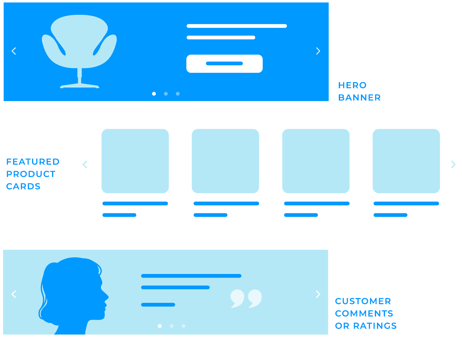
And on mobile? Even more reason to use them. Screens are tiny, attention spans are even tinier, and carousels give brands a way to display multiple pieces of content without making users scroll endlessly.
At first glance, carousels seem like a clever solution. But do they actually work? That’s where things start to get interesting.
Design and prototype Carousels with Justinmind. It’s free!
If a website absolutely must use a carousel, it needs to be done right because let’s be honest, a poorly designed one is a fast track to frustration. So, what separates a good carousel from one that just annoys users? It all comes down to UI design, guaranteeing clarity, usability, and adaptability in every interaction.
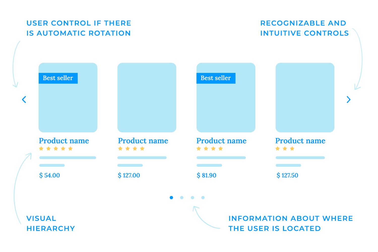
- Visual hierarchy: every slide should have a clear focus, whether it’s a product, an announcement, or a call to action. A well-structured visual hierarchy ensures that the most important elements—like key messages, images, or buttons—stand out first, guiding users’ attention effectively. Overloading a single slide with too much text or too many competing elements is a surefire way to make users ignore it altogether. Instead, keep messaging concise and let high-contrast text and buttons stand out against the background, so there’s no guesswork about where to click.
- Navigation and controls: navigation design should feel intuitive. Carousels aren’t just about what’s on-screen, they need to feel easy to move through. Arrows or chevrons should be prominent enough that users instantly recognize how to scroll through slides manually. Dots or thumbnails underneath help indicate how many slides exist and where a user is in the sequence, so they don’t feel like they’re trapped in an endless loop.
- Timing and auto-advance: then there’s the big debate: auto-rotation or manual control? Auto-rotating carousels can be useful, but only if they’re timed right. Too fast, and users can’t absorb the content before it disappears. Too slow, and they might not even realize there is more content to see. If auto-rotation is enabled, users should always have an easy way to pause or take control, because nothing’s more annoying than trying to click something that vanishes mid-scroll.
- Responsiveness: a carousel that looks great on a desktop but breaks on mobile is a problem. Slides should scale seamlessly, text should remain readable, and controls should still be easy to tap. Mobile layouts also bring a new challenge; portrait vs. landscape orientation. A carousel that works well in one might be awkward in the other, so fluid adjustments are a must.
Carousels aren’t a one-size-fits-all design element. How they function depends a lot on the device they’re viewed on. A desktop carousel has the luxury of space, while mobile screens demand a much tighter, more thoughtful approach. If a site is going to use them, it needs to make the most of the format.
With wider screens, desktop layouts can afford to show more at once. Instead of a single massive rotating image, you’ll often see card carousels, where multiple items, like blog previews or product cards, are displayed side by side, letting users scroll through a collection without losing context. This works especially well for e-commerce, where users want to quickly scan through options rather than wait for a rotating banner to cycle through.
Hover states can also elevate desktop carousels. A quick hover might reveal extra details; pricing, a product description, or even a “quick view” option, without forcing users to navigate away from the page. Small animations, like subtle zoom effects or fading tooltips, can also add a bit of polish without overwhelming the experience. For best practices in layout design, maintaining clear visual hierarchy and well-organized space is essential.

Let’s talk now about the hero carousel, the giant banner at the top of a webpage, cycling through promotions, announcements, or featured content. When done right, it can grab attention instantly. But there’s a fine balance between making an impact and slowing down a site. Oversized images that take forever to load or carousels packed with too much motion can hurt usability more than they help.
The trick? Keep it simple. One or two high-quality images with concise messaging are far more effective than a cluttered slideshow that people tune out. And performance matters; large hero images should be optimized to load quickly, especially since slow-loading pages can send visitors bouncing right back to search results.

For e-commerce websites, carousels make a lot of sense if they’re intuitive. Instead of forcing users to sit through an automatic slideshow, product carousels should be easy to scroll through manually, whether by clicking arrows or swiping on mobile.
What really makes a product carousel useful is context. Seeing a product image is great, but it’s even better when there’s supporting information; star ratings, price tags, a quick “add to cart” button. The best ones let shoppers interact without having to click into each individual product page, making browsing faster and more seamless.
At the end of the day, carousels on websites should enhance the experience, not just take up space. Whether it’s a hero banner, a product gallery, or a content slider, usability should always come first because if users don’t find it easy to engage with, they simply won’t.

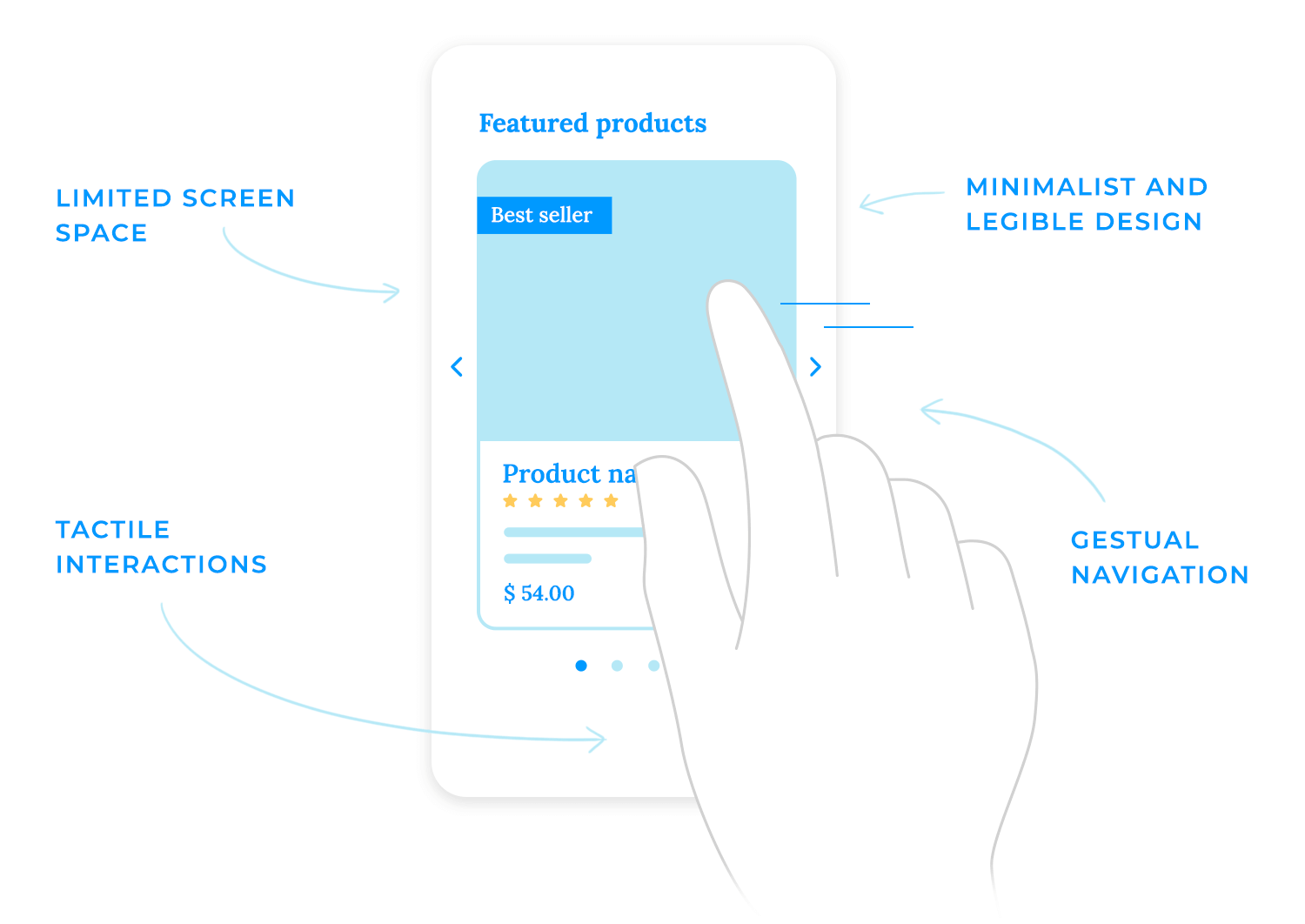
Carousels on mobile apps? A whole different ball game. The limited screen space changes everything, from how users interact with content to how much they actually see at once. What works smoothly on a desktop can feel cramped, awkward, or just plain frustrating on a phone.
On mobile, every pixel matters. There’s no room for oversized images with tiny text crammed into a corner, if users have to squint or scroll sideways to understand what they’re looking at, they won’t bother. Carousel slides need to be clear, concise, and designed with readability in mind. That means bold, high-contrast text, tappable buttons that don’t require precision aiming, and layouts that don’t feel cluttered.
Unlike desktops, where clicking arrows feels natural, mobile users expect to swipe through carousels. It’s an instinctive gesture, especially in apps where swiping is already a core interaction (think Instagram or TikTok). But getting that swipe experience right is key, because nothing’s worse than a carousel that’s unresponsive or, on the flip side, one that moves too easily, skipping past slides before you even meant to.
A good mobile carousel should feel effortless, with just the right amount of resistance when swiping; smooth, but not so sensitive that it flies past multiple slides with one flick.
This is where inertia and bounce effects come into play. A slight bounce at the end of a swipe signals to users that they’ve reached the last slide, preventing frustration. On the other hand, if the carousel moves with too much momentum, users might accidentally skip past content they wanted to see.
And let’s not forget platform-specific differences. iOS and Android handle touch interactions slightly differently, so designing swipe controls that feel intuitive across both ecosystems is a must. Testing on real devices, not just in a simulator, helps fine-tune the experience so it feels natural no matter where it’s used.
At the end of the day, a mobile carousel should never feel like a carousel, it should just feel like a natural, seamless way to explore content. If users are struggling to interact with it, something’s off.
Design and prototype Carousels with Justinmind. It’s free!
This type of carousel design is perfect for online shopping as it lets users browse multiple products without overwhelming the page. Instead of stacking items vertically or forcing endless scrolling, it neatly arranges products in a row, allowing for easy side-to-side navigation.
The left and right arrows make it clear that there’s more to see, and the clean layout keeps the focus on the essentials: product images, names, and prices. It’s a simple, familiar, and effective way to showcase multiple options while keeping the interface uncluttered. Great for desktop users who prefer clicking through selections rather than endless scrolling.

Big, bold, and visual. This carousel is all about setting the tone. The full-width image grabs attention instantly, making it feel immersive. The subtle branding and tagline layered on top add to the experience without overwhelming the image. It’s clean, stylish, and minimal, letting the visuals do most of the talking.
The left and right arrows give users control, making it clear that they can explore more slides. This kind of carousel is common for portfolios, creative agencies, or brands that want to tell a story visually. The key here? Keeping it slow and smooth, so users can actually take in the imagery before the next slide rolls in.

This carousel example makes it easy to explore featured speakers without feeling lost in a wall of text. Big, eye-catching photos paired with short but informative bios keep things clear and engaging. The smooth horizontal scroll invites users to browse naturally, while subtle arrows hint that there’s more to discover. It’s a clean, modern way to showcase event speakers without overwhelming the page.

Just like with speakers, sometimes you need to showcase multiple products without overwhelming the page. This carousel takes a simple, structured approach, displaying a row of product cards with key details like name, description, price, and ratings, all in one glance.
The side arrows let users scroll through more options without cluttering the screen, keeping everything clean and easy to browse. This setup works especially well for online stores, letting shoppers scan multiple items quickly instead of endlessly scrolling down the page. Plus, since each product stays visible for long enough, users aren’t rushed to make a decision.

This carousel keeps things visual and immersive, letting the images do the talking. It’s perfect for travel, adventure, or storytelling websites that want to spark curiosity without overwhelming users with text.
With simple side arrows, navigation feels easy with no auto-scroll, no rush, just a smooth way to explore. It’s an easy, engaging way to showcase stunning visuals and invite users to dive deeper.

In this example, this carousel keeps the focus on the books, making each title feel like a featured pick. The bold background adds character without overpowering the design, while the large cover image and title ensure the book stands out.
Navigation is straightforward with side arrows, and the button makes it easy to dive deeper. A simple, effective way to highlight new releases or must-reads without cluttering the page.

This carousel is all about personality. Instead of generic headshots, the black-and-white portraits give it a modern, editorial feel. The names and titles keep things professional, but the clean layout makes sure the focus stays on the people.
Navigation is smooth with side arrows, letting users browse without feeling like they’re flipping through a slideshow. It’s a simple, stylish way to introduce a team without overloading the page with text or unnecessary design clutter.

This one from Webflow is a slick, full-screen carousel that feels super smooth. It uses Swiper JS to create a centered slide with custom styles, giving the active slide a unique look. The infinite loop and navigation arrows make it easy to browse through content without any hiccups. Plus, it supports keyboard and mouse wheel controls, so users can navigate however they prefer.

The responsive design guarantees it looks great on any device. Perfect for showcasing portfolios, products, or any visual content in a clean and engaging way.
This carousel from Bohemia’s website puts customer feedback front and center, giving potential buyers a quick glimpse into real experiences. Instead of long-winded reviews, it keeps things concise and easy to read, making it effortless to skim through.

With smooth navigation, visitors can browse through testimonials at their own pace. It’s a great way to build trust and reinforce the brand’s reputation without cluttering the page with excessive text.
Toyota’s website uses a dynamic homepage carousel to showcase its latest vehicles and special offers. High-quality images and brief descriptions accompany each model, and intuitive navigation controls allow users to easily browse the content.

This design provides an engaging and accessible way for visitors to stay updated on Toyota’s newest products.
Design and prototype Carousels with Justinmind. It’s free!
We found this one on Dribbble that isn’t just a basic image slider, it uses smooth animations to transition between sections, making everything feel more polished and interactive. Instead of just clicking through static slides, users get a fluid, natural browsing experience that keeps things interesting.

It’s a great way to guide attention without overwhelming the page, perfect for showcasing products, telling a story, or just making a website feel more modern and engaging.
This carousel from Bahama Buck’s brings a fun, tropical vibe to the page, showcasing smoothies and special offers with bright colors and bold visuals. Each slide focuses on a different promotion, making it easy to see what’s new or popular.

Navigation is clear and easy, letting users click through without feeling rushed. It’s a great way to highlight deals and seasonal items while keeping the site fresh and engaging.
DreamWorks’ website uses a full-screen carousel to showcase its latest movies and projects. Each slide features eye-catching visuals and short descriptions, making it engaging for visitors. Easy-to-use navigation lets visitors explore at their own speed. This design effectively highlights DreamWorks’ various projects interactively.

Apple keeps things smooth with this design. Instead of clicking through, the content moves on its own, so that means they’re using an auto-rotating carousel showing different products like the latest iPhone, Fitness+ workouts, or Apple Arcade games.

The transitions are clean and natural, making the page feel dynamic without being distracting. It’s a great way to highlight multiple things without making users do the work.
This mobile-friendly carousel makes browsing products easy. Users can swipe through different items, with smooth transitions that keep things fast and intuitive.
Each slide is designed simply and clearly, showcasing the product image, price, and essential details without any distractions. The dots at the bottom show how many items are available, and the button encourages immediate action. This layout is perfect for shopping apps, guaranteeing a clean and easy-to-navigate experience on smaller screens.

This one makes shopping quick and easy. The main product gets the spotlight, with similar options lined up below so you can swipe or click to compare without extra steps. No digging through menus, just browse and decide.
Prices, images, and buttons are right where you need them, keeping everything simple. And since this is on a tablet, the carousel is touch-friendly, so you can swipe or drag naturally. A smooth, no-fuss way to explore products and shop without hassle.

Another example of mobile-friendly carousel, it walks users through key steps with clean visuals and bite-sized descriptions, making it easy to follow along. Each slide focuses on a single idea, keeping things neat and engaging without information overload.
The dot indicators at the bottom help users track their progress, while smooth swipe gestures make moving between slides feel effortless. It’s a natural, intuitive way to introduce users to an app without slowing them down.

Looking for a meeting room? This booking interface makes it simple with a horizontal date carousel. Instead of manually entering dates, users can quickly scroll through available options, picking the one that fits their schedule with just a tap.
The layout is clean and intuitive, letting users select the number of attendees while automatically disabling options that exceed the room’s capacity. With no unnecessary steps, it’s a smooth way to reserve a space in seconds.

For our last example, here’s a news carousel that keeps things sleek and organized. The top story grabs attention with a bold headline and full-width image, while the “Featured for you” section lets users scroll horizontally through curated articles.
Navigation is simple, you can swipe to browse without losing track of what’s important. It’s good to highlight trending stories while keeping the experience clean and easy to explore.

Carousels can be useful, but they’re not always the best choice. If users tend to ignore them, scroll past too fast, or get frustrated waiting for the right slide, it’s worth considering other ways to showcase content. Here are some solid alternatives that keep things clear, accessible, and easy to navigate.
Instead of a rotating slideshow, a single, bold hero image with a clear message keeps things simple and direct. It works great for highlighting one key product, promotion, or call to action without distractions. The downside? You don’t get to showcase as many things at once, but in many cases, less is more; users see exactly what they need right away.

If there’s a lot of content to display, tabs or accordions let users switch between sections on their own terms. No waiting for slides to rotate, just click and get to the point. This is especially handy for feature comparisons, FAQs, or product details. Labels need to be clear and intuitive, so users know exactly what they’re clicking into.

Rather than hiding content in a rotating slider, why not show everything at once? A grid or card layout makes it easy to scan multiple options without extra clicks. Think product listings, blog previews, or featured destinations, everything’s laid out neatly, so users can scroll and explore at their own pace.

Instead of making users flip through endless options, just show them the best picks upfront. Highlighting one or two top products, blog posts, or promotions makes decision-making easier. Less searching, more discovering.

On mobile, vertical scrolling feels more natural than swiping through a horizontal carousel. Whether it’s an infinite scroll (for things like news feeds) or clearly separated sections, this layout keeps users engaged without forcing them to navigate manually.

At the end of the day, the best alternative depends on the content and the user experience you want to create. If a carousel isn’t getting clicks, switch it up, because the goal is always to make things as smooth and intuitive as possible.
Design and prototype Carousels with Justinmind. It’s free!
If you’re adding a carousel to your design, prototyping it first is a smart move. It helps test usability, refine interactions, and make sure users actually engage with it, rather than just ignoring it. With Justinmind, you can create realistic, interactive carousel prototypes that feel like the final product, all without writing a single line of code.
Justinmind makes it easy to design and test carousels for both web and mobile. Whether you’re working on a hero slider, product showcase, or an image gallery, you can simulate real interactions like swiping, clicking arrows, or auto-rotation.
Here’s how you can build a carousel prototype step by step:
- Use dynamic panels: each slide in your carousel can be a panel, allowing you to switch between content smoothly.
- Add navigation controls: place left and right arrows or indicator dots so users can navigate manually.
- Simulate auto-rotation: set up timed transitions to cycle through slides automatically if needed.
- Enable gestures for mobile: use Justinmind’s swipe triggers to create touch-friendly carousels that feel natural on mobile.
- Test with users: run usability tests to see how people interact with your carousel. If they ignore it or get frustrated, you might want to consider an alternative design.

To speed things up, Justinmind offers UI kits with pre-built carousel components that you can customize. Here are some of the best kits to check out.
It’s great for homepage banners, hero sliders, and basic content carousels.

It includes touch-friendly carousel patterns with swipe gestures.
It follows Google’s Material Design guidelines and includes pre-built carousel elements, making it a great choice for Android app prototypes.

For those working with Vuetify, a Vue.js framework, this kit includes ready-to-use carousel components that match the Vuetify design system. Ideal for material-inspired web apps.

Designed for PrimeFaces applications, this kit includes a variety of navigation elements and interactive controls, including carousel components.

If you’re using Bootstrap, this kit comes with responsive carousel components that fit seamlessly into Bootstrap-based designs. A great choice for web projects that need a lightweight and flexible approach to UI design.

Prototyping lets you fine-tune your carousel before development, making sure it’s functional, intuitive, and actually adds value to the user experience. If users struggle with it, you can tweak the design or explore better alternatives before any code is written.
Design and prototype Carousels with Justinmind. It’s free!
Carousels can be a useful design tool, but only when they’re done right. If they’re poorly implemented like too fast, too cluttered, or lacking clear navigation, users will ignore them, get frustrated, or just scroll past. But when designed thoughtfully, they can enhance a site by making content engaging, accessible, and easy to browse.
Before committing to a carousel, it’s worth asking: Is this really the best way to present the content? In many cases, alternatives like static hero images, tabbed sections, or grids can be just as effective, if not better, at delivering key information without relying on motion or timed slides.
If a carousel is the right choice, prototyping first is the best way to ensure it works as intended. With Justinmind, you can build and test interactive carousels before development, making sure they’re smooth, intuitive, and actually useful.
What really matters isn’t just to have a carousel, it’s to create an interface that guides users, keeps them engaged, and ultimately makes their experience better. If a carousel achieves that, it’s doing its job. If not, it might be time to consider an alternative.
Related Content
 Learn how to design better e-learning platforms with user-centered UX principles, real examples, and high-fidelity prototyping tips to boost engagement and learning outcomes.13 min Read
 Infinite scroll keeps users engaged, but it’s not always the best choice. This guide breaks down when to use it, when to avoid it, and how to design it right.14 min Read
 Learn how to design web and mobile app prototypes, how to test them and what to look for in a prototyping tool in this complete guide.15 min Read


