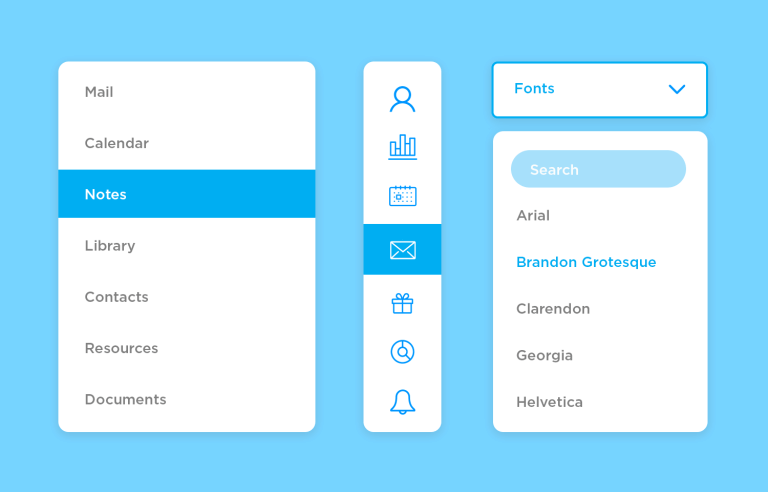
We see dropdown menus everywhere. But what makes a good dropdown? What changes when designing for mobile? We got the full run-through!
Dropdown menus are everywhere in website navigation bars. It’s one of those UI components that most users are familiar with and that designers rely on for important things such as navigation.
Design and prototype dropdown menus with Justinmind

But what separates a dropdown menu from a dropdown list? What are the true functions of dropdown menus?
Don’t worry. In this post, we’ll dive deep into a UI component most users will instantly recognize but few can pin down on terms of actual function. We’ll start with what dropdowns are, how we can design great ones – all the way to how you can prototype one in a few moments with our UI design tool. Read on to re-discover an old friend.
Dropdown menus are a classic UI design component. Users see them everywhere, serving all kinds of ends, such as helping people fill out forms. But what are the real functions behind dropdown menus? What is their real purpose on the interface?
Drop down menus are champions of clean interfaces. They offer a hidden world of functionality without overwhelming users with a button overload. This keeps the screen clear and uncluttered, but when needed, users can access a wealth of relevant options.
Imagine a text editor – a drop down menu for font styles groups those options together, making them easy to find at the exact moment you need to change the font. It’s like having a toolbox with hidden compartments that magically appear when you need a specific tool.
On mobile devices and websites with limited space, drop down menus become superheroes of navigation. By tucking sub-menus under a single parent item, they create a compact navigation bar that keeps things clean and usable.
But that’s not all! For complex websites with tons of content, nested drop down menus come to the rescue. Imagine a website with different product categories, each with subcategories and sub-subcategories. By using nested dropdowns, you can create a hierarchical organization that makes finding that specific product a breeze. It’s like having a branching tree where each branch leads you closer to what you’re looking for.

A dropdown menu can also reveal relevant actions only when needed. For example, in a file management system, each file might have a dropdown menu offering actions like “Rename,” “Delete,” “Download,” or “Share.” This approach keeps the interface clean while providing quick access to essential functions directly within the context of the item they affect. This localized approach streamlines workflows and improves efficiency by presenting users with only the actions relevant to their current task.

Dropdown menus are invaluable for managing user preferences and settings, especially when it comes to language and display options. For language selection, a dropdown offers a clean and efficient way for users to choose their preferred language, instantly making a website or application more accessible and welcoming to a global audience.
This simple feature drastically improves user experience and broadens reach. Similarly, dropdowns are perfect for managing display settings like screen resolution, themes (like light or dark mode), and color palettes.
Dropdowns are some of the most debated UI components out there. Some designers depend on them for key matters such as navigation – but dropdowns come with their own set of challenges. They can be clunky, occupy too much room and present some usability concerns when it comes to mobile devices. Keeping a certain balance of visual hierarchy and accessibility is tricky.
But when done right, they can boost any interface. Let’s go over some of the key best practices when designing a dropdown menu that delivers a great experience.
Design and prototype dropdown menus with Justinmind
Many platforms go for interactive dropdown menus, where the options depend on settings or selected features. Picture Chrome’s dropdown menu at the top of the screen. It would be confusing to users if the options in “Window” changed depending on which website they were looking at.
Users want great design – but they all need good usability. Changing the options of the dropdown menu will, without a doubt, confuse users. It will also make it more difficult for them to learn to use all features, directly impacting the discoverability and learnability of the product. This is closely connected to maintaining a consistent design for button states and choosing the right components.
You can also explore more about the ever-raging debate between radio button vs checkbox.

As a general rule, you want to establish which options go on the menu and keep them constant. Ah, but what about times when certain commands and controls aren’t available, you ask. It’s perfectly plausible that not all the controls or options of the dropdown menu can be available at all times – due to silly things like a lack of internet connection to other factors in the general design. In times like these, the best thing is to grey out any unavailable options.
This helps users understand the general functionality of the dropdown menu while immediately identifying which options are unusable. On mobile apps, consider adding a brief tooltip explaining why an option is unavailable, especially if it’s context-dependent.
For example, a photo editing app might have a dropdown menu for filters. If a user has a black and white photo selected, the “Warm Tones” filter could be grayed out with a tooltip that says “Not applicable for B&W photos.”
One of the main concerns when designing dropdown for both menus websites and mobile apps is the size and number of options. What makes a dropdown menu too big?
Generally, the need to scroll (or lack thereof). The general usability of the dropwdown menu is closely related to its size. If the menu offers too many links and options, users won’t be able to see them all at first glance. That can lead to users struggling to scroll while keeping the dropdown open, or users not even realizing they need to scroll to see more options.

In either case, you risk having either confused users or having users who never get to enjoy your design to its full potential. You want to create a dropdown menu that is short and sweet, making the absolute most of every option in there.
For complex product searches, like finding the perfect laptop, a single dropdown just won’t cut it. Instead, a well-structured combination of navigation and filtering mechanisms is key. First, a high-level category selection, perhaps through a main navigation menu (think “Laptops,” “Desktops,” or “Tablets”), guides you to the right product area. Then, once you’re in the laptop section, a suite of filter options appears, empowering you to refine your search.
You might see filters for brand (using checkboxes to select multiple favorites like Apple, Dell, or HP, or a dropdown for single selections), price range (using a slider or dropdown to set your budget), screen size (again, checkboxes or a dropdown for those crucial inches), RAM (filtering by 8GB, 16GB, or more), and even the operating system (Windows, macOS, or Chrome OS). Finally, a “Sort By” dropdown lets you arrange the remaining laptops by price, customer rating, or newest arrivals.

Filtering drastically reduces the number of items you have to consider at once, letting you quickly narrow down the selection based on your specific needs. The initial category selection acts like a signpost, directing you to the appropriate product area and further reducing the initial search space. And once you’ve filtered, sorting allows you to organize the remaining results in a way that makes it even easier to pinpoint exactly what you’re looking for. It’s all about giving you the tools to find the perfect match without overwhelming you with information.
Many websites out there use and abuse dropdowns, and it’s easy to see why. It can be such a convenient way to store more paths and links to all corners of the website, using little screen space while making sure the path is there should users want it. But there is a problem with that idea: users who are discovering your website.

Your website’s top ranking pages or categories should be visible to users, without making people look for them. This is particularly true for large websites that hold a lot of content, such as ecommerce platforms and online retailers. The large number of categories and pages can make it challenging to design the navigation, which leads to many designers relying exclusively on dropdown menus to solve the issue.
However, this can be confusing for mobile apps as well. While dropdown menus can be used on mobile apps, they should be used sparingly and only for secondary navigation. On mobile apps, prioritize the most important functions and user actions on the main screen.
Overall, it’s not advisable to hide the top pages of your website. This is for the simple reason that some users may not be able to find them, or at least won’t be able to find them before throwing in the towel and moving on to a website that is easier to work with.

If you have a website with many top-ranking pages or categories, consider going for a mega menu instead. It works in a similar fashion to dropdowns, but mega menus are more noticeable and that means users will be less likely to overlook the main navigation.
Design and prototype dropdown menus with Justinmind
Mobile apps are notoriously difficult to design, because of the reduced screen space. This puts dropdown menus in a tough spot, as they tend to occupy a lot of space when expanded. But there are some tricks and factors designers can take into account when using dropdowns on mobiles apps.
In modern iOS (iOS 14 and later), the closest thing to a traditional dropdown menu is the Pull-Down Button. These clever controls offer a clean and efficient way to present multiple options related to a single action. Imagine a regular button, but with a small downward-pointing arrow nestled beside its title. That’s a Pull-Down Button! When you tap it, the button smoothly expands downwards, revealing a bunch of choices. After you select one of these options, the menu neatly closes, and sometimes the button’s title even updates to reflect your selection, providing clear feedback. It’s a neat way to declutter the interface and offer more choices without taking up too much screen space.

In fact, Apple recommends that designers keep the picker on the same page as a modal, so that users get to see the label or question. Apple also asks that designers keep their options to a bare minimum, as scrolling through a whole bunch of options can be tedious for users. You can find more details about this in their human interface guidelines.
Unlike iOS, Android doesn’t have its own way of portraying dropdown menus. Instead, designers are offered a few pointers on how to get these menus right on Android apps.
Firstly, Material Design guidelines state that dropdown menus need to be in very close proximity to the icon that generated them in the first place. Designers have quite a bit of freedom here, with the possibility of placing the menu just about anywhere on the screen.

Another important detail is the changing states of the menus. Material design focuses on the active state of a dropdown menu, which should help users understand where they are and what they are doing. This works in a similar fashion to changing states of input fields in form design. These same states can help a dropdown in a form design to show error messages or signal that something’s gone wrong.
For more details: Check out our comparison between Flat design and Material design.
No matter how well you describe something – sometimes, seeing is believing. In this case, it’s inspiration rather than belief. Let’s check out some great dropdown menus that designers have come up with over time, and try to pin down why they work so well.
First up is this dropdown menu featured in our Bootstrap helpdesk template which is totally free to download using the link below! It features a modern design with a discreet user icon and neatly arranged options, encouraging users to navigate their account settings effortlessly. Its user-friendly layout and logical hierarchy of options help make sure users can easily locate what they are looking for.

The dropdown menu for our Mars Explorer web template features is also free to download. This dropdown basically informs users of the different aspects of this mission, preparing users to blast off into the intriguing realm of space exploration. Built with responsiveness in mind, you’ll never have trouble viewing your options. Users can even take it with them to Mars!

Imagine you’re managing your finances online. At the top of the screen, you see “My Accounts” with a little upward-pointing arrow (indicating the menu is open). This means the dropdown is currently displayed. This design is straightforward and practical, allowing users to quickly select the account they want to view without any fuss. It’s a great example of how a simple dropdown can enhance navigation in a banking app, keeping things organized and user-friendly.

Our e-learning website template dropdown menu, with its stylish user profile image and modern layout, invites users to explore options such as their dashboard, or account. The dropdown format efficiently maximizes screen space while providing a seamless user experience, inviting users to dive into the platform’s exciting offerings and unlock their full potential.

The travel booking site dropdown menu template shown below, also by Justinmind, provides a flexible way to organize and display information in a compact and attractive format. It allows for easy adaptation to different purposes and contexts. The template includes placeholders for various options, giving you the freedom to fill in the content that best meets your users’ needs!

Imagine you’re browsing an online store, adding some cool new headphones to your cart. This image shows a pop-up cart window, giving you a quick overview of your shopping spree. You’ve got two awesome pairs: the sleek “TENK black wireless” and the vibrant “LUNX metallic blue wireless.” Now, notice the little arrow pointing downwards next to the quantity for each pair (“1”). That’s our dropdown menu in action! This kind of dropdown menu makes online shopping simple, letting you customize your order with just a few taps.

Yes, the Justinmind website shamelessly uses dropdowns on our navigation bar. The cool thing about the dropdowns on our website is the careful planning of the changing states of the links.

When expanded, the dropdown design offers users a series of links. When hovering on any given link, users will see the others fade to a shade of grey. Notice that all of the dropdowns are short and sweet, without any need for scrolling. Our design team did us proud!
Design and prototype dropdown menus with Justinmind
Facebook enjoys about 2.6 billion active users every month. The whooping success behind the social media giant is a result from many different factors – the drop down menu UI design is one of those factors. Facebook makes very smart use of dropdown menus, using them for everything from helping users with issues to notifications.

Medium is a hub of designers and creatives who get to share stories and information. Their website can be considered a good example of using dropdown menus in order to take users to the most important corners of their account. The interface uses simple gray lines to separate the links, grouping them according to their nature.

Sunglass Hut‘s dropdown menu is your one-stop shop for navigating their vast collection of sunglasses. Brand fanatics can dive straight into iconic names like Ray-Ban and Prada, while trendsetters can explore the latest arrivals with a single click.
The menu caters to all budgets with a dedicated price point filter, and for those seeking specific features, options like polarized lenses and smart glasses are just a dropdown away. Whether you’re a brand loyalist or a browsing newbie, Sunglass Hut’s dropdown menu equips you to find the perfect pair of shades to complete your look.

Apple is a master of interface design, which we can appreciate in the smooth and minimalist lines of iOS – but also in their website. Apple makes every button count, and nowhere is this more obvious than in the dropdown menu of the shopping cart.

Leave it to Apple to take something like a cart dropdown and turn it into a source of useful links for users. People are offered links to their favorite items, account settings and so on. The best thing? Even with the additional links, the general feel is spacious and visually pleasing.
Photoshop is a staple in every UX designer’s toolbox. Photoshop, like many other pieces of software, needs to get a large number of buttons to users in a way that is logical and easy to find. It does this with dropdowns, which expand to show a selection of action controls.

It’s true that the learning curve for programs like Photoshop is big, but given the sheer number of buttons designers need, the UI design actually does a great job. Designers can learn their way around the different dropdown menus, which are well-organized and become easy to remember over time.
Puma makes for a good example of a dropdown menu with navigation purposes. The menu expands to show an organized series of links to the most important categories and pages. It’s clean, modern and it gets the job done in a very straightforward way.

But while an argument could be made that there are too many links on the dropdown, we love that they are presented in a way that is never overwhelming, with the top-ranking categories in bold.
Converse’s website unfolds like a map, with the drop down menu as your guide. Chuck Taylor devotees can head straight for their icon (think classic silhouette!), while fashion explorers can discover the latest trends with a single click. It’s a one-stop shop for all styles, offering options for men, women, and little ones.
Unleash your inner designer with a dedicated section for creating your own custom kicks – rainbow letters mark the spot! Whether you’re a Converse champion or a curious newcomer, this dropdown menu empowers you to find the perfect pair to reflect your unique style.

We love this little study of drop down menu website design by Shiva. It touches on the connection between hamburger menus and classic dropdowns we’re all used to. While the dropdown with the exclusive use of icons may not go far enough in delivery meaning to each link, we love the general feel of the design.

We’re fans of the third dropdown menu in the image, which the designer clarified that user would be able to type and search for their favorite food. This is a smart way to strike that balance between use of dropdowns and actual typing – simply let the people decide!
Dribbble is an entire community of designers and creative professionals, which means that the bar is set very high for Dribbble’s UI and UX design. And right off the bat, the navigation bar lives up to the task. Upheld with impeccable visual hierarchy, the dropdown is a wonderful example.

We love that while the dropdown is meant for navigation, it still delivers beautiful visuals, offering illustrations for most options as well as a brief description of the destination. It’s smart, it leaves room for the user to breathe and offers a central road to most of the platform.
Design and prototype dropdown menus with Justinmind
While some OS have their own brand of drop down menus, others do allow designers all sorts of freedom within the confined space of a mobile screen. And precisely because getting dropdown menus in apps is so hard, we should all appreciate those that get it right. Let’s see some designers who managed to hit the nail with the following drop down menu design examples.
Alex Muench designed this wonderful example of a dropdown that is oriented towards help and feedback for Doist. The general UI of the menu is clean, with flat icons that are filled with personality and a soft color palette.

Gina Chee designed a dropdown example that is modern, eye-catching and unique. It goes in the exact opposite direction of other dropdown menu examples here, forsaking soft colors and discreet palettes. This dropdown is the star of the show and offers an experience that users are unlikely to overlook or forget.

The drop down menu example by Orman Clark sports a sleek, minimalist look with a dark background and crisp, light text, giving it a modern and professional vibe. Subtle gradients and shadows add a touch of depth and visual interest, making the interface feel polished.

Madalyn Lee created a mobile dropdown that takes up the entire screen, but isn’t overwhelming. The fact that the entire screen is occupied by the menu gives it plenty of empty space, giving the user’s eyes a bit of rest, and focus on the options.

From the strong contrast between the black background and the white font, to the use of color to signal the selected option – this is a drop down menu mobile design example that minds the usability of it all. And we love the design for it!
Purple Bunny brings us a drop down menu design example that is all about visual hierarchy and the soft use of color. We love that in this drop down menu, the user can still see the main navigation and some crucial buttons along with the options in the menu.

The use of icons, navigation buttons and regular buttons might be confusing, but Purple Bunny has a visual hierarchy that makes the grouping of links easy to understand at a glance. That’s not easy to accomplish, which is why this makes for a wonderful dropdown menu design example!
Niki Smeets created a bold and innovative dropdown menu design example. We love that the screen is bright and colorful, but still lets the user focus on the dropdown menu from the “More” button. The positioning of the dropdown, along with the large font makes it eye-catching and easy to use.

We also love that even though the dropdown menu is large, users can still see the original button and screen, checking a very good usability box. Not to mention that the microinteraction in this dropdown example is enjoyable and to the point – another great box checked.
Claudio Vallejo created this beautiful drop down menu design option for mobile screens. This example consists of a vertical dropdown that exposes a whole navigation network of links. Some of the things we love about this drop down menu example include the use of soft colors, the brief but meaningful interactions and animations along the beautiful structure of the options.

The general menu that the dropdown exposes is well-organized, with dropdowns used within the menu itself using the ‘plus’ sign. The result is a menu that offers many different options, but conveys a good hierarchy in the options, resulting in a menu that users can easily understand.
Disney+ made headlines all over the world when it first premiered. The streaming service aims to compete with giants such as Netflix and Amazon Prime Video, resulting in a lot of effort being invested in their design. One of the things our team loved about the mobile interface was the dropdown menu UI design.

The menu itself occupies the entire screen, but it doesn’t feel like a separated thing from the original page due to the transparency of the modal. The options are spaced out, leaving no room for distractions or confusion.
Vimeo got its dropdown design right. The dropdown expands to form a modal window, which doesn’t take up the entire screen. The modal leaves plenty of room so users can see the original screen, acting as a reminder of the dropdown’s function.

The label at the top of the modal acts as a clear direction as to what the dropdown does, and what it refers to. The options aren’t that many, leaving plenty of room for icons and empty space, and giving users’ eyes room to rest. Well done!
Adobe Lightroom is another great example of a piece of software that involves a lot of different action buttons. The mobile app includes a great example of a dropdown menu that rises from the bottom of the screen, leaving ample room for users to see the original screen behind the extended menu.

We like that the options aren’t numerous, giving the user space to breathe. The options stand out with enough contrast to ensure good usability, while the general design makes the menu fit in effortlessly with the rest of the tool.
Design and prototype dropdown menus with Justinmind
Now for the fun stuff – prototyping a dropdown menu. In our example, you’ll see a standard navigation menu where users can make their way around the portfolio site. You could recreate this using simple text boxes, but there’s a more powerful way to go about it.
- First, we’ll create the main menu, which we will attach dropdown options to. In our example, we used a “text table widget” and made it one row long with five columns.
- Replace the default text in each cell with your main menu options. In our example, we have “Home”, “Portfolio”, “Services”, “Clients” and “Contact”.
- Next, we’ll need to create the dropdown options for each main menu option, using an additional text table widget for each dropdown selection.
- In our portfolio dropdown there are three navigation options: “Corporate Identity”, “Brochures”, “Flyers” and “Photography”.
- Drag the additional widgets to the canvas. In the properties tab, adjust the number of rows and columns, as well as the menu text.

- Click on the cell in your main menu that you want to be interactive (the one that triggers the dropdown). This will open the interaction settings menu.
- Within the interaction settings menu, add an “On Mouse Enter” event and a “Show” event. This makes the dropdown appear when the user hovers their cursor over the main menu cell.
- Next, add another event, “On Mouse Leave” and “Hide.” This ensures the dropdown disappears when the cursor moves away from the cell.
- To prevent accidental hiding, click the link to “Add Condition”. In the logic section, use a “NOT” button. Then, in the elements section, click the dropdown menu and choose “is visible.” This ensures the dropdown only hides when the user clicks outside of it, not when hovering over other menu items.
Simply repeat the previously stated steps for the other main menu cells to make all your dropdowns interactive.
For a more detailed tutorial: Go to our Help Center How to prototype a dropdown menu.
Simulate your prototype to see your interactive dropdown menu in action! This will help you refine the design and ensure a smooth user experience before implementing it in your final product.
In the Events palette, there is a link to add a condition. Click this and in the logic section add a NOT button. In the screens section, click the element you wish to add the condition to. In the dropdown menu click ‘is visible’. What this does is that it hides the element when you’ve not clicked on it. You can repeat these steps for the other text cells.
Now all you need to do is simulate and you’ll have your interactive dropdown menu!
Dropdown menus can be incredibly handy. They have the power to compress many different things into a single UI component, saving precious screen space. But it doesn’t come free of restrictions, as we’ve seen.
When done right, these UI components can truly help users and save designers a lot of stress. The bottom line is doing all of this, while still maintaining your usability levels. The good news is that, with care and practice, any designer is capable of creating a dropdown that users can love!
PROTOTYPE · COMMUNICATE · VALIDATE
ALL-IN-ONE PROTOTYPING TOOL FOR WEB AND MOBILE APPS
Related Content
 With the rise of mobile devices, we can fill out forms on the go and enjoy the practicality of it all - until a particularly poor app form design gets on our nerves.16 min Read
 Login page designs should be easy to understand and require no thought from the user. Here are 40+ to inspire your next design13 min Read
 Getting users to complete a signup form is no easy task. In this post, we take a look at companies who got their signup page design right! Check it out.28 min Read


