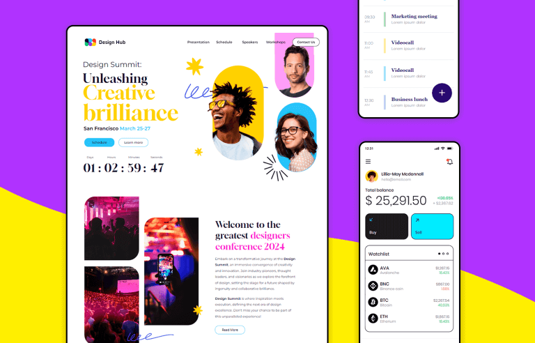
UI design examples that bring some serious inspiration. From parallax scrolling to delicate animations - this list has it all to get you inspired!
UI design can be a very fun playing field – but it’s not free of rules. Rather it be having a navigation design that works, a usable information architecture or simply a design that performs well – rules are rules. But these rules don’t exactly limit the things that UI designers can do in order to push the boundaries and create unique experiences for users. The following UI examples are living proof of that.
Make your favorite UI examples interactive with Justinmind
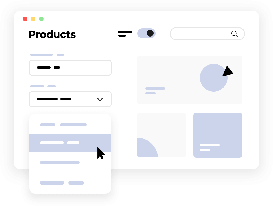
This list of UI design examples gathers some of the best and most creative website designs out there. From superb visuals, daring fonts to intricate interactions – these UI examples impressed us. Keep your favorite UI design tool ready to go. We’re about to throw some major UI inspiration at you.
UI design examples are like a treasure trove for designers and developers. They can save you a ton of time by providing pre-built templates that you can customize to fit your specific project. This means you can quickly create functional prototypes and get early feedback, accelerating the design process.
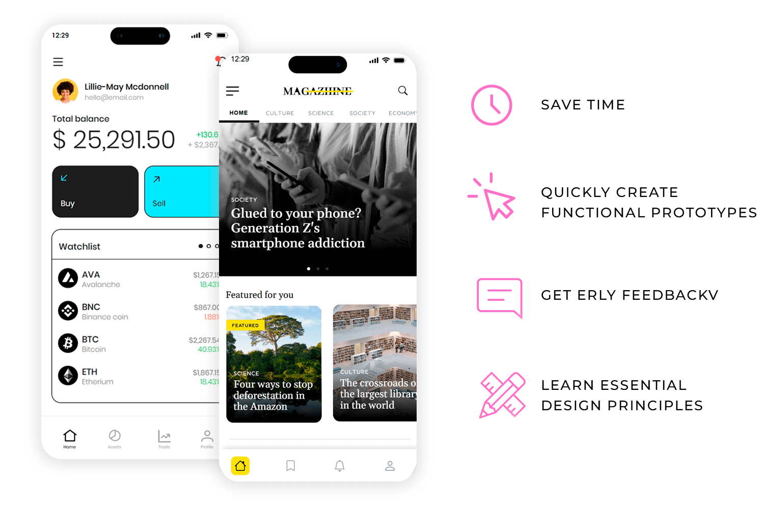
Learning from the best is easier than ever with UI design examples. You can pick up on essential principles like layout, typography, and color theory by analyzing well-crafted designs. You’ll also start to recognize common UI patterns that make designs more user-friendly.
But the fun doesn’t stop there! UI design examples can spark your creativity. You can come up with fresh and innovative ideas by exploring different styles and approaches. Plus, using these examples as a benchmark can help you create top-notch designs that meet industry standards.
So, the next time you’re stuck on a design project, remember the power of UI design examples. They’re your secret weapon for creating stunning and user-friendly interfaces.
This corporate UI design example is elegant and professional, perfect for making a great first impression. Right at the top, you get a stunning hero image that grabs attention. The layout adjusts smoothly across all devices, so it always looks good. Smartly placed call-to-action buttons guide visitors to contact you or explore your services. Whether you’re a startup or a big business, this template has everything you need.
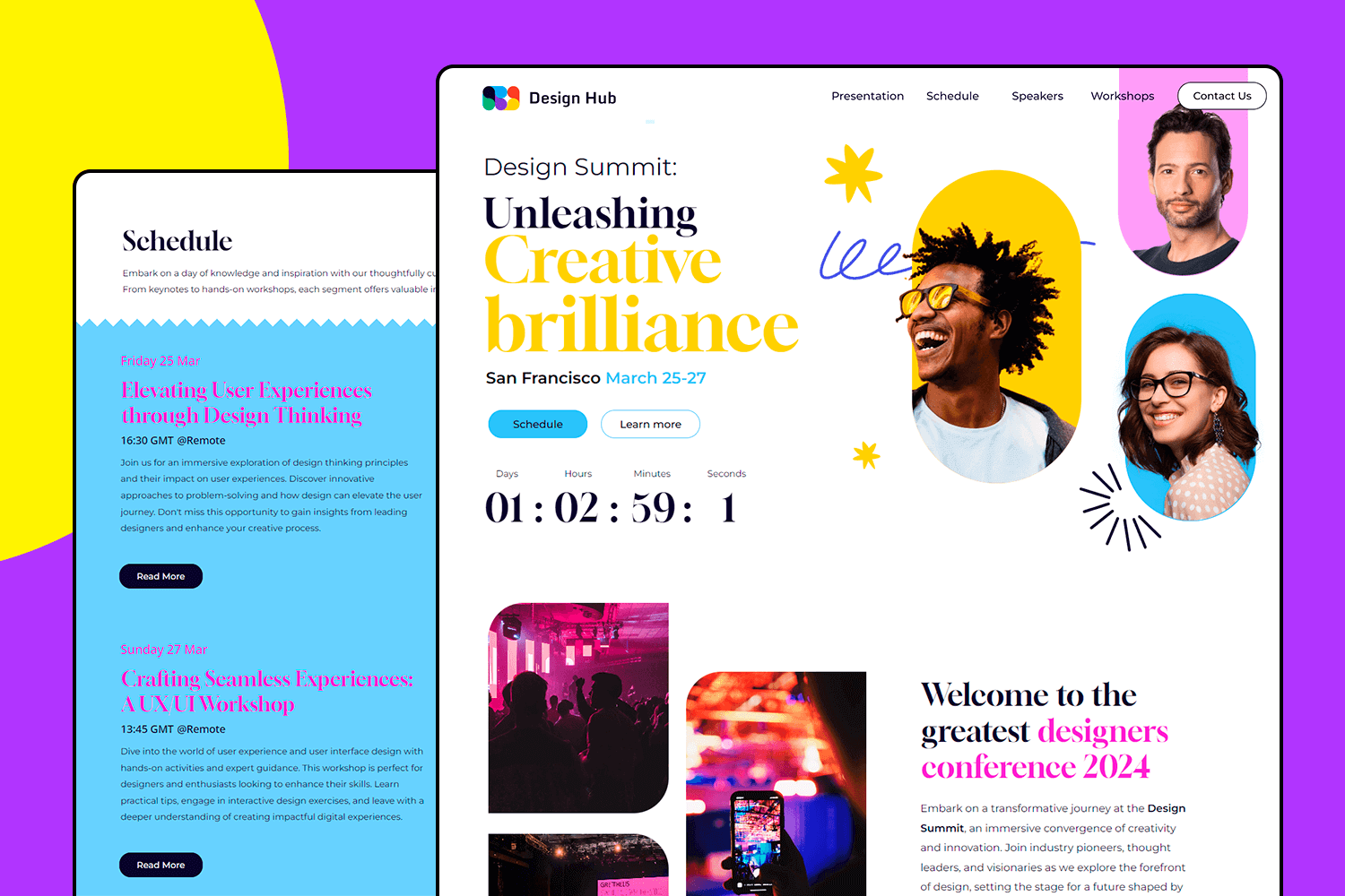
This example is all about creating an intuitive and engaging user experience. The design is clean, making it easy to navigate whether you’re swiping through menus or tapping on icons. It’s fully responsive, so it looks fantastic on any device. Perfect for any app that wants to keep users engaged and happy.
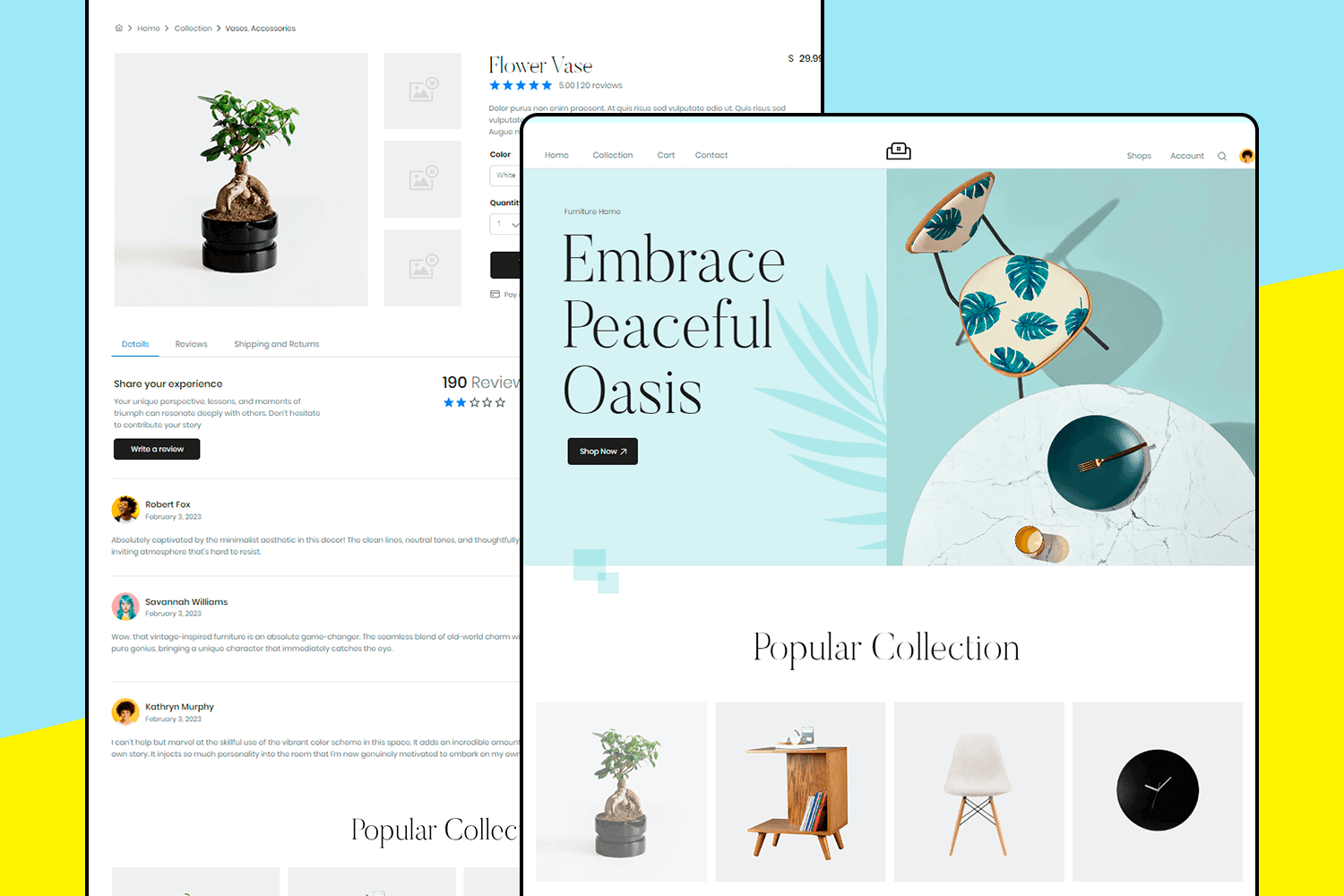
With this UI design example you can build your online store in a flash. Its eye-catching hero section showcases your best products, while the responsive design ensures a perfect display on any device. Customers can easily explore your offerings thanks to clear product listings, detailed descriptions, and strategic call-to-action buttons. A user-friendly search bar and filters make finding the perfect item a breeze, creating a smooth and enjoyable shopping experience.
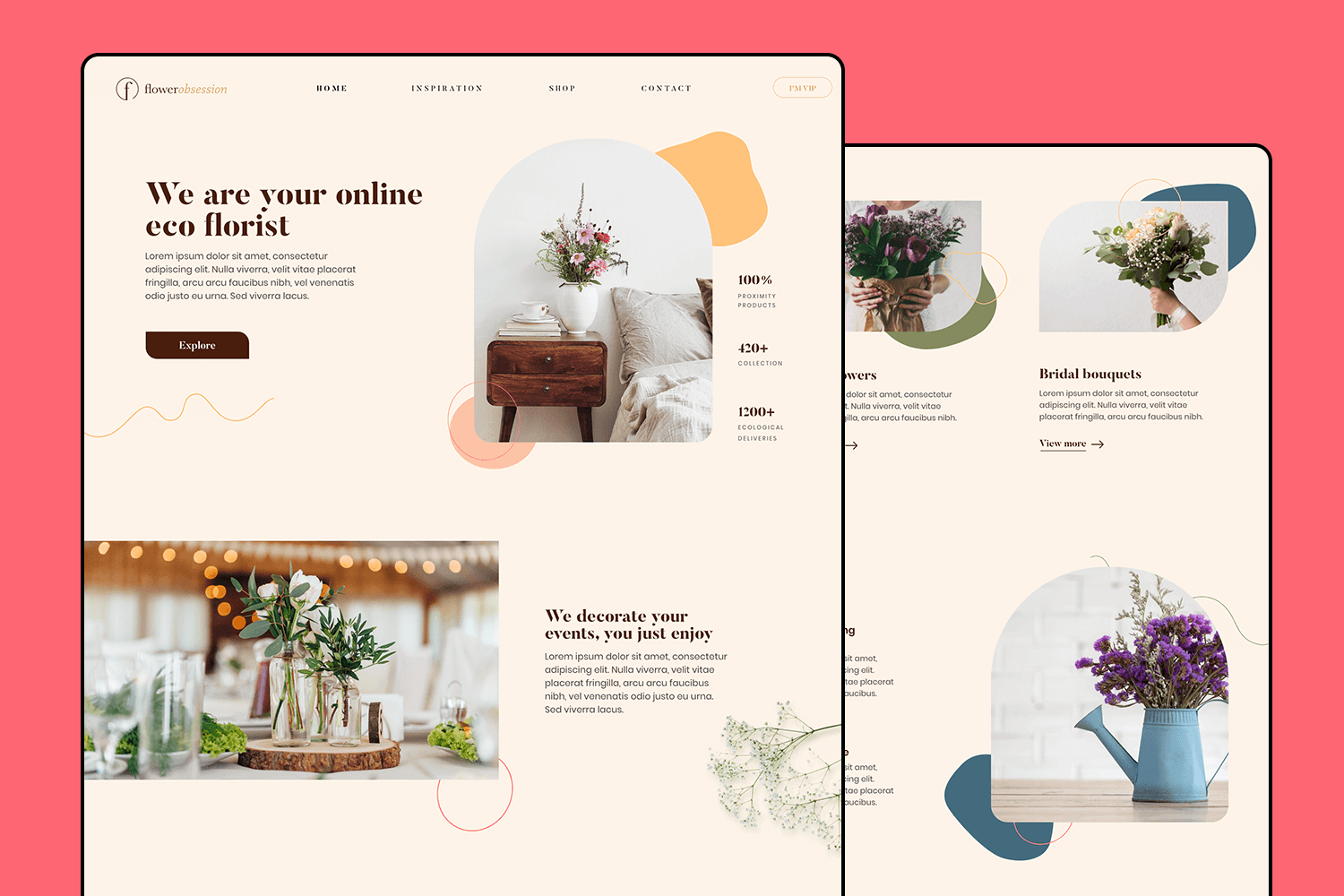
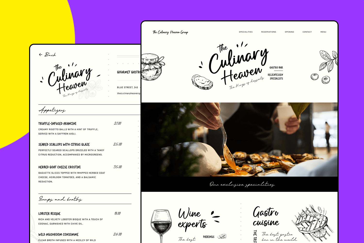
In this example, we have a restaurant landing page that is a feast for the eyes. It starts with a mouth-watering hero image that immediately catches attention. The design is clean and inviting, making it easy for visitors to explore your menu and specials. It looks fantastic on both mobile and desktop, ensuring a great experience across all devices.
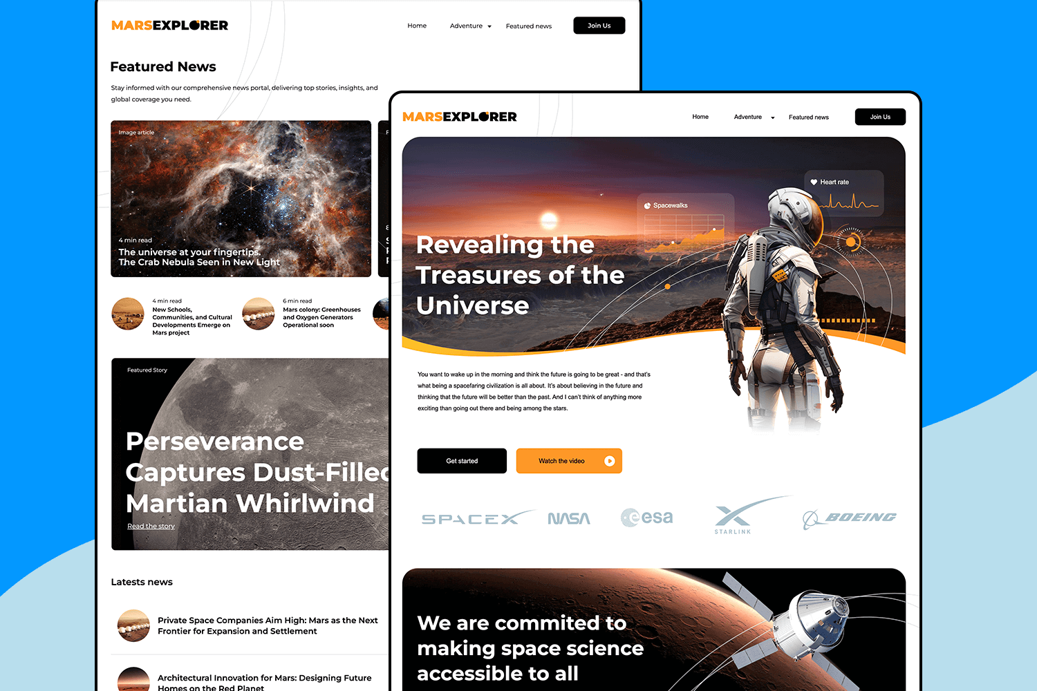
Building on our last cool template, this UI design example is easy to love. It starts with an eye-catching image giving a sleek and futuristic design look. It’s really easy to navigate, you can quickly find the sections, and it looks great on any device.
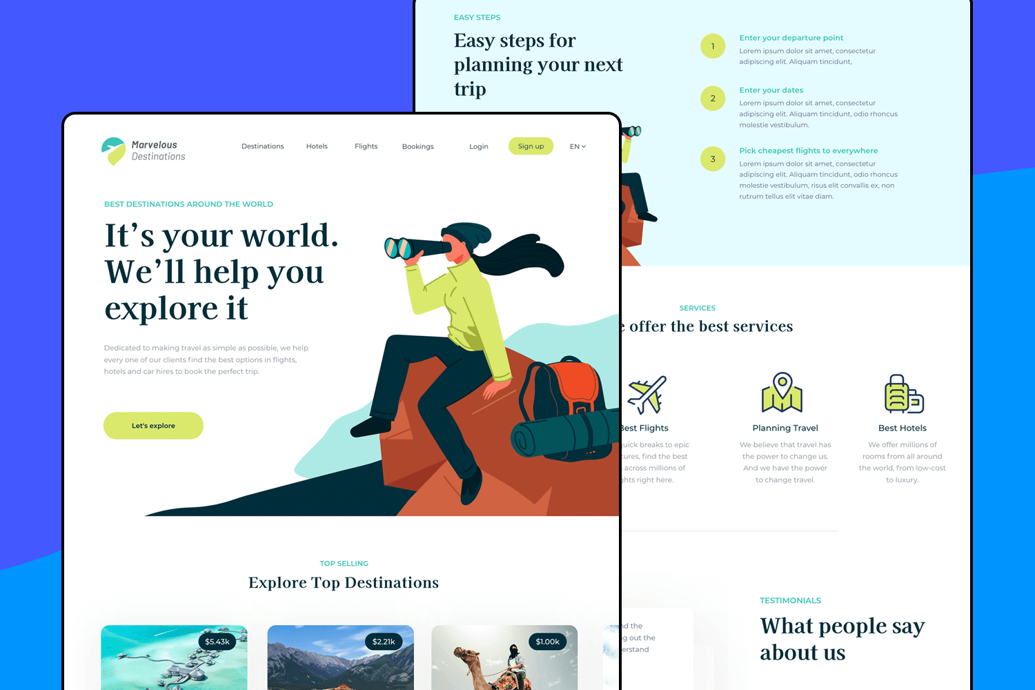
This travel booking UI design example is super friendly and easy to use. The homepage greets you with a welcoming message and you can quickly search for destinations, flights, hotels, and bookings. The clean design makes it simple to find the best travel options. With just a few clicks, you’re set to plan the perfect trip!
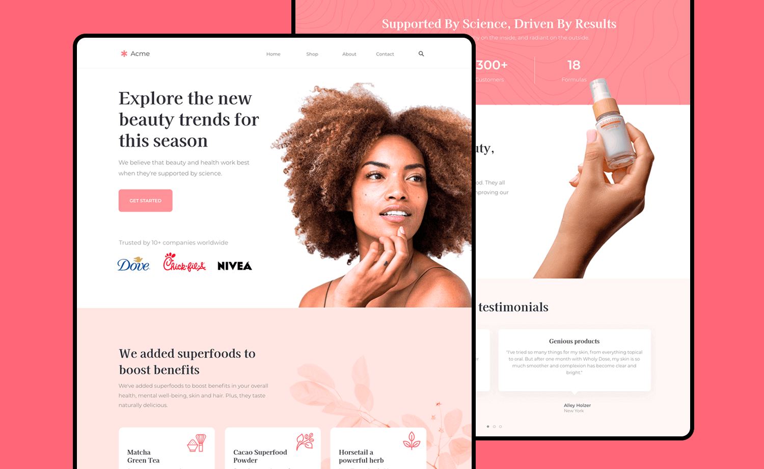
The beauty trends UI design is simple and inviting. The homepage catches your eye with a beautiful image and a clear message. We also love the good job it does of showing off popular brands in a way that feels both professional and friendly.
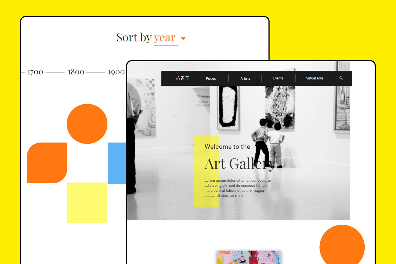
This UI design turns your screen into an art gallery. The homepage has a cool black-and-white style that feels classy and artistic. Getting around is easy, with clear links to view art pieces, discover artists, check out events, or take a virtual tour.
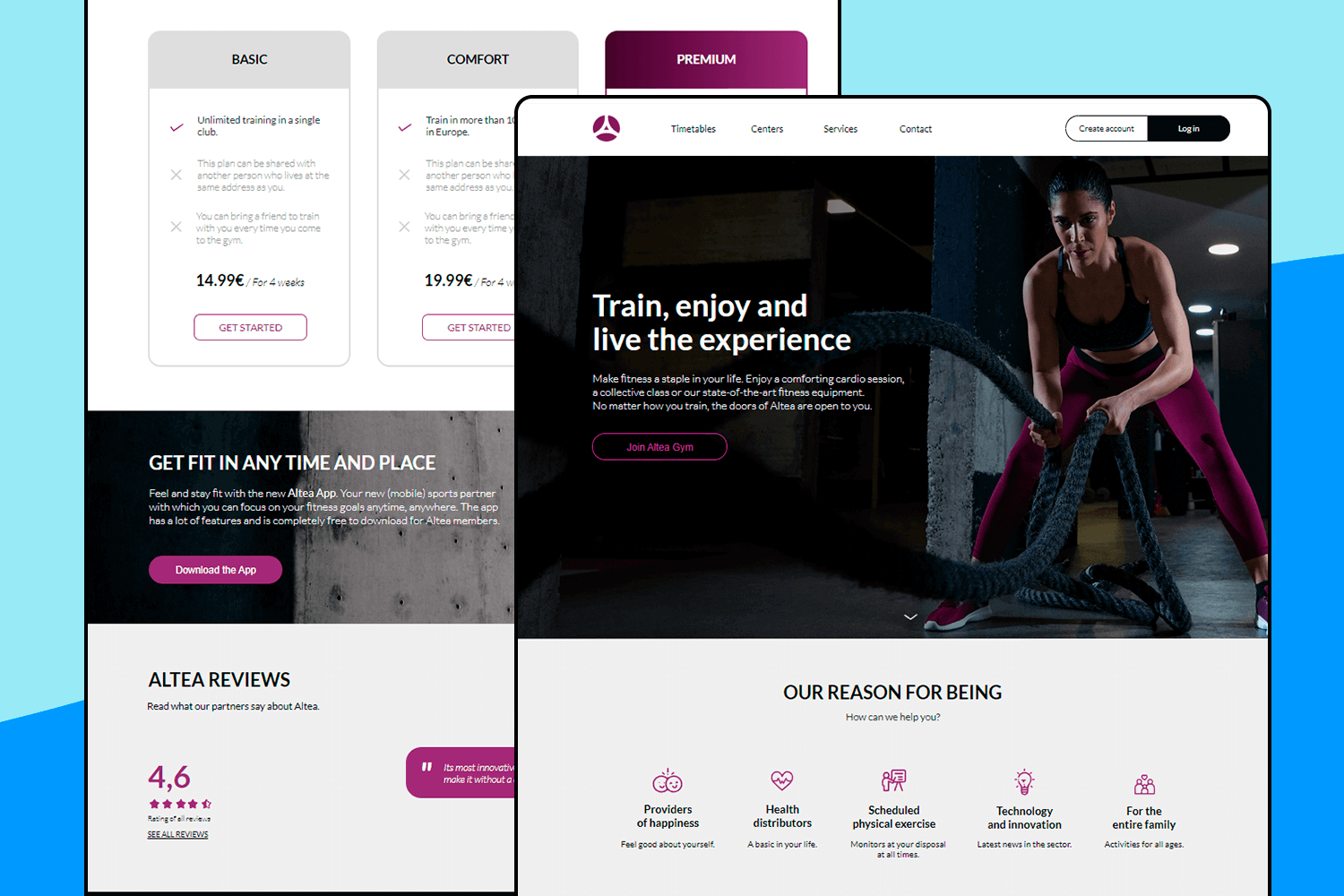
In this example, we have a fitness UI design focused on energy and motivation. The homepage pulls you in with a strong image and a message. Navigation is clean and simple, including links to timetables, centers, services, and more. The button is easy to spot, making it simple for users to get started.
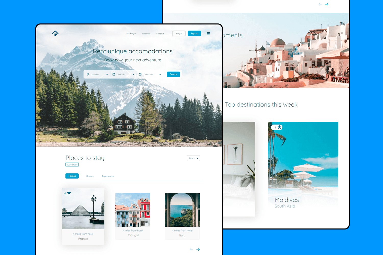
Now, this accommodation booking UI design is all about simplicity and adventure. The homepage with a breathtaking mountain view sets the tone for finding unique places to stay. It’s easy to navigate, with clear options to select your location, as well as check-in and check-out dates to start your search. The clean design makes it simple to plan your next getaway.
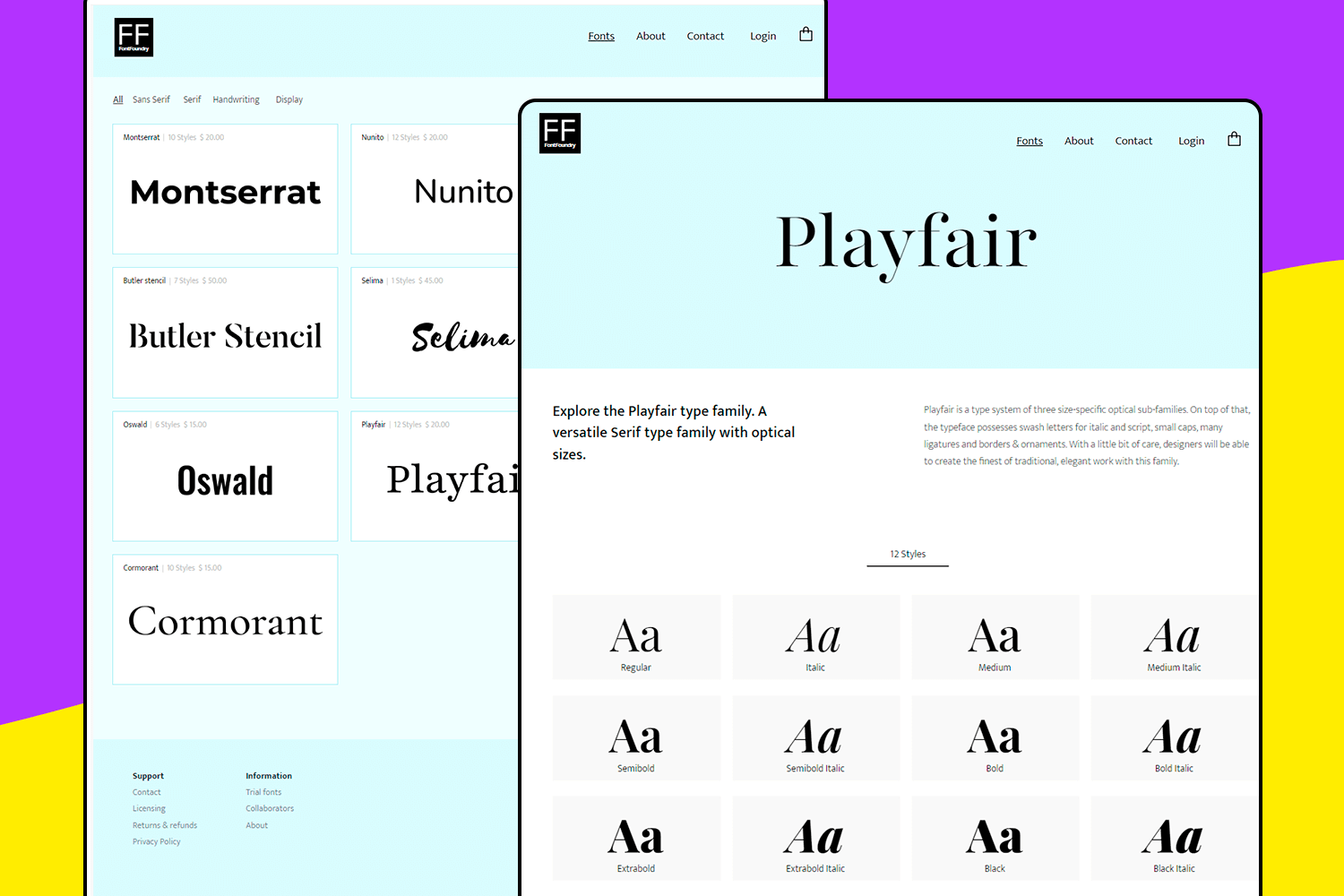
Here’s a simple and easy-to-use font selection UI design. The homepage shows different fonts, each with their styles and prices, making browsing straightforward. The layout is clean to help you find exactly what you need. It’s a no-fuss design that lets you pick and purchase fonts quickly and easily.
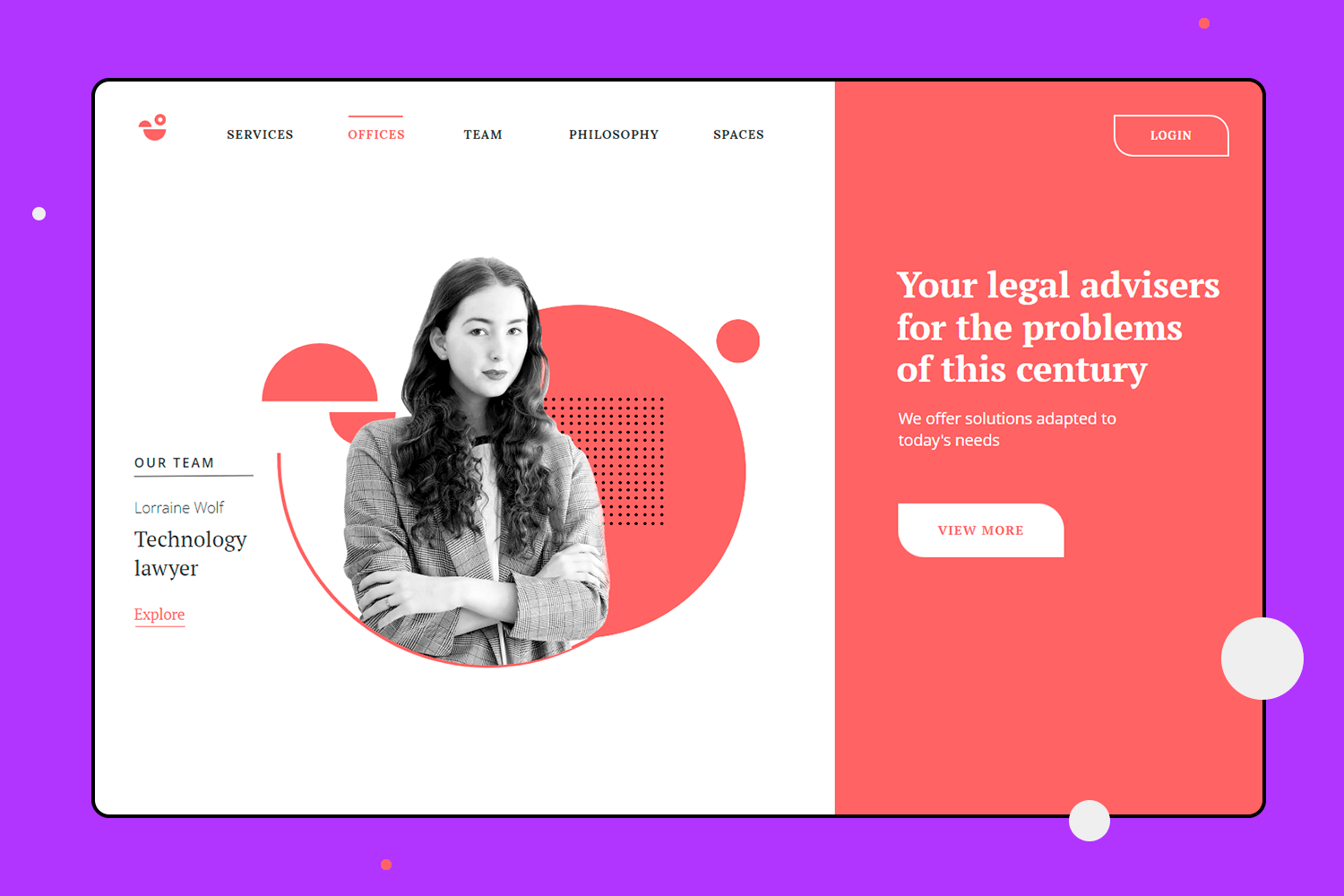
This time, we have a UI design example about legal services, that’s both modern and bold. The homepage pops with bright red and a clear message that grabs your attention. Getting around is easy with simple links to check out services, offices, and the team. This layout is perfect for a law firm that wants to be friendly and professional at the same time.
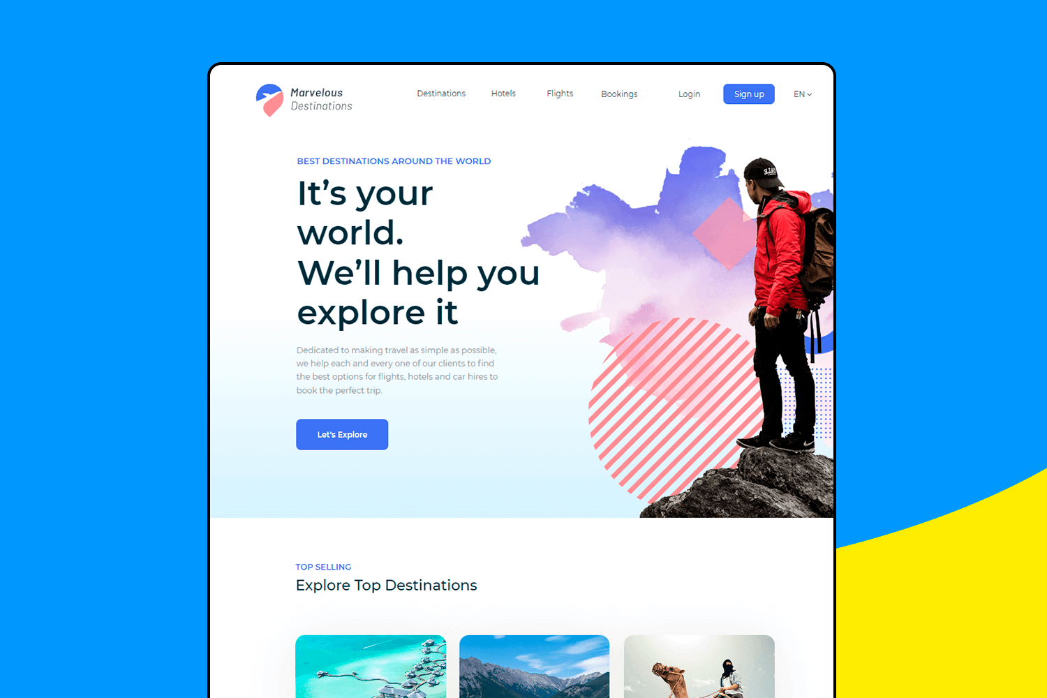
Moving on to this travel booking site, it keeps the adventure vibe going strong. The homepage is welcoming, with a bold message inviting you to explore the world. Everything is designed to make planning your next trip as simple as possible, so you can focus on the fun part – choosing where to go next.
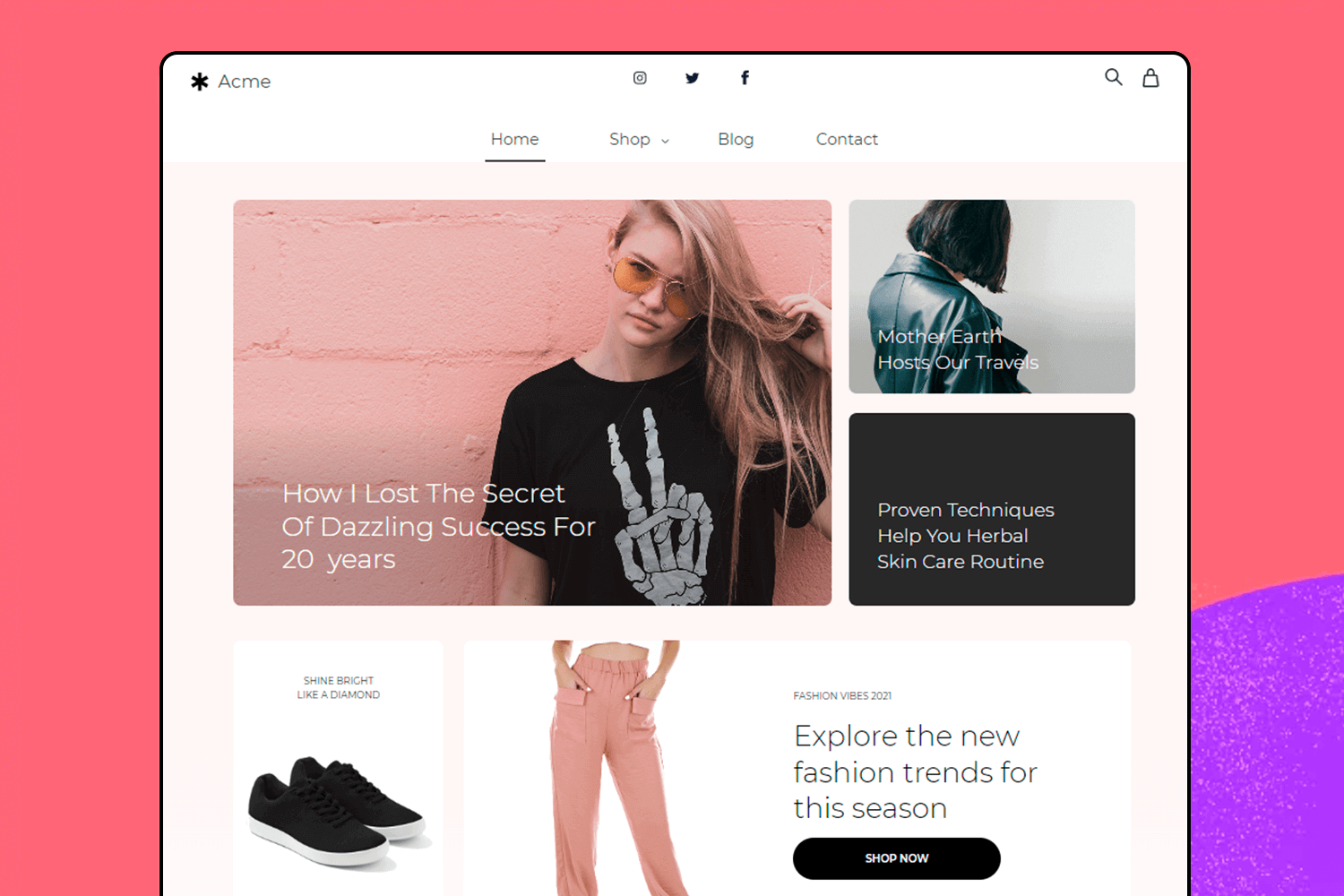
For this UI design example, the main focus is on fashion and lifestyle content. It showcases a mix of blog posts, products, and trends in a sleek and stylish layout. The homepage features a big, eye-catching image that draws you in, with neatly organized sections for shopping, reading, and exploring new trends. The navigation is quite simple, making it easy to jump from one section to another.
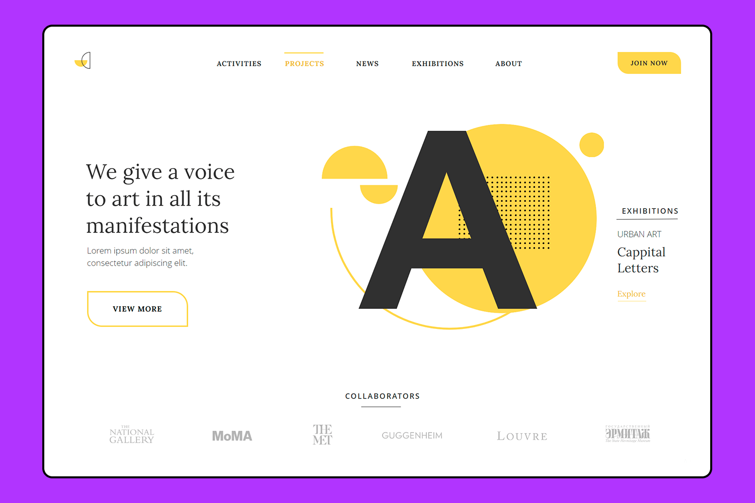
This art project example has a cool, modern vibe. The bright yellow on the homepage really pops and grabs your attention. It’s fairly easy to find your way around with clear sections for activities, projects, and exhibitions. This UI design is perfect for an art gallery or a creative studio that wants to show off their work in a fresh and engaging way.
Make your favorite UI examples interactive with Justinmind

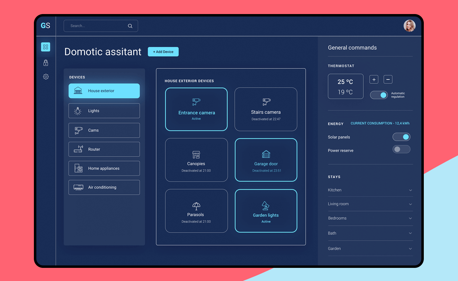
Now, let’s explore this home automation UI example. It’s perfect for managing your smart home effortlessly. See all your devices, like lights and cameras, right on the main screen. Adjust your thermostat, monitor energy use, and manage solar panels easily. The sleek, dark design is user-friendly and looks great on any device.
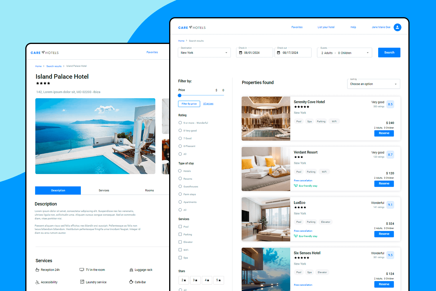
Ready to plan your next getaway? This hotel booking example makes it fast and easy. Start by choosing your destination, check-in and check-out dates, and the number of guests. The clean, straightforward design lets you browse through last-minute hotel deals with gorgeous images and prices clearly displayed.
No matter if it’s on the phone or computer, the site looks great. Users can save their favorite hotels with just a click, and the search bar helps you quickly find the perfect spot. Booking a stay is now simple and stress-free.
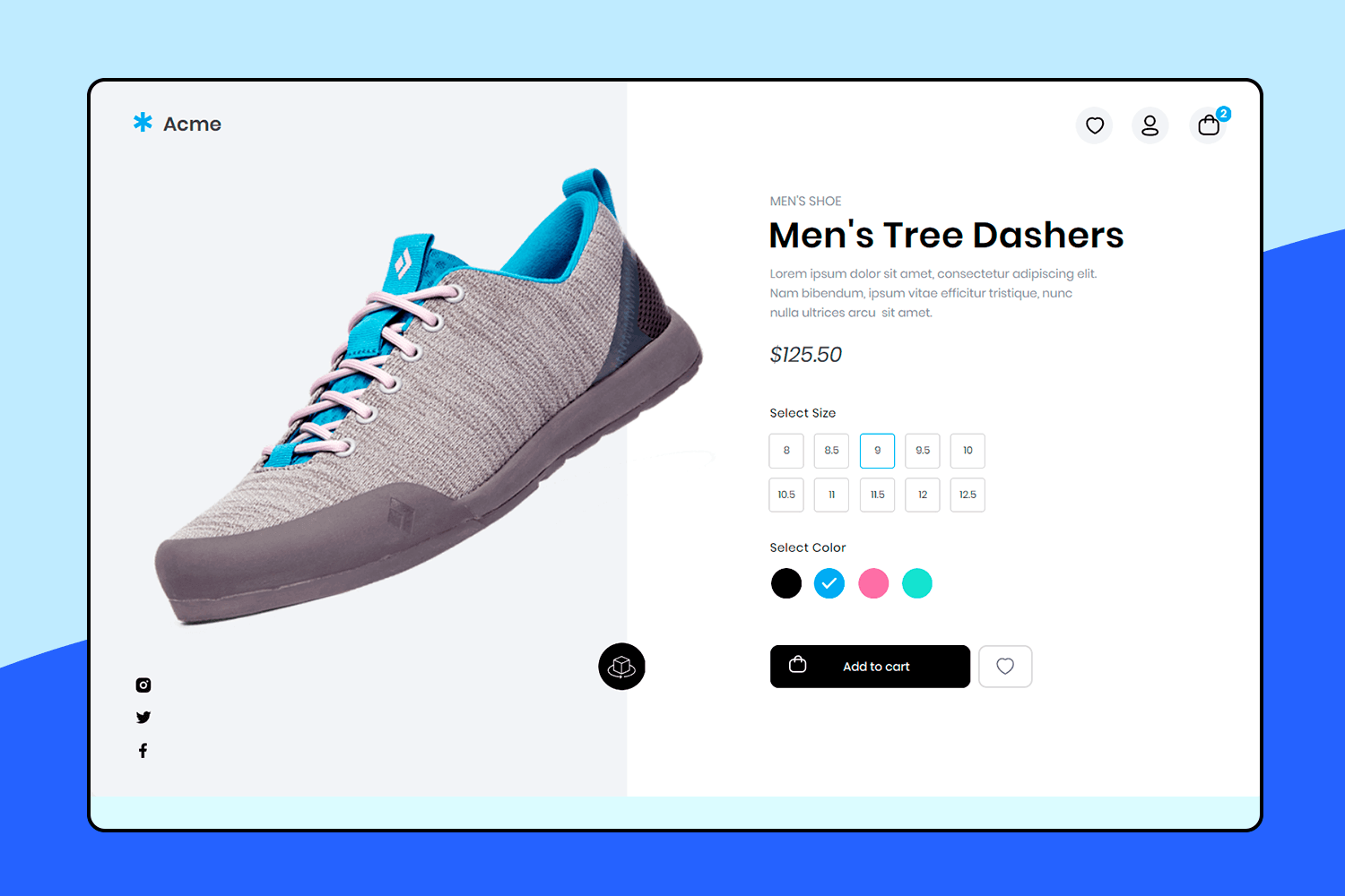
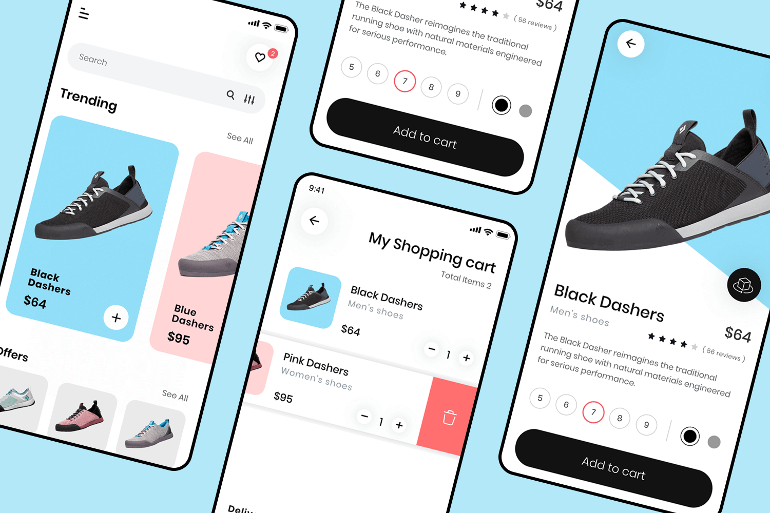
Leave it to this UI design example to make shopping for shoes a breeze. First, you get a big, clear picture of the shoe right at the top, also picking your size is easy with clickable buttons, and you can choose your favorite color, too. The price is shown clearly, so you know exactly what you’re paying.
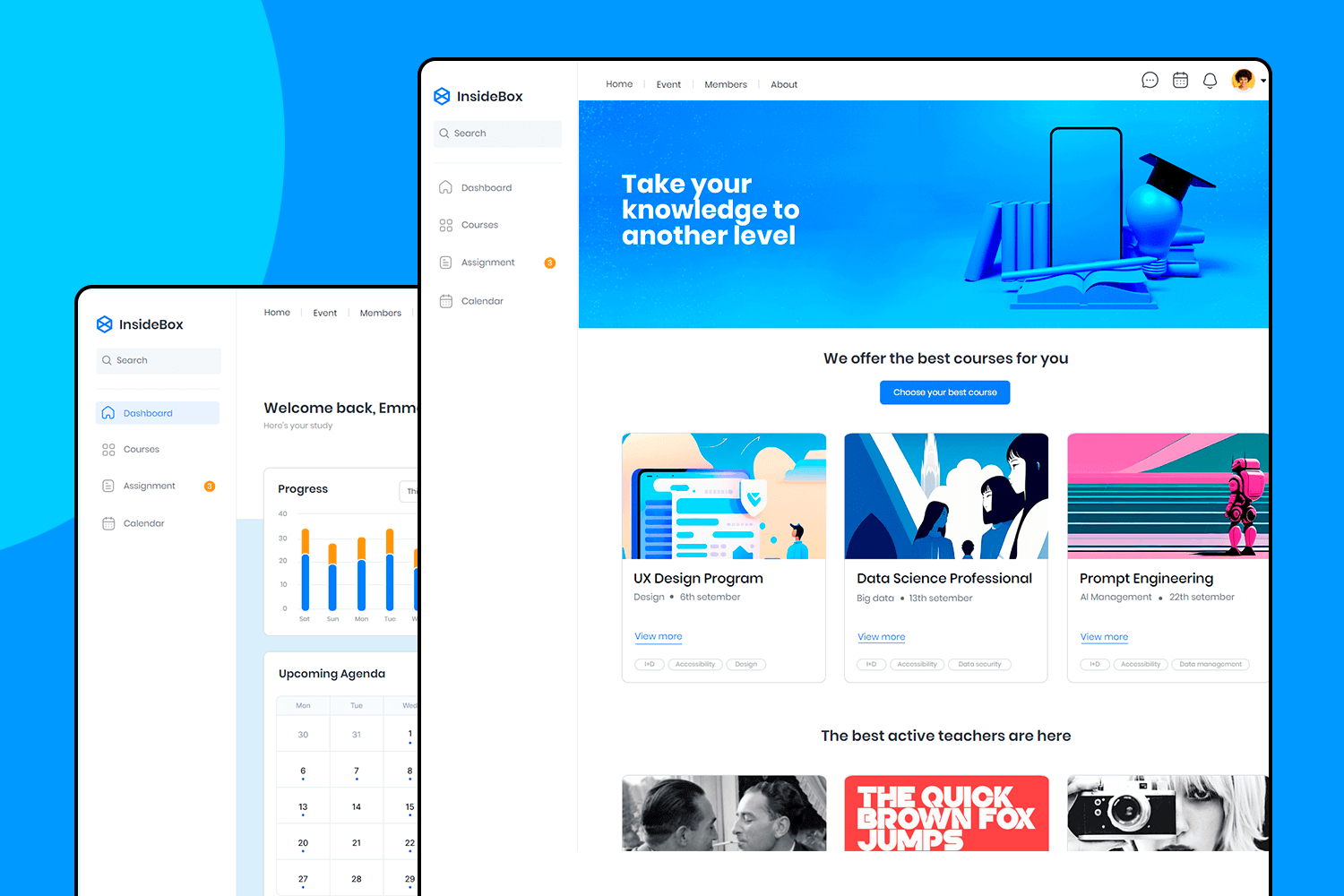
Just like our previous template, this e-learning dashboard is all about keeping things organized and easy. You can see your progress with colorful charts right on the main screen. Courses are listed with completion percentages, so you know where you stand. The upcoming agenda keeps your schedule neat and tidy, while the assignments section tracks what’s due.
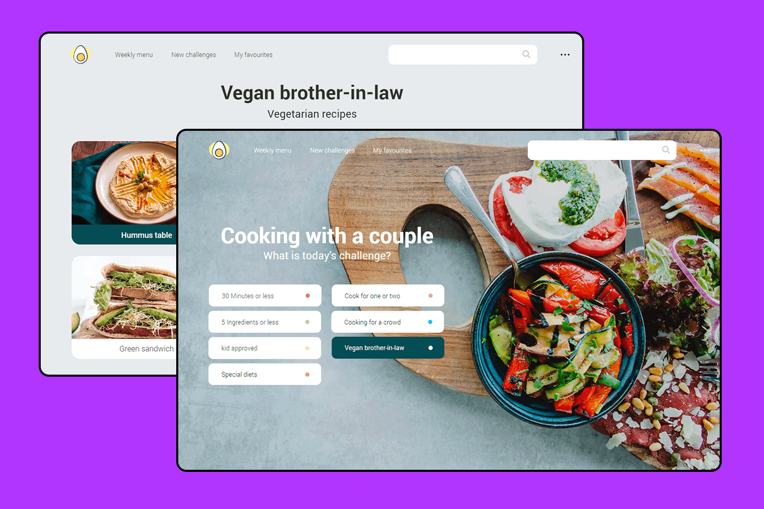
This vegan cooking app is designed for those who love experimenting in the kitchen. With its friendly and easy-to-use interface, you can quickly choose recipes based on different challenges like time limits, the number of ingredients, or special dietary needs.
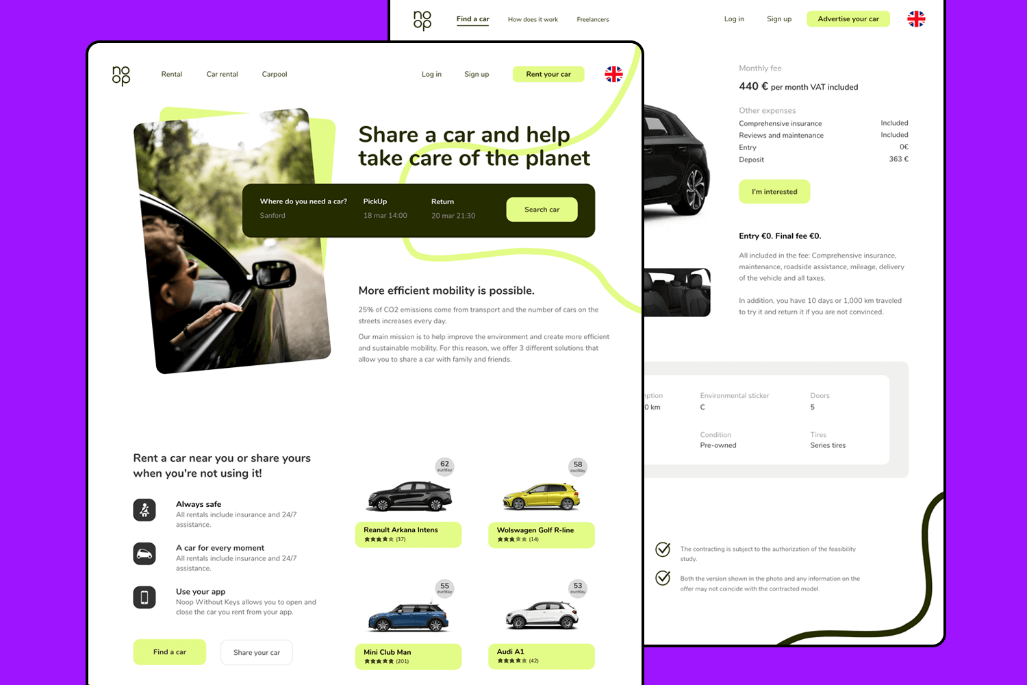
This car-sharing UI design example makes renting or sharing a car super easy. You can quickly choose your destination, pick-up, and return times. The clean and simple design is perfect for quick bookings. It also promotes eco-friendly travel by focusing on reducing CO2 emissions.
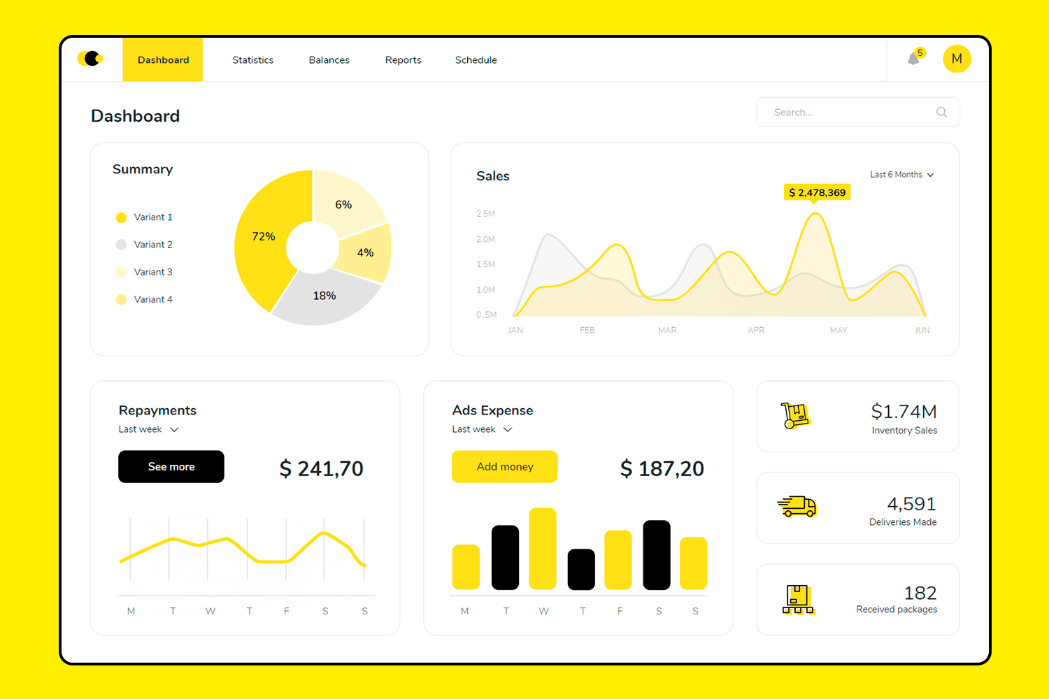
Continuing with our focus on user-friendly designs, this business UI design example makes it easy to keep track of your metrics. The main screen features clear, colorful charts for sales, repayments, and ad expenses, simplifying data analysis. The layout is neat and organized, with sections for statistics, balances, reports, and schedules.
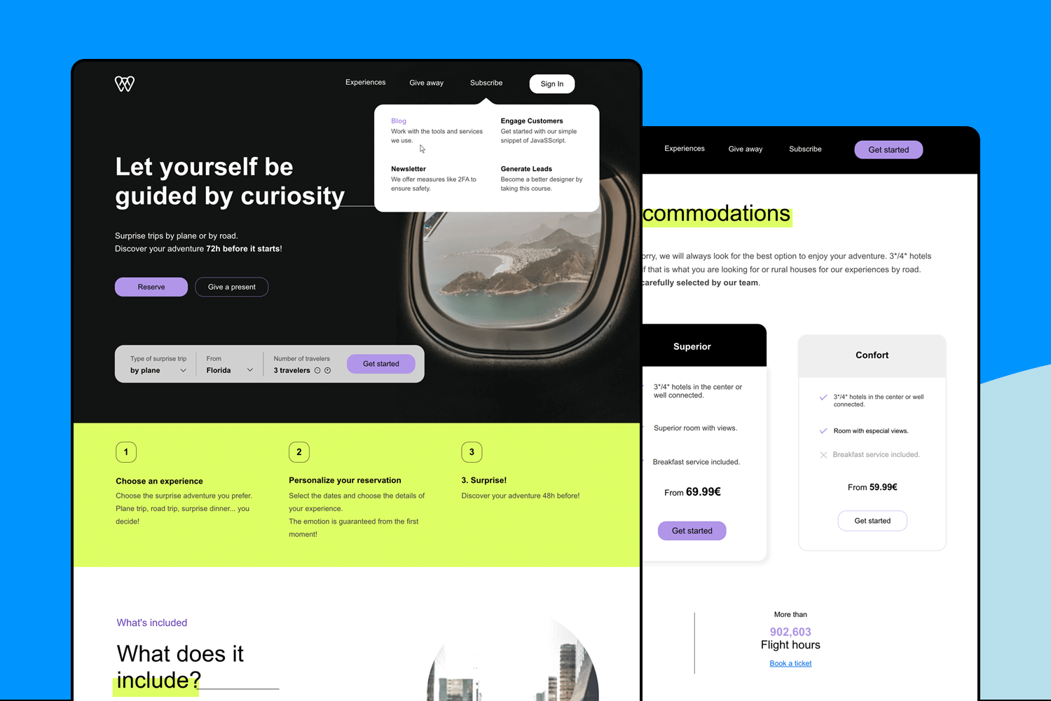
This travel booking UI design example platform is designed with thrill-seekers in mind. Its intuitive interface makes planning your next escapade very easy. The homepage’s tagline sets the tone for exploration. Easily filter your search by trip type, departure point, and group size. With clear, contrasting visuals and straightforward booking options, this UI design example makes finding and reserving your next adventure simple and exciting.
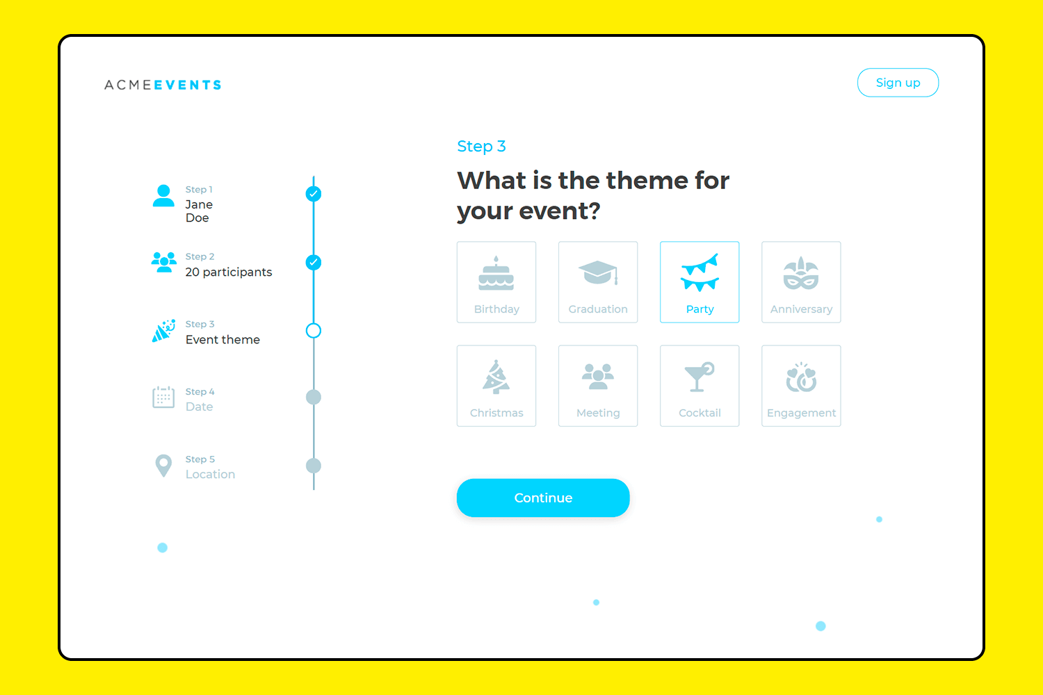
This one is all about simplicity. Planning an event? This template makes it effortless. It breaks down the process into clear steps: your name, participants, event theme, date, and location. The clean and minimalist layout is user-friendly, guiding you through each step smoothly. You always know where you are in the process, making it stress-free to fill in your details.
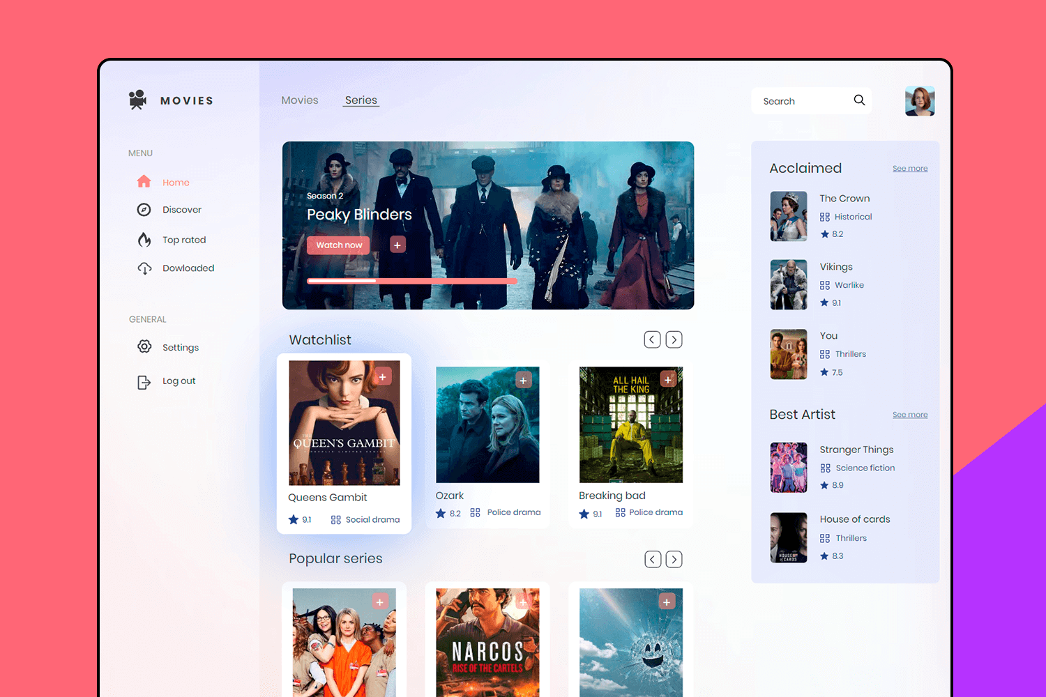
Here’s a simple and clean UI design for a streaming service. The homepage keeps everything organized, with your watchlist, popular shows, and top picks all easy to find. It’s really straightforward, so you can quickly spot something to watch. Whether you’re browsing or searching for a specific show, this design makes it all feel effortless. Everything is right where you need it, making the whole experience smooth and enjoyable.
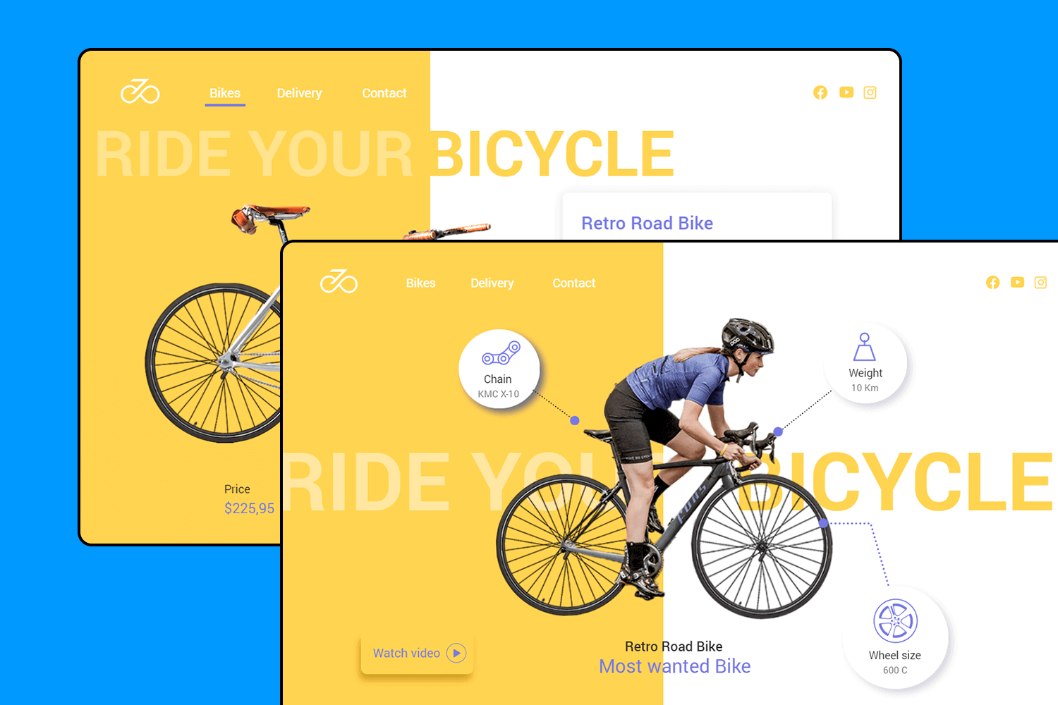
Let’s check out this bicycle shop’s UI design. The homepage is bright and engaging, with a focus on showcasing the bike’s features like weight, chain type, and wheel size. The design is simple, making it easy for users to explore different bike models. The navigation is straightforward, with quick access to the options. This layout is perfect for a shop looking to highlight its products in a clean and modern way.
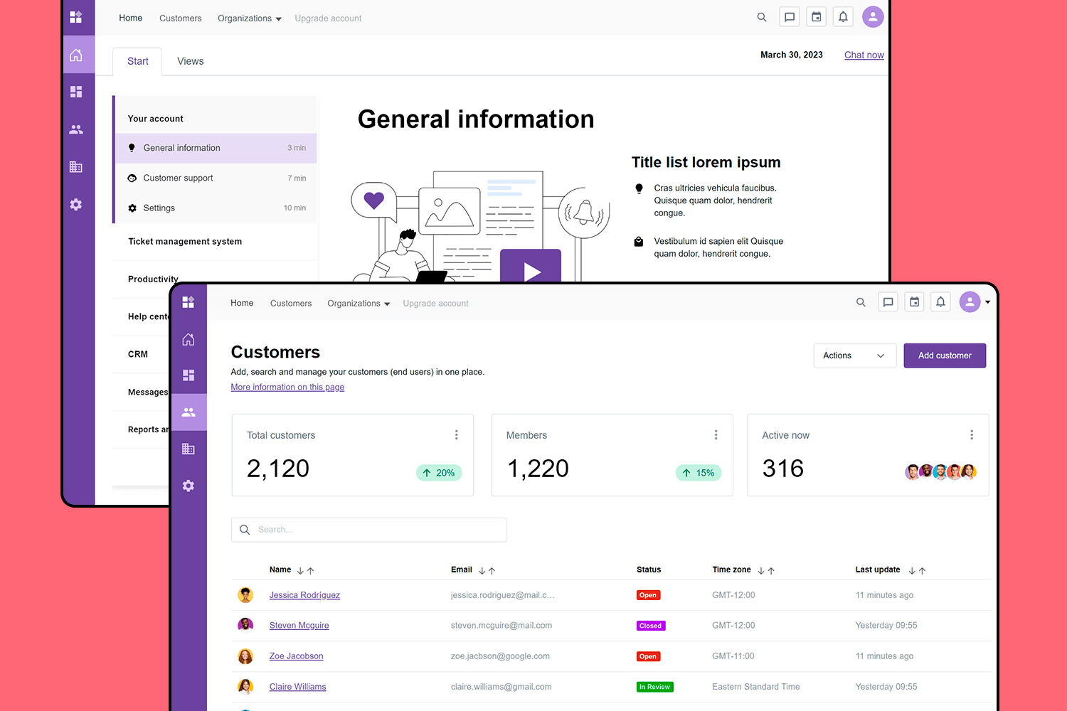
This UI design example is set up to keep everything simple and straightforward. You can easily manage customer details, track who’s active, and handle support tickets, all in one place. The design feels intuitive, so you don’t have to think too hard about where to find what you need. It’s perfect for staying organized and keeping things running smoothly without any extra hassle.
Here’s an intuitive and clean UI design for a streaming service. The homepage keeps everything organized, with your watchlist, popular shows, and top picks all easy to find. It’s really straightforward, so you can quickly spot something to watch. Whether you’re browsing or searching for a specific show, this design makes it all feel effortless.
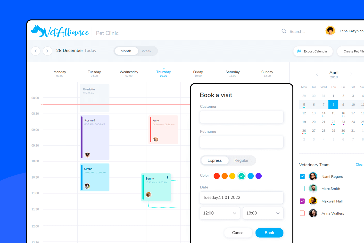
This UI design example showcases a vertical navigation sales dashboard. It’s perfect for getting a clear overview of your business metrics, from sales numbers to revenue and operations. The dashboard is organized and easy to follow, with sections for market overview, sales analytics, and reports. The navigation on the left side keeps everything within reach, allowing you to quickly switch between views.
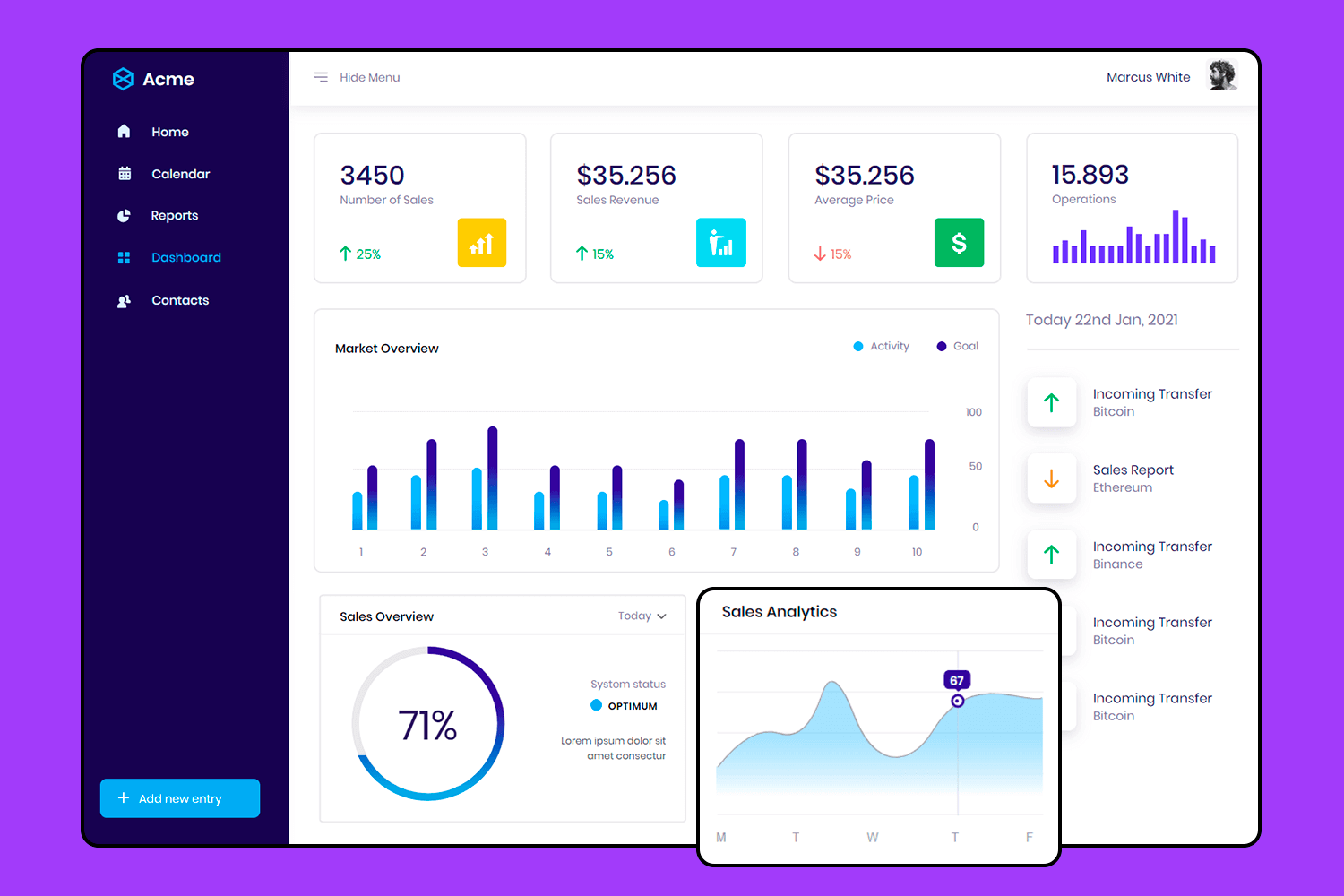
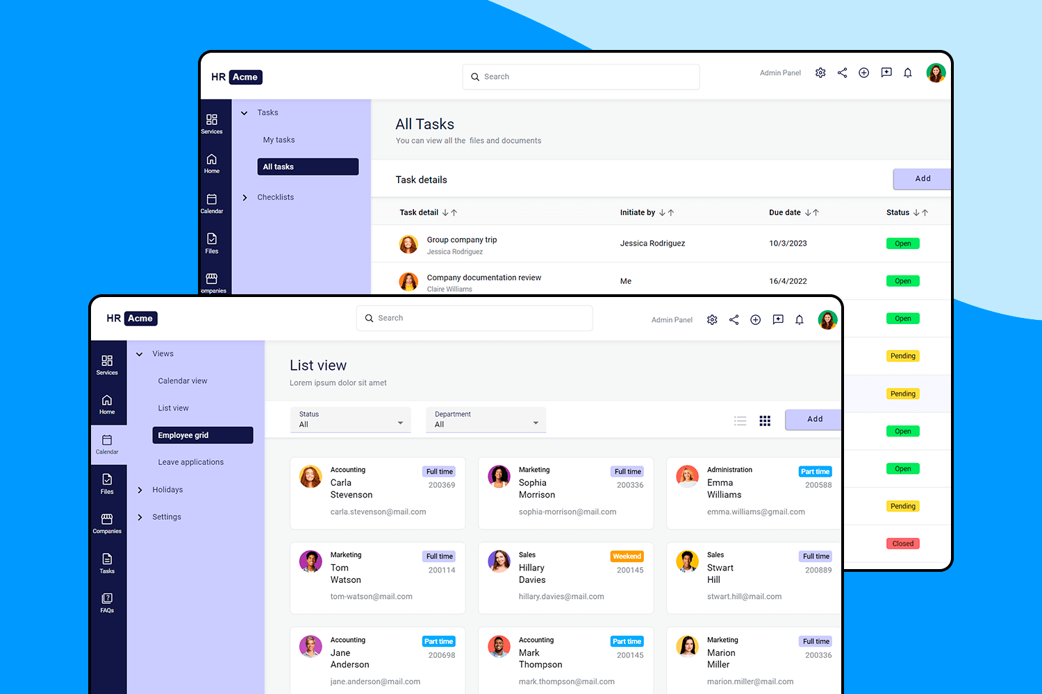
Here we have like a superhero for HR managers. It makes juggling tasks, keeping tabs on deadlines, and managing employee info a total breeze. With everything neatly organized into sections, finding your way around is convenient—like having a personal assistant for HR.
Make your favorite UI examples interactive with Justinmind

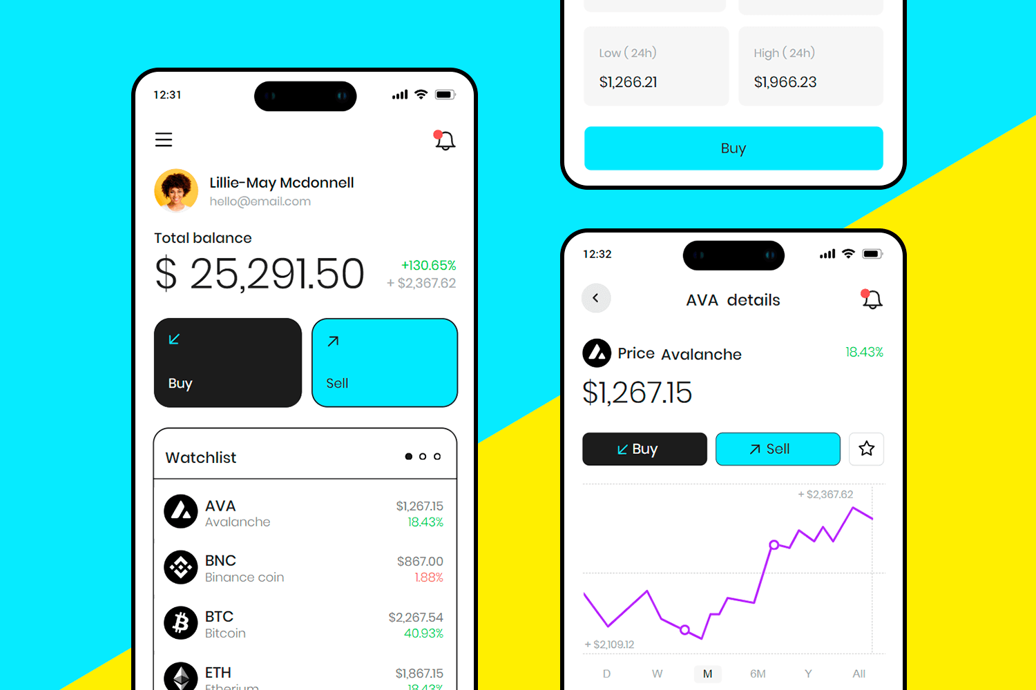
Let’s jump into this clean and engaging mobile interface. It’s designed for those who are into cryptocurrency trading, making every transaction clear and straightforward. You can easily view your balance, track price changes, and make quick decisions on buying or selling, so you can focus on what matters most: your investments.
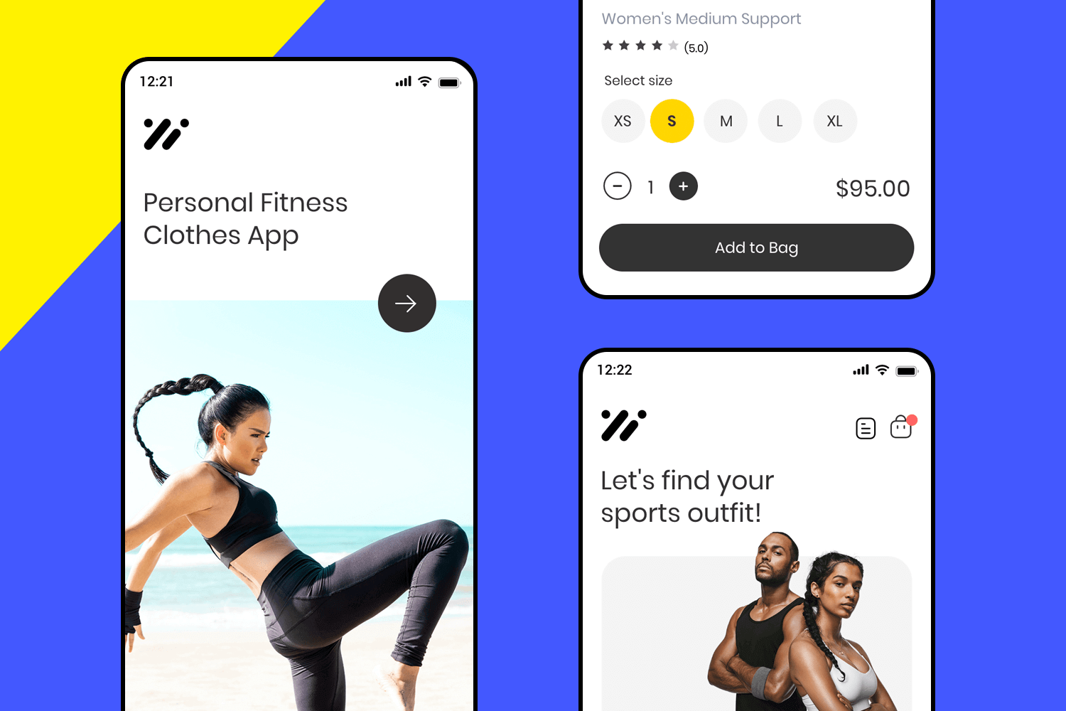
Looking for workout clothes? This app makes it simple. Just scroll through, pick your size, and you’re good to go. The UI design is sleek and user-friendly, so you can find what you need without any hassle. Everything is laid out clearly, making your shopping experience easy. It’s like having a quick, personal shopping assistant right on your phone.
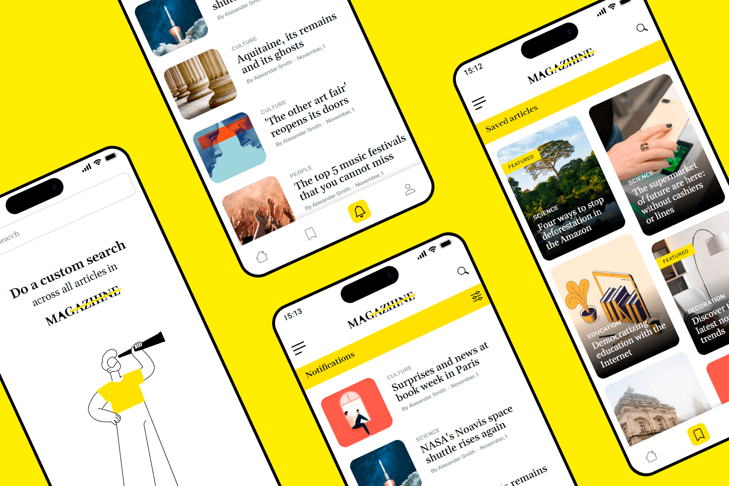
This magazine app UI design is perfect for reading enthusiasts. Its bright yellow and white color scheme creates a lively yet easy-on-the-eyes experience. With intuitive navigation, you can effortlessly browse articles, switch between featured stories, access saved content, and perform custom searches in no time.
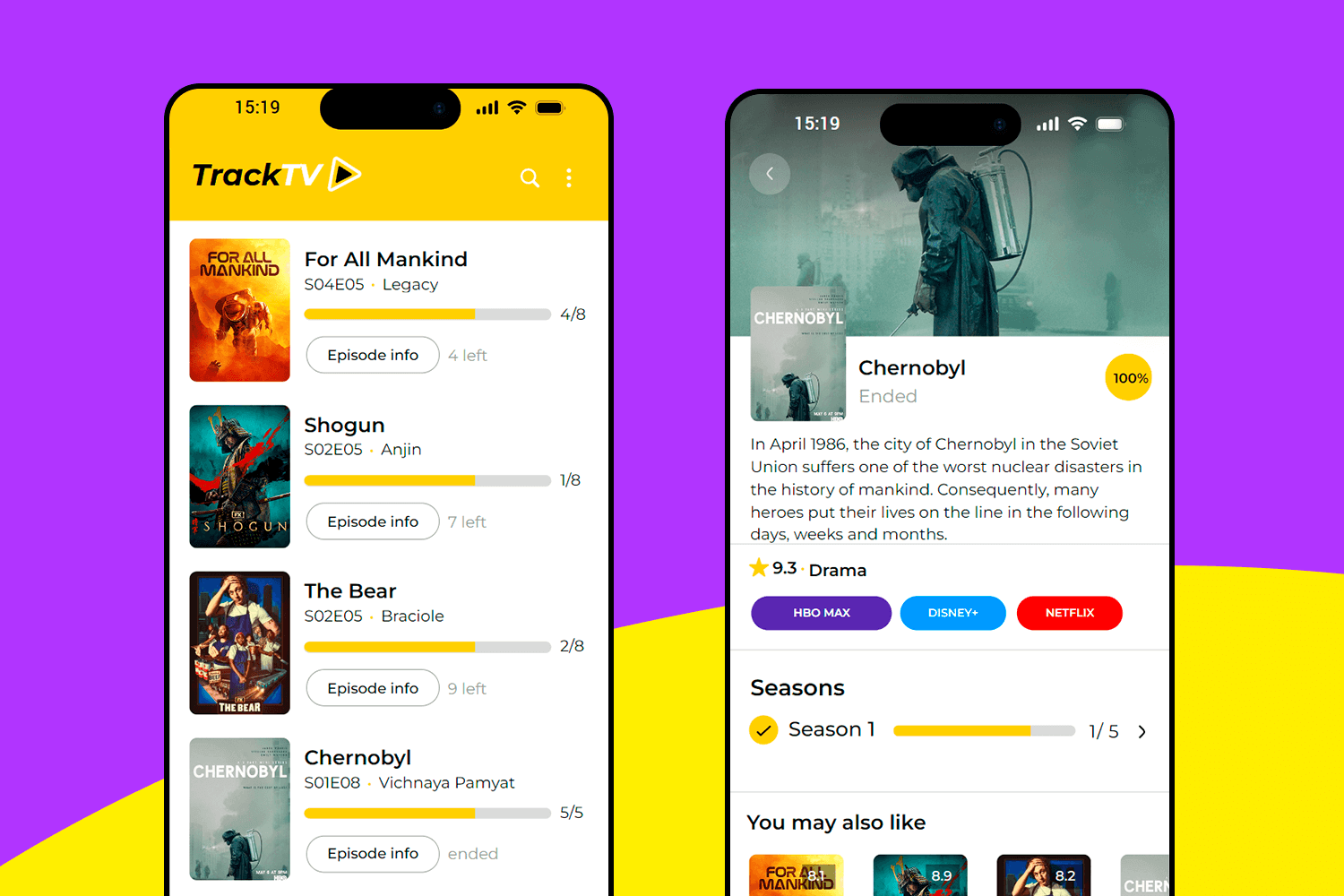
This UI design example for TV lovers makes keeping up with your favorite shows feel like second nature. It gives you an easy way to see where you left off, and with just a quick tap, you can dive into the details of each series. The whole experience is seamless, letting you focus more on enjoying your shows rather than managing them.
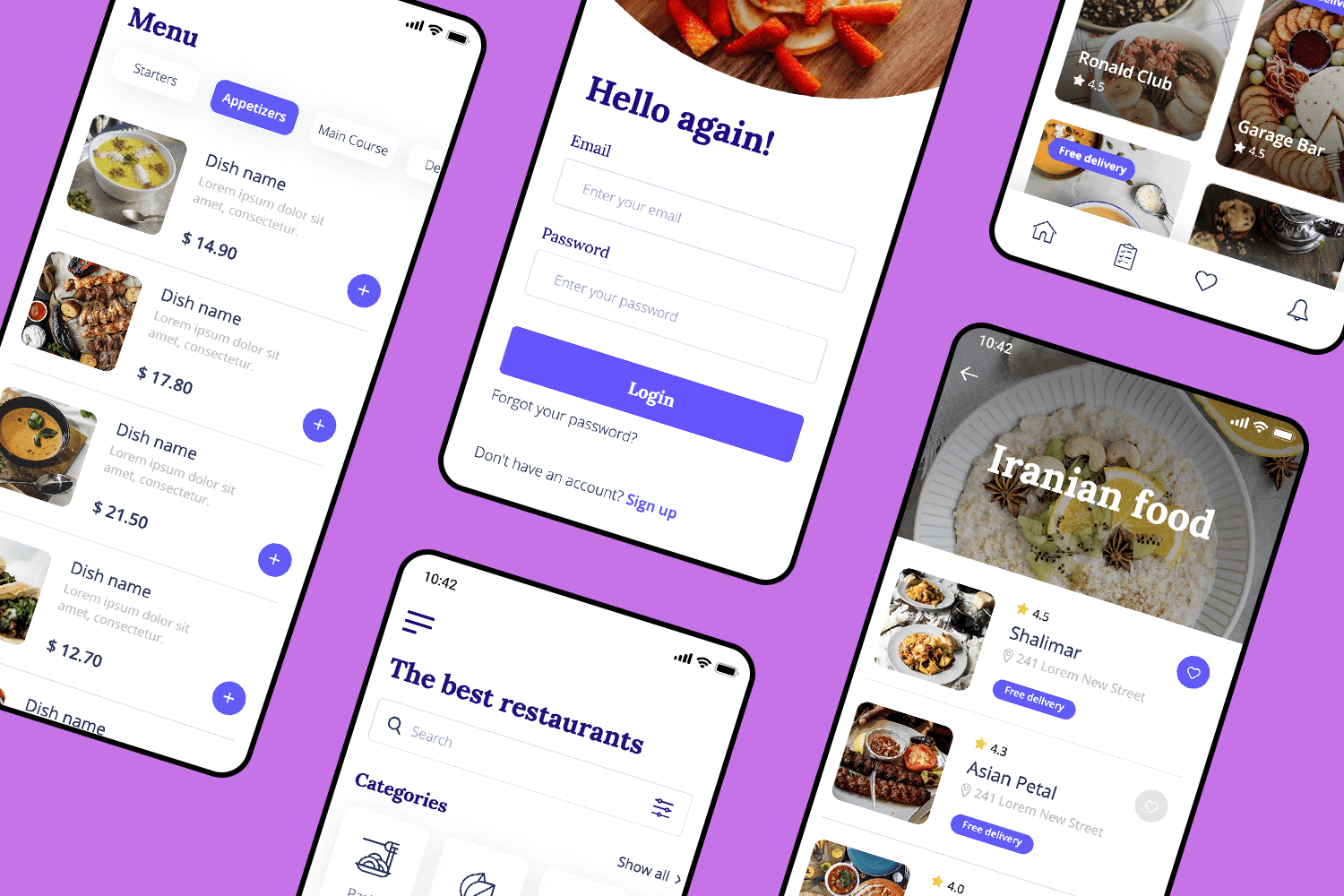
This app is like having a personal food guide in your pocket. You just need your email to dive into a world of food options. The menu is clear and straightforward, so you can easily find your favorite dishes or explore new tastes. It’s fun to discover new restaurants based on what you like.
This one’s all about making shopping an easy experience. The UI design makes it quick and smooth to find what you’re looking for. Everything is laid out clearly: product images, prices, and options like size or color. Adding items to your cart is effortless, and the checkout process is just as easy.
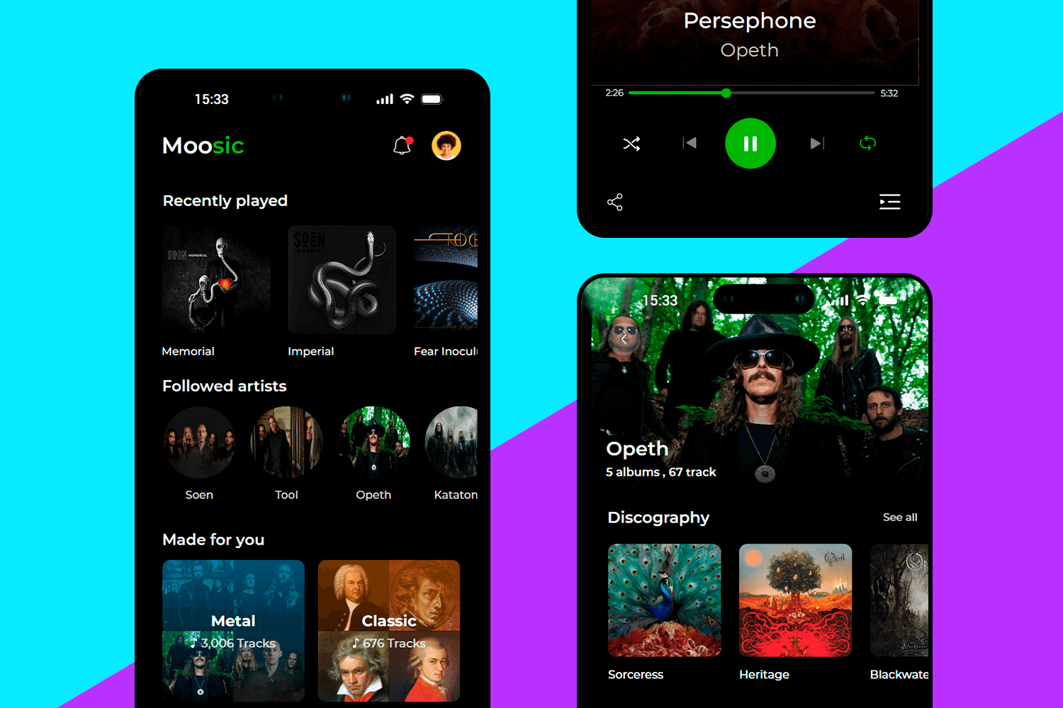
This UI design example for music apps is designed to keep your tunes at your fingertips. Start with your “Recently Played” to jump back into your latest favorites. Want to stay updated? The “Followed Artists” feature keeps you in the loop with the bands you love. Everything’s organized, so your favorite tracks are always just a tap away!
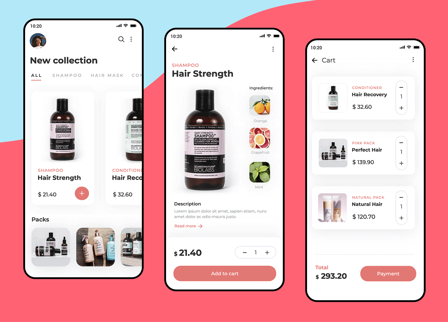
Here’s an app that makes purchasing hair products effortless. It’s really easy to explore new products, learn about them, and see exactly what’s inside. Checking out is a piece of cake too. This UI app design has everything to make shopping fun and easy.
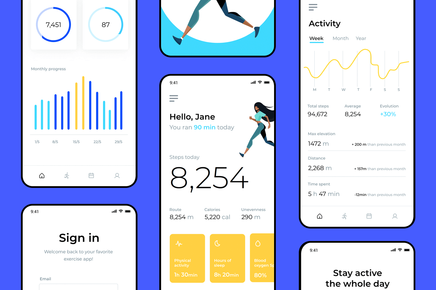
We love this UI design example because it feels like a personal cheerleader. It’s easy to see how you’re doing with your steps, sleep, and other goals at a glance. Plus, it’s nice to see your name when you open the app – it makes you feel like you’ve got a little extra support.
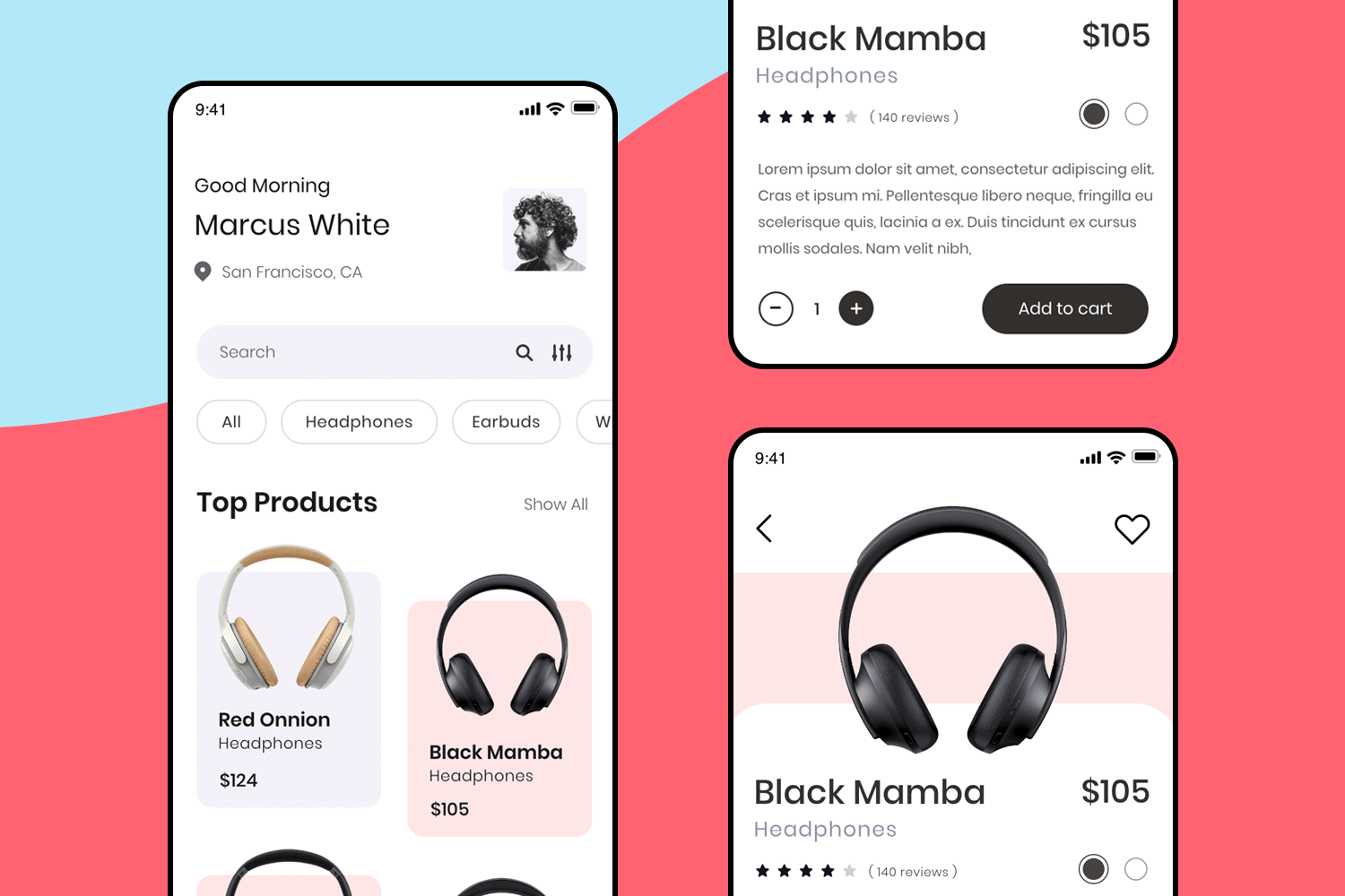
If you’re shopping for headphones, this layout is designed should be your go to. Right up front, you can see top products complete with prices and reviews. The product pages are clean and give you all the details you need. It’s an efficient shopping experience that’s straightforward and user-friendly, guiding you smoothly from browsing to checkout.
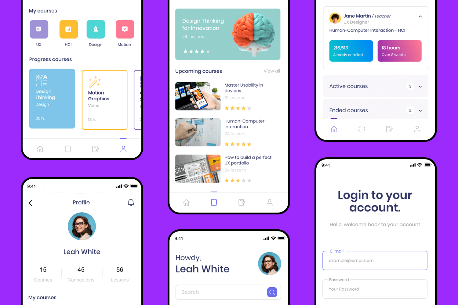
This app design takes online learning to the next level. With a welcoming dashboard, you can see your progress, upcoming courses, and what you’ve completed, all in one glance. It’s significantly easy to navigate through your lessons, track your time, and check out new content. And with a quick login, you can easily get back to your courses without any hassle.
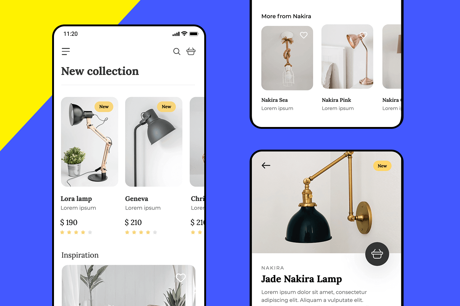
Browsing through this lamp collection is intuitive and simple. Each product is displayed with a clear image, price, and a brief description, so you can quickly find what catches your eye. The design also suggests similar items, helping you discover similar options with no trouble.
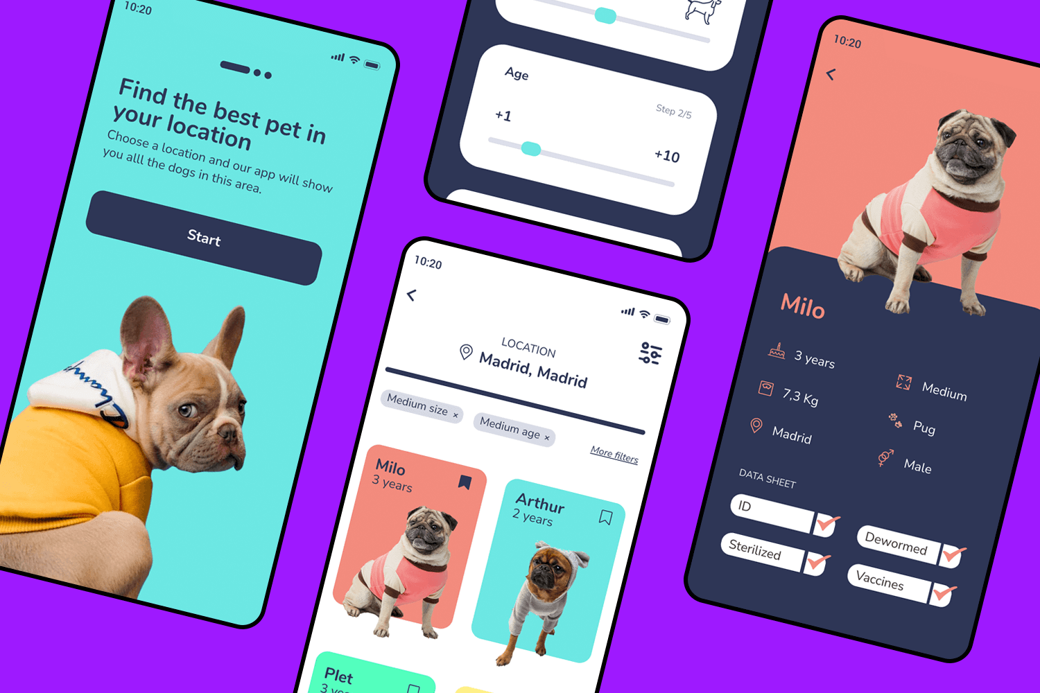
This UI design example makes finding your perfect pet smooth and fun. Just pick your location, and it shows all the available dogs nearby. You can filter by size, age, or other preferences to find the best match. The design is cute and straightforward, making the whole process feel user-friendly and enjoyable.
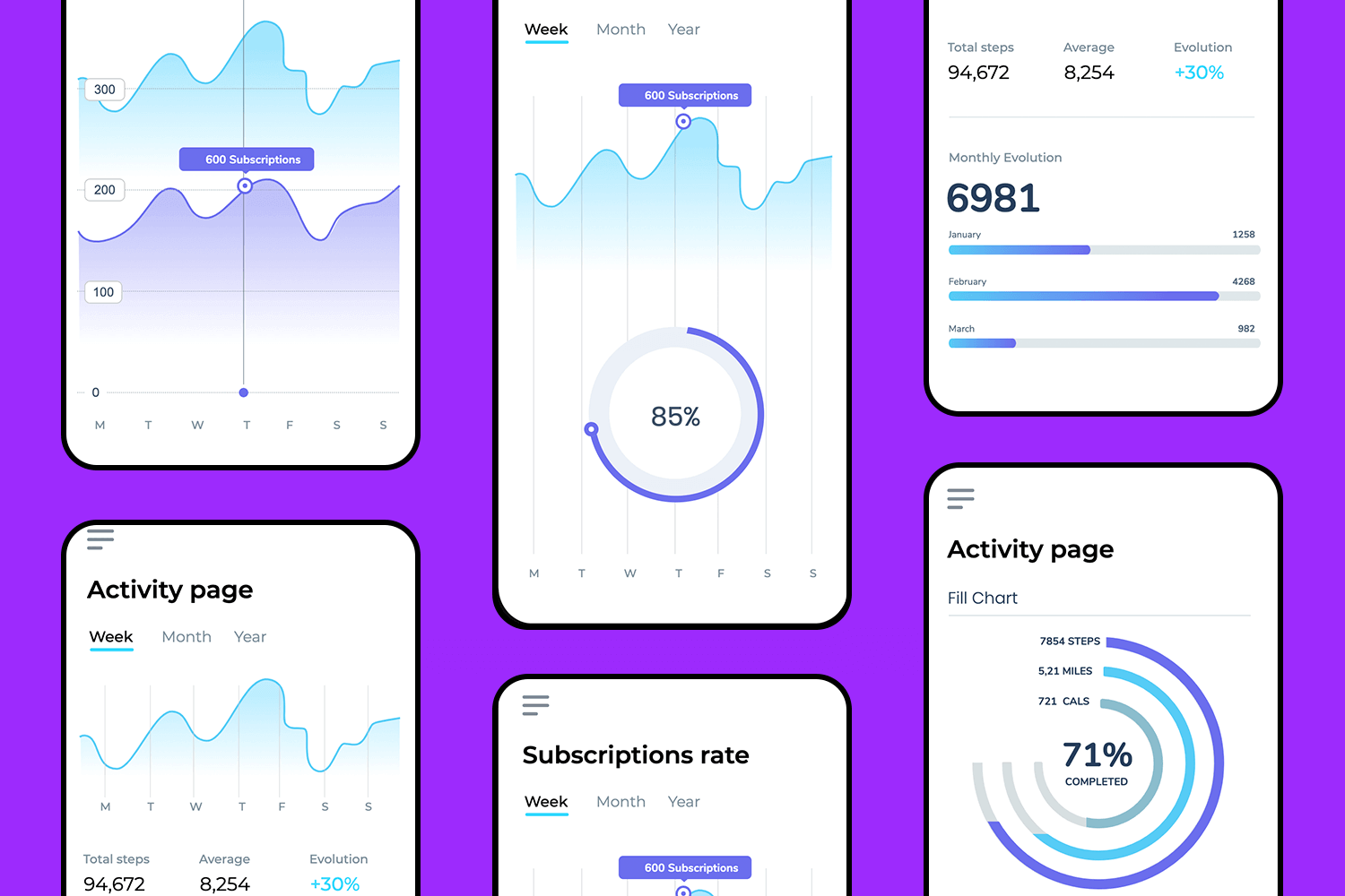
To track your progress, simply visit the activity page. It presents all the key details in a clear and intuitive way. Easily monitor your data, keep up with your subscriptions, and view a graph that simplifies everything at a glance.
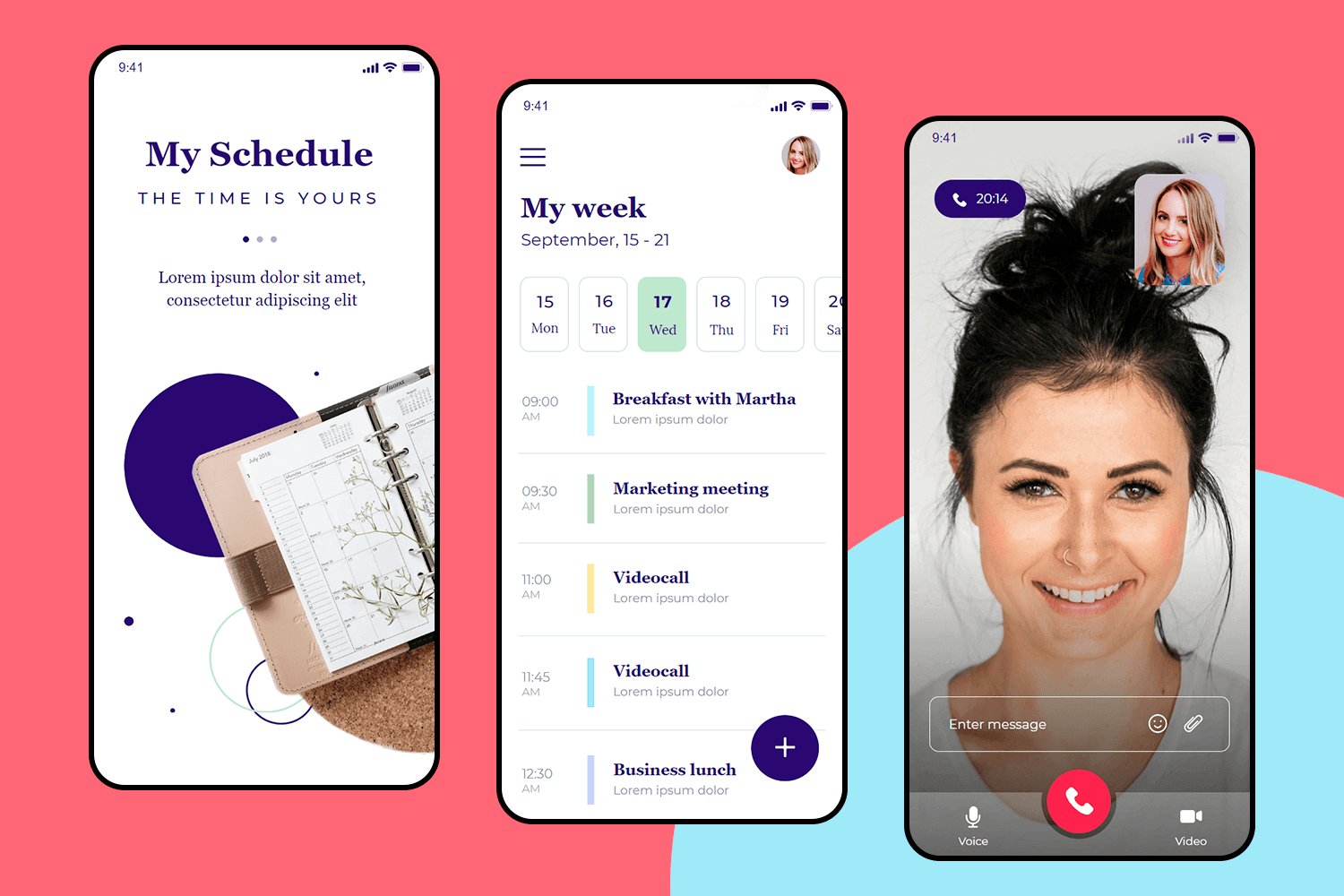
Alright, here we are with our last example. This scheduling app is all about making your life easier. The UI design is smooth and simple, so you can quickly plan your week and see what’s coming up. Need to jump on a video call? It’s just a tap away. So, with this final example, you’re all set to keep your days running smoothly.
Make your favorite UI examples interactive with Justinmind

Branding is essential for making your UI feel uniquely yours. Start by incorporating your brand’s primary colors into buttons and headings for consistency. Create a complementary color palette—online tools can help with this. Consider the emotions your brand conveys and choose colors that align. Typography is just as important, so select fonts that enhance your brand’s identity.
Use your brand’s fonts for text, making sure they’re easy to read in different sizes. If you use more than one font, make sure they look good together. Keep it simple and don’t use too many. Create a clear visual structure with different font sizes for headings, body text, etc.

Lastly, place your logo where it’s easily seen, usually at the top. Make sure it’s not too big or small and always use the right version. Don’t forget the little icon in the browser tab (favicon)—that should match your brand too!
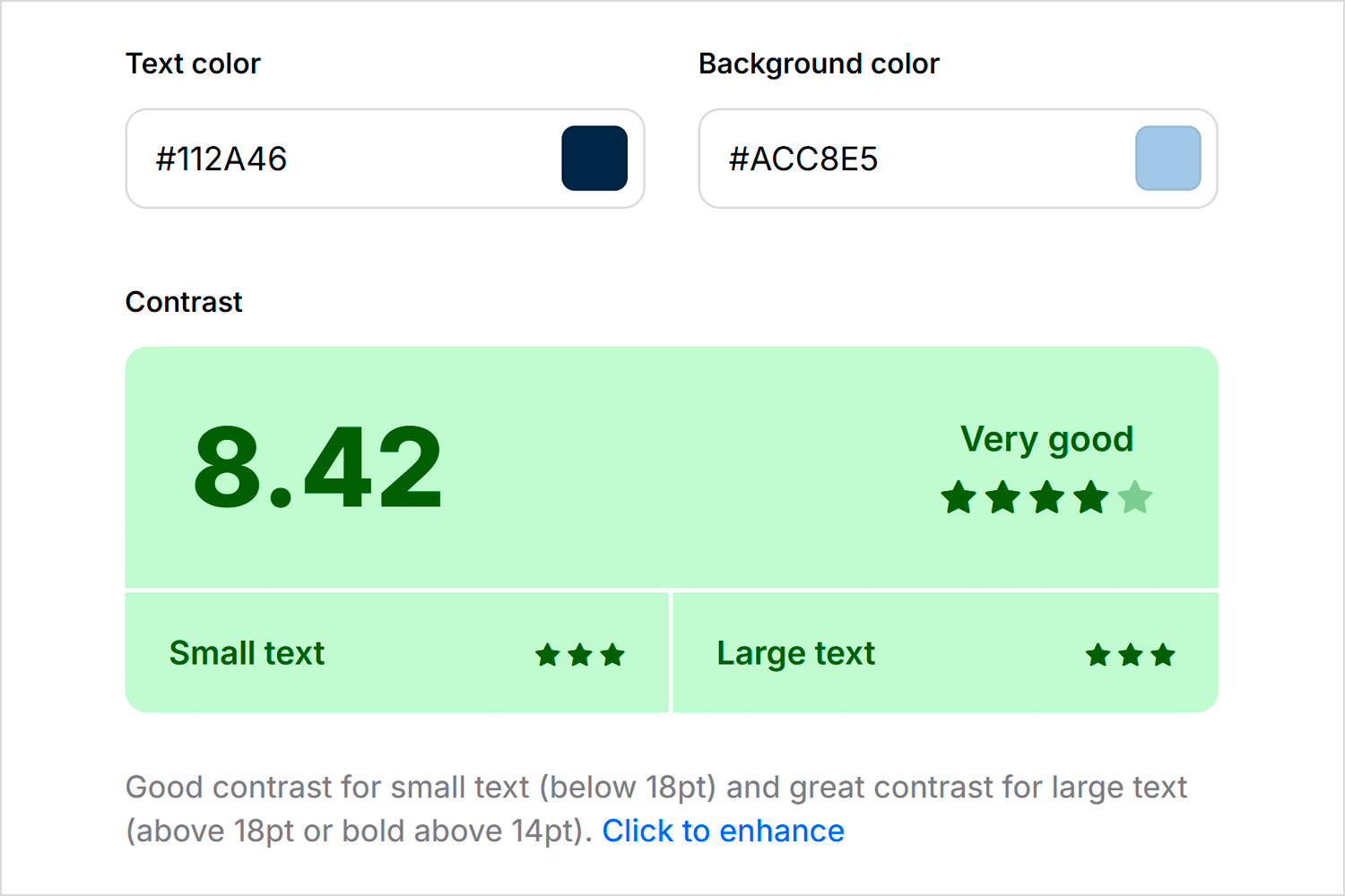
Making your UI accessible means everyone can use it. First, make sure there’s enough contrast between text and backgrounds so people can easily read it. Online tools can check this for you. Do the same for buttons and links. Use font sizes that are easy to read—avoid tiny text.
Testing is how you make sure your UI actually works for people. Get some people from your target audience to try it out. Give them tasks to complete and watch how they do it. Ask them for feedback!
You can also test multiple UI versions with different user groups to determine which performs best. Use analytics to see how people are using your UI in the real world—what are they clicking on? What are they ignoring? Use all this info to make your design even better. It’s all about continuous improvement!
Even with the most inspiring designs, it’s helpful to see what works and what doesn’t. Let’s check out five examples that nailed it and five that missed the mark.
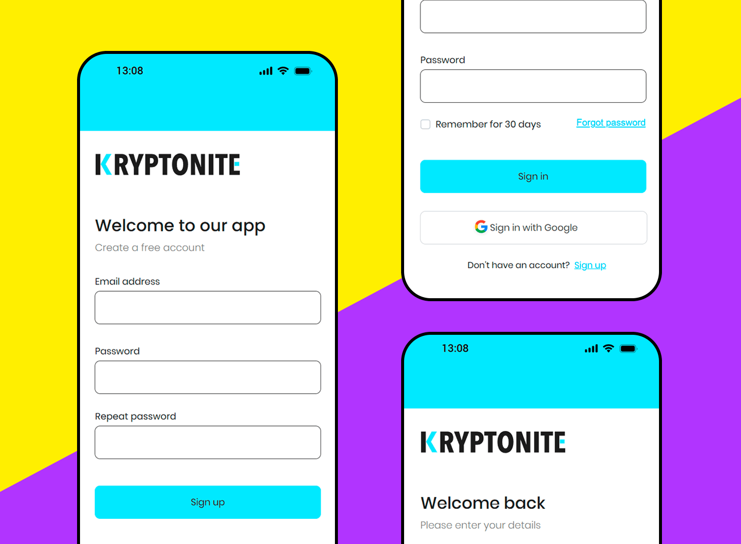
In contrast to cluttered and confusing sign-up forms, this UI design example stands out with its clean layout and user-centered approach. The Kyrptonite sign-up form fields are logically grouped, the error messages are clear, and the overall design promotes a positive user experience.
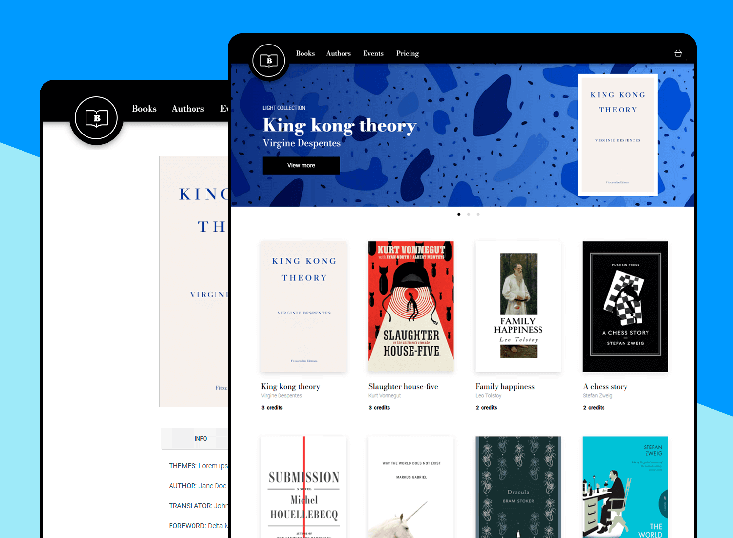
This UI design example presents a clean and modern approach to showcasing books online. From a UI perspective, it excels in several areas: clear visual hierarchy, effective use of whitespace, sophisticated typography, and a user-friendly carousel layout. The subtle background texture adds depth without competing with the content.
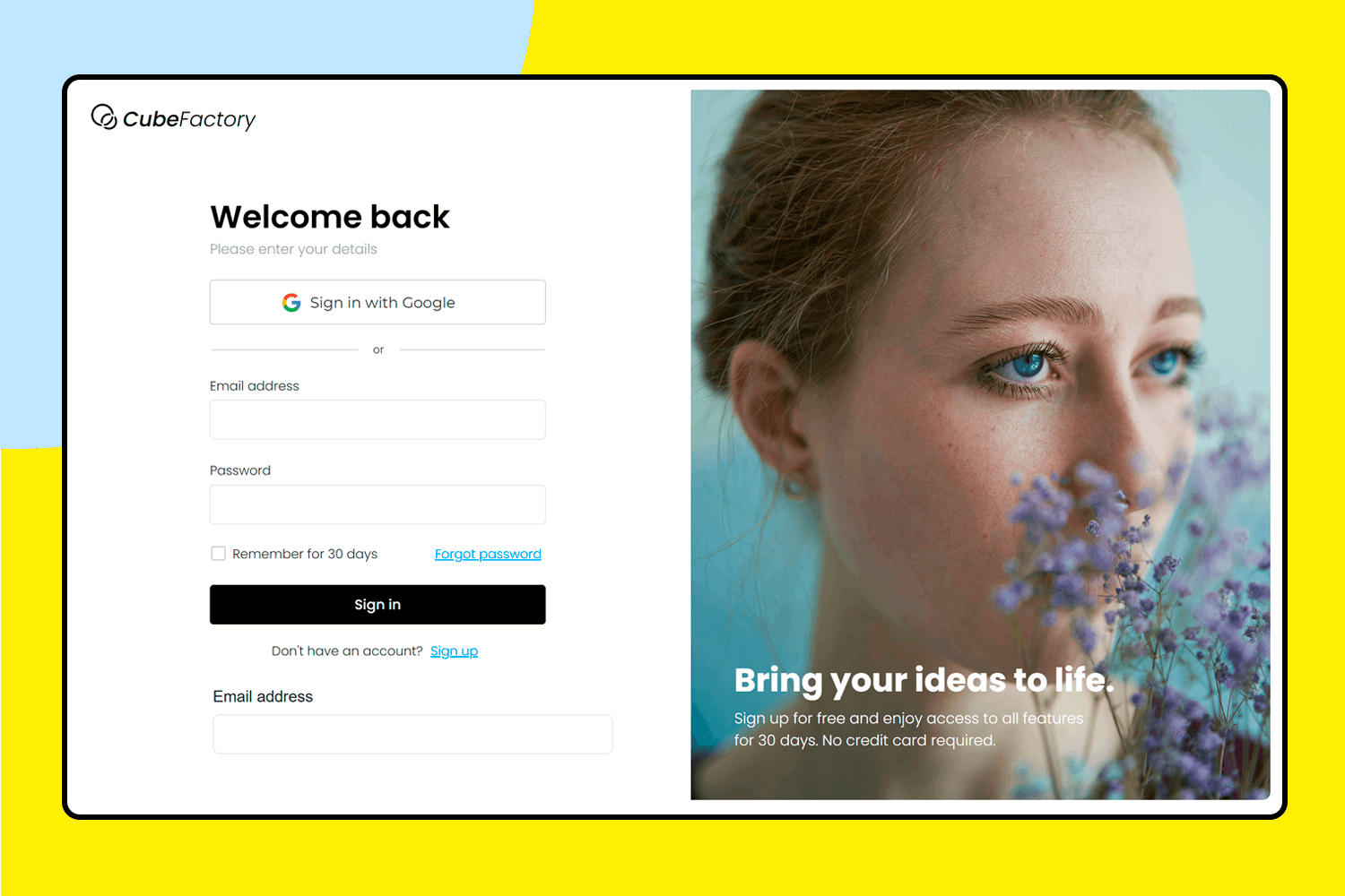
This UI design example effectively uses visual hierarchy to guide the user’s eye. The “Welcome back” heading is prominent, followed by the form fields. The contrasting colors of the buttons (“Sign in,” “Sign up,” “Sign in with Google”) help differentiate the actions. The use of a lighter background for the signup section visually separates it from the login area.
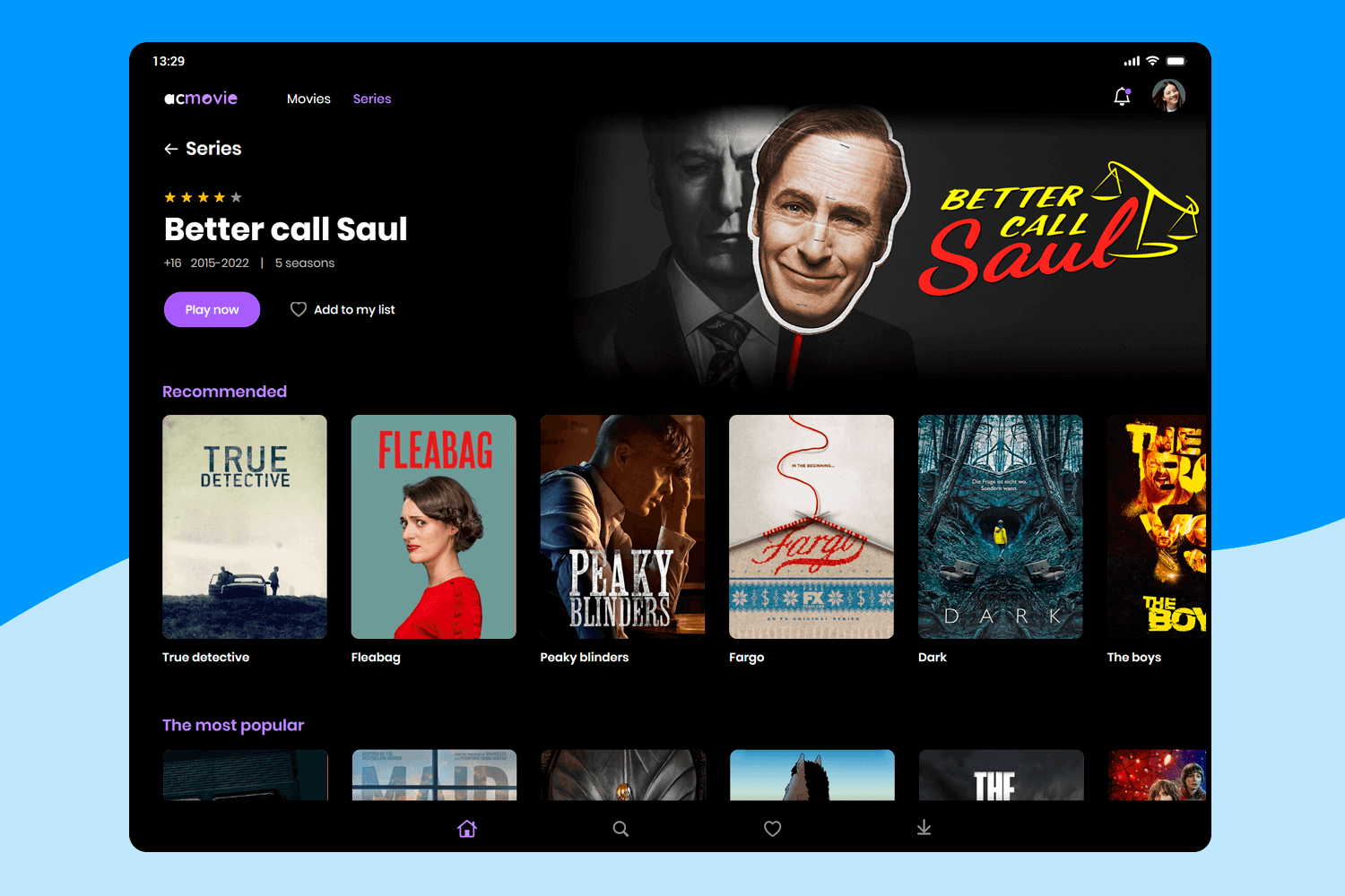
This UI design example demonstrates several UI best practices. The clear visual hierarchy, distinct call to action buttons, effective content grouping, and use of horizontal scrolling for related content create a user-friendly experience. The design effectively balances information density with visual clarity, making it a strong UI design example for a media streaming platform.
This UI design example caters to new users. The clear and concise form streamlines the user flow. The “Sign up to continue” message is a good example of onboarding, clearly communicating the purpose of the form. The “Already have an account? Sign in” link provides a clear path for returning users.
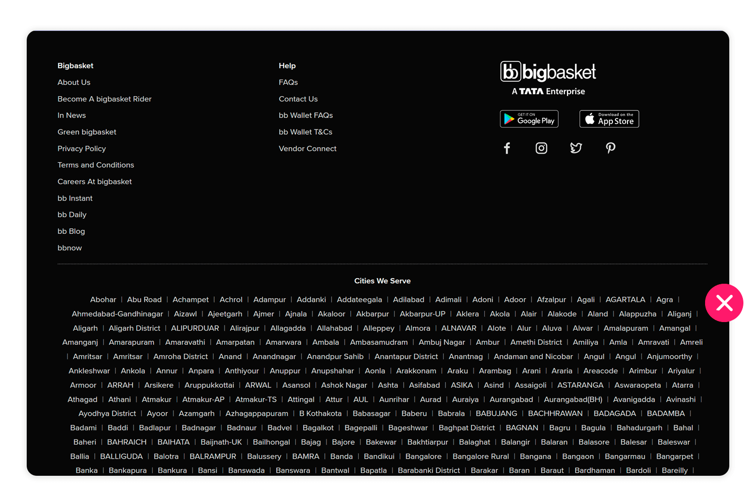
The current design of the Big Basket city list presents a significant usability issue. While the extensive list might initially appear impressive, the lack of interactivity diminishes its value. Users expect city names to be clickable links, leading to more specific information or tailored content. The current design, where the cities are simply listed as text, is both confusing and frustrating.
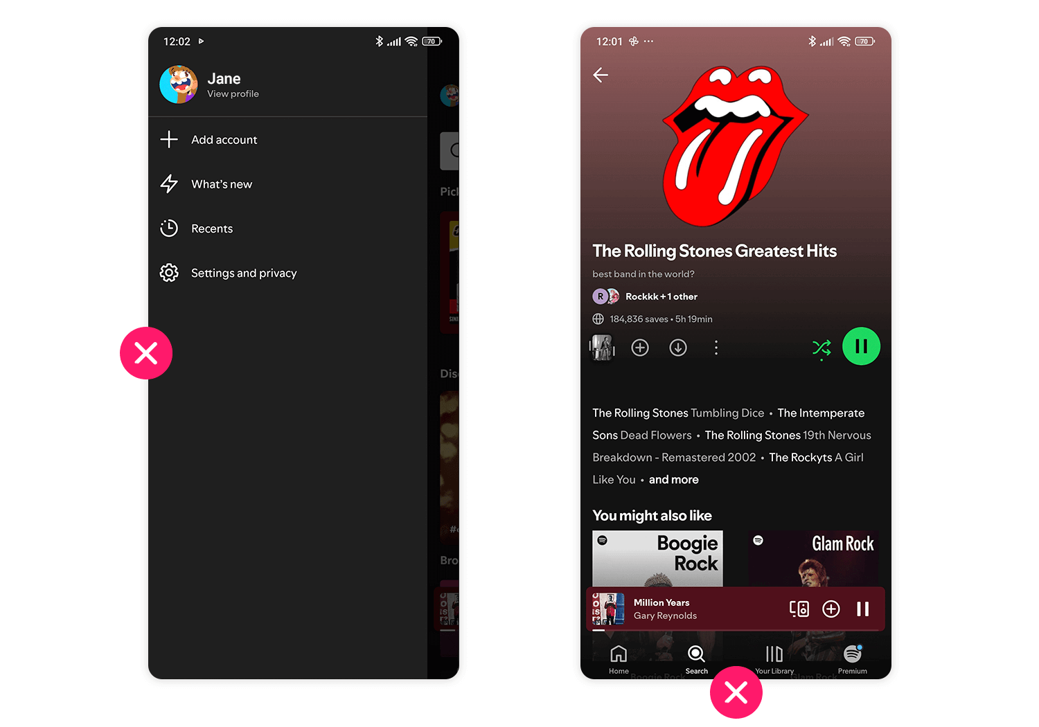
The current Spotify interface presents a design challenge where secondary features seem to overshadow the primary functions. Key tabs like “Search” and “Your Library” are not as prominent as they should be, potentially causing confusion for new users. Additionally, the sidebar lacks essential information, further hindering navigation and understanding of the platform.
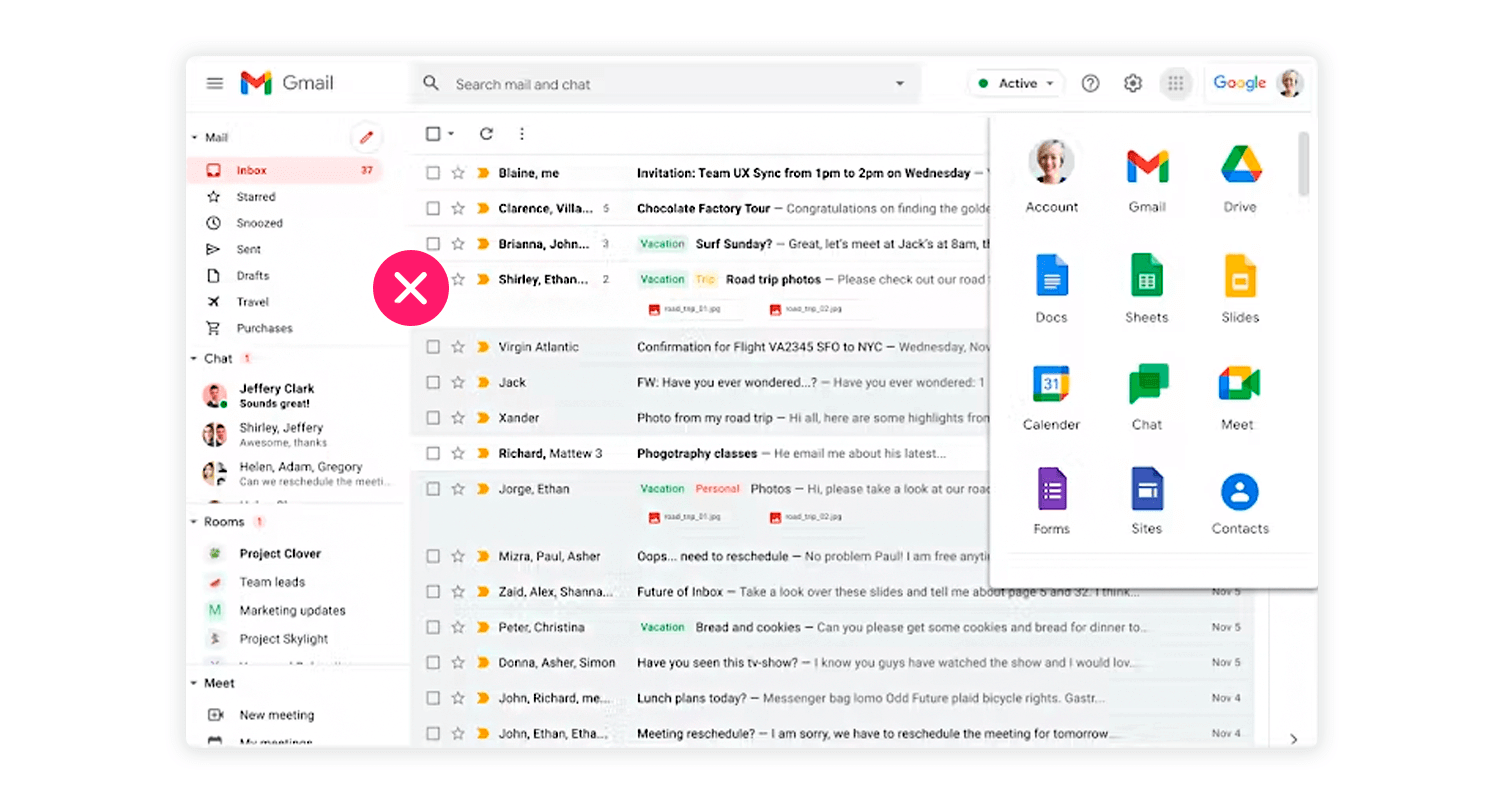
Gmail‘s market dominance seems to have stifled innovation in its interface and functionality. Though functional, the interface is cluttered and lacks clear visual separation, making navigation difficult. A key issue is the inability to easily select multiple emails for bulk actions; users must manually select each one. This lack of a basic drag-and-select feature hampers user experience. Implementing this feature would significantly improve bulk email management.
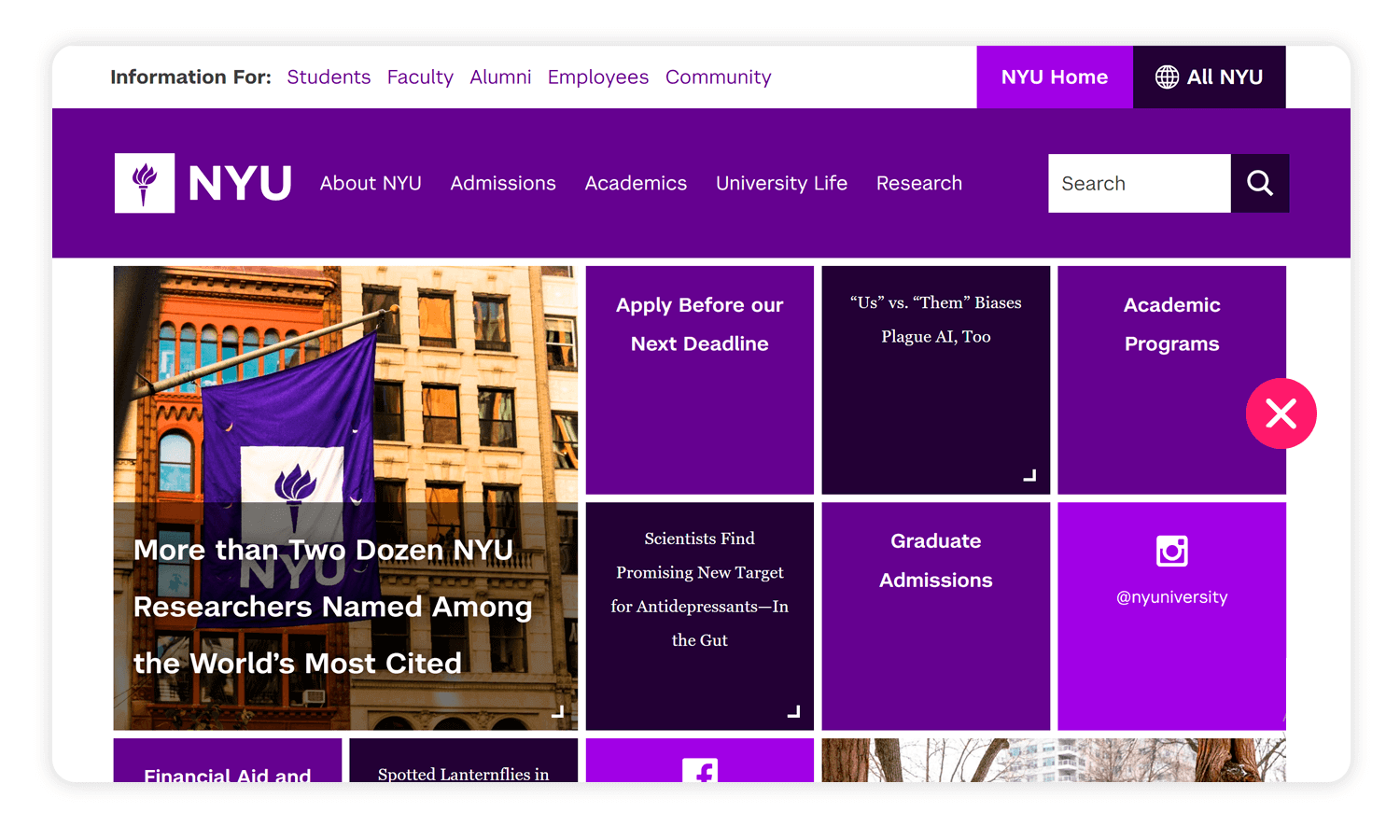
The NYU website’s design, while visually striking, presents some potential accessibility and user experience challenges. The deep purple background with stark white text, while providing high contrast for readability, can be visually intense for some users, especially during extended viewing.
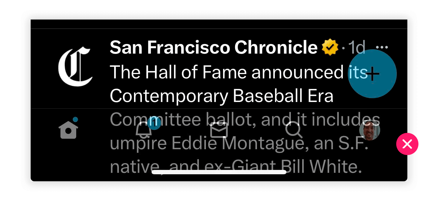
Even the most well-known platforms can sometimes miss the mark when it comes to user interface design. Let’s take a look at a specific example from X, formerly known as Twitter. The overlapping “+” icon on the tweet is a clear design flaw. These can lead to user confusion and frustration, as it can be difficult to determine the intended interaction.
UI design is the kind of field of work where there is so much margin for designers to create something unique. Yes, there’s game rules when it comes to things like usability and functionality. With that said, this list of UI design examples showcases just how different and wonderful interfaces can be, while still checking the right boxes. Feeling inspired yet?
PROTOTYPE · COMMUNICATE · VALIDATE
ALL-IN-ONE PROTOTYPING TOOL FOR WEB AND MOBILE APPS
Related Content
 There are lots of places where you can find free website icons. But sometimes, being spoiled for choice leaves us at a frustrating fork in the road. If you're not sure where to look, check out these 30 best places to find free web icons!8 min Read
 Website backgrounds can be a powerful tool in creating an experience. But what kind of experience can you convey and how? We got the full run-through for you!14 min Read
 See 50 responsive website examples along with what makes them good or bad. Get best practices to follow for your next responsive design!15 min Read
