
With clear, simple UIs and fast loading web pages, flat web design is going nowhere fast. Here are some important principles and great examples of this style.
Simple 2D, minimalist interfaces, bold and contrasting color schemes, along with a deliberate lack of interaction all point towards the signature characteristics of flat design.
Exploding onto the web design scene around the mid 2000s, flat website design was to revolutionize everything from web and mobile UIs, to PC operating systems and software. But why the need for this visually appealing, yet simplistic design? Why not have things detailed and 3D?
Design flat website prototypes with Justinmind

In this post, we’ll examine how flat website ui design came about and how that style has evolved to flat design 2.0. We’ll also explore some of the principles governing this style, as well as some great examples to inspire your next designs.
Flat design is all about keeping things straightforward and intentional. It’s clean, bold, and embraces minimalism in a way that feels modern and fresh. Instead of trying to make buttons or icons look like they belong in the real world, like old-school skeuomorphic designs with their leather textures and shiny gradients, flat design keeps it simple, and it works.
For example, in skeuomorphic design, a trash icon might look like a detailed, 3D metal bin. In flat design? It’s just a clean, simple outline of a bin. No fuss, no distractions, just the information you need. The goal is clarity. You instantly know what something is or does without all the extra visual fluff.

Flat design stands out because it balances functionality with great visual appeal, making it both practical and attractive. With bold colors, clean typography, and a focus on usability, it ensures that everything feels light, intuitive, and easy to navigate. Plus, it’s fast, no heavy textures or fancy effects slowing things down.
Flat design prioritizes both functionality and aesthetics. It demonstrates that impactful design doesn’t require excessive complexity. Here, less is more.
Flat design makes life easier, for both designers and users. Its biggest strength? Simplicity. There’s no clutter or unnecessary details to distract you, just clean, clear interfaces that let you focus on what matters.
Another big win is speed. Since flat design uses lightweight graphics (no heavy textures or detailed effects), websites and apps load faster. Nobody likes waiting, and this style helps keep things moving smoothly, whether you’re on a phone, tablet, or desktop.
And let’s be honest, flat design just looks good. Its modern, minimal aesthetic feels fresh and polished without trying too hard. It’s proof that simplicity can be incredibly effective and stylish at the same time.

Flat design may seem simple on the surface, but its effectiveness comes from following some key principles. These guidelines guarantee that flat design isn’t just visually appealing but also functional and user-friendly. Let’s break down the essential elements that bring flat websites to life.
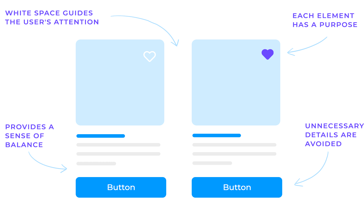
Flat design focuses on keeping things clean and easy to understand. Clear layouts and thoughtfully placed whitespace create a sense of balance and make navigation feel easy. Whitespace isn’t filler, it gives the design space to breathe and helps guide the user’s attention naturally.
Minimalism plays a big role here, too. Designs avoid unnecessary details or visual effects that might distract users. Every element has a purpose, whether it’s guiding someone to a button or highlighting important information. Keeping things simple makes flat design both modern and easy to use.
Colors also play a vital role in flat design. They don’t just make things look appealing, they guide attention, highlight important elements, and create a unified visual style. When done right, bold colors and strong contrast bring clarity and vibrancy to your design.
- Choosing the right colors: a good color palette ties the whole design together. It should reflect your brand’s identity and personality. Tools like Coolors or Adobe Color are great for exploring combinations and finding inspiration, helping you create a palette that feels intentional and cohesive.
- Contrast and accessibility: strong contrast makes text easy to read and makes sure key elements, like buttons, stand out. This isn’t just about aesthetics, it’s about usability. Following WCAG guidelines helps ensure your design is accessible to everyone. Testing for colorblind-friendly palettes is another step to ensure inclusivity and usability across a diverse audience.
- Accent colors vs. neutrals: bright accent colors can draw attention to important areas, like CTAs, while neutral tones create a calm and professional foundation. The key is balance. Too many bold colors can overwhelm, while too many neutrals can make the design feel flat. When you find the right mix, your design feels polished and intentional.
- Consistency across pages: keeping your colors consistent throughout the website creates a unified experience. A cohesive palette makes it easier for users to navigate and builds trust in your brand. Avoid using too many colors, as it can distract users and weaken your design’s impact.

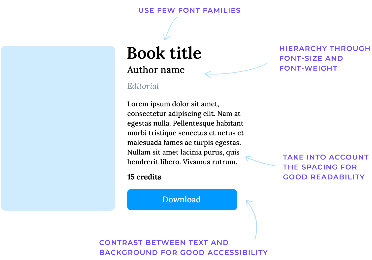
Typography is a key element in flat design. The right fonts and text styles not only enhance readability but also shape the personality of your design. Clean, well-thought-out typography can make your website feel modern, professional, and easy to navigate.
- Font selection: choosing the right typeface is essential. Modern, minimalistic fonts, like sans-serif or simple serif styles, work best in flat design because they’re clean and easy to read. Your font should also match your brand’s tone. For example, a playful brand might use rounded or quirky fonts, while a professional one might stick to classic and refined styles.
- Hierarchy and readability: text hierarchy helps users understand the structure of your content. Differentiating headings, subheadings, and body text with size or weight makes it easier for readers to scan the page. To improve clarity, pay attention to line spacing (leading) and letter spacing (tracking). These small adjustments can make a big difference in readability, especially on smaller screens.
- Web fonts and performance: services like Google Fonts and Adobe Fonts offer a wide selection of high-quality fonts for the web. However, it’s important to minimize font file sizes and limit the number of font families you use. Too many fonts can slow down your website and make it feel cluttered. A streamlined approach keeps your site fast and visually cohesive.
- Accessibility: accessible typography ensures that everyone can comfortably read your content. This means using sufficient contrast between text and background to make text stand out clearly. Additionally, providing clear focus states for tab-based navigation helps users who rely on keyboards or assistive technology.
Icons and images are a big part of flat design. They add visual interest, guide users, and help communicate ideas quickly. Keeping them clean, consistent, and lightweight is key to maintaining the simplicity that flat design is known for.
- Flat iconography: icons in flat design should be simple and minimal, with no extra details like shading or gradients. They need to convey their meaning instantly, users shouldn’t have to guess what an icon represents. When designing or sourcing icons, focus on clarity and ensure they align with the overall style of your site.
- Use of illustrations: flat design often incorporates vector-based illustrations. These are lightweight, scalable, and visually consistent with the flat aesthetic. When using illustrations, pay attention to details like color palettes, line thickness, and overall style to ensure they feel cohesive across the entire site.
- Photography and imagery: if you’re using photos, keep them simple and high-quality. Avoid heavy filters or overly stylized effects that can clash with the clean, minimal look of flat design. Photography should complement your design, not overpower it, so focus on images that are clear and relevant.
- Scalability: for both icons and images, scalability is really important. Using formats like SVG guarantees that visuals look crisp on any screen size or resolution, from smartphones to large monitors. Optimizing images for fast loading, by compressing files and choosing the right format, keeps your website quick and responsive, which users (and search engines) appreciate.
At the heart of flat design is the user. Every decision, from layout to interactions, revolves around making the experience intuitive and seamless. A user-first approach ensures that your design isn’t just visually appealing but also functional and easy to navigate.
- Designing around user needs: think about what users are trying to achieve and design with their tasks in mind. Clear interactions, like buttons, links, and forms, are essential. Users shouldn’t have to guess what’s clickable or where to go next; everything should feel natural and intuitive.
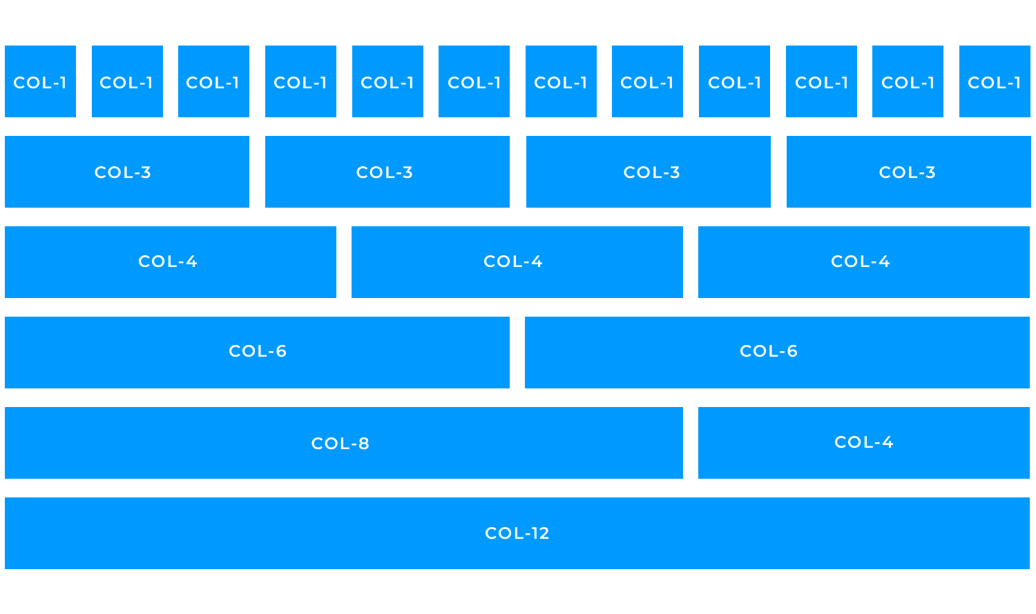
- Responsive grid layouts: a flexible grid system, like a 12-column layout, keeps your design scalable and adaptable. It ensures that your content looks great on any device, whether it’s a smartphone, tablet, or desktop. Responsive layouts are especially important in flat design, where clean structure and usability are key.
- Whitespace and margins: negative space, or whitespace, is a designer’s secret weapon. It creates breathing room and focuses attention on what matters most. Overcrowded designs can feel overwhelming, while well-placed whitespace adds balance and elegance to your layout.
- Common flat layout patterns: flat design often leans on simple, effective patterns like single-page or multi-section scrolling layouts. These formats are easy to navigate and work well with clear separation of content blocks, such as card-based layouts. These patterns help users process information quickly without feeling overwhelmed.
- Visual hierarchy: organize content by importance so users know where to look first. Use headers, subheaders, and body text to create structure, and guide the user’s eye with size, color, and positioning. Strong visual hierarchy makes your design both functional and easy to understand.
Design flat website prototypes with Justinmind
While flat design often emphasizes simplicity, interaction is what brings it to life. Buttons, menus, animations, and forms all play a role in guiding users and making the design feel intuitive. The key is to keep these interactions subtle, clear, and aligned with the clean aesthetics of flat design.
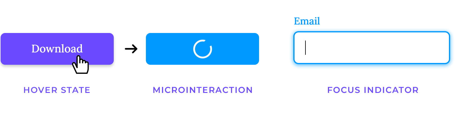
- Buttons and CTAs: flat buttons are a staple of this design style, often featuring solid colors and crisp, easy-to-read labels. To make interactions more dynamic, hover states and micro-interactions can provide subtle feedback when a user clicks or hovers. Accessibility is also important, focus indicators should be included to make sure all users can interact with buttons effectively.
- Navigation and menus: navigation in flat design should feel effortless. Whether you’re using a traditional top menu, a hamburger icon, or a side navigation bar, keep layouts clean and straightforward. Labels should be short, intuitive, and consistent across the site, so users always know where they are and where they’re going.
- Animations and transitions: movement can enhance a flat design when used sparingly. Subtle transitions, like a slight color change on hover or a smooth slide for drop-down menus, help users understand interactions without overwhelming them. Avoid overly complex animations that can feel out of place in a flat design and distract from its minimalist nature.
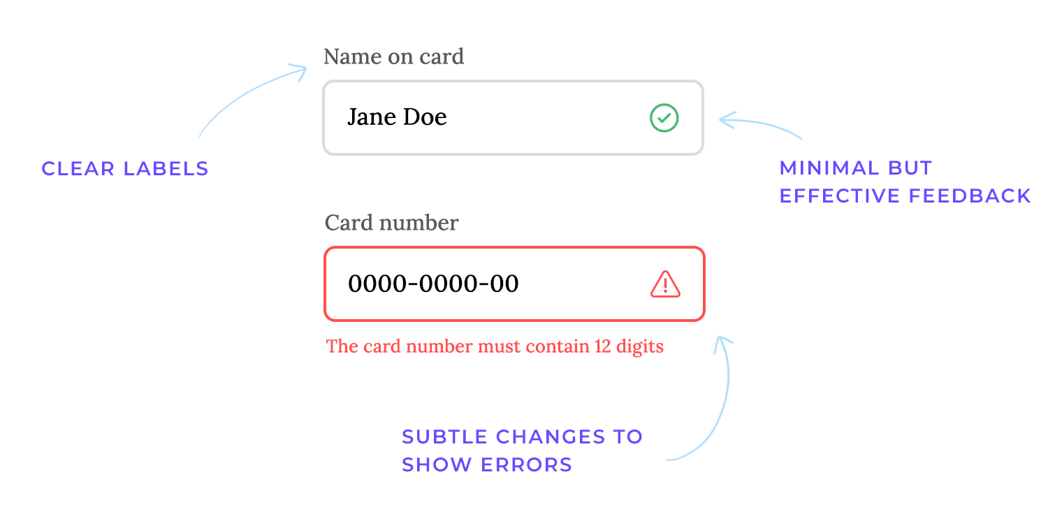
- Forms and input fields: forms should be simple, with clean fields and clear labels or placeholders to guide users. Flat design avoids decorative extras, so validation and feedback should also stay minimal but effective, think small text cues or subtle color changes to show errors or successful inputs.
Our first flat website example goes to Gogoro that uses a clean and minimalist design style. They’ve chosen flat colors with bold contrasts, making the information pop without being overwhelming. The layout is spacious and easy to navigate, with clear calls to action.

The overall impression is one of modernity and efficiency, which aligns perfectly with the company’s focus on electric vehicles and smart energy solutions.
In this flat website design, Mila takes a lighter, more playful approach.
The layout is clean and open, with plenty of whitespace that puts the focus on the headline and illustrations. The line-drawn graphics are a standout feature, simple and colorful, they add personality without overloading the page.
Typography plays a big role here too, blending bold, modern fonts with a handwritten touch that feels approachable and friendly. The buttons stick to flat design principles with solid colors and minimal styling, making them clear and easy to use.

Mila’s design is a perfect example of how flat design can be both fun and functional, creating a welcoming experience while staying simple and effective.
Here we have now a strong example; the 2Create website brings a bold and confident take on flat design. The layout is striking in its simplicity, with plenty of open space that immediately directs your attention to the powerful headline. The use of bold, oversized typography makes the message unmissable, while the subtle balance between black, white, and red creates a sharp, modern aesthetic.
Navigation is tucked neatly to the side, with a clean and minimal design that feels effortless to use. There are no unnecessary effects or distractions, just a crisp, intentional design that gets straight to the point.

2Create shows how flat design can exude strength and clarity, proving that less truly can be more when executed thoughtfully.
The Tala website is a smart example of flat design in action. Its clean layout guarantees content is easy to read and navigate, with a lot of whitespace to keep things balanced. The bold typography grabs attention, while the flat, colorful illustrations add a friendly and modern touch.
The color palette is simple yet effective, using bright accents to highlight important elements like buttons and calls to action. Everything about the design feels intentional and user-friendly, making it effortless to explore.

It’s a clear, focused approach to flat design that works seamlessly.
The Goodness Inc. website takes flat design and gives it a cheerful, welcoming feel. The use of warm colors like yellow and orange immediately sets a positive tone, while the clean layout keeps everything easy to follow. The flat shapes and simple illustrations fit perfectly with the minimal design, adding a playful but subtle charm.

What really makes this site great is how approachable it feels. The soft typography and thoughtful little details, like rounded shapes and icons, make it visually interesting without feeling cluttered. It’s a great example of flat design done in a way that feels fresh and full of personality.
A fun example of flat design is the wrk. website, which takes a creative approach to simplicity. The pastel blues and corals, combined with flat isometric illustrations, give it a playful vibe without losing its polished feel. The visuals aren’t just there to look good, they tell a story about the brand’s design-first focus in a way that feels fresh and engaging.

It’s proof that flat design can be functional and full of personality all at once.
Another bold example of flat design is the Made in Haus website, which grabs your attention instantly with its striking simplicity. The bright orange background and oversized black typography create a statement that’s impossible to ignore.

There’s no fluff or unnecessary visuals, just bold colors and clean, impactful design choices that get straight to the point. It’s flat design at its most confident, proving that sometimes less really is more.
Design flat website prototypes with Justinmind
A creative take on flat design is the Nurture website. It uses a bold, single-color background and flat illustrations that feel dynamic and interactive. The large, letter-shaped structure filled with detailed, flat visuals makes the site playful while staying clean and organized.

The typography is simple and easy to read, paired with a balanced layout that lets the design breathe. It’s a clever example of flat design that feels both functional and imaginative, pulling users in with its visual storytelling.
Caps viens-là is a straightforward, fun online game that is a great example of the evolution of flat website design with its 2.5D graphics. The designers created a sense of depth with 3D styling and shadowing, but the items that you interact with are unmistakably 2D.
Add graphics and animation and you’ve got the mixed bag of dimensionality and 3 dimensional modernity that is flat website design 2.0.
Here’s a fresh take on flat design with ClickRank. The site keeps things simple and modern, focusing on bold text and an uncluttered layout. The use of vibrant colors to highlight key actions makes navigation feel intuitive. There’s a strong emphasis on usability, with every element serving a clear purpose.

This is a clear example of how flat design can create a professional, easy experience while keeping things visually striking.
The well-known brand Chopard takes a completely different route on its website, stepping away from flat design and going into a highly detailed, luxurious aesthetic.
The website uses beautiful, close-up photos of the watches to really show off their craftsmanship. You can almost feel the texture and see the intricate details. The writing is simple and elegant, letting the watches speak for themselves. It’s a far cry from those flat, minimalist designs, this site is all about richness and depth.

It’s a great example of how a design can be immersive and sophisticated by focusing on realism and premium visuals, perfectly matching the brand’s high-end identity.
Kurly Creative’s website is an amazing example of how flat design can feel personal and vibrant. The bold, quirky typography grabs attention right away, while the soft pastel backgrounds keep things approachable. Flat illustrations are used thoughtfully, adding charm without cluttering the layout.

It’s a design that feels both creative and user-friendly, making it easy to explore while showcasing tons of personality. The balance of fun and functionality here is spot on!
This design from Papier Patate is an adorable example of flat design done right. The organic shapes, muted pastel tones, and playful typography create a cheerful, welcoming vibe. It’s a straightforward, creative, and minimalist design that guides the eye easily.

The layout feels light and fresh, proving you don’t need complicated visuals to leave a lasting impression. It’s a flat design with a friendly, approachable personality.
This is definitely a bold take on flat design. We love Studio Bagaz’ design as it embraces simplicity with a punchy, vibrant color palette that grabs attention quickly. The minimal layout guarantees the focus stays on their message, with clean typography and a playful tone adding personality.

It’s flat design with a confident, modern edge. Simple, striking, and impossible to ignore.
This is a fantastic example of flat design! And fittingly, it’s the last on our list. ChangeLab’s website stands out with its bold gradient background, clean typography, and minimalistic layout that communicates innovation and purpose.

The flat design principles are evident in its straightforward navigation and the smart use of contrast to guide attention. It’s a sleek, modern take that’s both visually striking and easy to engage with.
Even the best design approaches can go off track if you’re not careful. Flat design is no exception. Here are a few common pitfalls to watch out for, and how to avoid them.
- Over-simplification: flat design thrives on simplicity, but it’s easy to go too far. Stripping away too many visual cues, like buttons or hover effects, can confuse users. Make sure interactive elements, like links and CTAs, are easy to spot. Simplified doesn’t mean invisible.
- Lack of hierarchy: when everything looks the same, users might feel lost. Flat design needs a clear hierarchy to guide people through your content. Think about using bold headings, different font sizes, and strategic spacing to lead the way. Subtle cues, like contrast and alignment, can make a big difference.
- Inconsistent branding: flat design only works if it feels cohesive. Mismatched colors, random fonts, or inconsistent icon styles can disrupt the flow and make your site look unpolished. A unified style guide will help keep everything on-brand and harmonious across pages.
- Ignoring accessibility: flat design can’t forget about inclusivity. Poor color contrast, tiny text, or missing alt descriptions can make your site frustrating for some users. Keep accessibility in mind by following WCAG standards. Test for contrast, readability, and alternative text to ensure everyone can enjoy the experience.
Flat design is all about balance, keeping things clean and functional while avoiding these common missteps will ensure your site shines.
Design flat website prototypes with Justinmind
Love it or hate it, flat website design looks set to stay. And with good reason: it not only offers a clean and clearer UI that creates less visual noise for the user, but flat website designs are also more responsive by default.
Nowadays, with the sheer volume of content available on the internet, holding the user’s attention is more important than ever. Using a flat website design helps your webpages to load faster and helps avoid penalization by Google.
However, going forward, it’s clear that flat website design is evolving, with the apparition of flat website design 2.0. By going the extra mile and integrating flat design 2.0 principles, you can ensure your website is as intuitive as possible, with the latest design styles, while still being responsive.
PROTOTYPE · COMMUNICATE · VALIDATE
ALL-IN-ONE PROTOTYPING TOOL FOR WEB AND MOBILE APPS
Related Content
 A fun look at different data table designs, from basic lists to smart, interactive ones, based on how complex the data is and what users need.18 min Read
 Single page design v multi-page design – everything you need to help you choose the right design for your site’s content18 min Read
 Website backgrounds can be a powerful tool in creating an experience. But what kind of experience can you convey and how? We got the full run-through for you!14 min Read


