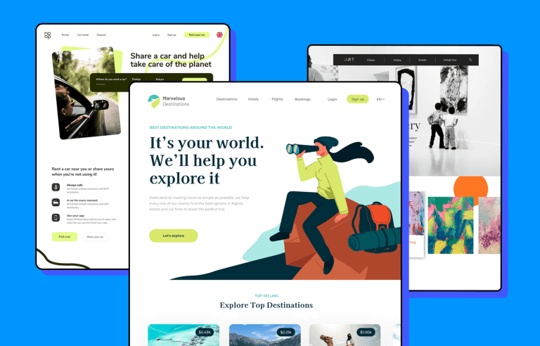
Looking for a quick start in a new project? Discover these practical 100% free website examples made by the Justinmind team just for you.
Looking to start a brand new website or web app project? We have a curated collection of examples that will save both time and effort. Download these unique web app examples and adapt them to fit your design, using the Justinmind UI design tool to tailor, rearrange, and add both detail and interaction.
Make your favorite example interactive with Justinmind

Let’s check out these free website examples that enjoy a sound structure and offer a great head start! Designed by professionals to adapt to the needs of any design project, we are sure you will find one that you can make your own.
Didn’t find what you were looking for? Check out our design templates page for many more designs.
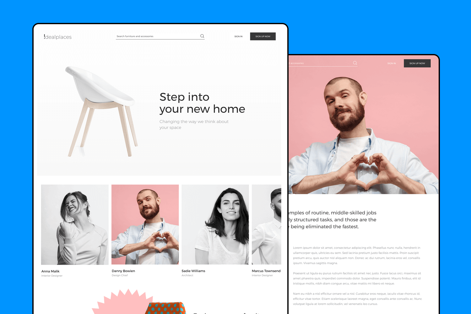
This website design example makes shopping for furniture easy for users. The screens are structured to allow easy discovery of products and come with a full interactive purchase experience. This example features furniture and home decor, however, it can be easily customized to fit any online shopping project.
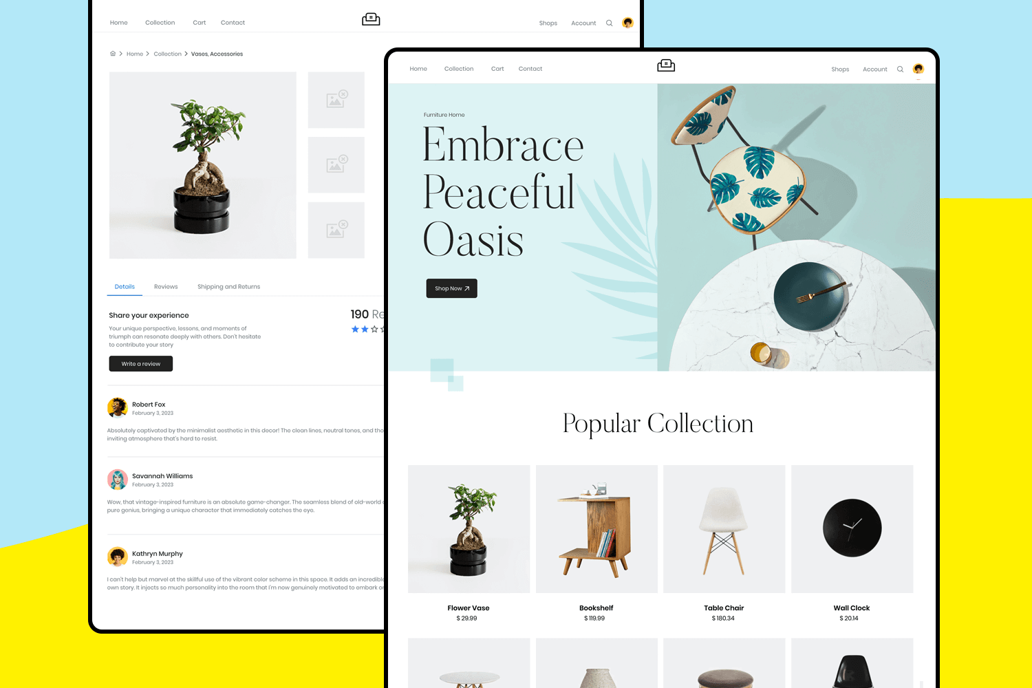
The website design includes all the screens you need for an effective user experience, from multiple filtering options, to placing an order and making its payment, this practical design also comes with fully-functional interaction design.
With the online mode of learning on the rise, interface design and focusing on usability and user experience are crucial for effective learning – and this website example focuses precisely on that. With a modern dashboard to show information at a glance, and 10 complete screens to organize its features, this design brings an engaging learning experience.
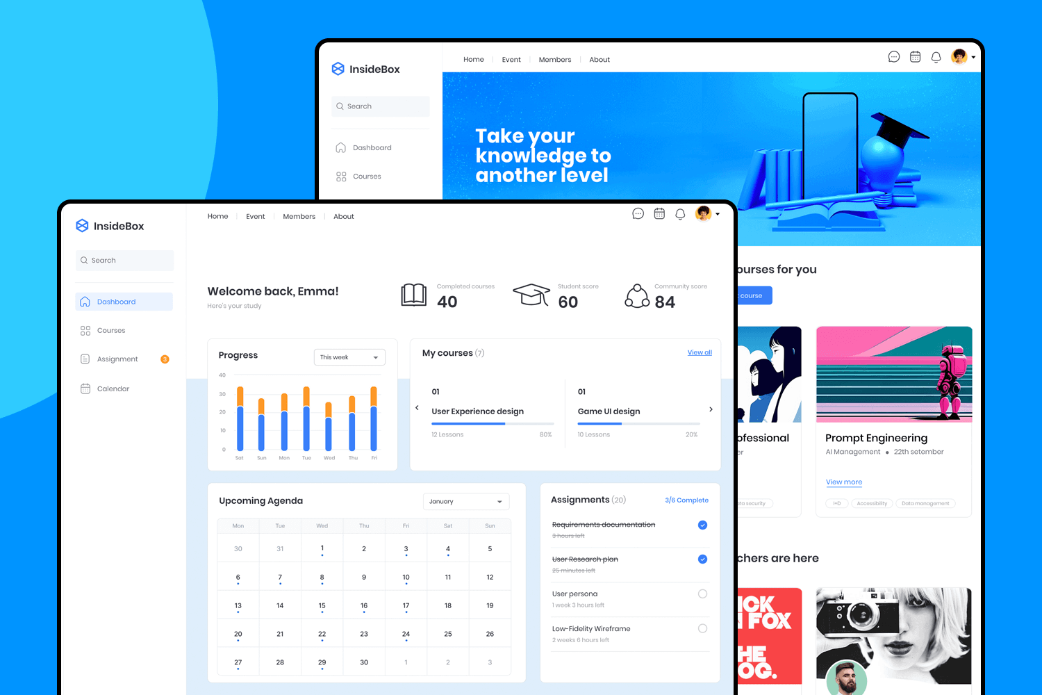
The design is simple, stylish, and functional while not being overwhelming. Some of the screens in this example include status updates, categorization of information and progress charts, which can be easily adapted to your brand’s identity and product goals.
This helpdesk example made with our free Bootstrap UI library is the perfect example of what an effective ticketing system could look like to provide online help to our users.
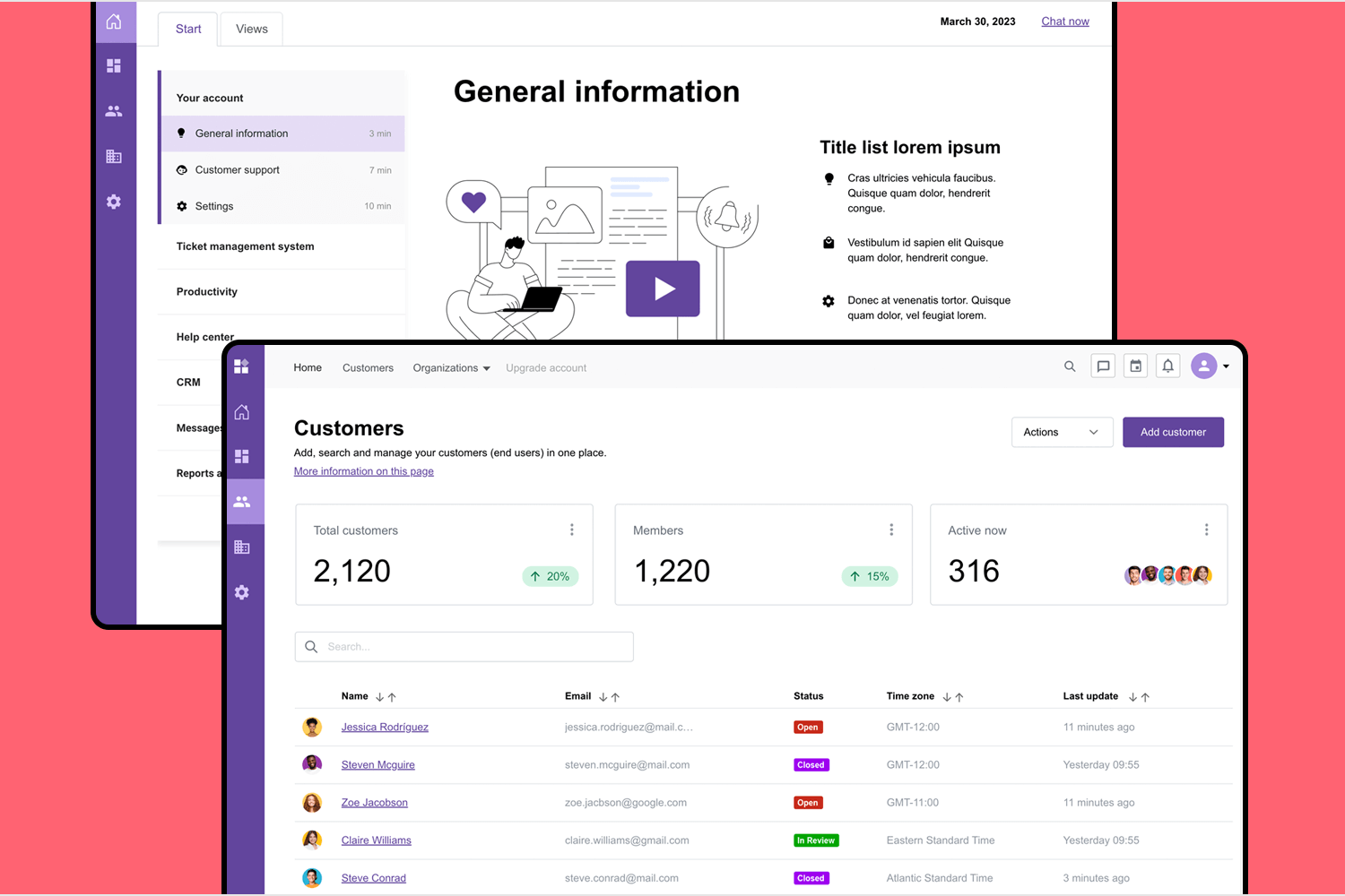
The screens in this web app offer a consistent and intuitive user experience, and acts as a centralized hub for all user information. For instance, you’ll find a login screen, a home dashboard with a side navigation menu, an interactive customers table with sorting and filtering options, a settings section as well as an organization’s screen that also comes with add, search and manage features.
Looking to improve HR management with a web app product? This example is ready just for you to add your product branding and identity. This example showcases a straightforward design with well structured user flows and built-in interactions.
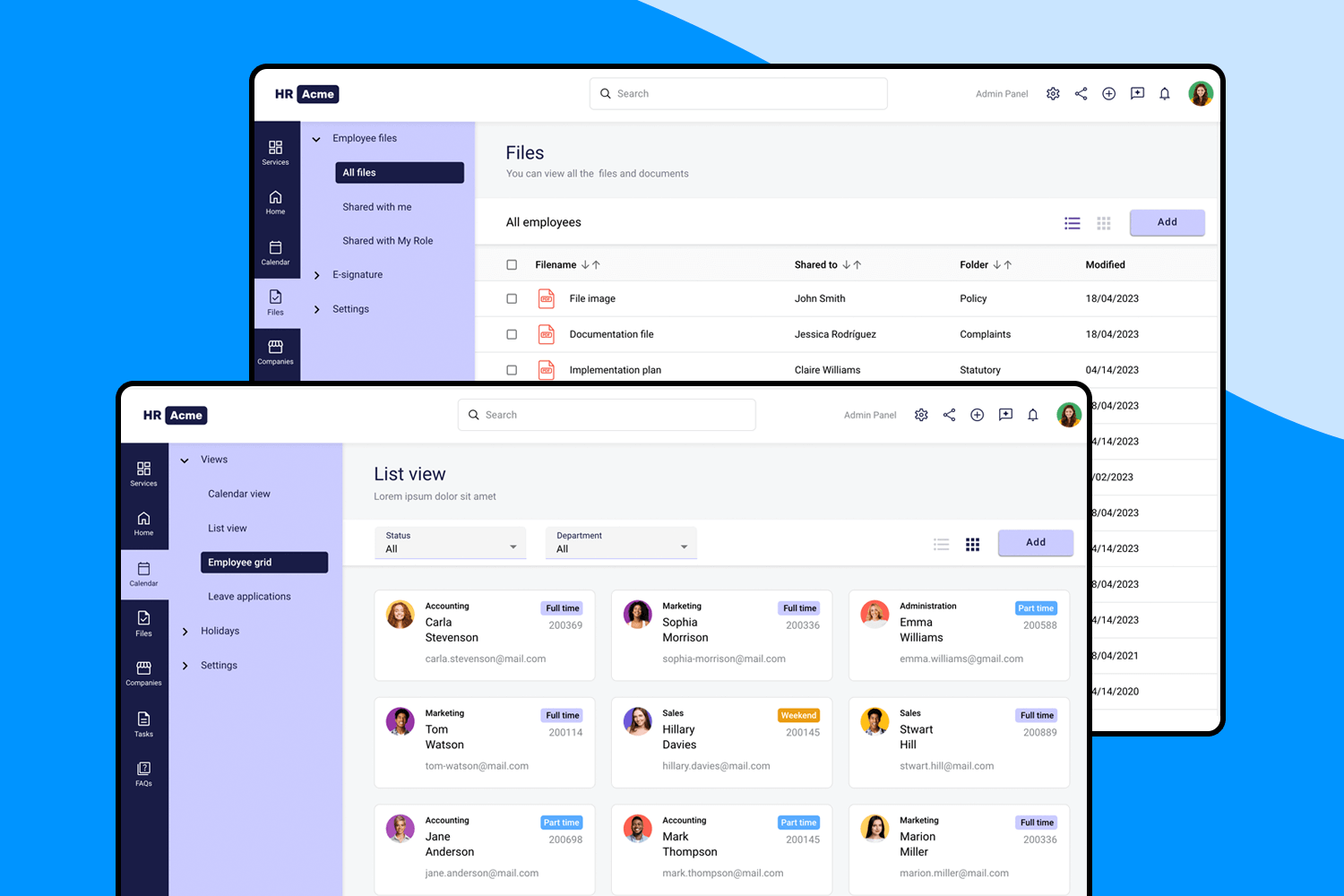
The six core screens that you’ll find in this example are Services, Home, Calendar, Files, Companies, Tasks and FAQs. Moreover, these screens also incorporate additional pages for the features and categories included in each section. Give it a try and make this pro design your own!
This fully customizable CRM web app example provides you with an effective design that you can rely on. It focuses on usability and functionality with a simple and easy to use design that allows users to complete their goals. Made with our free MUI library, it comes complete with charts and graphs.
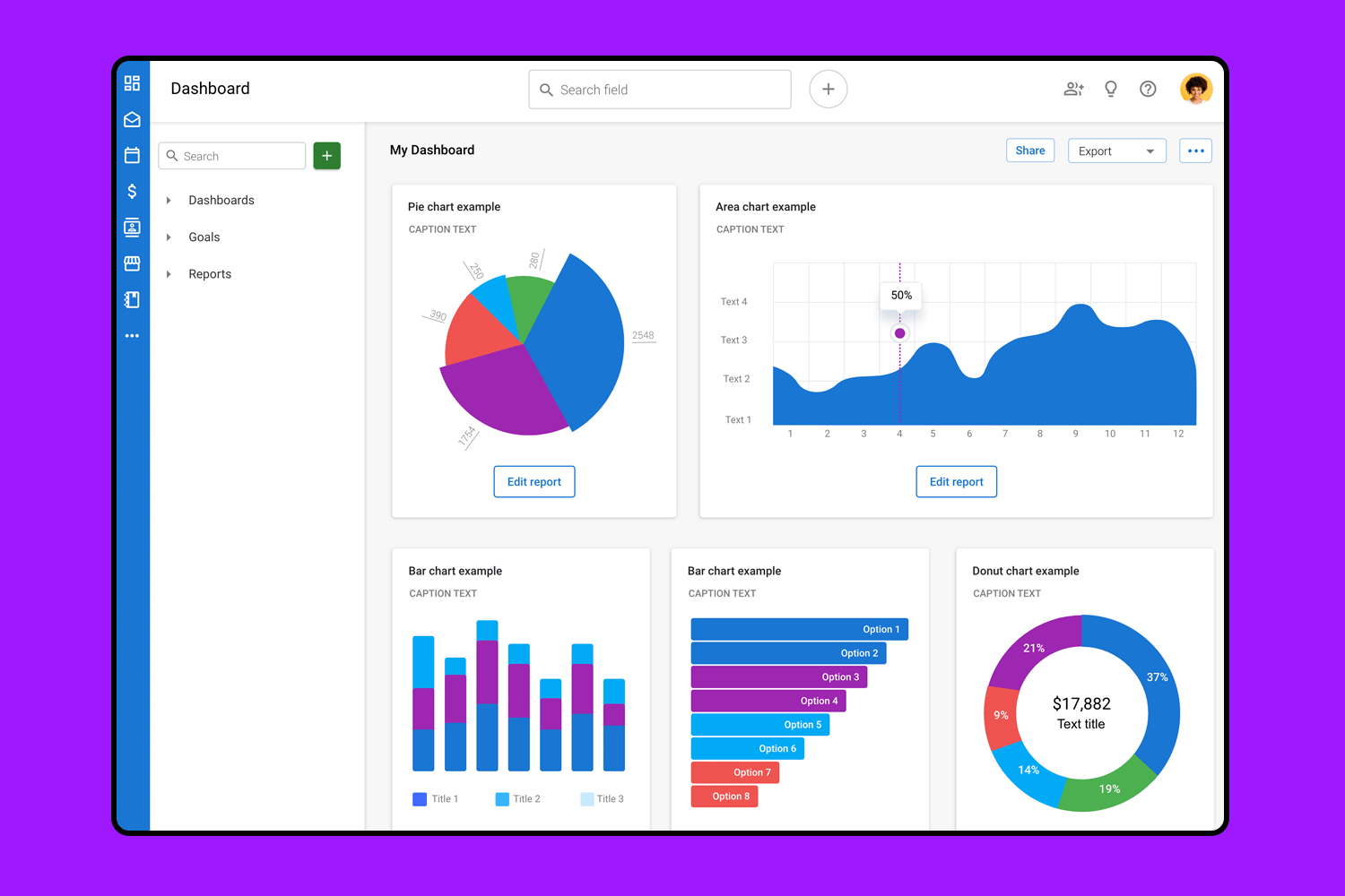
You’ll find 12 screens each with basic interaction, ranging from a sign up/sign in screen, an emails category which includes a table with filtering options, and also a user overview screen for specific information related to the specific user. There’s nothing missing here, except for your brand and product details.
This split-screen pattern is a jack-of-all-trades. This web design example brings you a basic design that could be the perfect structure for a wide variety of screens.
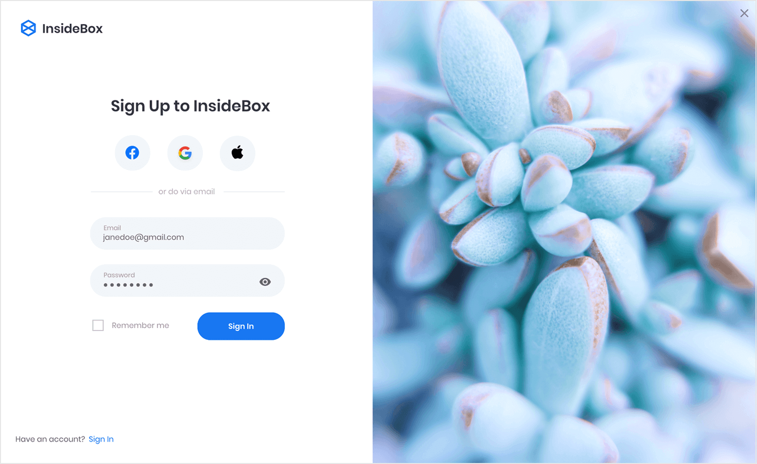
The example comes with a classic login form, social icons and a forgotten password setup. The form itself includes a checkbox and visibility icon for the password. Absolutely great!
A slightly different take on a web app login screen. This simple yet effective example also features a split-screen layout, but with a more modern and cleaner feel.
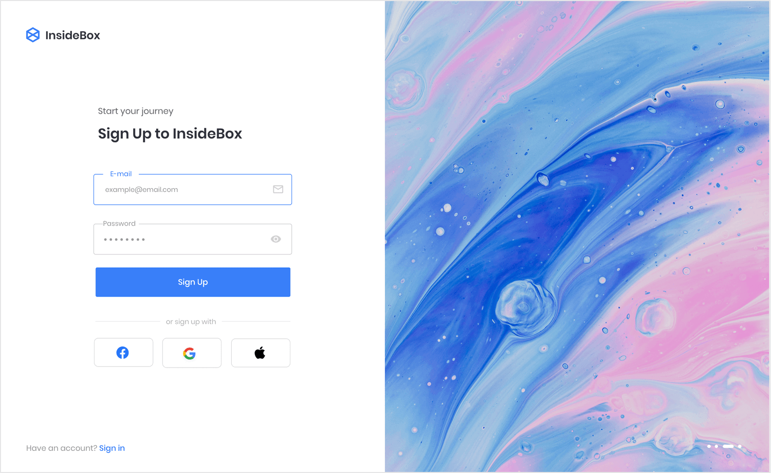
The social login icons are found below the form, with the action button being the star of the show. The form itself enjoys in-line labels that remain visible even when the user is typing.
This is a wonderful homepage design. With a featured image to the left and a pattern of text to the right, this layout is both classic and versatile. Navigation is found on top, with both an icon and a call-to-action button.
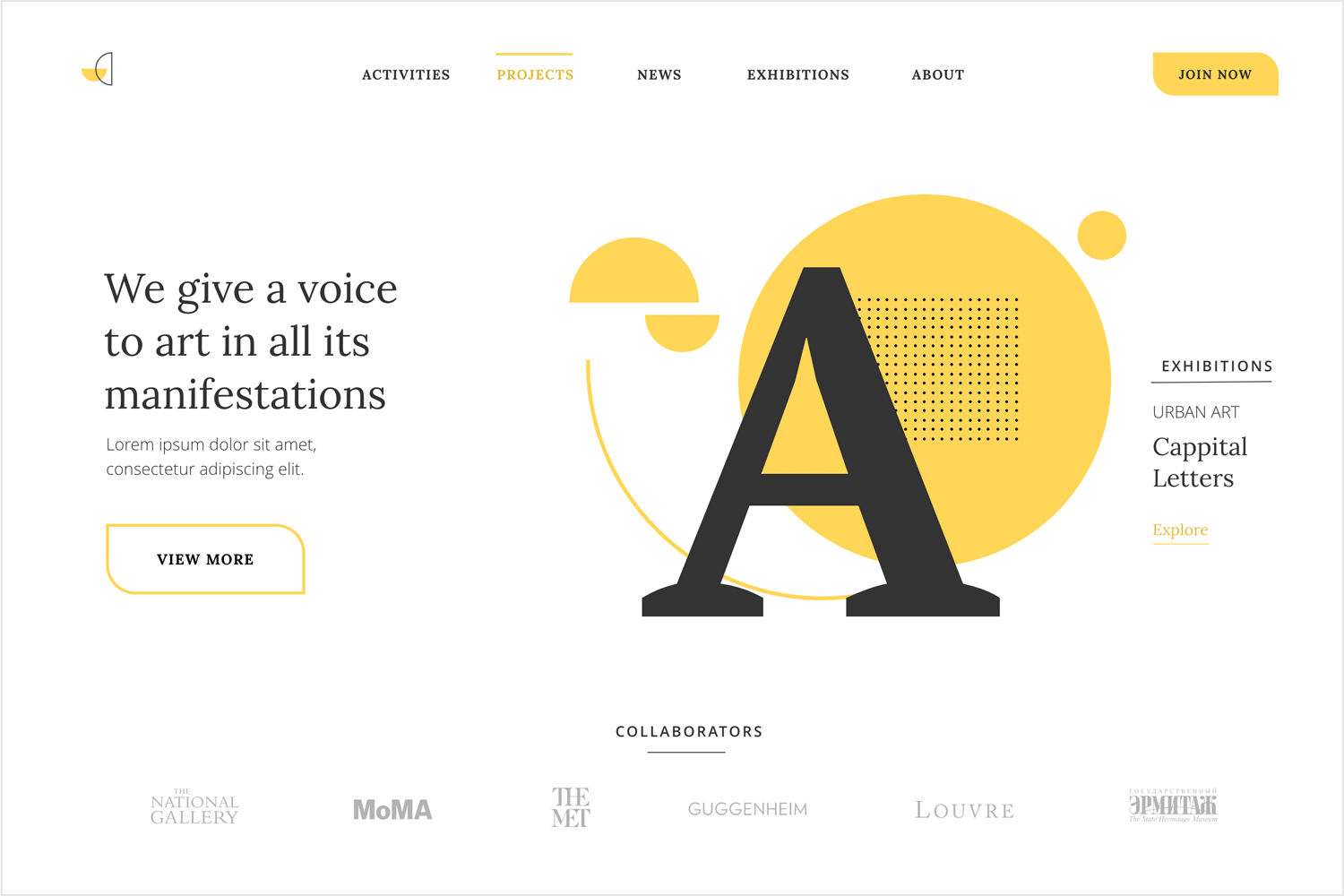
With a prominent hero section like this one, you will have zero problems communicating your brand’s value proposition to your users. There is also a logo banner at the bottom, where brands can showcase their partners or clients. Perfect for any service or web app design project.
This website design also features a split-screen design but with a more dramatic twist. This design example brings you two focal points, each with its own call-to-action button.
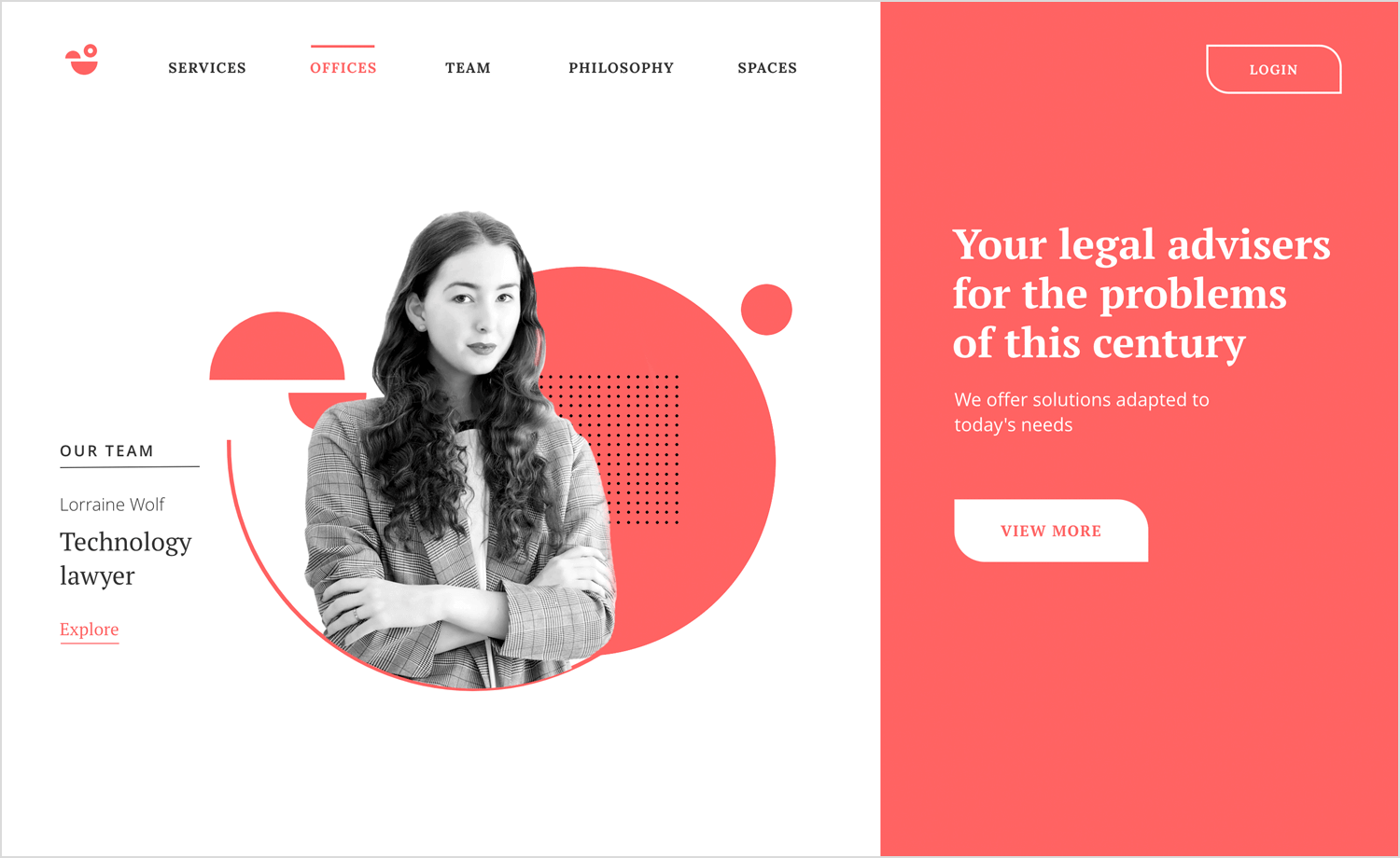
The colors make it bright and bold, while still delivering a classic homepage design for any project selling services or products. Modernize your website using this example!
This example is perfect for any scheduling design project. Following the basic principles of calendar design, the example gives you both a monthly view and a more detailed view of the day.
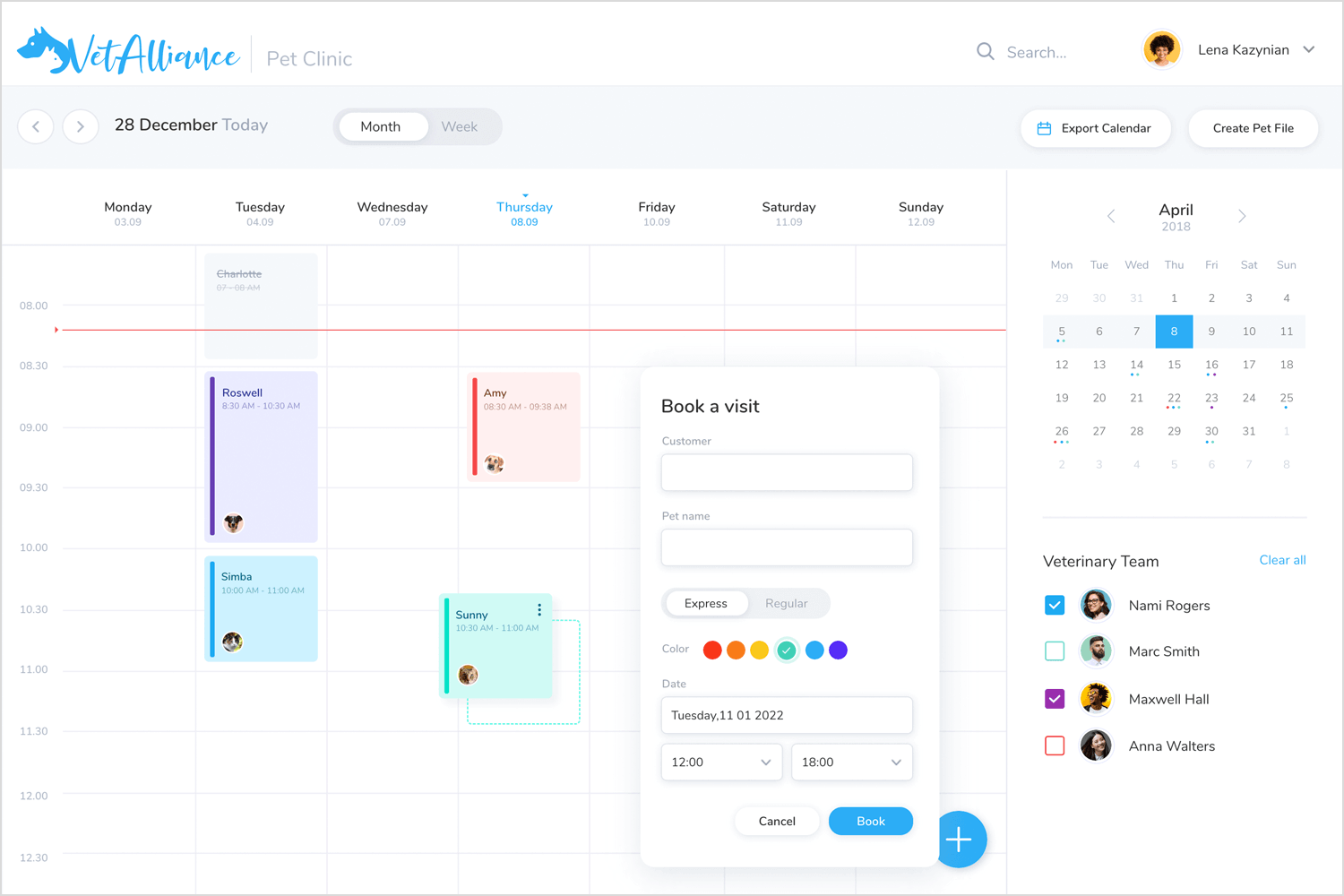
The design comes with all the details, such as a color-coding approach for different people on the team. Altogether, it makes for an easy experience both booking and managing appointments.
This example is the perfect homepage for any website selling products, services, or even written content. The navigation is kept simple with a navigation bar that features a logo and a CTA.
The header part of the screen is split into an image and a small group of components with text and a button. Below is a card display that can be easily adapted to display anything! This screen design also brings a logo wall, perfect to display partners or clients. There is also a testimony space, which follows a carousel layout.
Make your favorite example interactive with Justinmind

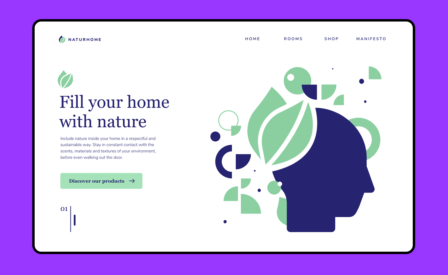
This simple but wonderful web example design brings you a homepage with a split pattern. You’ll find that the left of the screen is dominated by geometrical artwork, while the right side of the screen brings you some text with a call-to-action button.
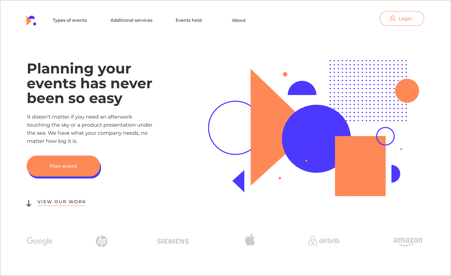
Navigation is done via a top-screen navigation bar, and even a section for social proof at the bottom of the page. Overall, the feel of this design is modern but serious, making it perfect for any sort of agency or service.
This example dedicates the top part of the homepage to a big featured image, delivering a big visual impact. You’ll also find a 3-card system where you can highlight the differences between 3 products, services, or subscriptions.
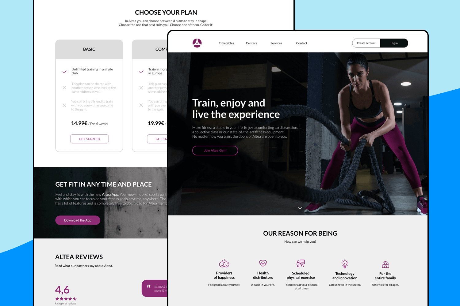
This design also enjoys a testimonial space as well as a footer design. It’s modern feel ensures that users will be able to navigate the website without feeling overwhelmed with unnecessary information or images, thanks to the perfect use of white space.
This website example brings you a graphical background that delivers a big visual impact. With both login and signup buttons to the top-right and a logo to the top-left, the navigation bar is subtle and elegant.
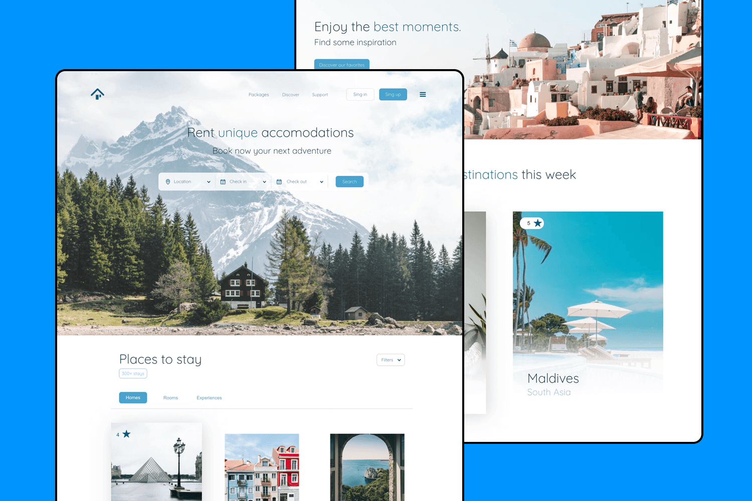
It features a well-structured information hierarchy, a visually appealing footer, a compelling subscription banner, and versatile card layouts. Together, these components create a cohesive and user-friendly experience.
The Art Gallery example was made with an edgy and arty feel to it. With a neutral and dark color palette and bursts of color, you can enjoy a navigation bar, a timeline, and a short footer that all work together to enhance the user’s ability to explore the gallery’s content and navigate easily.
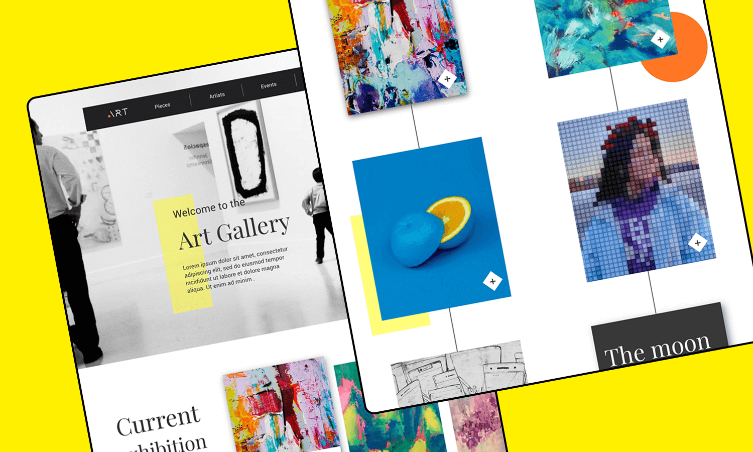
The subscription banner and social media icons offer convenient ways for visitors to stay connected and informed about upcoming events or new exhibitions.
This design showcases a harmonious blend of visual hierarchy and exceptional layout design. The generous use of whitespace and soft edges creates a minimalist and clean web interface that is both aesthetically pleasing and highly functional.
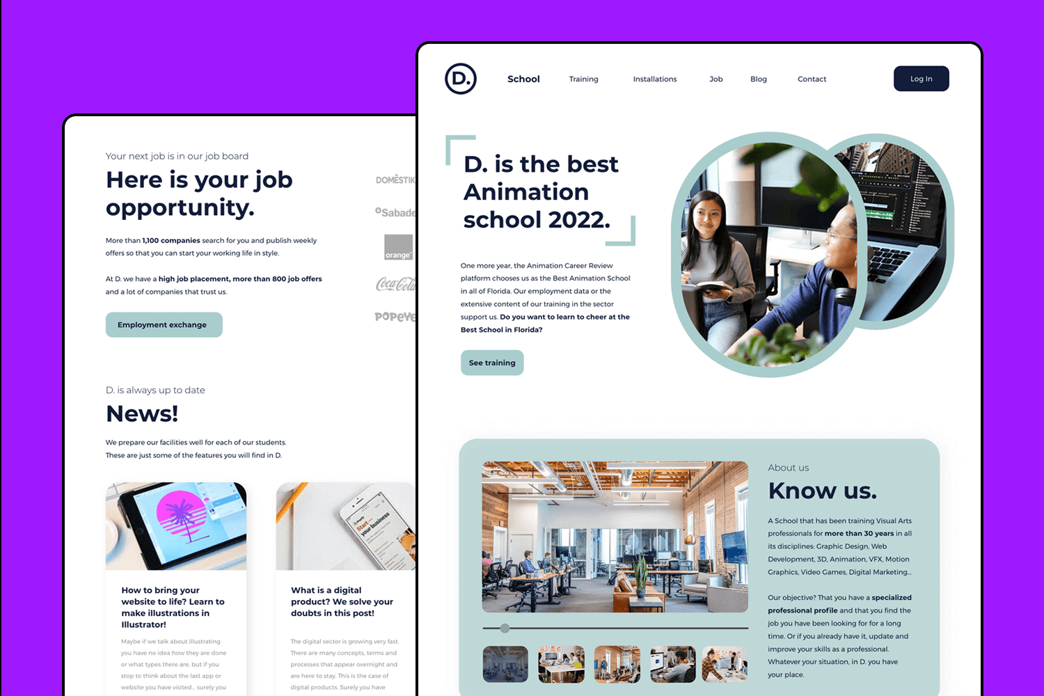
This adaptable design can be easily customized to suit a variety of purposes. Try it out!
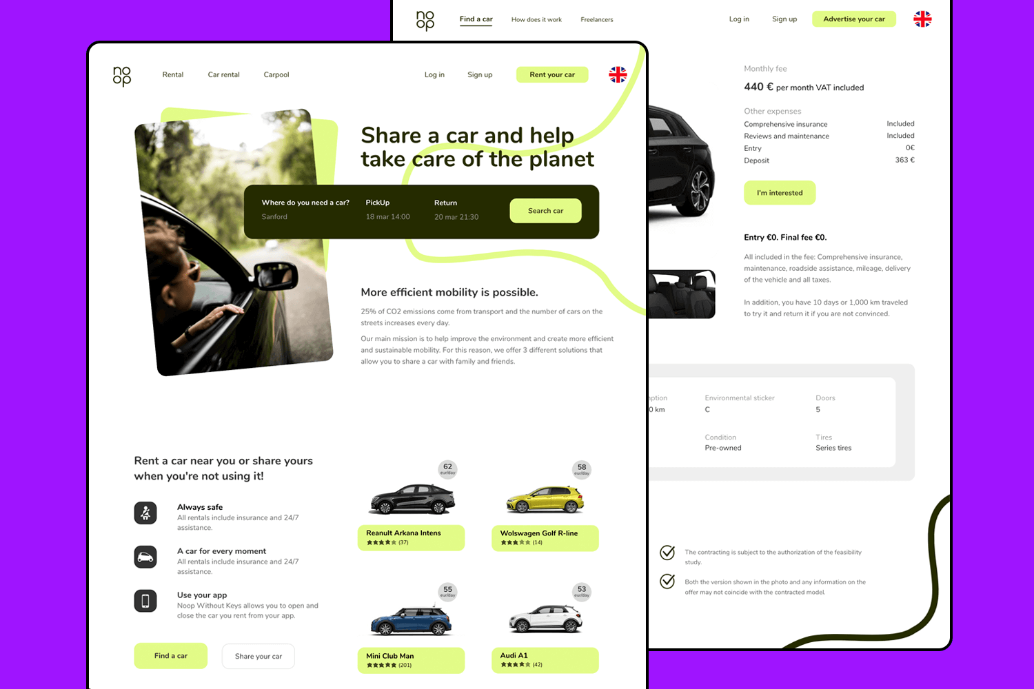
This car rental web app example has a young feel, offering plenty of card layouts that can display just about anything. Perfect for small design projects, this example offers a homepage that gets to the point and creates an efficient user experience.
One of the most complete examples out there! This design comes with full interaction, visuals and navigation. Made for a furniture shop, this is a wonderful starting point for any online store. With cards to display the artisans, featured images, and call-to-actions, this homepage has everything you need to create a modern and beautiful design.
This website example brings bright colors and a young vibe. With featured images, the layout also brings you accordion menus which are perfect for holding details and sale pitches. There are also card banners, testimonials, and a logo wall.
A minimalist and casual design, for a web app that could do just about anything. With testimonial cards, featured images and a perfect vibe for unique illustrations. With a wonderful layout that leaves plenty of whitespace, you can take this example any way you want to go.
In this beauty and wellness example you’ll find a horizontally split screen for the Homepage with a beautiful color palette and a typeface that fits just right.
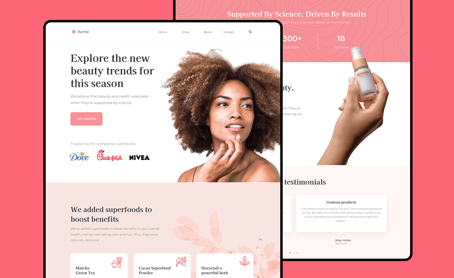
It includes a customer testimonial and a featured products section, as well as social icons and attractive CTA buttons. This modern multipurpose screen can be tailored to build the perfect home for your products.
Suitable for any type of team or project management digital product, this interactive example comes complete with 8 screens that can be easily adapted to show off your brand and design.
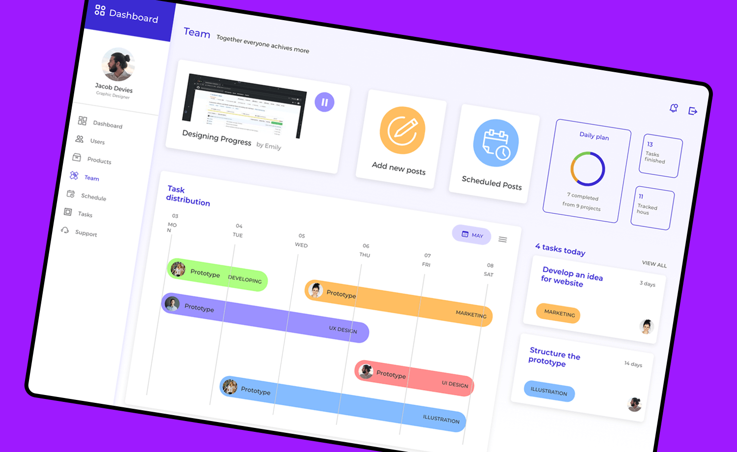
Screens include an interactive welcome page with a sign up form, different dashboards for complete data overview, a slide menu and a variety of organizational charts for project planning and tracking.
A great data visualization design allows us to explore data and makes it easier for the viewer to understand it. The cards in this example will let you present your data in a variety of ways and at any level of detail.
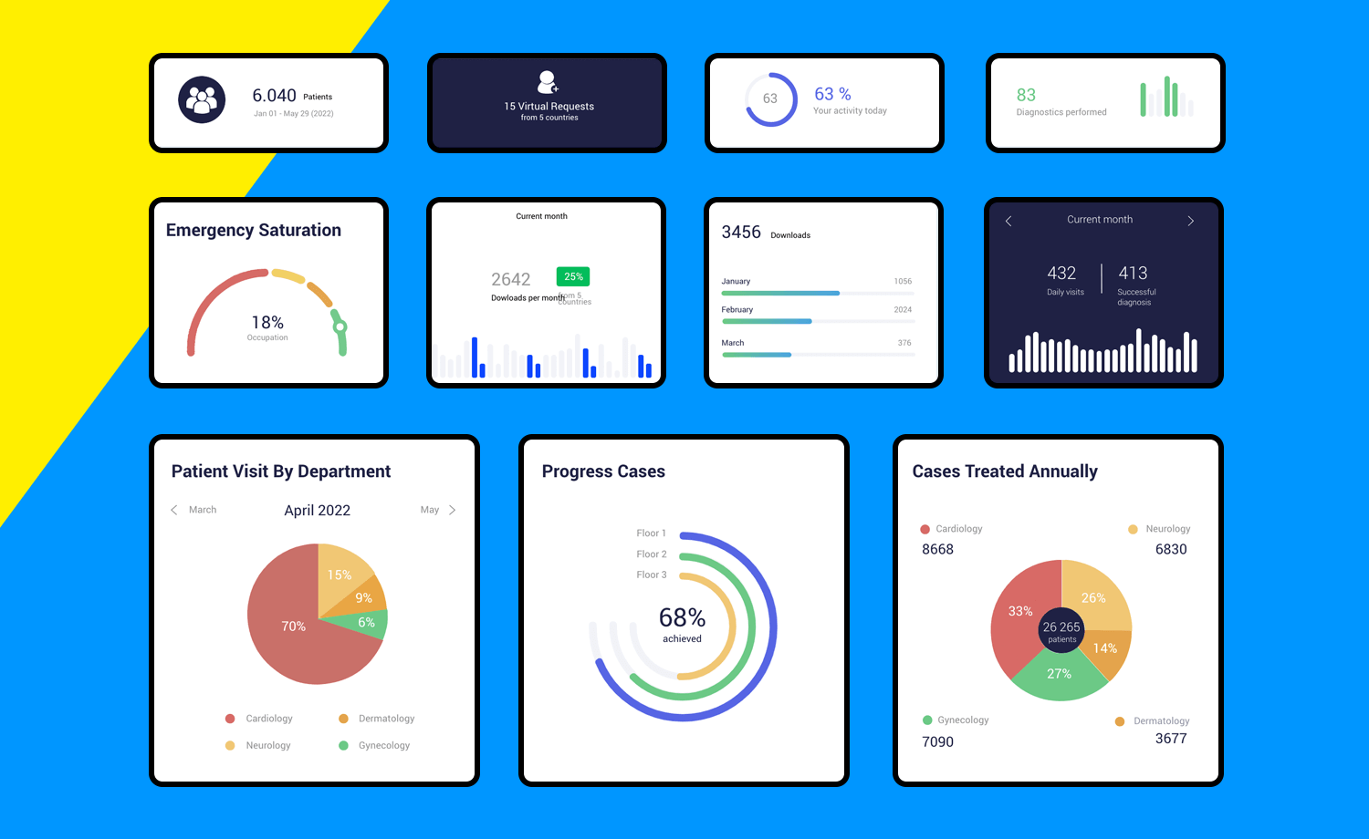
From Hospital patient charts to analytics graphs, fitness data summaries and infographics -these easy data screens will help you design the visuals for your website effortlessly.
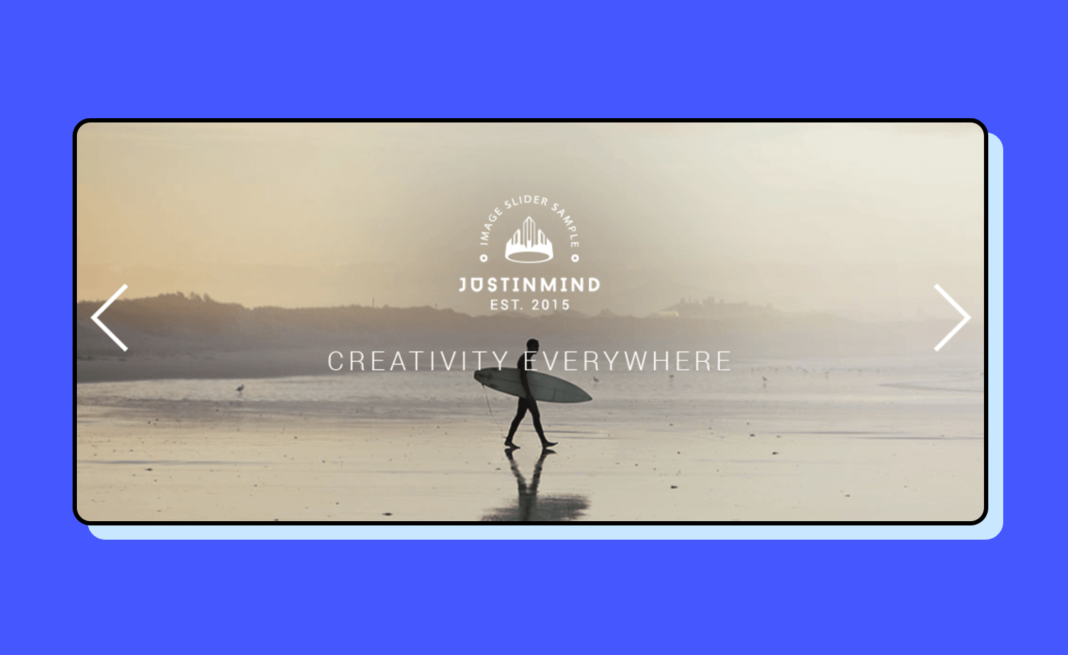
This clickable slideshow example offers easy-to-edit slides and transitions. You can use this example to level up your user experience design and make the most of any app design. Simply drag and drop your own images or pictures and start building from there.
People use internet banking now more than ever, and online banking products must be exceptionally designed for a great and easy experience. With this example you’ll get 6 screens to build just that!
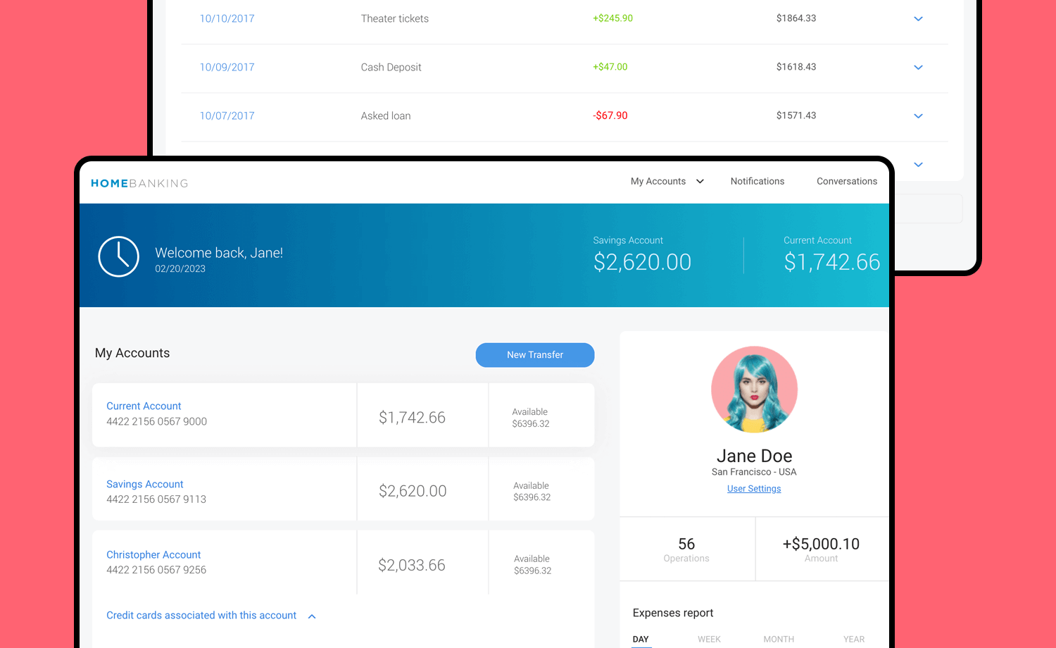
A home page with all the account details at a glance, a transfer screen with interactions from start to finish, and other interactive screens to visualize the activities in your different accounts.
Make your favorite example interactive with Justinmind

This online plant shop example offers you a minimalist homepage design with a modern take that proves that sometimes less can be more. This inspiring example emphasizes simplicity and has a pretty straight forward main menu, making it a one-stop shop for any web product or website.
This scrolling homepage offers an example of an innovative online shop. The design is simple but gives the perfect base for a cutting-edge fashion ecommerce site. It comes with a simple navigation header that includes social icons that catch the eye as well as the essential search bar at the top.
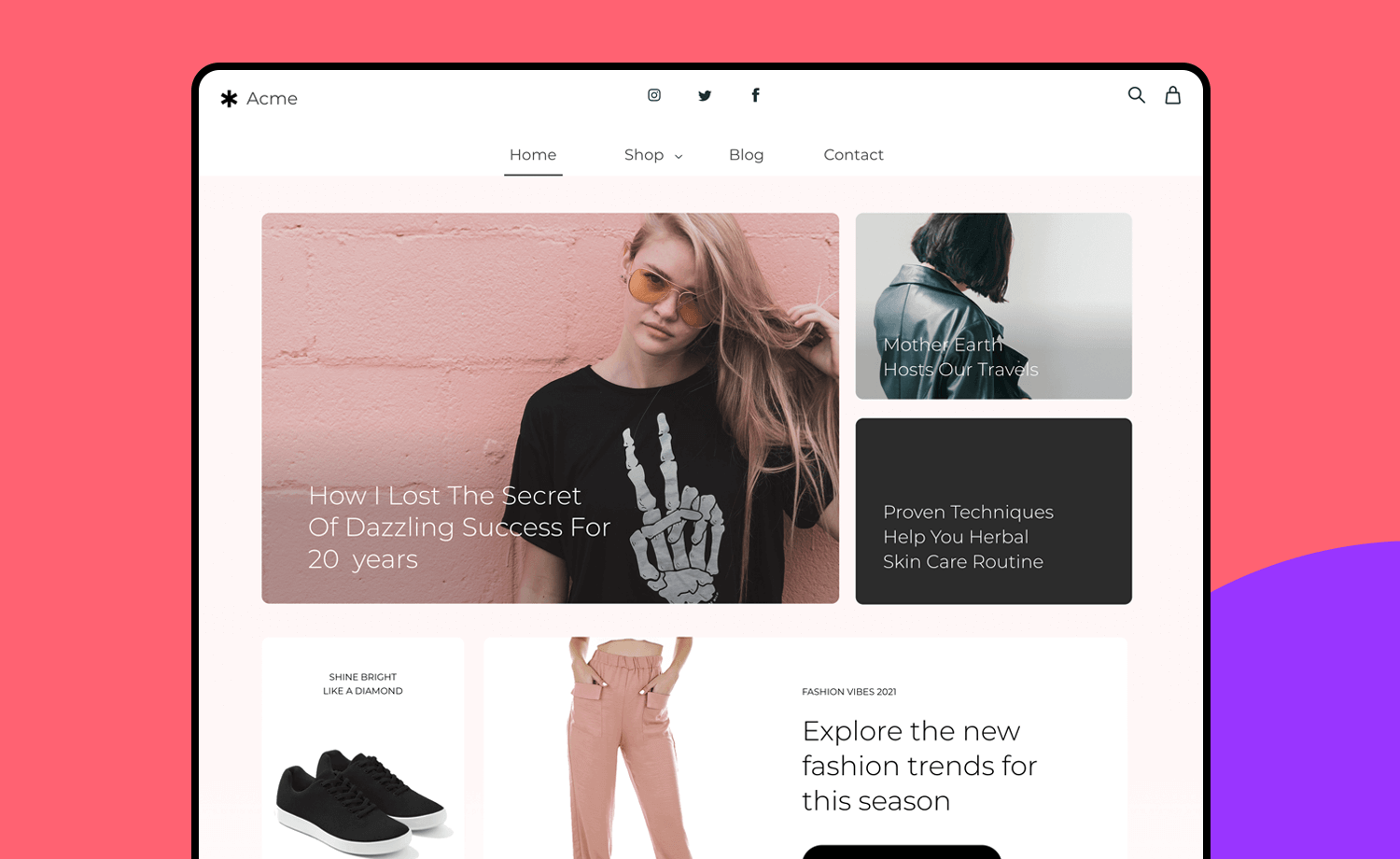
This example also features image grids for all the different products as well as different stand-out graphic elements to showcase featured items.
This example offers you various left-side navigation bar layouts for any type of project. Each option comes with the essential menu categories including settings, user profile, home, information overview, and even an analytics and a comments category.
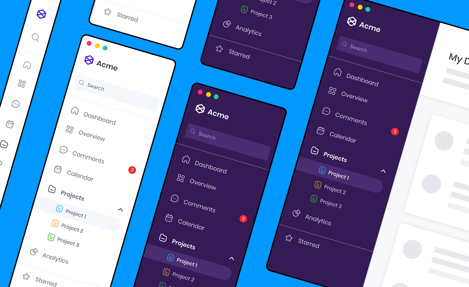
The design of this main navigation sidebar is perfect to get started and will allow you to easily grow it if need be without losing any structure.
This product page screen is suitable for any type of online shop, including shoes. You can use this example as a landing page for a specific product or to offer a close-up shot that highlights the product’s details.
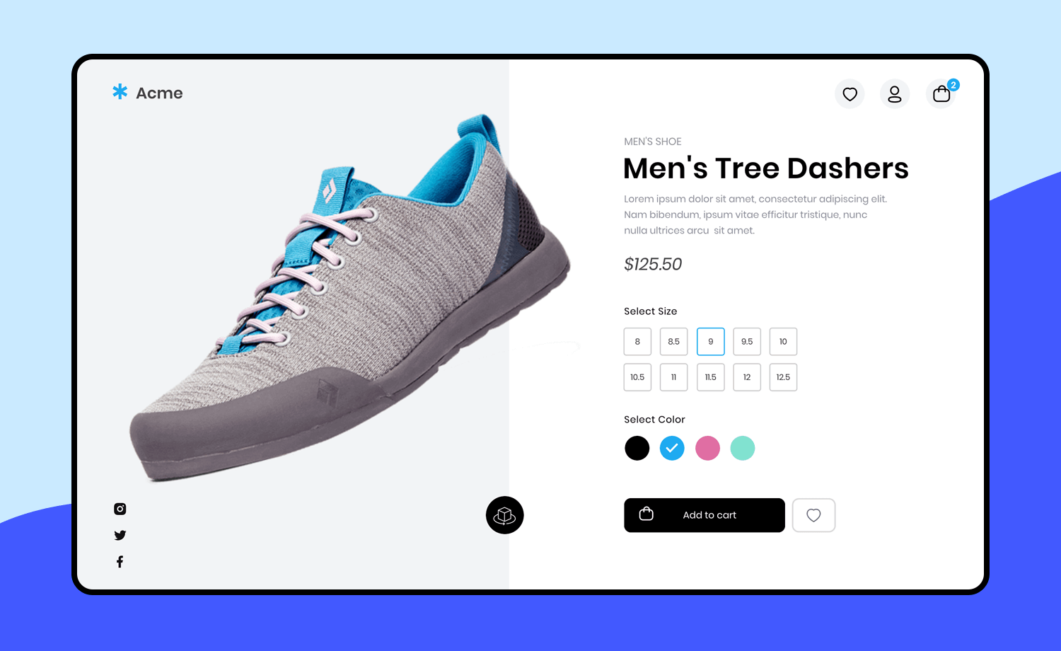
This design includes add to cart and add to favorites buttons, as well as social media icons and a subtle but straightforward navigation bar at the top.
This attention-capturing example features a well-organized web dashboard with all the information you need at first glance. Its white and neon blue color combination makes for improved readability and contrast.
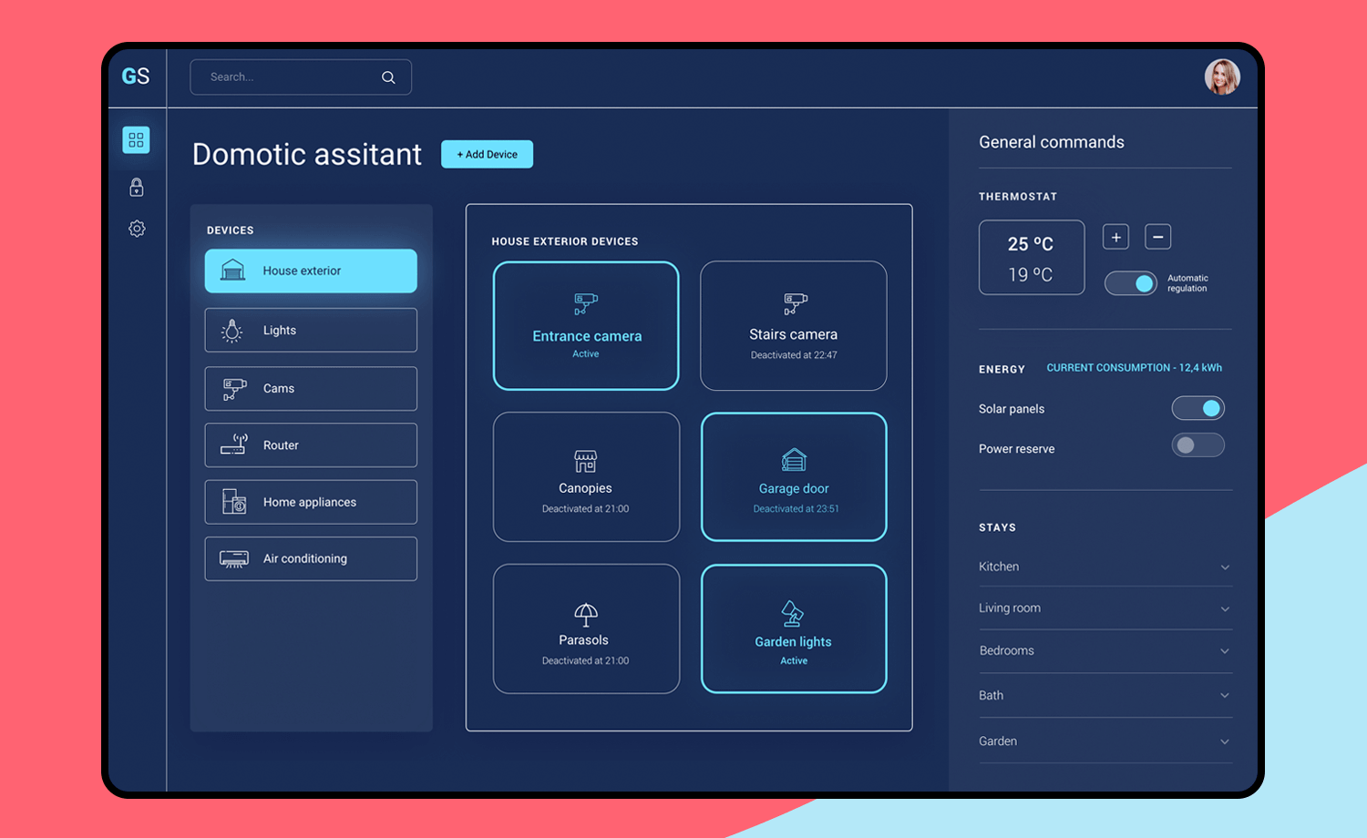
Acting as a single central user interface to control several devices, this design allows the user to interact with all their smart devices and features intuitively.
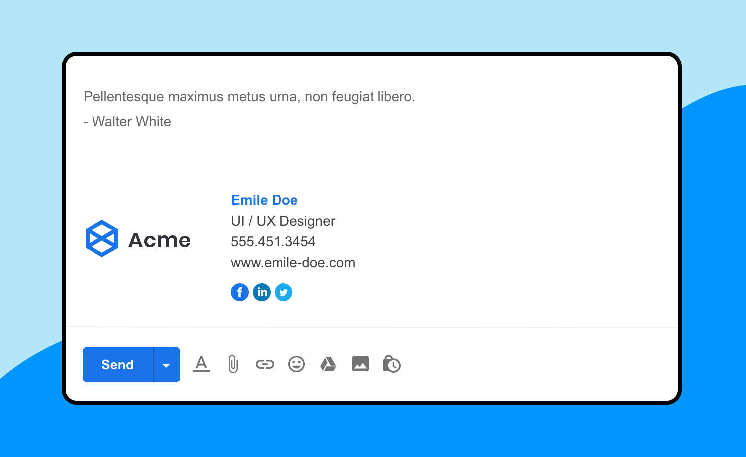
Because it is always nice to have a ready to use email template! This design is the classic gmail ‘new message’ layout. It is an easily scannable desktop email example that includes lorem ipsum text that is broken into sections. The design of course includes a complete signature with image and social media icons.
When it comes to creating a digital product, navigation plays a key role and this example covers one of the two most commonly used navigation options: the horizontal menu. This single screen dashboard has a horizontal navigation bar on top, which allows for the rest of the page to be used for content.
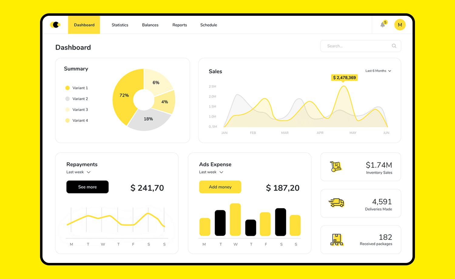
In this case we have a sales dashboard with enough real estate available to present data in a user-friendly way with easy to interpret graphs and charts. Make it your own in a few clicks!
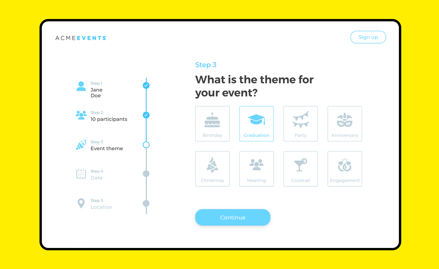
This web app example is an interactive design that covers the entire registration process of an event. It includes a vertical progress bar to help users get to the end of the registration form –this design also comes with visual cues to make the process fast and easy. And, all fields come with interactive inline validation so it requires the least interaction cost for the user!
Presenting simple views of all your financial information at a glance, this 3 screen design with a vertical navigation bar is the perfect layout to get you started. It includes an Overview with expenses report and recent activity in active credit cards.
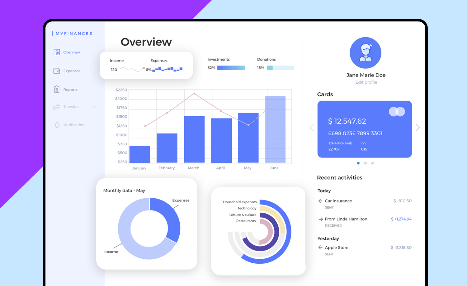
The second screen presents a detailed Expenses summary with the visuals to interpret the data, and finally a Reports screen that provides the viewer a rapid view of their liquidity over a period in time. The design is consistent throughout and simple enough to minimize distractions and maximize user experience. Also, this example is fully interactive!
This intuitive and basic sign up form example is a safe bet for any project that starts with a sign up. This friendly form shows only the essential required information to get the user started, including an agree to Terms & Conditions checkbox and a clear and simple CTA button.
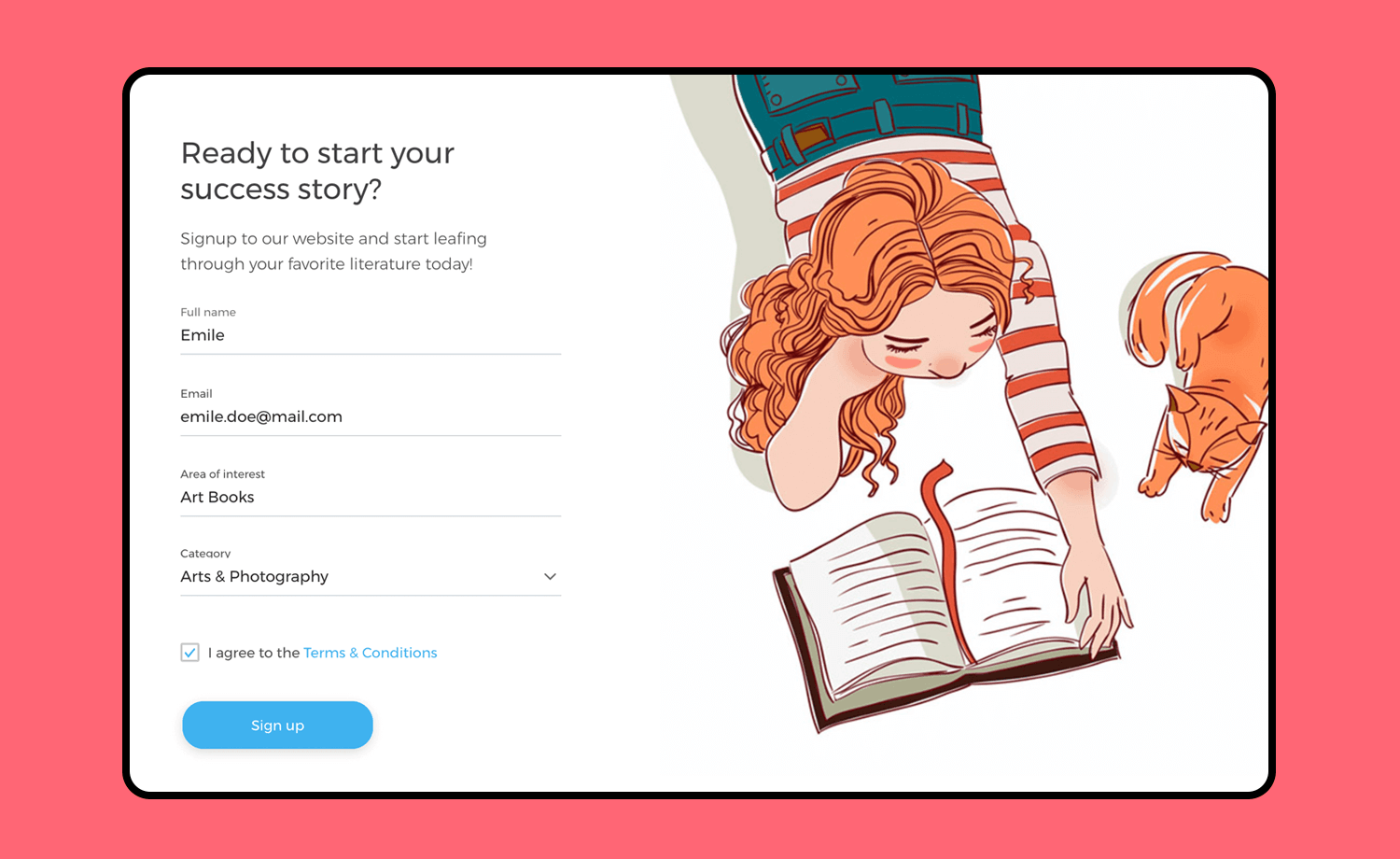
It comes with all interactions – from in-line validation to a select dropdown menu for categories, as well as a pop-up message to confirm a successful sign up.
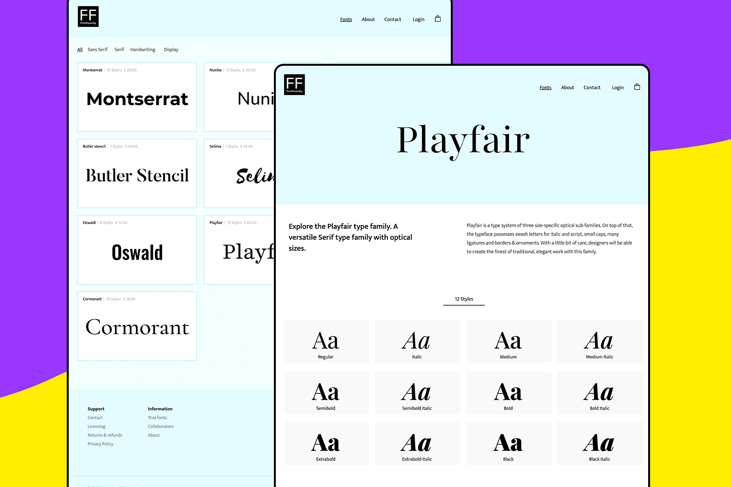
Looking to showcase your typefaces? This Type Foundry website design example is a great option for its clean and organized layout that makes it super easy for users to browse and preview different font families.
Perfect for any type design business wanting to stand out online.
Want to create a beautiful online presence for your eco-friendly florist business? This florist web app design example is a perfect option. With its clean and elegant design, you can showcase your floral arrangements and services effortlessly.
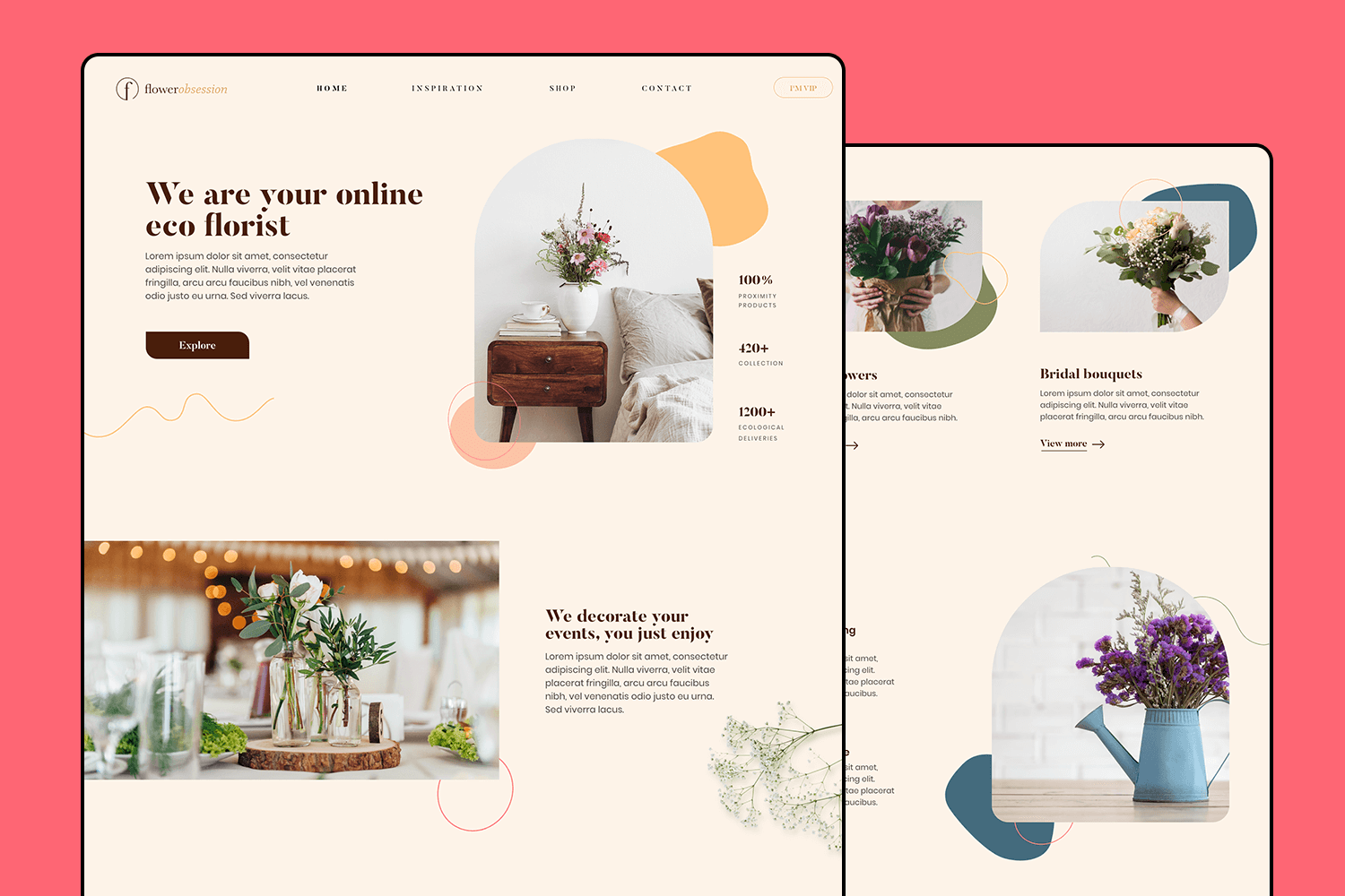
It features a lovely homepage with sections for featured products, services, and customer testimonials. The soft, natural color palette and stylish layout make it easy for visitors to fall in love with your brand.
Make your favorite example interactive with Justinmind

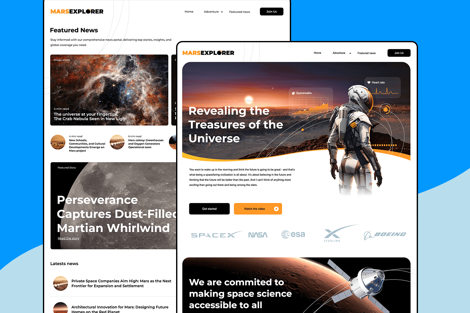
This Mars explorer website design example makes it easy to explore the final frontier with a sleek, futuristic design. This example is great for showcasing space missions and the latest cosmic discoveries. Dive into the homepage filled with eye-catching visuals and intriguing sections about space adventures.
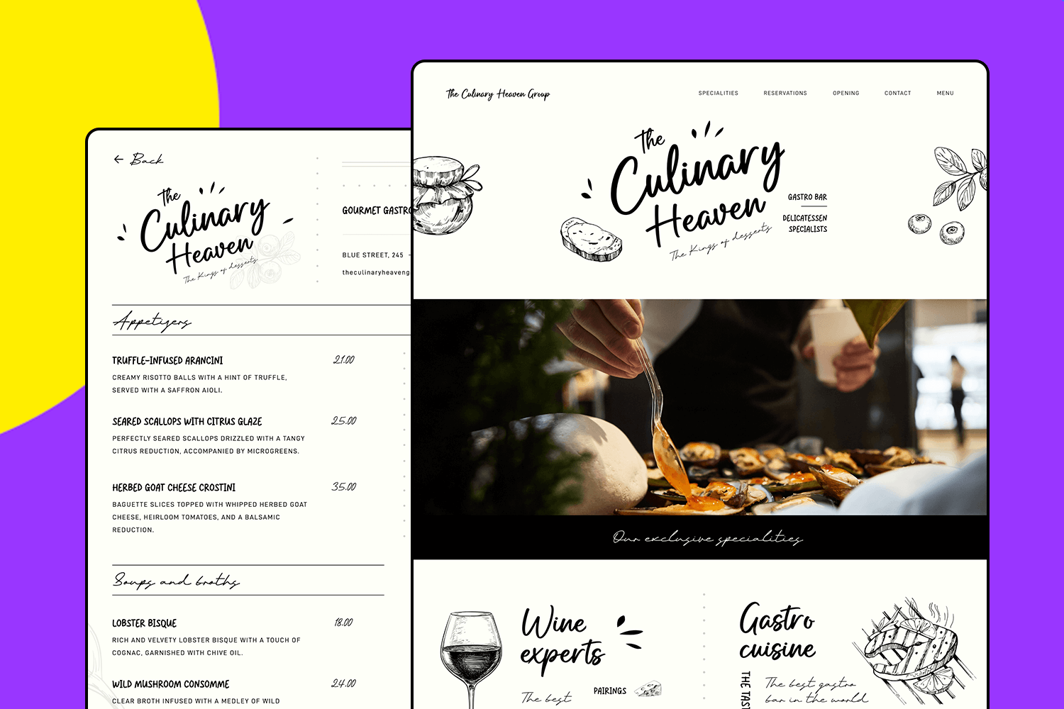
Bring your gourmet vision to life with this website design template. This stylish and appetizing design is perfect for showcasing unique dishes, setting up reservations, and promoting events.
It’s an excellent choice for anyone looking to create a captivating online presence for their culinary business.
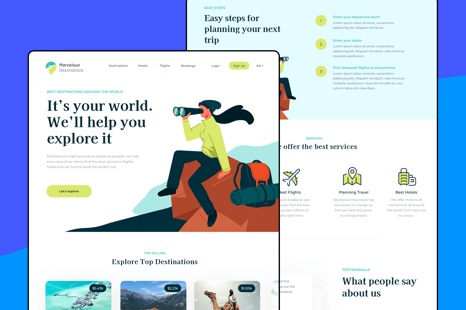
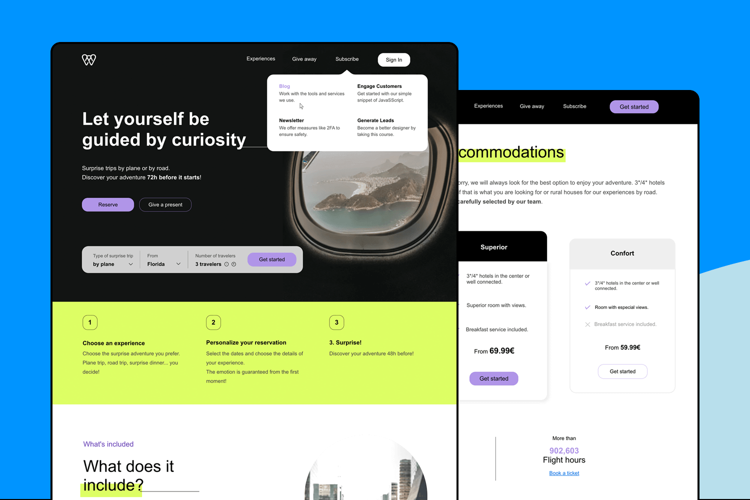
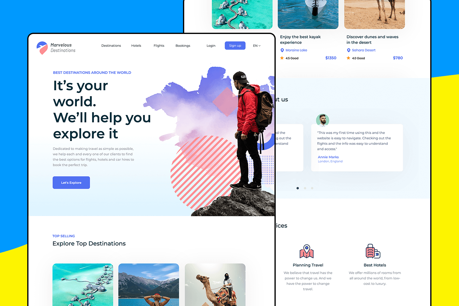
Here’s a great example for travel enthusiasts.This website design example is perfect for showing off amazing travel destinations. Its exciting and colorful design makes it easy to find the best places to visit, book flights and hotels, and get inspired for your next adventure.
Your audience will love exploring and planning their next trip with this fun and easy-to-use website.
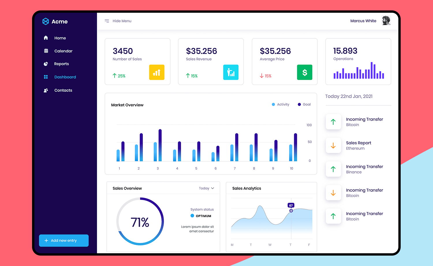
Boost your sales team’s performance with this sleek and intuitive sales dashboard. Its vertical navigation makes it easy to access essential data, from the number of sales and average deal size to a comprehensive market overview and in-depth sales analytics.
Track key metrics, monitor trends, and identify opportunities for growth, all in one centralized location. With its clean, modern design and user-friendly interface, this dashboard empowers your team to make data-driven decisions and drive sales success.
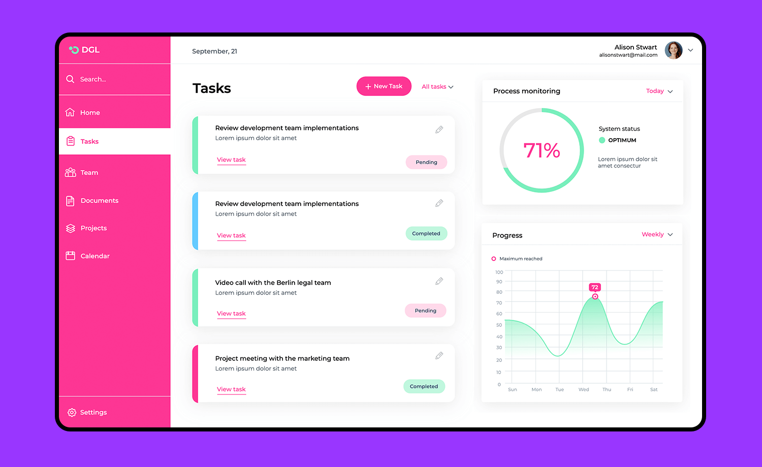
Stay organized and on top of your tasks with this web app design. Featuring a bright and clean layout, it’s perfect for managing projects, tracking progress, and collaborating with your team.
The dashboard includes sections for task lists, process monitoring, and progress charts, making it easy to see what needs to be done at a glance. Ideal for anyone looking to streamline their workflow and boost productivity.
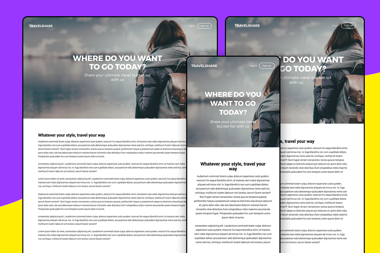
Picture this: a travel blog that looks amazing on any device, whether it’s a desktop, tablet, or smartphone. This responsive website design example is just what you need.
With a sleek and modern design, it’s ideal for sharing your travel stories, tips, and guides. Inspire your readers to explore the world with your unique perspective.
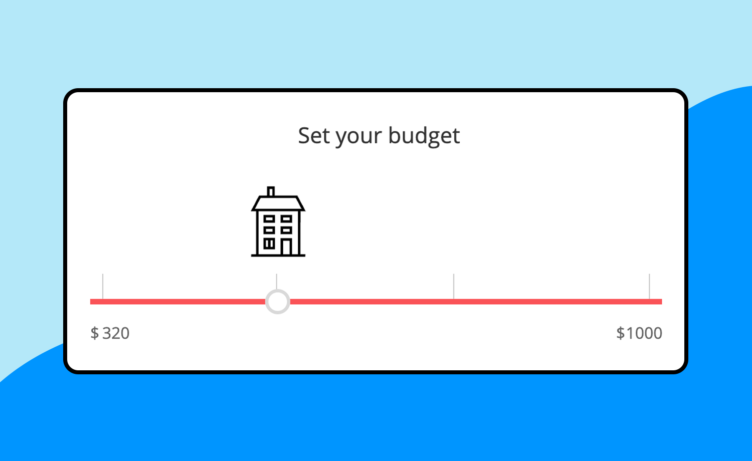
Need a simple way to set budgets? With this free website design example and its clean and intuitive tool, helping users to adjust their budget with a slider will be pretty easy.
Perfect for any project that requires budget setting, this example makes it straightforward and user-friendly.
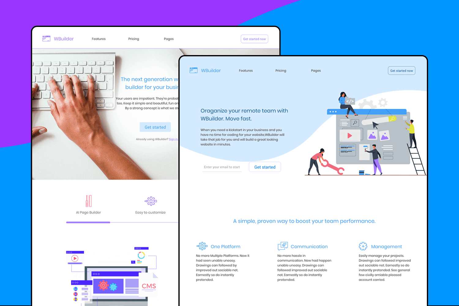
One of the website design templates you’ll love is the Web Builder web app template. It’s perfect for creating stunning websites effortlessly. With its intuitive and user-friendly design, you can easily customize layouts, manage content, and navigate your site.
Whether you’re building a business site, portfolio, or blog, this example has all the tools you need to get started quickly.

Creating a website or web app from scratch can be tough and time-consuming. That’s why we created these practical, ready to use templates. To help you save on time and effort, giving you a head start. With the right template, you can take full advantage of the structure and simply fill in the details.
PROTOTYPE · COMMUNICATE · VALIDATE
ALL-IN-ONE PROTOTYPING TOOL FOR WEB AND MOBILE APPS
Related Content
 A fun look at different data table designs, from basic lists to smart, interactive ones, based on how complex the data is and what users need.18 min Read
 Single page design v multi-page design – everything you need to help you choose the right design for your site’s content18 min Read
 Website backgrounds can be a powerful tool in creating an experience. But what kind of experience can you convey and how? We got the full run-through for you!14 min Read
