How do designers create entire new worlds for players? Check out this guide to game UI design and find out!
Who doesn’t love video games? There are so many different types of games out there now, it can be difficult to keep track of them all. UI designers are, perhaps, the best suited to appreciate the amount of work and planning that goes into creating a game from scratch.
There are many factors to consider, from who the players will be to how complex the plot needs to be – game UI design is one of the most interesting fields of design right now. Game UI design has attracted people since the 1980’s, with the boom in the number of people who would invest money into digital games.
Design and prototype game UIs with Justinmind.

Since then, people have dedicated time and effort into studying the theory of game design as well as understanding why people prefer some games over others. There’s a huge number of designers in their favorite UI design tool creating new games as you read this sentence.
Let’s take a closer look at how designers approach the matter of creating a new game, how they ensure players will get hooked and how it all comes together. Read on!
- What is a game UI?
- Understanding game UI requirements
- Levels of game UI design: world, system and levels
- Core elements of game UI
- Visual design principles for game UI
- UX considerations and player flow
- Platform-specific considerations
- Style and art direction in game UI
- The 15 best games UI for mobile, desktop, and consoles
Imagine stepping into a vibrant world, a realm of adventure and challenge. Game UI is your guide, your translator, your control panel in this digital space. It’s the visual layer that lets you interact with the game, from navigating menus and understanding the story to monitoring your health and unleashing special abilities. Think of it as the cockpit of your spaceship or the magical interface of your spellbook – it’s the thing that makes your mark on the game world.
Unlike the straightforward interfaces of apps or websites, game UI has a unique mission: to immerse you in the experience. Visuals, sounds, and of course, animations are carefully crafted to match the game’s theme, drawing you deeper into the narrative. A health bar might resemble a mystical amulet, a map could be an ancient scroll, and dialogue boxes might echo the style of the game’s era.

Game UI walks a tightrope between providing crucial information and preserving the magic of the game world. It needs to display health, ammo, objectives, and a myriad of other details without cluttering the screen or breaking the spell. This often leads to clever design solutions like Heads-Up Displays (HUDs) that overlay essential information subtly, or contextual menus that appear only when needed so as not to pull players out of the immersive experience.
Try to picture a gritty sci-fi game with a bubbly, cartoonish UI – you can’t can you? That’s because there’s a disconnect there which is also visibly jarring. A well-designed UI uses visual cues and metaphors that resonate with the game’s world, drawing players deeper into the experience.
This relationship between UI and world-building directly impacts player satisfaction. A clunky, confusing UI creates frustration, hindering enjoyment. A smooth, intuitive UI, on the other hand, empowers players, allowing them to focus on the game itself – which is what you want.
Clear info, responsive controls, and easy navigation all work together to make your gaming experience way more fun and satisfying.
The UI plays a vital role in onboarding and tutorials. It’s often the player’s first interaction with the game’s mechanics, and a well-structured UI can make learning both smooth and enjoyable.
Clear instructions, handy little tooltips that explain things, and menus that just make sense all work together to help you get started without any head-scratching. It’s like having a friendly guide who shows you the ropes so you can jump right into the fun and start enjoying the game!

But the UI’s role doesn’t end with onboarding. Throughout the game, it acts as a constant companion. HUDs display vital stats like health, ammo, and progress, keeping players informed and in control.
Think of it like the game giving you a high-five or a gentle nudge – it’s all about letting you know what happened and why! Whether you nailed a perfect shot or accidentally sent your character plummeting off a cliff, clear feedback helps you learn and get better.
A good UI makes sure this info is both helpful and engaging, so you’re always in the loop and understand the consequences of your choices, big or small.
RPGs
RPGs – short for role-player games – are notorious for their intricate UIs, and for good reason! These games often juggle a ton of information: character stats, inventories bursting with loot, sprawling skill trees, epic quest logs, branching dialogue options… the list goes on! The challenge for developers is making all this vital information readily accessible without overwhelming the player with a cluttered mess.

Hogwarts Legacy UI
Think intuitive menus, clear icons, and helpful tooltips. And because every player is different, customization options are a huge plus, letting players tweak the UI to perfectly suit their playstyle and preferences. After all, you don’t want to be wrestling with your inventory when you’re facing down a dragon!
FPS (first-person shooters)
In the fast-paced world of FPS games, the UI is all about keeping you alive and in the action. Think streamlined HUDs that give you the essentials – health, ammo, crosshair – without blocking your view of the battlefield.
You need to switch weapons and access other key actions fast, so the UI needs to be snappy and responsive. Distractions are the enemy here; the goal is maximum situational awareness, allowing you to react quickly and stay one step ahead of the competition.

Call of Duty - Warzone UI
A good FPS UI is almost invisible, providing the information you need before you even realize you need it.
Strategy games
Strategy games, with their sprawling empires and intricate systems, demand UIs that can handle a deluge of information without giving players a headache. We’re talking resources, units, buildings, global maps – the works! Clear visual cues are essential here, so players can quickly grasp the state of their civilization at a glance.
Intuitive controls are equally important for managing complex economies and commanding vast armies. The UI needs to be a well-oiled machine, presenting all this information in a logical hierarchy, so players don’t get lost in a sea of menus and data.

UI de The Lord of the Rings - Battle for the Middle Earth
Mobile casual games
Mobile casual games live and die by their UI. Simplicity and intuitiveness are king here. Touch controls need to be second nature, working flawlessly on those smaller screens. Visual clarity is absolutely crucial since players are often dropping in for short bursts of gameplay – no time to decipher a cluttered interface! Think big, friendly buttons, clear feedback, and a minimal amount of fuss.

Candy Crash UI
MMOs (massively multiplayer online games)
MMOs are the chameleons of UI design, often blending the complexity of RPGs with the large-scale management of strategy games. This means their UIs need to be highly customizable and packed with features.
Think about it: players juggling groups, raids, guilds, and inventories that could make a hoarder blush. Customization is key here, as players need to tailor their UI to handle everything from coordinating attacks to tracking buffs and debuffs.

League of Legends
One of the biggest challenges in game UI design is balancing complexity with usability. Deep strategy games often require complex UIs to convey the necessary information, but this complexity can be overwhelming for new players. The key is to present information clearly and logically, using visual cues, tooltips, and tutorials to guide players through the intricacies of the game.
On the other hand, action games like FPS titles demand streamlined UIs that provide essential information without distracting from the fast-paced gameplay. The UI must be intuitive and responsive, allowing players to react quickly to changing situations. Striking the right balance between depth and accessibility is crucial for creating a UI that enhances, rather than hinders, the player experience.
Creating a truly great game UI is like putting together a welcoming home for your players. And to do that, you have to start by understanding who your users, or players, are and what they’re hoping to experience.
Are they popping in for a quick visit, eager for instant fun? Or are they settling in for a long stay, ready to explore every nook and cranny? Knowing your target audience – whether they’re casual gamers looking for simplicity or hardcore players craving depth – is the first step in designing a UI that feels just right.
Once you know who your players are, it’s time to consider what they’re hoping to do in your game. Are they driven by a desire to conquer every challenge, meticulously ticking off every achievement?
Or do they yearn to lose themselves in a rich narrative, uncovering every hidden secret? Understanding these motivations – whether it’s competition, exploration, or storytelling – helps you tailor the UI to support their specific goals. A completionist, for example, will appreciate a detailed quest log, while an explorer might benefit from a map with subtle hints pointing towards hidden treasures.

Beyond goals and motivations, we also need to consider player skill levels. A beginner needs a gentle introduction, with clear tutorials and helpful tooltips. Imagine handing a novice driver the keys to a race car – overwhelming!
Instead, we start with the basics, gradually introducing more complex features as they gain confidence. On the other hand, experienced players often crave efficiency and customization. They want to fine-tune their UI to display precisely the information they need, exactly where they need it.
Ultimately, a player-centric approach to UI design is about empathy. It’s about putting yourself in the player’s shoes and asking: “What would make this game not just playable, but truly enjoyable?”
Design and prototype game UIs with Justinmind.
Think of the core loop – that satisfying cycle of actions that keeps players hooked. Whether it’s gathering resources, battling baddies, or cracking clever puzzles, the UI needs to be a smooth operator, making these actions feel natural and intuitive.
When you’re out collecting items, the UI should be your helpful assistant, clearly displaying what you’ve gathered, what it does, and how to use it. A well-organized inventory should be on your priority list. It basically lets your players compare treasures and equip the best gear without a hassle. And a little visual flair, like a shimmering highlight on a rare find, can make the whole process even more rewarding.

In the heat of combat, the game UI design transforms into your real-time command center. Health bars, enemy weaknesses, cooldown timers – it’s all vital information that helps you make split-second decisions. The UI should also give you clear feedback on your actions, letting you know how much damage you’re dealing and any status effects you’ve inflicted.
And when you’re tackling a brain-bending puzzle, the UI becomes your interactive canvas. It presents the challenge clearly, giving you the tools and information you need without giving away the answer. Intuitive controls and clear visual cues make the puzzle-solving process smooth and satisfying, turning frustration into fun.
Now, let’s talk about making the UI feel like a natural extension of the game, not a separate layer slapped on top. This means the UI needs to be context-aware, displaying relevant information based on what you’re doing at any given moment. When you approach an object, the UI might pop up with options to examine it, use it, or pick it up.
And it’s crucial for the UI to be responsive, providing immediate feedback to your actions. When you land a hit on an enemy, you should see a clear visual cue that confirms the damage. When you solve a piece of a puzzle, you should get a satisfying confirmation. These little touches make a huge difference in how connected your players feel to the game world.

Finally, a great UI speaks a consistent visual language. Icons, colors, and animations should be used consistently throughout the game, so you can quickly understand what things mean without having to constantly relearn the rules.
Intuitive controls are also essential, making it easy to interact with the game world, whether you’re using a touchscreen, a controller, or a mouse and keyboard. It’s all about making the experience feel smooth, effortless, and enjoyable. When the UI and the gameplay work together in harmony, that’s when the magic happens.
Imagine a gritty, post-apocalyptic RPG. A bubbly, brightly colored UI would feel jarring and out of place, breaking the immersion. Instead, the UI should reflect the harshness of the setting, perhaps using rusted metal textures, flickering lights, and a font that evokes a sense of desperation. The UI becomes a visual extension of the game world, reinforcing the narrative of survival and struggle.
The art direction of a game also heavily influences UI design. If a game employs a minimalist art style, the UI should follow suit, using clean lines, subtle colors, and avoiding unnecessary clutter. A highly stylized game, on the other hand, might use bold shapes, vibrant colors, and unique visual effects to create a more distinctive UI.

The UI should feel like it belongs in the game world, not like an afterthought. This might involve incorporating textures, patterns, and color palettes from the game’s environments and characters into the UI elements.
As in everything design-related, consistency is key. In game UI design, if the main menu is sleek and modern, that same aesthetic should carry through to the HUD, inventory screens, dialogue boxes – everything. Font, colors, visual style – these elements should echo each other, creating a unified and cohesive feel.
And it’s not just about menus and HUD. This consistency needs to extend to how you interact with the game world itself. If the game world has a flat design, the UI elements that pop up when you interact with objects or characters should also be flat. This means don’t use skeuomorphic clunky, ornate windows in a sleek, modern environment!
First, the world design. This is, as the name suggests, the action of creating the world or universe in which the game takes place. Usually, this falls to the head designer given the complexity and depth of the design challenge – creating an entire world isn’t easy. It must accompany the plot and set the tone for the game, creating a concrete map that players can follow as they progress.
Secondly, we have the system design. Some teams approach this as a more technical role, which deals with the technological and mathematical aspect of game UI design. Other design teams simply allocate to system design the definition of rules and the technical requirements to uphold these rules.
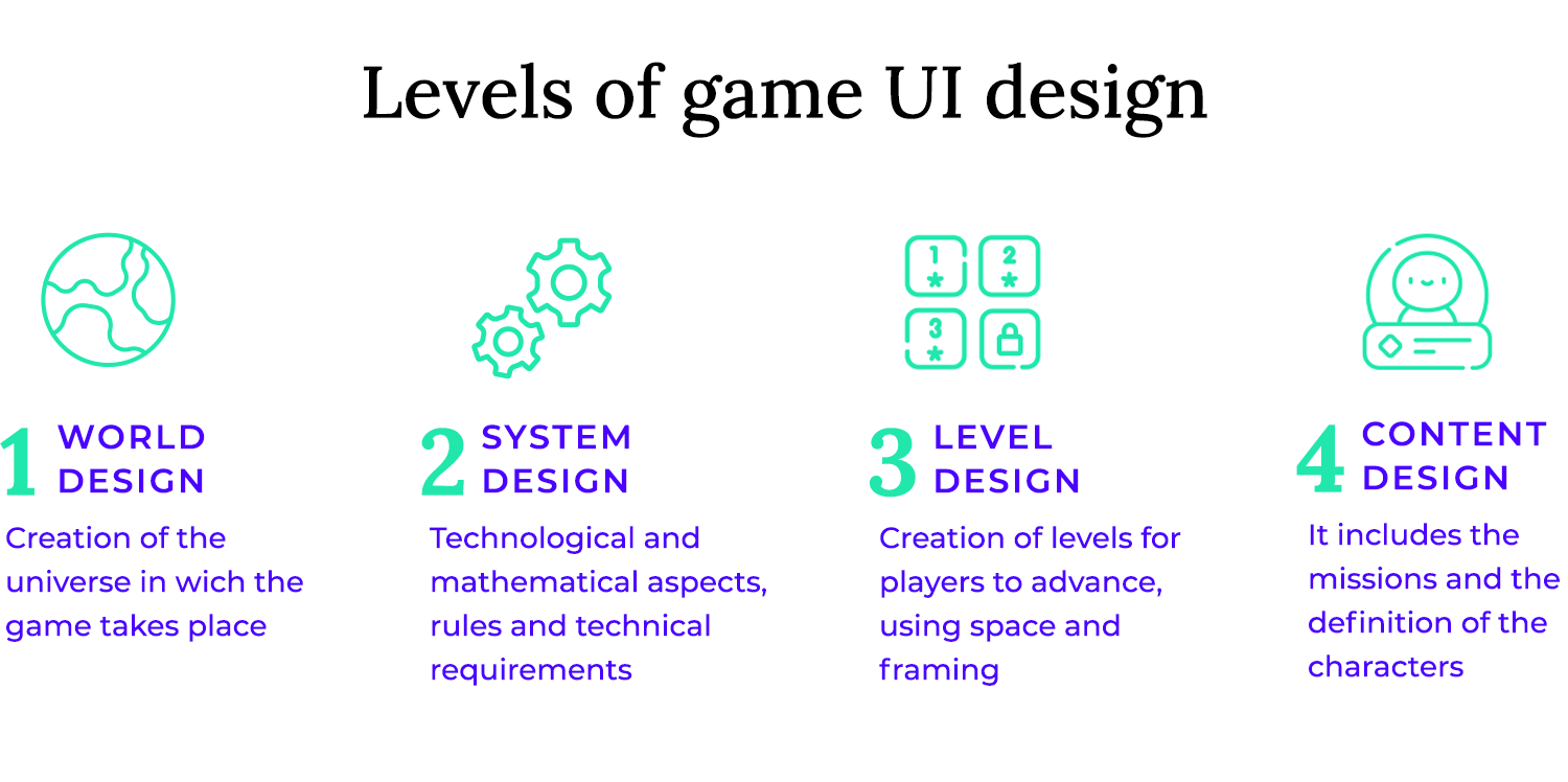
Third, we have level design. This is where designers use the rules and plot as well as the world created for the game in order to create levels for players to move through. This is where things like the space, contrast and framing come into play so that designers can direct players. Perhaps even more interesting is that while we create levels for players to advance through, there can also be misleading elements that aim to distract and trick players.
Fourth, we have content design. This is where the design team defines and creates the characters, the missions and any other form of content needed for the game. Some designers define this form of game UI design as something that excludes everything needed for the minimum viable product.
That is to say that while the main characters may not be included in content design, all secondary characters are. To some design teams, content design simply adds complexity to the MVP.
The previously mentioned HUD is the player’s constant companion in the game world, providing crucial information at a glance. Its design and placement are critical for maintaining immersion and ensuring players have the data they need to succeed. Effective HUD design is a delicate balancing act – providing essential information without overwhelming the player with visual clutter.

Let’s talk about placement first. HUD elements should be positioned strategically to be easily visible without obstructing the player’s view of the action. Corners are a popular spot for HUD elements – they’re easy to glance at without taking your eyes off the main action. But it really depends on the game. In a high-octane action game, you might want health and ammo closer to the center, where your eye naturally gravitates. In a strategy game, where things move at a slightly slower pace, resource counts in the corner are perfectly fine.
And design-wise, clarity is king. Health bars should be instantly readable – maybe using color gradients or clear numbers. Timers need to grab your attention without causing a panic attack. Mini-maps should be informative, showing you where you are and what’s around you without being a cluttered mess. Resource counters should be clear and to-the-point.
And of course, the whole HUD should feel like it belongs in the game world. The fonts, colors, and visual style should blend seamlessly with the game’s overall aesthetic.

The biggest challenge with HUD design is minimizing visual clutter. Too much information on the screen can overwhelm the player, making it difficult to focus on the gameplay. Minimalist design is one great approach. Just the essentials, please!
Another clever technique is using dynamic HUD elements. Why have a health bar constantly screaming at you when it’s full? Make it pop up when you take damage, then fade away. Transparency and subtle animations can also work wonders, making HUD elements feel less intrusive.
Time to talk about menus and navigation in games – they’re like the roadmaps that guide us through our adventures!
- Main menu: First up, you’ve got the main menu, the grand entrance to the game where you can start playing, tweak settings, and explore other options.
- Pause menu: Then there’s the pause menu, your trusty sidekick when life calls mid-game – it freezes the action and lets you jump back in, save your progress, or head back to the main menu.
- Inventory: Next, we have the inventory, your treasure trove of collected goodies, where you can organize and use all your hard-earned loot.
- Skill trees: For RPG fans, skill trees are where the magic happens, a visual playground for unlocking awesome new abilities and customizing your character’s growth.
- Quest log: And finally, there’s the quest log, your trusty journal keeping track of all your epic adventures, reminding you what to do and what sweet rewards await.

Consistency goes a long way here – a similar layout and design language across all menus helps players quickly orient themselves and find what they’re looking for. Clear and intuitive navigation is paramount; players shouldn’t have to hunt for basic options or get lost in a maze of sub-menus.
Design and prototype game UIs with Justinmind.
Dialogue and text displays are the unsung heroes of game UI, bringing stories to life and facilitating communication between characters and players. Whether it’s a bustling chat system in an MMO, the unfolding narrative in story text, helpful subtitles keeping you immersed, or the crucial choices presented in interactive dialogue, these elements are essential for conveying information and driving the narrative forward.
- Chat systems: First up, we’ve got chat systems, the bustling town squares of online games where players can chat, team up, and trade tips in real-time.
- Story text: Then there’s story text, the heart of the narrative, unfolding the game’s lore and adventures through cutscenes, dialogue boxes, or even little environmental details you discover as you explore.
- Subtitles: Subtitles are a game-changer, opening up the experience to everyone by translating spoken dialogue into text, making sure no one misses a beat.
- Interactive dialogue: And finally, there’s interactive dialogue, where you get to shape the story! These branching conversations let you make choices that impact the plot and how you interact with other characters.

First and foremost, readability is paramount. Text should be easy to read at a glance, even in the midst of intense gameplay. This means choosing appropriate font sizes and styles. Fonts should be clear, legible, and consistent with the game’s overall aesthetic.
Avoid overly stylized or decorative fonts that can be difficult to read. Consider using different font weights and sizes to create visual hierarchy, making important information stand out. A fantasy game might use an elegant, serif font, while a sci-fi game might opt for a clean, sans-serif font.
Subtitles should also be clear and easy to read, especially in fast-paced action sequences. They should be timed appropriately and positioned in a way that doesn’t obscure the gameplay.
Integrating voice-over or sound cues can significantly enhance the player’s experience. Voice acting brings characters to life and adds depth to the narrative. Sound cues can provide important feedback, such as when a character is speaking or when a new message arrives in a chat system.

When voice-over is used, text displays can serve as a backup, providing players with a visual representation of what’s being said. This can be especially helpful for players who are deaf or hard of hearing, or for those who are playing in a noisy environment.
Players need to understand how to interact with the game world, and the UI plays a crucial role in communicating these controls. Visual cues for different input methods, like keyboard/mouse, controller, or touchscreens, are vital, as is the UI’s ability to adapt dynamically to the player’s chosen control scheme.
For keyboard and mouse, this might involve displaying icons of the relevant keys or mouse buttons. For controllers, it’s crucial to show the correct button prompts for the specific controller being used (Xbox, PlayStation, Switch, etc.). Touchscreen controls should be clearly marked and easy to interact with, especially on smaller screens. The game UI design should also provide helpful tooltips or explanations for less common actions or complex combinations.

Dynamic on-screen prompts are a great way to adapt to different control methods. Instead of displaying static keyboard prompts, the UI can dynamically switch to controller prompts when a controller is connected and being used. This ensures that players always see the correct prompts for their chosen input method, eliminating confusion and frustration. The game UI can also adapt to different contexts within the game. For example, when the player enters a vehicle, the on-screen prompts might change to reflect the vehicle’s controls.
Customization options are also valuable. Allowing players to remap keys or controller buttons can greatly enhance their experience, especially for players with specific preferences or accessibility needs. The UI should clearly display these remapped controls, ensuring that players always know what actions correspond to which buttons.
Pop-ups, when used sparingly, can be effective for conveying important information, such as level-ups, quest completions, or significant story events. They should be visually distinct but not overly intrusive.
Achievement notifications should be celebratory but brief, acknowledging the player’s accomplishment without interrupting the flow of gameplay. A small, unobtrusive icon and a short message are more than enough.
Visual cues, such as flashing health bars, screen flashes, or directional indicators showing where the damage came from, can help players understand the situation and react accordingly.
However, these indicators should be designed carefully to avoid obscuring the player’s view or creating unnecessary visual clutter. Status effects, such as poison or buffs, should be clearly displayed but not overly prominent. Small icons or subtle visual effects can be effective without being distracting.

Think of it like getting a friendly tap on the shoulder, not a shout in your ear! Good feedback and notifications should grab your attention without being annoying. A mix of visual cues (like a subtle flash or change in color) and audio cues (a little chime or whoosh) can do the trick.
Timing is everything, too! You don’t want a message about your Farmville crops wilting to pop up right when you’re facing a final boss. Less important stuff can wait for a quieter moment, so you can stay focused on the action. It’s all about keeping you informed without pulling you out of the game.
The colors of the UI should complement the game’s vibe. A fantasy game might use warm, earthy tones like browns, greens, and gold, to make you feel like you’re exploring a magical world. A sci-fi game, on the other hand, might lean towards cool blues, grays, and silvers to create a futuristic atmosphere. It’s all about using colors to evoke the right mood and pull you deeper into the game world, making the whole experience more immersive and enjoyable.

Think about how colors make you feel – that’s the psychology of color at play! Red is often used for health bars because it instantly signals danger and urgency. Green, on the other hand, often represents good things, like buffs or positive status effects. A well-chosen color palette can look good and also subtly communicate important information to the player.
Poor contrast in a game UI is just as frustrating. If the text or icons blend into the background, it becomes a struggle to see important information, which can really ruin the experience.
A good rule of thumb is to go for high contrast – think dark text on a light background or the other way around. It’s like black and white – clear, simple, and easy on the eyes. Using colors that are too similar can make text and icons blend into the background, causing frustration and eye strain.
There are even handy online tools called contrast checkers that can help you make sure your colors are accessible. And it’s super important to remember that some players might have colorblindness, so always double-check that your color combinations are still distinguishable, even if someone can’t see all the colors perfectly. A little extra consideration goes a long way in making your game enjoyable for everyone!
It’s a delicate balancing act: finding fonts that have enough flair to fit the game’s world without sacrificing legibility, especially for critical information like stats and instructions. A fantasy RPG might use an ornate, elvish-inspired font, while a gritty cyberpunk game might opt for a sharp, geometric typeface.

The font should reinforce the game’s theme and contribute to the player’s immersion. However, style shouldn’t come at the expense of legibility. Fancy fonts can be beautiful, but if they’re difficult to read, they’ll hinder the player’s experience.
This is especially true for important information like character stats, quest descriptions, and tutorial instructions. You want players to be able to quickly and easily understand the information, not squint and struggle.
For critical text elements, prioritize clarity and readability. Choose fonts that are easy to scan and decipher at a glance. Consider using different font weights and sizes to create visual hierarchy, making important information stand out. For example, you might use a bolder font for headings and a lighter font for body text.
Kerning (the spacing between letters) and line height (the spacing between lines) also play a role in readability. Adjust these settings to ensure that text is comfortable to read. Test your font choices in different contexts and at different sizes to ensure they remain legible. Even a beautifully stylized font is useless if the player can’t read it.
Iconography is a visual language within your game. A potion icon instantly tells you “healing!”, while a sword icon clearly means “attack!”. Well-designed icons are like a visual shorthand, letting players quickly understand what’s what without having to read a wall of text.
These icons have to match the game’s style, whether it’s a whimsical cartoon, a gritty fantasy world, or a sleek sci-fi setting. Consistent iconography looks great and helps immerse your players in your game world.
Your game’s icons are tiny ambassadors of your game’s world. Imagine a whimsical fantasy adventure – the icons there might be hand-drawn and playful, bursting with vibrant colors and swirling lines. Now picture a gritty sci-fi game; the icons there would likely be sleek, geometric, and maybe even have a metallic sheen.
The point is, your icons need to feel like they belong in your game’s universe. It’s all about creating icons that whisper, “Welcome to this world!”
Clarity in icon meaning is essential for usability. Icons should be easily recognizable and their meaning instantly understandable, even at small sizes. Simple shapes, clear symbols, and a consistent visual style are key to making sure players know what each icon represents at a glance. If an icon’s meaning isn’t obvious, a little tooltip or label can be super helpful, especially for less common actions or items.
And don’t forget to test your icons on different screens – you want to make sure they’re still clear and easy to see no matter what device players are using. Creating a style guide for your icons is a great idea, too! It helps keep everything consistent and ensures your visual language is clear and effective throughout the game.
Design and prototype game UIs with Justinmind.
Grids are like the unsung heroes of game UI design – they’re the framework that keeps everything organized and looking sharp! Whether it’s a simple grid or a more complex modular system, they bring consistency and balance to the UI.
Think of it like building with LEGOs – the grid provides the foundation, ensuring all the elements align neatly and create a pleasing visual structure. This helps avoid a cluttered or haphazard look, making it easier for players to find what they need.

Players need essential info to make smart decisions, but nobody wants a UI that obscures the very game they’re trying to play! This means careful planning of screen real estate. Put the most important stuff – health, ammo, objectives – front and center, where players can see it instantly. Less critical info, like maybe a detailed quest log or less frequently used settings, can be tucked away in menus that are easy to access but don’t clutter the main screen.
Transparency and subtle animations are also your friends here, helping UI elements blend in and feel less intrusive. It’s all about giving players the data they need without making them feel like they’re looking at a spreadsheet instead of a game world.
UI animations, even subtle ones, can make a world of difference in how a game feels. Think of them as the polish that transforms a functional interface into a delightful experience. Instead of jarring screen transitions, gentle fades or slides guide the player’s eye and create a sense of flow.
Hover states, those subtle changes when you mouse over a button, provide valuable feedback and prevent accidental clicks. Even simple things like a smoothly updating health bar feel more polished and less abrupt than a sudden change. Ultimately, these small animations contribute to a UI that feels responsive, intuitive, and a joy to interact with.
Animations can also be used to provide meaningful feedback to the player. A health bar that pulses or flashes when the player takes damage provides immediate and clear feedback, allowing them to react quickly.
A subtle animation on a button press can confirm the player’s action and make the game UI design feel more responsive. Animations can also be used to convey information about status effects, such as a character being poisoned or buffed.

A great onboarding experience is like a friendly handshake that welcomes players to your game – it can make all the difference between them getting hooked or giving up in frustration! The trick is to gently introduce the basics, making learning fun and engaging, not overwhelming.
A major decision for developers is how to handle these first steps: do you weave tutorials directly into the gameplay, so players learn as they go? Or do you create separate tutorial levels, like a mini-training camp before the real adventure begins? Both approaches have their pros and cons, and the best choice depends on the specific game.
Contextual tutorials are woven seamlessly into the early stages of the game itself. As players encounter new mechanics or UI elements, the game provides brief, helpful explanations. This approach keeps players immersed in the game world and allows them to learn by doing.
It’s like learning to ride a bike with someone gently guiding you rather than reading a manual. Contextual tutorials can be particularly effective for games with complex systems, as they allow players to learn at their own pace, in the context of the actual gameplay. The UI itself can play a crucial role in contextual tutorials, highlighting interactive elements, providing tooltips, or displaying short video demonstrations.

Separate tutorial levels offer a more structured learning experience. They provide a dedicated space for players to practice core mechanics and familiarize themselves with the UI without the pressure of the main game. This approach can be beneficial for games with intricate controls or complex systems that require a more in-depth explanation.
However, separate tutorials can sometimes feel disconnected from the main game, and players may be eager to skip them and jump into the action. To make separate tutorials more engaging, consider incorporating narrative elements, challenges, or even mini-games to make the learning process more fun.
The best approach often involves a combination of both contextual tutorials and separate tutorial elements. Start with a brief, contextual introduction to the basic controls and UI elements, then offer a more in-depth tutorial level for players who want to learn more. This allows players to get started quickly while still providing a comprehensive learning experience for those who desire it.
Onboarding new players is like teaching someone to swim – you don’t just throw them in the deep end! A gradual introduction is key. Start with the absolute basics – the core gameplay and the most essential UI elements – and then slowly introduce more complex features as they get comfortable.
You should introduce new things in a logical order, building on what they’ve already learned. Contextual tutorials are a great way of doing this. The goal is to make the learning process smooth and enjoyable, so players feel confident and ready to dive deeper into the game.
These players crave depth and control, and they shouldn’t have to wade through layers of simplified UI to access the features they need. Consider offering UI customization options that allow experienced players to tailor the interface to their preferences.
This might include options to display more detailed information, customize control schemes, or even create custom HUD layouts. Clear and concise documentation, tooltips, or even advanced tutorials can also help experienced players quickly master the game’s more complex systems.

It’s not enough to simply display data; it needs to be presented in a way that allows players to quickly and easily grasp what’s most important. This involves following the UX design principles of information architecture and visual hierarchy when displaying critical information, like health and ammo, over secondary details, such as quest logs.
Critical information, such as the ones mentioned above, should be immediately visible and easily understood. A quick glance should tell the player everything they need to know about their vital stats Secondary details, like quest logs or inventory screens, are important but not as time-sensitive. These can be placed in less prominent areas or accessed through menus.
Size is a powerful tool for establishing hierarchy. Larger elements naturally draw the eye, so critical information should generally be larger than secondary details. Color can also be used to highlight important information. Bright colors or contrasting hues can make key elements stand out.
Positioning is another important factor. Placing critical information in the center of the screen or in easily accessible corners ensures that players can quickly glance at it without losing focus on the action.

Each platform—mobile, desktop, and console—presents unique input challenges and opportunities that directly impact UI layout. Mobile relies heavily on touchscreens, demanding large, easily tappable buttons and intuitive gesture support.
Desktop, with its keyboard and mouse, allows for precision and complex interactions, enabling smaller UI elements and intricate menus.
Consoles, using controllers, require layouts optimized for a limited set of buttons and analog stick navigation, often favoring radial menus or easily accessible button combinations.
Screen size significantly influences game UI design. Mobile devices, with their varied and often smaller screens, necessitate flexible and responsive layouts that prioritize essential information and minimize clutter. Desktop screens, generally larger, allow for more complex UIs and the display of more information simultaneously.
Consoles, typically used with large TVs, require UI elements that are easily visible from a distance, favoring larger fonts and clear icons. User interaction patterns also differ. Mobile users often engage in short bursts of gameplay, demanding quick access to key features. Desktop gamers often have longer play sessions, allowing for more complex UI interactions.

VR interfaces often exist within the virtual world itself, allowing for interaction with 3D objects and spaces. Imagine reaching out to manipulate a virtual control panel or navigating a holographic map. This requires intuitive 3D interaction paradigms and clear visual cues. Motion control icons become crucial for communicating how to use hand controllers or other input devices.
These icons must be easily understood in 3D space and clearly linked to specific actions. Immersive HUDs in VR can be seamlessly integrated into the virtual environment. Instead of a flat overlay, information might be displayed on a virtual wrist-mounted display or projected onto a surface within the game world.
AR interfaces, on the other hand, overlay digital information onto the real world. This requires precise tracking and alignment of virtual elements with the real environment. Think of seeing navigation directions projected onto the street ahead or viewing information about a product by pointing your phone at it.

Motion sickness is a significant concern in VR. UI design can play a crucial role in mitigating this issue. Avoid rapid, jerky movements of UI elements and prioritize smooth, gradual transitions.
Providing a stable visual reference point, such as a subtle frame or horizon line, can also help reduce motion sickness. In both VR and AR, ensuring UI readability in 360° environments is paramount.
UI elements should be positioned and designed so that they are easily visible and legible regardless of the user’s head orientation. Consider using dynamic UI elements that adjust their position or size based on the user’s gaze or field of view.
Text and icons must be clear and legible, even at the periphery of the user’s vision.
Performance is paramount in browser and cloud gaming. UI elements should be lightweight, minimizing the use of heavy graphics, complex animations, and unnecessary visual effects. You should use clean, simple designs that load quickly and don’t strain bandwidth. Also, caching frequently used UI assets locally can significantly reduce load times and improve responsiveness.
The UI should also be designed to adapt gracefully to variable network conditions. If the connection is slow, consider reducing the quality of visual effects or prioritizing the loading of essential UI elements.
Loading screens or progress bars can keep players informed and engaged during network operations. Asynchronous loading of UI elements allows the game to start before all assets are fully loaded, improving perceived load times and getting players into the action faster.
Browser and cloud games are often targeted at a broad audience, including casual gamers looking for quick entertainment. The game UI design should be intuitive and easy to navigate, even for those with limited gaming experience.

It should prioritize what’s most important right now, whether it’s how to jump or what your next objective is. Controls should be easy and intuitive, ideally using familiar methods like mouse and keyboard or touchscreens. Nobody wants to wrestle with a complicated control scheme! Onboarding should be quick and painless – get players into the action ASAP with minimal setup or long tutorials.
Focus on the core gameplay and provide just-in-time tips as needed. And since we live in a multi-device world, cross-platform compatibility is key. The UI needs to work flawlessly whether you’re playing on a desktop, a tablet, or a phone. Thorough testing across all those platforms is essential to keep the experience smooth and polished for everyone.
Design and prototype game UIs with Justinmind.
Think of it like the UI is whispering, “You’re really here!” It should feel like a natural part of the game world, not something tacked on. The colors in the UI should echo the environment and atmosphere of the game. A fantasy world might use warm, earthy tones, like browns and greens, while a sci-fi game might use cool blues and grays.
Even the textures in the UI should match what you see in the game itself. A post-apocalyptic world might have rusted metal textures in the UI, while a futuristic game might use sleek, polished chrome.

Visual motifs, such as recurring symbols or patterns, should be consistent throughout the game, reinforcing the game’s visual identity. For example, a game with a tribal theme might incorporate tribal patterns into its UI elements.
Consistency should extend across all UI modes, whether it’s the in-game HUD, the main menu, or the map screen. Elements like buttons, icons, and fonts should maintain a consistent style across all modes. This creates a unified experience and helps players quickly understand and navigate the UI, regardless of the context.
The game UI design should maintain a consistent visual language throughout. This might involve using the same font family, color palette, and visual style for all UI elements. Even subtle details can contribute to the overall cohesiveness of the UI.
Branding is an essential aspect of establishing a game’s identity and creating a connection with players. Studio logos can be subtly incorporated into the UI, perhaps appearing on the main menu or during loading screens.

Game logos should be prominently displayed, not only on the game’s title screen but also potentially within the UI design itself, reinforcing the game’s brand.
However, branding should be integrated tastefully, avoiding obtrusive placements that distract from gameplay. The goal is to reinforce brand recognition without overwhelming the player.
Customization is a fantastic way to boost engagement and make players feel like they’re truly in charge. Giving them the power to tweak the UI to their liking makes the whole experience feel more personal and satisfying. Offering different color themes is a great start – it lets players choose a look that suits their style (and can be especially helpful for those with color blindness). But going further with customizable HUD layouts is even better!
Letting players resize, reposition, or even hide certain elements means they can optimize the UI for their specific playstyle and screen size. It’s all about making the game feel like it was designed just for them.

Think of a gently flickering torch in a dark dungeon, casting dynamic shadows that dance across the UI elements. Or imagine a subtle shimmer of light surrounding a newly acquired magical item in your inventory. These small details, when done well, can add a layer of depth and immersion to the UI, making the game world feel more alive and believable. Smooth transitions between menus or UI states can also contribute to a more polished and professional feel. Instead of abrupt changes, consider using subtle animations or fades to create a seamless flow between different UI elements.
Particle effects can be used sparingly to add a touch of magic or wonder to certain UI elements, such as a sparkling effect when a character levels up. The key is subtlety; these effects should enhance the mood without taking center stage.
While visual effects can be captivating, it’s crucial to avoid overdoing it. UI elements that are too flashy or distracting can pull the player’s focus away from the core gameplay, hindering their ability to react to the game world and make informed decisions. You can opt for subtle flashes instead of constant and pulsating ones. This demands the player’s attention even while not totally distracting them from what they are doing.

Not only can overdoing flashy elements be distracting, but some might even experience anxiety when interacting with your game! Always keep in mind that the UI should support, not compete with, the gameplay.
Visual effects should be used purposefully, like a light change of color to highlight a specific element that can enhance the experience without becoming a distraction. A good rule of thumb is to ask yourself whether a particular visual effect adds value to the UI or if it’s simply there for show. If it doesn’t serve a clear purpose, it’s probably best to leave it out.
Let’s start off with Fortnite’s awesome HUD and UI. It’s super slick and helpful, right? When you jump in, the main menu is always fresh and exciting, showing off all the cool new stuff, challenges, and what’s in the Item Shop. Then, when you’re in a match, everything you need is right there on your HUD – health, shields, ammo, your inventory – all easy to see without getting in the way of the action. Building is simplified with the quick-access menu, and the map helps you keep track of the storm, sweet loot, and where your rivals are hiding. Teaming up is easy peasy too, thanks to the built-in social features. Basically, Fortnite’s HUD and UI are like a super helpful buddy, keeping you informed and ready for anything, whether you’re building forts or going for that Victory Royale!

From the moment you hit Call of Duty’s main menu, you know you’re in for some intense action, right? It’s all gritty and looks super professional, which gets you hyped to play. Finding your way around is a piece of cake, whether you’re picking a game mode or tweaking your loadout. Then, when you’re in the thick of it, your HUD has your back – health, ammo, where you’re headed, all the good stuff is right there, clear as day. Keeping track of killstreaks and perks is super easy too, so you can use them at just the right moment. Even customizing your weapons is a whole other satisfying experience. Basically, this game UI example shows how you can keep your players informed and ready for anything your game throws their way!

Fall Guys‘ UI is a vibrant and playful extension of its chaotic, jellybean world. From the candy-colored main menu showcasing your customizable character to the clear, chunky icons guiding navigation, the UI is both visually appealing and intuitively designed. During gameplay, essential information like player count and progress is subtly displayed, while round names and objectives are presented with fun animations.

Celebratory messages for victories and qualifications add to the joyful tone. The UI also effectively integrates the “Challenges” and “Fame Pass” systems, keeping players engaged and motivated to unlock rewards. Overall, Fall Guys’ game UI design is the perfect example of how all the elements complement its lighthearted and energetic gameplay!
Scott Pilgrim vs. The World: The Game‘s pixel-perfect UI is a nostalgic love letter to classic arcade aesthetics, perfectly mirroring the game’s retro vibe. From the chunky, bold font to the stylized character portraits during dialogue, the UI screams 8-bit charm. Information like health bars and experience points are displayed with a minimalist design, keeping players focused on the beat-’em-up action.
The item selection menus, reminiscent of classic RPGs, add a layer of strategic depth without sacrificing visual consistency. Even the level progression map, with its retro-inspired icons and pathways, feels like a nod to the games of yesteryear. Overall, the game UI design enhances the nostalgic experience and immerses players in its quirky, retro world.
Party Animals‘ UI is a delightful blend of playful charm and functional clarity, perfectly complementing its chaotic and hilarious gameplay. The menus are bright and inviting, featuring bold typography and whimsical character art that captures the game’s lighthearted spirit. Navigation is intuitive, making it easy to jump into a game or customize your adorable animal.

Even the in-game prompts and notifications are presented with a touch of humor, adding to the overall fun. It’s a UI that’s as energetic and engaging as the game itself, ensuring that players are always in the know while never missing a single moment of the absurd action.
Mario Golf: Super Rush‘s UI is as bright and welcoming as a sunny day on the links. From the character-filled main menu showcasing game modes like “Play Golf” and “Golf Adventure” to the clear stat displays and helpful mini-map during gameplay, the UI keeps you informed without ever distracting from the fun.

The power meter is prominently featured for precise swings, and shot feedback is satisfyingly clear. Intuitive menus make navigating options and customizing your golfer a breeze. We love this game UI example!
Design and prototype game UIs with Justinmind.
We think that it’s so cool how AoE kept that classic vibe while making everything look and work so much better. From the moment you see that familiar logo and the gorgeous main menu background, you’re ready to build an empire. Finding your way around is super easy, whether you’re jumping into a campaign, heading online, or checking out the tutorials.

And once you’re in the game, all the important stuff – your resources, population, what your villagers are up to – is neatly displayed on your HUD so you can keep a close eye on everything without any distractions. Managing your town and commanding your troops is simple thanks to the well-organized menus, and even the map is beautifully integrated.
Snufkin: Melody of Moominvalley features a beautifully crafted UI that perfectly captures the whimsical charm of the Moomin universe. The main menu evokes a storybook feel, with hand-painted artwork and elegant typography reminiscent of the books. Navigation is intuitive, using clear and stylish icons alongside descriptive text for options like “Continue,” “New Game,” and “Settings.”

During gameplay, the UI remains minimal and unobtrusive, allowing the stunning visuals to take center stage. Contextual prompts appear subtly, guiding players without breaking immersion. The overall aesthetic is gentle and inviting, making exploring Moominvalley a delightful and seamless experience, like stepping into a beloved storybook. Even the small details, like the delicate animations and sound design accompanying menu interactions, are as enchanting as the game itself.
Let’s start by stating how seriously stunning the UI design is in Final Fantasy XVI. From the moment you see that incredible main menu with the breathtaking visuals and epic music, you’re instantly transported to Valisthea. Getting around the menus is super smooth, whether you’re checking out your party, tweaking your equipment, or figuring out what quests to tackle next.

Then, when you’re in the game, your HUD gives you all the info you need – health, abilities, who you’re targeting – without getting in the way of those awesome battles. Exploring the world is a joy thanks to the beautifully designed map, and even chatting with characters is more engaging with stylish text and cool character portraits. Basically, this game UI example is like a work of art in itself, making every moment of your adventure feel even more epic and immersive!
Minecraft‘s game UI design is a perfect blend of simplicity and functionality, just like the game itself! The main menu is iconic, instantly recognizable with its blocky font and earthy tones, and navigating to single player, multiplayer, or settings is a breeze. The inventory and crafting screens are intuitive and easy to master, even for new players – arranging items and crafting recipes feels natural and satisfying.

During gameplay, essential info like health, hunger, and hotbar items are clearly displayed, but they don’t get in the way of your blocky adventures. Even the advancements screen, showcasing your progress and guiding you towards new goals, is cleverly integrated. One of the best examples of UI in game design!
The game UI design in Pokémon Go is so perfect for catching ’em all on the go, right? That main screen is your window to the world, with Pokémon and PokéStops popping up all around you, making exploring super exciting. Getting to your Pokémon, items, and challenges is easy peasy lemon squeezy with the touch-friendly menus.

And catching Pokémon? That flick gesture is so satisfying, especially with the little buzzes and animations letting you know you snagged one! Even managing your bag and powering up your Pokémon is quick and simple, perfect for playing on the bus or waiting in line. The UI makes hunting for Pokémon and becoming a master trainer a total blast!
Dota Underlords‘ UI is a masterclass in streamlined strategy, perfectly suited for its blend of autobattler and MOBA elements. The main menu is clean and efficient, clearly presenting game modes, progression, and customization options. During matches, the battlefield view is never obstructed, with unit information, health bars, and crucial timers displayed subtly yet effectively. Navigating shops, managing inventories, and deploying units is intuitive thanks to well-organized menus and drag-and-drop interfaces.

Clear tooltips and stat breakdowns make understanding unit abilities and synergies a breeze, even for newcomers. The post-game screens provide detailed match summaries and player rankings, feeding the competitive spirit.
LEGO Star Wars Battles‘ game UI design keeps you in the galactic action with a clean and clever design. Your chosen character, like Darth Vader here, takes center stage, showing your name and level. Up top, you’ll find your resources and currency, crucial for strategic play. On the left, your available units are displayed, ready for deployment. That yellow button is for special abilities, and the bottom section lets you unlock or upgrade units. The big “Battle” button gets you into the action fast, and the bottom menu has handy options. It’s all LEGO-styled and super user-friendly!

We can’t talk about mobile games without mentioning this super addictive one – Candy Crush. it’s just so colorful and fun, right? That main map screen is like a sweet adventure in itself, with all the levels laid out like a candy-coated journey. Getting to the next level is super easy, and those little animations when you progress are so satisfying!

Then, when you’re matching candies, everything is nice and clear, so you can focus on those sweet combos. Those special candies and boosters are so cool, and the game makes it easy to see what they do. And who doesn’t love those celebratory messages when you beat a level? Basically, the UI makes matching candies and climbing the Saga map a total treat!
And finally, last on our list, but first in our hearts, is Angry Birds. It’s game UI design is a vibrant and intuitive gateway to some serious bird-flinging fun! The main hub is bright and inviting, showcasing different game modes like “Hot Pursuit” and “When Birds Fly” with eye-catching artwork and clear labels, plus a “Coming Soon” section to keep you pumped for what’s next. Navigating between these modes is as easy as reciting your ABC’s (not backwards obviously).

Ultimately, creating a new video game takes a huge amount of creativity but also requires careful planning. UI designers are in a unique position to understand what it takes to create game UI design that stands out and becomes truly enjoyable (or even addictive) to players. Who knows? Maybe you’ll bring us the next Call of Duty!
PROTOTYPE · COMMUNICATE · VALIDATE
ALL-IN-ONE PROTOTYPING TOOL FOR WEB AND MOBILE APPS
Related Content
 In search of a great animation app for mobile or desktop but intimidated by the sheer volume of options out there? Justinmind to the rescue! We’ve compiled a diverse list with something for every level of animator. Enhance your prototypes with animation today!10 min Read
 Designing an iOS app prototype? Here are 30 awesome iOS app design examples and tips to help you navigate Apple's Human Interaction Guidelines.15 min Read
 Introducing Justinmind’s Material Design Android UI kit. All your Android prototyping needs covered in one UI library.


