Crafting landing pages that convert doesn't have to be tough. Here’s our snapshot of 30 landing page examples with awesome UX that nailed it!
There’s no magic formula to create a perfect landing page. Deciding headline and color are all but a few concerns when creating a landing page design that nudge users to do something. But what does a good landing page look like?
Start designing new landing pages today. Enjoy unlimited projects.

We took a look at some landing pages from great companies that really impressed us. Below are 30 awesome landing page examples that use persuasive marketing pitches and even more persuasive design to really make a point. Let’s check them out!
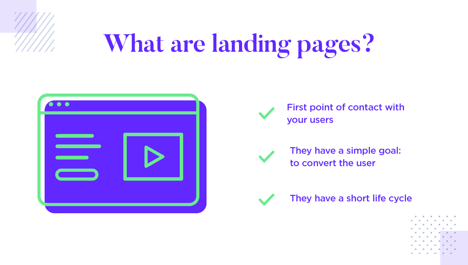
A landing page is often the first thing users see when they interact with your brand, usually by following a link. The main goal is to get users to take a specific action, like signing up, making a purchase, or joining a promotion. This focus on a single action keeps the design simple and easy to navigate, making it straightforward for users to complete the task.
One important thing to bear in mind is that landing pages have a short life-cycle. The beauty is that if you have a specific service, event or sale going on, you can put together a landing page as a starting point very quickly. With a professional prototyping tool, you can realistically make many landing pages in no time. This brings us to our next point: what makes a successful landing page.
Let’s leave the theory behind us and see what works in practice. You might notice that some of these examples are landing pages that no longer exist – that is ok. Landing pages come and go really fast, their short lives and simple design are part of their beauty. Let’s take a look at some of the landing pages that have impressed us over the past few years, and why they are so persuasive.
Justinmind’s restaurant landing page showcases an example of a visually appealing and informative design. The use of high-quality imagery and a consistent color palette creates a modern and sophisticated look. The primary call to action is prominently displayed, urging users to reserve a table at the restaurant.

While the menu is not visible on the landing page, the website appears to be well-organized and mobile-friendly. Additionally, a contact form is placed at the bottom of the page, making it easy to find and use, allowing potential customers to reach out with inquiries or feedback.
The Justinmind design summit landing page example effectively conveys the event’s core message of unleashing creative brilliance. The page provides clear information about the location, dates, and focus areas using a visually engaging design with bold colors like yellow, pink and blue alongside attractive images and a prominent call to action.

Details about the speakers and agenda provide a comprehensive understanding of the various events taking place during the summit. We highly recommend this landing page example if you are looking for a fun and engaging design for your website!
The Mars Explorer landing page is an attractive and informative website that effectively conveys the excitement and potential of space exploration. The banner features a striking image of an astronaut in space and a clear headline that highlights the mission’s goal of revealing the universe’s treasures.

The page provides detailed information about the technical aspects of the mission, including the spacecraft, timeline, and required expertise. And finally, testimonials showcased from individuals involved in the mission highlight the personal excitement and inspiration that space exploration can bring. Blast off to higher engagement with this landing page formula!
The Acme landing page example effectively promotes its beauty products through a visually appealing and informative design. The first part of the page showcases the brand’s reputation by featuring well-known brands and highlights the product’s unique benefits.

The second part focuses on building trust and encouraging purchases by displaying a product image, highlighting key features, and including positive testimonials. This landing page provides a compelling experience that effectively promotes the product’s value.
The trip planning landing page effectively captures the essence of travel and adventure with a visually striking image and empowering headline. The page clearly presents the services offered, including planned excursions to some of the world’s most beautiful sights, as well as explanations on features like smart search, best flights, planning travel, and best hotels.

The inclusion of testimonials adds credibility and builds trust. A clear call to action is provided for visitors to sign up for the newsletter and stay inspired. The overall design and organization of this inspiring landing page example make it easy for visitors to navigate and find the information they need, contributing to a successful and engaging user experience.
Slack‘s landing page employs a clean and minimalist UI that effectively communicates its value proposition. The use of ample white space enhances readability and focuses on key information. The layout is well-structured, guiding users through the page’s content in a logical progression.

The hero section prominently displays the product’s core benefit – improved communication and collaboration – through concise copy and visually appealing imagery. The use of clear and consistent typography reinforces brand identity. The inclusion of a prominent “Slack is free to try for as long as you like” under the CTA button ensures a clear conversion path. A winning landing page example in our eyes!
Dropbox‘s landing page effectively leverages a clean and intuitive UI to convey its core value proposition: secure file storage and sharing. The page employs a minimalist design with a strong emphasis on visual hierarchy, ensuring that key information stands out.

The hero section boasts a captivating image and concise copy that highlights the product’s core value. Contrasting colors make the call-to-action button pop, urging users to take action. The page is well-structured with clear sections that effectively convey Dropbox’s features and benefits.
Dropbox exemplifies a keen understanding of user experience, offering intuitive navigation and a seamless journey. Social proof elements, like customer testimonials and logos, build trust and credibility. Get inspired by this landing page example to elevate your own website!
Mailchimp‘s landing page is a masterclass in clean, modern design and clear, concise messaging. The page uses a strong visual hierarchy to guide users towards the primary call-to-action. Ample white space and a balanced layout enhance readability and improve overall user experience.

The hero section clearly articulates Mailchimp’s value proposition as an all-in-one marketing platform. Engaging visuals and persuasive copy effectively convey the product’s benefits. The page also incorporates social proof elements, such as customer testimonials and logos, to build trust and credibility.
While Mailchimp’s landing page is generally well-designed, there is an opportunity to further optimize the page by minimizing the amount of text above the fold and making the primary call-to-action even more prominent. Overall, the landing page effectively serves its purpose of generating leads and driving conversions.
Casper’s landing page features a minimalist aesthetic with ample white space and high-quality imagery, creating a soothing and inviting atmosphere. By focusing on a clear and concise value proposition, Casper successfully communicates the core benefit of their product: improved sleep quality.

The page’s visual hierarchy is well-executed, guiding users effortlessly through the content. The use of strong, visually appealing imagery complements the minimalist design and reinforces the brand’s identity. The strategic placement of clear and compelling calls-to-action encourages user engagement and conversion. These elements combine to create a positive user experience and drive conversions. As always, we provide only the finest selection of landing page examples for our readers.
Glossier’s landing page is a visual treat and a user-friendly dream. The minimalist design, featuring ample white space and high-quality product imagery, creates a clean and modern aesthetic. The color palette perfectly complements the brand’s identity and enhances the overall user experience. The website’s navigation is intuitive and easy to use. Users can effortlessly explore different product categories and access product pages directly from the images. The concise and benefit-driven product descriptions effectively communicate the value proposition of each item.

Glossier’s landing page is an excellent example of how you can successfully translate a brand’s aesthetic and values into a digital platform. The focus on user experience and clear navigation creates a positive and engaging journey for visitors, encouraging product exploration and purchase.
Start designing new landing pages today. Enjoy unlimited projects.
HubSpot‘s landing page is a masterclass in professional and inviting design. The clean layout and high-quality visuals contribute to a trustworthy image. Effective use of white space ensures key information stands out, while the color palette reinforces the brand’s identity as a reliable marketing solution.

The website’s information architecture is well-structured, guiding users towards a clear understanding of HubSpot’s offerings. The hero section effectively communicates the core value proposition, and subsequent sections provide in-depth information tailored to specific user needs. Clear and prominent calls-to-action strategically placed throughout the page encourage user engagement and conversion. A winning example in our eyes!
Warby Parker’s landing page is a masterclass in combining aesthetics with functionality. The platform employs a clean and modern design, featuring high-quality product imagery and interactive elements. The emphasis on visual appeal is balanced with a user-centric approach, ensuring a seamless browsing experience.
The website’s navigation is intuitive and efficient. Users can easily explore different product categories and access detailed product information. The “Try On Virtually” feature is a standout element, enhancing the user experience by allowing customers to visualize how different frames suit their face shape.
Warby Parker’s commitment to user satisfaction is evident in its overall design of their landing page. Clear pricing, customer reviews, and a streamlined checkout process build trust and encourage conversions. The website effectively balances style and functionality, making it a great example of how positive user experience can align with a brand’s identity.
Flora‘s landing page is a stellar example of clean, minimalist design, perfectly complementing the delicate nature of its product. The effective use of white space draws attention to key elements, such as the hero image and call-to-action (CTA) button.

The page employs a clear and logical information hierarchy. The hero section immediately introduces the brand and its offerings, followed by a concise explanation of the purchasing process. The “What the Press Says” and “Featured In” sections build credibility and social proof.
The page is visually appealing and easy to navigate. The consistent use of typography and color scheme creates a cohesive look and feel, and the placement of the CTA button is prominent and encourages user interaction. All in all, a standout example of landing page design excellence.
Moda‘s landing page is a stellar example of brand identity. The strong hero image and compelling copy convey a sense of sophistication and style, aligning with the brand’s target audience. The concise tagline, “Suits Perfect for Work + Play,” clearly communicates the product’s versatility and benefits, encouraging users to explore further.

The section below the hero image reinforces the core value proposition through clear and concise headings that highlight the suit’s key features: hand-sewn quality, modern fit, and unmatched comfort. Supporting text provides additional details without overwhelming the user, and the inclusion of customer testimonials adds credibility and builds trust. This landing page design example is like a tailored suit for your business. It’s sharp, stylish, and fits your brand perfectly.
Wayfaring‘s landing page is a standout example of clean, minimalist design that aligns with the adventurous spirit of travel. The effective use of white space and a limited color palette creates a sense of calm and focus, allowing the key information to stand out.

The page employs a clear and logical information hierarchy. The hero section immediately grabs attention with an exciting headline about a travel destination along with the use of high-quality images. The visuals effectively convey the allure of travel and complement the overall design, making you want to book an escape from the city trip ASAP.
A common selling point in the shared economy is the potential for everyone to make extra income. Lyft understood exactly what people want from the tool and laid out the main positive right at the beginning of the page. It’s concise and goes right to the heart of the user goal.

We like that the page design keeps things well-balanced when it comes to the proportion of text and imagery. The form to the right makes it possible for users to sign up right then and there, with concise labels and a good CTA that stands out – we love that the copy on that button is descriptive.
There’s something very smart about the calculator at the bottom. It gives users freedom to estimate how much they can realistically make with the app – taking an abstract concept and making it tangible. Putting an actual number on it makes it real, making a very persuasive point.
Any given landing page tries to sell something – anything, from ideas to physical items. And so, it should come as no surprise that Shopify, which specifies in helping people sell things, should have a great landing page example.

The sales pitch is as straightforward as can be: sell online with Shopify. It transmits the main idea in a single sentence, leaving the rest of the page to striking visuals and one lonely input field. It makes the signup process seem incredibly simple, even if this is just the first step in that process. By writing their email, users become invested and can jump into their business plans.
The icons and small details that are located at the bottom give a few glimpses into the main questions that new users will have – carefully selected after much data analysis, no doubt. It’s smart to add some more information, especially if you do it in a way that preserves the clean space.
O Coming Soon’s landing page is a bold and minimalist design that grabs attention with its vibrant colors and striking visual hierarchy. While the absence of imagery is notable, the captivating video of a woman making art and showcasing the product’s potential adds depth and context, enhancing user engagement.
The page’s simple information architecture focuses on capturing email addresses, with a clear headline and call-to-action. However, the lack of supporting content about the product or its benefits might leave users wanting more.

To improve the landing page’s effectiveness, consider adding more information about the product or service, along with elements like social proof or customer testimonials. These additions would enhance user understanding, build trust, and ultimately increase conversions.
Start designing new landing pages today. Enjoy unlimited projects.
Here, we have a page that relies heavily on text and copy to make the sales pitch – but there are some twists. Right off the bat, being able to claim that over five thousand businesses signed up in the past week definitely has an impact. It’s a fact, as opposed to some concept of popularity or claim of superiority to the competition.

Then we move on to the second type of argument that Basecamp presents, which is also quite persuasive. It consists of two testimonials from very happy customers that illustrate the one big advantage of a product like Basecamp: control over tasks. The power to keep deadlines and to not miss a single detail.
This landing page example shows that sometimes, you don’t even need the striking visuals or extravagant interactions. With a single input field and two CTAs, the page uses actual words to convert users.
Fresh Goods’ landing page template provides a structured and user-friendly layout for businesses to showcase their products or services. The design is clean and minimalist, focusing on essential elements while maintaining a visually appealing aesthetic.
The template includes sections for a concise description, customer testimonials, benefits, and additional information about the business. This structure helps guide users through the content and encourages them to take action.

The use of placeholders allows businesses to easily customize the template with their specific content, making it a versatile tool for various businesses. We think that Fresh Goods offers a solid example for creating effective landing pages that attract and engage users.
Start designing new landing pages today. Enjoy unlimited projects.
This Workable landing page example shows that a well-placed testimonial and a powerful use of color can have a huge impact. Workable lets their client tell users how they benefited from the product in a tangible way. Offering figures and realistic estimations of the benefit is important when it comes to B2B marketing. Simple abstract ideas of a happy businessman won’t cut it, and Workable understood that.

We like that the form to the right is big and spacious, keeping it short with only four questions. The use of text with lots of available room makes it stand out, much like seeing Monalisa all alone in the room at the Louvre. The CTA is clearly visible and helped by the social media buttons below, making the act of conversion/signup almost effortless.
This marketing agency created a landing page example that uses quite a lot of text – but it still manages to deliver a good sales pitch. The area above the fold keeps the copy concise, delivering the most compelling argument. Below, we find the main body of text to the left and a signup form to the right.

There is some debate as to how much text is too much text in a landing page such as this. While everyone will have a different and valid opinion, it’s true that the general design of the page works well. The whole point is to generate leads from website traffic, and it’s delivered right off the bat.
The users who need more details and want more information will bother to read. Those who don’t need any more convincing won’t.
Spotify, the music streaming giant, has been steadily using landing pages to promote their iconic playlists that portray the year that has passed. Each year, we have a new playlist with a new landing page. While the style changes, one thing remains true: the landing page delivers a great experience.

The goal is to simply get users to discover the legendary playlist. The page design plays to the strength of visuals and font, with the CTA showing plenty of contrast with the background. We love that this landing page example is all about getting people to focus on the music that the page evokes, with a young and fun vibe that benefits the platform. Wouldn’t you want to find out what made it to the playlist?
It should come as no surprise to find a company like Unbounce on this list. These guys help people all over the world to create landing pages that push the boundaries of design. Today we’ll take a look at one of their own landing pages, one that aims to convince users to download their landing page course.

This landing page example follows the recipe we constantly see in landing pages: strong visual on top, form to the right, information to the left. Here, we get the text that makes the main claim on the top. Below, we have a chatbot instead of the classic form. This is very interesting, because it makes the page undoubtedly more interactive and conversational.
Overall, the visual hierarchy of the landing page example is wonderful. Notice that the page holds quite a bit of information below the chatbot, but it’s carefully placed within the larger design. This means that users won’t feel distracted or overwhelmed by the text – instead, users will read it quickly as the hierarchy guides the eye through the content.
The O-Saas landing page is a strong example of user-centered design. The clean and modern aesthetic, combined with a strong value proposition and compelling visuals, creates an engaging user experience. The effective use of white space and clear typography enhances readability and guides the user’s focus. The subsequent section provides essential product information in a well-structured format, using concise headings and informative subtext.

The pricing section is a noteworthy feature, offering clear and concise pricing plans. The side-by-side comparison allows users to easily evaluate their options. The use of consistent visual elements reinforces the overall brand identity and enhances the user experience. The strategically placed call-to-action buttons encourage users to take the next step. We love this landing page example!
Another digital marketing agency that nailed their landing page design. Webprofits created a long landing page that goes into detail on how users stand to benefit from Webprofit’s services. We love that even though the page does offer some visuals, the true power emanates from the visual hierarchy.

We love that the agency delivers a lot of information but it never becomes too much. That could be due to the hierarchy of elements and empty space. On a similar note, we love that they found more visual ways to share that information, making it easy to digest.
Breather is a platform that helps teams with finding on-demand meeting rooms and temporary office space. This landing page example is smart, because it bypasses the visuals-to text debate. Similarly to Uber, Breather makes a persuasive pitch by making it interactive and concrete.

Users only have few questions such as where they need workspaces, before the page loads with viable options the platforms have. By offering real space and real meeting rooms, Breather immediately makes it clear that it has plenty of available options that could suit the needs of the user.
Square is all about helping businesses expand the payment options they accept. Their landing page example makes an impact with beautiful visuals above the fold. We love that it perfectly captures the goal customers have: to accept credit card payments from their own respective customers.

The CTA stands out while also respecting the color palette of the design, allowing the top of the page to do the heavy lifting. Further below, users can find more details that are delivered with concise copy and exceptional visual hierarchy.
Many landing pages try to rely on either visuals or text to make an argument, but the reason we included Instapage on this list is because it showcases another technique. The page is entirely empty aside from one short but powerful piece of text, which encourages people to signup for a webinar. Below, a clock in countdown.

The UI design creates a sense of urgency and scarcity, both of which are known to be very persuasive. People are afraid of missing out on things, and Instapage used that to their advantage. The page itself couldn’t be any more simpler, but it manages to be very convincing and ultimately, that is what makes a good landing page.
Intercom is a marketing platform that aims to change marketing from a monologue into a conversation. The page design makes a good point, using numbers to claim superiority over the immediate competition. We love the guerilla-style marketing, but the other elements also contribute to the persuasiveness of the design.

Using a live chat, Intercom replaces the classic form for something much easier for the user – which in of itself is a sales argument in their favor. The act of taking the boring classic and making it something everyone can get past with no effort at all, with immediate results. That is what Intercom does.
The visuals and the font both give the page a touch of youth, reflecting the brand personality. We love the color palette and the CTA!
Creating a landing page that effectively converts visitors into customers or leads requires a strategic approach. While individual tastes in design can vary, there’s one key factor that defines success: the conversion rate. The design’s ultimate purpose is to support that conversion.
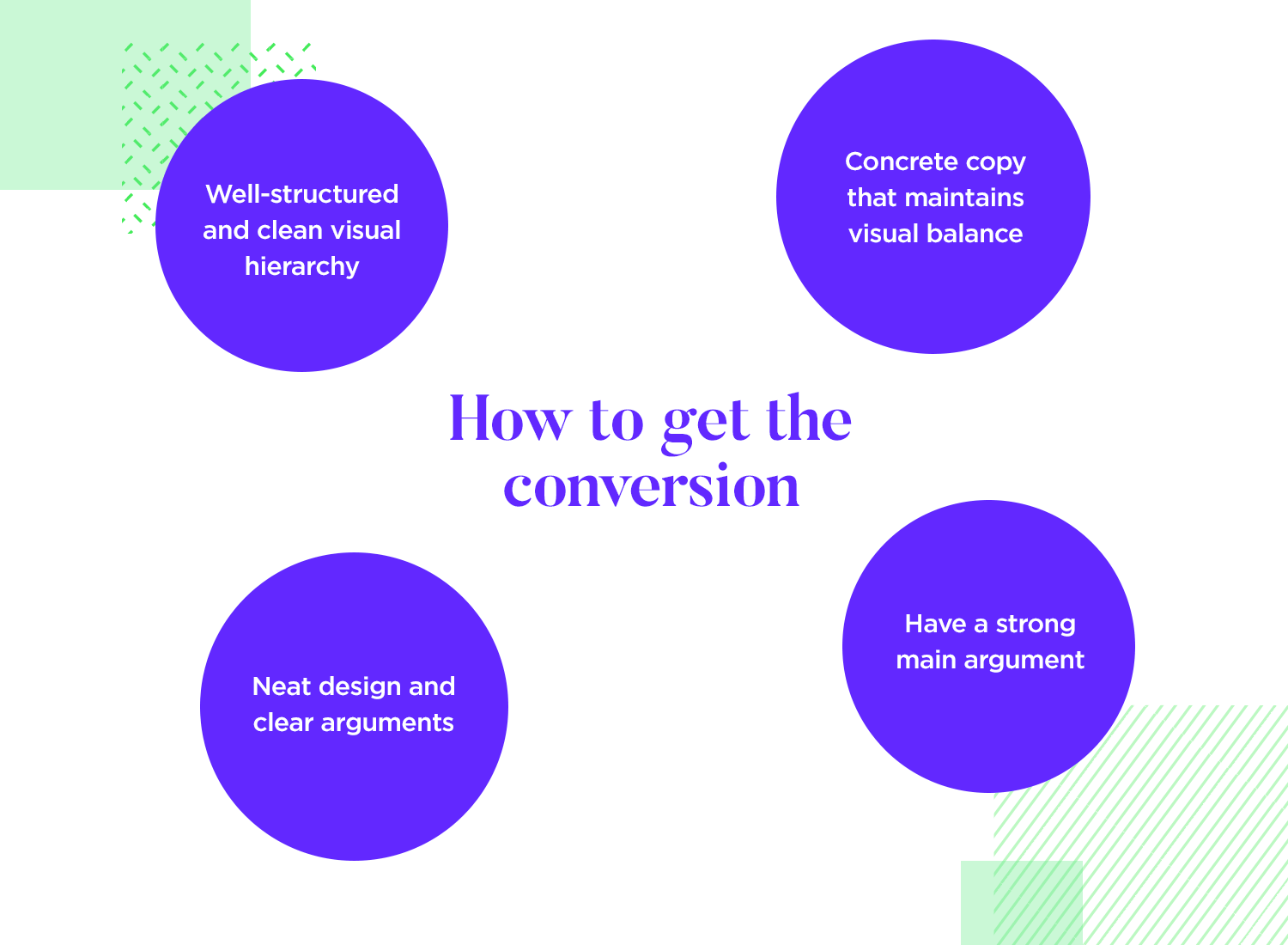
To make your landing page successful, it needs a clean visual hierarchy that guides the user’s attention where you want it. The page should be free of distractions, with a strong, clear argument presented upfront. The copy should be concise, maintaining visual balance with the design, while keeping the focus on the main goal. Remember, you don’t want to get too caught up in testing small details, since landing pages are often temporary, it’s more effective to monitor their performance once live.
With these fundamentals in mind, let’s dive into the step-by-step process to ensure your landing page converts effectively.
Before getting into the nitty gritty of the design phase, it’s essential to lay a solid foundation. These preliminary steps will ensure your landing page is aligned with your overall marketing goals and effectively targets your audience.
It’s crucial to know who you’re designing for before you even start designing. Start by creating detailed profiles of your ideal customers, often referred to as user personas. Delve into their demographics, behaviors, motivations, and challenges. Understanding their online habits is equally important. Where do they spend their time? What kind of content do they engage with? Armed with this knowledge, you can tailor your messaging and design to resonate with them on a deeper level.
What do you hope to achieve with your landing page? Are you aiming to generate leads, boost sales, or increase sign-ups? Clearly outline your primary goal. Once you have a clear objective, set specific, measurable, attainable, relevant, and time-bound (SMART) goals. These metrics will serve as your compass, guiding your design decisions and helping you evaluate the landing page’s success.
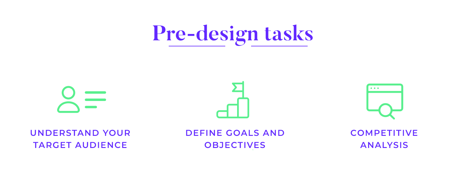
Take a deep look at what your competitors are doing. Analyze their landing pages, identifying their strengths and weaknesses. What works well? What could be improved? By understanding the competitive landscape, you can find opportunities to differentiate your own landing page. Check for gaps in the market or ways to surpass your competitors’ offerings. This analysis will help you create a landing page that truly stands out.
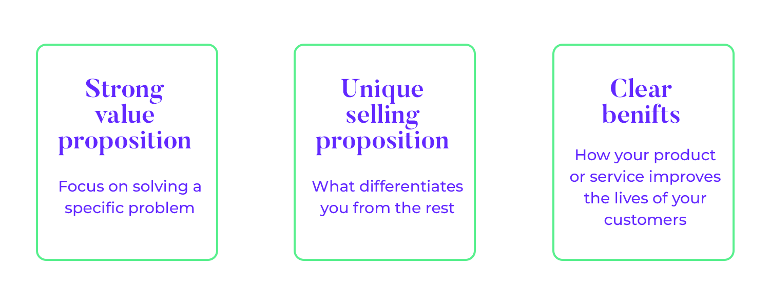
Your landing page’s content is the cornerstone of its success. It’s what persuades visitors to take the desired action.
Your value proposition is the core promise you make to your customers. It’s the answer to the question, “Why should they choose you?” Clearly and concisely communicate the primary benefit your product or service delivers. Focus on solving a specific problem your target audience faces. For example, instead of saying “We sell shoes,” say “Experience unparalleled comfort and style with our handcrafted leather shoes.”
What sets you apart from your competitors? Your Unique Selling Proposition (USP) is your unique value. It’s what differentiates you from the crowd. Clearly articulate what makes your product or service different and better. For instance, if you’re selling coffee, your USP might be “Fair-trade, organic coffee beans roasted to perfection for the ultimate coffee experience.”
While features are important, it’s the benefits that truly sell. Focus on how your product or service improves your customers’ lives. Use persuasive language that evokes emotions and desires. For example, instead of saying “Our phone has a high-resolution camera,” say “Capture stunning memories with our phone’s advanced camera technology.”
The CTA is the final push that converts visitors into customers or leads. It’s basically the moment of truth for your landing page.
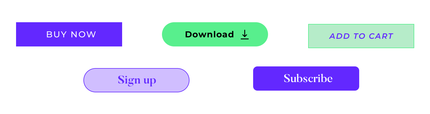
Your Call-to-Action (CTA) is the final step in the conversion process. It’s the action you want visitors to take. Use strong, action-oriented verbs like “buy now,” “sign up,” or “download.” Create a sense of urgency with limited-time offers or scarcity.
Make your CTA visually prominent with contrasting colors and clear button text. Experiment with different CTA placements and wording to optimize conversions. For example, instead of a generic “Submit” button, try “Start Your Free Trial.”
Trust is a cornerstone of successful conversions. People are more likely to do business with companies they perceive as trustworthy. Incorporating trust-building elements into your landing page can significantly boost your conversion rates.
Showcasing positive feedback from satisfied customers is one of the most effective ways to build trust. Testimonials and reviews act as social proof, demonstrating that real people have had positive experiences with your product or service. Feature quotes from customers highlighting the benefits they’ve experienced. Consider using video testimonials for a more personal touch.
Displaying trust badges and certifications can significantly enhance credibility. These visual cues reassure visitors that your business is legitimate and trustworthy. Partner with reputable organizations to obtain relevant certifications. Display trust badges prominently on your landing page to instill confidence in potential customers.

Here’s a breakdown of key design guidelines, layout elements, and considerations to help you create a landing page that resonates with your target audience.
These are crucial for capturing and retaining a visitor’s attention. Your headline should be clear, compelling, and accurately reflect the page’s purpose, acting as a captivating book title that entices readers to learn more. Use strong, active language and relevant keywords to maximize impact. The subheadline expands on the headline by providing additional context, highlighting key benefits, and creating a sense of urgency. Together, they should form a cohesive unit that effectively communicates your message and drives engagement.
Visual hierarchy is the art of guiding a user’s eye through a page. Think of it as a carefully constructed path that leads visitors to the most important information. By strategically varying the size, color, weight, and placement of elements, you can create a clear visual hierarchy.
Larger, bolder elements naturally command attention first. This is where you should place your headline, call-to-action (CTA), and key benefits. As the user’s eye moves down the page, the importance of information should gradually decrease. Consistent use of visual hierarchy ensures that your message is understood efficiently and effectively, improving user experience and engagement.
Maintaining a consistent brand identity is essential for building a strong and recognizable brand. By consistently using your brand’s unique colors, fonts, and imagery across all platforms and touchpoints, you create a cohesive and unified brand experience. This visual consistency reinforces brand recognition, making it easier for customers to identify and remember your brand.
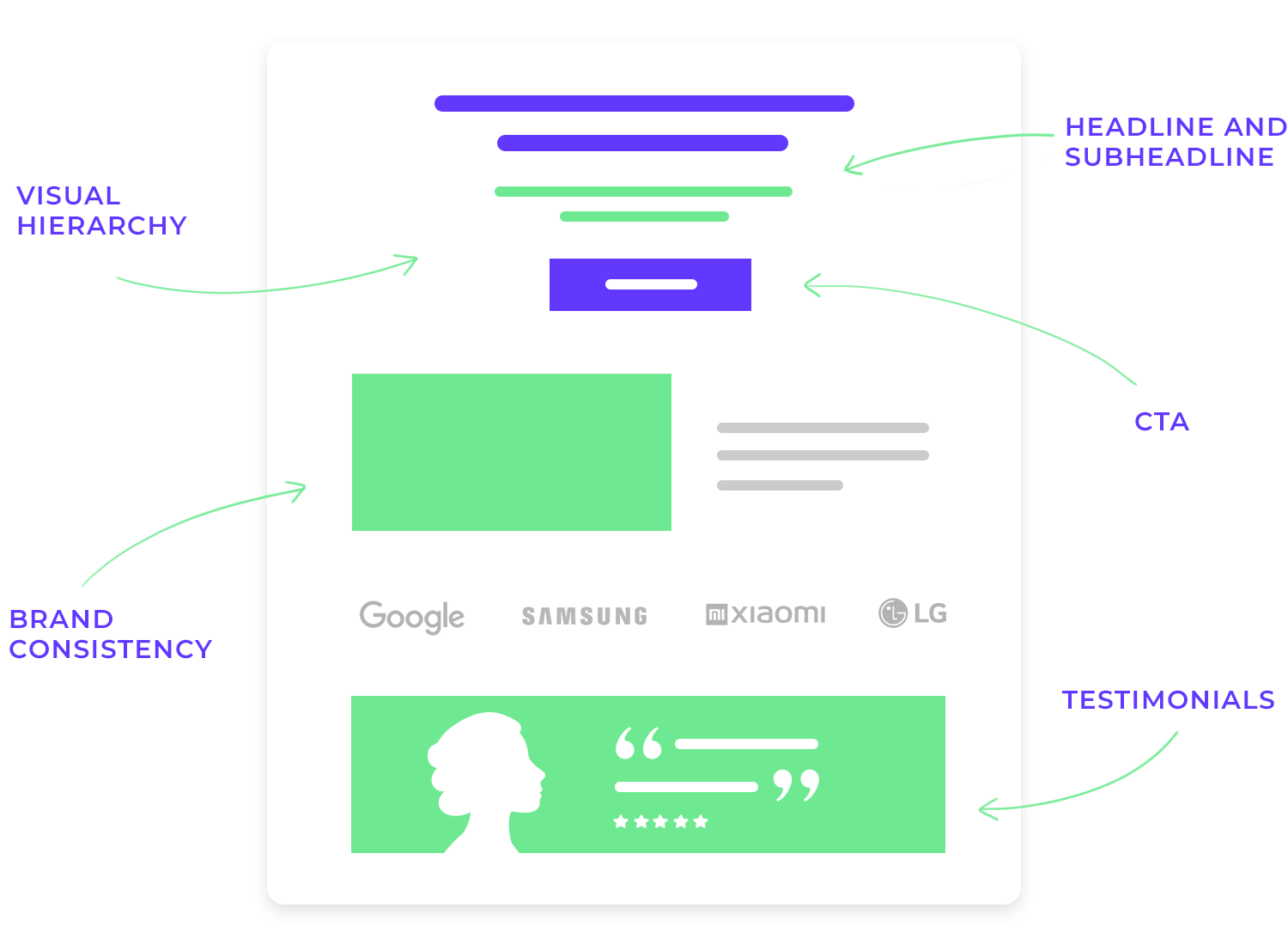
Furthermore, a consistent brand identity helps to establish trust. When customers see a familiar look and feel, they feel a sense of reliability and confidence in your brand. It also contributes to brand equity, as a strong brand identity can differentiate your business from competitors and create a loyal customer base.
A well-designed CTA is crucial for driving conversions. Strategic placement, whether above the fold, at content’s end, or within forms, maximizes visibility. Effective CTAs utilize contrasting colors, clear and bold typography, and action-oriented language. Their shape, size, and surrounding white space contribute to visual appeal.
Maintaining clarity and simplicity ensures the message is instantly understandable. A/B testing different CTA variations helps optimize performance. Ultimately, a compelling CTA is a perfect blend of design and persuasive copy that entices users to click. Just like the one below!
Start designing new landing pages today. Enjoy unlimited projects.
A wireframe is a basic blueprint of a webpage or app that outlines its structure and content layout without visual details. It’s essential for visualizing the overall design, facilitating collaboration, identifying usability issues early, and saving time.
By defining the information hierarchy, layout, content placement, spacing, and navigation, wireframes provide a clear foundation for the design process.
Creating effective wireframes involves defining project goals, identifying necessary content, choosing a fidelity level, using appropriate tools (like Justinmind) and iteratively refining the design based on feedback.
A captivating landing page isn’t just about aesthetics; it’s also about providing an intuitive user experience. By following these guidelines, you can ensure that visitors feel welcomed, informed, and motivated to take action.
Beyond the obvious benefits of reduced bounce rates and improved user satisfaction, fast-loading pages also contribute to higher search engine rankings. Google, for instance, considers page speed as a ranking factor.
Techniques like image compression, code minification, and leveraging browser caching not only accelerate page load times but also reduce server load, potentially lowering hosting costs. Additionally, content delivery networks can significantly enhance performance by distributing content across multiple servers, ensuring quicker delivery to users regardless of their geographic location.
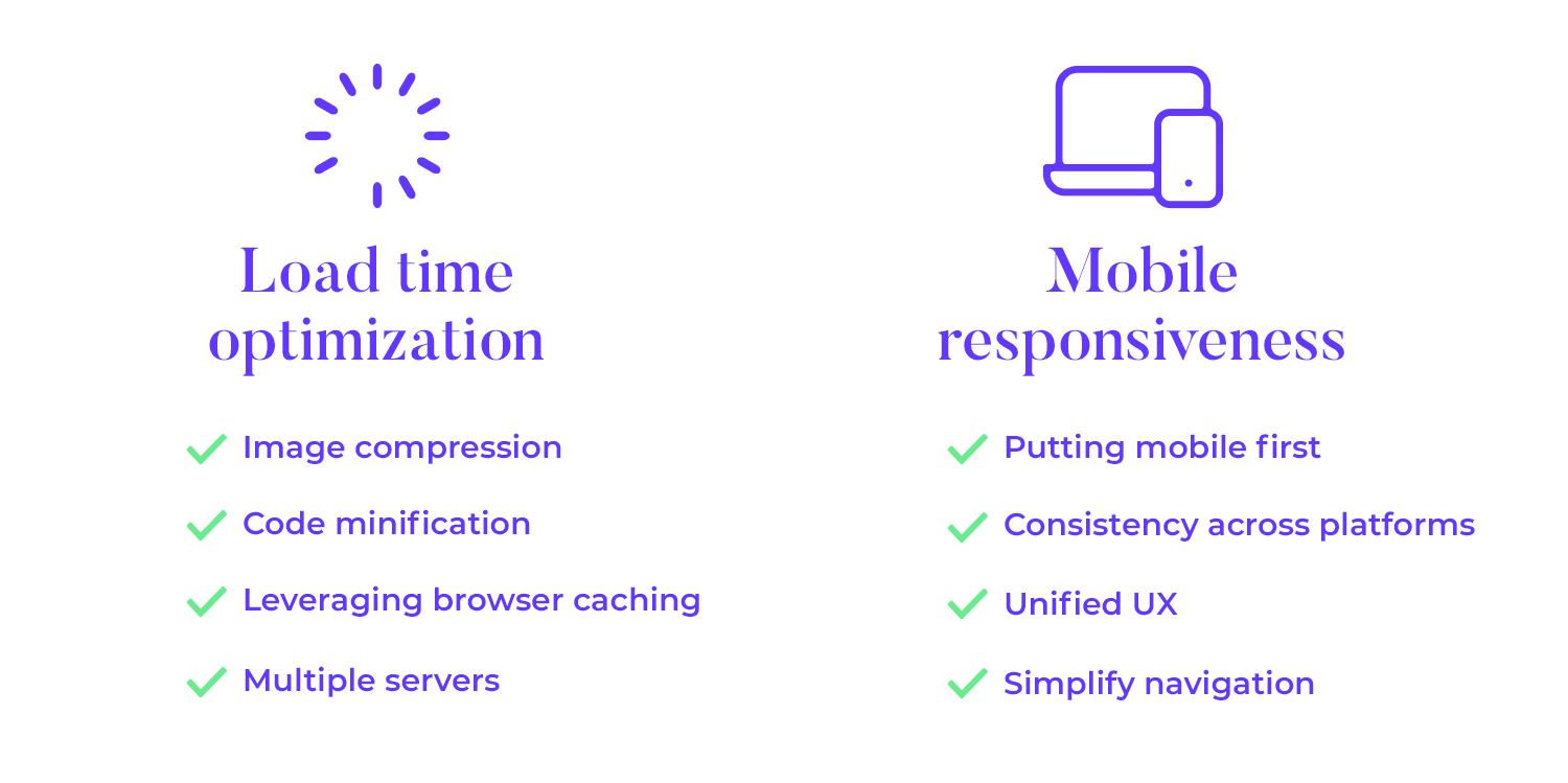
Mobile responsiveness is no longer a luxury but a necessity. With the majority of internet traffic originating from mobile devices, having a website that adapts to different screen sizes is paramount. Responsive design ensures consistency across platforms, providing a unified user experience.
Beyond aesthetics, mobile responsiveness impacts usability and conversions. Large buttons and clear touch targets are essential for easy interaction. Prioritizing essential content and simplifying navigation help maintain focus and prevent user frustration. Regular testing across various devices and network conditions is crucial to identify and address potential issues, guaranteeing optimal performance on all platforms.
Start designing new landing pages today. Enjoy unlimited projects.
With so much time and budget attributed to web and app design, it’s a wonder that badly designed landing pages still exist. Yet here we are.
Cluttered, slow-loading landing pages with meaningless copy are the worst – you’ll see what we mean. In this section, we’ll look at some of the worst landing pages ever to be seen on the internet. Let’s go!
Let’s be honest, a website that looks like it’s from the 90s is a major turn-off. The Grosvenor House Publishing website feels like a relic from the past, missing that je ne sais quoi that makes a site feel fresh and inviting.

The offers here come off as a delicious meal but without a fork. It’s like you have a hungry visitor scrolling through your content, excited to learn more, but then… nothing. A sign-up form is essential to turn those visitors into leads.
You’re ready to take flight with Delta’s SkyMiles program. You Google it, expecting a seamless journey, but what you find is a bit of a detour. It’s like walking into a store and the sales rep is hiding behind a curtain.

You’re here to join the SkyMiles family, so let’s make it easy for you, shall we? The signup button is buried deeper than a treasure chest at the bottom of the ocean. We need to bring it to the surface where it belongs. A hero image with a clear call to action would immediately grab visitors’ attention and guide them toward the signup button.
Cruise is a site that advertises cruise deals, reviews, and guides. Take a look at the image of their landing page design and see if you can guess what’s wrong with it.

If you thought clutter, you were right. There’s so much going on here, it makes our eyes hurt! The multitude of boxes, multiple navigation patterns, and large, bold text all crammed onto the screen makes for a poor viewing experience.
Layout is a critical factor for your landing page design as it has a direct impact on how your landing page will perform. Designing cluttered pages with very little whitespace decreases readability and increases the cognitive load for the user. Discover how to minimize that effect with accessibility design.
This is Chase, a national bank headquartered in Manhattan. The problem with this landing page design is simple: too many call-to-action (CTA) buttons.

On the left, there is a “learn more” CTA button, while over on the right another CTA button asks you to sign up for an account. And below this, five links take you to different destinations.
Using too many or irrelevant CTAs will end up disorienting or distracting your landing page’s visitors.
With multiple paths to conversion, users won’t know what you’re pushing at them and you’re more likely to lose them along the way. If you end up with multiple CTAs, you may need to segment your landing pages to match different search queries.
Similarly, bombarding users with multiple links is overkill and will just create confusion. Remember: visitors need content not ads.
Start designing new landing pages today. Enjoy unlimited projects.
In this section, we’ll explore some essential tools that can help you design, build, and test landing pages that not only look great but also deliver results. Whether you’re a seasoned pro or just starting out, these tools will empower you to create landing pages that captivate your audience and drive conversions.
Justinmind is a powerful platform designed to help you create high-converting landing pages. Its user-friendly interface, coupled with a vast library of professionally designed templates, makes the page-building process efficient and enjoyable. Justinmind excels at simulating user interactions, providing valuable insights into design effectiveness. While it offers a strong foundation for user testing, for those seeking advanced metrics and in-depth analysis, such as A/B testing or heatmaps, dedicated testing tools might be more suitable.

Unbounce is a leading platform renowned for its flexibility and robust A/B testing capabilities. Its user-friendly interface empowers marketers to create and test multiple landing page variations with ease, enabling them to identify the highest-performing designs and optimize conversion rates. With a strong focus on conversion optimization, Unbounce offers a comprehensive suite of tools and features, including advanced analytics, heatmaps, and personalization options. This allows businesses of all sizes to create high-performing landing pages that drive results.

Leadpages is a user-friendly tool specifically designed to streamline lead generation. It offers a wide range of professionally designed templates optimized for capturing leads and driving conversions. With its intuitive drag-and-drop interface, businesses can quickly create high-converting landing pages without requiring extensive design or coding expertise. Leadpages also provides valuable features such as A/B testing, lead management tools, and integration with popular email marketing platforms, making it a comprehensive solution for lead generation and conversion optimization.

Squarespace offers an incredible platform for creating both websites and landing pages, providing a unified solution for your online presence. Its user-friendly interface and stylish templates make it a popular choice for businesses seeking a visually appealing and professional online image. With Squarespace, you can easily create high-converting landing pages that align with your overall website design and branding. Additionally, Squarespace offers e-commerce functionality, making it a suitable option for businesses selling products or services online.

HubSpot offers a comprehensive marketing automation platform that includes a powerful landing page builder. It seamlessly integrates with other marketing tools, allowing you to manage your entire marketing funnel from one place. HubSpot is ideal for businesses looking for a holistic marketing solution.

ConvertKit is a popular email marketing platform that also offers a robust landing page builder. It’s designed to integrate with its email marketing features, making it an excellent choice for creators and bloggers who want to grow their email lists and sell digital products. ConvertKit’s landing page builder provides a user-friendly interface, a variety of customizable templates, and integration with payment processors, making it easy to create high-converting landing pages that support your overall marketing strategy.

Landing pages can be a powerful source of customers and users. They can make a great first impression on people and are very practical to make on the fly. It’s true that there is a certain general pattern in most landing pages, but they have plenty of margin for designers to get creative and have fun.
These landing page examples all work for different reasons, but they all made the most from the page and delivered selling points in ways that we can appreciate. The bottom line for any landing page is managing to convince the user, to entice and encourage. Hopefully with these landing page examples, you’ll be feeling extra inspired and go on to create a landing page that converts!
PROTOTYPE · COMMUNICATE · VALIDATE
ALL-IN-ONE PROTOTYPING TOOL FOR WEB AND MOBILE APPS
Related Content
 A fun look at different data table designs, from basic lists to smart, interactive ones, based on how complex the data is and what users need.18 min Read
 Single page design v multi-page design – everything you need to help you choose the right design for your site’s content18 min Read
 Website backgrounds can be a powerful tool in creating an experience. But what kind of experience can you convey and how? We got the full run-through for you!14 min Read


