We created a list of the top UI design principles that capture some of the most interesting faces of digital design. Check them out!
UI design has a huge margin for creating new things, but it’s not free from general rules. Not to be confused with UX design principles, these UI design principles are all good to have in mind when designing a digital product, making for better experiences for all.
Free UI Design Tool for individuals and teams

What makes a good UI design easy to read? What makes it easy for users to navigate? How do designers create an interface that makes the primary feature shine? What UI design tools are most popular? UI design is a rapidly changing game but it does come with general guidelines. Let’s take a closer look and see what these principles look like.
While these are often unspoken rules amongst the more experienced designers, they’re worth mentioning for newbies. When designing any interface, you want to know which bases need to be covered, no matter what.
If you want to venture into an inspirational type of post, check out our list of incredibly creative UI design examples.
Clarity is probably the most prioritized UI design principle. By ensuring that every element on an interface has a clear purpose and is easily understandable, designers can reduce cognitive load, prevent frustration, and enhance the overall user experience. A clear design helps users quickly grasp the functionality of each element, reducing the learning curve and improving goal achievement.
Effective navigation is a key aspect of achieving clarity. By guiding users seamlessly through the interface without requiring constant direction, designers can create a more intuitive and enjoyable experience. As products grow in complexity, designing intuitive navigation becomes increasingly challenging, but it’s essential for helping users find and access information efficiently. A well-established UI pattern can significantly simplify this process. By using familiar design elements and interactions, designers can create a more predictable and intuitive user experience.
The initial interaction users have with a product is particularly significant—it sets the tone for their entire experience and often determines whether they will continue using the product or abandon it. This first encounter needs to be clear and intuitive, allowing users to easily discover and understand primary features while gradually exploring secondary ones.
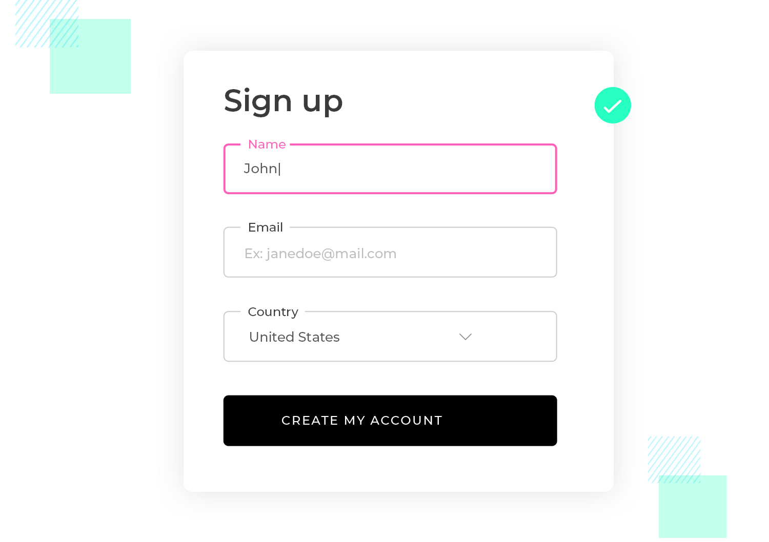
Clarity on a login form on a website, for example, ensures that the user knows exactly what is required to log in, reducing frustration.
- Clear labels: The form has fields labeled “Email” and “Password.” The labels are concise, placed directly above the input fields, and use straightforward language.
- Simple buttons: A single, clearly labeled button says “Log In” instead of something ambiguous like “Submit.”
- Error messages: If a user enters an incorrect password, the error message might say, “Incorrect password. Please try again,” rather than something vague like “Login failed.”
Lack of clarity leaves users guessing about what information they need to provide and how to proceed, leading to frustration and potentially abandonment of the sign-up process.
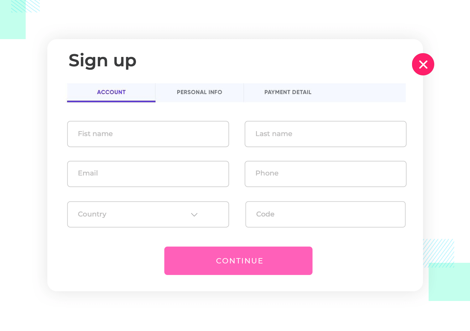
Putting this into context, imagine a sign-up form for a new social media platform:
- Ambiguous labels: The form has fields labeled “Identifier” and “Code.” It’s unclear what these mean—does “Identifier” refer to a username, email, or something else? And “Code” could refer to a password, a captcha, or a referral code.
- Confusing button text: Instead of “Sign Up” or “Create Account,” the button says “Proceed,” leaving users unsure whether they’re completing the sign-up process or just moving to the next step.
- Poor error messages: If a user enters an incorrect email format, the error message says “Invalid input,” without specifying which field has the error or what the correct format should be.
The UI principle of consistency is like having a reliable friend who always knows what you need. When a product’s design is consistent, users feel more at ease and can navigate it with confidence.
Imagine trying to learn a new language. Wouldn’t it be frustrating if the words and grammar changed every time you opened a new book? The same goes for digital products. Consistency helps users avoid the confusion and frustration of constantly learning new rules. So, what does consistency mean in practice?
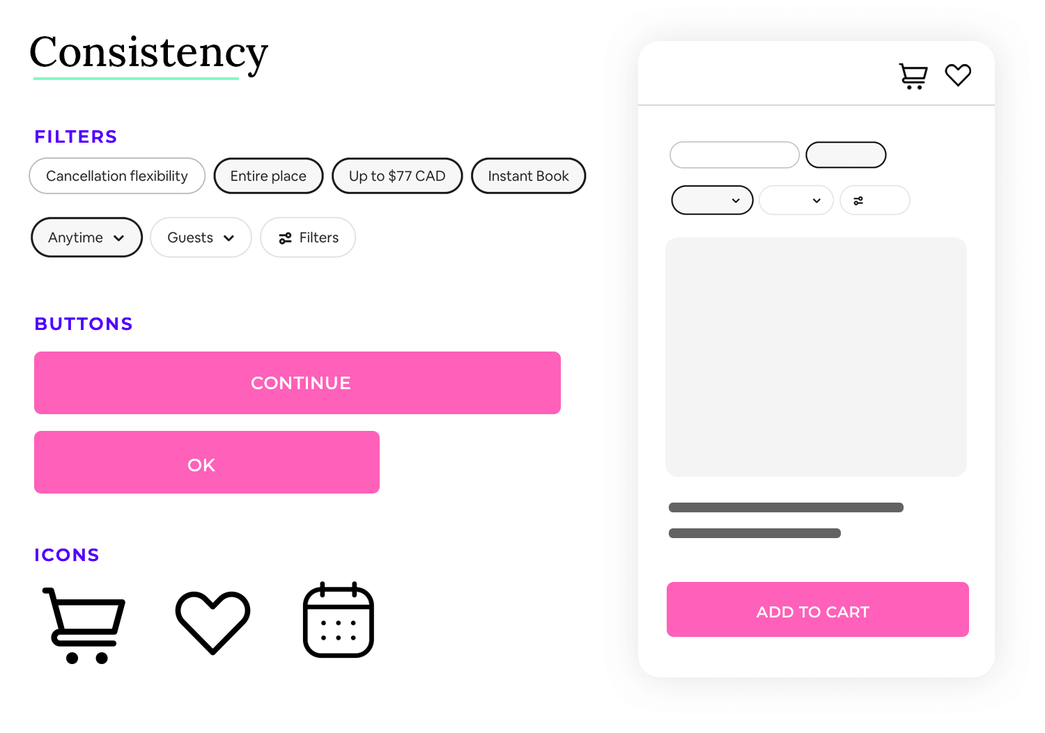
When it comes to the consistency of UI design, you want to be predictable. You want users to know what that button will do without the need to press it. A good example is having consistent button states, so your users know exactly how buttons behave throughout the entire product.
Consistency in UI design ensures that users can easily understand and navigate an interface because similar elements and interactions behave in predictable ways. Take this e-commerce website as an example.
- Consistent buttons: All buttons across the site, including “Add to Cart,” “Buy Now,” and “Checkout,” use the same color, shape, and hover effect. For instance, all buttons are rounded rectangles with a vibrant blue background and white text.
- Uniform navigation: The main navigation menu at the top of the page is consistent across all pages of the site. It includes the same links (e.g., Home, Shop, Contact) and uses the same style (e.g., horizontal layout with dropdowns for subcategories).
- Consistent typography: The site uses a consistent set of fonts—one for headings (e.g., a bold sans-serif) and another for body text (e.g., a clean serif). Headings are always a specific size and weight, and body text follows a uniform size and line spacing.
- Standard icons and imagery: The site uses a consistent style for icons throughout, such as using flat design icons with a single color (e.g., a shopping cart icon for the cart link).
- Form fields: Input fields, labels, and buttons in forms (e.g., sign-up forms, checkout forms) have a consistent design, including padding, font size, and border styles. All form elements follow the same visual and interaction patterns.
This results in a confusing and fragmented experience, where users struggle to understand how different elements interact and appear, increasing cognitive load and frustration. Take this company intranet portal as an example:
- Inconsistent button styles: Buttons on different pages have varying styles—some are rectangular with a blue background, while others are rounded with green backgrounds. Hover effects also differ, with some buttons changing color and others displaying a shadow.
- Variable navigation menus: The main navigation menu changes style between pages. On some pages, it’s a horizontal bar, while on others, it’s a vertical sidebar. The menu items are also inconsistently labeled or ordered.
- Diverse typography: Different pages use various font families and sizes—headings might be in a bold sans-serif on one page and a serif on another. Body text sizes and line spacing also vary, making the content feel disjointed.
- Inconsistent icons: Icons throughout the portal vary in style and color, with some being outlined and others filled. This inconsistency makes it harder for users to quickly recognize and understand iconography.
- Form fields: Form fields vary in style—some have rounded corners, while others have sharp edges. Label placements and field sizes are inconsistent, making forms feel fragmented and harder to use.
Simplicity in UI design is like having a clear and uncluttered workspace where you can easily find what you need. When a product’s interface is simple, users feel less overwhelmed and can focus on their tasks with ease.
Imagine trying to cook a new recipe in a cluttered kitchen. Wouldn’t it be frustrating to search for ingredients and tools amongst piles of unnecessary items? The same goes for digital products. Simplicity helps users avoid the confusion and frustration of navigating through complex interfaces. So, what does simplicity mean in practice?
When it comes to simplicity as a UI design principle, you want to be straightforward. You want users to understand the purpose of each element without needing extensive explanations. A good example is having a clear hierarchy of information, so your users can quickly grasp the key information and prioritize their actions.
Simplicity in UI design ensures that users can easily understand and interact with an interface because unnecessary elements are removed, and the focus is on essential features. Take this note-taking app as an example.
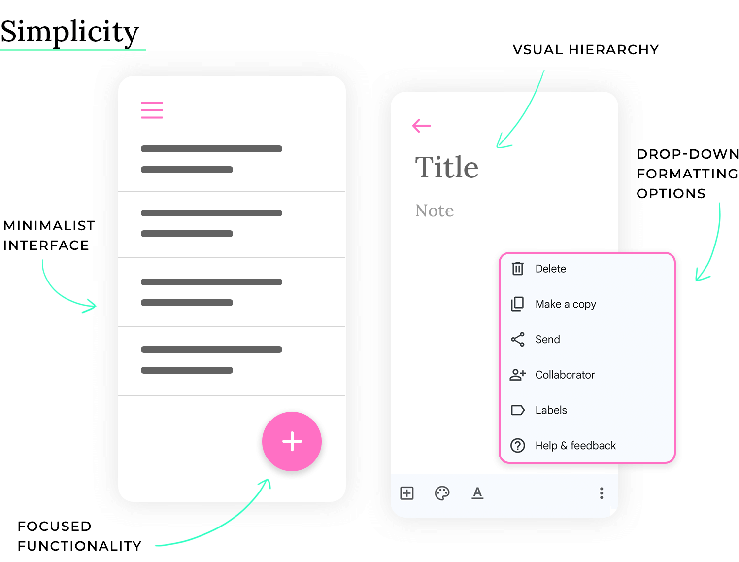
- Minimalist interface: The main screen displays only a list of notes with concise titles and timestamps. There are no distracting toolbars or complex menus cluttering the view.
- Clear visual hierarchy: Note titles are larger and bolder than timestamps, creating a clear visual hierarchy that allows users to quickly scan and find the desired note.
- Intuitive actions: Creating a new note is done through a single prominent “+” button. Opening a note reveals a clean text editor with only essential formatting options (e.g., bold, italics, lists).
- Focused functionality: The app focuses solely on note-taking, avoiding unnecessary features like social sharing or complex organization tools. This keeps the interface clean and focused on the core task.
- Progressive disclosure: When the user presses the “More” button, a second row of secondary operators appears. This prevents visual clutter and maintains focus on the most frequently used operations.
Usually leads to a cluttered and overwhelming experience, where users struggle to find essential features and understand the purpose of various elements, increasing cognitive load and frustration. Take this photo editing software as an example:
- Overwhelming toolbar: The main window is filled with numerous icons and buttons, many of which are rarely used. This cluttered toolbar makes it difficult for users to find the tools they need.
- Complex menus: Menu structures are deep and convoluted, requiring users to navigate through multiple submenus to find specific functions. This makes even simple tasks time-consuming.
- Unnecessary features: The software includes a wide range of advanced features that are irrelevant to most users, cluttering the interface and adding to the learning curve.
- Information overload: The interface displays too much information at once, such as multiple palettes, panels, and tooltips, overwhelming users and making it difficult to focus on the image being edited.
- Non-contextual tools: All tools are constantly visible, regardless of whether they are relevant to the current task. This makes the interface feel cluttered and confusing.
Accessibility is like building a ramp alongside a staircase, ensuring everyone can enter a building regardless of their physical abilities. When a product is designed with accessibility in mind, it can be used by people with a wide range of abilities, including those with visual, auditory, motor, or cognitive impairments.
Imagine trying to read a sign with very small text in dim lighting. Wouldn’t it be difficult to decipher the message? Now imagine you are someone with low vision. This simple example highlights the importance of considering different needs when designing products. Accessibility helps ensure that everyone has equal access and opportunity to use a product effectively. So, what does accessibility mean in practice?
When it comes to the accessibility principle of UI design, you want to be inclusive. You want users with disabilities to be able to perceive, operate, and understand the interface. A good example is providing alternative text for images, so screen readers can convey the image content to users who are blind or have low vision.
Accessibility in UI design ensures that users with disabilities can easily understand and interact with an interface because it adheres to accessibility standards and guidelines. Take this online news website as an example.
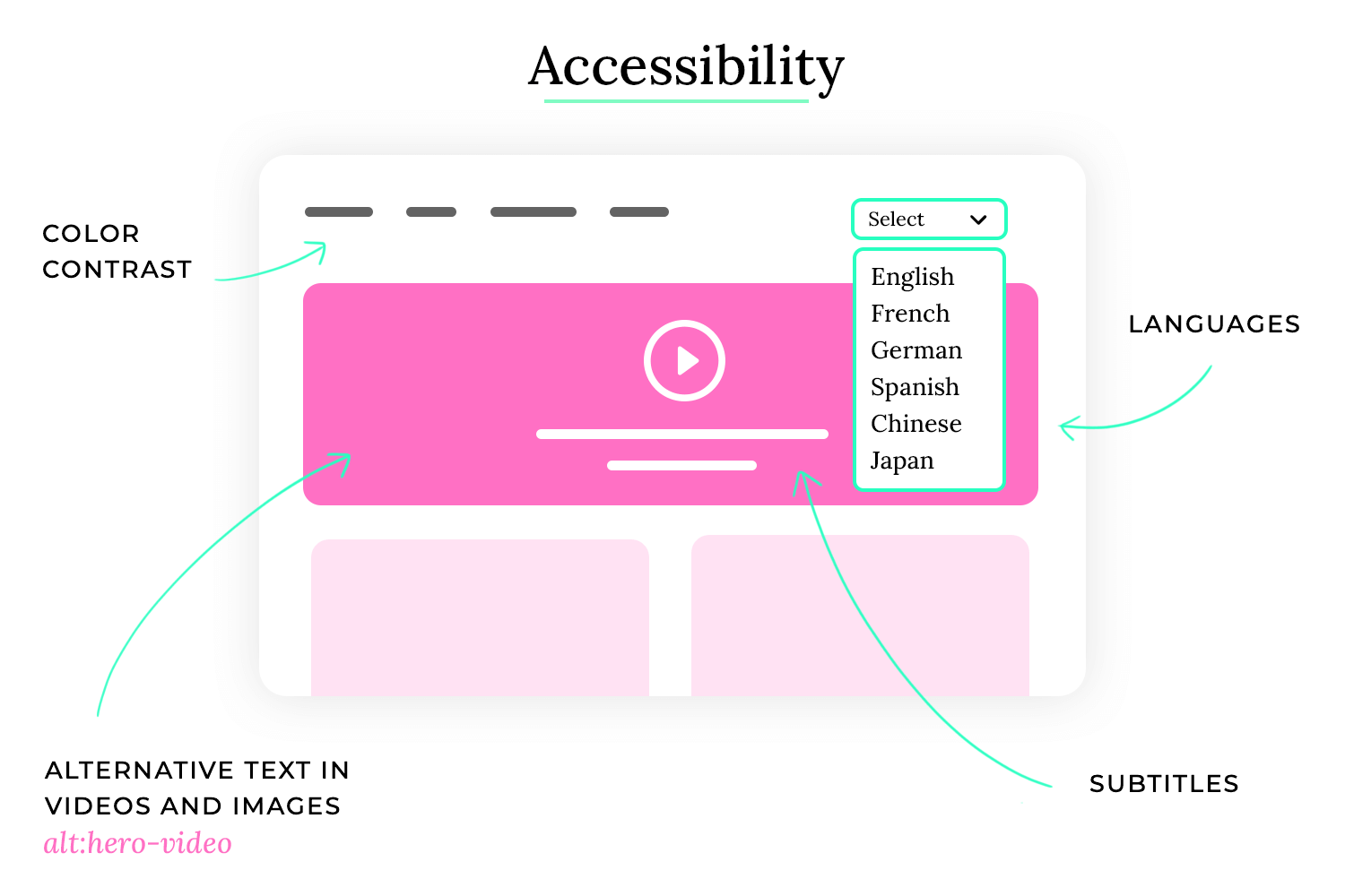
- Sufficient color contrast: The website uses a dark gray text on a light gray background, providing sufficient contrast for users with low vision. The contrast ratio between the text and background colors meets WCAG (Web Content Accessibility Guidelines) standards.
- Keyboard navigation: All interactive elements on the website, such as links, buttons, and form fields, can be accessed and operated using a keyboard alone. This allows users who cannot use a mouse to navigate the site.
- Alternative text for images: All images on the website have descriptive alternative text that is read aloud by screen readers. This allows users who are blind or have low vision to understand the content of the images.
- Clear and consistent layout: The website has a clear and consistent layout, making it easy for users with cognitive disabilities to understand the structure and find the information they need.
- Captions and transcripts for videos: All videos on the website have captions and transcripts, making them accessible to users who are deaf or hard of hearing.
Leads to an exclusive experience, where users with disabilities struggle to use the product effectively or are completely unable to use it, leading to frustration and exclusion. Take this mobile banking app as an example:
- Low color contrast: The app uses light gray text on a white background, making it difficult for users with low vision to read the text. The contrast ratio between the text and background colors does not meet WCAG standards.
- Lack of keyboard navigation: The app cannot be fully operated using a keyboard, making it inaccessible to users who cannot use a touchscreen.
- Missing alternative text for icons: Many icons in the app lack alternative text, making it difficult for users who use screen readers to understand their purpose.
- Complex and inconsistent layout: The app has a complex and inconsistent layout, making it difficult for users with cognitive disabilities to navigate and understand the interface.
- No captions or transcripts for video tutorials: The app includes video tutorials that lack captions or transcripts, making them inaccessible to users who are deaf or hard of hearing.
Free UI Design Tool for individuals and teams

User feedback is essential for a positive user experience. Unlike face-to-face interactions, digital products rely on UI designers to provide clear cues and signals. This feedback helps users understand the product’s functionality and feel more connected to it.
Microinteractions are a powerful tool for providing instant feedback. These small, subtle animations or visual cues can communicate a variety of information, such as whether an element is clickable or if the system is processing a request. A loading icon that briefly animates is a common example of a microinteraction.
Instantaneous feedback is crucial for avoiding confusion and frustration. Users don’t like uncertainty, and timely feedback can help them navigate the product more efficiently. Simple cues, like a button slightly moving up when hovered over, can indicate that it is clickable and responsive.
These simple cues are something UI designers have grown to do almost instinctively. They know that users need this sort of context in order for the product to shine, and so they look for these opportunities everywhere. These little details matter and make the entire experience better for users.
A classic example of simple but crucial feedback are the different states of key components, such as toggle button patterns, dropdown menus as well as the feedback from the well-loved UI design cards. If you’re interested in specific components, we also recommend you read our post on the debated choice between radio buttons vs checkboxes.
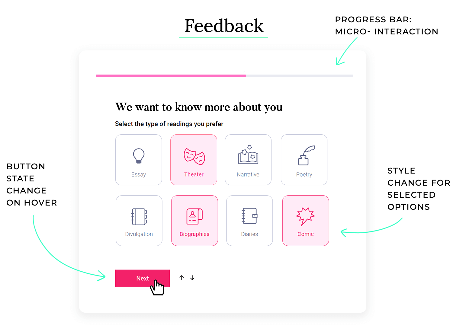
Good feedback and responsiveness as a UI design principle ensure that users receive clear, immediate feedback on their actions, keeping them informed and reassured throughout their interaction. Take this online banking app as an example:
- Form submission: When a user submits a form (e.g., for transferring money), the app provides immediate feedback. A progress spinner or loading indicator appears while the transaction is processing, and once completed, a success message with transaction details is displayed prominently. This reassures the user that their action was successful.
- Interactive elements: Buttons and interactive elements provide visual feedback. For example, a “Transfer” button changes color or displays a subtle animation when clicked, indicating that the action is being processed.
Bad feedback makes users feel unsure whether their actions have been registered or what the outcome is. This can lead to errors, frustration, and a negative perception of the product. Take this file uploading process as an example:
- No visual feedback: When the user selects a file to upload, there is no indication that the upload has started.
- No progress indicator: There is no progress bar or other indicator to show the upload progress.
- No confirmation message: Upon successful upload, there is no message to confirm that the file has been uploaded.
- Unclear error messages: If the upload fails, the error message is vague and does not explain the cause of the error.
Imagine stumbling upon a familiar face in a foreign land. It’s comforting, isn’t it? The same goes for digital products. When users encounter familiar elements, they feel a sense of comfort and familiarity. This is the power of leveraging established conventions and patterns in UI design.
By incorporating well-known design patterns, icons, and terminology, you’re essentially speaking your users’ language. It’s like offering them a warm cup of tea on a cold day. This affordance reduces the learning curve, making it easier for users to navigate and interact with your product.
Keep in mind that a familiar interface doesn’t mean a boring one. You can still create a unique and engaging experience while maintaining consistency with established design principles.
However, incorporating affordance requires careful consideration to avoid blending into the background. Designers must balance using familiar elements with innovating in a way that adds unique value to the product. The goal is to make interactions predictable and comfortable while still providing a distinct and effective user experience.
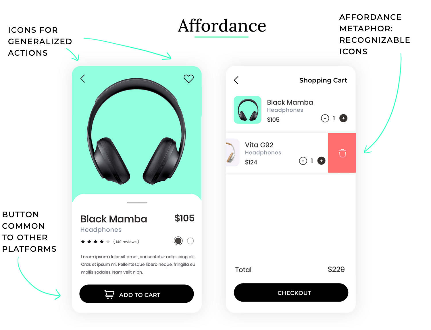
Affordance means designing interfaces that align with users’ existing knowledge and expectations. Using familiar design elements makes the interface easier to use because the user doesn’t need to learn a new system—they already understand how things should work based on their past experiences. Consider a shopping cart feature in an e-commerce app:
- Cart icon: The cart icon is a simple shopping cart or basket symbol, a widely recognized convention.
- Add to Cart button: The “Add to Cart” button is typically placed near the product details and uses the exact phrasing, which is common across most e-commerce platforms.
- Checkout process: The checkout process includes familiar steps: reviewing the cart, entering shipping information, choosing payment options, and confirming the purchase. Each step is labeled in a way that aligns with what users expect from similar experiences.
By ignoring familiar conventions, this file management app creates a steeper learning curve and a disorienting experience for users, which can lead to that pesky feeling of frustration again, which leads to decreased usability.
- Unusual icons: Instead of the familiar folder icon for directories and a document icon for files, this app uses abstract shapes—like triangles for folders and circles for files. Users have no immediate association with these shapes, causing confusion.
- Non-standard navigation: The app requires users to swipe left and right to open and close folders, rather than the familiar double-click or tap. This deviates from the widely accepted pattern in file management, forcing users to adapt to an unfamiliar method.
- Inconsistent terminology: The app uses terms like “Vaults” instead of “Folders” and “Tokens” instead of “Files,” making it hard for users to relate the app’s functions to the standard file management they’re accustomed to.
Learnability is like teaching someone how to ride a bicycle. You start with training wheels, provide clear instructions, and offer support until they feel confident enough to ride on their own. When a product has good learnability, users can quickly understand how to use it and accomplish their goals without extensive training or documentation.
Imagine trying to assemble a piece of furniture without any instructions. Wouldn’t it be frustrating to figure out which pieces go where and how they connect? The same goes for digital products. Learnability helps users avoid the confusion and frustration of struggling to understand how a product works. So, what does learnability mean in practice?
When it comes to the learnability as a UI design principle, you want to be educational and supportive. You want users to easily grasp the basic functionality and gradually discover more advanced features as needed. A good example is using familiar icons and metaphors, so users can intuitively understand the meaning of different elements.
Learnability in UI design ensures that users can quickly and easily learn how to use an interface because it leverages familiar patterns, provides clear guidance, and minimizes the cognitive effort required to understand its functionality. Take this music streaming app as an example.
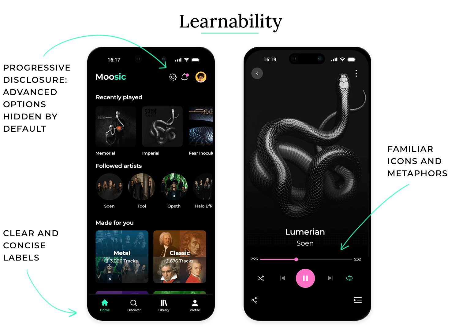
- Familiar icons and metaphors: The app uses familiar icons such as a play button (triangle), pause button (two vertical lines), and volume control (speaker icon). These icons are universally understood and require no explanation.
- Clear and concise labels: All buttons and menu items have clear and concise labels that accurately describe their function. This eliminates ambiguity and helps users understand what each element does.
- Onboarding tutorial: When users first open the app, they are guided through a brief onboarding tutorial that highlights the key features and explains how to use them. This helps new users get started quickly.
- Contextual tooltips: When users hover over less common icons or features, a small tooltip appears with a brief explanation. This provides just-in-time help without cluttering the interface.
- Progressive disclosure: Advanced features are hidden by default and are only revealed when users actively seek them out. This prevents users from being overwhelmed by too many options at once.
Bad learnability practice leads to an undesirable situation where users struggle to understand how to use the product, requiring extensive effort and potentially leading to abandonment. Take this professional video editing software as an example:
- Unfamiliar icons and metaphors: The software uses numerous custom icons that are not easily recognizable, making it difficult for new users to understand their meaning.
- Cryptic labels: Many buttons and menu items have cryptic labels or abbreviations that are not easily understood by non-experts.
- No onboarding or tutorial: The software provides no initial guidance or tutorial, leaving new users to figure out how to use it on their own.
- Lack of tooltips or help documentation: The software provides minimal documentation or contextual help, making it difficult for users to find answers to their questions.
- Overwhelming interface: The interface is packed with numerous panels, windows, and menus, making it difficult for new users to find the features they need and understand how they relate to each other.
Efficiency is like having a well-organized toolbox where every tool is readily accessible and designed for a specific purpose. When a product is efficient, users can accomplish their tasks quickly and easily, without wasting time on unnecessary steps or struggling with cumbersome processes.
Imagine trying to build a birdhouse with only a hammer and no other tools. It would be a slow and frustrating process. Having the right tools for the job makes the task much more efficient. The same goes for digital products. Efficiency helps users save time and effort, allowing them to focus on their goals. So, what does efficiency mean in practice?
When it comes to the efficiency of UI design, you want to be streamlined and optimized. You want users to achieve their desired outcomes with the fewest possible steps and clicks. A good example is providing keyboard shortcuts for frequently used actions, allowing experienced users to bypass menus and perform tasks more quickly.
Efficiency in UI design ensures that users can complete tasks quickly and with minimal effort because it aligns with their mental models, provides shortcuts, and streamlines workflows. Take this email client as an example.
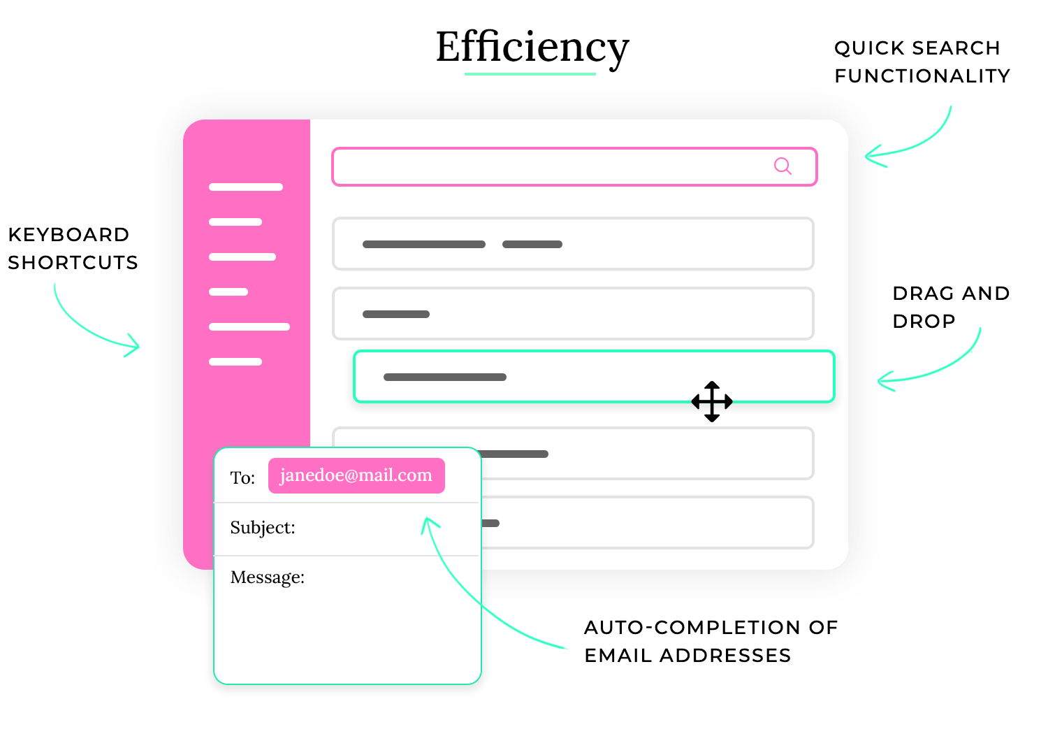
- Keyboard shortcuts: The email client offers a wide range of keyboard shortcuts for common actions such as composing a new message (Ctrl+N), replying to a message (Ctrl+R), and deleting a message (Delete key). This allows experienced users to navigate and manage their email much faster.
- Drag-and-drop functionality: Users can easily organize their emails by dragging and dropping them between folders. This provides a quick and intuitive way to manage their inbox.
- Quick search functionality: The email client has a powerful search function that allows users to quickly find specific emails based on keywords, sender, recipient, or date. This saves users from having to manually scroll through large numbers of emails.
- Customizable filters and rules: Users can create custom filters and rules to automatically sort incoming emails into different folders or perform other actions. This helps them manage their inbox more efficiently and prioritize important messages.
- Auto-complete for email addresses: When composing a new message, the email client automatically suggests matching email addresses as the user types. This saves time and reduces the risk of typos.
Free UI Design Tool for individuals and teams

Leads to a slow and frustrating experience, where users waste time on unnecessary steps, struggle with cumbersome processes, and find it difficult to accomplish their goals. Take this online form for filing taxes as an example:
- No keyboard navigation: Users are forced to use the mouse for all interactions, making it slow and cumbersome to fill out the form, especially for users who prefer keyboard navigation.
- Lack of auto-fill or data import: Users are required to manually enter all information, even data that has already been provided in previous years. This is time-consuming and increases the risk of errors.
- Complex and lengthy forms: The forms are long and complex, with many unnecessary fields and confusing instructions. This makes it difficult for users to understand what information is required and increases the time it takes to complete the process.
- No progress tracking or save functionality: Users cannot save their progress or track how much of the form they have completed. This is frustrating and can lead to data loss if the user’s session times out.
- Lack of clear error messages: When users make a mistake, the error messages are vague and unhelpful, making it difficult for them to understand what went wrong and how to fix it.
Flexibility is like having a versatile piece of furniture that can adapt to different situations. A sofa bed, for example, can be used as a sofa during the day and a bed at night. When a product is flexible, it can accommodate a wide range of user needs, preferences, and contexts, making it useful in various situations.
Imagine trying to wear the same pair of shoes for every activity, from hiking to swimming to attending a formal event. It wouldn’t be very practical. Different situations call for different tools and approaches. The same goes for digital products. Flexibility as a UI design principle helps ensure that a product can be used effectively by a diverse range of users in different contexts. So, what does flexibility mean in practice?
When it comes to the flexibility of UI design, you want to be adaptable and accommodating. You want users to be able to tailor the interface to their specific needs and preferences. A good example is providing customizable themes, allowing users to choose a color scheme that suits their taste or visual needs.
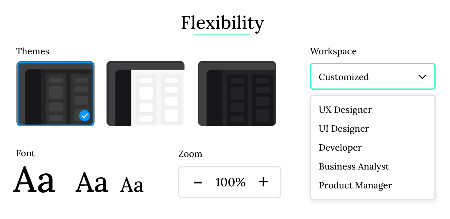
Flexibility in UI design ensures that users can adapt the interface to their individual needs and preferences, allowing for a more personalized and comfortable experience across various devices and contexts. Take this web browser as an example.
- Customizable toolbars and menus: Users can customize the browser’s toolbars and menus by adding, removing, or rearranging buttons and menu items. This allows them to create a personalized workspace that suits their specific browsing habits.
- Themes and extensions: The browser supports themes and extensions, allowing users to change the visual appearance of the browser and add new functionality. This allows for a high degree of personalization and customization.
- Responsive design: The browser’s interface adapts seamlessly to different screen sizes and devices, from desktops to laptops to tablets and smartphones. This ensures a consistent and usable experience regardless of the device being used.
- Accessibility settings: The browser offers a variety of accessibility settings, such as zoom controls, font size adjustments, and high-contrast themes. This makes the browser usable for people with visual impairments or other disabilities. Multiple profile support: The browser allows users to create multiple profiles, each with its own settings, bookmarks, and history. This is useful for sharing a computer with multiple users or for separating work and personal browsing.
Makes for a rigid and restrictive experience, where users are forced to adapt to the product rather than the other way around, leading to frustration and a feeling of being constrained. Take this single-purpose mobile app as an example:
- Fixed layout and design: The app has a fixed layout and design that cannot be customized. Users are unable to change the color scheme, font size, or arrangement of elements.
- No support for different screen sizes: The app is designed for a specific screen size and does not adapt well to other devices. On larger screens, the interface may appear stretched or pixelated, while on smaller screens, elements may be too small or overlap.
- Limited interaction options: The app only supports touch input and does not offer alternative input methods such as keyboard or voice control. This makes it difficult for users with motor impairments to use the app.
- No accessibility settings: The app lacks accessibility settings such as zoom controls or high-contrast themes, making it difficult for users with visual impairments to use the app.
- No personalization options: Users are unable to personalize the app in any way, such as setting preferences for notifications, language, or data storage. This makes the app feel generic and impersonal.
Visual hierarchy is the backbone of any well-organized interface. It’s the art of strategically arranging elements to guide users through content in a logical and intuitive manner. Think of it as a road map for your users, directing their attention to the most important information.
By varying size, color, contrast, and spacing, you can create a clear hierarchy. For instance, large, bold headings immediately grab attention, while subtle contrasts and smaller text are used for less critical details. This not only improves usability but also enhances the overall aesthetic appeal of your interface.
Layout is the foundation of any screen, and it’s where UI designers can show off their skills. While trendy styles like neumorphism can add visual flair, the real art lies in functionality. UI designers use their visual skills to create layouts that highlight important elements and encourage specific user actions. In e-commerce, for example, well-designed layouts can nudge users towards making purchases.
Whitespace also plays an important role in the layout design. Most people who are only beginning to learn about UI design often underestimate the importance of whitespace or how much of it they’ll need to create a good visual hierarchy. The truly skilled designers use that empty space to give the user’s eye some relief and let the component guide their gaze through the screen. This can be taken to an extreme with the trend of minimalist website design.
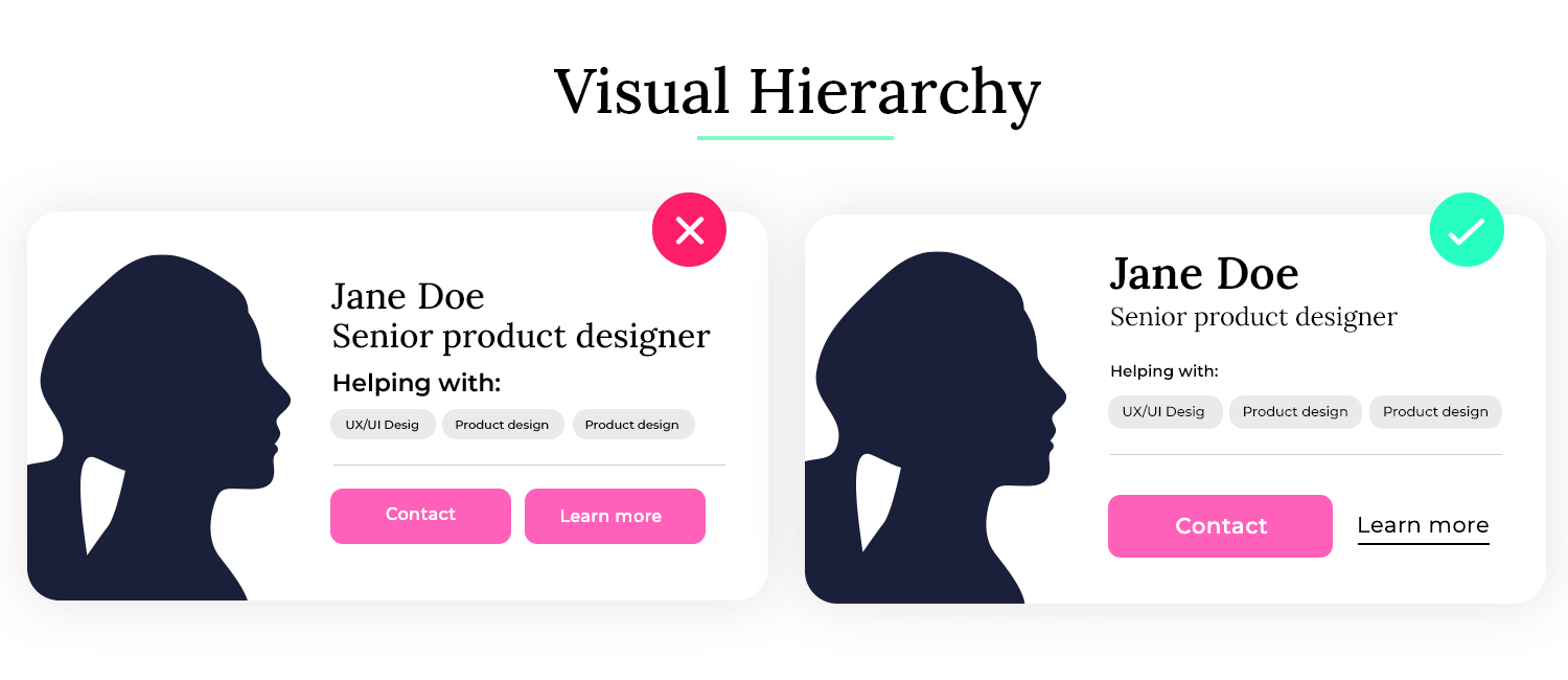
The secret to a successful layout lies in a combination of factors, including the general rule of proximity and visual hierarchy. By grouping related elements together and using visual cues to guide users’ attention, you can create an interface that is both functional and visually appealing.
Proximity plays a crucial role in guiding users’ attention and understanding. When elements are placed close together, they are perceived as related, reinforcing the connection between them. This careful orchestration of layout and hierarchy ensures that users can quickly and easily identify key actions and information.
A well-designed hierarchy communicates the importance of content immediately, often without needing a single word.
In this example of a news website the visual hierarchy ensures that the most critical information is highlighted and easily accessible, while secondary content is organized in a way that doesn’t overwhelm the user.
- Headlines: The most important news stories are displayed with large, bold headlines at the top of the page, drawing immediate attention.
- Subheadings: Below each headline, some smaller subheadings and summaries provide additional context. These are visually distinct but less prominent than the main headlines.
- Images: High-quality images accompany the top stories, with images that are visually larger for more critical stories, helping to attract attention.
- Navigation: The main navigation menu is clearly positioned at the top, with large buttons or tabs for different sections (e.g., World, Politics, Sports) to help users quickly find what they’re looking for.
- Call-to-Action (CTA): Key CTAs, such as “Subscribe Now” or “Read More,” are designed with contrasting colors and positioned in prominent locations, making them easy to spot and act upon.
In this example of a landing page for a product, the lack of a clear visual hierarchy makes it difficult for users to quickly understand the page’s purpose or find the most important information, which can lead to confusion and a poor user experience.
- Equal-weighted elements: The page features a large number of text blocks, images, and buttons of similar size and style. Everything seems equally important because no single element stands out more than the others.
- No clear focus: Important information like the product’s key features and benefits are buried in dense paragraphs of text, with no visual differentiation or emphasis.
- Inconsistent font sizes: The page uses various font sizes and styles inconsistently, making it hard to differentiate between headings, subheadings, and body text.
- CTAs lost in the mix: Call-to-action buttons are styled the same as regular links and are scattered throughout the page without a clear focus on guiding the user toward the primary action.
Aesthetic and use are like the harmonious blend of form and function in a well-crafted object. A beautifully designed chair, for example, is not only visually appealing but also comfortable and supportive. When a product strikes the right balance between aesthetics and use, it is both pleasing to the eye and effective in its purpose.
Imagine walking into a room that is either completely empty and sterile or cluttered with excessive decorations. Neither extreme would be very inviting or conducive to productivity. A well-designed space, on the other hand, would be both visually appealing and functional. The same goes for digital products. Balancing aesthetics with use helps create a positive user experience that is both enjoyable and efficient. So, what does this balance mean in practice?
When it comes to the aesthetic and use of UI design, you want to be elegant and purposeful. You want the visual design to enhance the user experience without compromising functionality. A good example is using whitespace effectively to create a clean and uncluttered interface that is both visually appealing and easy to navigate.
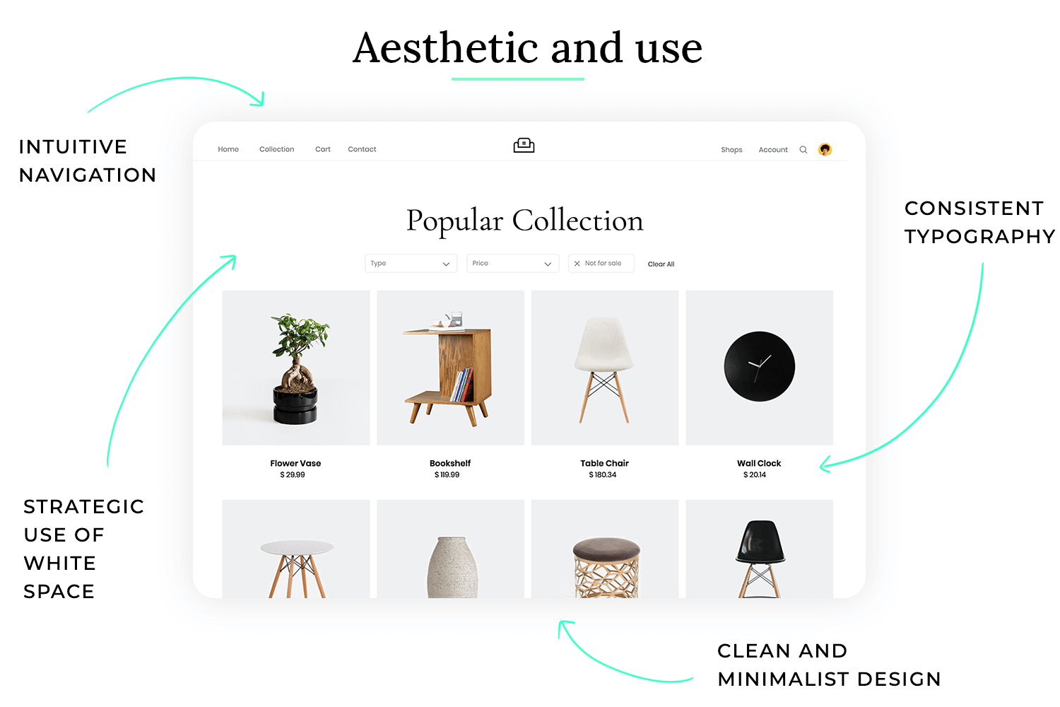
Aesthetic and use in UI design ensures that the interface is not only visually appealing but also functional and easy to use. It strikes a balance between beauty and utility, creating a positive and effective user experience. Take this online portfolio website as an example.
- Clean and minimalist design: The website uses a clean and minimalist design with plenty of whitespace, creating a visually appealing and uncluttered interface. This allows the user’s work to take center stage.
- High-quality imagery: The website uses high-quality images and videos to showcase the user’s work. This enhances the visual appeal of the website and provides a compelling showcase of the user’s skills.
- Consistent typography and color palette: The website uses a consistent typography and color palette, creating a cohesive and professional look. This enhances the visual appeal of the website and reinforces the user’s brand identity.
- Intuitive navigation: The website has an intuitive navigation structure that makes it easy for visitors to find the information they are looking for. This enhances the usability of the website and ensures that visitors can easily explore the user’s work.
- Subtle animations and transitions: The website uses subtle animations and transitions to enhance the user experience without being distracting. This adds a touch of polish to the website and makes it more engaging.
Leads to an unbalanced experience where either the visual design overwhelms the functionality or the functionality is compromised by poor design choices. This can lead to user frustration and a negative perception of the product. Take this e-commerce website as an example:
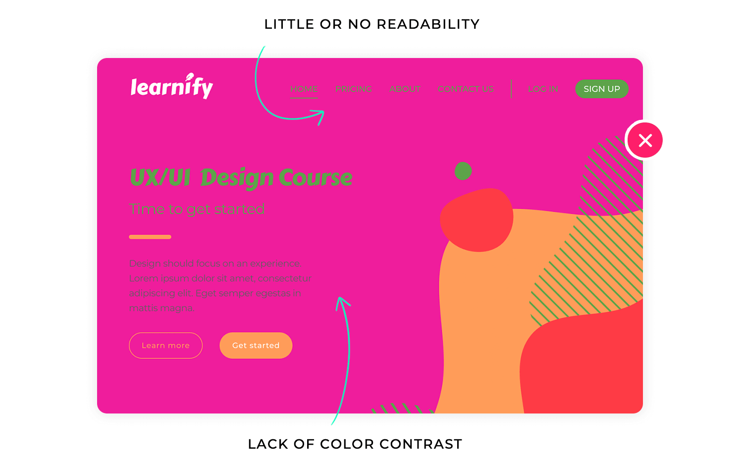
- Cluttered and overwhelming layout: The website is cluttered with excessive banners, pop-ups, and advertisements, making it difficult for users to focus on the products.
- Inconsistent design elements: The website uses inconsistent fonts, colors, and imagery, creating a disjointed and unprofessional look.
- Poor use of whitespace: The website lacks sufficient whitespace, making it feel cramped and overwhelming.
- Difficult navigation: The website has a complex and unintuitive navigation structure, making it difficult for users to find the products they are looking for.
- Distracting animations and effects: The website uses excessive and distracting animations and effects, which detract from the user experience and make it difficult to focus on the content.
User control is like having the steering wheel of a car. You have the power to decide where you want to go, how fast you want to travel, and when you want to stop. When a product gives users a sense of control, they feel more confident and comfortable using it. They are empowered to explore, experiment, and correct mistakes without fear of negative consequences.
Imagine being a passenger in a car with no steering wheel or brakes. You would feel anxious and powerless, not knowing where you are going or how to stop. The same goes for digital products. Without user control, users feel lost and frustrated, unable to navigate or correct mistakes. So, what does user control mean in practice?
When it comes to user control in UI design, you want to be empowering and predictable. You want users to feel in charge of their interactions and confident that they can always undo mistakes or reverse actions. A good example is providing clear and easily accessible undo/redo functionality.
User control in UI design ensures that users feel empowered and in charge of their interactions with the interface. It provides them with the ability to navigate, explore, and correct mistakes without fear of negative consequences. Take this word processing software as an example.
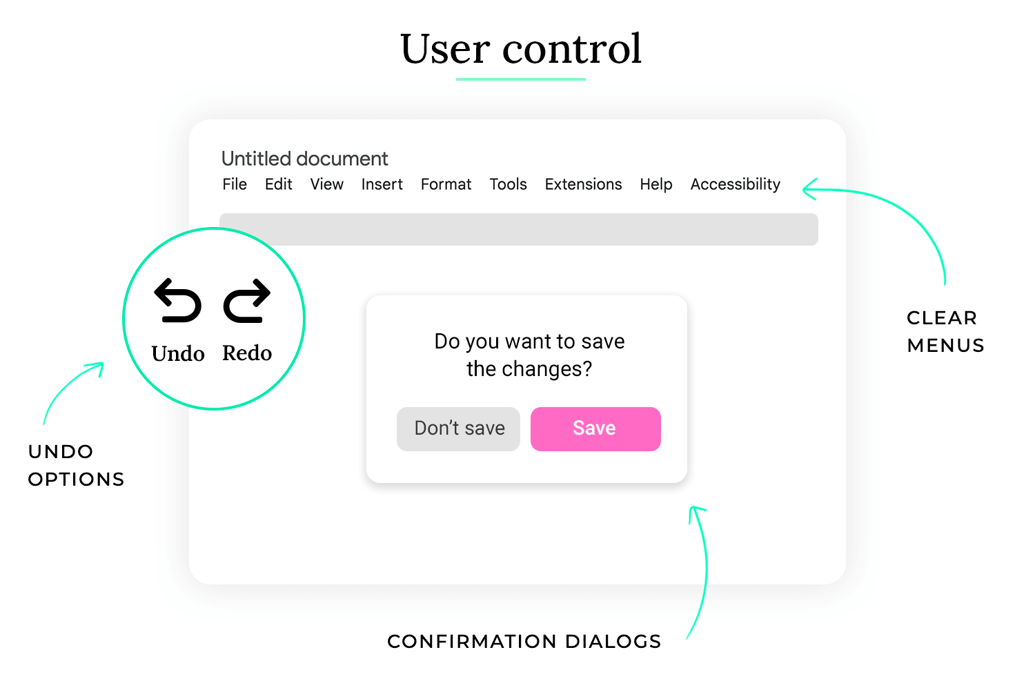
- Undo/redo functionality: The software provides robust undo/redo functionality, allowing users to easily reverse any changes they make to their document. This gives users the freedom to experiment and correct mistakes without fear of losing their work.
- Clear navigation and menus: The software has a clear and intuitive navigation structure, making it easy for users to find the features they need. Menus are logically organized and clearly labeled.
- Customizable settings: The software allows users to customize various settings, such as font size, page layout, and keyboard shortcuts. This allows them to tailor the software to their individual preferences and workflow.
- Confirmation dialogs for important actions: The software displays confirmation dialogs before performing important actions, such as deleting a file or saving changes. This prevents accidental data loss.
- Progress indicators for long processes: When performing long processes, such as saving a large file or exporting a document, the software displays a progress indicator. This keeps users informed of the progress and prevents them from thinking that the software has frozen.
This leads to a frustrating and disempowering experience, where users feel lost, confused, and unable to control the outcome of their actions. This can lead to anxiety, frustration, and ultimately, abandonment of the product. Take this automated software update process as an example:
- Forced updates without user consent: The software automatically downloads and installs updates without asking for user permission. This can disrupt the user’s workflow and lead to unexpected changes to their system.
- No option to postpone or cancel updates: Users have no option to postpone or cancel updates, even if they are in the middle of an important task.
- Lack of progress information: The update process provides little or no information about the progress of the update, leaving users unsure of how long it will take.
- No rollback option: If an update causes problems, users have no way to roll back to the previous version of the software. This can lead to significant frustration and data loss.
- Unclear error messages: If an update fails, the error messages are vague and unhelpful, making it difficult for users to understand what went wrong and how to fix it.
Error prevention is like having guardrails on a winding mountain road. They don’t prevent you from driving, but they significantly reduce the risk of accidentally driving off a cliff. In UI design, error prevention aims to minimize the likelihood of users making mistakes by anticipating potential problems and designing safeguards into the interface.
Imagine filling out a complex form with no clear instructions or validation. You might accidentally enter incorrect information or miss required fields, leading to frustration and wasted time. Error prevention helps avoid these situations by guiding users and providing feedback before mistakes happen. So, what does error prevention mean in practice?
When it comes to error prevention in UI design, you want to be proactive and helpful. You want to anticipate potential user errors and provide clear guidance and feedback to prevent them. A good example is using real-time form validation to provide immediate feedback when a user enters incorrect data in a form field.
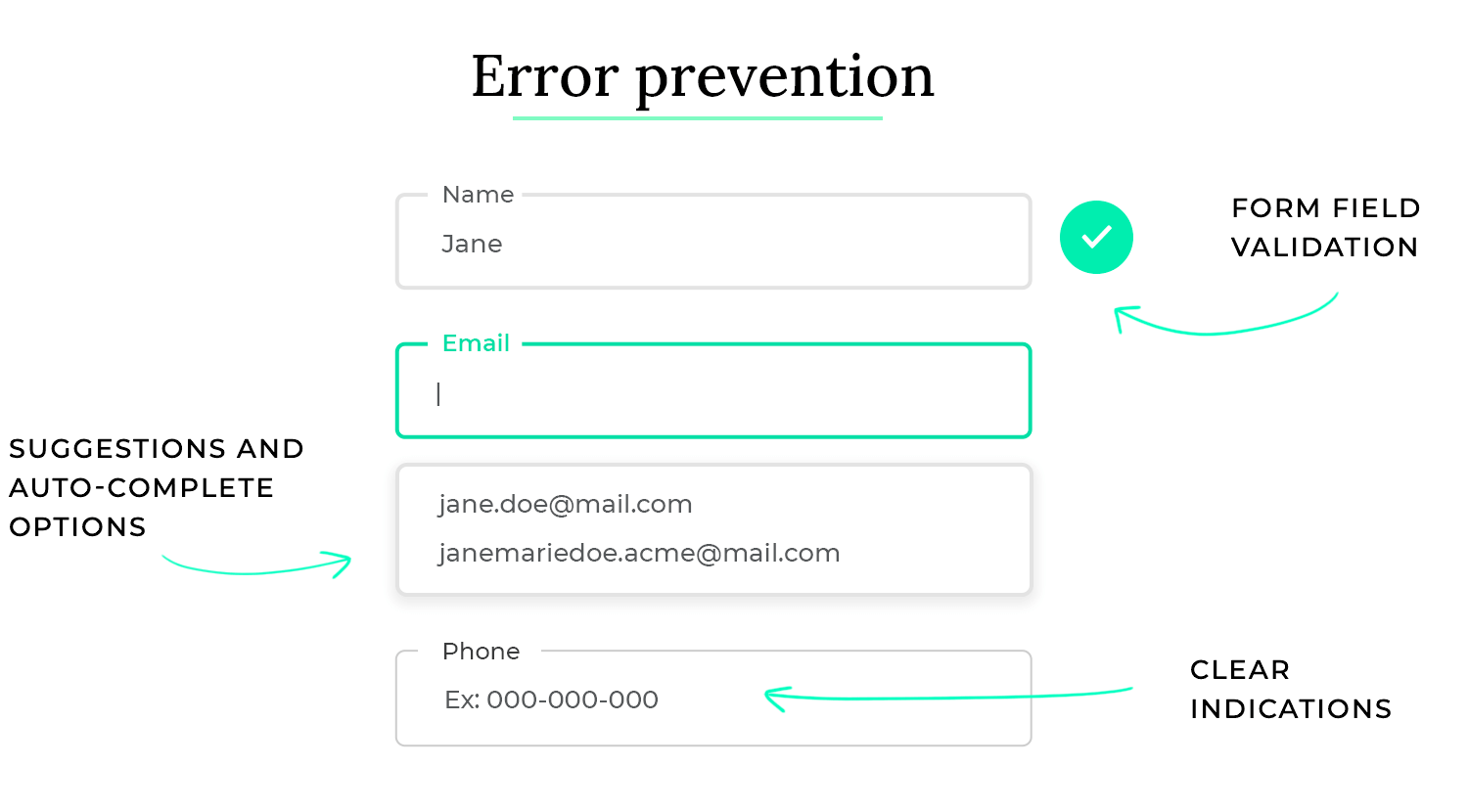
- Form field validation: The booking form uses real-time validation to check the format and validity of user input. For example, it checks if the email address is in the correct format, if the phone number contains only digits, and if required fields are filled in. This prevents users from submitting incomplete or incorrect information.
- Clear instructions and labels: The form provides clear instructions and labels for each field, explaining what information is required and how it should be entered. This reduces ambiguity and helps users understand what is expected of them.
- Dropdown menus and auto-complete: For fields with a limited number of options, the form uses dropdown menus or auto-complete suggestions. This prevents typos and ensures that users select valid options.
- Confirmation dialogs for critical actions: Before completing a booking, the system displays a confirmation dialog that summarizes the booking details and asks the user to confirm. This prevents accidental bookings.
- Disabling unavailable options: If certain dates or times are unavailable for booking, they are disabled in the calendar or time picker. This prevents users from selecting unavailable options.
This leads to a frustrating and error-prone experience, where users frequently make mistakes and have difficulty completing their tasks. This can lead to user frustration, wasted time, and a negative perception of the product. Take this file deletion process in an operating system as an example:
- No confirmation dialog for deletion: When users delete a file, there is no confirmation dialog asking them to confirm the deletion. This makes it easy to accidentally delete important files.
- No undo functionality for deletion: Once a file is deleted, there is no easy way to undo the deletion. This can lead to significant data loss if a user accidentally deletes a file they need.
- Vague or unhelpful error messages: If an error occurs during the deletion process, the error messages are vague and unhelpful, making it difficult for users to understand what went wrong and how to fix it.
- No visual cues or warnings: There are no visual cues or warnings to indicate that a file is about to be permanently deleted. This makes it easy for users to make mistakes, especially when deleting multiple files at once.
- Lack of file recovery options: There are no built-in file recovery options, making it difficult or impossible for users to recover accidentally deleted files.
Free UI Design Tool for individuals and teams

Error recovery is like having a spare tire in your car. You hope you never have to use it, but it’s essential when you get a flat tire. In UI design, error recovery focuses on how the system responds when users inevitably make mistakes. It’s about providing clear, helpful information and offering solutions so users can quickly get back on track.
Imagine encountering a cryptic error message on your computer that simply says “Error code 0x0000000A.” Unless you’re a computer expert, this message is meaningless and doesn’t help you solve the problem. Effective error recovery avoids this by providing clear, user-friendly explanations and actionable solutions. So, what does error recovery mean in practice?
When it comes to error recovery in UI design, you want to be supportive and informative. You want to guide users through the process of resolving errors and prevent them from feeling lost or frustrated. A good example is providing specific instructions on how to correct an error, rather than just stating that an error has occurred.
Error recovery in UI design ensures that when errors do occur, users are provided with the information and tools they need to quickly understand the problem and resolve it. It focuses on providing clear, concise, and helpful messages and offering actionable solutions. Take this online form submission process as an example.
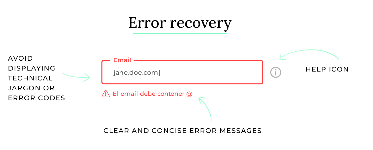
- Clear and concise error messages: If the user submits the form with errors, the system displays clear and concise error messages next to each incorrect field. The messages explain exactly what is wrong with the input (e.g., “Please enter a valid email address,” “This field is required”).
- Specific instructions and solutions: The error messages not only identify the problem but also provide specific instructions on how to correct it (e.g., “Please enter your email address in the format [email address removed]”).
- Contextual help: If the user is still unsure how to correct the error, they can click on a help icon next to the field to get more detailed information and examples.
- Preventing data loss: If the user needs to correct multiple errors, the system preserves the data they have already entered in other fields. This prevents them from having to re-enter everything.
- Graceful handling of unexpected errors: If an unexpected error occurs on the server side, the system displays a user-friendly message explaining that there was a temporary problem and suggests trying again later. It avoids displaying technical jargon or error codes.
Leads to a frustrating and confusing experience, where users are left stranded with vague error messages and no clear path to resolution. This can lead to user frustration, wasted time, and a negative perception of the product. Take this software installation process as an example:
- Cryptic error messages: If an error occurs during installation, the software displays cryptic error messages with technical jargon and error codes that are meaningless to most users.
- No explanation of the problem: The error messages do not explain what caused the error or what the user can do to fix it.
- No solutions or guidance: The software provides no solutions or guidance on how to resolve the error.
- No contextual help: There is no contextual help or documentation available to help users understand the error and find a solution.
- Abrupt termination of the process: If a critical error occurs, the installation process terminates abruptly without providing any explanation or options for recovery.
Focus in UI design is like using a spotlight on a stage. It directs the audience’s attention to the most important elements, preventing them from being distracted by the background or other irrelevant details. In a user interface, focus helps users concentrate on their current task by minimizing distractions and highlighting key information.
Imagine trying to read a book in a crowded, noisy room with flashing lights. It would be nearly impossible to concentrate. Similarly, a cluttered and distracting interface makes it difficult for users to focus on their goals. Focus in UI design creates a clear and organized environment that promotes concentration and efficiency. So, what does focus mean in practice?
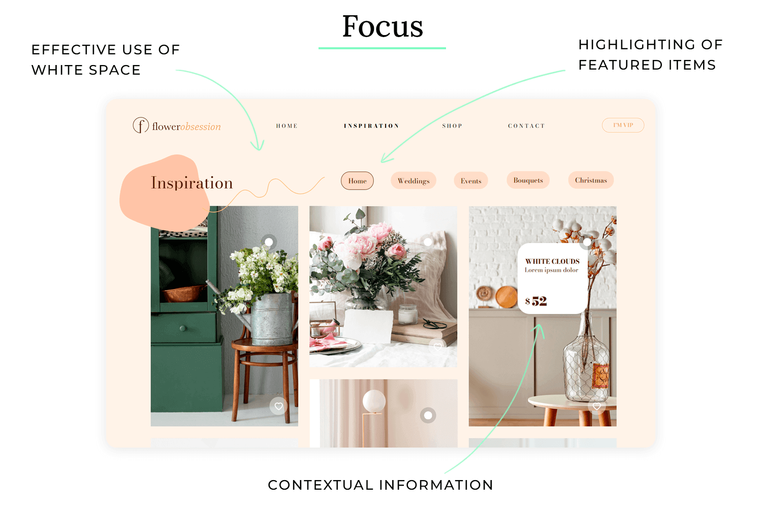
When it comes to focus in UI design, you want to be strategic and deliberate. You want to guide the user’s attention to the essential elements and minimize anything that could distract them. A good example is using whitespace effectively to create visual breathing room and separate different sections of the interface.
Focus in UI design ensures that users can easily concentrate on their tasks by minimizing distractions and highlighting relevant information. It uses various techniques to create a clear and organized interface that promotes concentration and efficiency. Take this writing application as an example.
- Minimalist interface: The writing application has a minimalist interface with no unnecessary toolbars or panels visible by default. This creates a clean and uncluttered writing environment.
- Effective use of whitespace: The application uses ample whitespace around text and other elements, creating visual breathing room and preventing the interface from feeling cramped.
- Highlighting active elements: When the user is typing, the current line or paragraph is subtly highlighted, helping them maintain focus on their current position.
- Full-screen mode: The application offers a full-screen mode that hides all interface elements except the text being written. This eliminates all distractions and allows the user to fully immerse themselves in the writing process.
- Contextual toolbars: Formatting options and other tools are only displayed when they are needed, such as when text is selected. This keeps the interface clean when not in use and provides relevant tools only when necessary.
Makes for a cluttered and distracting experience, where users struggle to concentrate on their tasks and are easily overwhelmed by the abundance of information and visual elements. This can lead to user frustration, errors, and decreased productivity. Take this complex data analysis dashboard as an example:
- Cluttered layout: The dashboard is packed with numerous charts, graphs, tables, and controls, making it difficult for users to focus on any one piece of information.
- Excessive use of colors and animations: The dashboard uses a wide range of bright colors and distracting animations, which further contribute to the visual clutter.
- Lack of whitespace: There is very little whitespace between elements, making the dashboard feel cramped and overwhelming.
- No clear visual hierarchy: There is no clear visual hierarchy to guide the user’s eye to the most important information. All elements compete for attention.
- Constantly updating data: The dashboard constantly updates with new data, which can be distracting and make it difficult for users to focus on their analysis.
Scalability in UI design is like building a house with a foundation that can support additional floors. The initial design should be able to accommodate future growth and changes without requiring a complete rebuild. In UI design, this means ensuring the interface works well across different screen sizes, resolutions, and devices, and that it can adapt to new features and content without becoming cluttered or confusing.
Imagine designing a website that looks great on a desktop computer but becomes unusable on a mobile phone because the text is too small and the buttons are too close together. This lack of scalability would limit the website’s reach and usability. Scalability ensures that the user experience remains consistent and effective regardless of the context. So, what does scalability mean in practice?
When it comes to scalability in UI design, you want to be forward-thinking and adaptable. You want to create a design that can handle future changes and growth without requiring major redesigns. A good example is using responsive design techniques to ensure that the interface adapts seamlessly to different screen sizes.
Scalability in UI design ensures that the interface can adapt to different contexts and future changes without compromising usability or visual appeal. It uses various techniques to create a flexible and adaptable design. Take this social media platform as an example.
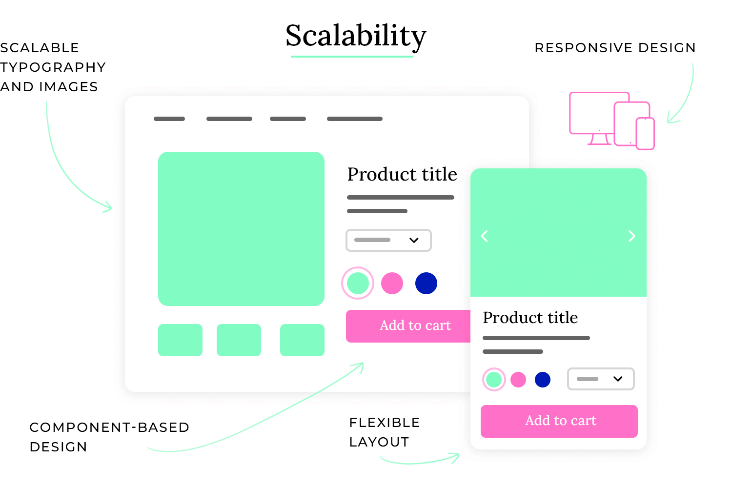
- Responsive design: The platform uses responsive design techniques to ensure that the interface adapts seamlessly to different screen sizes and devices, from desktops to laptops to tablets and smartphones.
- Flexible layouts: The platform uses flexible layouts that can accommodate different amounts of content without becoming cluttered or distorted. This allows the platform to easily add new features and information without requiring major redesigns.
- Component-based design: The platform uses a component-based design system, which means that the interface is built from reusable components that can be easily modified and updated. This makes it easier to maintain consistency and scale the design across different parts of the platform.
- Scalable typography and imagery: The platform uses scalable typography and imagery that can be easily adjusted to different screen sizes and resolutions. This ensures that the text and images are always legible and visually appealing.
- API-driven architecture: The platform uses an API-driven architecture, which makes it easier to integrate with other services and add new features in the future.
Leads to a rigid and inflexible design that cannot adapt to different contexts or future changes. This can result in a poor user experience, increased development costs, and difficulty in maintaining the product. Take this desktop application with a fixed window size as an example:
- Fixed layouts: The application uses fixed layouts that are designed for a specific screen resolution. When the application is used on a different resolution, the interface may appear distorted or cut off.
- Inflexible typography and imagery: The application uses fixed font sizes and image resolutions that do not scale well to different screen sizes. This can result in text that is too small or images that are pixelated.
- No support for different devices: The application is only designed for desktop computers and does not work on other devices such as tablets or smartphones.
- Difficult to add new features: The application’s architecture makes it difficult to add new features without requiring major redesigns.
- Poor performance on low-end devices: The application may perform poorly on low-end devices due to its lack of optimization for different hardware configurations.
Imagine a navigation app that only provided directions in written form, regardless of whether you were driving or walking. That would be quite inconvenient while driving! Context awareness ensures that the app provides voice guidance when you’re driving and switches to walking directions when you’re on foot. So, what does context awareness mean in practice?
When it comes to context awareness in UI design, you want to be perceptive and responsive. You want the interface to anticipate the user’s needs based on their current situation and adjust accordingly. A good example is a travel app that automatically displays flight information and gate numbers when the user is at the airport.
Context awareness in UI design ensures that the interface is relevant and helpful in the user’s specific situation. It uses various techniques to gather information about the user’s context and adjust the interface accordingly. Take this smart home control app as an example.
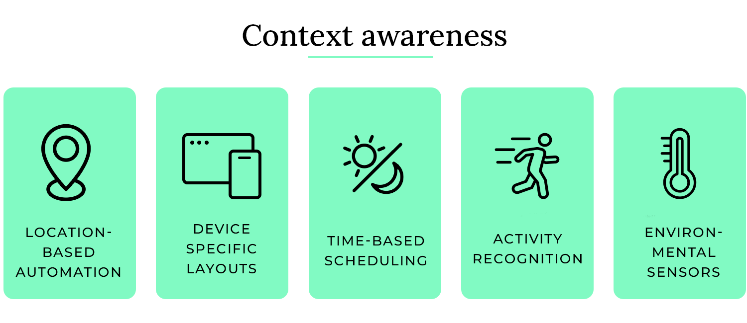
- Location-based automation: The app uses the user’s location to automatically turn on the lights and adjust the thermostat when they are approaching home.
- Time-based scheduling: The app allows users to schedule tasks based on the time of day, such as turning on the coffee maker in the morning or dimming the lights in the evening.
- Device-specific layouts: The app adapts its layout and functionality for optimal viewing on different devices, such as smartphones, tablets, and smartwatches.
- Activity recognition: The app can detect the user’s activity, such as walking, running, or driving, and adjust its behavior accordingly. For example, it might pause music playback when the user starts driving.
- Environmental sensors: The app can use data from environmental sensors, such as temperature, light, and humidity sensors, to adjust the settings of connected devices. For example, it might automatically turn on the air conditioning if the temperature is too high.
In this scenario, the interface is not relevant to the user’s current situation. This can lead to user confusion, errors, and a negative perception of the product. Take this music streaming app that doesn’t consider context as an example:
- No adaptation to location or activity: The app displays the same interface and offers the same features regardless of the user’s location or activity. For example, it might display large album art and detailed track information even when the user is driving, which can be distracting.
- No consideration of time of day: The app uses the same light theme regardless of the time of day, which can be straining on the eyes in low-light conditions.
- No device-specific optimizations: The app uses the same layout and functionality on all devices, even though some features might be more suitable for certain devices than others.
- No use of environmental data: The app does not use data from environmental sensors to adjust its behavior. For example, it might not adjust the volume of the music based on the ambient noise level.
- No personalization based on user preferences: The app does not learn from the user’s preferences or adapt its behavior over time. For example, it might not suggest music based on the user’s listening history or current mood.
Engagement in UI design is like a captivating storyteller who keeps you hooked until the very end. It’s about creating interfaces that not only fulfill a functional purpose but also provide a delightful and enjoyable experience that encourages users to interact and return. This can involve using:
- Animations and micro-interactions: Subtle animations and interactive elements that provide feedback and make the interface feel more responsive and alive.
- Gamification: Incorporating game-like elements such as points, badges, and leaderboards to motivate users and make tasks more engaging.
- Personalization: Allowing users to customize the interface to their preferences, making them feel more connected to the product.
Imagine using a social media app that was completely static and unresponsive. You would probably quickly lose interest. Engagement ensures that the app feels dynamic, responsive, and enjoyable to use, encouraging you to keep coming back. So, what does engagement mean in practice?

When it comes to engagement in UI design, you want to be creative and thoughtful. You want to create an experience that is not only functional but also enjoyable and rewarding. A good example is using subtle animations to provide feedback when a user interacts with an element, such as a button that changes color when clicked.
Engagement in UI design ensures that users find the interface enjoyable, rewarding, and motivating to use. It uses various techniques to create a positive and interactive experience. Take this language learning app as an example.
- Interactive exercises and games: The app uses interactive exercises and games to make learning fun and engaging. This keeps users motivated and encourages them to continue learning.
- Progress tracking and feedback: The app tracks the user’s progress and provides feedback on their performance. This helps users see how they are improving and encourages them to keep practicing.
- Personalized learning paths: The app adapts the learning path to the user’s individual needs and preferences. This makes the learning experience more relevant and engaging.
- Gamification elements: The app incorporates gamification elements such as points, badges, and leaderboards to motivate users and make learning more fun.
- Social features: The app allows users to connect with other learners and share their progress. This creates a sense of community and encourages users to stay engaged.
Users feel no motivation to interact with the interface or continue using the product. This can lead to user boredom, frustration, and ultimately, abandonment of the product. Take this generic form-filling website as an example:
- Static and unresponsive interface: The website has a static and unresponsive interface with no animations or interactive elements.
- Lack of feedback or progress indicators: The website provides no feedback or progress indicators to let users know what is happening or how much progress they have made.
- Generic and impersonal design: The website has a generic and impersonal design that does not appeal to users or make them feel connected to the product.
- No gamification or social features: The website does not incorporate any gamification or social features to make the experience more engaging.
- No personalization options: Users are unable to personalize the website in any way, making it feel impersonal and irrelevant.
Discoverability in UI design is like a well-organized grocery store. You can easily find what you need because items are grouped logically, signs are clear, and the layout is intuitive. In a user interface, discoverability ensures that users can easily find features and actions without having to search extensively or guess their location.
Imagine using a software application with a complex menu structure and cryptic icons. You would likely spend more time searching for features than actually using them. Discoverability aims to avoid this by making features readily apparent and easily accessible. So, what does discoverability mean in practice?
When it comes to discoverability in UI design, you want to be clear and intuitive. You want users to be able to easily find what they are looking for without requiring extensive training or documentation. A good example is using clear and concise labels for menu items and buttons, so users can quickly understand their function.
Discoverability in UI design ensures that users can easily find and access features and actions within the interface. It uses various techniques to make features readily apparent and easily accessible. Take this photo editing software as an example.
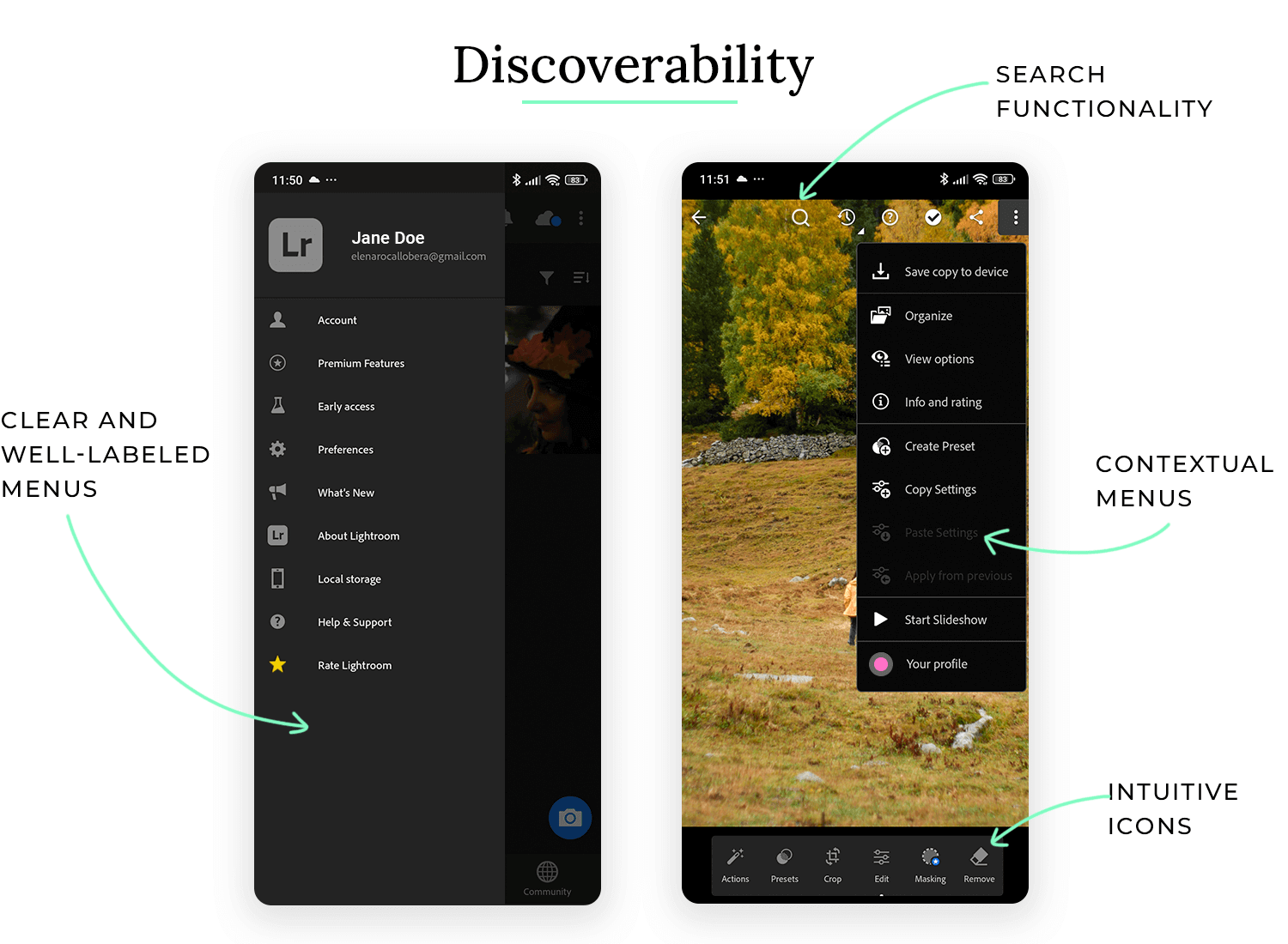
- Clear and well-labeled menus: The software uses clear and well-labeled menus to organize its features. This makes it easy for users to find the tools they need.
- Intuitive icons: The software uses intuitive icons to represent different tools and actions. This helps users quickly understand the function of each tool.
- Contextual menus: The software displays contextual menus when the user right-clicks on an element or performs a specific action. This provides quick access to relevant features.
- Search functionality: The software includes a search function that allows users to quickly find specific tools or features by typing their name.
- Tooltips and help documentation: The software provides tooltips that explain the function of each tool when the user hovers over it. It also provides comprehensive help documentation that users can access if they need more information.
Users struggle to find features and actions, wasting time and potentially abandoning the product. This can lead to user frustration, wasted time, and a negative perception of the product. Take this online banking website as an example:
- Hidden or obscure navigation: The website has a complex and obscure navigation structure that makes it difficult for users to find the information they need.
- Cryptic or inconsistent labels: The website uses cryptic or inconsistent labels for menu items and buttons, making it difficult for users to understand their function.
- Lack of search functionality: The website does not provide a search function, making it difficult for users to find specific information or features.
- No tooltips or help documentation: The website provides no tooltips or help documentation to guide users or explain the function of different elements.
- Overuse of jargon or technical terms: The website uses jargon or technical terms that are not easily understood by average users.
UI design guidelines can feel very broad, we get it. But that’s only because UI design in itself is indeed a wide world that includes many factors to be considered. With that said, it also comes with ample margin to let our creativity run free with artists all over the world flocking over to UI design.
PROTOTYPE · COMMUNICATE · VALIDATE
ALL-IN-ONE PROTOTYPING TOOL FOR WEB AND MOBILE APPS
Related Content
 Shopping carts may seem simple, but they have a huge impact on conversion. So, what separates a high-performing cart from the rest? Read on and find out!13 min Read
 Communicating UI design ideas isn't easy. Mood boards project your creativity in a visual way, letting you get back to what you do best: designing. They also serve as a useful style guide as you work. Here are some great examples and tools for your next brainstorming session!10 min Read
 See 50 responsive website examples along with what makes them good or bad. Get best practices to follow for your next responsive design!15 min Read


