What separates a good radio button design from a bad one? Radio buttons are simple but they come with their own set of rules. Read on for the full story on a familiar face!
Radio buttons are a classic UI component. We all know them, we’ve all interacted with them. But of all the radio buttons we’ve experienced over time, how many had terrible usability? These buttons are meant to help users make decisions quickly and easily – which means that bad usability may keep them from their main goal.
Design and prototype with fully-interactive radio buttons
So, let’s take a closer look at a familiar face. Radio button design is simple in both theory and practice – but like all other games, it comes with a set of rules. We’ll start by going over the basics, before moving on to awesome radio button examples and how you can prototype and test your UI design with the Justinmind UI design tool.
In case you want to design an actual game, check out our post on game UIs!
The radio button is a selection control element, allowing the user to select one option from a set of several mutually exclusive options. It’s represented as a small circle that has a solid dot inside it when selected. It’s commonly used as a part of UI patterns that focus on form design and settings screens.
The radio button has two states: checked (enabled) and unchecked (disabled). There’s a brief but key interaction where the user changes the states of the buttons by selecting an option. For more information, check out our article on button states.
Radio buttons are typically used when the user is required to fill in a form, configure settings or complete a survey. They should be used for exclusive selection in a list with two or more options, when all list options need to be visible at the same time.
Indeed, radio buttons have their place in UI design. However, they’re not the only selection control. Choosing the correct way to display data and have users interact with it is an important part of the user experience, so you create an experience that respects general UI principles. Here are a couple of rules to keep in mind.
When the user needs to make a selection from a large number of options, drop-down lists may be used instead of radio buttons in order to save space. However, dropdowns do require more from users, both in terms of clicks and cognitive effort.
That’s why it’s a good idea to use radio buttons when you have fewer options. Just lay your options bare to users from the get-go, and allow them to simply select the right option. Where’s the line that separates a radio button list from a potential dropdown UI? What about a list UI? Some designers, like folks over at UX Movement, say 5 options is the limit for radio lists.
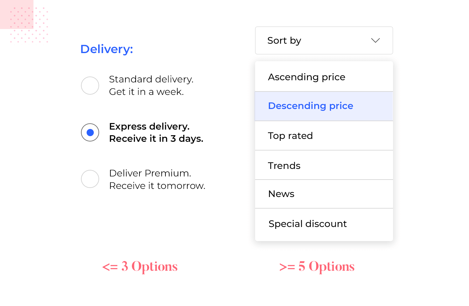
There’s a bit of a margin here for designers. You want the list to be short enough that it doesn’t eat up a lot of space, while not asking too much from users.
In contrast to single-selection radio buttons, checkboxes allow users to select multiple options. Each checkbox is independent, and checking one does not affect the others. Use radio buttons for mutually exclusive options where only one choice is allowed, while checkboxes work best for allowing multiple selections.
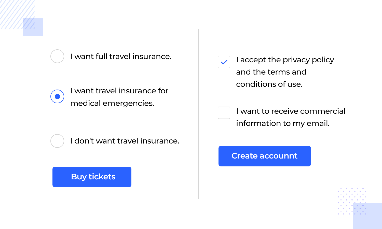
One challenge with checkboxes is that users might not always pay attention to the labels, which can lead to unclear data. Radio buttons make the selection process more direct.
Sometimes checkboxes are used when there are only two options, like choosing between Landscape and Portrait. But that can confuse users – radio buttons make it clear that they can only pick one.
Design and prototype with fully-interactive radio buttons

There are loads of reasons to design with radio buttons. They’re incorporated into products right from the beginning, from the UI sketching phase, and for good reason. Consider the following:
- Radio buttons help prevent incomplete or inaccurate data entry. When filling in a form, text entry can be ambiguous and difficult to validate prior to form submission. In contrast, data entry with radio buttons is specific and requires the user to choose from predefined options
- They provide quick and immediate access to options in a list
- They reduce the cognitive load and avoid wasted time and energy (particularly for users who have trouble selecting options from a drop-down list for mobility reasons)
Usability shouldn’t be an issue with such a simple UI component, right? Turns out, there are a few rules to radio button UI design. An important rule is that your radio button alone shouldn’t be the only clickable area. Instead, always make it so that users can click anywhere between the actual button and the label – so users won’t need to be perfectly accurate.
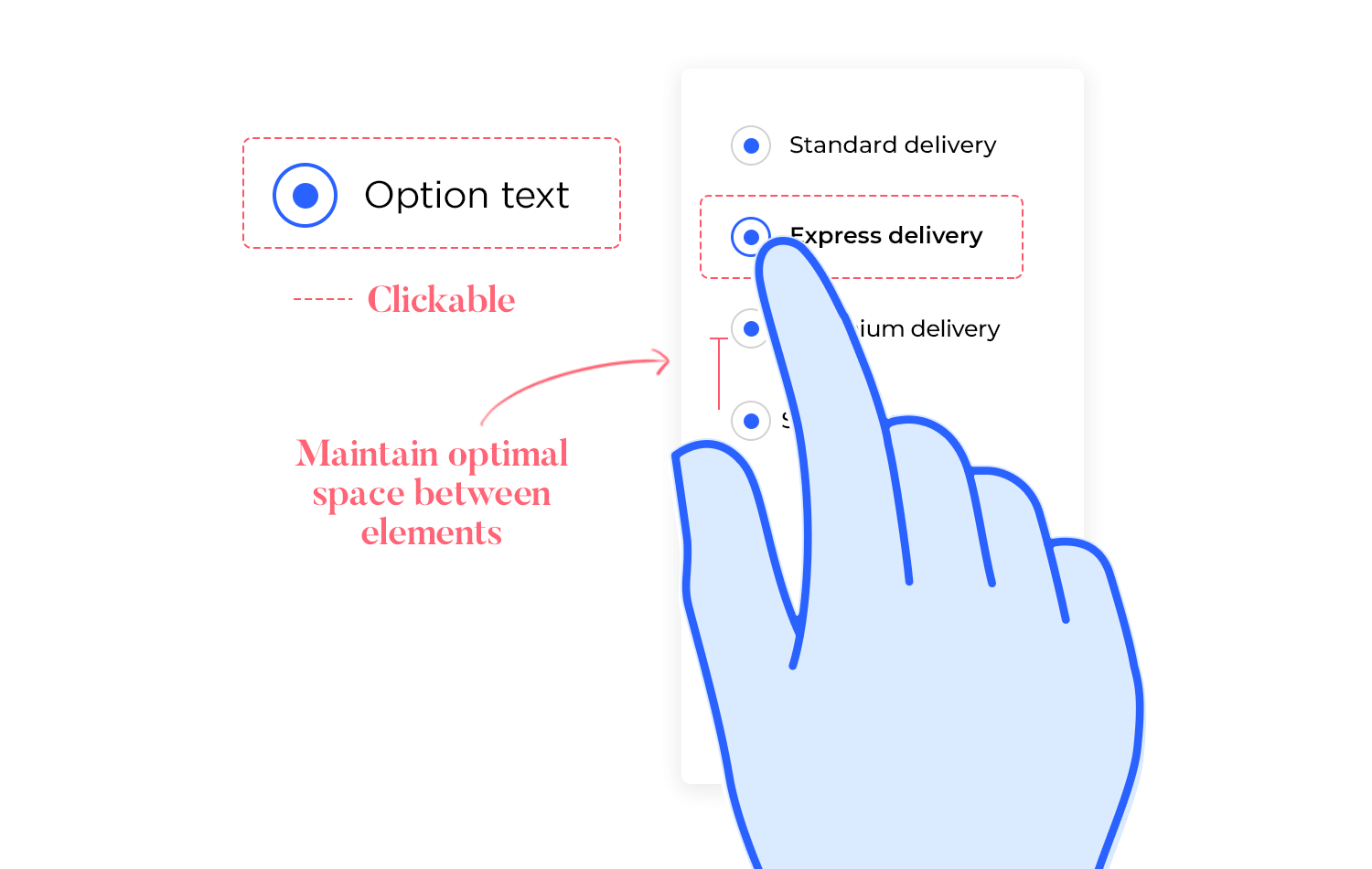
Mobile UI design tip: The clickable area is particularly important in mobile radio buttons. The buttons tend to be small, and users can have large fingers!
Additionally, avoid nested radio buttons that hide parts of your list – the whole point of radio button design is to keep options visible! Plus, you don’t want to confuse users by adding hierarchy in the possible options. Keep the list as brief as possible, and maintain a single aligned column.
The general UI layout needs to make the relationship between options obvious. It needs to show which label corresponds to which button. You want users to immediately see the options as a whole, while also giving enough space between options to allow the user to breathe. Proper spacing between options helps users select the right option, especially on small mobile screens where usability is key.
You can also check out this awesome list of the best fonts for apps and step up your mobile app design!
Visual clutter and redundant on-screen elements can overwhelm users. So when it comes to creating a list of options in radio buttons, consider some moves that could reduce the overall cognitive load.
One of those moves is making sure your radio button list has a logical layout. Users are used to seeing vertical lists, with each line presenting in option. Having horizontal radio lists represents a usability problem, because if there are more than two options users might not know which button corresponds to each label.
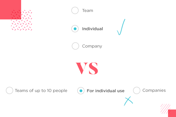
Aside from the list needing to be vertical, the labels also need to be concise. The longer a label is, the more time and effort users will need in order to grasp the list as a whole. It’s important to keep you labels short, especially if your radio list already requires a lot of options listed at once.
Radio buttons are used to change settings, but they are not action buttons. Once the user has made the selection, they must click or tap a command button to make the desired changes. The change should not take effect until the button has been clicked.
Actions triggered by radio buttons may confuse the user, increase the time it takes them to complete a task and interrupt their journey through your site or app. If the button in question triggers any action, a good old button will work best.
Imagine that a user downloads a brand new software for editing images. The user knows very little about the software, but right off the bat, is presented with a question. A pop-up presents two setups for the tool: classic setup and modern setup.
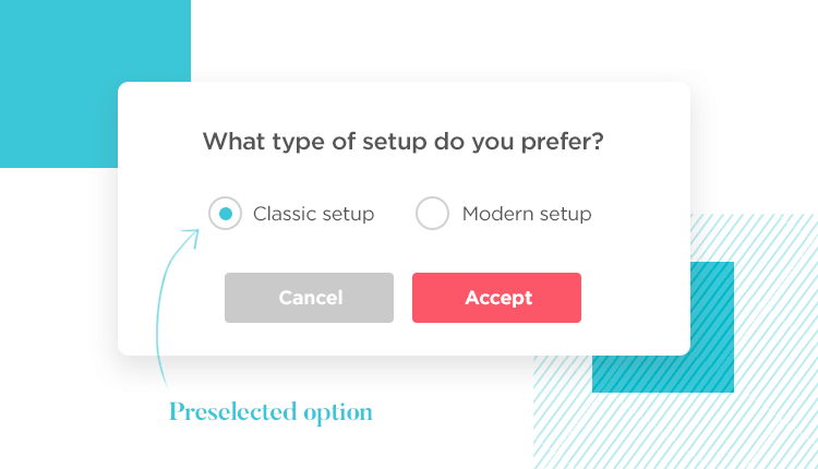
The problem, as you might have noticed, is that the user doesn’t really know what they’re selecting. Even with a bit of descriptive copy, the user wouldn’t be sure about their choice. In cases like these, it’s better to have a default selection. The default could be the most commonly selected option, or the best suited option for a beginner.
If we focus on the actual radio buttons alone, we’ll find that there are no real differences between their visual and interactive cues in web and mobile format. Much like with toggle switches, the real changes are about how the radio button relates to the other components in the UI design.
When designing your mobile radio button, pay close attention to the size of the button, as well as the size of the clickable area. This is very important, as any user with slightly chunky fingers will tell you with a sigh.
In fact, the sizing of everything is important. You want to maintain the visual hierarchy and grouping of elements, while also giving users plenty of empty space for visual relief. Remember to space the radio list options, so it’s easier to read and interact with them.
When it comes to radio buttons, simplicity is key. Keep the interaction as straightforward as possible as users should immediately understand how to select and deselect options. One common mistake is making radio buttons look too similar to other UI elements, like checkboxes or toggle switches.
So, make sure your radio buttons are instantly recognizable by their classic circular design. The last thing you want is a confused user wondering, “Wait, do I check this or click it?”

Accessibility should never be an afterthought. For radio buttons, this means making sure that they are large enough to be clicked or tapped, even for users with motor impairments. Also, don’t forget about keyboard navigation! Some users rely on the tab key to move through forms and the space bar to select radio buttons, so ensure your design accommodates this.
Screen readers should also be able to easily identify the options, so use clear and concise labels that explain what each button does. Simple tweaks like these can make a big difference.
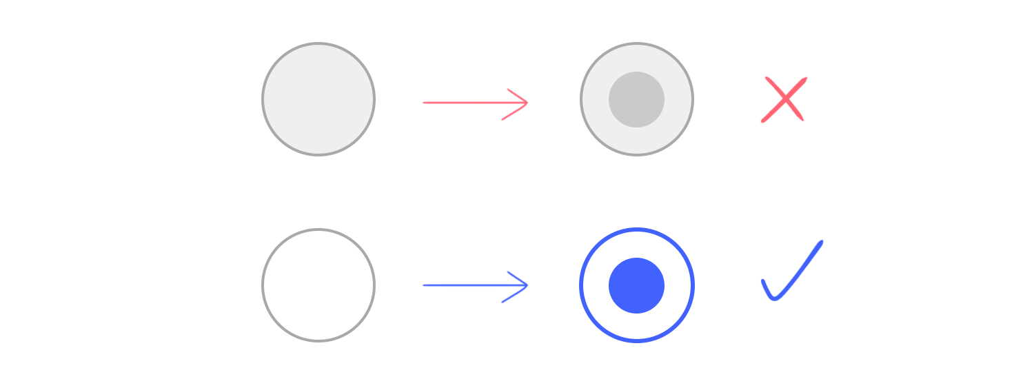
Visual feedback is everything when it comes to radio buttons. When a user selects an option, there should be no doubt in their mind that it’s selected. This can be achieved through color contrast.
Make sure always the selected state stands out visually, whether it’s a bolder color, a brighter hue, or an animation. You don’t want users squinting at the screen, wondering if their choice has registered.
While radio buttons are great for selection, overloading the user with too many choices can hurt usability. As a general rule, try to keep the number of options under five. If you need more than that, consider using a dropdown menu or breaking the options into smaller, more manageable groups.
Too many radio buttons in a row can feel overwhelming, and users might struggle to make a decision. Less is definitely more in this case!
Radio buttons might look perfect on a desktop screen, but what about on mobile? Always test your radio button design on different devices, particularly mobile phones. What works beautifully with a mouse might not work as well with a finger.
Test for things like tap size, spacing, and overall usability to ensure the best experience no matter where your users interact with your form.
Design and prototype with fully-interactive radio buttons

If you want to broaden your mind and see not just radio button examples, but also different types of product design, check out our post on UI design examples. If not, let’s take a look at some creative ways that designers have approached their radio buttons.
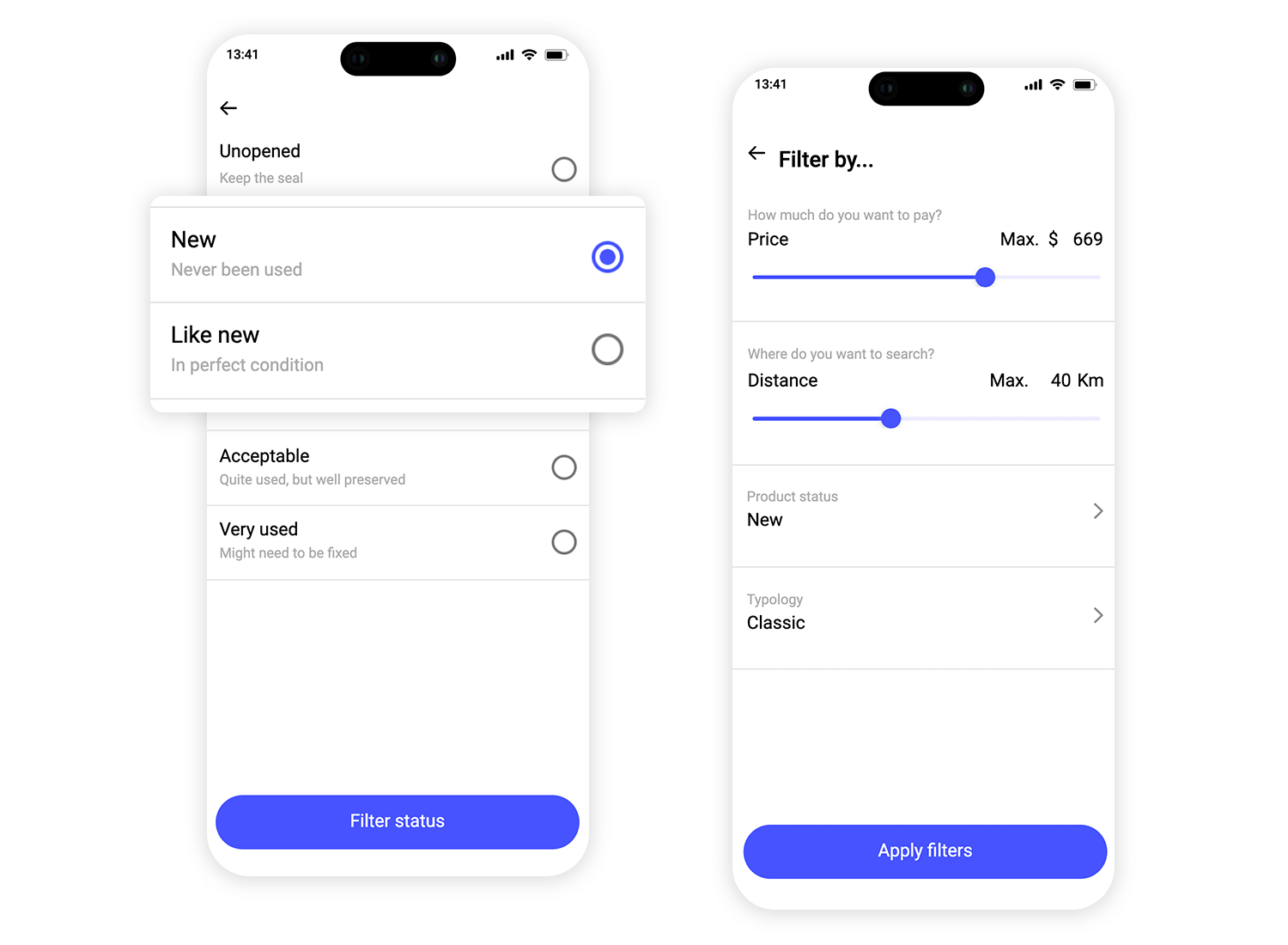
This radio button example from Justinmind features a clean and simple design perfect for filtering options in a mobile app. The list layout is simple, offering users a clear view of their choices, each with a brief description to help guide their selection. It’s a great example of how to keep things intuitive and user-friendly, making the process feel smooth and effortless.
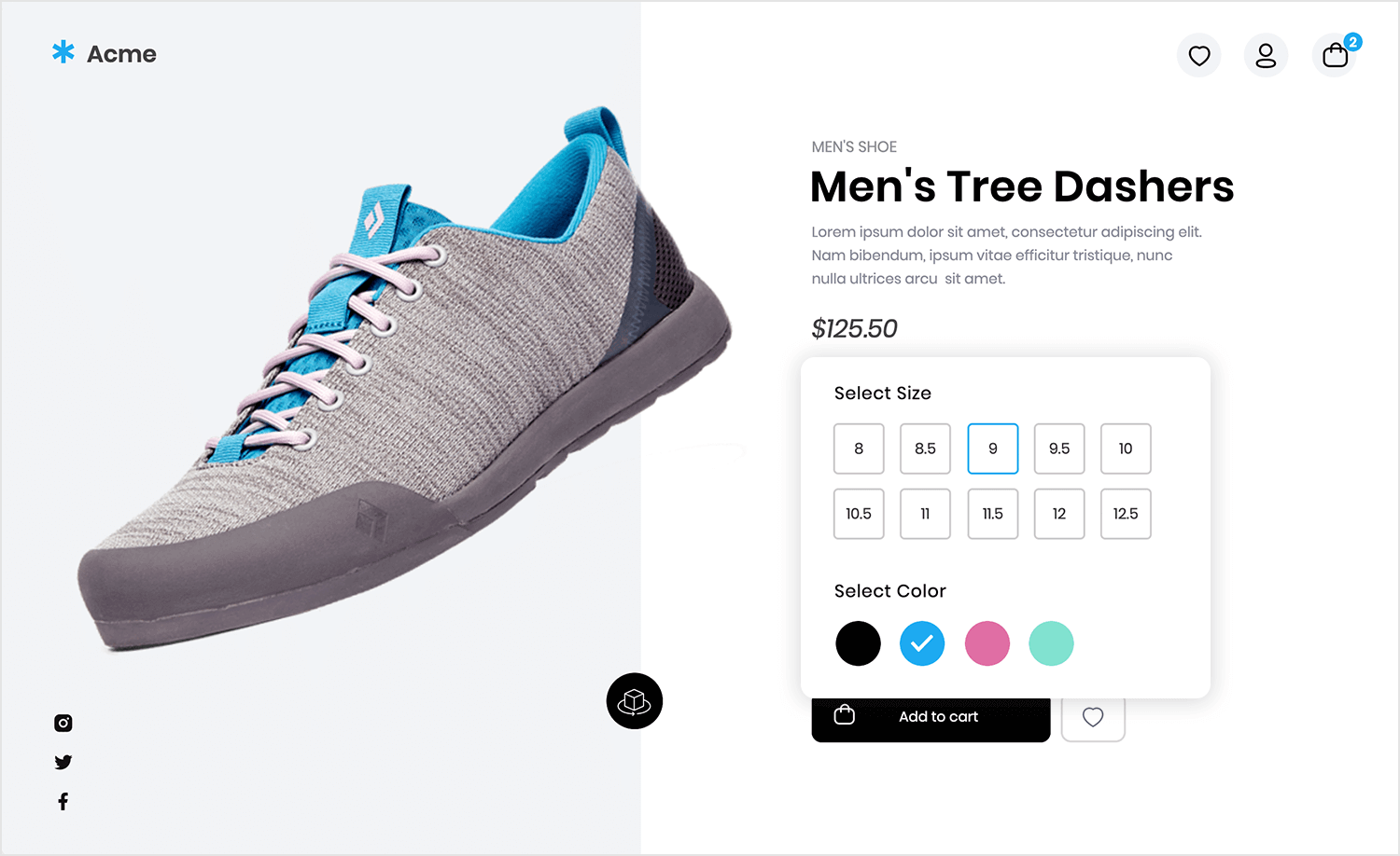
Continuing with another example from Justinmind, this radio button UI design lets users easily pick a product color by clicking on small, interactive circles. When a color is selected, it gets highlighted, giving clear feedback to the user. It’s a simple and clean way to make sure people can quickly choose what they want without any confusion.
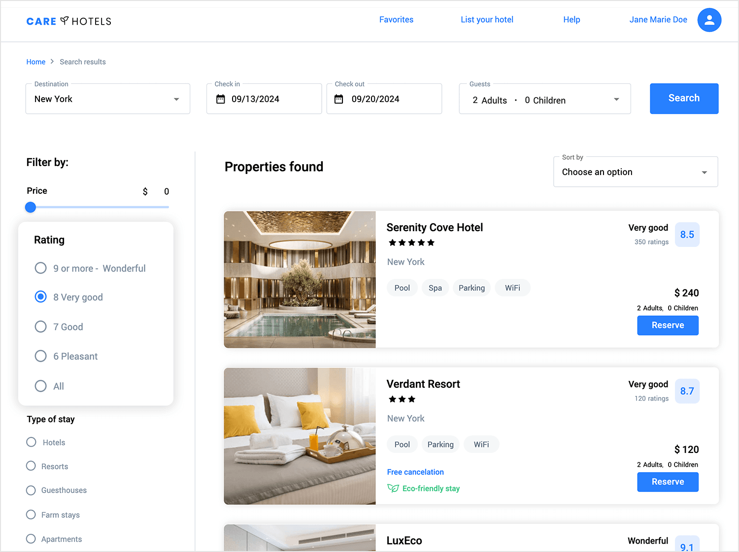
In this case, Justinmind brings us this clean and straightforward radio button design for filtering hotel results. Using radio buttons, users can easily select a rating to narrow down their search. The simple layout makes it easy to find and pick the right option without fuss, which is great for travel and booking apps where quick filtering is key.
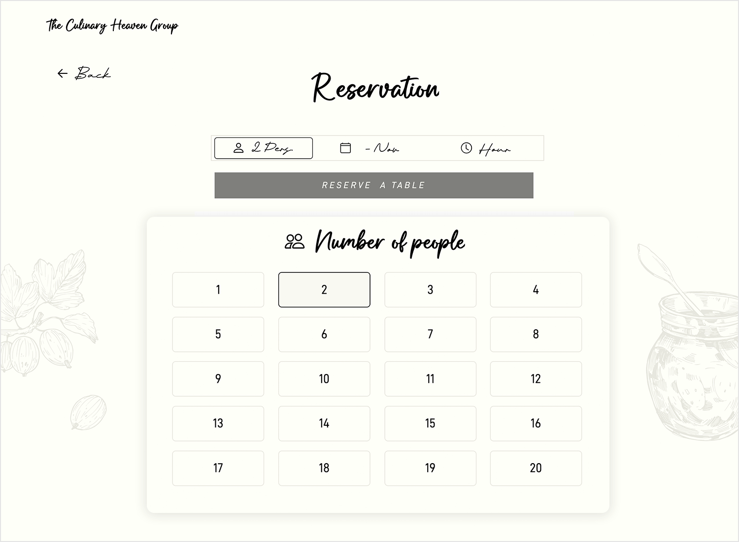
Here’s another lovely and practical example from Justinmind for booking reservations. The radio buttons here are used to quickly select the number of people for a table, presented in a clear grid. This radio button design keeps things simple and intuitive, letting users make their selections with just a click.
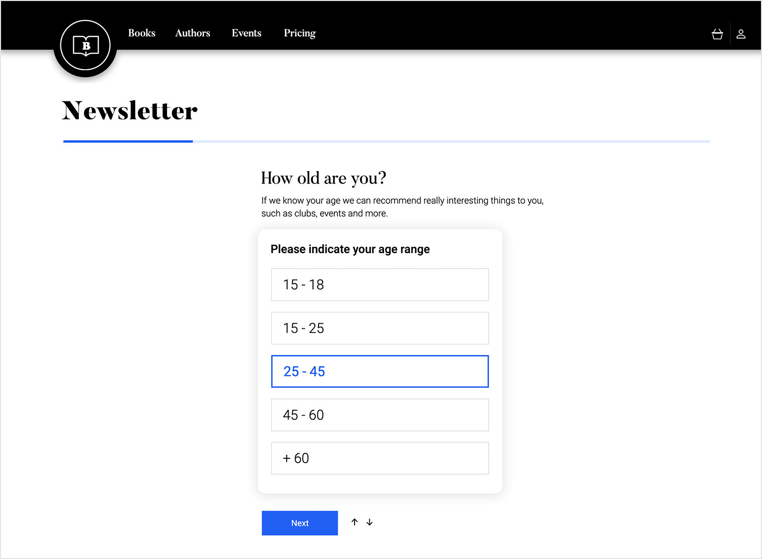
Justinmind offers us another clear and easy-to-use radio button design for selecting age ranges. The layout is simple, allowing users to quickly tap on their group and move on. This intuitive approach is perfect for forms or surveys, guiding users through the process smoothly and without distractions.
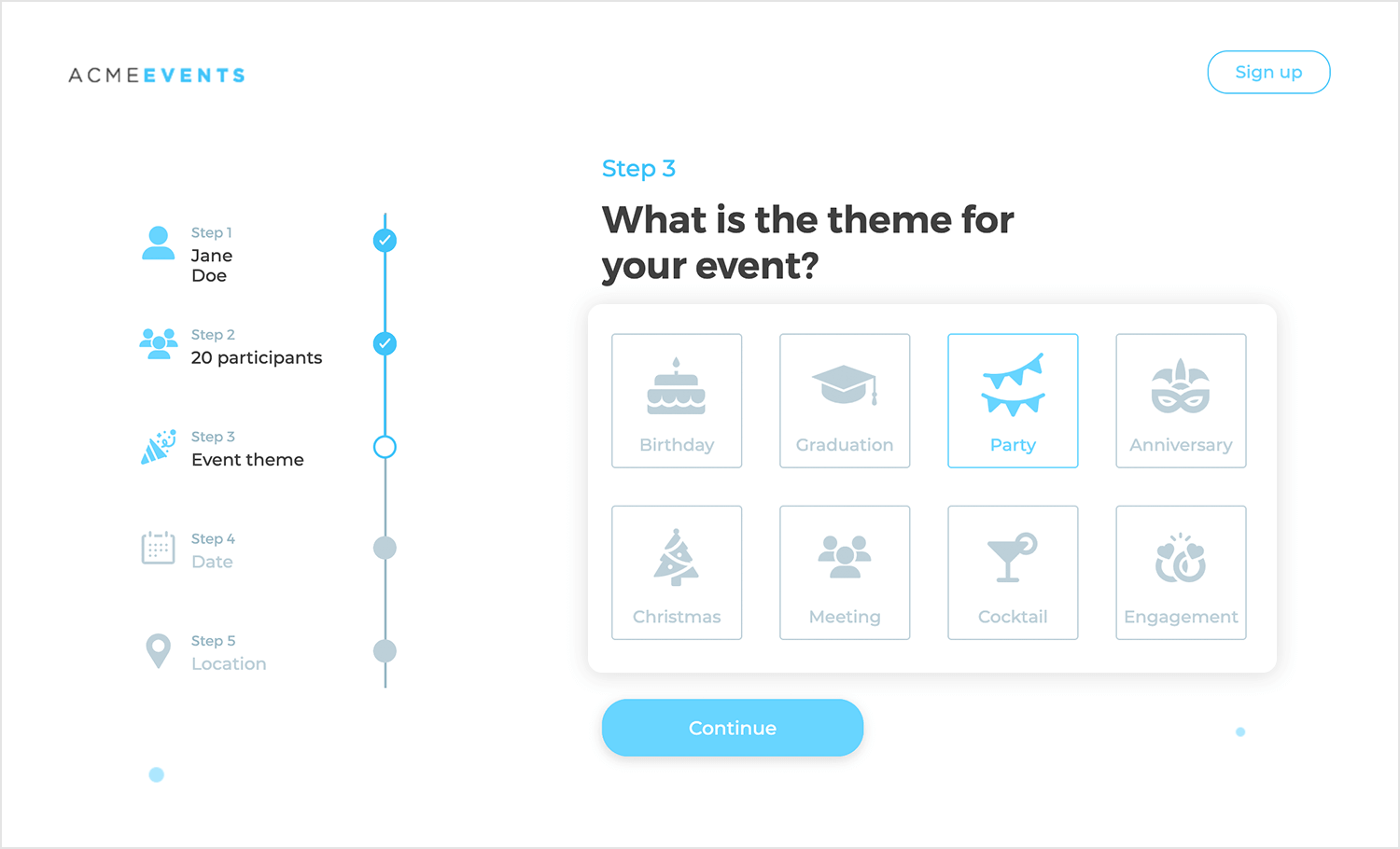
Picking an event was never this easy with this example from Justinmind. Each theme is shown with a cute little icon, making it super simple to choose what you need. The whole radio button design is smooth and friendly.
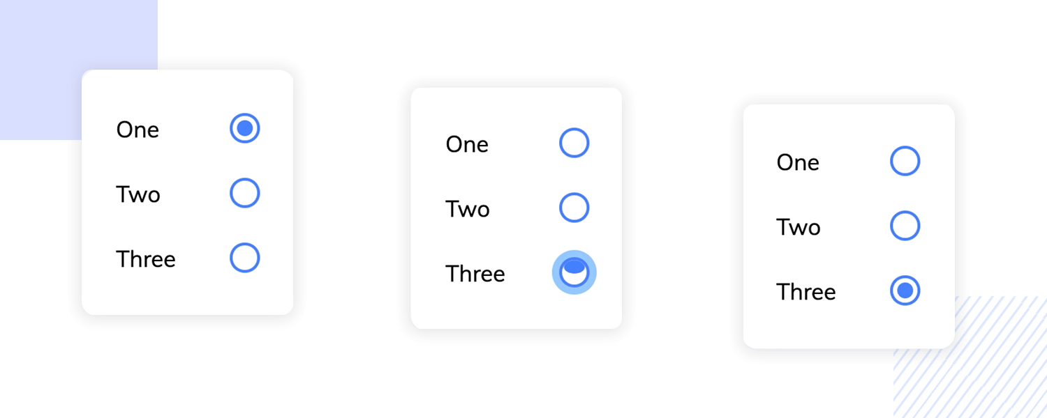
This radio button example is brought to us by Cosimo Scarpa. It’s simple UI design places the animation in the spotlight, making it fluid and unique. A classic radio button, with a twist.
Speaking of creative designs, check out this one by Ssilbi NG for PayFit!. These pricing plan radio buttons offer two different ways for users to make their choice: List view and Card view. It’s nice because you can pick whichever layout feels more intuitive to you.
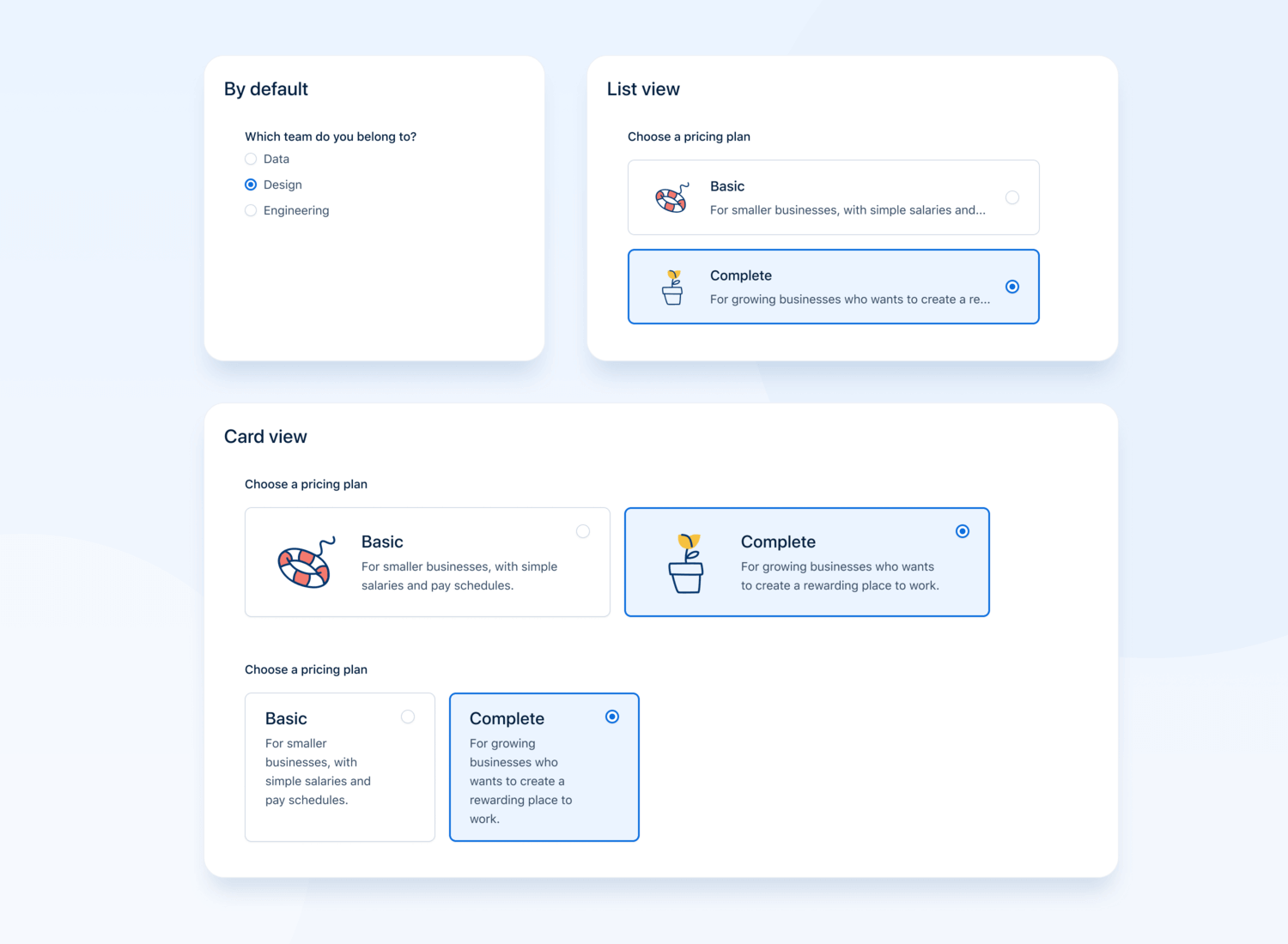
This type of radio button design is perfect for situations where users need to choose between several defined options like pricing plans, membership levels, or service tiers. It’s especially useful when each option needs a bit of context or a visual aid, like icons or short descriptions.
Once you’ve made your choice, the blue outline highlights your selection, giving that reassuring visual confirmation. It’s a simple, yet effective way to help users quickly and confidently make decisions.
Imagine you’re designing a high-end app or website, and you want every detail to feel exclusive. That’s exactly where these luxury radio buttons by Konstantin Eremeev come in. With their shiny metallic finish and soft gradient touches, they instantly give off a premium vibe.
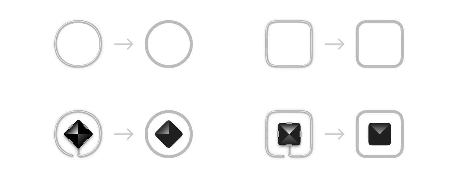
What makes these buttons special is how they combine style and function so effortlessly. When you select one, the feedback is smooth and satisfying, like you’re interacting with something luxurious. These buttons are perfect for any interface where you want to impress users with sleek design and make them feel like they’re choosing something special.
This kind of design works best when you want to add a touch of class to your app or product and leave a lasting impression.
Now let’s talk about these neumorphic radio buttons designed by Srdjan Vidakovic. If you’re looking for a design that feels fresh and modern, this one’s a great example. Neumorphism blends soft shadows and highlights to give the buttons a subtle 3D look, almost as if they’re popping out of the screen.
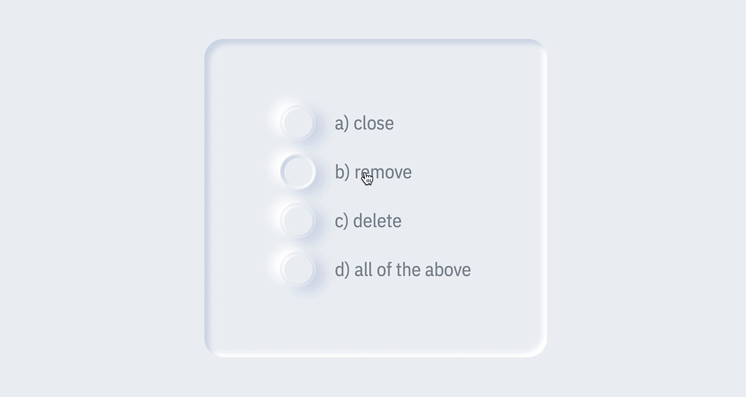
What’s nice about this design is how smooth and natural the interaction feels. When you select a button, the lighting changes just enough to give you a satisfying visual cue, making it clear that you’ve made your choice. This kind of design works perfectly for interfaces where you want a clean, modern look without sacrificing usability.
It’s ideal for apps or websites that want to create a soft, tactile experience for users without overwhelming them with too much visual noise.
Imagine filling out a form or adjusting some settings, and instead of the usual boring click, the radio buttons come to life with a smooth animation. That’s exactly what Zain Patel’s animated radio buttons do. They take a simple interaction making a choice and turn it into a more engaging experience.
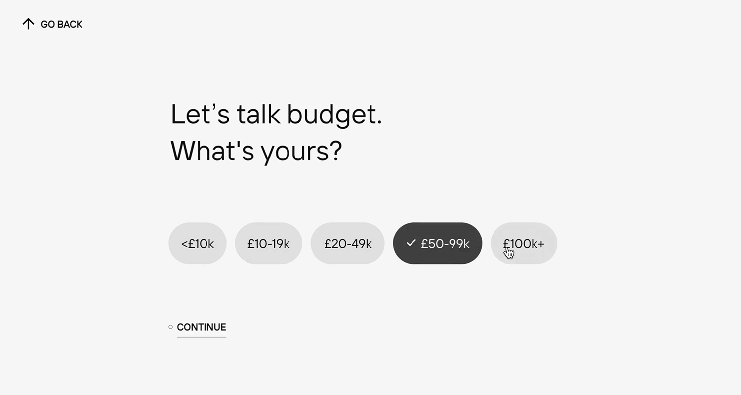
As soon as you click, there’s a little movement, a nice transition that makes you feel like something is actually happening, and it’s surprisingly satisfying. It’s not just about function here, it’s about making the process fun and adding a little personality to the interface.
These animated radio buttons are perfect for apps or websites where you want the design to feel more interactive and lively, turning a basic task into a more enjoyable one. It’s a small touch, but it makes a big difference in how users feel about your interface.
Imagine you’re planning a route on Google Maps, and instead of text options, you’re greeted by these clear, simple icons for car, bike, or walking. As you select your travel method, a soft glowing circle appears around the icon, instantly confirming your choice.

These Google Maps radio buttons are all about keeping things fast and easy. With just CSS, they offer smooth transitions and immediate feedback, making the experience feel seamless. It’s perfect for navigation tools where quick, visual choices make all the difference.
Here’s a creative twist on radio buttons. These location pin radio buttons bring a creative spin to the classic design. Instead of the usual circles, you’ve got these map pin icons. When you pick one, it lights up with a soft glow, making it clear which option you’ve chosen.

This design is perfect for any app or service dealing with locations, like picking a place or selecting destinations. The glowing highlight gives instant feedback, so there’s no guessing what you’ve selected.
It’s a playful and clever way to make something as simple as radio buttons more engaging. And with that, we’ve come to the end of our examples.
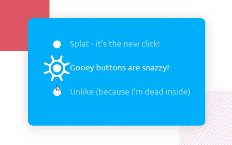
Chris Gannon created a wildly popular and creative radio button. The flat and minimalist UI design makes the animation stand out, resulting in a fun and memorable experience. It’d be perfect for a minimalist website.
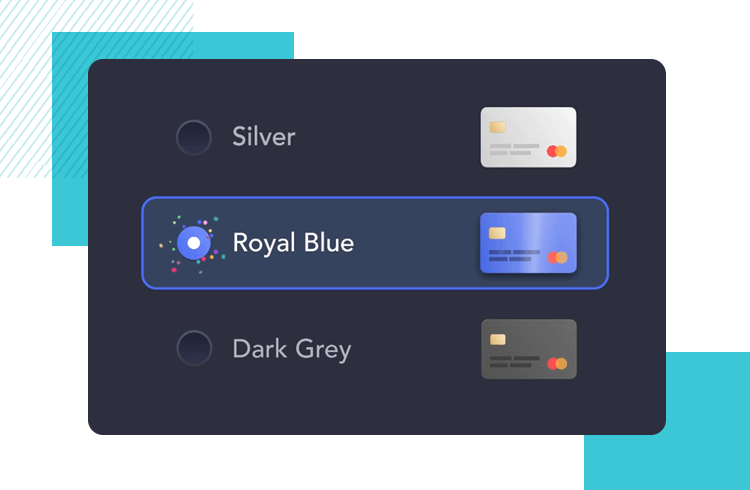
Jan Hoffmann bring us a colourful example of radio buttons used in a checkout process. The visual hierarchy is reinforced by the defined border on the buttons, including the radio buttons, labels and icons – tidy and functional UI design.
Rasika Warnasuriya also went for the bright colors. In this radio button example, it’s all about soft lines and the modern feel of the entire mobile screen UI design. We love the play of shadows and highlights to give the sense of depth.
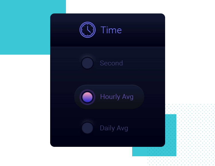
Julien Perrière delivers a great example of a radio button that takes button states to a new level. With a brief animation, the use of grey and a bright orange – the whole thing feels unique and effortless. it goes to show that when it comes to radio buttons, the details matter!
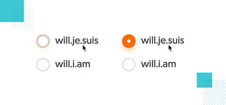
Sebastien Gabriel created a wonderful set of UI components, set in smooth lines and delicate changes in colors. The radio buttons blend in with the soft UI design style but also get the job done in sending context and feedback to users. Better yet? Sebastien uploaded the PSD file for everyone! Thanks, Sebastien.
Check out our post on toggle UIs for more on these classic switches.
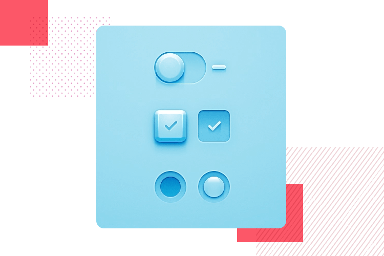
Check out out post on skeuomorphic design if you want to know more!
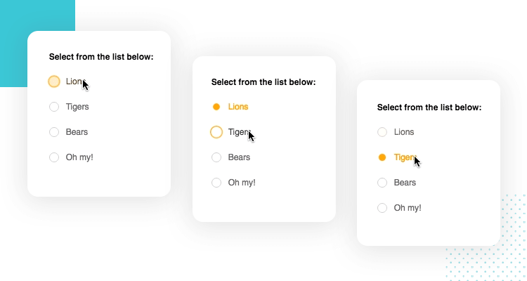
Aaron Benjamin designed another wonderful example of a radio button that uses animation to create a memorable experience. The good readability of the available lists and the pop of yellow make for a smart design that showcases how details can elevate any UI design.
To wrap things up Trapti Rahangdale offers this creative approach to radio button design. This example still delivers the same functionality, but changes the generally simple look of the individual buttons.
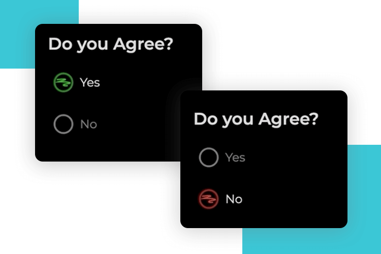
The design is playful, using bold colors and fun shapes, making it memorable and more engaging than a typical yes/no selection. It’s a great way to add personality to a basic form interaction while still being intuitive and user-friendly!
Design and prototype with fully-interactive radio buttons

Making use of radio buttons in Justinmind is as simple as it gets. Our UI kits already come with interactive radio buttons, so you’re ready to roll right away. But let’s go over some handy tips to make sure you’re getting the most out of them.
First things first, decide on the default radio button. We recommend selecting the most common response by default to make the user experience smoother. To do this, select your radio button from the canvas and head to the Properties tab. There, you can change the Value under General Properties to “Checked” or “Not Checked” depending on what you need. This ensures the correct button is selected during simulation.
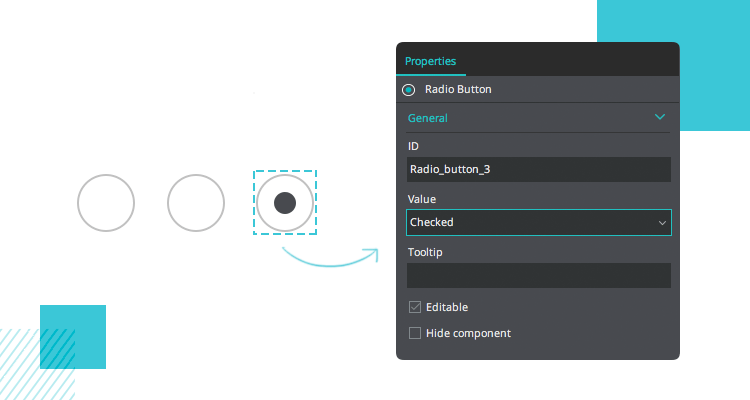
Want to take it a step further? You can customize your radio buttons by adding a PNG image for each state. This way, you can make your design stand out and match your brand’s look and feel.
Grouping is key to making radio buttons work properly. When you group radio buttons together in the canvas, only one can be selected at a time, and the others will be deselected. Perfect for scenarios where you need users to choose a single option.
There’s also the Radio Group component, which comes with a default list of options. Both the content and the look of this component can be customized to suit your design.
With these easy steps and customizations, your radio buttons will not only be functional but also tailored to your project’s needs.
Now that you know how easy it is to prototype radio buttons in Justinmind, let’s make it even simpler. Justinmind offers a range of UI kits that come with pre-built, interactive radio buttons. Whether you’re designing for web or mobile, these kits have everything you need to get started quickly.
Here’s a rundown of some of the UI kits you can download and start using right away.
Tailored for web design, this web UI kit comes with a variety of elements like radio buttons, forms, and navigations. It helps you craft a consistent, responsive web interface in no time.

If you’re building an iOS app, this iOS UI kit has you covered with all the components needed to follow Apple’s guidelines. It includes interactive radio buttons, along with other elements like switches and input fields, so you can build a seamless iOS experience in no time.

Designing for Android? The Android kit has interactive radio buttons, checkboxes, and more, built to fit Android’s design guidelines. Perfect for your mobile app prototypes.

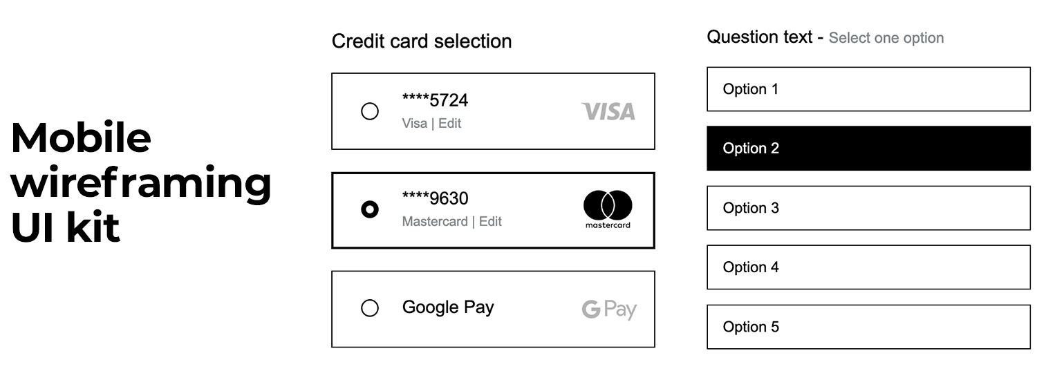
This one’s super handy for wireframing mobile apps. It includes simple radio buttons and other basic elements to help you sketch out ideas and get things moving quickly.
For web developers, the Bootstrap UI Kit is a great tool. It includes interactive elements like radio buttons, dropdowns, and checkboxes, all optimized for responsive web design. It’s a fantastic resource for prototyping web pages quickly and easily.

If you’re into material design, this kit has interactive radio buttons and other components that follow Google’s guidelines. It’s a great way to create that modern, sleek interface.
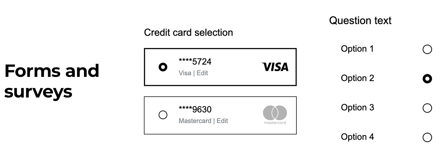
This forms and surveys UI kit is specifically designed for forms and surveys, so it includes interactive radio buttons, checkboxes, and input fields for both web and mobile prototypes. It’s ideal for collecting user feedback and input.
Imagine being able to wireframe on the fly, this sketching kit makes that easy. It includes basic UI elements like radio buttons, checkboxes, and buttons that are perfect for sketching out ideas quickly. It’s great for getting rough prototypes done fast, without skipping the interactive parts.

These kits are ready to go, you just have to drag and drop them into your designs and watch how quickly your prototype takes shape. Whether you’re working on a mobile app or a website, Justinmind has you covered with interactive components that make prototyping an easy task.
If only user testing your radio buttons were as easy as a single test and that the design passed or failed. In reality, testing is rarely straightforward. Even validating something as simple as a radio button is never about the button as a single component – it’s about seeing if the screen works as a whole.
Let’s go over some types of testing you could use in validating your screen UI design, with a particular focus on the radio buttons.
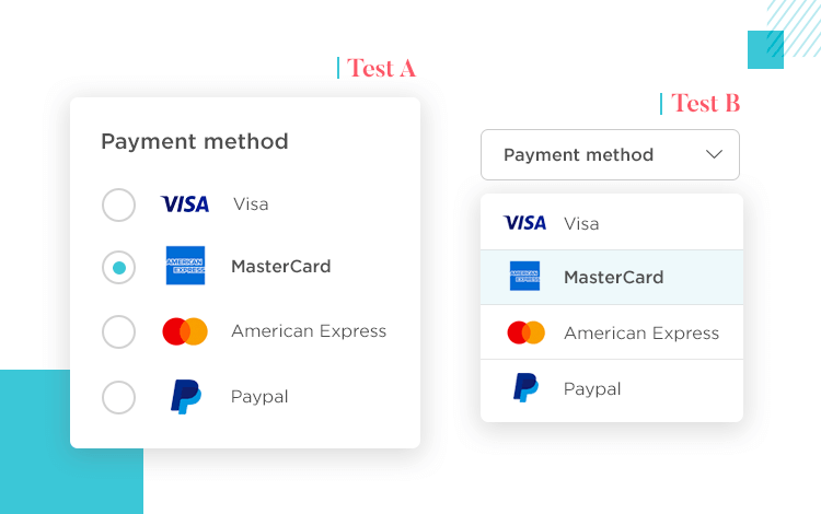
We just love A/B testing at Justinmind. It’s a great tool in creating a healthy testing process for the entire project, and even a testing culture in the team. The secret is to make slightly different versions of your radio button design and compare them with an A/B test – with each new round of testing, you test another aspect of your screen.
Eye tracking is another popular way to test your choice of UI components. Radio buttons are practical, but the whole point of using them is to get the user closer to their goal, faster and easier. With an eye tracking software, you could analyse where users paused, where they got confused.
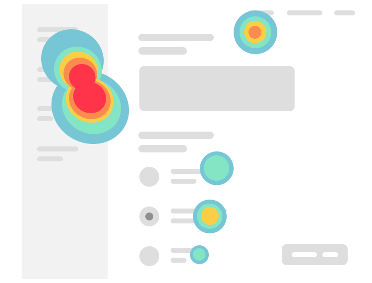
That’s crucial knowledge with radio buttons. You want the radio button design to make it so users only need a glance to understand the function the button deals with, the context and meaning of the labels and the actual button interaction. If you find that many users had to pause and read the labels three times… you may want to revisit the microcopy, for example.
Accessibility is important. Today, just about all sorts of people use the internet, which makes it the designer’s responsibility to make sure the product reaches certain accessibility standards. What are those standards, you may ask. There are some basic legal requirements, such as Section 508 in the United States.
But to a certain extent, it’s up to the design team to set those accessibility standards and ensure the product meets them. Depending on the type of product of the users you’re going for, you may want to make sure the visually impaired can use your product, for example. Or perhaps your product is related to medical help, which means you may want to help users with illnesses such as Epilepsy to use your product safely.
It can be tough to recommend certain types of accessibility testing in general terms. More often than not, each team has their own way of approaching accessibility. The important thing, however, is that you cover some minimum ground and open your product up to users with disabilities too.
If you want to know more specifics about testing methods and which common disabilities impact the user experience, check out our full guide on accessibility design.
Design and prototype with fully-interactive radio buttons

Radio button design is a powerful tool in UI design. It’s a way to lay down all the options in front of the user in a concise and efficient way – free of clutter or complication. Most users are already familiar with radio buttons, which makes them a great tool for creating discoverable, usable, and functional products.
With that said, they can also represent a window of opportunity to add flare and personality to your UI design. Be it with eye-catching animations or fun uses of colors and copy, your radio buttons can make a big impact on the user experience!
