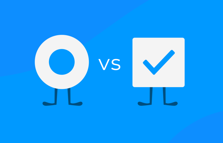
Checkbox vs radio button – ever wondered what the difference is? Read our complete guide and design them right every time. Get started now!
Every designer will be familiar with checkboxes and radio buttons UI design. These widgets help the user progress through many online tasks and can often be found hanging out in the same site or app UI design.
Prototype your web and apps with fully interactive checkboxes

But although now commonplace, checkboxes and radio buttons are still used incorrectly and interchangeably across web and mobile interfaces. Improper use of these widgets causes confusion, increases cognitive load and affects the overall user experience – as you’ll see in our post.
So make the most of checkboxes and radio buttons with this article. Learn how to recognize, understand and wireframe both of them with Justinmind’s UI design tool, and start improving the usability and desirability of your designs. If you want to, feel free to check our guide to accessibility design as well.
A checkbox is one of the simplest and most familiar elements you’ll find in user interfaces. It’s usually a small square that you can either check, with a tick mark, or leave unchecked. Think of it as a tiny box that you click on to select or unselect something.
In everyday apps and websites, checkboxes let you choose multiple options from a list. For example, when you’re filling out a form, you might want to subscribe to a newsletter and agree to the terms of service, so checkboxes let you easily do both at the same time. You can check one, both, or neither.
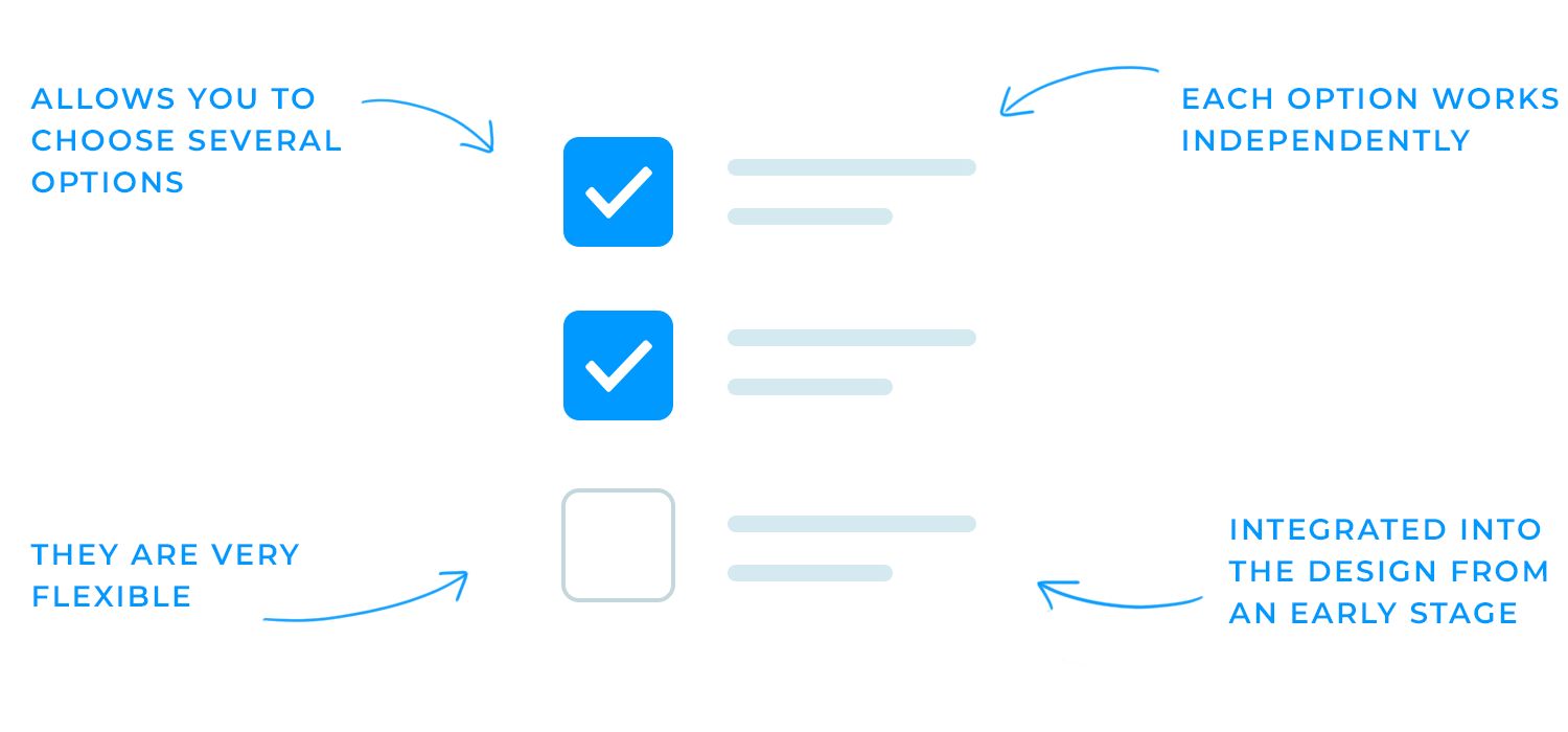
What makes checkboxes handy is their flexibility. They allow users to select as many or as few options as they want, and each box works independently of the others. It’s a small yet powerful tool for improving user experience, making it clear and easy for people to make choices.
Both these components are very popular and can be found in a wide number of UI patterns. The trick is learning when to use the right one in the right context, such as using them in form design as opposed to UI cards.
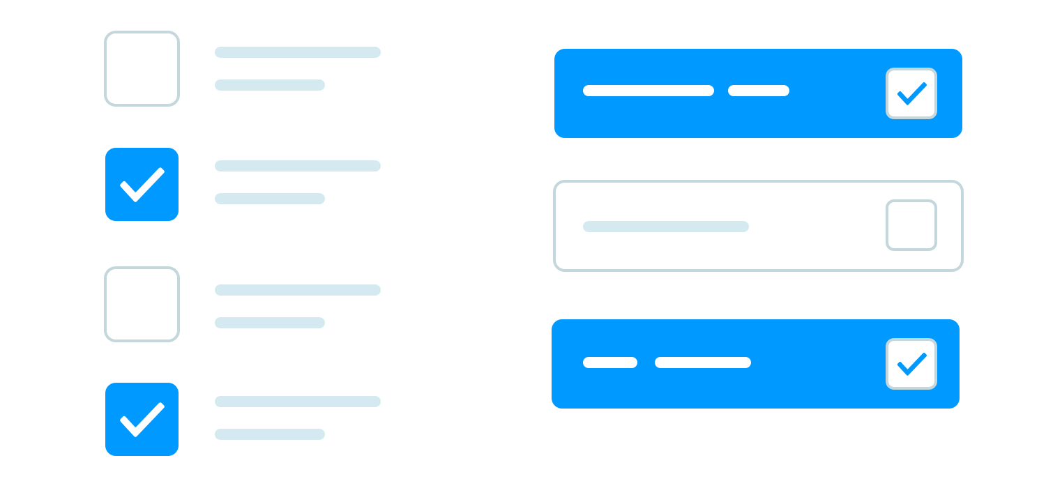
In UI design, the checkbox is presented as a small square box on the screen. It has two states: checked and unchecked. When checked, the square will be filled with a check mark.
Checkboxes are used to present the user with multiple options, from which they can select any number. In a group of checkboxes, each one functions independently, allowing the user to check or uncheck individual boxes as needed. This flexibility makes checkboxes perfect for situations where users need to select multiple items, preferences, or actions.
For example, when you’re choosing interests on a sign-up form, you can check several boxes like “sports,” “tech,” or “music,” without any restrictions on how many you select. Similarly, they’re useful in settings pages where you may want to toggle several features on or off (e.g., notifications, location access, etc.).
Checkboxes tend to be integrated into the design from an early stage, often appearing in UI wireframes or sketches.
A radio button, on the other hand, is displayed as a small circle. Like the checkbox, it has two button states. However, when selected, the circle is filled with a solid dot.
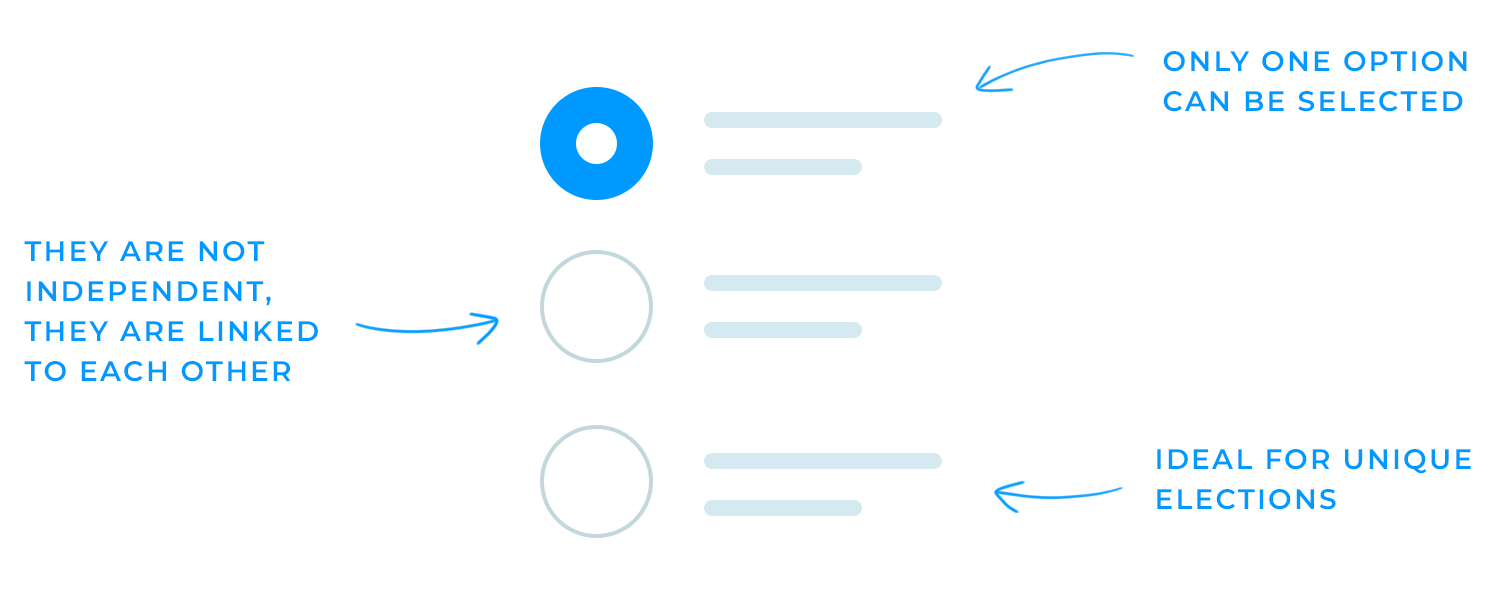
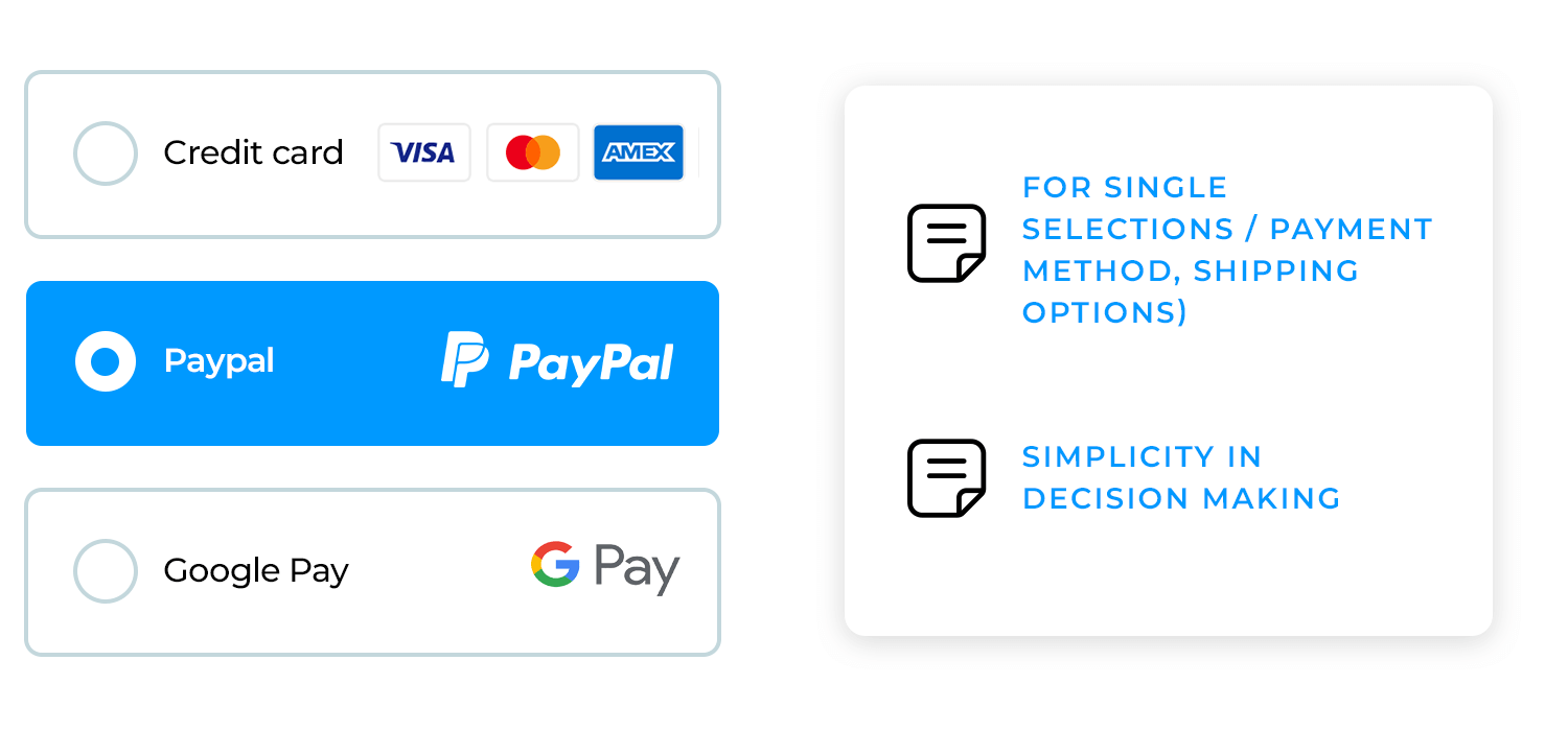
Unlike checkboxes, radio button groups are linked together, acting as a single control. This means users can select only one option from the available choices. When one radio button is selected, any other button in the group is automatically deselected.
This makes them ideal for scenarios where users must choose just one option, such as selecting a payment method during checkout (e.g., credit card or PayPal) or choosing a shipping option (e.g., standard or express).
As Michael Meadhra points out, it’s easy to mix up radio button vs checkbox in UI design. But even though they may seem similar, each has a unique role in creating an intuitive user experience.
Checkboxes are perfect when you want to let users select multiple options from a list. They’re often used in forms, settings pages, and databases to let users pick more than one answer or apply a range of settings. For example, when you ask users, “Do you want to join our mailing list? Yes or no,” that’s a typical single checkbox use, which works like a simple on/off switch.
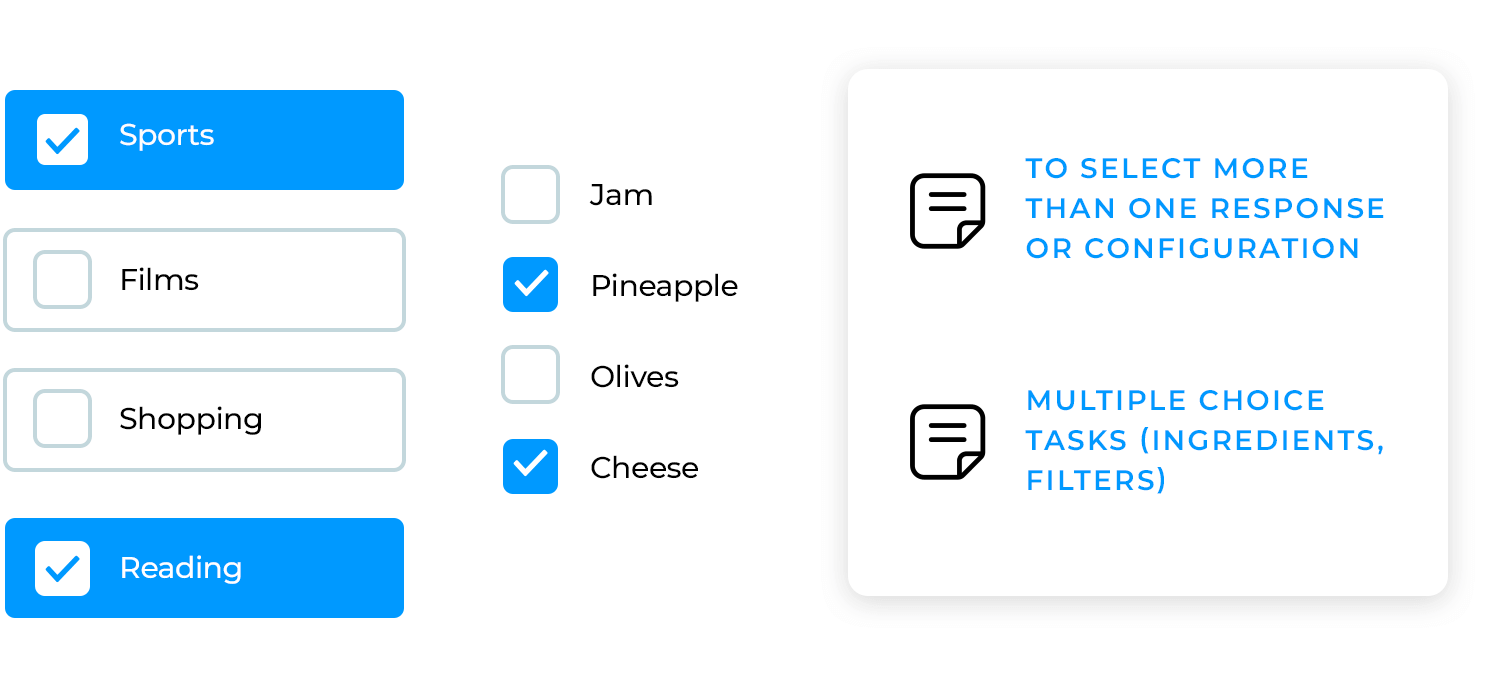
For multi-select tasks, like choosing interests, toppings for your pizza, or selecting filters on a shopping site, checkboxes are the way to go. They give users the flexibility to make multiple selections without restrictions. They give users the flexibility to make multiple selections without restrictions. This flexibility helps users feel more in control, especially in tasks where they need to select multiple items at once.
Radio buttons, on the other hand, are designed for situations where only one option can be selected from a group. They’re commonly found in surveys, settings menus, or any time a single choice needs to be made, like picking a payment method or selecting a shipping option.
You’ll often see them in data-heavy products like dashboard designs, where you need to make a quick, clear decision from a set of options. Their ability to limit users to one choice at a time simplifies decision-making and ensures accuracy in selection.
Interestingly, checkboxes and radio buttons always find their way into the latest design trends. Whether it’s skeuomorphic design (where they mimic real-world objects) or neumorphism (with soft shadows and gradients), these little components keep showing up in fresh, stylish interfaces.
Prototype your web and apps with fully interactive checkboxes
Checkboxes are often used to capture user preferences, as you can check as many boxes as you wish. They are used in everything from game UI to minimalist websites.
This example highlights how checkboxes are used to let users select multiple options within a form. Just click to check as many as you want, it’s clear, quick, and flexible.

Here’s a classic example of a checkbox in action. It’s a simple “Remember for 30 days” option that gives users control over whether they want to be remembered on the website or app. By clicking the checkbox, users can quickly make a choice without any hassle. This small detail adds convenience and improves the overall experience.

Another great use of checkboxes is this example where users can select their favorite types of reading material from a set of options (essay, narrative, etc). It lets them choose multiple preferences, giving them control over what they like. This kind of checkbox setup is super user-friendly and adds a personal touch to the user experience.

Need to select extra options? This setup uses checkboxes to offer choices like “Car rental” or, “Travel insurance,”. Each checkbox has a short description, giving users more information before they make a choice. It’s an easy way to let users customize their experience by picking exactly what they want.

In our last example of checkboxes, we see an option for “Express delivery” during the checkout process. By simply checking the box, users can choose faster shipping and view the estimated delivery date. This example of checkbox shows a quick and easy way to give customers more control over their experience.

Prototype your web and apps with fully interactive checkboxes
As a general rule of thumb, radio buttons should be used to allow the user to select one option from a set. This is what makes them the ideal candidate for making a selection from mutually exclusive options.
This is a classic use of radio buttons. You can pick one color for the headphones, either “Blue” or “Red.” Radio buttons work perfectly here because they keep the choice simple and clear, allowing only one selection at a time. It’s an easy way to guide users through options without confusion.

Here’s another simple use of radio buttons. In this hotel booking form, you can choose options for the purpose of traveling. You can only pick one option in each section, making it clear and easy to fill out. It’s a smooth way to guide users through their booking choices.

In this example, radio buttons are used to help you set the time for an event. When you choose either “AM” or “PM,” it’s clear that only one option can be selected. That’s the beauty of radio buttons; they keep things simple and prevent any mix-ups. You just click on the one you need, and you’re all set. It’s a quick way to make sure your scheduling stays accurate.

This time, we’re looking at button-style radio buttons. You pick one option for the number of people and one for the date. These button-style choices make it super clear that you can only select one in each group. It’s a simple and easy way to help users make their reservations with no issue.

Here’s our last example of radio buttons. This one uses a star rating system where you can choose between 2, 3, 4, or 5 stars, or simply select “All.” The button-style radio buttons make it clear and easy for users to pick just one option, perfect for quick filtering or rating tasks. It’s a clean way to help users make their selection in no time.

Checkboxes
- Don’t use checkboxes if you need the user to make a choice right away. It might be unclear if they left a box unchecked on purpose or by mistake.
- Only pre-check a box if it’s the easiest or most helpful option for the user. Otherwise, it might feel pushy or annoying.
Radio buttons
- Keep radio buttons together in one group so it’s obvious that users can only pick one option.
- Don’t make radio buttons act immediately. Let users choose, then give them a “Save” or “Apply” button to confirm their choice.
- If there are more than 5 options, think about using a drop-down list instead. It saves space and keeps things tidy.
Prototype your web and apps with fully interactive checkboxes
Creating checkboxes in Justinmind is super simple, and it’s a great way to bring your designs to life quickly. Whether you’re working on a form, survey, or preferences page, Justinmind’s prototyping tool has ready-made checkbox widgets that you can easily drag and drop into your design.

Once you’ve added a checkbox to your canvas, you can customize its appearance and behavior. You can change the default checked or unchecked state, adjust the size, or even style it to match the overall look of your project. If you need a group of checkboxes for multi-select options, just add a few and align them easily.
To help you get started, Justinmind offers a variety of resources and tutorials to guide you through the process. You can check out more detailed instructions and examples in the support section.
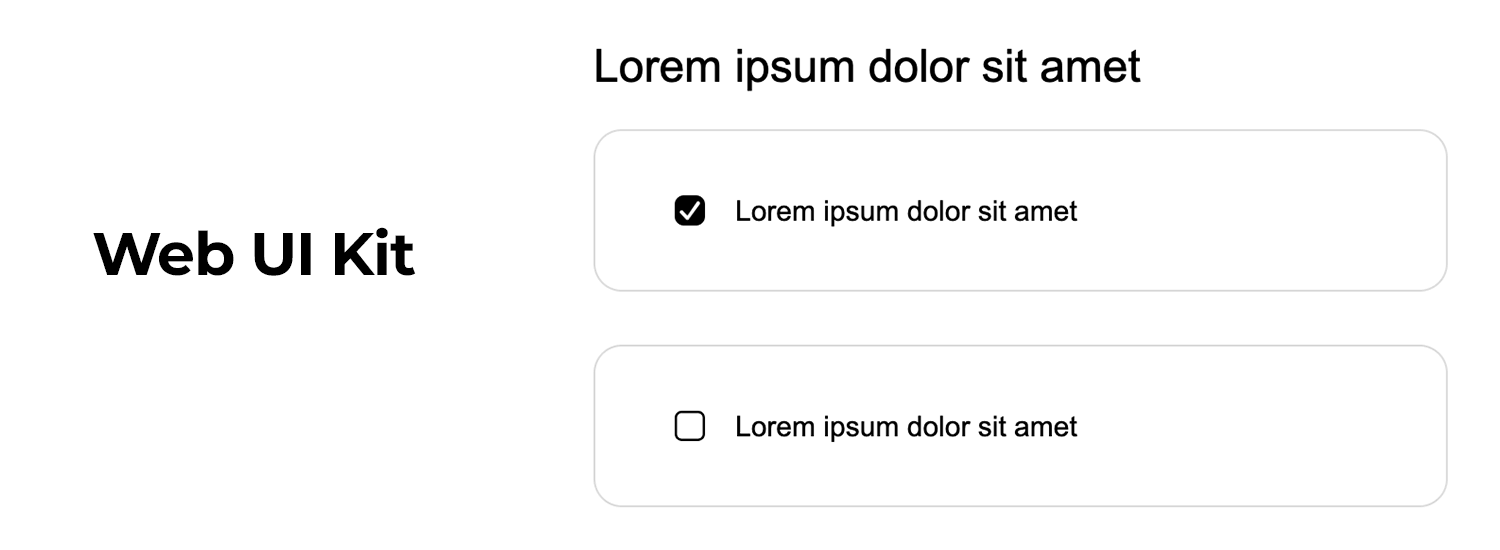
Now that you know how to create checkboxes, let’s make things even easier with Justinmind’s UI kits as these kits come loaded with interactive checkbox components that you can use for both web and mobile projects. No need to start from scratch, you can just drag and drop the checkboxes from the UI kit into your design.
The web UI kit has a variety of checkbox styles that you can drag and drop into your web prototypes. From classic checkboxes to more modern styles, you’ll find the perfect fit for your design. These components are fully customizable, so you can tweak the colors, sizes, and states to match your project.
Working on an iOS app? The iOS UI kit includes checkboxes that follow Apple’s design guidelines, ensuring a sleek and intuitive user experience. These interactive components are ready to use and can be easily added to any mobile screen in your prototype.
For Android app designers, the Android UI kit has a collection of checkbox components that align with Android’s Material Design. This makes it easy to maintain a consistent look and feel across your app. Just drag them onto your canvas, and they’re good to go.

The bootstrap UI kit makes adding checkboxes to your web prototypes super simple. It comes with ready-made components, including checkboxes, that are perfect for responsive design. With built-in interactions, you can easily customize and even export them into CSS for further development. It’s a quick way to get forms and other elements up and running.

The forms and surveys UI kit is packed with everything you need for building forms on both web and mobile. It includes interactive checkboxes, radio buttons, input fields, and even built-in validation to guide users through forms smoothly. Ideal for sign-up forms, surveys, or feedback forms, this kit lets you drag and drop components very easily.

So, to wrap it up: checkboxes and radio buttons each have their place in your design. Use checkboxes when you want to give users flexibility to select multiple options, and use radio buttons for single, clear choices. When you pick the right one, you make the user’s experience smooth and straightforward. Remember, it’s all about keeping things simple and user-friendly!