Looking for the best Search UI inspiration? You’re in the right place! We’ve explored some of the most well-designed search experiences across different industries.
Covering everything from e-commerce and travel booking to content platforms and mobile apps. In this guide, we’ll break down real-world examples of search UI, showcasing smart search boxes, intuitive filters, autocomplete suggestions, and seamless pagination.
Design and prototype search UIs with Justinmind

Whether you’re designing a search experience from scratch or refining an existing one, these examples will help you craft a smooth, fast, and user-friendly search interface.
Let’s get started!
- Why is a good search user experience important?
- Understanding user behavior and search context
- Designing the search entry: the search box
- Autocomplete and predictive search
- How to design a good search results page
- Filters, facets, and sorting
- Advanced search design
- Personalization and recommendations
- Some UI design examples for search boxes, filters and result pages
Search is at the heart of how users interact with many websites and apps. When someone uses a search function, they’re looking for a direct path to what they need. A well-designed search experience is a core part of effective UX design, guaranteeing users find what they need quickly, easily, and without frustration.
The impact of good search goes beyond convenience. It creates a sense of flow, allowing users to stay focused and engaged. Whether they’re shopping, reading, or researching, a seamless search function keeps the experience smooth and satisfying. For businesses, this translates to real outcomes: higher conversions, repeat visits, and stronger user loyalty.
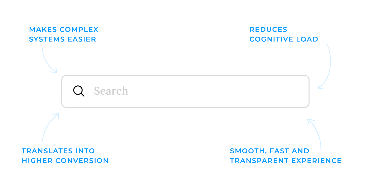
Good search design also makes complex systems feel simpler. Filters, clear labels, and intuitive interactions help users navigate even the most overwhelming datasets. The goal is to create an experience that’s fast, transparent, and leaves no room for doubt.
The objectives of search design are straightforward yet essential:
- Helping users find relevant content quickly. The best search interfaces surface results that match user intent in seconds, removing friction from the experience.
- Reducing cognitive load through intuitive interfaces and useful filters, make the process easy to navigate, even for first-time users.
- Providing clarity and transparency. A good search system gives users confidence. Whether it’s through auto-suggestions, filter options, or messaging like “No results found,” it communicates clearly how the system works and what users can expect.
When search feels effortless, it enhances the entire experience, leaving users with a sense of control and satisfaction that keeps them coming back. A well-thought-out UI design plays a key role in this, ensuring search interactions are smooth, intuitive, and built to guide users toward exactly what they need.
Design and prototype search UIs with Justinmind
A good search experience isn’t just about designing a sleek UI, it’s about understanding how people search in the first place. Users don’t always type in perfect, well-structured queries. Sometimes they’re vague, sometimes overly specific, and sometimes they don’t even know the right words to use. Search needs to bridge that gap, anticipating what users mean rather than just processing what they type.
Not all searches are the same. People search with different goals in mind, and recognizing those goals is important to delivering the right results.
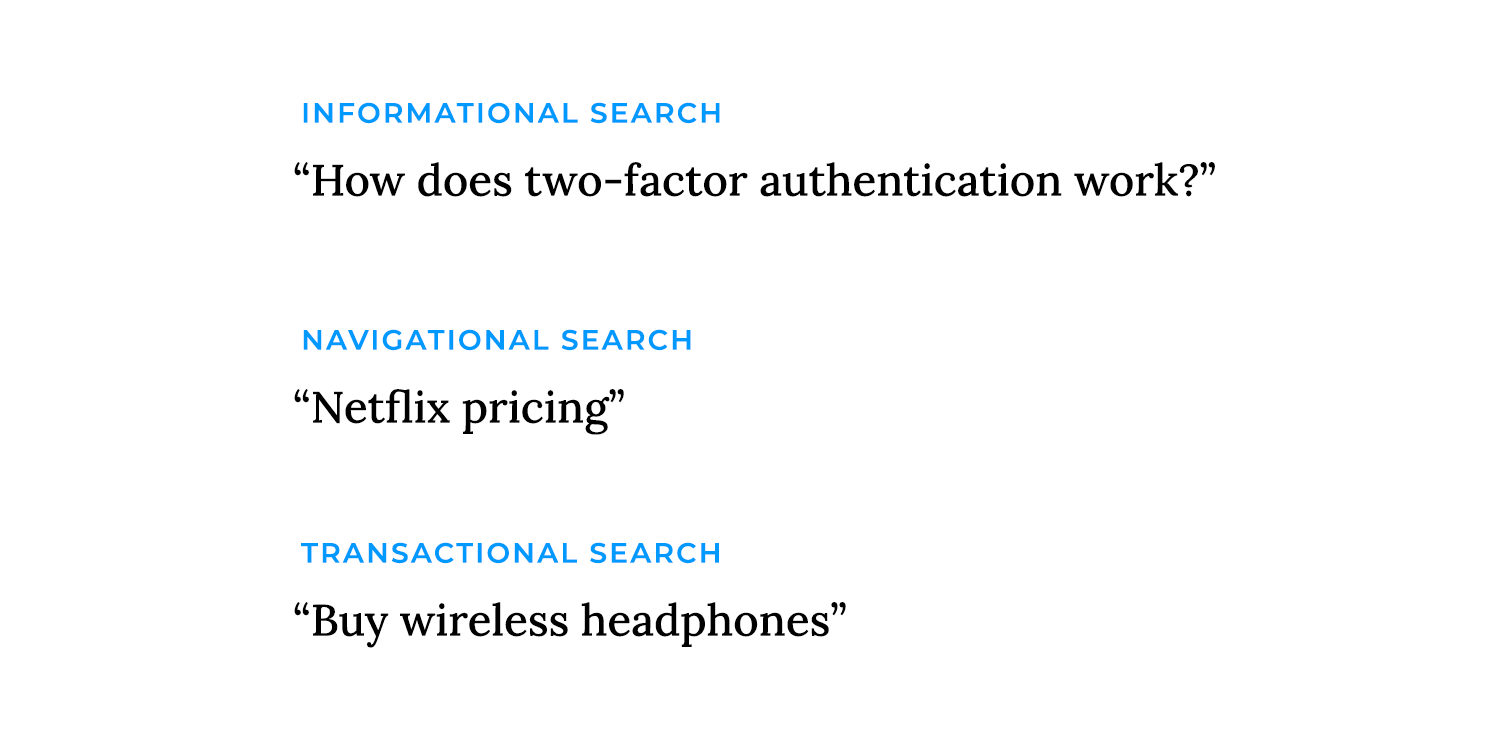
- Informational searches happen when users just want to learn something. “How does two-factor authentication work?” or “Best UX design principles” are good examples.
- Navigational searches are when someone is looking for a specific page or brand, like typing “Spotify login” or “Netflix pricing.”
- Transactional searches mean the user is ready to take action, buying a product, signing up for a service, or downloading something. Queries like “buy wireless headphones” or “free website templates” fall into this category.
A well-designed search system understands these differences and adjusts accordingly, prioritizing educational content for informational queries, making navigation easy for brand searches, and surfacing products for transactional intent.
People come to search with expectations shaped by past experiences. Most users assume search will behave like Google, handling typos, suggesting relevant terms, and understanding partial matches. If a search function is too rigid, forcing users to enter exact phrases or match content word-for-word, it feels frustrating and outdated.
Context matters, too. In some industries, people use highly specific jargon, while in others, they expect more conversational phrasing. A medical search tool, for example, should recognize both “myocardial infarction” and “heart attack” as the same thing. Understanding these mental models and adapting search behavior accordingly makes the experience feel natural rather than mechanical.
Not everyone searches the same way. Some people type short, broad terms like “laptop,” while others enter long, detailed queries like “best budget laptop for students 2024.” Some users phrase searches like a question (“What’s the best way to learn UX?”), while others keep it direct (“UX design course”). And with the rise of voice search, more queries are structured like spoken conversation: “Where can I buy running shoes near me?”
A strong search UI accommodates these differences. It accounts for misspellings, understands synonyms, and handles ambiguous terms with smart suggestions or clarifying prompts. If a user searches for “apple,” do they mean the fruit or the tech brand? Context helps refine results without forcing the user to do extra work.
Search is also about the context around them. Session data, previous searches, location, and profile preferences can all help refine results in a way that feels intuitive.

If someone frequently searches for UX design articles, the system can prioritize those results when they enter a general query like “best tools.” If a shopping site knows a user typically buys vegan products, it can surface plant-based options first when they search for “protein powder.”
That said, personalization has to be balanced with privacy. Users should feel like search is helping them, not tracking them too closely. Giving them control over personalized results, like toggling filters or adjusting preferences, guarantees the experience remains transparent and trustworthy.
So search is a reflection of how people think and what they need at the moment. When it responds naturally to their intent and behavior, it stops feeling like a feature and starts feeling like a seamless part of the experience.
The search box is where everything begins. It’s the first point of interaction, so it needs to be easy to find, intuitive to use, and designed in a way that encourages engagement. A well-thought-out search box removes friction from the start, making users feel like they can instantly get to what they need.
If users have to hunt for the search box, it’s already a problem. Search is one of the most frequently used tools on many websites and apps, so it should be positioned where people expect to find it, usually in the header, a prominent spot on the homepage, or at the top of content-heavy pages.
Beyond placement, visual cues help reinforce its purpose. The magnifying glass icon is universally recognized and instantly communicates “this is where you search.” Some interfaces even use slight styling cues, like a subtle border, shadow, or contrast, to make the search box stand out without being intrusive.
The design of the input field itself plays a big role in usability. If it’s too small, users will feel cramped when typing longer queries. If it blends into the background, it might go unnoticed. A well-sized, clearly defined search box makes the experience feel effortless.
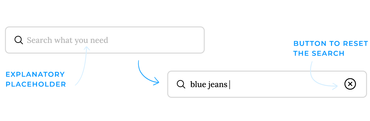
- Placeholder text can help guide users by suggesting common searches, things like “Search for products, brands, or categories”, but it shouldn’t be a replacement for a proper label.
- A clear button (X icon) lets users quickly reset their query, saving them from manually deleting text when they want to start over. Small details like this remove unnecessary effort.
Search should work for everyone, including users who rely on assistive technologies. A visible label or an ARIA-label makes sure screen readers can interpret the function correctly. Color contrast and proper focus states make keyboard navigation smoother, so users who prefer or need to navigate without a mouse can do so easily. These adjustments aren’t just about compliance, they create a search experience that feels accessible to all users.
Some search interfaces include a dedicated “search” button, while others rely on instant, real-time results as users type. Both approaches have their advantages.
- A search button gives users a clear sense of control, they enter a query, press search, and get their results. This works well for structured searches and when users expect a traditional experience.
- Instant search, instead, updates results dynamically as users type, speeding up the process and helping them refine queries on the fly. This works well when results are easy to scan and update quickly, but it needs to be well-executed, laggy or distracting real-time updates can create confusion.
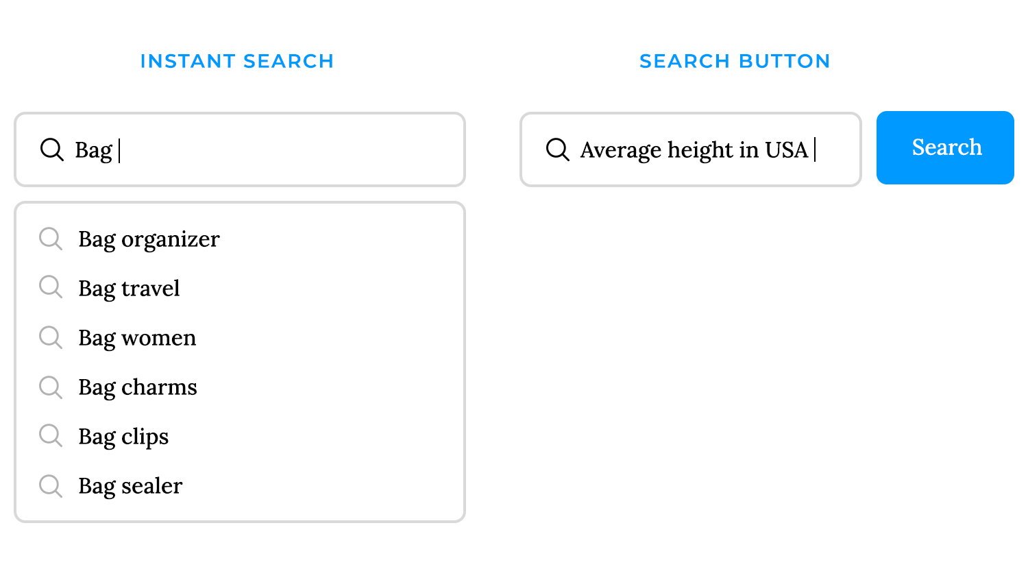
Managing expectations is key. If results change in real time, users should feel like they’re in control, not overwhelmed by constant updates. And if a search button is used, it should be clearly labeled and easy to click.
Design and prototype search UIs with Justinmind

Effective search goes beyond simply displaying results; it anticipates user needs. Features like autocomplete and predictive search streamline the search process by helping users refine their queries, correcting errors, and potentially bypassing the results page altogether. When done well, they speed up the process, reduce effort, and make search feel like it’s one step ahead.
As soon as users start typing, autocomplete suggestions kick in, offering possible queries based on popular searches, past behavior, or exact matches. This serves two purposes: it saves users time by completing their thoughts and helps them discover relevant results they might not have considered.
Suggestions can come in different forms:
- Recent searches: so users can easily pick up where they left off.
- Category-based suggestions: useful in e-commerce or content-heavy platforms (e.g., “Laptops > Gaming Laptops”).
- Exact matches and best guesses: offering the closest possible terms to what the user is typing.
The key is to present these suggestions in a way that’s helpful, not overwhelming. Too many options can be distracting, while too few might not add much value.
Beyond simple suggestions, predictive search takes it a step further by displaying real results directly in the dropdown. If the system is confident about what the user is looking for, it can show product thumbnails, article previews, or direct links to pages, eliminating unnecessary steps.

For example, if someone types “iPhone 15,” instead of just suggesting the term, the search dropdown could display links to product pages, reviews, or even related accessories. This kind of predictive experience works especially well for e-commerce, news sites, and knowledge bases where quick access matters.
But it’s a balance. Predictive search should enhance the experience without making users feel like they’re losing control. If the system aggressively pushes certain results, it can feel manipulative rather than helpful.
People make mistakes when typing, and search needs to be forgiving. Instead of returning zero results for a misspelled query, a good search system offers corrections or alternative suggestions:
- “Did you mean…?” prompts can help steer users in the right direction.
- Recognizing synonyms guarantees that searches for “couch” and “sofa” return the same results.
- Accounting for slang and brand-specific terms helps match user language with actual content, like recognizing that “AirPods” refers to wireless earbuds.

This flexibility makes search feel smarter, reducing dead ends and frustration.
None of these features matter if they feel slow or unresponsive. Autocomplete and predictive search should feel instant, any noticeable lag can break the flow and make the experience frustrating.
To handle this, search interfaces often use:
- Skeleton loaders or subtle animations to indicate that results are being fetched.
- Progressive loading, where partial suggestions appear immediately while more refined results load in the background.
- Pre-fetching techniques to speed up responses based on common patterns.
Performance isn’t just about speed, it’s about making interactions feel smooth and effortless. A well-optimized search UI keeps users in the flow, making search feel less like a task and more like a natural extension of their thought process.

Autocomplete and predictive search aren’t simple conveniences; they’re key to creating a seamless and intuitive search experience. Thoughtfully designed, these features anticipate user needs, correct errors, and eliminate unnecessary steps, making search feel fluid and effortless.
Design and prototype search UIs with Justinmind
A great search results page doesn’t just display results, it guides users, helping them make sense of what they’ve found and what to do next. It’s where all the work done in the background, autocomplete, query handling, filtering, finally comes together. If this page feels cluttered, confusing, or unhelpful, even the best search logic won’t save it.
The first thing users need is clarity. The search query and a summary, like “Showing 100 results for ‘blue sneakers’”, should be placed right at the top. This instantly reassures them that their query was understood and gives them a sense of how many options they have.
From there, how results are displayed depends on the type of content.
- Lists: they work best for text-heavy content like articles, blog posts, or documentation. They prioritize readability and scanning.
- Grids: they make sense for visual-heavy results like products, videos, or images, where thumbnails are key to decision-making.
The goal is to match the layout to the type of content being searched while keeping everything clean and easy to scan.
Each result needs to provide just enough information for users to decide if it’s relevant without overwhelming them. A well-designed result typically includes:
- A clear title that stands out.
- A brief description or snippet that gives context.
- Thumbnails or images when visuals matter.
- Metadata, like price, ratings, or publication date, depending on the type of result.
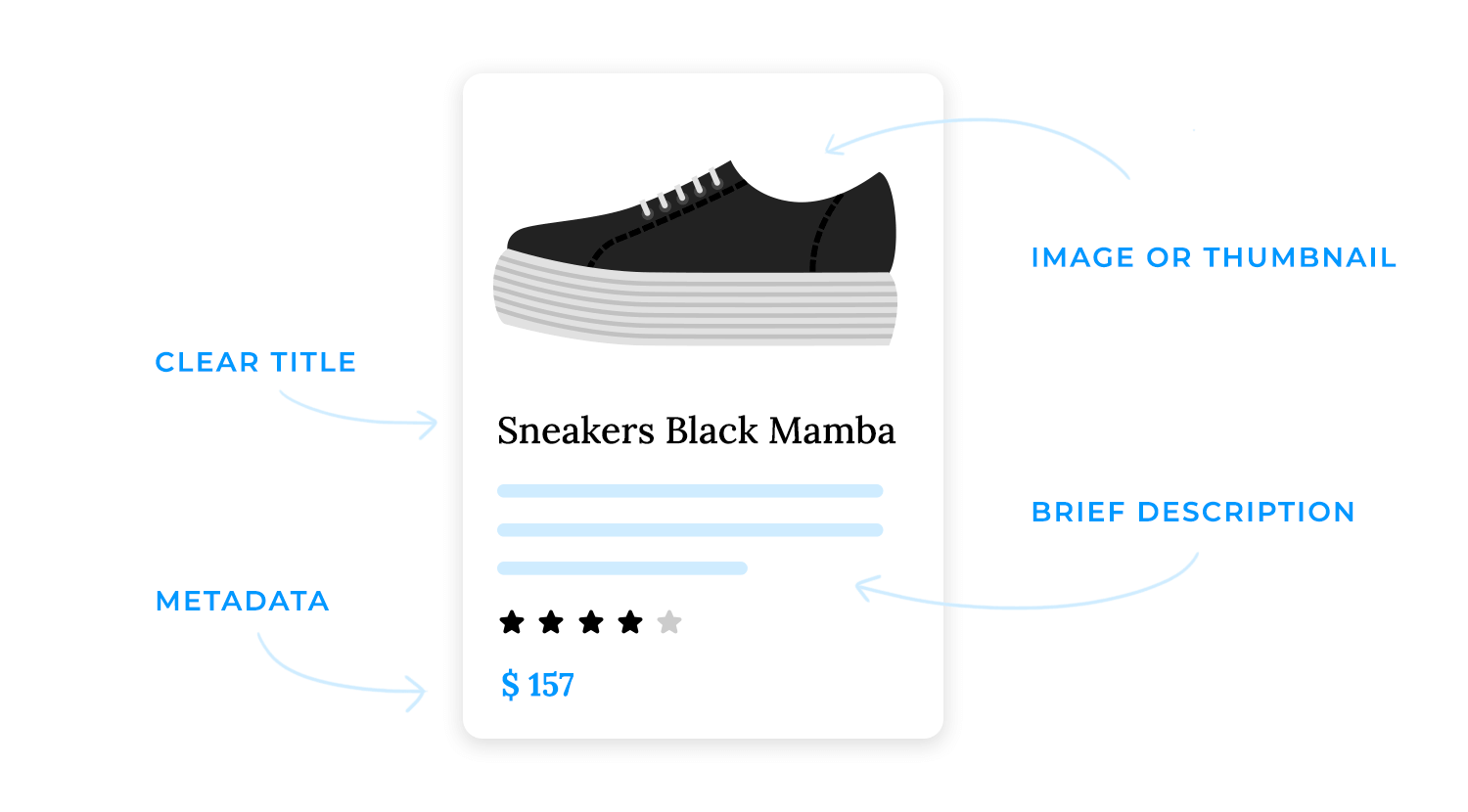
Highlighting matching keywords in the title or description can also help reinforce why a particular result appeared, making the search engine’s logic more transparent.
How many results should be shown at once? That depends on the context. Some users prefer to see everything in one go, while others are fine with breaking results into pages. The main approaches are:
- Traditional pagination, where users manually navigate between pages (good for structured browsing).
- “Load more” buttons, which let users extend results at their own pace without losing track of where they are.
- Infinite scrolling, which works well when users are likely to keep exploring but can be frustrating when they need to jump back and forth between results.

The best choice depends on the type of search and user behavior. For something like an e-commerce site, where users compare multiple items, a “Load More” button or numbered pagination is usually better than endless scrolling. For social feeds or discovery-based platforms, infinite scrolling might make more sense.
A search that leads to nothing is a dead-end, unless the design helps users recover. Instead of displaying a cold “No results found” message, the page should offer alternative paths.
Some ways to handle empty results:
- Suggest alternative searches, like related keywords or popular queries.
- Offer category-based navigation, helping users refine their search instead of starting over.
- Provide troubleshooting tips, like “Try different keywords” or “Check your spelling.”
A good no-results state feels like a helpful nudge rather than a roadblock. It keeps users engaged instead of making them feel stuck.
When it comes to designing a search UI, making it easy for users to find exactly what they’re looking for is key. Filters, facets, and sorting are like the secret sauce that helps users narrow down their options and get to the good stuff faster. Let’s break it down in a way that feels natural and intuitive.
Imagine you’re shopping online for a new pair of shoes. You’ve got hundreds of options, but you only want black sneakers under $100. Faceted navigation is what lets you drill down to those specific results. It’s all about giving users the power to refine their search by categories like price range, size, color, or even date.

But here’s the best part: dynamic filters. These are smart filters that update in real-time based on what’s actually available. For example, if you select “black,” the size options might update to show “60 products in size M.” It’s like the filters are having a conversation with the user, guiding them step by step.
Now, where do you put these filters? It’s a design decision that can make or break the experience. The most common patterns are:
- Left sidebar filters: classic and easy to scan, especially on desktop.
- Top horizontal filters: great for saving vertical space and keeping things compact.
- Collapsible filter panels: perfect for mobile, where screen real estate is limited.
Speaking of mobile, filters need to be just as accessible on smaller screens. A drawer or pop-over design works wonders here, keeping things tidy while still giving users full control.
Once users have narrowed things down with filters, they might want to reorder the results. Sorting options let them do just that, whether it’s by relevance, price, newest arrivals, or popularity.
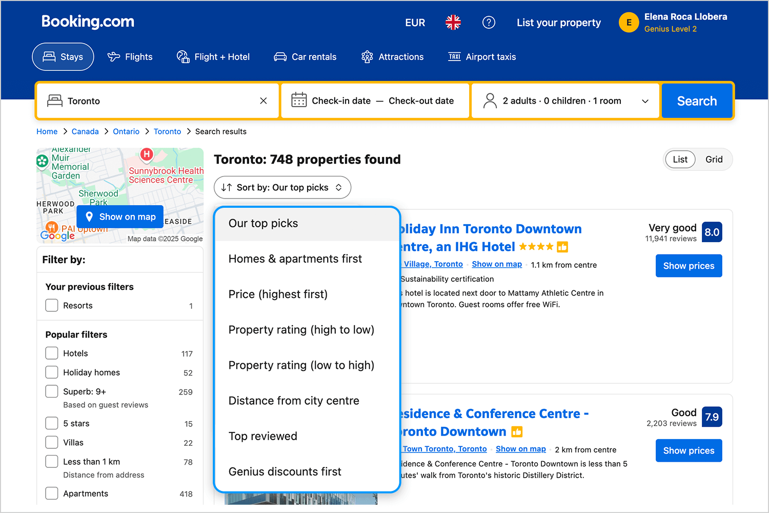
The trick is to make the current sort order obvious. If results are sorted by “price: low to high,” that should be clearly indicated. And the menu for changing the sort order? It should be simple and intuitive, like a dropdown or a set of clearly labeled buttons.
Sometimes users want to apply multiple filters at once (like “black” AND “size M”), and other times they want to choose just one (like “under $50”). That’s where multi-select checkboxes and single-select radio buttons come in.
Checkboxes are great for letting users stack filters, while radio buttons are perfect for exclusive choices. And don’t forget to make it easy for users to clear or deselect filters, nothing’s more frustrating than feeling stuck in a filter maze.

Here’s where things get technical, but the goal is simple: keep the experience fast and smooth. Some search UIs update results instantly as filters are applied, while others use an “Apply” button to batch changes. Both approaches have their pros and cons.
Instant updates feel magical but can be tricky with large datasets, nobody wants to sit through a loading spinner every time they click a filter. On the other hand, an “Apply” button gives the system a moment to process everything, which can be more efficient for heavy loads. The key is to strike a balance and keep things feeling responsive, no matter how much data you’re dealing with.
In the end, it’s all about creating a search experience that feels effortless. Filters, facets, and sorting are the tools that help users take control, and when done right, they make the whole process easy.
Design and prototype search UIs with Justinmind
While basic search gets the job done for most users, advanced search is where you cater to power users, the ones who know exactly what they’re looking for and want to fine-tune their queries to perfection. Let’s see how to design advanced search features that feel powerful yet approachable.
Advanced search forms are like the control panel for search. They let users refine their queries by specific attributes, like date ranges, file types, or categories. For example, a researcher might want to find all PDF documents published between 2018 and 2022.

But with great power comes great responsibility. Here’s how to keep advanced search forms user-friendly:
- Labeling and grouping: use clear, concise labels and group related options together. For example, “Date range” could include “Start date” and “End date” fields.
- Progressive disclosure: don’t overwhelm users. Start with the most common options and hide advanced features behind a toggle or expandable section.
- Defaults and examples: provide default values or example inputs to guide users (e.g., “Enter a date range like 01/01/2020 – 12/31/2022”).
For users who really want to geek out, Boolean search is a game-changer. It lets them combine terms with operators like AND, OR, and NOT to create highly specific queries. For example, a user could search for “coffee NOT decaf” to exclude decaf options.
But not everyone is a Boolean expert, so it’s important to provide guidance. Tooltips, examples, or even a cheat sheet can help users understand how to use these operators effectively.
Then there’s fuzzy search, which is like the friendly cousin of Boolean search. It’s designed to handle imperfect inputs, like typos, partial matches, or approximate spellings. For example, searching for “choclte” might still return results for “chocolate.” Fuzzy search is especially helpful for users who aren’t sure of the exact terms they’re looking for.

In a globalized world, search UIs need to work seamlessly across languages and scripts. This means adapting search logic to handle:
- Morphological variants: words can change form depending on grammar (e.g., “run,” “ran,” “running”). Search should recognize these variations.
- Right-to-left scripts: languages like Arabic or Hebrew require special handling for text input and display.
- Special characters: accents, diacritics, and non-Latin characters should be supported without breaking the search.
Localization isn’t just about translating text, it’s about understanding how users in different regions interact with search. For example, some languages rely more on word order, while others use compound words or suffixes. Tailoring search logic to these nuances ensures a smoother experience for everyone.
Voice search is becoming increasingly popular, especially on mobile devices and smart speakers. Designing for voice interfaces involves a few key considerations:
- Microphone icons: make it obvious where users can activate voice search. A simple microphone icon is the universal signal.
- Query transcripts: show users what the system heard by displaying a transcript of their spoken query. This helps catch errors or misunderstandings.
- Handling ambiguity: voice search can be tricky, background noise, accents, or homonyms (words that sound alike but mean different things) can lead to confusion. Providing suggestions or clarifying questions can help.

But voice isn’t the only alternative input method. Some users might prefer scanning barcodes, uploading images, or even drawing sketches. The key is to design for flexibility, ensuring that users can interact with search in the way that feels most natural to them.
Search should be more than just typing and seeing results. It should feel intuitive, helpful, and even personal. Features like autocomplete and predictive text make searching faster and easier. Personalization can make the experience even better, but it’s a balancing act. Too much can feel intrusive, while too little feels impersonal. Let’s explore how to make search a helpful and trusted guide.
Personalized search results are like walking into a store where the staff knows your preferences. If you’re always searching for running shoes, the search engine might start showing you running gear first. Or if you’ve been browsing a lot of mystery novels, it might prioritize those in your results.
But here’s the catch: personalization only works if it feels helpful, not creepy. Users need to feel in control of their experience. Here’s how to make it work:
- Be transparent: let users know why they’re seeing certain results. For example, “You’re seeing these because you searched for X.”
- Give control: offer an easy way to opt out of personalization or reset their preferences. A simple “Don’t use my history” toggle can go a long way.
- Avoid overreach: don’t assume too much based on limited data. Just because someone bought a gift once doesn’t mean they want to see similar items forever.
Recommendations are like the friendly nudge that helps users discover new things. They can appear as widgets near search results, suggesting related items, popular choices, or even things other users have bought.
For example:
- If you’re looking at hiking boots, it might suggest waterproof socks or a lightweight backpack.
- If you’re searching for a specific book, it might show you other titles by the same author or books in the same genre.

The key here is relevance. Recommendations should feel natural and connected to what the user is already looking for. Over time, AI can learn from user interactions to make these suggestions even smarter and more tailored.
Search isn’t always a one-and-done interaction. Users often refine their queries or explore related topics during a single session. Session-based context helps by remembering what the user has been doing and adjusting accordingly.
For example:
- If a user searches for “shoes” and then refines to “running shoes,” the system should remember the broader context and adjust recommendations or filters.
- Filters applied earlier in the session should stick around unless the user explicitly resets them.
This creates a seamless experience, making it feel like the search engine is “keeping up” with the user’s thought process.
While personalization can make search feel tailored, it can also create echo chambers, where users only see content that aligns with their past behavior. This can limit discovery and make the experience feel repetitive.
Here’s how to strike the right balance:
- Mix it up: combine personalized results with fresh or popular content. For example, “Based on your history” could sit alongside “Trending now.”
- Give users control: let them toggle personalization on or off. A “Reset personalization” button can help them start fresh if they feel stuck in a filter bubble.
- Be transparent: explain why certain results are being shown. For example, “You’re seeing these because you searched for X” builds trust and clarity.
Design and prototype search UIs with Justinmind
This search box UI goes beyond a simple input field by offering a full-screen search experience. Recent searches with category tags make it easy for users to pick up where they left off, reducing effort. The clean design, clear iconography, and intuitive layout keep the experience smooth. It’s a great example of mobile-friendly search.

Here we have another example of a search box designed for efficiency in a data-heavy environment. Placed directly above the customer table, it allows users to quickly filter through a large dataset without complex queries.
Ideal for dashboards and admin panels, it keeps things simple, users can type a name, email, or status to instantly refine results. While it lacks advanced filtering options here, pairing it with column-specific filters could make it even more powerful. A solid example of lightweight, inline search for structured data.

This search bar sits right at the top of the Discover page, making it the go-to tool for finding movies and shows. The microphone icon is a nice touch, voice search is a smart addition for media apps where users might be browsing on the go.
Visually, it blends in smoothly with the design, but it’s still easy to spot. Since the page already highlights trending content, search acts as a quick shortcut for those who know exactly what they want. A solid content-driven search experience that keeps things simple and accessible.
This one stands out with a dark theme search bar, blending seamlessly into the app’s UI while still being easy to spot. Like the previous example, it includes a microphone icon, making voice search an option, a great touch for a music app where hands-free interaction is useful.
What’s different here is how search sits within a discovery-driven experience. Users can explore their top genres first, then dive into search when they need something specific. It’s a hybrid approach, balancing browsing and direct search rather than forcing one over the other.

Booking a stay should be easy, and this search box makes sure of that. With a dropdown for destinations, date pickers, and a guest selector, users can set up their search in seconds. Plus, featured hotels are already displayed, offering a preview of what’s available before they even hit “search”. It’s a clean and intuitive design that makes things simple.

This is the powerhouse of search bars, the one most people recognize instantly. Amazon’s search box is big, bold, and impossible to miss because, on a marketplace with millions of products, search is the main way users navigate.

A key detail? The category dropdown next to the input field. This lets users refine their search from the start, filtering by departments like electronics, books, or clothing before even hitting enter. The bright search button (with the signature Amazon yellow) makes it clear where to click.
This is a no-nonsense, high-efficiency search UI, designed for speed and scale. It’s not about discovery, it’s about getting users exactly where they need to go as fast as possible.
This example of a search bar doesn’t just wait for users to type, it actively suggests what they might be looking for. The popular searches on the left give a quick starting point, while the recommended products on the right put relevant items front and center.

It’s a smart way 4Elementos uses to blend search with browsing, making it easy for users to jump straight to trending products. Plus, with voice and image search options, it offers multiple ways to find what you need without relying solely on typing.
For our final example of search UI bars, we have Target’s predictive search, which does more than just wait for input, it suggests what people are already searching for. The trending searches list gives users a quick shortcut to popular items, making search faster and easier, even if they weren’t sure what to type.

The design is clean, minimal, and distraction-free, keeping the focus entirely on search. With the microphone icon, voice search is also an option, making it more accessible. It’s a simple but effective way to guide users before they even start typing.
Now we’re diving into filters, starting with eBay. Their category pre-filter helps users narrow down searches before typing, keeping results relevant. Instead of searching everything at once, users can pick a category like Electronics, Clothing, or Books, making the process faster and more precise.

It’s a simple but effective way to prevent irrelevant results, especially on a massive marketplace with millions of listings.
Filters aren’t just about narrowing results, they can also guide users in making decisions. On Expedia, the search process starts with a few key inputs: destination, dates, and number of travelers. But instead of leaving users to type everything manually, the system offers popular destinations as shortcuts, making planning easy.

This kind of filtering works well for travel because people often browse options before settling on a decision. The UI surfaces trending locations and structured filters for dates and room preferences, balancing flexibility with speed to help users find relevant results faster.
Not all filters need to look fancy, sometimes, the most effective ones are built right into the tools we use every day. Google Sheets keeps it simple but powerful, letting users refine massive datasets with column-based filters, dropdowns, and searchable menus.

Instead of cluttering the interface, filters stay out of the way until needed. Users can sort, filter by conditions, or even search within menus to find the exact data they need. It’s the kind of no-frills, function-first filtering that works best when dealing with raw numbers, spreadsheets, and endless rows of information.
Filtering doesn’t always have to feel like filtering. On Spotify, there’s no complex dropdown or sidebar, just a simple way to browse by artists, albums, and playlists based on user preferences. Instead of making users manually refine their search, the UI naturally organizes content into personalized sections, letting them dive into what they like without extra effort.

This approach works well for media platforms where discovery is just as important as search. Filters surface relevant content first and shape the experience in the background, so users don’t feel like they have to do the work.
As the last example for filters, we have Yelp’s category and location filters, which help users quickly find businesses near them. Instead of forcing people to type out exact searches, Yelp suggests common industries like restaurants, plumbers, or auto repair right from the start.

The location filter works the same way; users can either enter a city or rely on their current location. This setup makes search feel fast and intuitive, especially for local services where filtering by category and area is essential.
Now, let’s look at different ways platforms display search results and handle pagination. Our first example comes from Google, which sticks to a classic list format with a well-structured results page.
Google presents results in a simple vertical list, showing the title, URL, and a short description for each link. Below the results, it offers related searches, helping users refine their queries without starting over.

Pagination is handled through a numbered navigation bar at the bottom, allowing users to jump between pages or click “Next” for more results. This method works well for text-heavy searches, where users may want to explore multiple pages rather than continuously scrolling.
Airbnb keeps things visual and easy to explore. Instead of overwhelming users with pages of results, it lays everything out in a clean grid format with big, inviting images. Pricing, ratings, and availability are right there, so users can quickly scan for what catches their eye.

Instead of a traditional pagination system, Airbnb uses a “Show more” button that loads more listings without losing the ones already on the screen. It keeps the experience smooth, no need to jump between pages or start over. Just keep scrolling and exploring.
LinkedIn’s job search results use a two-pane layout, with job listings on the left and details on the right. Instead of traditional pagination, users scroll through a sticky list of results while keeping job descriptions visible.

This is great for job platforms, where users need to compare listings without constantly navigating back and forth.
Tripadvisor’s search results make hotel hunting feel intuitive. On the left, you see a clean, structured list of accommodations, complete with reviews, prices, and highlights like “Traveler’s choice.” On the right, a dynamic map fills up with price markers, helping users visually compare locations without clicking back and forth.

Pagination keeps things structured, classic numbered pages let users jump around, while a “Next” button moves them through results smoothly. This setup works because travelers often compare multiple options, and having both a map for location context and a paginated list for easy browsing makes the experience seamless.
Coursera keeps things simple and organized. Courses are displayed in a clean grid, with filters on the left to narrow results by skills, duration, and educators. It’s easy to browse and find the right fit.

For pagination, Coursera uses a classic numbered format, letting users jump between pages without any hassle. It’s a familiar, no-fuss way to navigate through a large catalog of courses.
Another simple, no-fuss way to handle search results. Etsy keeps things organized with a clean product grid, a search bar for easy filtering, and straightforward pagination at the bottom.

No infinite scrolling, just clear, numbered pages, so users know exactly where they are and can jump ahead if needed. It’s efficient without being overwhelming.
This Skechers result page focuses on a clean, image-first layout, making it easy for users to browse shoes visually. The carousel pagination allows seamless scrolling through options without reloading the page, keeping the shopping experience smooth. Prices, discounts, and membership perks are clearly highlighted, guaranteeing users see the best deals upfront.

It’s a great example of product-focused search results that prioritize imagery and essential details.
Our last example is Zalando, a fashion marketplace that makes searching and filtering easy. The search bar at the top helps users quickly find what they need, while the filters below let them narrow things down by brand, size, color, and more.

At the bottom, pagination keeps things simple,and arrows move between pages smoothly. It’s a straightforward way to browse easily.
Design and prototype search UIs with Justinmind
A well-designed search UI isn’t just a convenience, it’s a necessity. Whether users are searching for information, products, or services, they expect search to be fast, intuitive, and efficient. The best search experiences feel effortless, guiding users toward what they need without frustration or unnecessary steps.
From the search box, which serves as the entry point, to filters that help users refine their results, and result pages that present information clearly, every aspect of search UI plays a crucial role. Thoughtful design choices, like predictive search, personalized recommendations, and smart pagination, can make the difference between a frustrating experience and a smooth, satisfying journey.
When we understand user intent, accommodating different search behaviors, and designing interfaces that feel natural and intuitive, businesses can create search experiences that not only help users find what they’re looking for but also keep them engaged and coming back.
In the end, a great search UI is about more than just technology, it’s about making interactions feel seamless, predictable, and even enjoyable. When done right, search becomes more than a feature; it becomes an invisible guide, effortlessly connecting users to what they need.
PROTOTYPE · COMMUNICATE · VALIDATE
ALL-IN-ONE PROTOTYPING TOOL FOR WEB AND MOBILE APPS
Related Content
 A fun look at different data table designs, from basic lists to smart, interactive ones, based on how complex the data is and what users need.18 min Read
 Learn how to design better e-learning platforms with user-centered UX principles, real examples, and high-fidelity prototyping tips to boost engagement and learning outcomes.13 min Read
 Infinite scroll keeps users engaged, but it’s not always the best choice. This guide breaks down when to use it, when to avoid it, and how to design it right.14 min Read


