Website footer design is often an afterthought, but did you know footers can be a make or break for some users? Read on for 25 great footer design examples.
Web page footers – often ignored or a last minute consideration – can be an instrumental section of a web page if designed with the proper business goals in mind. Maybe you want to bring users to other sections of your website, encourage them to get in contact or make a last ditch attempt to sign them up for your newsletter.
Design and prototype websites with Justinmind

Found at the bottom of each website’s page, footers typically contain supplementary information in list format. These sections, by default, aren’t the major selling point of a web page. This is perhaps why they’re normally little more than an afterthought, with a few semi-useful breadcrumbs thrown in.
However, a well thought-out website footer design can act as a safety net for users who might be about to leave your website and never return. Designing a great footer means knowing what your website’s users are looking for when they visit. To find out more about how to create winning website footer designs, read on for some great tips plus 25 great examples you’ll probably want to copy! Keep your favorite prototyping tool ready to go, cause we’re about to get you inspired.
Imagine the footer of a website as the helpful concierge of a grand hotel. Just as the concierge is always available to assist guests with their needs, the footer is always there to guide visitors through the website.
It’s a treasure trove of information, offering everything from contact details to site navigation links. Think of it as a one-stop shop for everything a visitor might need to know. Need to find the terms of service? Look at the footer. Want to connect with the company on social media? The footer has you covered.
But the footer’s role goes beyond just providing information. It’s also a way for the website to establish trust and credibility. By clearly displaying contact details and legal information, the website shows that it’s transparent and accountable.
While it’s true that a designer may spend most of their time designing a website’s header, among other sections, the footer is still one of the most important aspects of your website for many reasons.
Depending on the type of website you might be designing, your footer will have different goals. Hence it’s always important to analyze what those goals are before you jump the gun with a website footer design that’s not of use to a single soul.
Here are some reasons why you should invest time in designing your website footer and why it can really pay off:
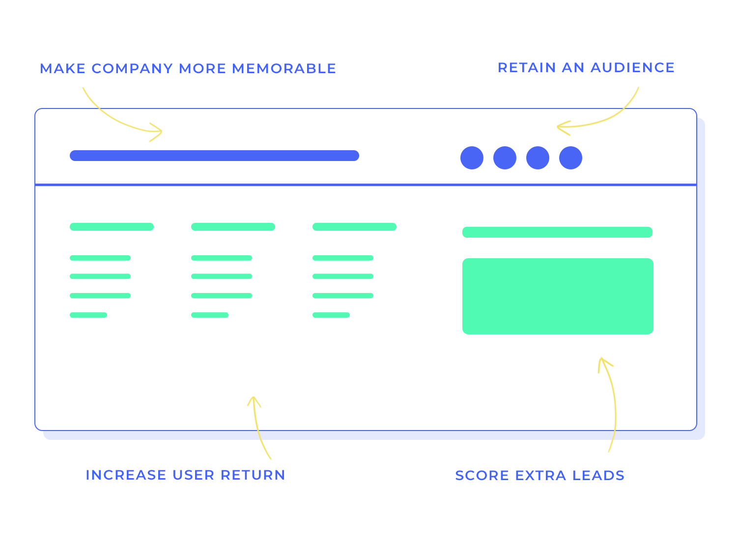
For the majority of websites, the desired effect of the footer is to:
- Retain an audience for as long as possible
- Make it more likely that users return
- Make the company more memorable
- Score extra leads
Depending on the structure of your website footer design, you’ll be able to keep users on the page longer by helping them find what they haven’t already found, or have them subscribe to your weekly newsletter.
Your website footer design can be a great chance to hold your users’ attention by expanding on any information contained in the main section of your website’s homepage, or even including information that isn’t there.
A great footer design can also help people find important tidbits that make all the difference when it comes to building trust such as awards, certificates and memberships of certain associations. This gives your website the so-called “halo” effect, thus making users trust your website more, making them hang around that bit longer, maybe even converting them into a lead or a subscriber.
In this section you can also boast about anything else your company might have achieved, how many followers you have on social media, how many subscribers you have to your email newsletter or how many new customers you had in a given period of time.
Good website footer designs can even serve to re-highlight a website’s content, if all else fails and the user’s attention is waning.
More importantly, it can help users find something they couldn’t before. For this reason, having a visible footer with clear navigation breadcrumbs can help your users find exactly the content they were looking for. Your website footer design is the perfect opportunity to include all the sections of your site in one succinct area, making navigation easier for the user.
Additionally, it can be an opportunity to get to the point and showcase a specific overview of the content on offer throughout the website prototype.
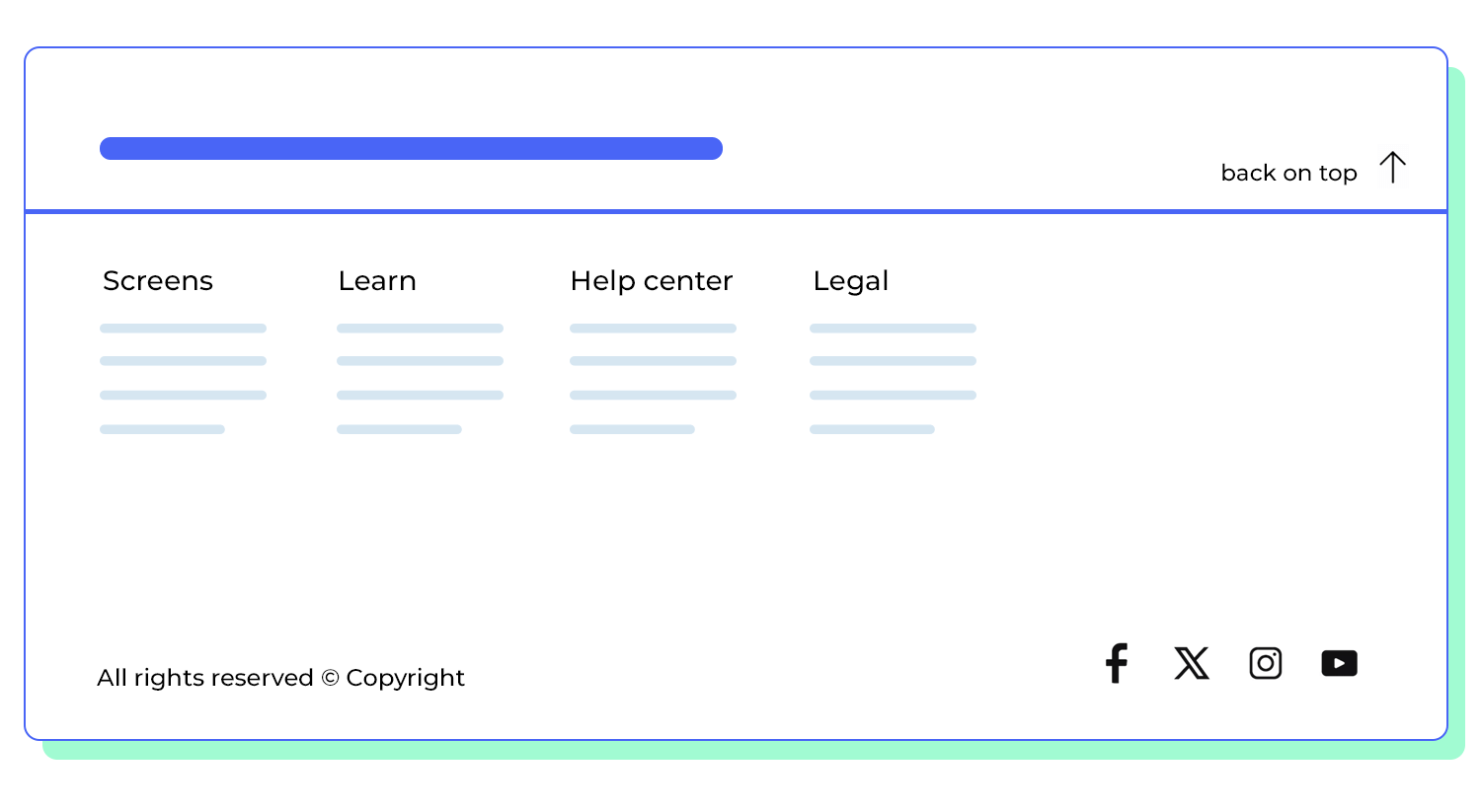
Or maybe they were so engrossed in the content of your homepage that they naturally kept scrolling until they reached the bottom. In this case, you have the chance to provide a helpful “back to top” button that sends them back to the header so they can then visit other sections of your website.
In short, a good website footer design can help your content stand out, adding more weight and pulling power to your overall web design.
Many websites contain a wealth of content and information, some of which may be secondary to your primary goal which is entertaining your users or converting them into subscribers or clients. Often, the footer is the perfect place to put secondary but important points such as legal information, privacy policy, terms and conditions, or information about partners and sponsors.
A well-designed footer can also be a valuable tool for enhancing the overall user experience. By providing easy access to important information and navigation tools, you can make it easier for visitors to navigate your website.
What a footer is for websites is what a concierge is for a building. Just as the concierge is always there to assist guests, a well-designed footer can guide visitors through your website. By including clear and concise links to your most important pages, you’re making it easier for visitors to find what they’re looking for, whether it’s your contact information, your products and services, or your privacy policy.
A footer that includes contact information, legal details, and social media links can help establish credibility and build trust with your visitors. When visitors see that you’re willing to share your contact information and legal details, they’re more likely to trust your website and your business.

When it comes to the best practices of website footer design, there are a few tried and tested winning combinations. You can deploy these combinations which are almost certain to boost the success of any website.
Remember – the footer of your website will be available on every page. This means you’ll want to include only the best information in your website footer design that helps achieve the business goals of your website in the best way possible.
You don’t want to overwhelm your users by having a website footer design that’s overcrowded. You want to have just the right amount of information and – this cannot be overstated – the relevant information!
Each website is different and, depending on its structure, its market and target audience, you’ll want to include a website footer design that provides at least some basic functionality, as well as being easy on the eyes. And last but not least, is responsiveness – a good website footer design caters to users of any device and should form part of an overall responsive website design.

Building a great website footer design is going to help both your users and your company. It can also serve to add value prestige to your website and further value and personality. Here are some pointers on how you can achieve all this in your next website footer design.
When it comes to navigation in website footer design, having a basic outline of all the sections and subsections in your website can be helpful to users feeling a little lost, or even disinterested.
Providing a sitemap in your website footer design can be the way to go, unless the layout of your website is quite complex and there is a lot of content divided up into different categories. In this case, the main sections with simple dropdowns might be a better fit.
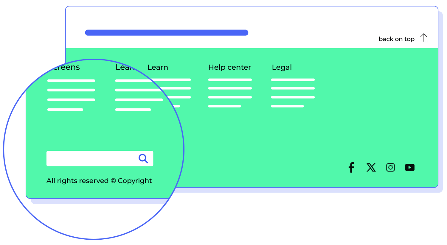
Including a search bar in your website footer design can help soothe a user’s frustration by letting them take direct control of the content they wish to see. This is especially useful if your website is content-heavy and contains an extensive list of sections, subsections and categories. Afterall, would you want to try and fit something like your computer’s registry into a footer?
Your website footer design is a great way to plug the personality of your website and brand. If the rest of the website or homepage is purely about business, the website footer design can be a space to show other quirks and interesting points about your site and company.
Including photos or even a mini gallery in your website footer design can add a bit of personality to your website at the end and leave a lasting impression on your users. This is especially helpful for users with shorter attention spans or who are more likely to scroll through a website fast unless there’s any real eye-catching content.
You can also use your website footer for nailing down a memorable logo that will be visible at the end of every page your user scrolls down. Why insert a logo in the footer? Because, if your footer is the last thing users see, your brand will be more memorable, even if your website wasn’t.
Including social icon buttons in your website footer design means including them below the entire web page. This means that users won’t be tempted to leave your homepage prematurely. By including them at the bottom, it means that people can still share your page or comment on it, but only after having viewed all of the page’s content first.
Now we know what you may be thinking: isn’t it a good thing to let them promote the website, even if it’s before they get a chance to view all of its content? Yes, but it would seem that most users have become accustomed via mental models to finding social icons near or on the footer.
According to Orbit media, 72% of the top marketing websites include their social icons in the website footer design.
Having a distinctive CTA button is a no-brainer and here’s why. As your users scroll to the bottom, after having read through most of the content on the page, they may be convinced that they want to use your services.
Instead of forcing them to have to scroll back up to the top or navigate to a different section of your website to register, sign up for an account or subscribe to a service, why not just include a visible CTA button in your website footer design?

Furthermore, having a CTA in the website footer design is still a great idea for those users who might have heard of your website via word of mouth and don’t have time to read any onsite content.
You know the way your website footer design will be visible all the way throughout your website? Well that makes it the perfect opportunity to improve your keyword Search Engine Optimization (SEO).
However, you don’t want to overdo it – Google’s been known to penalize websites that engage in keyword stuffing in their website footer designs. Just having one of two of the main keywords to your website should be more than enough.
Having a copyright symbol next to the year is an absolute must if you don’t want anyone to get away with plagiarising any part of your website, and your website footer design is the perfect place to include it.
Why? Because it’ll be visible on every page and you only have to include it in your website footer design once!
If you’re working on the website footer design for a brick and mortar commercial website, such as a restaurant, fast food outlet, barber, beauty salon or auto shop, then it makes sense to include the address of the establishment.
But you can actually go even further than that – there are some companies that, in their website footer design, even go as far as to include a map of the town localized to the user’s area. These maps pull up the user’s location relative to that of the business.
Not only is this useful for people on the go, but also for people in search of business close to them. So if your company fits the description above, you’ll you may want to include this feature in your website footer design!

Also handy is a contact phone number, and even better with a CTA button to dial the number immediately!
And in many cases, when it comes to providing an email address, it’s often better not providing one and instead having a queries text field where the user can leave their contact details and ask questions.
This is better for providing insights and tracking data to google analytics, but also because those queries can be automatically sorted and directed to the appropriate channel instead of flooding one email address.
Lastly, we would say that press buttons are necessary in case someone from the media happens to want to get in touch with your company.
However, according to Orbit Media Studios, less than 1% of a website’s traffic is the press wanting to contact them, therefore, you shouldn’t be wasting your main website real estate on a button for this. Guess where’s a great place – your website footer design!
A privacy policy is more than just a legal document; it’s a cornerstone of trust between you and your website visitors. By clearly outlining how you collect, use, and protect their data, you’re demonstrating your commitment to transparency and accountability.
A prominent link to your privacy policy in the footer ensures that visitors can easily access this important information, fostering a sense of security and confidence in your website. It’s a way of saying, “I value your trust, and I’m committed to protecting your personal information.”
Picture your website as a bustling city. Without a sitemap, visitors might get lost in the maze of pages. But with a well-designed sitemap, they can easily navigate the streets and find the places they’re looking for. It’s a navigational tool that helps visitors find the specific page they might be searching for on your website.
This usually proves to be more useful for larger or more complex websites with many pages than for a smaller one with 3-4 pages for example.
A newsletter signup form in the footer is like a direct line to your audience. It’s a way to stay connected, share updates, and build a community around your website. When you offer a convenient way for visitors to subscribe they can start receiving exclusive content and insider information, which makes them feel as though they have joined a community, not just a brand.
By subscribing to your newsletter, visitors are showing their support and interest in what you have to say. How flattering!
Design and prototype websites with Justinmind
Now, let’s look at some of the best website footer designs you’ll surely want to use. In this list, you’ll find plenty of fuel for website footer ideas that you can copy directly or mix and match into your design.
We even included some of our designer’s best website footer examples, and if you are yearning for more, go ahead and check out our design templates page and see what you can do with your favorite web design software, Justinmind!
The Justinmind travel booking website footer, put together by our amazing designers, is both visually appealing and highly functional. The dark backdrop and clean typography create a sophisticated atmosphere, while the carefully placed elements guide visitors effortlessly.

The “Get discounts instantly” banner, with its bold call-to-action and clear instructions, immediately draws your eye. The email subscription form, subtly placed below, invites you to join the community without feeling overwhelmed.
The footer’s navigation structure is well-organized, with clear categories like “Help and services,” “To explore,” and “Other possibilities.” This makes it a breeze to find what you need, whether it’s FAQs, contact details, or the blog. The “Subscribe” button, with its subtle animation, adds a touch of dynamism to the otherwise static elements. The social media icons, prominently placed at the bottom, provide additional touchpoints for engagement.
The copyright information and app store links complete the footer, offering a sense of credibility and convenience.
Another one by the creative geniuses behind Justinmind. Our Online Bookstore website footer showcases clean typography and an uncluttered layout that create a sophisticated atmosphere, while the carefully placed elements guide visitors through the information.

The footer’s navigation structure is well-organized, with clear categories like “Books,” “Authors,” “Collections,” and “Events,” which makes it ridiculously easy to find what you need. Plus, the social media icons, placed prominently at the bottom, provide additional touchpoints for engagement.
Our web design school website footer is a thoughtfully crafted element that enhances the overall aesthetic of the site. It’s like a well-designed logo that complements a brand’s identity. The navigation structure, organized into clear categories like “School,” “Students,” and “Blogs,” provides a guided tour through the information you need, much like a design brief guides a creative team to a successful project.

The footer’s layout is carefully considered, ensuring that all elements are easily accessible and visually appealing. The use of color, typography, and spacing creates a cohesive and harmonious design, making the footer a pleasure to interact with.
Justinmind’s fashion e-commerce website footer, also brought to you by our in-house UX masterminds, is a model of clarity and efficiency. Its clean design and well-organized structure make it easy for visitors to find the information they need.

The footer offers a concise overview of the website’s key sections, including the sitemap, company information, customer support resources, and legal terms. This streamlined approach ensures that users can quickly access the relevant content without being overwhelmed by unnecessary clutter.
The Lorelei Londres, an Italian haven of hospitality and charm, doesn’t just provide unforgettable experiences – it also leaves a lasting impression with its thoughtfully designed footer. A quick glance reveals essential contact information, navigation links, and a newsletter signup option, all arranged for easy access. Need to get in touch? Drop a line directly through the footer’s submission form.

Below, you’ll find the usual suspects: privacy policy, cookie policy, and a shout out to the talented team behind their website. To top it off, the footer is set against a stunning backdrop – a poolside view that perfectly captures the essence of Lorelei Londres. It’s like a little vacation for your eyes, even when you’re just scrolling to the bottom of the page.
Just as Drunk Elephant offers a luxurious and effective skincare experience, their footer is a delightful addition to your digital journey. A well-organized menu guides you through their range of biocompatible products, while informative sections delve into the brand’s philosophy and ethos.

Beyond the practical information, Drunk Elephant’s footer is a visual treat. The bold colors and playful aesthetic perfectly complement the brand’s personality, creating a cohesive and enjoyable experience. It’s like a mini-vacation for your eyes, even when you’re simply exploring the footer of your favorite skincare brand.
Pranjal Kaila, known creatively as Ajeeb, is an independent designer specializing in crafting immersive spatial and sensory experiences. This unique approach is evident throughout his website, including his thoughtfully designed footer.

While Ajeeb’s footer provides essential information, such as links to his sketchbook and work, contact details, social media icons, a copyright notice, and a privacy policy link, its presentation is anything but ordinary.
Against a dark, starry backdrop, the white typography resembles constellations, inviting exploration. The cursor acts as a celestial guide, illuminating the links with bold, blue typography against a bright yellow background as it hovers over them. This interactive design element adds a touch of magic and wonder to an otherwise functional component, reflecting Ajeeb’s commitment to creating engaging and memorable digital experiences.
Aisle, a leading ecommerce platform for reusable menstrual products, sells its products alongside a vision of a sustainable future. Their footer is a testament to this commitment, achieving an effortless blending of informative content with a visually appealing design.

A feed of inspiring images sets the tone, showcasing the brand’s vibrant and eco-conscious ethos. Below, the usual footer links provide practical information, while the eye-catching email opt-in form, complete with an orange background and yellow shapes, encourages visitors to join the Aisle community and receive exclusive offers.
Art4web, a creative digital studio, embodies uniqueness in their own digital footprint. Their footer offers a distinctive and engaging approach to customer interaction.

Unlike traditional footers that provide a single point of contact, Art4web’s footer presents three distinct call-to-action buttons, each tailored to different user needs. This innovative design captures attention and makes it effortless for potential clients to connect with the studio in a way that suits their preferences.
By offering multiple avenues for engagement, Art4web demonstrates its commitment to providing a personalized and user-centric experience. It’s a footer that looks great and also serves as a practical tool for attracting new business.
Based in the heart of New York City, Avex is a leading Shopify agency specializing in creating stunning and effective online stores for lifestyle brands. Beyond showcasing their impressive portfolio of client work, Avex’s footer highlights valuable resources for businesses seeking to elevate their online presence.

Avex’s footer serves as a platform for demonstrating their expertise and providing valuable resources to both clients and potential team members. It’s a testament to their commitment to excellence and their dedication to helping businesses succeed in the digital age.
Design and prototype websites with Justinmind
Callista, a luxurious apartment development in Rose Bay, offers a captivating online experience that brings the development to life. Their footer is a prime example, providing a virtual tour at your fingertips.

Explore stunning images of the apartments’ front and back facades, and navigate through the development with ease using the intuitive menu. The inviting question, “Where to?” encourages visitors to discover the exterior, interior, location, and even a video tour of Callista.
The convenient “Back to top” button ensures a seamless browsing experience, inviting visitors to explore further and discover the beauty of Callista from every angle.
As a pioneer in stem cell skin regeneration science, CALECIM‘s website offers a comprehensive and informative experience. Their footer is a testament to their commitment to user-friendliness and accessibility.

The footer’s four-column layout, featuring clear icons and headings, makes it easy to navigate through the site’s content. Whether you’re interested in exploring available products, learning about the science behind CALECIM, or seeking support, the footer provides a convenient one-stop shop.
For returning users, CALECIM offers a thoughtful touch: a login option at the footer. This allows members who have scrolled down the page to quickly access their account without having to navigate back to the top. It’s a small but significant detail that demonstrates CALECIM’s dedication to enhancing the user experience.
gOOOders, a platform dedicated to ethical and sustainable products, embodies a mission-driven approach that extends to every aspect of their online presence.

Recognizing the power of email as a direct channel for engagement, gOOOders prominently features a colorful and eye-catching email sign-up form in its website footer. This strategic placement encourages visitors to take immediate action and join the gOOOders community.
As a leading retailer of sporting apparel and branded sneakers in South Africa, Lemkus’ website footer is as distinctive as their products.
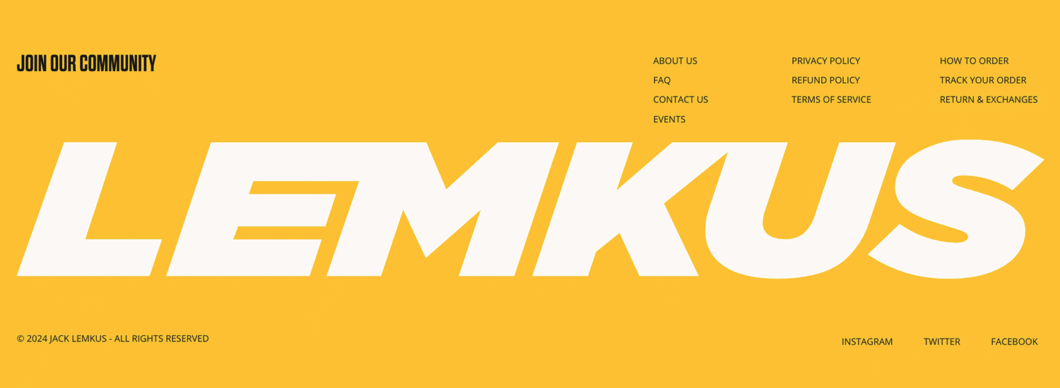
While the majority of the page adheres to a white background with black text and yellow accents, the footer boldly inverts this color scheme, making it visually striking and memorable. The email opt-in form, with its bold, black font, further emphasizes its importance, inviting visitors to join the Lemkus community
Perhaps most notably, Lemkus’ logo takes center stage, spanning the entire footer. This strategic placement not only reinforces the brand identity but also increases the likelihood that visitors will remember Lemkus long after they’ve left the site
Nixie, the zero-calorie, zero-sweetener beverage that’s bursting with flavor, offers a website that’s as vibrant and refreshing as their products. Their website footer features prominent links to Nixie’s social media pages. This allows visitors to dive deeper into the brand, exploring mocktail recipes, pairing ideas, and finding Nixie near them.

A standout feature is Nixie’s recognition of Manufactur, the creative agency that played a pivotal role in crafting their online experience. This acknowledgment highlights the collaborative effort behind Nixie’s successful digital presence, and gives credit where credit is due. How honorable!
Tenzo, a purveyor of clean caffeine alternatives, offers matcha tea in a way that’s both affordable and accessible. Their website is designed to encourage action, with multiple calls-to-action and a money-back guarantee.

The footer reinforces this commitment to customer satisfaction, offering a 10% discount for email subscribers. For those who prefer to stay connected without sharing their email, Tenzo provides social media links, making it easy to follow their journey on Pinterest, Facebook, Instagram, or Twitter.
Beyond engagement, the footer also caters to information seekers, providing links to explore different purchase options and learn more about matcha and the company.
The Financial Diet, a trusted personal finance resource, demonstrates the power of simplicity in its footer design. By focusing on essential information, they avoid overwhelming visitors with unnecessary clutter.

Standard elements like copyright, contact details, and privacy terms are readily accessible, ensuring transparency and accountability. However, it’s the Affiliate disclosure section that truly sets The Financial Diet apart. Their upfront acknowledgment of participation in Amazon’s affiliate program is a commendable example of transparency, a quality often lacking in websites that utilize affiliate links.
Will Ventures, an early-stage venture capital firm focused on consumer, health, and media startups, has embraced a minimalist approach in their website design. The black-and-white aesthetic and limited options in the footer contribute to a clear and uncluttered user experience.

Visitors to the footer are presented with a concise set of choices: sign up for the newsletter, connect on social media, or explore the site credits. This streamlined approach prevents information overload and ensures that the most important actions are easily accessible.
To add a touch of visual interest, the “WILL” text is animated to move up and down the page, creating a subtle yet engaging dynamic. This subtle animation helps to break up the static elements of the footer and keeps visitors engaged.
Furrion provides electrical luxury goods for homes, offices, boats and ground vehicles. Their website boasts a series of striking imagery, font and motion. In contrast, their footer keeps things beautifully simple.

Their brand logo is to the extreme left, along with social media, followed immediately by support, FAQs, downloads and dealer directions, then by a company bio. This shows that they knew how to prioritize the layout of their footer information in terms of both what they showed the customer and also what the customer or user would be looking for.
The New York Times couldn’t be a better example of a website that’s content-heavy but that doesn’t sweat the footer. They managed to organize their dense amount of categories into a succinct and easy-to-read sitemap in their website footer design.
The sitemap means the user can quickly and easily navigate to the story, interview or opinion article that matters most to them. In the first category, under News, they even have a section for “Corrections” so the relevant parties that might request them can find them easily.
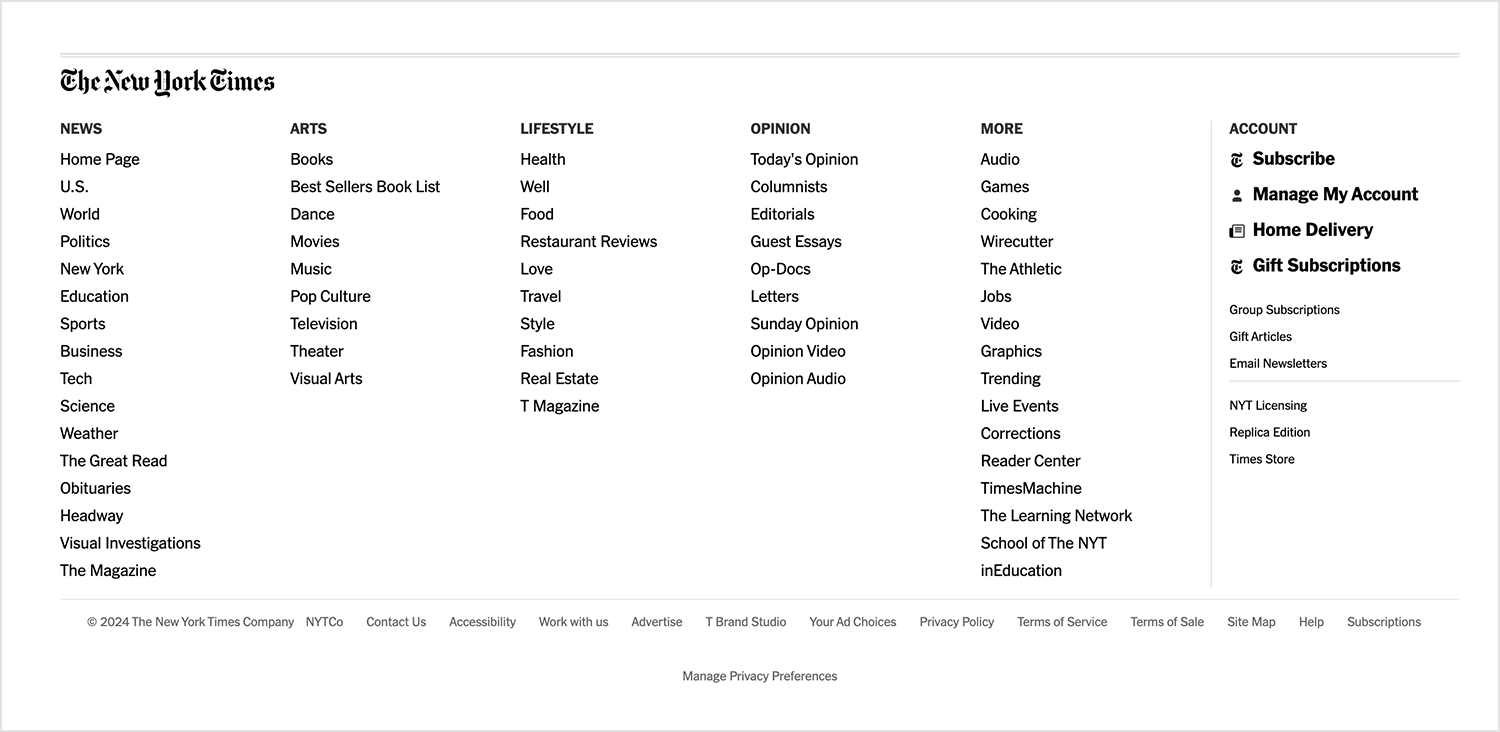
To the right, they have a subscribe button, as well as others like buttons for crosswords or a home delivery option. At the very bottom, some greyed-out breadcrumbs allow you to contact them, apply for a job or view their copyright clause.
This layout shows that they clearly thought about who their main users were, what they wanted and how to help them find it as quick as possible. Let’s take a leaf out of their book!
Design and prototype websites with Justinmind
Cosmetics company Guerlain was created in Paris in the year 1829 but their website footer design is as fresh as ever. Why? Because they’ve managed to maintain a simple, functional footer that achieves everything it needs to while being easy on the eyes.
Its minimalistic, aesthetic design, along with thin sans serif and tasteful black and white social icons to the left. This means you don’t have to squint at the footer options like is, unfortunately, the case with many website footer designs. In fact, the first thing on the left is the call to “follow #Guerlain”, with the social icons directly underneath and the newsletter subscription button to the right.
Learn more about designing a minimalist website with our post.
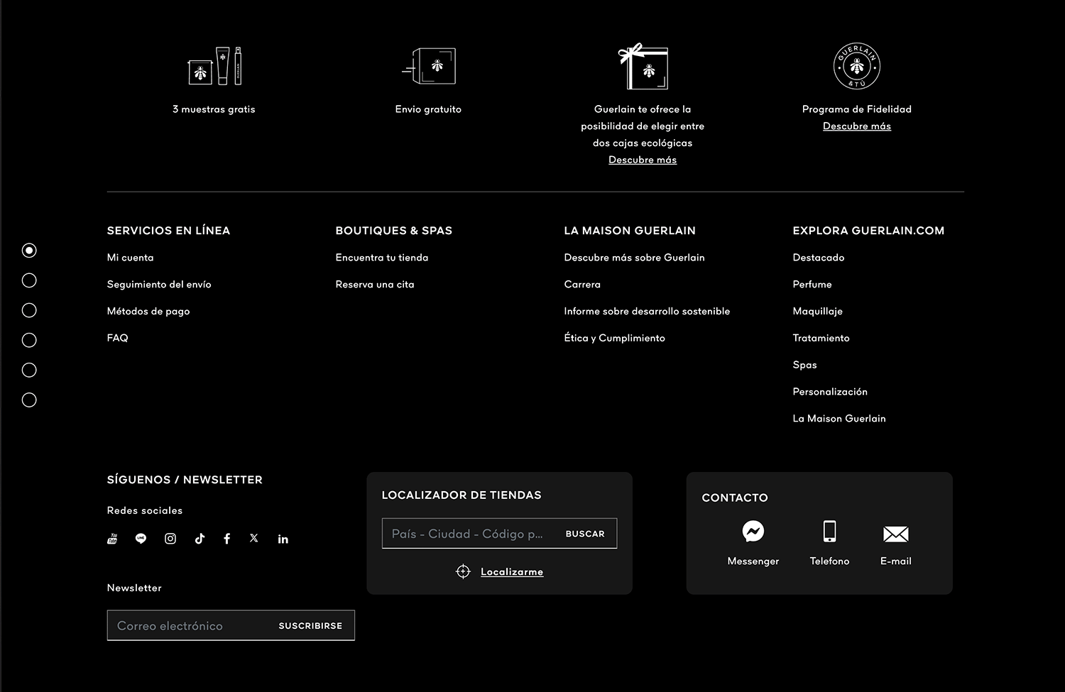
Also interesting was the choice to provide the sitemap as a simple breadcrumb to another page instead of including it all in the footer. The “back to top button” is a nice touch as it does take a while to scroll down.
Stylenovels is a furniture and interior design company whose website falls nothing short of captivating and hypnotic. Scrolling down this website’s homepage, you’ll be presented with a myriad of their products within their natural environments.
Their website footer design is also pretty impressive. Scroll right down to the bottom and you’ll be greeted by a bold but tasteful font inviting you to download their catalogues and sign up with your email.

The images and mix of colors used in this case provides an interesting contrast to the common, simplified footer.
Shantell Martin is an artist with a trippy website. It consists of the designer’s person lying atop a background of scribbled doodles, weilding a permanent marker and daydreaming about design (probably). Move the cursor over any of the myriad of doodles and they start to bounce and wiggle in quick succession.
With a website that innovative, you can only expect the website footer design would be pretty unique too – and it is. In fact, the footer is actually the main menu on the homepage, apart from an invisible hamburger menu hidden near the title.

Scrolling down to the footer, you’re greeted with three panels with bold brutalist text that transform into image links taking you to her three different instagram channels. Beneath that follows a handful of large, bold and simplified breadcrumb options that take you to all the different pages of the site, along with social media buttons spelled out with words.
Envoy is a design and innovation consultancy with striking, yet minimalistic visuals. As soon as you land on the homepage, you’re greeted by bold, white sans serif font against a black background with zero images and plenty of negative space.
Their website might be a questionable design for some and a breath of fresh air for others, but their website footer design is unarguably simple. Your eyes are immediately drawn to the logo and mission statement on the bottom left of the footer that states they create possibilities for a connected world and inviting you to “Be Bold”.
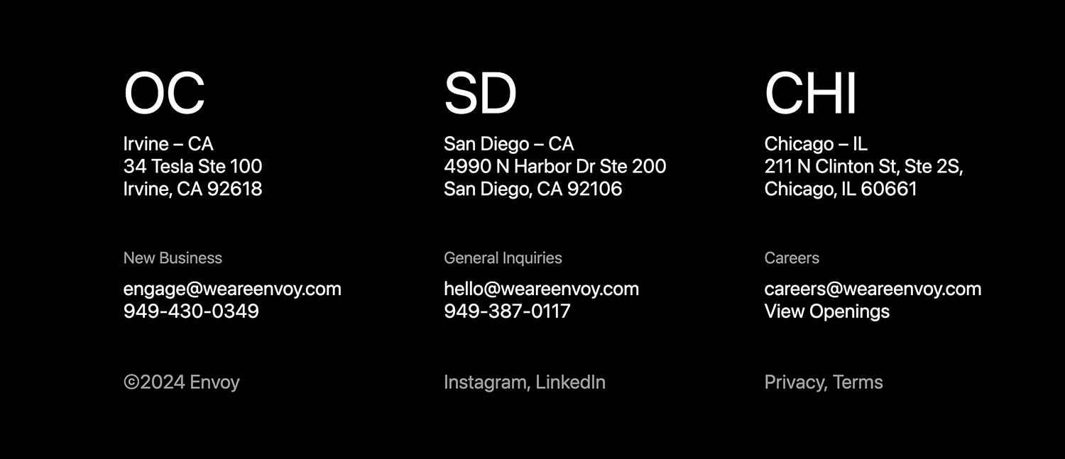
What we really like is the layout of their breadcrumb options, horizontally, from left to right, the first column being their sitemap, followed by their company directions and contact details, social media and legal pages.
Chobani sells Greek yogurt products and their website boasts a fun and mouthwatering design. If the seductive copy and images don’t make you hungry, then the chances are you could be a robot.
But what is our attention particularly drawn to? You guessed it! Their website footer design that stands out from everything else on the page, yet somehow paradoxically blends in.
In contrast with the rest of the page, the website footer design is deliberately simple, yet packs all the most important information into a nutshell on the left, with an email signup button on the right.

It’s the same shade of green as the copy and the header logo that makes this footer blend in seamlessly with the rest of the page’s content.
There’s no one-size-fits-all approach when it comes to website footer design. It all depends on the type of website where it will go. However, we could say there is a general recipe for success.
Creating a great website footer design involves analyzing the following aspects of your website:
- What type of content is available on your website?
- How is the information architecture of your website organized?
- Who are the target users of your website?
- What kind of information are they more likely to be looking for when they visit?
To sum up, the questions you need to ask yourself are: “how can I make the information in my website footer design as relevant as possible?” and “how much information is too much?” Answer these and you’re already on to a winner!
Design and prototype websites with Justinmind
Related Content
 A fun look at different data table designs, from basic lists to smart, interactive ones, based on how complex the data is and what users need.18 min Read
 Single page design v multi-page design – everything you need to help you choose the right design for your site’s content18 min Read
 Website backgrounds can be a powerful tool in creating an experience. But what kind of experience can you convey and how? We got the full run-through for you!14 min Read


