Apple Watch: a practical and free UI kit
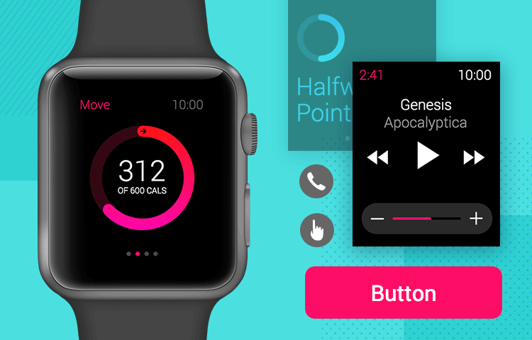
The apple watch changed the wearable tech game and with our free UI kit, you can prototype the next big Apple Watch app quickly and efficiently!
Wearable technology is one of those sectors that came into existence a short while ago, but has grown immensely. Global shipments of smart watches keep increasing year after year, and none is more well-known than the Apple Watch.
It’s true that designing for the Apple Watch and its extremely limited screen space is no easy task – but what if Justinmind gave you all the tools you needed? That’s why our design team created a free Apple Watch UI kit! Let’s take a closer look at what is in the UI kit and how you could use it to create amazing smartwatch apps with the Justinmind prototyping tool.
Apple needs no introduction, and neither does the Apple Watch. Known for its modern look, clean lines and advanced technology, it’s grown to be a widely successful product in its own right. By 2020, Apple held 55% of the smartwatch market share – making the Apple Watch a great platform for UX designers.
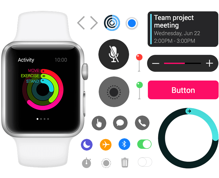
But what are some of the specific traits of Apple Watch designs? Here are some key aspects of designing for the Apple Watch, according to the Human Interaction Guidelines.
The Apple Watch comes with rounded corners that can trim and cut visuals, unless we stick within the safety margin. Ideally, you want to make sure all your content is located within the margin, including the content users see while scrolling.
The watch itself also comes with padding, offering a native border for the content and components. That means that when creating and prototyping apps for the watch, designers should place content all the way to the side borders – making the most of the permitted space.
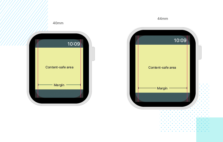
As any designer will immediately notice, this margin represents an even smaller available space in the screen. The limited space, however, works to reinforce some other characteristics we must bear in mind when designing apps for a watch piece. Designers often try to keep only the absolute components on mobile screens due to the reduced space – and creating apps for a watch takes that to a whole new level.
“Text elements should align with these margins, while graphic elements and button backgrounds continue to extend beyond the margins to the screen’s edge.”
Apple - Human Interaction Guidelines
Visual hierarchy and information architecture play a central part in any Apple Watch app. The layout UI has to be carefully planned, so users can see how each item relates to the other. Apple directs designers that grouping of elements is crucial, encouraging the use of negative space and separator lines.
The Apple Watch UI kit comes with both components and screens, ready to be implemented in your new prototype. Let’s take a closer look at some of the components that the UI kit brings into the fold.
You can expect to find buttons and action controls that adapt to your design, including larger buttons that can be used for critical actions. The large buttons come with three different colors, but like all other components, are fully customizable inside the Justinmind tool. To make matters easier, the UI kit also comes with smaller buttons that can be modified at will.
Other controls included in the Apple Watch UI kit are iOS classics, such as the minimalist Hang On and Hang Off buttons. Search, Trash, Pause, Mute and Flag are other great examples of buttons that all iOS users are closely familiar with.
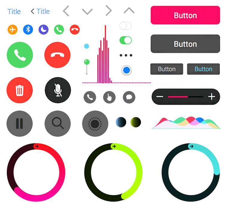
The UI kit also comes with micro buttons, which can fit in less central areas of the screen. These tend to refer to secondary aspects of the Apple Watch, such as the Bluetooth, Airplane Mode and Chat buttons.
Enjoy controls which deal with other possible topics, such as Pins for map features, switch and toggle buttons. However, not all action controls are classics we all see frequently on iOS or Mac products, being tailored for the smartwatch. This is the case with the Graph Bar, Voice Flow Diagram and Exercise Circles.
The Apple Watch UI kit comes with plenty of icons to suit your prototyping needs. With icons that users will recognize instantly, you’re free to let your creativity run wild. The icons in the UI kit cover common areas such as phone calls (hang on, hang up, mute) and music (play, pause, rewind, forward, volume).
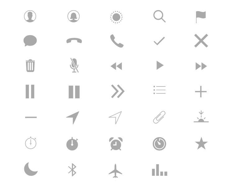
But those are only part of the icons included. You can expect to find other gems such as the sunset icon, stopwatches, alarms, location, contacts and much more! Every one of these icons can be customized to fit your prototype like a glove.
The dialogs in this UI kit are varied, and aim to decrease the amount of effort you’ll need to put your prototype together. A good example is the chat notifications. The chat notification bubbles come complete with text and other visual elements, and are offered in two different sizes.
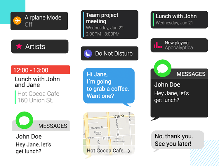
Other examples are the settings notification bubble, calendar notification, chat or the map dialogs. These are already assembled, and need minimal modification for use. These notifications already come with icons, text and CTA, making them perfect building blocks for your Apple Watch prototypes!
To get started designing your Apple Watch app prototypes, the first thing you have to do is download our prototyping tool! Then just follow these short and simple steps below:
- Download the Apple Watch UI kit from our UI kits page
- Unzip the file you wish to use to a folder on your computer
- Open Justinmind on your desktop
- Navigate to widgets on the menu bar
- Select “Add/remove libraries”
- Under “Default libraries”, scroll down till you see the Apple Watch UI kit
- Click “Add to widgets”
- Have fun designing your screens!
Let’s take a closer at some of the pre-made screens that come with the UI kit. These are all ready to be incorporated into your prototype, and approach many different subjects. From screens for weather apps, chat alerts or an email inbox – these examples are the perfect shortcut for speedy prototyping.
The Apple Watch UI kit comes with no less than eight screens dedicated to an exercise app concept.
Designers can expect to find a screen that holds an overview of the physical activity of the user, consisting of three different progress bars. The progress bars are filled to different extents, with each bar coming with a label (Stand or Running time, for example). Other details of the screen include the time and screen title at the top, as well as the four dots representing additional screens available for navigation at the bottom.
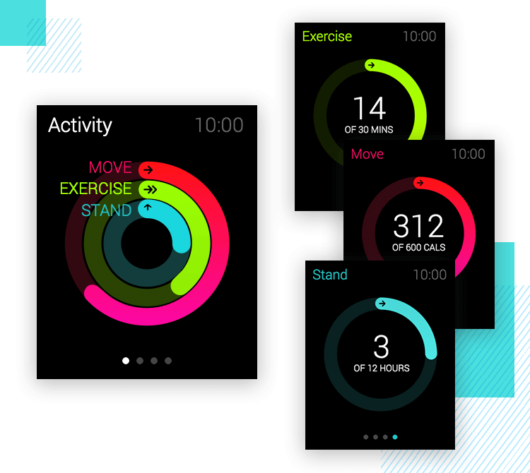
This overview can be broken into three different screens, each of which represents a progress bar. In these screens, users will see only one progress bar, which holds an additional key piece of information, such as the number of calories burned.
Aside from these screens, the UI kit also offers a Running Screen. This example comes with a picker at the center of the screen, along with a “back” arrow icon with a label and a CTA. Another additional screen consists of a graph, illustrating the amount of calories lost within a certain time frame.
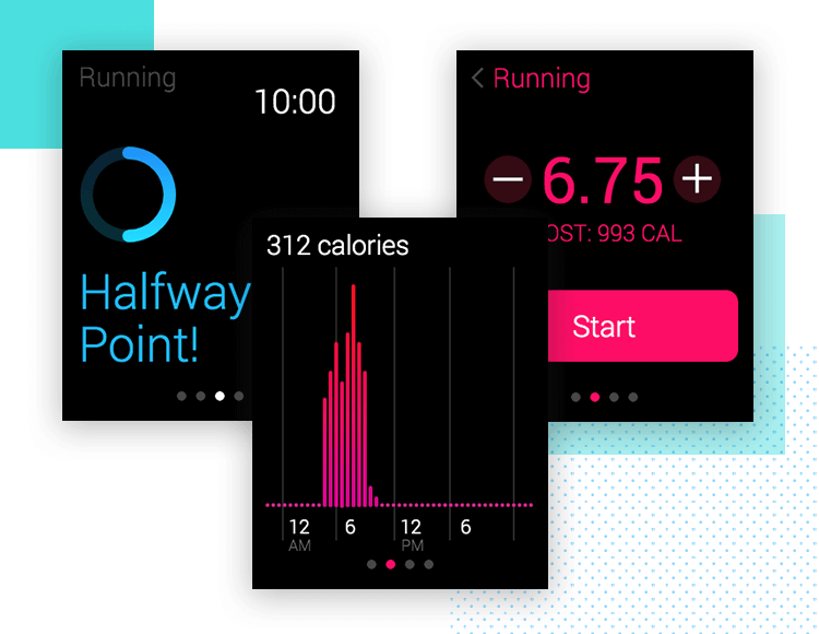
This brings us to the final screen, which marks a possible end to the user’s workout. This screen has two buttons: end and pause. With some central text to give the user context, this screen marks the wrap up on the fitness and exercise example of an Apple Watch prototype!
On we go, to another great example that requires minimal effort with the Justinmind UI kit. Let’s start with a menu, which holds buttons concerning the most important aspects of the music player. Aside from the screen title and time on the top part, users would see four key buttons, each holding an icon and a label. The first button shows what is being played at the moment, while the others take users to songs, artists or albums.
Our next screen shows the album art of the song being played at that point in time, which is simply the album cover along with the time. From this screen, we go to the screen of action controls.
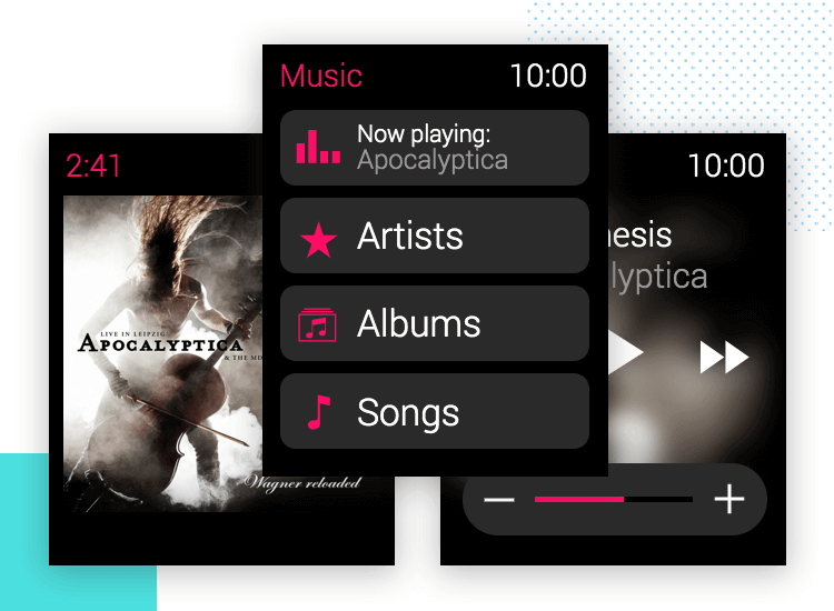
Designers have two options that come with the Apple Watch UI kit. One version shows a solid background, with no distractions from the control buttons we all know and love: play, fast forward, rewind and the volume control. The name of the song shows in white, while the artist (beloved Apocalyptica) can be seen in a lighter shade of grey. The other alternative shows the same action controls – but with the album cover out of focus in the background – for a more visual effect.
The Apple Watch UI kit makes for a powerful and versatile ally for any designer attempting to bring their smartwatch prototype to life. Take individual UI components and create screens from scratch, or take entire screens as a base – and modify, adapt and add on as you see fit.
Regardless of what type of app you have in mind, the Apple Watch UI kit is a must in your toolbox!